CHAPTER 7
Lower Chart Indicators L1 through L4
Moving average (MA) indicators are lagging indicators. They are lagging because the data are based on past history over a set number of periods or days. Regardless of this, MA settings are very important in terms of validating the V. The position of the MAs determines 90 percent of what we do when trading covered calls and LEAPS following the Compound Stock Earnings (CSE) methodology.
As we discussed earlier, M1 (white) is the lead dog. When M1 (white) is dramatically up or down, a strong cycle is occurring in either direction, and therefore we can trade positions fairly easily by applying our CSE management rules. However, we know that M1 (white) will change direction as the stock cycles up and down. Therefore, M1 (white) will regularly turn flat or horizontal. When M1 (white) begins to roll over from its upward or downward position to a flat or horizontal position, the highs and lows are averaging out. Other technical indicators must be applied to interpret the probabilities of the next cycle direction.
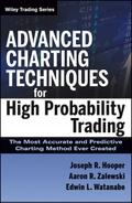
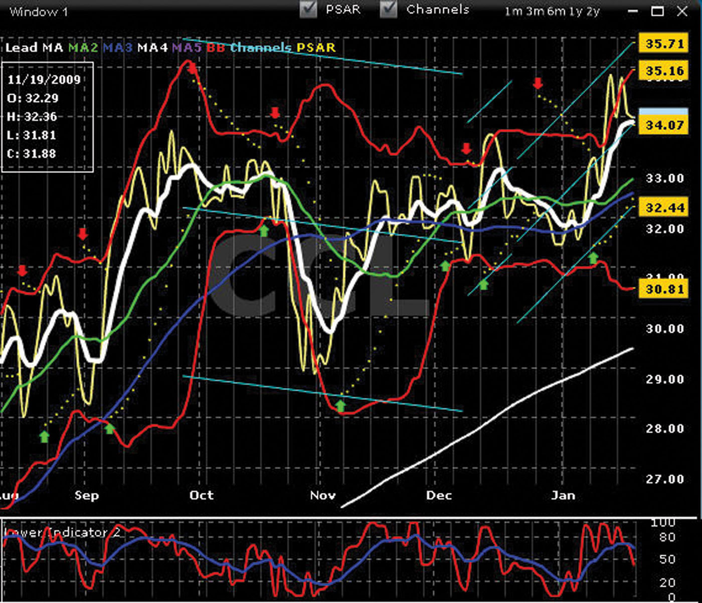
Look at the chart of CCL in late January shown in Figure 7.1. Note that M1 (white) has flattened out and gone horizontal. When this happens, we need to use our other lower chart indicators to interpret the probabilities of the next price direction. Note all of the arrows indicating a flat to slightly up or down M1. A slightly up or slightly down M1 is basically the same as a true flat or horizontal M1.
FIGURE 7.1 Chart of CCL—M1 Flat
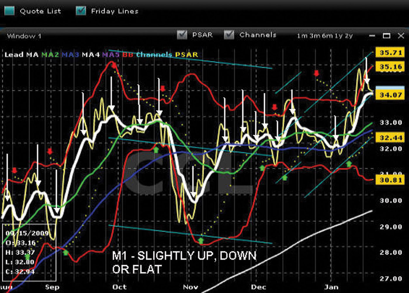
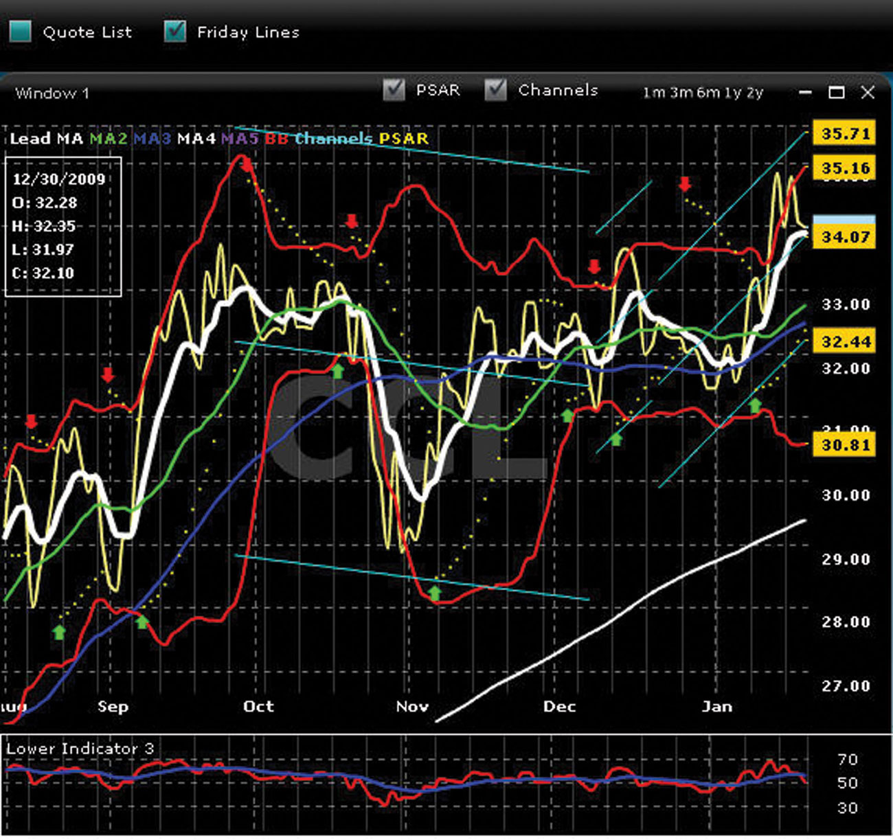
Look at chart in Figure 7.2. At the bottom of the chart are four key indicators that are used to determine likely future price direction of the stock.
FIGURE 7.2 Chart of CCL—Lower Indicators
When M1 (white) flattens out and we examine the current position of the chart, we see three things:
All four lower indicators have moved from the top of their scales (scales are the vertical numbers on the right edge of the indicators) and have turned down. The red line has crossed through the blue line. This gives us strong indication that the inverted V is valid and bias for the stock price in the short term is down. We do not tethered slingshot here but wait for more confirmation and validation.
The next section discusses these indicators and how we use them.
■ Defining the Lower Chart Indicators
As mentioned, there are four lower chart indicators that we use primarily to get an understanding of bias when M1 (white) flattens out and goes horizontal. In this section, we define and explain these indicators. In the next section, we look at several examples of M1 (white) flattening out and how we use these indicators to confirm and validate our opinion of bias.
It’s very important to note that none of these lower chart indicators is used alone. We view all four indicators together to get a better idea of bias for the stock.
Lower Indicator 1—L1
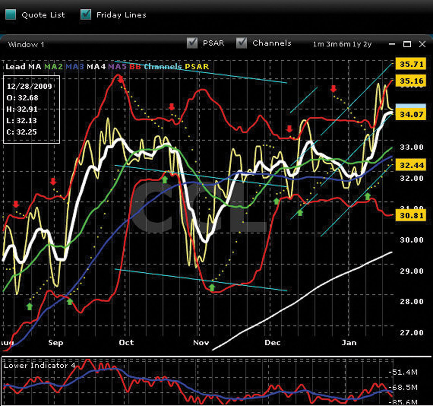
Lower indicator 1 (L1) is a trend following the momentum indicator that shows the relationship between two moving averages of prices. It is the first lower chart technical indicator that we check when M1 (white) is flat. Lower indicator 1 is displayed at the bottom of Figure 7.3.
Upward bias exists when:
FIGURE 7.3 Chart of CCL—L1
Downward bias exists when:
The red line tracks the price tic. The blue line is called the signal line, and its direction is influenced by the daily movement of the price tic. L1, in this example, shows the red and blue lines high relative to the scale on the right. The blue signal line still can move upward, but there is more room for L1 to move downward toward the bottom of the scale. Note the movement of L1 up and down and the movement of M1 on the chart. When M1 and the price tic move downward, L1 also moves down. When the price tic moves upward, L1 will begin to move up as well.
L1 is the most important lower indicator of the indicators under Chart 1 and the first of the lower indicators.
We discuss the use of this indicator in more detail later in the chapter when we review chart examples of M1 (white) flattening out and discuss how to use the lower indicators to understand likely stock price direction.
Where is L1 relative to its scale? Is it high, low, or in the middle? Note that if L1 is low relative to its scale, the cycle on Chart 1 is low. If L1 is high relative to its scale, the cycle on Chart 1 is high. L1 is very accurate in determining probable direction of the next cycle.
Lower Indicator 2—L2
Lower indicator 2 (L2) is a momentum indicator that shows the location of the current close price relative to the high/low range over a set number of periods. Lower indicator 2 is displayed in the lower region of Figure 7.4.
FIGURE 7.4 Chart of CCL—L2
Lower indicator 2 oscillates between a range of 0 and 100. Readings below 20 are generally considered oversold (bias is therefore up), and readings above 80 are generally considered overbought (bias is therefore down).
However, when interpreting lower indicator 2, it is important to understand that a stock regularly will continue to rise after the L2 has reached 80 and regularly will continue to fall after L2 has reached 20. As such, when using L2, we are looking for the oscillator to move from overbought territory back below 80 and from oversold territory back above 20. As with the other technical indicators, we use the L2 when M1 (white) is flat, slightly up, or down.
Upward bias exists when:
Downward bias exists when:
We discuss the use of this indicator in more detail later in the chapter when we review chart examples of M1 (white) flattening out and discuss how to use the lower indicators to understand likely stock price direction.
The blue line is the signal line, and its path up or down is created by the movement of the red line. If the signal line is pointed up, momentum is still upward. If the signal line is pointed down, momentum is downward. The direction of the signal line can be used to determine if a cycle is still in its momentum phase.
Lower Indicator 3—L3
Lower indicator 3 (L3) is another momentum oscillator used to compare the magnitude of a stock’s recent gains to the magnitude of its recent losses and turns that information into a number that ranges from 0 to 100. Readings below 30 are generally considered oversold (bias is therefore up), and readings above 70 are generally considered overbought (bias is therefore down).
When interpreting L3, as with L2, it is important to understand that a stock regularly will continue to rise after it has reached 70 and may continue to fall after it has reached 30. As such, when using L3, we are looking for the oscillator to move from overbought territory back below 70 and from oversold territory back above 30. As with the other technical indicators, we use L3 when M1 (white) flattens out (see Figure 7.5).
FIGURE 7.5 Chart of CCL – L3
Upward bias exists when:
Downward bias exists when:
We discuss the use of this indicator later in the chapter when we review chart examples of the M1 (white) flattening out and discuss how to use the lower indicators to understand likely stock price direction.
Lower Indicator 4—L4
Lower indicator 4 (L4) is a volume indicator that adds a period’s volume when the closing price is up and subtracts the period’s volume when the closing price is down. A cumulative total of the volume additions and subtractions forms the L4 line. The idea behind L4 is that changes in the volume will precede price changes—increases in volume often indicate the presence of smart money flowing into a security. L4 is thus a leading indicator tracking smart money.
A rising L4 line indicates that the volume is heavier on up days. If the price also is rising, the L4 can serve as a confirmation of the price uptrend. In such a case, the rising price is the result of an increased demand for the security, which is a requirement of a healthy uptrend.
However, if prices are moving higher while the volume line is dropping, a negative divergence is present. This divergence suggests that the uptrend is not healthy and should be taken as a warning signal that the trend will not persist.
The numerical value of L4 is not important; the direction of the line is. Concentrate on the L4 direction and its relationship with the security’s price (see Figure 7.6).
FIGURE 7.6 Chart of CCL – L4
Upward bias exists when:
Downward bias exists when:
Use the lower indicators when the lead MA (white) flattens out.
Now that we understand all our moving average indicators and the lower chart indicators, it is time to put all this information together. As discussed, when we have a clear cycle direction where M1 (white) is pointing dramatically up or down, it is very easy to interpret the direction of the stock price. However, when M1 (white) is flat or horizontal, we need to assess our lower chart indicators to understand bias.
There are three basic conditions where M1 (white) is flat:
Next we present examples of each of these conditions and show how to use the lower chart indicators to interpret the probabilities of stock price direction.
M1 (White) Has Been Declining and Is Now Flattening Out
Refer to Figure 7.7. Notice at the current point on the chart that:
FIGURE 7.7 Chart of COM—M1 Declining
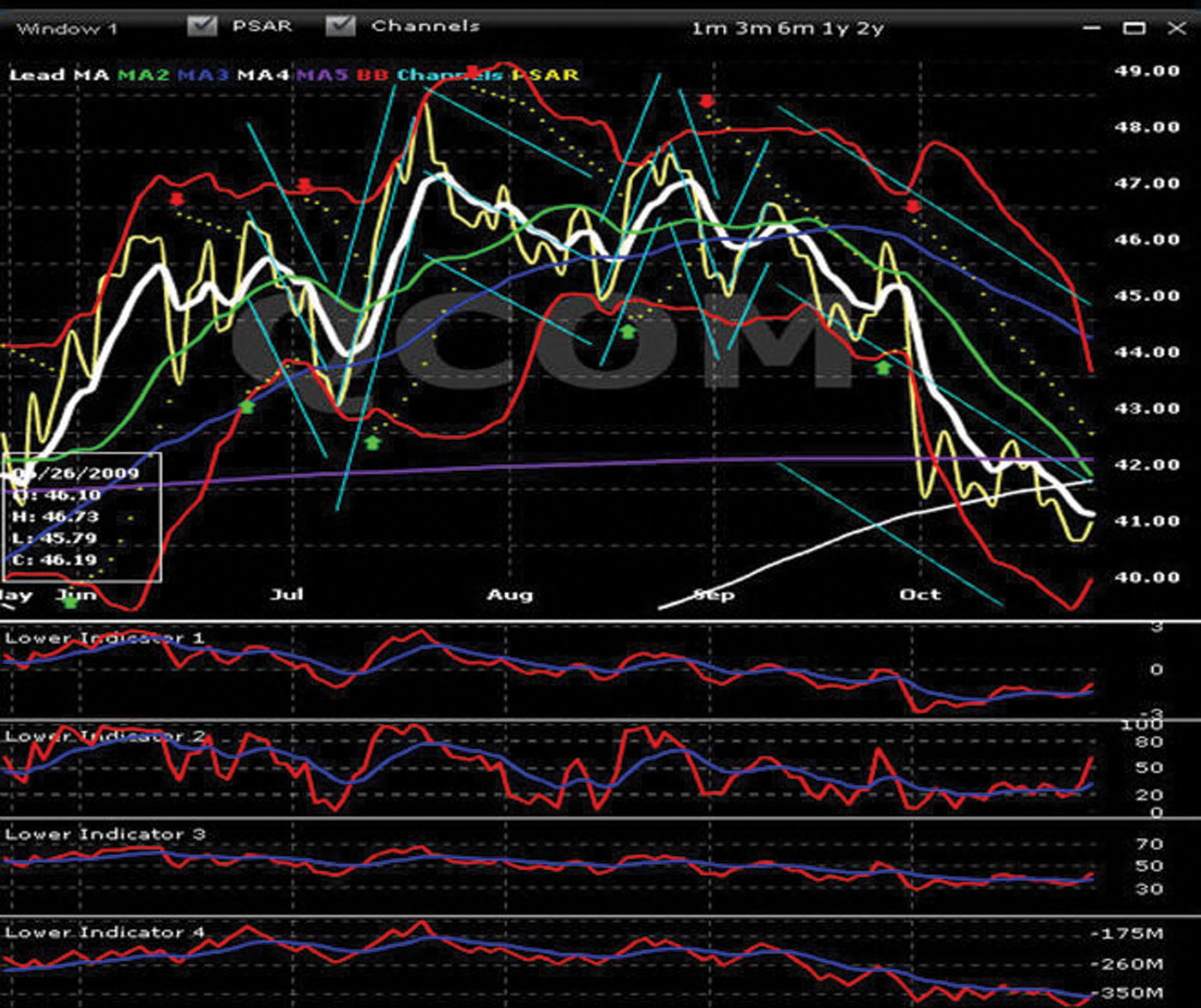
We can now refer to our lower indicators to get an understanding of bias for the future price direction of the stock. When we assess our lower indicators, we see very strong indication of upward momentum. We see that L1, L2, and L3 have moved from the bottom of their scales and are now heading up. This is confirmation and validation that this next cycle will be up. We also see that L4 (red line) has crossed the blue line and the blue line is now headed up.
Every indicator is telling us that the stock price has upward bias. What we do not know is how much of an up cycle will occur before M1 rolls over again and cycles down.
In Chapter 9 we cover specific rules indicating when to utilize the tethered slingshot (TSS) and when to enter new positions. However, for now, the important concept to understand is that when M1 (white) flattens out, we look at our lower indicators to confirm and validate bias for the next cycle.
M1 (White) Has Been Rising and Is Now Flattening Out
Refer to the chart in Figure 7.8. Notice at the current point on the chart that:
FIGURE 7.8 Chart of CSCO—M1 Flattening
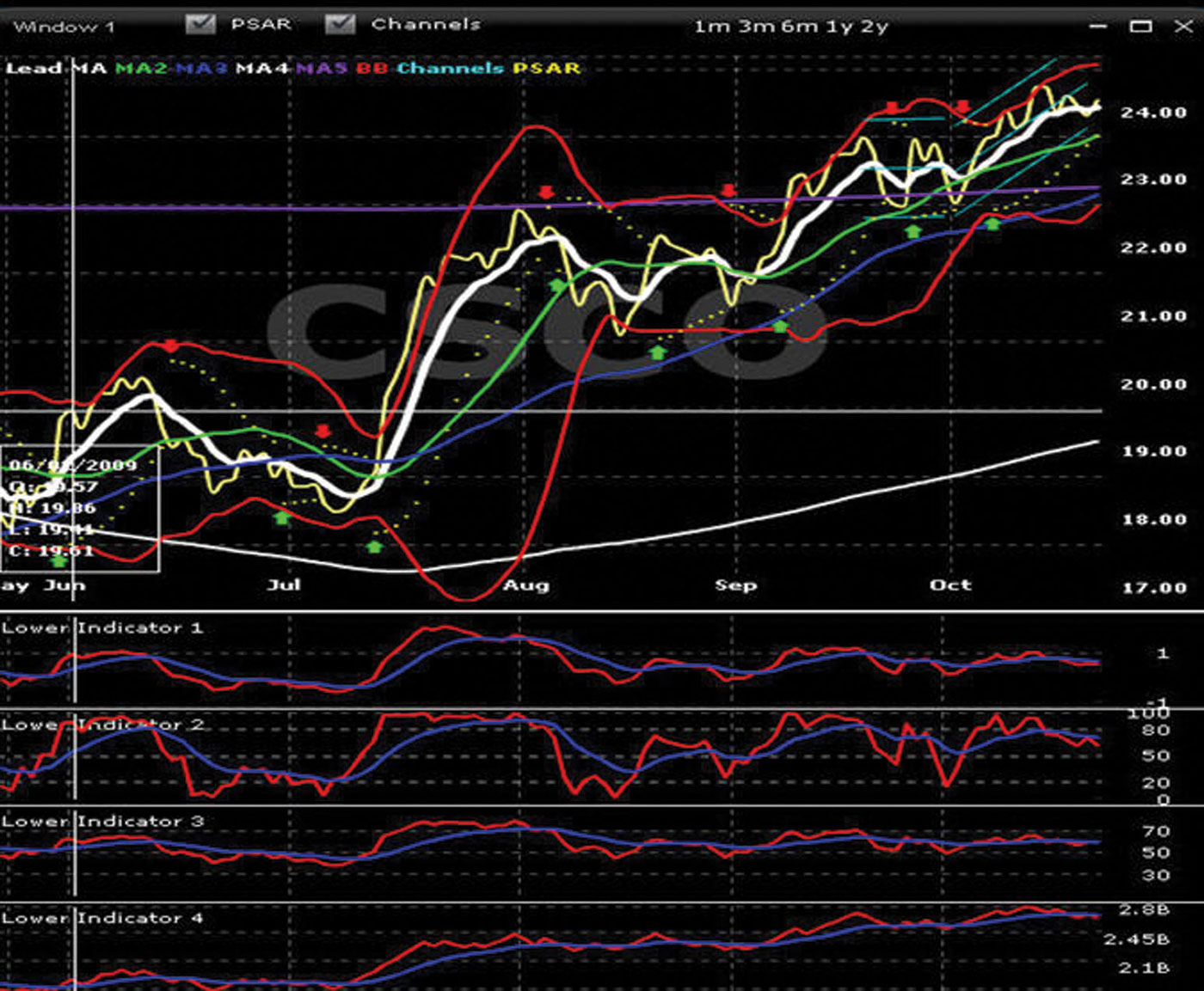
We can now refer to our lower indicators to get an understanding of bias for the future price direction of the stock. When we assess our lower indicators, we see very strong indication of downward momentum. We see that L1, L2, and L3 have moved from the top and are now heading down. We also see that L4 (red line) has crossed over the blue line from the top and is now pointing down.
Every indicator is telling us the stock price has downward bias. What we do not know is how much of a down cycle will occur before M1 rolls over again and cycles up.
You will see in Chapter 9 that we cover specific rules indicating when to TSS and when to enter new positions. However, for now, the important concept to understand is when M1 (white) flattens out, we look at our lower indicators to confirm and validate bias for the next cycle.
M1 (White) and M2 (Green) Have Converged and Are Moving Horizontally
As long as M1 and M2 are converged, do not trade. Wait for M1 to separate from M2 and turn either up or down.
Refer to Figure 7.9. Notice from the two convergence points on the chart that:
FIGURE 7.9 Chart of ZZ—M1 Convergence
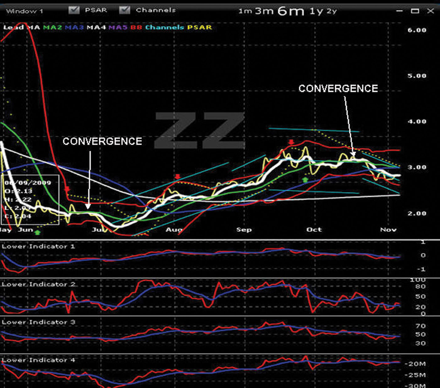
When M1 and M2 converge, it is a signal to wait and have patience. This signal is also confirmed by the lower indicators because they are tracking horizontally or are in total disagreement. The stock is not cycling in either direction. The Vs being formed are too shallow to realize a return using a TSS. We are unsure of the cycle direction, so this is not an ideal new position. We must have patience with this stock for now. These Advanced Charting indicators teach us patience, which remains an important part of the CSE covered call, LEAPS, and credit spread techniques.