
A powerful aspect of Access 2002 is its capability to be extensible. In addition to the controls available as part of the product, you can incorporate ActiveX controls on your forms. This means that you aren’t limited by what Access supplies, only by the imaginations of third-party developers who design ActiveX controls.
Note
Several years ago, Microsoft renamed OLE controls to ActiveX controls. You will still sometimes see these terms used interchangeably.
ActiveX controls support the OLE 2.0 custom control architecture and provide support for 32-bit operating systems. They have their own code, methods, events, and properties. An ActiveX control’s functionality is stored in a file with an .OCX extension. This is why ActiveX controls are often referred to as OCXs. A Calendar OCX control comes with Microsoft Access. Additional OCX controls are included in the Microsoft Office 2002 Developer (MOD) and are available from third-party vendors, such as FMS, DBI Technologies, Database Creations, Crescent, Sheridan, Far Point, and many others.
Two types of ActiveX controls exist. The first is visible at both design time and runtime; after being placed on a form, it provides a front-end interface that allows the user to directly manipulate the object. One example is the Calendar control in Access 2002. The second type of ActiveX control is visible at design time, but not at runtime; this type of control can, for example, give you access to all Windows common dialog boxes, such as Open, Print, and so on. The control itself isn’t visible to the user, but its functionality is available to the user at runtime. Another example is a timer control; it operates within the application, triggering event code to run, but it isn’t actually visible to the user.
With ActiveX controls, you can easily incorporate more functionality in your applications. For example, if you need to include a calendar on your form, you don’t need to worry about how to build your own. Instead, you can include a custom calendar control and modify the calendar’s behavior by changing its properties and executing its methods.
Before you can incorporate an ActiveX control in your application, you must perform three steps:
When you buy an ActiveX control, it generally has an installation program that copies the OCX file to your Windows system directory. The name of this directory can vary depending on whether you’re running Windows 95, Windows 98, Windows NT, or Windows 2000 and what you named your Windows directory during your operating system installation.
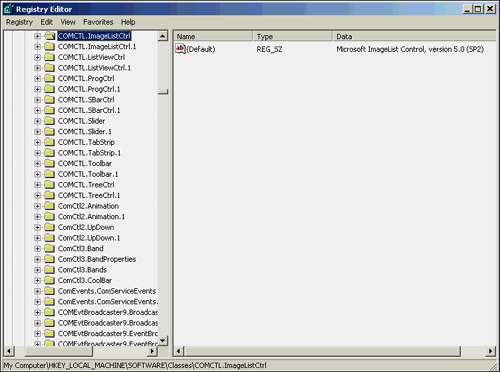
After you have installed the control, you’re ready to register it with Access. Often a control is automatically registered during installation, which is true of the Calendar OCX included with Access, as well as all the OCX controls that come with the Microsoft Office 2002 Developer (MOD). OCX controls are registered in the HKEY_LOCAL_MACHINESOFTWARE class in the Windows registry. (See Figure 21.1.) In the figure, the Image List control, registered as ImageListCtrl, is selected.
If an ActiveX control isn’t registered, you can do so by using the ActiveX Controls dialog box. To open this dialog box, choose Tools | ActiveX Controls. (See Figure 21.2.)
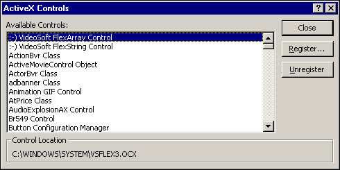
The ActiveX Controls dialog box lists all the ActiveX controls currently registered in Access. To add an ActiveX control to the list, click Register. This opens the Add ActiveX Control dialog box. (See Figure 21.3.)
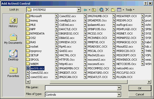
Make sure that you’re pointing to the directory containing the OCX you want to register. The control you’re registering must already be installed; if it hasn’t been installed, it won’t be on the list. Select the OCX you want to register, and click OK. You then return to the ActiveX Controls dialog box, and the control you selected appears on the list of registered controls. You’re ready to include the control on a form.
If you no longer plan to use an ActiveX control, you should use the Unregister button, located in the ActiveX Control dialog, which removes the registry entries for controls you don’t use.
After you have registered an ActiveX control, you can include it on your forms. You do this in one of two ways:
Select the ActiveX control from the toolbox by clicking the More Controls icon.
Choose ActiveX Control from the Insert menu when you’re in Form or Report Design view.
The More Controls tool contains all the ActiveX controls registered by your system. This includes ActiveX controls that are part of Excel, Visual Basic, and any other application that uses ActiveX controls. Some of these controls won’t work properly with Access. To determine which controls you can safely include in your application, read the Access Readme file or contact the vendor of the ActiveX control. The More Controls menu is shown in Figure 21.4.
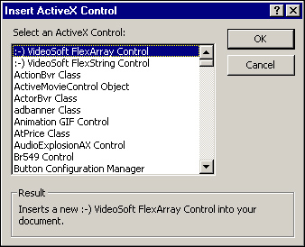
The menu for the More Controls tool shows all the ActiveX controls installed on the system. You can also use the Insert menu to select an ActiveX control from the Insert ActiveX Control dialog box. (See Figure 21.5.) After selecting a control from the Select an ActiveX Control list box, the control is placed on the form. You can move the control around the form and size it as needed.
After you have placed an ActiveX control on a form, the control is ready to operate in its default format. If you insert the Calendar OCX control in a form and run the form, it looks like Figure 21.6.
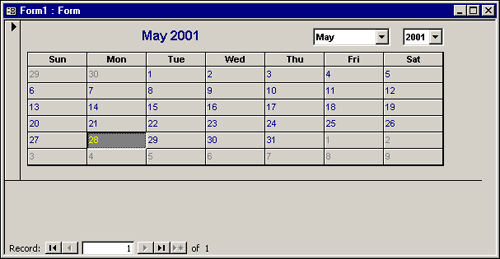
The Calendar control can display all the months of the year, along with the corresponding days for each particular month. So far, you haven’t set any properties for the calendar, nor have you written code to respond to any of the calendar’s events. Setting an ActiveX control’s properties, executing an ActiveX control’s methods, and responding to an ActiveX control’s events are covered in the following sections.
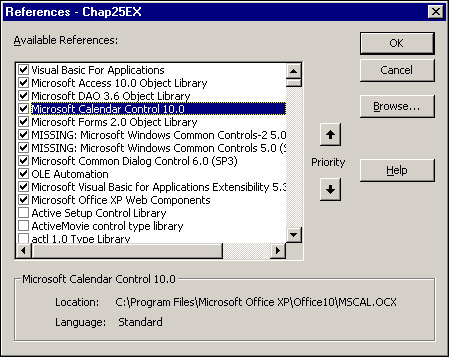
When you insert an ActiveX control on a form, Access automatically creates a reference to the control’s Type Library that appears in the References dialog box. (See Figure 21.7.) To invoke the References dialog box, choose Tools|References with the Visual Basic Editor active. Note that the full path to the control is stored in this dialog box. For example, Figure 21.7 shows that the Calendar OCX is stored in C:Program FilesMicrosoft OfficeOffice. If the OCX is moved, VBA might not be able to resolve the reference. If this happens, you must open the References dialog box and manually remove the check from the reference marked as missing and set a reference to the ActiveX control in its new location.
If you’re distributing an application with ActiveX controls, the application might or might not work without problems. Access does its best to try to resolve references to ActiveX controls. If the controls are in the WindowsSystem directory or the directory that Access is installed in, Access can automatically resolve the references, even if the application is installed in a different directory on the user’s machine than it was on your machine.
Remember, not only do ActiveX controls need to be referenced, but they also need to be registered in the Windows registry. If you use the Package and Deployment Wizard included with the MOD to distribute your application, the OCXs are automatically registered when the user installs your application. If you don’t use the Microsoft Office 2002 Package and Deployment Wizard to distribute your application, you must write code to register the ActiveX control, or the user will have to manually register it.
The methods, events, and properties associated with each ActiveX control differ. They’re specific to that control and are determined by the control’s author, and they are used to manipulate the control’s appearance and behavior. Each control’s methods, events, and properties are in a separate .OCX file.
If you don’t modify a control’s properties, it functions with its default appearance and behavior. Much of the richness of third-party controls comes from the ability to customize the controls by changing their properties at both design time and runtime. Some controls support data binding, which lets you store or display data in a control from an underlying field in a table. Furthermore, the ability to respond to an ActiveX control’s events lets you respond to the user’s interaction with the control, and being able to execute the control’s methods lets you manipulate the control.
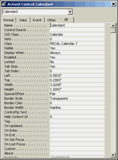
Figure 21.8 shows some of the Calendar control’s many properties. As with any control, most of its properties can be set at design time and modified or read at runtime.
Another way to set properties for a control is to do it graphically by selecting the Custom property from the object’s Property sheet, and then clicking the build button. For example, if you select the Custom property from the Calendar control’s Property sheet and click the build button, the control’s Properties dialog box appears. The properties shown in this dialog box vary for each control.
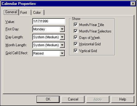
Figure 21.9 shows the Properties dialog box for the Calendar control. Here, you can modify many of the calendar’s attributes, including the first day of the week, whether you want the days of the week to show, and the colors and fonts.
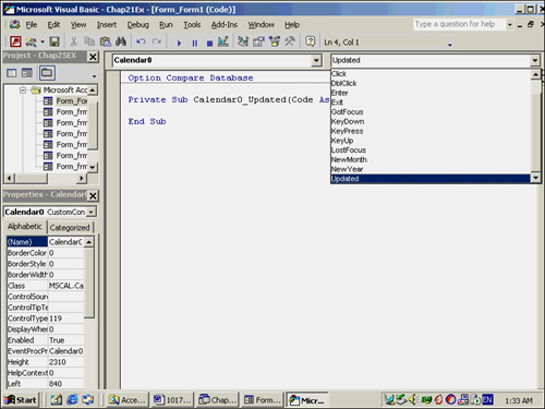
Just as the properties of the control can be set or evaluated at runtime, the control’s events can be coded, too. To get a list of all the events associated with an ActiveX control, open the Procedure box in the Module window. Make sure that the control name for your ActiveX control is listed in the Object box. Figure 21.10 shows all the events for the Calendar control.
The Calendar control’s AfterUpdate event is triggered when the user selects a date from the calendar. The following code changes the value of the txtDateSelected text box to the Value property of the calPickADay control. This code is placed in the Calendar control’s AfterUpdate event so that it executes any time the user selects a date on the calendar:
Private Sub calPickADay_AfterUpdate()
   txtDateSelected.Value = calPickADay.Value
End Sub
This code—and most of the code in this chapter—is in the CHAP21EX.MDB file on the book’s CD-ROM. This example is found in the frmPickADay form.
The Calendar control is one of the more powerful OCX controls available. Understanding its properties and methods makes it a lot easier to work with; they are covered in the following sections. Most of the examples are found in frmCalPropsAndMethods.
The Day, Month, and Year properties designate the day, month, and year displayed on the calendar. These properties are automatically changed at runtime as the user selects different dates on the calendar. You can modify the values programmatically by using macros or Visual Basic, thereby changing the day, month, or year that’s selected.
The Value property is one of the Calendar control’s most important properties. It retrieves the selected calendar date or moves the date highlight to a specific day. The following code uses the Value property to display the selected day in a message box:
Private Sub cmdDisplayDate_Click()
    'Display the date selected on the calendar
    MsgBox calSelectADay.Value
End Sub
The ValueIsNull property lets you indicate that no date is selected on the calendar. This property is used when you want to make sure that the user explicitly selects a date.
The DayFont and DayFontColor properties specify the font and color for displaying the day titles. The DayFont property is further broken down into the properties Name, Size, Bold, Italic, Underline, and Strikethrough. An individual property can be modified like this:
calSelectADay.DayFont.Italic = True
You can use the With...End With construct to change several font properties at once:
With calSelectADay.DayFont
      .Bold = True
      .Italic = True
      .Name = "Arial"
End With
The DayFontColor property can be used to easily modify the color of the day titles:
calSelectADay.DayFontColor = 16711680
The GridFont and GridFontColor properties are similar to the DayFont and DayFontColor properties. GridFont determines the font type and size attributes for the text in the calendar, and GridFontColor indicates the text color in the calendar. For example, the following routine modifies the Bold, Italic, and Name properties of the GridFont property and changes the color of the days displayed on the calendar:
Private Sub cmdChangeGridFont_Click()
    'Change attributes of the font on the grid
    With calSelectADay.GridFont
        .Bold = True
        .Italic = True
        .Name = "Arial"
    End With
    calSelectADay.GridFontColor = 8388736
End Sub
The DayLength and MonthLength properties designate how you want the day or month titles to be displayed. The available choices for DayLength are Short (0), Medium (1), and Long (2). Short displays the day as one character, Medium displays the day as a three-character abbreviation, and Long displays the full day (for example, Monday). The available choices for MonthLength are Short (0) and Long (2). Short displays the month as a three-character abbreviation, and Long displays the full month name. The following code specifies both the DayLength and MonthLength properties as Short:
Private Sub cmdChangeLength_Click()
    'Modify the display of the day and month titles
    calSelectADay.DayLength = 0
    calSelectADay.MonthLength = 0
End Sub
The ShowDateSelectors property indicates whether combo boxes appear at the top of the calendar, allowing the user to select a month and year. This property can be set to True or False.
The ShowTitle property indicates whether the month and year are displayed at the top of the calendar.
The GridLinesFormat and GridLinesColor properties specify whether the gridlines are raised, sunken, or flat, and what color they are.
The Calendar control also has several methods, or actions you can take on the Calendar object. The NextDay, PreviousDay, NextWeek, PreviousWeek, NextMonth, PreviousMonth, NextYear, and PreviousYear methods all move the control’s Value property forward or backward by the specified period of time.
Other methods of the Calendar control include the following:
The
Refreshmethod repaints the Calendar control.The
Todaymethod sets the Value property to the current date.The
AboutBoxmethod displays the Calendar control’s About box.
Note
The following examples require controls supplied with Microsoft Office 2002 Developer. You must have MOD 2002 for the following code samples to run. Also, if you have MOD, you can distribute these tools royalty free to your users.
If you have MOD installed and still can’t run some of the examples, you might want to check the References dialog box to make sure that the controls are properly referenced.
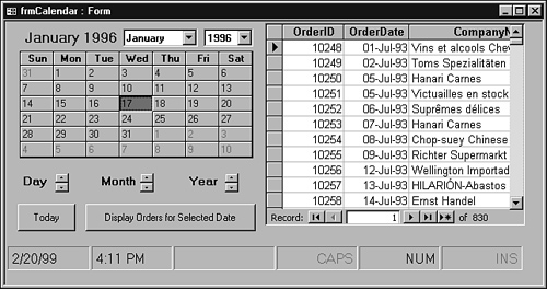
Figure 21.11 shows how the Calendar control works. As you can see, the form, called frmCalendar, lets the user move from day to day, month to month, or year to year. The user can also move to the current day, or even select a date, and then click the Display Orders for Selected Date command button to view all the orders placed on the selected date.
The code for the Today command button illustrates using the Today method:
Private Sub cmdToday_Click()
    'Change the selected date in the calendar control
    'to today's date
    calPickADay.Today
End Sub
Because the Today method is issued on the Calendar control, the selected day will become the current date. The code for the Display Orders for Selected Date command button looks like this:
Private Sub cmdOrders_Click()
    'Change the recordsource of the form
    'to select only those rows where the order
    'date matches the data selected in the
    'calendar control
    frmOrdersByDate.Form.RecordSource = _
        "Select * from qryOrdersByDate Where OrderDate = #" _
        & calPickADay.Value & "#"
End Sub
This code changes the subform’s RecordSource to include only those records in which the OrderDate is equal to the selected calendar date. The remainder of the code for the frmCalendar form is discussed in the following section.
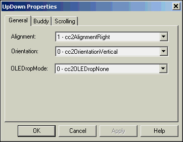
The UpDown control is an excellent tool for incrementing and decrementing values. Used in conjunction with other controls, it can easily act as a means to increment and decrement the other controls’ values. For example, on the frmCalendar form, UpDown objects increment and decrement the selected day, month, and year. Like the Calendar control, the UpDown object has its own built-in properties and methods. Although the properties can be modified on the Other tab of the Properties window, it’s easier to modify them by using the UpDown properties dialog box.(See Figure 21.12.) To open it, double-click on the UpDown object whose properties you want to modify.
The Orientation property, one of the most important for the UpDown object, indicates whether you want the UpDown object to be displayed vertically or horizontally. The two most commonly used events of a UpDown object are the UpClick event and the DownClick event; they specify what happens when the user clicks either button of the control. The following code is placed in the DownClick event of the updnDay UpDown object on frmCalendar. Notice that the code executes a PreviousDay method on the calPickADay control, causing the Calendar control to set the focus to the previous day:
Private Sub updnDay_DownClick()
    'Move selected day back one day
    calPickADay.PreviousDay
End Sub
The UpClick event of the updnDay control uses the NextDay method of the calPickADay control to cause the focus to shift to the next day:
Private Sub updnDay_UpClick()
    'Move selected day forward one day
    calPickADay.NextDay
End Sub
The DownClick event of the updnMonth control uses the Calendar control’s PreviousMonth method to move focus to the same day in the previous month:
Private Sub updnMonth_DownClick()
    'Move selected day back one month
    calPickADay.PreviousMonth
End Sub
The UpClick event of the updnMonth control uses the Calendar control’s NextMonth method to move focus to the same day in the next month:
Private Sub updnMonth_UpClick()
    'Move selected day forward one month
    calPickADay.NextMonth
End Sub
The DownClick and UpClick events of the updnYear control use the Calendar control’s PreviousYear and NextYear methods to move backward and forward a year in the calendar:
Private Sub updnYear_DownClick()
    'Move selected day back one year
    calPickADay.PreviousYear
End Sub

Private Sub updnYear_UpClick()
    'Move selected day forward one year
    calPickADay.NextYear
End Sub
As you can see, by combining the different ActiveX controls, you can create exciting, user-friendly, utilitarian applications.
You can use the StatusBar control to quickly and easily add professional-looking status bars to your forms, as shown at the bottom of the frmCalendar form in Figure 21.11. The StatusBar in the figure has six panels; the first two have been configured to display the current date and time, and the last three display the status of the Caps, Num, and Ins keys.
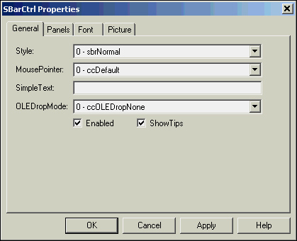
Properties can be set for the StatusBar control as a whole or for the individual panels. (See Figure 21.13.) The Style property specifies whether you want the status bar to include multiple panels or only a single panel. The SimpleText property is used only for single-panel status bars; it specifies the text in the panel. Finally, the MousePointer property lets you select the type of mouse pointer that appears when it’s placed over the StatusBar control.
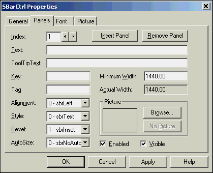
Each panel of the StatusBar control has properties that affect what that panel looks like and how it performs. The Index property of the panel is used to identify the particular panel. The panel properties are shown in Figure 21.14. The Style property is an important one; it specifies what information is displayed in the panel. It can be set to Text, Caps, Num Lock, Ins, Scroll, Time, Date, or Kana Lock (used for the Japanese character set). When set, the control can automatically sense whether the Caps Lock or other keys are active. The Text property indicates the text displayed in the panel when the Style property is set to Text. The value of this property is often modified at runtime to display a specific message to the user. The Alignment property determines whether the information is left-aligned, right-aligned, or centered in the panel, and the Bevel property can be set to None, Inset, or Raised.
As you insert and remove panels, each panel is assigned an index, and the Index property is used to refer to a specific panel at runtime, as shown in this example:
Private Sub calPickADay_AfterUpdate()
    'If the selected date equals today's
    'date, include the text TODAY!!! in the
    'third panel of the status bar
    If calPickADay.Value = Date Then
        sbrStatus.Panels(3).Text = "TODAY!!!"

    'Otherwise display nothing in the third panel
    'of the status bar
    Else
        sbrStatus.Panels(3).Text = ""
    End If
End Sub
This code evaluates the calPickADay value to see whether it’s equal to the current date. If so, the text of the third panel is set to TODAY!!!. Otherwise, the third panel’s text is set to a zero-length string.
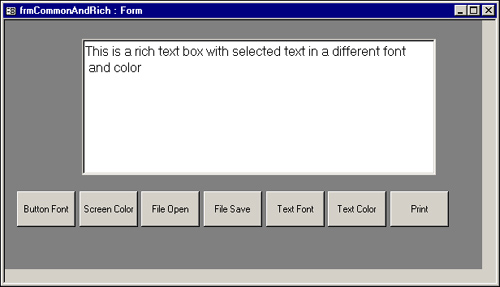
The Common Dialog control is actually like many controls in one. It’s used to display the standard Windows File Open, File Save As, Font, Color, and Print common dialog boxes. It’s a hidden control that doesn’t appear at runtime, but whose properties and methods can be manipulated by using VBA code. The frmCommonAndRich form, shown in Figure 21.15, illustrates using several of the common dialog boxes as well as the Rich Textbox control, covered in the next section.
Note
The new FileDialog object replaces much of the functionality supplied by the Common Dialog control. It is easy to use and, because it is built in, it is much lighter weight than the Common Dialog control. The FileDialog object is covered in Chapter 9, “Advanced Form Techniques.”
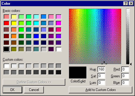
The Screen Color and Button Font command buttons illustrate uses of the Common Dialog control. They invoke the Color and Font common dialog boxes, respectively. The code for the Click event of the cmdColor command button looks like this:
Private Sub cmdColor_Click()
    'Set flags to show all colors
    dlgCommon.Flags = cdlCCFullOpen
    'Invoke color dialog
    dlgCommon.ShowColor

    'Change the BackColor property of the
    'form to match the selected color
    Me.Detail.BackColor = dlgCommon.Color
End Sub
The code begins by setting the Common Dialog control’s Flags property, which is used to specify attributes of the common dialog box. The value of cdlCCFullOpen indicates that the entire Color common dialog box, including the portion that lets the user create custom colors, is displayed. The ShowColor method, when applied to the Common Dialog control, invokes the Color common dialog box. (See Figure 21.16.) The color the user selects is filled into the Color property of the Common Dialog control. This color is used to modify the BackColor property of the form’s Detail section.
The following code uses the With...End With loop to change several properties from the Common Dialog control:
Private Sub cmdFont_Click()
Dim ctl As Control
'Set flags to show only screen fonts
dlgCommon.Flags = cdlCFScreenFonts
'Invoke font dialog
dlgCommon.ShowFont
'Loop through each control on the form,
'changing the font properties of the command
'buttons to the selected font attributes
For Each ctl In Controls
If TypeOf ctl Is CommandButton Then
With ctl
.FontName = dlgCommon.FontName
.FontBold = dlgCommon.FontBold
.FontItalic = dlgCommon.FontItalic
.FontSize = dlgCommon.FontSize
End With
End If
Next ctl
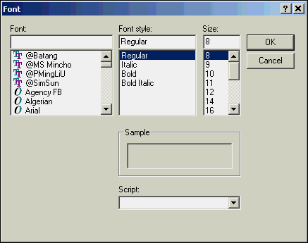
End SubThe Click event of cmdFont first sets the Common Dialog control’s Flags property to cdlCFScreenFonts. For the Font common dialog box, the value of cdlCDFScreenFonts causes the dialog box to list only the screen fonts supported by the user’s system. The ShowFont method is used to invoke the actual dialog box. (See Figure 21.17.) Using a With...End With construct, the code takes each property set in the common dialog box and uses it to loop through the form’s Controls collection, modifying the font attributes of each command button.
The File Open, File Save, and File Print common dialog boxes are covered in the next section.
The Rich Textbox control allows you to design a text box for writing code that affects the selected text. You can specify the Font, Font Size, Bold, and Italic properties. You can even add bullet points to the selected text. Furthermore, you can save the contents of the Rich Textbox control in a rich text format (RTF) file and later bring it back into the control.
The following code illustrates using several of the Rich Textbox control’s properties:
Private Sub cmdTextColor_Click()
    'Show the Color dialog
    dlgCommon.ShowColor

    'Change the color of the selected text
    'to the color selected in the dialog
    rtfDocument.SelColor = dlgCommon.Color
End Sub
This code uses the Color common dialog box to set the SelColor property of the Rich Textbox control. The selected text appears in whatever color the user selects from the common dialog box.
The Click event of the cmdTextFont command button sets the SelFontName, SelBold, SelItalic, and SelFontSize properties of the Rich Textbox control to the font, style, and size selected in the Font common dialog box:
Private Sub cmdTextFont_Click()
    'Set Flags to only show screen fonts
    dlgCommon.Flags = cdlCFScreenFonts

    'Display the Font dialog
    dlgCommon.ShowFont

    'Change the font of the selected text to the
    'font settings designated in the Font dialog
    With rtfDocument
        .SelFontName = dlgCommon.FontName
        .SelBold = dlgCommon.FontBold
        .SelItalic = dlgCommon.FontItalic
        .SelFontSize = dlgCommon.FontSize
    End With
End Sub
The selected attributes are applied only to the selected text.
The Rich Textbox control has a method called SaveFile that lets you save the contents of the Rich Textbox control to an RTF file. The code looks like this:
Private Sub cmdSave_Click()
'Designate default settings for the Save dialog
dlgCommon.Filter = "RTF Files (*.rtf)|*.rtf"
'Invoke the Save dialog
dlgCommon.ShowSave
'If no file is selected, display an error message
'If a file is selected, save the file with the name and
'location designated in the dialog
If dlgCommon.FileName = "" Then
MsgBox "You Must Specify a File Name", vbExclamation, "File NOT Saved!"
Else
rtfDocument.SaveFile dlgCommon.FileName
End If
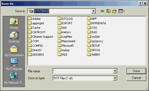
End SubThe code begins by setting the Common Dialog control’s Filter property; this filters the filenames displayed in the File Save common dialog box. The ShowSave method invokes the Save As common dialog box. (See Figure 21.18.) After the user types in or selects a filename, the Common Dialog control’s FileName property is filled in with the name of the file that the user specified. If the user clicks Cancel, the FileName property contains a zero-length string, and the user is warned that the file wasn’t saved.
As mentioned, you can also retrieve the contents of an RTF file into the control. The code looks like this:
Private Sub cmdOpen_Click()
'Set initial values for the Open dialog
dlgCommon.FileName = ""
dlgCommon.Filter = "RTF Files (*.rtf)|*.rtf"
dlgCommon.InitDir = CurDir
'Display the dialog
dlgCommon.ShowOpen
'If the user did not select a file, display a message
'If the user selected a file, load the file they selected
If dlgCommon.FileName = "" Then
MsgBox "You Must Specify a File Name", vbExclamation, "File Cannot Be Opened!"
Else
rtfDocument.LoadFile dlgCommon.FileName
End If
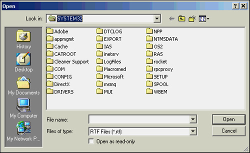
End SubThe Click event of the cmdOpen command button uses the ShowOpen method to invoke the File Open common dialog box. (See Figure 21.19.) If the user selects a file, the Rich Textbox control’s LoadFile method uses the Common Dialog control’s FileName property as the name of the file to open.
Besides being able to open and save the contents of a Rich Textbox control, you can print the control’s contents. The Click event of the cmdPrint command button sets the Common Dialog control’s Flags property to cdlPDAllPages:
Private Sub cmdPrint_Click()
'Select All in the Print dialog
dlgCommon.Flags = cdlPDAllPages
'Show the Print dialog
dlgCommon.ShowPrinter
'Print the selected text with the settings
'selected in the Print dialog
rtfDocument.SelPrint dlgCommon.hDC
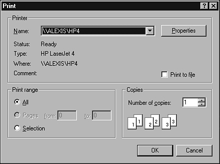
End SubThis selects the All option button in the Print dialog box (and deselects the Pages and Selection option buttons.) The ShowPrinter method displays the Print common dialog box. (See Figure 21.20.) The SelPrint method of the Rich Textbox control is then used to print the selected text with the printer selected in the Print common dialog box.
You can use the TabStrip control to conserve screen real estate by displaying data on different “pages” of the same form. The TabStrip control included in the MOD is the same control you’re used to seeing in applications such as Microsoft Word and Microsoft Excel. It’s easy to implement this control in your own forms. Figure 21.21 shows a form called frmTabbed that uses the TabStrip control.
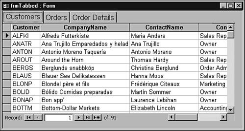
As the user clicks on each tab, the appropriate information displays. For example, if the user selects a customer on the Customers tab, and then clicks the Orders tab, all orders for the selected customer are displayed. If the user selects an order on the Orders tab, and then clicks the Order Details tab, all details about the selected order are displayed. The code looks like this:
Private Sub tabSelect_Click()
'Evaluate which tab is selected
'Hide and show the appropriate subforms,
'based on which tab is selected
Select Case Me!tabSelect.SelectedItem.INDEX
Case 1
Me!fsubCustomers.Visible = True
Me!fsubOrders.Visible = False
Me!fsubOrderDetails.Visible = False
Case 2
Me!fsubOrders.Form.RecordSource = _
"Select * from tblOrders Where CustomerID = '" _
& Me!fsubCustomers.Form!CustomerID & "';"
Me!fsubCustomers.Visible = False
Me!fsubOrders.Visible = True
Me!fsubOrderDetails.Visible = False
Case 3
Me!fsubOrderDetails.Form.RecordSource = _
"Select * from tblOrderDetails Where OrderID = " _
& Me!fsubOrders.Form!OrderID & ";"
Me!fsubCustomers.Visible = False
Me!fsubOrders.Visible = False
Me!fsubOrderDetails.Visible = True
End Select
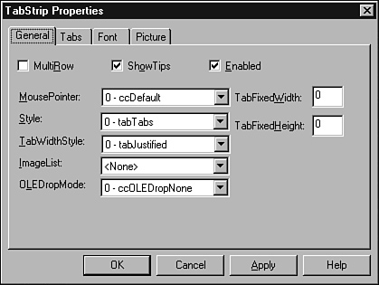
End SubHere’s how the code works: After adding a TabStrip control to a form, you can double-click it to view its properties. (See Figure 21.22.) The TabStrip Control Properties dialog box allows you to set properties for the TabStrip control as a whole, as well as for each tab. When the tabs have been added, you can code the TabStrip control’s Click event to determine what will happen when the user clicks on each tab.
Note
A Tab control is included as a standard control in the Access toolbox, so you don’t need to use the ActiveX TabStrip control in your applications. Third-party vendors have Tab controls with more features than Microsoft’s. These are all ActiveX-type controls.
Like the StatusBar control, the TabStrip control is one-based. A Case statement evaluates which tab was selected. The frmTabbed form has three subforms: fsubCustomers, fsubOrders, and fsubOrderDetails. When the frmTabbed form is first displayed, only the fsubCustomers subform control is visible. As the user clicks on each tab in the TabStrip control, the appropriate subform is displayed, and the other two subforms are hidden. The RecordSource for fsubOrders is modified at runtime to show only orders for the selected customer from fsubCustomers. The RecordSource for fsubOrderDetails is modified at runtime to show only the order detail items for the order selected on fsubOrders.
The TabStrip control can be enhanced by using an ImageList control, which stores images you’ll be using in the form. It’s populated at design time with these images. The ImageList control is hidden at runtime, but any of its images can be used in your form.
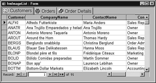
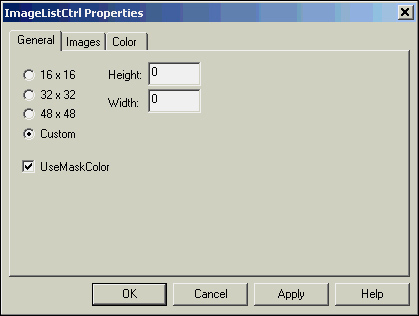
The frmImageList form, shown in Figure 21.23, is similar to the frmTabbed form, except that each tab has an image that comes from the ImageList control called imgPictures. The properties of the imgPictures ImageList control are shown in Figure 21.24. Notice that three pictures have been inserted. The General tab’s size has been set to 16×16, and the tabSelect TabStrip control has been modified to include imgPictures as its ImageList under the General properties tab. The index of each picture in the imgPictures ImageList control has been added as the Image property for each tab in the TabStrip control; the Image property specifies which image in the bound ImageList control should be displayed in the particular tab.
Some OCX controls can be distributed freely, but others have differing levels of restrictions. The licensing policies for a particular OCX control are determined by its vendor.
The licensing rules in effect for an OCX can be enforced by law, which means that improper distribution of the control is a crime. Distributing an OCX control without proper licensing is just like copying a software product illegally.
If you have any questions about licensing a third-party control, consult the vendor who created the control. A one-time fee might be required to freely distribute the OCX; in other cases, you might have to pay a royalty for each copy of the control that’s distributed. If you aren’t sure whether you want to buy a third-party control, you might want to consult the vendor. Many vendors let potential customers try out their products for a limited period of time. In fact, many of the demo versions are available online.
Note
Several other ActiveX controls are covered in Chapter 31, “Third-Party Tools That Can Help You to Get Your Job Done Effectively.”
One example of an ActiveX control is in the frmReportDateRange dialog box, shown in Figure 21.25. The Calendar control can be used to populate the Beginning Date and Ending Date text boxes.
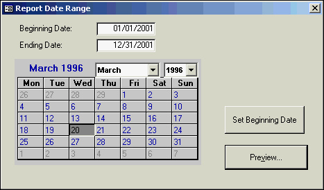
The code for adding the Calendar control looks like this:
Private Sub cmdSetDates_Click()
    On Error GoTo cmdSetDates_Error

    If cmdSetDates.Caption = "Set Beginning Date" Then
        BeginDate = calSetDates.Value
        cmdSetDates.Caption = "Set Ending Date"
    Else
        EndDate = calSetDates.Value
        cmdSetDates.Caption = "Set Beginning Date"
    End If

    Exit Sub

cmdSetDates_Error:
    MsgBox "Error # " & Err.Number & ": " & Err.Description
    Exit Sub

End Sub
Because the same calendar is used to populate the Beginning Date and Ending Date text boxes, the form has a command button with a caption that toggles. The user can select a date, and then click Set Beginning Date. The BeginDate text box is populated with the value selected on the calendar, and the command button’s caption is set to display Set Ending Date. If the command button’s caption says Set Ending Date and the user clicks that button, the EndDate text box is filled with the value selected on the calendar, and the command button’s caption changes to say Set Beginning Date.
ActiveX controls greatly extend the capabilities of Access 2002 and enable you to incorporate more functionality into your applications. These controls are easy to use and extremely powerful. In this chapter, you learned how to install, register, and work with ActiveX controls.
Each ActiveX control has its own properties, events, and methods. By modifying properties, reacting to events, and executing methods, you can take advantage of its rich features. Licensing for each ActiveX control varies, so you need to investigate that for each control you want to use to know whether—and under what conditions—you can distribute it to your users.