
Chapter 7. GUI Alerts: Menus, Dialogs, Toasts, Snackbars, and Notifications
User interface toolkits as diverse as Java Swing, the Apple Macintosh toolbox, Microsoft Windows, and browser JavaScript all feature the ubiquitous “pop-up menu,” usually in the window-frame version and the context (in-window) form. Android follows this convention, with some variations to be expected due to the smaller screens used on many devices (e.g., pop-up or context menus cover a large portion of the screen).
Those other window systems also feature the ubiquitous “dialog,” a window smaller than the main screen that pops up to notify you of some condition or occurrence and asks you to confirm your acceptance, or asks you to make one of several choices, provide some information, and so on.
Android provides a fairly standard dialog mechanism, as well as a smaller, lighter “pop-up” called a toast. This only appears on the screen for a few seconds, and fades away on its own. Intended for passive notification of low-importance events, it is often used for error notification, although I advise against this usage.
There is also a Snackbar, which looks like an action bar at the bottom of the screen, but behaves like a toast—it pops up, and then disappears after a few seconds.
And it doesn’t stop there. Android also provides a notification mechanism, which allows you to put text and/or an icon in the notifications bar (top left of the screen). A notification can optionally be accompanied by any combination of LED flashing, audio sounds, and device vibration.
Each of these interactive mechanisms is discussed in this chapter. The chapter proceeds in the same order as this introduction, from menus, to dialogs and toasts, to notifications.
7.1 Alerting the User with Toast and Snackbar
Ian Darwin
Solution
Use a toast for a short notification that appears in front of your application, or a Snackbar for a short notification that occupies the bottom part of your application’s screen.
Discussion
The toast mechanism is so basic that it is used everywhere. So named because its “pop up” action reminded an early developer of how an electric toaster pops up the bread when it’s toasted, the toast was designed to be easy to use:
Toast.makeText(context,message,length).show();
The Context argument can be an Activity or a Service.
The message argument is a String (or a CharSequence), or the R.id of a String resource.
The length argument is an integer, with one of the values Toast.LENGTH_SHORT or
Toast.LENGTH_LONG.
In older code you will often see the use of the nonfluent style:
ToastmyTemporaryToastVariable=Toast.makeText(context,message,length);myTemporaryToastVariable.show();
When I see code like this, I tend to ask: “But why create a temporary variable that’s only ever used once? Do you get paid by the keystroke?” If you like this style, use it, but most developers will use the shorter style.
For a slightly neater effect, you may want to use a Snackbar. While the normal action bar appears at the top of an Activity, the Snackbar appears at the bottom. Like a toast, a Snackbar is normally used to indicate something that you want the user to see, but that’s not critical for them to they see—if it’s critical, and you want confirmation that they’ve seen it, you need them to make a choice, etc., then use a dialog instead (Recipe 7.6).
The Snackbar is used in a similar fashion to the toast, but the first argument is a View:
Snackbar.make(view, message, length).show();
It is common to set an Action with the Snackbar. This is not done using the normal setOnClickListener() but instead using setAction(), whose second argument is the familiar OnClickListener (here implemented as a lambda; see Recipe 1.18):
Snackbar.make(view,pickRandomMessage(),Snackbar.LENGTH_LONG).setAction("Tap Me!",e->Log.d(TAG,"We should do something here")).show();
The message argument, a String or CharSequence, is displayed at the end of the Snackbar, and if the user taps on it, the OnClickListener will be invoked. If the user does nothing, the entire Snackbar will disappear in a few seconds (based on the length argument).
Figure 7-1 shows our example Snackbar in action.

Figure 7-1. Snackbar in action
7.2 Customizing the Appearance of a Toast
Rachee Singh
Solution
Define an XML layout for the toast and then inflate the view in Java.
Discussion
First, we will define the layout of the custom toast in an XML file, toast_layout.xml. It contains an ImageView and a TextView, as shown in Example 7-1.
Example 7-1. Toast layout in XML
<LinearLayoutxmlns:android="http://schemas.android.com/apk/res/android"android:id="@+id/toast_layout_root"android:orientation="horizontal"android:layout_width="fill_parent"android:layout_height="fill_parent"android:padding="10dp"android:background="#f0ffef"><ImageViewandroid:id="@+id/image"android:layout_width="wrap_content"android:layout_height="fill_parent"android:layout_marginRight="10dp"/><TextViewandroid:id="@+id/text"android:layout_width="wrap_content"android:layout_height="fill_parent"android:textColor="#000000"/></LinearLayout>
Then, in the Java code, we inflate this view using LayoutInflater. We set the gravity and duration of the toast. The setGravity() method modifies the position at which the toast will be displayed. On the click of the customToast button, we show the toast (see Example 7-2).
Example 7-2. Inflating the view
customToast=(Button)findViewById(R.id.customToast);LayoutInflaterinflater=getLayoutInflater();Viewlayout=inflater.inflate(R.layout.toast_layout,(ViewGroup)findViewById(R.id.toast_layout_root));ImageViewimage=(ImageView)layout.findViewById(R.id.image);image.setImageResource(R.drawable.icon);TextViewtext=(TextView)layout.findViewById(R.id.text);text.setText("Hello! This is a custom toast!");finalToasttoast=newToast(getApplicationContext());toast.setGravity(Gravity.CENTER_VERTICAL,0,0);toast.setDuration(Toast.LENGTH_LONG);toast.setView(layout);customToast.setOnClickListener(newView.OnClickListener(){@OverridepublicvoidonClick(Viewv){toast.show();}});
Source Download URL
The source code for this example is in the Android Cookbook repository, in the subdirectory CustomToast (see “Getting and Using the Code Examples”).
7.3 Creating and Displaying a Menu
Rachee Singh
Problem
You want to show a menu when the user presses the Menu button on an Android device.
On ancient versions of Android such as Gingerbread, most devices had a physical Menu button,
whereas modern applications generally use an ActionBar (see Recipe 6.5), which exposes
a “soft” Menu button consisting of three dots in a vertical stack.
Discussion
First, create a directory named menu in the res directory of the project. In the menu directory, create a Menu.xml file. Example 7-3 shows the code for Menu.xml.
Example 7-3. The menu definition
<menuxmlns:android="http://schemas.android.com/apk/res/android"><itemandroid:id="@+id/icon1"android:title="One"android:icon="@drawable/first"/><itemandroid:id="@+id/icon2"android:title="Two"android:icon="@drawable/second"/><itemandroid:id="@+id/icon3"android:title="Three"android:icon="@drawable/three"/><itemandroid:id="@+id/icon4"android:title="Four"android:icon="@drawable/four"/></menu>
In this XML code, we add a menu and to it we add as many items as our application requires. We can also provide an image for each menu item (in this example, default images have been used).
Now, in the Java code for the Activity, override the onCreateOptionsMenu():
@OverridepublicbooleanonCreateOptionsMenu(Menumenu){MenuInflaterinflater=getMenuInflater();inflater.inflate(R.menu.menu,menu);returntrue;}
Figure 7-2 shows how the menu should look.
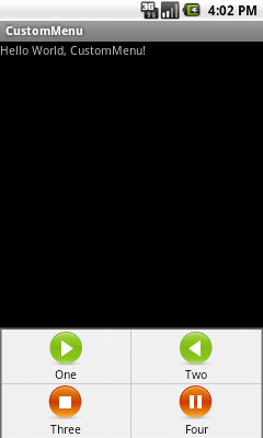
Figure 7-2. The custom menu
7.4 Handling Choice Selection in a Menu
Rachee Singh
Discussion
In the Java Activity, we need to override onOptionsItemSelected(). This method takes in a MenuItem and checks for its ID. Based on the ID of the item that is clicked, a switch-case can be used. Depending on the case selected, an appropriate action can be taken. The custom menu might look something like Figure 7-2 from the previous recipe.
For this example, the code just displays one of several toasts indicating which menu item was selected. Here’s the source code:
@OverridepublicbooleanonOptionsItemSelected(MenuItemitem){switch(item.getItemId()){caseR.id.icon1:Toast.makeText(this,"Icon 1 Beep Bop!",Toast.LENGTH_LONG).show();break;caseR.id.icon2:Toast.makeText(this,"Icon 2 Beep Bop!",Toast.LENGTH_LONG).show();break;caseR.id.icon3:Toast.makeText(this,"Icon 3 Beep Bop!",Toast.LENGTH_LONG).show();break;caseR.id.icon4:Toast.makeText(this,"Icon 4 Beep Bop!",Toast.LENGTH_LONG).show();break;}returntrue;}
Figure 7-3 shows the result.
Source Download URL
The source code for this project is in the Android Cookbook repository, in the subdirectory MenuAction (see “Getting and Using the Code Examples”).
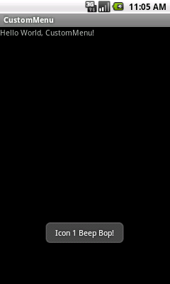
Figure 7-3. Menu choice confirmed
7.5 Creating a Submenu
Rachee Singh
Solution
Use a submenu implementation to provide additional options to the user.
Discussion
A submenu is a part of a menu that displays options in a hierarchical manner. On desktop operating systems, submenus appear to “cascade” down and to the side (usually to the right side). Android devices may not have room for that, so submenus appear like dialogs in that they float over the main screen of the application, rather like a spinner (see Recipe 6.14). You can create the menu hierarchy in the following ways:
-
By inflating an XML layout
-
By creating the menu items in the Java code
While the first approach is by far the most common,
in this recipe we will follow the second approach to show that it’s possible,
creating the menu/submenu items in the onCreateOptionsMenu() method.
First we add the submenu to the menu using the addSubMenu() method. In order to prevent conflicts with other items in the menu, we explicitly provide the group ID and item ID to the submenu we are creating (specifying constants for the item ID and group ID). Then we set an icon for the header of the submenu with the seHeadertIcon() method and an icon for the submenu with setIcon() (see Example 7-4).
To add items to the submenu, we use the add() method. As arguments to the method, the group ID, item ID, position of the item in the submenu, and text associated with each item are specified:
privatestaticfinalintOPTION_1=0;privatestaticfinalintOPTION_2=1;privateintGROUP_ID=4;privateintITEM_ID=3;
Example 7-4. The menu creation and listener methods
@Override
public boolean onCreateOptionsMenu(Menu menu) {
    MenuItem mi = menu.add("Main Menu, Option 1");
    mi.setShowAsAction(SHOW_AS_ACTION_IF_ROOM);
    SubMenu sub1 = menu.addSubMenu(GROUP_ID, ITEM_ID, Menu.NONE, R.string.submenu);
    sub1.setHeaderIcon(R.drawable.icon);
    sub1.setIcon(R.drawable.icon);
    sub1.add(GROUP_ID, OPTION_1, 0, "Submenu Option 1");
    sub1.add(GROUP_ID, OPTION_2, 1, "Submenu Option 2");
    return super.onCreateOptionsMenu(menu);
}

@Override
public boolean onOptionsItemSelected(MenuItem item) {
    switch (item.getItemId()) {
        case OPTION_1:
            Toast.makeText(this, "Submenu 1, Option 1", Toast.LENGTH_LONG).show();
            break;
        case OPTION_2:
            Toast.makeText(this, "Submenu 1, Option 2", Toast.LENGTH_LONG).show();
            break;
    }
    return true;
}
The onOptionItemSelected() method is called when an item on the menu/submenu is selected. In this method, using a switch-case we check for the item that is clicked and an appropriate message is displayed.
Figure 7-4 shows the application before and after you press the Menu button, then the message that appears when you click a submenu item (#2 in this screen capture).
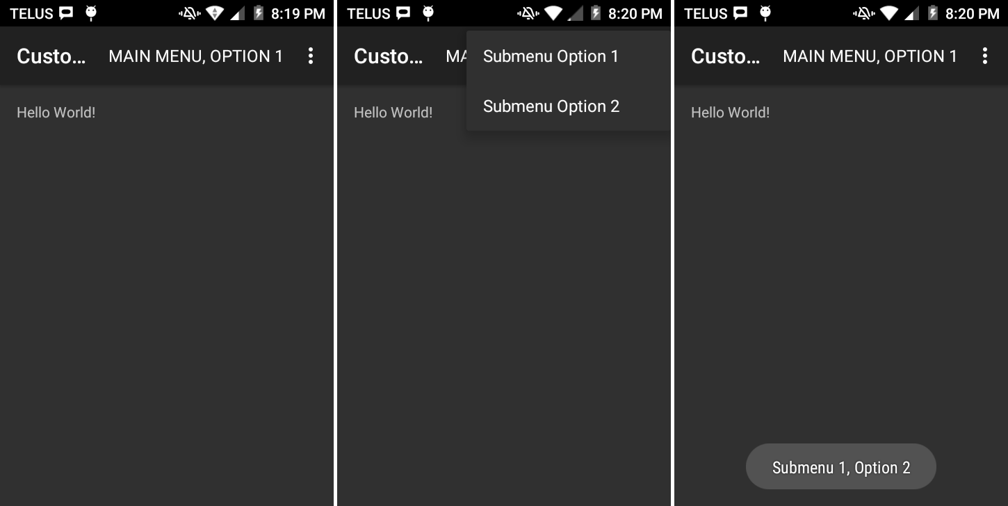
Figure 7-4. Custom submenu: Main menu active, submenu active, submenu item chosen
Source Download URL
The source code for this example is in the Android Cookbook repository, in the subdirectory CustomSubMenu (see “Getting and Using the Code Examples”).
7.6 Creating a Pop-up/Alert Dialog
Rachee Singh
Discussion
Through the AlertDialog class, you can provide the user with up to three options that can be used in any scenario:
-
Positive reaction
-
Neutral reaction
-
Negative reaction
If the user has entered some data in an EditText and is then attempting to cancel that Activity, the application should prompt the user to either save his changes, discard them, or cancel the alert dialog, which should also cancel the cancellation of the Activity.
Here is the code that would implement this kind of AlertDialog, along with appropriate click listeners on each button on the dialog:
alertDialog=newAlertDialog.Builder(this).setTitle(R.string.unsaved).setMessage(R.string.unsaved_changes_message).setPositiveButton(R.string.save_changes,newAlertDialog.OnClickListener(){publicvoidonClick(DialogInterfacedialog,intwhich){saveInformation();}}).setNeutralButton(R.string.discard_changes,newAlertDialog.OnClickListener(){publicvoidonClick(DialogInterfacedialog,intwhich){finish();}}).setNegativeButton(android.R.string.cancel_dialog,newAlertDialog.OnClickListener(){publicvoidonClick(DialogInterfacedialog,intwhich){Dialog.cancel();}}).create();alertDialog.show();
7.7 Using a Timepicker Widget
Pratik Rupwal
Discussion
The code in Example 7-5 shows how to reveal the current time on the screen and shows a button that, when clicked, produces the Timepicker widget through which the user can accept the time.
Example 7-5. The main Activity
publicclassMainextendsActivity{privateTextViewmTimeDisplay;privateButtonmPickTime;privateintmHour;privateintmMinute;staticfinalintTIME_DIALOG_ID=0;/** Called when the Activity is first created. */@OverridepublicvoidonCreate(BundlesavedInstanceState){super.onCreate(savedInstanceState);setContentView(R.layout.main);// Capture our View elementsmTimeDisplay=(TextView)findViewById(R.id.timeDisplay);mPickTime=(Button)findViewById(R.id.pickTime);// Add a click listener to the buttonmPickTime.setOnClickListener(newView.OnClickListener(){publicvoidonClick(Viewv){showDialog(TIME_DIALOG_ID);}});// Get the current timefinalCalendarc=Calendar.getInstance();mHour=c.get(Calendar.HOUR_OF_DAY);mMinute=c.get(Calendar.MINUTE);// Display the current dateupdateDisplay();}// The overridden method shown below gets invoked when// showDialog() is called inside the onClick() method defined// for handling the click event of the "Change the time" button@OverrideprotectedDialogonCreateDialog(intid){switch(id){caseTIME_DIALOG_ID:returnnewTimePickerDialog(this,mTimeSetListener,mHour,mMinute,false);}returnnull;}// Update the time we display in the TextViewprivatevoidupdateDisplay(){mTimeDisplay.setText(newStringBuilder().append(pad(mHour)).append(":").append(pad(mMinute)));}// The callback received when the user "sets" the time in the dialogprivateTimePickerDialog.OnTimeSetListenermTimeSetListener=newTimePickerDialog.OnTimeSetListener(){publicvoidonTimeSet(TimePickerview,inthourOfDay,intminute){mHour=hourOfDay;mMinute=minute;updateDisplay();}};privatestaticStringpad(intc){if(c>=10)returnString.valueOf(c);elsereturn"0"+String.valueOf(c);}}
Figure 7-5 shows the timepicker that appears onscreen after the user clicks the “Change the time” button.
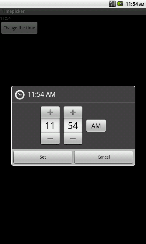
Figure 7-5. Setting the time
7.8 Creating an iPhone-like WheelPicker for Selection
Wagied Davids
Discussion
You can download Android-Wheel from the Google Code Archive. Unfortunately, installation requires more than just installing a JAR file in your libs directory, because resources needed for drawing must be in the res directory. You can extract the android-wheel-xx.zip file and copy the wheel/src and wheel/res folders into your project. Alternatively, create a new Android project from the wheel subdirectory (Android will automatically make it an Android library project) and make your main project depend on that (see Recipe 1.19). Then you can add one or more WheelView objects to your Layout, using the full class name. This class and its friends are found in the kankan.wheel.widget package; the adapters subpackage provides the WheelViewAdapter interface and some implementations. The widget package provides two interfaces that follow the standard setListener pattern on the WheelView component:
-
wheel.addChangingListener(OnWheelChangedListener) -
wheel.addScrollingListener(OnWheelScrollListener)
The code in Example 7-6, which comes from a medical app, lets you choose a body part and location (R or L for Right or Left, respectively). The choices are hardcoded here; in a real-world app, they would come from an XML file to allow for internationalization. The app should appear as shown in Figure 7-6.
This code uses the “kankan” wheel components, whose Java top-level package is kankan.wheel.widget
and whose Maven/Gradle coordinates are com.googlecode.android-wheel:datetime-picker:1.1.
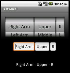
Figure 7-6. Picker wheel in action
Example 7-6. The ScrollWheel example code
publicclassWheelDemoActivityextendsActivity{privatefinalstaticStringTAG="WheelDemo";privatefinalstaticString[]wheelMenu1={"Right Arm","Left Arm","R-Abdomen","L-Abdomen","Right Thigh","Left Thigh"};privatefinalstaticString[]wheelMenu2={"Upper","Middle","Lower"};privatefinalstaticString[]wheelMenu3={"R","L"};// Wheel scrolled flagprivatebooleanwheelScrolled=false;privateTextViewresultText;privateEditTexttext1;privateEditTexttext2;privateEditTexttext3;@OverridepublicvoidonCreate(BundlesavedInstanceState){super.onCreate(savedInstanceState);setContentView(R.layout.activity_wheel_picker);initWheel(R.id.p1,wheelMenu1);initWheel(R.id.p2,wheelMenu2);initWheel(R.id.p3,wheelMenu3);text1=(EditText)this.findViewById(R.id.r1);text2=(EditText)this.findViewById(R.id.r2);text3=(EditText)this.findViewById(R.id.r3);resultText=(TextView)this.findViewById(R.id.resultText);}/*** Wheel scrolled listener*/OnWheelScrollListenerscrolledListener=newOnWheelScrollListener(){@OverridepublicvoidonScrollingStarted(WheelViewwheel){wheelScrolled=true;}@OverridepublicvoidonScrollingFinished(WheelViewwheel){wheelScrolled=false;updateStatus();}};/*** Wheel changed listener*/privatefinalOnWheelChangedListenerchangedListener=newOnWheelChangedListener(){@OverridepublicvoidonChanged(WheelViewwheel,intoldValue,intnewValue){Log.d(TAG,"onChanged, wheelScrolled = "+wheelScrolled);if(!wheelScrolled){updateStatus();}}};/*** Updates entered status*/privatevoidupdateStatus(){text1.setText(wheelMenu1[((WheelView)findViewById(R.id.p1)).getCurrentItem()]);text2.setText(wheelMenu2[((WheelView)findViewById(R.id.p2)).getCurrentItem()]);text3.setText(wheelMenu3[((WheelView)findViewById(R.id.p3)).getCurrentItem()]);resultText.setText(wheelMenu1[((WheelView)findViewById(R.id.p1)).getCurrentItem()]+" - "+wheelMenu2[((WheelView)findViewById(R.id.p2)).getCurrentItem()]+" - "+wheelMenu3[((WheelView)findViewById(R.id.p3)).getCurrentItem()]);}/*** Initializes one wheel* @param id* the wheel widget ID*/privatevoidinitWheel(intid,String[]wheelMenu1){WheelViewwheel=(WheelView)findViewById(id);wheel.setViewAdapter(newArrayWheelAdapter<String>(this,wheelMenu1));wheel.setVisibleItems(2);wheel.setCurrentItem(0);wheel.addChangingListener(changedListener);wheel.addScrollingListener(scrolledListener);}}
Source Download URL
The source code for this example is in the Android Cookbook repository, in the subdirectory WheelPickerDemo (see “Getting and Using the Code Examples”).
7.9 Creating a Tabbed Dialog
Rachee Singh
Solution
Use a tabbed layout within a custom dialog.
Discussion
The CustomDialog class extends the Dialog class:
publicclassCustomDialogextendsDialog
The constructor of the class has to be initialized:
publicCustomDialog(finalContextcontext){super(context);setTitle("My First Custom Tabbed Dialog");setContentView(R.layout.custom_dialog_layout);
To create two tabs, insert the Example 7-7 code within the constructor: place tab_image1 and tab_image2 in /res/drawable. These images are placed on the tabs of the tabbed custom dialog.
Example 7-7. Constructor code to create and add the tabs
// Get our tabHost from the xmlTabHosttabHost=(TabHost)findViewById(R.id.TabHost01);tabHost.setup();// Create tab 1TabHost.TabSpecspec1=tabHost.newTabSpec("tab1");spec1.setIndicator("Profile",context.getResources().getDrawable(R.drawable.tab_image1));spec1.setContent(R.id.TextView01);tabHost.addTab(spec1);// Create tab2TabHost.TabSpecspec2=tabHost.newTabSpec("tab2");spec2.setIndicator("Profile",context.getResources().getDrawable(R.drawable.tab_image2));spec2.setContent(R.id.TextView02);tabHost.addTab(spec2);
This is a simple tabbed dialog. It requires the addition of just a few lines to the constructor’s code. To implement something like a list view, a list view adapter would be required. A variety of tabs can be inserted based on the application’s requirements.
As shown in Example 7-8, the XML code for a tabbed dialog requires TabHost tags enclosing the entire layout. Within these tags you place the locations of various parts of the tabbed dialog. You must use a frame layout to place the content of the different tabs. In this case, we are creating two tabs, both with a scroll view containing text (stored in strings.xml and named lorem_ipsum).
Example 7-8. The custom_dialog_layout.xml file
<TabHostxmlns:android="http://schemas.android.com/apk/res/android"android:id="@+id/TabHost01"android:layout_width="fill_parent"android:layout_height="500dip"><LinearLayoutandroid:orientation="vertical"android:layout_width="fill_parent"android:layout_height="wrap_content"android:padding="5dp"><TabWidgetandroid:id="@android:id/tabs"android:layout_width="fill_parent"android:layout_height="wrap_content"/><FrameLayoutandroid:id="@android:id/tabcontent"android:layout_width="fill_parent"android:layout_height="wrap_content"android:padding="5dp"><ScrollViewandroid:id="@+id/ScrollView01"android:layout_width="wrap_content"android:layout_height="200px"><TextViewandroid:id="@+id/TextView01"android:text="@string/lorem_ipsum"android:layout_width="wrap_content"android:layout_height="wrap_content"android:gravity="center_horizontal"android:paddingLeft="15dip"android:paddingTop="15dip"android:paddingRight="20dip"android:paddingBottom="15dip"/></ScrollView><ScrollViewandroid:id="@+id/ScrollView02"android:layout_width="wrap_content"android:layout_height="200px"><TextViewandroid:id="@+id/TextView02"android:text="@string/lorem_ipsum"android:layout_width="wrap_content"android:layout_height="wrap_content"android:gravity="center_horizontal"android:paddingLeft="15dip"android:paddingTop="15dip"android:paddingRight="20dip"android:paddingBottom="15dip"/></ScrollView></FrameLayout></LinearLayout></TabHost>
Source Download URL
The source code for this example is in the Android Cookbook repository, in the subdirectory TabHostDemo (see “Getting and Using the Code Examples”).
7.10 Creating a ProgressDialog
Rachee Singh
Discussion
In this recipe we will provide a button that shows a ProgressDialog when clicked. In the ProgressDialog we set the title as “Please Wait” and the content as “Processing Information.” After this we create a new thread and start the thread’s execution. In the run() method (which gets executed once the thread gets started) we call the sleep() method for four seconds. After these four seconds expire the ProgressDialog is dismissed and the text in the TextView gets changed:
complete=(TextView)this.findViewById(R.id.complete);complete.setText("Press the Button to start Processing");processing=(Button)findViewById(R.id.processing);processing.setOnClickListener(newView.OnClickListener(){@OverridepublicvoidonClick(Viewv){progressDialog=ProgressDialog.show(ProgressDialogExp.this,"Please Wait","Processing Information...",true,false);Threadthread=newThread(ProgressDialogExp.this);thread.start();}});
We use a Handler to update the UI once thread execution finishes. We send an empty message to the Handler after thread execution completes, and then in the Handler we dismiss the ProgressDialog and update the text of the TextView:
publicvoidrun(){try{Thread.sleep(4000);}catch(InterruptedExceptione){e.printStackTrace();}handler.sendEmptyMessage(0);}privateHandlerhandler=newHandler(){@OverridepublicvoidhandleMessage(Messagemsg){progressDialog.dismiss();complete.setText("Processing Finished");}};
Source Download URL
The source code for this project is in the Android Cookbook repository, in the subdirectory ProgressDialogDemo (see “Getting and Using the Code Examples”).
7.11 Creating a Custom Dialog with Buttons, Images, and Text
Rachee Singh
Solution
Create a custom dialog with tabs. Since everything can be squeezed into a dialog in place of an entire Activity, the application will seem more compact.
Discussion
The CustomDialog class can directly extend Dialog:
publicclassCustomDialogextendsDialog
The following lines of code in the CustomDialog class’s onCreate() method add a title and get handles for the buttons in the dialog:
setTitle("Dialog Title");setContentView(R.layout.custom_dialog_layout);// OnClickListeners for the buttons present in the DialogButtonbutton1=(Button)findViewById(R.id.button1);Buttonbutton2=(Button)findViewById(R.id.button2);
For the two buttons that are added, OnClickListeners are defined in the next lines of code. On being clicked, button1 dismisses the dialog and button2 starts a new Activity:
button1.setOnClickListener(newView.OnClickListener(){@OverridepublicvoidonClick(Viewv){dismiss();// To dismiss the Dialog}});button2.setOnClickListener(newView.OnClickListener(){@OverridepublicvoidonClick(Viewv){// Fire an Intent on click of this buttonIntentshowQuickInfo=NewIntent("com.android.oreilly.QuickInfo");showQuickInfo.setFlags(Intent.FLAG_ACTIVITY_NEW_TASK);context.startActivity(showQuickInfo);}});
Here is the XML layout of the dialog, present in /res/layout custom_dialog_layout.xml. The entire code is enclosed in a LinearLayout. Within the LinearLayout, a RelativeLayout is used to position two buttons. Then, below the RelativeLayout is another RelativeLayout containing a scroll view. android_button and thumbsup are the names of the images in /res/drawable:
<LinearLayoutandroid:orientation="vertical"android:layout_width="fill_parent"android:layout_height="wrap_content"android:padding="5dp"><RelativeLayoutandroid:layout_width="fill_parent"android:layout_height="wrap_content"android:paddingBottom="10dip"><Buttonandroid:id="@+id/button1"android:background="@drawable/android_button"android:layout_height="80dip"android:layout_width="80dip"android:layout_alignParentLeft="true"android:layout_marginLeft="10dip"android:gravity="center"/><Buttonandroid:id="@+id/button2"android:background="@drawable/thumbsup"android:layout_height="80dip"android:layout_width="80dip"android:layout_alignParentRight="true"android:layout_marginRight="10dip"android:gravity="center"/></RelativeLayout><RelativeLayoutandroid:layout_width="fill_parent"android:layout_height="wrap_content"android:paddingBottom="10dip"><ScrollViewandroid:id="@+id/ScrollView01"android:layout_width="wrap_content"android:layout_height="200px"><TextViewandroid:id="@+id/TextView01"android:text="@string/lorem"android:layout_width="wrap_content"android:layout_height="wrap_content"android:gravity="center_horizontal"android:paddingLeft="15dip"android:paddingTop="15dip"android:paddingRight="20dip"android:paddingBottom="15dip"/></ScrollView></RelativeLayout></LinearLayout>
7.12 Creating a Reusable “About Box” Class
Daniel Fowler
Solution
Write an AboutBox class that can be installed into any new app.
Discussion
Whatever the operating system, whatever the program, chances are it has an About option. This is useful for support:
- Customer: “Hello, there is a problem with my application.”
- Help Desk: “Hi, can you press ‘About’ and tell me the version number?”
Since it is likely to be required again and again, it is worth having a ready-made AboutBox class that you can easily add to any new app that you develop. At a minimum, the About option should display a dialog with a title (such as About My App), the version name from the manifest, some descriptive text (loaded from a string resource), and an OK button.
The version name can be read from the PackageInfo class. (PackageInfo is obtained from PackageManager, which itself is available from the app’s Context). Here is a method to read an app’s version name string:
staticStringVersionName(Contextcontext){try{returncontext.getPackageManager().getPackageInfo(context.getPackageName(),0).versionName;}catch(NameNotFoundExceptione){return"Unknown";}}
PageInfo can throw a NameNotFoundException (for when the class is used to find information on other packages). The exception is unlikely to occur; here it is just consumed by returning an error string. (To return the version code, the app’s internal version number, swap versionName for versionCode and return an integer.)
With an AlertDialog.Builder and the setTitle(), setMessage(), and show() methods, you will soon have an About option up and running; but you can improve the About option by using the Android Linkify class and a custom layout. In the About text, any web addresses (such as app help pages on the web) and email addresses (useful for a support email link) can be made clickable. The layout shown in Example 7-9 is the contents of the file aboutbox.xml.
Example 7-9. The aboutbox.xml file
<?xml version="1.0" encoding="utf-8"?><ScrollViewxmlns:android="http://schemas.android.com/apk/res/android"android:id="@+id/aboutView"android:layout_width="fill_parent"android:layout_height="fill_parent"><LinearLayoutandroid:id="@+id/aboutLayout"android:orientation="horizontal"android:layout_width="fill_parent"android:layout_height="fill_parent"android:padding="5dp"><TextViewandroid:id="@+id/aboutText"android:layout_width="wrap_content"android:layout_height="fill_parent"android:textColor="#888"/></LinearLayout></ScrollView>
A ScrollView is required for when the About text is long and the screens are small (e.g., QVGA; see Table 5-2).
The AboutBox class uses a Spannable to hold the text; the TextView containing the spanned text is be passed to android.text.util.Linkify. The layout is inflated, the About text is set, and then AlertBuilder.Builder is used to create the dialog. Example 7-10 shows the full code for the AboutBox class.
Tip
You could also load the text from a static HTML file shipped with the application (see Recipe 10.3).
Example 7-10. The AboutBox class
publicclassAboutBox{staticStringVersionName(Contextcontext){try{returncontext.getPackageManager().getPackageInfo(context.getPackageName(),0).versionName;}catch(NameNotFoundExceptione){return"Unknown";}}publicstaticvoidshow(ActivitycallingActivity){// Use a Spannable to allow for link highlightingSpannableStringaboutText=newSpannableString("Version "+VersionName(callingActivity)+" "+callingActivity.getString(R.string.about));// Generate views to pass to AlertDialog.Builder and to set the textViewabout;TextViewtvAbout;try{// Inflate the custom viewLayoutInflaterinflater=callingActivity.getLayoutInflater();about=inflater.inflate(R.layout.aboutbox,(ViewGroup)callingActivity.findViewById(R.id.aboutView));tvAbout=(TextView)about.findViewById(R.id.aboutText);}catch(InflateExceptione){// Unchecked exception - unlikely, but default to TextView if it occursabout=tvAbout=newTextView(callingActivity);}// Set the about texttvAbout.setText(aboutText);// Now Linkify the textLinkify.addLinks(tvAbout,Linkify.ALL);// Build and show the dialognewAlertDialog.Builder(callingActivity).setTitle("About "+callingActivity.getString(R.string.app_name)).setCancelable(true).setIcon(R.drawable.icon).setPositiveButton("OK",null).setView(about).show();// Builder method returns allow for method chaining}}
The app’s icon can be shown in the About box title using setIcon(R.drawable.icon).
String resources for the About text can be placed in a separate file for easier maintenance, such as res/values/about_strings.xml. The name of this file is irrelevant, as string resources are identified by their ID:
<?xml version="1.0" encoding="utf-8"?><resources><stringname="about">This is our App, please see http://www.example.com. Email support at [email protected].</string></resources>
Showing the About box requires only one line of code, shown here on a button click:
publicclassMainextendsActivity{@OverridepublicvoidonCreate(BundlesavedInstanceState){super.onCreate(savedInstanceState);setContentView(R.layout.main);findViewById(R.id.button1).setOnClickListener(newOnClickListener(){publicvoidonClick(Viewv){AboutBox.show(Main.this);}});}}
The result should look something like Figure 7-7.
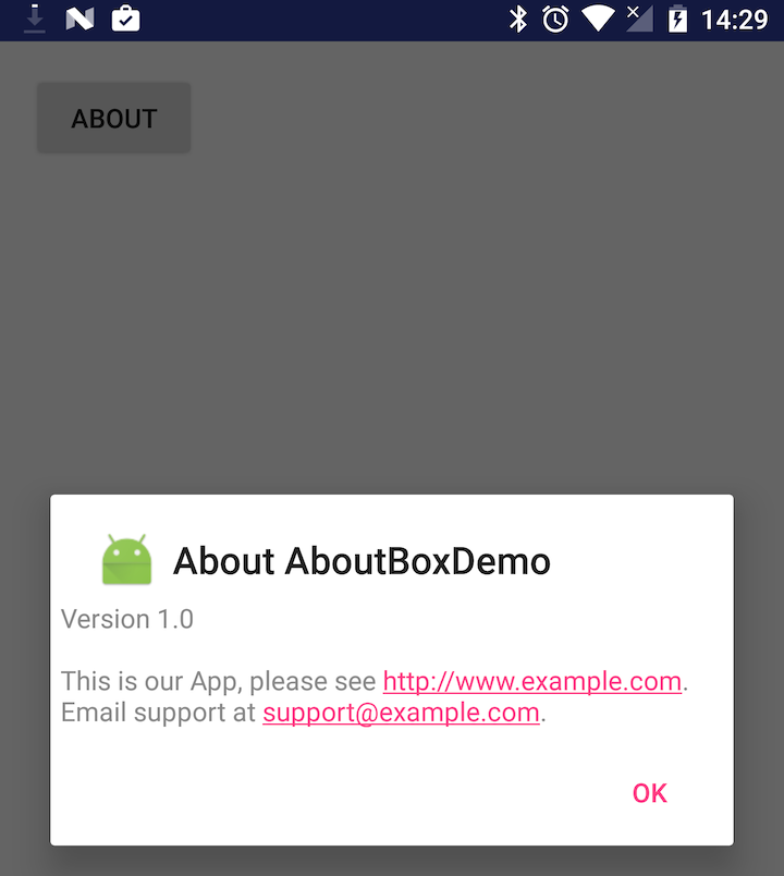
Figure 7-7. The About box in action
To reuse this About box, just copy the aboutbox.xml file into a project’s res/layout folder, copy about_strings.xml to res/values (adjusting its text as needed), and copy the AboutBox.java file into the source folder (adjusting the package name as needed). Then call AboutBox.show() from a button or menu listener. Web addresses and email addresses highlighted in the text can be clicked and invoke the browser or email client, which makes it easier for the user to contact you using those means.
Source Download URL
The source code for this project is in the Android Cookbook repository, in the subdirectory AboutBoxDemo (see “Getting and Using the Code Examples”).
7.13 Creating a Notification in the Status Bar
Ian Darwin
Solution
Create a Notification object, and provide it with a PendingIntent that wraps a real Intent for what to do when the user selects the notification. At the same time you pass in the PendingIntent you also pass a title and text to be displayed in the notification area. You should set the AUTO_CANCEL flag unless you want to remove the notification from the status bar manually. Finally, find and ask the NotificationManager to display (notify) your notification, associating with it an ID so that you can refer to it later (e.g., to remove it).
Discussion
Notifications are normally used from a running Service class to notify (hence the name) the user of some fact, either because an event has occurred (receipt of a message, loss of contact with a server, or whatever) or just to remind the user that a long-running Service is still running. The notification is commonly used to start an Activity and is, in fact, the only recommended way for a background Service to start an Activity (Services should never start Activities directly!).
Create a Notification object; the constructor takes an Icon ID, the text to display briefly in the status bar, and the time at which the event occurred (a timestamp in milliseconds). Before you can show the notification, you have to provide it with a PendingIntent for what to do when the user selects the notification, and ask the NotificationManager to display your notification. Example 7-11 shows the notification code.
Warning
The following code shows doing the right thing in the (usually) wrong place. Notifications are frequently shown from Services; this recipe just focuses on the Notification API.
Example 7-11. The notification code
publicclassMainextendsActivity{privatestaticfinalintNOTIFICATION_ID=1;/** Called when the Activity is first created. */@OverridepublicvoidonCreate(BundlesavedInstanceState){super.onCreate(savedInstanceState);setContentView(R.layout.main);inticon=R.drawable.icon;// Preferably a distinct icon// Create the notification itselfStringnoticeMeText=getString(R.string.noticeMe);Notificationn=newNotification(icon,noticeMeText,System.currentTimeMillis());// And the Intent of what to do when user selects notificationContextapplicationContext=getApplicationContext();IntentnotifyIntent=newIntent(this,NotificationTarget.class);PendingIntentwrappedIntent=PendingIntent.getActivity(this,0,notifyIntent,Intent.FLAG_ACTIVITY_NEW_TASK);// Condition the notificationStringtitle=getString(R.string.title);Stringmessage=getString(R.string.message);n.setLatestEventInfo(applicationContext,title,message,wrappedIntent);n.flags|=Notification.FLAG_AUTO_CANCEL;// Now invoke the Notification serviceStringnotifService=Context.NOTIFICATION_SERVICE;NotificationManagermgr=(NotificationManager)getSystemService(notifService);mgr.notify(NOTIFICATION_ID,n);}}
The following is the file strings.xml:
<resources><stringname="app_name">NotificationDemo</string><stringname="hello">Hello World, Main!</string><stringname="noticeMe">Lookie Here!!</string><stringname="title">My Notification</string><stringname="message">This is my message</string><stringname="target_name">Notification Target</string><stringname="thanks">Thank you for selecting the notification.</string></resources>
The noticeMe string may appear briefly (only for a few seconds) in the status bar. Notification text and icons appear in the very upper left of the screen, as shown in Figure 7-8.
The tiny Android logo is this application’s icon.
When the user drags the status bar down, it expands to show the details, which include the icons and the title and message strings (see Figure 7-9). You can also use a custom view here; refer to the official Android documentation.
Figure 7-8. Notification demo
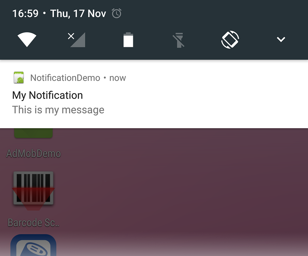
Figure 7-9. Notification “pulled down”
If you have auto-clear set, the notification will no longer appear in the status bar. If the user selects the notification box, the PendingIntent becomes current. Ours simply shows a basic “Thank you” notification (Figure 7-10). If the user clicks the Clear button, however, the Intent does not get run (even with auto-clear, which can leave you in a bit of a lurch).
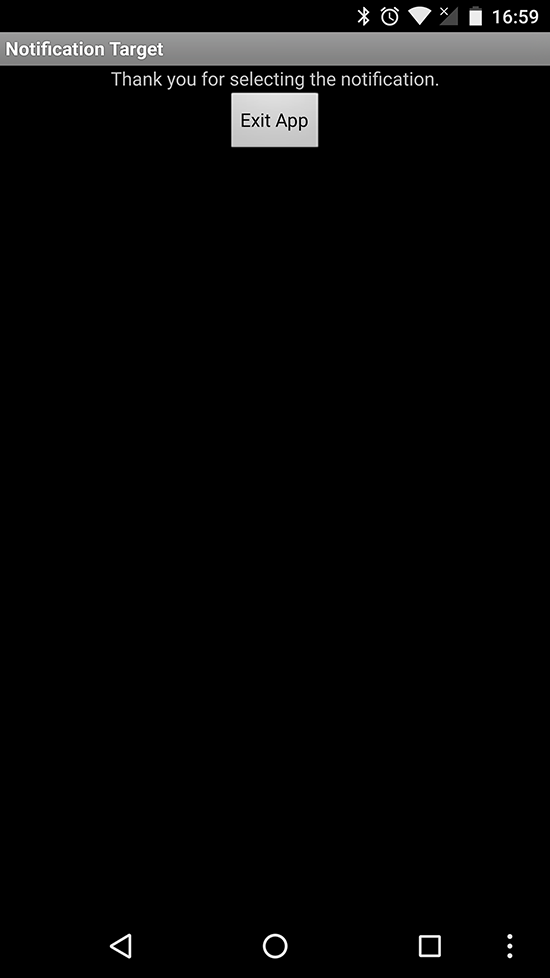
Figure 7-10. Response to choosing a notification
Sounds and other irritants
If the user’s attention is needed right away, you can specify a sound to be played when the notification is first displayed. Or you can make the device vibrate, where supported.
The user’s default notification sound can be played as follows:
notification.defaults|=Notification.DEFAULT_SOUND;
Alternatively, you can provide a Uri to a sound file, either on the SD card or in your application:
notification.sound=Uri.parse("file:///sdcard/mydata/annoy_the_user.mp3");
Note that if you both set DEFAULT_SOUND and provide a “sound” URI, only the default will be used.
To really annoy the user, you can make the sound play repeatedly; just add the flag FLAG_INSISTENT to the flags field:
notification.defaults|=Notification.FLAG_INSISTENT;
Invoking device vibration when your notification is displayed is as simple as:
notification.defaults|=Notification.DEFAULT_VIBRATE;
Lighting the LED
As a final flourish, on devices with a signaling LED (on most phones it’s near the bottom of the physical screen or otherwise in the controls area), you can make the LED flash in various colors and patterns. At a bare minimum, you need:
notification.ledARGB=color;notification.defaults|=Notification.FLAGS_SHOW_LIGHTS;
The +color+ is a four-byte integer containing, as the name suggests, alpha (transparency), red, green, and blue values. This is similar to traditional web color syntax, but for the transparency part; thus, 0xff0000ff is bright blue (full opacity/no transparency; no red or green).
You can also specify a flashing pattern using notification.ledOnMS and notification.ledOffMS, which are the times in milliseconds for the LED to be on and off as it flashes. Again, if you set any of these values but don’t specify FLAGS_SHOW_LIGHTS, nothing will happen.
See Also
The developer documentation on notifications.
Source Download URL
The source code for this example is in the Android Cookbook repository, in the subdirectory NotificationDemo (see “Getting and Using the Code Examples”).