
4. Tip Calculator App
Objectives
In this chapter you’ll:
• Design a GUI using a TableLayout.
• Use the ADT Plugin’s Outline window in Eclipse to add GUI components to a TableLayout.
• Directly edit the XML of a GUI layout to customize properties that are not available through the Visual Layout Editor and Properties window in Eclipse.
• Use TextView, EditText and SeekBar GUI components.
• Use Java object-oriented programming capabilities, including classes, anonymous inner classes, objects, interfaces and inheritance to create an Android app.
• Programmatically interact with GUI components to change the text that they display.
• Use event handling to respond to user interactions with an EditText and a SeekBar.
4.2 Test-Driving the Tip Calculator App
4.4.1 TableLayout Introduction
4.4.2 Creating the Project and Adding the TableLayout and Components
4.4.3 Reviewing the Layout So Far
4.4.4 Customizing the Components to Complete the Design
4.4.5 The Final XML Markup for the Tip Calculator GUI
4.5 Adding Functionality to the App
Self-Review Exercises | Answers to Self-Review Exercises | Exercises
4.1. Introduction
The Tip Calculator app (Fig. 4.1) calculates and displays tips for a restaurant bill. As the user enters a bill total, the app calculates and displays the tip amount and total bill for three common tipping percentages—10%, 15% and 20%. The user can also specify a custom tip percentage by moving the thumb of a Seekbar—this updates the percentage shown to the right of the Seekbar. We chose 18% as the default custom percentage in this app because many restaurants add this tip percentage for parties of six people or more. The suggested tips and bill totals are updated in response to each user interaction. [Note: The keypad in Fig. 4.1 may differ based on your AVD’s or device’s Android version.]
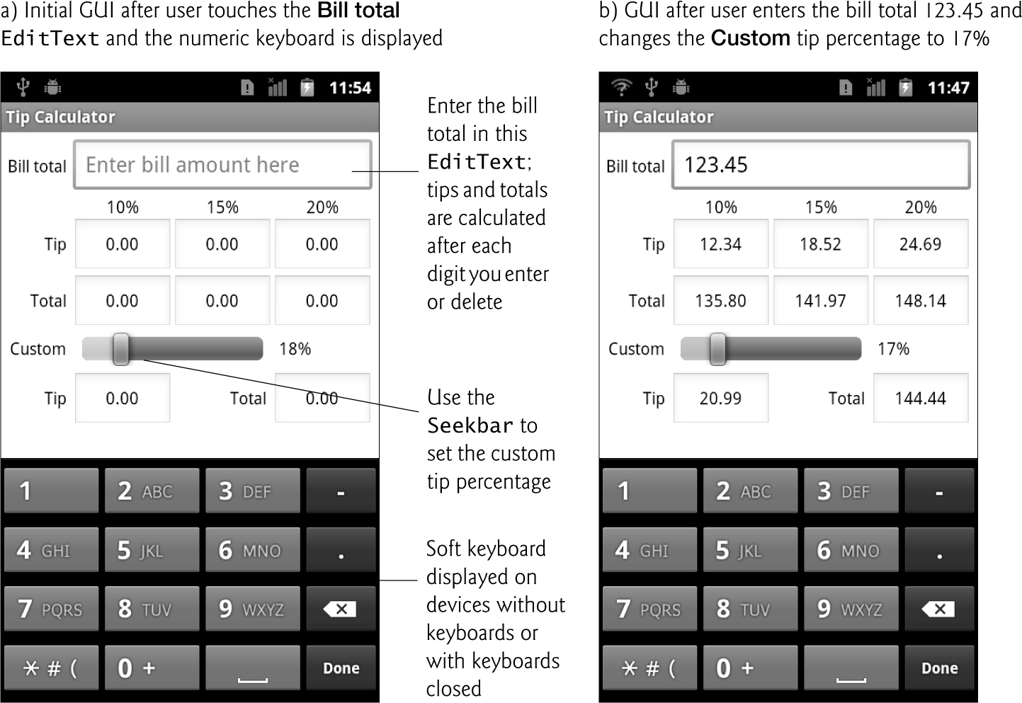
Fig. 4.1. Entering the bill total and calculating the tip.
You’ll begin by testing the app—you’ll use it to calculate standard and custom tips. Then we’ll overview the technologies we used to build the app. Next you’ll build the app’s GUI using the Outline window in Eclipse to add the GUI components, and you’ll use the Visual Layout Editor to see what the GUI looks like. Most of the XML for this GUI will be generated for you by the ADT Plugin tools, but you’ll also directly edit the XML to customize properties that aren’t available through the Properties window. Finally, we’ll present the complete code for the app and do a detailed code walkthrough.
4.2. Test-Driving the Tip Calculator App
Open and Run the App
Open Eclipse and import the Tip Calculator app project. Perform the following steps:
1. Open the Import Dialog. Select File > Import... to open the Import dialog.
2. Import the Tip Calculator app’s project. In the Import dialog, expand the General node and select Existing Projects into Workspace, then click Next > to proceed to the Import Projects step. Ensure that Select root directory is selected, then click the Browse... button. In the Browse For Folder dialog, locate the TipCalculator folder in the book’s examples folder, select it and click OK. Click Finish to import the project into Eclipse. The project now appears in the Package Explorer window at the left side of the Eclipse window.
3. Launch the Tip Calculator app. In Eclipse, right click the TipCalculator project in the Package Explorer window, then select Run As > Android Application from the menu that appears. This will execute Tip Calculator in the AVD that you created in the Before You Begin section. [Note: If you have multiple AVDs or any Android devices connected to your computer, you may need to select one of them on which to execute the app.]
Enter a Bill Total
Touch the Bill Total EditText to display the keypad, then enter 123.45 into it using the keypad. [Note: If the keyboard displays Japanese text, long press the Bill Total EditText—that is, touch it for a couple of seconds—then select Input method from the list of options. Next, select Android keyboard from the second list of options.]
If you make a mistake, press the delete ( ) button to erase the last digit you entered. The
 EditTexts under 10%, 15% and 20% display the tip and the total bill for the pre-specified tip percentages (Fig. 4.1(b)), and the EditTexts for the custom tip and total display the tip and total bill, respectively, for the default 18% custom tip percentage. All the Tip and Total EditTexts update each time you enter or delete a digit.
Select a Custom Tip Percentage
Use the Seekbar to specify a custom tip percentage. Drag the Seekbar’s thumb until the custom percentage reads 17%. The tip and bill total for this custom tip percentage now appear in the EditTexts below the Seekbar. By default, the Seekbar allows you to select values from 0 to 100.
4.3. Technologies Overview
This chapter uses many Java object-oriented programming capabilities, including classes, anonymous inner classes, objects, methods, interfaces and inheritance. You’ll create a subclass of Android’s Activity class to specify what should happen when the app starts executing and to define the logic of the Tip Calculator. You’ll programmatically interact with EditTexts, a TextView and a SeekBar. You’ll create these components using the Visual Layout Editor and Outline window in Eclipse, and some direct manipulation of the GUI layout’s XML. An EditText—often called a text box or text field in other GUI technologies—is a subclass of TextView (presented in Chapter 3) that can display text and accept text input from the user. A SeekBar—often called a slider in other GUI technologies—represents an integer in the range 0–100 by default and allows the user to select a number in that range. You’ll use event handling and anonymous inner classes to process the user’s GUI interactions.
4.4. Building the App’s GUI
In this section, you’ll build the GUI for the Tip Calculator using the ADT Plugin tools. At the end of this section, we’ll present the XML that the ADT Plugin generates for this app’s layout. We’ll show the precise steps for building the GUI. In later chapters, we’ll focus primarily on new features in each app’s GUI and present the final XML layouts, highlighting the portions of the XML we modified. [Note: As you work your way through this section, keep in mind that the GUI will not look like the one shown in Fig. 4.1 until you’ve completed the majority of the steps in Sections 4.4.2—4.4.4.]
4.4.1. TableLayout Introduction
In this app, you’ll use a TableLayout (Fig. 4.2) to arrange GUI components into six rows and four columns. Each cell in a TableLayout can be empty or can hold one component, which can be a layout that contains other components. As you can see in rows 0 and 4 of Fig. 4.2, a component can span multiple columns. To create the rows, you’ll use TableRow objects. The number of columns in the TableLayout is defined by the TableRow that contains the most components. Each row’s height is determined by the tallest component in that row—in Fig. 4.2, you can see that rows 1 and 4 are shorter than the other rows. Similarly, the width of a column is defined by the widest element in that column—unless you allow the table’s columns to stretch to fill the width of the screen, in which case the columns could be wider. By default, components are added to a row from left to right. You can specify the exact location of a component—rows and columns are numbered from 0 by default. You can learn more about class TableLayout at:
developer.android.com/reference/android/widget/TableLayout.html
and class TableRow at
developer.android.com/reference/android/widget/TableRow.html

Fig. 4.2. Tip Calculator GUI’s TableLayout labeled by its rows and columns.
Figure 4.3 shows the names of all the GUI components in the app’s GUI. For clarity, our naming convention is to use the GUI component’s class name in each component’s Id property in the XML layout and in each component’s variable name in the Java code.

Fig. 4.3. Tip Calculator GUI’s components labeled with their Id property values.
4.4.2. Creating the Project and Adding the TableLayout and Components
You’ll now build the GUI in Fig. 4.2. You’ll start with the basic layout and controls, then customize the controls’ properties to complete the design. As you add components to each row of the TableLayout, set the Id and Text properties of the components as shown in Fig. 4.3. As you learned in Section 3.5, literal string values should be placed in the strings.xml file in the app’s res/values folder—especially if you intend to localize your app for use with multiple languages. For the 10%, 15% and 20% TextViews, we chose not to use string resources. Be sure to perform the steps for building the GUI in the exact order specified—otherwise, the components will not appear in the correct order in each row. If this happens, you can rearrange the components in the Outline window or in the main.xml file.
In the following steps, you’ll use the Outline window to add components to the proper TableRows of the TableLayout. When working with more complex layouts like TableLayouts, it’s difficult to see the nested structure of the layout and to place components in the correct nested locations using the Visual Layout Editor. The Outline window makes these tasks easier because it shows the nested structure of the GUI. So, in a TableLayout, you can select the appropriate row and add a GUI component to it.
Step 1: Creating the TipCalculator Project
Eclipse allows only one project with a given name per workspace, so before you perform this step, delete from the workspace the existing Tip Calculator app that you executed in the test drive. To do so, right click it and select Delete. In the dialog that appears, ensure that Delete project contents on disk is not selected, then click OK. This removes the project from the workspace, but leaves the project’s folder on disk. Next, create a new Android project named TipCalculator. Specify the following values in the New Android Project dialog, then press Finish:
• Build Target: Ensure that Android 2.3.3 is checked
• Application name: Tip Calculator
• Package name: com.deitel.tipcalculator
• Create Activity: TipCalculator
• Min SDK Version: 10. [Note: This SDK version corresponds to Android 2.3.3; however, we do not use any Android 2.3.3-specific functionality in this app. If you’d like this app to execute on AVDs or devices running an earlier Android version, you can set the Min SDK Version to a lower value. For example, you could specify 8 to indicate that the app can execute on Android 2.2 or higher.]
Step 2: Deleting and Recreating the main.xml File
For this application, you’ll replace the default main.xml file with a new one that uses a TableLayout in which components are arranged relative to one another. Perform the following steps to replace the default main.xml file:
1. Right click the main.xml file in the projects /res/layout folder and select Delete to delete the file.
2. Right click the layout folder and select New > Other... to display the New dialog.
3. In the Android node, select Android XML File and click Next > to display the New Android XML File dialog.
4. Specify the file name main.xml and select TableLayout, then click Finish.
Step 3: Configuring the Visual Layout Editor to Use the Appropriate Android SDK
After completing the previous step, the new main.xml file opens in the Visual Layout Editor. Recall that if you’ve installed multiple Android SDKs, the ADT Plugin selects the most recent one as the default for design purposes in the Graphical Layout tab—regardless of the SDK you selected when you created the project. As you did in Fig. 3.7, select Android 2.3.3 from the SDK selector drop-down list at the top-right side of the Graphical Layout tab to indicate that we’re designing a GUI for an Android 2.3.3 device.
Step 4: Configuring the Visual Layout Editor’s Size and Resolution
As you did in Fig. 3.11, select 3.7in WVGA (Nexus One) from the Device Configurations drop-down list at the top-left side of the Graphical Layout tab. This configures the design area for devices with 480-by-800 (WVGA) resolution.
Step 5: Configuring the TableLayout
Select the TableLayout the Outline window to display its properties in the Properties window, then set the following properties:
• Background: #FFF
• Id: @+id/tableLayout
• Padding: 5dp
• Stretch columns: 1,2,3
By default, the Layout width and Layout height properties are set to match_parent so that the layout fills the entire screen. Setting the Padding property to 5dp ensures that there will be 5 density-independent pixels around the border of the entire layout. The Stretch columns property—represented in the XML with the attribute android:stretchColumns (Fig. 4.5, line 8)—indicates that columns 1, 2 and 3 should stretch horizontally to fill the layout’s width. Column 0 will be as wide as its widest element plus any padding specified for that element.
Step 6: Adding the TableRows
Next, you’ll use the Outline window to add six TableRows to the TableLayout. To do so:
1. Right click tableLayout in the Outline window and select Add Row to add a TableRow.
2. Repeat this process five more times.
Be sure to right click tableLayout each time so that the TableRows are properly nested in the TableLayout. The Id properties of the TableRows are automatically specified as tableRow1 through tableRow6, respectively. Since columns are numbered from 0, for consistency, we changed the TableRows’ Id properties to tableRow0 through tableRow5, respectively. Also, select each TableRow and set its Layout width property to match_parent so that the rows are the full width of the layout. To do this for all six TableRows at once, click the first TableRow in the Outline window, then hold the Shift key and click the last TableRow in the Outline window to select all six. Then, you can set the property value.
Step 7: Adding the Components for tableRow0
Next, you’ll add a TextView and EditText to tableRow0. To do so:
1. Drag a TextView (billTextView) from the Palette’s Form Widgets section onto tableRow0 in the Outline window.
2. Drag an EditText (billEditText) from the Palette’s Form Widgets section onto tableRow0 in the Outline window.
3. Set the Id and Text property values for each component. For quick access to these properties, you can right click the component in the Outline window and select Edit ID... and Edit Text..., respectively.
It’s important to drop these items onto the proper TableRow in the Outline window to ensure that the elements are nested in the proper TableRow object.
Step 8: Adding the Components for tableRow1
Add three TextViews to tableRow1. To do so:
1. Drag a TextView (tenTextView) onto tableRow1 in the Outline window.
2. Repeat this process to add the fifteenTextView and twentyTextView.
3. Set the Id and Text property values for each component.
Step 9: Adding the Components for tableRow2
Add a TextView and three EditTexts to tableRow2. To do so:
1. Drag a TextView (tipTextView) onto tableRow2 in the Outline window.
2. Drag three EditTexts onto tableRow2 in the Outline window—tip10EditText, tip15EditText and tip20EditText.
3. Set the Id and Text property values for each component.
Step 10: Adding the Components for tableRow3
Add a TextView and three EditTexts to tableRow3. To do so:
1. Drag a TextView (totalTextView) onto tableRow3 in the Outline window.
2. Drag three EditTexts onto tableRow3 in the Outline window—total10EditText, total15EditText and total20EditText.
3. Set the Id and Text property values for each component.
Step 11: Adding the Components for tableRow4
Add a TextView, a SeekBar and another TextView tableRow4. To do so:
1. Drag a TextView (customTextView) onto tableRow4 in the Outline window.
2. Drag a SeekBar (customSeekBar) onto tableRow4 in the Outline window.
3. Drag a TextView (customTipTextView) onto tableRow4 in the Outline window.
4. Set the Id and Text property values for the TextViews.
Step 12: Adding the Components for tableRow5
Add a TextView, an EditText, another TextView and another EditText to tableRow5. To do so:
1. Drag a TextView (tipCustomTextView) onto tableRow5 in the Outline window.
2. Drag an EditText (tipCustomEditText) onto tableRow5 in the Outline window.
3. Drag a TextView (totalCustomTextView) onto tableRow5 in the Outline window.
4. Drag an EditText (totalCustomEditText) onto tableRow5 in the Outline window.
5. Set the Id and Text property values for each component.
4.4.3. Reviewing the Layout So Far
At this point, the GUI should appear as shown in Fig. 4.4. As you compare this to Fig. 4.2, notice that:
• The billEditText and customSeekBar do not yet span multiple columns.
• The text of all the TextViews is light gray and hard to read.
• Some of the components are in the wrong columns—in particular, the 10%, 15% and 20% TextViews in tableRow1 and the 18% TextView in tableRow4. The last of these will self-correct after we make the customSeekBar span two columns.
• Most of the text in Fig. 4.2 is either center aligned or right aligned, whereas all the text in Fig. 4.4 is left aligned.
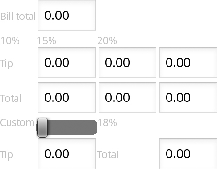
Fig. 4.4. Tip Calculator GUI before customizing properties other than the Id and Text of each component.
4.4.4. Customizing the Components to Complete the Design
In the next steps, you’ll complete the app’s design by customizing the components’ properties.
Step 13: Change the Text color Property of All the TextViews
In the Outline window, you can select multiple components at the same time by holding the Ctrl (or Control) key as you click each component that you wish to select. When you do this, the Properties window shows you only the properties that the selected components have in common. If you change a property value with multiple components selected, that property’s value is changed for every selected component. We’d like all of the TextViews to use black text to make them more readable. To change the Text color property for all of the TextViews at once:
1. Hold the Ctrl (or Control) key and click each TextView until they’re all selected.
2. Locate the Text color property in the Properties window and set it to #000.
Step 14: Moving the 10%, 15% and 20% TextViews to the Correct Columns
In Fig. 4.2, the 10%, 15% and 20% column heads are in the second, third and fourth columns, respectively. By default, when you add components to a TableRow, the first component is placed in the first column, the second component is placed in the second column and so on. To start in a different column, you must specify the component’s column number. Unfortunately, this property is not displayed in the Properties window by default. To specify a component’s column, you must edit the component’s XML directly.
1. Switch to the main.xml tab in the Visual Layout Editor to view the layout’s XML markup.
2. Locate the <TextView> element with the android:id attribute that has the value "@+id/tenTextView".
3. In the TextView’s opening XML tag, add the following attribute/value pair:
android:layout_column="1"
This moves the 10% TextView to the second column—columns are numbered from 0. All other components in the row are placed in the subsequent columns automatically. If you wish to skip other columns, you can set the android:layout_column attribute on each component in a row to specify the exact column in which the component should appear. Once you manually add an attribute to the XML, the attribute and its value are displayed in the Properties window under the Misc section.
Step 15: Centering the Text in the TextViews of tableRow1 and the EditTexts of tableRow2, tableRow3 and tableRow5 and Setting the EditTexts’ Font Size
In Fig. 4.2, the text of many components is centered. Here you’ll set the Gravity property of these components to center their text. Switch back to the Graphical Layout tab in the Visual Layout Editor, then perform the following steps:
1. In the Outline window, select the three TextViews in tableRow1.
2. Set the Gravity property to center in the Properties window.
3. Select all the EditTexts in tableRow2, tableRow3 and tableRow5.
4. Set the Gravity property to center in the Properties window.
5. Set the Text size property to 14sp—this reduces the default font size in the EditTexts so more digits can be displayed without wrapping the text.
Step 16: Setting billEditText and the customSeekBar to Span Multiple Columns
In Fig. 4.2, the billEditText spans columns 1–3 and the customSeekBar spans columns 1–2. You must add the spanning attribute directly in the XML.
1. Click the main.xml tab in the Visual Layout Editor to view the layout’s markup.
2. Locate the <EditText> element with the android:id attribute that has the value "@+id/billEditText".
3. In the EditText’s opening XML tag, add the following attribute/value pair:
android:layout_span="3"
4. Locate the <SeekBar> element.
5. In the SeekBar’s opening XML tag, add the following attribute/value pair:
android:layout_span="2"
The billEditText now spans columns 1–3 and customSeekBar now spans columns 1–2.
Step 17: Right Aligning the TextViews
The TextViews in column 0 are all right aligned as is the TextView in tableRow5’s third column. Also, each of these TextViews has 5dp of padding at its right side to separate it from the control immediately to its right.
1. Switch back to the Graphical Layout tab in the Visual Layout Editor.
2. In the Outline window, select all the TextViews in column 0 and the second TextView in the last row.
3. Set the Gravity property to right, then set the Padding right to 5dp.
Step 18: Vertically Centering the TextViews in tableRow4
We’d like the TextViews in tableRow4 to align better vertically with the SeekBar, so we’ll now adjust the Gravity property.
1. In the Outline window, select the customTextView in tableRow4.
2. Locate the Gravity property and click the ellipsis ( ) button to the right of the property’s value to display the list of possible Gravity values.
3. Check the center_vertical value. Now both right and center_vertical should be checked.
4. Click OK to apply the value.
5. In the Outline window, select the customTipTextView in tableRow4.
6. Set the Gravity property to center_vertical.
7. Click OK to apply the value.
8. In the Outline window, select both TextViews in tableRow4 and set their Layout height properties to match_parent and the Padding bottom property to 5dp. This makes the two TextViews the same height as the SeekBar and enables the Gravity property to align the text vertically with the SeekBar. We’ll also be setting the Padding bottom property of the SeekBar momentarily, so setting this property on the TextViews helps keep their text aligned with the SeekBar.
9. Finally, set the customTipTextView’s Padding left property to 5dp to separate the TextView from the SeekBar.
Step 19: Setting the customSeekBar’s Progress Property and Padding
To complete the GUI design, you’ll set the Progress, Padding left and Padding right properties of the SeekBar. Initially, we’d like the SeekBar’s thumb position to represent 18%, since that’s what we’re displaying in the TextView to the SeekBar’s right. Also, we need to add some padding to the left and right side of the SeekBar. When you move the thumb to the far left or far right of the SeekBar (representing 0 and 100, respectively), the thumb becomes hard for the user to grab if there is not enough space between the SeekBar and the components to its left and right.
1. In the Outline window, select the customSeekBar.
2. Set the Progress property to 18.
3. Set the Padding left and Padding right properties to 8dp.
4. Set the Padding bottom property to 5dp to separate it from the last row of components.
5. Set the Focusable property to false so that when the user changes the SeekBar’s value, the billEditText still maintains the focus—this helps keep the keyboard on the screen on a device that displays the soft keyboard.
Step 20: Preventing the User from Manipulating Text in the EditTexts That Show Calculation Results
With the exception of the billEditText at the top of the GUI, all the other EditTexts in this app are used simply to show the results of calculations. For this reason, the user should not be allowed to manipulate their text. You can control whether or not the user can give the focus to an EditText by setting its Focusable property. You can also prevent the user from long clicking an EditText and prevent an EditText from displaying a cursor so that the user can’t manipulate the text. To configure these options:
1. In the Outline window, select all the EditTexts except the billEditText.
2. Set the Focusable, Long clickable and Cursor visible properties to false.
Step 21: Specifying billEditText’s Keypad Type
The user should be allowed to enter only floating-point numbers in billEditText. To configure this options:
1. In the Outline window, select the billEditText.
2. Set the Input type property to numberDecimal.
Step 22: Set the Layout Weights of Various Components
A component’s Layout weight specifies its relative importance with respect to other components. By default, all components have a Layout weight of 0. Each component’s Layout weight determines how it should be sized relative to other components. In this layout, we set Layout weight to 1 for all the components except the TextViews in the left column. When the layout is stretched to fill the width of the screen, the TextViews in the left column will occupy only the width required by the widest TextView in that column. The other components with Layout weight set to 1 will stretch to fill the remaining space and will share that space equally. If a component in a row had Layout weight set to 2, it would occupy twice as much space as the components with Layout weight set to 1 in that row.
This completes the GUI design. The next section presents the XML markup that was generated by the Visual Layout Editor, then Section 4.5 presents the app’s code.
4.4.5. Final XML Markup for the Tip Calculator GUI
Your GUI should now appear as shown in Fig. 4.2. Figure 4.5 presents the completed XML markup for the Tip Calculator’s GUI. We’ve reformatted the XML and added comments for readability. We’ve also highlighted some of the key new GUI features that were discussed in Sections 4.4.2– and 4.4.4.
1 <?xml version="1.0" encoding="utf-8"?>
2 <!-- main.xml -->
3 <!-- Tip Calculator's XML Layout -->
4
5 <TableLayout xmlns:android="http://schemas.android.com/apk/res/android"
6 android:layout_width="match_parent" android:layout_height="match_parent"
7 android:background="#FFF" android:id="@+id/tableLayout"
8 android:stretchColumns="1,2,3" android:padding="5dp">
9
10 <!-- tableRow0 -->
11 <TableRow android:layout_height="wrap_content"
12 android:layout_width="match_parent" android:id="@+id/tableRow0">
13 <TextView android:id="@+id/billTextView"
14 android:layout_width="wrap_content"
15 android:layout_height="wrap_content"
16 android:text="@string/billTotal" android:textColor="#000"
17 android:gravity="right" android:paddingRight="5dp"></TextView>
18 <EditText android:layout_width="wrap_content"
19 android:id="@+id/billEditText"
20 android:layout_height="wrap_content" android:layout_span="3"
21 android:inputType="numberDecimal" android:layout_weight="1">
22 </EditText>
23 </TableRow>
24
25 <!-- tableRow1 -->
26 <TableRow android:layout_height="wrap_content"
27 android:layout_width="match_parent" android:id="@+id/tableRow1">
28 <TextView android:id="@+id/tenTextView"
29 android:layout_width="wrap_content"
30 android:layout_height="wrap_content" android:text="10%"
31 android:textColor="#000" android:layout_column="1"
32 android:gravity="center" android:layout_weight="1"></TextView>
33 <TextView android:id="@+id/fifteenTextView"
34 android:layout_width="wrap_content"
35 android:layout_height="wrap_content" android:text="15%"
36 android:textColor="#000" android:gravity="center"
37 android:layout_weight="1"></TextView>
38 <TextView android:id="@+id/twentyTextView"
39 android:layout_width="wrap_content"
40 android:layout_height="wrap_content" android:text="20%"
41 android:textColor="#000" android:gravity="center"
42 android:layout_weight="1"></TextView>
43 </TableRow>
44
45 <!-- tableRow2 -->
46 <TableRow android:layout_height="wrap_content"
47 android:layout_width="match_parent" android:id="@+id/tableRow2">
48 <TextView android:id="@+id/tipTextView"
49 android:layout_width="wrap_content"
50 android:layout_height="wrap_content"
51 android:text="@string/tip" android:textColor="#000"
52 android:gravity="right" android:paddingRight="5dp"></TextView>
53 <EditText android:layout_width="wrap_content"
54 android:id="@+id/tip10EditText"
55 android:layout_height="wrap_content" android:text="@string/zero"
56 android:gravity="center" android:focusable="false"
57 android:layout_weight="1" android:textSize="14sp"
58 android:cursorVisible="false" android:longClickable="false">
59 </EditText>
60 <EditText android:layout_width="wrap_content"
61 android:id="@+id/tip15EditText"
62 android:layout_height="wrap_content" android:text="@string/zero"
63 android:gravity="center" android:focusable="false"
64 android:layout_weight="1" android:textSize="14sp"
65 android:cursorVisible="false" android:longClickable="false">
66 </EditText>
67 <EditText android:layout_height="wrap_content"
68 android:layout_width="wrap_content"
69 android:id="@+id/tip20EditText" android:text="@string/zero"
70 android:gravity="center" android:focusable="false"
71 android:layout_weight="1" android:textSize="14sp"
72 android:cursorVisible="false" android:longClickable="false">
73 </EditText>
74 </TableRow>
75
76 <!-- tableRow3 -->
77 <TableRow android:layout_height="wrap_content"
78 android:layout_width="match_parent" android:id="@+id/tableRow3">
79 <TextView android:layout_width="wrap_content"
80 android:layout_height="wrap_content"
81 android:id="@+id/totalTextView" android:text="@string/total"
82 android:textColor="#000" android:gravity="right"
83 android:paddingRight="5dp"></TextView>
84 <EditText android:layout_width="wrap_content"
85 android:text="@string/zero" android:layout_height="wrap_content"
86 android:id="@+id/total10EditText" android:gravity="center"
87 android:focusable="false" android:layout_weight="1"
88 android:textSize="14sp" android:cursorVisible="false"
89 android:longClickable="false"></EditText>
90 <EditText android:layout_width="wrap_content"
91 android:text="@string/zero" android:layout_height="wrap_content"
92 android:id="@+id/total15EditText" android:gravity="center"
93 android:focusable="false" android:layout_weight="1"
94 android:textSize="14sp" android:cursorVisible="false"
95 android:longClickable="false"></EditText>
96 <EditText android:layout_width="wrap_content"
97 android:text="@string/zero" android:layout_height="wrap_content"
98 android:id="@+id/total20EditText" android:gravity="center"
99 android:focusable="false" android:layout_weight="1"
100 android:textSize="14sp" android:cursorVisible="false"
101 android:longClickable="false"></EditText>
102 </TableRow>
103
104 <!-- tableRow4 -->
105 <TableRow android:layout_height="wrap_content"
106 android:layout_width="match_parent" android:id="@+id/tableRow4">
107 <TextView android:id="@+id/customTextView"
108 android:layout_width="wrap_content" android:text="@string/custom"
109 android:textColor="#000" android:paddingRight="5dp"
110 android:gravity="right|center_vertical"
111 android:layout_height="match_parent" android:paddingBottom="5dp"
112 android:focusable="false"></TextView>
113 <SeekBar android:layout_height="wrap_content"
114 android:layout_width="match_parent"
115 android:id="@+id/customSeekBar" android:layout_span="2"
116 android:progress="18" android:paddingLeft="8dp"
117 android:paddingRight="8dp" android:paddingBottom="5dp"
118 android:layout_weight="1"></SeekBar>
119 <TextView android:id="@+id/customTipTextView"
120 android:layout_width="wrap_content" android:text="18%"
121 android:textColor="#000" android:gravity="center_vertical"
122 android:layout_height="match_parent" android:paddingLeft="5dp"
123 android:paddingBottom="5dp" android:focusable="false"
124 android:layout_weight="1"></TextView>
125 </TableRow>
126
127 <!-- tableRow5 -->
128 <TableRow android:layout_height="wrap_content"
129 android:layout_width="match_parent" android:id="@+id/tableRow5">
130 <TextView android:layout_width="wrap_content"
131 android:layout_height="wrap_content"
132 android:id="@+id/tipCustomTextView" android:text="@string/tip"
133 android:textColor="#000" android:gravity="right"
134 android:paddingRight="5dp"></TextView>
135 <EditText android:layout_width="wrap_content"
136 android:layout_height="wrap_content"
137 android:id="@+id/tipCustomEditText" android:text="@string/zero"
138 android:gravity="center" android:focusable="false"
139 android:layout_weight="1" android:textSize="14sp"
140 android:cursorVisible="false" android:longClickable="false">
141 </EditText>
142 <TextView android:id="@+id/totalCustomTextView"
143 android:layout_width="wrap_content"
144 android:layout_height="wrap_content" android:text="@string/total"
145 android:textColor="#000" android:gravity="right"
146 android:paddingRight="5dp" android:layout_weight="1"></TextView>
147 <EditText android:layout_height="wrap_content"
148 android:layout_width="wrap_content"
149 android:id="@+id/totalCustomEditText" android:text="@string/zero"
150 android:gravity="center" android:focusable="false"
151 android:layout_weight="1" android:textSize="14sp"
152 android:cursorVisible="false" android:longClickable="false">
153 </EditText>
154 </TableRow>
155 </TableLayout>
Fig. 4.5. Tip Calculator app’s XML layout.
4.4.6. strings.xml
Figure 4.6 contains the string resources that are used in Fig. 4.5.
1 <?xml version="1.0" encoding="utf-8"?>
2 <resources>
3 <string name="app_name">Tip Calculator</string>
4 <string name="billTotal">Bill total</string>
5 <string name="tip">Tip</string>
6 <string name="total">Total</string>
7 <string name="custom">Custom</string>
8 <string name="zero">0.00</string>
9 </resources>
Fig. 4.6. String resources in strings.xml.
4.5. Adding Functionality to the App
Figures 4.7–4.15 implement the Tip Calculator app in the single class TipCalculator that calculates 10%, 15%, 20% and custom percentage tips on a bill amount, then adds the tip to the bill amount to calculate the total bill.
1 // TipCalculator.java
2 // Calculates bills using 5, 10, 15 and custom percentage tips.
3 package com.deitel.tipcalculator;
4
5 import android.app.Activity;
6 import android.os.Bundle;
7 import android.text.Editable;
8 import android.text.TextWatcher;
9 import android.widget.EditText;
10 import android.widget.SeekBar;
11 import android.widget.SeekBar.OnSeekBarChangeListener;
12 import android.widget.TextView;
13
Fig. 4.7. TipCalculator’s package and import statements.
The package and import Statements
Figure 4.7 shows the package statement and import statements in TipCalculator.java. The package statement in line 3 indicates that the class in this file is part of the package com.deitel.tipcalculator. This line was inserted when you created the project in Step 1 of Section 4.4.
The import statements in lines 5–14 import the various classes and interfaces the app uses:
• Class Activity of package android.app (line 5) provides the basic lifecycle methods of an app—we’ll discuss these shortly.
• Class Bundle of package android.os (line 6) represents an app’s state information. An app can save its state when it’s sent to the background by the operating system—for example, when the user launches another app or a phone call is received.
• Interface Editable of package android.text (line 7) allows you to change the content and markup of text in a GUI.
• You implement interface TextWatcher of package android.text (line 8) to respond to events when the user interacts with an EditText component.
• Package android.widget (lines 9–12) contains the widgets (i.e., GUI components) and layouts that are used in Android GUIs, such as EditText (line 9), SeekBar (line 10) and TextView (line 12).
• You implement interface SeekBar.OnSeekBarChangeListener of package android.widget (line 11) to respond to the user moving the SeekBar’s thumb.
Tip Calculator App Activity and the Activity Lifecycle
Android apps don’t have a main method. Instead, they have four types of components—activities, services, content providers and broadcast receivers—we’ll show how these are initiated. In this chapter, we’ll discuss only activities. Users interact with activities through views—that is, GUI components. A separate activity is typically associated with each screen of an app.
Class TipCalculator (Figs. 4.8–4.15) is the Tip Calculator app’s only Activity class. In later chapters, we’ll create apps that have several activities—typically each activity represents a different screen in the app. The TipCalculator class extends (inherits from) class Activity (line 15). When you created the TipCalculator project, the ADT Plugin generated this class as a subclass of Activity and provided the shell of an overridden onCreate method, which every Activity subclass must override. We’ll discuss this method shortly.
14 // main Activity class for the TipCalculator
15 public class TipCalculator extends Activity
16 {
Fig. 4.8. Class TipCalculator is a subclass of Activity.
Throughout its life an activity can be in one of several states—active (or running), paused or stopped. The activity transitions between these states in response to various events.
• An active (or running) activity is visible on the screen and “has the focus”—that is, it’s in the foreground. This is the activity the user is interacting with.
• A paused activity is visible on the screen but doesn’t have the focus. A paused activity can be killed when its memory is needed by the operating system (perhaps to run another app), but stopped activities are killed first.
• A stopped activity is not visible on the screen and is likely to be killed by the system when its memory is needed.
As an activity transitions among these states, it receives calls to various lifecycle methods—all of which are defined in the Activity class (developer.android.com/reference/android/app/Activity.html). Two lifecycle methods that we implement in the Tip Calculator app are onCreate and onSaveInstanceState. Some other key methods are onStart, onPause, onRestart, onResume, onStop and onDestroy. We’ll discuss most of these methods in later chapters.
• onCreate is called by the system when an Activity is starting—that is, when its GUI is about to be displayed so that the user can interact with the Activity.
• onSaveInstanceState is called by the system when the configuration of the device changes during the app’s execution—for example, when the user rotates the device or slides out a keyboard on a device with a hard keyboard (like the original Motorola Droid). This method can be used to save state information that you’d like to restore when the app’s onCreate method is called as part of the configuration change. When an app is simply placed into the background, perhaps so the user can answer a phone call or when the user starts another app, the app’s GUI components will automatically save their contents for when the app is brought back to the foreground (provided that the system does not kill the app).
Each activity lifecycle method you override must call the superclass’s version of that method first; otherwise, an exception will be thrown when that method is called.
Class Variables and Instance Variables
Lines 18–32 of Fig. 4.9 declare class TipCalculator’s variables, many of which are the EditTexts into which the user types the bill amount, and in which the app displays the possible tip amounts and total bills with the tip amounts included. The static Strings (lines 18–19) are used as the keys in key/value pairs for the current bill total and custom tip percentage. These key/value pairs are stored and retrieved in onSaveInstanceState and onCreate, respectively, when the app’s configuration changes.
17 // constants used when saving/restoring state
18 private static final String BILL_TOTAL = "BILL_TOTAL";
19 private static final String CUSTOM_PERCENT = "CUSTOM_PERCENT";
20
21 private double currentBillTotal; // bill amount entered by the user
22 private int currentCustomPercent; // tip % set with the SeekBar
23 private EditText tip10EditText; // displays 10% tip
24 private EditText total10EditText; // displays total with 10% tip
25 private EditText tip15EditText; // displays 15% tip
26 private EditText total15EditText; // displays total with 15% tip
27 private EditText billEditText; // accepts user input for bill total
28 private EditText tip20EditText; // displays 20% tip
29 private EditText total20EditText; // displays total with 20% tip
30 private TextView customTipTextView; // displays custom tip percentage
31 private EditText tipCustomEditText; // displays custom tip amount
32 private EditText totalCustomEditText; // displays total with custom tip
33
Fig. 4.9. TipCalculator class’s instance variables.
The bill amount entered by the user into EditText billEditText is read and stored as a String in currentBillTotal—this requires a conversion that we’ll explain in a moment. The custom tip percentage that the user sets by moving the Seekbar thumb (an Integer in the range 0–100) will be stored in currentCustomPercent—this value will eventually be multiplied by .01 to create a double for use in calculations. The amount of the custom tip and the total bill including the custom tip are stored in tipCustomEditText and totalCustomEditText, respectively. Line 30 declares the TextView in which the custom tip percentage that corresponds to the SeekBar thumb’s position is displayed (see the 18% in Fig. 4.1(a)).
The fixed percentage tips of 10%, 15% and 20% and the total bills with these tips included are displayed in EditTexts. The amount of the 10% tip and the total bill including a 10% tip are stored in tip10EditText and total10EditText, respectively. The amount of the 15% tip and the total bill including a 15% tip are stored in tip15EditText and total15EditText, respectively. The amount of the 20% tip and the total bill including a 20% tip are stored in tip20EditText and total20EditText, respectively.
Overriding Method OnCreate of Class Activity
The onCreate method (Fig. 4.10)—which is auto-generated when you create the app’s project—is called by the system when an Activity is started. Method onCreate typically initializes the Activity’s instance variables and GUI components. This method should be as simple as possible so that the app loads quickly. In fact, if the app takes longer than five seconds to load, the operating system will display an ANR (Application Not Responding) dialog—giving the user the option to forcibly terminate the app. Time-consuming initializations should be done in a background process instead of the onCreate method.
34 // Called when the activity is first created.
35 @Override
36 public void onCreate(Bundle savedInstanceState)
37 {
38 super.onCreate(savedInstanceState); // call superclass's version
39 setContentView(R.layout.main); // inflate the GUI
40
41 // check if app just started or is being restored from memory
42 if ( savedInstanceState == null ) // the app just started running
43 {
44 currentBillTotal = 0.0; // initialize the bill amount to zero
45 currentCustomPercent = 18; // initialize the custom tip to 18%
46 } // end if
47 else // app is being restored from memory, not executed from scratch
48 {
49 // initialize the bill amount to saved amount
50 currentBillTotal = savedInstanceState.getDouble(BILL_TOTAL);
51
52 // initialize the custom tip to saved tip percent
53 currentCustomPercent =
54 savedInstanceState.getInt(CUSTOM_PERCENT);
55 } // end else
56
57 // get references to the 10%, 15% and 20% tip and total EditTexts
58 tip10EditText = (EditText) findViewById(R.id.tip10EditText);
59 total10EditText = (EditText) findViewById(R.id.total10EditText);
60 tip15EditText = (EditText) findViewById(R.id.tip15EditText);
61 total15EditText = (EditText) findViewById(R.id.total15EditText);
62 tip20EditText = (EditText) findViewById(R.id.tip20EditText);
63 total20EditText = (EditText) findViewById(R.id.total20EditText);
64
65 // get the TextView displaying the custom tip percentage
66 customTipTextView = (TextView) findViewById(R.id.customTipTextView);
67
68 // get the custom tip and total EditTexts
69 tipCustomEditText = (EditText) findViewById(R.id.tipCustomEditText);
70 totalCustomEditText =
71 (EditText) findViewById(R.id.totalCustomEditText);
72
73 // get the billEditText
74 billEditText = (EditText) findViewById(R.id.billEditText);
75
76 // billEditTextWatcher handles billEditText's onTextChanged event
77 billEditText.addTextChangedListener(billEditTextWatcher);
78
79 // get the SeekBar used to set the custom tip amount
80 SeekBar customSeekBar = (SeekBar) findViewById(R.id.customSeekBar);
81 customSeekBar.setOnSeekBarChangeListener(customSeekBarListener);
82 } // end method onCreate
83
Fig. 4.10. Overriding Activity method onCreate.
During the app’s execution, the user could change the device’s configuration by rotating the device or sliding out a hard keyboard. The user wants the app to continue operating smoothly through such configuration changes. When the system calls onCreate, it passes a Bundle to parameter savedInstanceState. This contains the activity’s saved state, if any. Typically, this state information is saved by the Activity’s onSaveInstanceState method (Fig. 4.13). (We use savedInstanceState in lines 42–55.) Line 38 calls the superclass’s onCreate method, which is essential when overriding any Activity method.
As you build your app’s GUI and add resources (such as strings in the strings.xml file or GUI components in the main.xml file) to your app, the ADT Plugin tools generate a class named R that contains nested static classes representing each type of resource in your project’s res folder. You can find this class in your project’s gen folder, which contains generated source-code files. Within class R’s nested classes, the tools create static final int constants that enable you to refer to these resources programmatically from your app’s code (as we’ll discuss momentarily). Some of the nested classes in class R include:
• Class drawable—contains constants for any drawable items, such as images, that you put in the various drawable folders in your app’s res folder
• Class id—contains constants for the GUI components in your XML layout files
• Class layout—contains constants that represent each layout file in your project (such as, main.xml)
• Class string—contains constants for each String in the strings.xml file
The call to setContentView (line 39) receives the constant R.layout.main to indicate which XML file represents the activity’s GUI—in this case, the constant represents the main.xml file. Method setContentView uses this constant to load the corresponding XML document, which is then parsed and converted into the app’s GUI. This process is known as inflating the GUI.
Lines 42–55 determine whether the app has just started executing or is being restored from a configuration change. If savedInstanceState is null (line 42), the app just started executing, so lines 44–45 initialize currentBillTotal and currentCustomPercent with the values that are required when the app first loads. If the app is being restored, line 50 calls the savedInstanceState object’s getString method to get the saved bill total as a double value, and lines 53–54 call the savedInstanceState object’s getInt method to get the saved custom tip percentage as an int value.
Once the layout is inflated, you can get references to the individual widgets using Activity’s findViewById method. This method takes an int constant for a specific view (that is, a GUI component) and returns a reference to it. The name of each GUI component’s constant in the R.id class is determined by the GUI component’s android:id attribute in the main.xml file. For example, billEditText’s constant is R.id.billEditText.
Lines 58–63 obtain references to the six EditTexts that hold the 10%, 15% and 20% calculated tips and total bills including these tips. Line 66 obtains a reference to the TextView that will be updated when the user changes the custom tip percentage. Lines 69–71 obtain references to the EditTexts where the custom tip and total amounts will be displayed.
Line 74 gets a reference to the billEditText, and line 77 calls its addTextChangedListener method to register the TextChangedListener that will respond to events generated when the user changes the text in the billEditText. We define this listener object in Fig. 4.15.
Line 80 gets a reference to the customSeekBar and line 81 calls its setOnSeekBarChangeListener method to register the OnSeekBarChangeListener that will respond to events generated when the user moves the customSeekBar’s thumb to change the custom tip percentage. We define this listener object in Fig. 4.14.
Method updateStandard of Class TipCalculator
Method updateStandard (Fig. 4.11) updates the 10%, 15% and 20% tip and total EditTexts each time the user changes the bill total. The method uses the currentBillTotal value to calculate tip amounts and bill totals for tips of 10% (lines 88–95), 15% (lines 98–106) and 20% (lines 109–116) tips. Class String’s static format method is used to convert the tip amounts and bill amounts to Strings that are displayed in the corresponding EditTexts.
84 // updates 10, 15 and 20 percent tip EditTexts
85 private void updateStandard()
86 {
87 // calculate bill total with a ten percent tip
88 double tenPercentTip = currentBillTotal * .1;
89 double tenPercentTotal = currentBillTotal + tenPercentTip;
90
91 // set tipTenEditText's text to tenPercentTip
92 tip10EditText.setText(String.format("%.02f", tenPercentTip));
93
94 // set totalTenEditText's text to tenPercentTotal
95 total10EditText.setText(String.format("%.02f", tenPercentTotal));
96
97 // calculate bill total with a fifteen percent tip
98 double fifteenPercentTip = currentBillTotal * .15;
99 double fifteenPercentTotal = currentBillTotal + fifteenPercentTip;
100
101 // set tipFifteenEditText's text to fifteenPercentTip
102 tip15EditText.setText(String.format("%.02f", fifteenPercentTip));
103
104 // set totalFifteenEditText's text to fifteenPercentTotal
105 total15EditText.setText(
106 String.format("%.02f", fifteenPercentTotal));
107
108 // calculate bill total with a twenty percent tip
109 double twentyPercentTip = currentBillTotal * .20;
110 double twentyPercentTotal = currentBillTotal + twentyPercentTip;
111
112 // set tipTwentyEditText's text to twentyPercentTip
113 tip20EditText.setText(String.format("%.02f", twentyPercentTip));
114
115 // set totalTwentyEditText's text to twentyPercentTotal
116 total20EditText.setText(String.format("%.02f", twentyPercentTotal));
117 } // end method updateStandard
118
Fig. 4.11. TipCalculator method updateStandard calculates and displays the tips and totals for the standard tip percentages—10%, 15% and 20%.
Method updateCustom of Class TipCalculator
Method updateCustom (Fig. 4.12) updates the custom tip and total EditTexts based on the tip percentage the user selected with the customSeekBar. Line 123 sets the customTipTextView’s text to match the position of the SeekBar. Lines 126–127 calculate the customTipAmount. Line 130 calculates the customTotalAmount. Lines 133–135 convert the customTipAmount and the customTotalAmount to Strings and display them in the tipCustomEditText and totalCustomEditText, respectively.
119 // updates the custom tip and total EditTexts
120 private void updateCustom()
121 {
122 // set customTipTextView's text to match the position of the SeekBar
123 customTipTextView.setText(currentCustomPercent + "%");
124
125 // calculate the custom tip amount
126 double customTipAmount =
127 currentBillTotal * currentCustomPercent * .01;
128
129 // calculate the total bill, including the custom tip
130 double customTotalAmount = currentBillTotal + customTipAmount;
131
132 // display the tip and total bill amounts
133 tipCustomEditText.setText(String.format("%.02f", customTipAmount));
134 totalCustomEditText.setText(
135 String.format("%.02f", customTotalAmount));
136 } // end method updateCustom
137
Fig. 4.12. TipCalculator method updateCustom calculates and displays the tip and total for the custom tip percentage that the user selects with the customSeekBar.
Overriding Method onSaveInstanceState of Class Activity
Lines 139–146 of Fig. 4.13 override class Activity’s onSaveInstanceState method, which the system calls when the configuration of the device changes during the app’s execution—for example, when the user rotates the device or slides out a keyboard on a device with a hard keyboard. In Eclipse, you can generate this method by right clicking in the source code, then selecting Source > Override/Implement Methods.... The dialog that appears shows you every method that can be overridden or implemented in the class. Simply select the checkbox for onSaveInstanceState, specify where in your class you’d like the IDE to insert the code and click OK to create the method’s shell.
138 // save values of billEditText and customSeekBar
139 @Override
140 protected void onSaveInstanceState(Bundle outState)
141 {
142 super.onSaveInstanceState(outState);
143
144 outState.putDouble( BILL_TOTAL, currentBillTotal );
145 outState.putInt( CUSTOM_PERCENT, currentCustomPercent );
146 } // end method onSaveInstanceState
147
Fig. 4.13. Overriding Activity method onSaveInstanceState to save state when the app’s configuration changes.
In this app we first call the superclass’s onSaveInstanceState method, then we store key/value pairs in the Bundle that was passed to the method. Line 144 saves the current bill total and line 145 saves the custom tip percentage (that is, the current position of the SeekBar’s thumb). These values are used in onCreate when it’s called to restore the app after the configuration change. In upcoming apps, we’ll explore several other Activity lifecycle methods, which are documented in detail at:
bit.ly/ActivityLifeCycle
Anonymous Inner Class That Implements Interface OnSeekBarChangeListener
Lines 149–171 of Fig. 4.14 create the anonymous inner-class object customSeekBarListener that responds to customSeekBar’s events. (Anonymous inner classes are discussed in Appendix I.) Line 81 registered customSeekBarListener as customSeekBar’s event listener. Lines 153–170 implement the methods of interface OnSeekBarChangeListener.
148 // called when the user changes the position of SeekBar
149 private OnSeekBarChangeListener customSeekBarListener =
150 new OnSeekBarChangeListener()
151 {
152 // update currentCustomPercent, then call updateCustom
153 @Override
154 public void onProgressChanged(SeekBar seekBar, int progress,
155 boolean fromUser)
156 {
157 // sets currentCustomPercent to position of the SeekBar's thumb
158 currentCustomPercent = seekBar.getProgress();
159 updateCustom(); // update EditTexts for custom tip and total
160 } // end method onProgressChanged
161
162 @Override
163 public void onStartTrackingTouch(SeekBar seekBar)
164 {
165 } // end method onStartTrackingTouch
166
167 @Override
168 public void onStopTrackingTouch(SeekBar seekBar)
169 {
170 } // end method onStopTrackingTouch
171 }; // end OnSeekBarChangeListener
172
Fig. 4.14. Anonymous inner class that implements interface OnSeekBarChangeListener to respond to the events of the customSeekBar.
Overriding Method onProgressChanged of Interface OnSeekBarChangeListener
Lines 153–160 override method onProgressChanged. In line 158, SeekBar method getProgress returns an Integer in the range 0–100 representing the position of the SeekBar’s thumb and assigns this value to currentCustomPercent. Line 159 calls method updateCustom, which uses the customCurrentPercent to calculate and display the custom tip and total bill.
Overriding Methods onStartTrackingTouch and onStopTrackingTouch of Interface OnSeekBarChangeListener
Java requires that we override every method of an interface that we implement. We don’t use either of these interface methods in our app, so we simply provide an empty shell for each (lines 162–170) to fulfill the interface contract.
Anonymous Inner Class That Implements Interface TextWatcher
Lines 174–206 of Fig. 4.15 create the anonymous inner-class object billEditTextWatcher that responds to billEditText’s events. Line 77 registered billEditTextWatcher as billEditText’s listener. Lines 177–205 implement the methods of interface TextWatcher.
173 // event-handling object that responds to billEditText's events
174 private TextWatcher billEditTextWatcher = new TextWatcher()
175 {
176 // called when the user enters a number
177 @Override
178 public void onTextChanged(CharSequence s, int start,
179 int before, int count)
180 {
181 // convert billEditText's text to a double
182 try
183 {
184 currentBillTotal = Double.parseDouble(s.toString());
185 } // end try
186 catch (NumberFormatException e)
187 {
188 currentBillTotal = 0.0; // default if an exception occurs
189 } // end catch
190
191 // update the standard and custom tip EditTexts
192 updateStandard(); // update the 10, 15 and 20% EditTexts
193 updateCustom(); // update the custom tip EditTexts
194 } // end method onTextChanged
195
196 @Override
197 public void afterTextChanged(Editable s)
198 {
199 } // end method afterTextChanged
200
201 @Override
202 public void beforeTextChanged(CharSequence s, int start, int count,
203 int after)
204 {
205 } // end method beforeTextChanged
206 }; // end billEditTextWatcher
207 } // end class TipCalculator
Fig. 4.15. Anonymous inner class that implements interface TextWatcher to respond to the events of the billEditText.
Overriding Method onTextChanged of Interface TextWatcher
The onTextChanged method (lines 177–194) is called whenever the text in the billEditText is modified. The method receives four parameters (lines 178–179). In this example, we use only CharSequence s, which contains a copy of billEditText’s text. The other parameters indicate that the count characters starting at start replaced previous text of length before.
Line 184 converts the text the user entered in billEditText to a double. Line 192 calls updateStandard to update the 10%, 15% and 20% EditTexts for both the tip amounts and the total bills including the tip amounts. Line 193 calls updateCustom to update the custom tip and total bill EditTexts, based on the custom tip percentage obtained from the SeekBar.
Methods beforeTextChanged and afterTextChanged of the billEditTextWatcher TextWatcher
We don’t use these TextWatcher interface methods in our app, so we simply override each with an empty method (lines 196–205) to fulfill the interface contract.
4.6. Wrap-Up
In this chapter, you created your first interactive Android app—the Tip Calculator. We overviewed the app’s capabilities, then you test-drove it to calculate standard and custom tips based on the bill amount entered. You followed detailed step-by-step instructions to build the app’s GUI using the ADT Plugin’s tools in Eclipse, including the Visual Layout Editor, the Outline window and the Properties window. In subsequent chapters, we’ll discuss only the new GUI capabilities as we introduce them. Finally, we did a detailed code walkthrough of the Activity class TipCalculator, which specifies what happens when the app starts executing and defines the app’s logic.
In the app’s GUI, you used a TableLayout to arrange the GUI components into rows and columns. You learned that each cell in a TableLayout can be empty or can hold one component, and each cell can be a layout that contains other components. You used TableRows to create the rows in the layout and learned that the number of columns is defined by the TableRow that contains the most components. You also learned that each row’s height is determined by the tallest component in that row and the width of a column is defined by the widest element in that column (unless the columns are set to stretch). You used TextViews to label the GUI’s components, an EditText to receive the bill total from the user, non-focusable EditTexts to display the various tips and totals for different tip percentages, and a SeekBar to allow the user to specify a custom tip percentage. Most of the XML for the GUI was generated for you by the ADT Plugin’s tools, but you also directly edited the XML to customize several properties that were not available through the Properties window.
You used many Java object-oriented programming capabilities, including classes, anonymous inner classes, objects, methods, interfaces and inheritance. We explained the notion of inflating the GUI from its XML file into its screen representation. You learned about Android’s Activity class and part of the Activity lifecycle. In particular, you overrode the onCreate method to initialize the app when it’s launched and the onSaveInstanceState method save app state when the device’s configuration changes. In the onCreate method, you used Activity method findViewById to get references to each of the GUI components that the app interacts with programmatically. For the billEditText, you defined an anonymous inner class that implements the TextWatcher interface so the app can calculate new tips and totals as the user changes the text in the EditText. For the customSeekBar, you defined an anonymous inner class that implements the OnSeekBarChangeListener interface so the app can calculate a new custom tip and total as the user changes the custom tip percentage by moving the SeekBar’s thumb.
In the next chapter, we introduce collections while building the Favorite Twitter Searches app. You’ll lay out a GUI programmatically—allowing you to add and remove components dynamically in response to user interactions.
Self-Review Exercises
4.1. Fill in the blanks in each of the following statements:
a. A(n) __________—often called a text box or text field in other GUI technologies—is a subclass of TextView that can display text and accept text input from the user.
b. Use a(n) __________ to arrange GUI components into rows and columns.
c. When working with more complex layouts like TableLayouts, it’s difficult to see the nested structure of the layout and to place components in the correct nested locations using the Visual Layout Editor. The __________ window makes these tasks easier because it shows the nested structure of the GUI. So, in a TableLayout, you can select the appropriate row and add a GUI component to it.
d. Class __________ of package android.os represents an app’s state information.
e. You implement interface __________ of package android.text to respond to events when the user interacts with an EditText component.
f. A separate __________ is typically associated with each screen of an app.
g. The method __________ is called by the system when an Activity is starting—that is, when its GUI is about to be displayed so that the user can interact with the Activity.
h. As you build your app’s GUI and add resources (such as strings in the strings.xml file or GUI components in the main.xml file) to your app, the ADT Plugin tools generate a class named __________ that contains nested static classes representing each type of resource in your project’s res folder.
i. Class __________ (nested in class R)—contains constants for any drawable items, such as images, that you put in the various drawable folders in your app’s res folder.
j. Class __________ (nested in class R)—contains constants for each String in the strings.xml file.
k. Once the layout is inflated, you can get references to the individual widgets using Activity’s __________ method. This method takes an int constant for a specific view (that is, a GUI component) and returns a reference to it.
l. You use a TableLayout to arrange the GUI components into __________ and __________.
4.2. State whether each of the following is true or false. If false, explain why.
a. Android requires that you use the GUI component’s class name in each component’s Id property in the XML layout and in each component’s variable name in the Java code.
b. You can force an EditText to display a cursor so that the user can’t manipulate the text.
c. Each component’s Relative weight determines how it should be sized relative to other components.
d. As with all Java programs, Android apps have a main method.
e. An active (or running) activity is visible on the screen and “has the focus”—that is, it’s in the background. This is the activity the user is interacting with.
f. A stopped activity is visible on the screen and is likely to be killed by the system when its memory is needed.
g. Method onCreate typically initializes the Activity’s instance variables and GUI components. This method should be as simple as possible so that the app loads quickly. In fact, if the app takes longer than five seconds to load, the operating system will display an ANR (Application Not Responding) dialog—giving the user the option to forcibly terminate the app.
Answers to Self-Review Exercises
a. EditText.
b. TableLayout.
c. Outline.
d. Bundle.
e. TextWatcher.
f. activity.
g. onCreate.
h. R.
i. R.drawable.
j. R.string.
k. findViewById.
l. rows, columns.
a. True.
b. False. You can prevent an EditText from displaying a cursor so that the user can’t manipulate the text.
c. False. Each component’s Layout weight determines how it should be sized relative to other components.
d. False. Android apps don’t have a main method.
e. False. An active (or running) activity is visible on the screen and “has the focus”—that is, it’s in the foreground. This is the activity the user is interacting with.
f. False. A stopped activity is not visible on the screen and is likely to be killed by the system when its memory is needed.
g. True.
Exercises
4.3. Fill in the blanks in each of the following statements:
a. String literals should be placed in the strings.xml file in the app’s __________ folder—especially if you intend to localize your app for use with multiple languages.
b. You can control whether or not the user can give the focus to an EditText by setting its __________ property.
c. A component’s __________ specifies its relative importance with respect to other components.
d. Class __________ of package android.app provides the basic lifecycle methods of an app.
e. Interface __________ of package android.text allows you to change the content and markup of text in a GUI.
f. You implement interface __________ of package android.widget to respond to the user moving the SeekBar’s thumb.
g. Android apps have four types of components—activities, services, content providers and __________.
h. Throughout its life an activity can be in one of several states—active (or running), paused or __________. The activity transitions between these states in response to various events.
i. The method __________ is called by the system when the configuration of the device changes during the app’s execution—for example, when the user rotates the device or slides out a keyboard on a device with a hard keyboard.
j. Class __________ (nested in class R)—contains constants for the GUI components in your XML layout files.
k. Method setContentView uses a received constant to load the corresponding XML document, which is then parsed and converted into the app’s GUI. This process is known as __________ the GUI.
4.4. State whether each of the following is true or false. If false, explain why.
a. By default, a Seekbar allows you to select values from 0 to 255.
b. A GUI component can span multiple columns in a TableLayout.
c. If you’ve installed multiple Android SDKs, the ADT Plugin selects the oldest one as the default for design purposes in the Graphical Layout tab—regardless of the SDK you selected when you created the project.
d. Every Activity subclass must override the Construct method.
e. A paused activity is visible on the screen and has the focus.
f. Time-consuming initializations should be done in an onCreate method instead of the background process.
g. You use TableRows to create the rows in a TableLayout.
h. You override the onStart method to initialize the app when it’s launched.
4.5. (Enhanced Tip Calculator App) Make the following enhancements to the Tip Calculator app:
a. Add an option to calculate the tip based on either the price before tax or after tax.
b. Allow the user to enter the number of people in the party. Calculate and display the amount owed by each person if the bill were to be split evenly among the party members.
4.6. (Mortgage Calculator App) Create a mortgage calculator app that allows the user to enter a purchase price, down payment amount and an interest rate. Based on these values, the app should calculate the loan amount (purchase price minus down payment) and display the monthly payment for 10, 20 and 30 year loans. Allow the user to select a custom loan duration (in years) by using a SeekBar and display the monthly payment for that custom loan duration.
4.7. (College Loan Payoff Calculator App) A bank offers college loans that can be repaid in 5, 10, 15, 20, 25 or 30 years. Write an app that allows the user to enter the amount of the loan and the annual interest rate. Based on these values, the app should display the loan lengths in years and their corresponding monthly payments.
4.8. (Car Payment Calculator App) Typically, banks offer car loans for periods ranging from two to five years (24 to 60 months). Borrowers repay the loans in monthly installments. The amount of each monthly payment is based on the length of the loan, the amount borrowed and the interest rate. Create an app that allows the customer to enter the price of a car, the down-payment amount and the loan’s annual interest rate. The app should display the loan’s duration in months and the monthly payments for two-, three-, four- and five-year loans. The variety of options allows the user to easily compare repayment plans and choose the most appropriate.
4.9. (Miles-Per-Gallon Calculator App) Drivers often want to know the miles per gallon their cars get so they can estimate gasoline costs. Develop an app that allows the user to input the number of miles driven and the number of gallons used and calculates and displays the corresponding miles per gallon.
4.10. (Body Mass Index Calculator App) The formulas for calculating the BMI are
or
Create a BMI calculator app that allows users to enter their weight and height and whether they are entering these values in English or Metric units, then calculates and displays the user’s body mass index. The app should also display the following information from the Department of Health and Human Services/National Institutes of Health so the user can evaluate his/her BMI:
BMI VALUES
Underweight: less than 18.5
Normal: between 18.5 and 24.9
Overweight: between 25 and 29.9
Obese: 30 or greater
4.11. (Target-Heart-Rate Calculator App) While exercising, you can use a heart-rate monitor to see that your heart rate stays within a safe range suggested by your trainers and doctors. According to the American Heart Association (AHA), the formula for calculating your maximum heart rate in beats per minute is 220 minus your age in years (http://bit.ly/AHATargetHeartRates). Your target heart rate is a range that is 50–85% of your maximum heart rate. [Note: These formulas are estimates provided by the AHA. Maximum and target heart rates may vary based on the health, fitness and gender of the individual. Always consult a physician or qualified health care professional before beginning or modifying an exercise program.] Write an app that inputs the person’s age, then calculates and displays the person’s maximum heart rate and target-heart-rate range.