
- Android Programming for Beginners - Second Edition
- Table of Contents
- Android Programming for Beginners - Second Edition
- Contributors
- Preface
- 1. Beginning Android and Java
- 2. First Contact – Java, XML, and the UI Designer
- Examining the log output
- A note for early adopters of this book
- Exploring the project's Java code and the main layout's XML code
- Adding buttons to the main layout file
- Leaving comments in our Java code
- Coding messages to the user and the developer
- Writing our first Java code
- Frequently asked questions
- Summary
- 3. Exploring Android Studio and the Project Structure
- 4. Getting Started with Layouts and Material Design
- Material design
- Exploring Android UI design
- Layouts
- Creating the Exploring Layouts project
- Building a menu with LinearLayout
- Wiring up the UI with the Java code (part 1)
- Adding layouts within layouts
- Making the layout look pretty
- Wiring up the UI with the Java code (part 2)
- Building a precise UI with ConstraintLayout
- Laying out data with TableLayout
- Summary
- 5. Beautiful Layouts with CardView and ScrollView
- 6. The Android Lifecycle
- 7. Java Variables, Operators, and Expressions
- 8. Java Decisions and Loops
- 9. Java Methods
- 10. Object-Oriented programming
- 11. More Object-Oriented Programming
- Remember that encapsulation thing?
- Encapsulation and static methods mini-app
- OOP and inheritance
- Inheritance example app
- Polymorphism
- Frequently asked questions
- Summary
- 12. The Stack, the Heap, and the Garbage Collector
- 13. Anonymous Classes – Bringing Android Widgets to Life
- Declaring and initializing the objects
- Creating UI widgets from pure Java without XML
- Exploring the palette – part 1
- Anonymous classes
- Exploring the palette – Part 2, and more anonymous classes
- Widget exploration app
- Converting layouts to ConstraintLayout
- Summary
- 14. Android Dialog Windows
- Dialog windows
- The Note to self app
- Summary
- 15. Arrays, ArrayList, Map and Random Numbers
- A random diversion
- Handling large amounts of data with arrays
- Simple array example mini-app
- Getting dynamic with arrays
- Entering the nth dimension with Arrays
- ArrayLists
- Arrays and ArrayLists are polymorphic
- More Java Collections – Meet Java Hashmap
- The Note to Self app
- Frequently asked questions
- Summary
- 16. Adapters and Recyclers
- RecyclerView and RecyclerAdapter
- Adding RecyclerView, RecyclerAdapter, and ArrayList to the Note to Self project
- Running the app
- Frequently asked questions
- Summary
- 17. Data Persistence and Sharing
- 18. Localization
- 19. Animations and Interpolations
- 20. Drawing Graphics
- 21. Threads, and Starting the Live Drawing App
- 22. Particle Systems and Handling Screen Touches
- 23. Supporting Different Versions of Android, Sound Effects, and the Spinner Widget
- 24. Design Patterns, Multiple Layouts, and Fragments
- 25. Advanced UI with Paging and Swiping
- 26. Advanced UI with Navigation Drawer and Fragment
- 27. Android Databases
- 28. Coding a Snake Game Using Everything We Have Learned So Far
- 29. Enumerations and Finishing the Snake Game
- 30. A Quick Chat Before You Go
- Other Books You May Enjoy
- Index
In this section, we will explore some more attributes that control the finer details of our UI. You have probably noticed how the UI looks a bit squashed in some places and wonky and unsymmetrical in others. As we progress through the book, we will continually add to our repertoire to improve our layouts, but these short steps will introduce and take care of some of the basics:
- Select the
Multiline Text,and then expand thePaddingattribute. Set thealloption to15sp. This has made a neat area of space around the outside of the text. - To make a nice space below the
Multiline text,find and expand theLayout_Marginattribute and setbottomto100sp. - On both
TextView that are aligned/related to the buttons,set thetextSizeattribute to 20sp, thelayout_gravitytocenter_vertical,thelayout_widthtomatch_parent,and thelayout_weightto.7. - On both buttons, set the weight to
.3. Notice how both buttons now take up exactly.3of the width and the text.7of theLinearLayout,making the whole appearance more pleasing. - On the
RatingBar,find theLayout_Marginattribute and then setleftandrightto15sp. - Still with the
RatingBarand theLayout_Marginattribute, changetopto75sp.
You can now run the app and see our first full layout in all its glory:
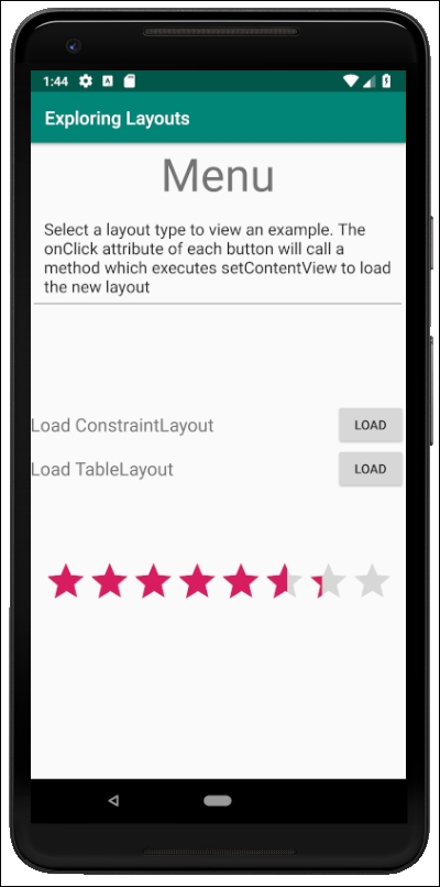
Notice that you can play with the RatingBar, although the rating won't persist when the app is turned off.
Tip
By way of a reader challenge, find an attribute or two that could further improve the appearance of the LoadConstraintLayout and LoadTableLayout text. They look a little bit close to the edges of the screen. Refer to the section on attribute summary at the start of the next chapter for suggestions.
Unfortunately, the buttons don't do anything yet. Let's fix that.
-
No Comment