
This chapter talks about the drawing and animation features built into Android, including creating custom View classes and working with Canvas and Paint to draw shapes, text, and animations to the screen. Then later, in Chapter 14, “Using Android 3D Graphics with OpenGL ES,” we dive further into using the OpenGL ES library for 2D and 3D rendering.
We talked about layouts and the various View widgets available, but now we work at a slightly lower level and talk about drawing on the screen. With Android, we can draw images such as PNG and JPG graphics, text, or primitive shapes to the screen. We can paint them with various colors, styles, and gradients. We can modify them using standard image transforms. We can even animate drawables to give the illusion of motion.
Tip
We work with graphics in many of the sample applications available on the CD at the end of this book and on the book Web site. The code that follows is part of the “Drawing” sample application.
To draw to the screen, you need a valid Canvas. Typically we get a Canvas by extending the View class for our own purposes and implementing the onDraw() method.
For example, here’s a simple View subclass called ViewWithRedDot. We override the onDraw() method to dictate what the View looks like, in this case it draws a red circle on a black background.

We can then use this View like any other layout. For example, we might override the onCreate() method in our Activity with the following:
setContentView(new ViewWithRedDot(this));
The resulting screen would look something like Figure 8.1.

The Canvas (android.graphics.Canvas) holds the draw calls, in order, for a rectangle of space. There are methods available for drawing images, text, shapes, and support for clipping regions.
The dimensions of the Canvas are bound by the container view. You can retrieve the size of the Canvas using the getHeight() and getWidth() methods.
In Android, Paint (android.graphics.Paint) stores far more than a color. The Paint class encapsulates the style and complex color and rendering information, which can be applied to a drawable like a graphic, or shape, or piece of text in a given Typeface.
You can set the color of the Paint using the setColor() method. Standard colors are predefined within the android.graphics.Color class. For example, the following code sets the paint color to red:
Paint redPaint = new Paint();
redPaint.setColor(Color.RED);
Antialiasing makes many graphics—whether they are shapes or Typefaces—look smoother on the screen. This property is set within the Paint of an object.
For example, the following code instantiates a Paint object with antialiasing enabled:
Paint aliasedPaint = new Paint(Paint.ANTI_ALIAS_FLAG);
Paint style controls how an object is filled with color. For example, the following code instantiates a Paint object and sets the Style to STROKE, which signifies that the object should be painted as a line drawing and not filled (the default):
Paint linePaint = new Paint();
linePaint.setStyle(Paint.Style.STROKE);
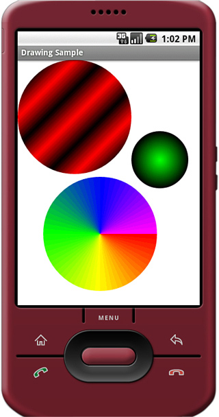
You can create a gradient of colors using one of the gradient subclasses. The different gradient classes (Figure 8.2), including LinearGradient, RadialGradient, and SweepGradient, are available under the superclass android.graphics.Shader.
Figure 8.2. An example of a LinearGradient (top), a RadialGradient (right), and a SweepGradient (bottom).
All gradients need at least two colors—a start color and an end color—but might contain any number of colors in an array. The different types of gradients are differentiated by the direction in which the gradient “flows.” Gradients can be set to mirror and repeat as necessary.
You can set the Paint gradient using the setShader() method.
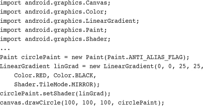
A linear gradient is one that changes colors along a single straight line. The top-left circle in Figure 8.2 is a linear gradient between black and red, which is mirrored.
This can be achieved by creating a LinearGradient and setting the Paint method setShader() before drawing on a Canvas, as follows:
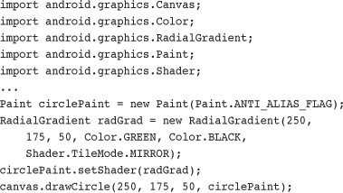
A radial gradient is one that changes colors starting at a single point and radiating outward in a circle. The smaller circle on the right in Figure 8.2 is a radial gradient between green and black.
This can be achieved by creating a RadialGradient and setting the Paint method setShader() before drawing on a Canvas, as follows:
A sweep gradient is one that changes colors using slices of a pie. This type of gradient is often used for a color chooser. The large circle at the bottom of Figure 8.2 is a sweep gradient between red, yellow, green, blue, and magenta.
This can be achieved by creating a SweepGradient and setting the Paint method setShader() before drawing on a Canvas, as follows:

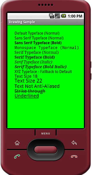
Android provides several default font typefaces and styles. Applications can also use custom fonts by including font files as application assets and loading them using the AssetManager, much as one would use resources.
Tip
The Typeface code that follows is part of the Drawing sample application available on the CD at the end of this book and on the book Web site.
By default, Android uses the Sans Serif typeface, but Monospace and Serif typefaces are also available. The following code excerpt draws some antialiased text in the default typeface (Sans Serif) to a Canvas:

You can instead load a different typeface, such as Monotype:
Typeface mType = Typeface.create(Typeface.MONOSPACE,
Typeface.NORMAL);
Perhaps you would prefer italic text, in which case you can simply set the style of the typeface and the font family:
Typeface mType = Typeface.create(Typeface.SERIF,
Typeface.ITALIC);
Caution
Not all Typeface styles are supported by all Typeface families. Bold Sans Serif works, but Italics are not implemented. You need to check to make sure the style desired exists on the device.
You can set certain properties of a typeface such as antialiasing, underlining, and strike-through using the setFlags() method of the Paint object.
mPaint.setFlags(Paint.UNDERLINE_TEXT_FLAG);
Figure 8.3 shows some of the Typeface families and styles available by default on Android.
You can easily use custom typefaces with your application by including the font file as an application asset and loading it on demand. Fonts might be used for a custom look-and-feel, for implementing language symbols that are not supported natively, or for custom symbols.
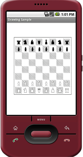
For example, we might want to use a handy chess font to implement a simple, scalable chess game. A chess font includes every symbol needed to implement a chessboard, including the board and the pieces. Hans Bodlaender has kindly provided a free chess font called Chess Utrecht. Using the Chess Utrecht font, the letter Q draws a black queen on a white square, whereas a q draws a white queen on a white square, and so on. This nifty font is available on the Web site www.chessvariants.com/d.font/utrecht.html as chess1.ttf.
To use a custom font such as Chess Utrecht, simply download the font from the Web site and copy the chess1.ttf file from your hard drive to the project directory /assets/fonts/ chess1.ttf.
Now you can load the Typeface programmatically much as you would any resource:

You can then use the Chess Utrecht typeface to “draw” a chessboard (see Figure 8.4) using the appropriate character sequences.
You can find lots of goodies for working with graphics such as bitmaps (including NinePatch) in the android.graphics package. The core class for bitmaps is android.graphics.Bitmap.
You can draw bitmaps onto a valid Canvas, such as within the onDraw() method of a View, using one of the drawBitmap() methods. For example, the following code loads a Bitmap resource and draws it on a canvas:

Perhaps you want to scale your graphic to a smaller size. In this case, you can use the createScaledBitmap() method (Figure 8.5), like this:
Bitmap sm = Bitmap.createScaledBitmap(pic, 50, 75, false);
You can preserve the aspect ratio of the Bitmap by checking the getWidth() and getHeight() methods and scaling appropriately.
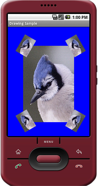
You can use the helpful Matrix class to perform transformations on a Bitmap graphic. Use the Matrix class to perform tasks such as mirroring and rotating graphics, among other actions.
The following code uses the createBitmap() method to generate a new Bitmap that is a mirror of an existing Bitmap called pic:

You can perform a 30-degree rotation in addition to mirroring by using this Matrix instead:
You can see the results of different combinations of tilt and mirror Matrix transforms in Figure 8.5. When you’re no longer using a Bitmap, you can free its memory using the recycle() method:
pic.recycle();
There are a variety of other Bitmap effects and utilities available as part of the Android SDK, but they are numerous and beyond the scope of this book. See the android.graphics package for more details.
You can define and draw primitive shapes such as rectangles and ovals using the ShapeDrawable class in conjunction with a variety of specialized Shape classes. You can define Paintable drawables as XML resource files, but more often, especially with more complex shapes, this is done programmatically.
Tip
You can find example code of how to draw different shapes in the ShapeShifter sample project provided on the CD and on the book Web site.
In Chapter 5, “Managing Application Resources,” we showed you how to define primitive shapes such as rectangles using specially formatted XML files within the /res/drawable/ resource directory.
For example, the following resource file called /res/drawable/green_rect.xml describes a simple, green rectangle shape drawable:

You can then load the shape resource and set it as the Drawable as follows:
ImageView iView = (ImageView)findViewById(R.id.ImageView1);
iView.setImageResource(R.drawable.green_rect);
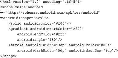
You should note that many Paint properties can be set via XML as part of the Shape definition. For example, the following Oval shape is defined with a linear gradient (red to white) and stroke style information:
You can also define these ShapeDrawable instances programmatically. The different shapes of are available as classes within the android.graphics.drawable.shapes package. For example, the aforementioned green rectangle could be defined programmatically as follows:
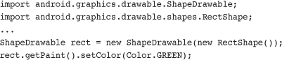
You can then set the Drawable for the ImageView directly:
ImageView iView = (ImageView)findViewById(R.id.ImageView1);
iView.setImageDrawable(rect);
The resulting green rectangle is shown in Figure 8.6.

Some of the different shapes available within the android.graphics.drawable.shapes package include
• Rectangles (and squares)
• Rectangles with rounded corners
• Ovals (and circles)
• Arcs and lines
• Other shapes defined as Paths
These shapes can be created and used as Drawable resources directly within ImageView views, or you can find corresponding methods for creating these primitive shapes within a Canvas.
Drawing rectangles and squares (rectangles with equal height/width values) is simply a matter of creating a ShapeDrawable from a RectShape object. The RectShape object has no dimensions but is bound by the container object, in this case the ShapeDrawable. You can set some basic properties of the ShapeDrawable, such as the Paint color and the default size.
For example, here we create a magenta-colored rectangle that is 100-pixels long and 2-pixels wide, which looks like a straight, horizontal line. We then set shape as the drawable for an ImageView so the shape can be displayed:

You can create rectangles with rounded corners, which can be nice for making custom buttons. Simply create a ShapeDrawable from a RoundRectShape object. The RoundRectShape requires an array of eight float values, which signify the radii of the rounded corners. For example, the following creates a simple cyan-colored, rounded-corner rectangle:

The resulting round rectangle is shown in Figure 8.7.

You can also specify an inner-rounded rectangle within the outer rectangle, if you so choose. The following creates an inner rectangle with rounded edges within the outer white rectangle with rounded edges:

The resulting round rectangle with an inset rectangle is shown in Figure 8.8.

You can create ovals and circles (ovals with equal height/width values) by creating a ShapeDrawable using an OvalShape object. The OvalShape object has no dimensions but is bound by the container object, in this case the ShapeDrawable. You can set some basic properties of the ShapeDrawable, such as the Paint color and the default size. For example, here we create a red oval that is 40-pixels high and 100-pixels wide, which looks like a Frisbee:
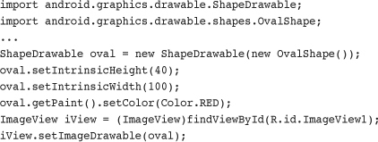
The resulting red oval is shown in Figure 8.9.

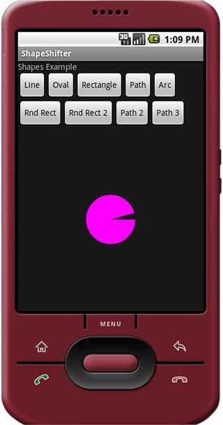
You can draw arcs, which look like pie charts or Pac-Man, depending on the sweep angle you specify. You can create arcs by creating a ShapeDrawable by using an ArcShape object. The ArcShape object requires two parameters: a startAngle and a sweepAngle. The startAngle begins at 3 o’clock. Positive sweepAngle values sweep clockwise, negative values counterclockwise. You can create a circle by using the values 0 and 360.
The following code creates an arc that looks like a magenta Pac-Man:

The resulting arc is shown in Figure 8.10.
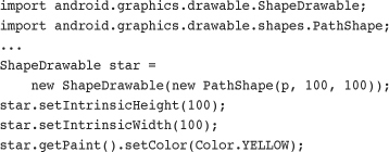
You can specify any shape you want by breaking it down into a series of points along a path. The android.graphics.Path class encapsulates a series of lines and curves that make up some larger shape.
For example, the following Path defines a rough five-point star shape:

You can then encapsulate this star Path in a PathShape, create a ShapeDrawable, and paint it yellow.
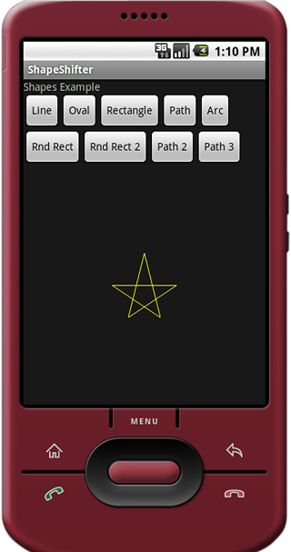
By default, this generates a star shape filled with the Paint color yellow (Figure 8.11).

Or, you can set the Paint style to Stroke for a line drawing of a star.
star.getPaint().setStyle(Paint.Style.STROKE);
The resulting star would look something like Figure 8.12.
Tip
The graphics support available within the Android SDK could be the subject of an entire book. There are many different drawing mechanisms and methods available within the Android SDK. When you have familiarized yourself with the basics, we highly recommend checking out the APIDemos sample application provided with the Android Software Development Kit (SDK), paying special attention to com.example.android.apis.graphics package (whose samples can be found under the APIDemos menu item called Graphics). For a simple game design, check out the Lunar Lander sample application as well.
The Android platform supports three types of graphics animation:
• Animated GIF images
• Frame-by-frame animation
• Tweened animation
Animated GIFs store the animation frames within the image, and you simply include these GIFs like any other graphic drawable resource. For frame-by-frame animation, the developer must provide all graphics frames of the animation. However, with tweened animation, only a single graphic is needed, upon which transforms can be programmatically applied.
Tip
You can find examples of both of these animation methods in the ShapeShifter sample project provided on the CD and on the book Web site.
You can think of frame-by-frame animation as a digital flipbook in which a series of similar images display on the screen in a sequence, each subtly different from the last. When you display these images quickly, they give the illusion of movement. This technique is called frame-by-frame animation and is often used on the Web in the form of animated GIF images.
Frame-by-frame animation is best used for complicated graphics transformations that are not easily implemented programmatically.
For example, we can create the illusion of a genie juggling gifts using a sequence of three images, as shown in Figure 8.13.
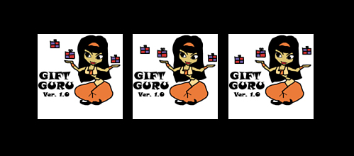
In each frame, the genie remains fixed, but the gifts are repositioned slightly. The smoothness of the animation is controlled by providing an adequate number of frames and choosing the appropriate speed on which to swap them.
The following code demonstrates how to load three Bitmap resources (our three genie frames) and create an AnimationDrawable. We then set the AnimationDrawable as the background resource of an ImageView and start the animation.

To name the animation loop continuously, we can call the setOneShot() method:
mAnimation.setOneShot(false);
And to begin the animation, we call the start() method:
mAnimation.start();
We can end our animation at any time using the stop() method:
mAnimation.stop();
Although we used an ImageView background in this example, you can use a variety of different View widgets for animations. For example, you can instead use the ImageSwitcher view and change the displayed Drawable resource using a timer. This sort of operation is best done on a separate thread. The resulting animation might look something like Figure 8.14—you just have to imagine it moving.

With tweened animation, you can provide a single Drawable resource—it is a Bitmap graphic (Figure 8.15, left), a ShapeDrawable, a TextView (Figure 8.15, right), or any other type of View object—and the intermediate frames of the animation are rendered by the system. Android provides tweening support for several common image transformations, including alpha, rotate, scale, and translate animations. You can apply tweened animation transformations to any View, whether it is an ImageView with a Bitmap or shape Drawable, or a layout like a TableLayout.

You can define tweening transformations as XML resource files or programmatically. All tweened animations share some common properties, including when to start, how long to animate, and whether to return to the starting state upon completion.
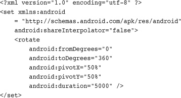
In Chapter 5 we showed you how to store animation sequences as specially formatted XML files within the /res/anim/ resource directory. For example, the following resource file called /res/anim/spin.xml describes a simple five-second rotation:
You can also define these animations programmatically. The different types of transformations are available as classes within the android.view.animation package. For example, the aforementioned rotation animation can be defined as follows:
Animation transformations can happen simultaneously or sequentially by setting the startOffset and duration properties, which control when and for how long an animation takes to complete. Animations can be combined into the <set> tag (programmatically, using AnimationSet) to share properties.
For example, the following animation resource file /res/anim/grow.xml includes a set of two scale animations: First, we take 2.5 seconds to double in size, and then at 2.5 seconds, we start a second animation to shrink back to our starting size.

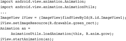
Loading animations is made simple by using the AnimationUtils helper class. The following code loads an animation XML resource file called /res/anim/grow.xml and applies it to an ImageView whose source resource is a green rectangle shape drawable:
We can listen for Animation events, including the animation start, end, and repeat events, by implementing an AnimationListener class, such as the MyListener class shown here:
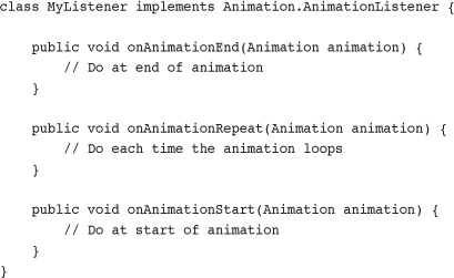
You can then register your AnimationListener as follows:
an.setAnimationListener(new MyListener());
Now let’s look at each of the four types of tweening transformations individually. These types are
• Transparency changes (Alpha)
• Rotations (Rotate)
• Scaling (Scale)
• Movement (Translate)
Transparency is controlled using Alpha transformations. Alpha transformations can be used to fade objects in and out of view, or to layer them on the screen.
Alpha values range from 0.0 (fully transparent or invisible) to 1.0 (fully opaque or visible). Alpha animations involve a starting transparency (fromAlpha) and an ending transparency (toAlpha).
The following XML resource file excerpt defines a transparency-change animation, taking five seconds to fade in from fully transparent to fully opaque:

Programmatically, you can create this same animation using the AlphaAnimation class within the android.view.animation package.
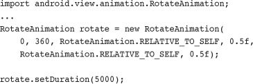
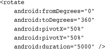
Rotation operations can be used to spin objects clockwise or counterclockwise around a pivot point within the object’s boundaries.
Rotations are defined in terms of degrees. For example, you might want to rotate an object completely once in a clockwise direction. To do this, you would set the fromDegrees property to 0 and the toDegrees property to 360. To rotate the object counterclockwise instead, you would set the toDegrees property to -360.
By default, the object pivots around the (0,0) coordinate, or the top-left corner of the object. This is great for rotations such as those of a clock’s hands, but much of the time, you want to pivot from the center of the object; this is easily done by setting the pivot point, which can be a fixed coordinate or a percentage.
The following XML resource file excerpt defines a rotation animation, taking 5 seconds to rotate one full-time clockwise, pivoting from the center of the object:
Programmatically, you can create this same animation using the RotateAnimation class within the android.view.animation package.
You can use scaling operations to stretch objects vertically and horizontally. Scaling operations are defined as relative scales. Think of the scale value of 1.0 as 100 percent, or full-size. To scale to half size or 50 percent, set the target scale value of 0.5.
You can scale horizontally and vertically on different scales or on the same scale (to preserve aspect ratio). You need to set four values for proper scaling: starting scale (fromXScale, fromYScale) and target scale (toXScale, toYScale). Again, you can use a pivot point to stretch your object from a specific (x,y) coordinate such as the center or another coordinate.
The following XML resource file excerpt defines a scaling animation, taking five seconds to double an object’s size, pivoting from the center of the object:

Programmatically, you can create this same animation using the ScaleAnimation class within the android.view.animation package.
You can move objects around using translate operations. Translate operations move an object from one position on the (x,y) coordinate to another coordinate.
To perform a translate operation, you must specify the change, or delta, in the object’s coordinates. You can set four values for translations: starting position (fromXDelta, fromYDelta) and relative target location (toXDelta, toYDelta).
The following XML resource file excerpt defines a translate animation, taking 5 seconds to move an object up (negative) by 100 on the y-axis. We also set the fillAfter property to be true, so the object doesn’t “jump” back to its starting position when the animation finishes:
Programmatically, you can create this same animation using the TranslateAnimation class within the android.view.animation package.
The Android SDK comes with the android.graphics package, which includes powerful classes for drawing graphics and text to the screen in a variety of different ways. Some features of the graphics library include Bitmap graphics utilities, Typeface and font style support, Paint colors and styles, different types of gradients, and a variety of primitive and not-so-primitive shapes that can be drawn to the screen and even animated using tweening and frame-by-frame animation mechanisms.