
Most Android applications inevitably need some form of user interface. In this chapter, we discuss the user interface elements available within the Android Software Development Kit (SDK). Some of these elements display information to the user whereas others gather information from the user.
You learn how to use a variety of different components and widgets to build a screen and how your application can listen for various actions performed by the user. Finally, you learn how to style widgets and apply themes to entire screens.
Before we go any further, we need to define a few terms. This gives you a better understanding of certain capabilities provided by the Android SDK before they are fully introduced. First, let’s talk about the View and what it is to the Android SDK.
The Android SDK has a Java packaged named android.view. This package contains a number of interfaces and classes related to drawing on the screen. However, when we refer to the View object, we actually refer to only one of the classes within this package, the android.view.View class.
The View class is the basic user interface building block within Android. It represents a rectangular portion of the screen. The View class serves as the base class for nearly all the widgets and layouts within the Android SDK.
The Android SDK contains a Java package named android.widget. When we refer to widgets, we are typically referring to a class within this package. Widgets include almost anything within the Android SDK that you might want to draw, including ImageView, FrameLayout, EditText, and Button objects. As mentioned previously, all widgets are typically derived from the View class.
This chapter is primarily about widgets that display and collect data from the user. We cover many of these basic widgets in detail.
Note
There is also another term, AppWidget, which was introduced in Android SDK 1.5. An AppWidget (android.appwidget) is an application extension, such as a desktop plug-in, which can be placed on the Android Home screen. We discuss AppWidgets in more depth in Chapter 7, “Designing Android User Interfaces with Layouts.”
One type of widget found within the android.widget package is the layout. An Android layout widget is still a View object, but it doesn’t actually draw anything on the screen. Instead, it is a parent container for other widgets (children). Layout widgets determine how and where on the screen they draw child widgets following particular rules. For instance, the LinearLayout View draws its child widgets in a single horizontal row or a single vertical column. AbsoluteLayout widgets allow exact coordinates to be set for each child widget.
By necessity, we use some of the layout View objects within this chapter to illustrate how to use the widgets previously mentioned. However, we won’t go into the details of the various layout types until the next chapter.
In Chapter 7 we organize various widgets within layouts and other containers. These special View widgets, which are derived from the android.view.ViewGroup class, are useful only when you understand the various simple widgets these containers can hold.
One of the most basic user interface elements, or widgets, in the Android SDK is the TextView widget. It is used, quite simply, to draw text on the screen. The TextView widget is primarily used to display fixed text strings or labels.
Frequently, the TextView widget is used by or is derived from other screen elements. As with most of the user interface elements, it is derived from View and is within the android.widget package. Because it is a View, all the standard attributes such as width, height, padding, and visibility can be applied to the object. However, as a text displaying control, many other TextView specific attributes can be applied to control widget behavior and how the text is viewed in a variety of situations.
First, though, let’s see how to put some quick text up on the screen. The XML layout file tag used to display text on the screen is <“TextView”>. You can set the android:text property of the TextView to be either a raw text string in the layout file or a reference to a string resource.
Here are examples of both methods to set the android:text attribute of a TextView. The first sets the text attribute to a raw string, the second to a string resource defined in the strings.xml resource file.

To display this TextView on the screen, all your Activity needs to do is call the setContentView() method with the layout resource identifier in which you defined the preceding XML shown. You can change the text displayed programmatically by calling the setText() method on the TextView object. Retrieving the text is done with the getText() method.
Now let’s talk about some of the more common attributes of TextView objects.
Although you learn more about general layout in the Chapter 7, the TextView object has some special attributes that control how the text is drawn and flows. You can, for instance, set the TextView to be a single line high and a fixed width. If, however, you put a long string of text that can’t fit, the text truncates abruptly. However, there are some attributes that control this.
Tip
When looking through the attributes available to TextView objects, you should be aware that the Android SDK actually has the full editable text input implementation as part of TextView. This means a lot of the attributes apply only to input fields, which are used primarily by the subclass EditText object. For example, the autoText attribute, which helps the user by fixing common spelling mistakes, is most appropriately set on editable text fields (EditText). There is no need to use this attribute normally when displaying only text.
The width of a TextView can be controlled in terms of the ems measurement rather than in pixels. An em is a term used in typography that is defined in terms of the point size of a particular font. (For example, the measure of an em in a 12-point font is 12 points.) This measurement allows better control over how much text is viewed, regardless of the font size. Through the ems attribute, you can set the width of the TextView. Additionally, you can use the maxEms and minEms attributes to set the maximum width and minimum width, respectively, of the TextView in terms of ems.
The height of a TextView can be set in terms of lines of text rather than pixels. Again, this is useful for controlling how much text can be viewed regardless of the font size. The lines attribute sets the number of lines that the TextView can display. You can also use maxLines and minLines to control the maximum height and minimum height, respectively, that the Textview displays.
Here is an example that combines these two types of sizing attributes. This TextView will be two lines of text high and 12 ems of text wide. The layout width and height are specified to the size of the TextView and are required attributes in the XML schema:

Instead of having the text only truncate at the end, as happens in the preceding example, we can enable the ellipsize attribute to replace the last couple of characters with an ellipsis (...) so the user knows that not all text is displayed.
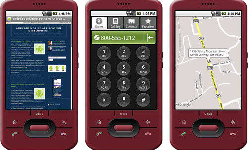
If your text contains references to email addresses, web pages, phone numbers, or even addresses, you might want to consider using the attribute autoLink (see Figure 6.1). The autoLink attribute has four values that can be used in combination with each other. When enabled, these autoLink attribute values create standard web-style links to the application that can act on that data type. For instance, setting the attribute to web automatically finds and links any URLs to web pages.

Your text can contain the following values for the autoLink attribute:
• web: Enables linking of URLs to web pages
• email: Enables linking of email addresses to the mail client with the recipient filled
• phone: Enables linking of phone numbers to the dialer application with the phone number filled out, ready to be dialed
• map: Enables linking of addresses to the map application to show the location
Turning on the autoLink feature relies on the detection of the various types within the Android SDK. In some cases, the linking might not be correct or might be misleading. Here is an example that links email and web pages, which are the most reliable in our opinion:

There are two helper values for this attribute, as well. You can set it to none to make sure no type of data is linked. You can also set it to all to have all known types linked, as demonstrated in Figure 6.2. The default for a TextView is not to link any types. If you want the user to see these various data types highlighted but you don’t want them to click on them, you can set the attribute linksClickable to false.
The Android SDK provides a convenient widget called EditText to handle text input from a user. The EditText class is derived from TextView. In fact, most of its functionality is contained within TextView but enabled when created as an EditText. The EditText object has a number of useful features enabled by default, many shown in Figure 6.3.

First, though, let’s see how to define an EditText widget in an XML layout file:
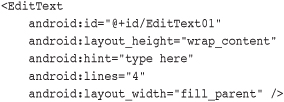
This layout code shows a basic EditText element. There are a couple of interesting things to note. First, the hint attribute puts some text in the edit box that will go away when the user starts entering text. Essentially, this gives a hint to the user as to what should go there. Next is the lines attribute, which defines how many lines tall the input box will be. If this is not set, the entry field grows as the user enters text. However, setting a size allows the user to scroll within a fixed sized to edit the text. This also applies to the width of the entry.
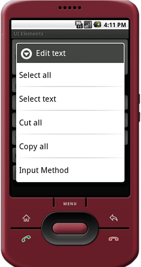
By default, the user can perform a long press to bring up a context menu. This allows the user some basic copy, cut, and paste operations (shown in Figure 6.4). You do not need to provide any additional code for this useful behavior to benefit your users. You can also highlight a portion of the text from code, too. A call to setSelection() does this, and a call to selectAll() highlights the entire text entry field.
Figure 6.4. Long press on EditText widgets typically launches a Context menu for Select, Cut and Paste.
The EditText object is essentially an editable TextView. This means that text can be read from it in the same way as you did with TextView: by using the getText() method. You can also set initial text to draw in the text entry area using the getText() method. This is useful when a user edits a form that already has data. Finally, you can set the editable attribute to false, so the user cannot edit the text in the field but can still copy text out of it using a long press.
In addition to providing a basic text editor with the EditText widget, the Android SDK also provides a way to help the user out with entering commonly entered data into forms. This functionality is provided through the auto-complete feature.
There are two forms of auto-complete. One is the more standard style of filling in the entire text entry based on what the user types. If the user begins typing a string that matches a word in a developer-provided list, the word can be finished for the user, if they choose. This is done through the AutoCompleteTextView widget (Figure 6.5). The second method allows the user to enter a list of items, each of which has auto-complete functionality (also see Figure 6.5). These items must be separated in some way by providing a Tokenizer to the MultiAutoCompleteTextView object that handles this method. A common Tokenizer implementation is provided for comma-separated lists and is used by specifying the MultiAutoCompleteTextView.CommaTokenizer object. This can be helpful for lists of specifying common tags and the like.

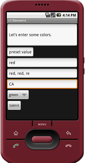
Both of the auto-complete text editors use an adapter to get the list of text that they use to provide completions to the user. This example shows how to provide an EditText for the user that can help them type some of the basic colors from an array in the code:

In this example, when the user starts typing in the field, if they start with one of the letters in the COLORS array, a drop-down list shows them all the available completions. Note that this does not limit what the users can enter. They are still free to enter any text that they choose (like puce). The adapter controls the look of the drop-down list. In this case, we use a built-in layout made for such things. Here is the layout resource definition for this AutoCompleteTextView widget:

There are a couple more things to notice here. First, you can choose when the completion drop-down list shows by filling in a value for the completionThreshold attribute. In this case, we set it to a single character, so it will show immediately if there is a match. The default value is two characters of typing before it displays auto-completion options. Second, you can set some text in the completionHint attribute. This shows at the bottom of the drop-down list to help users out. Finally, the drop-down list for completions will be sized to the TextView. This means that it should be wide enough to show the completions and the text for the completionHint attribute.
The MultiAutoCompleteTextView is essentially the same as the regular auto-complete, except that you must assign a Tokenizer to it so that the control knows where each auto-completion should begin. The following is an example that uses the same adapter as the previous example but includes a Tokenizer for a list of user color responses, each separated by a comma:

As you can see, the only change actually is setting the Tokenizer. Here we used the built-in comma Tokenizer provided by the Android SDK. In this case, whenever a user chooses a color from the list, the name of the color is completed, and a comma is automatically added so that the user can immediately start typing in the next color. As before, this does not limit what the user can enter. If the user were to enter “maroon” and place a comma after that, the auto-completion starts again as they type another color regardless of the fact that it didn’t help the user type in the color maroon. You can create your own Tokenizer by implementing the MultiAutoCompleteTextView.Tokenizer interface. You can do this if you’d prefer entries separated by a semicolon or some other more complex separators.
There are often times when you don’t want the user to type just anything. Validating input after the user has entered something is one way to do this. However, a better way to avoid wasting the user’s time is to filter the input. The EditText widget provides a way to set an InputFilter that does only this.
The Android SDK provides some InputFilter objects for use. There are InputFilter objects that enforce such rules as allowing only uppercase text and limiting the length of the text entered. You can create custom filters by implementing the InputFilter interface, which contains the single method called filter(). Here is an example of an EditText widget with two built-in filters that might be appropriate for a two-letter state abbreviation:
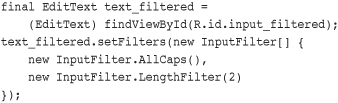
As you see, the setFilters() method call takes an array of InputFilter objects. This is useful for combining multiple filters, as shown. In this case, we’re converting all input to uppercase. Additionally, we’re setting the maximum length to two-characters long. As you can see in Figure 6.6, the EditText widget looks the same as any other, but if you try to type lowercase, it will be converted to uppercase, and the string is limited to two characters. This does not mean that all possible inputs will be valid, but it does help the user out so that they don’t need to worry about making the input too long or bother with the case of the input. This also helps your application by guaranteeing that any text from this input will be a length of two. It does not constrain the input to only letters, though.
Sometimes you want to limit the choices available for users to type. For instance, if users are going to enter the name of a state, we might as well limit them to only the valid states because this is a known set. Although you could do this by letting them type something and then blocking invalid entries, you can also provide similar functionality with a Spinner control. Like the auto-complete method, the possible choices for a spinner can come from an Adapter. You can also set the available choices in the layout definition by using the entries attribute with an array resource (specifically a string-array that is referenced as something like @array/state-list). The Spinner control isn’t actually an EditText although it is frequently used in a similar fashion. Here is an example of the XML layout definition for a Spinner control for choosing a color:

This places a spinner control on the screen (Figure 6.7). When the user selects it, a pop-up shows the prompt text followed by a list of all the possible choices. This list allows only a single item to be selected at a time, and when one is selected the pop-up will go away.
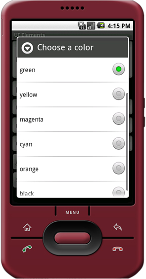
There are a couple of things to notice here. First, the entries attribute is set to the values that shows by assigning it to an array resource, referred to here as @array/colors.
Second, the prompt attribute is defined to a string resource. Unlike some other string attributes, this one is required to be a string resource. The prompt displays when the pop-up comes up and can be used to tell the user what kinds of values they are selecting from.
Because the Spinner control is not a TextView, but a list of TextView objects, you can’t directly request the selected text from it directly. Instead, you have to retrieve the selected View and extract the text directly:

As it turns out, you can request the currently selected View object, which happens to be a TextView in this case. This allows us to retrieve the text and use it directly. Alternatively, we could have called the getSelectedItem() or getSelectedItemId() methods to deal with other forms of selection.
Another common user interface element is the button. In this section, you learn about different kinds of buttons provided by the Android SDK. These include the basic Button, ToggleButton, CheckBox, and RadioButton. You can find examples of each button type in Figure 6.8.
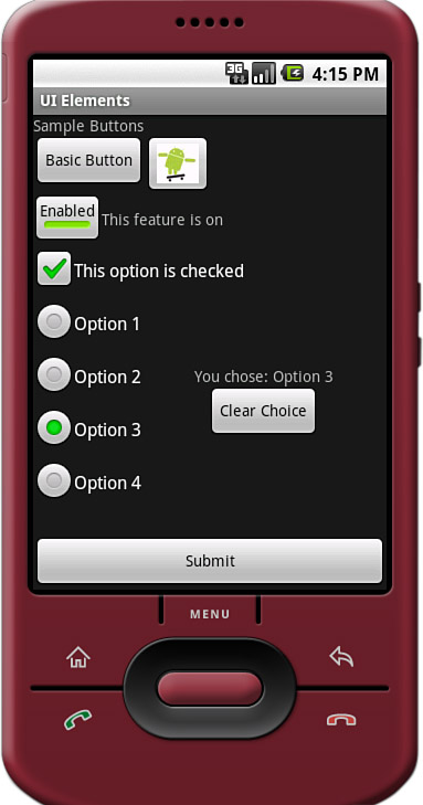
A basic Button is often used to perform some sort of action, such as submitting a form or confirming a selection. They can contain a text or image label.
A CheckBox is a button with two states—checked or unchecked. CheckBox widgets are often used to turn a feature on or off or to pick multiple items from a list.
A ToggleButton is similar to a CheckBox, but is used to visually show the state. The default behavior of a toggle is like that of a power on/off button.
A RadioButton provides selection of an item. Grouping RadioButton widgets together in a container called a RadioGroup enables the developer to enforce that only one RadioButton is selected at a time.
The android.widget.Button class provides a basic button implementation in the Android SDK. Within the XML layout resources, buttons are specified using the Button element. The primary attribute for a basic button is the text field. This is the label that appears on the middle of the button’s face. You’ll often use basic Button widgets for buttons with text such as “Ok,” “Cancel,” or “Submit.”
Tip
You can find many common application string values in the Android system resource strings, exposed in android.R.string. There are strings for common button text like “yes,” “no,” “ok,” “cancel,” “copy.” For more information on system resources, see Chapter 5.
The following XML layout resource file shows a typical Button widget definition.

A button won’t do anything, other than animate, without some code to handle the click event. Here is an example of some code that handles a click for a basic button and displays a Toast message on the screen:

To handle the click event for when a button is pressed, we first get a reference to the Button by its resource identifier. Next, the setOnClickListener() method is called. It requires a valid instance of the class View.OnClickListener. A simple way to provide this is to define the instance right in the method call. This requires implementing the onClick() method. Within the onClick() method, you are free to carry out whatever actions you need. Here, we simply display a message to the users telling them that the button was, in fact, clicked.
A button with its primary label as an image is an ImageButton. An ImageButton is, for most purposes, almost exactly like a basic button. Click actions are handled in the same way. The primary difference is that you can set its src attribute to be an image. Here is an example of an ImageButton definition in an XML layout resource file:

In this case, a small drawable resource is reference. You can see what this “Android” button looks like in Figure 6.8.
The check box button is often used in lists of items where multiple items can be selected. The Android check box contains a text attribute that appears to the side of the check box. This is used in a similar way to the label of a basic button. In fact, it’s basically a TextView next to the button.
Here’s an XML layout resource definition for a CheckBox widget:

You can see how this CheckBox is displayed in Figure 6.8.
The following example shows how to check for the state of the button programmatically and change the text label to reflect the change:
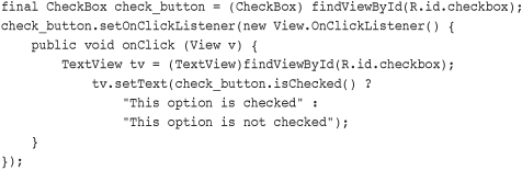
This is similar to the basic button. A check box automatically shows the check as enabled or disabled. This allows us to deal with behavior in our application rather than worrying about how the button should behave. The layout shows that the text starts out one way but after the user pressed the button in changes to one of two different things depending on the checked state. As the code shows, the CheckBox is also a TextView.
A Toggle Button is similar to a check box in behavior but is usually used to show or alter the on or off state of something. Like the CheckBox, it has a state (checked or not). Also like the check box, the act of changing what displays on the button is handled for us. Unlike the CheckBox, it does not show text next to it. Instead, it has two text fields. The first attribute is textOn, which is the text that is shown on the button when its checked state is on. The second attribute is textOff, which is the text that is shown on the button when its checked state is off. The default text for these is “ON” and “OFF,” respectively.
The following layout code shows a definition for a toggle button that shows “Enabled” or “Disabled” based on the state of the button:
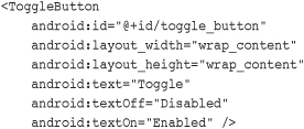
This type of button will not actually display the value for the text attribute, even though it’s a valid attribute to set. Here, the only purpose it serves is to demonstrate that it doesn’t display. You can see what this ToggleButton looks like in Figure 6.8.
Radio buttons are often used when a user should be allowed to only select one item from a small group of items. For instance, a question asking for gender can give three options: male, female, and unspecified. Only one of these options should be checked at a time. The RadioButton objects are similar to CheckBox objects. They have a text label next to them, set via the text attribute, and they have a state (checked or unchecked). However, RadioButton objects can be grouped inside a RadioGroup that handles enforcing their combined states so that only one RadioButton can be checked at a time. If the user selects a RadioButton that is already checked, it does not become unchecked. However, you can provide the user with an action to clear the state of the entire RadioGroup so that none of the buttons are checked.
Here we have an XML layout resource with a RadioGroup containing four RadioButton objects (shown in Figure 6.8). The RadioButton objects have text labels, “Option 1,” and so on. The XML layout resource definition is shown here:

Handling actions on these RadioButton objects is handled through the RadioGroup object. The following example shows registering for clicks on the RadioButton objects within the RadioGroup:
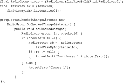
As this layout example demonstrates, there is not anything special that you need to do to make the RadioGroup and internal RadioButton objects work properly. The preceding code illustrates how to register to receive a notification whenever the RadioButton selection changes.
The code demonstrates that the notification contains the resource identifier for the specific RadioButton that was chosen, as assigned in the layout file. To do something interesting with this, you need to provide a mapping between this resource identifier (or the text label) to the corresponding functionality in your code. In the example, we query for the button that was selected, get its text, and assign its text to another TextView widget that we have on the screen.
As mentioned, the entire RadioGroup can be cleared so that none of the RadioButton objects are selected. The following example demonstrates how to do this in response to a button click outside of the RadioGroup:

The action of calling the clearCheck() method triggers a call to the onCheckedChangedListener() callback method. This is why we have to make sure that the resource identifier we received is valid. Right after a call to the clearCheck() method, it will not be a valid identifier but instead will be set to the value -1 to indicate that no RadioButton is currently checked.
Figure 6.8 shows what all these buttons look like on a single screen. The code for this is provided on the CD provided with the book and the book Web site.
The Android SDK provides a couple of widgets for getting date and time input from the user. The first is the DatePicker widget (shown in Figure 6.9). It can be used to get a month, day, and year from the user.

The basic XML layout resource definition for a DatePicker follows:

As you can see from this example, there aren’t any attributes specific to the DatePicker widget. Like many of the other widgets, your code can register to receive a method call when the date changes. You do this by implementing the onDateChanged() method. However, this isn’t done the usual way.
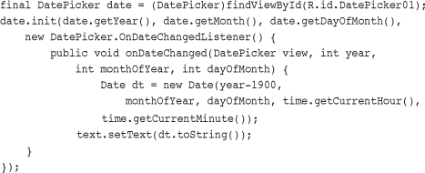
The preceding code sets the DatePicker.OnDateChangedListener by a call to the DatePicker.init() method. A DatePicker widget is initialized with the current date. A TextView is set with the date value that the user entered into the DatePicker widget. The value of 1900 is subtracted from the year parameter to make it compatible with the java.util.Date class.
A TimePicker widget (also shown in Figure 6.9) is similar to the DatePicker widget. It also doesn’t have any unique attributes, either. However, to register for a method call when the values change, you call the more traditional method of TimePicker.setOnTimeChangedListener().

As in the previous example, this code also sets a TextView to a string displaying the time value that the user entered. Used together, the user can set a full date and time.
The Android SDK provides a number of widgets that can be used to visually show some form of information to the user. These indicator widgets include progress bars, clocks, and other similar controls.
Applications commonly perform actions that can take a while. A good practice during this time is to show the user some sort of progress indicator, informing the user that the application is off “doing something.” Applications can also show how far a user is through some operation, such as a playing a song or watching a video. The Android SDK provides several types of progress bars.
The standard one is a circular indicator that only animates. It does not show how complete an action is. It can, however, show that something is taking place. This is useful when an action is indeterminate in length. There are three sizes of this type of progress indicator (Figure 6.10).
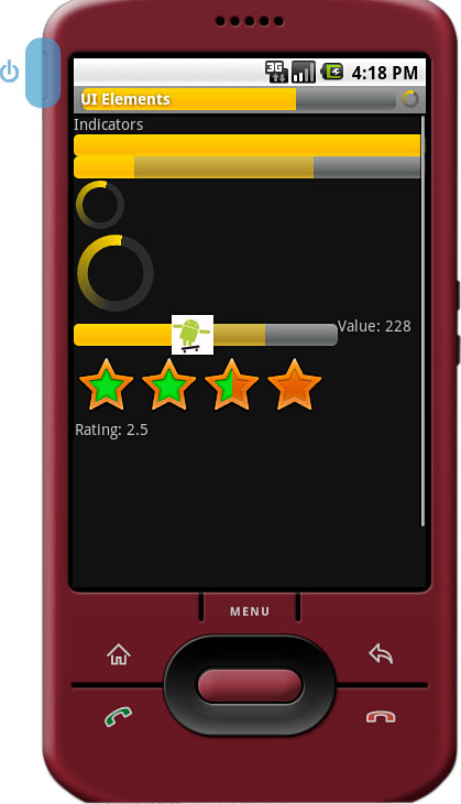
The second type is a horizontal progress bar that can show the completeness of an action. (For example, you can see how much of a file is downloading.) This horizontal progress bar can also have a secondary progress indicator on it. This can be used, for instance, to show the completion of a downloading media file while that file plays.
This is an XML layout resource definition for a basic indeterminate progress bar:

The default style is for a medium-size circular progress indicator; not a “bar” at all. The other two styles for indeterminate progress bar are progressBarStyleLarge and progressBarStyleSmall. This style animates automatically. The next sample shows the layout definition for a horizontal progress indicator:

We have also set the attribute for max in this sample to 100. This can help mimic a percentage progress bar. That is, setting the progress to 75 shows the indicator at 75 percent complete.
We can set the indicator progress status programmatically as follows:
mProgress = (ProgressBar) findViewById(R.id.progress_bar);
mProgress.setProgress(75);
You can also put these progress bars in your application’s title bar (as shown in Figure 6.10). This can save screen real estate. This can also make it easy to turn on and off an indeterminate progress indicator without changing the look of the screen. Indeterminate progress indicators are commonly used to display progress on pages where items need to be loaded before the page can finish drawing. This is often employed on web browser screens. The following code demonstrates how to place this type of indeterminate progress indicator on your Activity screen:

To use the indeterminate indicator on your Activity objects title bar, you need to request the feature Window.FEATURE_INDETERMINATE_PROGRESS, as previously shown. This shows a small circular indicator in the right side of the title bar. For a horizontal progress bar style that shows behind the title you need to enable the Window.FEATURE_PROGRESS. These features must be enabled before your application calls the setContentView() method, as shown in the preceding example.
You need to know about a couple of important default behaviors. First, the indicators are visible by default. Calling the visibility methods shown in the preceding example can set their visibility on or off. Second, the horizontal progress bar defaults to a maximum progress value of 10,000. In the preceding example, we set it to 5,000, which is equivalent to 50 percent. When the value reaches the maximum value, the indicators fade away so that they aren’t visible. This happens for both indicators.
You have seen how to display progress to the user. What if, however, you want to allow the user some ability to move the indicator, for example, to set the current cursor position in a playing media file or to tweak a volume setting? This can be accomplished by using the SeekBar widget provided by the Android SDK. It’s like the regular horizontal progress bar, but includes a thumb, or selector, which can be dragged by the user. A default thumb selector is provided, but any drawable item can be used as a thumb. In Figure 6.10, we replace the default thumb with a little Android graphic.
Here we have an example of an XML layout resource definition for a simple SeekBar:

With this sample SeekBar, the user can drag the thumb to any value between 0 and 500. Although this is shown visually, it might be useful to show the user what exact value they are selecting. To do this, you can provide an implementation of the onProgressChanged() method, as shown here:
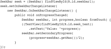
There are two interesting things to notice in this example. The first is that the fromTouch parameter tells the code if the change came from the user input or if, instead, it came from a programmatic change like we demonstrated with the regular ProgressBar widgets. The second interesting thing is that the SeekBar still allows a secondary progress value to be set. In this example, we set the secondary indicator to be halfway between the user’s selected value and the maximum value of the progress bar. You might use this feature to show the progress of a video and the buffer stream.
Although the SeekBar is useful for allowing a user to set a value, such as the volume, the RatingBar has a more specific purpose: showing ratings or getting a rating from a user. By default, this progress bar uses the star paradigm with five stars by default. A user can drag across this horizontal to set a rating. A program can set the value, as well. However, the secondary indicator cannot be used because it is used internally by this particular control.
Here’s an example of an XML layout resource definition for a RatingBar with four stars:

This layout definition for a RatingBar demonstrates setting both the number of stars and the increment between each rating value. Here, users can choose any rating value between 0 and 4.0, but only in steps of 0.25. For instance, they can set a value of 2.25. This is visualized to the users, by default, with the stars partially filled. Figure 6.10 illustrates how the RatingBar behaves.
Although the value is indicated to the user visually, you might still want to show a numeric representation of this value to the user. This can be done by implementing the onRatingChanged() method of the RatingBar.OnRatingBarChangeListener class.

The preceding example shows how to register the listener. When the user selects a rating using the control, a TextView is set to the numeric rating the user entered. One interesting thing to note is that, unlike the SeekBar, the implementation of the onRatingChange() method is called after the change is complete, usually when the user lifts a finger. That is, while the user is dragging across the stars to make a rating, this method isn’t called. It is called when the user stops pressing the control.
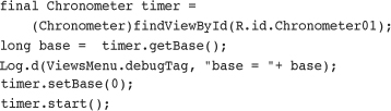
Sometimes you want to show time passing instead of incremental progress. In this case, you can use the Chronometer widget as a timer (Figure 6.11). This might be useful if it’s the user that is taking time doing some task or in a game where some action needs to be timed. The Chronometer widget can be formatted with text, as shown in this XML layout resource definition:


The Chronometer object’s format attribute can be used to put text around the time that displays. A Chronometer won’t show the passage of time until its start() method is called. To stop it, simply call its stop() method. Finally, you can change when the timer is counting from. That is, you can set it to count from a particular time in the past instead of from whenever it’s started. You call the setBase() method to do this.
In this next example code, the timer is retrieved from the View by its resource identifier. We then check its base value and set it to 0. Finally, we start the timer counting up from there.
Displaying the time in an application is often not necessary because Android devices have a status bar to display the current time. However, there are two clock widgets available to display this information, if your application needs them.
First is the DigitalClock widget (Figure 6.11). This widget is a compact text display of the current time in standard numeric format based on the users’ settings. It is a TextView, so anything you can do with a TextView you can do with this widget, except change its text. You can change the color and style of the text, for example.
By default, the DigitalClock widget shows the seconds and automatically updates as each second ticks by. Here is an example of an XML layout resource definition for a DigitalClock widget:

The second clock widget is the AnalogClock (Figure 6.11). This is a dial-based clock that is a basic clock face with two hands, one for the minute and one for the hour. It also updates automatically as each minute passes. The image drawn for the clock scales appropriately with the size of its View.
Here is an example of an XML layout resource definition for an AnalogClock widget:

The AnalogClock widget’s clock face is simple. However you can set its minute and hour hands, and the clock face can be set to specific drawable resources, if you wanted to jazz it up. Neither of these clock widgets accept a different time or a static time to display. They can show only the current time in the current time zone of the device, so they are not particularly useful.
You need to be aware of two special application menus for use within your Android applications: the options menu and the context menu.
The Android SDK provides a method for users to bring up a menu by pressing the menu key from within the application (Figure 6.12). You can use options menus within your application to bring up help, to navigate, to provide additional controls, or to configure options. The OptionsMenu control can contain icons, submenus, and keyboard shortcuts.
For an options menu to show when the user presses the Menu button on their device, you need to override the implementation of onCreateOptionsMenu() in your Activity. Here is a sample implementation that gives the user three menu items to choose from:
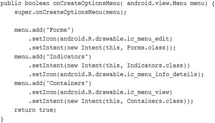
For each of the items that are added, we also set a built-in icon resource and assign an Intent to each item. The item title is given with a regular text string, for clarity. A resource identifier can be used, as well. For this example, there is no other handling or code needed. When one of these menu items is selected, the Activity described by the Intent starts.
This type of options menu can be useful for navigating to important parts of an application such as the help page, from anywhere within your application. Another great use for an options menu is to allow configuration options for a given screen. These options can be configured in the form of checkable menu items. The initial menu that appears when the user presses the menu button does not support checkable menu items. Instead, these menu items must be placed on a SubMenu control, which is a type of Menu that can be configured within a menu. SubMenu objects support checkable items but do not support icons or other SubMenu items. Building on the preceding example, the following is code for programmatically adding a SubMenu control to the previous Menu:

This code would be inserted before the return statement in the implementation of the onCreateOptionsMenu() method. It adds a single menu item with an icon to the previous menu, called “Style.” When the “Style” option is clicked, a pop-up menu with the two items of the SubMenu control is displayed. These items are grouped together and the checkable icon, by default, looks like the radio button icon. The checked state is assigned during creation time.
To handle the event when a menu option item is selected, we also implement the onOptionsItemSelected() method, as shown here:
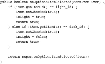
This method must call the super class’s onOptionsItemSelected() method for basic behavior to work. The actual MenuItem object is passed in, and we can use that to retrieve the identifier that we previously assigned to see which one was selected and perform an appropriate action. Here, we switch the values and return. By default, a Menu control will go away when any item is selected, including checkable items. This means it’s useful for quick settings but not as useful for extensive settings where the user might want to change more than one item at a time.
As you add more menu items to your options menu, you might notice that a “More” item automatically appears. This happens whenever six or more items are visible. If the user selects this, the full menu appears. The full, expanded menu doesn’t show menu icons and although checkable items are possible, they should not be done here. Additionally, the full title of an item doesn’t show. The initial menu, also known as the icon menu, shows only a portion of the title for each item. You can assign each item a condensedTitle attribute, which shows instead of a truncated version of the regular title. For example, instead of the title Instant Message, you can set the condensedTitle attribute to “IM.”
The ContextMenu is a subtype of Menu that you can configure to display when a long-press is performed on a View. As the name implies, the ContextMenu provides for contextual menus to display to the user for performing additional actions on selected items.
ContextMenu objects are slightly more complex than OptionsMenu objects. You need to implement the onCreateContextMenu() method of your Activity for one to display. However, before that is called, you must call the registerForContextMenu() method and pass in the View you want to have a context menu for. This means each View on your screen can have a different context menu, which is appropriate as the menus are designed to be highly contextual.
Here we have an example of a Chronometer timer, which responds to a long-click with a context menu:
registerForContextMenu(timer);
After the call to the registerForContextMenu() method has been executed, the user can then long-click on the View to open the context menu. Each time this happens, your Activity gets a call to the onCreateContextMenu() method, and your code creates the menu each time the user performs the long click.
The following is an example of a context menu for the Chronometer widget, as previously used:

Recall that any View widget can register to trigger a call to the onCreateContextMenu() method when a long-press is performed by the user. That means we have to check which View widget it was that the user tried to get a context menu for. Next, we inflate the appropriate menu from a menu resource that we defined with XML. Because we can’t define header information in the menu resource file, we set a stock Android SDK resource to it and add a title. Here is the menu resource that is inflated:

This defines three menu items. If this weren’t a context menu, we could have assigned icons. However, context menus do not support icons, submenus, or shortcuts. For more information on setting Menu resources in XML, see Chapter 5.
Now we need to handle the ContextMenu clicks by implementing the onContextItemSelected() method in our Activity. Here’s an example:

Because we have only one context menu in this example, we find the Chronometer view for use in this method. This method is called regardless of which context menu the selected item is on, though, so you should take care to have unique resource identifiers or keep track of which menu is shown. This can be accomplished because the context menu is created each time it’s shown.
You’ve seen how to do basic event handling in some of the previous widget examples. For instance, you know how to handle when a user clicks on a button. There are a number of other events generated by various actions the user might take. This section briefly introduces you to some of these events.
First, though, we need to talk about the input states within Android.
The Android screen can be in one of two states. The state determines how the focus on View widgets is handled. When touch mode is on, typically only objects such as EditText get focus when selected. Other objects, because they can be selected directly by the user tapping on the screen, won’t take focus but instead trigger their action, if any. When not in touch mode, however, the user can change focus between even more object types. These include buttons and other views that would normally need only a click to trigger their action. In this case, the user would use the arrow keys, trackball, or wheel to navigate between items and select them with the Enter or select keys.
Knowing what mode the screen is in is useful if you want to handle certain events. If, for instance, your application relies on the focus or lack of focus on a particular widget, your application might need to know if the phone is in touch mode because the focus behavior is likely different.
Your application can register to find out when the touch mode changes by using the addOnTouchModeChangeListener() method within android.view.ViewTreeObserver class. Your application needs to implement the ViewTreeObserver.OnTouchModeChangeListener class to listen for these events. Here is a sample implementation:
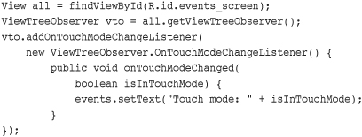
In this example, the top level View in the layout is retrieved. A ViewTreeObserver listens to a View and all its child View objects. Using the top level View of the layout means the ViewTreeObserver listens to events within the entire layout. An implementation of the onTouchModeChanged() method provides the ViewTreeObserver with a method to call when the touch mode changes. It merely passes in which mode the View is now in.
In this example, the mode is written to a TextView named events. We use this same TextView in further event handling examples to visually show on the screen which events our application has been told about. The ViewTreeObserver can enable applications to listen to a few other events on an entire screen.
By running this sample code, we can demonstrate the touch mode changing to true immediately when the user taps on the touch screen. Conversely, when the user chooses to use any other input method, the application reports that touch mode is false immediately after the input event, such as a key being pressed or the trackball or scroll wheel moving.
You saw in the last section how your application can watch for changes to the touch mode state for the screen using the ViewTreeObserver class. The ViewTreeObserver also provides three other events that can be watched for on a full screen or an entire View and all of its children. These are
• PreDraw: Get notified before the View and its children are drawn
• GlobalLayout: Get notified when the layout of the View and its children might change, including visibility changes
• GlobalFocusChange: Get notified when the focus within the View and its children changes
Your application might want to perform some actions before the screen is drawn. You can do this by calling the method addOnPreDrawListener() with an implementation of the ViewTreeObserver.OnPreDrawListener class interface.
Similarly, your application can find out when the layout or visibility of a View has changed. This might be useful if your application is dynamically changing the display contents of a view and you want to check to see if a View still fits on the screen. Your application needs to provide an implementation of the ViewTreeObserver.OnGlobalLayoutListener class interface to the addGlobalLayoutListener() method of the ViewTreeObserver object.
Finally, your application can register to find out when the focus changes between a View widget and any of its child View widgets. Your application might want to do this to monitor how a user moves about on the screen. When in touch mode, though, there might be fewer focus changes than when the touch mode is not set. In this case, your application needs to provide an implementation of the ViewTreeObserver.OnGlobalFocusChangeListener class interface to the addGlobalFocusChangeListener() method. Here is a sample implementation of this:

In this example, the same ViewTreeObserver, vto, and TextView events are used as in the previous example. This shows that both the currently focused View and the previously focused View pass to the listener. From here, your application can perform needed actions.
If your application merely wants to check values after the user has modified a particular View, though, you might need to only register to listen for focus changes of that particular View. This is discussed later in this chapter.
In a previous section discussing the ContextMenu control, you learned that you can add a context menu to a View that is activated when the user performs a long-click on that view. A long-click is typically when users press on the touch screen and hold their finger there until an action is performed. However, a long-press event can also be triggered if the users navigate there with a nontouched, via a keyboard or trackball, method and then hold the Enter or Select key for a while. This action is also often called a press-and-hold action.
Although the context menu is a great typical use case for the long-click event, you can listen for the long-click event and perform any action you want. However, this is the same event that triggers the context menu. If you’ve already added a context menu to a View, you might not want to listen for the long-click event as other actions or side effects might confuse the user or even prevent the context menu from showing. As always with good user interface design, try to be consistent for usability sake.
Tip
Usually a long-click is an alternative action to a standard-click. If a left-click on a computer is the standard click, a long-click can be compared to a right-click.
Your application can listen to the long-click event on any View. The following example demonstrates how to listen for a long-click event on a Button widget.
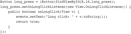
First, the Button object is requested by providing its identifier. Then the setOnLongClickListener() method is called with our implementation of the View.OnLongClickListener class interface. The View that the user long-clicked on is passed in to onLongClick() event handler. Here again we use the same TextView as before to display text saying that a long-click occurred.
In addition to listening for click events, the Android SDK also provides a way to detect gestures that the user performs on the touch screen. Unlike some other events, your application can’t request for events on certain gestures. Instead, your application needs to provide data to the android.view.GestureDetector class.
To provide the data the GestureDetector class needs, you need to provide an implementation of the onTouchEvent() method within your Activity class. The onTouchEvent() method is provided with a MotionEvent object. This contains the data your GestureDetector needs. Simply call your GestureDetector object’s onTouchEvent() method with this data. The following is an example implementation of this:

In addition, you need to instantiate your GestureDetector object. The event listener is assigned through the constructor for the GestureDetector class.
There are two interfaces that you can implement to listen for these events. The first is GestureDetector.OnGestureListener, which requires implementing all methods. The second is GestureDetector.SimpleOnGestureListener, which provides an implementation for all methods, returning false to them so that you can override only those that you actually want to listen to. The following is a list of the possible methods you can implement and the action they represent:
• onDown: Called when the user first presses on the touch screen.
• onShowPress: Called after users first presses the touch screen but before they lift up or move around on the screen; used to visually or audibly indicate that the press has been detected.
• onSingleTapUp: Called when the user lifts up (using the up MotionEvent) from the touch screen as part of a single-tap event.
• onSingleTapConfirmed: Called when a single-tap event occurs.
• onDoubleTap: Called when a double-tap event occurs.
• onDoubleTapEvent: Called when an event within a double-tap gesture occurs, including any down, move, and up MotionEvent.
• onLongPress: Similar to onSingleTapUp, but called if the users hold their finger down long enough to not be a standard click but also don’t move their finger.
• onScroll: Called after users press and then move their finger in a steady motion and lift up.
• onFling: Called after the users press and then move their finger in an accelerating motion before lifting it. This is commonly called a flick gesture and usually results in some motion continuing after the users lift their finger.
The following is a sample implementation that shows listening for onScroll and onFling:
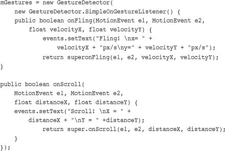
We provide an implementation of the GestureDetector.SimpleOnGestureListener class because we will not be listening for all of the possible events, only onFling and onScroll events. First, we implement the onFling() method so that we can get fling, or flick, events. The first MotionEvent is where the users initially press. The second MotionEvent is where their finger was before they released to generate the flick. The velocities are the final values before they flicked. These can be used by your application to programmatically scroll or animate some displayed object beyond when the users presses on the screen. This is commonly done to scroll quickly by the users with multiple flicks.
Next, we provide an implementation for the onScroll() method. This is called frequently while Android detects scroll events while the users have their finger on the screen. This is different from the fling event in that it is called frequently rather than once. After a bunch of onScroll events, an onFling event can be called, too. Each onScroll() call contains the original MotionEvent in which the users initially click and the MotionEvent in which the users’ finger is currently. The distance is from the last call to onScroll() and not the difference between the two. An object that moved along with the distances provided should track with the users’ finger.
What your application does with the gestures is, of course, up to you. However, using gestures can greatly increase the intuitiveness and fluidness of your application. A good implementation feels natural to the user; a bad implementation can increase user frustration, so tread with care.
We already discussed focus changes for listening for them on an entire screen. All View objects, though, can also trigger a call to listeners when their particular focus state changes. This is done by providing an implementation of the View.OnFocusChangeListener class to the setOnFocusChangeListener() method. The following is an example of how to listen for focus change events with an EditText widget:

In this implementation, we also use a private member variable of type String for mSaveText. After retrieving the EditText view as a TextView, we do one of two things. If the users move focus away from it, we store off the text they entered in mSaveText and set the text to empty. If the users moves to it, though, we restore this text. This has the amusing effect of hiding the text they entered when they are not entering it. This can be useful on a form where multiple, lengthy text entries are needed but you want to provide the users with an easy way to see which one they edit. It is also useful for demonstrating a purpose for the focus listeners on a text entry. Other uses might include validating text they enter after they navigate away or prefilling the text entry the first time they navigate to it with something else they have entered.
The Android devices on the market today have landscape and portrait modes and can seamlessly transition between these orientations. To listen for orientation transitions between modes, use the OrientationEventListener (android.view.OrientationEventListener) to receive SensorManager events when the device orientation changes.
Caution
Versions of the Android SDK prior to 1.5 R1 included a class called OrientationListener, which was used by many to handle screen orientation transitions. This class is now depreciated and should not be used. Additionally, in Android SDK 1.5, the screen will automatically adjust to the new orientation. This happens in a manner similar to a physical event that might have triggered the orientation change, such as the keyboard being slid open on the T-Mobile G1 handset. Developers should be aware that such SDK changes might break application behavior if it already monitored a similar event to the event monitored by the system.
Tip
For those unfamiliar with how orientation sensors work, the Novoda blog provides a helpful Orientation Sensor Cheat Sheet: www.novoda.com/blog/?p=77.
A style is a group of common View attribute values. The style can then be applied to individual View widgets. Styles can include such settings as the font to draw with or the color of text. The specific attributes depend on the View drawn. In essence, though, each style attribute can change the look and feel of the particular object drawn.
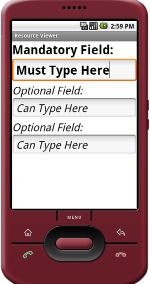
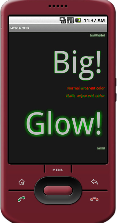
In the previous examples of this chapter, you have seen how XML layout resource files can contain many references to attributes that control the look of TextView objects. You can use a style to define your application’s standard TextView attributes once and then reference to the style either in an XML layout file or programmatically from within Java. For example, in Figure 6.13, we use one style to indicate mandatory form fields and another to indicate optional fields.
As we talked about in Chapter 5, styles are typically defined within the resource file res/values/styles.xml. The XML file consists of a resources tag with any number of style tags, which contain an item tag for each attribute and its value that will be applied with the style.
The following is an example with two different styles:
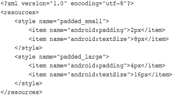
When applied, this style sets the padding to two pixels and the textSize to 8 pixels. The following is an example of how it is applied to a TextView from within a layout resource file:

Styles support inheritance; therefore, styles can also reference another style as a parent. This way, they pick up the attributes of the parent style. The following is an example of how this might be used:

Here you find two common attributes in a single style and a reference to them from the other two styles that have different attributes. Any style can be referenced as a parent style; however, only one style can be set as the style attribute of a View. Applying the padded_italics style that is already defined makes the text 14 pixels in size, italic, red, and padded. The following is an example of applying this style:

As you can see from this example, applying a style with a parent is no different than applying a regular style. In fact, a regular style can be used for applying to Views and used as a parent in a different style.

Here the padded_xlarge style is set as the parent for the green_glow style. All six attributes will then be applied to any view that this style is set to.
A theme is a collection of one or more styles (as defined in the resources) but instead of applying the style to a specific widget, the style is applied to all View objects within a specified Activity. Applying a theme to a set of View objects all at once simplifies making the user interface look consistent and can be a great way to define color schemes and other common widget attribute settings.
An Android theme is essentially a style that is applied to an entire screen. You can specify the theme programmatically by calling the Activity method setTheme() with the style resource identifier. Each attribute of the style will be applied to each View within that Activity, as applicable. Styles and attributes defined in the layout files explicitly override those in the theme.
For instance, consider the following style:
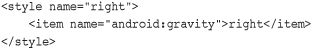
This can be applied as a theme to the whole screen. This would cause any view displayed within that Activity to have its gravity attribute to be right-justified. Applying this theme is as simple as making the method call to the setTheme() method from within the Activity, as shown here.
setTheme(R.style.right);
You can also apply themes to specific Activity instances by specifying them as an attribute within the <activity> element in the AndroidManifest.xml file as follows:
Unlike applying a style in an XML layout file, multiple themes can be applied to a screen. This allows for flexibility in defining style attributes in advance while applying different configurations of them based on what might be displayed on the screen. This is demonstrated in the follow code:
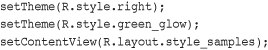
In this example, both the right style and the green_glow style are applied as a theme to the entire screen. You can see the results of green glow and right-aligned gravity, applied to a variety of TextView widgets on a screen, as shown in Figure 6.14. Finally, we set the layout to the Activity. This must be done after setting the themes. That is, all themes must be applied before calling the method setContentView() or the inflate() method so that their attributes can take effect.
A combination of well-designed and thought-out themes and styles can make the look of your application consistent and easy to maintain. Android comes with a number of built-in themes that can be a good starting point. These include such themes as Theme_Black, Theme_Light, and Theme_NoTitleBar_Fullscreen. They are all variations on the system theme, Theme, which built-in apps use.
The Android SDK provides many useful user interface components, which developers can use to create compelling and easy-to-use applications. This chapter introduced you to many of the most useful widgets, discussed how each behaves, how to style them, and how to handle events from the user.
You learned how widgets can be combined to create user entry forms. Important widgets for forms include EditText, Button, RadioButton, CheckBox, and Spinner. You also learned about widgets that can indicate progress or the passage of time to users.
In addition to drawing widgets on the screen, you learned how to detect user actions such as clicks and focus changes and how to handle these events. Finally, you learned how to style individual widgets and how to apply themes to entire screens (or more specifically, a single Activity) so that your application will be styled consistently and thoroughly.
We talked about many common user interface widgets in this chapter; however, there are many others. In Chapter 8, “Drawing and Working with Animation in Android,” and Chapter 12, “Using Android Multimedia APIs,” we use graphics widgets such as ImageView and VideoView to display drawable graphics and videos.
In the next chapter, you learn how to use various layout and container widgets to organize a variety of widgets on the screen easily and accurately. Additionally, you learn how to bind data to widgets to quickly display information to the user from various data sources.