
Chapter 15. Developing for Android tablets
- Working with fragments
- The Action Bar
- Implementing drag and drop
Everything is getting bigger. The way to go now is to program in a little more sophisticantion.
Bill Budge
The year was 2001. Microsoft was the largest technology company in the world and they had debuted their biggest advancement to their ubiquitous operating system: Windows XP Tablet PC Edition. Touch-based computing had arrived, they claimed. We know how that turned out: XP Tablet PC Edition flopped.
In reality, XP Tablet wasn’t the first attempt to bring touch-based computing to a mass market. A decade earlier engineers at Apple developed a prototype to what would one day become the Newton. It was eerily similar to those Tablet PCs that Microsoft would tout 10 years later. That variant of the Newton never saw the light of day, and instead the Newton became the forerunner to the PDA.
To say that touch-based computing was “the next big thing” for years is an understatement. One can argue that the reason these earlier attempts failed was that they tried to evolve the PC into a tablet. Two decades after the Newton-tablet prototype, it became obvious that the smartphone was the natural device for touch-base computing, and the logical ancestor to the tablet. This was the formula for Apple’s iPad and for Android on tablets. The Android 3.0 Honeycomb release marked a radically new version of Android, designed with tablets in mind. So what does this mean for you, the Android developer?
If you already have an app or two on the Android Market, the immediate question to answer is “What should I do for tablets?” Truth be told, the number of tablet users out there will be far less the number of phone users. It takes awhile for a new paradigm such as tablet computing to take hold, whereas there are already millions of smartphone users. It’s likely that you’ll get much more return on your efforts by continuing to invest in Android application development targeting smartphones instead of tablets. This equation holds even truer for brand-new applications. You’ll be able to reach a much larger audience by focusing on smartphone application development.
There are exceptions to this advice. Certain types of applications are a more natural fit for tablets than for smartphones. For example, apps that have lots of rich content to show such as newsreaders, social networking, and shopping apps will greatly benefit from all of that extra space. What might’ve been two or three screens of related content on a smartphone can become a single engaging screen on a tablet. Even for other types of applications, there are significant advantages to being an early mover on the Android Market. Your application can become established with little competition, putting it in a prime position as more users buy tablets and hit the Market looking for great apps to install.
Whether you’re an early adopter or not, at some point you’ll make the decision that it’s time to create a tablet application, or you probably wouldn’t be reading this chapter! In this chapter, we’ll expand on the DealDroid application from chapter 2 and create a tablet application. Figure 15.1 shows you what the finished product looks like.
Figure 15.1. The DealDroid application reimaged on a tablet

Deciding to create a tablet application isn’t a gradual decision; it’ll be a distinct decision to start developing for tablets. This can be an exciting prospect, as many more possibilities are open to developers on a tablet compared to a smartphone. Many of the familiar constraints around screen space, memory, supporting old versions of Android, and network speeds are less of a problem on a tablet. But before you start tossing around Fragments full of StackViews, you might take inventory of what you already have in terms of Android development and figure out how to proceed from there.
15.1. Tablet prep
Tablet development isn’t a matter of using some different APIs and incorporating larger artwork. You need to decide whether you want to create a separate application or expand an existing smartphone application that also works well on a tablet. In this chapter, we’ll focus on the separate application route. This will allow us to take advantage of everything in Android 3.0. It’s possible to leverage all or most of the techniques in this chapter while going the universal application path.
Technique 87: Leveraging existing code using library projects
Because you’re creating a separate application aimed squarely at Android tablets doesn’t imply that your application will be completely different from what you’ve already created for smartphones. The applications will share a lot of functionality. In fact, they’ll probably manage much of the same data. That could be data that’s local to the device, or data that’s stored and retrieved to a server in the cloud. The way that you access such data, and even the way that you organize it once you’ve loaded it into local memory will probably be the same as it was on a smartphone. Fortunately, there’s a smart way to share code between Android applications.
Problem
You want your new tablet application to share code with your existing smartphone application. You want there to be only one copy of this code, so you have one place to add new code, fix bugs, and so on.
Solution
The key to sharing code between Android applications is to use Android library projects. This is a useful way to organize your code that was introduced at the same time as Android 2.2. It’s not specific to tablets and Android 3.0; you can use library projects to share code between multiple smartphone applications as well. The smartphone-plus-tablet application use case is a perfect fit for library projects.
As we’ve already mentioned, library projects were introduced at the same time as Android 2.2. But they were retrofitted to even earlier versions of Android. There’s a chance that you already have your code organized with them and will be able to immediately take advantage of them and start developing a tablet application that leverages your existing smartphone codebase. In that case, you can skip ahead to the next technique. Otherwise, you’ll probably need to do some refactoring and reorganizing of your code.
For our tablet application, we’ll bring the DealDroid application first introduced in chapter 2 to the tablet. All of the code for DealDroid was in a single Android project. We’ll need to do some reorganization of this. Figure 15.2 shows how we’ve reorganized the code so that it can be shared with our new tablet application project.
Figure 15.2. Code organized for sharing with a tablet application

In figure 15.2 you can see the DealsLib project and the TabletDeals project. DealsLib is our Android library project that will contain the code shared between our smartphone and tablet applications. TabletDeals is our tablet application project. We’ll explore it in great detail throughout this chapter. You can see what code was placed in the library project. All of the code for retrieving and parsing data from the Internet (in the com. manning.aip.dealdroid.xml package) was moved to the library. There’s no reason for this code to be any different on a tablet than it was on a smart-phone. When XML data is parsed, the resulting model objects (in the com.manning.aip.dealdroid.model package) are used by the application, so these are also part of the library.
We also see several classes in the top-level package (com.manning.aip. dealdroid). The most interesting of these is the DealsApp class, which is the Application object for both apps. This contains a cache of data as well as the state of the application. This could’ve been different for the tablet application, but in this case it wasn’t. So it made sense to share it between the smart-phone and tablet.
Finally, some resources are shared between the applications. Notably strings.xml and plurals.xml are shared. Other resources such as drawables could be shared as well.
Discussion
Library projects are a powerful tool. This feature was highly requested by developers, especially those who had started writing suites of applications with lots of code shared between various applications. Often, this common code was network access and data model code, similar to our use case. Another common use case was code for authenticating a user, and then managing the resulting identity materials (tokens for authentication and/or authorization). Often this code included some UI, since you usually want to standardize what users see when they log in to your application. There’s no problem with this, as you can include activities, layout XML, and more in a library project. Your library project must also have an AndroidManifext.xml file. You can declare activities, services, and so forth as you would in any other manifest. But, if an application is using a library project and it wants to use an Activity from the library project (or any other component from the library project that must be declared in the manifest), then it must still declare that Activity in its own AndroidManifest.xml file. The manifest of a library project acts more like a menu of components that you can choose from and then declare in your application’s manifest file.
There are other ways to share code between projects. If you’re using Eclipse (or Ant or Maven or anything else that provides dependency management), then you can roll your own library that’s a collection of Java code. Your application will then depend on this other project. It could still be a source-level dependency, or a binary-level dependency where you’d compile the library project first, and maybe even package it into a JAR. The only tricky part is making sure the library code doesn’t use any standard Java classes that aren’t allowed in Android, and having it depend on the appropriate android.jar. These are both handled for you if you use an Android library project.
The other main benefit of an Android library project over the usual Java library is resource management. In our example, we’re including a common strings.xml file. Doing so allows this file to be shared by both the smartphone and tablet versions of the application. You can also override a particular string or add extra strings by having a different strings.xml file in the application project. The compiler will merge the resources. This is also true for other resources like styles and drawables, and even layout files.
Now that we have a smart way to organize our code and share it between our smart-phone and tablet applications, we can start thinking about our tablet application in more detail. As we mentioned earlier, we’ll take the approach of creating an application that’s only meant for tablets. We won’t try to create an application that works equally well on smartphones and tablets. Fortunately, that’s easy and it yields some excellent benefits.
Technique 88: Targeting only tablets
Fragmentation used to be a dirty word to Android developers. The term was usually used by anti-Android pundits to claim that the Android platform was too difficult to develop for because you had to support devices with different screen sizes, and so forth. But this was a hidden strength of Android. The “right” way to develop forced you to not make assumptions about the screen size and geometry. You were given plenty of tools to approach application design with a flexible layout in mind. So as new devices came out with 4 and 4.3 inch screens, or with smaller 2.5 inch screens, most apps worked. Even when the first tablets came out with 7 inch screens and running Android 2.2, most apps (though not all; some developers chose not to follow best practices and made unfortunate assumptions about screen size when creating their layouts) worked with no problems. This was a great selling point for these small tablets. They came to market with a huge number of apps ready to run beautifully on them.
But as larger tablets were being readied, there became some obvious advantages to designing the OS for these large tablets. This was the concept behind Android 3.0. The platform contains all of the ingredients for making applications work equally well on smartphones and tablets, but it now also allows tablet-only applications to shine. In order to do this, you must exclude devices that your tablet application isn’t designed to run on.
Problem
You’re writing a tablet-only application. You want to take advantage of all of the platform capabilities available on tablets, and you want to take advantage of the larger screen. You don’t want to adapt your application to smaller screens, regardless of what version of Android these devices are running.
Solution
You may have already guessed at the solution here. We can use our AndroidManifest.xml file to specify all of the requirements we need for our application to work. Then the Android Market’s application filters will make sure that our application won’t show up for users who don’t have a tablet. The next listing shows the relevant part of our manifest.
Listing 15.1. Target only tablets with the manifest

For our application to only target tablets, we need to require and specify two basic things in the manifest. First, the device
must be running Android 3.0 (Honeycomb) or higher  . Now you might be tempted to stop here. After all, as long as we have API level 11 (Android 3.0) or higher, we’ll have access
to all of the APIs that we’ll use in the code shown in this application. But though Android 3.0 was the latest version of Android and only available on tablets at
the time this book was written, there’s a good chance that there is already (or will be soon) a newer version of Android that
incorporates everything in Android 3.0, but works on both smartphones and tablets. We need to also specify that we only support
xlarge screens
. Now you might be tempted to stop here. After all, as long as we have API level 11 (Android 3.0) or higher, we’ll have access
to all of the APIs that we’ll use in the code shown in this application. But though Android 3.0 was the latest version of Android and only available on tablets at
the time this book was written, there’s a good chance that there is already (or will be soon) a newer version of Android that
incorporates everything in Android 3.0, but works on both smartphones and tablets. We need to also specify that we only support
xlarge screens  . This screen size was introduced with Android 2.3. It translates to screens that are at least seven inches. With these two
requirements specified in your manifest, you can now be sure that any device that runs your app is a tablet with all of the
optimized-for-tablet APIs introduced in Honeycomb.
. This screen size was introduced with Android 2.3. It translates to screens that are at least seven inches. With these two
requirements specified in your manifest, you can now be sure that any device that runs your app is a tablet with all of the
optimized-for-tablet APIs introduced in Honeycomb.
Finally, one more aspect of tablet development should be mentioned. When you’re developing for a smartphone, you probably assume the user will have the device in portrait mode most or all of the time. Fortunately, the OS handles orientation changes in a reasonable way, so even if you forget about landscape mode completely, your application probably works decently when the user rotates the device. It’s a good idea to think about landscape mode as well, and sometimes you’ll even want to create different layouts for landscape. The Android convention is to create a layout-land folder and put the optimized layout XML files there. On the other hand, you might decide not to support landscape at all and only support portrait. There are some advantages to this, though it may not please users with side-sliding keyboards.
A tablet is a different beast than a smartphone, and orientation is one place where they differ greatly. The usual orientation of a tablet is landscape, not portrait. So it’s convention to put landscape-oriented layout files in the /res/layout folder and create a /res/layout-port for portrait layouts. If you’re using the ADT plugin for Eclipse, its UI builder can help you get a feel for tablet development. Figure 15.3 shows an example of this.
Figure 15.3. Building a tablet interface using ADT

Discussion
In many ways, the approach outlined here is different from your typical Android development. Usually, you want to support as many different screen sizes as possible. Here, we’re excluding all screen sizes except one. When the first wave of Android tablets running Honeycomb came out, not only did they all have similar dimensions, they had the same screen resolution: 1280x800. This presented an interesting situation for Android developers who were accustomed to developing for a range of screen sizes and resolutions. Not since the days of the G1 could your application target a single screen geometry (not quite uniform, since the physical sizes were slightly different.) But you shouldn’t be tempted into dredging up the deprecated AbsoluteLayout or start using physical pixels for sizes within a layout.
With library projects, the latest APIs, and large layouts at our fingertips, we’re ready to start developing for Android tablets. We’ll start with the fundamental techniques that the developer of any tablet application should have in their arsenal. We’ll also see how these techniques aren’t applicable to tablets and can easily make their way back into smartphone development as well.
15.2. Tablet fundamentals
Long before Android 3.0 was released, there were Android-powered tablets. These were typically smaller than the early Honeycomb tablets, with screen sizes ranging from five to seven inches. These mini-tablets were interesting in their own right. As mentioned earlier, most Android applications ran well on them. Some looked quite good in fact, thanks to the extra space. Still, you could only describe them as adequate. It’s a testament to Android that you can stretch things out without creating a horrible user experience.
Android 3.0 was designed to be far more than adequate. It didn’t take the approach of getting Android to work properly on a bigger screen. It didn’t bolt on extra UI components. It provided more fundamental changes to help the developer with the task of developing effectively for large screens. We’ll start our examination of the essential techniques for tablet development by looking at one of the most fundamental concepts introduced in Honeycomb: Fragments.
Technique 89: Fragments
Earlier, we talked about how Android 3.0 had was designed for tablets; it wasn’t extra stuff bolted on top of an earlier version of Android. One key feature that demonstrates this is the Fragment API. This represents a new way to organize your application code that makes it much easier to handle the layout challenges created by the large screens of Android tablets. But as we’ll see, the usefulness of this feature isn’t limited to tablet applications.
Problem
You need to modularize your application code so that it can use significantly different layouts in landscape and portrait orientations without having to duplicate code and functionality.
Solution
The solution is to use Fragments to organize your code. Having different layouts for landscape and portrait orientations isn’t a new thing. What makes it different on tablets is the amount of screen space you have. On a smaller-screened smartphone, it’s common for the landscape and portrait layouts to have the same content and functionality. Going from one orientation to the other causes everything to be rearranged in some sensible manner. On a tablet, it’s not unusual to have entirely different components on the screen depending on the layout. Let’s look at a more concrete example.
Recall that our DealDroid application (see chapter 2) allowed the user to view eBay’s Daily Deals. One Activity in the application showed a list of deals, while another showed the details of the deal. With a tablet, we have enough space to show all of this information in a single Activity, but only in landscape orientation. Figure 15.4 shows an example of this.
Figure 15.4. Deals list and details in landscape

This UI pattern of showing a scrollable list on the left side of the screen with details about an individual entry of that list on the right side is common in application development for tablets. Figure 15.5 shows how tapping on an item from the list changes what’s shown in the large detail area.
Figure 15.5. Browsing items from the deals list

Going back to our problem statement of showing different components depending on the orientation of the tablet, figure 15.6 shows what happens if we rotate the tablet into a portrait orientation.
Figure 15.6. Deals list and details in portrait

If you compare figures 15.4 and 15.5, you see that the main details part of the Activity is similar in both landscape and portrait orientations. The kinds of differences shown are similar to those we’re accustomed to in smartphone applications. But the deals lists are completely different. This is what we meant by “significantly different layouts” in our problem statement. This would be an unusual phenomenon in a smart-phone application, but it’s par for the course in a tablet application.
The key to producing this kind of applications is to use Fragments. They allow us to modularize the UI components we’ve seen. The following listing contains the layout for figure 15.4.
Listing 15.2. Deals details layout XML (/res/layout/details.xml)

Hopefully, it’s reassuring to see how simple the layout file is for the details view in our application. It’s a pair of Fragments. The first Fragment shows the list of deals on the right side of the screen. The second Fragment shows the details of the currently selected Fragment. The first Fragment is in the next listing.
Listing 15.3. Fragment for displaying a list of deals (SectionDetailsFragment.java)


Creating a Fragment is as simple as extending android.app.Fragment. In this case, we extend ListFragment, which is a subclass of Fragment. A ListFragment contains a single ListView and is commonly used for lists of items viewed in a split screen layout, as shown in figure 15.4. A Fragment has its own lifecycle that’s tied to the lifecycle of the Activity that hosts it. The host Activity will ask the Fragment for its View by invoking the Fragment’s onCreateView method. We don’t have to worry about this for a ListFragment, as the superclass returns the ListFragment’s ListView for us. Instead, we focus on two other lifecycle methods. The onCreate method is called right after the Activity’s onCreate method is called, but before the Fragment’s onCreateView method is invoked. Here, we choose to restore or set up the state of the Fragment, as you would for an Activity. Some time after the Fragment’s onCreateView is invoked, its onActivityCreated  method will be invoked. As the name suggests, this happens after the Activity is created. This is where we perform all our setup for the ListView
  that’s part of our ListFragment. It’s like any other ListView so we need to provide it with a ListAdapter
  that provides the data and the layout of the items in the ListView.
Note that the last thing we do in the setup of the ListFragment’s UI is to invoke its showDeal method. This is a method for showing a particular deal in the main deals Fragment. As such, we also want to invoke this when an item in the list is tapped. The following listing shows the code for showing deals and tapping items.
Listing 15.4. Showing a particular deal (from SectionDetailsFragment.java)

One of the conveniences of using a ListFragment is that we only need to override its onListItemClick method to handle items from the list being tapped on. In this case, we keep track of the currently selected item in the list. Then, we invoke the same showDeal method mentioned in listing 15.3. We want to tell our other Fragment to display a different deal, so we need to get a handle on that Fragment. To do this, we use the FragmentManager instance that’s available in any Fragment. If you look back at listing 15.2, you can see that we gave the Fragment an ID that we can now use to get a handle on it. Once we have a handle on it, we invoke its showCurrentItem method to tell it to redraw itself. The following listing shows this method and the rest of the DealFragment.
Listing 15.5. Fragment for displaying a deal (DealFragment.java)
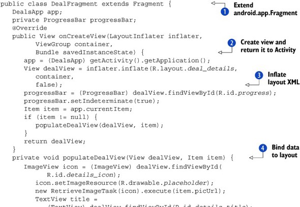

This is another example of a Fragment. This time we directly subclass the Fragment class. We don’t have to worry about managing the state of this Fragment, since it’s tied to the state of the Activity (and the ListFragment in listing 15.3). So we only override its onCreateView method. Note that this callback method gets a LayoutInflater passed into it. We take advantage of this by using it to inflate a layout XML file for this view . Then we need to bind the data from the currently selected deal to the widgets in the layout XML. Finally, we expose the aforementioned showCurrentItem method, so that other Fragments can invoke it. This method checks what the currently selected item is and passes it to the same populateDealView that we used earlier .
When the orientation of the tablet changes and we go into portrait mode, we want to show a different layout, as seen in figure 15.6. The most straightforward way to show a different layout is to have a different layout XML. The portrait layout XML is in the following listing.
Listing 15.6. Layout for portrait orientation (/res/layout-port/details.xml)

The code in listing 15.6 isn’t much different from the code in listing 15.2. It reuses the same Fragment that we looked at, the DealFragment. Reuse is part of the point of Fragments. Note that we haven’t shown the code for the Activity that hosts these Fragments. There’s been no need. The Fragments are self-contained. For our portrait orientation we’ve replaced the SectionDetailsFragment with the FilmstripFragment. The next listing contains the code.
Listing 15.7. Filmstrip of deal images used for selecting a deal (FilmstripFragment.java)


The FilmstripFragment has some similarities to the SectionDetailsFragment from listing 15.3. They both display all of the deals in a given section and allow you to tap on a deal to change the deal’s details shown
by the DealFragment component. We follow a similar pattern to the other Fragments. We start by restoring state in the onCreate method. Then we implement the onCreateView method, inflating a layout XML into a View to return. This time we don’t have a ListView, but a filmstrip–a horizontally scrolling set of images (it is a HorizontalScrollView; see /res/layout-port/filmstrip.xml). All we need to do is populate it with ImageViews backed by a bitmap of the image of a deal. For each ImageView, we need to set an event handler for when the user taps on the image. When this happens, we once again use the FragmentManager API to get a handle on the DealFragment and then invoke its showCurrentItem method .
Discussion
Fragments provide a new way to organize application code. A Fragment can be self-sufficient in most regards. It manages the data that it displays and takes care of its own state. The Fragments shown in our examples also have a dependency on the global state of the application—the Application object for app. These Fragments could be used anywhere within our tablet app, but not outside of it. This is an intentional design decision. Alternatively, you could create Fragments that depend on a Service or Fragments that depend on nothing at all.
Developers were using this kind of pattern in Android well before Fragments were introduced. There was nothing in the Android framework to make it easy. One common pattern is to have UI components that can manage state, retrieve data, and so on. A variation of that pattern is to have the UI components interact directly with a Service that takes care of the heavy lifting. Though some might argue that such patterns are to be avoided, as they break the model-view-controller paradigm, they often prove valuable. Consider having a common header bar that displays some stateful information, such as the number of unread messages or new daily deals. Prior to Fragments, the other common alternative to mixing model code with a UI component was to have some subclass of Activity that managed the state. This base Activity would then be subclassed by all of the activities in the application. Again, there are pros and cons to these alternatives, but Fragments tend to be a much cleaner technique to use than any of these other approaches.
Another popular use case for the base Activity pattern is for handling menus. The base Activity can create a menu that can then show up on all activities. One common reason for this application-level menu is because the menu is often of little value to the developer. If you put anything important in the menu, then you have to put it somewhere else “on the screen” as users often don’t use the menus. Hence the relegation of common utilities (such as About the App, Customer Support, Sign Out, and so forth) in the menu. Honeycomb introduces a much better alternative to the menu, the Action Bar. Our next technique is about how and when to use the Action Bar.
Technique 90: The Action Bar
The menu concept in Android has a lot of merit. You could put many shortcuts and useful things in the menu. You could also put many contextual things in the menu. The big problem is that users may never look in the menu. The Action Bar is an evolution of the menu idea. It has many of the same use cases, but it’s more effective to use because it’s more visible to the end user.
Problem
You want to show extra but useful functions that are contextual to the Activity the user is interacting with. You don’t want to use the standard menu features of Android because of their usability issues.
Solution
The solution is to use the Action Bar. It’s located at the top of the screen, it’s highly visible to the user. This solves the biggest problem of the menu system. Figure 15.7 shows an example of the Action Bar in our tablet application.
Figure 15.7. The Action bar in action!
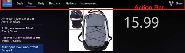
As you can see in the figure, the Action Bar is the top bar on the screen. In our example, it shows the icon of our app, several tabs, and a share button. The application icon allows the user to navigate back to the application’s home screen. The tabs allow the user to change which section of eBay Daily Deals they’re viewing. As figure 15.8 shows, the Share button allows them to share the deal they’re looking at using other applications installed on their device.
Figure 15.8. Sharing a deal on the tablet

If you recall the original DealDroid application, the sharing feature was hidden away in the menu. But that application’s navigation was much more limited than what we now have on the tablet edition. The Action Bar not only solves the menu problem, but it can do much more. We’ll take a look at the navigation tabs shortly, but we’ll start with the application and share icons on the Action Bar. Here’s the code behind these features.
Listing 15.8. Action Bar app and share icons (from DetailsActivity.java)

As you can see from figure 15.8, the Action Bar shows its roots as a menu. To create it, you implement the Activity’s onCreateOptionsMenu lifecycle callback method. You could programmatically create the items on the Action Bar, especially if these elements depend
on the state of the Activity. If not, you can use XML to specify what should be in the menu. Here’s the XML for the Action Bar seen in figure 15.7:
<menu xmlns:android="http://schemas.android.com/apk/res/android">
   <item android:id="@+id/share_action"
      android:title="@string/deal_details_share_menu"
      android:icon="@drawable/ic_menu_share"
      android:showAsAction="ifRoom|withText" />
</menu>
As you can see, it specifies a single item, along with its title and its icon. In our example, both of these are externalized resources, so they could also be localized. Also note that we set the showAsAction attribute. This was introduced in Android 3.0 and gives you options on when to display the menu item as an action and how to display it. You can set this to always, but things could get messy if there isn’t enough room.
Going back to listing 15.8, we define the behavior of the Action Bar (what happens when the user taps on items on it) by implementing the Activity’s onOptionsItemSelected method. This is also how we respond to the user tapping on the application icon in the left corner of the Action Bar. We identify this using the predefined resource ID home and then respond to it by clearing the Activity stack and sending the user to the home screen. Similarly, we identify tapping on the Share button by matching the ID defined in the
menu XML against the ID of the selected MenuItem . In this case, we invoke the shareDealUsingChooser method—the same as the one used in the DealDroid application seen in chapter 2. This will bring up the UI shown in figure 15.8.
Going back to the Action Bar, we’ve now defined how to create the icons on it and how to give them behavior. Now let’s look at how we created the tabs seen in figure 15.7. The next listing shows this code.
Listing 15.9. Creating and managing Action Bar tabs (from DetailsActivity.java)


Starting with Android 3.0, every Activity can have an Action Bar and you can access it via the Activity’s getActionBar method . The idea is to programmatically create tabs and add them to the Action Bar. Each tab will need a TabListener to respond to being tapped on, so we create a single TabListener to use for all of the tabs. We implement its onTabSelected method and invoke the changeTab method based on the position of the tab selected. We’ll take a look at how the changeTab method works momentarily.
Once we have a TabListener instance, we’re ready to create the tabs and add them to the Action Bar. We programmatically create a tab and set its title and its TabListener . Note that we also specify which tab should be currently selected based on what section is currently selected by the user.
Finally, we tell the Action Bar to not display the title of the Activity and to instead show the tabs and use those for navigation.
Now let’s look at the changeTab method that’s invoked via the TabListener’s onTabSelected callback method. This method first checks what orientation the device is currently in . This is because the contents of the Activity will be different based on the orientation. It uses this knowledge along with the Activity’s FragmentManager to get a handle on the Fragment that’s being displayed in the Activity. Then, we set the section on the Fragment  , so it knows which section of Daily Deals to display now.
Discussion
Tabbed navigation isn’t something new and unique to tablets. It’s been a common way to organize web applications for many years and has been a part of Android since 1.0. These have always come via the TabHost and TabWidget classes. The TabHost has allowed you to create a series of tabs, each with its own Activity that will be displayed. The Action Bar tabs is an evolution of this idea, similar to how the other parts of the Action Bar are an evolution of the menu.
With the Action Bar and its tabbed navigation mode, you can create tabs similar to how you create tabs for a TabHost. But instead of associating a single Activity to a tab, you work within a single Activity and use Fragments. In our example, we changed the content of the Fragment that was there. But note that the onTabSelected method was passed a FragmentTransaction object. This would allow you to perform series of operations on the Fragments in the Activity, typically removing one or more Fragments and replacing them one or more other Fragments. The Action Bar not only improves the legacy menu system, but builds on top of Fragments to provide a simpler, but more flexible way to organize your application code.
The last of our essential techniques for tablet development, drag and drop, improves on how users can interact with your application.
Technique 91: Drag and Drop
Product managers have been asking developers for drag and drop ever since Douglas Engelbart invented the mouse. Rich desktop application frameworks have made it an essential ingredient for decades. Drag and drop on the web struggled for years, with some JavaScript frameworks making it more accessible to developers until it finally became part of the HTML 5 specification. On mobile, the frameworks have largely ignored it until Android 3.0. Sure, it could be done via touch APIs, but this was more commonly the realm of game programming. With Honeycomb, drag and drop can be more easily used within any kind of application.
Problem
You want to allow your users to more intuitively interact with your application by enabling drag and drop of various elements.
Solution
To enable drag and drop in an application, we only need to use a handful of APIs introduced in Android 3.0. To demonstrate this we’ll provide a simple drag and drop application. It’ll display StackViews (a new widget introduced in Honeycomb) on a screen and allow the user to rearrange them using drag and drop. Figure 15.9 shows what this application looks like.
Figure 15.9. The Drag and Drop demo application

As you can see this is a simple grid with a couple of StackView widgets. Here’s the code for this layout.
Listing 15.10. Drag and drop grid layout XML


Listing 15.10 shows that we’re using a TableLayout . There’s nothing special about a TableLayout; it’s an easy way to identify the various parts of the screen for a demonstration like this. Within each cell of the table
we have a LinearLayout . Again there’s nothing special about LinearLayout; we needed some kind of container that other Views could be dragged and dropped in to. Those other Views in this case are StackViews . Again, there’s nothing unique about them when it comes to drag and drop. In fact, it would’ve been simpler to not use them,
but they’re visually interesting widgets so they’re good for tablet applications.
The key idea in this application is to allow the user to drag and drop the StackViews into the various LinearLayout containers on the screen. To start dragging and dropping, the user will tap and hold (long click) a stack, causing all of the drop zones to be highlighted. Figure 15.10 shows the drop zones ready to have a stack dragged in to them.
Figure 15.10. Drop zones active

Everything else in the application is done programmatically. The next listing shows the code for creating the UI.
Listing 15.11. Setting up the UI


The first thing we do to set up our UI is get a reference to one of the StackViews. We then load image resources that are part of the application . As you can tell from figures 15.9 and 15.10 as well as the code in listing 15.11, each of the images used for the StackView is an icon representing the various releases of Android up to Honeycomb. These images are decoded into Bitmap objects and then passed in to a custom Adapter for the StackView. A StackView is an Adapter-based widget like a ListView or a GridView. We’ll take a look at this custom Adapter in listing 15.12. Finally, we get a handle on each of the LinearLayout containers from listing 15.10, and we give them an OnDragListener object . This is a new interface introduced in Android 3.0 and we’ll look at our implementation of it in listing 15.13. For now, let’s look at the custom Adapter for our StackViews.
Listing 15.12. Adapter used for the StackViews in the application


As mentioned earlier, a StackView is like a ListView or GridView. It uses the same kind of Adapter, so we extend the BaseAdapter class. Everything else is like any other Adapter. In fact, we could use the ImgAdapter in listing 15.12 with a ListView or a GridView. Nothing is specific to StackView. The only special code is for enabling drag and drop. To do this, we set the OnLongClickListener for the StackView. This is when we want to initiate dragging. We don’t want to drag and drop the individual ImageViews in the StackView; we want to drag and drop the StackView itself. That’s why we kept a reference to the StackView called owner. Here, we call its startDrag method , a method added to android.view.View in Honeycomb. This is how to initiate dragging on the StackView. Note that one of the parameters to startDrag is a DragShadowBuilder instance. This is a class responsible for drawing a shadow of the View being dragged on the screen. We’re using a default DragShadowBuilder. It will show the View that we passed to it in its constructor. This could be an expensive object to show, in which case you’d want to subclass
DragShadowBuilder and provide your own custom drag shadow. Alternatively, if you use the default one but don’t pass it a View in its constructor, then it’ll draw no shadow at all.
You might’ve noticed in listing 15.13 that we also passed in a ClipData object to the startDrag method. If so, you probably also noticed that we put junk in this object. ClipData is useful when some more complicated piece of data is being represented by the View that you’re dragging and dropping in your application. For example, the View might represent a contact object that your application is helping the user organize. ClipData provides a convenient way to attach a pointer to the dragged View that provides a references back to the complex object. You’ll also need to use ClipData if you want to provide customized copy-and-paste in your application.
Once we’ve initiated the dragging of a StackView in our application, we need to deal with dropping it in one of the LinearLayout containers in the application. Here’s how this is done by the OnDragListener set earlier.
Listing 15.13. Implementing the OnDragListener for containers

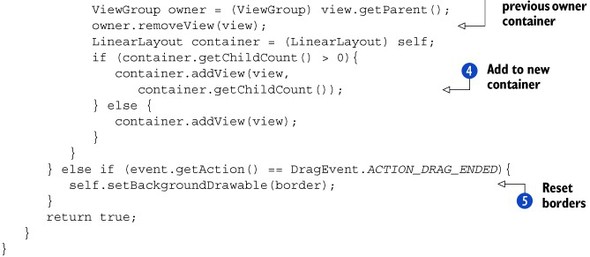
Each container in our application uses an instance of the OnDragListener class shown in listing 15.13. The container needs to keep track of whether a dragged View is currently inside the container, so we use a Boolean flag to do this . When dragging starts, we set the border of our container to red to indicate that this container can accept a dragged View into it. Next, we keep track of the ENTERED/EXIT events by using our Boolean flag. When a drop event is fired, we need to do two things. First, we need to remove the dragged View from its previous owner. Then, we need to add the dragged View to its new owner . Finally, when we see that the dragging has ended, we revert border of our container back to whatever it was before we turned it red. Note that we don’t care what kind of View is being dragged and dropped into our container. Also note that if we had a container and we didn’t want it to participate
in drag and drop, we don’t set its OnDragListener. Then its borders won’t turn red and it won’t accept a View being dropped into it.
Discussion
There’s a good reason why application developers are always being asked to provide drag and drop capabilities in their applications. For any kind of application, drag and drop provides a more intuitive way to interact with the application. In the past, this meant dragging and dropping with a mouse for desktop and web applications. Even with the artificial construct of a mouse, drag and drop remained intuitive.
Now we’re in the age of touch computing, and smartphones have led the way. We haven’t seen a lot of drag and drop in this area, and not because frameworks like Android didn’t provide much for it. Drag and drop is a little awkward on a small screen. The places where you can tap to drag and or drop tend to be small, and not so easy to use. But tablets change things here significantly. The awkwardness introduced by the small screens on smartphones is gone. Tablets have large screens so you can tap on exactly what you want to interact with. Furthermore, a touch-based interface is so much more natural for dragging and dropping than a mouse-based one. Drag and drop with a mouse mimics a hand grabbing and moving something in real life. Drag and drop on a tablet doesn’t have to mimic a hand because it involves a real human hand interacting with the objects on the screen.
The possibilities for creating intuitive human interfaces using drag and drop on a tablet application are endless and appealing. There are still some challenges. As drag and drop hasn’t been prevalent in touch computing (smartphones), there are no well-known affordances to indicate that drag and drop is possible in an application. In our example application, we used tap and hold, or the long click as Android developers know it. This initiated dragging. We didn’t want to initiate drag and drop from any tap on the StackView. That would’ve prevented the user from swiping through the images in the StackView, and it might become annoying if every time the user touched the screen, the borders on the containers went red in anticipation of drag and drop. But, we’re not trying to suggest that tap and hold will become the ubiquitous way to initiate drag and drop in tablet applications. Another possibility that jumps out is to have an Edit button (perhaps on the Action Bar) as a way to turn on drag-and-drop mode, and then to allow taps to initiate dragging on an object.
15.3. Summary
As you’re undoubtedly aware, Android wasn’t the first smartphone platform to be extended to tablets. Android’s success in touch-based computing on smartphones made it an obvious choice for tablets as well. But as you can see from this chapter, the Android team didn’t rest on their laurels. Instead, a number of significant advancements were made in Android with tablets specifically in mind. The biggest of these is the introduction of Fragments. As we mentioned earlier, the need to create more self-contained components in Android didn’t come from tablets. It had already existed, and many application developers had already come up with various solutions for this problem. The need for user interfaces that made better use of large screens in different orientations accentuated this missing piece to Android, and Fragments fill that void. Fragments, and the other essential parts of tablet development explained here—the Action Bar and drag and drop—are also available in earlier versions of Android via the Android Compatibility package.
Finally, it’s good to note that this chapter isn’t exhaustive in detailing all of the changes to Android in Honeycomb. Most of those changes were meant to help application developers build for tablets, so all of them are relevant to this chapter. But we’ve chosen to focus on the essential techniques that the developers of any tablet application should keep in mind. That’s not meant to detract from the other features. For example, we’ve completely ignored several new features that are of great benefit to game developers, such as Renderscript. We’ve also not gone in to the improvements in RemoteViews that allow for improved home screen widgets and notifications. These are all important features that may be crucial to you depending on what your application is going to do. As always, the Android documentation provides great detail on these API and behavioral improvements. And with that, you’ve made it! You’ve gone from kicking the tires with Hello Android in chapter 1, through many advanced topics and over 80 techniques, to racing down the track with tablets. You should now have a very solid footing for developing Android applications, so pat yourself on the back!