
Game Design: The Pen Is Mightier Than the Code
As we said earlier, it is rather tempting to fire up the IDE and just hack together a nice tech demo. This is OK if you want to prototype experimental game mechanics and see if those actually work. However, once you do that, throw away the prototype. Pick up a pen and some paper, sit down in a comfortable chair, and think through all high-level aspects of your game. Don't concentrate on technical details yet—you'll do that later on. Right now, you want to concentrate on designing the user experience of your game. The best way to do this is by sketching up the following things:
- The core game mechanics, including a level concept if applicable.
- A rough backstory with the main characters.
- A list of items, powerups, or other things that modify the characters, mechanics, or environment if applicable.
- A rough sketch of the graphics style based on the backstory and characters.
- Sketches of all the screens involved as well as diagrams of transitions between screens, along with transition triggers (for example, for the game-over state).
If you've peeked at the Table of Contents, you know that we are going to implement Snake on Android. Snake is one of the most popular games ever to hit the mobile market. If you don't know about Snake already, look it up on the Web before reading on. I'll wait here in the meantime…
Welcome back. So, now that you know what Snake is all about, let us pretend we just came up with the idea ourselves and start laying out the design for it. Let's begin with the game mechanics.
Core Game Mechanics
Before we start, here's a list of what we need:
- A pair of scissors
- Something to write with
- Plenty of paper
In this phase of our game design, everything's a moving target. Instead of carefully crafting nice images in Paint, Gimp, or Photoshop, we suggest you create basic building blocks out of paper and rearrange them on a table until they fit. You can easily change things physically without having to cope with a silly mouse. Once you are OK with your paper design, you can take photos or scan the design in for future reference. Let's start by creating those basic blocks of our core game screen. Figure 3–12 shows you our version of what is needed for our core game mechanics.

Figure 3–12. Game design building blocks
The leftmost rectangle is our screen, roughly the size of a Nexus One screen. That's where we'll place all the other elements. The next building blocks are two buttons that we'll use to control the snake. Finally, there's the snake's head, a couple of tail parts, and a piece it can eat. We also wrote out some numbers and cut them out. Those will be used to display the score. Figure 3–13 illustrates our vision of the initial playing field.

Figure 3–13. The initial playing field
Let's define the game mechanics:
- The snake advances in the direction in which its head is pointed, dragging along its tail. Head and tail are composed of equally-sized parts that do not differ much in their visuals.
- If the snake goes outside the screen boundaries, it reenters the screen on the opposite side.
- If the right or left button is pressed, the snake takes a 90-degree clockwise (right) or counterclockwise (left) turn.
- If the snake hits itself (for example, a part of its tail), the game is over.
- If the snake hits a piece with its head, the piece disappears, the score is increased by 10 points, and a new piece appears on the playing field in a location that is not occupied by the snake itself. The snake also grows by one tail part. That new tail part is attached to the end of the snake.
This is quite a complex description for such a simple game. Note that we ordered the items somewhat in ascending complexity. The behavior of the game when the snake eats a piece on the playing field is probably the most complex one. More elaborate games cannot, of course, be described in such a concise manner. Usually, you'd split these up into separate parts and design each part individually, connecting them in a final merge step at the end of the process.
The last game mechanics item has this implication: the game will end eventually, as all spaces on the screen will be used up by the snake.
Now that our totally original game mechanics idea looks good, let's try to come up with a backstory for it.
A Story and an Art Style
While an epic story with zombies, spaceships, dwarves, and lots of explosions would be fun, we have to realize that we are limited in resources. Our drawing skills, as exemplified in Figure 3–12, are somewhat lacking. We couldn't draw a zombie if our lives depended on it. So we did what any self-respecting indie game developer would do: resorted to the doodle style, and adjusted the settings accordingly.
Enter the world of Mr. Nom. Mr. Nom is a paper snake who's always eager to eat drops of ink that fall down from an unspecified source on his paper land. Mr. Nom is utterly selfish, and he has only a single, not-so-noble goal: becoming the biggest ink-filled paper snake in the world!
This little backstory allows us to define a few more things:
- The art style is doodly. We will actually scan in our building blocks later and use them in our game as graphical assets.
- As Mr. Nom is an individualist, we will modify his blocky nature a little and give him a proper snake face. And a hat.
- The digestible piece will be transformed into a set of ink stains.
- We'll trick out the audio aspect of the game by letting Mr. Nom grunt each time he eats an ink stain.
- Instead of going for a boring title like “Doodle Snake,” let us call the game “Mr. Nom,” a much more intriguing title.
Figure 3–14 shows Mr. Nom in his full glory, along with some ink stains that will replace the original block. We also sketched a doodly Mr. Nom logo that we can reuse throughout the game.

Figure 3–14. Mr. Nom, his hat, ink stains, and the logo
Screens and Transitions
With the game mechanics, backstory, characters, and art style fixed, we can now design our screens and the transitions between them. First, however, it's important to understand exactly what makes up a screen:
- A screen is an atomic unit that fills the entire display, and it is responsible for exactly one part of the game (for example, the main menu, the settings menu, or the game screen where the action is happening).
- A screen can be composed of multiple components (for example, buttons, controls, head-up displays, or the rendering of the game world).
- A screen allows the user to interact with the screen's elements. These interactions can trigger screen transitions (for example, pressing a New Game button on the main menu could exchange the currently active main menu screen with the game screen or a level-selection screen).
With those definitions, we can put on our thinking caps and design all of the screens of our Mr. Nom game.
The first thing our game will present to the player is the main menu screen. What makes a good main menu screen?
- Displaying the name of our game is a good idea in principle, so we'll put in the Mr. Nom logo.
- To make things look more consistent, we also need a background. We'll reuse the playing field background for this.
- Players will usually want to play the game, so let's throw in a Play button. This will be our first interactive component.
- Players want to keep track of their progress and awesomeness, so we'll also add a high-score button, another interactive component.
- There might be people out there that don't know Snake. Let's give them some help in the form of a Help button that will transition to a help screen.
- While our sound design will be lovely, some players might still prefer to play in silence. Giving them a symbolic toggle button to enable and disable the sound will do the trick.
How we actually lay out those components on our screen is a matter of taste. You could start studying a subfield of computer science called human computer interfaces (HCI) to get the latest scientific opinion on how to present your application to the user. For Mr. Nom, that might be a little overkill, though. We settled with the simplistic design shown in Figure 3–15.
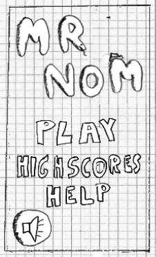
Figure 3–15. The main menu screen
Note that all of these elements (the logo, the menu buttons, and so forth) are all separate images.
We get an immediate advantage by starting with the main menu screen: we can directly derive more screens from the interactive components. In Mr. Nom's case, we will need a game screen, a high-scores screen, and a help screen. We get away with not including a settings screen since the only setting (sound) is already present on the main screen.
Let's ignore the game screen for a moment and concentrate first on the high-scores screen. We decided that high scores will be stored locally in Mr. Nom, so we'll only keep track of a single player's achievements. We also decided that only the five highest scores will be recorded. The high-scores screen will therefore look like Figure 3–16, showing the “HIGHSCORES” text at the top, followed by the five top scores and a single button with an arrow on it to indicate that you can transition back to something. We'll reuse the background of the playing field again because we like it cheap.
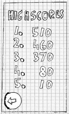
Figure 3–16. The high-scores screen
Next up is the help screen. It will inform the player of the backstory and the game mechanics. All of that information is a bit too much to be presented on a single screen. Therefore, we'll split up the help screen into multiple screens. Each of these screens will present one essential piece of information to the user: who Mr. Nom is and what he wants, how to control Mr. Nom to make him eat ink stains, and what Mr. Nom doesn't like (namely eating himself). That's a total of three help screens, as shown in Figure 3–17. Note that we added a button to each screen to indicate that there's more information to be read. We'll hook those screens up in a bit.

Finally, there's our game screen, which we already saw in action. There are a few details we left out, though. First, the game shouldn't start immediately; we should give the player some time to get ready. The screen will therefore start off with a request to touch the screen to start the munching. This does not warrant a separate screen; we will directly implement that initial pause in the game screen.
Speaking of pauses, we'll also add a button that allows the user to pause the game. Once it's paused, we also need to give the user a way to resume the game. We'll just display a big Resume button in that case. In the pause state, we'll also display another button that will allow the user to return to the main menu screen.
In case Mr. Nom bites his own tail, we need to inform the player that the game is over. We could implement a separate game-over screen, or we could stay within the game screen and just overlay a big “Game Over” message. In this case, we'll opt for the latter. To round things out, we'll also display the score the player achieved, along with a button to get back to the main menu.
Think of those different states of the game screen as subscreens. We have four subscreens: the initial get-ready state, the normal game-playing state, the paused state, and the game-over state. Figure 3–18 shows these subscreens.

Figure 3–18. The game screen and its four different states
Now it's time to hook the screens together. Each screen has some interactive components that are made for transitioning to another screen.
- From the main menu screen, we can get to the game screen, the high-scores screen, and the help screen via their respective buttons.
- From the game screen, we can get back to the main screen either via the button in the paused state or the button in the game-over state.
- From the high-scores screen, we can get back to the main screen.
- From the first help screen, we can go to the second help screen; from the second to the third; and from the third to the fourth; from the fourth, we'll return back to the main screen.
That's all of our transitions! Doesn't look so bad, does it? Figure 3–19 visually summarizes all of the transitions, with arrows from each interactive component to the target screen. We also put in all of the elements that comprise our screens.

Figure 3–19. All design elements and transitions
We have now finished our first full game design. What's left is the implementation. How do we actually make this design into an executable game?
NOTE: The method we just used to create our game design is fine and dandy for smaller games. This book is called Beginning Android Games, so it's a fitting methodology. For larger projects, you will most likely work on a team, with each team member specializing in one aspect. While you can still apply the methodology described here in that context, you might need to tweak and tune it a little to accommodate the different environment. You will also work more iteratively, constantly refining your design.