
Creating the Assets
Our new game has two types of graphical assets: UI elements and actual game, or world, elements. Let's start with the UI elements.
The UI Elements
The first thing to notice is that the UI elements (buttons, logos, and so forth) do not depend on our pixel-to-world unit mapping. As in Mr. Nom, we design them to fit a target resolution—in our case 320×480 pixels. Looking at Figure 9–2, we can determine which UI elements we have.
The first UI elements we create are the buttons we need for the different screens. Figure 9–4 shows all the buttons of our game.
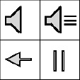
Figure 9–4. Various buttons, each 64×64 pixels in size.
We prefer to create all graphical assets in a grid with cells having sizes of 32×32 or 64×64 pixels. The buttons in Figure 9–4 are laid out in a grid with each cell having 64×64 pixels. The buttons in the top row are used on the main menu screen to signal whether sound is enabled or not. The arrow at the bottom left is used in a couple of screens to navigate to the next screen. The button in the bottom right is used in the game screen when the game is running to allow the user to pause the game.
You might wonder why there's no arrow pointing to the right. Remember that, with our fancy sprite batcher, we can easily flip things we draw by specifying negative width and/or height values. We'll use that trick for a couple of graphical assets to save some memory.
Next up are the elements we need on the main menu screen. There we have a logo, the menu entries, and the background. Figure 9–5 shows all those elements.

Figure 9–5. The background image, the main menu entries, and the logo.
The background image is used not only on the main menu screen, but on all screens. It is the same size as our target resolution, 320×480 pixels. The main menu entries make up 300×110 pixels. The black background you see in Figure 9–5 is there since white on white wouldn't look all that good. In the actual image, the background is made up of transparent pixels, of course. The logo is 274×142 pixels with some transparent pixels at the corners.
Next up are the help screen images. Instead of compositing each of them with a couple of elements, we lazily made them all full-screen images of size 320×480 instead. That will reduce the size of our drawing code a little while not adding a lot to our program's size. You can see all of the help screens in Figure 9–2. The only thing we'll composite these images with is the arrow button.
For the high-scores screen, we'll reuse the portion of the main menu entries image that says HIGHSCORES. The actual scores are rendered with a special technique we'll look into later on in this chapter. The rest of that screen is again composed of the background image and a button.
The game screen has a few more textual UI elements, namely the READY? label, the menu entries for the paused state (RESUME and QUIT), and the GAME OVER label. Figure 9–6 shows them in all their glory.
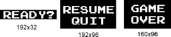
Figure 9–6. The READY?, RESUME, QUIT, and GAME OVER labels
Handling Text with Bitmap Fonts
So, how do we render the other textual elements in the game screen? With the same technique we used in Mr. Nom to render the scores. Instead of just having numbers, we also have characters now. We use an image atlas where each subimage represents one character (for example, 0 or a). This image atlas is called a bitmap font. Figure 9–7 shows the bitmap font we'll use.
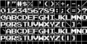
Figure 9–7. A bitmap font.
The black background and the grid in Figure 9–7 are, of course, not part of the actual image. Bitmap fonts are a very old technique to render text on the screen in a game. They usually contain images for a range of ASCII characters. One such character image is referred to as a glyph. ASCII is one of the predecessors of Unicode. There are 128 characters in the ASCII character set, as shown in Figure 9–8.
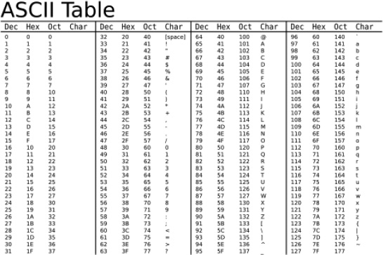
Figure 9–8. ASCII characters and their decimal, hexadecimal, and octal values.
Out of those 128 characters, 96 are printable (characters 32 to 127). Our bitmap font only contains printable characters. The first row in the bitmap font contains the characters 32 to 47; the next row contains the characters 48 to 63, and so on. ASCII is only useful if you want to store and display text that uses the standard Latin alphabet. There's an extended ASCII format that uses the values 128 to 255 to encode other common characters of Western languages, such as ö or é. More expressive character sets (for example, for Chinese or Arabic) are represented via Unicode and can't be encoded via ASCII. For our game, the standard ASCII character set suffices.
So, how do we render text with a bitmap font? That turns out to be really easy. First, we create 96 texture regions, each mapping to a glyph in the bitmap font. We can store those texture regions in an array as follows:
TextureRegion[] glyphs = new TextureRegion[96];
Java strings are encoded in 16-bit Unicode. Luckily for us, the ASCII characters we have in our bitmap font have the same values in ASCII and Unicode. To fetch the region for a character in a Java string, we just need to do this:
int index = string.charAt(i) - 32;
This gives us a direct index into the texture region array. We just subtract the value for the space character (32) from the current character in the string. If the index is smaller than zero or bigger than 95, we have a Unicode character that is not in our bitmap font. Usually, we just ignore such a character.
To render multiple characters in a line, we need to know how much space there should be between characters. The bitmap font in Figure 9–7 is a so-called fixed-width font.
That means that each glyph has the same width. Our bitmap font glyphs have a size of 16×20 pixels each. When we advance our rendering position from character to character in a string, we just need to add 20 pixels. The number of pixels we move the drawing position from character to character is called advance. For our bitmap font, it is fixed; however, it is generally variable depending on the character we draw. A more complex form of advance takes both the current character we are about to draw and the next character into consideration for calculating the advance. This technique is called kerning, if you want to look it up on the Web. We'll only use fixed-width bitmap fonts, as they make our lives considerably easier.
So, how did we generate that ASCII bitmap font? We used one of the many tools available on the Web for generating bitmap fonts. The one we used is called Codehead's Bitmap Font Generator, and it is freely available. You can select a font file on your hard drive and specify the height of the font, and the generator will produce an image from it for the ASCII character set. The tool has a lot more options that we can't discuss here. We recommend that you check it out and play around with it a little.
We'll draw all the remaining strings in our game with this technique. Later, you'll see a concrete implementation of a bitmap font class. Let's get on with our assets.
With the bitmap font, we now have assets for all our graphical UI elements. We will render them via a SpriteBatcher using a camera that sets up a view frustum that directly maps to our target resolution. This way we can specify all the coordinates in pixel coordinates.
The Game Elements
What are left are the actual game objects. Those are dependent on our pixel-to-world unit mappings, as discussed earlier. To make the creation of those as easy as possible, we used a little trick: we started each drawing with a grid of 32×32 pixels per cell. All the objects are centered in one or more such cells, so that they correspond easily with the physical sizes they have in our world. Let's start with Bob, depicted in Figure 9–9.
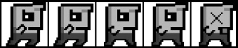
Figure 9–9. Bob and his five animation frames.
Figure 9–9 shows two frames for jumping, two frames for falling, and one frame for being dead. Each image is 160×32 pixels in size, and each animation frame is 32×32 pixels in size. The background pixels are transparent.
Bob can be in three states: jumping, falling, and dead. We have animation frames for each of these states. Granted, the difference between the two jumping frames is minor—only his forelock is wiggling. We'll create an Animation instance for each of the three animations of Bob, and we'll use them for rendering according to his current state. We also don't have duplicate frames for Bob heading left. As with the arrow button, we'll just specify a negative width with the SpriteBatcher.drawSprite() call to flip Bob's image horizontally.
Figure 9–10 depicts the evil squirrel. We have two animation frames again, so the squirrel appears to be flapping its evil wings.
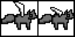
Figure 9–10. An evil flying squirrel and its two animation frames.
The image in Figure 9–10 is 64×32 pixels, and each frame is 32×32 pixels.
The coin animation in Figure 9–11 is special. Our keyframe sequence will not be 1, 2, 3, 1, but 1, 2, 3, 2, 1. Otherwise, the coin would go from its collapsed state in frame 3 to its fully-extended state in frame 1. We can conserve a little space by reusing the second frame.
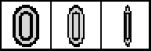
Figure 9–11. The coin and its animation frames.
The image in Figure 9–11 is 96×32 pixels, and each frame is 32×32 pixels.
Not a lot has to be said about the spring image in Figure 9–12. The spring just sits there happily in the center of the image.

Figure 9–12. The spring. The image is 32×32 pixels.
The castle in Figure 9–13 is also not animated. It is bigger than the other objects (64×64 pixels).
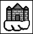
Figure 9–13. The castle.
The platform in Figure 9–14 (64x64 pixels) has four animation frames. According to our game mechanics, some platforms will be pulverized when Bob hits them. We'll play back the full animation of the platform in that case once. For static platforms, we'll just use the first frame.

Figure 9–14. The platform and its animation frames.
Texture Atlas to the Rescue
That's all the graphical assets we have in our game. We already talked about how textures need to have power-of-two widths and heights. Our background image and all the help screens have a size of 320×480 pixels. We'll store those in 512×512-pixel images so that we can load them as textures. That's already six textures.
Do we create separate textures for all the other images as well? No. We create a single texture atlas. It turns out that everything else fits nicely in a single 512×512 pixel atlas, which we can load as a single texture—something that will make the GPU really happy, since we only need to bind one texture for all game elements, except the background and help screen images. Figure 9–15 shows the atlas.
The image in Figure 9–15 is 512×512 pixels in size. The grids and red outlines are not part of the image, and the background pixels are transparent. This is also true for the black background pixels of the UI labels and the bitmap font. The grid cells are 32×32 pixels in size. The cool thing about using a texture atlas like this is that, if you want to support higher resolution screens, you don't need to change anything but the size of this texture atlas! Scale it up to 1024×1024 with higher-fidelity graphics and, even though our target was 320×480, OpenGL gives you the better graphics with no game changes!
We placed all the images in the atlas at corners with coordinates that are multiples of 32. This makes creating TextureRegions easier.
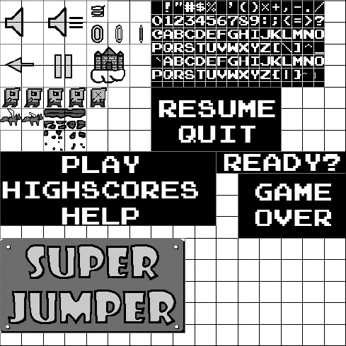
Figure 9–15. The mighty texture atlas.
Music and Sound
We also need sound effects and music. Since our game is an 8-bit retro-style game, it's fitting to use so-called chip tunes. Chip tunes are sound effects and music generated by a synthesizer. The most famous chip tunes were generated by Nintendo's NES, SNES, and GameBoy. For the sound effects, we used a tool called sfxr, by Tomas Pettersson (or rather the Flash version, called as3sfxr). It can be found at www.superflashbros.net/as3sfxr. Figure 9–16 shows its user interface.

Figure 9–16.as3sfxr, a Flash port of sfxr, by Tomas Pettersson.
We created sound effects for jumping, hitting a spring, hitting a coin, and hitting a squirrel. We also created a sound effect for clicking UI elements. All we did was mash the buttons to the left of as3sfxr for each category until we found a fitting sound effect.
Music for games is usually a little bit harder to come by. There are a few sites on the Web that feature 8-bit chip tunes fitting for a game like Super Jumper. We'll use a single song called “New Song,” by Geir Tjelta. The song can be found at www.freemusicarchive.org. It's licensed under the Creative Commons Attribution-NonCommercial-NoDerivatives (a.k.a. Music Sharing) license. This means we can use it in noncommercial projects, such as our open source Super Jumper game, as long as we give attribution to Geir and don't modify the original piece. When you scout the Web for music to be used in your games, always make sure that you adhere to the license. People put a lot of work into those songs. If the license doesn't fit your project (that is, if it is a commercial one), then you can't use it.