In the previous chapter, you built your first multiview application. In this chapter, we’ll build another one—this time, creating a full tab bar application with five different tabs and five different content views. Building this application reinforces a lot of what we covered in Chapter 6. We’ll use those five content views to demonstrate a type of iOS control not yet covered, a picker view, or just a picker. You may not be familiar with the name, but you’ve almost certainly used a picker if you own an iPhone or iPod touch for more than 10 minutes. Pickers contain controls with dials that spin. You use them to input dates in the Calendar application or to set a timer in the Clock application, as shown in Figure 7-1. It is not quite as common on an iPad, since the larger display lets you present other ways of choosing among multiple items, but even there, it’s used by the Calendar application.

Figure 7-1. The Clock app uses a picker to set the time the alarm should go off
Pickers provide a bit more complexity than the iOS controls we’ve seen so far; and as such, they deserve a little more attention. Pickers can be configured to display one dial or many. By default, pickers display lists of text, but they can also be made to display images.
The Pickers Application
This chapter’s application, Pickers, features a tab bar and as you build Pickers, you’ll change the default tab bar so that it has five tabs, add an icon to each of the tab bar items, and then create a series of content views and connect each view to a tab. The application’s content views feature five different pickers:
Date picker:The first content view we’ll build uses a date picker, the easiest type of picker to implement (see Figure 7-2). The view also has a button that, when tapped, displays an alert showing the date that was picked.

Figure 7-2. The first tab displays a date picker
Single-component picker: The second tab features a picker with a single list of values, as shown in Figure 7-3 and provides a little more work to implement than the date picker. You’ll learn how to specify the values to be displayed in the picker by using a delegate and a data source.

Figure 7-3. A picker displaying a single list of values
Multicomponent picker: In the third tab, we’ll create a picker with two separate wheels. The technical term is picker component. Here, we create a picker with two components. You’ll see how to use the data source and delegate by providing two independent lists of data to the picker (see Figure 7-4), each changeable without impacting the other one.
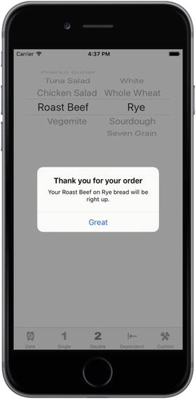
Figure 7-4. A two-component picker, showing an alert that reflects our selection
Picker with dependent components: In the fourth content view, we’ll build another picker with two components. But this time, the values displayed in the component on the right change based on the value selected in the component on the left. In our example, we’re going to display a list of states in the left component and a list of that state’s ZIP codes in the right component, as shown in Figure 7-5.
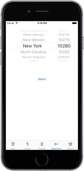
Figure 7-5. In this picker, one component depends on the other. As you select a state in the left component, the right component changes to a list of ZIP codes in that state
Custom pickerwith imageswwwww In the fifth content view, I’ll demonstrate how to add image data to a picker, and we’re going to do it by writing a little game that uses a picker with five components. Apple’s documentation describes the picker’s appearance as looking a bit like a slot machine. So, we’ll be creating a slot machine, as shown in Figure 7-6. For this picker, the user won’t be able to manually change the values of the components, but will be able to select the Spin button to make the five wheels rotate to a new, randomly selected value. If three copies of the same image appear in a row, the user wins.
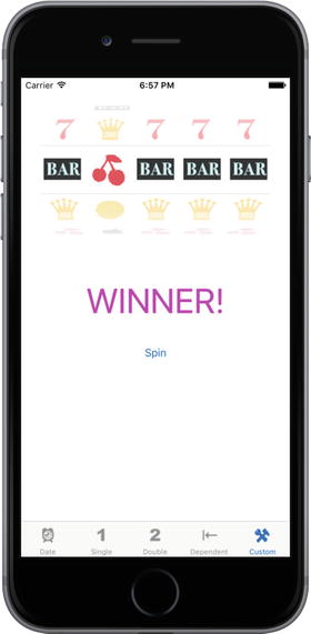
Figure 7-6. Our fifth component picker uses the picker like a slot machine
Delegates and Data Sources
Before we start building the application, let’s look at what makes pickers more complex than the other controls we’ve used so far. With the exception of the date picker, you can’t use a picker by just grabbing one in the object library, dropping it on your content view, and configuring it. You also need to provide each picker with both a delegate and a data source.
We’ve already used application delegates and the basic idea works the same for pickers. The control itself defers several jobs to its delegate, the most important of these being the determination what to actually draw for each of the rows in each of its components. The picker asks the delegate for either a string or a view that will be drawn at a given spot on a given component. The picker gets its data from the delegate.
In addition to the delegate, pickers must have a data source. The data source tells the picker how many components it will be working with and how many rows make up each component. The data source works like the delegate in that its methods are called at certain, pre-specified times. Without a data source and a delegate, pickers cannot do their job; in fact, they won’t even be drawn.
It’s very common for the data source and the delegate to be the same object and exist in the same actual Swift file, typically the view controller for the picker’s enclosing view. We use that approach in this application: the view controllers for each of our application’s content panes will be the data source and the delegate for their picker.
Note
The question often arises as to whether the picker data source is part of the model, view, or controller portion of the application? A data source sounds like it must be part of the model, but it’s actually part of the controller. The data source isn’t usually an object designed to hold data. In simple applications, the data source might hold data, but its true job is to retrieve data from the model and pass it along to the picker.
Creating the Pickers Application
Although Xcode provides a template for tab bar applications, we’re going to build ours from scratch. It’s not much extra work and it will be good practice.
Create a new project, select the Single View Application template again, and choose Next to go to the next screen. In the Product Name field, type Pickers. Make sure the check box that says Use Core Data is unchecked, and set the Language to Swift and the Devices pop-up to Universal. Then choose Next again. Xcode will let you select the folder where you want to save your project.
We’re going to walk you through the process of building the whole application; but at any step of the way, if you feel like challenging yourself by moving ahead, by all means do so. If you get stumped, you can always come back.
Creating the View Controllers
In the previous chapter, we created a root view controller (“root controller” for short) to manage the process of swapping our application’s other views. We’ll be doing that again this time, but we won’t need to create our own root view controller class. Apple provides a very good class for managing tab bar views, so we’re just going to use an instance of UITabBarController as our root controller. First, we need to create five new classes in Xcode: the five view controllers that the root controller will swap in and out. Expand the Pickers folder in the Project Navigator. There, you’ll see the source code files that Xcode created to start off the project. Single-click the Pickers folder, and press ⌘N or select File ➤ New ➤ File….
Select iOS and then select Source in the left pane of the new file assistant. Then, select the Cocoa Touch Class icon and click Next to continue. The next screen lets you give your new class a name. Enter DatePickerViewController in the Class field. Ensure the Subclass of field contains UIViewController. Make sure that the Also create XIB file check box is unchecked, set the Language to Swift, and then click Next.
You’ll be shown a folder selection window, which lets you choose where the class should be saved. Choose the Pickers directory, which already contains the AppDelegate class and a few other files. Make sure also that the Group pop-up has the Pickers folder selected and that the target check box for Pickers is checked. After you click the Create button, the file DatePickerViewcontroller.swift will appear in the Pickers folder.
Repeat those steps four more times, using the names SingleComponentPickerViewController, DoubleComponentPickerViewController, DependentComponentPickerViewController, and CustomPickerViewController. At the end of all this, the Pickers folder should contain all of the view controller class files, as shown in Figure 7-7.
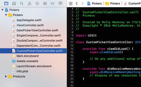
Figure 7-7. The Project Navigator should contain all these files after creating the five view controller classes
Creating the Tab Bar Controller
Now, let’s create our tab bar controller. The project template already contains a view controller called ViewController, which is a subclass of UIViewController. To convert it to a tab bar controller, all we need to do is change its base class. Open ViewController.swift and make the following change shown in bold:
class ViewController: UITabBarController { Next, to set the tab bar controller up in the storyboard, open Main.storyboard. The template added an initial view controller, which we’re going to replace, so select it in the Document Outline or the editor area, and delete it by pressing the Delete key . In the Object Library, locate a Tab Bar Controller and drag it over to the editing area (see Figure 7-8).
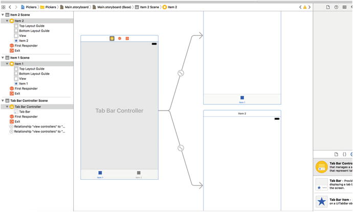
Figure 7-8. Dragging a tab bar controller from the library onto the canvas
While you’re dragging, you’ll see that, unlike the other controllers we’ve been asking you to drag out from the object library, this one actually pulls out three complete view-controller pairs at once, all of which are connected to each other with curved lines. This is actually more than just a tab bar controller; it’s also two child controllers, already connected and ready to use.
Once you drop the tab bar controller onto the editing area, three new scenes are added to the storyboard. If you expand the document view on the left, you will see a nice overview of all the scenes contained in the storyboard (see Figure 7-8). You’ll also see the curvy lines still in place connecting the tab bar controller with each of its children. Those lines will always adjust themselves to stay connected if you move the scenes around, which you are always free to do. The on-screen position of each scene within a storyboard has no impact on your app’s appearance when it runs.
This tab bar controller will be our root controller . As a reminder, the root controller controls the very first view that the user will see when your program runs and it is responsible for switching the other views in and out. Since we’ll connect each of our views to one of the tabs in the tab bar, the tab bar controller makes a logical choice as a root controller . We need to tell iOS that the tab bar controller is the one that it should load from Main.storyboard when the application starts. To do this, select the Tab Bar Controller icon in the Document Outline and open the Attributes Inspector; and then in the View Controller section, check the Is Initial View Controller check box. With the view controller still selected, switch to the Identity Inspector and change the class to ViewController.
Tab bars can use icons to represent each of the tabs, so we should also add the icons we’re going to use before editing the storyboard. You can find some suitable icons in the 07 - ImageSets folder of the source code archive for this book. Each subfolder of 07 - ImageSets contains three images (one for devices with a standard display, two for Retina devices). In the Xcode Project Navigator, select Assets.xcassets and drag each subfolder from the 07 - ImageSets folder and drop it into the left column of the editing area, underneath AppIcon, to copy them all into the project (see Figure 7-9).

Figure 7-9. Drag the images below AppIcon within Assets.xcassets in Xcode
If you want to make your own icons instead, there are some guidelines for how they should be created. The icons you use should be 24 × 24 pixels and saved in .png format. The icon file should have a transparent background. Don’t worry about trying to color the icons so that they match the appearance of the tab bar. Just as it does with the application icon, iOS will take your image and make it look just right.
Tip
An image size of 24 × 24 pixels is actually for standard displays; for Retina displays on iPhone 4 and later and for the new iPads, you need a double-sized image, or it will appear pixelated. For the iPhone 6/6s Plus, you need to provide an image that’s three times the size of the original. This is very easy: for any image foo.png, you should also provide an image named [email protected] that is doubled in size and another called [email protected] that is three times the size. Calling UIImage(named:"foo") will return the normal-sized image or the double-sized image automatically to best suit the device on which your app is currently executing.
Back in the storyboard, you can see that each of the child view controllers shows a name like “Item 1” at the top and has a single bar item at the bottom of its view, with a label matching what is present in the tab bar. We might as well set these two up so that they have the right names from the start, so select the Item 1 view controller, and then click the tab bar item labeled Item 1 in the Document Outline. Open the Attributes Inspector and you’ll see a text field for setting the Title of the Bar Item, which currently contains the text Item 1. Replace the text with Date and press the Enter key. This immediately changes the text of the bar item at the bottom of this view controller, as well as the corresponding tab bar item in the tab bar controller. While you’re still in the inspector, click the Image pop-up and select clockicon to set the icon, too. Now repeat the same steps for the second child view controller, but name this one Single and use the singleicon image for its bar item.
Our next step is to complete our tab bar controller so it reflects the five tabs shown in Figure 7-2. Each of those five tabs will contain one of our pickers. The way we’re going to do this is by simply adding three more view controllers to the storyboard (in addition to the two that were added along with the tab bar controller), and then connecting each of them so that the tab bar controller can activate them. Get started by dragging out a normal View Controller from the Object Library and dropping on the storyboard. Next, Control-drag from the tab bar controller to your new view controller, release the mouse button, and select view controllers from the Relationship Segue section of the small pop-up window that appears. This tells the tab bar controller that it has a new child to maintain, so the tab bar immediately acquires a new item. Your new view controller gets a bar item in the bottom of its view and in the Document Outline, just like the others already had. Now do the same steps outlined previously to name this latest view controller’s bar item Double with doubleiconas its image.
Drag out two more view controllers and connect each of them to the tab bar controller, as described previously. One at a time, select each of their bar items, naming one of them Dependent with dependenticonas its image, and name the other Custom with toolicon as its image. When finished, you should have one view controller with your tab bar at the bottom and five connected view controllers, as shown in Figure 7-10.
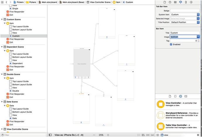
Figure 7-10. Adding our five view controllers that we’ll access using the tab bar from our root view controller
Now that all our view controllers are in place, it’s time to set up each of them with the correct controller class from the set that we created earlier. This will let us implement different functionality for each controller. In the Document Outline, select the view controller labeled Date and bring up the Identity Inspector . In the Custom Class section of the inspector, change the class to DatePickerViewController , and press Return or Tab to finish (see Figure 7-11).

Figure 7-11. Connecting our Date view to its view controller
Repeat this same process for the other four view controllers, in the order in which they appear at the bottom of the tab bar controller. You can select each view controller in turn by clicking on it in the storyboard, making sure to click in the bar at the top of the controller that contains the controller’s name. In the Identity Inspector for each, use the class names SingleComponentPickerViewController , DoubleComponentPickerViewController, DependentComponentPickerViewController, and CustomPickerViewController, respectively. Before moving on to the next bit of GUI editing, save your storyboard file.
Initial Simulator Test
At this point, the tab bar and the content views should all be hooked up and working. Compile and run, and your application should launch with a tab bar that functions, as shown in Figure 7-12. Click each of the tabs in turn. Each tab should be selectable.
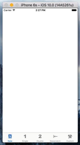
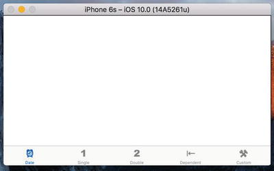
Figure 7-12. The application with five empty but selectable tabs
There’s nothing in the content views now, so the changes won’t be very dramatic . In fact, you won’t see any difference at all, except for the highlighting tab bar items. But if everything went correctly, the basic framework for your multiview application is now set up and working. We can start designing the individual content views.
Tip
If your simulator crashes when you click one of the tabs, most likely you’ve either missed a step or made a typo. Go back and make sure the connections are right and the class names are all set correctly.
If you want to make doubly sure everything is working, you can add a different label or some other object to each of the content views, and then relaunch the application. In that case, you should see the content of the different views change as you select different tabs.
Implementing the Date Picker
To implement the date picker, we’ll need a single outlet and a single action. The outlet will be used to grab the value from the date picker. The action will be triggered by a button and will put up an alert to show the date value pulled from the picker. We’ll add both of these from inside Interface Builder while editing the Main.storyboard file, so select it in the Project Navigator if it’s not already front-and-center.
The first thing we need to do is find a Date Picker in the Object Library and drag it over to the Date Scene in the editing area. Click the Date icon in the Document Outline to bring the correct view controller to the front, and then drag the date picker from the Object Library and place it at the top of the view, right up against the top of the display. It’s OK if it overlaps the status bar because this control has so much built-in vertical padding at the top that no one will notice.
Now we need to apply Auto Layout constraints so that the date picker is correctly sized and placed when the application runs on any kind of device. We want the picker to be horizontally centered and anchored to the top of the view. We also want it to be sized based on its content, so we need three constraints. With the date picker selected, first select Editor ➤ Size to Fit Content from the Xcode menu bar . If this option is not enabled, move the picker slightly and try again. Next, click the Align button below the storyboard, check the Horizontally in Container box, and then click Add 1 Constraint. Click the Pin button (which is next to the Align button). Using the four distance boxes at the top of the pop-up, set the distance between the picker and the top of edge of the view above it to zero by entering zero in the top box, and below it so that it becomes a solid line. At the bottom of the pop-up, set Update Frames to Items of New Constraints, and then click Add 1 Constraint. The date picker will resize and move to its correct position, as shown in Figure 7-13.

Figure 7-13. The date picker, positioned at the top of its view controller’s view
Single-click the date picker, if it’s not already selected, and go back to the Attributes Inspector. As you can see in Figure 7-14, a number of attributes can be configured for a date picker. We’re going to leave most of the values at their defaults (but feel free to play with the options when we’re finished , to see what they do). The one thing we will do is limit the range of the picker to reasonable dates. Look for the heading that says Constraints and check the box that reads Minimum Date. Leave the value at the default of 1/1/1970. Also check the box that reads Maximum Date and set that value to 12/31/2200.

Figure 7-14. The Attributes Inspector for a date picker. Set the maximum date, but leave the rest of the settings at their default values
Now let’s connect this picker to its controller. Press ⌥⌘Enter to open the Assistant Editor and make sure the jump bar at the top of the Assistant Editor is set to Automatic. That should make DatePickerViewController.swift show up there. Next, Control-drag from the picker to the blank line between the class declaration and the viewDidLoad() method, releasing the mouse button when the Insert Outlet, Action, or Outlet Collection tooltip appears. In the pop-up window that appears after you let go, make sure the Connection is set to Outlet, enter datePicker as the Name, and then press Enter to create the outlet and connect it to the picker.
Next, grab a Button from the library and place it a small distance below the date picker. Double-click the button and give it a title of Select. We want this button to be horizontally centered and to stay a fixed distance below the date picker. With the button selected, click the Align button at the bottom of the storyboard, check the Horizontally in Container box, and then click Add 1 Constraint. To fix the distance between them, Control-drag from the button to the date picker and release the mouse. In the pop-up that appears, select Vertical Spacing. Finally, click the Resolve Auto Layout Issues button at the bottom of the storyboard and then click Update Frames in the top section of the pop-up (if this item is not enabled, it means that the button is already in its correct location). The button should move to its correct location and there should no longer be any Auto Layout warnings.
Make sure that DatePickerViewController.swift is still visible in the Assistant Editor; if it’s not, use the Manual selection in the jump bar to locate and open it. Now Control-drag from the button to the line above the closing brace at the end of the class in the assistant view, until you see the Insert Outlet, Action, or Outlet Collection tooltip appear. Change the Connection type to Action, name the new action onButtonPressed, and press Enter to connect it. Doing so creates an empty method called onButtonPressed() , which you should complete with the code in Listing 7-1.
Listing 7-1. Our Select Button Action Code
@IBAction func onButtonPressed(_ sender: UIButton) {let date = datePicker.datelet message = "The date and time you selected is (date)"let alert = UIAlertController(title: "Date and Time Selected",message: message,preferredStyle: .alert)let action = UIAlertAction(title: "That's so true!",style: .default,handler: nil)alert.addAction(action)present(alert, animated: true, completion: nil)}
In viewDidLoad(), we create a new NSDate object. An NSDate object created this way will hold the current date and time. We then set datePicker to that date, which ensures that every time this view is loaded from the storyboard, the picker will reset to the current date and time, see Listing 7-2.
Listing 7-2. Setting Our Date in the viewDidLoad() Method
override func viewDidLoad() {super.viewDidLoad()// Do any additional setup after loading the view.let date = NSDate()datePicker.setDate(date as Date, animated: false)}
And that is all there is. Go ahead and build and run to make sure your date picker checks out. If everything went OK, your application should look like Figure 7-2 when it executes. If you choose the Select button, an alert will pop up, telling you the date and time currently selected in the date picker.
Note
The date picker does not allow you to specify seconds or a time zone. The alert displays the time with seconds and in Greenwich Mean Time (GMT) . We could have added some code to simplify the string displayed in the alert, but isn’t this chapter long enough already? If you’re interested in customizing the formatting of the date, take a look at the NSDateFormatter class.
Implementing the Single-Component Picker
Our next picker lets the user select from a list of values. In this example, we’ll use an array to hold the values we want to display in the picker. Pickers don’t hold any data themselves. Instead, they call methods on their data source and delegate to get the data they need to display. The picker doesn’t really care where the underlying data lives. It asks for the data when it needs it, and the data source and delegate (which are often, in practice, the same object) work together to supply that data. As a result, the data could be coming from a static list, as we’ll do in this section, or it could be loaded from a file or a URL, or even made up or calculated on the fly.
For the picker class to ask its controller for data, we must ensure that the controller implements the right methods. One part of doing that is declaring in the controller’s class definition that it will implement a couple of protocols. In the Project Navigator, single-click SingleComponentPickerViewController.swift. This controller class will act as both the data source and the delegate for its picker, so we need to make sure it conforms to the protocols for those two roles. Add the following code:
class SingleComponentPickerViewController: UIViewController,UIPickerViewDelegate, UIPickerViewDataSource {
When you do this, you’ll see an error appear in the editor. That’s because we haven’t yet implemented the required protocol methods. We’ll do that soon, so just ignore the error for now.
Building the View
Select Main.storyboard again, since it’s time to edit the content view for the second tab in our tab bar. In the Document Outline, click the Single icon to bring the view controller into the foreground in the editor area. Next, bring over a Picker View from the library (see Figure 7-15), and add it to your view, placing it snugly into the top of the view, as you did with the date picker view.
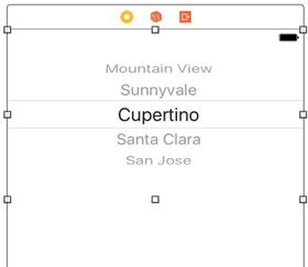
Figure 7-15. Adding a picker view from the library to your second view
Now we need to apply Auto Layout constraints so that the picker is correctly sized and placed when the application runs on any kind of device. We want the picker to be horizontally centered and anchored to the top of the view. We also want it to be sized based on its content, so we need three constraints. With the picker selected, first select Editor ➤ Size to Fit Content from the Xcode menu bar. If this option is not enabled, move the picker slightly and try again. Next, click the Align button below the storyboard, check the Horizontally in Container box, and then click Add 1 Constraint. Click the Pin button (which is next to the Align button). Using the four distance boxes at the top of the pop-up, set the distance between the picker and the top of edge of the view above it to zero by entering zero in the top box, and then click the dashed red line below it so that it becomes a solid line. At the bottom of the pop-up, set Update Frames to Items of New Constraints, and then click Add 1 Constraint. The picker will resize and move to its correct position, as shown in Figure 7-16.

Figure 7-16. The picker, positioned at the top of its view controller’s view
Now let’s connect this picker to its controller. The procedure here is just like for the previous picker view: open the Assistant Editor, set the jump bar to show the SingleComponentPickerViewController.swift file , Control-drag from the picker to the top of the SingleComponentPickerViewController class and create an outlet named singlePicker.
Next, with the picker selected, press ⌥⌘6 to bring up the Connections Inspector. If you look at the connections available for the picker view, you’ll see that the first two items are dataSource and delegate. If you don’t see those outlets, make sure you have the picker selected, rather than the UIView. Drag from the circle next to dataSource to the View Controller icon at the top of the scene in the storyboard or in the Document Outline (see Figure 7-17), and then drag from the circle next to delegate to the View Controller icon. Now this picker knows that the instance of the SingleComponentPickerViewController class in the storyboard is its data source and delegate, and the picker will ask it to supply the data to be displayed. In other words, when the picker needs information about the data it is going to display, it asks the SingleComponentPickerViewController instance that controls this view for that information.

Figure 7-17. Connecting the dataSource to the View Controller
Drag a button to the view, place it just below the picker. Double-click the button and name it Select. Press Return to commit the change. In the Connections Inspector , drag from the circle next to Touch Up Inside to code in the assistant view, releasing it just above the closing bracket at the end of the class definition to make a new action method. Name this action onButtonPressed and you’ll see that Xcode fills in an empty method. You’ve just seen another way to add an action method to a view controller and link it to its source view. We want this button to be horizontally centered and to stay a fixed distance below the date picker. With the button selected, click the Align button at the bottom of the storyboard, check the Horizontally in Container box, and then click Add 1 Constraint (see Figure 7-18).

Figure 7-18. Center the button horizontally in the view
To fix the distance between them, Control-drag from the button to the picker and then release the mouse. In the pop-up that appears, select Vertical Spacing (see Figure 7-19). Finally, if you have any layout issues as shown by the Issue Inspector, click the Resolve Auto Layout Issues button at the bottom of the storyboard, and then click Update Frames in the top section of the pop-up (if this item is not enable, it means that the button is already in its correct location). The button should move to its correct location and there should no longer be any Auto Layout warnings.

Figure 7-19. Set a consistent vertical spacing from the button to the picker
Implementing the Data Source and Delegate
To make our controller work properly as the picker’s data source and delegate, we’ll start with some code you should feel comfortable with, and then add a few methods that you’ve never seen before.
Single-click SingleComponentPickerViewController.swift in the Project Navigator and add the following property at the top of the class definition. This gives us an array with the names of several well-known movie characters:
@IBOutlet weak var singlePicker: UIPickerView!private let characterNames = ["Luke", "Leia", "Han", "Chewbacca", "Artoo","Threepio", "Lando"]
And then change the onButtonPressed() method to what’s shown in Listing 7-3.
Listing 7-3. The onButtonPressed Method for Our Single Picker View
@IBAction func onButtonPressed(_ sender: UIButton) {let row = singlePicker.selectedRow(inComponent: 0)let selected = characterNames[row]let title = "You selected (selected)!"let alert = UIAlertController(title: title,message: "Thank you for choosing",preferredStyle: .alert)let action = UIAlertAction(title: "You're welcome",style: .default,handler: nil)alert.addAction(action)present(alert, animated: true, completion: nil)}
As we saw earlier, a Date Picker contains the data we need to get to, but here, our regular picker hands off that job to the delegate and data source. The onButtonPressed() method needs to ask the picker which row is selected, and then grabs the corresponding data from your pickerData array. Here is how we ask it for the selected row:
let row = singlePicker.selectedRow(inComponent: 0)Notice that we needed to specify which component we want to know about. We have only one component (i.e. one spinning wheel) in this picker, so we simply pass in 0, which is the index of the first (and only) component.
In the class declaration, we created an array of character names so that we have data to feed the picker. Usually, your data will come from other sources, like a property list or a web service query. By embedding an array of items in our code the way we’ve done here, we are making it much harder on ourselves if we need to update this list or if we want to have our application translated into other languages. But this approach is the quickest and easiest way to get data into an array for demonstration purposes. Even though you won’t usually create your arrays like this, you will almost always configure some form of access to your application’s model objects here in the viewDidLoad() method, so that you’re not constantly going to disk or to the network every time the picker asks you for data.
Tip
If you’re not supposed to create arrays from lists of objects in your code, as we just did, how should you do it? Embed the lists in property list files and add those files to your project. Property list files can be changed without recompiling your source code, which means there is little risk of introducing new bugs when you do so. You can also provide different versions of the list for different languages, as you’ll see in Chapter 22. I’ll discuss property lists in more detail when we get to Chapter 13.
Finally, insert the code shown in Listing 7-4 at the bottom of the file.
Listing 7-4. Picker Data Source and Delegate Methods
// MARK:-// MARK: Picker Data Source Methodsfunc numberOfComponents(in pickerView: UIPickerView) -> Int {return 1}func pickerView(_ pickerView: UIPickerView,numberOfRowsInComponent component: Int) -> Int {return characterNames.count}// MARK: Picker Delegate Methodsfunc pickerView(_ pickerView: UIPickerView, titleForRow row: Int, forComponent component: Int) -> String? {return characterNames[row]}
These three methods are required to implement the picker. The first two methods are from the UIPickerViewDataSource protocol, and they are both required for all pickers (except date pickers). Here’s the first one:
func numberOfComponents(in pickerView: UIPickerView) -> Int {return 1}
Pickers can have more than one spinning wheel, or component, and this is how the picker asks how many components it should display. We want to display only one list this time, so we return a value of 1. Notice that a UIPickerView is passed in as a parameter. This parameter points to the picker view that is asking us the question, which makes it possible to have multiple pickers being controlled by the same data source. In our case, we know that we have only one picker, so we can safely ignore this argument because we already know which picker is calling us.
The second data source method is used by the picker to ask how many rows of data there are for a given component:
func pickerView(_ pickerView: UIPickerView,numberOfRowsInComponent component: Int) -> Int {return characterNames.count}
Once again, we are told which picker view is asking and which component that picker is asking about. Since we know that we have only one picker and one component, we don’t bother with either of the arguments and simply return the count of objects from our sole data array.
After the two data source methods, we implement one delegate method. Unlike the data source methods, all of the delegate methods are optional. The term optional is a bit deceiving because you do need to implement at least one delegate method. You will usually implement the method that we are implementing here. However, if you want to display something other than text in the picker, you must implement a different method instead, as you’ll see when we get to the custom picker later in this chapter:
func pickerView(_ pickerView: UIPickerView, titleForRow row: Int, forComponent component: Int) -> String? {return characterNames[row]}
In this method, the picker asks us to provide the data for a specific row in a specific component. We are provided with a pointer to the picker that is asking, along with the component and row that it is asking about. Since our view has one picker with one component, we simply ignore everything except the row argument and use that to return the appropriate item from our data array.
Build and run the application. When the simulator comes up, switch to the second tab—the one labeled Single—and check out your new custom picker, which should look like Figure 7-3.
In the next section we’ll implement a picker with two components. If you feel up to a challenge , this next content view is actually a good one for you to attempt on your own. You’ve already seen all the methods you’ll need for this picker, so go ahead if you’d like to give it a try. You might want to start with a good look at Figure 7-4, just to refresh your memory. When you’re finished, read on, and you’ll see how we tackled this problem.
Implementing a Multicomponent Picker
The next tab will have a picker with two components, or wheels, each independent of the other. The left wheel will have a list of sandwich fillings and the right wheel will have a selection of bread types. We’ll write the same data source and delegate methods that we did for the single-component picker. We’ll just need to write a little additional code in some of those methods to make sure we’re returning the correct value and row count for each component. Start by single-clicking DoubleComponentPickerViewController.swift and adding the following code:
class DoubleComponentPickerViewController: UIViewController,UIPickerViewDelegate, UIPickerViewDataSource {
Here, we simply conform our controller class to both the delegate and data source. Save this and click Main.storyboard to work on the GUI.
Building the View
Select the Double Scene in the Document Outline and click the Double icon to bring its view controller to the front in the editor area. Now add a picker view and a button to the view, change the button label to Select, and then make the necessary connections. We’re not going to walk you through it this time, but you can refer to the previous section if you need a step-by-step guide, since the two view controllers are identical in terms of connections in the storyboard. Here’s a summary of what you need to do:
Create an outlet called doublePicker in the class extension of the DoubleComponentPickerViewController class to connect the view controller to the picker.
Connect the dataSource and delegate connections on the picker view to the view controller (use the Connections Inspector).
Connect the Touch Up Inside event of the button to a new action method called onButtonPressed on the view controller (use the Connections Inspector).
Add Auto Layout constraints to the picker and the button to pin them in place.
Make sure that you save your storyboard before you dive back into the code. You may want to bookmark this page because you may be referring to it in a bit.
Implementing the Controller
Select DoubleComponentPickerViewController.swift and add the code in Listing 7-5 at the top of the class definition, below our picker outlet.
Listing 7-5. Parameters Needed for Our Two-Component Picker
@IBOutlet weak var doublePicker: UIPickerView!private let fillingComponent = 0private let breadComponent = 1private let fillingTypes = ["Ham", "Turkey", "Peanut Butter", "Tuna Salad","Chicken Salad", "Roast Beef", "Vegemite"]private let breadTypes = ["White", "Whole Wheat", "Rye", "Sourdough","Seven Grain"]
As you can see, we start out by defining two constants that will represent the indices of the two components, which is just to make our code easier to read. Picker components are referred to by number, with the leftmost component being assigned zero and increasing by one each move to the right. Next, we declare two arrays that hold the data for our two picker components.
Now implement the onButtonPressed() method, as shown in Listing 7-6.
Listing 7-6. What to Do When the Select Button Is Pressed
@IBAction func onButtonPressed(_ sender: UIButton) {let fillingRow =doublePicker.selectedRow(inComponent: fillingComponent)let breadRow =doublePicker.selectedRow(inComponent: breadComponent)let filling = fillingTypes[fillingRow]let bread = breadTypes[breadRow]let message = "Your (filling) on (bread) bread will be right up."let alert = UIAlertController(title: "Thank you for your order",message: message,preferredStyle: .alert)let action = UIAlertAction(title: "Great",style: .default,handler: nil)alert.addAction(action)present(alert, animated: true, completion: nil)}
Also, add the data source and delegate methods at the bottom of the class, as shown in Listing 7-7.
Listing 7-7. The dataSource and delegate Methods
// MARK:-// MARK: Picker Data Source Methodsfunc numberOfComponents(in pickerView: UIPickerView) -> Int {return 2}func pickerView(_ pickerView: UIPickerView, numberOfRowsInComponent component: Int) -> Int {if component == breadComponent {return breadTypes.count} else {return fillingTypes.count}}// MARK:-// MARK: Picker Delegate Methodsfunc pickerView(_ pickerView: UIPickerView, titleForRow row: Int, forComponent component: Int) -> String? {if component == breadComponent {return breadTypes[row]} else {return fillingTypes[row]}}
The onButtonPressed() method is a bit more involved this time, but there’s very little there that’s new to you. We just need to specify which component we are talking about when we request the selected row using those constants we defined earlier—breadComponent and fillingComponent:
let fillingRow =doublePicker.selectedRow(inComponent: fillingComponent)let breadRow = doublePicker.selectedRow(inComponent: breadComponent)
You can see here that using the two constants instead of 0 and 1 makes our code considerably more readable. From this point on, the onButtonPressed() method is fundamentally the same as the last one we wrote.
When we get down to the data source methods, that’s where things start to change a bit. In the first method, we specify that our picker should have two components rather than just one:
func numberOfComponents(in pickerView: UIPickerView) -> Int {return 2}
This time, when we are asked for the number of rows, we need to check which component the picker is asking about and return the correct row count for the corresponding array:
func pickerView(_ pickerView: UIPickerView, numberOfRowsInComponent component: Int) -> Int {if component == breadComponent {return breadTypes.count} else {return fillingTypes.count}}
Next, in our delegate method , we do the same thing. We check the component and use the correct array for the requested component to fetch and return the correct value:
func pickerView(_ pickerView: UIPickerView, titleForRow row: Int, forComponent component: Int) -> String? {if component == breadComponent {return breadTypes[row]} else {return fillingTypes[row]}}
That wasn’t so hard, was it? Compile and run your application, and make sure the Double content pane looks like Figure 7-4.
Notice that the wheels are completely independent of each other. Turning one has no effect on the other. That’s appropriate in this case, but there will be times when one component is dependent on another. A good example of this is in the date picker. When you change the month, the dial that shows the number of days in the month may need to change, because not all months have the same number of days . Implementing this isn’t really hard once you know how, but it’s not the easiest thing to figure out on your own, so let’s do that next.
Implementing Dependent Components
As we’re picking up momentum, I’m not going to hold your hand quite as much when it comes to material we’ve already covered. Instead, we’ll focus on addressing new features. Our new picker will display a list of US states in the left component and a list of corresponding ZIP codes in the right component.
We’ll need a separate list of ZIP code values for each item in the left-hand component. We’ll declare two arrays, one for each component, as we did last time. We’ll also need a dictionary. In the dictionary, we’re going to store an arrayfor each state (see Figure 7-20). Later, we’ll implement a delegate method that will notify us when the picker’s selection changes. If the value in the left picker wheel changes, we will grab the correct array out of the dictionary and assign it to the array being used for the right-hand picker wheel. Don’t worry if you didn’t catch all that; we’ll talk about it more as we get into the code.
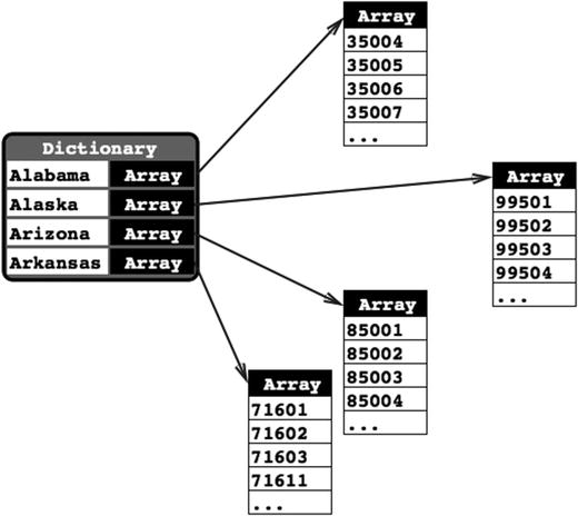
Figure 7-20. Our application’s data. For each state, there will be one entry in a dictionary with the name of the state as the key. Stored under that key will be an Array<String> instance containing all the ZIP codes from that state
Add the following code to your DependentComponentPickerViewController.swift file :
class DependentComponentPickerViewController: UIViewController,UIPickerViewDelegate, UIPickerViewDataSource {private let stateComponent = 0private let zipComponent = 1private var stateZips:[String : [String]]!private var states:[String]!private var zips:[String]!
Now it’s time to build the content view. That process is identical to the previous two component views we built. If you get lost, flip back to the Building the View section for the single-component picker and follow those step-by-step instructions. Here’s a hint: start off by opening Main.storyboard, find the view controller for the DependentComponentPickerViewController class, and then repeat the same basic steps you’ve done for all the other content views in this chapter. You should end up with an outlet property called dependentPicker connected to a picker, an empty onButtonPressed: method connected to a button, and both the delegate and dataSource properties of the picker connected to the view controller. Don’t forget to add the Auto Layout constraints to both views! When you’re finished, save the storyboard.
Now we’ll implement this controller class. This implementation may seem a little complicated at first. To make one component dependent on the other, we need to add a whole new level of complexity to our controller class. Although the picker displays only two lists at a time, our controller class must know about and manage 51 lists. The technique we’re going to use here actually simplifies that process. The data source methods look almost identical to the one we implemented for the DoublePickerViewController. All of the additional complexity is handled elsewhere, between viewDidLoad and a new delegate method called pickerView(_:didSelectRow:inComponent:).
Before we write the code, we need some data to display. Up until now, we’ve created arrays in code by specifying a list of strings. Because we didn’t want you to need to type in several thousand values, we’re going to load the data from a property list. Both NSArrayand NSDictionary objects can be created from property lists.
The data that we need is included in a property list called statedictionary.plist in the project archive, under the 07 – Picker Data folder. Drag that file into the Pickers folder in your Xcode project. If you single-click the .plist file in the Project Navigator, you can see and even edit the data that it contains (see Figure 7-21).
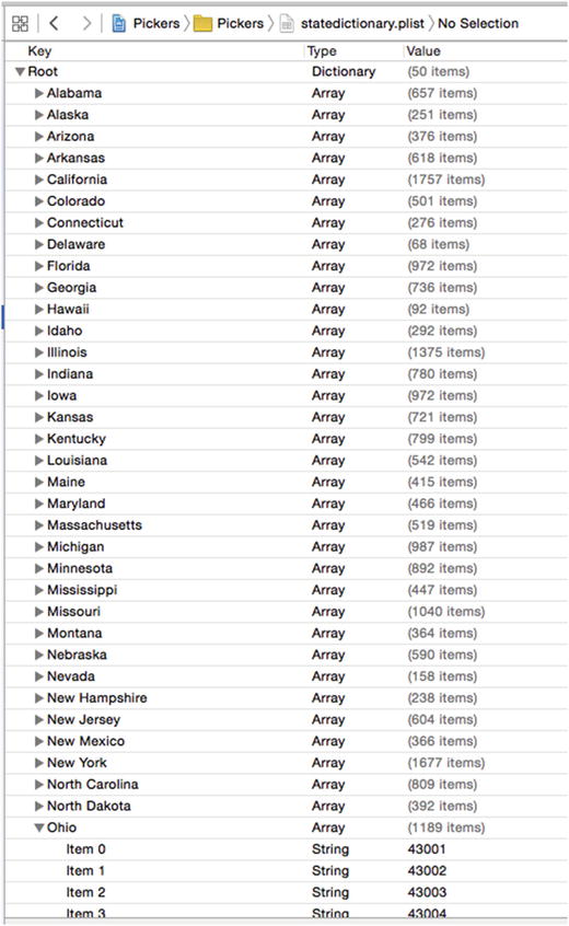
Figure 7-21. The statedictionary.plist file , showing our list of states. Within Ohio, you can see the start of a list of ZIP codes
In DependentComponentPickerViewController.swift, we’re going to first show you some whole methods to implement, and then we’ll break it down into more digestible chunks. Start with the implementation of onButtonPressed(),as shown in Listing 7-8.
Listing 7-8. The onButtonPressed Method for Our ZIP Code View
@IBAction func onButtonPressed(_ sender: UIButton) {let stateRow =dependentPicker.selectedRow(inComponent: stateComponent)let zipRow =dependentPicker.selectedRow(inComponent: zipComponent)let state = states[stateRow]let zip = zips[zipRow]let title = "You selected zip code (zip)"let message = "(zip) is in (state)"let alert = UIAlertController(title: title,message: message,preferredStyle: .alert)let action = UIAlertAction(title: "OK",style: .default,handler: nil)alert.addAction(action)present(alert, animated: true, completion: nil)}
Next, add the following code to the existing viewDidLoad() method, as shown in Listing 7-9.
Listing 7-9. Add to the viewDidLoad() Method
override func viewDidLoad() {super.viewDidLoad()// Do any additional setup after loading the view.let bundle = Bundle.mainlet plistURL = bundle.urlForResource("statedictionary",withExtension: "plist")stateZips = NSDictionary.init(contentsOf: (plistURL)!) as! [String : [String]]let allStates = stateZips.keysstates = allStates.sorted()let selectedState = states[0]zips = stateZips[selectedState]}
And, finally, add the data source and delegate methods at the bottom of the file, as shown in Listing 7-10.
Listing 7-10. Our dataSource and delegate Methods for Displaying State ZIP Codes
// MARK:-// MARK: Picker Data Source Methodsfunc numberOfComponents(in pickerView: UIPickerView) -> Int {return 2}func pickerView(_ pickerView: UIPickerView, numberOfRowsInComponent component: Int) -> Int {if component == stateComponent {return states.count} else {return zips.count}}// MARK:-// MARK: Picker Delegate Methodsfunc pickerView(_ pickerView: UIPickerView, titleForRow row: Int, forComponent component: Int) -> String? {if component == stateComponent {return states[row]} else {return zips[row]}}func pickerView(_ pickerView: UIPickerView, didSelectRow row: Int, inComponent component: Int) {if component == stateComponent {let selectedState = states[row]zips = stateZips[selectedState]dependentPicker.reloadComponent(zipComponent)dependentPicker.selectRow(0, inComponent: zipComponent,animated: true)}}
There’s no need to talk about the onButtonPressed() method since it’s fundamentally the same as the previous one. We should talk about the viewDidLoad() method, though. There’s some stuff going on there that you need to understand, so pull up a chair and let’s chat. The first thing we do in this new viewDidLoad() method is grab a reference to our application’s main bundle:
let bundle = Bundle.mainA bundleis just a special type of folder, the contents of which follow a specific structure. Applications and frameworks are both bundles, and this call returns a bundle object that represents our application.
Note
In the latest revision of Xcode and the iOS libraries, Apple provided a more user friendly way of referring to elements such as NSBundle from Swift. Instead of something like “let bundle = NSBundle.mainBundle()”, we use the much easier and more readable preceding versions.
One of the primary uses of a bundle ( NSBundle) is to get to resources that you added to your project. Those files will be copied into your application’s bundle when you build your application. If we want to get to those resources in our code, we usually need to use a bundle. We use the main bundle to retrieve the URL of the resource in which we’re interested:
let plistURL = bundle.urlForResource("statedictionary",withExtension: "plist")
This will return a URL containing the location of the statedictionary.plist file. We can then use that URL to load our dictionary. Once we do that, the entire contents of that property list will be loaded into the newly created Dictionary object; that is, it is assigned to stateZips:
stateZips = NSDictionary.init(contentsOf: (plistURL)!) as! [String : [String]]The Swift Dictionarytype has no convenient way to load data from an external source, but the Foundation class NSDictionary does. This code takes advantage of that by loading the content of the statedictionary.plist file into an NSDictionary, which we then cast to the Swift type [String : [String]] that is, a dictionary in which each key is a string representing a state and the corresponding value is an array containing the ZIP codes for that state, as strings. This reflects the structure shown in Figure 7-18.
To populate the array for the left-hand component of the picker, which will display the states, we get the list of all keys from our dictionary and assign those to the states array. Before we assign it, though, we sort it alphabetically:
let allStates = stateZips.keysstates = allStates.sorted()
Unless we specifically set the selection to another value, pickers start with the first row (row 0) selected. To get the zips array that corresponds to the first row in the states array, we grab the object from the states array that’s at index 0. That will return the name of the state that will be selected at launch time. We then use that state name to grab the array of ZIP codes for that state, which we assign to the zips array that will be used to feed data to the right-hand component:
let selectedState = states[0]zips = stateZips[selectedState]
The two data source methods are practically identical to the previous version. We return the number of rows in the appropriate array. The same is true for the first delegate method we implemented. The second delegate method is the new one, which is where the magic happens:
func pickerView(_ pickerView: UIPickerView, didSelectRow row: Int, inComponent component: Int) {if component == stateComponent {let selectedState = states[row]zips = stateZips[selectedState]dependentPicker.reloadComponent(zipComponent)dependentPicker.selectRow(0, inComponent: zipComponent,animated: true)}}
In this method, which is called any time the picker’s selection changes, we look at the component and see whether the left-hand component is the one that changed, which would mean that the user selected a new state. If it is, we grab the array that corresponds to the new selection and assign it to the zips array. Next, we set the right-hand component back to the first row and tell it to reload itself. By swapping the zips array whenever the state changes, the rest of the code remains pretty much the same as it was in the DoublePicker example.
We’re not quite finished yet. Build and run the application, and then check out the Dependent tab, as shown in Figure 7-22. The two components are equal in size. Even though the ZIP code will never be more than five characters long, it has been given equal billing with the state. Since state names like Mississippi and Massachusetts won’t fit in half of the picker on most iPhone screens, this seems less than ideal.

Figure 7-22. Do we really want the two components to be of equal size? Notice the clipping of a long state name
Fortunately, there’s another delegate method we can implement to indicate how wide each component should be. Add the method in Listing 7-11 to the delegate section of DependentComponentPickerViewController.swift. You can see the difference in Figure 7-23.

Figure 7-23. With the adjustment in width of our picker components, our UI has become more visually useful
Listing 7-11. Setting the Width of Our Picker’s Components
func pickerView(_ pickerView: UIPickerView, widthForComponent component: Int) -> CGFloat {let pickerWidth = pickerView.bounds.size.widthif component == zipComponent {return pickerWidth/3} else {return 2 * pickerWidth/3}}
In this method, we return a number that represents how many pixels wide each component should be, and the picker will do its best to accommodate this. We’ve chosen to give the state component two-thirds of the available width and the rest goes to the ZIP component . Feel free to experiment with other values to see how the distribution of space between the components changes as you modify them. Save, build, and run; the picker on the Dependent tab will look more like the one shown in Figure 7-5.
By this point, you should be fairly comfortable with both pickers and tab bar applications. We have one more thing to do with pickers.
Creating a Simple Game with a Custom Picker
Next up, we’re going to create a simulated slot machine. Take a look back at Figure 7-6 before proceeding, so you know what we’re building.
Preparing the View Controller
Begin by adding the following code to CustomPickerViewController.swift:
class CustomPickerViewController: UIViewController,UIPickerViewDelegate, UIPickerViewDataSource {private var images:[UIImage]!
At this point, all we’ve added to the class is a property for an array that will hold the images to use for the symbols on the spinners of the slot machine. The rest will come a little later.
Building the View
Even though the picker in Figure 7-6 looks quite a bit fancier than the other ones we’ve built, there’s actually very little difference in the way we’ll design our storyboard. All the extra work is done in the delegate methods of our controller.
Make sure that you’ve saved your new source code, and then select Main.storyboard in the Project Navigator and use the Document Outline to select the Custom icon in the Custom Scene to edit the GUI. Add a picker view, a label below that, and a button below that. Name the button Spin.
With the label selected, bring up the Attributes Inspector. Set the alignment to centered. Then click Text Color and set the color to something bright. Next, let’s make the text a little bigger. Look for the Font setting in the inspector, and click the icon inside it (it looks like the letter T inside a little box) to pop up the font selector. This control lets you switch from the device’s standard system font to another if you like, or simply change the size. For now, just change the size to 48 and delete the word Label, since we don’t want any text displayed until the first time the user wins. With the label selected, click Editor ➤ Size to Fit Content to make sure the label is always large enough to display its content.
Now add Auto Layout constraints to center the picker, label, and button horizontally and to fix the vertical gaps between them and between the label and the picker, and the picker and the top of the view. You’ll probably find it easiest to drag from the label in the Document Outline when adding its Auto Layout constraints, because the label on the storyboard is empty and difficult to find.
After that, make all the connections to outlets and actions. Create a new outlet called picker to connect the view controller to the picker view, another called winLabel to connect the view controller to the label. Again, you’ll find it easiest to use the label in the Document Outline than the one on the storyboard. Next, connect the button’s Touch Up Inside event to a new action method called spin(). After that, just make sure to connect the delegate and data source for the picker.
There’s one additional thing that you need to do. Select the picker and bring up the Attributes Inspector . You need to uncheck the check box labeled User Interaction Enabled within the View settings, so that the user can’t manually change the dial and cheat. Once you’ve done all that, save the changes you’ve made to the storyboard.
Implementing the Controller
We have a bunch of new stuff to cover in the implementation of this controller. Select CustomPickerViewController.swift and get started by filling in the contents of the spin() method, as shown in Listing 7-12.
Listing 7-12. The spin() Method
@IBAction func spin(_ sender: UIButton) {var win = falsevar numInRow = -1var lastVal = -1for i in 0..<5 {let newValue = Int(arc4random_uniform(UInt32(images.count)))if newValue == lastVal {// numInRow++ *** NOTE THAT increment/decrement operators are deprecated in Swift 3numInRow += 1} else {numInRow = 1}lastVal = newValuepicker.selectRow(newValue, inComponent: i, animated: true)picker.reloadComponent(i)if numInRow >= 3 {win = true}}winLabel.text = win ? "WINNER!" : " " // Note the space between the quotes}
Note
The common use of unary increment (foo++) and decrement (foo--) has been deprecated in Swift 3 to the use of += and -=, respectively.
Change the viewDidLoad() method to what’s shown in Listing 7-13.
Listing 7-13. The Modifications to viewDidLoad() to Set up the Images and Label
override func viewDidLoad() {super.viewDidLoad()// Do any additional setup after loading the view.images = [UIImage(named: "seven")!,UIImage(named: "bar")!,UIImage(named: "crown")!,UIImage(named: "cherry")!,UIImage(named: "lemon")!,UIImage(named: "apple")!]winLabel.text = " " // Note the space between the quotesarc4random_stir()}
Finally, add the dataSource and delegate code to the end of the class declaration, before the closing brace, as shown in Listing 7-14.
Listing 7-14. Our dataSource and delegate Methods
// MARK:-// MARK: Picker Data Source Methodsfunc numberOfComponents(in pickerView: UIPickerView) -> Int {return 5}func pickerView(_ pickerView: UIPickerView, numberOfRowsInComponent component: Int) -> Int {return images.count}// MARK:-// MARK: Picker Delegate Methodsfunc pickerView(_ pickerView: UIPickerView, viewForRow row: Int, forComponent component: Int, reusing view: UIView?) -> UIView {let image = images[row]let imageView = UIImageView(image: image)return imageView}func pickerView(_ pickerView: UIPickerView, rowHeightForComponent component: Int) -> CGFloat {return 64}
The spin Method
The spin() method executes when the user taps the Spin button. In it, we first declare a few variables that will help us keep track of whether the user has won. We’ll use win to keep track of whether we’ve found three in a row by setting it to true if we have. We’ll use numInRow to keep track of how many of the same value we have in a row so far. We will keep track of the previous component’s value in lastVal, so that we have a way to compare the current value to the previous value. We initialize lastVal to -1 because we know that value won’t match any of the real values:
var win = falsevar numInRow = -1var lastVal = -1
Next, we loop through all five components and set each one to a new, randomly generated row selection. We get the count from the images array to do that, which is a shortcut we can use because we know that all five columns use the same number of images:
for i in 0..<5 {let newValue = Int(arc4random_uniform(UInt32(images.count)))
We compare the new value to the previous value and increment numInRow if it matches. If the value didn’t match, we reset numInRow back to 1. We then assign the new value to lastVal, so we’ll have it to compare the next time through the loop:
if newValue == lastVal {numInRow += 1} else {numInRow = 1}lastVal = newValue
After that, we set the corresponding component to the new value, telling it to animate the change; we tell the picker to reload that component:
picker.selectRow(newValue, inComponent: i, animated: true)picker.reloadComponent(i)
The last thing we do each time through the loop is check whether we have three in a row, and then set win to true if we do:
if numInRow >= 3 {win = true}
Once we’re finished with the loop, we set the label to say whether the spin was a win:
winLabel.text = win ? "WINNER!" : " "// Note the space between the quotes
The viewDidLoad() Method
The first thing was to load six different images, which we added to Images.xcassets right back at the beginning of the chapter. We did this using the imageNamed() convenience method of the UIImage class:
images = [UIImage(named: "seven")!,UIImage(named: "bar")!,UIImage(named: "crown")!,UIImage(named: "cherry")!,UIImage(named: "lemon")!,UIImage(named: "apple")!]
The next thing we did in this method was to make sure the label contains exactly one space. We want the label to be empty, but if we really make it empty, it collapses to zero height. By including a space, we make sure the label is shown at its correct height:
winLabel.text = " " // Note the space between the quotesFinally, we called the arc4random_stir() function to seed the random number generator so that we don’t get the same sequence of random numbers every time we run the application.
So what do we do with those six images? If you scroll down through the code you just typed, you’ll see that two data source methods look pretty much the same as before; however, if you look further into the delegate methods, you’ll see that we’re using completely different delegate code to provide data to the picker. The one that we’ve used up to now returned a string, but this one returns a UIView.
Using this method instead, we can supply the picker with anything that can be drawn into a UIView. Of course, there are limitations on what will work here and look good at the same time, given the small size of the picker. But this method gives us a lot more freedom in what we display, although it is a bit more work:
func pickerView(_ pickerView: UIPickerView, viewForRow row: Int, forComponent component: Int, reusing view: UIView?) -> UIView {let image = images[row]let imageView = UIImageView(image: image)return imageView}
This method returns one UIImageView object initialized with one of the images for the symbols. To do that, we first get the image for the symbol for the row. Next, create and return an image view with that symbol. For views more complex than a single image, it can be beneficial to create all needed views first (e.g., in viewDidLoad()), and then return these pre-created views to the picker view when requested. But for our simple case, creating the needed views dynamically works fine.
You got through all of it in one piece, and now you get to take it for a test. So, build and run the application and see how it works (see Figure 7-24).

Figure 7-24. Not the prettiest slot machine app, but it gives you an idea of the versatility of working with pickers
Additional Details for Our Game
Our game works okay, especially when you think about how little effort it took to build it. Now let’s improve it with a couple more tweaks. There are two things about this game right now that we should address:
It’s so quiet. Real slot machines aren’t quiet, so ours shouldn’t be either.
It tells us that we’ve won before the dials have finished spinning, which is a minor thing, but it does tend to eliminate the anticipation. To see this in action, run your application again. It is subtle, but the label really does appear before the wheels finish spinning.
The 07 - Picker Sounds folder in the project archive that accompanies the book contains two sound files : crunch.wav and win.wav. Drag both of these files to your project’s Pickers folder. These are the sounds we’ll play when the users tap the Spin button and when they win, respectively.
To work with sounds, we’ll need access to the iOS Audio Toolbox classes. Insert the following AudioToolbox line, to a position after the existing import line at the top of CustomPickerViewController.swift:
import UIKitimport AudioToolbox
Next, we need to add an outlet that will point to the button. While the wheels are spinning, we’re going to hide the button. We don’t want users tapping the button again until the current spin is all done. Add the following bold line of code to CustomPickerViewController.swift :
class CustomPickerViewController: UIViewController,UIPickerViewDelegate, UIPickerViewDataSource {private var images:[UIImage]!@IBOutlet weak var picker: UIPickerView!@IBOutlet weak var winLabel: UILabel!@IBOutlet weak var button: UIButton!
After you type that and save the file, click Main.storyboard to edit the GUI. Open the Assistant Editor and make sure it shows the CustomPickerViewController.swift file. Click and drag from the little ball to the left of the Outlet we just added to the button on the Storyboard, as shown in Figure 7-25.
Figure 7-25. Connecting the button outlet to the button on the Storyboard canvas
Now, we need to do a few things in the implementation of our controller class. First, we need some instance variables to hold references to the loaded sounds. Open CustomPickerViewController.swift again and add the following new properties (shown in bold):
class CustomPickerViewController: UIViewController,UIPickerViewDelegate, UIPickerViewDataSource {private var images:[UIImage]!@IBOutlet weak var picker: UIPickerView!@IBOutlet weak var winLabel: UILabel!@IBOutlet weak var button: UIButton!private var winSoundID: SystemSoundID = 0private var crunchSoundID: SystemSoundID = 0
We also need a couple of methods added to our controller class. Add the two methods in Listing 7-12 to CustomPickerViewController.swift file .
Listing 7-12. Hiding the Spin Button And Playing Sounds in Our Slot Machine Game
func showButton() {button.isHidden = false}func playWinSound() {if winSoundID == 0 {let soundURL = Bundle.main.urlForResource("win", withExtension: "wav")! as CFURLAudioServicesCreateSystemSoundID(soundURL, &winSoundID)}AudioServicesPlaySystemSound(winSoundID)winLabel.text = "WINNER!"DispatchQueue.main.after(when: .now() + 1.5) {self.showButton()}}
We use the first method to show the button. As noted previously, we’ll need to hide the button when the user taps it because, if the wheels are already spinning, there’s no point in letting them spin again until they’ve stopped.
The second method will be called when the user wins. First, we check if we have already loaded the winning sound. The winSoundID and crunchSoundID properties are initialized as zero and valid identifiers for loaded sounds are not zero, so we can check whether a sound is loaded yet by comparing its identifier to zero. To load a sound, we first ask the main bundle for the path to the sound, in this case win.wav, just as we did when we loaded the property list for the Dependent picker view. Once we have the path to that resource, the next three lines of code load the sound file in and play it. Next, we set the label to WINNER! and call the showButton() method ; however, we call the showButton() method in a special way using a function called DispatchQueue(when: ). This is a very handy function that lets you run code sometime in the future—in this case, one and a half seconds in the future, which will give the dials time to spin to their final locations before telling the user the result. This function is one of a group of useful functions collectively referred to as Grand Central Dispatch (or GCD for short), which I’ll discuss in Chapter 15.
Note
You may have noticed something a bit odd about the way we called the AudioServicesCreateSystemSoundID() function. That function takes a URL as its first parameter, but it doesn’t want an instance of NSURL. Instead, it wants a CFURL (previously CFURLRef), which is a pointer to a structure that belongs to the C-language Core Foundation framework. NSURL is part of the Foundation framework, which is written in Objective-C. Fortunately, many of the C components in Core Foundation are “bridged” to their Objective-C counterparts in the Foundation framework, so that a CFURL is functionally equivalent to an NSURL pointer. That means that certain kinds of objects created in Swift or Objective-C can be used with C APIs simply by casting them to the corresponding C type using the as keyword.
We also need to make some changes to the spin() method. We will write code to play a sound and to call the playWinSound method if the player wins. Make the following changes to the spin() method, as shown in Listing 7-14.
Listing 7-14. Our Updated spin() Method to Add Sounds
@IBAction func spin(sender: AnyObject) {var win = falsevar numInRow = -1var lastVal = -1for i in 0..<5 {let newValue = Int(arc4random_uniform(UInt32(images.count)))if newValue == lastVal {numInRow += 1} else {numInRow = 1}lastVal = newValuepicker.selectRow(newValue, inComponent: i, animated: true)picker.reloadComponent(i)if numInRow >= 3 {win = true}}if crunchSoundID == 0 {let soundURL = Bundle.main.urlForResource("crunch", withExtension: "wav")! as CFURLAudioServicesCreateSystemSoundID(soundURL, &crunchSoundID)}AudioServicesPlaySystemSound(crunchSoundID)if win {DispatchQueue.main.after(when: .now() + 0.5) {self.playWinSound()}} else {DispatchQueue.main.after(when: .now() + 0.5) {self.showButton()}}button.isHidden = truewinLabel.text = " " // Note the space between the quotes}
First, we load the crunch sound if needed, just as we did with the win sound before. Now play the crunch sound to let the player know the wheels have been spun. Next, instead of setting the label to WINNER! as soon as we know the user has won, we do something tricky. We call one of the two methods we just created, but we do it after a delay using DispatchQueue.main.after(when: ). If the user won, we call our playWinSound() method half a second into the future, which will give time for the dials to spin into place; otherwise, we just wait a half a second and re-enable the Spin button. While waiting for the result, we hide the button and clear the label’s text.
Now we’re done so build and run the app, and then click the final tab to see and hear this slot machine in action. Tapping the Spin button should play a little cranking sound, and a win should produce a winning sound.
Summary
By now, you should be comfortable with tab bar applications and pickers. In this chapter, we built a full-fledged tab bar application containing five different content views from scratch. We practiced using pickers in a number of different configurations and creating pickers with multiple components. We even know how to make the values in one component dependent on the value selected in another component. We also saw how to make the picker display images rather than just text.
Along the way, we talked about picker delegates and data sources, and saw how to load images, play sounds, and create dictionaries from property lists. It was a long chapter, so congratulations on making it through. In the next chapter we’ll start working with one of the most common elements for iPhone devices: table views.