
Over the course of the next few chapters, we’ll build some hierarchical navigation-based applications similar to the Mail application that ships on iOS devices. Applications of this type, usually called master-detail applications, allow the user to drill down into nested lists of data and edit that data. But before we can build these types of applications, we’ll need to master the concept of table views.
Table views provide iOS devices the most common mechanism used to display lists of data to the user. They are highly configurable objects able to look practically any way you want them to. Mail uses table views to show lists of accounts, folders, and messages; however, table views are not limited to just the display of textual data. The Settings, Music, and Clock apps also use table views , even though those applications exhibit very different appearances, as shown in Figure 8-1.
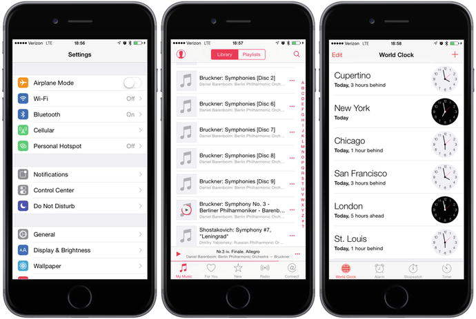
Figure 8-1. Though they all look different, the Settings, Music, and Clock applications use table views to display their data
Table View Basics
Tables display lists of data, each item in a table’s list known as a row. iOS allows tables to have an unlimited number of rows, constrained only by the amount of available memory, but only one column wide.
Table Views and Table View Cells
A table view object displays a table’s data and functions as instance of the class UITableView; each visible row in a table being implemented by an instance of the class UITableViewCell, as shown in Figure 8-2.

Figure 8-2. Each table view is an instance of UITableView, and each visible row is an instance of UITableViewCell
Though not responsible for storing all of your table’s data, table view contain only enough data to draw the rows currently visible. Somewhat like pickers, table views get their configuration data from an object that conforms to the UITableViewDelegate protocol, and their row data from an object that conforms to the UITableViewDataSource protocol. We’ll see how all this works when developing our sample programs later in the chapter.
As mentioned, all tables contain just a single column. The Clock application, shown on the right side of Figure 8-1, gives the appearance of having two columns, but in reality, that’s not the case—each row in the table is represented by a single UITableViewCell. By default, a UITableViewCell object can be configured with an image, some text, and an optional accessory icon, which is a small icon on the right side, which we’ll cover in detail in chapter 9.
You increase the amount data in a cell by adding subviews to UITableViewCell by using one of two basic techniques: 1) adding subviews programmatically when creating the cell or, 2) loading them from a storyboard or nib file. You lay out the table view cell however appropriate including any subviews needed. This makes the single-column limitation far less limiting than it sounds at first. We’ll explore how to use both of these techniques in this chapter.
Grouped and Plain Tables
Table views come in two basic styles:
Grouped: A grouped table view contains one or more sections of rows. Within each section, all rows rest tightly together in a compact grouping; but between sections, clear visible gaps exist, as shown in the leftmost picture in Figure 8-3. Note that a grouped table can consist of a single group.

Figure 8-3. One table view displayed as a grouped table (left); a plain table without an index (middle); and a plain table with an index, which is also called an indexed table (right)
Plain: A plain table view (see Figure 8-3, middle), the default style, sections are slightly closer together, and each section’s header optionally styled in a custom manner. When an index is used, we refer to this style as indexed (see Figure 8-3, right).
If your data source provides the necessary information, the table view allows the user to navigate your list by an index that is displayed along the right side.
iOS breaks up your table into divisions called sections. In a grouped table, each section presents itself visually as a group. In an indexed table, each indexed grouping of data Apple refers to as a section. For example, in the indexed table shown in Figure 8-3, all the names beginning with A would be one section, those beginning with B would be another, and so on .
Caution
Even though it is technically possible to create a grouped table with an index, you should not do so. The iOS Human Interface Guidelines specifically state that grouped tables should not provide indexes.
Implementing a Simple Table
Let’s look at the simplest possible example of a table view to get a feel for how it works. In this first example, we’ll only display a list of text values.
Create a new project in Xcode. For this chapter, we’re going back to the Single View Application template, so select that one. Call your project Simple Table, set Swift as the Language, set the Devices field to Universal, and make sure that Use Core Data is unchecked.
Designing the View
In the Project Navigator, expand the top-level Simple Table project and the Simple Table folder. This is such a simple application that we’re not going to need any outlets or actions. Go ahead and select Main.storyboard to edit the storyboard. If the View window isn’t visible in the layout area, single-click its icon in the Document Outline to open it. Next, look in the object library for a Table View (see Figure 8-4) and drag that over to the View window.

Figure 8-4. Dragging a table view from the library onto our main view
Drop the table view onto the view controller and line it up to be more or less centered in its parent view. Now let’s add Auto Layout constraints to make sure that the table view is positioned and sized correctly no matter what size the screen is. Select the table in the Document Outline, and then click the Pin icon at the bottom right of the storyboard editor (see Figure 8-5).
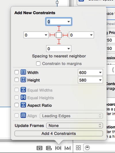
Figure 8-5. Pinning the table view so that it fits the screen
At the top of the pop-up, clear the Constrain to margins check box, click all four dashed lines, and set the distances in the four input fields to zero. This will have the effect of pinning all four edges of the table view to those of its parent view. To apply the constraints, change Update Frames to Items of New Constraints, and click the Add 4 Constraints button. The table should resize to fill the whole view.
Select the table view again in the Document Inspector and press ⌥⌘6 to bring up the Connections Inspector. You’ll notice that the first two available connections for the table view are the same as the first two for the picker views that we used in the last chapter: dataSource and delegate. Drag from the circle next to each of those connections over to the View Controller icon in the Document Outline or above the view controller in the storyboard editor. This makes our controller class both the data source and delegate for this table, as shown in Figure 8-6.
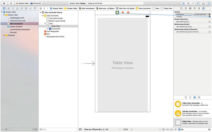
Figure 8-6. Connecting our Table View’s dataSource and delegate outlets
Next, we’ll start writing the Swift code for our Table View.
Implementing the Controller
If you’ve gone through the previous chapters, a lot of this will sound familiar and maybe a bit boring. However, because some readers skip ahead, I’m going to try and maintain a consistent approach at least for these early, more basic chapters. Single-click ViewController.swift and add the code in Listing 8-1 to the class declaration.
Listing 8-1. Add to the Top of the Class Declaration to Create Our Element Array
class ViewController: UIViewController,UITableViewDataSource, UITableViewDelegate {private let dwarves = ["Sleepy", "Sneezy", "Bashful", "Happy","Doc", "Grumpy", "Dopey","Thorin", "Dorin", "Nori", "Ori","Balin", "Dwalin", "Fili", "Kili","Oin", "Gloin", "Bifur", "Bofur","Bombur"]let simpleTableIdentifier = "SimpleTableIdentifier"
In Listing 8-1 we’re conforming our class to the two protocols that are needed for it to act as the data source and delegate for the table view, declaring an array that holds the data that will be displayed in the table and an identifier that we’ll use shortly. In a real application, the data would come from another source, such as a text file, a property list, or a web service .
Next, add the code in Listing 8-2 above the closing brace at the end of the file.
Listing 8-2. Our Table View’s dataSource Methods
// MARK:-// MARK: Table View Data Source Methodsfunc tableView(_ tableView: UITableView, numberOfRowsInSection section: Int) -> Int {return dwarves.count}func tableView(_ tableView: UITableView, cellForRowAt indexPath: IndexPath) -> UITableViewCell {var cell = tableView.dequeueReusableCell(withIdentifier: simpleTableIdentifier)if (cell == nil) {cell = UITableViewCell(style: UITableViewCellStyle.default,reuseIdentifier: simpleTableIdentifier)}cell?.textLabel?.text = dwarves[indexPath.row]return cell!}
These methods are part of the UITableViewDataSource protocol. The first one, tableView(_ tableView: UITableView, numberOfRowsInSection section: Int) -> Int is used by the table to ask how many rows are in a particular section. As you might expect, the default number of sections is one, and this method will be called to get the number of rows in the one section that makes up the list. We just return the number of items in our array.
The next method probably requires a little explanation, so let’s look at it more closely:
func tableView(_ tableView: UITableView,cellForRowAt indexPath: IndexPath) -> UITableViewCell {
This method is called by the table view when it needs to draw one of its rows. Notice that the second argument to this method is an NSIndexPath instance. NSIndexPath is a structure that table views use to wrap the section and row indexes into a single object. To get the row index or the section index out of an NSIndexPath, you just access its row property or its section property, both of which return an integer value.
The first parameter, tableView, is a reference to the table that’s being constructed. This allows us to create classes that act as a data source for multiple tables.
A table view displays only a few rows at a time, but the table itself can conceivably hold considerably more. Remember that each row in the table is represented by an instance of UITableViewCell, a subclass of UIView, which means each row can contain subviews. With a large table, this could represent a huge amount of overhead if the table were to try to keep one table view cell instance for every row in the table, regardless of whether that row was currently being displayed. Fortunately, tables don’t work that way.
Instead, as table view cells scroll off the screen, they are placed into a queue of cells available to be reused. If the system runs low on memory, the table view will get rid of the cells in the queue. But as long as the system has some memory available for those cells, it will hold on to them in case you want to use them again .
Every time a table view cell rolls off the screen, there’s a pretty good chance that another one just rolled onto the screen on the other side. If that new row can just reuse one of the cells that has already rolled off the screen, the system can avoid the overhead associated with constantly creating and releasing those views. To take advantage of this mechanism, we’ll ask the table view to give us a previously used cell of the specified type using the identifier we declared earlier. In effect, we’re asking for a reusable cell of type simpleTableIdentifier:
var cell = tableView.dequeueReusableCell(withIdentifier: simpleTableIdentifier)In this example, the table uses only a single type of cell, but in a more complex table, you might need to format different types of cells according to their content or position, in which case you would use a separate table cell identifier for each distinct cell type.
Now, it’s completely possible that the table view won’t have any spare cells (e.g., when it’s being initially populated), so we check the cell variable after the call to see whether it’s nil. If it is, we manually create a new table view cell using the same identifier string. At some point, we’ll inevitably reuse one of the cells we create here, so we need to make sure that we create it using simpleTableIdentifier:
if (cell == nil) {cell = UITableViewCell(style: UITableViewCellStyle.default,reuseIdentifier: simpleTableIdentifier)}
Curious about UITableViewCellStyle.default? We’ll get to it when we look at the table view cell styles shortly.
We now have a table view cell that we can return for the table view to use. So, all we need to do is place whatever information we want displayed in this cell. Displaying text in a row of a table is a very common task, so the table view cell provides a UILabel property called textLabel that we can set to display strings. That just requires getting the correct string from our dwarves array and using it to set the cell’s textLabel.
To get the correct value, however, we need to know which row the table view is asking for. We get that information from the indexPath’s row property. We use the row number of the table to get the corresponding string from the array, assign it to the cell’s textLabel.text property, and then return the cell:
cell?.textLabel?.text = dwarves[indexPath.row]return cell!
Compile and run your application, and you should see the array values displayed in a table view, as shown on the left of Figure 8-7.

Figure 8-7. The Simple Table application showing our dwarves array
You may be wondering why we need all the ? operators in this line of code:
cell?.textLabel?.text = dwarves[indexPath.row]Each use of the ? operator is an example of Swift’s optional chaining, which allows you to write compact code even if you have to invoke the methods or access the properties of an object reference that could be nil. The first ? operator is required because, as far as the compiler is concerned, cell could be nil. The reason for that is we obtained it by calling the dequeueReusableCellWithIdentifier() method, which returns a value of type UITableViewCell?. Of course, the compiler doesn’t take into account the fact that we explicitly check for a nil return value and create a new UITableViewCell object if we find one, thus ensuring that cell will, in fact, never be nil when we reach this line of code. If you look at the documentation for the UITableViewCell class, you’ll see that its textLabel property is of type UILabel?, so it could also be nil. Again, that won’t actually be the case because we are using a default UITableViewCell instance, which always includes a label. Naturally, the compiler doesn’t know that, so we use a ? operator when dereferencing it. This is something we’ll see throughout our Swift experiences .
Adding an Image
It would be nice if we could add an image to each row. You might think that we would need to create a subclass of UITableViewCell or add subviews to do that. Actually, if you can live with the image being on the left side of each row, we’re already set. The default table view cell can handle that situation just fine. Let’s see how it works.
Drag the files star.png and star2.png from the 08 - Star Image folder in the example source code archive to your project’s Assets.xcassets, as shown in Figure 8-8.
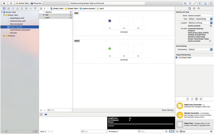
Figure 8-8. Adding our images to the Assets.xcassests folder
We’re going to arrange for these icons to appear on every row of the table view. All we need to do is create a UIImage for each of them and assign it to the UITableViewCell when the table view asks its data source for the cell for each row. To do this, in the file ViewController.swift, modify the tableView(_:cellForRowAtIndexPath:) method, as shown in Listing 8-3.
Listing 8-3. Our Modifications to Add the Image to Each Cell
func tableView(_ tableView: UITableView, cellForRowAt indexPath: IndexPath) -> UITableViewCell {var cell = tableView.dequeueReusableCell(withIdentifier: simpleTableIdentifier)if (cell == nil) {cell = UITableViewCell(style: UITableViewCellStyle.default,reuseIdentifier: simpleTableIdentifier)}let image = UIImage(named: "star")cell?.imageView?.image = imagelet highlightedImage = UIImage(named: "star2")cell?.imageView?.highlightedImage = highlightedImagecell?.textLabel?.text = dwarves[indexPath.row]return cell!}
That’s it. Each cell has an imageView property of type UIImage, which in turn has properties called image and highlightedImage. The image given by the image property appears to the left of the cell’s text and is replaced by the highlightedImage, if one is provided, when the cell is selected. You just set the cell’s imageView.image and imageView.highlightedImage properties to whatever images you want to display.
If you compile and run your application now, you should get a list with a bunch of nice little blue star icons to the left of each row, as shown in Figure 8-9. If you select any row, you’ll see that its icon switches from blue to green, which is the color of the image in the star2.png file. Of course, we could have included a different image for each row in the table, or, with very little effort, we could have used different icons for the different categories of dwarves.
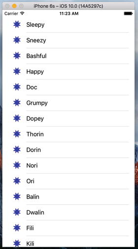
Figure 8-9. We used the cell’s imageView property to add an image to each of the table view’s cells
Note
UIImage uses a caching mechanism based on the file name, so it won’t load a new image property each time UIImage(named:) is called. Instead, it will use the already cached version.
Using Table View Cell Styles
The work you’ve done with the table view so far has used the default cell style shown in Figure 8-9, represented by the constant UITableViewCellStyle.default. But the UITableViewCell class includes several other predefined cell styles that let you easily add a bit more variety to your table views. These cell styles all use three different cell elements :
Image: If an image is part of the specified style, the image is displayed to the left of the cell’s text.
Text label: This is the cell’s primary text. In the case of the UITableViewCellStyle.Default style that we have been using so far, the text label is the only text shown in the cell.
Detail text label: This is the cell’s secondary text, usually used as an explanatory note or label .
To see what these new style additions look like, add the following code to tableView(_:cellForRowAtIndexPath:) in ViewController.swift :
if indexPath.row < 7 {cell?.detailTextLabel?.text = "Mr Disney"} else {cell?.detailTextLabel?.text = "Mr Tolkien"}
Place it just before the cell?.textLabel?.text = dwarves[indexPath.row] line in the method.
All we’ve done here is set the cell’s detail text. We use the string "Mr. Disney" for the first seven rows and the string "Mr. Tolkien" for the rest. When you run this code, each cell will look just as it did before (see Figure 8-10). That’s because we are using the style UITableViewCellStyle.default, which does not use the detail text.

Figure 8-10. The default cell style shows the image and text label in a straight line
Now change UITableViewCellStyle.default to UITableViewCellStyle.subtitle like this:
if (cell == nil) {cell = UITableViewCell(style: UITableViewCellStyle.subtitle,reuseIdentifier: simpleTableIdentifier)}
Now run the app again. With the subtitle style , both text elements are shown, one below the other, as shown in Figure 8-11.

Figure 8-11. The subtitle style shows the detail text in smaller letters below the text label
Next, change UITableViewCellStyle.subtitle to UITableViewCellStyle.value1, and then build and run again. This style places the text label and detail text label on the same line, but on opposite sides of the cell, as shown in Figure 8-12.
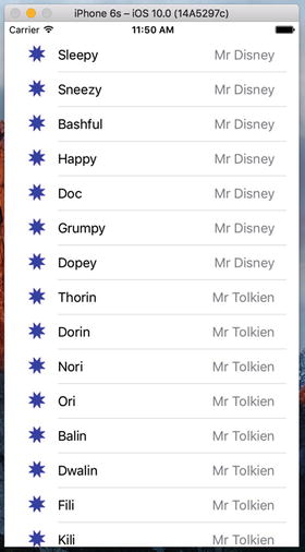
Figure 8-12. The style value1 places the text label on the left side in black letters and the detail text right-justified on the right side
Finally, change UITableViewCellStyle.value1 to UITableViewCellStyle.value2. This format is often used to display information along with a descriptive label. It doesn’t show the cell’s icon, but places the detail text label to the left of the text label, as shown in Figure 8-13. In this layout, the detail text label acts as a label describing the type of data held in the text label.
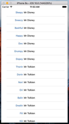
Figure 8-13. The style value 2 does not display the image and places the detail text label in blue letters to the left of the text label
Now that you’ve seen the cell styles that are available, go ahead and change back to the UITableViewCellStyle.default style before continuing. Later in this chapter, you’ll see how to create custom table view cells. But before you do that, make sure you consider the available cell styles to see whether one of them will suit your needs.
You may have noticed that we made our controller both the data source and delegate for this table view; but up until now, we haven’t actually implemented any of the methods from the UITableViewDelegate protocol. Unlike picker views, simpler table views don’t require the use of a delegate to do their thing. The data source provides all the data needed to draw the table. The purpose of the delegate is to configure the appearance of the table view and to handle certain user interactions. Let’s take a look at a few of the configuration options now. We’ll discuss a few more in the next chapter.
Setting the Indent Level
The delegate can be used to specify that some rows should be indented. In the file ViewController.swift, add the following method to your code:
// MARK:-// MARK: Table View delegate Methodsfunc tableView(_ tableView: UITableView, indentationLevelForRowAt indexPath: IndexPath) -> Int {return indexPath.row % 4}
This method sets the indent levelfor each row based on its row number; so row 0 will have an indent level of 0, row 1 will have an indent level of 1, and so on. Because of the % operator, row 4 will revert back to an indent level of 0 and the cycle begins again. An indent level is simply an integer that tells the table view to move that row a little to the right. The higher the number, the further to the right the row will be indented. You might use this technique, for example, to indicate that one row is subordinate to another row, as Mail does when representing subfolders.
When you run the application again, you’ll see that the rows indent in blocks of four, as shown in Figure 8-14.

Figure 8-14. Indented table rows
Handling Row Selection
The table’s delegate has two methods that allow you to handle row selection. One method is called before the row is selected, which can be used to prevent the row from being selected or even to change which row gets selected. Let’s implement that method and specify that the first row is not selectable. Add the following method to the end of ViewController.swift:
func tableView(_ tableView: UITableView, willSelectRowAt indexPath: IndexPath) -> IndexPath? {return indexPath.row == 0 ? nil : indexPath}
This method is passed an indexPath that represents the item that’s about to be selected. Our code looks at which row is about to be selected. If it’s the first row, which is always index zero, then it returns nil to indicate that no row should actually be selected. Otherwise, it returns the unmodified indexPath, which is how we indicate that it’s OK for the selection to proceed.
Before you compile and run, let’s also implement the delegate method that is called after a row has been selected, which is typically where you’ll actually handle the selection. In the next chapter, we’ll use this method to handle drill-downs in a master-detail application, but in this chapter, we’ll just put up an alert to show that the row was selected. Add the method in Listing 8-4 at the end of ViewController.swift .
Listing 8-4. Pop up an Alert When the User Taps a Row
func tableView(_ tableView: UITableView, didSelectRowAt indexPath: IndexPath) {let rowValue = dwarves[indexPath.row]let message = "You selected (rowValue)"let controller = UIAlertController(title: "Row Selected",message: message, preferredStyle: .alert)let action = UIAlertAction(title: "Yes I Did",style: .default, handler: nil)controller.addAction(action)present(controller, animated: true, completion: nil)}
Once you’ve added this method, compile and run the app, and then take it for a spin. For example, see whether you can select the first row (you shouldn’t be able to), and then select one of the other rows. The selected row should be highlighted. Also, your alert should pop up, telling you which row you selected while the selected row fades in the background, as shown in Figure 8-15.
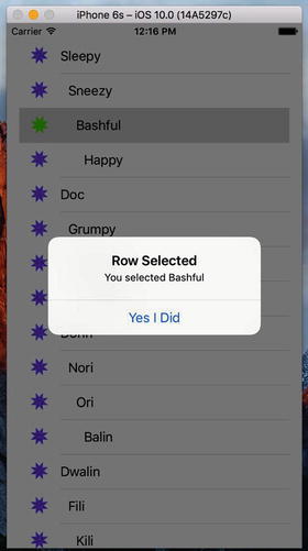
Figure 8-15. In this example, the first row is not selectable, and an alert is displayed when any other row is selected
Note that you can also modify the index path before you pass it back, which would cause a different row and/or section to be selected. You won’t do that very often, as you should have a very good reason for changing the user’s selection. In the vast majority of cases where you use the tableView(_:willSelectRowAtIndexPath:) method, you will either return indexPath unmodified to allow the selection or return nil to disallow it. If you really want to change the selected row and/or section, use the NSIndexPath(forRow:, inSection:) initializer to create a new NSIndexPath object and return it. For example, the code in Listing 8-5 would ensure that if you tried to select an even-numbered row, you would actually select the row that follows it.
Listing 8-5. Returning the Following Row
func tableView(tableView: UITableView,willSelectRowAtIndexPath indexPath: NSIndexPath)-> NSIndexPath? {if indexPath.row == 0 {return nil} else if (indexPath.row % 2 == 0){return NSIndexPath(row: indexPath.row + 1,section: indexPath.section)} else {return indexPath}}
Changing the Font Size and Row Height
Let’s say that we want to change the size of the font being used in the table view. In most situations, you shouldn’t override the default font; it’s what users expect to see. But sometimes there are valid reasons to change the font. Change the code for your tableView(_:cellForRowAtIndexPath:) method:
func tableView(_ tableView: UITableView, cellForRowAt indexPath: IndexPath) -> UITableViewCell {var cell = tableView.dequeueReusableCell(withIdentifier: simpleTableIdentifier)if (cell == nil) {cell = UITableViewCell(style: UITableViewCellStyle.default,reuseIdentifier: simpleTableIdentifier)}let image = UIImage(named: "star")cell?.imageView?.image = imagelet highlightedImage = UIImage(named: "star2")cell?.imageView?.highlightedImage = highlightedImageif indexPath.row < 7 {cell?.detailTextLabel?.text = "Mr Disney"} else {cell?.detailTextLabel?.text = "Mr Tolkien"}cell?.textLabel?.text = dwarves[indexPath.row]cell?.textLabel?.font = UIFont.boldSystemFont(ofSize: 50) // <- add this linereturn cell!}
When you run the application now, the values in your list are drawn in a really large font size, but they don’t exactly fit in the row, as shown in Figure 8-16.

Figure 8-16. Changing the font used to draw table view cells
There are a couple of ways to fix this. First, we can tell the table that all of its rows should have a given, fixed height. To do that, we set its rowHeight property, like this:
tableView.rowHeight = 70If you need different rows to have different heights, you can implement the UITableViewDelegate’s tableView(_:heightForRowAtIndexPath:) method. Go ahead and add this method to your controller class:
func tableView(_ tableView: UITableView, heightForRowAt indexPath: IndexPath) -> CGFloat {return indexPath.row == 0 ? 120 : 70}
We’ve just told the table view to set the row height for all rows to 70 points, except for the first row, which will be a little larger. Compile and run, and your table’s rows should be a better fit for their content now, as shown in Figure 8-17.
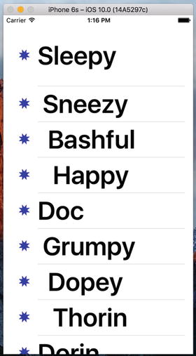
Figure 8-17. Changing the row size using the delegate. Notice that the first row is much taller than the rest
There are more tasks that the delegate handles, but most of the remaining ones come into play when you start working with hierarchical data, which we’ll do in the next chapter. To learn more, use the documentation browser to explore the UITableViewDelegate protocol and see what other methods are available.
Customizing Table View Cells
You can do a lot with table views right out of the box; but often, you will want to format the data for each row in ways that simply aren’t supported by UITableViewCell directly. In those cases, there are three basic approaches: one that involves adding subviews to UITableViewCell programmatically when creating the cell, a second that involves loading a cell from a nib file, and a third that is similar, but loads the cell from a storyboard. We’ll take a look at the first two techniques in this chapter and you’ll see an example that creates a cell from a storyboard in Chapter 9.
Adding Subviews to the Table View Cell
To show how to use custom cells, we’re going to create a new application with another table view. In each row, we’ll display two lines of information along with two labels, as shown in Figure 8-18. Our application displays the name and color of a series of potentially familiar computer models. We’ll show both of those pieces of information in the same row by adding subviews to its table view cell.
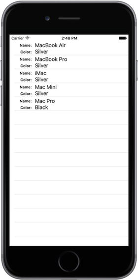
Figure 8-18. Adding subviews to the table view cell can give you multiline rows
Implementing a Custom Table Views Application
Create a new Xcode project using the Single View Application template. Name the project Table Cells and use the same settings as your last project. Click Main.storyboard to edit the GUI in Interface Builder.
Add a Table View to the main view and use the Connections Inspector to set its data source to the view controller, as we did for the Simple Table application. Then, use the Pin button at the bottom of the window to create constraints between the table view’s edges and those of its parent view and the status bar. You can actually use the same settings as in Figure 8-5, since the values that you specify in the input boxes at the top of the pop-up are, by default, the distances between the table view and its nearest neighbor in all four directions. Finally, save the storyboard.
Creating a UITableViewCell Subclass
Until this point, the standard table view cells we’ve been using have taken care of all the details of cell layout for us. Our controller code has been kept clear of the messy details about where to place labels and images; we just pass off the display values to the cell. This keeps presentation logic out of the controller, and that’s a really good design to stick to. For this project, we’re going to make a new cell UITableViewCell subclass of our own that takes care of the details of the new layout, which will keep our controller as simple as possible.
Adding New Cells
Select the Table Cells folder in the Project Navigator, and press ⌘N to create a new file. In the assistant that pops up, select Cocoa Touch Class from the iOS Source section and press Next. On the following screen, enter NameAndColorCell as the name of the new class, select UITableViewCell in the Subclass of pop-up list, leave Also create XIB file unchecked, click Next again, and on the next screen, click Create.
Now select NameAndColorCell.swift in the Project Navigator and add the following code:
class NameAndColorCell: UITableViewCell {var name: String = ""var color: String = ""var nameLabel: UILabel!var colorLabel: UILabel!
Here, we’ve added two properties (name and color) to our cell’s interface that our controller will use to pass values to each cell. We also added a couple of properties that we’ll use to access some of the subviews we’ll be adding to our cell. Our cell will contain four subviews, two of which are labels that have fixed content and another two for which the content will be changed for every row.
Those are all the properties we need to add, so let’s move on to the code. We’re going to override the table view cell’s init(style:reuseIdentifier:) initializer to add some code to create the views that we’ll need to display, as shown in Listing 8-6.
Listing 8-6. Our Table View Cell’s init() Method
override init(style: UITableViewCellStyle, reuseIdentifier: String?) {super.init(style: style, reuseIdentifier: reuseIdentifier)let nameLabelRect = CGRect(x: 0, y: 5, width: 70, height: 15)let nameMarker = UILabel(frame: nameLabelRect)nameMarker.textAlignment = NSTextAlignment.rightnameMarker.text = "Name:"nameMarker.font = UIFont.boldSystemFont(ofSize: 12)contentView.addSubview(nameMarker)let colorLabelRect = CGRect(x: 0, y: 26, width: 70, height: 15)let colorMarker = UILabel(frame: colorLabelRect)colorMarker.textAlignment = NSTextAlignment.rightcolorMarker.text = "Color:"colorMarker.font = UIFont.boldSystemFont(ofSize: 12)contentView.addSubview(colorMarker)let nameValueRect = CGRect(x: 80, y: 5, width: 200, height: 15)nameLabel = UILabel(frame: nameValueRect)contentView.addSubview(nameLabel)let colorValueRect = CGRect(x: 80, y: 25, width: 200, height: 15)colorLabel = UILabel(frame: colorValueRect)contentView.addSubview(colorLabel)}
That should be pretty straightforward. We create four UILabels and add them to the table view cell. The table view cell already has a UIView subview called contentView, which it uses to group all of its subviews. As a result, we don’t add the labels as subviews directly to the table view cell, but rather to its contentView.
Two of these labels contain static text. The label nameMarker contains the text Name:, and the label colorMarker contains the text Color:. Those are just labels that we won’t change. Both of these labels have right-aligned text using NSTextAlignment.right.
We’ll use the other two labels to display our row-specific data. Remember that we need some way of retrieving these fields later, so we keep references to both of them in the properties that we declared earlier.
Since we’ve overridden a designated initializer of the table view cell class, Swift requires us to also provide an implementation of the init(coder:) initializer. This initializer will never be called in our example application, so just add these three lines of code:
required init?(coder aDecoder: NSCoder) {fatalError("init(coder:) has not been implemented")}
In Chapter 13, we’ll discuss this initializer and why it’s sometimes needed.
Now let’s put the finishing touches on the NameAndColorCell class by adding some setter logic to the name and color properties. Change the declarations of these properties as follows:
var name: String = "" {didSet {if (name != oldValue) {nameLabel.text = name}}}var color: String = "" {didSet {if (color != oldValue) {colorLabel.text = color}}}
All we’re doing here is adding code to ensure that when the name or color property’s value is changed, the text property of the corresponding label in the same custom table view cell is set to the same value.
Implementing the Controller’s Code
Now, let’s set up the simple controller to display values in our nice new cells. Start off by selecting ViewController.swift and add the code in Listing 8-7.
Listing 8-7. Displaying Values in Our Custom Cell
class ViewController: UIViewController, UITableViewDataSource {let cellTableIdentifier = "CellTableIdentifier"@IBOutlet var tableView:UITableView!let computers = [["Name" : "MacBook Air", "Color" : "Silver"],["Name" : "MacBook Pro", "Color" : "Silver"],["Name" : "iMac", "Color" : "Silver"],["Name" : "Mac Mini", "Color" : "Silver"],["Name" : "Mac Pro", "Color" : "Black"]]override func viewDidLoad() {super.viewDidLoad()// Do any additional setup after loading the view, typically from a nib.tableView.register(NameAndColorCell.self,forCellReuseIdentifier: cellTableIdentifier)}
We conformed the view controller to the UITableViewDataSource protocol, and added a cell identifier name and an array of dictionaries. Each dictionary contains the name and color information for one row in the table. The name for that row is held in the dictionary under the key Name, and the color is held under the key Color. We also added an outlet for the table view, so we need to connect it in the storyboard. Select the Main.storyboard file. In the Document Outline, Control-drag from the View Controller icon to the Table View icon. Release the mouse and select tableView in the pop-up to link the table view to the outlet .
Now add the code in Listing 8-8 to the end of the ViewController.swift file.
Listing 8-8. Our Table View’s Data Source Methods
// MARK: -// MARK: Table View Data Source Methodsfunc tableView(_ tableView: UITableView, numberOfRowsInSection section: Int) -> Int {return computers.count}func tableView(_ tableView: UITableView, cellForRowAt indexPath: IndexPath) -> UITableViewCell {let cell = tableView.dequeueReusableCell(withIdentifier: cellTableIdentifier, for: indexPath)as! NameAndColorCelllet rowData = computers[indexPath.row]cell.name = rowData["Name"]!cell.color = rowData["Color"]!return cell}
You have already seen these methods in our previous example—they belong to the UITableViewDataSource protocol. Let’s focus on tableView(_ tableView: UITableView, cellForRowAt indexPath: IndexPath) since that’s where we’re really getting into some new stuff. Here we’re using an interesting feature: a table view can use a sort of registry to create a new cell when needed. That means that as long as we’ve registered all the reuse identifiers that we’re going to use for a table view, we can always get access to an available cell. In our previous example, the dequeue method we implemented also used the registry, but it returned nil if the identifier that we give it isn’t registered. The nil return value is used as a signal that we need to create and populate a new UITableViewCell object. The following method that we’re using never returns nil:
dequeueReusableCell(withIdentifier: cellTableIdentifier, for: indexPath)
So how does it get a table cell object? It uses the identifier that we pass to it as the key to its registry. We added an entry to the registry that’s mapped to our table cell identifier in the viewDidLoad method:
tableView.register(NameAndColorCell.self,forCellReuseIdentifier: cellTableIdentifier)
What happens if we pass an identifier that’s not registered? In that case, the dequeueReusableCell method crashes. Crashing sounds bad, but in this case, it would be the result of a bug that you would discover right away during development. Therefore, we don’t need to include code that checks for a nil return value since that will never happen .
Once we’ve got our new cell, we use the indexPath argument that was passed in to determine which row the table is requesting a cell for, and then use that row value to grab the correct dictionary for the requested row. Remember that the dictionary has two key/value pairs: one with name and another with color:
let rowData = computers[indexPath.row]Now, all that’s left to do is populate the cell with data from the chosen row, using the properties we defined in our subclass:
cell.name = rowData["Name"]!cell.color = rowData["Color"]!
As you saw earlier, setting these properties causes the value to be copied to the name and color labels in the table view cell.
Build and run your application. You should see a table of rows, each with two lines of data, as shown in Figure 8-19.

Figure 8-19. Our Table View of custom cells created in code
Being able to add views to a table view cell provides a lot more flexibility than using the standard table view cell alone, but it can get a little tedious creating, positioning, and adding all the subviews programmatically. Gosh, it sure would be nice if we could design the table view cell graphically by using Xcode’s GUI editing tools . Well, we’re in luck. As mentioned earlier, you can use Interface Builder to design your table view cells, and then simply load the views from a storyboard or a XIB file when you create a new cell.
Loading a UITableViewCell from a XIB File
We’re going to re-create that same two-line interface we just built in code using the visual layout capabilities that Xcode provides in Interface Builder. To do this, we’ll create a new XIB file that will contain the table view cell, and lay out its views using Interface Builder. Then, when we need a table view cell to represent a row, instead of creating a standard table view cell, we’ll just load the XIB file and use the properties we already defined in our cell class to set the name and color. In addition to using Interface Builder’s visual layout, we’ll also simplify our code in a few other places. Before proceeding, you might want to make a copy of the Table Cells project in which you can make the changes that follow. As we did previously, exit Xcode, and just compress the project file giving it a suitable name for reference. I called mine Table Cells Orig.zip as a reference to it being our original Table Cells project (see Figure 8-20).

Figure 8-20. You can compress a project folder to create a version baseline in case you decide to go back to it later
First, we’ll make a few changes to the NameAndColorCell class, in NameAndColorCell.swift. The first step is to mark up the nameLabel and colorLabel properties as outlets, so we can use them in Interface Builder:
@IBOutlet var nameLabel: UILabel!@IBOutlet var colorLabel: UILabel!
Now, remember that setup we did in init(style: UITableViewCellStyle, reuseIdentifier: String?), where we created our labels? All that can go. In fact, you should just delete the entire method since all that setup will now be done in Interface Builder. And since we are no longer overriding any of the base class initializers, you can delete the init(coder:) method too.
After all that, you’re left with a cell class that’s even smaller and cleaner than before. Its only real function now is to shuffle data to the labels. Now we need to re-create the cell and its labels in Interface Builder.
Designing the Table View Cell in Interface Builder
Right-click the Table Cells folder in Xcode and select New File… from the contextual menu. In the left pane of the new file assistant, click User Interface (making sure to pick it in the iOS section, rather than the watchOS, tvOS, or macOS section). From the upper pane, select User Interface and Empty, and then click Next (see Figure 8-21). On the following screen, use the file name NameAndColorCell.xib. Make sure that the main project directory is selected in the file browser and that the Table Cells group is selected in the Group pop-up. Press Create to create a new XIB file .

Figure 8-21. Create an empty UI file that will become our custom cell XIB
Next, select NameAndColorCell.xib in the Project Navigator to open the file for editing. Until now, we’ve been doing all of our GUI editing inside of storyboards, but now we’re using a nib file instead. Most things are similar and will look very familiar to you, but there are a few differences. One of the main differences is that, while a storyboard file is centered around scenes that pair up a view controller and a view, inside a nib file there’s no such forced pairing. In fact, a nib file often doesn’t contain a real controller object at all, just a proxy that is called File’s Owner. If you open the Document Outline, you’ll see it there, right above First Responder.
Look in the library for a Table View Cell and drag one over to the GUI layout area, as shown in Figure 8-22.

Figure 8-22. Drag a table view cell from the library onto the canvas
Next, press ⌥⌘4 to go to the Attributes Inspector (see Figure 8-23). One of the first fields you’ll see there is Identifier. That’s the reuse identifier that we’ve been using in our code. If this does not ring a bell, scan back through the chapter and look for CellTableIdentifier. Set the Identifier value to CellTableIdentifier.

Figure 8-23. The Attributes Inspector for our table view cell
The idea here is that, when we retrieve a cell for reuse, perhaps because of scrolling a new cell into view, we want to make sure we get the correct cell type. When this particular cell is instantiated from the XIB file, its reuse identifier instance variable will be prepopulated with the name you entered in the Identifier field of the Attributes Inspector—CellTableIdentifier, in this case.
Imagine a scenario where you created a table with a header and then a series of “middle” cells. If you scroll a middle cell into view, it’s important that you retrieve a middle cell to reuse and not a header cell. The Identifier field lets you tag the cells appropriately.
Our next step is to edit our table cell’s content view. First, select the table cell in the editing area and drag down its lower edge to make the cell a little taller. Keep dragging until the height is 65. Go to the library, drag out four Label controls , and place them in the content view, using Figure 8-24 as a guide. The labels will be too close to the top and bottom for those guidelines to be of much help, but the left guideline and the alignment guidelines should serve their purpose. Note that you can drag out one label, and then Option-drag to create copies, if that approach makes things easier for you.
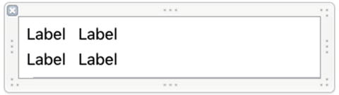
Figure 8-24. The table view cell’s content view, with four labels dragged in
Next, double-click the upper-left label and change its title to Name:, and then change the lower-left label to Color:.
Now, select both the Name: and Color: labels and press the small T button in the Attribute Inspector’s Font field. This will open a small panel containing a Font pop-up button. Click that and choose Headline as the typeface. If needed, select the two unchanged label fields on the right and drag them a little more to the right to give the design a bit of breathing room, and then resize the other two labels so that you can see the text that you just set. Next, resize the two right-side labels so that they stretch all the way to the right guideline. Figure 8-25 should give you a sense of our final cell content view.

Figure 8-25. The table view cell’s content view with the left label names changed and set to Headline style, which is bold, and with the right labels slightly moved and resized
As always when we create a new layout, we need to add Auto Layout constraints. The general idea is to pin the left side labels to the left side of the cell and the right side labels to its right. We’ll also make sure that the vertical separation between the labels and the top and bottom of the cell and between the labels is preserved. We’ll link each left side label to the one on its right. Here are the steps :
Click the Name: label, hold down Shift, and then click the Color: label. Click the Pin icon below the nib editor, check the Equal Widths check box, and click Add 1 Constraint. You’ll see some Auto Layout warnings appear when you do this—don’t worry about them, because we’ll fix them as we add more constraints.
With the two labels still selected, open the Size Inspector and find the section headed Content Hugging Priority . If you don’t see it, try deselecting and reselecting both labels. The values in these fields determine how resistant the labels are to expanding into extra space. We don’t want these labels to expand at all in the horizontal, so change the value in the Horizontal field from 251 to 500. Any value greater than 251 will do—we just need it to be greater than the Content Hugging Priority of the two labels on the right, so that any extra horizontal space is allocated to them.
Control-drag from the Color: label up to the Name: label, select Vertical Spacing from the pop-up, and press Return.
Control-drag diagonally up and left from the Name: label toward the top-left corner of the cell until the cell’s background turns completely blue. In the pop-up, hold down Shift and select Leading Space to Container Margin and Top Space to Container Margin, and then press Return.
Control-drag diagonally down and left from the Color: label toward the bottom-left corner of the cell until its background is blue. In the pop-up, hold down Shift, select Leading Space to Container Margin and Bottom Space to Container Margin, and then press Return.
Control-drag from the Name: label to the label to its right. In the pop-up, hold down Shift, select Horizontal Spacing and Baseline, and then press Return. Control-drag from the top label on the right toward the right edge of the cell until the cell’s background turns blue. In the pop-up, select Trailing Space to Container Margin .
Similarly, Control-drag from the Color: label to the label to its right. In the pop-up, hold down Shift, select Horizontal Spacing and Baseline, and then press Return. Control-drag from the bottom label on the right toward the right edge of the cell until the cell’s background turns blue. In the pop-up, select Trailing Space to Container Margin and press Return.
Finally, select the Content View icon in the Document Outline and then choose Editor ➤ Resolve Auto Layout Issues ➤ Update Frames from the menu, if it’s enabled. The four labels should move to their final locations, as shown in Figure 8-26. If you see something different, delete all of the constraints in the Document Outline and try again.

Figure 8-26. Final label positioning within our custom cell
Now, we need to let Interface Builder know that this table view cell isn’t just a normal cell, but an instance of our special subclass. Otherwise, we wouldn’t be able to connect our outlets to the relevant labels. Select the table view cell by clicking CellTableIdentifier in the Document Outline, bring up the Identity Inspector by pressing ⌥⌘3, and choose NameAndColorCell from the Class control (see Figure 8-27).

Figure 8-27. Set to our custom class
Next, switch to the Connections Inspector (⌥⌘6), where you’ll see the colorLabel and nameLabel outlets (see Figure 8-28).

Figure 8-28. Our colorLabel and nameLabel outlets
Drag from the nameLabel outlet to the top label on the right in the table cell and from the colorLabel outlet to the bottom label on the right, as shown in Figure 8-29.

Figure 8-29. Connecting our name and color label outlets
Using the New Table View Cell
To use the cell we designed, we just need to make a few pretty simple changes to the viewDidLoad() method in ViewController.swift, as shown in Listing 8-9.
Listing 8-9. Modifying viewDidLoad() to Use Our New Cell
override func viewDidLoad() {super.viewDidLoad()// Do any additional setup after loading the view, typically from a nib.tableView.register(NameAndColorCell.self,forCellReuseIdentifier: cellTableIdentifier)let xib = UINib(nibName: "NameAndColorCell", bundle: nil)tableView.register(xib,forCellReuseIdentifier: cellTableIdentifier)tableView.rowHeight = 65}
Just as it can associate a class with a reuse identifier (as you saw in the previous example), a table view can keep track of which nib files are meant to be associated with particular reuse identifiers. This allows you to register cells for each row type you have using classes or nib files once, and dequeueReusableCell (_:forIndexPath:) will always provide a cell ready for use.
That’s it. Build and run. Now your two-line table cells are based on your Interface Builder design skills, as shown in Figure 8-30.

Figure 8-30. The results of using our custom cell
Grouped and Indexed Sections
Our next project will explore another fundamental aspect of tables. We’re still going to use a single table view—no hierarchies yet—but we’ll divide data into sections. Create a new Xcode project using the Single View Application template again, this time calling it Sections. As usual, set the Language to Swift and the Devices to Universal.
Building the View
Open the Sections folder and click Main.storyboard to edit the file. Drop a table view onto the View window, as we did before and add the same Auto Layout constraints that we used in the Table Cell example. Then press ⌥⌘6 and connect the dataSource connection to the View Controller icon.
Next, make sure the table view is selected and press ⌥⌘4 to bring up the Attributes Inspector. Change the table view’s Style from Plain to Grouped, as shown in Figure 8-31. Save the storyboard.

Figure 8-31. The Attributes Inspector for the table view, showing the Style pop-up with Grouped selected
Importing the Data
This project needs a fair amount of data. To save you a few hours of typing, we’ve provided another property list for your tabling pleasure. Grab the file named sortednames.plist from the 08 - Sections Data subfolder in this book’s example source code archive and drag it into your project’s Sections folder in Xcode.
Once sortednames.plist is added to your project, single-click it just to get a sense of what it looks like, as shown in Figure 8-32. It’s a property list that contains a dictionary, with one entry for each letter of the alphabet. Underneath each letter is a list of names that start with that letter.

Figure 8-32. The sortednames.plist property list file. The letter J is open to give you a sense of one of the dictionaries
We’ll use the data from this property list to feed the table view, creating a section for each letter.
Implementing the Controller
Single-click the ViewController.swift file. Make the class conform to the UITableViewDataSource protocol, add a table cell identifier name, and create a couple of properties by adding the following code in bold:
class ViewController: UIViewController, UITableViewDataSource {let sectionsTableIdentifier = "SectionsTableIndentifier"var names: [String: [String]]!var keys: [String]!
Select the Main.storyboard file again and then bring up the Assistant Editor. If not shown, use the jump bar to select ViewController.swift file. Control-drag from the table view to the Assistant Editor to create an outlet for the table just below the definition of the keys property:
@IBOutlet weak var tableView: UITableView! Now modify the viewDidLoad() method, as shown in Listing 8-10.
Listing 8-10. Our New viewDidLoad Method
override func viewDidLoad() {super.viewDidLoad()// Do any additional setup after loading the view, typically from a nib.tableView.register(UITableViewCell.self,forCellReuseIdentifier: sectionsTableIdentifier)let path = Bundle.main.path(forResource:"sortednames", ofType: "plist")let namesDict = NSDictionary(contentsOfFile: path!)names = namesDict as! [String: [String]]keys = (namesDict!.allKeys as! [String]).sorted()}
Most of this isn’t too different from what you’ve seen before. Earlier, we added property declarations for both a dictionary and an array. The dictionary will hold all of our data, while the array will hold the sections sorted in alphabetical order. In the viewDidLoad() method, we first registered the default table view cell class that should be displayed for each row, using our declared identifier. After that, we created an NSDictionaryinstance from the property list we added to our project and assigned it to the names property, casting it to the appropriate Swift dictionary type as we do so. Next, we grabbed all the keys from the dictionary and sorted them to give us an ordered array with all the key values in the dictionary in alphabetical order. Remember that our data uses the letters of the alphabet as its keys, so this array will have 26 letters sorted from A to Z. We’ll use the array to help us keep track of the sections.
Next, add the code in Listing 8-11 to the end of the ViewController.swift file.
Listing 8-11. Our Table View’s Data Source Methods
// MARK: Table View Data Source Methodsfunc numberOfSections(in tableView: UITableView) -> Int {return keys.count}func tableView(_ tableView: UITableView, numberOfRowsInSection section: Int) -> Int {let key = keys[section]let nameSection = names[key]!return nameSection.count}func tableView(_ tableView: UITableView, titleForHeaderInSection section: Int) -> String? {return keys[section]}func tableView(_ tableView: UITableView, cellForRowAt indexPath: IndexPath) -> UITableViewCell {let cell = tableView.dequeueReusableCell(withIdentifier: sectionsTableIdentifier, for: indexPath)as UITableViewCelllet key = keys[indexPath.section]let nameSection = names[key]!cell.textLabel?.text = nameSection[indexPath.row]return cell}
These are all table data source methods. The first one we added to our class specifies the number of sections. We didn’t implement this method in the earlier examples because we were happy with the default setting of 1. This time, we’re telling the table view that we have one section for each key in our dictionary:
func numberOfSectionsInTableView(tableView: UITableView) -> Int {return keys.count}
The next method calculates the number of rows in a specific section. In the previous example, we had only one section, so we just returned the number of rows in our array. This time, we need to break it down by section. We can do this by retrieving the array that corresponds to the section in question and returning the count from that array:
func tableView(_ tableView: UITableView, numberOfRowsInSection section: Int) -> Int {let key = keys[section]let nameSection = names[key]!return nameSection.count}
The method tableView(_:titleForHeaderInSection:) allows you to specify an optional header value for each section. We simply return the letter for this group, which is the group’s key:
func tableView(_ tableView: UITableView, titleForHeaderInSection section: Int) -> String? {return keys[section]}
In our tableView(_:cellForRowAtIndexPath:) method, we need to extract both the section key and the names array using the section and row properties from the index path, and then use those to determine which value to use. The section number will tell us which array to pull out of the names dictionary, and then we can use the row to figure out which value from that array to use. Everything else in that method is basically the same as the version in the Table Cells application we built earlier in the chapter.
Build and run the project remembering that we changed the table’s Style to Grouped, so we ended up with a grouped table with 26 sections, which should look like Figure 8-33.

Figure 8-33. A grouped table with multiple sections
As a contrast, let’s change our table view back to the plain style and see what a plain table view with multiple sections looks like. Select Main.storyboard to edit the file in Interface Builder again. Select the table view and use the Attributes Inspector to switch the view to Plain. Save the project, and then build and run it—same data, but a different look, as shown in Figure 8-34.

Figure 8-34. A plain table with sections
Adding an Index
One problem with our current table is the sheer number of rows. There are 2,000 names in this list. Your finger will get awfully tired looking for Zachariah or Zayne, not to mention Zoie.
One solution to this problem is to add an index down the right side of the table view. Now that we’ve set our table view style back to Plain, that’s relatively easy to do, as shown in Figure 8-35. Add the following method to the bottom of ViewController.swift, and then build and run the app.
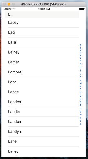
Figure 8-35. Adding an index to our Table View
func sectionIndexTitles(for tableView: UITableView) -> [String]? {return keys}
Adding a Search Bar
The index is helpful, but even so, we still have a whole lot of names here. If we want to see whether the name Arabella is in the list, for example, we’ll need to scroll for a while even after using the index. It would be nice if we could let the user pare down the list by specifying a search term, making it more user friendly. Well, it’s a bit of extra work, but it’s not that much. We’re going to implement a standard iOS search bar using a search controller, like the one shown on the left in Figure 8-36.

Figure 8-36. The application with a search bar added to the table
As the user types into the search bar, the list of names reduces to only those that contain the entered text as a substring. As a bonus, the search bar also allows you to define scope buttons that you can use to qualify the search in some way. We’ll add three scope buttons to our search bar—the Short button will limit the search to names that are less than six characters long, the Long button will consider only those names that have at least six characters, and the All button includes all names in the search. The scope buttons appear only when the user is typing into the search bar; you can see them in action on the right of Figure 8-36.
Adding search functionality is quite easy. You need only three things:
Some data to be searched. In our case, that’s the list of names.
A view controller to display the search results. This view controller temporarily replaces the one that’s providing the data. It can choose to display the results in any way, but usually the source data is presented in a table and the results view controller will use another table that looks very similar to it, thus creating the impression that the search is simply filtering the original table. As you’ll see, though, that’s not actually what’s happening.
A UISearchController that provides the search bar and manages the display of the search results in the results view controller.
Let’s start by creating the skeleton of the results view controller. We are going to display our search results in a table, so our results view controller needs to contain a table. We could drag a view controller onto the storyboard and add a table view to it as we have done in the earlier examples in the chapter, but let’s do something different this time. We’re going to use a UITableViewController, which is a view controller with an embedded UITableView that is preconfigured as both the data source and the delegate for its table view. In the Project Navigator, right-click the Sections group and select New File… from the pop-up menu. In the file template chooser, select Cocoa Touch Class from the iOS Source group and press Next. Name your new class SearchResultsController and make it a subclass of UITableViewController. Press Next, choose the location for the new file, and let Xcode create it.
Select SearchResultsController.swift in the Project Navigator and make the following change to it:
class SearchResultsController: UITableViewController,UISearchResultsUpdating {
We’re going to implement the search logic in this view controller, so we conformed it to the UISearchResultsUpdating protocol, which allows us to assign it as a delegate of the UISearchController class. As you’ll see later, the single method defined by this protocol is called to update the search results as the user types into the search bar.
Since it’s going to implement the search operation for us, SearchResultsController needs access to the list of names that the main view controller is displaying, so we’ll need to give it properties that we can use to pass to it the names dictionary and the list of keys that we’re using for display in the main view controller. Let’s add these properties to SearchResultsController.swift now. You’ve probably noticed that this file already contains some incomplete code that provides a partial implementation of the UITableViewDataSource protocol and some commented-out code blocks for other methods that UITableViewController subclasses frequently need to implement. We’re not going to use these in this example, so delete all of the commented-out code and the two UITableViewDataSource methods, and then add the following code at the top of the file:
class SearchResultsController: UITableViewController, UISearchResultsUpdating {let sectionsTableIdentifier = "SectionsTableIdentifier"var names:[String: [String]] = [String: [String]]()var keys: [String] = []var filteredNames: [String] = []
We added the sectionsTableIdentifier variable to hold the identifier for the table cells in this view controller . We’re using the same identifier as we did in the main view controller, although we could have used any name at all. We also added the two properties that will hold the names dictionary and the list of keys that we’ll use when searching, and another that will keep a reference to an array that will hold the search results.
Next, add a line of code to the viewDidLoad() method to register our table cell identifier with the results controller’s embedded table view:
override func viewDidLoad() {super.viewDidLoad()tableView.register(UITableViewCell.self,forCellReuseIdentifier: sectionsTableIdentifier)}
That’s all we need to do in the results view controller for now, so let’s switch back to our main view controller for a while and add the search bar to it. Select ViewController.swift in the Project Navigator and add a property to hold a reference to the UISearchController instance that will do most of the hard work for us in this example at the top of the file:
class ViewController: UIViewController, UITableViewDataSource {let sectionsTableIdentifier = "SectionsTableIndentifier"var names: [String: [String]]!var keys: [String]!@IBOutlet weak var tableView: UITableView!var searchController: UISearchController! // ← add this line
Next, modify the viewDidLoad() method to add the search controller, as shown in Listing 8-12.
Listing 8-12. Adding the Search Controller to Our Main viewDidLoad method in ViewController.swift
override func viewDidLoad() {super.viewDidLoad()// Do any additional setup after loading the view, typically from a nib.tableView.register(UITableViewCell.self,forCellReuseIdentifier: sectionsTableIdentifier)let path = Bundle.main.pathForResource("sortednames", ofType: "plist")let namesDict = NSDictionary(contentsOfFile: path!)names = namesDict as! [String: [String]]keys = (namesDict!.allKeys as! [String]).sorted()let resultsController = SearchResultsController()resultsController.names = namesresultsController.keys = keyssearchController =UISearchController(searchResultsController: resultsController)let searchBar = searchController.searchBarsearchBar.scopeButtonTitles = ["All", "Short", "Long"]searchBar.placeholder = "Enter a search term"searchBar.sizeToFit()tableView.tableHeaderView = searchBarsearchController.searchResultsUpdater = resultsController}
We start by creating the results controller and set its names and keys properties. Then, we create the UISearchController, passing it a reference to our results controller—UISearchController presents this view controller when it has search results to display:
let resultsController = SearchResultsController()resultsController.names = namesresultsController.keys = keyssearchController =UISearchController(searchResultsController: resultsController)
The next three lines of code get and configure the UISearchBar, which is created by the UISearchController and which we can get from its searchBar property:
let searchBar = searchController.searchBarsearchBar.scopeButtonTitles = ["All", "Short", "Long"]searchBar.placeholder = "Enter a search term"
The search bar’s scopeButtonTitles property contains the names to be assigned to its scope buttons. By default, there are no scope buttons, but here we install the names of the three buttons discussed earlier in this section. We also set some placeholder text to let the user know what the search bar is for. You can see the placeholder text on the left in Figure 8-36.
So far, we have created the UISearchController but we haven’t connected it to our user interface. To do that, we get the search bar and install it as the header view of the table in our main view controller:
searchBar.sizeToFit()tableView.tableHeaderView = searchBar
The table’s header view is managed automatically by the table view. It always appears before the first row of the first table section. Notice that we use the sizeToFit() method to give the search bar the size that’s appropriate for its content. We do this so that it is given the correct height—the width that’s set by this method is not important, because the table view will make sure that it stretches the whole width of the table and will resize it automatically if the table changes size (typically because the device has been rotated.)
The final change to viewDidLoad assigns a value to the UISearchController’s searchResultsUpdater property, which is of type UISearchResultsUpdating:
searchController.searchResultsUpdater = resultsController Each time the user types something into the search bar, UISearchControlleruses the object stored in its searchResultsUpdater property to update the search results. As mentioned, we are going to handle the search in the SearchResultsController class, which is why we needed to make it conform to the UISearchResultsUpdating protocol.
That’s all we need to do to in our main view controller to add the search bar and have the search results displayed. Next, we need to return to SearchResultsController.swift, where we have two tasks to complete—add the code that implements the search and the UITableDataSource methods for the embedded table view.
Let’s start with the code for the search. As the user types into the search bar, the UISearchController calls the updateSearchResultsForSearchController() method of its search results updater, which is our SearchResultsController. In this method, we need to get the search text from the search bar and use it to construct a filtered list of names in the filteredNames array. We’ll also use the scope buttons to limit the names that we include in the search. Add the following constant definitions at the top of SearchResultsController.swift:
class SearchResultsController: UITableViewController, UISearchResultsUpdating {private static let longNameSize = 6private static let shortNamesButtonIndex = 1private static let longNamesButtonIndex = 2
Now add code in Listing 8-13 to the end of the file.
Listing 8-13. Our Search Results Code
// MARK: UISearchResultsUpdating Conformancefunc updateSearchResults(for searchController: UISearchController) {if let searchString = searchController.searchBar.text {let buttonIndex = searchController.searchBar.selectedScopeButtonIndexfilteredNames.removeAll(keepingCapacity: true)if !searchString.isEmpty {let filter: (String) -> Bool = { name in// Filter out long or short names depending on which// scope button is selected.let nameLength = name.characters.countif (buttonIndex == SearchResultsController.shortNamesButtonIndex&& nameLength >= SearchResultsController.longNameSize)|| (buttonIndex == SearchResultsController.longNamesButtonIndex&& nameLength < SearchResultsController.longNameSize) {return false}let range = name.range(of: searchString, options: NSString.CompareOptions.caseInsensitive, range: nil, locale: nil)// let range = name.rangeOfString(searchString ,// options: NSString.CompareOptions.CaseInsensitiveSearch)return range != nil}for key in keys {let namesForKey = names[key]!let matches = namesForKey.filter(filter)filteredNames += matches}}}tableView.reloadData()}
Let’s walk through this code to see what it’s doing. First, we get the search string from the search bar and the index of the scope button that’s selected, and then we clear the list of filtered names. We only search if the text control returns a string; theoretically, it is possible for the text to be nil, so we bracket the rest of the code in an if let construction:
if let searchString = searchController.searchBar.text {let buttonIndex = searchController.searchBar.selectedScopeButtonIndexfilteredNames.removeAll(keepingCapacity: true)
Next, we check that the search string is not empty—we do not display any matching results for an empty search string:
if !searchString.isEmpty {Now we define a closure for matching names against the search string. The closure will be called for each name in the names directory, and will be given a name (as a string) and return true if the value matches and false if there’s no match. We first check that the length of the name is consistent with the selected scope button and return false if it isn’t :
let filter: (String) -> Bool = { name in// Filter out long or short names depending on which// scope button is selected.let nameLength = name.characters.countif (buttonIndex == SearchResultsController.shortNamesButtonIndex&& nameLength >= SearchResultsController.longNameSize)|| (buttonIndex == SearchResultsController.longNamesButtonIndex&& nameLength < SearchResultsController.longNameSize) {return false}
If the name passes this test, we look for the search string as a substring of the name. If we find it, then we have a match:
let range = name.range(of: searchString, options:NSString.CompareOptions.caseInsensitive,range: nil, locale: nil)return range != nil}
That’s all the code that we need in the closure to handle the name search. Next, we iterate over all the keys in the names dictionary, each of which corresponds to an array of names (key A maps to the names that start with the letter A, and so on). For each key, we get its array of names and filter it using our closure. This gets us a (possibly empty) filtered array of the names that match, which we add to the filteredNames array:
for key in keys {let namesForKey = names[key]!let matches = namesForKey.filter(filter)filteredNames += matches}
In this code, namesForKey is of type [String] and contains the names that correspond to whichever key value we are processing. We use the filter() method of Array to apply our closure to each of the elements in namesToKey. The result is another array containing only the elements that match the filter—that is, only the names should match the search text and the selected scope button, which we then add to filteredNames.
Once all the name arrays have been processed, we have the complete set of matching names in the filteredNames array. Now all we need to do is arrange for them to be displayed in the table in our SearchResultsController. We start by telling the table that it needs to redisplay its content:
}tableView.reloadData()}
We need the table view to display one name from the filteredNames array in each row. To do that, we implement the methods of the UITableViewDataSource protocol in our SearchResultsController class. Recall that SearchResultsController is a subclass of UITableViewController, so it automatically acts as its table’s data source. Add the code in Listing 8-14 to SearchResultsController.swift, above the updateSearchResults method .
Listing 8-14. Our Table View Data Source Methods
// MARK: Table View Data Source Methodsoverride func tableView(_ tableView: UITableView, numberOfRowsInSection section: Int) -> Int {return filteredNames.count}override func tableView(_ tableView: UITableView, cellForRowAt indexPath: IndexPath) -> UITableViewCell {let cell = tableView.dequeueReusableCell(withIdentifier: sectionsTableIdentifier)cell!.textLabel?.text = filteredNames[indexPath.row]return cell!}
You can now run the app and try filtering the list of names, as shown in Figure 8-37.

Figure 8-37. The application with a search bar added to the table
View Debugging
The UISearchController class does a good job of switching between the two tables in our last example—so good that you might find it hard to believe that there is a switch going on at all. Apart from the fact that you’ve seen all the code, there are also a couple of visual clues—the search table is a plain table, so you don’t see the names grouped like they are in the main table. It also has no section index. If you want even more proof, you can get it by using a neat feature of Xcode called View Debugging, which lets you take snapshots of the view hierarchy of a running application and examine them in the Xcode editor area. This feature works on both the simulator and real devices. You’ll probably find it invaluable at some point or another when you’re trying to find out why one of your views appears to be missing or is not where you expect it to be.
Let’s start by looking at what View Debugging makes of our application when it’s showing the full name list. Run the application again and in the Xcode menu bar, select Debug ➤ View Debugging ➤ Capture View Hierarchy. Xcode grabs the view hierarchy from the simulator or device, and displays it, as shown in Figure 8-38.
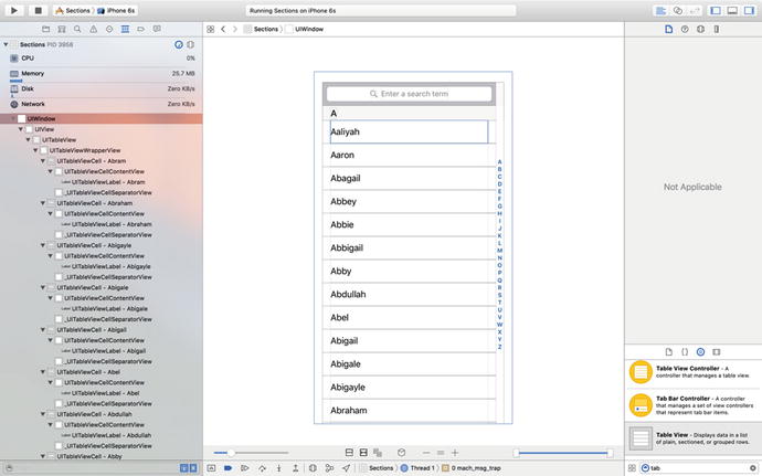
Figure 8-38. The view hierarchy of the Sections application
That probably doesn’t look very useful—we can’t really see anything more than we could in the simulator. To reveal the view hierarchy, you need to rotate the image of the application so that you can look at it “from the side.” To do so, click the mouse in the editor area, somewhere just to the left of the captured image, and drag it to the right. As you do so, the layering of views in the application will reveal itself. If you rotate through about 45 degrees, you’ll see something like Figure 8-39.

Figure 8-39. Examining the application’s view hierarchy
If you click the various views in the stack, you’ll see that the jump bar at the top changes to show you the class name of the view that you’ve clicked and those of all of its ancestor views. Click each of the views from the back to the front to get familiar with how the table is constructed. You should be able to find the view controller’s main view, the table view itself, some table view cells, the search bar, the search bar index, and various other views that are part of the table’s implementation.
Now let’s see what the view hierarchy looks like while we are searching. Xcode pauses your application to let you examine the view snapshot, so first resume execution by clicking Debug ➤ Continue. Now start typing into the application’s search bar and capture the view hierarchy again using Debug ➤ View Debugging ➤ Capture View Hierarchy. When the view hierarchy appears, rotate it a little and you’ll see something like what’s shown in Figure 8-40.

Figure 8-40. Our View Hierarchy when searching for “Zoe”
Now it’s pretty clear that there are indeed two tables in use. You can see the original table near the bottom of the view stack and above (i.e., to the right of) it, you can see the table view that belongs to the search results view controller. Just behind that, there’s a translucent gray view that covers the original table—that’s the view that dims the original table when you first start typing in the search bar.
Experiment a little with the buttons at the bottom of the editor area—you can use them to turn on and off the display of Auto Layout constraints, reset the view to the top-down view shown earlier, and zoom in and zoom out. You can also use the slider on the left to change the spacing between views, and use the one on the right to remove layers at the top or bottom of the hierarchy so that you can see what’s behind them. View Debugging is a very powerful tool.
Summary
This was a pretty hefty chapter and you’ve learned a great deal. You should have a very solid understanding of the way that flat tables work. You should know how to customize tables and table view cells, as well as how to configure table views. You also saw how to implement a search bar, which is a vital tool in any iOS application that presents large volumes of data. Finally, you met View Debugging, an extremely useful feature of Xcode. Make sure you understand everything we did in this chapter because we’re going to build on it.
We’re going to continue working with table views in the next chapter. For example, you’ll learn how to use them to present hierarchical data. And you’ll see how to create content views that allow the user to edit data selected in a table view, as well as how to present checklists in tables, embed controls in table rows, and delete rows.