2
Valuation and Something About Kool-Aid
To which earnings (E) should we apply the P/E ratio? Valuation should be based on future earnings, not current earnings.
—JPP
FOR STOCKS, THE NEXT STEP IS TO REFINE OUR EARNINGS forecasts. Then we can decompose expected returns into more detailed building blocks. When I estimated the equity market risk premium as an input to the CAPM, I showed that the simplest way to forecast equity returns based on valuation is to invert the price-to-earnings ratio. We divide 1 by the quoted P/E number, et voilà, we have a reasonable long-term return forecast. But in finance, especially when we try to forecast returns, nothing is ever that simple. I introduced the battle of the professors between Siegel and Shiller, two equally credible academics. The choice of which ratio to use seems to be at the center of their debate. As mentioned, Shiller uses a ratio that’s adjusted for cycles and inflation (the CAPE), while Siegel uses a more current P/E ratio. Also, Shiller doesn’t simply invert the ratio. Instead, he models the relationship between initial CAPE and subsequent returns, based on a regression model.
Since its publication, the CAPE approach has received a lot of attention. As many as 204 research papers have cited the original article by Campbell and Shiller (1998).1 In a recent paper, published in May/June 2016 in the Financial Analysts Journal, titled “The Shiller CAPE Ratio: A New Look,” even Siegel admits that “the CAPE ratio is a very powerful predictor on long-term stock returns.” He shows that, based on data from 1881 to 2014, CAPE forecasts have a 60% correlation with subsequent 10-year returns (35% r-squared). Although they don’t always agree with each other, industry thought leaders and leading investors Cliff Asness, founder and CIO of AQR, and Rob Arnott, chairman and CEO of Research Affiliates, have both come to the defense of the CAPE against naysayers.2
Nonetheless, the naysayers make some good points. Siegel (2016) argues that accounting standards have changed over time, which biases current 10-year average earnings down and produces overly pessimistic CAPE forecasts. Rob Arnott, Vitali Kalesnik, and Jim Masturzo (2018) point out that:
Since 1996, the U.S. CAPE ratio has been above its long-term average (16.6) 96% of the time, and above 24, roughly one standard deviation above its historical norm, more than two-thirds of the time. This dislocation is long enough to make even the most ardent fans of the CAPE take pause.
Siegel shows that if you use more consistent earnings measures, you can increase the model’s predictive power and reduce the pessimistic bias. But even with a more consistent earnings methodology, data from 2008–2009 may still bias 10-year earnings down. As soon as these data roll out of the trailing 10-year sample, the CAPE automatically drops (as average earnings jump), even if nothing changes in investors’ expectations. For example, the CAPE’s drop could occur while the one-year P/E doesn’t move. This cliff effect is a function of which 10-year smoothing methodology we choose. For that matter, 10 is a nice round number, but why not use a different window? As Asness (2012) puts it: “Ten years is, of course, arbitrary. You would be hard-pressed to find a theoretical argument favoring it over, say, nine or 12 years.” The choice of time window matters because it drives significant differences in return forecasts.
Jeremy Grantham, founder and chief investment officer of GMO, also argues that recent earnings growth is sustainable, a regime change of sorts, due to “increased monopoly, political, and brand power.”3 Grantham says, “This time is different.” He explains that if we believe recent earnings growth will continue for the next 10 years, we also believe the CAPE isn’t as bearish a signal as it currently looks. This mental adjustment is equivalent to using a P/E based on recent earnings. The trailing 12-month P/E is still high, but it’s not as extreme as the CAPE. Ultimately, we must keep in mind that the CAPE is not perfect, and there are decades in history during which it failed as a predictor of forward returns. The next decade could be one of these outliers.
I don’t find that argument particularly convincing. My colleague David Giroux, portfolio manager and CIO at T. Rowe Price and one of the most talented investors I’ve ever worked with, recently pointed out in an internal memo (Q1 2018) that recent earnings on the S&P 500 have been inflated by a recovery in the energy sector and a weak US dollar, two factors that may not prevail going forward.
Moreover, I spent five years at PIMCO, where I drank the Kool-Aid of the new normal/new neutral narrative—a pessimistic view of the future that’s typical of bond managers. If the economy continues to grow at a sluggish 2–3% rate due to long-term, persistent trends such as high levels of global debt (close to an all-time high at more than 300% of global GDP),4 demographics (percentage of the world population age 65 and over to double by 2050),5 and technology disruption (automation could replace 800 million jobs by 2030),6 how can earnings continue to grow in the 10–15% range, especially when profit margins are already high? It’s theoretically possible, but unlikely. I suppose the new normal Kool-Aid is not yet completely out of my system.
Then there’s the relative valuation between stocks and bonds. Relative to global bond yields, stocks are much cheaper than they appear on the basis of the CAPE alone. Should we expect rates to remain low by historical standards for the next 10 years? Lower growth for longer (new normal) and lower volatility in macroeconomic variables such as GDP growth and inflation should, at least theoretically, lead to lower rates for longer. If so, the CAPE could remain elevated. It’s simple math: lower discount rates mean higher valuations. But there’s no doubt that unwinding global monetary stimulus poses risks (and even more risks in a post-COVID-19 world). Investors have priced markets for a perfect, beautiful landing. In an Asset Allocation Committee meeting in 2018, we discussed the risk of an inflation shock in the context of our tactical positions, when I asked, “Since when is 2% or even 3% inflation ‘bad’?” One of our superstar investors responded wisely, “It’s bad when the market doesn’t expect it.”
If we put it all together, the CAPE gives us a back-of-the-envelope signal that we shouldn’t ignore, and it’s on the pessimistic side. Despite its good track record, the CAPE doesn’t tell the whole story. Other simple ratio-based forecasts, such as Siegel’s, give more optimistic numbers. To improve our forecasts, we must get more specific about the components of our forward- looking views. What do we expect to receive as dividends? What’s our earnings growth forecast? Do we expect significant valuation changes? To answer these questions, we must throw away our envelope and fire up a spreadsheet.
The Simplest Valuation-Based Model: Building Blocks
The building block model decomposes equity returns into three components: income, growth, and valuation change. I’m partial to it because my first research project in the industry was to backtest it on data for more than 20 countries. In this, I had help from Mark Kritzman, president and CEO of Windham Capital Management and senior partner at State Street Associates.
At the onset of the project, he handed me a 1984 paper by Jarrod Wilcox, titled “The P/B-ROE Valuation Model.” This paper explains the theory behind the building block model. Wilcox first states that
Realized return = dividend yield + price change
Then, he splits the “price change” term into “growth” and “valuation change,” such that
Realized return = dividend yield + growth + valuation change
For “growth,” he uses growth in book value. For the “valuation change” term, he calculates the change in the price-to-book ratio.
Nowadays, investors use several variations of this model. For example, there are versions that use the P/E ratio, as well as different definitions for growth, such as growth in earnings, GDP, etc. There are many ways to forecast each of the components. In fact, this building block model has become a standard approach across the industry. Think of it as the valuation-focused equivalent of the CAPM: it’s as simple as it gets, and it’s ubiquitous. But as with the CAPM, the devil is in the details.
Wilcox points out that if you add a small (negligible) cross-term, you can perfectly explain realized returns. As he puts it, “The relationship is not causal; it is an inevitable consequence of the algebra.” In other words, it’s an accounting identity, just like 1 + 1 = 2. In contrast, with the CAPM, we can’t even explain realized return. Stocks (or asset classes) with high betas can underperform stocks with low betas over very long periods of time, even when we calculate the betas in-sample (Fama and French, 2004). With the building block model, we can explain 100% of past returns. And we can specify the time horizon over which we decompose realized or expected returns—another advantage of this model over the CAPM.
Once we understand how past returns were divided among income, growth, and valuation change, we can forecast each of these components.
For income, there’s good news. Even though the price component of dividend yield is quite unpredictable, companies tend to adjust their payout ratio to smooth dividend yields over time. (Dividend yield = dividend/price, and the payout ratio is the percentage of earnings paid out as dividends.) For the S&P 500, based on data going back to the 1970s, my estimate of the correlation between one year’s dividend yield and the following year’s is 92%.7 In a world where markets are reasonably efficient, that’s a remarkably high level of predictability.
Corporate finance fundamentals give us the “sustainable growth rate,” defined as the return on equity (ROE) multiplied by the retention rate (the percentage of earnings that’s not paid out as dividends).8 My estimate of the year-over-year predictability/autocorrelation in the S&P 500’s sustainable growth rate is 48%, based on data going back to the 1990s.9 It’s less persistent than the dividend yield, but it’s still quite predictable relative to price changes, for example. Also, the idea is to estimate a long-term, stable growth rate rather than focus on year-over-year variations.
This definition of sustainable growth is as basic as it gets. CFA charterholders will remember it as an important part of the program. It’s a good building block to forecast returns. Theory says that a company’s ability to grow its dividends depends on how well it can generate earnings for a given set of resources (book value), as well as how much of these earnings are reinvested in the company, presumably to finance growth projects. It’s finance 101, and again I suppose there’s nothing more practical than a good theory. In my backtests, when I replaced the economic growth model estimates with the sustainable growth rate for each country, the strategy’s performance jumped significantly.
I was young, starting my career, and I was quite excited to see the strategy beat the pants off the MSCI World Index, with very limited look-ahead bias. (In hindsight, exceptional backtest performance is never that exceptional. A client once told me that he had never seen a backtest that didn’t work. He added that the only people who can consistently generate Sharpe ratios of 3.0 or above were quants running backtests, plus Bernie Madoff. Even without explicit look-ahead bias, researchers benefit from years of published research on what works and what doesn’t, which is itself an implicit look-ahead bias.)
The last and hardest building block to forecast is valuation change. Because yearly price changes drive changes in price-to-earnings (or price-to-cash-flows, or price-to-book) ratios, it’s not surprising that valuation changes aren’t correlated from one year to the next. Based on quarterly data going back to 1990, the year-over-year predictability/autocorrelation in the S&P 500’s price-to-earnings ratio is –3%, and it’s statistically indistinguishable from zero.10 Last year’s change in P/E tells us nothing about next year’s change in P/E.
In any given year, valuation changes can dominate realized returns. Based on calendar-year data from 1990 to 2016, I get a correlation of 75% between total returns for the S&P 500 and concurrent changes in P/E ratio.11 However, over the long run, there’s a powerful mean-reversion effect in valuation levels. Hence, a fair assumption is that valuation changes average out to zero over time. The problem is that it’s hard to model the speed of mean reversion, and the path is never smooth. Most investors assume that current levels will revert to their long-term mean over five to ten years. The math is straightforward: First, you calculate the difference between current valuation (for example, the current P/E) and its long-term average. Second, you divide this valuation spread by the number of years you think it will take to get back to the average. Voilà, you have your valuation change forecast. Unfortunately, over short time periods, these forecasts aren’t very accurate. But there are ways to improve the forecast.
For my project, I compared the effectiveness of two valuation change models: one that assumed mean reversion and another that used proprietary data on institutional investor flows. I set up the flow-based model as a cross-sectional regression. My goal was to explain a country’s stock market performance relative to that of other markets, rather than predict each country’s valuation changes over time (i.e., a time series regression). It sounds like a technical nuance, but the difference between cross-sectional and time series forecasts is important.
The intuition for this cross-sectional approach was that if a country receives significant inflows from institutional investors, its valuation level should increase more than that of other countries, especially those with significant outflows. We made the implicit assumption that institutional investor flows were persistent, i.e., that they move incrementally, in part due to their size—like supertankers rather than speedboats. Harvard professor Ken Froot and several coauthors over the years have published serious academic research on these data. In a 2001 paper titled “The Portfolio Flows of International Investors,” Ken, Paul O’Connell, and Mark Seasholes concluded that “the flows are strongly persistent.”
In contrast with this academic research, my model was not as statistically robust. A key advantage of my approach was that it was simple. Simple is good. I focused on valuation changes as opposed to total returns. I assumed that flows and year-over-year valuation changes were mostly driven by sentiment, so I removed long-run fundamentals (income and growth) from total returns and focused on what I called “transitory valuation spreads.”
To do so, I measured a beta between flows and subsequent valuation changes across countries. Then I applied this beta to recent flows. It worked very well: the first time I ran the backtest with the full forecast of income, growth, and flow-based valuation change, the results improved drastically. They got even better when I introduced the ROE component for growth. When I first saw these results, I stood up at my desk and danced like a prospector who’s just struck oil.
Mark set up the project as a horse race between models. First, he asked me to run a backtest without any return forecast. To run a backtest without return forecasts, I set up the optimizer to solve for the risk-minimizing weights every month. Surprisingly, this approach outperformed the benchmark. It seemed that portfolio optimization could add value without any information about forward returns. So much for the GIGO critique. My risk-minimizing approach relied on five-year historical volatilities and correlations as risk forecasts, which are fairly “naïve” inputs. These results proved that during the 1980s and 1990s, the MSCI World was a very inefficient benchmark (from the perspective of its underlying country weights). It was an easy opponent to beat—a slow horse.
Then results improved further when I added forecasts for income and growth. Last, as mentioned, the valuation change forecast boosted performance meaningfully. For this component, I tested the flow-based approach against a model that assumed mean reversion in valuation spreads. Both approaches performed well, but the flow-based forecast won. Our final recommendation was to use an approach that combined everything: a risk component (volatilities and correlations) and the forecasts for income, growth, and valuation change. Each building block was expected to add value incrementally. This example fits well within the framework I advocate throughout this book: for a complete asset allocation approach, each building block—ideas, processes, investment views, inputs, models—must build on the others. Otherwise, simple is better. No need to unnecessarily complicate our process.
Over the next several years, the approach became a commercial success. One European institutional client invested more than $2 billion in the strategy. The client earned positive alpha over several years, before the client decided to convert to a passive approach due to personnel turnover on its side.
My strategy was tactical, as it rebalanced monthly. But the building block approach can be applied to longer horizons. It provides a good reality check on CAPM expected returns. In Table 2.1, I show long-run building block expected returns for the same equity asset classes we used in Chapter 1 for the CAPM.12 I’ve added the earlier CAPM numbers for comparison.
TABLE 2.1 Building Block Model Expected Returns*
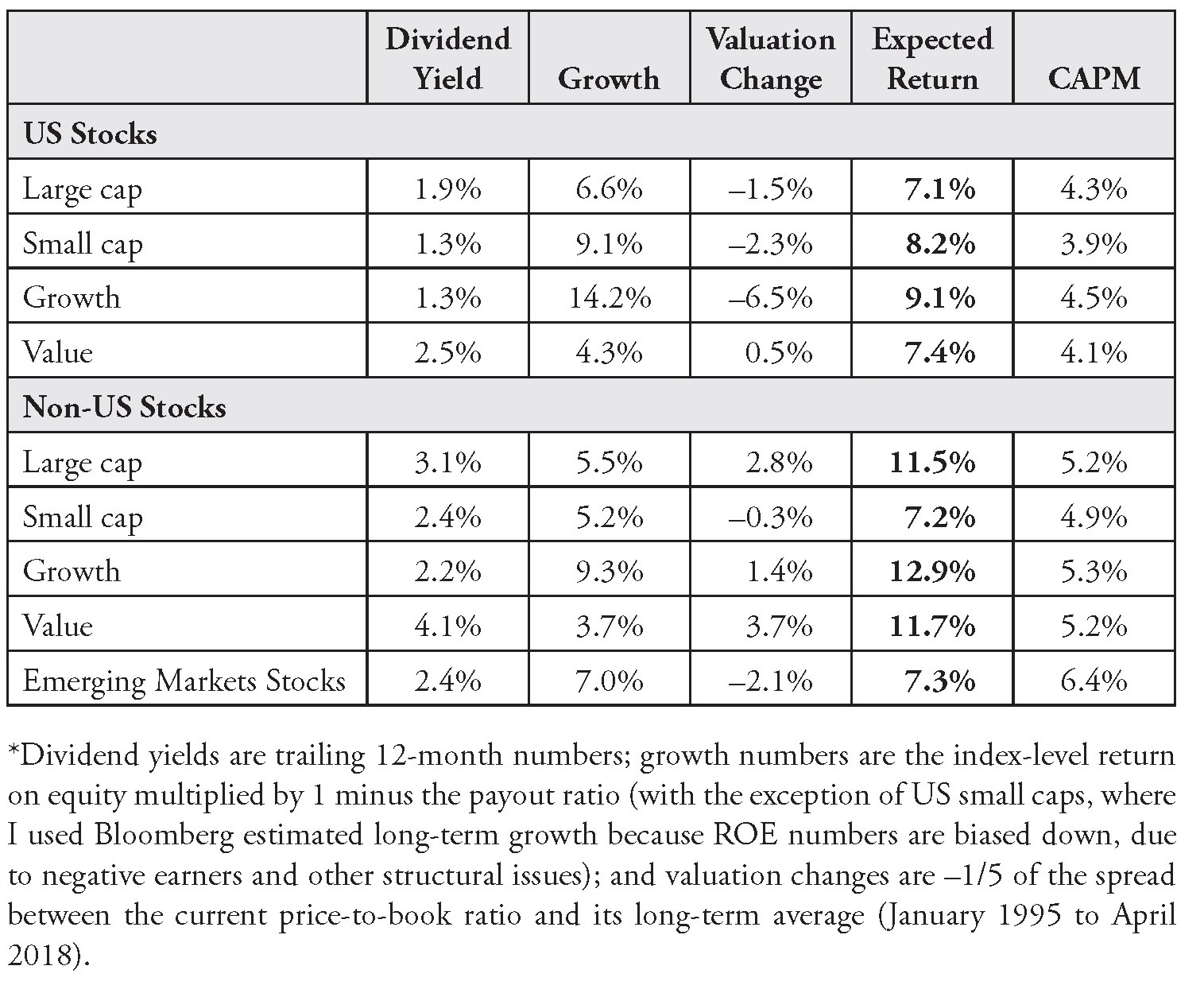
As usual with any forecasted returns, we must address data issues, caveats, and points of debate. Compared with our CAPM estimates, and certainly Shiller’s pessimistic forecast for the US stock market, these numbers are very high. On the other hand, with 7.1% expected return for US large caps, they seem in line with Siegel’s forecast. Dividend yields are close to an all-34time high relative to rates, which partially explains why these numbers are higher than our CAPM estimates. (As I’ve shown, CAPM estimates anchor around the level of interest rates.) Also, the sustainable growth rate approach generates optimistic growth forecasts because earnings have been very high recently (“peak earnings”) due to a recovery in the energy sector, sustained and coordinated economic growth, monetary stimulus, and fiscal stimulus in the United States.
Last, the pandemic and economic crisis of 2020 will require us to reassess dividend yields, sustainable growth, and valuation change estimates. As I finalize this book, equities have just crashed, which means that each of these components could be higher, although the jury is still out on the potential hit to companies’ long-term fundamentals.
Regarding dividend yields, it’s common practice to add share buybacks to estimate “total payouts.” Buybacks are an important building block for forecasting returns. When companies buy their own stock, existing shareholders get a larger percentage claim on earnings, which leads to share price appreciation. Hence, with buybacks, companies are essentially returning cash to existing shareholders, almost like a dividend.
But there’s a debate about how to estimate the effect of share buybacks on expected returns. My view is that share buybacks matter, but their contribution to returns is overrated. For example, how should we adjust for IPOs and new share issuances? If we do make these adjustments, then net buybacks have very little impact. But also, various scholars have different opinions about whether net buybacks should be calculated at the total market level or at the index level. When calculated at the index level, the dilution effect is much less pronounced on existing shareholders. This intellectual boxing match has been interesting to follow. Recently, the debate has intensified in the “Letters to the Editor” section of the Financial Analysts Journal (arguably its most entertaining section).
In favor of a negative buyback effect, William Bernstein and Rob Arnott argue that share issuances and IPOs have consistently outpaced buybacks. In a 2003 paper titled “Earnings Growth: The Two Percent Dilution,” they estimate that the expected return adjustment for net buybacks should be –2%. They take a clear stance against the idea that the net buyback yield is positive: “The vast majority of the institutional investing community has believed these untruths (that buyback yield is positive) and has acted accordingly. Whether these tales are lies or merely errors, our implied indictment of these misconceptions is a serious one—demanding data.”
In favor of a positive buyback effect, Philip Straehl and Roger Ibbotson’s 2017 paper “The Long-Run Drivers of Stock Returns: Total Payouts and the Real Economy” estimates that the net buyback yield has been +1.48% from 1970 to 2014—a significant difference from Bernstein and Arnott’s –2% estimate.
In response to Straehl and Ibbotson’s paper, Arnott and Bernstein (2018) refer to an article published in 2015 by Chris Brightman, Vitali Kalesnik, and Mark Clements (Arnott’s colleagues at Research Affiliates) and double down on their position:
In 2014, buybacks totaled $696 billion, or 2.9% of starting market value. This is a stupendous buyback yield. Yet the [total stock market] CRSP 1–10 Index rose by 1.8% less than its market capitalization. Did 4.7% of stock market return simply go missing? No. It turns out that $1.2 trillion in new share issuance occurred—and was largely unnoticed by those tallying buybacks—in a single year, a year with supposedly blockbuster buybacks.
These disagreements come down to differences in methodologies, and there is no industry consensus on how to resolve the question. As mentioned, my view is that buyback yield estimates are often too high because they don’t account for harder-to-measure dilution effects. Antti Ilmanen, a practitioner I mentioned in Chapter 1, comments that “the debate on whether and how to include buybacks will not end soon.” If no related adjustment is made to the expected growth term, he recommends adding +0.5% to +1.0% for buybacks net of dilution.13 BlackRock uses +0.5% for US stocks and –1.0% for non-US stocks.14 J.P. Morgan uses +0.3% for US stocks.15 AQR’s estimates vary from –1.4 to 0.1% across regions. Let’s keep it simple and assume that buybacks will roughly equal share issuances plus or minus some noise.
In addition to the income component, this debate has implications for another one of our building blocks: our growth estimates. As shown in Table 2.1, in the current environment, ROE-based estimates appear optimistic due to elevated earnings. A more common approach to estimate the growth term—at least for the market as a whole—is to assume that earnings will grow at the same pace as the economy. Corporate profit margins can’t grow forever. It doesn’t make sense to assume that over the long run, the corporate slice of the pie (versus labor) can grow faster than the pie itself. But on a per share basis, if we expect a dilution effect, we must adjust earnings or dividend growth estimates down (more shareholder mouths to feed), while if we expect net positive buybacks, we should adjust them up (fewer shareholder mouths to feed).
One of the issues is that per capita GDP also depends on population growth. And there are other points of debate: what the impact is of productivity growth, whether debt and leverage should be considered, and if new capital is indeed dilutive, as it is used to purchase new assets that benefit existing shareholders. Let’s extricate ourselves from this technical quicksand, and let’s simply state that, from a practical perspective, if we make an adjustment to the growth term, we should not double-count net buybacks in the yield term. We should adjust one or the other.
In the absence of a strong view on margins, it’s common practice to assume that total market earnings will grow at the same rate as GDP.16 Currently, the IMF forecasts world GDP to grow around 3.5–4% per year for the next five years (in real terms).17 This “new normal” growth rate, when combined with the income and valuation change components, gets us closer to our earlier CAPM estimates.
While expected GDP growth is available at the country level, it doesn’t apply directly to equity sectors or style/size sub–asset classes (large caps, small caps, value, and growth). However, it provides a reality check on the ROE-based numbers. If we assume a very long horizon, GDP growth puts an upper-bound on our estimates. Moreover, we can use regression analysis between GDP growth and sector-level earnings to build more granular, sector-level forecasts. In practice, while they don’t necessarily run regressions, fundamental analysts intuitively account for the broad economic environment when they forecast company-level earnings. These forecasts can then be aggregated at the sector and asset class levels for use by multi-asset investors.
Earnings Forecasts and the Role of Fundamental Analysis
There’s an elephant in the room of this debate around how to best estimate our “growth” building block. Ultimately, to forecast earnings growth, we need fundamental analysis. Yet clients and novice quants often look for formulaic approaches, because there’s comfort in replicable methodologies. Sovereign wealth funds, for example, often ask asset managers for formulaic insights and strategies. In exchange for large mandates, they want the asset manager’s intellectual property. They’ll even send trainees to work in the asset manager’s offices for weeks. Their goal is to apply these approaches to the assets they manage in-house. (But if your process is to rely on the judgment of experienced analysts and portfolio managers, the intellectual property transfer idea becomes impractical unless the Sovereign Wealth Fund hires your portfolio managers.)
My view is that the ROE-based sustainable growth rate, calculated from public, precooked, index-level data, is as good as any other formulaic approach. But there’s no magic formula that has been shown to consistently generate forecasts that would be more accurate than consensus.
My team at T. Rowe Price recently started a survey-based process to generate capital markets assumptions across asset classes. It’s a hybrid approach that marries forward-looking investment judgment with some quantitative structure. We ask portfolio managers to forecast various components of returns, based on the building block model. To make it intuitive, we ask them to forecast annualized earnings growth for the next five years. Most of these portfolio managers are bottom-up stock pickers, but they have a good sense of what to expect for their sector. They talk to CEOs, comb through company balance sheets and income statements, and stay on top of important trends in technology, labor costs, consumer demand, etc. Some of them may use a formal decomposition for earnings growth that starts with a forecast of sales (perhaps tied to GDP growth), adjusts for margins (which tend to mean-revert over time), and so on. Others may express a gut feeling, which, given their investment experience and expertise, is often better than any quantitative approach we could think of.
In the same survey, we ask them to forecast the level of the P/E ratio in five years. Most quants probably look at this approach the way scientists look at astrology. (But implicitly, our fundamental investors account for historical patterns such as mean reversion. Such historical patterns are also used to build model-based, quantitative forecasts. Hence, fundamental and quantitative approaches aren’t as different as most people think.)
As an aside, for those more focused on formulas, I recently set up a horse race between the following ratios: price to earnings (P/E), price to book (P/B), and price to cash flow (P/CF). I wanted to know which of these valuation measures would produce the highest correlation with subsequent valuation changes, which I defined as
Valuation change = realized return – (income + growth)
This is the same “transitory valuation spread” definition we used in the building block model we discussed earlier. Recall that we forecast the income and growth components at the beginning of the period. If I look at the current level of P/E, P/B, or P/CF, which is most predictive of the difference between realized returns and my initial income and growth forecasts?
I focused on one-year forecasts. I had to scrub the data for outliers, especially P/E ratios and payouts around the 2000 and 2008 sell-offs, and adjust small caps data due to negative earnings, but the results were clear: P/CF won. Its average correlation with subsequent valuation changes was over 10% stronger than for the second-best ratio (P/B), and it won across seven out of nine asset classes (exceptions were small caps and non-US growth stocks).18 Cash flows are harder to “game,” or manipulate, than earnings and book values, and they’re more comparable across asset classes.
In our survey process, we combine responses into the building block model, and we make the necessary adjustments for expected inflation. To finalize the forecasts, a committee of multi-asset investors as well as our group CIO will review and adjust the results. We look at the dispersion in views, evaluate consistency across asset classes, and make top-down adjustments as necessary.
This process imposes structure on how we express investment views. In the end, to harness fundamental analysis sometimes seems more ad hoc than historical analysis, but it is the key building block to forecast return. Interestingly, while stock return forecasts require a heavy dose of judgment, bond return forecasts are bounded by fairly precise mathematical guardrails.
Back to Bonds
As I mentioned in Chapter 1, it’s easier to forecast returns for bonds than for stocks. For most fixed income asset classes, if your time horizon is long enough (3–10 years), current yield to maturity is a reasonably accurate predictor of future return. Recently, my colleagues Justin Harvey and Aaron Stonacek (2018) tested this assertion across time horizons for several fixed income asset classes. They looked at the correlation between initial yield to worst and subsequent returns, as a function of the ratio of
Time elapsed/starting duration
A ratio of 1.0 means that time elapsed is exactly equal to the initial duration. Currently, the Bloomberg Barclays U.S. Aggregate has a duration of 6.34,19 so a 1.0 implies a horizon of 6.34 years. In their analysis, which goes back to 1976, Harvey and Stonacek find that the correlation between initial yield and subsequent return is above 80% for ratios of 0.5 to 2.0 (2.0 is the maximum ratio they tested). Initial yield reaches maximum predictability (at 97% correlation) at 1.08 times duration, and it remains quite high (above 95%) for longer horizons. Importantly, the authors show that predictability is equally strong whether rates are rising or falling.
They find similar (albeit slightly weaker) results for international hedged bonds. But for other asset classes, initial yield is not as predictive. Correlation for high-yield bonds peaks at 78% at 0.98 duration and hovers around 70–75% for the 1.0 to 2.0 range. For emerging markets bonds, it peaks at 89% at 1.9 duration. For unhedged international bonds, correlation peaks at 57% at 0.5 duration (here the effect of currency risk muddies the water).
Harvey and Stonacek conclude that “current yields are most highly correlated with future returns for higher-quality and hedged bond indexes. As these indexes follow stricter maturity, duration, and quality rules, they present a more stable risk/return profile than unhedged and lower quality indexes.”
For equity asset classes, even a 57% correlation between a simple, publicly available indicator and subsequent returns would be remarkable. Yet some of the fiercest debates I’ve witnessed on expected returns have been between bond quants, on how to account for minute details that may or may not improve the forecast. I’ve seen normally shy and introverted colleagues get into near-religious debates on how to forecast carry, roll down, defaults, and other components of total return, down to the basis point.
The important question is this: Can we improve on initial yield as the predictor of bond returns? Can we improve this forecast, for example, if we have a view on the direction of yields? If we want to keep it simple, over a finite horizon of one year, a good starting point to proxy return is as follows:
Return = initial yield – initial duration × change in yield
We earn the carry (yield) plus or minus the change in price (– duration ×change in yield). Ilmanen (2012) uses a similar proxy as a building block to introduce various ways to estimate the bond risk premium.
The in-sample fit for this simple model is quite good. Based on rolling annual data from March 1990 to June 2018, my estimate of the correlation between realized returns for the Bloomberg Barclays U.S. Aggregate and this proxy is 97%.20 This result doesn’t indicate that the model provides a good forecast, because I used realized changes in yields. It merely shows that the “approximation” error for realized returns is very low. But if I extend the horizon to five years, the fit degrades to 94% correlation. One of the issues is that initial yield becomes a less accurate representation of carry over longer horizons.
For the survey that my team uses to build capital markets assumptions, we have expanded this simple decomposition into a model that increases the in-sample fit from 94% to 96% and allows us to avoid large deviations between estimated and realized returns in volatile markets:
Return = average yield + roll down + interest rate duration × change in yield + spread duration × change in spread
where:
Average yield = (yield in 5 years per survey – current yield)/2
Roll down = duration × current slope (9 – 10-year yield)
Change in yield = (yield in 5 years per survey – current yield)/5
Change in spread = (spread in 5 years per survey – current spread)/5
We use two definitions of duration: interest rate duration measures the sensitivity of the bond portfolio’s return to changes in the risk-free interest rate, and spread duration measures its sensitivity to changes in spread. (We’ll review these measures in more detail when we discuss factors in Chapters 11 and 12.) For our five-year forecasts, average yield, change in yield, and change in spread incorporate views from the survey on where respondents think yields and spreads will be five years from now.
There are many ways to further expand these components, but in our model, average yield and roll down refer to total yield to maturity and combine the risk-free rate and spread components. We assume that we’ll earn the average yield over the period. As rates rise, the investor reinvests coupons and principals at higher yields, and vice versa when rates decline. Principal gets reinvested when maturity is reached, as well as within the investment horizon to maintain duration and/or earn the roll down.
The roll down component is measured based on the steepness of the curve, and we assume a one-year holding period. If the yield curve slopes upward (as it does most of the time), and nothing else changes (the level of yields remains constant, defaults remain constant, etc.), a bond will appreciate in price over time. The intuition is as follows: One year from now, the bond will be one year closer to maturity. Since a bond with shorter maturity is discounted at a lower rate, its price will go up.
We divide changes in yield and spread by 5 to annualize. Then we multiply these annual changes by their respective durations to estimate annual price changes. Overall, the fixed income return decomposition that we use in our survey makes it obvious that price changes and income (yield/carry) work in opposite directions. This “counterweight” effect explains why at longer time horizons, as mentioned, the path of rates matters a lot less than most investors think. As rates rise, we earn more carry over time (per the average yield component), which is offset by the change in price (the duration × change in yield component). Similarly, if rates decline, we earn less carry, but we gain on price. The same counterweight effect works for the spread components of return.
Notes
1. I refer to Shiller’s participation in this debate, but the model itself was first described in a paper he coauthored with John Campbell. (Shiller and Campbell, 1998). For some reason, Shiller’s name is much more associated with the CAPE than is Campbell’s. Scopus compiled the 204 citations for this paper, http://www.elsevier.com/solutions/scopus.
2. https://www.researchaffiliates.com/en_us/publications/articles/645-cape-fear-why-cape-naysayers-are-wrong.html; https://www.aqr.com/Insights/Research/White-Papers/An-Old-Friend-The-Stock-Markets-Shiller-PE.
3. http://fortune.com/2018/01/16/why-wall-street-is-ignoring-cape-fear/.
4. https://www.bloomberg.com/news/articles/2018-04-10/global-debt-jumped -to-record-237-trillion-last-year.
5. https://www.nih.gov/news-events/news-releases/worlds-older-population-grows-dramatically.
6. https://www.mckinsey.com/global-themes/future-of-organizations-and-work/what-the-future-of-work-will-mean-for-jobs-skills-and-wages.
7. Based on quarterly data from Bloomberg Finance L.P. for the time period December 31, 1970 to March 31, 2018. Data field is Dvd 12M Yld. I compare current dividend yield (current price divided by dividends over the next year) with the same measure a year later. To do so, first I make an adjustment to the price component (I subtract the last 12 months of price appreciation), because the unadjusted data give me current price divided by dividends over the previous year. This adjustment is a subtlety; it doesn’t change the result meaningfully. My data sample includes 182 rolling 4-quarter periods.
8. See Robert C. Higgins (2016).
9. Based on quarterly data from Bloomberg Finance L.P. for the time period March 30, 1990, to March 31, 2018. The time period was selected based on data availability. Data fields are DVD_PAYOUT_RATIO and RETURN_COM_EQY.
10. Based on quarterly data from Bloomberg Finance L.P. for the time period March 30, 1990 to March 31, 2018. The time period was selected based on data availability. Data field is BEst_PE.
11. Bloomberg Finance L.P., using SPXT and Best_PE in the historical regression analysis tool.
12. Data for the building block method are as of April 30, 2018. The list of underlying indexes is provided in Table 1.1. Sources are Bloomberg Finance L.P. and my own calculations. Bloomberg Finance L.P. data fields: EQY_DVD_YLD_12M, RETURN_COM_EQY, DVD_PAYOUT_RATIO, PX_TO_BOOK_RATIO, and BEST_LTG_EPS for US small cap growth estimates.
13. Expected returns on major asset classes.
14. https://www.blackrock.com/institutions/en-us/insights/portfolio-design/ capital-market-assumptions.
15. https://am.jpmorgan.com/gi/getdoc/1383498247596.
16. See, for example, Blackrock (https://www.blackrock.com/institutions/en-us/insights/portfolio-design/capital-market-assumptions) and BNY Mellon (https://www.bnymellonwealth.com/assets/pdfs-strategy/thought_capital-market-return-assumptions.pdf).
18. Monthly data from January 31, 1996 to April 30, 2018. Source: Bloomberg Finance L.P. Data fields used: EQY_DVD_YLD_12M, RETURN_COM_EQY, DVD_PAYOUT_RATIO, PX_TO_BOOK_RATIO, INDX_ADJ_POSITIVE_PE, PX_TO_CASH_FLOW. Asset classes used were the same equity asset classes as in the previous tables.
19. Bloomberg Finance L.P. As of March 31, 2018.
20. Quarterly data from Bloomberg Finance L.P., using total return, yield to worst, and option-adjusted duration.