11
Fat Tails and Something About the Number of Particles in the Universe
We must accept that the normal distribution is just an approximation of the true distribution.
–JPP
EARLIER I STATED THAT HIGHER MOMENTS MATTER, BUT they are more difficult to predict than volatility. This issue merits further discussion. If returns are normally distributed (or Gaussian, i.e., part of a family of bell-shaped probability distributions), we can approximate exposure to loss based on volatility. If not, we’re likely to underestimate risk. By how much is the key question.
In our study, we estimated the persistence in risk measures, but we didn’t estimate the size of measurement errors. Volatility is too crude a risk measure. Most investors and academics agree with this statement, and the events of 2020 have made it even more obvious. There are several analytical tools available to asset allocators to model fat tails, such as historical analysis, blended probability distributions, and scenario analysis.
Nassim Taleb (2010) argues that we can’t predict higher moments. We don’t know when extreme losses will occur, but we should build resilience to them. Black swans, like the pandemic and oil shock of 2020, are rare, but they do exist. Taleb notes, “The Black Swan idea is not to predict—it is to describe this phenomenon, and how to build systems that can resist Black Swan events.”1 And “Black Swans being unpredictable, we need to adjust to their existence (rather than naïvely try to predict them).”2 There are many examples where we must build resilience to rare but consequential events that we can’t predict, in all areas of life. Pick your analogy: skiers wear helmets; cars have air bags; houses are built to withstand hurricanes; boats are built to withstand rogue waves; planes are built to withstand lightning; etc.
However, a strict interpretation of Taleb’s black swan theory seems impossible to implement with models and data, because, in his words (Taleb, 2010), a black swan “lies outside the realm of regular expectations, because nothing in the past can convincingly point to its possibility.” If nothing in the past can convincingly point to the possibility of an event, we might as well throw our hands up and not even try to forecast risk. Or I suppose, we can imagine what could happen, even though it has never happened. Tomorrow, pigs could fly. There’s something unsatisfying and defeatist about this interpretation of the theory.
For our purposes, let us define outliers as possible but rare events—the financial equivalents of the car crash, the hurricane, the rogue wave. We have little data for these events, but we do have evidence of their possibility. Our horse races showed we can’t forecast the timing of these outliers (as evidenced by the lack of persistence or strong mean reversion in skewness and kurtosis). But we know they exist, and we know they matter. As Peter Bernstein (1996) wrote in his book Against the Gods: The Remarkable Story of Risk, “It is in those outliers and imperfections that the wildness lurks.”
For example, suppose you invest $100,000 in a portfolio composed of 60% US stocks and 40% US bonds. What’s the most you could lose in one year? We might not know when this loss will occur or what will cause the loss (like a pandemic), but we still want to know whether it could occur. Throughout history, we have enough evidence to hypothesize that financial crashes are always a possibility. Often, what causes them are “once-in-a-hundred-year” events or, sometimes, events that have never happened before.
Let us define this exposure as the minimum loss you could suffer 1% of the time—in other words, we want to estimate the one-year value at risk at the 99% confidence level. If we model the exposure based on the portfolio’s volatility, without special consideration for fat tails, your “maximum” loss is $12,028.3 But it’s not too difficult to account for fat tails. If we have a representative data sample, we can simply use the data directly, instead of the volatility-based estimate. If we look back at monthly returns from February 1976 to January 2019 to measure your exposure directly, the estimate almost doubles, to $23,972.
As I’ve mentioned, fat tails matter, and volatility is a poor proxy for exposure to loss. Financial advisors, investment managers, consultants, individual investors, and everybody else involved in investment management must at some point determine their (or their end investor’s) risk tolerance and align the portfolio’s risk accordingly. If we ignore fat tails, we underestimate exposure to loss and take too much risk relative to the investor’s risk tolerance.
Of course, risk tolerance itself is a fuzzy concept. Several years ago, a client asked Mark Kritzman and me how we calibrate risk tolerance. As usual, Mark had an interesting, tongue-in-cheek answer:
There’s some research that was done at MIT to estimate people’s risk tolerance based on neurochemical science. For example, individuals with higher levels of specific enzymes may have higher risk tolerance. However, our clients have found the idea of a blood test a bit too invasive.
Less invasive approaches include survey methods. We ask investors questions such as “What’s the most you could tolerate to lose in one year?” Robo-advisors rely on such questions to select portfolios for individuals without human intervention. This approach obviously requires the ability to estimate exposure to loss correctly, with consideration for fat tails. Otherwise, when we select the portfolio for the investor, we create a dangerous misalignment between exposure to loss and the investor’s risk tolerance.
These issues about fat tails have been well known and discussed ad nauseam in academia and throughout our industry for decades. As MIT professor Andrew Lo explains in the 2001 article “Risk Management for Hedge Funds”:
It is well known that financial data . . . are highly non-normal; i.e., they are asymmetrically distributed, highly skewed, often multimodal, and with fat tails that imply many more “rare” events than the normal distribution would predict.
Yet though I’m sure he would disagree with many of the concepts I present in this book, Nassim Taleb makes a valid point: too often fat tails are ignored, even by very smart people who should know better. Fat tails matter because asset allocators must forecast exposure to loss when they construct portfolios. For example, I’m always surprised at how many professional investors, who know the impact of fat tails on exposure to loss, still ignore them when they discuss Sharpe ratios (defined as excess return over cash, divided by volatility). Clearly, we should not use Sharpe ratios to compare strategies that sell optionality (like most alternative investments) with traditional asset classes, investment strategies, and products. But I continue to hear such comparisons everywhere.
In early 2019, I attended a conference on risk premiums in New York. On the stage, several investment pros discussed the role of risk premiums in investors’ portfolios. The mood was somber, as 2018 was a tough year for these strategies. Aside from one panelist who clearly was a salesperson (disguised, as is often the case, as a “product manager”), all others were full-time investors. I recoiled at all the mentions of “high Sharpe ratios” for risk premiums that are long carry and/or short optionality.
In the same article from which I took the earlier quote on fat tails, Andrew Lo presents a fascinating case study on this issue. Based on monthly data from January 1992 to December 1999, he simulates a mystery investment strategy that requires no investment skill whatsoever: no analysis, no foresight, no judgment. When I mention this case study during conference presentations, I usually say that “the strategy is so simple, a monkey could do it,” which is only a slight overstatement.
Despite its simplicity, in Lo’s backtest, the mystery strategy doubles the Sharpe ratio of the S&P 500, from 0.98 to 1.94. And from January 1992 to December 1999, it experienced only 6 negative months, compared with 36 for the S&P 500. “By all accounts, this is an enormously successful hedge fund with a track record that would be the envy of most managers,” teases Lo.
Then Lo reveals the simulated strategy: he sold out-of-the-money put options on the S&P 500. Essentially, the strategy loaded up on tail risks. Like the currency carry strategy I mentioned in Chapter 9, it picked up pennies in front of a steamroller. Lo concludes:
In the case of the strategy of shorting out-of-the-money put options on the S&P 500, returns are positive most of the time, and losses are infrequent, but when they occur, they are extreme. This is a very specific type of risk signature that is not well summarized by static measures such as standard deviation.
He hints that many hedge funds, under the cloak of nontransparency that they enjoy compared with the transparency of mutual funds (many hedge funds operate as a “black box”), may use this type of strategy to juice their track records. As a caveat, he doesn’t argue that selling insurance in financial markets is wrong per se, as evidenced by the significant need for insurance from institutional investors. Some entities must provide insurance, and there should be a premium to entice them. I made a similar risk premium argument in Chapter 7 when I discussed our covered call writing strategy. Lo worries about the risk management of such strategies for hedge funds themselves, and most importantly, on the part of institutional investors such as pension plans that use Sharpe ratios to select investments. As I mentioned earlier, when it comes to all aspects of risk forecasting, higher moments matter.
This fact of life became evident during 2007 and the subsequent financial crisis, as well as in 2020. In a wonderfully sarcastic article, “How Unlucky Is 25-Sigma?,” Kevin Dowd, John Cotter, Chris Humphrey, and Margaret Woods (2008) illustrate the limitations of risk forecasting models based on normal distributions. If we ignore nonnormal higher moments, some extreme losses should be virtually impossible. The authors quote executives at Goldman Sachs and Citigroup who seemed to imply that normal distribution probabilities explained how “unlucky” or unforecastable losses were. But clearly, the risk models themselves were wrong. Goldman’s CFO was quoted as saying, “We were seeing things that were 25-standard deviation moves, several days in a row.”
A 7-sigma event, let alone a 25-sigma event, should occur 1 day out of 3,105,395,365 years, Dowd and coauthors explain. They provide some intuition for such probabilities (for noncreationists):
A 5-sigma event corresponds to an expected occurrence of less than just one day in the entire period since the end of the last Ice Age; a 6-sigma event corresponds to an expected occurrence of less than one day in the entire period since our species, Homo Sapiens, evolved from earlier primates; and a 7-sigma event corresponds to an expected occurrence of just once in a period approximately five times the length of time that has elapsed since multicellular life first evolved on this planet.
Then they help the reader understand the infinitesimal nature of 25-sigma probabilities:
These numbers are on a truly cosmological scale so that a natural comparison is with the number of particles in the universe, which is believed to be between 1.0e+73 and 1.0e+85. Thus, a 20-sigma event corresponds to an expected-occurrence period measured in years that is 10 times larger than the high end of the estimated range for the number of particles in the universe. A 25-sigma event corresponds to an expected-occurrence period that is equal to the higher of these latter estimates, but with the decimal point moved 52 places to the left!
This analysis puts in perspective the statement that Goldman saw such events “several days in a row.”
To be fair, I suspect the Goldman statement was made simply to illustrate the unlikely nature of the market moves, not to imply that fat tails don’t exist or that we should use the normal distribution to assess the likelihood of these losses. The events of 2007, 2008, and the first quarter of 2009 were still very unusual. In hindsight, the speculative excesses in subprime mortgages and the fragile, house-of-cards derivatives edifice built on top of them explain a large part of the financial crisis. But at the time, most risk forecasting models were not built to incorporate such unobserved, latent risks. Perhaps that’s what Taleb means when he writes that a black swan “lies outside the realm of regular expectations, because nothing in the past can convincingly point to its possibility.” Except that in 2007, a lot of signs in the present pointed to a possible blowup. Credit spreads on structured products had never exploded in the past; yet unprecedented pressures were building in the entire system.
A decade later, as asset prices reached new highs across markets, in our Asset Allocation Committee we constantly asked ourselves, “Where’s the excess speculation, the latent risk?” In other words, where’s the bubble? The answer isn’t obvious. The postcrisis rally in risk assets has been largely supported by fundamentals. Investors have become more cautious. Some refer to this rally as an unloved bull market. There was a bubble in cryptocurrencies, but it’s been deflating somewhat slowly and, so far, without systemic consequences. However, we do worry about latent risks such as the unprecedented levels of government debt and 0% interest rates outside the United States.
As the events related to the coronavirus pandemic of 2020 continue to unfold, pundits like to compare this crisis with the 2008 financial crisis. Yet there are important differences. The 2008 crisis involved a speculative bubble in real estate. Systemic risk was high, in great part because banks owned structured products linked to this bubble. A shaky edifice composed of layers upon layers of complex, interconnected structured products and derivatives stood on the shoulders of risky subprime borrowers.
In 2020, financial institutions are not in the thick of the storm. However, the novel coronavirus will cause an economic shock of unprecedented size—an economic heart attack. Small businesses, countless levered companies, and the consumer are all at risk. Monetary and fiscal authorities have taken out their defibrillators, with rate cuts, asset purchases, and trillions of dollars in fiscal stimulus. As I hand over this manuscript to my editor, we have yet to determine the shock’s full impact.
Asset allocators can use the concept of risk regimes to model, and perhaps forecast, latent risks. We discussed risk regimes in Chapter 9 in the context of tail correlations. If markets oscillate between high- and low-volatility regimes, we should expect fat tails. The idea is that the fat tails belong to another probability distribution altogether—the risk-off regime, which is characterized by investor panics, liquidity events, and flights to safety. And if we blend two normal distributions (risk-on versus risk-off or “quiet” versus “turbulent”), we can get a highly nonnormal distribution. In other words,
Normal distribution + normal distribution = nonnormal distribution
In that context, a “25-sigma event” could be a 1- or 2-sigma event generated from the risk-off distribution. For example, high-yield bonds have very different volatility when the S&P 500 sells off, compared with what happens in more normal times. They have an annualized volatility of 31% when the S&P 500 sells off 7% or more in a month. But on the rest of the dataset (i.e., on months during which the S&P 500 returns –7% or better), they have a volatility of only 9%.4 Here I’ve defined the regimes based on an arbitrary cutoff for S&P 500 monthly returns (–7%), but there are several more advanced ways to parse out risk regimes. (For example, see Chow, Jacquier, Kritzman, and Lowry, 1999, on the Mahalanobis distance, which we will discuss further in Chapter 14, as well as in the context of Markov-switching models.) Also, I could have used a cutoff on high-yield returns, but I chose –7% the S&P 500 to make my regime definition more “systemic.” US equities are a good indicator of risk-on versus risk-off sentiment across markets.
If we assume that the average annualized return for high-yield bonds is +7% in the normal regime and –10% in the risk-off regime, we can model two normal distributions:
1. Normal times: average of +7%, volatility of 9%
2. Risk-off regime: average of –10%, volatility of 31%
Both distributions have a skewness of zero and a kurtosis of 3, which are the values we should expect for normal distributions. (In other words, when skewness is zero and kurtosis is 3, there are no fat tails.) To define these regimes, I’ve used a filter on monthly returns and then expressed the averages and volatilities in annual terms. This conversion between monthly and annual return distributions requires some mental and mathematical gymnastics, but these technicalities are beside the example’s point.
Suppose there is a 5% probability that we shift to the risk-off regime in any given year. Otherwise, 95% of the time, we remain in the “normal” regime. We can use these regime probabilities in a simulation. The goal is to add the two distributions and thereby simulate returns for high-yield bonds in a way that accounts for regime shifts. It’s remarkably simple, and it’s a fun exercise. It takes less than five minutes, so I would encourage even non-quants to try it to gain important intuition on risk regimes. Here’s how it works in Excel, for example:
1. First, simulate a series of returns, say 10,000 observations, for each regime. In the first column, copy and paste the following formula 10,000 times, for a total of 10,000 rows:
=NORMINV(RAND(), 7%, 9%)
And do the same in the second column for the risk-off regime:
=NORMINV(RAND(), –10%, 31%)
2. In a third column, use the RAND() function to draw a number from 0 to 1 randomly, also 10,000 times.
3. In a fourth column, use an IF function that selects a simulated return based on the outcome of the RAND() function. Select a return from the risk-off regime only when the random number draw is 0.05 or below. Otherwise, select a normal regime return.
Suppose normal regime returns are in column E, risk-off regime returns are in column F, and the RAND() is in column G. Also, suppose the simulation starts on row 4. Here is the formula:
=IF(G4<0.05,F4,E4)
The simulated return distribution that includes regime shifts (fourth column) has a skewness of –1.65 and a kurtosis of 12.6. It’s extremely fat tailed, even though it was generated from two normal distributions (again, normal + normal = nonnormal). In that context, extreme losses represented by 6-, 7-, or more sigma events aren’t expected to be as rare as “once in the history of the universe” or other such claims. In light of the “25-sigma” paper, perhaps our industry has underestimated the power of this regime-based framework for risk forecasting.
Yet academics and quantitative practitioners have developed a wide range of models to define and forecast regimes. In the paper “Regime Shifts: Implications for Dynamic Strategies (Corrected)” that Mark Kritzman, David Turkington, and I (2012) wrote, we explain how to use so-called Markov models to define regimes. In my previous example with high-yield bonds, I use a threshold of –7% equity returns as the cutoff for the risk-off regime. But we can reduce noise if we define regimes based on “maximum likelihood.” In our paper, we show that because they ignore regime persistence, thresholds give more false signals than advanced techniques.
As we saw in the discussion on risk forecasting, there is significant month-to-month persistence in volatility across asset classes. Suppose we observe a somewhat benign return, close to the long-term average of the normal regime. A threshold method would classify this return as part of the normal regime. But if the observation follows several extreme returns, it’s more likely that it is part of the turbulent regime and that the next observation will be volatile. As an analogy, in the middle of turbulence, the airplane may glide quietly for a few seconds. If you’re like me, a born worrier, you probably think, “This is not over.” If the last few minutes have been rough, the probability that the plane will continue to experience turbulence is higher than it would be if the air had been smooth for a while. The advanced techniques we used in our paper account for the fact that asset returns (as well as fundamental and economic data) tend to cluster, like air turbulence.
Maximum likelihood models also better capture relative volatilities. Suppose regime 1 has a higher average return than regime 2, but with a higher volatility. In that case, it’s possible that several large negative returns come from regime 1, even though it has a higher average return than regime 2.
In my view, regardless of how we define the regimes, the most interesting aspect of the approach is that we can specify regime probabilities to build a risk forecast. Historically, regimes are highly persistent month to month, like air turbulence. For example, in “Regime Shifts: Implications for Dynamic Strategies,” we show that there’s a 90% or more probability that we stay in the current equity turbulence regime from one month to another. Such transition probabilities form the basis of the Markov regime-switching model. (In the paper’s appendix, we provide Matlab code to estimate this model.)
Still, these improvements are technical details, and the regime-based approach can be useful even to investors who don’t want to deploy this heavy econometric artillery. As a simpler application, let us go back to my example with high-yield bonds. Suppose we form a view that there’s a 10% probability of a recession over the next year, and we think the market hasn’t priced in this risk. In that case, we would apply a 10% weight to the risk-off regime, instead of 5% as I did earlier. As a result, we would get a fatter-tailed mixture.
Investors should pay attention to this key idea for risk forecasting: we can parse historical data into regimes and then apply forward-looking probabilities to reweight them. These probabilities should depend on current conditions. Is monetary policy accommodative or restrictive? Are valuations particularly elevated? Are equity earnings likely to surprise on the upside or disappoint? This framework provides a rare opportunity to merge fundamental views with quantitative methods in a coherent and transparent way. Quants should use judgment and experience to determine forward-looking probabilities, and fundamental investors should be ready to rely on the data to define the regimes.
Scenario Analysis
Another approach to tail-risk estimation is scenario analysis, also referred to as stress testing. Like the risk regime framework, scenario analysis often marries quantitative and fundamental inputs. In the Global Multi-Asset Division at T. Rowe Price, we apply a wide range of historical scenarios and forward-looking shocks on our 200+ portfolios.
In its simplest form, historical scenario analysis is straightforward. We multiply current asset class weights by asset class returns from a historical episode:
Current asset class weights × asset class returns during a past crisis
Suppose your portfolio is invested 80% in stocks and 20% in bonds, and you would like to know how this portfolio would perform in another financial crisis such as the 2008–2009 meltdown. You could simply multiply 0.8 × the return of stocks during the crisis, plus 0.2 × the return of bonds during the crisis.
There are many applications for this framework: financial advisors can use it to help individual clients better assess their risk tolerance; asset allocators can stress-test their portfolio to determine whether they are properly diversified; plan sponsors can use it to manage expectations with their boards of trustees; and so on. We’ll revisit scenarios in Chapter 14 when we discuss tail-aware portfolio construction, but as I mentioned in Chapter 9 when we discussed the failure of diversification, there is a need for our industry to move scenario analysis from the back office (after-the-fact reporting) to the front office, where investment decisions are made.
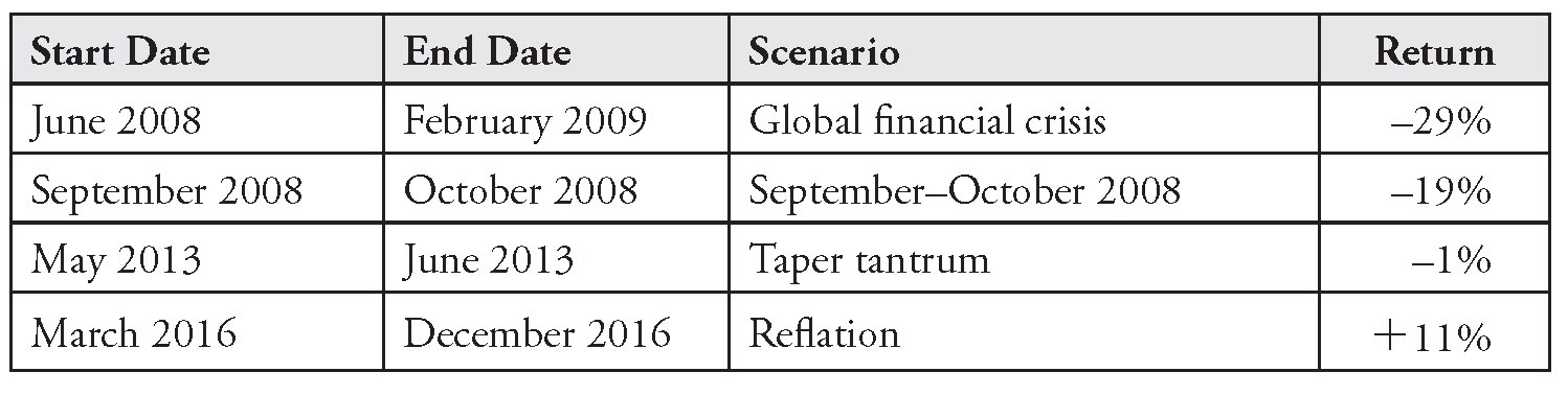
Examples of past crises include the crash of October 1987, the global financial crisis (June 2008 to February 2009), the US debt downgrade (August 2011 to September 2011), the taper tantrum (May 2013 to June 2013), and the current 2020 pandemic crisis. For strategies that are managed against a benchmark, investors should consider upside scenarios as well. If the active portfolio is under-risked relative to its benchmark, by how much could it underperform in a market rally (“melt-up”) event? For example, a scenario dashboard could include a reflation scenario (March 2016 to December 2016).
Of course, to define the scenarios is not an exact science. We must make a judgment call on the start and end dates for each historical episode. I have found peak-to-trough scenarios to be useful, because they relate to the concept of maximum drawdown. When we use the market’s peak as the start date and the trough as the end date, we ask, “How bad can it get?”
An important, and often underappreciated, drawback of this simple approach to historical scenarios is that asset classes change over time. Fluctuations in sector weights within the S&P 500 provide a good example. The most unstable sector in the index has been technology. From 5% of the index, it reached a peak of 29% in 1999, during the dot-com mania. Then it declined back to a trough of 15% in 2005. With the recent rise of the tech giants (Amazon, Apple, Facebook), it now stands at 21%.
Over time, the S&P 500 index has become less exposed to cyclical sectors. In 2007, before the global financial crisis, the financials and energy sectors represented 31% of the index. These two sectors now represent only 19% of the index. Sector weights for industrials and materials have gone down over this period as well.5 Therefore, not only will the next crisis be different (as crises always are), but the sensitivity of US stocks to that new crisis will be different as well. They should be more resilient to an economic downturn that affects mostly cyclicals. Recent market performance during the coronavirus pandemic proves this point. Large technology companies have protected the S&P 500 from the much larger drawdown it would have experienced if it still had a 31% weight in financials and energy.
These changes in sector weights also make time series analyses of valuation ratios on the S&P 500 less reliable. In 2019, a P/E ratio of 16x on a less cyclical, more tech-heavy S&P 500 means something different than does a P/E ratio of 16x from the early 1970s, for example. (To complicate things, even the nature of tech itself has changed, from a speculative bet on no-earning internet companies in 1999 to the solid cash flow growers that we know today.) In Chapter 1, when we discussed return forecasting and compared the Shiller and Siegel approaches, we didn’t adjust for sector exposures when we made statements such as “Markets are expensive relative to history.” But in practice, such adjustments can be helpful. They may reveal that markets aren’t as expensive as they seem. For scenario analysis, valuations matter as well. High P/Es often indicate fragile markets with elevated probabilities of tail events.
Emerging markets stocks provide an even more pronounced example of how an asset class can drastically change under the hood. This asset class has changed substantially compared with how it was a few years ago. In fact, it doesn’t even look like the same asset class. This change invalidates most unadjusted historical analyses (volatility and correlation estimation, scenario analysis, valuation, etc.) that involve emerging markets stocks. In a 2017 article published in the Financial Times, “Emerging Market Assets Are Trapped by an Outdated Cliché,” Jonathan Wheatley says:
[In] November 2014, . . . the weight of technology stocks in the benchmark MSCI EM equities index overtook the weight of energy and materials—the commodities stocks that many see as emblematic of emerging markets.
This transformation has been dramatic. When the commodities supercycle was in full swing, in mid 2008, energy and materials accounted for more than a third of MSCI EM market capitalisation and tech companies just a tenth. Last month, the commodities group was barely an eighth of EM market cap, and tech companies more than a quarter.
This should be no surprise. EM tech companies include the Chinese internet trio of Tencent, Alibaba and Baidu and longer-established names such as Hon Hai and TSMC of Taiwan and Samsung Electronics of South Korea.6
Emerging markets stocks have become more “high tech” and less commodity-dependent. Consumer sectors have also become more prominent. Like the S&P 500, all else being equal, the asset class should be more resilient to traditional economic downturns than in the past. Also, while political crises still occur (as evidenced by 2018 events in Turkey and Venezuela), most emerging markets countries now have stronger current account balances. The risk of contagion appears to have decreased. So far in the first half of 2020, emerging markets have been more resilient than during previous crises (on a relative basis).
In fixed income markets, changes in factor exposures within asset classes can affect the fundamental nature of how they react to macroeconomic shocks. This issue is problematic for index investors. Take the Barclays Aggregate, for example.7 In early 2008, before the global financial crisis, Treasuries constituted less than 25% of the index. They now represent close to 40% of the index. Unlike in stock markets, where supply and demand regulate market capitalization weights, in fixed income markets, index weights are driven mainly by supply. The more an issuer borrows, the larger the issuer’s weight in the index. This perverse effect has been an argument against passive/index approaches in bonds. (Ultimately, it’s an oversimplification, but please bear with me, for the sake of argument.)
Postcrisis fiscal stimulus and accumulated budget deficits have forced the US government to borrow more and more. The debt-to-GDP ratio in the United States has reached 104%, from 63% in Q4 2007.8 This increased borrowing explains the rise in the relative weight of Treasuries in the index. In theory, it makes the index more resilient to risk-off shocks.
On the other hand, there might be a scenario in which the government’s excess borrowing degrades the credit quality of its debt to such an extent that US Treasuries cease to be the safe-haven asset class. It’s unlikely now, but this never-before-seen scenario is perhaps an example of Taleb’s black swans. US government debt was indeed downgraded in 2011. Stocks sold off while Treasuries, somewhat unexpectedly, remained the safe haven despite their lowered rating. Where else were investors supposed to hide?
Nonetheless, there might be a breaking point in the future. Treasuries could become a risk asset. Beyond their inflation risk, default risk could begin to drive part of their volatility, similarly to, say, Italian government debt. With over $2 trillion in fiscal measures to address the crisis of 2020, who knows?
Meanwhile, the duration of the Barclays Aggregate Index has increased, from an average of 4.5 years in 2005 to 6 years in 2019. Again, the inflection point was the global financial crisis. Before this crisis, duration had remained stable for over two decades, from the start of the data series. Since then, it has climbed steadily, which means that the index has become much more sensitive to interest rate shocks.
If we create a historical scenario analysis of the 1994 surprise rate shock when the Fed started tightening, we must adjust the historical asset class returns downward to account for the now longer duration of the index. With a 6-year duration, a +100-bps rise in rates roughly translates into a –6% price drop (–6 × 1%), compared with –4.5% with a duration of 4.5 (–4.5 × 1%). The rise in duration is attributable to corporate debt issuance. Corporations, especially in the industrials sector, have taken advantage of lower rates to issue long-term debt. When rates decline, duration increases mathematically due to convexity, but this effect is relatively minor.
There is another way in which passive exposures to US bonds have become riskier: a degradation in credit quality, despite the rise in the index weight of Treasuries. Based on data for the Barclays U.S. Aggregate from January 2008 to February 2020, if we exclude Treasuries and securitized bonds, the weight of high-quality bonds (rated AAA or AA) has decreased from 21 to 2% as a share of corporates. Hence, the weight of the riskier bonds (rated A or BAA) has increased from 89 to 98% of corporates and from 15 to 23% of the entire index.
Therefore, a risk-off scenario based on historical returns for the index would likely underestimate exposure to loss. As the coronavirus and oil shock events unfolded during the first half of 2020, this deterioration in credit became painfully evident.
There are many other such examples across asset classes. US small caps have deteriorated in quality; value stocks have become more cyclical; etc. The bottom line is that a simple scenario analysis based on historical asset class returns can lead to an underestimation or overestimation of exposure to loss, because asset classes change over time.
Factor analysis provides an easy solution to this issue. Factors and risk premiums have captured the attention of investors over the last decade, so we will cover these topics in Chapter 12. In the context of risk models, asset classes can be represented as a collection of underlying risk factors, such as equity beta, value, growth, momentum, interest rate duration, credit duration, and currencies. The risk factors cut across asset classes, which means that several asset classes may have exposure to the same risk factor. Non-US asset classes are exposed to the same currency factors; fixed income asset classes have common exposures to interest rate duration; equity asset classes have common exposures to sector and country factors; real estate, hedge funds, and almost all risk assets are exposed to equity market beta; and so on.
For factor-based scenario analysis, we can replace asset class weights with risk factor exposures, and we can replace asset class returns with risk factor returns. We used this model for asset class returns:
Current asset class weights × asset class returns during a past crisis
With the risk factor framework, we use:
Current risk factor exposures × risk factor returns during a past crisis
There is no industry consensus on how to convert asset classes into risk factor exposures. We’ll review a few approaches shortly. For now, let me say that for scenario analysis at T. Rowe Price, our risk systems produce security- level factor mappings. These mappings are then aggregated at the asset class and portfolio levels.
Unlike asset class–based scenarios, factor-based scenarios rely on current exposures. For example, the Barclays Aggregate is modeled based on its current duration; emerging markets stocks are modeled based on their current sector exposures; etc. I’ve heard from clients that some risk system vendors market this approach as “forward-looking.” It’s an exaggeration, because factor- based scenarios rely on historical factor returns, but at least the framework circumvents the issue that factor exposures within asset classes change over time.
Suppose that as of January 31, 2019, you held the following typical 60% stocks/40% bonds asset mix, all invested in passive benchmarks: 42% in US equities (Russell 3000); 18% in non-US equities (MSCI AC World ex-U.S.); 32.5% in US bonds (Barclays Aggregate), and 7.5% in short-term inflation- protected bonds (Barclays U.S. TIPS 1-5).
Based on current factor exposures, Table 11.1 shows potential losses and gains under various historical episodes.9
TABLE 11.1 Scenario Analysis
Our systems also account for active positions. For each scenario, we can apply an attribution model to produce a detailed, hypothetical attribution. Our model decomposes returns into contributions from security selection, tactical asset allocation, and strategic asset allocation. It further decomposes these returns into asset class-, factor-, and security-level contributions.
The ability to zoom in and out of decision layers is remarkable. For example, we can make statements such as, “Given our current exposures, if we were to face another 2008-like scenario, we would lose X% from our security selection within US growth equities (of which Y% would come from our position in company XYZ, a large tech company), gain Z% from our tactical underweight to equities, and lose A% from our strategic overweight to high-yield bonds.”
However, there are drawbacks to this factor-based approach. First, it’s often difficult to map portfolios to risk factors. Some exposures contain a fair amount of unexplained volatility (so-called nonfactor-based, or “idiosyncratic,” volatility). Absolute return strategies with small or unstable factor exposures are particularly difficult to model, for example. Suppose a hedge fund currently holds very little equity beta, while over time it often takes significant directional exposure to equities. The snapshot that we take when the fund happens to have minimal equity exposure may underestimate exposure to loss. In this case, we should probably use the longer-run average rather than the current exposure.
Another issue is that every crisis is different. It may be an obvious statement, but in the context of scenario analysis, it becomes particularly important. For many investors, in 2020 it became evident that portfolios built to be resilient to a past crisis may not be as resilient to the next one. For example, structured products were resilient to the tech bubble burst. From December 31, 1999 to December 31, 2002, the S&P 500 crashed, losing 38%. Over the same period, the Barclays Commercial Mortgage Backed Securities (CMBS) Index was up 44%. Hence, CMBS provided a remarkable hedge to the equity sell-off.
Now, let us fast-forward to the 2008–2009 crisis. The picture looks quite different. In three months, from September 19 to November 20, 2008, the S&P 500 crashed, losing 40%. Over the same period, the Barclays CMBS Index lost 37%. This move in the CMBS index was extreme on a risk- adjusted basis. It speaks to our earlier discussion on the article “How Unlucky Is 25-Sigma?” The quarterly volatility in the CMBS index from the start of its history in Q1 1997 to before the sell-off in Q2 2008 was 2.4%. The 37% loss was, therefore, a 15-standard deviation event.10
After the 2008–2009 crisis, I met with a senior bank executive to discuss scenario analysis. He showed me a chart of structured credit spreads that spanned precrisis data. Before 2008, the line was almost flat. It showed barely any volatility. Banks held significant allocations to these products, for their risk-return free lunch, as well as a regulatory (capital charge) free lunch. He rhetorically asked, “That’s the data we had at the time. Who could have predicted the types of moves we saw during the crisis?”
I don’t know. Quantitative value-at-risk models rely on past data, and to the extent that a latent risk has not materialized yet, these models will give a false sense of security. A lot has been said about this crisis with the benefit of hindsight. I do remember some thought leaders raising alarm bells before the sell-off unraveled (Nouriel Roubini, Robert Shiller, and others).
My point is that robust scenario analysis requires forward-looking scenarios as well. Most quants are uncomfortable with “made-up” scenarios, but the risk factor approach provides a useful compromise between art/fundamental judgment and science. Instead of historical factor returns, we can specify hypothetical factor returns:
Current risk factor exposures × hypothetical factor returns
It is common practice to specify shocks to one or two factors and then propagate these shocks to the other factors. Essentially, we use the betas (sensitivities) between factors. Suppose we shock the equity risk factor by –20%. To propagate this shock to credit spreads, we multiply –20% × the beta between credit and equity. We can also adjust the propagated shocks for the differences in means (expected return) between factors.11 This approach also allows shocks to nonfinancial factors, such as GDP and inflation, as long as we can estimate the betas between the nonfinancial and the financial factors.
If we don’t propagate shocks, we assume, very mistakenly, that the other factors would remain stable under stress. For example, if we shock the equity factor in isolation, we assume credit spreads, currencies, rates, etc., would remain stable. Given the high correlations across risk assets, for most portfolios, shocking individual factors in isolation (i.e., without propagation) will underestimate exposure to loss.
Even with propagation, in practice there is another flaw in how investors have applied this framework. It relates to the well-known issue of unstable correlations and betas that we discussed in Chapter 9. During stress events, such as the crisis of 2020, the beta between equity and rates is likely to become more negative, while almost all other betas are likely to jump higher. Yet most risk models rely on recent rather than stress betas. (Many investors realized in 2020 that they had more credit risk in their portfolio than they expected, and that this credit risk was essentially indirect equity risk.)
When we shock a risk factor and infer movements in other related risk factors, we should use stress betas. To use a simple example, as of February 28, 2019, based on the last 12 months, the beta between the equity and credit factors was 0.13. Hence, a shock of –10% on the equity factor would translate into a loss of 0.13 × –10% = –1.3% for credit factor exposures. However, on December 31, 2008, the trailing 12-month beta was 0.48, which would translate into a propagated shock to credit of –4.8%.12
Stacy Cuffe and Lisa Goldberg (2012), in their article “Allocating Assets in Climates of Extreme Risk,” explain how the sensitivities (covariances/betas) that we measure to propagate shocks can be adjusted based on the nature of the stress tests:
It may be prudent to go back in history to find a consistent covariance matrix forecast. For example, a manager who believes that the U.S. economy is on the brink of a prolonged period of disinflation might wish to impart this view to his or her asset allocation in the context of a stressed covariance matrix taken from a disinflationary historical period. The financial crisis of 2008 spawned a disinflationary regime that led to deflation. To assess how asset class returns may behave during a period of disinflation or deflation, a manager can either construct a covariance matrix from an equally weighted sample of observations from relevant historical periods or take a historical EWMA covariance matrix using an analysis date from the relevant regime..
Despite these complications, the approach is quite useful because it allows investors to specify shocks or a combination of shocks that may not have happened before but that may be possible given current conditions. The propagation framework allows the investor to express views on a limited number of factors.
There is no crystal ball. To the extent an investor lacks insights about possible future shocks, the framework will be of little help. The banker who told me that no one could have predicted the spread moves that occurred during the 2008 crisis wouldn’t have gained much insight from the framework unless someone identified the risk of a significant jump in structured credit spreads. The logic is circular. It depends heavily on the investor’s views, which are the true value-added. The framework itself is simply there to impose consistency and scale the approach to multiple portfolios and factors.
Offense Versus Defense
So far, we’ve discussed how to use scenario analysis to play defense, i.e., to better understand fat tails and to calibrate and hedge exposure to loss. In practice, if pressed, most investors will admit that they use scenario analysis after portfolio construction has taken place, as a back-office exercise to appease clients and perhaps reassure themselves that their portfolio isn’t exposed to undue risks. But I’ve rarely seen scenario analysis influence portfolio construction in a meaningful way.
However, investors and analysts who formulate forward-looking macro views can use scenario analysis to play offense as well. In a tactical framework, we can specify various macro scenarios in quadrants across growth and inflation. Then we can map which trades would do well in which state of the world. These trades can be implemented across currencies, countries, rates, spread sectors, etc. They can represent long, short, or long-short positions. Some trades might be designed to generate alpha, while others may mitigate tail risks. Probabilities can be assigned to each scenario.
The important part of such a process, as always, is to understand market expectations and how deviations from market expectations can impact asset returns. Easier said than done, but the idea is that scenario analysis can influence investment decisions more than many investors seem to appreciate. When we discuss single-period portfolio optimization in Chapter 14, we will see how to integrate scenarios directly into asset allocation decisions.
The Most Common Risk Forecasting Error
Fat tails are difficult to predict. Even after the fact (looked at in retrospect), they often lead to the mismeasurement of risk. Regime-based models and scenario analysis can alleviate these forecasting errors.
Before we move to portfolio construction, we must cover one additional source of risk forecasting error. This error is surprisingly common. Even investment experts and risk managers frequently get it wrong. Yet its impact is greater than anything we’ve discussed so far. Once revealed, it becomes obvious and intuitive.
On December 31, 2017, I met with three old friends in Newport Beach, California, for a champagne brunch. We got into a debate on Bitcoin, which had closed above $14,000 the week before. Two of my friends were bullish on the cryptocurrency. I said it was a bubble, about to burst. (I don’t trade Bitcoin.) I converted our fourth compadre to my view. Two against two. To settle the disagreement, we decided to bet on Bitcoin’s direction in 2018. We would meet again for brunch in a year. If Bitcoin went below $5,000—a 64% drop—the other bear and I would win.
This bet was ambiguous, because we didn’t specify whether we would win if Bitcoin dipped below $5,000 at any point in 2018 or whether it had to end the year below $5,000. It’s a perfect example of the key source of risk forecasting error: accounting for within-horizon risk. There are many scenarios in which Bitcoin could dip during the year but recover before the end of the year. The probability that it would dip below $5,000 at least once during 2018 (the “first-passage probability”) was higher than the probability that it would end the year below that threshold. We kept debating whether we should use the first-passage or end-of-horizon outcome over text messages through the year. Bitcoin ended 2018 at $3,600, down 74%.
Mark Kritzman and Don Rich (2002) explain this important distinction between within-horizon and end-of-horizon risk measurement in “The Mismeasurement of Risk.” They begin with a famous quote from John Maynard Keynes: “In the long run, we are all dead.”
Then they add the sentence that followed it in the original text A Tract on Monetary Reform (1923): “Economists set themselves too easy, too useless a task, if in tempestuous seasons they can only tell us that when the storm is long past, the ocean will be flat.” This quote isn’t as well-known, but it speaks to within-horizon exposure to loss.
The authors introduce two new risk measures based on first-passage probabilities. Within-horizon probability of loss, noted above, is the probability that the asset or portfolio dips below a threshold at some time, and continuous value at risk is an improved version of value at risk (minimum loss at a given confidence level) that measures exposure to loss throughout the investment horizon. The authors present several examples of why within-horizon risk matters: an asset manager might get fired if performance dips below a threshold; a hedge fund might face insolvency even if the losses are temporary; a borrower must maintain a given level of reserves per the loan covenants; etc.
Shorter-horizon risk measures don’t address these concerns, because while they provide an estimate of exposure to loss—say, one day forward—they don’t reflect losses that may accumulate over time. Maximum drawdown, while a useful measure of peak-to-trough exposure, doesn’t consider the initial level of wealth. Hence, it doesn’t differentiate between a case when the portfolio’s value goes up 20% and then down 10% versus a case when the portfolio is flat and then down 10%, which is clearly a worse outcome.
Kritzman and Rich explain the mathematics behind first-passage probabilities in an intuitive and transparent way. They provide examples that show a significant difference in exposure to loss, whether we measure risk within or at the end of the horizon. For some experts, this distinction is obvious. But those who consume risk reports too often don’t realize that the numbers are based on end-of-horizon probabilities. Then they get surprised when, along the way, realized risk “feels” much higher than what was forecasted.
In my Bitcoin example, the $5,000 threshold was more likely to be breached at some point within the year than precisely at the end of the year. For a more generic example, suppose you hold a plain-vanilla portfolio invested 60% in US stocks and 40% in US bonds. What is the probability that this portfolio could be down –5% over the next 12 months? If we use monthly data from February 1976 to January 2019 and account for fat tails, the traditional, end-of-horizon estimate is about 6%. However, the probability that the portfolio may be down –5% at any point over the next year is 21%. The difference between within-horizon and end-of-horizon probabilities increases as the time horizon gets longer. With a five-year horizon, the probability that the portfolio will be down –5% five years from now is only 1.4%, compared with the within-horizon probability of 28%.13 These numbers suggest that from the perspective of first-passage probabilities, time diversification does not work. The idea that over time, risk goes down as good years diversify bad years only holds if we use end-of-horizon estimates. Otherwise, within-horizon exposure to loss increases as the time horizon gets longer.
Next time someone shows you a report with risk forecasts, the first question you should ask, even before you ask if fat tails were considered, is whether the numbers are based on end-of-horizon or within-horizon probabilities. Odds are, these are typical end-of-horizon numbers, and therefore they underestimate your exposure to loss along the way.
Rules of Thumb for Risk Forecasting
To summarize our discussion on risk forecasting, here are my top 10 rules of thumb:
1. When in doubt, use short data windows, even for medium-term forecasts.
2. Use higher-frequency data, including for low-frequency volatility forecasts.
3. If available, use information derived from options prices (implied volatility).
4. Account for the fact that volatility is most persistent over shorter horizons.
5. Do not worry too much about the need to use highly sophisticated models.
6. Expect some mean reversion for long-term forecasts (over five or more years).
7. Recognize that fat tails matter and should be included in your risk forecasts.
8. Separate your dataset into regimes, and assign probabilities to each regime.
9. Build historical and forward-looking scenarios to stress-test exposure to loss.
10. Model exposure to loss both at the end of and within the investment horizon.
Notes
1. http://nassimtaleb.org/tag/fat-tails/.
2. https://www.nytimes.com/2007/04/22/books/chapters/0422-1st-tale.html.
3. All numbers in this section are estimated with the Windham Portfolio Advisor. Indexes: MSCI USA for US stocks and Barclays U.S. Aggregate for US bonds. Monthly data from February 1976 to January 2019 were used.
4. Windham Portfolio Advisor. Based on monthly returns for the Merrill Lynch High Yield Index from February 1994 to January 2019.
5. All sector weights are from Bloomberg Finance L.P., compiled at the end of each year mentioned. Recent data are as of March 17, 2019. See SPX Index, MEMB function.
6. Jonathan Wheatley, 2017, “Emerging Market Assets Are Trapped by an Outdated Cliché,” Financial Times, FT.com, June 26, 2017. Used under license from the Financial Times. All Rights Reserved. https://www.ft.com/content/3f2d69ea-575e-11e7-9fed-c19e2700005f.
7. Sources for this section on the Barclays U.S. Aggregate: Thrivent Asset Management, https://www.thrivent.com/literature/29311.pdf; and Bloomberg Barclays Indices, from the Barclays Data Feed; Bloomberg Finance L.P.
8. As of Q3, 2018. Source: Federal Reserve Bank of St. Louis, https://fred .stlouisfed.org/series/GFDEGDQ188S.
9. Factor exposures and factor returns are from MSCI Barra, POINT, and proprietary in-house systems (T. Rowe Price). As of January 31, 2019.
10. Bloomberg Finance L.P. TRA Function; SPX Index; LC09TRUU Index. Numbers reported are for total returns.
11. See Cuffe and Goldberg (2012).
12. Examples are constructed based on monthly data from Bloomberg Finance L.P. The equity factor is approximated with the price return of the S&P 500. The credit spread factor is estimated as –7 × the change in the OAS of the Barclays Credit Index (LUCROAS).
13. All estimates are from the Windham Portfolio Advisor, using a block bootstrap with 12-month blocks. As of January 31, 2019.