
Chapter

Ideas for Money Management
Bad money management will crush a good system.
Introduction
A big variable affecting the future performance of any system is money management. It is a major factor in properly implementing any trading system. There are many excellent books devoted just to this subject.
We begin by calculating the risk of ruin for the values you will meet during system testing. The data in the literature do not extend down to the range covered here. The risk-of-ruin calculations assume that your probability of winning and payoff ratio are constant. Since these values change from time to time, the risk-of-ruin calculations are simply for guidance.
We then study an example of the interaction between system design and money-management rules, and the effects of using fixed or variable contracts with a typical breakout system. We then expand on the theme of projecting drawdowns using the standard deviation of monthly equity changes. An out of sample test will convince you that it is reasonable to project future drawdowns with this method. It is very useful to have a reasonable projection of future drawdowns because it helps you pick a suitable equity level for a system.
Lastly, we will see how changing bet size affects the equity curve. For a given system, you can change the smoothness of the equity curve by how you alter your betting strategy.
After reading this chapter, you will be able to:
- Apply the risk-of-ruin ideas for money management.
- Understand how system design and money-management rules interact with one another.
- Project the range of possible future drawdowns for any system.
- Develop strategies for changing bet size after winning and losing periods.
The Risk of Ruin
The mathematical calculations of the risk of ruin are the heart of your money-management rules. These statistical calculations assume that you play the game thousands of times with precisely the same odds. However, your trading situation does not fit this ideal in the real world. Nevertheless, you can best understand the hazards of leverage by studying the risk of ruin.
Using certain simplifying assumptions, the risk of ruin estimates the probability of losing all your equity. The goal of money management is to reduce your risk of ruin to, say, less than 1 percent. Here we follow the general approach used by Nauzer Balsara (see bibliography for reference; refer to this excellent book for more details).
There are three variables that influence the risk of ruin: (1) the probability of winning, (2) the payoff ratio (ratio of average winning to average losing trade), and (3) the fraction of capital exposed to trading. Your trading system design governs the first two quantities; your money-management guidelines control the third. The risk of ruin decreases as the payoff ratio increases or the probability of winning increases. It is obvious that the larger the fraction of capital risked on each trade, the higher the risk of ruin.
The estimates here follow Balsara’s general simulation strategy to estimate the risk of ruin, except that we used a total of only 1,000 simulations (rather than 100,000 simulations) to estimate the probabilities. If you can go broke in just 1,000 simulations, you probably would not survive 100,000 simulations.
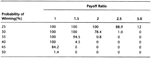
Table 7.1 summarizes the risk of ruin if 1 percent of capital is at risk on each trade with a hard dollar stop. We looked at winning percentages ranging from 25 to 50 percent, and payoff ranging from 1 to 3. Most trading systems will show about 25 to 50 percent profitable trades.
Table 7.1 Risk of ruin with 1 percent of capital at risk. A 0 probability means the total loss of equity is unlikely, but not impossible.

This range of values is what you would typically see in testing. The 25 percent lower limit for profitable trades is a personal choice. The upper limit was chosen because the risk of ruin decreases substantially as the winning percentage goes beyond 50 percent. Similarly, it is relatively rare to get a payoff ratio greater than 3 when you test one contract per market. Conversely, there is little benefit to trading a system with a payoff ratio less than 1 unless it is very accurate and your transaction costs are small. The smaller bet size of testing (1 percent) is likely to be interesting because Balsara’s book does not show risk of ruin for less than 10 percent risked per trade. The results generally agree with his calculations.
These theoretical calculations show that it is not attractive to trade a system with a payoff ratio near 1 unless it has a winning percentage greater than 50 percent. Similarly, the calculations show that if you have a payoff ratio greater than 2.5, then a winning percentage greater than 35 percent should reduce your risk to acceptable levels.
Tables 7.2 and 7.3 are for 1.5 and 2 percent of capital risked on each trade, respectively. Note how the risk of ruin increases as the amount risked increases, and decreases as the probability of winning increases or payoff ratio increases. These tables show why many traders recommend risking 2 percent per trade with a hard stop.
These calculations assume that the payoff ratio and probability of winning are constant. In reality, these numbers keep changing in time, and any estimates you have today will probably change in a few months. Thus, it is better to consider a range of payoff ratios and winning percentages when you consider your risk of ruin.
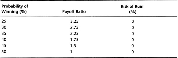
Looking at the problem from a different point of view, what would be the “magic” payoff ratios for a 1 percent risk per trade if your winning percentages ranged from 25 to 50 percent? The data in Table 7.4, which you can use as a quick reference when you evaluate system testing results, help to answer this question. For example, if the system had a winning percentage of 40 percent, then a payoff ratio above 1.75 would reduce your risk of ruin to manageable levels.
Table 7.2 Risk of ruin with 1.5 percent of capital at risk. A 0 probability means the total loss of equity is unlikely, but not impossible.
Note the nonlinear nature of these relationships. For example, consider a payoff ratio of 1.5 and winning percentage of 40 percent. If you now change your risk per trade from 1 percent to 2 percent, the risk of ruin increases disproportionately from 0.5 to 9.2 percent (see Tables 7.1 and 7.3). Hence, there is little incentive to overleverage an account and consistently bet much more than 2 percent per trade. You should also notice the benefits of modifying system design to improve the payoff ratio, or probability of winning, or both. The main advantage is that you can then increase the fraction of capital allocated to the system without unduly increasing risk.
These calculations do not mean you cannot vary bet size from trade to trade based on other information. For example, as Table 7.4 shows, if your probability of winning is greater than 50 percent and the payoff ratio is greater than 1, then the risk of ruin is very small. Thus, if you can find a mechanism to identify extraordinary opportunities, you can vary bet size. Such variations could significantly improve your overall results. See the section on identifying extraordinary opportunities in Chapter 4.
Table 7.3 Risk of ruin with 2 percent of capital at risk. A 0 probability means the total loss of equity is unlikely, but not impossible.
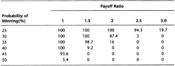
Table 7.4 Payoff ratio needed for negligible risk of ruir with a 1 percent hard stop.
In summary, the risk-of-ruin calculations show that there is little incentive to overtrade an account by regularly betting, say, 10 percent or more of account equity. A bet size of 1 to 2 percent of account equity is a more prudent choice. However, because the risk of ruin calculations assume that the probability of winning and payoff ratio are constants, and in actual trading, the probability of winning and payoff ratio vary from trade to trade, these risk-of-ruin results should be used only as general guidelines. They can be used to increase exposure for extraordinary opportunities.
Interaction: System Design and Money Management
This section examines the effects of two different money management strategies on portfolio performance. First we examine the effects of trading a system with a fixed or variable number of contracts. Then we see how portfolio performance differs for the two strategies. Finally, we check if our interval equity changes are useful for projecting worst-case drawdowns.
Your goal is to take care of the downside, and let the market take care of the upside. You would like to maximize the rate of growth of account equity while managing the extent of cumulative losses. Money management involves all the decisions specifying amount of capital risked per trade. This, in turn, determines the number of contracts traded. The contracts traded impact the percentage of account equity allocated to margin dollars. Of course, you must also choose the markets traded in each account. You can use relatively simple rules or relatively complex rules to make each of these choices, but your choice can significantly alter account equity evolution. You can also trade the same system with different money-management limits to produce significantly different results. This section briefly discusses common rules and shows their effects, but you should also review other books devoted just to this one subject.
The simplest risk control tool is an initial risk or money-management stop. This is usually a hard-dollar stop, with the dollar amount being usually less than 6 percent of your total equity. A hard-dollar stop is simply the amount of capital at risk per trade, usually implemented with a stop-loss order. Thus, you will exit the trade if the loss on all contracts approaches the hard-dollar stops. For example, we saw in the previous section that the usual choice is to risk 1 to 2 percent of your total equity on every position. Then, if your risk per contract is smaller than the total risk, you could trade more than one contract.
You are making a trade-off between the rate at which you want your equity to grow and the drawdown you are capable of absorbing. Theories such as optimal-f use more complex formulas to increase equity growth beyond the one-contract-per-market approach. However, when you trade multiple contracts, the drawdown tends to increase, and hence money management becomes even more important.
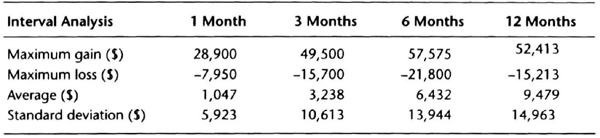
We can examine the interaction between system design and money management by using a channel breakout system on the deustche mark using actual contract data with rollovers. The monthly equity curve for the system trading one contract with $100 allowed for slippage and commission is shown in Figure 7.1. This system had a steady increase in equity with several significant retracements. We imported the monthly equity curve into a spreadsheet and analyzed the interval change in equity over 1, 3, 6, and 12 months. Those data appear in Table 7.5.
Some simple calculations will show the usefulness of Table 7.5. Assume that the monthly average return is zero and that monthly equity changes are normally distributed. Most trend-following systems have losing streaks lasting six months or less. Hence, to estimate downside potential, let us look at the worst loss over the 6-month interval. The maximum loss over six months was –$5,263, which is 3.5 times the monthly standard deviation of $1,471, rounded up to $1,500. We will use the 3.5 figure as a guideline, and round it up to 4. Thus, we will plan for a drawdown of four times the standard deviation of monthly equity changes. We know from statistical theory that the probability of getting a number larger than four times the standard deviation is quite small, about 6 in 100,000.
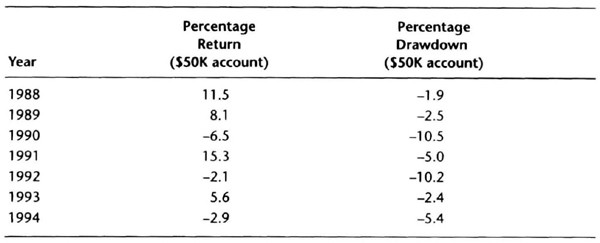
Now for a $50,000 account trading one deutsche mark contract for this system, our projected “worst” drawdown is 12 percent (= ($1,500 × 4) / $50,000). Using the same estimate for the upside, our “best” upside annual performance would be 12 percent. Thus, our most likely performance band will be ±12 percent. We can make this “linear” assumption because we are trading just one contract per market. Let us see how the system performed on an annual basis, assuming the account was reset to $50,000 at the beginning of each year.
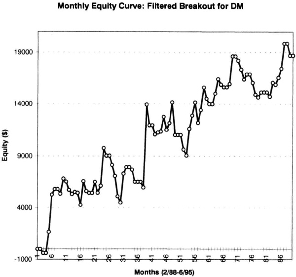
Figure 7.1 Monthly equity curve for deutsche mark trading one contract.
Table 7.6 shows that the performance band of ±12 percent was generally a good estimate. The 10.5 percent drawdown trading just one contract (1990) is worrisome. To cut the figure in half, trade this system with an account equity of $100,000. However, doubling the equity will halve your return, and you will have to decide your comfort level between returns and drawdowns.
Now that you have some feel for how to deal with a single contract, let us consider the impact of trading multiple contracts. One method of selecting the number of contracts is to fix your hard-dollar stop, and then to use market volatility to determine the number of contracts. In such systems, the number of contracts is inversely proportional to volatility. When market volatility is high, you trade a smaller number of contracts, and vice versa. We have discussed volatility-based calculations before, such as for the long-bomb system in Chapter 5. If volatility is $2,000, you buy five contracts for a $10,000 hard stop. If volatility triples to $6,000, you buy just one contract. You can use any measure volatility, such as the 10-day SMA of the daily range.
Table 7.5 Interval equity change analysis for the deutsche mark over 90 months (2/88–6/95).
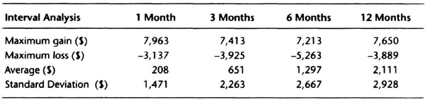
Table 7.6 Annual return for DM system, $50,000 equity at start of year.
In trading terms, the volatility is often low at the start of a trend after the market has consolidated for a few months. Your volatility-based criterion will trade more contracts, giving you a big boost if a dynamic trend occurs. Conversely, near the end of a trend, the volatility is usually higher, and you will buy fewer contracts. Thus, any false signals near the end of a trend will have a proportionately smaller impact.
If the volatility-based logic worked perfectly, you would have greater exposure during trends and smaller exposure during consolidations. Thus, your overall results should improve “nonlinearly” with variable contracts versus trading a fixed number of contracts each time. For example, trading, say, eight contracts using a volatility-based entry criterion may be better than just trading a fixed number of eight contracts at every signal. You hope to achieve greater returns with smaller drawdowns (higher profit factor) using the volatility-based contract calculations. Figure 7.2 shows the effects of using a volatility-based multiple contract system using the breakout system for the deutsche mark. Compare this equity curve to the curve in Figure 7.1 for one contract.
The annual returns for the multiple-contract strategy are shown in Table 7.7. The multiple-contract system made more than five times the profit of the single-contract system. The system traded a maximum of eight contracts, and an average of three contracts. The drawdowns were, on average, only three times higher. Thus, there was a significant improvement in performance by going to a multiple-contract strategy. Of course, the drawdowns were higher as well. Let us look at the interval returns to better understand system performance.
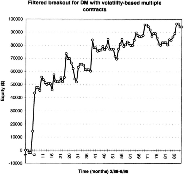
Figure 7.2 Equity curve for deutsche mark system with multiple contracts.
Table 7.7 Annual return for deutsche mark system, $50,000 equity at start of year, multiple contracts.
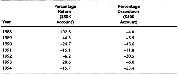
Table 7.8 Interval equity change analysis for the deutsche mark over 90 months with multiple contracts (2/88–6/95).
Comparing Tables 7.5 for one contract and 7.8 for multiple contracts, you will see the big difference due to the variable contract strategy, since the quantities are three to four times larger in Table 7.8. For example, if we traded five contracts for the DM system from Table 7.5, the maximum drawdown for the 6-month interval would be –$26,315 (5 × $5,263). The variable-contract strategy (Table 7.8) produces a maximum 6-month loss of –$21,800, 17 percent smaller than the fixed 5× strategy. However, the fixed 5× strategy produces the same nominal net profit as the variable contract strategy. Thus, the “nonlinearity” of the variable-contracts logic can produce interesting results.
As in the single contract strategy, we round up the 1-month standard deviation to $6,000 and use a 4× multiple, to estimate –$24,000 as the “worst” drawdown. Thus, for a $50,000 account this would be a performance band of 48 percent. It should be immediately obvious that we are practically overleveraging a $50,000 account with this multiple-contract system. Comparing Table 7.6 for single contracts with Table 7.7 for multiple contracts, observe that in 1991, the 1-contract system made a 15.3-percent profit, versus a 15.1-percent loss for the multiple-contract system. It is not recommended that you trade an account with so much leverage, and these calculations emphasize this point.
When you increase the amount of account equity, it reduces the fluctuations in equity on a percentage basis. Hence, when you calculate a linear regression on the percentage changes in equity, then you get a smoother curve by using a smaller leverage. This is only natural, since the equity in the account acts like a buffer to absorb small fluctuations when you reduce leverage. You can see this pattern clearly in Table 7.9, which shows the standard error for account sizes of $50,000, $75,000, and $100,000 for the data shown in Table 7.5.
A decrease in the standard error means the equity curve is smoother. As the size of the account increases, the percentage fluctuations decrease. Note that our estimated performance band was a good guess about drawdowns. Thus, the 1-month standard deviation of equity returns times four may be a good starting point to estimate downside risk. You can then deduce the account size to maintain a low level of drawdowns. Say you trade six markets, and want to limit the “worst” drawdown to 3 percent. Then you would trade the multiple contract system with an account equity of $800,000. This is very different from the $50,000 account.
Table 7.9 Smaller leverage gives a smoother equity curve on a percentage basis.
| Account Size | Standard Error of Monthly Changes (%) |
| $50,000 | 2.94 |
| $75,000 | 1.96 |
| $100,000 | 1.47 |
The results and discussion of this section should convince you that money management strategies can significantly alter portfolio performance. As stated previously, as a design philosophy, you should try to protect the downside and let the market take care of the upside. In the next section we examine if it is possible to estimate future drawdowns using our interval analysis of the equity curve.
Projecting Drawdowns
A key money-management goal is to protect the downside using rigid risk control. We would therefore like to make reasonable projections about potential drawdowns. We have to rely on past analyses to forecast the future, so we should try to err on the side of caution, and bias our forecasts toward the high side. It is better to plan for a larger drawdown than a smaller one.
The previous section suggested that the standard deviation of monthly equity changes for a system is a reasonable tool to project the magnitude of future losses. We first developed the daily equity curve, then converted it into a monthly equity curve, and then calculated the monthly changes in equity. Using spreadsheet software, we can also calculate the standard deviation of monthly equity changes. Let us call this quantity σ1 for convenience. A conservative forecast for future drawdowns is 4σ1 for any system. However, this is only an estimate, and you could consider other nearby values such as 5σ1 or even 3σ1.
To test this forecasting technique, we used continuous contracts from January 1, 1985, through December 31, 1990, for these seven arbitrarily selected markets: cotton, Eurodollar, gold, heating oil, Japanese yen, Swiss franc, and U.S. bond. We tested three arbitrary, nonoptimized systems: the 65sma-3cc, a 20-bar breakout on close (CHBOC) with a 10-tick barrier, and a volatility-based system (VOL). The rules for this last system are described in detail in Chapter 8 on data scrambling. We used a $2,500 initial stop and an exit on trailing 10-day high or low, and allowed $100 for slippage and commissions. These choices were all made arbitrarily, without any idea of how the systems will perform and without looking at the data.
The logic for entering the markets is quite different for each system, although they have the same exit strategy. Hence, being trend-following in nature, they should all be profitable in trending markets. It is their response to sideways markets that will differentiate system performance. The 65sma-3cc system will probably show smaller losses, since it tends to be self-correcting during trading ranges. The CHBOC 20-bar breakout will stay out of narrow trading ranges, but will suffer false breakouts during broad trading range markets. The volatility system will be vulnerable to sharp moves within the trading range.
By examining overall system profits and maximum intraday losses, you can better appreciate the analysis of monthly equity changes. Tables 7.10 and 7.11 show that there were wide differences in overall profitability and drawdowns for the three systems over the seven markets.
The 65sma-3cc system produced the smallest total drawdown, followed by the CHBOC system. Note the large drawdowns produced by the volatility system in heating oil from 1985 to 1990. Gold, heating oil and U.S. bonds were difficult to trade with these systems. Note also the large fluctuations in profits and losses over the test periods. You should focus on relative differences in system performance.
We would like to see if this interval analysis can project future drawdowns. Hence, we exported the daily equity curves, converted them into monthly curves, and used a spreadsheet to develop information on changes in equity over 1, 3, 6, 7, 8, 9, and 12 months.
In most systems tested, the periods of drawdown usually last less than 9 months. Hence, we paid greater attention to the 6- to 9-month range. We calculated the standard deviation of the monthly equity changes, and then determined the worst performance over any of the above intervals, hoping that the ratio of the worst interval performance to the standard deviation of monthly equity changes would be 5 or less.
Table 7.10 Simulated profits and drawdowns for the 1985–1990 period (Max P = net profit, MIDD = maximum intraday drawdown).
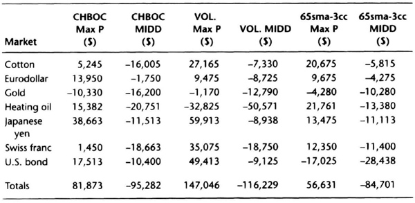
Table 7.11 Simulated profits and draw downs for the 1991–95 period (Max P = net profit, MIDD = maximum intraday draw down).
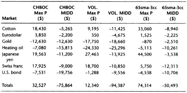
The equity calculations were repeated for the next block of data, from January 1, 1991, through June 30, 1995, without changing the system. The new test period was an “out of sample” test to check stability. We then did the interval equity change calculations in a bid to see if the forecast for the worst drawdown based on the data from 1985 to 1990 had held up on the data from 1991 to 1995. Ideally, the standard deviation of monthly equity changes would be roughly comparable in the two periods, to reinforce our confidence in this approach.
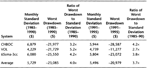
Table 7.12 shows the standard deviation of monthly equity changes and maximum drawdown for the three systems over each period. The monthly standard deviation was quite stable. The ratio of the average loss was approximately four times the monthly standard deviation over both time periods. This is encouraging, since we did an “out of sample” test without optimization using arbitrarily selected systems and markets. These data show that it is reasonable to project future drawdowns by using the standard deviation of monthly equity changes, assuming a potential loss of four to five times the monthly standard deviation.
Once you know the projected loss, you can immediately gauge a possible equity level to trade the system or portfolio. Let us say you wanted to keep the drawdowns below 20 percent. To be safe, let us use a target of 15 percent, with a 5-percent cushion for future uncertainties. Hence, if you had a calculated standard deviation of $6,000, then a 5× forecast would be a drawdown of –$30,000. Since we want to keep projected drawdowns at the 15-percent level, the approximate equity level is $200,000 for trading this system or portfolio.
Table 7.12 Comparison of standard deviation and theoretical losses for three systems over two different time periods using monthly changes in equity.
Remember that our projections are only approximations of what might happen, and no guarantee that losses will remain at or near this level. However, the method discussed in this section does provide an objective tool to plan for reasonable equity losses. You must rigidly enforce the risk control mechanism incorporated into the system tests, otherwise these forecasts are meaningless. Ideally, once we have protected the downside, the design of our system and future market action will take care of performance on the upside.
Changing Bet Size After Winning or Losing
One of the key money-management decisions you have to make is how you will change your bet size as your account equity evolves in time. Your trade-off is between equity growth and smoothness of the equity curve. This section presents some common “betting” strategies and their impact on the equity curve.
Two references will fill in the background on betting strategies. Bruce Babcock’s book on trading systems examines different betting strategies. Jack D. Schwager’s interviews with market wizards shows that many indicated that they reduced the size of their trades during losing periods. These references (see bibliography for details) should convince you that changing bet size can be as important as your system design.
The premise behind changing bet size is that you can use the outcome of the last trade to predict the outcome of the next trade. This implies that winning and losing trades come in streaks. However, it is easy to show mathematically that successive trades are independent. Hence, on average, it is difficult to justify the premise behind changing bet size. Despite this mathematical fact, most traders will tell you there are psychological benefits to reducing trade size during a drawdown. You can be conservative and assume losing trades will come in bunches, though winning trades may not. Under this assumption, you could generate a smoother equity curve by changing bet size.
A simulation will help us to examine the effect of different betting strategies on the smoothness of the equity curve. We will use the standard error calculations to have a uniform basis for the comparison. We chose ten trades at random, half of them winners, and sampled these trades at random to construct 14 sequences of ten trades each. On each sequence, we then tested the following four strategies:
- Constant contracts: always trading two per signal.
- Double-or-half: if the previous trade was a winner, trade four contracts. If the last trade was a loser, trade one contract.
- Half-on-loss: if the previous trade is a loser, trade one contract. If the last trade was a winner, then trade two contracts again.
- Double-on-loss: if the previous trade is a loser, trade four contracts. If the last trade is a winner, then trade two contracts again.
We started with $100,000 in each portfolio. Every strategy was tested on precisely the same trades. We ran 14 simulations, for a total of 140 trades, and then averaged the equity curves for each trading strategy. We compared the averaged curves for each strategy to the average curve for trading two contracts per trade. Finally, we used linear regression analysis to calculate the standard error.
You should conduct a larger simulation with your data to find the strategy you like. In particular, be aware that the double-on-loss is the riskiest strategy. If you are hit with an unusually long string of losses, this strategy will produce the largest drawdowns.
Table 7.13 shows the effect of changing the bet size after each trade. The strategy of halving trade size to one contract after each losing trade produced a 21.6-percent reduction in the standard error of the equity curve for only a 2.4-percent profit penalty. Thus, we got a substantially smoother curve for a relatively small reduction in profits.
The double-or-half strategy increased ending equity on average by only 2.1 percent, but the standard error increased by nearly 41 percent. You would expect this strategy to show sharp gains if winning trades come in bunches. Hence, the equity curve will be rougher and the increase in standard error is no surprise.
The double-on-loss strategy was the riskiest, as you can see by a more than 53-percent increase in standard error. The equity curve (see Figure 7.3) shows that this strategy can produce steep drawdowns. Although this strategy had the highest ending average equity, this was only 5 percent greater than the constant contract strategy. Hence, the relative risk reward does not seem worth the aggravation.
Table 7.13 Effect of betting strategies on standard error of average equity curve.
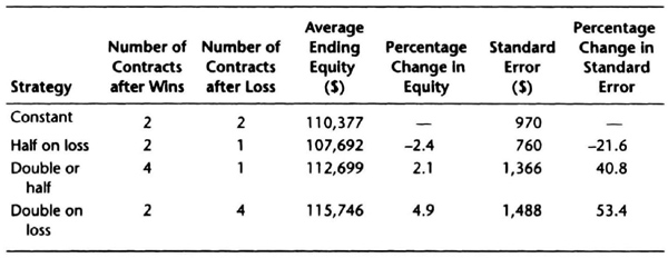
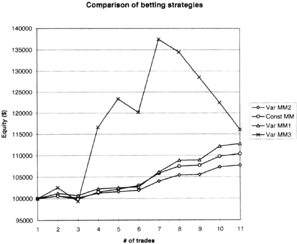
Figure 7.3 Average equity curves for four betting strategies. The “Const MM” curve is for a constant two contracts per trade. The “Var MM1” curve is for the double-or-half strategy. The “Var MM2” is for the half-on-loss strategy. The “Var MM3” curve is for the double-on-loss strategy.
This limited simulation supports the opinion expressed by many accomplished traders that they like to reduce trade size during drawdowns. Table 7.13 clearly shows that the half-on-loss strategy had the best reward-to-risk performance. Some traders suggest that they defer accepting new signals during drawdowns, but ignoring new signals may cause you to miss just the signal you need to boost equity.
Table 7.13 shows that the fixed contracts strategy is also a reasonable choice. Certainly, when you are starting off, you may wish to consider this strategy to keep life simple. Eventually, as you feel more confident and have more equity, you can move on to other more elaborate strategies.
Note that when you use a fixed 2-percent stop to calculate a variable number of contracts, you are automatically adjusting position size to equity and volatility. If you have losing trades, equity will drop and bet size will decrease. Similarly, after profits, your bet size will increase. Hence, this strategy will produce a different equity curve. The calculations here should provide a starting point for you to explore other complex strategies, such as continuously varying exposure during a trade. Ultimately, you are the best judge of the betting strategy that suits your style of trading.
Depth of Drawdowns for Actual Performance Records
We saw previously how we could project the expected future drawdown using the standard deviation of monthly returns. We tested those ideas using the hypothetical results of three different trading systems. In this section, we test those ideas using the actual track records of professional money managers, namely commodity trading advisors and hedge fund managers.
If we can show that the ideas of the previous section provide good working estimates for drawdowns using actual performance histories, we would have accomplished a good deal, because objective estimates of future drawdowns would allow comparisons between managers, and assist in formulating and vetting multimanager programs. The estimates can also be used to adjust funding levels to control the depth of expected drawdowns. Note that, because one is making probabilistic statements, there is always the chance, however small, that the estimates will be exceeded in the future. Hence, estimates of future depth and duration of drawdowns must be used with caution.
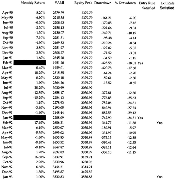
First, let us look at how we calculate month-end drawdowns and identify drawdown strings. Consider the track record shown in Table 7.14. The table shows monthly returns and the month-end value of an account that started with $1,000. The last column shows a drawdown flag: if the month-end equity is lower than the highest month-end equity since the start of trading, then the flag = –1 because the account is in a drawdown. If the month-end equity is at the highest level since the start of trading, then the flag is blank.
Table 7.14 Introduction to calculation of drawdowns.
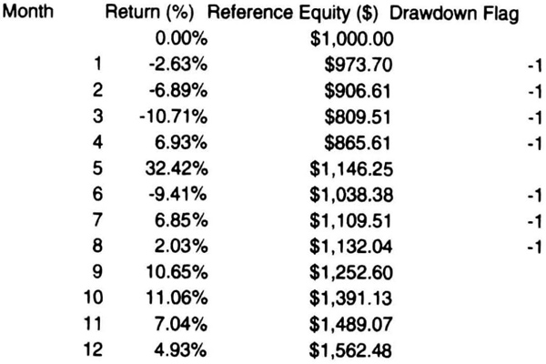
At the end of month 1, the return is –2.63 percent, and the closing equity is therefore $973.7. Because this is less than the highest equity since starting, the drawdown flag is −1. The program experiences losses for the next two months and then has a positive month. Even though month 4 has a positive return, the month-end closing equity of $865.61 is still less than $1,000, and hence the drawdown flag is −1. In month 5, there is a strong return of 32.42 percent, and the monthly closing equity is $1,146, the highest level since the start of trading. Hence, the drawdown flag is blank. At the end of month 5, we can look back and say that there was a drawdown string of 4 months, and the worst month-end drawdown during that string was −19.05 percent, when the account value dipped down to $809.51 at the end of the third month. Now see if you can explain the subsequent drawdown string of three months with a worst drawdown of –9.41 percent.
Let us now take a step forward and summarize the duration and depth of every losing period or string in a track record. Table 7.15 shows these summary data for an actual track record; it shows the length of drawdown strings and the depth of drawdown (in percent) that occurred in each period. We can now analyze such a summary table in two different ways. First, we find the average and standard deviation of both columns. For example, the standard deviation of the lengths of drawdown strings, (σdd), was 2 months for this manager, and the standard deviation of the depth of the drawdown (σΔ) was 4.94 percent. The longest drawdown was 8 months and the worst drawdown was—20.59 percent. We see that the longest drawdown was about 4*σdd and the absolute value of the deepest drawdown was 4.17 percent σΔ. Second, we express the absolute value of worst drawdown as a multiple of the standard deviation of monthly returns, σM. Table 7.15 shows that the absolute deepest drawdown was 3.17 percent σM. The calculation using drawdown strings takes a bit longer than the short-cut method of expressing the worst drawdown as a multiple of σM. Thus, Table 7.15 gives us two simple rules for estimating the depth and duration of drawdown using monthly performance data. How does this analysis look when applied to a large number of managers?
Table 7.15 Summary of drawdown periods from an actual track record.
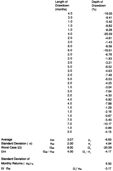
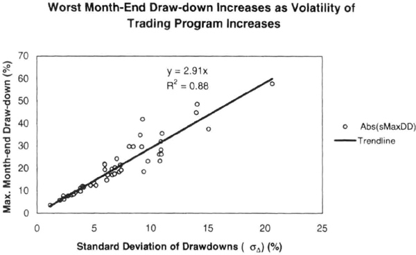
Figure 7.4 The worst drawdown on a month-end basis reported by a manager compared to the standard deviation of the depths of previous drawdowns in the manager’s record (σΔ) (%).
Let us look at an extension of the above analysis to the performance record of approximately 50 randomly chosen commodity trading advisors, covering a wide variety of trading styles, portfolios, leverages, and lengths of trading records. We analyzed their monthly performance numbers and equity curves to calculate the depth and duration of the absolute value drawdowns. For example, a typical CTA record was 3 to 5 years long and had five or more drawdown periods lasting a month or more during that period. We calculated the standard deviation of the worst month-end drawdown during each losing period. Note that because we used monthly data, the drawdown was measured on a month-end basis, and not on a peak-to-valley basis.
Figure 7.4 shows how the depth of the absolute worst drawdown (on a month-end basis) related to the standard deviation of the losses in drawdown streaks (σΔ) in percent. A trend line drawn through the origin had a slope of 2.91 with an R2 value of 0.88. Figure 7.4 suggests that, to a good approximation, the depth of the worst drawdown was three times the standard deviation of drawdowns. For example, if the standard deviation of the depth of the drawdowns was 5 percent, then the worst drawdown in equity on a month-end basis was typically −15 percent. These data also confirm that volatile managers tend to produce deeper drawdowns.
An application of the short-cut approach is to relate the peak-to-valley drawdown to the standard deviation of monthly returns (σM) in percent. For example, Figure 7.5 shows the absolute value of maximum peak-to-valley drawdown (PVDD) figures reported by over 100 CTAs, plotted against the standard deviation of their monthly returns (σM). A trend line through the origin had a slope of 2.84 and an R2 value of 0.45. Approximately 90 percent of the data had a ratio of worst drawdown to standard deviation of less than 4. Thus, to a good approximation, PVDD is likely to be less than four times the standard deviation of monthly returns. For example, if the standard deviation of monthly returns is 7 percent, then the worst PVDD is expected to be in the range of 21 to 28 percent.
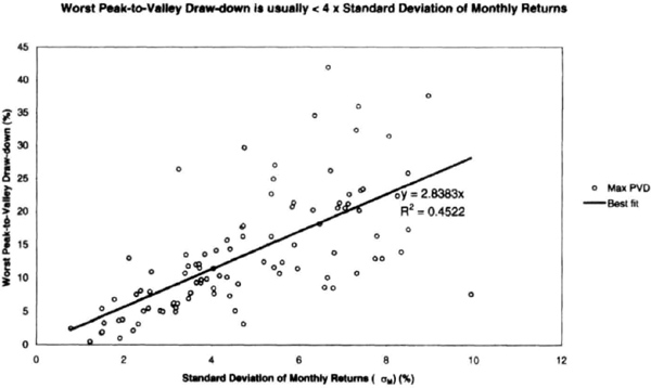
Figure 7.5 An analysis of the actual track record of over 100 commodity trading advisors shows that the worst peak-to-valley drawdown is typically three times the standard deviation of monthly returns (DM), as shown by the slope of the line through the origin.
If the distributions of drawdown depth and duration were truly normal, it would be rare to see values greater than three times the standard deviation, or 3σ. However, the scatter in the data suggests that actual performance data are not truly normal, and an estimate of 3σ to 5σ would be a more conservative multiplier for estimating the depth and duration of drawdowns.
Next, we analyzed the monthly performance of 30 randomly chosen hedge funds from June 1995 through June 1998 for additional confirmation. The results are similar. Figure 7.6 shows the absolute value of the worst peak-to-valley drawdown (Δ) reported by each fund over that 3-year period plotted against the standard deviation of monthly returns for that fund. The Δ generally increases as the standard deviation of monthly returns increases. A best-fit linear regression line through the origin has a slope of 3.0 and an R2 value of 0.69. For 83 percent of the sample, the Δ was less than four times the standard deviation. Thus, to a good approximation, Δ is less than four times the monthly standard deviation (σM). We generalize this relationship as:
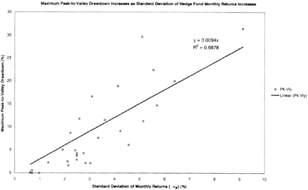
Figure 7.6 The worst peak-to-valley drawdown reported by 30 hedge funds was typcially three times the standard deviation of monthly returns (σM) in percent, similar to the result in Figure 7.5 for CTAs.
Thus, we started with a hypothesis using simulated results, and checked it for different trading approaches. We then checked the idea using actual performance data of different money managers using different approaches to trading. We then double-checked this approach using hedge fund data. In every instance, the results confirm that the worst PVDD can be expressed as four times the standard deviation of monthly returns. If you wish to be aggressive, you would use a multiple of 3σM instead of 4σM.
Allocators and investors could use the ratio of the worst PVDD to the standard deviation of monthly returns as a figure of merit that measures the quality of risk control techniques used by a manager (see Figures 7.5 and 7.6). For example, the smaller this ratio, the better the design and implementation of risk control methodology followed by an advisor. If, for example, this ratio was greater than 5, then it might suggest the need for a more detailed due-diligence check to understand why a particular drawdown occurred.
The due-diligence process can be simplified if the performance record of CTAs could be “normalized” to allow comparisons on an apples-to-apples basis. The interesting feature of this analysis is that we could combine the performance records of CTAs with many different lengths, styles, portfolios, and leverages on the same curve. Hence, such an approach may provide a uniform framework for normalizing advisor performance records for comparison purposes.
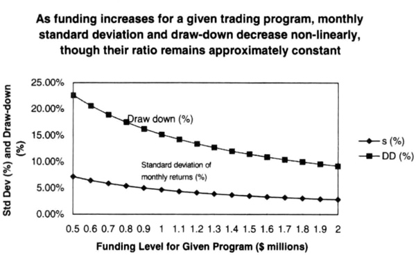
Figure 7.7 The effect of changing the leverage (the funding level) for accounts trading a diversified portfolio of the futures markets. Leverage increases as funding levels are reduced from $2 million to $0.5 million and the standard deviation of monthly returns and the worst peak-to-valley increase nonlinearly. Thus, leverage can be adjusted to obtain the desired level of volatility and drawdown risk.
Figures 7.4 through 7.6 suggest that advisors that are more volatile tend to produce deeper and longer drawdowns. Note that “volatile” is defined rather narrowly here, with particular reference to the standard deviation of the depth and duration of losing periods. Hence, investor or allocator preferences can be used to adjust the capital allocation to an advisor in order to modulate the desired level of volatility derived from the performance record. This idea is illustrated in Figure 7.7 using hypothetical returns.
We now show the effect of “leveraging-up” a trading program. Figure 7.7 shows the changes in the standard deviation of hypothetical monthly returns and the worst month-end drawdown, as the funding of a $2 million trading program is decreased to $0.5 million from $2 million. Observe that the drawdowns and monthly standard deviation increase nonlinearly during the funding decrease, even though their ratio remains approximately constant. Figure 7.7 suggests that funding can be changed to raise or lower the expected volatility of a trading program, simultaneously changing the expected worst drawdown.
The discussion so far has focused on diversified portfolios of futures or futures plus equities. The same logic can be applied to a portfolio of stocks. However, the stocks in a “basket” tend to be more highly correlated to one another than a basket of commodities or futures because stocks as a whole respond to the same macroeconomic data. Thus, we would expect the drawdowns to be more severe. We analyzed the performance of the S&P-500 and the NASDAQ index as a proxy for diversified stock portfolios. The analysis shows that the downside risk for stocks is closer to 8σM than 4σM for diversified futures portfolios. Figure 7.8 shows the worst month-end-basis drawdowns in the S&P-500 cash index for every year since 1980. We normalized the actual drawdown by the 4.13 percent, the standard deviation of monthly returns, σM, over the same period. The worst absolute drawdown was in 1987, at approximately 7σM.
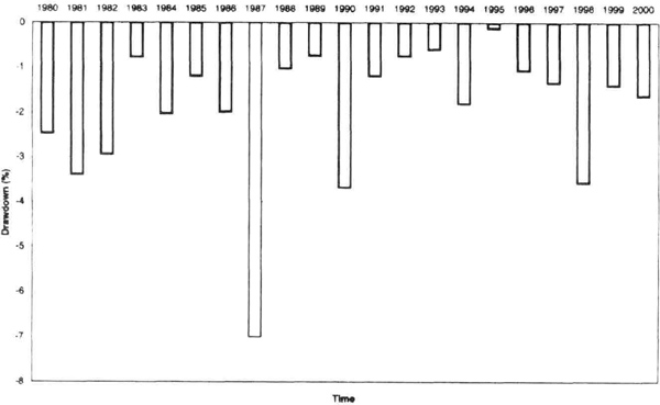
Figure 7.8 Drawdown in the S&P-500 stock index normalized by its monthly standard deviation of 4.31 percent. The worst drawdown since 1980 was approximately 7σM in 1987.
A similar result is obtained for the NASDAQ composite index. Figure 7.9 shows the worst drawdown on a month-end basis for the index for every year since 1971, normalized by the standard deviation of monthly returns of 5.87 percent. Notice that the figure does not show the intramonth peak-to-valley drawdown data. You may want to use a higher multiple of the monthly standard deviation to account for intramonth data. The average absolute drawdown was 2.4σM on a month-end basis, and the worst was 7σM in 1975.
We then analyzed a convenience sample of 50 mutual funds from four large and popular fund families: Fidelity, Janus, PBHG, and Vanguard Group. This mixture of funds represents equities and bonds, as well as a mixture of styles and market capitalization. The overall results are similar to those obtained for futures, hedge funds, and stock indexes. The worst PVDD in a mutual fund’s record from 1994 to 2000 increased as the standard deviation of monthly returns increased. A linear regression through the origin had a slope of 3.85 and R2 = 0.75 (see Figure 7.10). Most funds were typically in the range of 3σM to 5σM, as we would expect from our other studies.
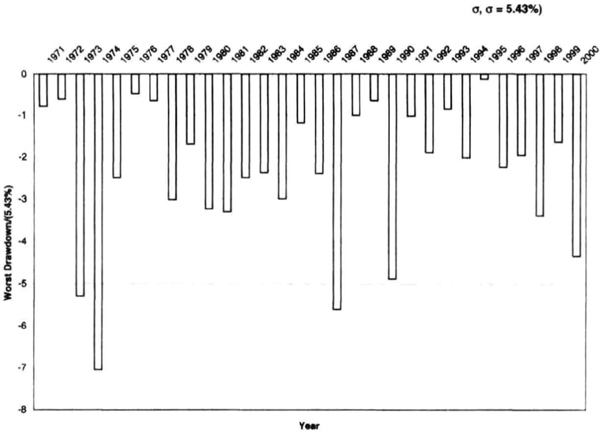
Figure 7.9 The annual losses in the NASDAQ index normalized by the standard deviation of monthly returns of 5.87 percent.
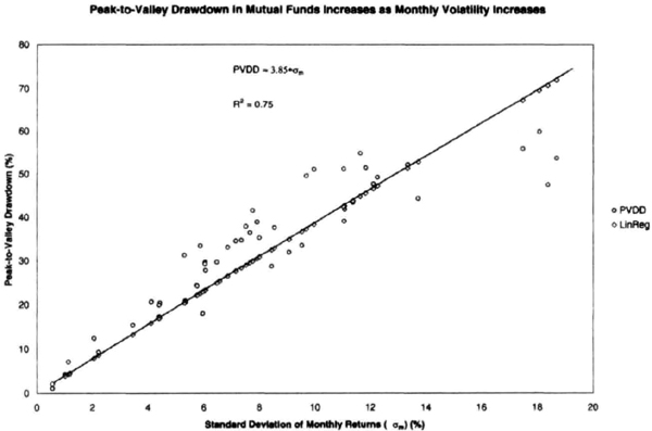
Figure 7.10 A convenience sample of 50 mutual funds from Fidelity, Janus, PBHG, and Vanguard also shows increasing peak-to-valley drawdowns with increasing standard deviation of monthly returns (σM). The typical mutal fund reported a worst peak-to-valley drawdown of 3σM to 5σM.
We can summarize this section by noting that to a very good approximation, the worst peak-to-valley drawdown can be estimated as a multiple of 3 to 5 times the standard deviation of monthly returns, σM, expressed in percent. This is a powerful statement because you can use it to control risk, select the suitable leverage, and manage expectations across a broad range of financial instruments, from mutual funds and stock indexes to hedge funds and commodity trading advisors.
Estimating the Duration of Drawdowns
The performance of a trading advisor can be viewed as a process of drawing random samples from an unknown distribution of returns. When this record is viewed on a month-end basis, it consists of either positive or negative returns. The performance record will have sequences, or “strings,” when the equity makes new highs, and when the equity drops below previous highs. In industry parlance, the advisor is in a drawdown period when the equity is not making new highs. A drawdown period simply corresponds to drawing a series of predominantly negative returns from the distribution of the manager’s returns.
For every equity curve, we can measure the time to new highs in months, which is the same as measuring the duration of each drawdown period. If an advisor takes 7 months to record a new equity high, then the duration of that drawdown period was also 7 months. We now assume that the time between the arrivals of consecutive new equity highs is exponentially distributed. The basis for this assumption is an empirical analysis of more than 50 equity curves, in which the frequency distribution of the duration of drawdown periods generally appeared to follow an exponential distribution.
Figure 7.11 shows the typical distribution of drawdown periods from the actual track record of a leading CTA. We can now use month-end performance data to make probabilistic statements about the duration of future drawdowns. A key assumption is that the advisor will not change the style of trading that led to the past performance relied upon to make projections about the future. Should there be a substantial change in the advisor’s trading process, then the projections from past data will become even less reliable. Note that because one is making probabilistic statements, there is always the chance, however small, that the estimates will be exceeded in the future. Hence, estimates of future duration of drawdowns must be used with caution. Because we are relying on the exponential distribution, here is a brief review of the properties of the exponential distribution.
An exponential distribution is used to describe the distribution of the time between two occurrences of many natural phenomena, such as the time for radioactive decay, or the time between arrivals of a bus at a bus stop, cars at toll-booth, or customers at a teller window. Because we are fitting the duration of drawdowns to an exponential distribution, we are tracking the time between successive arrivals of new equity highs. The distribution assumes that the phenomena being described are uniformly distributed in time, that is, they occur at a constant rate.
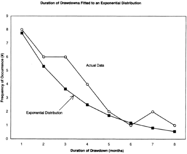
Figure 7.11 The duration of drawdowns for trading managers can be assumed to follow an exponential distribution.
A brief mathematical description of the exponential distribution is given here. The probability density function of the exponential distribution is:
![]()
where x is the time interval (in months, say) and Λ is the rate at which the event occurs (in occurrences per month, say). The mean value μ of an exponential distribution is μ = 1/Λ, and the standard deviation of the distribution σ is 1/Λ. Note that the range of values that can occur is infinite, that is, the drawdown can last “forever.” However, the probability of getting very long gaps between successive occurrences of new equity highs diminishes rapidly.
Consider the summary shown in Table 7.15, in which column one shows the lengths of the different drawdown periods in that track record. The average length of the drawdown period was 3.07 months, or approximately 3 months. In order to fit an exponential distribution to these data, the best estimate of Λ, the parameter of the exponential distribution, is given by the inverse of the average of the duration of drawdown lengths. Hence, for the data in Table 7.15, the exponential distribution parameter Λ = 1/3.07 = 0.326.
We can now make probabilistic statements about the duration of the “worst” drawdown. The probability of a drawdown of duration longer than some time t is given by e(-Λt). For example, the probability of a drawdown longer than 12 months for the data in Figure 7.11 is e(-0.326*12), or 2 percent. Because the average of the exponential distribution is (1/Λ), it follows that the probability of a drawdown equal to three times the average is e−3, or 4.978 percent, or approximately 5 percent. Note that this only an estimate, and can be exceeded in actual trading. Now let us examine how this analysis works with actual performance data.
For the data of Figure 7.4, Figure 7.12 shows that the duration of the longest drawdown increases as the standard deviation of the duration of losing periods increases. A trend line drawn through the origin had a slope of 2.98 with an R2 value of 0.85. This suggests that, to a good approximation, the longest month-end drawdown was approximately three times the standard deviation of the duration of month-end drawdowns. For example, if the standard deviation of the duration of drawdowns was 5 months, then the longest drawdown was about 15 months. Thus, the actual performance data seem to fit an assumption that the duration of drawdowns is distributed exponentially. We know from the exponential distribution that there is only a 5 percent probability of getting a drawdown longer than three times the standard deviation of drawdown periods. The data also suggest that due to the variability inherent in trading, an estimate of 4.5σ may be a more conservative estimate of expected “worst case” drawdown.
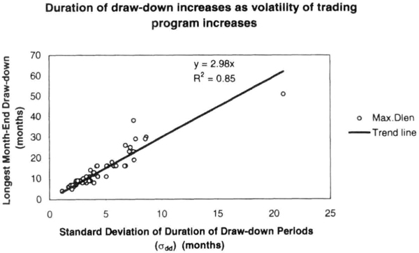
Figure 7.12 Duration of drawdown increases as the standard deviation of the duration of historical drawdown increases, implying that programs that are more volatile tend to have longer-lasting drawdowns. The duration of drawdown depends on the trading system, money management, and portfolio being traded, and the longest drawdown typically lasted three times the standard deviation of the duration of previous drawdowns (Odd) in the manager’s track record.
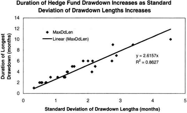
Figure 7.13 The drawdown of hedge funds also increases as the standard deviation of the duration of drawdowns in the track record of a manager increases.
We also checked the performance of the 30 randomly selected hedge funds in Figure 7.6 for good measure. Figure 7.13 shows the duration of longest drawdown (τ) plotted against the standard deviation of the lengths of losing streaks in a track record (σdd). Figure 7.13 shows that the duration of longest drawdown generally increases as the standard deviation of the length of losing streaks increases. A best-fit linear regression line through the origin has a slope of 2.62 and an R2 value of 0.86. Thus, we have additional confirmation about the duration of drawdowns from hedge fund data.
In summary, the duration of drawdowns can be modeled as an exponential distribution, and that allows us to make probabilistic statements about the length of future drawdowns. We can measure the lengths of drawdowns in the track record of a manager and find the standard deviation of drawdown durations (σdd). The length of future drawdowns (in months) can then be estimated as 3σdd, knowing that there is only a 5 percent probability that this length will be exceeded. Thus, we have two valuable tools to estimate the length of drawdowns, and these should help resolve another dimension of uncertainty about the future performance of a manager or trading system.
Estimating Future Returns
One of the most difficult tasks an investor or allocator has to perform is to estimate future performance, precisely because past performance is not indicative of future performance. The three critical unknowns of future performance for any system or trading manager are the expected returns, the depth of drawdowns, and the duration of drawdowns. In the previous sections, we developed estimators for depth and duration of drawdowns, and we studied how to analyze the equity curves. We now develop a simple model for estimating returns.
We begin with the “threshold of pain” of the investor, or the peak-to-valley drawdown the investor would find difficult to tolerate. As the first step, we convert the threshold of pain (Δ) of the investor into the target monthly standard deviation (σM) for our trading program or system, and we adjust the pricing algorithm or the funding level to achieve the desired volatility. In the following discussion, we will not use the subscript M to denote monthly data, for clarity and simplicity. We now use our results on estimating drawdowns, that the “worst-case” drawdown is four times the monthly standard deviation.
Thus,
Note that the multiplier 4 is a relatively conservative choice; however, you can choose to be more or less conservative than this model. If you wish to be conservative, you could use Δ = 5σ, 5σ, if you wish to be aggressive, you may choose to use Δ = 3σ. As shown below, your choice will affect your returns as well as drawdown potential.
We can now use some simple equations to show a connection between the thresholds of pain Δ an investor can tolerate and the expected reward for that risk. We begin by defining return efficiency (ρ), which is similar to a Sharpe ratio calculated on a monthly basis with a risk-free rate set to zero.
where, ρ = return efficiency, μ is the average monthly return (%), and σ is the standard deviation of monthly returns(%). For example, μ could be 1.5 percent and σ could be 5 percent. In practice, ρ is a measure of the overall quality of the investment strategy and the risk control methodology of the manager, and the larger the value the better. We can use ρ as an internal benchmark for different types of return processes. A good benchmark for return efficiency is ρ = 0.25, and this value seems to work well for futures, hedge funds, and equities.
We use equation (7.3) to solve for μ, the average monthly return, and then we substitute for the monthly standard deviation σ from equation (7.2) to express μ in terms of the investor’s risk tolerances. Specifically, equation (7.3) can be rewritten as:
The importance of equation (7.4) is that it shows that average returns are determined by investor risk tolerance and the return efficiency of the return generation process (RGP). Thus, higher average returns require the investor to assume more risk (higher ρ) or find a more efficient RGP (higher ρ). All that remains is to convert the expected average return into annual returns by compounding 12 times, once for each month. Thus, we calculate annual returns (R) by compounding the average monthly return μ as:
Upon substituting from equation (7.4), we can rewrite equation (7.5) as:
Equation (7.6) shows the direct connection between returns, monthly volatility and the design of the investment process. It shows the annual returns expected for different levels of return efficiency and monthly standard deviation (see Figures 7.14 and 7.15). Clearly, higher returns require greater risk (higher σ and Δ), or, for a given level of risk, higher returns require superior risk-adjusted returns (higher ρ). This relationship is illustrated graphically in Figure 7.16, which shows that one cannot expect arbitrary relationships between risk and reward. If you wish to increase returns, you must assume more risk, or for the same level of risk, find a more efficient investment. As economists love to preach, “there is no free lunch.”
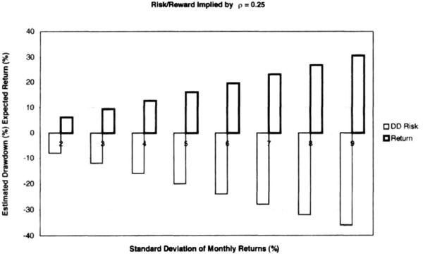
Figure 7.14 Risk and reward implied by equation (7.6) for a return efficiency of 0.25 and standard deviation of monthly returns ranging from 2 to 9 percent. Greater returns require the investor to assume greater risk.
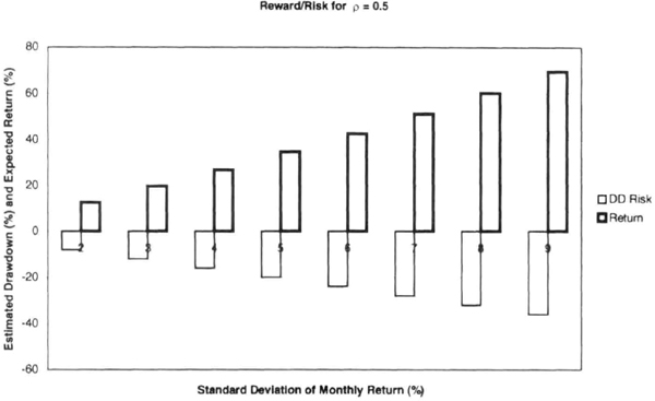
Figure 7.15 Risk and reward implied by equation (7.6) for a return efficiency of 0.5 and standard deviation of monthly returns ranging from 2 to 9 percent. Observe the improvement in the relative magnitudes of reward versus risk because of the higher return efficiency.
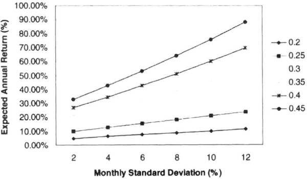
Figure 7.16 Expected annual returns as a function of the return efficiency and the standard deviation of monthly returns. This figure is a graphical representation of equation (7.6). To seek higher returns, one must tolerate higher risk or find a superior return-generation process.
Table 7.16 Calculation of expected return, starting with the threshold of pain of the client.
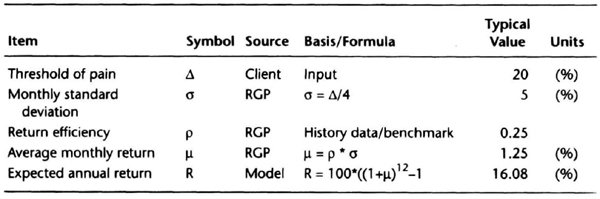
Suppose that you can specify a target for the worst peak-to-valley drawdown Δ. For example, if we set our worst PVDD or Δ threshold at 20 percent, then ρ = 0.25 would produce an expected R = 16.08 percent (see Table 7.16). Clearly, a higher ρ or a smaller Δ divisor would improve investment returns. Equation (7.6) is a powerful reason to favor investments with higher return efficiency. Using the results of an earlier section, we can now quantify and relate the downside risk and duration of drawdown to the upside reward.
Chande Comfort Zone
We now have the tools to estimate the three key unknowns about future system performance: the expected returns, the depth of drawdowns, and the duration of drawdowns. Our estimates are of the “upper-bound” of values we can reasonably expect; they do not predict the actual values that will be realized in the future. We can plot these three quantities using a three-dimensional grid to define a “box” or comfort zone (Chande Comfort Zone, or CCZ) within which we can reasonably expect our performance. Remember, it is possible to realize results outside this box under particularly favorable or unfavorable conditions.
Figure 7.17 shows the general shape of the CCZ; its value lies in allowing you to decide if you are comfortable with the proposed dimensions of the box. If you are comfortable, you should be able to stick with your investment strategy for a long time without actively seeking modifications. If you are not happy with the box, you can reshape it to meet your needs.
For example, let us assume that the projected drawdown for a particular strategy is 30 percent, but you want to limit the high probability zone to 20 percent. You can do so by reducing the leverage used in the strategy or increasing the capital allocated to the strategy. Consider now another scenario in which the duration of the drawdown is forecast to be 12 months, but you want it to be 7 months. In this case, you have a portfolio problem: perhaps you can combine the investment process under review with other return generation processes to reduce the duration drawdowns.
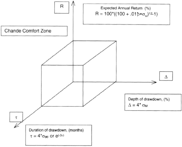
Figure 7.17 The Chande Comfort Zone shows estimates for the three key unknowns of future performance for any manager or trading system: expected annual return (%), expected depth of drawdown (%), and expected duration of drawdown (months). Future performance is expected to lie in the “box.”
You can also use the CCZ to answer other important questions, such as, has the system stopped working? This is a particularly difficult question because drawdowns are to be expected. However, the shape of the CCZ provides an answer. If the depth and duration of a drawdown both lie outside the projected CCZ, then a detailed review of the RGP is called for, because the system may indeed have “stopped working.” Thus, the depth and duration of drawdown provide valuable benchmarks for assessing performance. Let us assume that the CCZ projects a 22 percent drawdown lasting less than 12 months. If you experience a drawdown of 25 percent lasting 13 months, then this is cause for concern and a review is probably necessary; it does not automatically mean that the system has stopped working. You would like to assess if other traders with a similar strategy are also experiencing drawdowns. You should also check for execution errors that may have led to losses. For example, a manager may increase the leverage used in trading in a bid to recover from a drawdown. Any significant deviation from the planned leverage level is certainly a sufficient reason for review and reassessment.
The CCZ also provides valuable clues when the performance has been significantly better than expected. For example, the CCZ projects a 25 percent return, but you are actually up 40 percent. Should you liquidate a portion of this investment? There is no automatic answer, but it is worth a second thought because you have experienced highly favorable market conditions. Once again, it is worth checking if there have been any unusual deviations in execution, such as increasing leverage or changing the portfolio, that may explain the performance.
The CCZ also provides a clue about when to add money to a trading manager, portfolio, or return generation process. Let us further say that the expected duration of drawdown is 8 months, and the manager is 5 months into the drawdown. Let us further assume that the expected severity of the drawdown is 20 percent, and the manager is down 10 percent. This may be a good opportunity to add some assets to this manager because your entry point is significantly below recent equity highs, and the drawdown may be close to ending, assuming the exponential distribution parameters are stable. Additional due-diligence checks would also be necessary, to check if the manager has altered the strategy or reduced leverage.
The CCZ thus performs a useful function by defining the “expected” performance envelope, thus allowing the investor or allocator to take calculated risks while managing their investments.
Dealing with Drawdowns
Dealing with drawdowns is an inevitable part of any investment process. It is easy to understand why it is psychologically difficult to cope with drawdowns because the exact depth and duration of any drawdown period is unknown. It is not difficult to magnify the potential severity of a drawdown when one is faced with this uncertainty. Hence, it would be nice to develop a strategy to deal with drawdowns before initiating the investment program.
The analysis presented in earlier sections provides tools to estimate the depth and duration of the potential drawdowns and allows us to define the scope of the problem. The key money management issues are these: should you cut down or eliminate a strategy or trading manager in a drawdown, or, instead, should you add funds to the strategy or manager? The second part of the problem is the timing of addition or withdrawal of funds. This analysis assumes that the manager does not change trading strategy during the drawdown, because that would further reduce the relevance of historical data used to predict the scope of the drawdown period.
One way to approach the problem is to measure the effect of additions or withdrawals of capital after absolute drawdowns, such as 10 percent, or 15 percent. A better solution might be to measure what the historical performance would have been when capital was added after drawdowns measured in multiples of the monthly standard deviation, such as 2σ or 3σ. We thus ask the question: What would be the return in the 12-month period following the month-end in which the drawdown was 2σ below the previous peak? Because markets often move in cycles of favorable and unfavorable periods, we can expect a period of strong recovery after a sustained drawdown. Note that adding capital during a drawdown would be an “antitrend” strategy or “trend anticipation” strategy, because success is predicated on a strong recovery in performance in the months ahead. The primary risk to such an “add capital when in drawdown” strategy is that markets may change in ways that lead to failure of the underlying trading strategy.
A second approach is to add or withdraw capital after a fixed amount of time in the drawdown, such as after three successive losing months, or 5 months in a drawdown. Here we can use the exponential distribution to estimate the length of the expected worst drawdown, and measure the impact of adding or withdrawing capital when one is, say, half-way through the expected drawdown duration.
We have defined the conditions under which we can determine when a strategy may have failed. If the absolute loss exceeds 4σ and the duration of drawdown exceeds 3σdd, then an outlier event has occurred, and we may be justified in reducing or withdrawing capital from the trading strategy. By combining both of these approaches, we can add capital with a relatively tight dollar stop and time stop.
A third approach would be to reduce leverage after a specific time in drawdown. Let us say that the expected worst drawdown length is 7 months, and the parameter of the exponential distribution of drawdown strings is 0.6. In this case, the average length of the drawdown period is about 2 months. You could reduce leverage after 2 months in drawdown. This would produce a “soft landing” should the drawdown continue, because the depth of the drawdown will be shallower. Note, however, that the recovery from the drawdown will be slower with reduced leverage and may take longer.
Let us illustrate these ideas with a simple example. Consider the track record shown in Table 7.17, selected because it shows extended drawdowns and uses high leverage. An analysis of the results of the first 36 months of the track record showed that the standard deviation of monthly returns was 11.72 percent, projecting to drawdown potential (4σ) of 46.9 percent of equity. An exponential distribution fitted to the drawdowns in this 36-month period had an exponential parameter of 0.26, projecting to a drawdown period of 11 months with a 5 percent probability. We use the lower probability projection because we are using the drawdown strings only. The trading rule suggested by these data would be as follows: buy on the first occurrence when the drawdown is at least 6 months long, and the depth of the drawdown is at least 1σ, or 12 percent. Table 7.18 shows the application of this rule in February 1991 and January 1992. This rule actually provided entries in February 1991, January 1992, August 1994, June 1995, and August 1999. The gains, 12 months later for the first four occurrences, were as follows: 37.6 percent, 22.25 percent, 26.80 percent, and 47.40 percent. At time of writing, the 12-month period for the August 1999 entry was not complete. This example, admittedly an anecdotal one, does illustrate the idea that one can find low-risk entry points by calculating the expected length of drawdown and depth of drawdown.
Table 7.17 Analysis of drawdown performance of an actual track record.
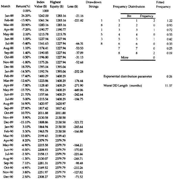
Table 7.18 Application of trading rule for dealing with drawdowns derived from Table 7.17.
”Rescaling” Volatility
One of the most frequently asked questions about any trading program is its daily volatility. Many risk-control programs closely monitor daily volatility of all managers or systems in a portfolio for risk-control purposes. Fortunately, the daily, monthly, and annualized volatility are related, and one can be scaled from the other. It is important to note the calendar period over which the volatility has been calculated, because the volatility is a summary statistic and does vary over time.
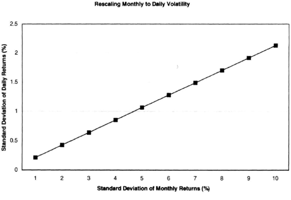
Figure 7.18 Volatility measured by the standard deviation of returns can be easily scaled from a larger time frame to a shorter time frame, or vice versa, providing useful guidance for traders and managers.
We use stochastic calculus or the theory or Brownian motion to scale from a shorter time to a longer time. If we assume 22 trading days to a month, the conversion from daily to monthly (Figure 7.18) works as:
Similarly, we can scale up monthly volatility into annualized volatility by multiplying by the square root of 12. For example, a monthly volatility of 5 percent implies a daily volatility of 1.07 percent and an annual volatility of 17.32 percent. These conversions are useful in monitoring the daily operation of a return generation process.
The conversion of monthly into daily volatility can be used to extend the ideas of peak-to-valley drawdown. Because there is less smoothing in the daily data (versus monthly data, for example), one has to use a larger multiple. For example, a good scaling for the worst daily drawdown is 5σdaily, or approximately equal to the monthly standard deviation. Similarly, the worst monthly drawdown is approximately equal to the annualized standard deviation.
A Calibration for Leverage
In this section, we review simple rules to adjust the standard deviation of monthly returns, σM. We have seen in earlier sections that the worst drawdown as well as the average monthly return can be calibrated to σM, and we need some understanding of how to change σM to control risk and reward. We limit the discussion here to a portfolio of futures because it is a simple matter to simulate portfolios with historical data.
The simplest calibration we want is how much each market “adds” to the σM each month. Naturally, this contribution depends on the trade sizing algorithm and how much equity is risked on each trade. Historical calculations with portfolios of up to 80 futures markets suggest the following simple rule: if we risk 1 percent of equity on each market, then a single futures market typically contributes 0.15 percent to σM per month, depending on the trade sizing algorithm. This means that the σM depends on the trade sizing algorithm, equity risked, and number of markets traded in the portfolio. Thus, the rule for estimated σM may be written as:
For example, if you risked 1 percent of $1 million per trade, then with a 60-market portfolio, you would expect to see a standard deviation of monthly returns of 9 percent, given by equation (7.8). This simple equation suggests that we can reduce the volatility by reducing the percentage of initial equity risk, or cutting back on the dollar risk (see Figure 7.19). We can also reduce volatility by reducing the size of the portfolio. If you change the money management algorithm or the fee structure, then the constant of 0.15 may increase to, say, 0.3 or decrease to 0.08. Overall, the changes are nearly linear, although some nonlinearity exists as the size of the account increases. The relationship can be more complex for multisystem portfolios, but can be restated in the above form.
Return-Efficiency Benchmarks
We defined return efficiency (ρ) as the ratio of the average monthly return (μ) to the standard deviation (σ) of monthly returns (ρ = μ/σ). Return efficiency is a useful measure of risk-adjusted performance because it can be used to make apples-to-apples comparisons without being overly sensitive to the leverage used in different return generation processes. It would be immensely useful to develop a benchmark for return efficiency because it can be used to compare and contrast different RGPs.
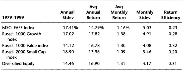
We begin by examining equity performance for the period 1979-1999, which includes one of the greatest bull markets in history. The following data (see Table 7.19) appeared in the Chicago Tribune on May 30, 2000, courtesy of T. Rowe Price and Company. The table shows the performance of various stock “cash” indexes that do not have management fees or expenses. The Diversified Equity performance consisted of 37.5 percent Russell 1000 Growth index, 37.5 percent Russell 1000 Value index, 10 percent Russell 2000 Small Cap index, and 15 percent MSCI EAFE index. The data are useful for two reasons. First, they show that the typical monthly standard deviation for a stock index is around 5 percent. Second, they show that the return efficiency was between 0.2 and 0.32 percent, and about 0.26 percent on average, during a period with a roaring bull market.
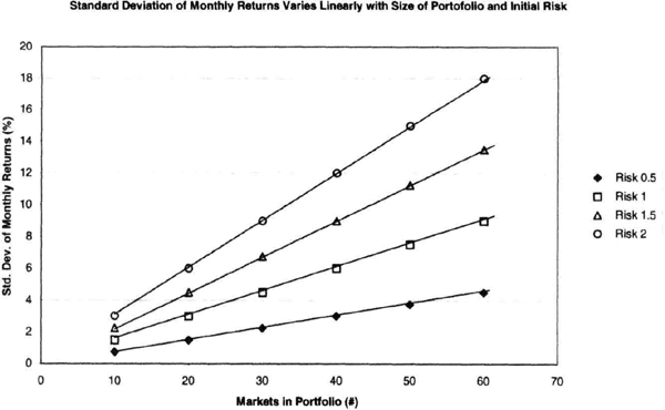
Figure 7.19 The relationship between the standard deviation of monthly returns, initial risk, and number of markets in the portfolio is practically linear for a given trade sizing algorithm for a portfolio of futures markets—a useful feature for adjusting risk and reward.
Table 7.19 Summary of risk-adjusted performance of U.S. stock indexes.
Schneeweis and Spurgin reported data for many equity and CTA indices for the period January 1987 through December 1995. Their data (Table 7.20) provide a comparison among various asset classes. For example, the S&P-500 total return index return efficiency was 0.29, similar to the performance for the Russell 2000 Growth index. The data from Schneeweis and Spurgin show that only the T-bill had a long-term value of return efficiency greater than 1, a direct result of the steady returns with very low volatility provided by Treasury bills. Note that the definition of the return efficiency favors precisely this type of consistent return. The return efficiency of CTA indexes is close to 0.25. It is significant that the MAR CTA Discretionary index had a return efficiency of 0.49, because discretionary traders can vary bet size more efficiently, putting on relatively large positions when they expect smooth markets. Discretionary traders are often strikingly correct at pinpointing turning points, which allows them to post superior risk/reward performance.
If we combine Tables 7.19 and 7.20, a reasonable benchmark for return efficiency is 0.25, which reflects performance of diversified portfolios across different asset classes, trading strategies, leverage levels, and calendar periods. The return efficiency is clearly not constant; it varies between asset classes and with time for the same return generation process. Setting up a benchmark has profound implications for evaluating trading manager performance and managing investor expectations. We have seen from the previous sections that, risk tolerance being equal, you should favor an RGP with a “better” return efficiency.
The value of return efficiency used will vary with the calendar period for a given RGP. For example, if you used rolling 24-month periods or rolling 36-month periods, then the return efficiency calculated over these rolling intervals would change. Hence, as suggested earlier, the R3RE, or rolling 3-month return efficiency, may be a good way to smooth the data. Yet another approach to data smoothing is to calculate the return efficiency of the return efficiency. A manager with a smoother equity curve will have a high value for the second-order return efficiency.
Table 7.20 Return efficiency data for variety of indexes and instruments from Schneeweis and Spurgin (1997).
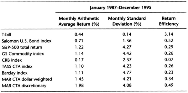
Source: Schneeweis and Spurgin, J. Derivatives, Summer 1997.
Empty Diversification
Diversification is a commonly proposed antidote to the variability of returns experienced in trading. Diversification can increase returns and reduce variability, but is there some point of diminishing returns? We examine this question by recognizing that there are many kinds of diversification. One can diversify across markets (or sectors), trading philosophies (or systems), and various money management and risk control algorithms. The goal is to improve the risk-adjusted performance of the portfolio of system-market combinations.
Figure 7.20 shows the effect of adding futures markets in random order to a portfolio traded using a simple channel breakout-style system. The figure shows that as expected, when markets are added to this portfolio, the standard deviation of monthly returns increases steadily. However, the risk-adjusted performance, as measured by the return efficiency, first increases and then levels out, increasing at a slower rate as markets are added (Figure 7.21). Thus, the incremental benefits of adding markets to this portfolio are decreasing. What would happen if we add even more markets to this portfolio?
When we add another 26 or so markets to this portfolio, the standard deviation of returns keeps increasing steadily without any noticeable saturation in the rate of increase (Figure 7.22). However, the return efficiency reaches a peak and declines, suggesting that there may be a point of diminishing returns in futures portfolios (Figure 7.23). There are two possible reasons for this decline: (1) adding markets that are unprofitable over the test interval, and (2) adding markets that are structurally correlated to those already in the portfolio.
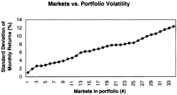
Figure 7.20 Adding markets in random order to a portfolio of futures markets monotonically increases the standard deviation of monthly returns.
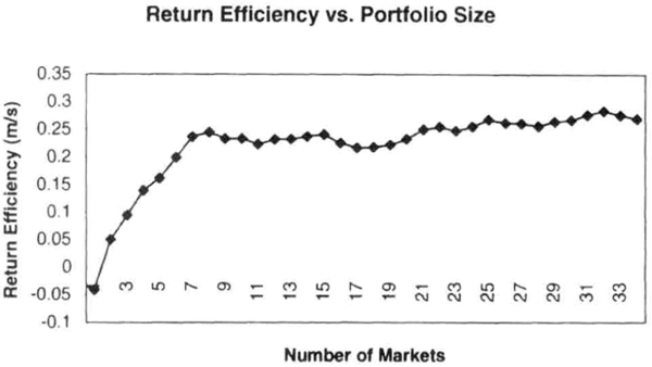
Figure 7.21 Adding markets in random order to a portfolio of futures markets increases return efficiency, but the gains get progressively smaller as number of markets in this data set increases.
A number of factors can influence the shape of the return efficiency curve shown in Figure 7.23. For example, if all market sectors perform strongly during the test period, then the return efficiency curve may flatten out, or even increase slowly instead of declining. As global economies become ever more closely connected, the effects of structural correlation are more difficult to overcome.
Some factors that can potentially limit the benefits of diversification are that new markets added are correlated to markets in the portfolio, correlation shifts from historical correlations among markets in the portfolio, markets stay in a nontrending mode longer than historical norms, or drawdowns from usually noncorrelated systems occur coincidentally in a narrow time window. In essence, the diversification logic assumes that history will repeat itself, which it might, but in ways that negate some of the benefits of diversification.
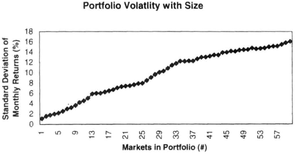
Figure 7.22 As expected, the standard deviation of monthly returns continues to increase monotonically as we add even more markets to the portfolio shown in Figure 7.20.
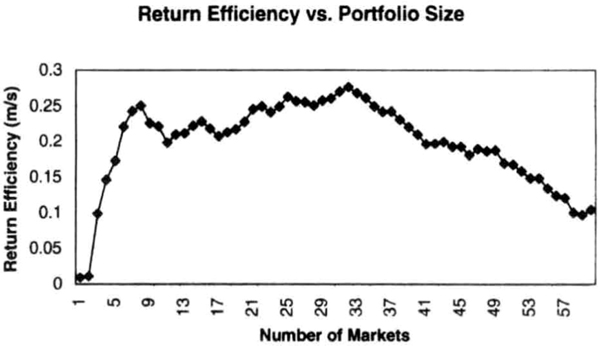
Figure 7.23 As we add even more markets to the portfolio in Figure 7.20, the return efficiency actually decreases significantly because the new markets were, on the whole, unprofitable over this data set.
Comparing Money Managers
Comparing the performance of money managers is more art than science because you have to evaluate historical data to fearlessly forecast future performance. You have to factor in your risk tolerance and expectations of profitability, and temper them with the uncertainties associated with selecting managers based on historical data. In this section, we focus on the performance records of a convenience sample of nine commodity trading advisors and apply the tools developed in previous sections to differentiate among them.
Table 7.21 shows the monthly performance data for nine CTAs from January 1998 through December 1999. The length of the track records is arbitrary, and you could choose to analyze 36 months of data instead if you so desire. We compute the average monthly return (μ), the standard deviation of monthly returns (σ), and the return efficiency (ρ = μ/σ). You can use the built-in spreadsheet functions for the average and the standard deviation for this calculation. Return efficiency measures risk-adjusted performance and is insensitive to the order in which the returns were realized. It is a good measure of the overall structure of the trading program (systems and markets), with a higher ratio indicating a better system. However, your returns as an investor are affected by the order in which returns are realized.
We quantify the actually realized returns by calculating the net profits and net losses after fees and interest for an account starting at $1,000 at the beginning of the test period, and then calculate the ratio of the two quantities to get the net profit factor (NPF). The NPF is sensitive to the order in which returns are realized, and measures the money management process. The NPF measures how much money the managers make when they are right, versus how much they lose when they are wrong. It may be interpreted as a composite measure of the money management process, including risk control, trade sizing, and speed of exits. NPF is not sensitive to the absolute value of leverage because increasing leverage will generally increase both the net profits and the net losses. The NPF thus recognizes those managers who use leverage more effectively to the upside, that is, managers who are not penalized for a greater volatility in winning months. At a minimum, NPF should be greater than 1, and the higher the value the better. In theory, if there were no losing months during a test period, then the NPF would be infinite because there would be no net losses. Similarly, if there were no winning months, the NPF would be zero because the net profits would be zero. We illustrate the calculation of the net profit factor for CTA-3 in Table 7.22.
Table 7.21 Comparing managers based on multiple criteria.
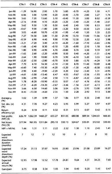
We started with an account of value $1,000. In January 1998, there was a net gain of 2.0 percent, or $20, so the ending account value was $1,020. In February 1998, there was a gain of 12.90 percent, which was applied to the previous month’s ending index value of $1,020, giving a new ending index value of $1,151.58. Thus, the net gain for the month was $131.58. The 1.8 percent loss in June 1998 came on an index value of $1,379.53 at the end of May, and the net loss for the month was $24.83. After all the monthly calculations are done, we add up the total dollars gained and lost. For example, for the 2-year period ending December 1999, a $1,000 account would have gained $1,460.27 and lost $1,311.84, for a net return of $148.43 or 14.84 percent. The net profit factor is thus (l,460.27/1,311.84), or 1.11.
We next calculate the expected duration of the worst drawdown. We use the same methodology discussed earlier, but we use all the strings in the data, both runups and drawdowns, because the overall length of the data being evaluated is relatively short. In general, the shorter the length of the expected drawdown, the more attractive a manager’s record. Table 7.23 shows a sample calculation for CTA-3. Table 7.21, which shows the net profit factor calculations, is used to find the duration of all strings in the equity curve. For example, the track record for CTA-3 starts with a string of 5 winning months, then 1 losing month, followed by 5 winning months, and so on. This raw data on strings is tabulated in the first column of Table 7.23. These are then converted into a histogram, using the built-in data analysis tools in Microsoft Excel 2000®. For example, there are six strings of one-month duration and one string of six-month duration. We next use an iterative procedure to fit an exponential distribution to the frequency distribution of strings. We guess the parameter value to be 0.5, and fit an exponential distribution to the data. Then we calculate the squared deviations of the fitted frequency from the actual frequency. The solver tool in Excel 2000 is then used to minimize the sum of squared deviations while adjusting the parameter of the exponential distribution. The solver solution is assumed to provide the best-fit exponential distribution parameter. The last step is to find the drawdown length with 0.1 percent probability of occurring, which is obtained by dividing 6.9 by the parameter of the exponential distribution. In the case of CTA-3, the estimated exponential parameter value is 1.04. Hence, the expected worst drawdown duration is 6.9/1.04, or 6.63 months, which rounds up to 7 months. The worst expected drawdown is estimated at four times the standard deviation of monthly returns in Table 7.2. Therefore, CTA-3, with a monthly standard deviation of 9.27 percent (see Table 7.21) has a worst expected drawdown of 37.08 percent. The expected annual returns are obtained by compounding the average monthly returns 12 times.
Table 7.22 Calculation of the net profit factor for CTA-3 from Table 7.21.
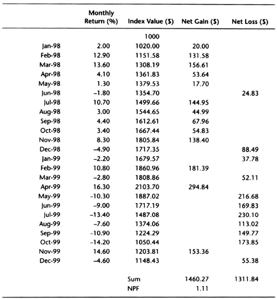
Table 7.23 Calculation of duration of worst drawdown.
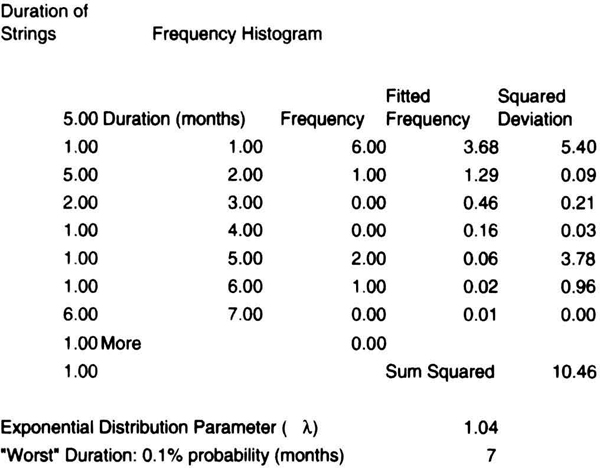
The gain/pain ratio is simply the ratio of expected annual returns divided by the worst expected drawdown. A higher ratio is obviously preferred to a lower ratio. It is similar to an annualized Sharpe ratio with the risk free rate of zero. A manager that produces consistent returns with short and shallow drawdowns will have a larger gain/pain ratio.
As an investor or allocator, you can focus on the particular measurement that meets your objectives. For example, you can rank managers on the basis of return efficiency or NPF or any of the other measures. It is also possible to derive a composite measure by scoring managers relative to one another. For example, we can average the expected duration of drawdowns, the worst depth of drawdown, and expected annual returns across all managers. Table 7.24 shows that for the group of CTAs under review, the average length of worst expected drawdown is 9.11 months, the average depth of drawdown is 23.48 percent, and the expected annual return is 15.76 percent. We can calculate relative scores as follows. Because a shorter drawdown duration is more attractive than a longer one, we divide the expected average drawdown duration (9.11 months) by the expected duration of the individual CTAs. Hence, for CTA-1, the duration score is 9.11/7, or 1.30. Because a smaller drawdown is preferred to a larger drawdown, we divide the average worst drawdown by the expected drawdown for each manager. For CTA-1, the drawdown score is 23.48/17.24, or 1.36. By design, the drawdown score favors managers with a lower volatility. However, they will be penalized in the return score because their return will generally be lower, accounting for differences in return efficiency. Because a higher return is preferred to a lower return, we divide the expected return for every manager by the average expected return for the group. Thus, for CTA-1 the return score is given by 12.93/15.76, or 0.82. Note that because CTA-1 had a lower monthly volatility than some of the other CTAs, CTA-1 had a higher drawdown score but a lower return score, than, say, CTA-2 or CTA-5. We can now build the total performance score (TPS) by summing the duration score, drawdown score, and return score. Note that this is a performance score of expected future performance, and such rankings can be quite useful.
Table 7.24 Ranking on the basis of total performance score of expected future performance.
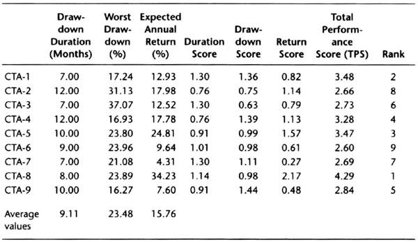
Table 7.24 shows that CTA-8 was the highest-rated CTA based on the total performance score of expected future performance. CTA-8 had the highest return efficiency and the second highest NPF (see Table 7.21). The importance of a low duration of expected drawdowns is reflected in the number 2 ranking for CTA-1 on the TPS because CTA-1 had the fourth best return efficiency and NPF (see Table 7.21). Thus, the TPS adds value by factoring duration of drawdowns in addition to the quality of returns. The importance of the duration score also explains why CTA-2 narrowly beat out CTA-7 to avoid the lowest ranking.
The calculation of the length of the expected drawdown can be time consuming. A quicker approach would be to rank the managers based on the depth of drawdown score and the expected return score. To explore this idea, we selected another convenience sample of 10 CTAs with a technical trend-following trading strategy on diversified futures portfolios. Only two managers from the sample of nine CTAs used earlier were included in the sample of ten we discuss now. The primary reason to change the sample is to find CTAs whose track record extends to January 1993. We would also like to check if there is any predictive value to this ranking strategy. We use rolling 2-year calendar intervals starting with January 1993 and ending with December 1999. Thus, we use overlapped samples 1993–1994, 1994–1995, and so on. The calculations in Table 7.25 are the same as Table 7.24, except that we do not calculate the length of the expected drawdown, and we rank the managers using relative performance on the sum of expected return score and expected worst-case drawdown score. We then use the nonparametric rank correlation test, Spearman’s rho, to check for statistical significance.
Table 7.25 Ranks based on composite drawdown depth and expected return score.
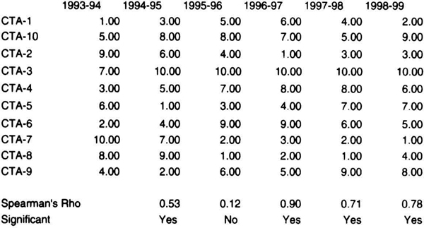
The relative ranking of the 10 CTAs is summarized in Table 7.25 for the overlapped two-year intervals starting in 1993 and ending in 1999. The correlation between successive periods was statistically significant in four of the five intervals. For example, if you examine the last two columns, a CTA with a high ranking (low number) is associated with a high ranking (low number) in the subsequent period, and a CTA with a low ranking (high number) is associated with a low rank in the subsequent period. For example, CTA-3 was the lowest ranked CTA in both the 1997–1998 and 1998–1999 periods, and CTA-7 was ranked number 2 and number 1 in the two periods, respectively. The relationship in the rankings between the two periods was not random. Statistically, the ranking was significant at better than the 5 percent level.
In the 1994–1995 period compared to the 1995–1996 period, however, the numbers do not follow a pattern: CTA-8 was ranked number 9 in the first period and number 1 in the subsequent period. This period was marked by “rotation” in the rankings, and hence the rankings in the two periods are not significant statistically. The rotation is easier to see in Table 7.26, which shows the same results as the previous table by substituting the name of the CTA for its rank. The rotation may be because of a change in trading strategy and portfolio tactics. Notice how CTA-8 rose from the lower rankings in 1995–1996 and stayed as one of the top performers through 1997–1998. Notice also how CTA-3 remained the lowest-ranked CTA from 1994–1995 through 1998–1999. Even if you picked the best-performing CTA in one interval, your downside risk was three rankings; in this sample, the slippage was usually only two slots. Thus, the rankings based on expected future performance may be a useful way to find CTAs likely to perform well in the future. For example, you could build a portfolio of the top four CTAs at the end of each year and hold it for the next year. Table 7.27 shows how the portfolio would rotate; managers in highlighted boxes are held over from the prior year.
Table 7.26 Ranks based on composite drawdown depth and expected return score.
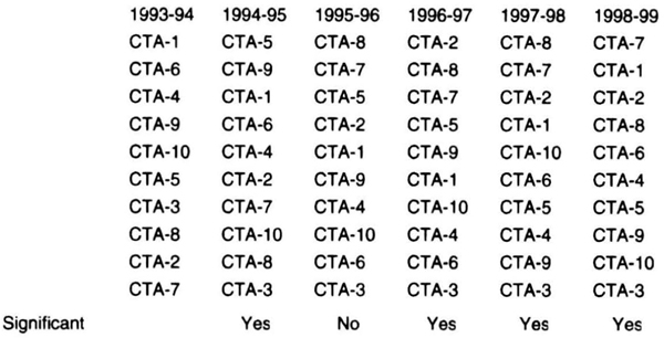
These calculations can be repeated using the Hotelling-Pabst test with identical results of statistical significance. The fact that this method can provide statistically significant rankings has great practical significance. As always, we must use caution must because the rankings are not guaranteed to persist, and are not an assurance of improved performance. There is also the issue of sample size: we have examined a relatively small sample over a moderately long period.
Table 7.27 Portfolio of top four CTAs at the end of the previous year. Managers in highlighted cells are held over from the previous year.
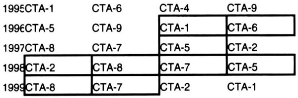
You should crosscheck these ideas on a larger sample if possible. Our discussion in this section shows that we can integrate the ideas underlying the Chande comfort zone that estimate the expected return and the depth and duration of future drawdowns into a composite score for ranking money managers. Remember that the process of evaluating a manager is complex, and a quantitative analysis of performance can be only one small part of the total picture.
Risk and Reward in Stocks and Mutual Funds
Just how much risk is there in a stock or mutual fund? There is the relative risk that you may underperform other stocks or funds in the peer group. However, you are also bearing an absolute risk—the risk that you will lose 2 5 percent or more of your value in a week or less. In the end, the absolute risk is more important to your investment success—in fact, your survival—than relative risk. The spread of online trading and real-time data feeds has led to a culture that punishes bad news with a summary execution. These “trigger-happy vigilantes” proudly espouse the philosophy of “shoot first, ask questions later.” A review of the sharp declines in market leaders such as Intel and Apple in September 2000 suggests that market capitalization and liquidity are no protection against an avalanche of sell-orders. The price moves that previously occurred in months can now be completed in a matter of hours. In this section, we extend the ideas of estimating the depth of drawdowns to daily events. You will remember that the peak-to-valley drawdown can be estimated to a good approximation as four times the standard deviation of monthly returns (σM). On daily data, we will use the standard deviation of daily closes over 22 days (σ22) as our estimate of the standard deviation of monthly returns. Implicitly, we are assuming that there are 22 trading days in a month.
We begin by examining the decline in Intel Corp. (INTC) stock in September 2000 following an earnings warning. The company issued a warning after the close on a Thursday, and the stock declined in after-hours trading, opening down about $15 the next day. Figure 7.24 shows that the 22-day standard deviation of the daily close was $6.15 as of Thursday close. The closing price of Thursday does not show after-hours trading. Hence, the decline amounted to approximately 2.2σ22 on a closing basis. This suggests that the price decline, although instantaneous, was relatively well contained.
Apple (APPL) followed a few days later with its own announcement of declining revenues and falling sales of its flagship products. The market took a large bite out of AAPL, sending the stock down 7.44 σ22, considerably worse than Intel’s woes (see Figure 7.25). AAPL’s drop was in line with the worst stock market declines, as shown in Figures 7.8 and 7.9 for the S&P-500 and NASDAQ. Thus, 8σ22 is probably a better estimate of the daily risk in a stock today, given the speed of movement and liquidity constraints.
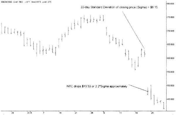
Figure 7.24 Intel gapped lower after the company surprised analysts by lowering earnings forecasts. The decline amounted to approximately 22 times the standard deviation of returns over the previous 22 days.
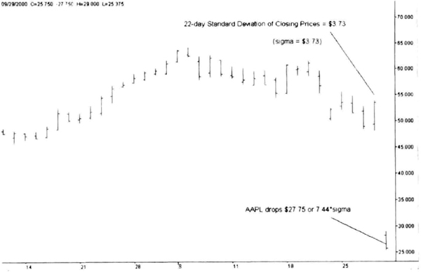
Figure 7.25 Apple Computer stock declined a stunning seven times the standard deviation of daily returns over the previous month after announcing weak sales.
Are mutual funds subject to similar risks? As shown previously in Figure 7.10, the peak-to-valley drawdown increases with increasing monthly standard deviations (σM). The average drawdown was 4.3σM, suggesting that the diversification afforded by owning 50 or more stocks tends to smooth out the equity curve. An analysis of the daily data of more than 50 funds suggests that the severest daily declines are typically less than 2.5σ22 and closer to 1.5σ22, primarily due to smoothing effects of a diversified portfolio.
An analysis of the return efficiency of a convenience sample of 50 mutual funds used to create Figure 7.10 suggests that return efficiency is insensitive to monthly volatility (see Table 7.28). Return efficiency is the ratio of average monthly return to the standard deviation of monthly returns and can be used to estimate expected returns using equation (7.6). The average return efficiency of this sample was 0.37. You can use this figure to weed out funds with lower return efficiency for a given range of monthly volatility. Because increasing volatility leads to larger drawdowns, you can start by estimating a target standard deviation of monthly returns as your threshold of pain divided by 4. If your threshold of pain is 32 percent, then the target standard deviation is 8 percent. You should avoid funds with much higher standard deviations or much lower standard deviations because you have identified a risk level you can tolerate. The next step is to select those funds that exceed the average return efficiency at the same or similar level of risk in order to maximize your returns for the level of risk you are willing to bear.
You should remember that the return efficiency is not cast in stone, but will vary from year to year. However, this approach will help you find funds that meet your risk exposure limits and yet provide superior absolute returns versus funds of similar absolute risk. This approach of using absolute risk to select mutual funds is probably more meaningful than other commercial approaches based on performance relative to an entire category of funds or relative to riskless investments such as U.S. Treasury bills.
Summary
In this chapter we discussed key money-management ideas. We began by examining the risk of ruin. Those calculations show that there is little incentive to overleverage a trading account. The risk-of-ruin calculations assume that your bet size, payoff ratio, and fraction winners are fixed. However, you can vary bet size if you could identify an extraordinary opportunity in the markets.
We then looked at the interaction between system design and money management. The design philosophy is for you to protect the downside and let the market take care of the upside. We then used the standard deviation of monthly equity to project future drawdowns at four to five times the standard deviation.
| Fund | Return Efficiency |
| FBALX | 0.34 |
| FBI0X | 0.27 |
| FCMTX | 0.35 |
| FCVSX | 0.46 |
| FDCAX | 0.28 |
| FDCPX | 0.31 |
| FDEGX | 0.43 |
| FDEQX | 0.34 |
| FDGFX | 0.35 |
| FEQIX | 0.34 |
| FEQTX | 0.35 |
| FEXPX | 0.32 |
| FFIDX | 0.4 |
| FFTYX | 0.18 |
| FMAGX | 0.36 |
| FPURX | 0.23 |
| FSINX | 0.16 |
| FSPCX | 0.21 |
| FSPTX | 0.47 |
| FSTCX | 0.36 |
| FSTGX | 0.55 |
| FSUTX | 0.47 |
| JABAX | 0.41 |
| JAEIX | 0.41 |
| JAENX | 0.43 |
| JAFIX | 0.32 |
| JAGIX | 0.44 |
| JAHYX | 0.18 |
| JAMPX | 0.49 |
| JANSX | 0.44 |
| JAOLX | 0.48 |
| JAOSX | 0.34 |
| JASSX | 0.41 |
| JATEX | 0.21 |
| JAVLX | 0.46 |
| JAWWX | 0.46 |
| JAXBS | 0.76 |
| PBCRX | 0.31 |
| PBEGX | 0.21 |
| PBHEX | 0.38 |
| PBHGX | 0.29 |
| PBHLX | 0.44 |
| PBLDX | 0.31 |
| PBMCX | 0.39 |
| PBTCX | 0.41 |
| PLCPX | 0.52 |
| PSSCX | 0.28 |
| TWCGX | 0.42 |
| VFINX | 0.43 |
| VGXTX | 0.43 |
We examined how betting strategies affect the smoothness of the equity curve. The fixed-contracts per signal is a reasonable choice for most traders. You can get a smoother curve by reducing position size after a losing trade. Your other strategies, such as double-on-win or double-on-loss, greatly increased equity curve roughness. You should understand this material well, because each of these money-management strategies can significantly affect future portfolio performance.
We then shifted gears and examined in detail factors affecting the depth and duration of drawdowns. The depth of drawdowns is generally less than four times the standard deviation of monthly returns for many asset classes, such as futures, hedge funds, and mutual funds. The duration of drawdowns can be estimated from an exponential distribution or as three times the standard deviation of the duration of drawdown “strings,” or periods. These are extremely valuable tools to estimate two critical aspects of future performance. We discussed how return efficiency could be used to create a model for expected returns. Together these models help define the Chande comfort zone, a powerful tool for managing risks and expectations.
We next studied the difficult issues of how to deal with drawdowns, and showed how to identify low-risk entry points when a manager is in a drawdown. Next, we looked at practical issues dealing with rescaling volatility, and a calibration for leverage. These will help you determine how much volatility to expect and how to estimate the volatility from the number of markets traded and leverage used. These ideas form essential building blocks no trader, investor, or allocator can afford to ignore.
We addressed a critical issue by proposing a benchmark for return efficiency that can be used for futures, stocks, mutual funds, and hedge funds. A return efficiency of 0.25 is an excellent benchmark of risk-adjusted performance among these diverse asset classes. Diversification is often touted as the best pathway for superior risk-adjusted performance. However, how many markets are too much? We showed how it is not difficult to obtain empty diversification by trading too many markets.
We then gave a detailed example of the application of these ideas by examining how money managers can be compared. In this discussion, we proposed several new measures of ranking managers to better handicap their future performance. This section should be of much interest to investors and allocators. We ended by showing how individuals could apply the ideas introduced in this chapter to define the risk in individual stocks or to identify superior mutual fund investments.