
Chapter

Equity Curve Analysis
The holy grail of trading system design is the perfectly smooth equity curve.
Introduction
Only the equity curve provides a complete and continuous picture of your system’s performance over time. The usual test summary tells you little about how your design trade-offs alter performance on a day-to-day basis. Hence your system development is not complete until you understand the impact of your decisions on the evolution of account equity.
In this chapter we take a detailed look at how to measure the smoothness of the equity curve using the standard error (SE) from linear regression analysis—the larger the SE, the rougher the equity curve. Then we see how the equity curve for the 65sma-3cc system changes with different exit strategies at the contract level. You will get a feel for how your design choices translate into equity changes.
Next, we discover how SE changes when you combine two systems trading the same market. A common belief is that trading many different markets gives a smoother equity curve. We explore this belief by combining two markets that have some positive covariance.
We then explore the monthly changes in equity curves, examining the performance of the 65sma-3cc system trading the deutsche mark over monthly intervals of different lengths. These quantities are termed the interval equity changes. Our goal here is to see how a system does over all 1-month, 3-month or 6-month intervals in the test period. These measures help in understanding the effects of adding a trailing stop or changing exit strategies.
These tests show that exit strategies alone do not improve equity curve smoothness (that is, reduce standard error); we look at changing a system’s design. Filtering the usual channel breakout system gives a smoother equity curve.
The usual performance summary reveals none of this information, so the new insights from this analysis make it well worth the effort. After reading this chapter you can:
- Measure the smoothness of an equity curve.
- Understand the impact of system design on changes in the equity curve.
- Grasp the effect of diversification on equity curves.
- Recognize the benefits of using filters in system design.
Measuring the “Smoothness” of the Equity Curve
This section shows how to use linear regression analysis to measure the smoothness of an equity curve. We will use contrived data to perform actual calculations. You will understand how to use standard error and how to calculate the risk reward ratio. In later sections of this chapter we apply these ideas to market data and trading system calculations. The main advantage of using linear regression analysis is that it provides a consistent framework to analyze every equity curve.
The equity curve of your trading account or system is simply its daily equity. The daily equity is the sum of your starting account balance, plus the profit or loss of all closed trades, plus the profit or loss of all open trades. Ideally, we want an equity curve that rises steadily in time, as shown for the hypothetical data in Figure 6.1. The slope of this equity line is $100 per day, all the points lie exactly on a straight line through zero, and the standard error is zero. This line shows an account whose equity increases exactly $100 each day.
Since we all have some trades that lose money, the equity curve is never a perfectly straight line. As you begin to compare the equity curves of different trading systems, you need a way to measure their “smoothness.” If you compare two systems with similar performance, the one with the smoother equity curve is preferred. We assume here that you are comparing system performance over the same time unit (days) and similar length (months or years). You could compare systems over other time units and length, but you must recognize that sometimes you may not be comparing these systems on a consistent basis.
We will use linear regression analysis to determine smoothness. One of the outputs of linear regression analysis is the residual sum squares (RSS). The RSS is the sum of the squared vertical distance between the actual data and the fitted regression line at each point. The next step is to divide the RSS by the number of data points minus two, and then to take the square root, to calculate the standard error. The standard error measures the smoothness. If all the points fall exactly on the best fit linear regression line, then RSS is automatically zero, and the standard error is also zero, for the ultimate smoothness in an equity curve.

Figure 6.1 The perfectly smooth equity curve.
The curve in Figure 6.2 shows more hypothetical data. The slope of the best-fit linear regression line through zero is again $100. However, the points are scattered on either side of the best fit line. The standard error for these data is $82. If you measured the vertical distance between the actual equity value and the best fit line every day, on average, this absolute, average vertical distance is $82. Thus, the standard error tells you typically how far a point is from the best-fit line.
In Figure 6.3, which uses even more hypothetical data, the slope of the best-fit equity curve is still $100, but there is a lot more scatter in the data on either side of the best-fit line. As expected, the SE is almost four times bigger, at $318.

Figure 6.2 These hypothetical data have a slope of $100, and the scatter about the regression line increases the standard error to $82.
You can get a better feel for what standard error means by looking at Figure 6.4, which contains the data in Figure 6.3 plus two lines one standard error away from the best-fit line. The data points are inside, or close to, the standard error lines. Remember we find the standard error by squaring the vertical distance between the actual point and the best-fit line, summing this up, and dividing by the number of points less two. Hence, the standard error is the average “offset” on either side of the best-fit line, and the data clearly lie inside or close to the “offset” or standard error.
Thus, the standard error from linear regression analysis is a good measure of the smoothness of the equity curve. Note that the linear regression method can be applied to any number of time periods and to any equity curve. The standard error offers a general, consistent, and powerful method to measure smoothness.

Figure 6.3 These data have a $100 slope, but the large scatter about the linear regression line increases the standard error to $318.
The combined SE of two or more equity curves will be smaller than the SE of the individual curves only if the curves are negatively correlated. Negative correlation means that when one increases, the other decreases. For a data set that is exactly negatively correlated to the data in Figure 6.3, the combined equity curve is a perfect straight line with zero standard error (see Figure 6.5).
Lowering SE is one of the arguments for diversification, usually interpreted as trading many markets within a single portfolio. If the markets are negatively correlated at least some of the time, then the joint equity curve of the combined portfolio will be smoother. Note that the slope of the joint equity curve will be just the algebraic sum of the slopes of the individual equity curves. This simply means that the slope of the line through the origin will change to accommodate all profits made over a given period.
You can expand the diversification theme to include different systems on the same market. Again, the equity curve will be smoother only if the systems are negatively correlated. If the systems have positive covariance, then the overall standard error will increase. Of course, if all systems are profitable then the slope will increase as well. Remember that slope and roughness are independent. Thus, increasing the slope does not translate into a smoother equity curve.
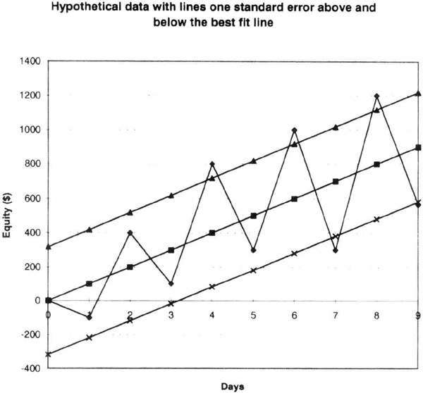
Figure 6.4 The same data as in Figure 6.3 with lines on either side of the best-fit line one standard error away.
We can extend the linear regression-based analysis to calculate the risk-reward ratio of a particular system by taking the ratio of the slope to the standard error. This is a quick and reliable way to compare different systems tested over the same data sets. This calculation assumes we are using daily data and looking at system paper profits.
RRR (risk reward ratio) = slope / standard error.
In the three hypothetical cases, the RRR approaches infinity for the first system because its SE is equal to zero. For the second system it would be 1.21 (100/82) and for the third 0.31 (100/318). There is little doubt we would all prefer the first system if one ever existed. You can use a spreadsheet such as Microsoft Excel® for linear regression calculations. For example, in Excel you can use the built-in tools to find all relevant regression data by just filling out a template (pick Tools, then Data Analysis, then Regression, and fill out the template). Otherwise, you could use one of the many easily available packages for statistical analysis.
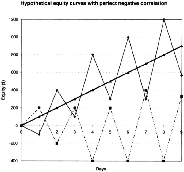
Figure 6.5 Hypothetical equity curves that are perfectly negatively correlated; combining them reduces the SE to zero in this contrived example, because the resultant equity curve is a perfect straight line.
In the following sections we use SE to measure equity curve smoothness. Remember that increasing the slope does not automatically increase smoothness (that is, reduce SE). We will examine how different system designs affect portfolio level equity curves.
Effect of Exits and Portfolio Strategies on Equity Curves
All the decisions you make about entries, exits, and stops show up in the slope and smoothness of the equity curve. In this section we will explore the equity curves of the 65sma-3cc model using a deutsche mark actual contract with rollovers. We will study how the equity curve responds to changes in system design. Our yardstick for comparison will be the standard error calculations described in the previous section. We will not test continuous contracts, because the actual contracts with rollovers provide a better simulation. Besides, the System Writer Plus™ software from Omega Research can be used here to develop detailed equity curves.
The test set includes actual deutsche mark contracts from March 1988 through September 1995. We allowed $100 for slippage and commissions, and the software automatically rolled over the contracts on the 20th day of the month preceding expiration.
The procedure is as follows: the daily equity of the test case is exported into an ASCII file, which is then imported into the Microsoft Excel® 5.0 spreadsheet. The regression calculations are perfomed in Excel using their built-in tools for regression analysis, as explained in the previous section.
We first tested the 65sma-3cc model on the deutsche mark contracts without any stops or exits (case 1). The case 1 equity curve (Figure 6.6), has a linear regression slope of $17.54, and a standard error of $4,043. During the test period, the 65sma-3cc model produced paper profits of $24,288, with a profit factor of 1.34 and a maximum intraday drawdown of –$11,938, trading one contract at time. The equity curve for case 1 is rather jagged, with a significant retracement in 1992, and is typical of trend-following systems without any exits. Note how many trades gave up significant profits before being closed. Also, if the market enters an extended sideways period, this model will suffer drawdowns, and you can go a long time before new equity highs.

Figure 6.6 Case 1, the 65sma-3cc model without any stops or exits, on actual deutsche mark data with rollovers.
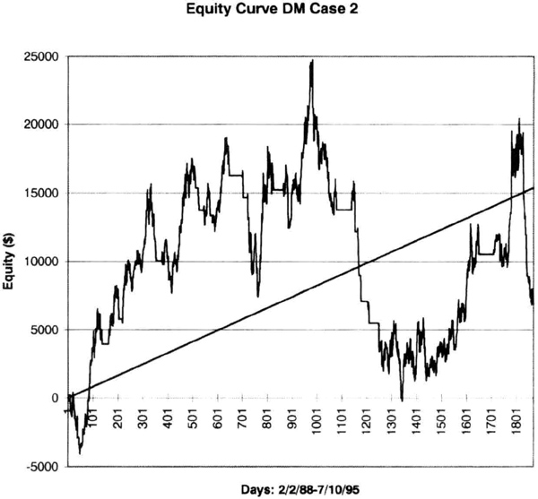
Figure 6.7 Case 2, the deutsche mark contracts and 65sma-3cc system with $1,500 initial stop.
Case 2 is the same system with a $1,500 hard stop. The equity curve (Figure 6.7) shows that adding this stop decreased profits and reduced smoothness compared to case 1. The net paper profit dropped sharply from $24,288 to just $6,913, for a meager profit factor of 1.10. The maximum intraday drawdown almost doubled, to –$20,225, suggesting that a $1,500 stop is too tight. The equity curve (see Figure 6.7) shows the lower profit and higher drawdown. Note that the slope has halved from case 1, to $8.24, and the standard error has increased to $7,517. Hence, when you set your stop, compare the hard dollar amount to the market’s volatility, and ensure you are safely outside its zone of random movements. Many traders seem to favor tight or close stops, and these calculations suggest that tight stops may degrade long term performance.
In case 3, the stop was increased to $5,000. This produced the same results as case 1. Thus, at $5,000 the initial stop was so wide that it produced results identical to testing without any stops. Thus, returning to the volatility argument, you should check that your stop is not so wide that it is virtually the same as not using a stop at all. Of course, a wide stop will act as firewall of last resort, and is useful for the occasional hiccup in the markets.
Many traders agree that exit strategies play a crucial role in a system’s ultimate success. A common practice is to use several exits for a single entry signal. The 65sma-3cc system was tested with two exits, one an exit at the lowest low or highest high of 10 days, and the other the volatility-based exit discussed in Chapter 5.
The result of using both these exits (case 4) with a $5,000 initial stop was to reduce the paper profits even further, to $3,737, for a paltry profit factor of 1.07. The maximum intraday drawdown of –$13,337 was actually larger than the calculations with no stops at all. You would expect the equity curve to be smoother as a result of the exits. As Figure 6.8 shows, the slope decreased to $5.08 and the SE was $3,368. The new slope was only 29 percent of the slope without stops, but standard error was only 17 percent smaller. Thus, there was a sevenfold drop (85 percent reduction) in reward for only a 17 percent reduction in risk—too high a price to pay for this system.
Notice how the equity curve for case 4 looks qualitatively different from that for case 1, because it has “flat” portions where the exits take the system out of the market. Case 4 neatly illustrates one of the trade-offs in system design: you can go for higher profits or a smoother equity curve. Your choice may depend on many factors, including your personal preferences for risk and equity fluctuations.
We next consider a delayed 20-bar breakout system with a $5,000 initial stop and a trailing stop at the 14-day high or low (case 5). The DM contracts over the same period for this case yielded a slope of $8.36, with a SE = $1,960. Case 5 had a clipped equity curve (see Figure 6.9) with many flat portions when the model was out of the market. The equity shows that this approach successfully caught some of the trends, and avoided most of the sideways markets.
You must be careful not to judge the relative smoothness of an equity curve simply by inspecting it visually. For example, consider case 6, the equity curve obtained by adding those for case 1 and case 5. This equity curve (Figure 6.10) seems smoother to the eye than the equity curve for case 1. Besides, we are adding an equity curve to case 1 that has just half of its SE. A regression calculation shows that the slope of the joint equity curve is $25.90 and the SE = $5,263, bigger than either curve. You may find this easier to believe if you grasp that the profitable periods coincide, increasing the amplitude of the movement during these overlapping periods. The result is an equity curve with larger standard error. Thus, you should check the regression numbers when you combine multiple systems on the same market.

Figure 6.8 The 65sma-3cc system on DM with trailing stop, volatility stop, and $5,000 exit.
Note that due to its greater slope, the composite equity curve (case 6) has a higher reward/risk ratio (25.90/5263 = 0.00492) then the original case 1 (17.54/4043 = 0.00434). Thus, we could improve the risk/reward ratio by combining systems using different logic to trade the same market.
You should not underestimate the potential difficulties caused by positive covariance. Figure 6.11 shows the effect of combining two DM systems with positive covariance. The usual rules for combining variance of two independent systems predicted a standard error of $5,430. The actual calculated SE was $6,935, about 28 percent greater. The two systems have positive covariance because they tend to make (or lose) money at the same time, at least some of the time. Figure 6.11 shows lines one standard error on either side of the best fit line. These SE lines include most, but not all, of the points of the joint equity curves. The points that lie outside the SE bands occur when both systems “reinforce” each other, when they make money at the same time. Thus, combining systems with positive covariance will increase SE and reduce smoothness. Now add the complication that we do not know how covariances will change in the future. Therefore, improvements in smoothness may not result from simply adding different systems trading the same market.

Figure 6.9 Equity curve for a delayed breakout model with $5,000 stop and 14-day high-low trailing stop (case 5).
One popular prescription for smoothing the equity curve is diversification through trading multiple markets. The equity curve for the cotton (CT) market, using the 65sma-3cc system from February 22, 1988, through June 20, 1995, with a $5,000 stop is shown in Figure 6.12. The system reported a profit of $28,720, with a profit factor of 1.64, and a maximum intraday drawdown of –$7,120. As usual, $100 was allowed for slippage and commissions in these calculations. Regression calculations showed a slope of 11.65 and a SE of $3,184. The 65sma-3cc calculations for DM for the same period and conditions as the CT calculations yielded profits of $24,900 with a profit factor of 1.34 and a maximum intraday drawdown of –$11,687.

Figure 6.10 Case 6 combined equity curve for case 1 plus case 5.
The CT and DM equity curves to test for increased smoothness. The assumption here is that the CT and DM markets are not dependent on each other. The regression analysis of the joint CT plus DM equity curve (Figure 6.13) showed a slope of $29.34 and a SE of $5,265. The increase in slope is understandable, since adding the two markets roughly doubled the profits over the same period. The joint slope for CT and DM is the sum of their individual slopes ($29.34 = $11.65 + $17.69). The rules for combining variance suggest that if the two markets were independent, then their variances (squared standard error) would just add up linearly. This indicates that the expected value of the standard error for the joint CT + DM equity curve is $5,098. However, we see that the actual value is slightly higher, at $5,264, implying some positive covariance. Thus, we could not have reduced equity curve roughness by combining these two markets. We can show that adding more markets to a portfolio does not increase smoothness (reduce SE) unless the two markets are negatively correlated. Usually, there is some weak correlation between markets due to random or fundamental factors, and markets rarely move exactly opposite to each other. Hence, we should expect roughness (or SE) to increase as we combine the equity curves from different markets.

Figure 6.11 Trading two systems on the DM market with strong positive covariance increases SE and equity curve roughness. The lines above and below the best fit line are one standard error away.
In summary, the SE of the equity does not automatically decrease when you change exit strategies, combine different systems on the same markets, or combine different markets on the same system. However, changing entry strategies can change SE significantly. This conclusion goes a bit against the popular wisdom that “diversification” gives a smoother equity curve. Diversification in this context means trading many different markets with the same system, or the same market with many systems. Of course, we are measuring the smoothness using the standard error from linear regression analysis. We saw in the previous section that increasing the slope does not reduce the SE.
You should use the information in this section to understand how system design and portfolio strategies can affect the smoothness of your equity curve. In this section we examined the daily equity curve for individual markets or systems. In the next section we look at the monthly equity curve and how it changes with money-management rules.

Figure 6.12 Equity curve for CT using the 65sma-3cc system.
Analysis of Monthly Equity Changes
The impact of a given system on your equity curve will depend on system design and money-management decisions. In this section we look at the monthly equity curve, to understand month-to-month performance. We follow standard accounting procedures and look at the profit and loss figures at the end of each month. You may wish to look at the equity curves on a weekly basis, but the random noise in the market often complicates the analysis of such detailed data.
We saw in the previous section that the standard error of the linear regression provides an excellent measure of the roughness of the equity curve. However, the linear regression approach does not show how much money the system lost over a 1-, 2-, or 3-month period, nor does it reveal the maximum cumulative loss. We also would like to know what percentage of the months showed profitable returns, and whether the curve becomes smoother when we add certain markets or change the portfolio mix. Another useful bit of information is how quickly the system recovers from a losing streak, measured in months between new highs.
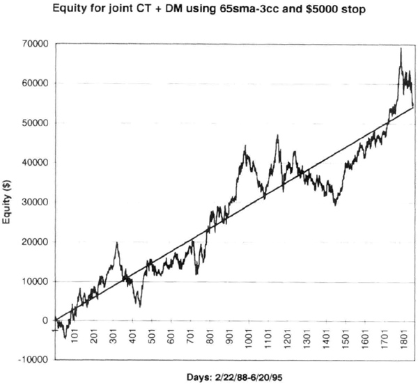
Figure 6.13 The joint CT + DM equity curve.
You must remember that this analysis reflects past data, not how the system will do in the future. However, if you use average numbers and standard deviations, you can get a fair estimate of future performance. You can then decide how to capitalize the system, by quantifying the equity swings you can tolerate. Thus, analyzing the equity curve on a portfolio basis gives a deeper understanding of system performance, and you can better prepare for future equity swings in real-time trading.
Most of this analysis was done in a spreadsheet, since the popular system testing software does not provide this information. We first used Omega Research’s System Writer Plus™ software to generate the daily equity curve using real contract data with rollovers, because we found that continuous contracts were not giving reliable results. We then used Torn Berry’s Portfolio Analyzer™ software to summarize these data into monthly performance numbers. You can do the same using a spreadsheet, or you can write a simple program.
Once in the spreadsheet, we calculated the actual dollar changes in equity over 1, 2, 3, 4, 5, 6, and 12 months. We could then quickly calculate the best performance, the worst performance (drawdown) and standard deviation of profits over each period. The advantage of making the dollar equity change calculations was that we could clearly see the effects of a particular exit strategy or of combining different markets in a portfolio. Some sample calculations will give you a feel for analyzing equity curves at a portfolio level.
We used actual DM contracts from automatic rollover on the 20th day of the month preceding expiration. The test period was February 1988 through June 1995. We allowed $100 for slippage and commissions and used the 65sma-3cc system with one-way entries to test different exit strategies. A one-way model does not allow back-to-back entries of the same type, so that you will not see two consecutive long or short trades. Thus, the number of entries over a data set is constant, allowing an apples-to-apples comparison.
Figure 6.14 is the monthly equity curve for the 65sma-3cc system with a $5,000 initial stop and no other exits. Thus, the long entry was also the short exit signal, and vice versa. The large stop makes it a better test of the inherent robustness of the entry signals. The system reported a paper profit of $24,900 from February 22, 1988 through June 20, 1995, with a profit factor of 1.34, 35 of 70 profitable trades, and a drawdown of –$11,687.
The monthly equity curve (see Figure 6.14) shows the overall rising trend with many sharp equity retracements, which occurred during trading range markets following a strong trend. Interestingly, rolling over the contract captured most of the profits in an uptrend, better than most exits. However, the system gave up most of the profits in the consolidation that followed the up-trend, suggesting that filtering this model should smooth out the equity curve. You could have deduced this information by studying the charts of each contract tested. However, the equity curve clearly shows a need to check those charts if you had not checked them already.
Our usual summary does not tell us what the equity changes are over periods of 1, 2, 3, 4, 5, 6, or 12 months. Yet we need this type of information to understand the impact of the trading strategy on account equity. So, let us review how the 65sma-3cc system did over different time intervals. Figure 6.15 is a plot of the worst drawdown over any consecutive periods of 1, 2, 3, 4, 5, 6, or 12 months. The drawdowns were in the range of –$9,000 to –$13,000. This is the maximum peak-to-valley reduction in equity over the monthly period of interest.
You will recognize that such a drawdown is meaningful only in the context of your account equity. Thus, if you traded this system with a $25,000 account, it would suffer drawdowns greater than 20 percent, suggesting you should trade this system with $50,000 or more of equity per contract traded.
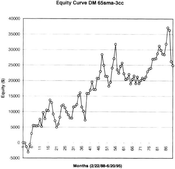
Figure 6.14 Monthly equity curve for deutsche mark calculations with rollover contracts.
Another important piece of information we can gather from the equity analysis is the percentage of intervals that were profitable. This will show what percentages of consecutive months were profitable on a monthly basis, a useful measure of system performance. Figure 6.16 shows these data for the DM test with 65sma-3cc. More than 50 percent of the 90 monthly intervals from February 1988 through June 1995 were profitable. The proportion of winning intervals increases as the period increases. This could be interpreted as the longer you are in a drawdown mode, the more likely you are to come out it.
You should take a good look at the proportion of profitable intervals for each market when you combine different markets hoping to increase the proportion of profitable intervals. A good measure of your successful diversification processes is upward changes in the proportion of profitable intervals. Here diversification includes multiple markets, multiple trading systems, and different money-management strategies.

Figure 6.15 Maximum losses in DM over fixed monthly intervals from February 1988 through June 1995. Data are for 1- to 12-month intervals.
You should also look at the standard deviation of monthly equity changes. You can use it to project drawdowns for this system. This idea is explored in the next section. For now, we will test the effect of adding a $1,500 trailing stop to the 65sma-3cc model using actual DM contracts with rollovers and a $5,000 initial stop. As usual, we allow $100 for slippage and commissions. The $1,500 stop trails from the point of highest equity for long and short trades. The net paper profit was $7,500, with a profit factor of 1, 12, and a drawdown of –$15,515. These results were somewhat worse than not using a trailing stop at all. However, the net profit analysis does not provide the additional insight sketched below.
Figure 6.17 compares the average monthly equity changes with and without a trailing stop for the 65sma-3cc system. There is little doubt that the trailing stop significantly reduces average monthly performance. You should expect the drop in monthly performance since the net profit with the trailing stop was $7,500 versus $24,900 without the trailing stop. A key point not evident from the profit summary, but clearly visible in Figure 6.17 is the performance at the 12-month level, which strongly favors not using a trailing stop.
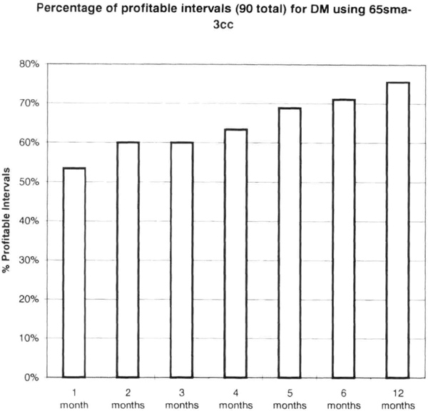
Figure 6.16 Proportion of profitable intervals shows that this system tends to have fewer unprofitable intervals as the length of the interval increases.
Unfortunately, the trailing stop also had the effect of reducing the proportion of profitable intervals. The trailing stop did little to improve the smoothness of the equity curve. For example, the standard error with the trailing stop was 3 percent higher, at $4,087, even though profits plummeted nearly 70 percent.
Deleting the trailing stop and adding an exit on the twentieth day of entry increased the reported profit to $14,950 (versus $7,500 with the trailing stop) with a profit factor of 1.27, and drawdown of –$11,325. These data are virtually the same as those with a $5,000 initial stop. Hence, there should be little change in portfolio level performance as a result of adding this exit.
The new SE was 10 percent smaller, at $3,781, but the performance over the intervals was comparable to tests without the stop. Hence, adding this exit produced little improvement, but cost a 40-percent drop from $24,000 in potential profits. Although not shown here, the proportion of profitable intervals dropped about 10 percent, another strike against this exit strategy.

Figure 6.17 The average profit over each monthly interval was substantially better without the trailing stop, suggesting that many trades were cut off prematurely. The unmarked bars are for 2 months, 4 months, and 6 months.
A number of other exit strategies yielded similar results: none improved smoothness of the equity curve by more than 10 percent, a few worsened it, and most had a heavy profit penalty. Changing exit strategies often seems to degrade month-to-month performance. Hence, in the next section we will try to get a smoother equity curve by changing system design.
Effect of Filtering on the Equity Curve
Filtering is a way to reduce the number of trades and provide better entries into the trade. Filtering can also produce a smoother equity curve. We saw that we could not improve smoothness (reduce standard error) with exits alone. Of course, you can argue that there might be other exits that work better, and you can check them all if you like.
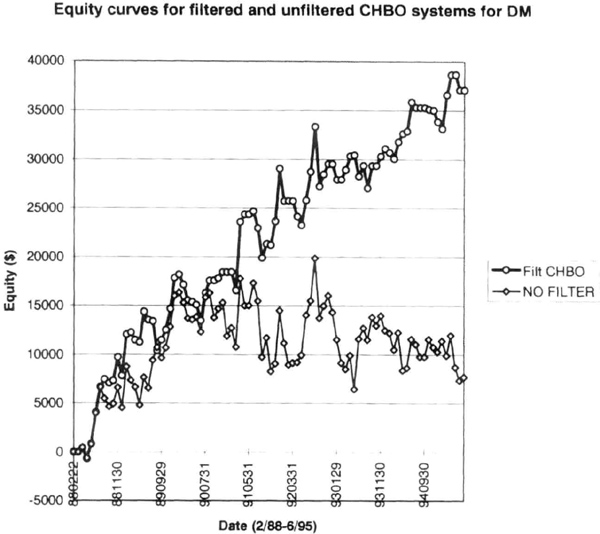
Figure 6.18 Equity curve for a 20-day channel system on DM with (upper line) and without (lower line) filter. Calculations are with rollovers on actual daily contract data.
In order to get a smoother equity curve, we will try changing the system design by introducing a filter. Because losses come from entries during consolidations, the primary benefit of filtering would be to eliminate some of the unprofitable entries. The penalty would be late entry into trends, resulting in lost profits. In some cases, the late entries would be near intermediate tops or bottoms, with the market reversing into the previous consolidation region. Such trades would trigger the initial stop loss orders. We explored how to use the RAVI filter with the 65sma-3cc system in Chapter 3. You can use momentum-based filters or invent other filtering schemes.
We tested a breakout system because breakout systems inherently do not produce entries during small consolidations. For example, a narrow consolidation will not produce new 20-day highs or lows. Therefore, entries from the 65sma-3cc system in these areas would be eliminated. We used a simple filter based on the directional movement index (DMI) because it is a bit more sensitive than the average directional index, or ADX. The purpose of the filter is just to reduce false breakouts, since breakouts during wide consolidations will occur without strong market momentum. The filter merely stipulates that the 14-day DMI be greater than an arbitrarily chosen level such as 50. For details on the construction of the DMI please refer to Wilder’s book (see bibliography for reference).
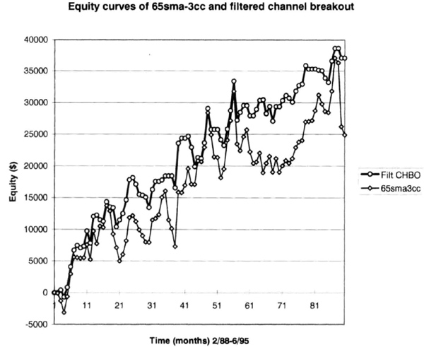
Figure 6.19 The filtered breakout system (upper line) had a smoother curve compared to the 65sma-3cc system without initial stop or exits (case 1; lower line).
We tested the system on DM data from March 1988 through June 1995 with rollovers on the twentieth day of the month before expiration, a $1,500 initial stop, and $100 allowed for slippage and commissions. The equity curves for the filtered and unfiltered system are shown in Figure 6.18.
Filtering also produced an equity curve (see Figure 6.19) that is smoother than for the unfiltered 65sma-3cc system, described in this chapter as case 1. Note that the case 1 equity curve has been converted from daily to monthly data. The SE for case 1 was $3,776, versus $2,507 for the filtered equity curve, a difference of 50 percent. The interval drawdowns were also smaller, confirming the smoother equity changes (see Figure 6.20).

Figure 6.20 The filtered breakout system produced smaller drawdowns than the 65sma-3cc system without initial stop or exits (case 1). Data are for 1-, 3-, 6-, and 12-month intervals (from left to right).
We then compared the performance of the channel breakout system with and without filtering. The average interval equity change over 1, 3, 6, and 12 months was greater for the filtered system, as shown in Figure 6.21. Thus, the filtered system produced more consistent results for DM. For example, standard deviation of interval returns was greater for the unfiltered system (see Figure 6.22), confirming its uneven performance.
As expected, a linear regression analysis showed the standard error for the filtered system to be $2,507 versus $3,937 for the unfiltered system. Thus, filtering produced a smoother equity curve, since the standard error decreased by 36 percent. A brief comparison of the filtered and unfiltered system is shown in Table 6.1.
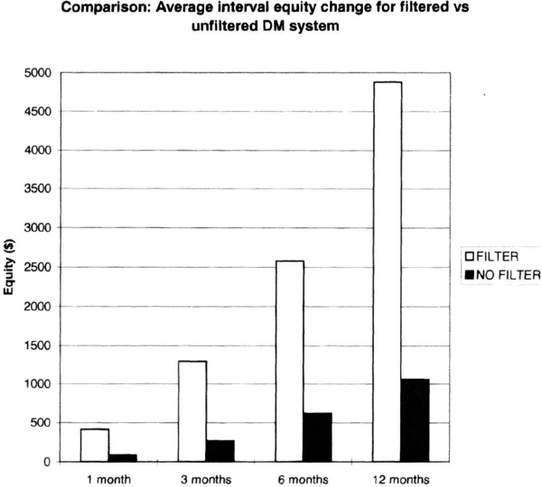
Figure 6.21 The interval equity changes were greater for the filtered deutsche mark system.
The data in Table 6.1 show that filtering reduced the number of trades, and improved profitability and the profit factor in this instance. These calculations suggest that filtering can produce a smoother equity curve. Hence, you should also evaluate the effects of changing entry strategies at the portfolio level.
Table 6.1 Comparison of DM systems.

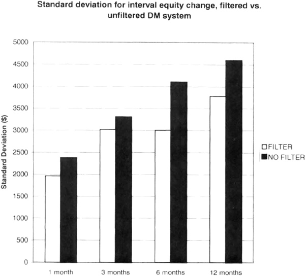
Figure 6.22 The unfiltered channel breakout system had larger standard deviation of interval equity changes.
Modeling CTA Returns
Where do commodity trading advisor (CTA) returns come from? Can the origin of returns explain variations in correlation among managers? The returns on the track record of a CTA can be explained by returns on subsectors of the futures markets. One can thus try to synthesize the equity curve of a manager by “correctly” combining subsector returns using simple trading systems. Synthesizing an equity curve requires some knowledge of the manager’s trading philosophy and approach, but such information is not easily available. For example, it should be relatively easy to synthesize the returns of trend-following CTAs because trend followers, as a group, should be long or short a market at about the same time during major trends. Of course, the details of entries, exits, and trade sizing are unknown and can vary widely.
We examine this issue by using a simple 80-channel breakout system to generate hypothetical returns on the major sectors on the futures markets, namely agricultural and soft commodities (AG), currencies (CR), energies (EN), short rates (SR), long rates (LR), metals (MT), and stock indexes (ST). Included are all of the major liquid markets in North America, Europe, and the Pacific Rim that are traded by the top CTAs. For comparison purposes, we use a random sample of a dozen top CTAs who together manage more than $6 billion. Table 6.2 summarizes sector-by-sector correlation of the composite returns for each CTA without regard to fees or interest, assuming $100 for slippage and commissions per trade. The table shows the correlation of the actual returns to the theoretical returns of the long-term channel breakout system. The calculations cover a period from January 1996 to December 1999. A correlation less than 0.30 may be considered a weak relationship, and a correlation greater than 0.60 may be considered a strong suggestion that the manager uses long-term trend-following strategies on a portfolio comprising those subsectors. The correlations for the simple long-term model vary from as low as 0.15 to as high as 0.78, showing that the model does have some explanatory power.
Table 6.2 Correlation between composite CTA returns and portfolios of subsector returns. The degree of diversification of the portfolios increases from left to right.
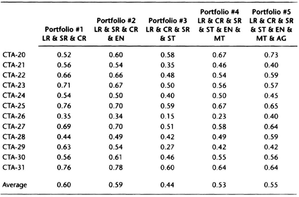
Of interest is a comparison of CTA-20 and CTA- 31, who manage close to $1 billion between them. The correlation between the actual track records of CTA-20 and CTA-31 is 0.59, implying that there a moderately strong similarity, but the strategies are not “identical.” With respect to Portfolio #1, long and short rates and currencies, the two seem to have quite different strategies (see Table 6.2, column 1). However, comparing CTA-20 on a diversified portfolio (column 5) with CTA-31 on a portfolio with interest rates and currencies (column 1), we see that their correlation to a long-term trend-following system rises to the low to mid-seventies, implying they seem to have similar trading strategies. Thus, the similarity between the strategies of CTA-31 and CTA-20 are not apparent unless we break down the performance on a sector basis. Indeed, CTA-20, CTA-23, CTA-27, and CTA-31 all seem to favor long-term trend-following strategies, and the portfolio differences seem to be the leading explanation for differences in correlation among them.
We now extend the analysis by using multiple linear regression analysis of CTA-25’s results and subsector returns. We can explain at least 60 percent of the variation in the returns of this CTA with a statistically significant regression using the sector returns of long bonds and currencies (see Table 6.3). The actual equity curve and the curve estimated from the linear regression model are shown in Figure 6.23. Thus, subsector analysis may provide clues into the “black-box” that is the trading strategy of a CTA. A “high” value of correlation (greater than 0.60) implies a good explanation of the source of CTA returns. A test of the returns of very short term CTAs, whose returns should have nothing to do with long-term trend-following returns, showed correlations to interest rate subsectors in the 0.2 to 0.3 range, but a linear regression analysis did not show statistically significant relationships, as we would expect. Thus, correlations less than 0.3 could imply that the correlation is possibly spurious.
Table 6.3 A summary of the statistically significant linear regression calculations from a spreadsheet showing that a substantial percentage of the variation in this CTA-25’s returns could be explained by the returns of a long-term trend-following system trading long bonds and currencies.

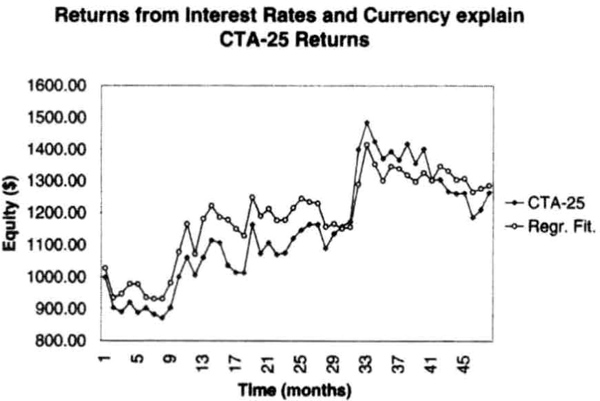
Figure 6.23 The returns of CTA-25 can be modeled quite closely by the returns of a long-term trend-following system trading long bonds and currencies using the linear regression parameters calculated in Table 6.3.
Our analysis in this section indicates that understanding correlations among CTAs also requires detailed information about their portfolios. In the absence of such information, we can use simple trend-following systems to derive subsector returns. Such returns can be synthesized into statistically significant models of CTA returns. This information can be used to build more robust and efficient portfolios.
Stabilized Money Manager Rankings
There is considerable interest in deriving a stable ranking procedure for the performance of return generation processes (RGPs). Such rankings could potentially be used to construct efficient portfolios and achieve greater returns. Unfortunately, the problem is more difficult than may first appear because past performance seems to bear little relationship to future performance. As a first step, we must define what we mean by performance. Performance can be measured on an absolute basis (percent return over the period), on a risk-adjusted basis (such as average monthly return divided by standard deviation of monthly returns) or on a relative basis (such as rankings compared to a group of other RGPs). The relative rankings themselves may be derived from a comparison of absolute or risk-adjusted performance versus the peer group.
For the purposes of the current effort, we will use commodity trading advisor performance for analysis, with each CTA considered as a separate RGP. A small body of work suggests that CTA rankings based on past performance have limited predictive value (see Irwin et al., Schwager, 1996). These studies from academia and industry compared a large number of CTAs over different periods and concluded that little can be said about absolute returns in a subsequent period. These studies did conclude that the rankings based on the standard deviation of monthly returns was relatively consistent, so highly volatile CTAs tended to retain their high volatility over subsequent periods.
Let us consider why past performance will vary over future periods for even a single CTA. We assume here that the CTA does not change the leverage employed in trading. If the RGP and portfolio remain unchanged, absolute performance will vary from year to year simply because the markets in the portfolio performed differently over time. These variations in market performance will be reflected in variations in risk-adjusted performance over time. Because most CTAs continually research new trading ideas, the portfolio and RGP typically vary over time—slowly for some CTAs and more rapidly for others. This further complicates performance comparisons over time. Furthermore, performance will show even greater variations if the CTA chooses to systematically vary the leverage. Hence, even if we used just a single CTA, performance measures will vary over time.
Now we consider the problem of comparing CTAs without regard to their RGP, portfolio, or average account size. In this situation, we may compare short-term traders with long-term traders, and specialized currency traders with those trading diversified portfolios without regard to market conditions over the period under review. The size of the accounts traded also has a significant impact on relative performance, with CTAs trading larger sizes likely to show performance that is more consistent. For example, trend-following models may all indicate that the accounts should be long the Japanese Government Bond (JGB). However, for some CTAs, the accounts may be too small to permit trading this market. Hence, even with diversified portfolios, account size can be a significant determinant of relative performance. Thus, there is little reason, a priori, to expect stability in relative, absolute, or risk-adjusted performance within a randomly selected basket of CTAs because the factors influencing their performance are so diverse.
Can we expect performance measures to show any stability at all? The answer is a resounding “maybe” if we select our sample carefully. First, we should compare apples to apples by selecting CTAs trading similar strategies and portfolios. For example, we can select trend-following CTAs all trading diversified portfolios. Even though there are many trend-following strategies, we expect the CTAs as a group to be long when the market is in a major uptrend and short in a major downtrend. Differences in strategy will be reflected in different entry and exit points. In any group that we pick, we can assume that the CTAs will not drastically change the leverage used over time. Even grouping by portfolios is problematic because most CTAs do not provide sufficient details on the markets traded and the relative weights for each. It would be an oversimplification to assume that all CTAs are trading all markets with the same relative weights. For example, two “diversified” trend followers may trade the currency markets with different weights within their portfolios. Hence, there will be differences in performance that cannot be completely accounted for.
Second, we can use overlapped samples to provide internal smoothing for changes in trading strategies used by the CTAs over time. For example, we use the latest two years of data when analyzing performance on December 31 of successive calendar years. A strong case can be made for using overlapped time intervals for performance comparison, even though previous studies have used nonoverlapping time intervals for comparison. The statistical theory of sampling allows for systematic rotation within the selected sample, as long as 50 percent or more of the sample has fresh data (see Jessen, 1978). In our case, we test the ideas by using two different overlapping strategies: using 2 years of data with 12 old and 12 new monthly data points (50 percent replacement), or using 21 months of data, with 9 old and 12 new data points (57 percent replacement).
Third, we can compare relative performance based on risk-adjusted returns by using return efficiency, defined as the ratio of average monthly returns to the standard deviation of those returns. For example, the CTA with the highest return efficiency will be ranked number 1, and the others will be assigned higher ranks in descending order of return efficiency. Comparison of absolute returns is corrupted by variations in leverage used by CTAs. The comparison of relative risk-adjusted performance assumes that structural differences in the design of RGPs will persist so that superior designs will perform better than inferior designs. Thus, we expect relatively stable relative risk-adjusted performance rankings among CTAs with similar trading strategies and similar portfolios. We also expect some changes in relative rankings as CTAs change their RGPs because of continuing research.
The statistical test used is similar to that used in prior studies. We first calculate the return efficiency over a 24-month period ending December 31, and rank the CTA based on return efficiency. Next, we advance the date by 12 months, to the end of the next calendar year, and use the latest 24-month data. This creates an overlapped sample with 12 data points carried over from the first 24-month sample. We then rank the CTAs by return efficiency in the second sample. The statistical test is the nonparametric Spearman’s rank correlation test or Spearman’s correlation coefficient, which is equivalent to running a linear regression between the two sets of ranks and calculating the correlation between them. If the two sets are correlated, then lower-ranked CTAs will continue to carry a low ranking in the second set, and higher-ranked CTAs will carry their high rankings into the second set.
International Traders Research’s (of La Jolla, California) database was the source of the data for 17 CTAs, who report that they use a trend-following trading strategy on diversified portfolios. Their names have been replaced to maintain anonymity. The dataset spans 1995 to 1999 to allow comparison among all 17 managers, so we have four overlapped 2-year intervals. The relative rankings and correlations are summarized in Table 6.4. The correlation in ranks over the three periods is significant at the 1 percent level. The rankings have interesting implications for portfolio construction. Table 6.5 shows the portfolio comprising the five top CTAs at the end of each two-year period. The starting portfolio for each period is the same as the ending portfolio of the previous period. The rankings would have rotated the portfolio toward the best-performing CTAs on a risk-adjusted basis over the test period.
Table 6.4 CTA rank based on return efficiencies over 2-year overlapped samples calculated on December 31.

The results are similar if we use a different rule to construct the overlapped intervals. We now use a rule in which we use 21 months of data, with 12 new data points and 9 old data points from the previous interval. We again rank the CTAs based on return efficiency and measure rank correlation (see Table 6.6). These rankings are statistically significant at the 1 percent level for 1996–97 and 1998–99, and at the 10 percent level for 1997–98. Thus, as the amount of overlap decreases, we see the results continue to be stable. The portfolio rotation results change slightly, but not enormously, as shown in Table 6.7.
Table 6.5 Portfolio rotation based on rankings at year-end using 24-month overlapped data.

Table 6.6 CTA ranks based on 21-month intervals with 57 percent replacement of data.
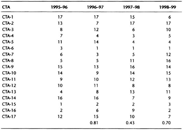
Table 6.7 Portfolio rotation based on analysis of 21 months of data.

These data suggest that using overlapped data on CTAs trading similar RGPs and portfolios could provide stable relative rankings, with important implications for portfolio rotation. The rankings themselves are not a guarantee of superior performance. A CTA ranked highly at the end of one year may drop out of the top five in the subsequent year. Conversely, a CTA not ranked in the top five at the end of the year may zoom to the top of the list at the end of the subsequent year. Thus, there will be a lag in the rankings because of the smoothing process used to develop them. Note that we use return efficiency, a risk-adjusted measure of performance, to create these rankings. Return efficiency makes sense because the leverage can be adjusted to arrive at the desired risk/reward ratio. However, the rankings would be different if different criteria were used to rank the managers.
Mirror, Mirror on the Wall…
”Mirror, Mirror on the Wall! Who has the smoothest equity curve of all?” This is a question of much interest. The evaluation of past performance, whether actual or simulated, is an essential part of portfolio design and system development. The analysis usually focuses on the equity curve of a return generation process or trading manager using monthly data, but daily data can be equally valuable. You can adopt a quantitative, qualitative, or mixed strategy to evaluate the equity curve, with the challenge being to achieve an apples-to-apples companson.
A qualitative approach compares two or more managers over periods characterized by unique market events. For example, you may analyze a 3-month period in which interest rate contracts rallied vigorously and then experienced a sharp retracement. Alternatively, you could compare the risk-control strategies of two equity managers during the week in which the NASDAQ index dipped about 25 percent in April 2000. A qualitative approach would examine how each RGP handled the sharp retracement.
A quantitative approach compares two or more RGPs over the same period by using a number of separate quantitative criteria. The difficulty with this approach lies in interpreting whether meaningful differences exist between RGPs using numerical criteria. First, the user must be careful to identify whether the selected criterion is sensitive or insensitive to the actual sequence of returns in the equity curve. The actual sequence of returns is certainly relevant to calculating compounded returns. However, the average return and standard deviation are not sensitive to the actual order in which returns were realized. Second, the effects of leverage also influence the absolute values of many numerical criteria. For example, as the leverage used by a manager increases, absolute returns, drawdowns, average monthly return, and standard deviation all increase. Hence, it is often meaningless to compare managers or RGPs without accounting for differences in leverage used in obtaining those returns. A third problem with using quantitative criteria is selecting the actual criteria used to make comparisons. These criteria may not have significant predictive value for even a single RGP. For example, absolute returns over a fixed calendar period, such as 12 months, have so much variability that reliable projections about future returns are difficult to make.
A hybrid approach allows you to combine desirable features of both the qualitative and quantitative strategies. For example, you can use risk-adjusted quantitative measures over selected months to compare RGPs. This focuses the discussion, allowing a direct apples-to-apples comparison.
Normalizing Returns
Imagine you are comparing two RGPs or managers at the end of a month of strong positive performance. You want to decide if one or other is doing better than expected during the strong month. For example, even though one manager is actually reporting a larger absolute return than the other, that manager may be underperforming, given the level of leverage used by the managers. A second issue you want to resolve is whether the return over the past quarter is consistent with the leverage used, and a third issue is whether the returns are consistent with the pattern of prior returns. For example, one manager may have predominantly upside volatility (i.e., large positive returns and small negative returns), and the other may have about equal upside and downside volatility. Your qualitative assessment of the strong months would be quite different if you had a prior expectation for returns based on the pattern of prior performance.
We need a yardstick to measure the performance in the most recent month (or the month under study). We arbitrarily choose the standard deviation of monthly returns over the trailing 24 months (Std24), not including the most recent month or the month under study, as the basis for normalizing returns. You could make a case for using the prior 12 months, or the prior 36 months, or any other interval. We arrived at 24 months as a compromise between being too short or too long, but remember that the results of the normalization will change as you change the yardstick.
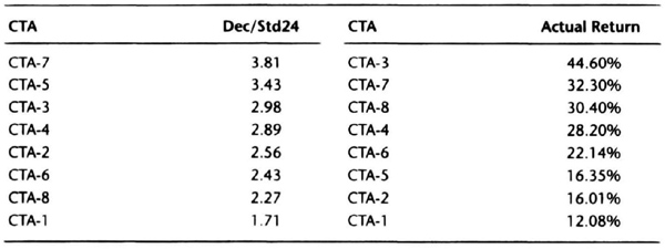
Table 6.8 shows the actual performance data for eight commodity trading advisors from December 1989 through December 1991. December 1991 was a strong positive month for this group of CTAs, and we wish to determine which CTAs turned in the best performance that month. Table 6.9 shows the CTAs ranked by absolute returns. CTA-3 had the highest absolute returns, at 44.6 percent. However, CTA-7, with a 32.3 percent absolute return turned in the best risk-adjusted return, at 3.81 times the trailing 24-month standard deviation of monthly returns. CTA-3 had a return that was 2.98 times the trailing 24-month standard deviation. The magnitude of Std24 is related to the amount of leverage used by the CTA and the number of markets traded. All other parameters being equal, as leverage is increased, the dollar gains (and losses) also increase, although the increase may be slightly nonlinear due to the effect of trading costs and performance fees. Because leverage can be used to increase absolute returns, normalization is used to identify which CTAs are using leverage efficiently. The difference in returns between CTA-3 and CTA-7 can at least partly be explained by the difference in leverage used by the two CTAs (Std24 is 14.99 percent for CTA-3 versus 8.47 percent for CTA-7), so had the two been traded with equal leverage, an investor would have made more money with CTA-7 than with CTA-3. Thus, Table 6.9 shows that CTA-7 and CTA-5 are making more efficient use of leverage than CTA-3, even though their absolute returns are proportionately lower because of using lower leverage.
Table 6.8 Actual monthly performance data for a random sample of eight CTAs.

Std24 is the standard deviation of monthly returns (Dec’89–Nov’91). Dec/Std24 means returns for December 1991 are normalized using Std24.
Table 6.9 CTAs ranked by normalized and actual December 1991 returns.
This idea can be extended to normalize returns over periods longer than I month. Thus, you could normalize year-to-date returns by a yardstick based on volatility measured over a representative historical interval. For example, we can annualize the Std24 by multiplying it by the square root of 12 (3.4641). In Table 6.8, the trailing 24-month standard deviation of 7.05 percent annualizes to 24.42 percent, allowing for rounding error. The calendar year 1991 return of 12.51 percent is then divided by 24.42 percent to obtain the normalized 1991 year-to-date return. CTA-4 clearly led the others, based on normalized calendar 1991 returns.
There is a tendency to rank CTAs by returns alone, without regard to the leverage used by the CTA, as reflected in higher or lower monthly standard deviations. However, it may be more meaningful to compare CTAs based on normalized returns because it is easy to place CTAs on an equal footing by adjusting leverage to equalize the standard deviation of monthly returns calculated over a specified period.
Risk-Adjusted Measures of Performance
One category of measures of quantitative performance calculates risk-adjusted returns. The design strategy is to devise a ratio in which the numerator measures returns and the denominator measures risk. For example, the Sharpe ratio (SR) is a popular measure of risk-adjusted performance. This ratio is defined as the excess annualized return over the risk free rate, divided by the annualized standard deviation:
where SR is the Sharpe ratio, R is the expected annual return(%), Σ is the annual risk-free rate (%), and Σ is the annualized standard deviation of returns (%). The expected annual return is often the average annual return over the duration of the track record, and the risk-free rate is the 1-year U.S. Treasury bill interest rate. The calculation is obviously sensitive to how R, r, and Σ are specified and the period over which they are computed. The general design of SR is similar to the form of the standardized normal random variable Z from the definition of the normal distribution, Z = (X- μ)/σ, where μ and σ are the parameters of the normal distribution, and X is a particular random sample drawn from that distribution. By analogy, if annual returns were drawn from a normal distribution with μ = r (the risk-free rate) and standard deviation Σ, then any particular realization of returns, R, would be normalized as Z = (R – r)/Σ, the definition of the Sharpe ratio. Note, however, that the true distribution of SR is not known.
The Sharpe ratio has been criticized as an imperfect measure of risk-adjusted performance, particularly for analyzing the returns of a futures trading program. A good summary of these criticisms can be found in Schwager (1996). Criticisms centering on the definition include sensitivity to manipulation by increasing leverage, the ambiguity in interpreting negative values, and the bias in favor of steady returns. For example, because the numerator contains the deduction of the risk-free rate that does not depend on the leverage used in trading, the Sharpe ratio can be increased by increasing leverage. The return R can be expressed as a multiple of Σ, so doubling Σ can double R, thus increasing the Sharpe ratio. Therefore, comparing programs based solely on the Sharpe ratio can mask the effect of differences in the leverage used by those programs. Continuing our analysis, reducing Σ by half would reduce R by half, and may even yield a negative SR. What is unclear is whether the negative SR would have resulted from using insufficient leverage or inferior returns alone.
Another peculiarity arises because the standard deviation, by definition, is more responsive to extreme values and less sensitive to values close to the average. Thus, if the annualized standard deviation increases, it is not clear if the increase results from extreme values on both sides of the average or just one side of the average, namely, on the positive side. Hence, the Sharpe ratio favors steady returns over time rather than a program in which the gains occur in spurts (i.e., a program with high upside volatility). Another result of using the standard deviation in building the Sharpe ratio is that, because the standard deviation computation is not sensitive to the chronological order in which returns are realized, the Sharpe ratio cannot distinguish between intermittent and consecutive losses.
A significant limitation of the Sharpe ratio arises from using the difference between expected returns and risk-free returns in the numerator. Because financial return series are mathematically described as Martingales, the “best” predictor for the return in the next period is the return in the latest period. This means that the numerator is not designed to “forecast” returns over an extended period, and hence the ratio has limited predictive potential. A final problem with the SR that its distribution is unknown; as calculated, it is a point estimate, and for actual performance data, the SR value changes when calculated over rolling time intervals.
Researchers have developed other alternatives to the Sharpe ratio to overcome some of its limitations. One approach focuses on the numerator and seeks a way to eliminate the risk-free rate. A theoretical justification for this change is that investors or traders in managed futures can margin their account with a Treasury bill and will collect all the interest earned on account balances. Hence, their annualized return can be written as R = T, + r, where T, is the expect return due to trading and r is the risk-free rate. Hence, the numerator in the Sharpe ratio would be ((Tr, + r) – r), or just Tr, which is equivalent eliminating the risk-free rate.
An alternative formulation makes the argument that investors in a futures program are not risk averse and thus do not consider the risk-free rate in their investment decisions. This is the equivalent of setting the risk free rate to zero, and has the same effect as the previous argument. This approach to modifying the Sharpe ratio can be written as
where SR* is the modified Sharpe ratio, R is the annualized return, and Σ is the annualized standard deviation. Many authors use this definition interchangeably with the basic definition of Sharpe ratio and do not use any special notation to denote the difference. Although no consistent naming convention exists for this change, it should be obvious that the modified Sharpe ratio is not sensitive as the original Sharpe ratio to changes in leverage because the numerator and denominator will change linearly in most situations. Some nonlinearities due to “frictions,” such as trading costs and advisory fees may exist, but the changes are linear for most practical purposes.
One interesting feature of the modified Sharpe ratio is that it can be interpreted and constructed slightly differently when computed on a monthly basis. The difference depends on whether we use arithmetic or geometric average returns in the numerator. Consider, for example, the “monthly” Sharpe ratio with the risk-free rate equal to zero. Note that we cannot derive equation (6.3) simply by rewriting R and Σ using monthly returns and the standard deviation.
Rather, we “create” this equation by copying the structure of SR* with monthly average return and monthly standard deviation. When computed on a monthly basis, SR* can be viewed as return efficiency p, where
Here μ is the average monthly return and σ is the standard deviation of monthly returns. The length of the data series is typically 36 months, but could be longer or shorter if necessary. Return efficiency combines the risk preferences of the investor, where the risk (read volatility) preference is quantified by the standard deviation, and the effectiveness of the RGP is measured by the average monthly return μ. Return efficiency can be interpreted as the fraction of the risk tolerance of the investor that is converted into returns. Return efficiency using arithmetic average return is easy to compute because performance data are easily available in monthly form, and easy to interpret as the fraction of the volatility tolerance that is converted to returns.
Let us clarify two technical issues. The numerator can be defined as the arithmetic or geometric return over a given time period. The arithmetic average return is not sensitive to the order in which the returns are realized, but the geometric return is. When the average monthly return is compounded to measure annualized returns, the precise method of calculating μ, whether arithmetic or geometric, will make a small, but perhaps significant, difference. The arithmetic average is better in calculating return efficiency because its statistical properties are well known: it is normally distributed with a standard deviation ![]() . where n is the number of months in the data series. Few generalized statements can be made about the distribution of geometric returns.
. where n is the number of months in the data series. Few generalized statements can be made about the distribution of geometric returns.
When the return efficiency is computed on an annualized basis, it can be viewed as a gain/pain ratio, where the numerator is the expected annual gain, and the denominator is representative of the expected future”worst case” drawdowns (see Chapter 7). The gain/pain ratio is not sensitive to leverage, and it allows one to manage expectations on the upside (returns) as well as the downside (drawdowns). This interpretation serves to address the criticism that the denominator of the Sharpe ratio does not measure risk as viewed by the typical investor. To this end, Schwager (1996) has proposed the return retracement ratio (RRR),
where the numerator R is the average annual compounded return, and AMR is the average maximum retracement for each data point. The AMR, in turn, is the average of the maximum retracement from a prior equity peak or maximum retracement to a subsequent low. The AMR tries to average the retracement up to and beyond each data point and does not arbitrarily restrict drawdown data to calendar-year intervals. The RRR is sensitive to the actual order in which returns were realized in both its numerator and denominator, and smoother curves will lead to a higher RRR. This sensitivity reduces its usefulness as a predictor of future performance. The AMR calculation, besides being complicated, can lead to quirky situations because the future drawdown is unknown. For example, when a market is making new equity highs, the maximum retracement from a prior equity peak and maximum retracement to a subsequent low are both zero. This can lead to distortions when the equity makes a series of new highs. Most investors are likely to experience drawdowns substantially different from the AMR because the magnitude of future drawdowns is impossible to predict precisely.
A couple of new approaches are suggested by the preceding discussion. One approach is to extend the idea of return efficiency by calculating it using rolling 3-month returns instead of monthly returns. The rolling 3-month return efficiency, R3 RE, then becomes

where μ3 is the average rolling 3-month return, and σ3 is the standard deviation of rolling 3-month returns. One advantage of using a rolling 3-month return is that it reflects quarterly performance, allowing sustained gains and drawdowns to be reflected more accurately.
The other approach is to calculate a “double” modified Sharpe ratio, that is, a modified Sharpe ratio of the modified Sharpe ratio, assuming the first SR* calculation occurs over rolling periods of, say, 24 or 36 months. The logic here is that if the returns are steady, without sharp gains or losses, then the standard deviation of SR* will be small, and the double SR* will be proportionately larger. In equation form,

where it is clear that the calculation of R3RE would be far simpler than that of (SR*)2.
Comparison of Risk-Adjusted Performance Measures
We now compare and contrast the measures of risk-adjusted performance discussed previously. We use a specially contrived set of hypothetical data for our analysis (see Tables 6.10 and 6.11). The equity curves are 24 months long, and each has nominally the same starting and ending points (see Figures 6.24 through 6.27), with the 2-year return being approximately 12.7 percent. These contrived data allow us to compare different quantitative measures of performance on an apples-to-apples basis.
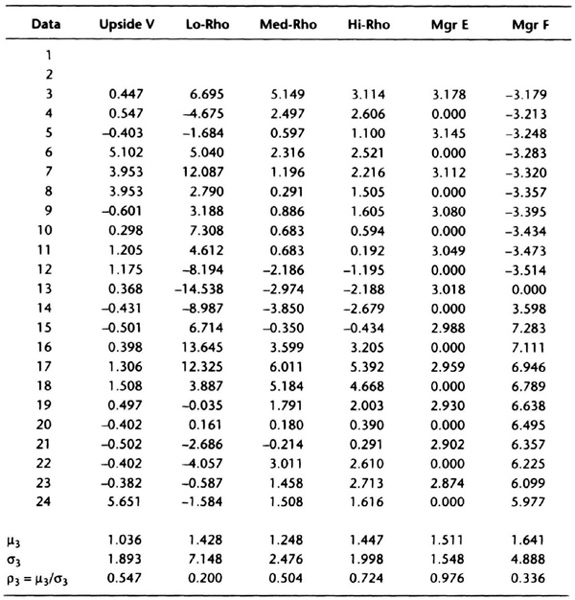
Table 6.10 Specially contrived equity curves to illustrate performance analysis (returns over 24 months nominally 12.7% for all curves).

Upside V: Volatility concentrated in months with positive returns
Lo-Rho: Low return efficiency (ρ); volatility distributed over positive and negative months; (ρ = μ/σ;μ = average monthly return, σ = standard deviation of monthly returns)
Med-Rho: Medium return efficiency
Hi-Rho: High return efficiency
Mgr E: Manager E from Schwager (1996): alternate up/down months; positive month dollar gains twice dollar losses in down months
Mgr F: Manager F from Schwager (1996): 12 consecutive down months, 12 consecutive up months; positive month dollar gains twice dollar losses in down months
Figures 6.24 through 6.27 show that equity curves for Lo-Rho and Manager F are the most “choppy,” and Manager E has the steadiest equity curve. The Upside V curve is relatively flat with only 2 months with sharp gains. The Med-Rho and Hi-Rho curves are similar to the Lo-Rho curve, but with less volatility. They are “smoother” than for Lo-Rho, but not as steady as for Manager E. Let us now see how the numerical computations shake out.
Table 6.11 Specially contrived equity curves to illustrate performance analysis (derived from Table 6.10 by compounding monthly returns).

We begin by calculating RRR following Schwager (1996). A sample calculation for the Med-Rho data from Table 6.10 is shown in Table 6.12. The table first convens monthly returns into an equity curve, assuming that we start with $1,000, to find the equity E(I) at each point. The next two columns calculate the peak equity through the end of month I, PE(I), and the maximum retracement from a prior equity peak at point I, MRPP(I). The detailed formula is shown in the footnotes accompanying Table 6.12. The following two columns find the minimum month-end equity on or subsequent to any month, Min E(I), and the maximum retracement to a subsequent low, MRSL(I). For example, at the end of Month 1, the lowest retracement is 1,031, but from month 2 through month 14, it is 1,032.131. The last column in Table 6.12 finds the maximum MRPP or MRSL at each month end, MR(I). The average compounded return is simple to calculate in this case because there are only 2 years of data. The RRR is the average compounded return divided by the AMR, and is 2.7439 for the Med-Rho data.

Figure 6.24 Contrived equity curves for comparing quantitative measures of performance. Manager E (Mgr E) from Schwager (1996) has alternate winning and losing months, whereas Manager F (Mgr F) has consecutive losing and winning months. The goal is to derive a measure of risk-adjusted performance to distinguish between these two extreme situations.
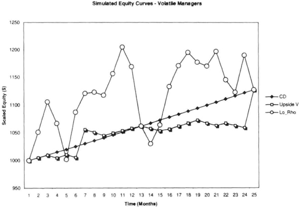
Figure 6.25 Contrived equity curves, as described in Figure 6.24. The Upside V equity curve has all its volatile moves on the up (or winning) side. The Lo-Rho curve has about equal volatility on both the upside and the downside.

Figure 6.26 Contrived equity curves with low to medium volatility.

Figure 6.27 Contrived equity curves used to compare quantitative measures of risk-adjusted performance. The goal is to find risk-adjusted performance criteria that can distinguish between steady returns, volatile returns, and curves with infrequent or consecutive losses.
Table 6.12 Sample calculation of Schwager’s RRR for Med-Rho data.

PE(I): Peak equity through month 1
E(I): Equity at end of month 1
MRPP(I): Maximum retracement from a prior equity peak = (PE(I) – E(I))/PE(I)
Min E(I): Minimum equity on or subsequent to month 1
MRSL(I): Maximum retracement to a subsequent low = (E(I) - ME(I))/E(I)
MR(I): Maximum retracement at point 1 = Max(MRPP(I), MRSL(I))
AMR = Average MR over data set
R = Average compounded return over data set in decimal terms
RRR = R/AMR
The completed calculations are as follows (with RRR values in parentheses): Upside V (10.11), Manager E (6.54), Hi-Rho (4.85), Med-Rho (2.74), Manager F (0.96), and Lo-Rho (0.82). The RRR calculations clearly do not penalize upside volatility, and favor steady returns, explaining the high rankings for Upside V and Manager E. The relatively low-volatility Hi-Rho and MedRho managers are in the middle of the pack. The RRR clearly penalizes a string of consecutive losses, but likes volatile equity curves even less, explaining the low rankings for Manager F and Lo-Rho. These rankings are generally in agreement with our visual assessment, with the exception that Manager E ranked lower than Upside V, who had little downside volatility.
We have also computed the Sharpe ratio, modified Sharpe ratio, return efficiency, and R3RE for the data set to observe their ranking behavior (see Tables 6.13 and 6.14). Because all the series have nominally the same return, ranking using SR is equivalent to ranking by the inverse order of the monthly standard deviation. Table 6.15 shows that SR, SR*, and return efficiency produce essentially the same ranking order, which does not distinguish between upside and downside volatility. Hence, the Hi-Rho and Med-Rho curves are ranked ahead of the Upside V curve. The Upside V curve moves up to third when ranked using R3RE, showing that the R3RE approach is moving toward the RRR model with a simpler calculation. Note that the Lo-Rho curve, with its “big” upside and downside volatility, ranked last in all calculations.
To further test the relative performance of the different risk-adjusted measures, we tested data on the eight CTAs from Table 6.8; the results of the calculations are summarized in Table 6.16. For the purposes of comparison, we looked at just the return retracement ratio, RRR; the return efficiency, ρ; and the rolling 3-month return efficiency, R3RE = ρ3. All three approaches ranked CTA-1 as the best performer and CTA-7 as the worst performer. The top three CTAs were identical for RRR and return efficiency, which also had the same four CTAs at the bottom half of the table. Similarly, RRR and ρ3 picked the same four CTAs in the top half, but in different order. In summary, the rankings produced by the methods are similar, but the key difference is how they account for upside and downside volatility. The return efficiency and R3RE are easier to compute than RRR, and they do not have some of the computational quirks of the RRR. Hence, the rolling 3-month return efficiency may be a useful measure of risk-adjusted performance.
The key issue raised by these calculations is whether CTAs truly have different volatility on the upside versus the downside. If we assume that volatility will be “symmetric,” volatility on the upside caused by favorable markets can also be seen on the downside during unfavorable markets. Under the assumption of symmetric volatility, measures such as the Sharpe ratio or its variants (return efficiency or R3RE) will provide more accurate measures of risk-adjusted performance. Empirical research of CTA and hedge fund track records shows that worst-case drawdowns measured on a monthly basis are usually less than four times the standard deviation of monthly returns (see Chapter 7). These data support the assumption of symmetric volatility. Note that typical CTA risk-control procedures cut off losing trades at a predetermined loss level; however, profitable trades are not always liquidated at a profit target, but usually allowed to proceed as long as possible. Thus, it is possible that under favorable market conditions you could have a prolonged performance period lasting 3 to 5 years in which the volatility is predominantly on the upside. This produces a distribution of returns skewed to the left. However, CTA performance in 1999 suggests that volatility on the upside will eventually be matched by volatility on the downside.
Table 6.13 Return efficiency, Sharpe ratio, and gain/pain ratio calculations for contrived data.

μ = Average monthy return(%)
σ Standard deviation of monthly returns (%)
ρ = μ/σ: Return efficiency, can be viewed as the monthly Sharpe ratio with risk-free rate = 0
R = Avg. Ann. Return (%): Average annual return (%)obtained by compounding μ over 12 months
Σ:= Ann. Std. Dev. (%): Annualized standard deviation (%); ![]() ; can be interpreted as expected future “worst case” drawdown
; can be interpreted as expected future “worst case” drawdown
Sharpe (r = 5%): Sharpe ratio with r = 5%
SR* = Gain/Pain = R/Σ:; return adjusted by expected “worst case” drawdown (r = 0)
Table 6.14 Rolling 3-month returns, return efficiency, Sharpe ratio, and Gain/Pain ratio calculations.
μ3 = Average return over rolling 3-month intervals (%)
σ3 = Standard deviation of rolling 3-month returns (%)
σ3 = μ3/σ3: Return efficiency, can be be viewed as the monthly Sharpe ration with risk-free rate = 0
Table 6.15 Ranking equity curves based on different risk-adjusted measures of performance.

Control Charts for Future Performance
Analysis of past performance data can help distinguish performance of competing RGPs or managers, but it says little about future performance. We find it difficult to forecast the future with precision, but we can make some estimates about the range of future outcomes. Such range forecasts, instead of point forecasts, can be useful for devising trading or investment strategies.
We resort to the central limit theorem (CLT) from statistics, which applies to a simple random sample drawn from an infinite population of finite mean μ and standard deviation σ. The CLT says that if the sample size is sufficiently large, then the average of the sample is normally distributed with mean μ and standard deviation ![]() . The distribution of RGP returns may be non-normal, but returns certainly have a finite mean and variance, given by μ and σ2, respectively. In this instance, the sample mean statistic, X is approximately normally distributed for sufficiently large n (say, n > 25), with a mean μ and standard deviation
. The distribution of RGP returns may be non-normal, but returns certainly have a finite mean and variance, given by μ and σ2, respectively. In this instance, the sample mean statistic, X is approximately normally distributed for sufficiently large n (say, n > 25), with a mean μ and standard deviation ![]() , provided the population is infinite. This means that we can use the properties of the normal distribution to place limits on the range of values obtained for the rolling 12-, 24-, or 36-month average returns obtained over, say, the next 12 months. For example, we can calculate the rolling 24-month average monthly returns and the standard deviation of those returns. Then, we can say that in the next 12 months, there is a 68 percent chance that rolling 24-month average returns will be within an interval
, provided the population is infinite. This means that we can use the properties of the normal distribution to place limits on the range of values obtained for the rolling 12-, 24-, or 36-month average returns obtained over, say, the next 12 months. For example, we can calculate the rolling 24-month average monthly returns and the standard deviation of those returns. Then, we can say that in the next 12 months, there is a 68 percent chance that rolling 24-month average returns will be within an interval ![]() calculated at the end of the current year.
calculated at the end of the current year.
Figure 6.28 shows rolling 24-month returns using actual CTA performance data. Also shown are the upper and lower bounds for the rolling 24-month returns obtained using the equation ![]() where μ24 is the average return over the 24 months ending December of the prior year, and σ24 is the standard deviation of those returns ending the prior December. Thus, for calendar year 1999, the values used are those calculated at the end of December 1998. For example, the average monthly return at the end of December 1998 for the prior 24 months was 1.10 percent, with a standard deviation of 3.77 percent, giving upper and lower bounds of 1.87 percent and 0.33 percent for calendar year 1999. What does this mean? If the rolling 24-month return was exactly 1.10 percent at the end of December 1999, then the return over the prior 24-month period would be approximated by compounding the average return as follows: 100((1+0.11)24 – 1) = 30 percent (approximately). The upper bound of the expected 24-month returns ending December 1999 was 100((1+.0187)24 – 1) = 56 percent (approximately). Similarly, the lower bound estimate for the 2-year period ending December 1999 was 8.2 percent (approximately). As it turned out, the actual December 1999 average 24-month return was 1.02 percent, with an estimated 2-year return of 27.5 percent; the actual 24-month return was 26.5 percent. The forecasting error was partly because we are compounding the arithmetic average return instead of the geometric average return. Nevertheless, the error in the forecast is acceptable because it gives us a graphical method of tracking expected and actual returns.
where μ24 is the average return over the 24 months ending December of the prior year, and σ24 is the standard deviation of those returns ending the prior December. Thus, for calendar year 1999, the values used are those calculated at the end of December 1998. For example, the average monthly return at the end of December 1998 for the prior 24 months was 1.10 percent, with a standard deviation of 3.77 percent, giving upper and lower bounds of 1.87 percent and 0.33 percent for calendar year 1999. What does this mean? If the rolling 24-month return was exactly 1.10 percent at the end of December 1999, then the return over the prior 24-month period would be approximated by compounding the average return as follows: 100((1+0.11)24 – 1) = 30 percent (approximately). The upper bound of the expected 24-month returns ending December 1999 was 100((1+.0187)24 – 1) = 56 percent (approximately). Similarly, the lower bound estimate for the 2-year period ending December 1999 was 8.2 percent (approximately). As it turned out, the actual December 1999 average 24-month return was 1.02 percent, with an estimated 2-year return of 27.5 percent; the actual 24-month return was 26.5 percent. The forecasting error was partly because we are compounding the arithmetic average return instead of the geometric average return. Nevertheless, the error in the forecast is acceptable because it gives us a graphical method of tracking expected and actual returns.
Table 6.16 Risk-adjusted performance measures for CTA data from Table 6.8.


Figure 6.28 A control chart for CTA performance showing the expected upper and lower bounds for the rolling 24-month average return.
As Figure 6.28 shows, we can use the control chart with well-defined bounds for future performance to track performance as it evolves in the new year. In 1995, for example, the CTA returns fell outside the ![]() bands, and we had plenty of warning of that event. In 1996, the forecast bands shifted downward, to accommodate the new reality, and the performance rebounded strongly toward the upper end of expected performance. For 1997 through 1999, the bands did not shift very much, and performance has generally been in the middle of the expected range at year end. Thus, we can develop control charts using past performance data to make a range forecast for expected returns smoothed over a 24- or 36-month period. A 12-month smoothing period can also be used, but the forecast bands must be set wider apart to allow for greater variability in the shorter time frame.
bands, and we had plenty of warning of that event. In 1996, the forecast bands shifted downward, to accommodate the new reality, and the performance rebounded strongly toward the upper end of expected performance. For 1997 through 1999, the bands did not shift very much, and performance has generally been in the middle of the expected range at year end. Thus, we can develop control charts using past performance data to make a range forecast for expected returns smoothed over a 24- or 36-month period. A 12-month smoothing period can also be used, but the forecast bands must be set wider apart to allow for greater variability in the shorter time frame.
Summary
In this chapter we saw that the standard error from regression analysis is a good measure of the roughness of the equity curve. A smoother equity curve has a smaller value for the standard error.
We saw that the usual prescriptions for producing “smooth” equity curves do not work every time. Most exit strategies tested did not reduce the SE by more than 20 percent, but had a substantial profit penalty. Diversification over different markets or systems also increased standard error. We also examined monthly equity changes to confirm these findings. Only a change in entry rules gave a smoother equity curve.
We modeled CTA returns and showed that they can be explained by returns on simple trend-following models on subsectors of the futures markets. This approach provides a deeper understanding of correlation relationships among CTAs and helps build robust portfolios. The process of assembling portfolios will be further assisted by the procedure for developing stabilized money-manager rankings, a key improvement over existing approaches in this area. Risk-adjusted measures may help you narrow the choices as you build portfolios, and hence this chapter presented a detailed discussion of competing measures of risk-adjusted performance accompanied by an apples-to-apples comparison of those measures. The rolling 3-month return efficiency was shown to be a simpler and effective alternative measure of risk-adjusted performance to the return retracement ratio. We ended the chapter with an application illustrating how control charts can be developed to monitor the performance of money managers.
This chapter showed that analyzing equity curves provides valuable insight into system design not available from the performance summary. Hence, no system development effort can be complete without examining equity curves.