Given that our foveal acuity is as narrow as a laser, the first monetizable event in the attention economy is when we point it toward your meme to the exclusion of all others. You must understand this as an economic transaction: in the face of endless informational demands, we allocate the scarce resource of foveal acuity and attention in the way we hope will be the most rewarding. The instant we flex our orbital muscles and look, we become customers to digital advertisers, publishers, and developers like you. And as we begin to consume your memes, you can begin to monetize our attention.
Psychologists have known since the 1960s that goals determine the direction of our gaze. In one experiment in 1967, Yarbus showed us the painting titled “Unexpected Visitors” by Ilya Repin and asked us to guess the ages of the characters. i This is where we looked (Figure 3-1).

Figure 3-1. Eye gaze when guessing age. Adapted from Yarbus (1967).
But when he asked us to determine how rich everyone is, this is where we looked (Figure 3-2).
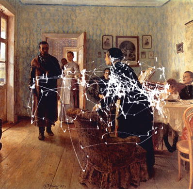
Figure 3-2. Eye gaze when guessing material circumstances. Adapted from Yarbus (1967).
And when Yarbus asked us to guess how long the unexpected visitor had been away, this is where we looked (Figure 3-3).

Figure 3-3. Eye gaze when guessing how long the visitor had been away. Adapted from Yarbus (1967).
No question, we voluntarily direct our gaze to different elements of a meme depending on our informational goals.
The same is true when looking at most content, social media, and storefront web sites . As always, our objective is to grasp the meaning of the page with the least allocation of attentional resources. As such, we tend to scan such pages in a F-shaped pattern, as discovered by usability expert Jakob Nielsen in 2006. We concentrate our gaze at the top-left corner and penetrate into the body to read (Figure 3-4). The headline at the top usually meets our miserly goals the best, so that’s where we look the most, but if we aren’t satisfied, we read lines lower down, hence the F-shape. The F-shape is reversed for languages like Hebrew and Arabic, written right to left, which proves this pattern is a function of our goals.
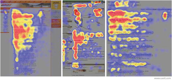
Figure 3-4. Gaze dwell times shown as “heatmaps” reveal an F-shaped pattern. From Nielsen (2006). ii
So, the attentional bottleneck isn’t a round pinhole; when you account for common eye movements, it’s shaped like a capital F. What this means for your design, if by chance we’re the first to tell you, is that on most web sites with left-to-right languages, the lower-right corner is an attentional desert. We just don’t focus our attention there very often. We recommend you never put any critical navigational links there, and unfortunately any ads you place there won’t perform very well either. They won’t pass through the bottleneck of gaze. Interestingly, if you try to offset our tendency to ignore that area with brighter colors, it will actually backfire: we’ll simply think it’s another ad on which we should waste no attention. In general, it’s a good idea to design to the F-shaped pattern ; you have to have a really good reason to fight against our expectations. Put important links across the top and down the left spine; use a headline. What should you put in no-man’s land? Maybe just whitespace.
Key Point
On most web sites with left-to-right languages, the lower-right corner is an attentional desert.
What happens when our information goals are flat out unmet on a web page and we simply cannot find what we’re looking for? The F-shaped gaze pattern gives way to one big blob of hunting around. But there is something you should learn from our desperate search: it proceeds in three distinct phases.
A usability study of the Washington State unemployment statistics site illustrated this nicely. We participated in the study during the Great Recession of 2009 when everyone wanted to find job openings. Our task was simply to locate the link that would lead us to them on the site shown in Figure 3-5, which is how it appeared prior to the re-design.

Figure 3-5. Washington State employment statistics site before the re-design , circa 2009.
We began our search in the efficient F-shape , hunting by location more so than by graphics or text (phase one). Unrewarded, we changed our gaze pattern to instead scrutinize all of the icons and other graphics on the page (phase two). Still not finding it, we changed our strategy again, now reading every word of every link on the page (phase three). This hierarchical process is very similar to how psychologists believe we read most text: we scan entire blocks of words first, and if we don’t comprehend the meaning, we look at words themselves, and if we still don’t comprehend, we look at characters. iii
On the Washington State unemployment site before the re-design , the best two links to find jobs were those labeled “Job Seekers” and “Occupation Explorer.” But they were both located on the right side rather than the left, and low enough to be dangerously close to the attentional desert. Good graphics and better word choice would have helped, to be sure, but so would placement on the page.
Interviews with participants in the study confirmed that we were unable to find our information using the efficient F-shaped scan. Instead, the layout forced us all the way to phase-three link-reading, and therefore extracted the maximal attentional cost from us. Our gaze dwelled for many seconds on almost all areas of the page (Figure 3-6). Had the reward been anything less important than jobs in our area (and most memes are), we most likely would not have paid this price. We would have simply left the site. It’s always embarrassing to web page designers when, from behind a one-way mirror in a usability test, they see us abandon their work and go to Google to find something that could have been found from the page we were just looking at. You’d be surprised how often that happens.
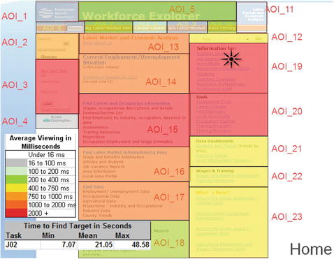
Figure 3-6. Gaze dwell times for areas of interest (AOI) on the Washington State employment statistics site. iv
You should learn what the gaze pattern is for your meme. After the State of Washington did that for its unemployment site , this is how they changed it (Figure 3-7). The link to “Employment Resources” was now in the top left at the epicenter of the F-shaped gaze pattern. And in the middle bar of the F, they put an easy pull-down menu where we could specify “I am a job seeker…looking for job openings.” It was much easier for us to meet our goals. We found our way to the job openings in a fraction of the time.

Figure 3-7. Washington State employment statistics site , circa 2010.
Positioning key content within the F-shaped gaze pattern is a great way to help us meet our goals. But as meme-makers, you have business goals too, and on ad-supported sites, this often means attracting our attention away from our goals and toward ads or other monetizable content. Or thinking of smartphones , you may find that push notifications are needed to remind us to use your app. Data published by Quettra in 2016 calculated that 80% of us never use an app again five or more days after we install it. v An animated reminder to which we again orient our attention is often needed to trigger another usage session.
But the psychology of triggering an involuntary orienting response is one you should understand well and use sparingly, because it further constricts the already narrow bottleneck of our attention.
Meme -makers since the inventors of the “pop-up ad ” in the late 1990s have known that memes that jiggle, flash, or are bright red exploit a loophole in our attentional systems and get us to look at them regardless of our goals for the moment. Recall that the cone-shaped cellsin our fovea have the acuity, color sensitivity, and depth perception required to process your meme. So what are the rod-shaped cellsthat dominate the periphery of our retina optimized for? They are best at detecting small changes in light and motion. vi The light from the entire binocular visual field, ranging 100 degrees out from the nose temporally to both sides, stimulates the peripheral retina and is processed in the occipital cortex, where it is stitched into a running conception of our environment. This is integrated with the sounds heard by our ears that are formed into their own neural model in our parietal lobes. vii
So, for example, while reading song lyrics on Pandora, we form an image of the entire page, not resolute enough to read it all, but just enough to get a sense for the broader space we’re in. We continually compare new impulses from the eyes and ears to the current neural model, and we are supremely adapted to ignore things that stay the same, but to orient to things that move. (This neural wiring is common in predatory species like ourselves. We are so tuned to movement that we often fail to notice things that instantly appear or disappear in a phenomenon called change blindness.)
Thus, when something in the periphery animates, whether vertically, horizontally, or in apparent proximity to us, that motion violates our neural model and we orient to it. The parietal lobe disengages our attention from whatever it’s currently on, our superior colliculus moves our fovea your direction, and our thalamus re-engages it. viii Our heart rates drop briefly and we turn our eyes and heads to allow our nervous systems to encode your meme. This is the orienting response.
Done well, it’s very effective. The cacophony of early popup ads later settled into the horizontal carousel, as seen in Figure 3-8, in which informational slides scroll to the next one automatically, sometimes with integrated advertisements. We orient to this motion even though our task-positive goals might take us elsewhere on the page, and any of us in a mind-wandering task-negative mode welcomes the unsolicited content.

Figure 3-8. A horizontal carousel on SocialPsychology.org.
However, other animations trigger our orienting response in a way that feels out of proportion to our perceptible benefits. With the proliferation of streaming video, many video ads began playing automatically on the pages we navigated to. Or in another example from 2015, one of us remarked that desktop notifications for updates of Adobe Reader had been interrupting our attention for ten years without a noticeable change in the software experience (Figure 3-9). Despite these updates being important for security and requiring our approval, many of us made fun of Adobe over this for weeks. Windows 10 later corralled all of these “desktop toast” alerts into an “action center,” removing the animations and replacing them with a black and white system icon. This helped, but in 2016 we were still awaiting more control over the timing of system updates, one of which had become Windows itself.

Figure 3-9. Update notification.
Even as we were less often needlessly orienting to desktop notifications, we were seeing ever more alerts on our smartphones . The dominant design for these was the bright red dot with a number in it, sometimes called “the meatball ,” indicating how many new pieces of content the meme-makers wanted us to attend to (Figure 3-10). This was enormously effective at cuing a response to Facebook, LinkedIn, and others, but by 2016, duplicate notifications were appearing on both phones and PCs, and cancelling one did nothing to cancel the others.
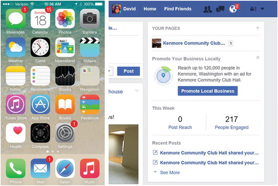
Figure 3-10. “Meatball” notifications of new content on smartphone (left) and web site (right).
If animation and red colors attract attention, then what’s the problem with more of it, you ask? The answer is that when we come to perceive them to be a constant in our environment, rather than an anomaly, they are incorporated into our neural model of the status quo, and we stop orienting to them. This is a form of habituationand it is the opposite of orienting. It is the gradual decrease in our likelihood to look if we are not rewarded. From the time we were monkeys, a rustle in the branches would cue us to look, but swaying branches in a swift breeze would be ignored.
Key Point
The more you trigger an orienting response with sound and animation, the more the attentional bottleneck will constrict and we will ignore it.
Habituation should concern you very much as a designer and a meme-maker: it means that the attentional bottleneck constricts even more the more you abuse it. And every time you exploit the orienting response, consider how others are too. Each time a red dot or bell tone takes our attention away from a task-positive activity, like for example using a smartphone navigation app while driving, there are potentially dangerous consequences. And this is only compounded when you consider our cars themselves might be flashing and beeping at us at the same time.
That is why good designers know to notify only when we will be reinforced for it. The makers of Slack , a team productivity tool, helped make the @mention feature go mainstream, in which we received a special alert when someone mentioned us by @name in a post. This helped us orient to group messages that called us out specifically or gave us an assignment that we did not want to miss. However, some of us began abusing the @channel feature, which sent one of these notices to everyone following a channel topic. Habituation was sure to ensue, so Slack put the brakes on it with a dialog box that asked if we were sure we wanted everyone to orient to our message (Figure 3-11).

Figure 3-11. Discouragement to send habituating notifications.
Even the most serious and justified use of push notifications must take care not to train us into habituation. Starting January 2013, millions of mobile phone users in the United States began receiving a text message with sound and vibration alerting them about a child abduction in progress (Figure 3-12). These were the result of a partnership between the Department of Justice, the FCC, and FEMA, and named “AMBER Alerts ” after an abducted Texas child whom law enforcement was unable to save in time in 1996. But on the DOJ web site , they acknowledged that these alerts should not be abused, and only issued when it was verified that a child was in danger and there was enough information for the public to actually help. “AMBER Alerts should be reserved for those cases that meet the AMBER criteria. Overuse of AMBER Alert could result in the public becoming desensitized to alerts when they are issued.“ ix
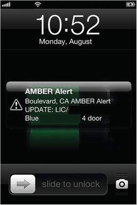
Figure 3-12. AMBER Alert on a smartphone.
If we are at risk of habituating to memes that are this important, we’re likely at risk of habituating to yours as well. If you cannot ascertain where our attention will be directed next and be waiting there for us, then treat every leveraging of our orienting response with the care of an AMBER Alert.
Notes
Yarbus A. L. (1967). Eye Movements and Vision. New York: Plenum Press. Repin, I. (1888). Unexpected Visitors. Oil on canvas.
Nielsen, J. (2006). F-shaped pattern for reading web content. Image used with permission from https://www.nngroup.com/articles/f-shaped-pattern-reading-web-content/ .
Marsh, G., Friedman, M., Welch, V., & Desberg, P. (1981). A cognitive-developmental theory of reading acquisition. Reading research: Advances in theory and practice, 3, 199–221. See also Spiro, R. J., Bruce, B.C., and Brewer, W.F. eds. (1980). Theoretical issues in reading comprehension: Perspectives from cognitive psychology, linguistics, artificial intelligence, and education. Routledge.
Evans, D. C, Johnson, J., Levine, J., & Duffy, R. (2011, October 24). Combined findings: Baseline and redesign usability testing. Proprietary study commissioned by the Washington State Employment Security Department. Used with permission. Eyetracking provided by Cascade Strategies.
Chen, A. & Jain, A. (2015). New data shows losing 80% of mobile users is normal, and why the best apps do better. Blog post retrieved from http://andrewchen.co/new-data-shows-why-losing-80-of-your-mobile-users-is-normal-and-that-the-best-apps-do-much-better/ .
Rodieck, R. W. (1998). The First Steps in Seeing (Vol. 1). Sunderland, MA: Sinauer Associates.
Cook, E., & Turpin, G. (1997). Differentiating orienting, startle, and defense responses: The role of affect and its implications for psychopathology. In Lang, P.J. (Ed); Simons, R. F. (Ed); Balaban, M. T. (Ed). Attention and Orienting: Sensory and Motivational Processes, (pp. 137–164). Mahwah, NJ, US: Lawrence Erlbaum Associates Publishers.
Diao, F., & Sundar, S. S. (2004). Orienting response and memory for web advertisements: Exploring effects of pop-up window and animation. Communication Research, 31(5), 537–567.
Department of Justice. Amber Alert Frequently Asked Questions. Retrieved October 29, 2016 from http://www.amberalert.gov/faqs.htm .
