Congratulations, your meme has penetrated a brain. It survived the attentional bottleneck. Now it needs to be interpreted as you intended; otherwise, we will not be able to decide its value to us. This is the perceptual bottleneck. We must interpret your carefully-arranged pixels to be that precise thing with that precise function that you intended, be it a download button, a play button, or even a dinosaur. If we do not, our attention will move on to something else.
You may feel that all you need to do to ensure we interpret your elements correctly is to label them well. But as you saw in the last chapter, we don’t often expend the cognitive resources to read, which it turns out is a rather effortful way to consume memes. Psychologists have known for decades that we are cognitive misers, meaning that we will allocate the least possible processing power to determine your value to us.
So as we are scanning your meme and the graphic elements that make it up, we employ Gestalt perception, which is a precognitive determination, a guess really, of what the elements mean or do based on the size, shape, position, or other elements around them. Precognitive means we judge your meme without thinking, and “Gestalt” is the German word for shape or form, meaning we judge your meme based on its appearance and the company it keeps. i To see how much context contributes to the meaning we perceive, read this text (Figure 4-1).
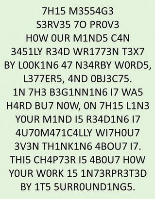
Figure 4-1. Demonstration of the influence of context on perception. ii
In a similar manner, long before we read the labels on your buttons, your float-over text, or your tagline under your logo, or much of anything, we've already determined for ourselves how your meme works and what it can do for us.
Key Point
Before we read the textual labels on graphic elements, we precognitively examine their form (Gestalt) and nearby elements to guess their function, so as to expend the least attentional effort to reach our goals.
Here’s an example. In 2007, Microsoft started selling perpetual versions of Office as a downloaded product rather than a store-bought DVD, taking advantage of the fact that most of us now had high-speed internet. Someone a lot like you had to design the download process. This was no small assignment; your interface brought in millions of dollars every month. After sending us through a pretty typical checkout, we came to the screen shown in Figure 4-2 where we could click a blue button labeled “Download Now ” to download what we had bought. Unfortunately, underneath the blue button, at the bottom-right of the box, appeared a promotional advertisement with a larger green button labeled “Get Started Now” (Figure 4-2).

Figure 4-2. Download dialog box for Office 2007 . Buttons enlarged for visibility.
Many of us clicked the lower, larger green button instead of the higher, smaller blue one, which took us away from our goal. Some never made it back.
Now mind you, we weren’t zoning out here in some task-negative haze; we had just spent as much as $400 and so we were devoting all of our task-positive attention on getting our reward. But as Gestalt theorists have told us for years, the size, shape, color, and positioning of objects are extremely influential on our correct perception of it, sometimes more so than the words. In this case, the wrong button was larger, making it seem more important. It was the same green color green as the graphic under the words “Thank You” in the progress bar at the top, both of which were oriented to the right, suggesting to us that their function was similar, and therefore we should click it next.
Finally, the wrong button was located lower in the dialog box. Graphic artists will tell you that humans often assume “progress reads left to right and rolls downhill,” again suggesting to us precognitively that the correct button was in the lower-right corner of the box.
After Microsoft listened to us explain this perceptual bottleneck in our own words, this is how they changed the screen (Figure 4-3). Many more of us downloaded Office successfully, and fewer of us called their help desk. The Office meme continued to populate the earth. Notice that the old button and the new one were identically labeled “Download Now .” But the revision helped to align the graphical treatment with the meaning, as Gestalt theorists would have recommended. The cost to fix this perceptual bottleneck was minimal, but the payoff was immense, as is often the case when minor design improvements are made to interfaces used by millions.

Figure 4-3. Redesigned download dialog box for Office 2007.
The Gestalt principles , as applied to digital media (Figure 4-4), assert that without really thinking, we assume the function of an element is related to others…
That are in close proximity
That are similar in color or shade
That are similar in size or shape
That are moving in the same direction ( common fate )
That are on the same line
That share a commonregion
That are graphically connected
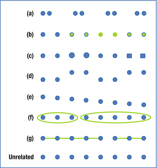
Figure 4-4. Notice how you precognitively group the shapes, following the Gestalt principles of (a) proximity, (b) common color or shade, (c) common size or shape, (d) common fate, (e) linear alignment, (f) common region, and (g) graphic connection.
When your graphical treatment is taking advantage of the Gestalt principles, the meaning of your elements is grasped without thinking. You will need far less text (if any) to explain what they do, and your meme will demand far less attention from us.
Perhaps the best example of leveraging Gestalt principles was found in the music play-along games like Rock Bandand Guitar Hero(Figure 4-5). The scrolling fret board on the screen matched the buttons on the faux-guitar controller in both color and position (from left to right: green, red, yellow, blue, and orange). With almost no explicit instructions, we knew what we had to do to play the game. This smart use of Gestalt principles helped millions of first-time users quickly learn the game and come to enjoy its rewards, no doubt contributing to the explosive success of this meme. For this reason, in 2007 IGN declared that Rock Band“may just be among the best party games ever released.” iii The game was so successful that the CEO of Electronic Arts admitted they were hard-pressed to meet the demand of the 2007 holiday season. iv
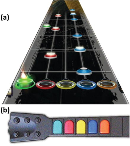
Figure 4-5. The (a) digital fret board and (b) guitar-shaped game controller, illustrative of play-along music video games.
Unfortunately, violations of the Gestalt principles are easier to find. Think of the difference between early TV remote controls and those of today (Figure 4-6). Early models were a simplistic grid of identically-sized buttons; they may have included a few colors and regions to communicate meaning, but they primarily relied on text. This design had two obvious problems: it demanded too much attention, which we preferred to allocate to the TV, and we could not use our sense of touch to find the right button in the dark when the text was unreadable. By contrast, later models used proximity, shape, and color more extensively. They can still improve, but today we can now use our Gestalt perceptions to a far greater extent to determine the meaning of the elements.
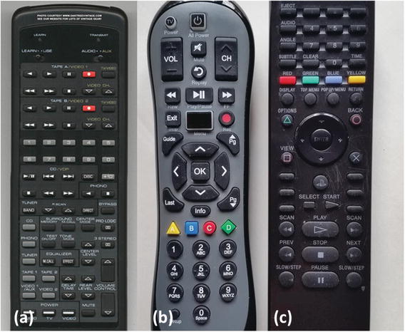
Figure 4-6. Early (a) and later-model (b, c) television remote controls.
Key Point
When your meme is taking advantage of the Gestalt perceptual principles, we grasp its function without thinking. When your design conflicts with Gestalt principles, our assumptions impair our ability to use it.
Here’s another hardware example. Most of us drive cars with windshield wipers that can be set to swipe at intervals from seldom to often, depending on how heavy it is drizzling. Sounds simple enough, so why do we have such trouble learning which way to turn the knob? Why do we seemingly need to perform another trial-and-error test every time we use it? Put another way, why is this so cognitive rather than precognitive? Violations of Gestalt are again to blame.
Look closely at the “wedge” graphic on the wiper control in the pictures in Figure 4-7. The design on the left marked (a) asks us to turn to the fat end of the wedge for a long interval and the skinny end of the wedge for a short interval. To interpret this graphic correctly, we need to invoke a negative: a fat wedge/long interval is for light rain and a skinny wedge/short interval is for heavy rain. Worse, the direction we must turn the knob does not share the common fateas the volume of rain (it is opposite, we dial the knob forward for less rain, and we dial it back for more rain). Very cognitive. Almost mind bending.

Figure 4-7. Windshield-wiper controls that are (a) less aligned and (b) more aligned with Gestalt principles of perception.
But on the right is another design marked (b), where the wedge is flipped upside down and aligned to the amount of rain (skinny for light rain, fat for heavier rain). Moreover, we dial it forward for more rain, and we dial it back for less rain. Way easier (and if we still don’t get the hint, they added a few raindrops to drive it home). In the second design, the graphic is labeled in a more Gestalt, precognitive , user-friendly way, and it works as we expect even when we cannot point our fovea at it.
This is not a trivial issue: if smartphones have suddenly interested lawmakers in the perils of distracted driving, shouldn’t they also examine the attentional demands that are already present? And as we try to bring computing services to commuters trapped in cars as they navigate sprawling suburbs to get to work, unfriendly designs of traditional car functions like this will steal attention from more useful memes. Users like us have long complained about software that is not user-friendly; the day has already arrived when cars are held to the same standard.
What if you don’t conform to Gestalt principles in your functional and graphic design? If you don’t, one of two types of errors will result: unrelated elements will look related and we will infer they have the wrong function (call that Type 1 error), and related elements will look unrelated and we will overlook their correct function (Type 2 error).
An example of Type 1 error where we infer the wrong function is found on the rightmost TV remote control back in Figure 4-6c. After pausing a video, we often press the stop button when we wanted to press play to resume the video. (This isn’t much of a problem when playing DVDs, but when streaming something from Netflix or Amazon, if we stop the video, it often takes several clicks and a good minute or two to resume while everyone in the room is yelling “hey!”) Due to the Gestalt principle of proximity, we assume the play button will be adjacent to the pause button, and when it is not, we press the stop button in error. Another example of Type 1 error , where we infer the wrong function, is the wrong download button for Microsoft Office that we described earlier, this time due to the Gestalt principles of size and color.
Here’s an example of Type 2 error , where we overlook the correct function of an element due to Gestalt principles. In 2013, SimplyMeasured.com a successful web site that sold social-media analytics underwent a redesign. In this screenshot, their catalogs of reports were presented as individual tiles (Figure 4-8a). Twitter reports were sometimes light blue and other times they were red; red was a color also shared by YouTube reports. Thus we overlooked them, assuming them to be unrelated although they were.
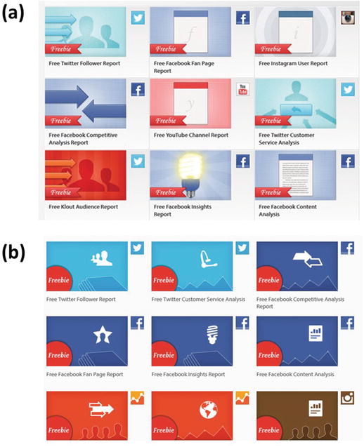
Figure 4-8. Tiles of analytical reports for sale (a) before a Gestalt redesign and (b) after a redesign. Similar reports were grouped together proximally and treated with similar colors. v
After the company did an easy redesign (Figure 4-8b), all of the Twitter reports were rendered light blue, all of the Facebook reports were dark blue, and the other reports were orange. A simple alignment of color and meaning communicated a lot of information without any text, including the number, nature, and type of reports they had in their catalog.
Another example of how a design led us to overlook an element due to Gestalt perceptions was the “lozenge” that appeared in Microsoft Office 2007 (Figure 4-9a). It looked like a logo to many of us, and it was located in the typical logo location at the top left of the app window, so we perceived it to be a non-functioning piece of pure art and didn’t think to click it. But we needed to click it to carry out important functions like saving our work or printing. Unable to find these functions due to our precognitive assumptions about the design, many of us descended into the costliest depths of cognitive demand hunting for them, often to no avail. (This was a pity, actually, because Office 2007 introduced the ribbon, which was a real usability win.) By 2010, Office had retired the lozenge and brought back the File menu we had come to know and use without much thought at all (Figure 4-9b).
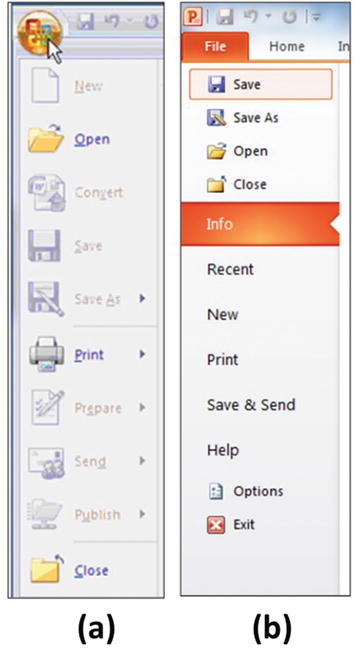
Figure 4-9. The File menu in (a) Microsoft Office 2007 and (b) Microsoft Office 2010.
One of the most impactful ways to survive the perceptual bottleneck is just to scrub your creation of common Gestalt errors, especially on web sites . Now that you know your users assume the function of an element is related to others…
…that are in close proximity, then remove crucial navigation links from the body of the page where ads are normally found.
…that are similar in color or shade, then make clickable links a different color (and don’t make any normal text blue and underlined).
…that are of similar size or shape, then don’t try to use anything other than a triangle pointed to the right to play a video.
…that are moving the same direction, then don’t show the steps of a wizard or a checkout process as tabs; show them as an arrow or a line.
…that are on the same line, then make a carousel for related elements and keep unrelated ones out.
…that share a common region, then put boxes around related elements and keep unrelated ones out.
…that are graphically connected, then sometimes you should just draw a line and connect the dots for us.
The final word we want to say about this is that we know you sometimes intentionally use Gestalt principles to trick us into thinking unrelated elements are related. We now see plenty of ads that look like posts from our friends or like legitimate news stories. This type of “contextual advertising” is very effective, leveraging similar size (of thumbnail photos), similar color (of text) and proximity (location among real posts) to get us to click. However, as Facebook saw after the 2016 U.S. presidential election, a company can face criticism when it tries to connect us to legitimate news at the same time it allows ads (which are not held to the same standards of journalistic integrity) to take on a similar Gestalt and blend in among them.
Another example involves the internet lists that we love so well, such as “23 photos taken moments before tragedy struck,” and “15 historical photos that will leave you breathless.” Sometimes we are truly rewarded for our attention; other times we are not. Inevitably, however, we will spot an advertisement somewhere near the slideshow that displays an arrow designed to resemble the button we need to click for the next slide.

Figure 4-10. The arrow in the ad above the slideshow is intended to mimic the functionality of the Next button below it.
This is fine, but we will eventually habituate to them as we do to ads that trick our orienting response. Treatments that initially appear similar are soon differentiated in our perception, and the mental effort it takes us to learn how you’re tricking us will soon become automatic and precognitive itself. At the same time, the price that these ad placements fetch almost inevitably falls over time, because anything that tricks a click is unlikely to close a sale since it is not in alignment with our goals. Thus the ROI on these ads will eventually disappoint your advertisers. Once again, it’s better to align with our goals than to derail them. The more you rob the bank, the less cash we leave there to steal.
Notes
Wertheimer, M. (1912). Experimentelle studien über das sehen von bewegung (monograph). Leipzig: JA Barth. See also Wagemans, J., Elder, J. H., Kubovy, M., Palmer, S. E., Peterson, M. A., Singh, M., & von der Heydt, R. (2012). A century of Gestalt psychology in visual perception: I. Perceptual grouping and figure–ground organization. Psychological Bulletin, 138(6), 1172.
Adapted from Schimp, E. (2014). Brain Study (If you can read this you have a strong mind.) Project created for Khan Academy. Retrieved from https://www.khanacademy.org/computer-programming/brain-studyif-you-can-read-this-you-have-a-strong-mind/4681788649635840 .
Goldstein, H., Blevins, T., Brudvig, E., & Clayman, D. (2007, November, 16). Rock band review. IGN. Retrieved from http://www.ign.com/articles/2007/11/17/rock-band-review-4 .
Plunkett, L. (2007, November, 1). Rock Band: Time to start worrying about availability. Kotaku. Retrieved from https://web.archive.org/web/20081216125617/http://kotaku.com/gaming/rock-band/time-to-start-worrying-about-rock-band-availability-318040.php .
Simply Measured. Retrieved January 2013 and January 2016 from http://simplymeasured.com . Adapted from Fram, A. (2013, January). Unpublished paper for coursework on the Psychology of Digital Media, University of Washington.
