
The last chapter examined how we your users correctly perceive the meaning of graphic elements, and how that’s crucial for the success of your apps, web sites, or entire operating systems.
But what if the element is a dinosaur and your meme is a video game , or a special effect for a motion picture (Figure 5-1)?

Figure 5-1. An impression of depth is key to the impactful perception of objects, especially in movie and game design. Image from ARK: Survival Evolved © Studio Wildcard. Used with permission.
Here you will need to use more than just the Gestalt principles to get us to interpret your digital innovation correctly. To get the reaction you want from us, the elements must appear to occupy three-dimensional space and move around in it the way we expect. If the dinosaurs in ARK: Survival Evolved and Jurassic Park didn’t evoke the sense that they were huge and chasing us, the games would have failed. Even the candy in Candy Crush had to have some appearance of depth to be convincing. We’re not sure we would have played "Colored Square Crush" quite as much.
The challenge is, most monitors are still flat, two-dimensional slabs, and so is everything displayed on them. So how do you make flat things look fat?
One of two ways: the fancy, expensive hardware way (using special forms of production and either active or passive goggles) or the cheap, effective software way (using only graphics). We’ll explain both, and then argue why the latter is essential and the former has historically been a waste of money.
Key Point
To give a sense of depth, you can use specialized production and eyewear to present slightly disparate images to each eye, or you can use less expensive graphic treatments that may be just as engaging.
To achieve dimensionality the hardware way, you somehow need to present a slightly different image to our right and left fovea. The images should be of the same object, but just from a slightly different angle. This retinal disparityhappens all the time because our two eyes sit side-by-side separated by an inch or two (unlike a Cyclops), and the slight disparity in their viewpoints leads us to perceive the object as a solid against a background rather than just more background (Figure 5-2). This phenomenon is called stereopsis.

Figure 5-2. Retinal disparity . The cube is sensed differently by each eye due to the lateral offset between them.
We can get the effect with these two slightly different images of Icelandic ponies (Figure 5-3). Alone each image looks flat, because both fovea see the same thing when we train them on one or the other. But if we hold them about 18 inches away and look through them to a point a few feet on the other side of the book or monitor (like we would a "magic eye" picture), we uncross our eyes and push out our focal point and thus show the left image to the left eye and the right image to the right eye. Soon, a middle image appears that "pops" with three-dimensionality.
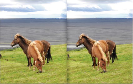
Figure 5-3. Disparate right and left images, which appear to have depth when viewed with crossed or uncrossed eyes. i
There it is, the illusion of depth. We’re not just looking at a picture of a ponies in Iceland, it feels like we’re in Iceland. If only you could convince us to sit through an entire movie or video game with our eyes uncrossed this way. Since that would only give us a headache, over the years you’ve introduced a number of hardware solutions to present different images to each of our eyes. While some of these memes have thrived, most have gone extinct or never made it off the Galapagos. The wide array of stereopsis goggles is a great example of a meme pool.
"Active goggles " or "stereoscopes " are a pair of mini-cinemas that try to trick us into seeing depth by showing different images to the two eyes. The current form lets us insert our smartphones , which are displaying a split screen like the image of the Icelandic ponies (Figure 5-4). No eye crossing needed, but these devices have tended to be too big and bulky for our liking (although View-Masters introduced in 1929 were a big hit). Size problems are usually solved over time with shrinking technologies, but smaller technologies are generally also more expensive.
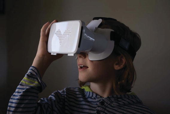
Figure 5-4. A virtual reality headset. ii
This is why we’ve seen the co-evolution of the "passive goggles" approach. Here, the two disparate images are projected externally, on top of each other, overlaid on the same screen. The passive goggles then blot out one of the images for each eye, leaving us to see the slightly disparate angles and get that sense of depth (Figure 5-5). The 1950s version of this overlaid red and blue images on each other, and the red and blue cellophane lenses in the goggles obscured one of them for each eye. Kudos for creativity, but this distorted the usual color of things. This was bad: in addition to depth, color is key to us interpreting images as the things they represent (precisely as we saw in the last chapter on the Gestalt principles). More recent solutions projected two polarized images to us while we wore polarized goggles. One frame showed images with light waves aligned northeast-to-southwest, and the next frame showed images aligned northwest-to-southeast.

Figure 5-5. Passive goggle use color or polarized lenses to block out a left or right image. In practice, the images will be superimposed; they are separated here for illustration.
By orienting our two polarized lenses the opposite way, they wiped out one of the images for each eye. (For an analogy, imagine looking at a white picket fence through a window with blinds. If the blinds are horizontal, we still see the fence; but if the blinds are vertical, the fence is hidden.) This has worked well and is affordable both in cinemas and on TVs, but the main criticism has been that the movie looks dark. We’re watching it through sunglasses after all.
These little complaints were not the biggest drag on 3D programming, nor was it always the expense to us, your intended audience (even though the prototype goggles-free 3D TVs cost most of us over a year’s worth of groceries). No, the biggest drag has been the expense to you, the movie and game producers. To offer us both 3D and 2D versions, you need to essentially shoot two different versions with different cameras, direction, and editing. Unless we showed a lot of interest in 3D, you weren’t likely to go to the trouble.
At first, we did show a lot of interest. In its opening weekend, Avatar 3D (2009) made over three times the revenue that the 2D version made. Shortly after, Alice in Wonderland 3D (2010) made twice what the 2D version did. But it has been all downhill from there (Figure 5-6). Toy Story 3 (2010) made the same amount in 2D and 3D, and Harry Potter and the Deathly Hallows (2010) actually made less in 3D than in 2D. On television, ESPN, BBC, and DIRECTV have all cut back or killed their 3D programming , and this is despite the fact that many of us could have easily watched it on our LED, LCD, and plasma TVs. All we needed to do is flip on the 3D feature and put on the passive goggles .
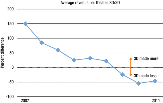
Figure 5-6. Difference in revenue between 3D and 2D films. Each data point represents the average of five major releases. Adapted from Engber (2011). iii
This drop-off in revenue had all the markings of a fad: we checked it out at first, but it didn’t keep us hooked. In fact, a very similar pattern was probably observed with 1950s 3D movies and the red-and-blue cardboard goggles. Plenty of pundits speculated why. iv Our view was that most movies and video games were already made with great depth perception achieved the software way, involving graphic treatments and our learned associations. Hardware-based stereopsis wasn’t a breakthrough innovation that gave us 3D for the first time; it was a tweak on how it was done. The 3D memes have failed so far to out-compete their 2D counterparts in part because they haven’t yet offered an experiential advantage worth the resources (or the bulky headgear) needed to enjoy them.
With shockingly few graphic tricks called monocular depth cues, we have always perceived flat objects to be dimensional solids with plenty of depth of field (even when we had no goggles, flat monitors, and at times only one good eye). The most widespread trick is light source vectors: brightly illuminating surfaces facing assumed light sources and darkening those facing away from them. Beyond that, we perceive objects to be more distant if…
they are partially obscured by otherobjects( interposition )
they appear smaller than we expect relative to objects whosesizewe know well ( relative size )
they are positioned near the narrow end of converging lines that we expect to be parallel(linear perspective, shown in Figure 5-7a )

Figure 5-7. Depth perception without stereopsis. v
their texture appears denser and less detailed than the texture elsewhere in our field of vision(texture gradients, shown in Figure 5-7b )
the light from them is more scattered and misty(atmospheric perspective, shown in Figure 5-7c )
the light from them is out of focus ( depth of field )
they shift very little when we move our heads left andright( motion parallax: objects that shift a lot are perceived to be closer)
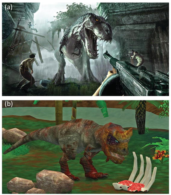
Take a look at these two pictures of dinosaurs in Figure 5-8 to see how the proper use of these principles by designers can achieve radically better dimensionality, as in the upper image (Figure 5-8a) compared to the lower one (Figure 5-8b).
Light source vectors: In the upper image (a), the sides of the gun, people, and the dinosaur pointed toward the light are more brightly lit than their shadowy other sides, so we perceive them to be a solid illuminated by the dim sun. In the lower image (b), we see this graphic trick done on the rocks, but not on the dinosaur or on the trees, which, as a result, look flat.
Interposition: The dinosaur in the upper image (a) obscures trees and ruins, so we perceive it to be closer. We almost forget that the image is completely flat and that no part of it is closer or farther.
Relative size: The dinosaur in the upper image (a) is positioned beside two men, whose circa six-foot height is so well-known to us that it is automatically assumed. This makes the dinosaur seem to be a towering height. In the lower image (b), no known object tells us the dinosaur’s size. It could be the size of a cat chewing on chicken bones for all we know.
Linear perspective: The the walls of the ruins in the upper image (a) appear to converge, although we’ve learned through much experience that they are usually parallel. This tricks us into thinking the flat image is as deep as a building. The lower image (b) does not employ this trick.
Texture gradients: In the upper image (a), we see every wrinkle in the dinosaur’s face, but on the feet, belly, and tail, that texture is smoothed out and nearly gone. This adds to the sense that the tail recedes into the background.
Atmospheric perspective: In the upper image (a), the mountains, ruins, and trees in the background appear shrouded in scattered light. Through learned experience, this primes us to think they are far away.
Motion parallax: This trick requires movement to see it, but it represented a great breakthrough in video games. As we move our avatar left and right with the controller, a good game will show near objects shifting radically left to right, but show distant objects shifting only a little. In the upper image (a), if we moved our heads left or right, we’d expect the gun to shift a lot, but the ruins less so. This gives a very keen sense of depth.
Our point is this: before you start building mini-cinemas for our fovea using expensive technology that may be cool - but bulky or unaffordable for both of us, consider whether your graphic treatment already gives a sufficient sense of depth. If it doesn’t, by all means have another pass at it. But if you are already leveraging these principles of depth perception, maybe you should focus next on the story, not the stereopsis.
Notes
Kúla (2016). Images captured with Kúla Deeper and processed with Kúlacode. Retrieved from http://www.kula3d.com/gallery.html . Used with permission.
Evans, G. A. (Photographer). (2016, November).
Engber, D. (2011, September 15). Who killed 3-D? Slate. Retrieved from http://www.slate.com/articles/health_and_science/science/2011/09/who_killed_3d.html .
Thomas, A. (2011). Why ’3D’ will fail… again. Blog post retrieved from http://www.dr-lex.be/info-stuff/3dfail.html .
Image (a) Evans, G. A. (Photographer). (2016, November). Image (b) Copyright itpow/123RF Stock Photo. Used with permission.
Ubisoft. (2005). Peter Jackson’s King Kong: The Official Game of the Movie. Discontinued game.
Oberon Media (2006). Zoo Tycoon 2 Dino Danger Pack. Discontinued game.