Styling the Theme with CSS
In addition to layout files, themes contain images, scripts, and the stylesheets that control the visual aspects of the site, such as colors, fonts, and placement of content. These assets go in the static/ directory of your theme. You’ll find both a css folder and js folder in your theme’s static folder.
To style your site, you could bring in any number of CSS frameworks, but for this site, you’ll build a very bare-bones layout by hand using plain CSS. Modern browsers have built-in support for newer CSS features like Flexbox[13] or CSS Grid, which makes it much less challenging to build a layout.
The theme you’re going to build in this book won’t win any design awards, but it will give you a place to start from and show you how to integrate CSS into your Hugo site.
Before diving into the CSS, let’s add more structure to the layout so you can have more control over the width of the page. This will be helpful on larger devices. Modify the baseof file to wrap everything in a div with the class of container, and change the existing div tag around the main block to an HTML main sectioning tag. The main tag will make it easier for assistive technology to identify the site’s main content, and the container div will let you control how wide the site is on larger monitors when you add the CSS:
| | <!DOCTYPE html> |
| | <html> |
| | {{- partial "head.html" . -}} |
| | <body> |
| » | <div class="container"> |
| | {{- partial "header.html" . -}} |
| » | <main> |
| | {{- block "main" . }}{{- end }} |
| » | </main> |
| | {{- partial "footer.html" . -}} |
| » | </div> |
| | </body> |
| | </html> |
Save the file.
Now, create the stylesheet itself. Since you’re making a theme, create the file themes/basic/static/css/style.css.
In the file, add this code to define the width of the container:
| | .container { |
| | margin: 0 auto; |
| | width: 80%; |
| | } |
Next, define the background and foreground colors for the navigation bar and footer of the site, and center the text in both:
| | nav, footer { |
| | background-color: #333; |
| | color: #fff; |
| | text-align: center; |
| | } |
On small screens, the navigation elements will need to stack as a list; on larger screens, the navigation can be a long horizontal navigation bar. Add this code to style the navbar for both small and large screens:
| | nav { |
| | display: flex; |
| | flex-direction: column; |
| | } |
| | |
| | nav > a { |
| | flex: 1; |
| | text-align: center; |
| | text-decoration: none; |
| | color: #fff; |
| | } |
| | |
| | @media only screen and (min-width: 768px) { |
| | nav { flex-direction: row; } |
| | } |
This code defines the nav element as a Flexbox region and defines the elements in the region to flow as a column. It then sets the anchor elements within the navbar as flex elements, evenly spaced apart. After that, it defines a color for each element and centers the text for each link. From there, using a media query targeting on larger screens, it redefines the flex-direction to align the contents as a row.
Finally, in the head.html partial, add a link tag to load a stylesheet named style.css, which will be located in the css directory:
| | <head> |
| | <meta charset="utf-8"> |
| | <meta name="viewport" content="width=device-width, initial-scale=1"> |
| | <title>{{ .Site.Title }}</title> |
| » | <link rel="stylesheet" href="{{ "css/style.css" | relURL }}"> |
The relURL function creates site-root-relative link to the file instead of an absolute link that contains the site’s domain name. For ease of development and deployment, you should use relative URLs whenever possible. When Hugo generates the site, it’ll copy the contents of the themes/basic/static directory, including all subdirectories, into the public directory, so your CSS file will be located at /css/style.css.
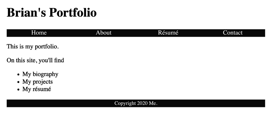
Save the file and switch back to your browser. The styles are applied to the page and you have a basic theme. In Chapter 7, Managing Assets with Pipes, you’ll explore more things you can do with CSS.
In this chapter, you kept the stylesheet in the static directory of the theme instead of in the static directory in your Hugo site. It’s best to follow this convention and use your site’s static directory for images or other assets that are specific to your site, and keep things that are specific to the theme within the theme’s directory structure. When you generate your site, Hugo will grab files from both places and put them in the public directory. If you name files the same, the ones in your site’s static directory will override the ones in the theme.