
Chapter 4. Exploring Controls
iOS has always had a place for innovative custom UIs, but it’s often a good idea to start with the standard controls provided by the platform. On Apple Watch, standard controls are (for now) the only option—but as we take a tour of the available interface elements, you’ll see that there’s still plenty to work with on the new platform.
House Rules
As we take a look through the Object Library and the APIs, almost everything has a similar and direct analog available on the larger iOS devices. But let’s pause for a moment and review some small but important differences in the Watch environment (which we are sure will be no trouble to an intelligent, creative, and insightful developer such as you, dear reader).
 The user interface and the controls it contains are defined during development using the storyboard editor. In contrast to iOS, you can’t create the UI in code. If you are one of those developers who prefer to avoid the visual editor, then you’ll find it’s time to dip your proverbial toe in its waters.
Even so, some properties of the controls can be set at run time (how else would you update a label to give your user information that you didn’t have at build time?), but only some. Others can be set only in the storyboard editor. We’ll identify which properties on each control can be dynamically updated as we examine each.
Where values can be set to controls, they cannot be read by your Watch app. For example, you can set a switch to on from your interface controller, but you cannot read from it whether it is on or off. Instead, you must wire up the switch’s change event to an @IBAction method in your controller and keep track of state changes in a property.
This might sound like the Watch presents an even more restrictive environment than we’re used to as developers for iOS platforms, but as you saw when exploring the available navigation options (Chapter 3), you can do a lot with what’s available.
WatchKit Controls
All interface objects (what we refer to as “controls”) in WatchKit are subclasses of WKInterfaceObject. Apps are limited to using and configuring the standard controls, so we can’t work with our own subclasses of WKInterfaceObject—or of any of its subclasses (which are the controls in the following sections). Any configuration is done in the storyboard editor or via @IBOutlet properties in your interface controllers.
WKInterfaceObject provides common methods for hiding and showing the control, changing its size, and setting its accessibility attributes. We’ll refer to hiding, showing, and changing size methods as you learn about the available controls, and we’ll look in detail at the accessibility options in Chapter 6.
Simple Display Controls
The following controls are for displaying data to the user. They do not accept user interaction.
Labels
Where would we be without labels in our user interfaces? The humble label is the first option to display text to the user in any iOS app, and it’s the first option in your Watch app as well.
The WKInterfaceLabel is analogous to UILabel and is configurable in some of the same ways: text (of course), text color, font, minimum scale and maximum number of lines (to handle long text values), and alignment. Additionally, text color can be set at run time with the label’s setTextColor(_:) method. The text displayed by the label can be updated with the setText(_:) and setAttributedText(_:) methods. The latter, as you’d expect, allows configuration of the text’s style.
WKInterfaceDate and WKInterfaceTimer (Figures 4.1 and 4.2) are two special label classes that are a new idea to WatchKit.


WKInterfaceDate always displays the current date, the current time, or both. The storyboard editor is used to configure the format of the displayed date–time information, using setTextColor(_:), setTimeZone(_:), and setCalendar(_:), which are available at run time. This control makes it trivial to display the current date and time in your app.
WKInterfaceTimer is equally specialized. It manages, displays, and updates a countdown timer, with the format and displayed units configurable in the storyboard editor. The Enabled check box in the Timer (Figure 4.3) specifies whether the timer starts counting down immediately when the interface is initialized.

The timer label is managed programmatically using its setDate(_:), setTextColor(_:), start(), and stop() methods. Once started, the timer will count down to its target date without any further management from your app.
 Tip
Tip
Your app receives no notification or callback when the timer reaches zero. If your app needs to take any action when the timer is up, you should run an NSTimer object set to the same target date. Remember that your interface control has no way to communicate with the code running in your WatchKit extension.
Images
The WKInterfaceImage is used to display an image, or an animation made up of a series of images, in your Watch app’s interface. Use the storyboard editor to configure the initial image, its content mode, the tint color for template images, and whether the control is able to animate. At run time, a number of methods are available to set the image or images, to set the tint color, and to start and stop animation.
As has been the case since the early days of the web (on iOS and other platforms), the humble image control is a very powerful tool for setting the look and feel of your app, communicating information, or even adding a little whimsy or delight for the user. We’ll spend significant time in Chapters 5 and 6 looking at how to get the best out of WKInterfaceImage.
Maps
The WKInterfaceMap control (Figure 4.4) takes much of the pain out of displaying a map to the user. Its output is essentially a specialized image—the map is not interactive. However, you can configure it to launch the Maps app to the location in the map control—simply set it to Enabled in the storyboard editor.

The Enabled property is the only configuration available in the storyboard editor—all other configuration must be made at run time from your interface controller.
The area covered by the map is set either with its setVisibleMapRect(_:) method or with setRegion(_:). Which you use depends on how your app defines its areas—with an MKMapRect or with an MKCoordinateRegion. In either case, the map control adjusts the area it displays and its zoom level to make sure the area specified is visible.
It is also possible to add image annotations to the map (addAnnotation(_:withImage:centerOffset:) and addAnnotation(_:withImageNamed:centerOffset:)) or to add pins (addAnnotation(_:withPinColor:)). The method removeAllAnnotations() does what it says, clears the map of annotations.
 Note
Note
Remember that the map will not display if the user’s phone doesn’t have a network connection. As with the Maps apps on iPhone and on the Watch, map data is downloaded as needed.
Interactive Controls
Displaying information to the user is, of course, only half the story. WatchKit offers buttons, switches, and sliders for all your users’ tapping needs.
Buttons
WKInterfaceButton is a tappable control that should be connected to an @IBAction method in an interface controller. The signature of this method is slightly different from the equivalent on iOS, taking no parameters:
@IBAction func buttonTapped()
The other notable difference is that a button can contain multiple other interface objects, acting as a group (see the “Control Groups” section later in this chapter for a discussion of WKInterfaceGroup), as well as the expected single text label. This is configured using the Content property in the storyboard editor.
You can configure buttons with different fonts, text colors, background colors, and background images, as well as with the title text itself. You may also enable or disable the button. These properties can be set programmatically as well as in the storyboard—title color and font being managed via the setAttributedTitle(_:) method, whereas the background is updated using the setBackgroundColor(_:), setBackgroundImage(_:), setBackgroundImageData(_:), and setBackgroundImageNamed(_:) methods. Figure 4.5 shows examples of how a button can be configured.

Switches
WKInterfaceSwitch is a control that displays the familiar on/off switch with a label beside it. The class and its properties manage both the switch itself and the label for you (Figure 4.6).
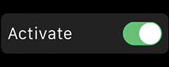
Because it’s not possible to query controls for their state, the switch’s action method takes the following form:
@IBAction func switchSwitched(value: Bool)
When the method is called, your interface controller should stash the state of the switch in a property if necessary. When creating the switch in the storyboard editor, you may configure its initial state, the color of the switch’s On state, whether it is initially enabled, and the text, color, and font for the switch’s label.
At run time you can use setTitle(_:) or setAttributedTitle(_:) to update the switch’s label, setOn(_:) and setEnabled(_:) to update its state and whether it’s active, and setColor(_:) to update its On color.
Sliders
WKInterfaceSlider allows the user to select a value within a defined range—think of the volume slider in iPhone’s Music app or the volume control in the Watch’s Now Playing glance (Figure 4.7).

The minus and plus buttons visible in Figure 4.7 are provided by default. They can be replaced with custom images, which must be part of the WatchKit App bundle when distributed.
The value of the slider is represented as a Float and is delivered to your interface controller via an action method with the following signature:
@IBAction func sliderSlid(value: Float)
As with the switch control, your interface controller should store the state value as necessary.
The slider presents quite a number of configuration options, most of which must be managed in the storyboard editor:
The value of the slider is initially set in the storyboard and can be updated at run time with the setValue(:_) method.
The minimum and maximum possible values.
The number of steps the slider recognizes between those two values. This can also be set in code with setNumberOfSteps(_:).
Whether the slider displays as a continuous, solid bar or as a row of segments.
The color of the slider bar, also configurable with the setColor(_:) method at run time.
Custom min image and max image for the slider’s minus and plus buttons.
Whether or not the slider is enabled. You can update this state at run time with setEnabled(_:).
Movies
Your app can play video via a WKInterfaceMovie control. This control displays a poster image and a play button for the video file (Figure 4.8); tapping the play button plays the video in a modal presentation.

We’ll demonstrate using WKInterfaceMovie when exploring the media capabilities of Apple Watch in Chapter 12.
Structural Controls
A WKInterfaceController’s user interface is arranged quite differently from a view hierarchy on iOS in that it takes a series of controls and flows them down the screen. If you’ve ever written HTML for a webpage, this might feel familiar. As with HTML, there are options (although not nearly as many as on the web) for managing this flow by using some structure controls.
Control Groups
WKInterfaceGroup is an interface object designed to contain other interface objects, and although it may not sound very exciting (it’s a box!), this control enables a great deal of customization for how its members are displayed (Figure 4.9).

Figure 4.10 shows the configuration options available for an interface group. A group can display a background of a solid color or an image—the image can even be animated! If used, the background has a default corner radius of 6 points. Modifying the group’s edge insets and spacing will vary how much of the background is visible around and between items in the group. The interface group’s layout can also be configured to flow its contained items horizontally or vertically.
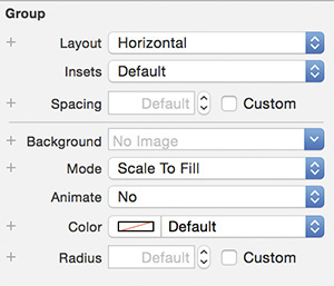
The properties that can be updated at run time are
Background color, with setBackgroundColor(_:).
Background image, with setBackgroundImage(_:), setBackgroundImageData(_:), and setBackgroundImageNamed(_:).
Corner radius, with setCornerRadius(_:).
Background image animation can be controlled with methods that mirror those on WKInterfaceImage: startAnimating(), startAnimatingWithImagesInRange(_:duration:repeatCount:), and stopAnimating().
Separators
After the whirl of options available on an interface group, WKInterfaceSeparator is delightfully simple. It’s a horizontal line to separate controls, and you can set its color in the storyboard editor and in code via its setColor(_:) method. That’s it.
Tables
Working with table views is the bread and butter of many iOS developers. WKInterfaceTable is different enough from UITableView that we’ll take some time to work with it and its API.
1. In Xcode, create a new iOS project, and add a WatchKit App target.
2. In the WatchKit App’s storyboard, add a table to the interface controller scene (Figures 4.11 and 4.12).


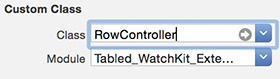
3. Add the source file for a class named RowController to the WatchKit extension. It should be a subclass of NSObject (Figure 4.13).

4. Update the contents of RowController.swift to the following:
import WatchKit
class RowController: NSObject {
@IBOutlet weak var listLabel: WKInterfaceLabel! {
didSet(oldValue) {
listLabel.setTextColor(UIColor.greenColor())
}
}
}
5. In the WatchKit App’s Interface.storyboard, select the table’s table row controller in the left sidebar. Open the Identity inspector and set the table row controller’s Class setting to RowController (Figure 4.14). The Module setting will update automatically.
6. Open the table row controller’s Attribute inspector, and set its Identifier to RowController.
7. Add a label to the row controller’s group, and connect it to the row controller’s listLabel property (Figure 4.15).

8. Replace the contents of InterfaceController.swift with the following:
import WatchKit
import Foundation
class InterfaceController: WKInterfaceController {
@IBOutlet weak var listTable: WKInterfaceTable!
}
9. Connect the table in the storyboard to the @IBOutlet you have just defined.
10. Add the following two methods to the InterfaceController class:
override func awakeWithContext(context: AnyObject?) {
super.awakeWithContext(context)
updateTableItems()
}
func updateTableItems() {
let listOfThings = [
"Apple", "Banana", "Pear", "Orange", "Lemon",
"Guava", "Melon", "Starfruit", "Grape"
]
let numberOfThings = listOfThings.count
listTable.setNumberOfRows(numberOfThings, withRowType: "RowController")
for i in 0..<numberOfThings {
let rowController = listTable.rowControllerAtIndex(i) as! RowController
rowController.listLabel.setText(listOfThings[i])
}
}
11. Add the following method to the same class:
override func table(table: WKInterfaceTable, didSelectRowAtIndex rowIndex:
Int) {
let rowController = listTable.rowControllerAtIndex(rowIndex) as!
RowController
rowController.listLabel.setTextColor(UIColor.redColor())
}
12. Run the WatchKit App, you should see a list of fruit (Figure 4.16). Tapping a row will turn its label red.

This example demonstrates the basics of setting up and populating a WKInterfaceTable. Note the following details of using a table:
The table is populated all at once when the data is available. This is in contrast to the approach taken on iOS, where the UITableView asks its data source for each cell to display in turn as needed.
Access to an individual row, perhaps to update some property of its UI, is simple using rowControllerAtIndex(_:).
The idea of a “row controller” is implemented in two parts. First, in the storyboard, the row controller is created and its UI is defined. Then, it’s necessary to create a custom class (RowController in our example) to associate with that UI. Instances of this class are how you interact with the interface items of a given row. The table identifies the row controller types by their Identifier properties and instantiates them according to their Class settings.
In this example, we have used only a single type of row in the table. However, you can define multiple row controllers on a table by increasing its Rows attribute in the storyboard editor. Interface controller code can then reference the different row controller types by their differing Identifier attributes.
Tip
In the storyboard, a table’s Rows attribute represents the number of different row controllers, whereas the actual number of rows in the table at run time is provided by your interface controller.
Three methods on WKInterfaceTable allow you to specify which row types to use:
setNumberOfRows(_:withRowType:), the method used in the example, specifies the number of rows in the table and assigns the same row type to each of them.
setRowTypes(_:) takes an array of strings that are the identifiers for the row controllers. The array should contain one string for each row that should be displayed in the table.
insertRowsAtIndexes(_:withRowType:) takes the identifier of the row controller to use for the inserted rows.
In each case, as seen in the example, you access the row controller object for a given row using the table’s rowControllerAtIndex(_:) method.
It’s possible to add and remove table rows without re-creating the row set for the whole table. This is done using the methods insertRowsAtIndexes(_:withRowType:) and removeRowsAtIndexes(_:). The interface controller can trigger a scroll to a specified row by calling scrollToRowAtIndex(_:) on the table.
Finally, it’s possible to define segues in the storyboard that are triggered by taps on table rows. (This will be familiar to you if you’ve ever configured a UITableView to trigger a segue on iOS.) When one of these segues is triggered, the table’s interface controller receives one of the table segue callbacks asking for the context to be received by the incoming interface controller’s awakeWithContext(_:) method. These callback methods are contextForSegueWithIdentifier(_:inTable:rowIndex:) and contextsForSegueWithIdentifier(_:inTable:rowIndex:). Which is called depends on the target and type of the segue, the latter being the method called when transitioning to a modal presentation of paged interface controllers.
Pickers
One of the features of Apple Watch most talked about when it was announced was its digital crown, which provides a smooth, intuitive hardware interface for the user to scroll onscreen content. Developer access to the digital crown’s scrolling action is via the WKInterfacePicker control.
WKInterfacePicker allows your app to define a series of options (represented by instances of the class WKPickerItem), providing text, an image, or both for each. The user selects the picker by tapping it. They can then use the digital crown to scroll through the available options, and then tap the control again to select the current option.
Tip
Interacting with pickers in the Apple Watch simulator is delightfully intuitive. Simply click the picker to give it focus (if it is not already focused), then use your normal scrolling action via the trackpad or mouse to simulate the movement of the digital crown.
There are three types of picker your app can use:
The List picker (Figure 4.17) displays a list of options and allows the user to scroll through them and select one. Each item may have an accessory image, a title, both an accessory image and a title, or a content image.

The Stacked picker animates through a virtual stack of cards, displaying one at a time onscreen, with a whimsical transition between items. Each item should be assigned a content image.
The Image Sequence picker cycles through a series of images according to the user’s scrolling of the digital crown, displaying one at a time. The images are supplied via the picker items’ contentImage properties. This picker type differs from the behavior of the Stacked picker in that the transition isn’t animated. If the picker’s focus highlight (the green outline visible in Figure 4.17) is disabled and the sequence of images is constructed with care, this option might give you all kinds of ideas for custom UI. (See Chapter 6 for another approach to using a picker to control an animation: with its setCoordinatedAnimations(_:) method.)
Note that the Stacked and Image Sequence pickers (Figures 4.18 and 4.19) look identical. The difference is in the transition—or lack of transition, in the Image Sequence picker—between the items.


Each type of picker is configurable in two ways in the storyboard editor:
The Focus property of the picker in the storyboard editor controls whether the picker is outlined to show when it is in focus (responding to digital crown input), whether it shows its caption in addition to its focus ring (Figure 4.20), or whether there is no indication that the picker has focus.
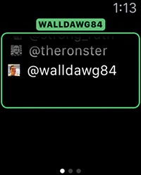
The Indicator property specifies whether or not the picker gives an indication of its current display in the list of items. The indicator can be seen in Figure 4.17, and is reminiscent of UIScrollView’s scroll indicators on iOS.
As with other controls, WKInterfacePicker has a setEnabled(_:) method to set whether or not it is available for the user to interact with. It can be given focus programmatically with a call to its regally named focusForCrownInput() method.
The picker’s items are set via its setItems(_:) method, which accepts an array of WKPickerItem instances. The currently selected item is specifiable by its index, via the setSelectedItemIndex(_:) method. Each picker item has the following properties available for configuration:
contentImage is available to all three types of picker: it’s the only property used by Stacked and Image Sequence pickers, and if it’s set in the WKPickerItems to be consumed by a List picker, then the other properties should not be set.
title is the text used by a List picker.
accessoryImage is the small image used by a List picker, displayed next to its title.
caption is the text used in the picker’s caption area, if it’s enabled (Figure 4.20).
Note
The images accepted by WKPickerItem’s image properties are of the type WKImage. These can be created from instances of UIImage by calling WKImage’s init(image:) initializer.
Finally, to let your app respond to the changing selection of the picker, the picker can send an action method to its interface controller. The method takes the form @IBAction func pickerAction(index: Int) and receives the index of the picker item selected by the user.
Alerts
It’s possible to display an alert, with options for the user, in much the same way as using UIAlertController (or the older, deprecated API UIAlertView) on iOS. Although alerts don’t involve subclasses of WKInterfaceObject, we include them here because they are a natural fit in our tour of UI controls.
An alert is triggered with a call to WKInterfaceController’s method presentAlertControllerWithTitle(_:message:preferredStyle:actions:). The actions parameter takes an array of WKAlertAction instances.
To see the alerts in action, carry out the following steps:
1. Create a new iOS App with WatchKit App project (File > New > Project).
2. In the WatchKit App’s Interface.storyboard, add a button as shown in Figure 4.21.

3. Update your InterfaceController.swift file to have an empty implementation, as follows:
import WatchKit
import Foundation
class InterfaceController: WKInterfaceController {
}
The button will be updated depending on the option chosen by the user when the alert is presented.
4. Add the following enum and property inside (since Swift allows nested types, and this enum is of interest only inside the class—yay!) the curly brackets of the InterfaceController class:
enum ButtonState {
case OutOfDanger, Danger, Exploded
}
var buttonState = ButtonState.Danger
5. Create the following @IBAction and @IBoutlet in InterfaceController, and connect both to the button in the storyboard:
@IBOutlet var dangerButton: WKInterfaceButton!
@IBAction func dangerTapped() {
presentAlertControllerWithTitle("Danger!",
message: "What will you do?",
preferredStyle: .Alert,
actions: alertActions())
}
We then need to define the actions for the alert.
6. Define the method referenced in the previous call:
func alertActions() -> [WKAlertAction] {
return [
WKAlertAction.init(title: "Deal with it",
style: .Default) {self.buttonState = .OutOfDanger},
WKAlertAction.init(title: "Ignore it",
style: .Cancel) {self.buttonState = .Danger},
WKAlertAction.init(title: "Explode it",
style: .Destructive) {self.buttonState = .Exploded}
]
}
Next, the button needs to be updated according to the value of the buttonState property. The time to do this is in the willActivate() method.
7. Add the following code to the interface controller:
override func willActivate() {
super.willActivate()
updateButton()
}
func updateButton() {
switch buttonState {
case .OutOfDanger: outOfDanger()
case .Danger: danger()
case .Exploded: exploded()
}
}
8. Add the following three methods to set the different button states:
func outOfDanger() {
dangerButton.setTitle("Phew")
dangerButton.setEnabled(false)
}
func danger() {
dangerButton.setTitle("DANGER!")
dangerButton.setEnabled(true)
}
func exploded() {
dangerButton.setTitle("BOOM!")
dangerButton.setBackgroundColor(.redColor())
dangerButton.setEnabled(false)
}
Tip
The InterfaceController class here uses an enumeration to track the state of the button and update the UI accordingly because the interface controller will be deactivated while the alert is shown. This means the button will not respond to the calls to its setters in the alert handlers, and needs to be updated when willActivate() is called on the controller. To save future-you some debugging pain, you might want to remember this moment.
9. Run the app and tap the button. You should see the alert appear, as in Figure 4.22.
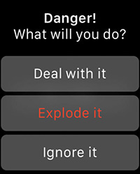
The preferredStyle parameter in the call to presentAlertControllerWithTitle(_:message:preferredStyle:actions:) in step 5 is a case of the WKAlertControllerStyle enumeration. The available cases are
Alert dispays a simple, flexible alert with a variable number of actions. This is the style used in the example.
SideBySideButtonsAlert accepts only two actions and displays their buttons side by side (Figure 4.23).

ActionSheet accepts either one or two custom actions and comes with a standard Cancel button in its top corner (Figure 4.24).

As an exercise, we suggest you try modifying the previous example to display alerts matching those in Figures 4.23 and 4.24.
User Input
You might have noticed that none of the interface objects is anything like our old friends UITextField or UITextView from iOS. Textual input on the Watch is a very different proposition from other devices. We’ll look at it in detail in Chapter 11.
Wrapping Up
This chapter skimmed over all the interface controls available from WatchKit. Knowing the blocks from which you build your user interface is only part of the story. Designing UI for the Watch is a very different prospect from doing so for larger devices. Read on to Chapter 5 to learn how to effectively combine these pieces in your app.