Chapter 10: Conclusion
In this book, we’ve covered some of the finer points and broad strokes of CSS. In some ways, we’ve only scratched the surface.
With the CSS Working Group’s switch to modularized specifications and shorter browser release cycles, new CSS features are created and implemented much more quickly. Attempting to keep up and stay ahead of the curve can leave your head spinning. Indeed, there are a few specifications and features that we’ve barely mentioned in this book.
So what’s on the horizon?
CSS Shapes
Web page layouts have historically been limited to rectangles of varying sizes—and sometimes circles with the help of border-radius. With CSS Shapes, however, we’ll soon be able to flow content into and around complex, non-rectangular shapes.
Let’s look at a simple example using a floated element and some accompanying text:
<div class="shape"></div>
<p class="content">Integer venenatis, nisi sed congue ...</p>
And we’ll use the following CSS:
.content {
    width: 600px;
}
.shape {
    background: purple;
    shape-outside: polygon(0 0, 100% 40%, 100% 100%, 80% 100%);
    clip-path: polygon(0 0, 100% 40%, 100% 100%, 80% 100%);
    float: left;
    width: 300px;
    height: 300px;
    margin: 20px;
}
The shape-outside property determines how other elements in the document will flow around .shape. To start with, in order to make elements actually flow around .shape at all, we’ve added float: left:

However, the background color of .shape doesn’t follow the edges of the polygon created with shape-outside. For that, we need to set a clip-path value equal to that of shape-outside. That gives us the layout shown below.

Firefox 62+, Chrome 37+ and Safari 10.1+ all support CSS shapes by default. In Microsoft Edge, it’s still under consideration. It’s fine to use it with progressive enhancement. Just be sure to include an alternative layout for browsers that lack support.
Perhaps surprisingly, the clip-path property isn’t defined by the CSS Shapes specification. Instead, it’s outlined in the CSS Masking Module Level 1. All current major browsers support the use of clip-path with SVG documents. All except Microsoft Edge support the use of clip-path with HTML elements as well. Safari ≤ 12 and Chrome versions 24–54 require a -webkit- vendor prefix (for example, -webkit-clip-path).
CSS Masking
Masking is another CSS feature that’s coming to browsers. It may be familiar to you if you’ve ever worked with graphics editors such as Photoshop, Acorn, or GIMP. It’s an effect created when one layer hides—masks—portions of another layer, as illustrated below.

Let’s look at an example. We’ll add a mask to the paragraph:

In CSS, masks are created using the mask-* family of properties. To create a mask, use mask-image. Its value should be a url() or a CSS image such as linear-gradient or radial-gradient.
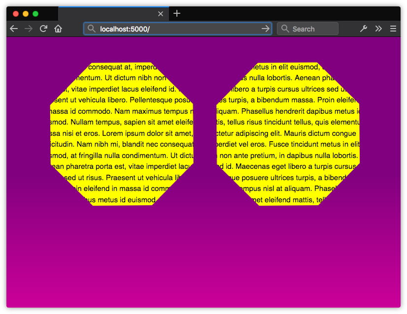
We’ll use an image named octagon.svg to illustrate. Since this is a scalable vector image, we’ll also set the size of the mask using mask-size. The mask-size property works much like the background-size property and accepts the same values:
p {
    background: yellow;
    color: #000;

    /* For WebKit and Blink browsers. */
    -webkit-mask-image: url(octagon.svg);
    -webkit-mask-size: auto 100%;

    /* For browsers that support the unprefixed properties. */
    mask-image: url(octagon.svg);
    mask-size: auto 100%;
}
Figure 10-5 shows the result. Notice that the visible parts of the paragraph fall within the octagon shape. Other areas of the paragraph are hidden from view.
We can also combine the lines above using the mask shorthand property:
p {
    background: yellow;
    color: #000;

    /* For WebKit and Blink browsers. */
    -webkit-mask: url(octagon.svg) / auto 100%;

    /* For browsers that support the unprefixed properties. */
    mask: url(octagon.svg) / auto 100%;
}
Although the clip-path property of the CSS Masking specification is widely supported, support for other properties is less robust. Firefox (version 53 and later) is furthest along. It supports all of the properties defined by the specification.
Chrome, Safari, and Samsung Internet support most masking properties. They do, however, lack support for mask-composite, and all mask-* properties still require a -webkit- vendor prefix. Microsoft Edge 18+ doesn’t yet support the mask-box-* properties.
The Mozilla Developer Network has a more detailed overview of mask and related properties.
Scroll Snap
As the web platform grows, it has also gained features that mimic native applications. One such feature is the CSS Scroll Snap Module. Scroll snap lets developers define the distance an interface should travel during a scroll action. You might use it to build slide shows or paged interfaces—features that currently require JavaScript and expensive DOM operations.
Scroll snap as a feature has undergone a good deal of change. An earlier, 2013 version of the specification—called Scroll Snap Points at the time—defined a coordinates-and-pixels-based approach to specifying scroll distance. This version of the specification was implemented in Microsoft Edge, Internet Explorer 11, and Firefox.
Chrome 69+ and Safari 11+ implement the latest version of the specification, which uses a box alignment model. That’s what we’ll focus on in this section.
Watch Out for Tutorials That Cover the Old Spec
Many of the scroll snap tutorials currently floating around the web are based on the earlier CSS Scroll Snap Points specification. The presence of the word “points” in the title is one sign that the tutorial may rely on the old specification. A more reliable indicator, however, is the presence of the scroll-snap-points-x or scroll-snap-points-y properties.
Since scroll snap is really well-suited to slide show layouts, that’s what we’ll build. Here’s our markup:
<div class="slideshow">
  <img src="avocado-and-bacon-salad.jpg" alt="avocado and bacon salad">
  <img src="salad-eggs-and-scallops.jpg" alt="salad topped with hard boiled eggs, seared scallops">
  <img src="seafood-and-noodles.jpg" alt="seafood stew over noodles">
  <img src="grilled-salmon-and-side-salad.jpg" alt="grilled salmon steak, avocado and side salad">
  <img src="avocado-toast-with-egg.jpg" alt="avocado toast with egg">
</div>
That’s all we need. We don’t need to have an outer wrapping element with an inner sliding container. We also don’t need any JavaScript.
Now for our CSS:
* {
    box-sizing: border-box;
}
html, body {
    padding: 0;
    margin: 0;
}
.slideshow {
    scroll-snap-type: x mandatory; /* Indicates scroll axis and behavior */
    overflow-x: auto;              /* Should be either scroll or auto */
    display: flex;
    height: 100vh;
}
.slideshow img {
    width: 100vw;
    height: 100vh;
    scroll-snap-align: center;
}
Adding scroll-snap-type to .slideshow creates a scroll container. The value for this property, x mandatory, describes the direction in which we’d like to scroll, and the scroll snap strictness. In this case, the mandatory value tells the browser that it must snap to a snap position when there’s no active scroll operation. Using display: flex just ensures that all of our images stack horizontally.
The other property we need is scroll-snap-align. This property indicates how to align each image’s scroll snap area within the scroll container’s snap port. It accepts three values: start, end, and center. In this case, we’ve used center, which means that each image will be centered within the viewport:

For a more comprehensive look at Scroll Snap, read “Well-Controlled Scrolling with CSS Scroll Snap” from the Google Web Fundamentals guide.
Blend Modes and CSS Filters
Visual effects is another area of CSS with some interesting activity. Aside from transforms, there are two specifications to keep an eye on: Compositing and Blending Level 1 and Filter Effects Module Level 1.
Blend modes make it possible to blend background colors and images using effects commonly found in graphics software such as Photoshop. Defined modes include multiply, screen, overlay, and color-dodge. We can use these blend modes to combine layered elements and backgrounds.
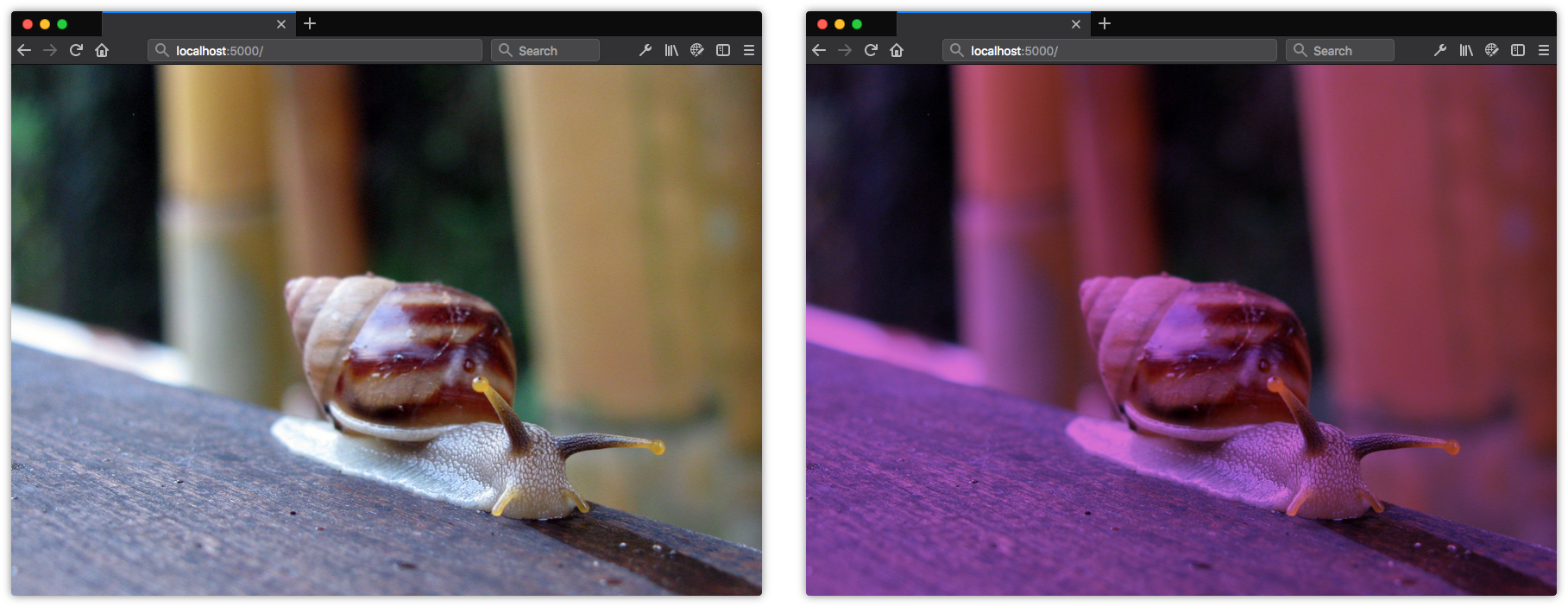
Here we’ve used the background-blend-mode property to give the background photograph a purplish tint. For background-blend-mode to work, you’ll have to set one or more background images or a background image and a background color. To create the background effect in figure 10-7, you’d use the following CSS:
.blend {
    background: orchid url(images/snail.jpg);
    background-blend-mode: multiply;
}
Current versions of Chrome, Firefox, Safari, and Opera support the background-blend-mode as well as the mix-blend-mode property. Safari, however, lacks support for the hue, saturation, luminosity, and color filters. Neither Microsoft Edge nor Internet Explorer support this property yet.
Blend modes affect how the layers within a stacking context may be visually combined. CSS Filters, on the other hand, alter the rendering of layers without combining them. With CSS Filters, we can blur objects, change them from color to grayscale or sepia tone, modify their hue, or invert their colors. Each CSS filter is a function, and we can use them alone or in a filter list.

If we want to blur an image and make it grayscale, as in figure 10-8, we can use the following CSS:
img {
    filter: blur(10px) grayscale(1);
}
Full support for filters is available without a prefix in Firefox 35+. Firefox versions 3.6–34 only support the url() function for filters. Chrome 18+, Opera 15+, and Safari 6+ also support filters with a -webkit- prefix. Microsoft Edge supports most filter functions, but doesn’t yet support the use of external images as filters. Filter effects can also be animated, unlike blend modes.
How to Follow Changes and Additions to CSS
Keeping track of all this can be overwhelming. Just when you think you’re up to date on everything, you find a new spec that you didn’t know existed, or an existing spec changes in a significant way. Because specifications and implementations are often in flux, keeping up with changes to CSS can be tough. But it is possible.
The World Wide Web Consortium manages a list of current specifications and their status. One of the best ways to become a CSS expert is to carefully read specifications. Specifications explain how features are supposed to work, and can help you understand what may be going wrong in your CSS.
If you’d like to track the development and discussion of CSS specifications, try the CSS Working Group’s GitHub repository. It contains current drafts of specifications, and a list of issues that developers, browser vendors, and specification editors are working through. The CSS Working Group also has a Twitter account if you’d just like to keep up with developments without getting into the proverbial weeds.
Tracking Browser Support
There are also several resources for tracking browser support for CSS features. Can I Use is perhaps the leader in this space. It tracks support for a range of CSS, HTML, SVG, and JavaScript features in every major browser across several versions.
Most browser vendors also provide their own feature-tracking dashboards. Chrome Status and Microsoft Edge’s Platform Status are great ways to keep up with the CSS features currently supported in Chrome and Edge. You can track Firefox’s progress with the Firefox Platform Status dashboard. And while Safari doesn’t have its own dashboard, its feature set tracks pretty closely to what’s found on the WebKit Feature Status page.
Most browser vendors also contribute support data to the robust documentation of the Mozilla Developer Network.
Documentation and Tutorials
The Mozilla Developer Network is an amazing resource for web development more generally. It’s CSS Reference is perhaps the best on the Web. Almost every property is documented, and each property’s page includes examples of use, details whether it’s experimental or production-ready, and links to the relevant specification.
For general CSS tricks, tips, and techniques, CSS-Tricks is an excellent resource. The site includes tutorials on CSS and other front-end development topics.
SitePoint.com, too, has a treasure trove of CSS-related material. Its HTML and CSS channel has lots of CSS tutorials, including topics such as Grid, CSS optimization, authoring tools, and progressive enhancement. If you need help, you can always ask a question in the SitePoint Forums.
And that’s how this book ends. Of course, reading this book isn’t sufficient for becoming a true CSS master. The best way to achieve mastery is by putting knowledge into practice. My hope is that you’ve come away with a better understanding of a range of CSS topics, including specificity, layout, and project architecture. These topics provide a solid foundation on your journey to mastering CSS.