Chapter 2: Debugging and Optimization
On your road to becoming a CSS master, you’ll need to know how to troubleshoot and optimize your CSS. How do you diagnose and fix rendering problems? How do you ensure that your CSS creates no performance lags for end users?
It’s also important to ensure code quality. Were you a little too verbose with your comments? Are there too many unused selectors? Are your selectors overly specific in a way that could affect performance?
Knowing which tools to use will help you ensure that your front end works well. In this chapter, we’ll look at tools to help you analyze and troubleshoot your CSS. They fall into three categories:
- debugging tools, such as browser-based developer tools and remote debugging services
- minification tools
- code-quality tools
In this chapter, we’ll delve into the browser-based developer tools for Chrome, Safari, Firefox, and Microsoft Edge. We’ll also explore a few command-line, Node.js-based tools to help you streamline the CSS you put into production.
We’ll also look at how to concatenate files, using tools that are available with your computer’s operating system.
Browser-based Developer Tools
Most desktop browsers include an element inspector feature that you can use to troubleshoot your CSS. Start using this feature by right-clicking and selecting Inspect Element from the menu. Mac users can also inspect an element by clicking the element while pressing the Ctrl key. The image below indicates what you can expect to see in Firefox Developer Edition.

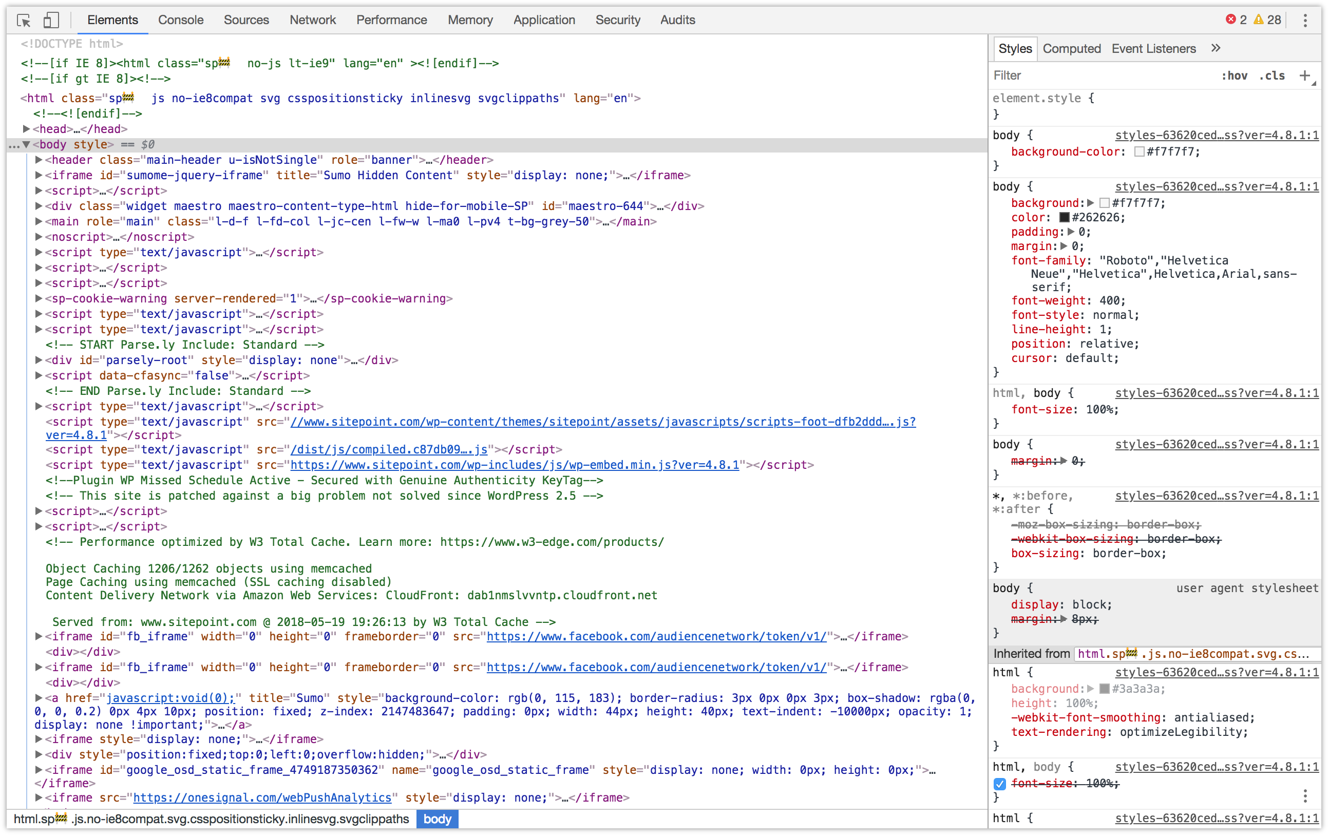
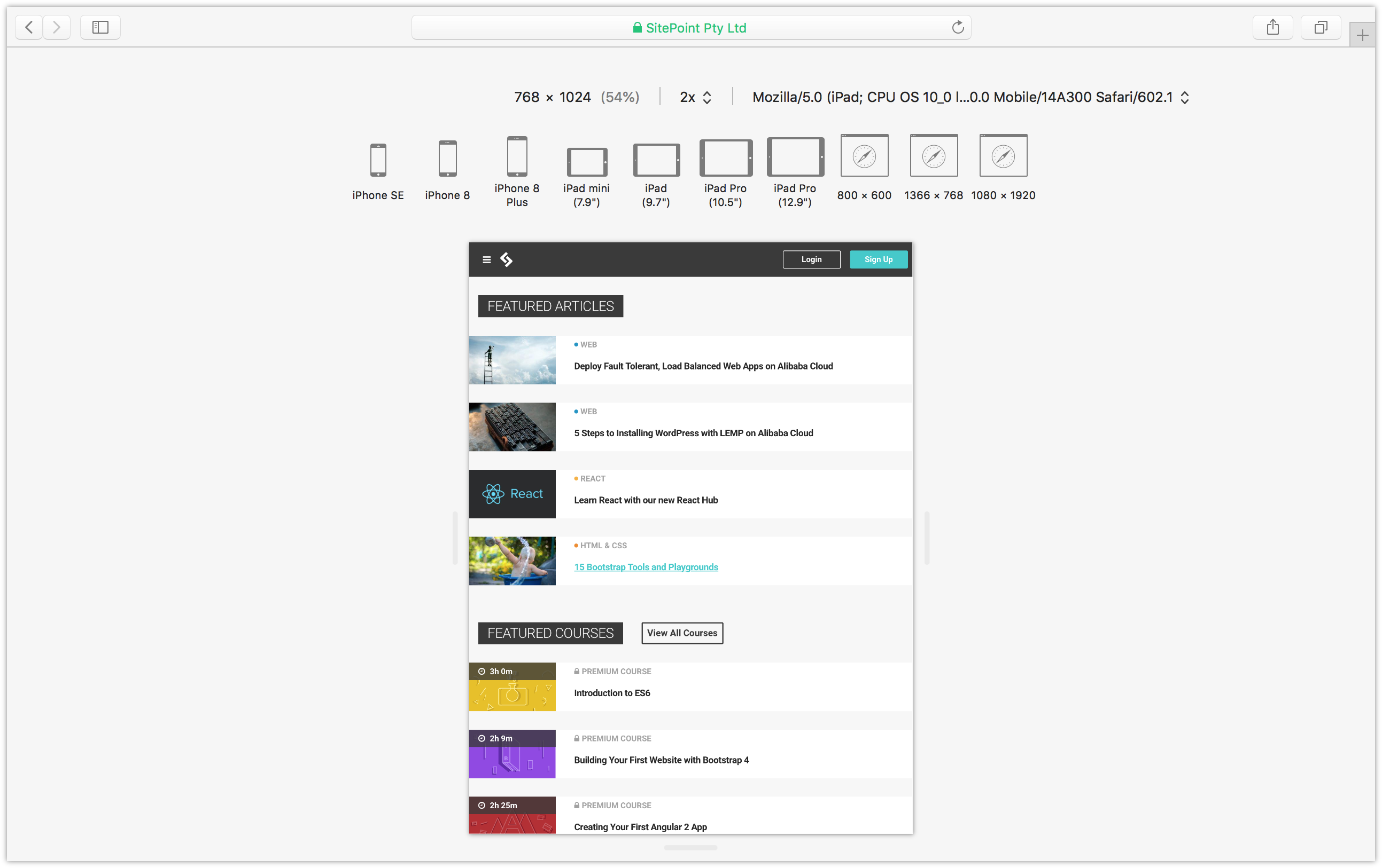
In Firefox, Chrome and Safari you can also press Ctrl + Shift + I (Windows/Linux) or Cmd + Option + I (macOS) to open the developer tools panel. The screenshot below shows the Chrome developer tools.
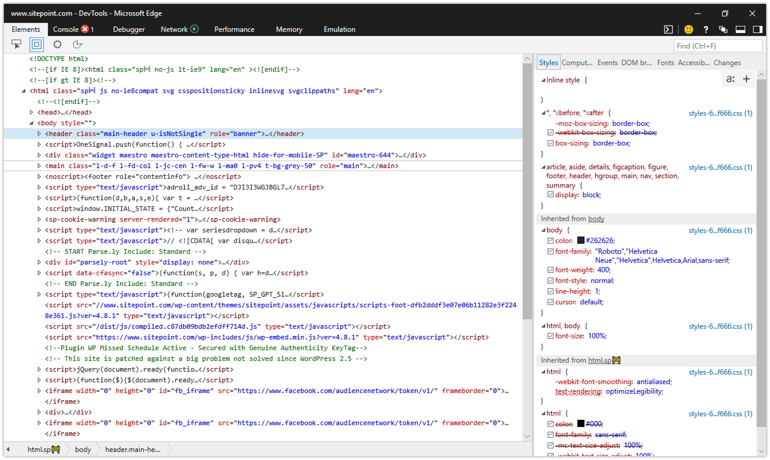
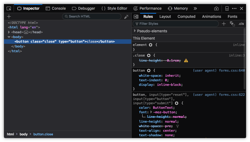
While in Microsoft Edge, open developer tools by pressing the F12 key, as shown in figure 2-3.
You can also open each browser’s developer tools using the application’s menu:
- Microsoft Edge: Tools > Developer Tools
- Firefox: Tools > Web Developer
- Chrome: View > Developer
- Safari: Develop > Show Web Inspector
In Safari, you may have to enable the Develop menu first by going to Safari > Preferences… > Advanced and checking the box next to Show Develop menu in menu bar. The view for Safari developer tools is illustrated below.
After opening the developer tools interface, you may then need to select the correct panel:
- Microsoft Edge: DOM Explorer
- Firefox: Inspector
- Chrome: Elements
- Safari: Elements
You’ll know you’re in the right place when you see HTML on one side of the panel, and CSS rules on the other.
Generated Markup
The markup you’ll see in the HTML panel is a representation of the DOM. It’s generated when the browser finishes parsing the document and may differ from your original markup. Using View Source reveals the original markup, but keep in mind that for JavaScript applications there may not be any markup to view.
Using the Styles Panel
Sometimes an element isn’t styled as expected. Maybe a typographical change failed to take, or there’s less padding around a paragraph than you wanted. You can determine which rules are affecting an element by using the Styles panel of the Web Inspector.
Browsers are fairly consistent in how they organize the Styles panel. Inline styles, if any, are typically listed first. These are styles set using the style attribute of HTML, whether by the CSS author or programmatically via scripting.
Inline styles are followed by a list of style rules applied via author stylesheets—those written by you or your colleagues. Styles in this list are grouped by media query and/or filename.
Authored style rules precede user agent styles. User agent styles are the browser’s default styles. They too have an impact on your site’s look and feel. In Firefox, you may have to select the Show Browser Styles option in order to view user agent styles. You can find this setting in the Toolbox Options panel.
Properties and values are grouped by selector. A checkbox sits next to each property, letting you toggle specific rules on and off. Clicking on a property or value allows you to change it, so you can avoid having to edit, save and reload.
Identifying Cascade and Inheritance Problems
As you inspect styles, you may notice that some properties appear crossed out. These properties have been overridden either by a cascading rule, a conflicting rule, or a more specific selector, as depicted below.
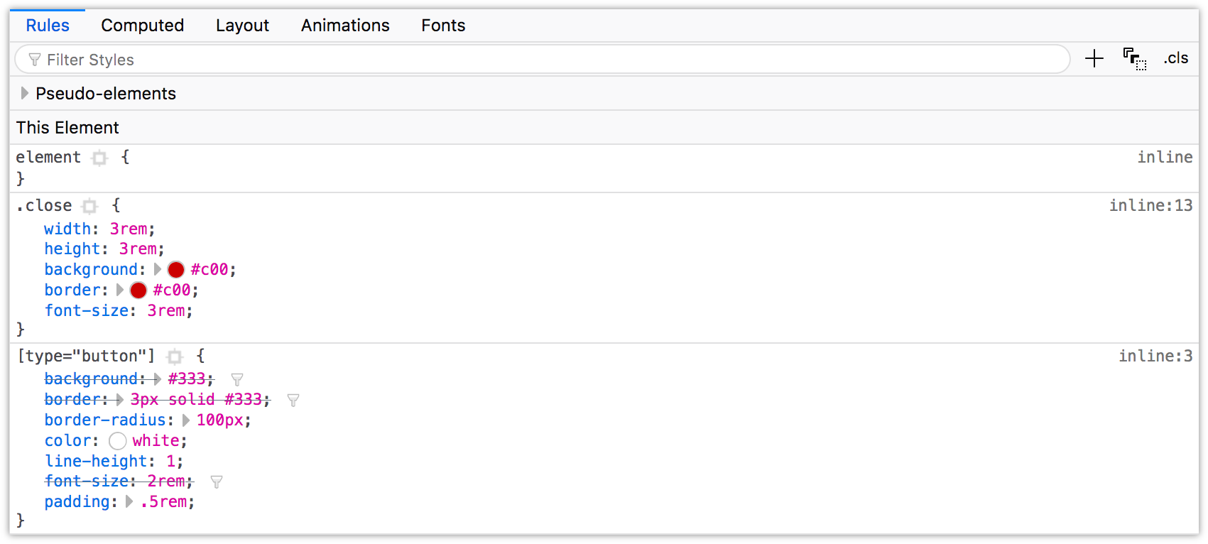
In the image above, the background, border, and font-size declarations of the [type=button] block are displayed with a line through them. These declarations were overridden by those in the .close block, which succeeds the [type=button] in our CSS.
Spotting Invalid Properties and Values
You can also use the element inspector to spot invalid or unsupported properties and property values. In Chromium-based browsers, invalid CSS rules both have a line through them and an adjacent warning icon, which can be seen below.

Firefox also strikes through invalid or unsupported properties and values. Firefox Developer Edition also uses a warning icon, as shown below. Standard Firefox displays errors similarly, but doesn’t include the warning icon.
In the screenshot below, Safari strikes through unsupported rules with a red line, and highlights them with a yellow background and warning icon.
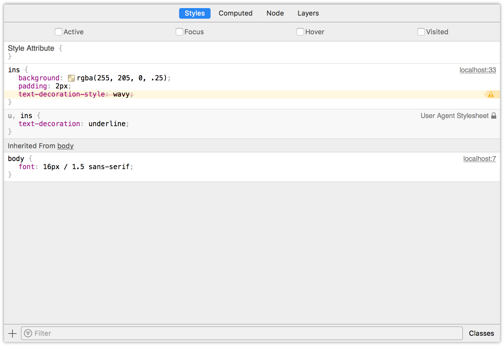
Microsoft Edge instead uses a wavy underline to indicate unsupported properties or values.

When it comes to basic debugging and inheritance conflicts, whichever browser you choose doesn’t matter. Familiarize yourself with all of them, however, for those rare occasions when you need to diagnose a browser-specific issue.
Debugging Responsive Layouts
On-device testing is always best. During development, however, it’s helpful to simulate mobile devices with your desktop browser. All major desktop browsers include a mode for responsive debugging.
Chrome
Chrome offers a device toolbar feature as part of its developer toolkit. To use it, click the device icon (pictured below) in the upper-left corner, next to the Select an element icon.

Device mode lets you mimic several kinds of Android and iOS devices, including older devices such as the iPhone 5 and Galaxy S5. Device mode also includes a network throttling feature for approximating different network speeds, and the ability to simulate being offline.
Firefox
In Firefox, the equivalent mode is known as Responsive Design Mode. Its icon resembles early iPods. You’ll find it on the right side of the screen, in the developer tools panel, as shown below.

In responsive mode, you can toggle between portrait and landscape orientations, simulate touch events, and capture screenshots. Like Chrome, Firefox also allows developers to simulate slow connections via throttling.
Microsoft Edge
Microsoft Edge makes it possible to mimic Windows mobile devices—such as the Surface—with its Emulation tab. Select Windows Phone from the Browser profile menu, as shown below.
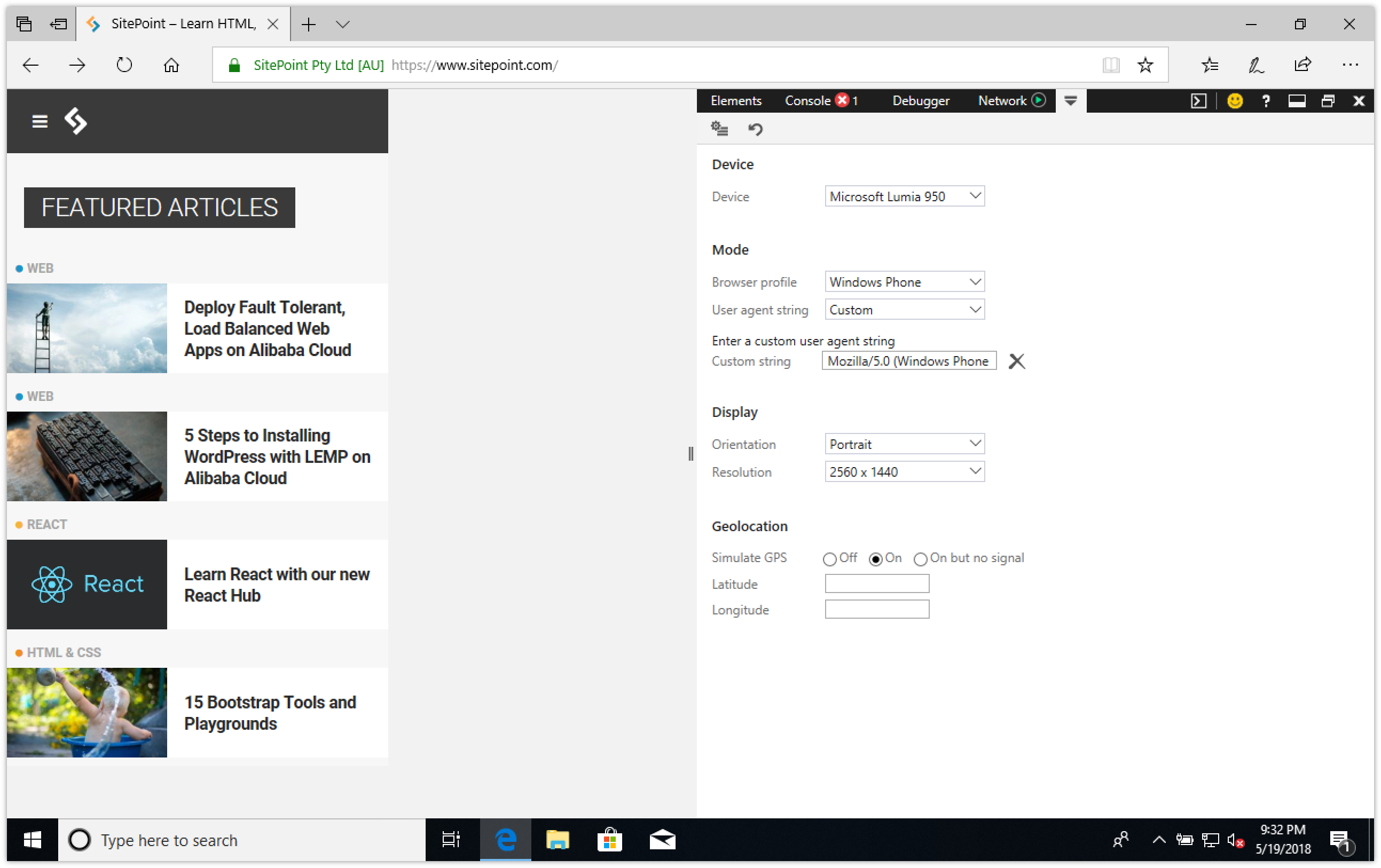
In addition to mimicking orientation and resolution, emulation mode enables you to test geolocation features. However, you can’t use its emulation mode to simulate network conditions.
Safari
Safari’s Responsive Design Mode is in its developer toolkit. It’s similar to Emulation Mode in Firefox, but adds the ability to mimic iOS devices, as illustrated below.
To enter Safari’s responsive design mode, select Develop > Enter Responsive Design Mode, or Cmd + Ctrl + R.
Debugging for UI Responsiveness
CSS properties and values that trigger reflows and repaints are expensive in terms of processor usage and performance. They can slow user interface responsiveness—page rendering, animation smoothness, and scroll performance—especially on low-powered devices.
What Are Reflows and Repaints?
A reflow is any operation that changes the layout of part or all of a page. Examples include changing the dimensions of an element or updating its left position. They’re expensive because they force the browser to recalculate the height, width, and position of elements in the document.
Repaints are similar to reflows in that they force the browser to re-render part of the document. Changing the color of a button when in a :hover state is one example of a repaint. They’re a bit less troublesome than reflows because they don’t affect the dimensions or position of nodes.
Reflows and repaints are most often triggered by DOM operations—for example, adding or removing elements. They can also be caused by changes to properties that affect the dimensions, visibility, or position of an element. This is true whether the change is caused by JavaScript or a CSS-based animation.
Page Loads
Page loads will always trigger reflow and repaints as the browser parses the initial HTML, CSS, and JavaScript.
It’s difficult to completely banish repaints and reflows from a project. We can, however, identify them and reduce their impact using performance tools.
Performance Tools
Performance tools are a bit befuddling at first. They measure how well your front end behaves, capturing how much time it takes for various tasks to complete. By recording activity while interacting with our pages, we can determine which portions of our CSS may be causing performance bottlenecks.
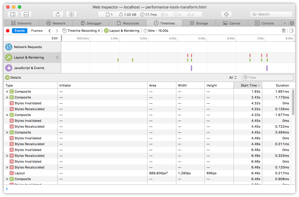
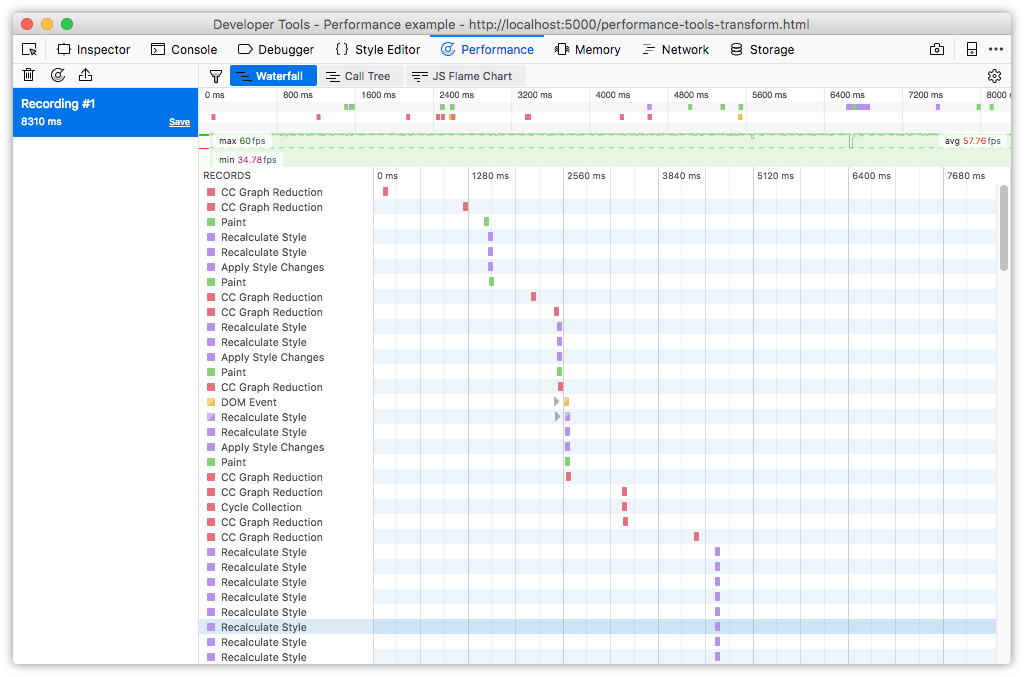
To use performance tools, click the timeline tab in the developer tools interface. In Microsoft Edge, Chrome and Firefox, it’s appropriately named Performance. Safari instead calls it Timelines.
In any browser, press the Record button to start the recording process (in Microsoft Edge, the record button looks more like a play icon). Interact with the page and, when you’re done, click the Stop button to end recording.
Depending on which browser you use, you may see data immediately or after recording ends. Safari displays data in real time. Chrome and Microsoft Edge render a performance chart after you stop recording. Firefox does a little bit of both. You’ll see some data displayed while recording, and a larger, waterfall chart of operations when recording completes.
Document loads, function calls, DOM events, style recalculations, and paint actions are logged, giving us an overview of performance bottlenecks. What we’re looking for, at least as far as CSS performance is concerned, are two related aspects:
- large numbers of style recalculation and paint operations
- operations that take a long time, as indicated by larger blocks in the timeline
To see what this looks like in practice, we’ll compare two basic documents, Examples A and B. In both cases, we’re moving a series of div elements from an x-position of zero to an x-position of 1,000. Both examples use CSS transitions. In Example A, however, we’re going to animate the left property. In Example B, we’re going to use a translation transform and animate the transform property.
Our markup for both is the same:
<!DOCTYPE html>
   <html lang="en-US">
   <head>
        <meta charset="utf-8">
        <title>Performance example</title>
        <style type="text/css">
            /* CSS will go here. */
        </style>
    </head>
    <body>
       <button type="button" id="move">Move</button>
       <div></div>
       <div></div>
       <div></div>
       <div></div>
       <div></div>
       <div></div>
       <div></div>
       <div></div>
       <div></div>
       <div></div>

       <script type="text/javascript" src="toggle-move-class.js"></script>
    </body>
</html>
Our JavaScript for both documents is also the same. Clicking the Move button toggles the moved class on each div element:
var move = document.getElementById('move');
move.addEventListener('click', function(e) {
    var objs = document.querySelectorAll('div');

    objs.forEach((o) => {
        o.classList.toggle('moved');
    });
});
Our CSS, on the other hand, diverges. What follows is the CSS used in Example A:
div {
    background: #36f;
    margin-bottom: 1em;
    width: 30px;
    height: 30px;
    position: relative;
    left: 0;
    transition: left 2s ease-in;
}
.moved {
    left: 1000px;
}
When triggered, this animation will generate a lot of style calculation and repaint indicators in our timeline. The images that follow show timeline output for this transition in Safari (figure 2-14), Chrome (figure 2-15), Microsoft Edge (figure 2-16), and Firefox (figure 2-17).


The reason for the style calculations and repaints has to do with the property we’re transitioning: left. The left property triggers a reflow whenever it’s changed, even if that change is caused by an animation or transition.
Now, let’s take a look at the CSS for Example B:
div {
    background: #f3f;
    margin-bottom: 1em;
    width: 30px;
    height: 30px;
    position: relative;
    left: 0;
    transition: transform 2s ease-in;
    transform: translateX(0);
}
.moved {
    transform: translateX(1000px);
}
Here we’re using a transform, transitioning between translateX(0) and translateX(1000px). In most browsers, transforms don’t trigger reflows. We’ll see far fewer style recalculation and rendering operations. This is especially evident in Safari (figure 2-18), Chrome (figure 2-19), and Firefox (figure 2-20). We’ll talk more about transforms in Chapter 7.

In Microsoft Edge, on the other hand (figure 2-21), our transform animation is actually slightly slower according to the Visual throughput chart. However, it also uses a lower proportion of available CPU power.

Identifying Which Lines to Remove
The CSS Triggers site is a fantastic starting point for identifying which properties may be causing performance bottlenecks. Once you know which properties could be problematic, the next step is to test the hypothesis. Disable that property—either with a comment or by adding a temporary x- prefix—and rerun the timeline test.
Remember that performance is relative, not absolute or perfect. The goal is improvement: make it perform better than it did before. If a property or effect is performing unacceptably slow, eliminate it altogether.
More on Web Performance
If you’d like to learn more about how to use browser tools to analyze performance, check out Lean Websites by Barbara Bermes.
Minification
Developer tools help you find and fix rendering issues, but what about efficiency? Are our file sizes as small as they can be? For that, we need minification tools.
Minification in the context of CSS simply means “removing excess characters.” Consider, for example, this block of code:
h1 {
    font: 16px / 1.5 'Helvetica Neue', arial, sans-serif;
    width: 80%;
    margin: 10px auto 0px;
}
That’s 98 bytes long, including line breaks and spaces. Let’s look at a minified example:
h1{font:16px/1.5 'Helvetica Neue',arial,sans-serif;width:80%;
    ➥margin:10px auto 0}
Now our CSS is only 80 bytes long—an 18% reduction. Fewer bytes, of course, means faster download times and data transfer savings for you and your users.
In this section, we’ll look at CSS Optimizer, or CSSO, a minification tool that runs on Node.js. To install CSSO, you’ll first have to install Node.js and npm. npm is installed as part of the Node.js installation process, so you’ll only need to install one package.
Using CSSO does require you to be comfortable using the command-line interface. Linux and macOS users can use the Terminal application (Applications > Terminal.app for macOS). If you’re using Windows, utilize the command prompt. Go to the Start or Windows menu and type cmd in the search box.
Installing CSSO
Once you’ve set up Node.js and npm, you can install CSSO. In the command line, type:
npm install -g csso
The -g flag installs CSSO globally so that we can use it from the command line. npm will print a message to your terminal window when installation is complete:
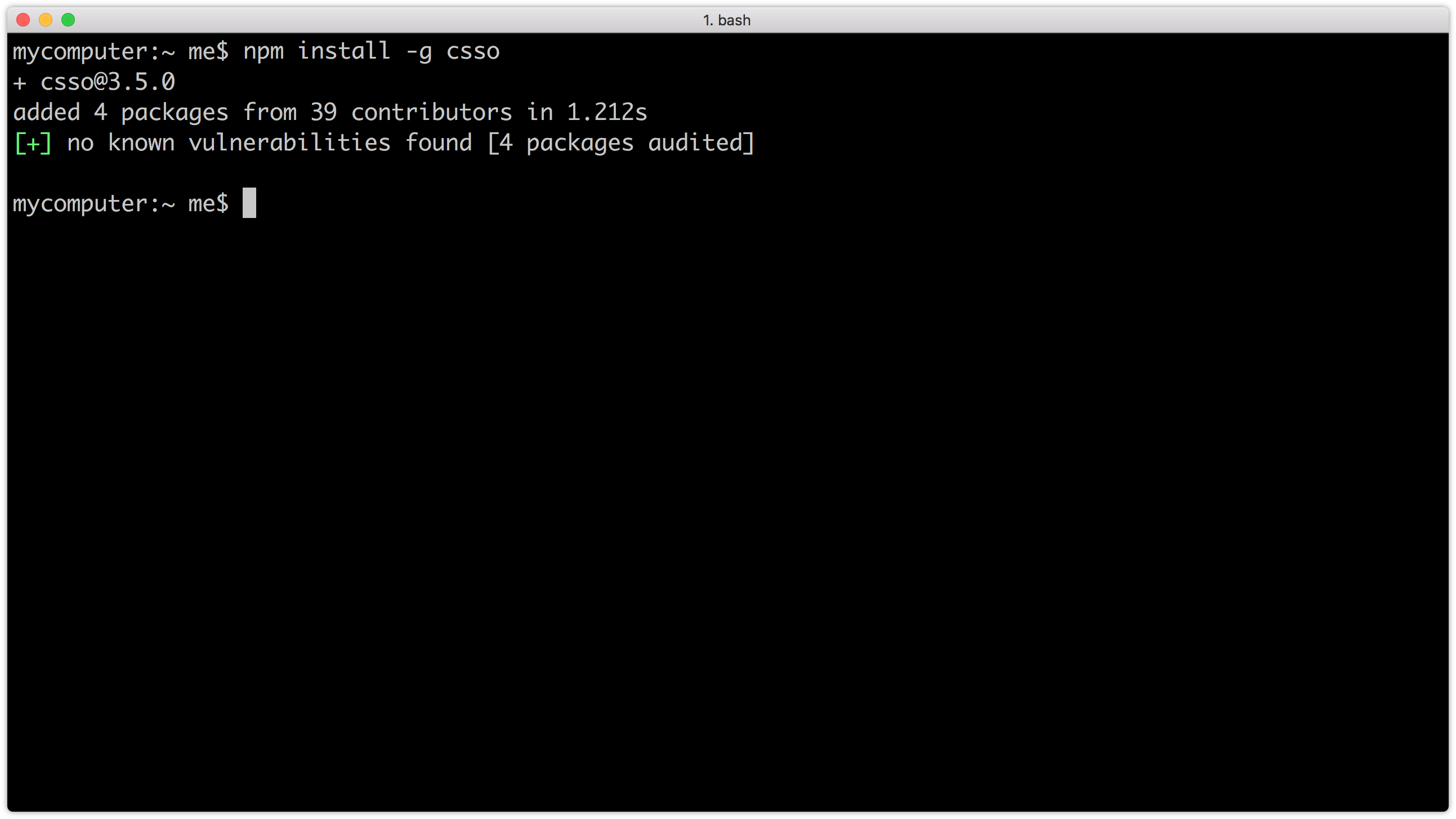
Now we’re ready to minify our CSS.
Minification with CSSO
To minify CSS files, run the csso command, passing the name of a file as an argument:
csso style.css
This will perform basic compression. CSSO strips unneeded whitespace, removes superfluous semicolons, and deletes comments from your CSS input file.
Once complete, CSSO will print the optimized CSS to standard output, meaning the current terminal or command prompt window. In most cases, however, we’ll want to save that output to a file. To do that, pass a second argument to csso—the name of the minified file. For example, if we wanted to save the minified version of style.css as style.min.css, we’d use the following:
csso style.css style.min.css
By default, CSSO will rearrange parts of your CSS. It will, for example, merge declaration blocks with duplicated selectors and remove some overridden properties. Consider the following CSS:
body {
    margin: 20px 30px;
    padding: 100px;
    margin-left: 0px;
}
h1 {
    font: 200 36px / 1.5 sans-serif;
}
h1 {
    color: #ff6600;
}
In this snippet, margin-left overrides the earlier margin declaration. We’ve also repeated h1 as a selector for consecutive declaration blocks. After optimization and minification, we end up with this:
body{padding:100px;margin:20px 30px 20px 0}h1{font:200 36px/1.5 sans-serif;color:#f60}
CSSO removed extraneous spaces, line breaks, and semicolons, and shortened #ff6600 to #f60. CSSO also merged the margin and margin-left properties into one declaration (margin: 20px 30px 20px 0) and combined our separate h1 selector blocks into one.
If you’re skeptical of how CSSO will rewrite your CSS, you can disable its restructuring features. Just use the --restructure-off or -off flags. For example, running csso style.css style.min.css -off gives us the following:
body{margin:20px 30px;padding:100px;margin-left:0}h1{font:200 36px/1.5 sans-serif}h1{color:#f60}
Now our CSS is minified, but not optimized. Disabling restructuring will keep your CSS files from being as small as they could be. Avoid disabling restructuring unless you encounter a problem.
Preprocessors and post-processors (such as Sass, Less and PostCSS) offer minification as part of their toolset. However, using CSSO can shave additional bytes from your file sizes.
Code-quality Tools
Finally, let’s discuss tools that help you analyze the quality of your CSS. We’ll focus on two:
- stylelint
- UnCSS
stylelint is a linting tool. A linter is an application that checks code for potential trouble spots, enforcing coding conventions such as spaces instead of tabs for indentation. stylelint can find problems such as duplicate selectors, invalid rules, or unnecessary specificity. These have the greatest impact on CSS maintainability.
UnCSS, on the other hand, checks your CSS for unused selectors and style rules. It parses a stylesheet and a list of HTML pages, returning a CSS file that’s stripped of unused rules.
Both of these tools use Node.js and can be installed using npm.
If you’re working on a small site, such as a personal blog or a few pages that are updated infrequently, many of the problems that these tools flag can safely be ignored. You’ll spend time refactoring for little gain in maintainability and speed. For larger projects, however, they’re invaluable. They’ll help you head off maintainability problems before they start.
stylelint
stylelint helps you avoid errors and enforce conventions in your styles. It has more than 160 error-catching rules and allows you to create your own as well via plugins.
stylelint Installation and Configuration
Install stylelint as you would any other npm package:
npm install -g stylelint
Once it’s installed, we’ll need to configure stylelint before using it. stylelint doesn’t ship with a default configuration file. Instead, we need to create one. Create a .stylelistrc file in your project directory. This file will contain our configuration rules, which can use JSON (JavaScript Object Notation) or YAML (YAML Ain’t Markup Language) syntax. Examples in this section use JSON.
Our .stylelistrc file must contain an object that has a rules property. The value of rules will itself be an object containing a set of stylelist rules and their values:
{
    "rules": {}
}
If, for example, we wanted to banish !important from declarations, we can set the declaration-no-important to true:
{
    "rules": {
        "declaration-no-important": true
    }
}
stylelint supports over 150 rules that check for syntax errors, indentation and line-break consistency, invalid rules, and selector specificity. You’ll find a complete list of rules and their available values in the stylelint User Guide.
Starting with a Base stylelint Configuration
You’ll probably find it easier to start with a base configuration and then customize it to your project needs. The stylelint-config-recommended base configuration is a good starting configuration. It enables all of the “possible errors” rules. Install it using npm:
npm install -g stylelint-config-recommended
Then, in your project directory, create a .stylelistrc file that contains the following lines:
{
    "extends": "/absolute/path/to/stylelint-config-recommended"
}
Replace /absolute/path/to/ with the directory to which stylelint-config-recommended was installed. Global npm packages can usually be found in the %AppData%
pm
ode_modules directory on Windows 10 systems, and in /usr/local/lib/node_modules on Unix/Linux and macOS systems. Type npm list -g to locate your global node_modules directory.
We can then augment our configuration by adding a rules property. For example, to disallow vendor prefixes, our .stylelistrc file would look similar to the what’s below:
{
    "extends": "/absolute/path/to/stylelint-config-recommended",
    "rules": {
       "value-no-vendor-prefix": true
    }
}
What if we wanted to limit the maximum specificity of our selectors to 0,2,0? That would permit selectors such as .sidebar .title but not #footer_nav. We can do this by adding a selector-max-specificity rule to our configuration:
{
    "extends": "/absolute/path/to/stylelint-config-recommended",
    "rules": {
       "value-no-vendor-prefix": true,
       "selector-max-specificity": "0,2,0"
    }
}
Using stylelint
To lint your CSS files using stylelint, run the stylelint command, passing the path to your CSS file as an argument:
stylelint stylesheet.css
Alternatively, you can lint all of the CSS files in a particular directory, even recursively:
stylelint "./css/**/*.css"
stylelint can also lint CSS that’s embedded in HTML files using the style element. Just pass the path to an HTML file as the argument.
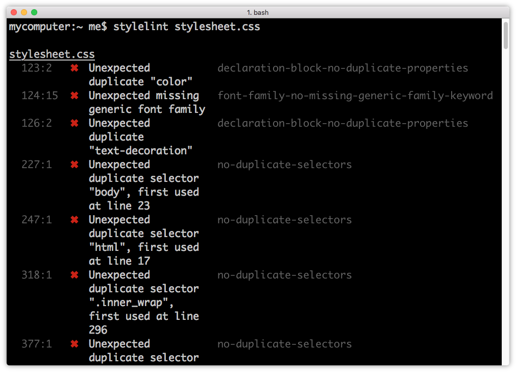
When complete, stylelint will display a list of files that contain errors, along with their type and location, as shown in figure 2-23.
UnCSS
UnCSS parses your HTML and CSS files, removing unused CSS. If your projects include a CSS framework such as Bootstrap or use a reset stylesheet, consider adding UnCSS to your workflow. It will shave unnecessary CSS—and bytes—from your code.
UnCSS Installation
As with other npm packages, you can install UnCSS using the following command:
npm install -g uncss
Using UnCSS from the Command Line
UnCSS requires the file path or URL of an HTML page that contains a linked CSS file. For example:
uncss https://sitepoint.com/
UnCSS will parse the HTML and its linked stylesheets, and print the optimized CSS to standard output. To redirect to a file, use the redirect operator (>):
uncss https://sitepoint.com/ > optimized.css
You can also pass multiple file paths or URLs to the command line. UnCSS will analyze each file and dump optimized CSS that contains rules affecting one or more pages:
uncss index.html article-1.html article-2.html > optimized.css
For a full list of commands—and an example of how to use UnCSS with a Node.js script—consult the UnCSS docs.
Consider a Task Runner or Build Tool
Running these tools probably seems like a lot of extra work. To that end, consider adding a task runner or build system to your workflow. Popular ones include Grunt, Gulp, and webpack. All three have robust documentation and sizable developer communities.
What’s great about these task runners and build systems is that they automate concatenation and optimization tasks. They’re not limited to CSS either. Most build tools also include plugins for optimizing JavaScript and images.
Because the configuration and build script files are typically JSON and JavaScript, you can easily reuse them across projects or share them with a team. Each of the tools mentioned in this section can be integrated with Grunt, Gulp, or webpack with the help of a plugin.
Above all, however, take a pragmatic approach to building your toolkit. Add tools that you think will enhance your workflow and improve the quality of your output.
Conclusion
In this chapter, we’ve looked at some tools to help you diagnose, debug, and optimize your CSS. In the next chapter, we’ll look at how to work with variables in CSS.