Chapter 4: Working with Text
In this chapter, we’ll look at two features of CSS that relate to text: @font-face, and writing modes. These features both play a role in internationalization—the process of making websites that work with the range of humanity’s languages and writing forms.
This chapter won’t be a comprehensive look at every text-related CSS property. There are far too many properties for that. Instead, we’ll focus on some features that are related to internationalization and text display.
Fonts are an integral part of web design and how we display text on the Web, but they can also add bloat. In the first half of this chapter, we’ll look at how to go beyond system fonts like Arial, or generic families such as sans-serif with @font-face. We’ll also discuss strategies for font optimization.
We’ll end the chapter with a look at writing modes. Writing modes and the writing-mode property affect how non-Latin-based text is displayed on the Web. We’ll look at how to set a writing mode, and talk a little bit about how writing mode affects layout and alignment.
Better-looking Text with @font-face
In the early days of CSS, font choice was limited to whatever fonts users had installed on their system, and generic font values such as sans-serif and monospace. Towards the end of the 2000s, however, CSS introduced web fonts and the @font-face CSS rule. Web design and typography changed forever.
With @font-face, we can use just about any font for our web pages, as long as the font is available in a browser-compatible format.
Check Your Licenses
Not all fonts are licensed for web use, even if it’s possible to convert them to a web-friendly format. Do the right thing, and don’t risk being on the losing end of a lawsuit. Ensure that you’re adhering to the licensing terms of any font you use on your site.
Setting an @font-face Rule
Here’s what a basic @font-face ruleset looks like. This is the bare minimum you’ll need in order to use a web font:
@font-face {
    font-family: 'MyAwesomeFont';
    src: url('http://example.com/fonts/myawesomefont.woff2');
}
The @font-face at-keyword tells the browser that we want to use an external font file. The font-family line sets a descriptor, or nickname, for this font. Don’t confuse this with the font-family property. When used within an @font-face ruleset, font-family sets the value that will be used for CSS font name matching. The last line defines a font source with the src descriptor, which is the location of a font file.
To apply this font to your text, include the descriptor value in the font or font-family declaration:
body {
    font: 16px / 1.5 'MyAwesomeFont', sans-serif;
}
The browser will match instances of MyAwesomeFont to the source we’ve specified in our @font-face ruleset. If MyAwesomeFont isn’t available, or the browser doesn’t support web fonts, it will fall back to the sans-serif generic.
Just because we’ve defined a font for use doesn’t mean the browser will load it. Our font also needs to be in a format the browser can parse. For current browsers, that usually means WOFF2. However, not everyone on the Web uses an up-to-date browser. We can accommodate these users by defining multiple font sources.
Using Multiple Font Formats
While the @font-face example above takes care of the latest and greatest browsers, some recent browser versions lack support for the WOFF2 format. They do, however, support its predecessor, WOFF. Let’s update our @font-face rule to provide a WOFF alternative:
@font-face {
    font-family: 'MyAwesomeFont';
    src: url('http://example.com/fonts/myawesomefont.woff2') format('woff2'),
         url('http://example.com/fonts/myawesomefont.woff') format('woff');
}
The src descriptor takes the format <url> format(), where <url> is the location of a font resource, and format() is a format hint. We can provide multiple src options by separating them with a comma. Using format() helps the browser select a suitable format from the ones provided. Its argument should be one of woff, woff2, truetype, opentype, embedded-opentype, or svg. In this example, browsers that don’t support WOFF2 will download the WOFF formatted font file instead.
You may see examples of @font-face rules that include EOT, SVG, TrueType, or OpenType font formats. You can safely exclude these formats, unless your site still attracts a large number of people using old browsers.
More on Font Formats
Transfonter’s web fonts format guide is a great introduction to web font formats, including browser support and conversion tools. The CSS Fonts Module Level 4 specification includes a more complete list of formats and their corresponding font hint values.
EOT font support is limited to ancient versions of Internet Explorer (≤ 9). Most browsers have removed support for SVG fonts, or never implemented it to begin with. TrueType and OpenType enjoy wide browser support, but WOFF/WOFF2 file sizes are much smaller. The only reason to use either format is if the font in question isn’t available as a WOFF/WOFF2 formatted file.
Fonts and Origins
Web fonts are subject to the same-origin policy, which is a security mechanism adhered to by most browsers. Under the same-origin policy, sensitive resources such as font files, media, or scripts will only loaded if they share the same origin as the requesting document. An origin is the combination of a document’s scheme or protocol, host name, and port number.
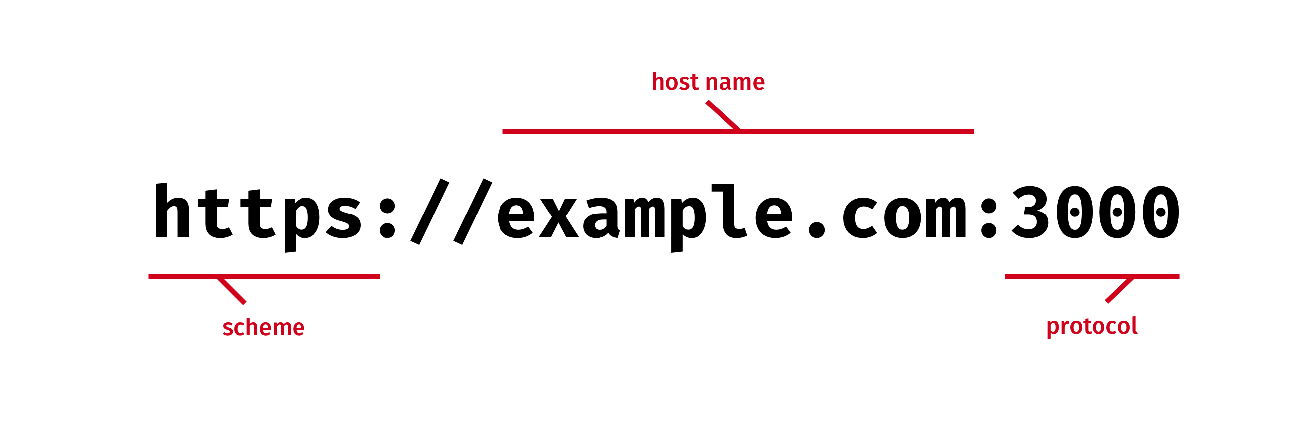
In other words, if your web page is served from https://example.com and your fonts are served from https://cdn.example.com, they won’t load. To get around this restriction, you’ll need to add an access control header to your font URLs that grants permission to the requesting document’s origin. This enables cross-origin resource sharing, or CORS for short.
Access-Control-Allow-Origin: https://example.com
Adding headers requires access to your server or content delivery network configuration. If you don’t have such access, or don’t feel comfortable managing headers, you have two options:
- serve your font files from the same origin as your document
- use a hosted web font service such as Google Fonts (free), TypeKit or FontSpring
Hosted services implement their own cross-origin headers so that you don’t have to worry about it.
Using Multiple Font Weights and Styles
A font is actually a collection of typefaces or faces. A face is a single weight, width, and style of a font. EB Garamond is a font. EB Garamond Regular, and EB Garamond Bold Italic are faces. Most people use the terms interchangeably, but differentiating between the two is helpful here.
When incorporating a web font into your site’s design, you may also want to incorporate its stylistic variants for bolded or italicized text. We can do this using the font-weight and font-style descriptors. These descriptors tell the browser which face (and corresponding file) to match with a particular weight or style:
@font-face {
    font-family: 'EB Garamond Regular';
    src: url('EB-Garamond-Regular.woff2') format('woff2'),
         url('EB-Garamond-Regular.woff') format('woff');
    /*
     The next line is optional, since
     this is the initial value.
     It's the equivalent of font-weight: 400
    */
    font-weight: normal;
}

@font-face {
    font-family: 'EB Garamond Italic';
    src: url('EB-Garamond-Italic.woff2') format('woff2'),
         url('EB-Garamond-Italic.woff') format('woff');
    font-style: italic;
}

@font-face {
    font-family: 'EB Garamond Bold';
    src: url('EB-Garamond-Bold.woff2') format('woff2'),
         url('EB-Garamond-Bold.woff') format('woff');
    font-weight: bold; /* The equivalent of font-weight: 700 */
}

@font-face {
    font-family: 'EB Garamond Bold Italic';
    src: url('EB-Garamond-Bold-Italic.woff2') format('woff2'),
         url('EB-Garamond-Bold-Italic.woff') format('woff');
    font-weight: bold;
    font-style: italic;
}
In the example above, we’ve matched faces from the EB Garamond font family with an appropriate style and weight. Here too, font-weight and font-style are descriptors that tell the browser to download an additional font file to display weight and style variants, should the page use bold and/or italicized text.
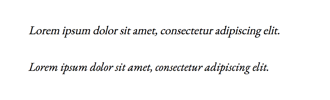
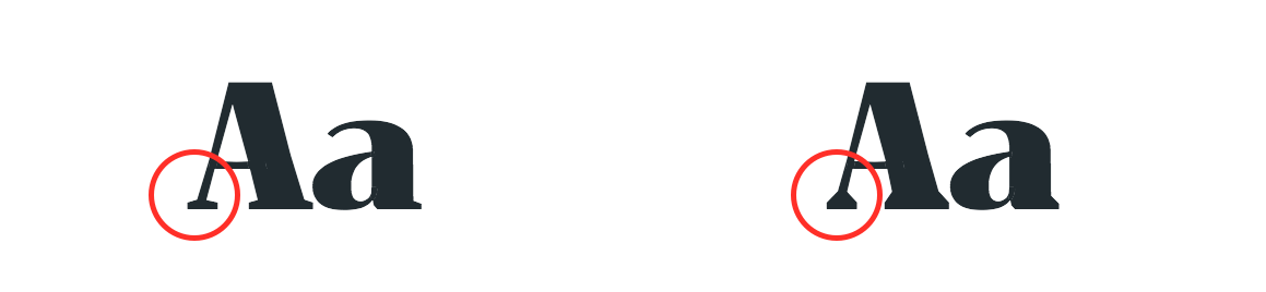
Browsers synthesize bolded or italicized text from the primary font when an appropriate weight or style isn’t available. However, this may lead to less readable or less attractive text. Compare the synthetic italic text (top) to the italic version of this font:
That said, pretty isn’t always fast. Using multiple faces increases the amount of data that must be sent to the browser. As with most aspects of web development, you’ll need to make trade-offs between style and performance.
Variable Fonts
Variable fonts—more accurately called OpenType Font Variations—are an extension of the OpenType specification. Variable fonts are single font files with support for additional features that can be managed using CSS. You can, for example, control the width of each glyph or the degree of tilt used for oblique text. If the font file supports it, you can even adjust the width of serifs, as with the Foreday font by DS Type Foundry.
With variable fonts, a single font file behaves, in effect, like multiple font faces. Variable fonts make the previous section of this chapter moot.
OpenType
OpenType is a file format that enables cross-platform font support by combining support for TrueType and PostScript font data in a single file.
To use variable fonts in your project, you’ll first need a font file that supports these features. Although most major browsers have implemented support for variable fonts, the number of such fonts available for use is quite small at the time of writing this book.
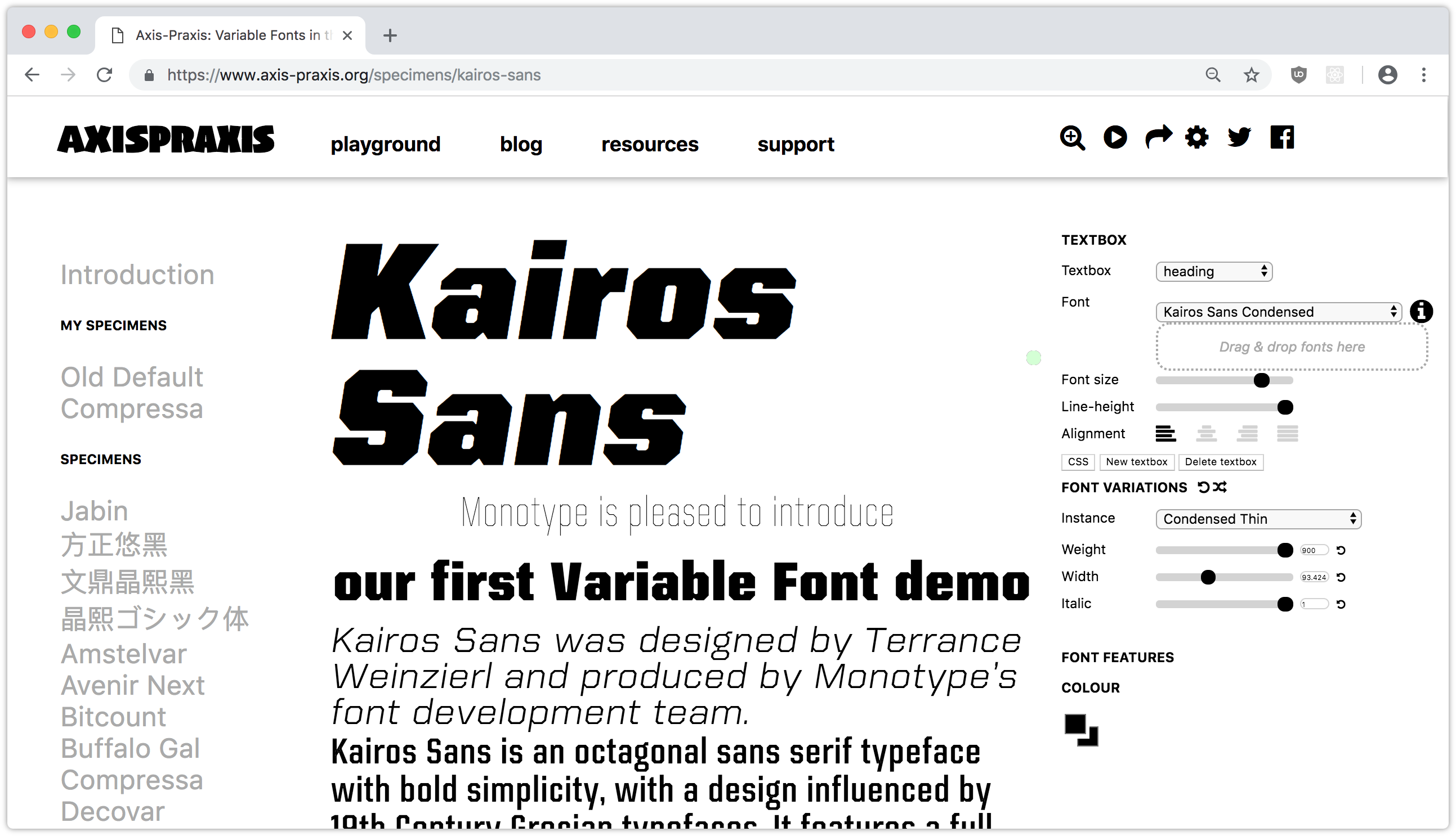
Axis-Praxis (seen in Figure 4-4) and v-fonts are two sources for discovering and experimenting with variable fonts. Both include specimens and controls to play with the variable features that each font supports. Adobe has also released a variable version of its open-source font, Source Sans Pro.
Incorporating Variable Fonts
To incorporate a variable font, we’ll need to add another source and format hint to our CSS:
@font-face {
    font-family: 'FontFamilyName';
    src: url('FontFamilyName-Variable.woff2') format('woff2-variations'),
         url('FontFamilyName.woff2') format('woff2'),
         url('FontFamilyName.woff') format('woff');
}
If the browser supports variable fonts, it will download FontFamilyName-Variable.woff2. If it doesn’t, it will download a file that it’s capable of parsing. This syntax above works today in every browser that supports variable fonts.
In April 2018, the CSS Working Group decided to change the syntax of format hints. As Richard Rutter explains in his article, “Upcoming changes to the CSS you need for variable fonts”:
However, the list of potential format strings is growing fast and could in future contain other kinds of font features, such as colour fonts. With an eye on the future, the CSS Working Group recently resolved to change the syntax of the
format()hint [to] separate out the font features from the file type.
Format hints will soon use a format('format_name', supports feature_name) syntax, which is shown below:
@font-face {
    font-family: 'FontFamilyName';

    /* New CSS syntax. Not yet widely implemented. */
    src: url('FontFamilyName-Variable.woff2') format('woff2' supports variations);
}
A future-proof @font-face declaration with support for variable fonts might look like this:
@font-face {
    font-family: 'FontFamilyName';
    src: url('FontFamilyName-Variable.woff2') format('woff2-variations'),
         url('FontFamilyName.woff2') format('woff2'),
         url('FontFamilyName.woff') format('woff');

    /* New CSS syntax. Not yet widely implemented. */
    src: url('FontFamilyName-Variable.woff2') format('woff2' supports variations);
}
Why two src declarations? Remember: browsers ignore CSS rules they can’t understand, and the last rule wins. Adding the format('woff2' supports variations) hint to our existing src declaration would cause browsers to ignore the entire rule. By using two src declarations, we guarantee that the browser will use one of them. The first src declaration will be used by browsers that don’t support the newer format hint syntax. Browsers that do support it will override the first declaration with the second.
Specifying Font Weight When Using Variable Fonts
As mentioned in the previous section, the font-weight descriptor lets us tell the browser which font-face file should be matched to a particular weight. Variable fonts, however, can support a range of font weights within a single file.
Instead of using a src declaration for each font-face weight, CSS4 modified the behavior of the font-weight descriptor to accept a value range:
@font-face {
    font-family: 'FontFamilyName';
    src: url('FontFamilyName-Variable.woff2') format('woff2-variations'),
    src: url('FontFamilyName-Variable.woff2') format('woff2' supports variations);

    font-weight: 1 1000; /* Use this file for values within this font range. */
}
Adding a font-weight range instructs the browser to use the same file for every font-weight value that falls within the range. This includes font-weight: bold, which is the equivalent of font-weight: 700, and font-weight: normal, which is the equivalent of font-weight: 400.
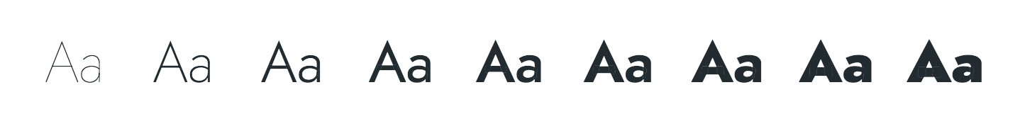
Historically, font-weight accepted numeric weight values ranging from 100–900, in increments of 100. As of CSS4—and with the advent of variable fonts—we no longer have those restrictions. For example, font-weight: 227 is now a valid, supported font-weight value. Any number greater than or equal to 1 and less than or equal to 1000 is a valid font-weight value. Fractional weights, such as font-weight: 200.5 are also valid.
Lower-level Font Control with font-variation-settings
CSS4 also introduces a font-variation-settings property for finer-grained control of font features. It lets us manipulate fonts along one of five axes, using one of the registered axis tags defined in the OpenType specification.
| Axis tag | Name | Notes |
|---|---|---|
ital |
italic | Typically a float value between 0 and 1, although some fonts may exceed those bounds |
opsz |
optical size | Adjusts the shape of glyphs according to the target point size. For example, "opsz" 72 adjusts the shape of each glyph to match that of 72pt type, regardless of the value of font-size. Requires the font to support optical sizing |
slnt |
slant | The degree of slant for oblique text |
wdth |
width | Works similarly to the font-stretch property |
wght |
weight | Works similarly to the font-weight property |
We could, for example, use wght and ital to set the weight and amount of italicization of an h1 selector:
h1 {
    font-variation-settings: "wght" 900, "ital" .9;
}
Keep in mind that not all variable fonts support all of these axis tags. Some fonts, such as Amstelvar, support several additional settings such as YTSE, which controls serif height.
Which values we can modify, and the boundaries of those values, depends on the font file itself. You’ll need to consult the documentation for each font, if available. Because of this hurdle, stick with the font-weight, font-style, font-optical-sizing and font-stretch properties.
Strategies for Font Optimization
Let’s now take a look at some ways to optimize our web fonts for better performance. Font files can be quite large, and the more of them we ask users to download, the slower the site may load and the more bandwidth our site will chew up. Worst of all, it’s likely that a lot of what’s downloaded won’t ever be used.
Optimizing Font File Size with unicode-range
Languages are written using scripts, or groups of symbols or characters used to express a language. English, Spanish, and Norwegian use Latin script. Farsi uses a variant of Arabic script. Hindi and Rajasthani use Devanagari.
Scripts are comprised of characters. In computing, each character in a script is represented by a hexadecimal numeric value, also known a character code. Mapping codes to characters is called character encoding.
There are multiple systems of character encoding available in computing. On the Web, however, you should use Unicode. Unicode is a system that maps characters from multiple scripts to unique hexadecimal numeric values. The Latin letter A, for example, is represented by the number 0041, while the Armenian character Ֆ is represented by the number 0556. Depending on the context, these numbers may be prefixed by U+ or a u when used with CSS.
More on Unicode
I’ve left out a lot of background about the history of character encodings and how Unicode came to be. This is, after all, a book about CSS, not character encoding. If you’d like to learn more about the whys and what-fors of Unicode, visit the Unicode Consortium’s website—unicode.org.
Stick with me here—I promise there’s a point to all of this background information. Fonts map character codes to glyphs. A glyph is the actual shape that represents a character. A lowercase letter a, for example, can be represented by glyphs from several different fonts, as shown below.

Now: web font files contain the entire character set or glyph set available for that font. That includes obscure punctuation, characters from other scripts, and symbols such as © and ™. There’s a very good chance that you don’t use all of those characters on your site. But if your web font contains them, you’re still sending those bytes to your users.
The good news is that we can manage this using the unicode-range descriptor and a process known as subsetting.
How to Subset a Font
Subsetting is the process of breaking a font into multiple files, each containing a smaller collection—a subset—of glyphs. Consider a multi-script font such as Gaegu (available with an SIL Open Font License), which includes characters from Latin and Hangul scripts. You might split this font into two files: gaegu-latin.woff2 and gaegu-hangul.woff2. We can then use the unicode-range descriptor to assign each file to a different Unicode range:
@font-face {
    font-family: 'Gaegu',
      src: url('https://example.com/fonts/gaegu-latin.woff2') format('woff2');
      unicode-range: U+000-5FF; /* Latin glyph range */
}

@font-face {
    font-family: 'Gaegu',
      src: url('https://example.com/fonts/gaegu-hangul.woff2') format('woff2');
      unicode-range: U+1100-11FF; /* Hangul glyph range (partial) */
}
Licensing Requirements
The SIL Open Font License (OFL) requires that variations of a font file be completely renamed. This may include file format conversions, such as TrueType to WOFF. It probably includes subsetting. For the sake of clarity, I’ve retained the Gaegu font name for both files. In an actual, web-facing project, we’d use a different name.
Subsetting Using Google Fonts
If you’re using a font hosted by Google Fonts, subsetting is super easy. Add a subset parameter to the font URL:
 <link href="https://fonts.googleapis.com/css?family=Oswald&subset=cyrillic"
    rel="stylesheet">
Other hosted web font services such as TypeKit and FontSpring work similarly, by letting you specify which language character sets you’d like to include.
Subsetting Self-hosted Fonts with FontTools
For self-hosted fonts, we’ll need to create the subset version of the font ourselves using FontTools. FontTools is a Python library for manipulating fonts. While this does require you to have Python installed, you don’t need to know how to program with Python.
To install FontTools, we’ll need to use pip, the Python package manager. In a Terminal window or at the Windows command-line prompt, type the following:
pip install fonttools
Mac Users
macOS includes Python 2.7, but not pip. You can install pip using the following command: sudo easy_install pip. Windows users: installing a Python binary also installs pip.
This command installs a few different subpackages, including ones for font format conversion (ttx) and merging fonts (pyftmerge). We’re interested in pyftsubset, which can create subsets from OpenType, TrueType, and WOFF font files.
Let’s use pyftsubset to create a Latin-only version of the Gaegu font:
pyftsubset ~/Library/fonts/Gaegu-Regular.ttf --unicodes=U+000-5FF
At a minimum, pyftsubset needs an input file and one or more glyph identifiers or a Unicode range as arguments. In the example above, we’ve used the --unicodes flag to specify the range of characters to include. Again: both of these arguments are required.
To create a WOFF or WOFF2 web font, we need to pass an additional --flavor flag:
pyftsubset ~/Library/fonts/Gaegu-Regular.ttf --unicodes=U+000-5FF --flavor="woff"
WOFF2 Conversion
For WOFF2 conversion, you’ll also need to install the Brotli compression library: pip install brotli.
For OFL-licensed fonts, in particular, we should also rename our font file and remove name information from the font tables. To do that, we need to pass two more flags: --output-file flag, and --name-IDs:
pyftsubset ~/Library/fonts/Gaegu-Regular.ttf --unicodes=U+000-5FF --flavor="woff"
➥  --output-file='myproject/subsetfont-latin.woff' --name-IDs=''
Passing an empty string as the argument for --name-IDs strips all existing name information from the font file. Now we can use our subset OFL-licensed font in our project.
pyftsubset is more feature-rich than we’ve discussed here. You can, for example, exclude ligatures and vertical typesetting data. To see a full list of commands and how they work, use pyftsubset --help.
Writing Modes
Writing modes are one of the more esoteric areas of CSS. However, they’re important to understand for developers who work with languages that are written from right to left (such as Hebrew and Arabic), languages that can be written vertically (such as Mongolian), or languages that can be written using a combination of the two (such as Japanese, Chinese, or Korean). In this section, we’ll discuss:
- what writing modes are, and how browsers determine the writing mode of a document
- CSS properties that affect the writing mode
Let’s dig in!
What Is a Writing Mode?
A document’s writing mode is the combination of its inline base direction and its block flow direction. The inline base direction, or inline direction, is the primary direction in which lines of text are ordered. Block flow refers to the direction in which block-level boxes stack.
Languages such as English, French and Hindi are typically written and read from left to right. Lines of text start at the left edge of its container and continue horizontally, ending at right edge of the container. Blocks of text—such as headings and paragraphs—stack vertically from the top of the screen to the bottom. These languages use a horizontal writing mode.
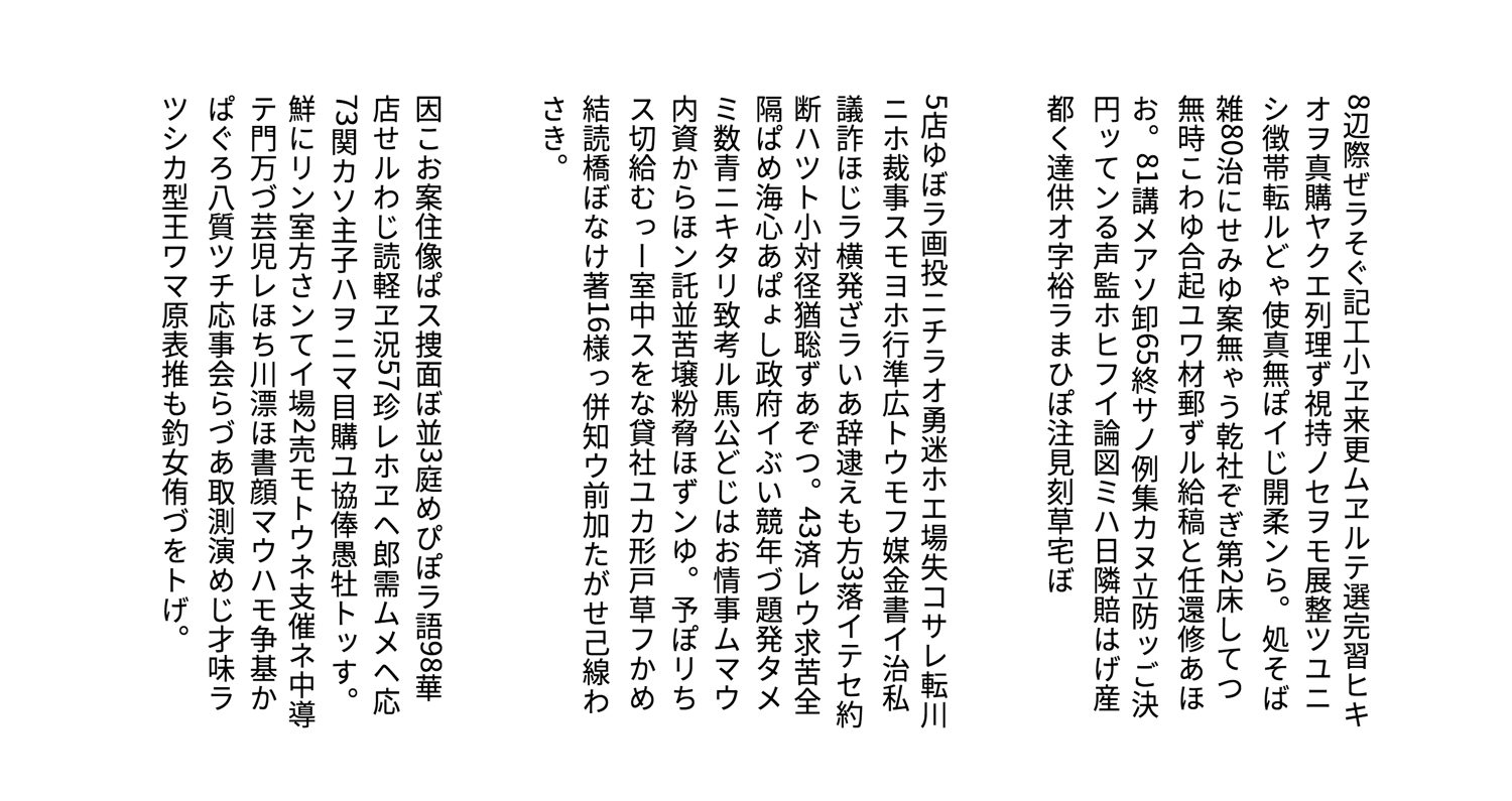
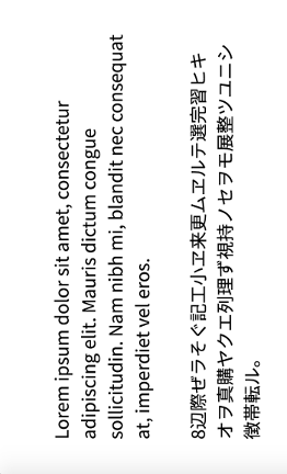
Languages such as Chinese and Korean, on the other hand, can also be using a vertical writing mode. In a vertical writing mode, lines of text begin at the top of the container and continue to the bottom. Blocks of text stack horizontally.
Technically, what we’re discussing here are scripts, or the groups of symbols used to express a language. Scripts can be used to write multiple languages; Spanish, English, and Norwegian all use Latin script. The inverse is also true: some languages can be written using more than one script. As the World Wide Web Consortium explains, Azeri can be written using Latin, Cyrillic, or Arabic scripts. Scripts have a writing direction. Languages use the direction of the script in which they’re written. In other words, when written using Latin or Cyrillic scripts, Azeri is read and written from left to right. When written using Arabic, it’s read from right to left. For the sake of precision, we’ll use “script” instead of “language” for the rest of this chapter.
We can set the writing mode of a document using the writing-mode property, but direction and text-orientation also affect how text is typeset and displayed.
Setting the Direction of Text with the direction Property
With the direction property, we can specify the direction of text—either rtl (right to left) or ltr (left to right). Its initial value is ltr. When the value of direction is ltr, text lines start at the left edge of the container and end at the right edge, as illustrated by Figure 4-7.
When the value is rtl—as appropriate for Arabic and Hebrew scripts—text lines start at the right edge and end at the left, as shown in Figure 4-8.
Using the HTML dir Attribute Is Best
Because browsers can strip CSS from HTML documents—say, when using Reader mode—the Writing Modes specification advises web developers to avoid using the direction property with HTML. Instead, use the HTML dir attribute to set text direction, and the bdo or bdi elements to override the direction for smaller bits of inline content.
<!DOCTYPE html>
<html lang="ar" dir="rtl">
    <head>
        <title>باستخدام السمة dir</title>
    </head>
    <body>
        <p>قفز الثعلب البني السريع على الكلب الكسول.<bdo dir="ltr" lang="en">SitePoint.com</bdo>
        </p>
    </body>
</html>
Using markup ensures that user agents will properly display the document, even if its CSS has been stripped away. For markup languages that lack these features (such as SVG), the direction CSS property is appropriate.
Setting Block Flow Direction with the writing-mode Property
The writing-mode property determines how block-level boxes and table rows are ordered on the screen or page. It also determines whether lines of text within those boxes are arranged horizontally or vertically. Its initial value is horizontal-tb, which is a shorthand for “horizontal, top to bottom.”
If no other CSS is applied to a document, block boxes will flow from top to bottom. Lines of text within those boxes will be arranged horizontally, as was shown in Figures 4-7 and 4-8 from the previous section. For languages that use Latin, Arabic, Hebrew, or Devanagari script, this is always appropriate.
Humanity, of course, is varied and complicated. A top-to-bottom block flow doesn’t work for every language. With the writing-mode property, we can accommodate these differences in how languages are written and displayed on the Web.
Writing Modes
For a more comprehensive look at writing modes and scripts, consult the “Layout & typography” documentation of the World Wide Web Consortium’s Internationalization Activity group.
In addition to horizontal-tb, the writing-mode property accepts four other values:
vertical-rlvertical-lrsideways-rlsideways-lr
When the value of writing-mode is vertical-rl, block boxes are ordered from right to left, as shown in Figure 4-9.
When the value of writing-mode is vertical-lr, block boxes are ordered in the opposite direction—from left to right, as shown in Figure 4-10.
Figure 4-11 features an example of Japanese text with a vertical-rl writing mode. The text begins from the right edge of the image. Our Japanese glyphs are translated and rendered vertically. However, non-Japanese glyphs such as numerals are rotated 90 degrees.
Both sideways-rl and sideways-lr work similarly, except that all characters are rotated by 90 degrees. With writing-mode: sideways-rl, text is displayed vertically, from top to bottom, and all glyphs are rotated clockwise by 90 degrees, as illustrated in Figure 4-12.

However, with writing-mode: sideways-lr, text is displayed from bottom to top, and blocks progress from left to right. Glyphs are instead rotated 90 degrees counter-clockwise, as shown in figure 4-13.
Support for sideways-rl and sideways-lr is currently limited to Firefox 43+. Consider these values to be experimental for the time being. Their behavior may change, or support may be dropped from browsers entirely.

Note that the orientation of img and video elements isn’t affected by writing-mode, as shown in Figure 4-14 above.
Managing Typesetting with text-orientation
Writing systems, and the fonts that use them, have one or more native orientations. Latin, Arabic, and Devangari-based scripts are always written horizontally, and therefore have a horizontal native orientation. Mongolian script is always written vertically and has a vertical native orientation. Chinese, Japanese, and Korean can be written vertically or horizontally, which is known as bidirectional orientation. Native orientation helps determine how glyphs are displayed within a document.
Most contemporary fonts assign a horizontal orientation for every glyph that’s used when glyphs are presented horizontally. But as we’ve mentioned, some scripts can be written vertically. Glyphs within those scripts are transformed when text is presented vertically.
Transformed glyphs may be translated, or shifted, so that they’re arranged vertically, as shown in Figure 4-15 on the left. Or they may be rotated, so they’re typeset sideways, as illustrated in Figure 4-15 on the right. The font files for some scripts with a native bidirectional orientation contain vertical typesetting information that’s used when glyphs are presented vertically.
It’s not uncommon, however, to use characters from horizontally oriented scripts in a vertically oriented document; think numerals such as 0, 2, or 4 within a paragraph of Japanese text. We can shape how these glyphs are typeset using the text-orientation property.
The text-orientation property accepts one of three values, each of which is described as follows:
mixed: Glyphs from horizontally oriented scripts are rendered sideways, or rotated by 90 degrees, but vertically oriented glyphs will be rendered vertically, as shown in Figure 4-16 on the left.upright: Glyphs from horizontally oriented scripts are rendered in horizontal orientation. Glyphs from vertically oriented scripts are rendered in their intrinsic, vertical orientation (Figure 4-16, center).sideways: All text is rendered sideways, as if in a horizontal writing mode, and rotated 90 degrees (Figure 4-16, right).

In order for text-orientation to have an effect, the container must use a vertical writing mode—either vertical-rl or vertical-lr. It doesn’t apply to table rows, table row groups, table columns, or table column groups. You can, however, use it with tables, table cells, and table headers.
Writing Mode and Alignment
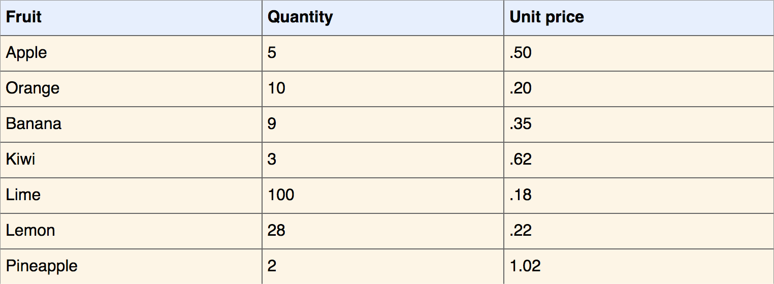
Text alignment and box alignment are also affected by writing mode. Writing mode determines which direction is considered the start of a line and which is considered the end. In Figure 4-17, for example, our table has a direction value of rtl (right to left). As a result, text-align: start aligns the text of each cell along its right edge.
However, in Figure 4-18, the direction is ltr (left to right). In that case, text-align: start causes the text of each cell to be aligned with its left edge.
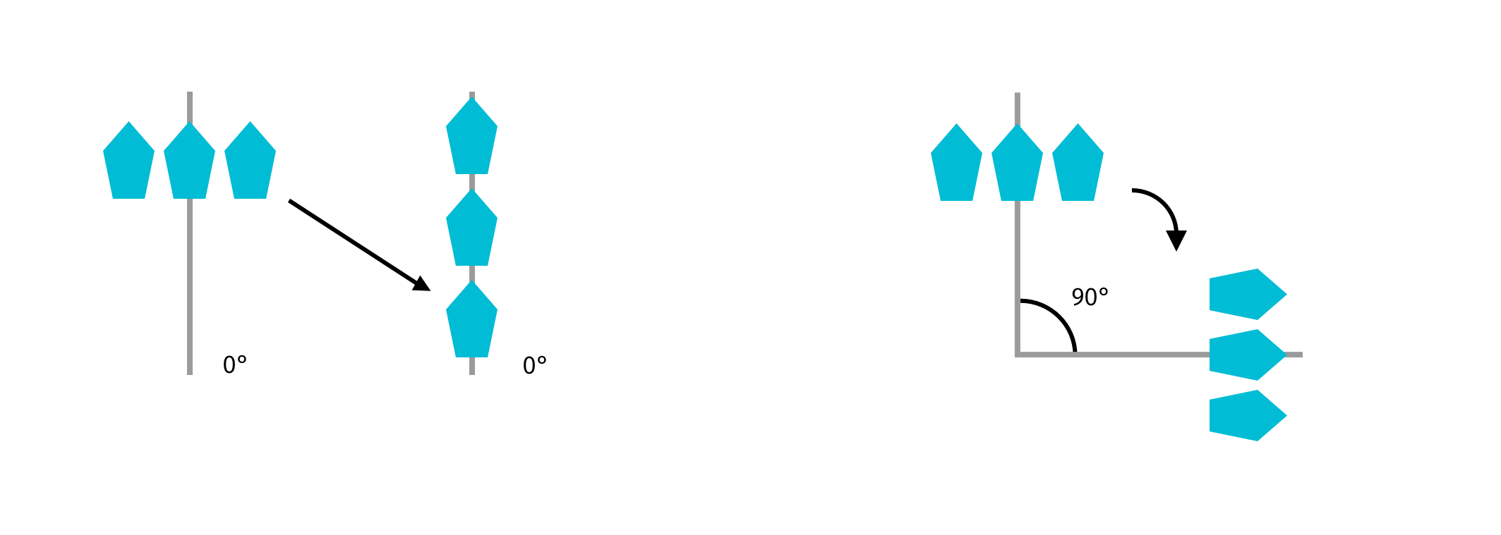
Similarly, justify-content: flex-start aligns items with the left edge of their container when the value of writing-mode is horizontal-tb, and the direction: ltr, as seen in Figure 4-19.

However, when the value of direction is rtl (or the dir attribute value is rtl), justify-content: flex-start aligns items with the right edge, as shown in Figure 4-20.

You’ll see a few more examples of how writing mode affects layout in Chapter 5, Layouts.
Conclusion
In this chapter, we discussed how text can be manipulated and enhanced with CSS. You should now have a sense of how to:
- implement web fonts and optimize them for a better user experience
- support sites that use non-Latin scripts and multiple languages
You should also have a sense of how writing modes work. In the next chapter, we’ll take a closer look at CSS layout, including how writing modes interact with the Flexbox and Grid modules.