
Chapter 7: Transforms
Transforms allow us to create effects and interactions that are otherwise impossible. When combined with transitions and animations, we can create elements and interfaces that rotate, dance, and zoom. Three-dimensional transforms, in particular, make it possible to mimic physical objects.
Take, for example, the humble postcard received from a friend. Its front face displays a photo of the location your friend sent the card from. When you flip it over, you see expanded information about the photo and your friend’s journey. (By the way, they wish you were there.)

A postcard isn’t a web interface, obviously, but it’s a metaphor for the kind of interfaces we can create. Perhaps you want to build a weather widget that functions similarly to a postcard. The front of our widget contains a current weather summary, which can be seen in figure 7-2. Flipping it over—triggered by a tap or swipe—might show an expanded weather forecast, or reveal a Settings panel, as seen in figure 7-3.


Card-style interfaces are a great example of what we can build with transforms. In this chapter, we’ll do a deep dive into the details of how they work.
Checking Out the Spec
Transforms are defined by the CSS Transforms Module Level 2 specification. At one point, two-dimensional and three-dimensional transforms were defined in separate specifications. As you move through the chapter, you’ll notice some redundancy in function names.
How Transforms Affect Layout
Before we go too much further, there are some things you should know about how the transform property affects layout. When you apply the transform property to an element and its value is other than none, three things happen:
- the element becomes a containing block for child elements
- it establishes a new stacking context for the element and its children
- it imposes a local coordinate system within the element’s bounding box
Let’s look at these concepts individually.
transform Creates a Containing Block
When an element is positioned—that is, when the value of the position property is something other static—it’s drawn relative to a containing block. A containing block is the closest positioned ancestor or, failing that, the root element (such as html or svg) of a document.
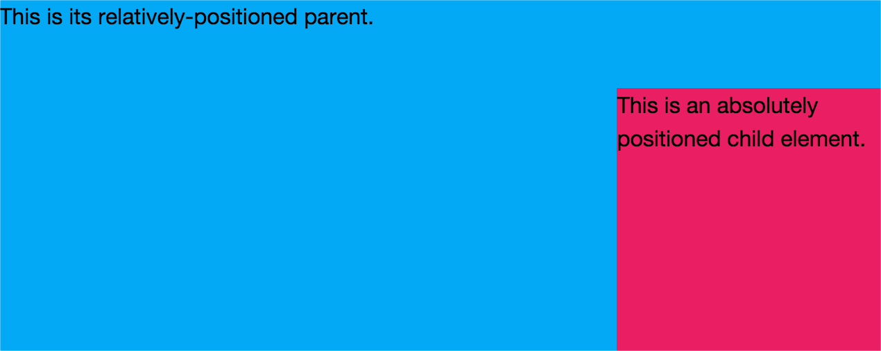
In figure 7-4, the child rectangle has a position value of absolute. Its right and bottom properties are both set to 0. Its parent element has a position value of relative. Because the parent in this case is positioned, it becomes a containing block for the child. If the parent rectangle was not positioned, this child element would instead be drawn at the bottom right of the browser window.
Transforms work similarly. Setting the value of transform to something other than none turns the transformed element into a containing block. Positioned children of a transformed element are positioned relative to that element, as seen in figure 7-5.

In figure 7-5, the parent element is not positioned. The transform property is what’s creating this containing block.
transform Creates a New Stacking Context
A transform also creates a new stacking context for the element it’s applied to. As you may recall from Chapter 5, Layouts, elements within a stacking context are painted from back to front, as follows:
- child-stacking contexts with a negative stack level (for example, positioned
z-index: -1) - nonpositioned elements
- child-stacking contexts with a stack level of
0(for example, positioned andz-index: 0;orz-index: auto;) - child-stacking contexts with positive stack levels (for example,
z-index: 1) sit at the top of the stack
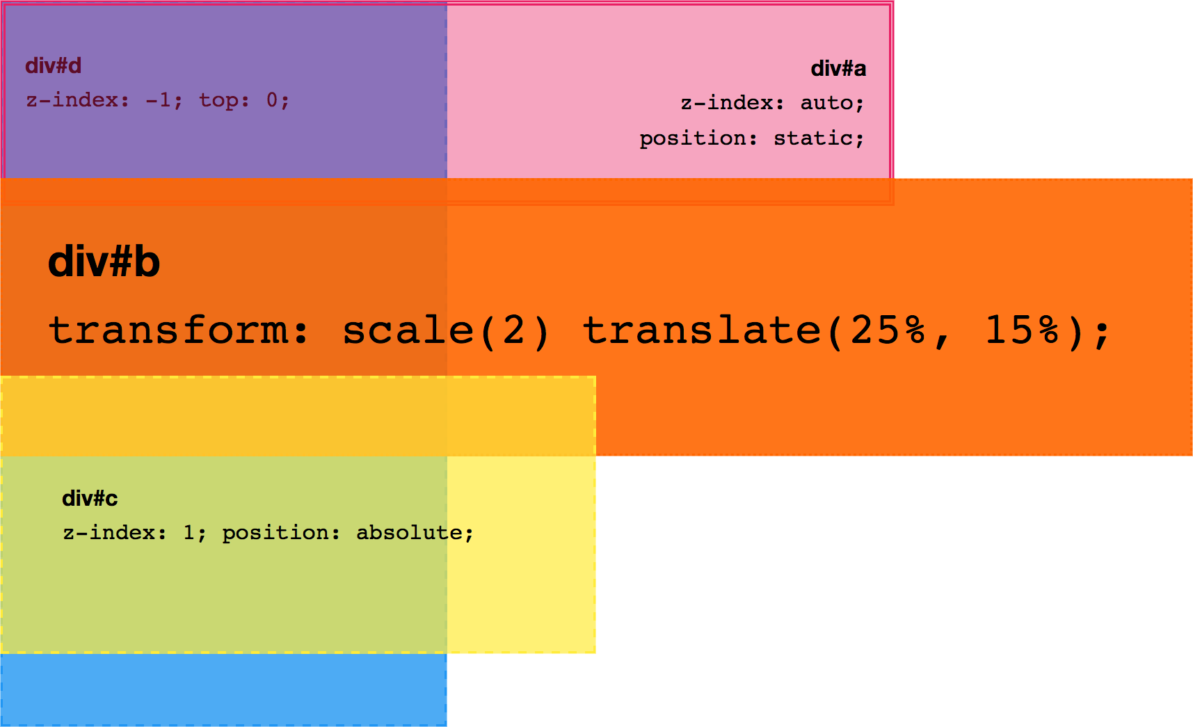
Setting the value of transform to something other than none puts the element’s stack level at 0, and causes a transformed element to be stacked in front of nonpositioned elements. The z-index values of each child element will be relative to the parent. Let’s update our example from Chapter 5 to see how this works:
<div style="position:relative;">
    <div id="a">
        <p><b>div#a</b></p>
    </div>

    <div id="b" style="transform: scale(2) translate(25%, 15%);">
        <p><b>div#b</b></p>
    </div>

   <div id="c" style="position:relative; z-index: 1">
        <p><b>div#c</b></p>
    </div>
    <div id="d" style="position:absolute; z-index: -1">
        <p><b>div#d</b></p>
    </div>
</div>
In this case (see figure 7-6), div#d sits at the bottom of the stack, and div#a sits above it. But div#b comes next because the transform property forces its z-index value to be 0 instead of auto. With z-index: 1, div#c sits at the top of the stack.
Three-dimensional transforms add additional complexity. An element shifted along the Z-axis may render on a different plane than its container. Elements may also intersect with other elements across layers. Still, the basic rules of the stacking order apply.
Transformed elements may also overlap other elements on the page and prevent them from receiving mouse, touch, or pointer events. Applying pointer-events: none to the transformed element will solve this issue.
Browsers apply transforms after elements have been sized and positioned. Unlike floated elements, transformed elements aren’t removed from the normal flow. Document flow is described by the Visual formatting model section of the CSS2.1 specification. Updates to this model are partly described by the CSS Display Module Level 3. Content and other elements won’t wrap around transformed elements.
Because transforms are applied after the layout has been calculated, they don’t affect document layout. Although transformed child elements may overflow the parent element’s bounding box, they don’t affect the position of other elements on the page. They also don’t affect a the HTMLElement.offsetLeft or HTMLElement.offsetTop DOM properties of an element. Using these properties to detect the rendered position of an element will give you inaccurate results.
Transforms do, however, affect client rectangle values and visual rendering of elements. To determine the rendered left and top positions of an element, use the HTMLElement.getClientRects() or HTMLElement.getBoundingClientRect() DOM methods (for example, document.getElementById('#targetEl').getClientRects()). Because they don’t force the browser to calculate page layout, transforms typically perform better than properties such as left and height when animated.
transform Creates a Local Coordinate System
You may recall from geometry class that the Cartesian coordinate system is a way of specifying points in a plane. You may also recall that a plane is a flat, two-dimensional surface that extends infinitely along the horizontal and vertical axes. These axes are also known as the X-axis and Y-axis.
Point values along the X-axis increase as you move from left to right, and decrease from right to left. Y-axis point values increase as you move up, and decrease as you move down. The X and Y axes are perpendicular to each other. Where they cross is known as the origin, and the coordinates of its location are always (0,0), as illustrated in figure 7-7.

In a three-dimensional coordinate system, there’s also a Z-axis. This axis is perpendicular to both the X and Y axes, as well as the screen (see figure 7-8). The point at which the Z-axis crosses the X and Y axes is also known as the origin. Its coordinates are (0,0,0).
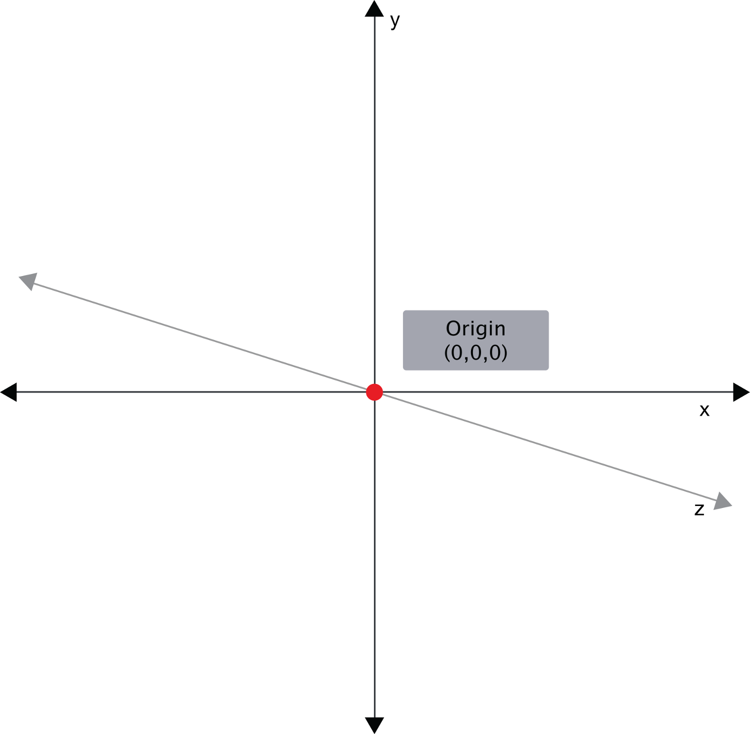
A rendered HTML document is, essentially, a coordinate system. The top-left corner is the origin, with coordinates of (0,0) or (0,0,0). Values increase along the X-axis as you move right. Values increase along the Y-axis as you move down the screen or page. Z-axis values increase as elements move towards the viewer and decrease as they move away from the viewer.
Setting the value of transform to a value besides none adds a local coordinate system to the selected elements. The origin—point (0,0) or (0,0,0)—in this local coordinate system sits at the center of the element’s bounding box. We can change the position of the origin, however, by using the transform-origin property. Points within the element’s bounding box are then transformed relative to this local origin.
The transform-origin Property
The transform-origin property accepts up to three values, one for each of the X, Y, and Z positions—for example, transform-origin: 300px 300px for a 2D transformation, or transform-origin: 0 0 200px for a 3D transformation.
If one value is specified, the second value is assumed to be center, and the third value is assumed to be 0px.
Both the X and Y coordinates may be percentages, lengths, or positioning keywords. Positioning keywords are left, center, right, top, and bottom. The Z position, however, must be a length. In other words, transform-origin: left bottom 200px works, but transform-origin: left bottom 20% doesn’t.
Setting transform-origin moves the (0,0) point of the local coordinate system to a new location within the element’s bounding box. This, of course, modifies the transformation, sometimes radically. Figure 7-9 shows a transform-origin point of 50% 50% and one at 0px 0px.

Now that you know a little more about how transforms affect document layout, let’s dig into the transform functions. This is how we make the magic. Transforms let us rotate, flip, skew, and scale elements. When combined with animations and transitions, we can create sophisticated motion graphic effects.
Transforms can be grouped into two categories: 2D and 3D. Each group contains functions for rotating, skewing, scaling, and translating. 2D functions are concerned with transformations of points along the X and Y axes. 3D functions add the third dimension of depth and affect points along the Z-axis.
2D Transform Functions
There are four primary two-dimensional transform functions: rotate, scale, skew, and translate. Six other functions let us transform an element in a single dimension: scaleX and scaleY; skewX and skewY; and translateX and translateY.
rotate()
A rotation transform spins an element around its origin by the angle specified around the transform-origin point. Using rotate() tilts an element clockwise (positive angle values) or counter-clockwise (negative angle values). Its effect is much like a windmill or pinwheel, as seen in figure 7-10.

The rotate() function accepts values in angle units. Angle units are defined by the CSS Values and Units Module Level 3. These may be deg (degrees), rad (radians), grad (gradians), or turn units. One complete rotation is equal to 360deg, 6.28rad, 400grad, or 1turn.
Rotation values that exceed one rotation (say, 540deg or 1.5turn) are rendered according to their remaindered value, unless animated or transitioned. In other words, 540deg is rendered the same as 180deg (540 degrees minus 360 degrees) and 1.5turn is rendered the same as .5turn (1.5 - 1). But a transition or animation from 0deg to 540deg or 1turn to 1.5turn will rotate the element one-and-a-half times.
2D Scaling Functions: scale, scaleX, and scaleY
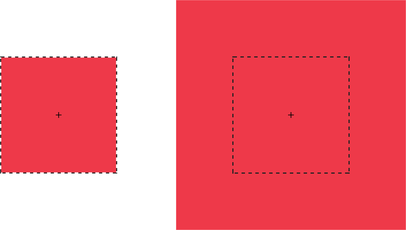
With scaling functions, we can increase or decrease the rendered size of an element in the X-dimension (scaleX), Y-dimension (scaleY), or both (scale). Scaling is illustrated in figure 7-11, where the border illustrates the original boundaries of the box, and the + marks its center point.
Each scale function accepts a multiplier or factor as its argument. This multiplier can be just about any positive or negative number. Percentage values aren’t supported. Positive multipliers greater than 1 increase the size of an element. For example, scale(1.5) increases the size of the element in the X and Y directions 1.5 times. Positive multipliers between 0 and 1 will reduce the size of an element.
Values less than 0 will also cause an element to scale up or down in size and create a reflection (flip) transform.
Watch Your Scale
Using scale(0) will cause the element to disappear, because multiplying a number by zero results in a product of zero.
Using scale(1) creates an identity transformation, which means it’s drawn to the screen as if no scaling transformation was applied. Using scale(-1) won’t change the drawn size of an element, but the negative value will cause the element to be reflected. Even though the element doesn’t appear transformed, it still triggers a new stacking context and containing block.
It’s possible to scale the X and Y dimensions separately using the scale function. Just pass it two arguments: scale(1.5, 2). The first argument scales the X-dimension; the second scales the Y-dimension. We could, for example, reflect an object along the X-axis alone using scale(-1, 1). Passing a single argument scales both dimensions by the same factor.
2D Translation Functions: translateX, translateY, and translate
Translating an element offsets its painted position from its layout position by the specified distance. As with other transforms, translating an element doesn’t change its offsetLeft or offsetTop positions. It does, however, affect where it’s visually positioned on screen.
Each 2D translation function—translateX, translateY, and translate—accepts lengths or percentages for arguments. Length units include pixels (px), em, rem, and viewport units (vw and vh).
The translateX function changes the horizontal rendering position of an element. If an element is positioned 0px from the left, transform: transitionX(50px) shifts its rendered position 50px to the right of its start position. Similarly, translateY changes the vertical rendering position of an element. A transform of transform: transitionY(50px) offsets the element vertically by 50px.
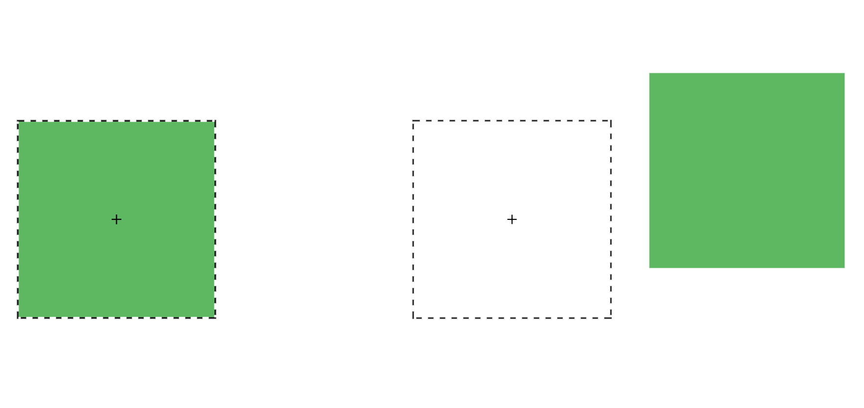
With translate(), we can shift an element vertically and horizontally using a single function. It accepts up to two arguments: the X translation value, and the Y translation value. Figure 7-12shows the effect of an element with a transform value of translate(120%, -50px), where the left green square is in the original position, and the right green square is translated 120% horizontally and -50px vertically from its containing element (the dashed border).
Passing a single argument to translate is the equivalent of using translateX; the Y translation value will be set to 0. Using translate() is the more concise option. Applying translate(100px, 200px) is the equivalent of translateX(100px) translateY(200px).
Positive translation values move an element to the right (for translateX) or downward (for translateY). Negative values move an element to the left (translateX) or upward (translateY).
Translations are particularly great for moving items left, right, up, or down. Updating the value of the left, right, top, and bottom properties forces the browser to recalculate layout information for the entire document. But transforms are calculated after the layout has been calculated. They affect where the elements appear on screen, but not their actual dimensions. Yes, it’s weird to think about document layout and rendering as separate concepts, but in terms of browsers, they are.
Transform Properties May Be Coming to a Browser near You
The latest version of the CSS Transforms specification adds translate, rotate, and scale properties to CSS. Transform properties work much like their corresponding transform functions, but values are space-separated instead of comma-separated. We could, for example, express transform: rotate3d(1, 1, 1, 45deg) using the rotate property: rotate: 1 1 1 45deg. Similarly, translate: 15% 10% 300px is visually the same as transform: translate3d(15%, 10%, 300px) and scale: 1.5 1.5 3 is the same as transform: scale3d(1.5, 1.5, 3). With these properties we can manage rotation, translation or scale transformations separately from other transformations.
At the time of writing, browser support for transform properties is still pretty sparse. Chrome and Samsung Internet support them out of the box. In Firefox versions 60 and later, support is hidden behind a flag; visit about: config and set layout.css.individual-transform.enabled to true.
skew, skewX, and skewY
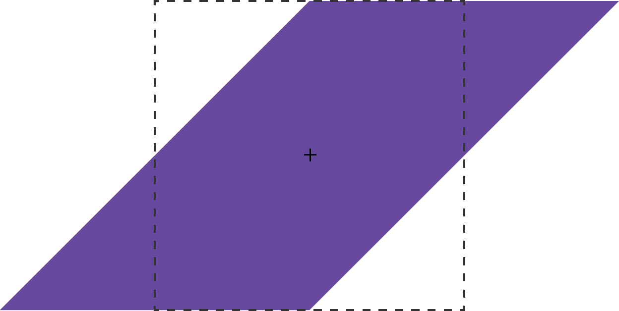
Skew transformations shift the angles and distances between points while keeping them in the same plane. Skew transformations are also known as shear transformations, and they distort the shapes of elements, as seen in figure 7-13, where the dashed line represents the original bounding box of the element.
The skew functions—skew, skewX, and skewY—accept most angle units as arguments. Degrees, gradians, and radians are valid angle units for the skew functions, while turn units, perhaps obviously, are not.
The skewX function shears an element in the X or horizontal direction (see figure 7-14). It accepts a single parameter, which again must be an angle unit. Positive values shift the element to the left, and negative values shift it towards the right.

Similarly, skewY shears an element in the Y or vertical direction. Figure 7-15 shows the effect of transform: skewY(30deg). Points to the right of the origin are shifted downward with positive values. Negative values shift these points upward.

This brings us to the skew function. The skew function requires one argument, but accepts up to two. The first argument skews an element in the X direction, and the second skews it in the Y direction. If only one argument is provided, the second value is assumed to be zero, making it the equivalent of skewing in the X direction alone. In other words, skew(45deg) renders the same as skewX(45deg).
Current Transform Matrix
So far, we’ve discussed transform functions separately, but they can also be combined. Want to scale and rotate an object? No problem: use a transform list. For example:
.rotatescale {
    transform: rotate(45deg) scale(2);
}
This produces the results you see below.

Order matters when using transform functions. This is a point that’s better shown than talked about, so let’s look at an example to illustrate. The following CSS skews and rotates an element:
.transformEl {
    transform: skew(10deg, 15deg) rotate(45deg);
}
It gives us the result you see below.

What happens if you rotate an element first and then skew it?
.transformEl {
    transform:  rotate(45deg) skew(10deg, 15deg);
}
The effect, shown in figure 7-18, is quite different.

Each of these transforms has a different current transform matrix created by the order of its transform functions. To fully understand why this is, we’ll need to learn a little bit of matrix multiplication. This will also help us understand the matrix and matrix3d functions.
Matrix Multiplication and the Matrix Functions
A matrix is an array of numbers or expressions arranged in a rectangle of rows and columns. All transforms can be expressed using a 4×4 matrix:
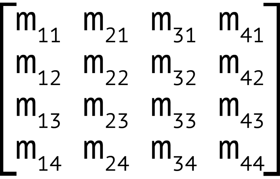
This matrix corresponds to the matrix3d function, which accepts 16 arguments, one for each value of the 4×4 matrix. Two-dimensional transforms can also be expressed using a 3×3 matrix, seen in figure 7-20.

This 3×3 matrix corresponds to the matrix transform function. The matrix() function accepts six parameters, one each for values a through f.
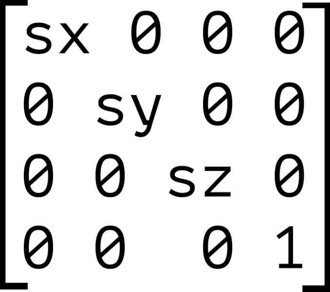
Each transform function can be described using a matrix and the matrix or matrix3d functions. Figure 7-21 shows the 4×4 matrix for the scale3d function, where sx, sy, and sz are the scaling factors of the X, Y, and Z dimensions respectively.
When we combine transforms—such as transform: scale(2) translate(30px, 50px)—the browser multiplies the matrices for each function to create a new matrix. This new matrix is what’s applied to the element.
But here’s the thing about matrix multiplication: it isn’t commutative. With simple values, the product of 3×2 is the same as 2×3. With matrices, however, the product of A×B is not necessarily the same as the product of B×A. Let’s look at figure 7-22 as an example. We’ll calculate the matrix product of transform: scale(2) translate(30px, 50px).
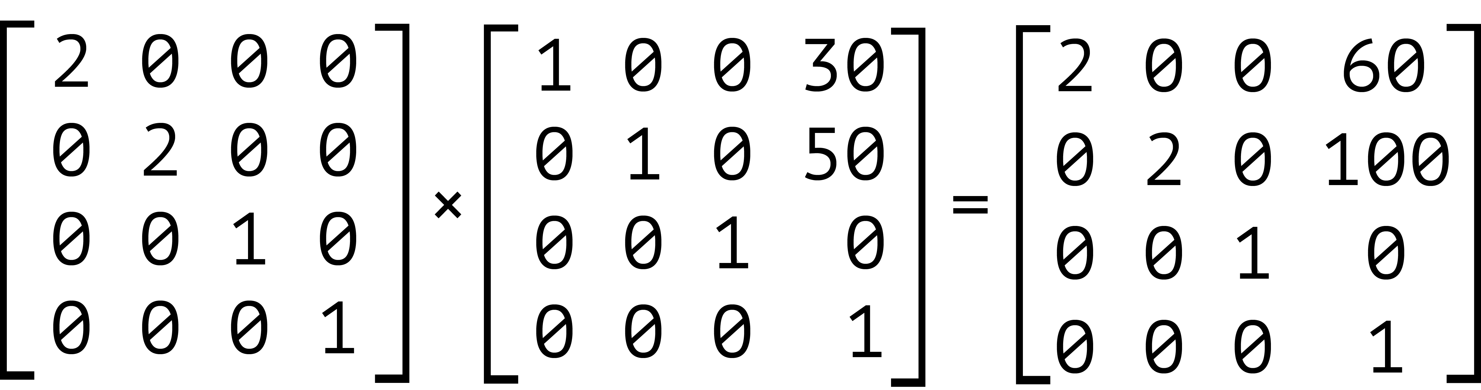
Our element has been scaled by a factor of two, and then translated 60px horizontally and 100px vertically. We can also express this product using the matrix function: transform: matrix(2, 0, 0, 2, 60, 100). Now let’s switch the order of these transforms—that is, transform: translate(30px, 50px) scale(2). The results are shown in figure 7-23.
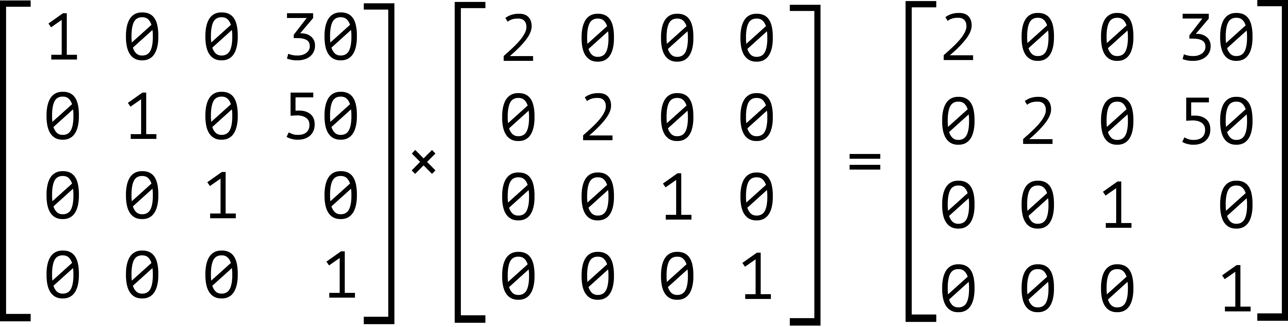
Notice that our object is still scaled by a factor of two, but here it’s translated by 30px horizontally and 50px vertically instead. Expressed using the matrix function, this is transform: matrix(2, 0, 0, 2, 30, 50).
It’s also worth noting that inherited transforms function similarly to transform lists. Each child transform is multiplied by any transform applied to its parent. For example, take the following code:
<div style="transform: skewX(25deg)">
    <p style="transform: rotate(-15deg)"></p>
</div>
This is rendered the same as the following:
<div>
    <p style="transform: skewX(25deg) rotate(-15deg)"></p>
</div>
The current transform matrix of the p element will be the same in both cases. Though we’ve focused on 2D transforms so far, the above also applies to 3D transforms. The third dimension adds the illusion of depth. It also brings some additional complexity in the form of new functions and properties.
3D Transform Functions
There are nine functions for creating 3D transforms. Each of these functions modifies the Z-coordinates of an element and/or its children. Remember, Z-coordinates are points along the plane that sit perpendicular to the viewer. With the exception of rotateZ(), these functions create and change the illusion of depth on screen.
rotateX() and rotateY()
The rotateX() and rotateY() functions rotate an element around the X and Y axes respectively. Using rotateX() creates a somersault effect, causing an object to flip top-over-tail around a horizontal axis. With rotateY(), the effect is more like that of a spinning top, rotating around a vertical axis.
Like rotate(), both rotateX() and rotateY() accept an angle measurement as an argument. This angle can be expressed in degrees (deg), radians (rad), gradians (grad), or turn units. As mentioned earlier in the chapter, rotateZ() works the same way as rotate(). It’s a relic from when 2D and 3D transforms were defined by separate specifications.
Positive angle values for rotateX() cause an element to tilt backwards, as shown in figure 7-24.

Negative angle values for rotateX() do the opposite, causing the element to tilt forward:

Negative angles for rotateY() cause the element to tilt counter-clockwise. In figure 7-26, the element has had a rotation of -55 degrees around the Y-axis.

Positive values tilt it clockwise, as shown in figure 7-27.

The containing element in figure 7-25, figiure 7-26, and figure 7-27 has a perspective value of 200px. We’ll discuss the perspective property later in this chapter. For now, it’s enough to know that this property adds a sense of depth and exaggerates the effect of the three-dimensional rotation. Compare figure 7-28 to figure 7-27. Both have been rotated along the Y-axis by 55 degrees, but in figure 7-28 , the parent container has a perspective value of none. Our object looks more squished than rotated. Use perspective on a container element when creating a 3D transform.

Disappearing Elements
There’s another facet to be aware of when working with 3D rotations. Rotating an element by ±90 degrees or ±270 degrees can sometimes cause it to disappear from the screen. Each element on a page has an infinitesimal thickness. By rotating it a quarter or three-quarters of a turn, we’re looking at its infinitesimally thin side. It’s kind of like looking at the edge of a sheet of paper that’s perpendicular to your face. Adjusting the perspective and perspective-origin values of a parent element can prevent this behavior in some cases, but not all of them.
Rotating around Multiple Axes with rotate3d()
Sometimes, we want to rotate an object around more than one axis. Perhaps you want to rotate an element counter-clockwise and tilt it by 45 degrees, as in figure 7-29. This is what rotate3d() does.

The rotate3d() function accepts four arguments. The first three make up an X, Y, Z direction vector, and each of these arguments should be a number. The fourth argument for rotate3d() should be an angle. The transformed object will be rotated by the angle around the direction vector defined by the first three arguments.
What those first three numbers are matters less than the ratio between them. For example, transform: rotate3d(100,5,0,15deg); and transform: rotate3d(20,1,0,15deg); have equivalent 3D matrices and produce the same effect.
That said, because of how the rotate3d matrix is calculated, something like transform: rotate3d(1, 500, 0, 15deg); won’t produce a significantly different effect than transform: rotate3d(1, 1, 0, 15deg);.
Just about any non-zero value for any of the first three parameters will create a tilt along that axis. Zero values will prevent a tilt. As you may have guessed, rotateX(45deg) is the equivalent of rotate3d(1, 0, 0, 45deg) and rotateY(25deg) could also be written as rotate3d(0, 1, 0, 25deg).
If the first three arguments are 0 (such as transform: rotate3d(0, 0, 0, 45deg)), the element won’t be transformed. Using negative numbers for the X, Y, or Z vector arguments is valid; it will just negate the value of the angle. In other words, rotate3d(-1, 0, 0, 45deg) is equivalent to rotate3d(1, 0, 0, -45deg).
Using rotate3d() rotates an element by the given angle along multiple axes at once. If you want to rotate an element by different angles around multiple axes, you should use rotateX(), rotateY(), and rotate() or rotateZ() separately.
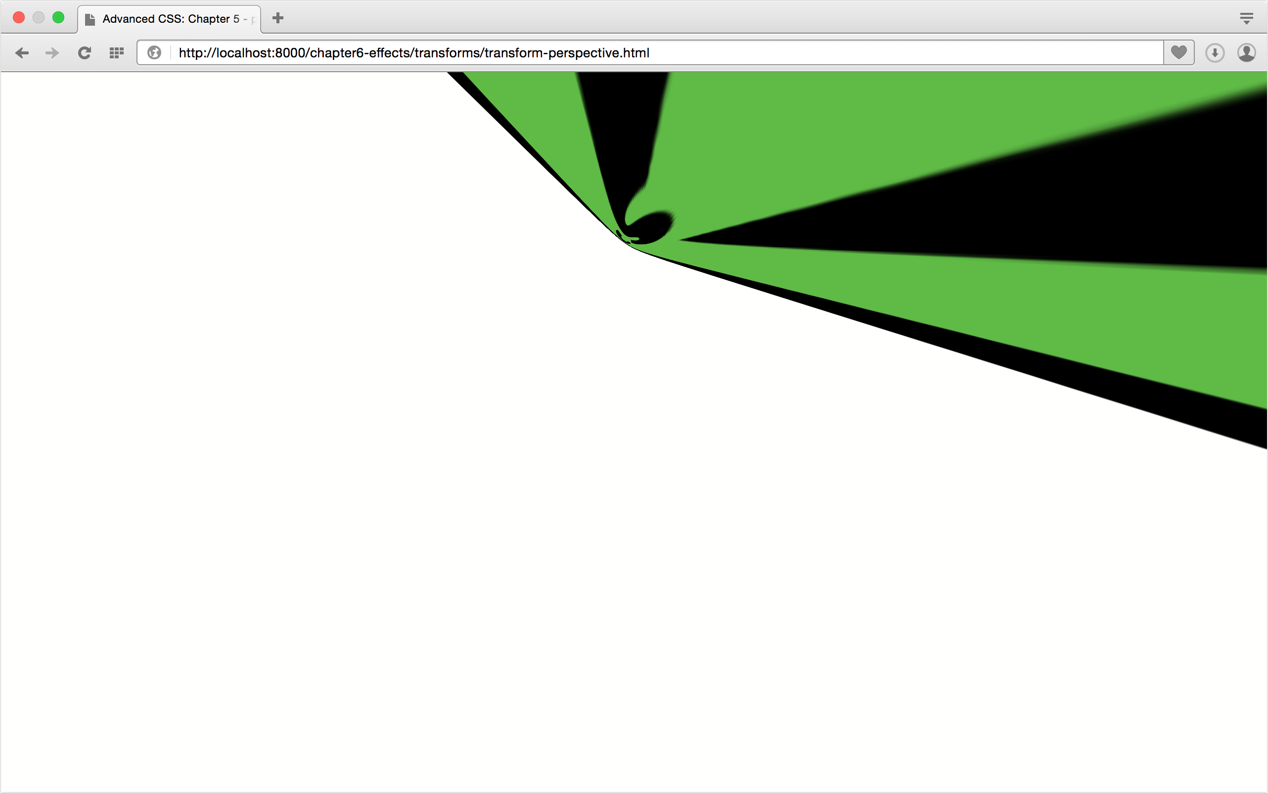
The perspective() Function
The perspective() function controls the foreshortening of an object when one end is tilted towards the viewer. Foreshortening is a specific way of drawing perspective—that is, simulating three dimensions when you only have two dimensions. With foreshortening, the end of objects that are tilted towards the viewer appear larger, and the end furthest from the viewer appears smaller. It mimics the distortion that occurs when you view an object up close versus viewing it at a distance.
The more technical definition, pulled from the CSS Transforms Module Level 2, says that perspective() “specifies a perspective projection matrix.” The definition continues:
This matrix scales points in X and Y based on their Z value, scaling points with positive Z values away from the origin, and those with negative Z values towards the origin. Points on the Z=0 plane are unchanged.
In practice, this means that perspective() will have a visible effect only when some of an object’s points have a non-zero Z-coordinate. Use it with another 3D function in a transform list (for example, transform: perspective(400px) rotateX(45deg)), or apply it to the child of a transformed parent.
The perspective() function accepts a single argument. This argument must be a length greater than zero. Negative values are invalid, and the transform won’t be applied. Lower values create a more exaggerated foreshortening effect, as you can see below. In this image, the value of our transform is perspective(10px) rotate3d(1,1,1,-45deg).
Higher values create a moderate amount of foreshortening. Figure 7-31 illustrates the impact of a higher perspective value. Its transform property value is perspective(500px) rotate3d(1,1,1,-45deg).

Order really matters when working with the perspective() function. A good rule of thumb is to list it first, as we’ve done in the examples here. You can list it elsewhere in the transform list (for example, rotate3d(1,0,1,-45deg) perspective(100px)), but the resulting current transform matrix doesn’t create much of an effect.
There’s also a point of diminishing returns with the perspective() function (and with the perspective property, as well). Increasing the argument’s value beyond a certain threshold will create little difference in how the element and its children are painted to the screen.
perspective() versus perspective
A word of caution: the transforms specification defines both a perspective() function and a perspective property. Though both are used to calculate the perspective matrix, they differ in how they’re used. The perspective property affects—and must be applied to—the containing element. It sets an imaginary distance between the viewer and the stage. The perspective() function, on the other hand, can be applied to elements as part of a transform list.
Translating Depth with translateZ() and translate3d()
Earlier in this chapter, we discussed how to translate an element horizontally or vertically using translateX() and translateY(). We can also, however, translate along the Z-axis. There are two functions that allow us to do this: translateZ() and translate3d(). We can combine them with transitions to create zoom effects, or mimic the feeling of moving through a chute.
The translateZ() function accepts a single length parameter as its argument. Length units are the only valid units for this function. Remember that we’re projecting three-dimensional coordinates into a two-dimensional space, so percentages don’t make much sense. The translateZ() function shifts the object towards or away from the user by the specified length. Negative values shift the element or group away from the user, in effect shrinking it, as can be seen in figure 7-32.
Positive values shift the element towards the viewer, making it appear larger. Sometimes the effect is to fill the entire viewport, thereby engulfing the viewer, as seen in figure 7-33.
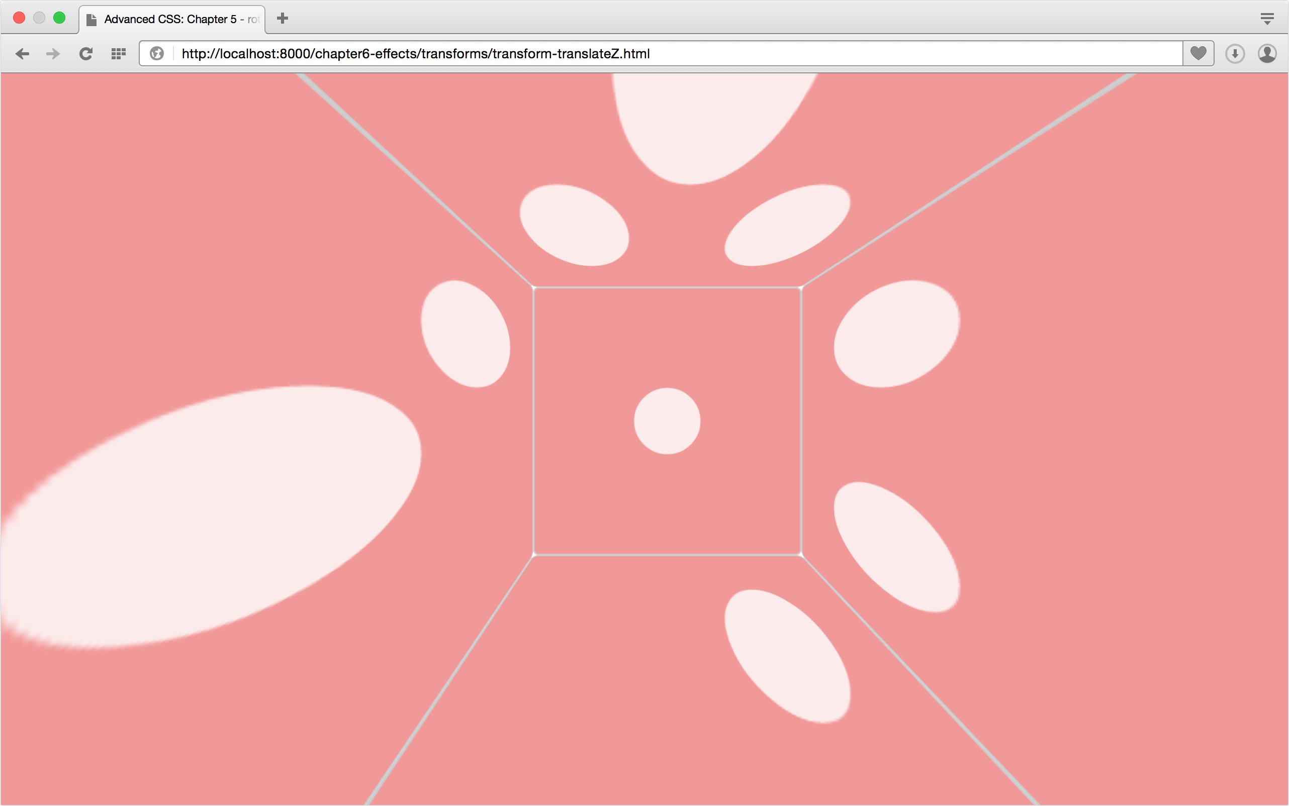
If the value of translateZ() is large enough, the element will disappear from view. It’s actually moved behind the viewer in this imagined 3D space. Similarly, if the value of translateZ() is small enough, say translateZ(-40000px), the element will disappear from view because it’s now “too far” from the viewer and too small to draw on screen.
translate3d() is just a more concise way of translating in two or three directions at once. It accepts three arguments: one each for the X, Y, and Z directions. Translation values for the X and Y direction arguments may be lengths or percentages, but the Z-direction argument (the third argument) must be a length value. Keep in mind that translateX(50%) translateY(10%) translateZ(100px) is the equivalent of translate3d(50%, 10%, 100px). Use translate3d when you want to translate more than one dimension but also want more concise code.
Scaling the Z-dimension: scaleZ() and scale3d()
We can also scale an object’s Z-dimension using the scaleZ() and scale3d() functions. The scaleZ() function transforms points along the Z-axis alone, while scale3d() lets us scale all three dimensions at once. Scaling the Z-dimension changes the depth of an object, and in some combinations can be used to create zoom effects. Experiment with them and see.
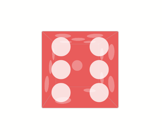
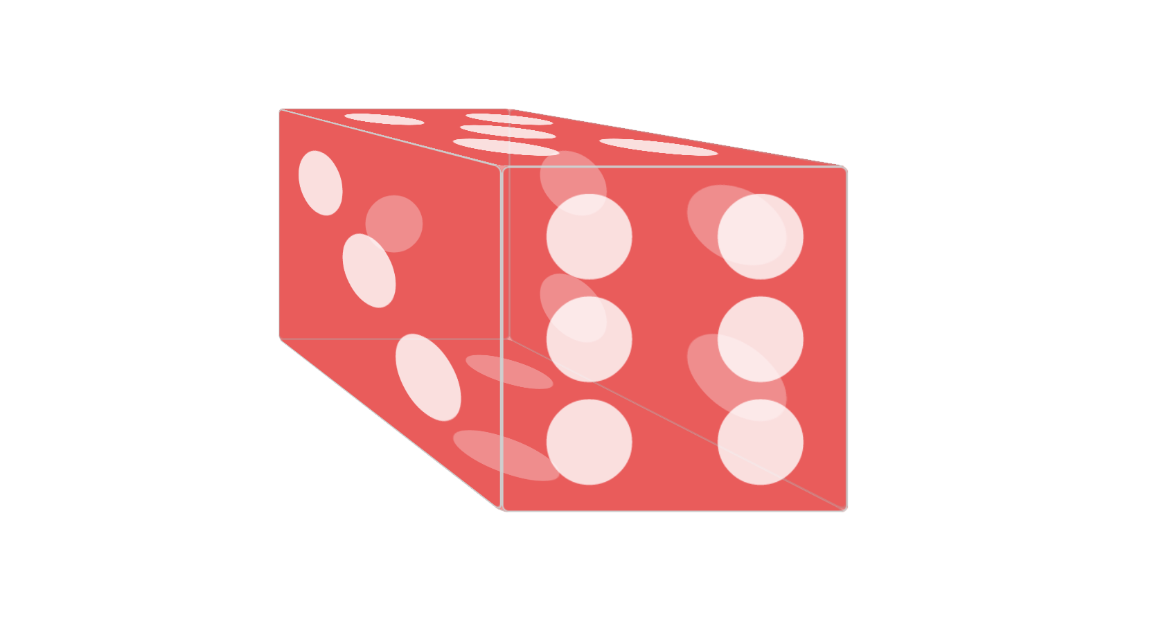
The scaleZ() function accepts a number as its argument. As with scaleX() and scaleY(), positive values greater than 1 increase the size of the element’s Z-dimension. Values between 0 and 1 decrease its size. Negative values between 0 and -1 decrease the element’s size along the Z-dimension, while values less than -1 increase it. Because these values are negative, however, the element and its children will be inverted. In figure 7-34, the left die shows an element group with transform: scaleZ(0.5) applied. The box on the right has a transformation of scaleZ(-0.5) applied. Notice that the positions of the six face and one face have been swapped in the example with a negative scale.

The scale3d() function accepts three arguments, and all three arguments are required in order for this function to work. The first argument scales the X dimension. The second argument scales its Y dimension, and the third argument scales the Z dimension. As with translate3d(), the scale3d() function is just a more concise way to write transforms that scale in multiple dimensions. Rather than using scaleX(1.2) scaleY(5) scaleZ(2), for example, you could use scale3d(1.2, 5, 2).
Transform functions are only part of what you need to create 3D transforms. You’ll also need CSS properties that manage how objects are drawn in a simulated three-dimensional space. These properties directly affect the perception of depth and distance.
Creating Depth with the perspective Property
To make a 3D-transformed object look like it’s sitting in a three-dimensional space, we need the perspective property. The perspective property adjusts the distance between the drawing plane and the viewer. We’re still projecting three-dimensional coordinates into a two-dimensional space. But adding perspective to a containing element causes its children to have the appearance of being in a 3D space.
As with transform, perspective creates both a new containing block and a new stacking context when the value is something other than none. Along with the perspective-origin property, perspective is used to calculate the perspective matrix. We’ll cover perspective-origin in the next section.
Aside from the none keyword, perspective also accepts a length as its value. Values must be positive (for example, 200px or 10em). Percentages don’t work. Neither do negative values such as -20px.
Smaller values for perspective increase the visual size of the element, as seen below, which has a perspective value of 500px. Items that are closer to the viewer on the Z-axis appear larger than those further away.

Larger values, on the other hand, make elements appear smaller. The container element in figure 7-36 has a perspective value of 2000px. This is similar to how your eye perceives objects of varying distances.

Modifying the Point of View with perspective-origin
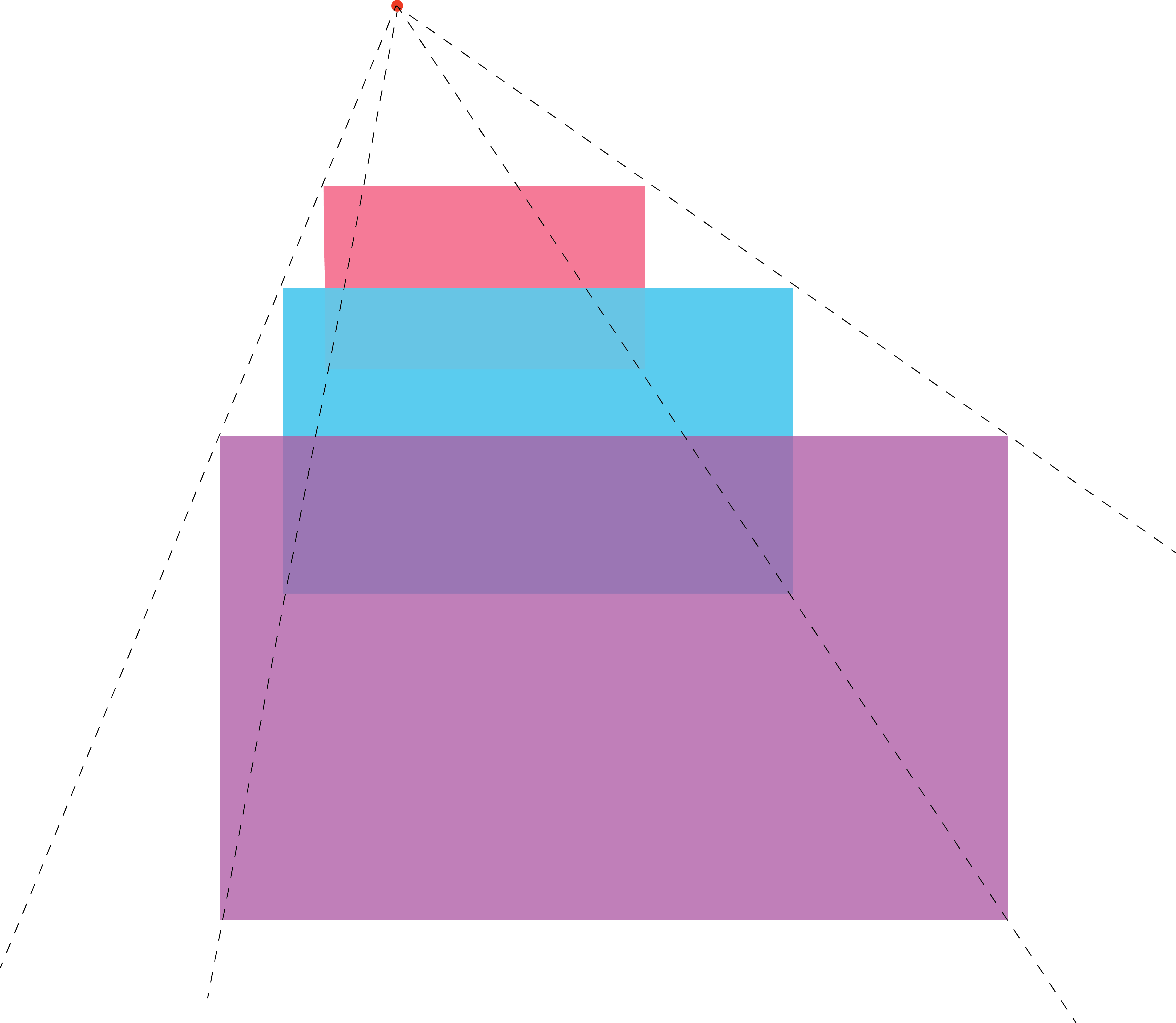
If you’ve studied how to draw in perspective, the perspective-origin property will feel like old hat. To draw in perspective, you first make a point on your page or canvas. This point is known as the vanishing point. It’s the point in your drawing at which items will theoretically disappear from view.
Next, draw a shape of your choosing. We’ll keep this example simple, and use a rectangle.
Step three is to draw a series of lines towards the vanishing point, as shown in figure 7-37 These lines, also known as convergence lines, serve as guides for drawing shapes that are sized appropriately given their perceived distance from the viewer.

As you can see in figure 7-38, the rectangles that appear closer to the viewer are larger. Those that appear further away are smaller.
This is essentially how the perspective-origin property works. It sets the coordinates of the vanishing point for the stage. Negative Y values give the impression that the viewer is looking down at the stage, while positive ones imply looking up from below it. Negative X values mimic the effect of looking from the right of the stage. Positive X values mimic looking from its left. Figure 7-39 shows a containing element with a perspective-origin of -50% -50%.
As with transform-origin, the initial value of perspective-origin is 50% 50%—the center point of the containing element. Values for perspective–origin may be lengths or percentages.
Positioning keywords—left, right, top, bottom, and center—are also valid. The center keyword is the same as 50% 50%. Both bottom and right compute to positions of 100% along the vertical and horizontal positions respectively. The top and left keywords compute to vertical and horizontal positions of 0%. In all cases, perspective-origin is an offset from the top-left corner of the container.
Preserving Three Dimensions with transform-style
As you work with 3D transforms, you may stumble across a scenario in which your transforms fail to work—or they work, but only for one element. This is caused by grouping property values. Some combinations of CSS properties and values require the browser to flatten the representation of child elements before the property is applied. These include opacity when the value is less than 1 and overflow when the value is something other than visible.
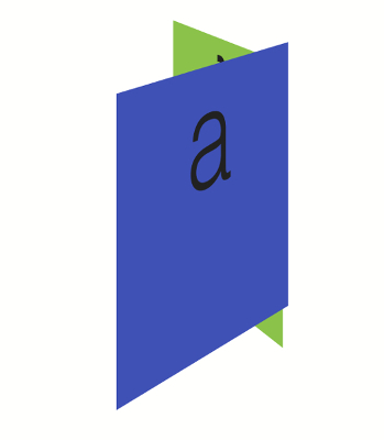
Here’s the counterintuitive part: transform and perspective also trigger this flattening when their value is something other than none. In effect, this means that child elements stack according to their source order if they have the same z-index value, regardless of the transform applied. Consider the following source:
<div class="wrapper">
    <figure>a</figure>
    <figure>f</figure>
</div>
And the following CSS:
.wrapper {
    perspective: 2000px;
    perspective-origin: 50% -200px;
}
.wrapper figure {
    position: absolute;
    top: 0;
    width: 200px;
    height: 200px;
}
.wrapper figure:first-child {
    transform: rotateY(60deg) translateZ(191px);
    background: #3f51b5;
}
.wrapper figure:nth-child(2) {
    transform: rotateY(120deg) translateZ(191px);
    background: #8bc34a;
}
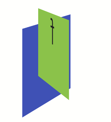
In this example, since we’ve applied perspective: 1000px to .wrapper, our figure elements are flattened. Since both elements also have the same calculated z-index, .wrapper figure:nth-child(2) will be the topmost element in the stack, as witnessed in figure 7-40. Note that .wrapper figure:first-child is still visible. It’s just not the topmost element. Here the computed value of transform-style is flat.
To work around this, we set the value of transform-style to preserve-3d. Let’s update our CSS:
.wrapper {
    perspective: 2000px;
    perspective-origin: 50% -200px;
    transform-style: preserve-3d;
}
.wrapper figure {
    position: absolute;
    top: 0;
    width: 200px;
    height: 200px;
}
.wrapper figure:first-child {
    transform: rotateY(60deg) translateZ(191px);
    background: #3f51b5;
}
.wrapper figure:nth-child(2) {
    transform: rotateY(120deg) translateZ(191px);
    background: #8bc34a;
}
Now .wrapper figure:first-child becomes the topmost element, as our rotateY functions suggest it should be in figure 7-41.
In the vast majority of cases, you should use transform-style: preserve-3d. Use transform-style: flat only when you want to collapse child elements into the same layer as their parent.
Showing Both Faces with the backface-visibility Property
By default, the back face of an element is a mirror image of its front face. With stacked or overlapping elements, the reverse side is always visible to the viewer, regardless of which side sits at the top of the stack.
Sometimes, however, we don’t want this back side to be visible. Let’s return to the card metaphor mentioned in the introduction to this chapter. This time we’ll use a playing card, seen in figure 7-42. With any card, we only want one side to be visible to the user at a time. To manage the visibility of an object’s back side, we can use the backface-visibility property.
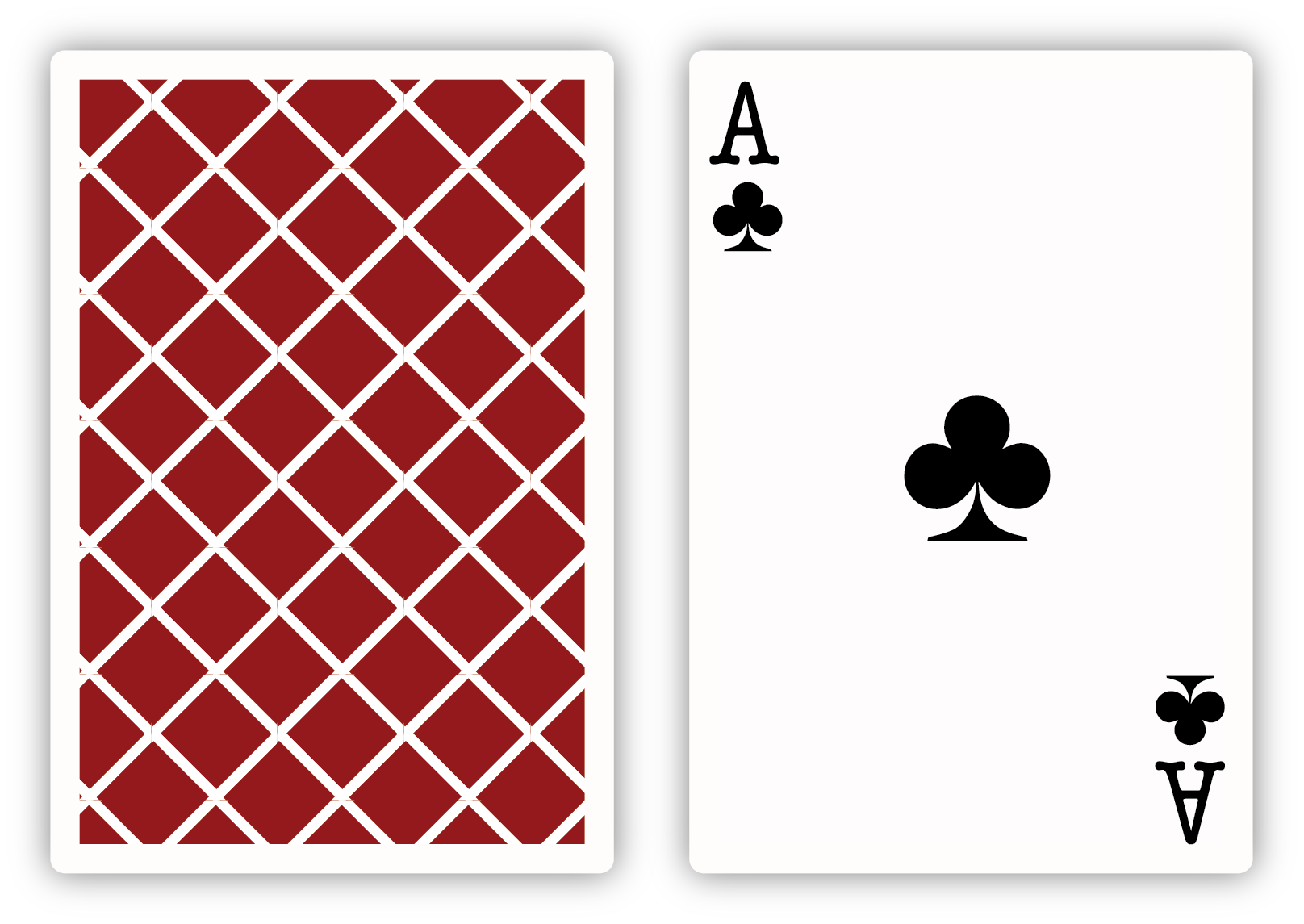
The initial value of backface-visibility is visible. Rear faces will always be shown. But if we want to hide a visible back face, we can use backface-visibility: hidden instead.
Let’s create our playing card. First our HTML:
<div class="card">
<div class="side front">
<div class="suit">♣</div>
</div>
<div class="side back"></div>
</div>
In this markup, we’ve set up front and back sides for a card container. Here’s our card CSS (for broadest browser compatibility, make sure you include prefixed versions of transition and transform-style):
.card {
    border: 1px solid #ccc;
    height: 300px;
    position: relative;
    transition: transform 1s linear;
    transform-style: preserve-3d;
    width: 240px;
}
The important part to notice here is transform-style: preserve-3d. Again, we’ll need this property to prevent the flattening that occurs by default when we use the transform property. Now let’s set up the CSS for the front and back sides of our cards:
/* Applies to both child div elements */
.side {
    height: inherit;
    left: 0;
    position: absolute;
    top: 0;
    width: inherit;
}
.front {
    transform: rotateY(180deg);
}
.back {
    background: rgba(204, 204, 204, 0.8);
}
.suit {
    line-height: 1;
    text-align: center;
    font-size: 300px;
}
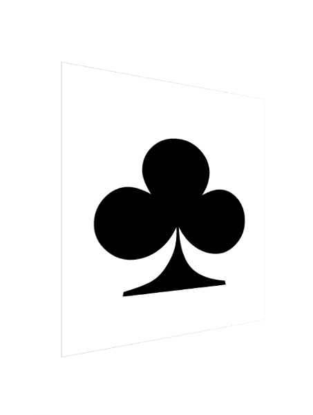
Both sides are absolutely positioned, so they’ll stack according to their source order. We’ve also flipped the .front sides around the Y-axis by 180 degrees. When it’s all put together, your card should look a bit like the image in figure 7-43.

Both sides of the card are visible at the same time. Let’s revise our CSS slightly. We’ll add backface-visibility: hidden to our .side ruleset:
.side {
    backface-visibility: hidden;
    height: inherit;
    left: 0;
    position: absolute;
    top: 0;
    width: inherit;
}
Now, div.front is hidden. If you see a gray box and no club symbol, it’s working as expected.
Prefixes
Safari 12 and earlier versions require the -webkit- vendor prefix for the backface-visibility property.
The utility of backface-visibility: hidden becomes a little clearer when we flip div.card. Let’s add a .flipped class to our CSS:
.flipped {
    transform: rotateY(180deg);
}
Now when we flip our card over (shown in figure 7-44), we see div.front, and only div.front.
Fiogure 7-45 shows two cards before being flipped. The card on the left has a backface-visibility value of hidden, while the one on the right has a value of visible.
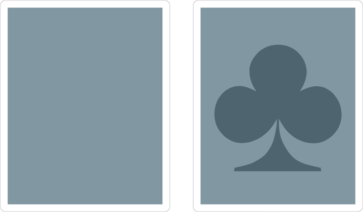
And in figure 7-46, we can see these same cards after the flipped class is added—that is, <div class="card flipped">.

Conclusion
Whew! That was a lot to take in. I hope after reading this chapter, you’ve learned how to:
- affect page layout and stacking order with transforms
- calculate the current transform matrix
- apply 2D transform functions that rotate, translate, and skew objects
- use 3D transforms to create the illusion of depth and dimension
In our next chapter, we’ll look at conditional CSS, including @supports, newer @media features, and related JavaScript APIs.