Chapter 9: Using CSS with SVG
So far, we’ve talked about using CSS with HTML, but we can also use CSS with SVG, or Scalable Vector Graphics. SVG is a markup format for describing flat, two-dimensional images. Because it’s a markup language, it has a Document Object Model, and can be used with CSS.
By using CSS with SVG, we can change the appearance of SVG based on user interaction. Or we can use the same SVG document in multiple places, and show or hide portions of it based on the width of the viewport.
Some of what we’ll discuss here has limited browser support at the time of writing. That may change by the time this book arrives in your hands.
Before we go any further, however, let’s talk about what SVG is and why you should use it.
Vector Images versus Raster Images
Most of the images currently used on the Web are raster images, also known as bitmap images. Raster images are made up of pixels on a fixed grid, with a set number of pixels per inch. JPEG, WebP, GIF, and PNG are all examples of raster image formats.
Raster images are resolution dependent. A 96dpi PNG image will look great on a device with a 96dpi display resolution. When viewed on a 144dpi display, however, that same image will appear fuzzy or pixelated. Raster images also have fixed dimensions and look best at their original size. Scaling a 150 x 150px image up to 300 x 300px will distort it.
Vector images, on the other hand, use primitive shapes and mathematical expressions to construct the image. Instead of pixels on a grid, vector image formats describe the shapes that make up an image and their placement within the document’s coordinate system. As a result, vector images are resolution independent, and retain their quality regardless of display resolution or display dimensions.
Resolution independence is the biggest advantage of SVG. We can scale images up or down with no loss of quality. The same image will look great on both high and low DPI (dots-per-inch) devices. That said, SVG is poorly suited to the amount of color data required for photographs. It’s best for drawings and shapes. Use it in place of PNG and GIF images, or custom fonts for logos, charts, and icons.
Another advantage of SVG is that it was designed to be used with other web languages. We can create, modify, and manipulate SVG images with JavaScript. Or, as we’ll see in this chapter, we can style and animate SVG using CSS.
Associating CSS with SVG Documents
Using CSS with SVG is a lot like using it with HTML. We can apply CSS using the style attribute of an SVG element; group CSS within a document using the style element; or link to an external stylesheet. The pros and cons of each method are the same as when using CSS with HTML.
Using the style Attribute
Here’s a simple SVG document where the code creates a black circle, as shown in figure 9-1:
<svg version="1.1" xmlns="http://www.w3.org/2000/svg" viewBox="0 0 200 200"
➥enable-background="new 0 0 200 200">
    <circle cx="101.3" cy="96.8" r="79.6"/>
</svg>
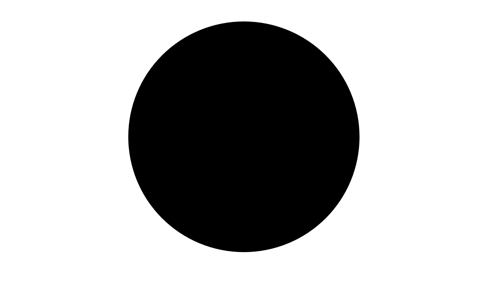
Let’s give our circle a pink fill using CSS and the style attribute, the result of which can be seen in figure 9-2:
<svg version="1.1" xmlns="http://www.w3.org/2000/svg" viewBox="0 0 200 200"
➥enable-background="new 0 0 200 200">
    <circle cx="101.3" cy="96.8" r="79.6" style="fill: #f9f" />
</svg>
Here’s one difference between using CSS with HTML and using it with SVG: property names. Many of the CSS properties that we use with HTML documents aren’t compatible with SVG, and vice versa. We’ll come back to this point later in the chapter.
Using the style attribute isn’t the best way to use CSS, of course. Doing so limits the reusability of those styles. Instead, we should use embedded or linked CSS.
Embedding CSS in SVG Documents
A better approach to using CSS with SVG is to embed it using the style element like this:
<svg version="1.1" xmlns="http://www.w3.org/2000/svg" viewBox="0 0
➥ 200 200" enable-background="new 0 0 200 200">
    <style type="text/css">
        circle {
            fill: #0c0;
        }

    </style>
    <circle cx="101.3" cy="96.8" r="79.6" />
</svg>
Embedding CSS in an SVG document lets us reuse those styles for multiple elements within the same document, but it prevents that CSS from being shared across multiple documents. That’s probably acceptable for logos and icons, but if you’re creating a library of chart styles, use an external CSS file instead.
Linking from SVG to an External CSS File
As with HTML, linking to an external CSS file makes it possible to share styles across several SVG documents. To link an external CSS file, add <? xml-stylesheet ?> to the beginning of your SVG file:
<?xml version="1.0" encoding="utf-8"?>
<?xml-stylesheet href="style.css" type="text/css"?>
<svg version="1.1" xmlns="http://www.w3.org/2000/svg" viewBox="0 0
➥ 200 200" enable-background="new 0 0 200 200">
    <circle cx="101.3" cy="96.8" r="79.6" />
</svg>
Using the <link> Element
Alternatively, use the XHTML link element. Just be sure to add the namespace attribute xmlns=http://www.w3.org/1999/xhtml to your tag:
<defs>
    <link href="style.css" type="text/css" rel="stylesheet"
➥ xmlns="http://www.w3.org/1999/xhtml"/>
</defs>
The link element isn’t an SVG element. It belongs to HTML and XHTML. Under the rules of XML, though, we can borrow elements and their behavior from other XML dialects such as XHTML. To do this, however, we have to add the xmlns namespace attribute to the link tag.
Using @import
We can also link to an external stylesheet by using @import inside <style> and </style> tags:
<style type="text/css">
@import('style.css');
</style>
Limitations of Externally-linked CSS
Linking from SVG files to external assets, including CSS file, doesn’t work with the img element. It’s a security limitation of the img element that’s baked into most browsers.
If you’re using the img element to serve SVG images, you’ll need to do either of these two things:
- Use the
styleelement within your SVG document. - Use the
objectoriframeelements to embed your SVG file. Usingobjectoriframealso makes the SVG document tree available to the parent document’s document tree, which means that we can use JavaScript to interact with it (for example,document.querySelector('object').contentDocument).
Inline SVG and External Assets
Inline SVG has a similar limitation in Firefox and Safari. In those browsers, external CSS files won’t load. We can, however, link to the CSS for our SVG document from the head of our HTML document:
<head>
    ⋮
    <link href="svg.css" type="text/css" rel="stylesheet" />
</head>
We can also use the style element instead.
SVG elements within HTML documents become part of the HTML document tree. Rather than manage SVG-related CSS and HTML-related CSS separately, you may also wish to group the CSS for your SVG document with the CSS of its parent.
SVG images created with software such as Sketch, Inkscape, or Illustrator can also be edited using a standard text editor to add CSS. In most cases, doing so won’t affect your ability to modify the image with that drawing application, but the application may remove your CSS or otherwise change your markup when you edit and re-save it.
Differences between SVG and HTML
While SVG and HTML are both markup languages, there are two significant differences between them that affect how they work with CSS:
- SVG doesn’t adhere to the CSS box model
- SVG lacks a positioning scheme
SVG Doesn’t Adhere to the CSS Box Model
As pointed out in Chapter 5, Layouts, when used with HTML, CSS layout follows the rules of the CSS box model. SVG, on the other hand, uses coordinates for layout. It adheres to what may be best understood as a “shape model.”
SVG shapes aren’t limited to rectangular boxes. As a result, most box-model-related properties are inapplicable to SVG elements. You can’t, for instance, change the padding or margin of an SVG element. You can’t use the box-sizing, box-shadow, outline, or border-* properties. Grid layout, floats, and Flexbox also don’t work.
You can, however, use CSS to set or change a range of SVG properties and attribute values. The full list is outlined in the SVG specification. We’ll discuss a few of them in this chapter, within the context of specific techniques.
SVG Lacks a Positioning Scheme
When CSS is used with HTML, element boxes can:
- exist within a normal flow
- be removed from normal flow with the
floatproperty - be removed from normal flow with the
positionproperty
The CSS specification refers to these as positioning schemes. Positioning schemes don’t exist in SVG. The position property has no effect on SVG elements. Neither do properties such as top, left and bottom, which depend on elements being positioned. You also can’t float elements within an SVG document.
Instead, SVG uses a coordinate system for element placement. To create a circle, for example, you need to set its center point coordinates using the cx and cy attributes, and set a radius length using the r attribute. A polygon consists of a series of point coordinates and line segments drawn between them. In other words, you can define where an element will be drawn to the SVG canvas, but you can’t “position” them in the CSS sense of the word.
Related to positioning schemes, SVG also lacks the idea of z-index and stacking contexts. It's worth noting that the SVG 2 specification does define behavior for z-index and stacking contexts in SVG documents, but most browsers don’t yet support that part of the spec. SVG elements are stacked according to their source order. Those that appear later in the document sit towards the top of the stack. If you want to change the stacking order of SVG elements, you’ll need to move them around in the source or use JavaScript to reorder them in the DOM tree.
In fact, most CSS 2.1 properties don’t apply to SVG documents. Exceptions include animations and transforms, display, overflow, visibility, and a few font and text-related properties. Instead, you’ll have to use SVG-specific styling properties with SVG documents. Most of these properties can also be expressed as SVG element attributes.
Styling SVG Elements
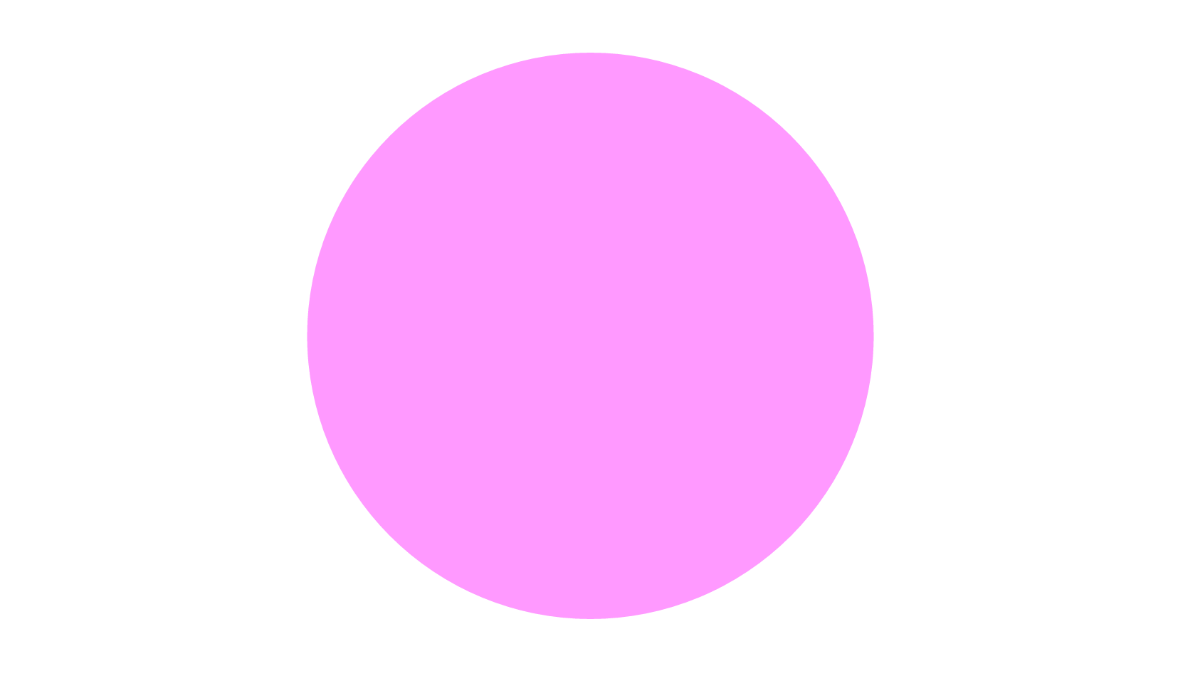
Here’s a simple example of how to style SVG elements using CSS. First our SVG document, which is a stand-alone file:
<?xml version="1.0" encoding="utf-8"?>
<?xml-stylesheet href="styles.css" type="text/css" ?>
<svg version="1.1" xmlns="http://www.w3.org/2000/svg" xmlns:xlink=
➥"http://www.w3.org/1999/xlink" x="0px" y="0px" viewBox="0 0 497
➥ 184" enable-background="new 0 0 497 184" xml:space="preserve">
    <polygon id="star" points="77,23.7 98.2,66.6 145.5,66.5 111.2,
➥106.9,119.3,154 77,131.8 34.7,154 42.8,106.9 8.5,67.5 55.8,
➥66.6 "/>
    <circle id="circle" cx="245" cy="88.9" r="67.5"/>
</svg>
This markup creates the image shown below.

As has been mentioned, we can’t use most CSS properties with SVG documents. But we can use CSS to change an element’s color. Let’s make our star yellow:
#star {
    fill: rgb(255,185,0);
}
You’ll often see the fill attribute used with SVG tags—for example, <circle fill="rgb(255,185,0)" cx="3" cy="10" r="100">—but it’s also a property that can be used with CSS.
We can also use CSS to adjust an element’s stroke, which is the outline of an SVG shape. A shape’s stroke exists, even if no stroke properties are set. Let’s give our circle a dark-blue, dashed border that’s 10px wide. We’ll also set its fill property to cornflowerblue:
circle {
    fill: cornflowerblue;
    stroke: darkblue;
    stroke-width: 10;
    stroke-dasharray: 10, 15;
    stroke-linecap: round;
}
Together this gives us the result below.
Not every SVG attribute is available via CSS—at least not in every browser. Most browsers support using CSS to change text, font, stroke, clipping, filter, gradient, color, and painting properties, as defined by the SVG 1.1 specification.
Support for, say, setting x and y values via CSS is another matter. Many of the details are still being hashed out as part of the SVG 2.0 specification process. One day, we may be able to use CSS to set the definition of a path element:
path {
    d: "M27,167 C72,128 169,-21 267,68 C365,157 123,264 224,373 C291, 445 373, 401 471,239";
}
Alas, to date, only Chrome supports anything like this. It also uses the outdated path function syntax (that is, d: path(…)). Until this becomes more widely supported, use SVG attributes for path definitions and shape placement.
Animating and Transitioning SVG CSS Properties
Using CSS with SVG becomes more interesting when we add transitions and animations to the mix. The process is just like animating HTML elements with CSS, but with SVG-specific properties. Let’s create a twinkling star effect using the following SVG document:
<svg version="1.1" xmlns="http://www.w3.org/2000/svg" x="0px"
➥ y="0px" viewBox="0 0 497 184" xml:space="preserve">
    <defs>
        <link href="twinkle.css" type="text/css" rel="stylesheet"
➥ xmlns="http://www.w3.org/1999/xhtml"/>
    </defs>
    <polygon class="star" points="77,23.7 98.2,66.6 145.5,66.5 111.2
➥,106.9 119.3,154 77,131.8 34.7,154 42.8,106.9 8.5,67.5
➥ 55.8,66.6 "/>
    <polygon class="star twinkle" points="77,23.7 98.2,66.6 145.5,
➥66.5 111.2,106.9 119.3,154 77,131.8 34.7,154 42.8,106.9
➥ 8.5,67.5 55.8,66.6 "/>
</svg>
Our document contains two star-shaped polygon elements, each with a class name of star. To create the twinkling effect, we’ll animate the first one. Here’s our CSS:
@keyframes twinkle {
    from {
        fill-opacity: .4;
    }
    to {
        fill-opacity: 0;
        transform: scale(2);
    }
}
.star {
    fill: rgb(255,195,0);
    transform-origin: 50% 50%;
}
.twinkle {
    animation: twinkle 1.5s infinite forwards ease-in;
}
Here we’ve used the SVG-specific property fill-opacity. As with CSS, if the value of an SVG styling property can be interpolated, it can also be animated or transitioned. You can see two different points of the animation in figure 9-5.

Let’s look at another example. This time we’ll create a drawing effect by transitioning the stroke-dasharray property. Here’s our SVG document:
<svg version="1.1" xmlns="http://www.w3.org/2000/svg"
➥xmlns:xlink="http://www.w3.org/1999/xlink" x="0px" y="0px"
     viewBox="0 0 200 200" enable-background="new 0 0 200 200">
    <circle fill="transparent" stroke-width="16" cx="101.3"
➥ cy="96.8" r="79.6"/>
</svg>
The stroke-dasharray property accepts a comma-separated list of length or percentage values that creates a dashed pattern. Odd-numbered values determine the dash length. Even-numbered values determine the gap length. A stroke-dasharray value of 5, 10 means that the stroke will be 5px long with a gap of 10px between each dash. A value of 5, 5, 10 alternates 5pc and 10px dash lengths with 5px gaps in between.
We can use stroke-dasharray to create a drawing effect by starting with a zero dash length and a large gap, and ending with a large dash length and a dash gap of zero. Then we’ll transition between the two. Here’s what our CSS looks like:
circle {
    transition: stroke-dasharray 1s ease-in;
    fill: transparent;
    stroke-dasharray: 0, 500;
}
.animate {
    stroke-dasharray: 500, 0;
}
At the beginning of the transition, our stroke is invisible because the dash length is 0 and our gap is 500. But when we add the animate class to our circle, we shift the dash length to 500 and eliminate the gap. The effect is a bit like drawing a circle with a pair of compasses. Why 500? It’s the smallest value that worked to create this particular effect.
An Animated Path Future
Remember our example of defining a path via CSS from the previous section? In future browsers, we’ll be able to animate or transition those values too:
path {
    d: "M27,167 C72,128 169,-21 267,68 C365,157 123,264 224,373 C291, 445 373, 401 471,239";
    transition: d 1s ease-in-out;
}
.straighten {
    d: "M27,167 C72,128 169,-21 267,68 C365,157 123,264 224,373 C291,445 373, 401 471,239";
}
Unfortunately, support for animating path definitions is limited to Blink-based browsers such as Chrome. For now, we need to use JavaScript to animate path definitions. GreenSock and its MorphSVGPlugin is the leading JavaScript library for animating SVG shapes. SVG.js and the svg.pathmorphing.js plugin is another option.
Using SVG with Media Queries
With HTML documents, we might show, hide, or rearrange parts of the page based on the conditions of the viewport. If the browser window is 480px wide, for example, we might shift our navigation from a horizontal one to a vertical, collapsible list. We can do something similar with media queries and SVG documents. Consider a logo, such as that of the fictitious Hexagon Web Design & Development:

Without media queries, this SVG logo would simply stretch or shrink to fit the viewport or its container. But with media queries, we can do more clever things.
Let’s distinguish between the HTML document viewport and the SVG document viewport. When SVG is inline, the HTML viewport and the SVG viewport are one and the same. The SVG document behaves like any other HTML element. On the other hand, when an SVG document is linked—as with the object or img elements—we’re dealing with the SVG document viewport.
Media queries work in both cases, but when the SVG document is linked, its viewport is independent of its HTML document. In that case, the size of the browser window doesn’t determine the size of the SVG viewport. Instead, the viewport size is determined by the dimensions of the object, iframe, or img element. Take the (abridged) SVG document that follows as an example:
<svg version="1.1" id="HexagonLogo" xmlns="http://www.w3.org/2000/
➥svg" xmlns:xlink="http://www.w3.org/1999/xlink" x="0px" y="0px"
➥ viewBox="0 0 555 174" xml:space="preserve">
    <defs>
        <style type="text/css">
        /* CSS goes here */
        </style>
    </defs>
    <g id="hex">
        <polygon id="hexagonbg" points="55.2,162 10,86.5 55.2,11
➥ 145.5,11 190.7,86.5 145.5,162  "/>
        <path id="letterH" fill="#FFFFFF" d="M58,35.5h33v35.2h18.
➥4V35.5 h33.2v103.4h-33.2v-38.3H91v38.3H58V35.5z M77.5,126.5V87.
➥3h45.6v39.2h4V47.9h-4v35.6H77.5V47.9h-4v78.6H77.5z"/>
    </g>

    <g id="word-mark">
        <g id="hexagon-word">
            ...
        </g>
        <g id="web-design-and-dev">
            ...
        </g>
    </g>
</svg>
In smaller viewports, let’s show just the H in a hexagon symbol:
@media (max-width: 20em) {
    [id=word-mark] {
        display: none;
    }
}
Now, whenever our SVG’s container is less than or equal to 20em, only the symbol portion of our logo will be visible:
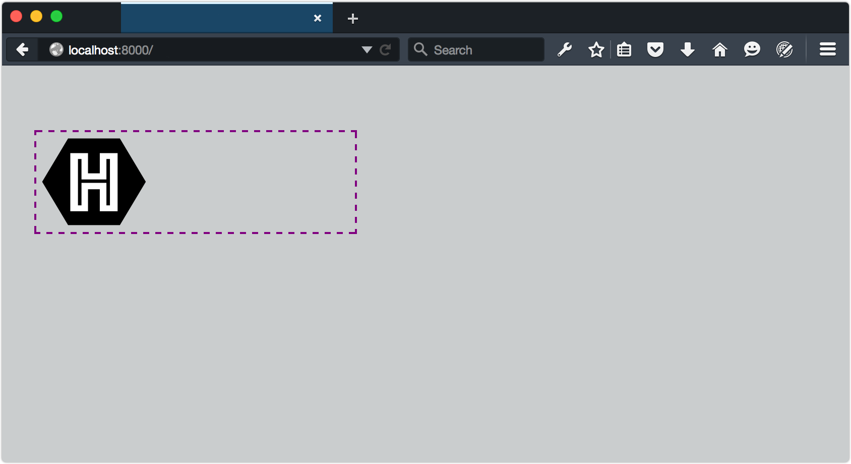
To trigger this view from the HTML document, set the width of the SVG container:
<object data="hexlogo.svg" type="image/svg+xml" style="width: 20em;"></object>
As you may have noticed from looking at figure 9-7, our SVG image retains its intrinsic dimensions even though part of it has been hidden. This, unfortunately, is a limitation of SVG. To fix it, we need to change the viewBox attribute of the SVG document, but only when the viewport is below a certain size. This is a great use case for matchMedia (matchMedia is discussed in Chapter 8, Applying CSS Conditionally).
The viewBox attribute, as its name suggests, determines the viewable area of an SVG element. By adjusting it, we can determine which part of an SVG image fills the viewport. What follows is an example using matchMedia and a media query to update the viewBox attribute:
<script type="text/javascript">
var svg, originalViewBox, max20em, mq, updateViewBox;

svg = document.querySelector('svg');

/* Store the original value in a variable */
originalViewBox = svg.getAttribute('viewBox');

/* Define our media query and media query object */
mq  = matchMedia("(max-width: 20em)");

/* Define the handler */
updateViewBox = function(){
    if (mq.matches) {
        /* Change the viewBox dimensions to show the hexagon */
        svg.setAttribute('viewBox', "0 0 200 174");
    } else {
        svg.setAttribute('viewBox', originalViewBox);
    }
}

/* Fire on document load */
// WebKit/Blink browsers
svg.onload = updateViewBox;

// Firefox & IE
svg.addEventListener('SVGLoad', updateViewBox, true);

/* Fire if the media condition changes */
mq.addListener(updateViewBox);

</script>
Browsers and SVGLoad
Browsers are a little bit of a mess when it comes to handling the SVGLoad event. In my tests, addEventListener worked most consistently with Firefox. For best results in Chrome and Safari, use the onload event attribute. Microsoft Edge also works best with onload, but only when used as an attribute of the <svg> tag. In other words, <svg onload="updateViewBox">.
Now, whenever the SVG container is 20em or less, the value of viewBox will be "0 0 200 174". When it exceeds 20em, viewBox will be restored to its initial value:

More on Creating Interactive SVG Documents
For a fuller primer on creating interactive SVG documents, read the “Dynamic SVG and JavaScript” chapter of An SVG Primer for Today’s Browsers from the W3C.
Since this technique uses either the onload event attribute or the SVGLoad event, it’s a good idea to embed our CSS and JavaScript within the SVG file. When CSS is external, the SVGLoad event may fire before its associated CSS finishes loading.
Using Media Queries with background-size
SVG documents and media queries aren’t limited to foreground images. We can also resize the SVG viewport using the CSS background-size property. All of the latest major browsers support this technique, but older browser versions don’t. Be careful when using this technique in production.
We’ll start with this SVG document:
<?xml version="1.0" encoding="utf-8"?>
<svg version="1.1" id="Layer_1" xmlns="http://www.w3.org/2000/svg"
➥ xmlns:xlink="http://www.w3.org/1999/xlink" x="0px" y="0px"
➥ viewBox="-20 -20 250 250" xml:space="preserve">
    <style type="text/css">
       circle {
            stroke: #000;
            stroke-width: 30;
            fill: #009688;
       }
       @media (width: 100px) {
            circle {
                fill: #673ab7;
            }
        }
        @media (width: 300px) {
            circle {
                fill: #ffc107;
            }
        }
    </style>
    </defs>
    <circle cx="100" cy="100" r="100" />
    <circle cx="100" cy="100" r="50" />
</svg>
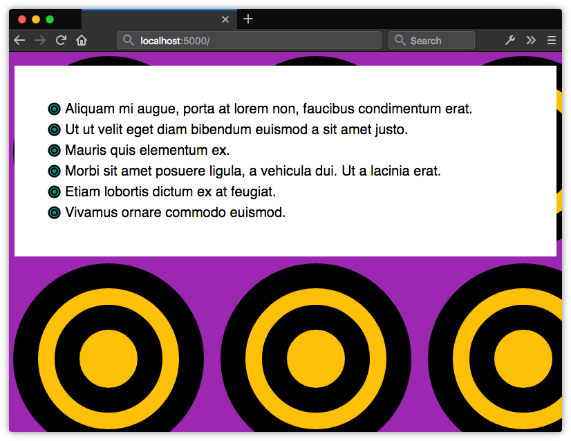
This is a simple case. Our circle elements will get a new fill color at specific viewport widths. When the viewport is 20px wide, the fill will be teal. When it’s 300px wide, it will be yellow.
To make this work, we have to use our SVG image as a background image and set the selector’s background-size property. In this case, we’ll use our image as a background for the body element and for li elements. Figure 9-9 shows the results:
body, li {
    background: url(../Images/circles.svg);
}
body {
    background-color: #9c27b0;
    background-size: 300px auto;
}
li {
      background-size: 20px auto;
      background-repeat: no-repeat;
      background-position: left 3px;
      padding-left: 25px;
}
Conclusion
Using SVG with CSS gives us more possibilities for flexible and adaptive documents. Upon completing this chapter, you should now know how to:
- use CSS to style SVG elements
- animate SVG properties
- employ CSS media queries and the
matchMediaAPI to show and hide portions of an SVG document.