Chapter 8: Applying CSS Conditionally
Conditional CSS refers to CSS rules that are applied when a condition is met. A condition may be a CSS property and value combination, as with the @supports rule. A condition may test for a browser window condition such as width, as with the @media rule. Or a condition may be a device feature such as hover capability or pointer input, as with some newer features of @media. We’ll discuss all of the above in this chapter.
Both @media and @supports are described by the CSS Conditional Rules Module Level 3 specification. The @media rule—which you probably know as media queries—is fully defined by the Media Queries specification.
Media Queries and @media
The @media rule is actually a long-standing feature of CSS. Its syntax was originally defined by the CSS 2 specification back in 1998. Building on the media types defined by HTML 4, @media enabled developers to serve different styles to different media types—print or screen, for example.
With the Media Queries Level 3 specification, the @media rule was extended to add support for media features in addition to media types. Media features include window or viewport width, screen orientation, and resolution. Media Queries Level 4 added media interaction queries, a way to apply different styles for pointer device quality—the fine-grained control of a mouse or stylus versus the coarseness of a finger. Media Queries Level 5 adds feature queries for light-level, and scripting along with user preference feature queries such as prefers-reduced-motion and prefers-reduced-transparency.
Alas, most of the media types defined by HTML4 are now obsolete. Only all, screen, print, and speech are currently defined by any specification. Of those, only all, screen and print have widespread browser support. We’ll briefly discuss them in the examples that follow. As for media features, we’ll focus on what’s available in browsers today.
Media Query Syntax: The Basics
Media query syntax seems simple, but sometimes it’s a bit counterintuitive. In its simplest form, a media query consists of a media type, used alone or in combination with a media condition—such as width or orientation. A simple, type-based media query for screens looks like this:
@media screen {
    /* Styles go here */
}
CSS style rules are nested within this @media ruleset. They’ll only apply when the document is displayed on a screen, as opposed to being printed.
@media screen {
    body {
        font-size: 20px;
    }
}
In this example, the text size for this document will be 20px when it’s viewed on a desktop, laptop, tablet, mobile phone, or television.
If No Media Type Is Specified
When no media type is specified, it’s the same as using all.
We can apply CSS to one or more media types by separating each query with a comma. If the browser or device meets any condition in the list, the styles will be applied. For example, we could limit styles to screen and print media using the following:
@media screen, print {
    body {
        font-size: 16px;
    }
}
The real power of media queries, however, comes when you add a media feature query. Media feature queries interrogate the capabilities of the device or conditions of the viewport.
A media feature query consists of a property and a value, separated by a colon. The query must also be wrapped in parentheses. Here’s an example:
@media (width: 30em) {
    nav li {
        display: inline-block;
    }
}
What we’re doing is applying a new style to nav li only when the width of the viewport is equal to 30em. Since em units are relative, using them for width and lengths makes sense for screens. Let’s use the and keyword to make a more specific media query:
@media screen and (width: 30em) {
    nav li {
        display: inline-block;
    }
}
These styles will be used only when the output device is a screen and its width is 30em. Notice here that the media type is not enclosed by parentheses, unlike our media feature (width: 30em).
The query above has a small problem, however. If the viewport is wider than 30em or narrower than 30em—and not exactly 30em—these styles won’t be applied. What we need instead is a range.
Range Media Feature Queries and min- and max- Prefixes
A more flexible media query tests for a minimum or maximum viewport width. We can apply styles when the viewport is at least this wide, or more than that wide. Luckily for us, the Media Queries Level 3 specification defined the min- and max- prefixes for this purpose. These prefixes establish the lower or upper boundaries of a feature range.
Let’s update our previous code:
@media (max-width: 30em) {
    nav li {
        display: block;
    }
}
In this example, nav li will have a display: property value of block from a viewport width of 0, up to and including a maximum viewport width of 30em.
We can also define a media query range using min- and max-, along with the and keyword. For example, if we wanted to switch from display: block to display: flex between 30em and 100em, we might do the following:
@media (min-width: 30em) and (max-width: 100em) {
    nav li {
        display: block;
    }
}
If both conditions are true—that is, the viewport width is at least 30em, but not greater than 100em—our styles will apply.
Not all media feature properties support ranges with min- and max-. The table below lists those that do, along with the type of value permitted for each.
| Property | Description | Value type |
|---|---|---|
aspect-ratio |
The ratio of viewport width to height |
ratio (such as 1024/768 or 16:9) |
color |
Number of bits per color component of the device; 0 when the device is not a color device |
integer |
color-index |
Minimum number of colors available on the device | integer |
height |
Height of the viewport or page box | length |
monochrome |
Number of bits per pixel in a monochrome frame buffer | integer |
resolution |
Describes the pixel density of a device | resolution (dpi, dpcm, and dppx) units |
width |
Width of the viewport or page box | length |
Future browsers may support comparison operators such as > and <= in addition to the min and max syntax for ranges. Instead of @media (min-width: 30em) and (max-width: 100em), we could write this query as follows:
@media (width >= 30em) and (width <= 100em) {
    nav li {
        display: block;
    }
}
That’s a little clearer than @media (min-width: 30em) and (max-width: 100em). Unfortunately, this more compact syntax isn’t yet supported by most browsers. Stick with min- and max- for now.
Discrete Media Feature Queries
There’s a second type of media feature—the discrete type. Discrete media features are properties that accept one of a set, or a predefined list of values. In some cases, the set of values is a boolean—either true or false.
Discrete media features are properties for which a quantity makes little sense. Here’s an example using the orientation property. The example adjusts the proportional height of a logo when in portrait mode:
@media screen and (orientation: portrait) {
    #logo {
        height: 10vh;
        width: auto;
    }
}
Remember the Parentheses!
Notes are useful asides that are related—but not critical—to the topic at hand. Think of them as extra tidbits of information.
The orientation feature is an example of a discrete media feature. It has two supported values, portrait and landscape. Minimum and maximum values don’t make much sense for these properties. The table below lists discrete media features that are currently available in major browsers.
| Property | Description | Acceptable values |
|---|---|---|
any-hover |
Ability of any connected input mechanism to have a hover state as determined by the user agent | none, hover |
hover |
Ability of the primary input mechanism to have a hover state as determined by the user agent | none |
any-pointer |
Presence and accuracy of any pointing device available to the user | none, coarse, coarse |
pointer |
Presence and accuracy of the primary pointing device as determined by the user agent | none, coarse, coarse |
grid |
Whether the device is grid (such as a teletype terminal or phone with a single fixed font) or bitmap. Don’t confuse this with CSS grid layout | Boolean |
orientation |
Describes behavior for whatever is larger out of width or height. When the width is greater than height, the orientation is landscape. When the inverse is true, the orientation is portrait |
portrait, landscape |
scan |
Which scanning process is used by the output display | interlace, progressive |
Other discrete media features include overflow-block and overflow-inline, which describe the behavior of the device when content overflows in the block or inline direction (think billboards or slideshows). Eventually, we may also see support for scripting and light-level features, which test for JavaScript support and ambient light conditions.
One discrete feature query we can use now is hover (along with any-hover). The hover media feature query allows us to set different styles based on whether or not the primary input mechanism supports a :hover state. The any-hover feature works similarly, but applies to any input mechanism, not just the primary one. It’s a discrete feature type, and has just two valid values:
none: the device has no hover state, or has one that’s inconvenient (for example, it’s available after a long press)hover: the device has a hover state
Consider the case of radio buttons and checkbox form controls on touch screens. Touch screen devices typically have an on-demand hover state, but may lack one completely. Adult-sized fingers are also fatter than the pointers of most mouse or trackpad inputs. For those devices, we might want to add more padding around the label, making it easier to tap:
@media screen and (hover: on-demand) {
    input[type=checkbox] + label {
        padding: .5em;
    }
}
Another other media feature that’s landed in browsers is the pointer media feature (and any-pointer). With pointer, we can query the presence and accuracy of a pointing device for the primary input mechanism. The any-pointer property, of course, tests the presence and accuracy of any pointer available as an input mechanism. Both media features accept one of the following values:
none: the device’s primary input mechanism is not a pointing devicecoarse: the primary input mechanism is a pointing device with limited accuracyfine: the device’s primary input mechanism includes an accurate pointing device
Devices with pointing inputs include stylus-based screens or pads, touch screens, mice, and trackpads. Of those, touch screens are generally less accurate. Stylus inputs, on the other hand, are very accurate—but like touch screens, they lack a hover state. With that in mind, we might update our hover query from earlier so that we only add padding when the pointer is coarse:
@media screen and (hover: none) and (pointer: coarse) {
    input[type=checkbox] + label {
        padding: .5em;
    }
}
To date, every major browser except Firefox supports hover/any-hover and pointer/any-pointer.
Improving Accessibility with prefers-reduced-motion
As mentioned in Chapter 6, Transitions and Animations, large-scale animations can create sensations of dizziness and nausea for people with vestibular disorders. Flickering animations can cause seizures for people with photosensitive epilepsy.
Seizures and dizziness don’t make for a very good user experience. At the same time, animation can improve usability for users who aren’t affected by vestibular disorders. As a way to balance improved usability for some while preventing debilitating conditions in others, WebKit proposed a prefers-reduced-motion feature query. It has two possible values: no-preference and reduce.
Rationale
“Responsive Design for Motion”, a blog post from the WebKit team, explains the team’s rationale for proposing the query, as well as how to use it.
With prefers-reduced-motion, we can provide an alternative animation or disable it altogether, as shown in the following example:
@media screen and (prefers-reduced-motion: reduce) {
    .wiggle {
        animation-play-state: paused;
    }
}
In this case, if the user’s preference is to reduce motion, the .wiggle animation will be disabled.
When used without a value, prefers-reduced-motion is true. In other words, we could remove reduce from the above media query and it has an equivalent meaning:
@media screen and (prefers-reduced-motion) {
    .wiggle {
        animation-play-state: paused;
    }
}
So far, support for prefers-reduced-motion is limited to Safari. Until support is more widespread, adhere to WCAG guidelines for animations, and offer users the ability to disable them altogether.
Nesting @media Rules
It’s also possible to nest @media rules. When might nesting media queries be useful? Here’s one example:
@media screen {
    @media (min-width: 20em) {
        img {
            display: block;
            width: 100%;
            height: auto;
        }
    }

    @media (min-width: 40em) {
        img {
            display: inline-block;
            max-width: 300px;
        }
    }
}
In this example, we’ve grouped all our screen styles together, with sub-groups for particular viewport widths.
Working around Legacy Browser Support with only
As mentioned in the beginning of this chapter, @media has been around for a while. However, the syntax and grammar of @media has changed significantly from its original implementation. As the Media Queries Level 4 specification explains, the original error-handling behavior:
would consume the characters of a media query up to the first non-alphanumeric character, and interpret that as a media type, ignoring the rest. For example, the media query
screen and (color)would be truncated to justscreen.
To avoid this, we can use the only keyword to hide media queries from browsers that support the older syntax. The only keyword must precede a media query, and affects the entire query:
@media only screen and (min-resolution: 1.5dppx) {
    /* Styles go here */
}
The only keyword tells the browser that these styles should be applied only when the following condition is met. The good news is that the older error-handling behavior is mostly an edge case among browsers in use today. For most current browsers and current web users, using the only keyword is unnecessary. I’ve included it here for completeness.
Negating Media Queries
We can also negate a media query using the not keyword. The not keyword must come at the beginning of the query, before any media types or features. For example, to hide styles from print media, we might use the following:
@media not print {
    body {
        background: url('paisley.png');
    }
}
If we wanted to specify low-resolution icons for lower-resolution devices instead, we might use this snippet:
@media not print and (min-resolution: 1.5dppx) {
    .external {
        background: url('arrow-lowres.png');
    }
}
Notice here that not comes before and negates the entire media query. You can’t insert not after an and clause. Arguments such as @media not print and not (min-resolution: 2dppx) or @media screen and not (min-resolution: 2dppx) violate the rules of media query grammar. However, you can use not at the beginning of each query in a media query list:
@media not (hover: hover), not (pointer: coarse) {
    /* Styles go here */
}
Styles within this grouping rule would be applied when the device is without a hover state or when the pointing device has low accuracy.
Other Ways to Use Media Queries
Thus far, we’ve talked about @media blocks within stylesheets, but this isn’t the only way to use media types and queries. We can also use them with @import, or the media attribute. For example, to import a stylesheet typography.css when the document is viewed on screen or printed, we could use the following CSS:
@import url(typography.css) screen, print;
But we can also add a media feature query to an @import rule. In the following example, we’re serving the hi-res-icons.css stylesheet only when the device has a minimum resolution of 1.5dppx or 96dpi:
@import url(hi-res-icons.css) (min-resolution: 1.5dppx), (min-resolution: 96dpi);
HTTP/1.1
For browsers and servers using HTTP/1.1, @import adds an additional HTTP request and blocks other assets from downloading. Use it with care!
Another way to use queries is with the media attribute, which can be used with the style, link, video, and source elements. In the following example, we’ll only apply these linked styles if the device width is 480px wide or less:
<link rel="stylesheet" href="styles.css" type="text/css" media="screen and (max-width: 480px)">
Performance Considerations
In every browser tested, the stylesheet will be requested and downloaded, even when the media query doesn’t apply. However, linked assets within that stylesheet (for example, background images defined with url()) won’t be.
Precedence
If your linked stylesheets also contain media queries, these will take precedence over the value of the media attribute.
We can also use the media attribute with the source element to serve different files for different window widths and device resolutions. What follows is an example using the source element and media attribute with the picture element:
<picture>
    <source srcset="image-wide.jpg" media="(min-width: 1024px)">
    <source srcset="image-med.jpg" media="(min-width: 680px)">
    <img src="image-narrow.jpg" alt="Adequate description of the image contents.">
</picture>
Browser Support
Neither Internet Explorer 11 nor Microsoft Edge 12 support the picture element. To add support for those browsers, use a polyfill such as Scott Jehl’s Picturefill.
Content-driven Media Queries
A current common practice when using media queries is to set min-width and max-width breakpoints based on popular device sizes. A breakpoint is the width or height that triggers a media query and its resulting layout changes. Raise your hand if you’ve ever written CSS that resembles this:
@media screen and (max-width: 320px) {
    ⋮
}
@media screen (min-width: 320px) and (max-width: 480px) {
    ⋮
}
@media screen (min-width: 481px) and (max-width: 768px) {
    ⋮
}
@media screen (min-width: 769px) {
    ⋮
}
These work for a large number of users. But device screen widths are more varied than this. Rather than focus on the most popular devices and screen sizes, use a content-centric approach.
Don't Use device-width with Media Queries
Avoid using device-width (including min/max) altogether for media queries. High DPI devices in particular may have a device width that doesn’t match its actual pixel capability.
A content-centric approach to media queries sets breakpoints based on the point at which the layout starts to show its weaknesses. One strategy is to start small, which is also known as a mobile-first approach. As Bryan Reiger puts it, “the absence of support for @media queries is in fact the first media query.”
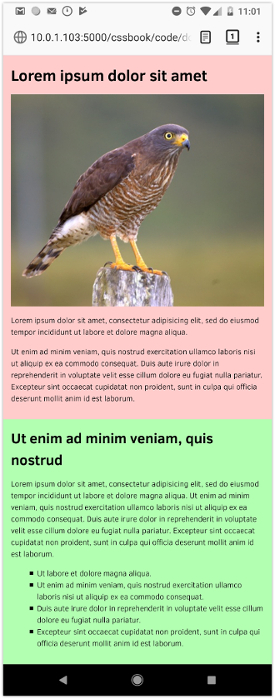
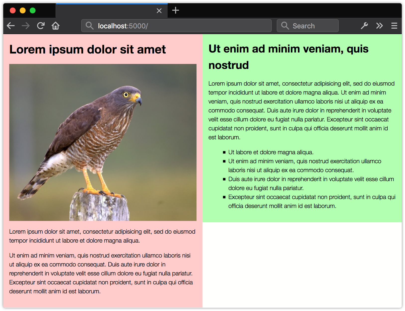
You can do a lot to create a flexible, responsive layout before adding media queries. Then as you increase the viewport width or height, add styles that take advantage of the additional real estate. For example, how wide is the browser window when lines of text become too long to read? That can be the point at which your layout switches from a single-column layout (figure 8-1) to a two-column layout (figure 8-2).
There are two advantages to this approach. First, your site will still work on older mobile browsers that lack support for media queries. The second reason is more important: this approach prepares your site for a wider range of screen widths and resolutions.
Using Media Queries with JavaScript
Media queries also have a JavaScript API, better known as matchMedia(). If you’re not versed in JavaScript, don’t worry. We’ll keep the examples short so that they’re easier to understand. The API for media queries is actually defined by a different specification, the CSSOM View Module. It’s not CSS, strictly speaking, but since it’s closely related to @media, we’ll cover it.
The matchMedia() method is a property of the window object. That means we can refer to it using window.matchMedia() or just matchMedia(). The former is clearer, since it indicates that this is a native JavaScript method, but the latter saves a few keystrokes. I’m a
lazy typist, so I’ll use matchMedia() in the examples that follow.
Use matchMedia() to test whether a particular media condition is met. The function accepts a single argument, which must be a valid media query.
Why use a media query with JavaScript, rather than CSS? Perhaps you’d like to display a set of images in a grid on larger screens, but trigger a slide show on small screens. Maybe you want to swap the src value of a video element based on the screen size or resolution. These are cases for using matchMedia().
Here’s a simple example of matchMedia in action. This code checks whether the viewport width is greater than or equal to 45em:
var isWideScreen = matchMedia("(min-width: 45em)");
console.log(isWideScreen.matches); // Logs true or false to console
Using matchMedia() creates a MediaQueryList object. Here, that object is stored in the isWideScreen variable. Every MediaQueryList object contains two properties:
media: returns the media query argument that was passed tomatchMedia()matches: returnstrueif the condition is met andfalseotherwise
Since we want to know whether it’s true that the browser window is at least 45em wide, we need to examine the matches property.
MediaQueryList.matches will return false when either:
- the condition isn’t met at the time
matchMedia()is invoked - the syntax of the media query is invalid
- the browser doesn’t support the feature query
Otherwise, its value will be true.
Here’s another example of using matchMedia. We’ll update the source of a video element based on the size of the current viewport and resolution:
if(matchMedia("(max-width: 480px) and (max-resolution: 1dppx)") {
    document.querySelector('video').src = 'smallvideo.mp4';
}
If the condition doesn’t match—or the browser doesn’t support the resolution feature query—the value of src won’t be changed.
Error Checking with not all
Typically, the value of the media property will be the media query we’ve tested. But maybe you forgot to include the parentheses around your feature query (a syntax error). Or perhaps the query uses a
pointer feature query, but the browser is yet to support it. In both of those cases, the browser will return a not all value. This is media query speak for “this doesn’t apply to any media condition.”
In cases where the media query is a list—that is, when it contains multiple conditions—the value of matchMedia().media will also contain multiple values. If part of that query list is invalid or unsupported, its value will be not all. Here’s an example:
var mq = matchMedia("(hover: none), (max-width: 25em)");
In browsers lacking support for the hover: none media feature query, the value of mq.media will be not all, (max-width: 25em). In browsers that do support it, the value of mq.media will be (hover: none), (max-width: 25em). Let’s look at another example:
var mq = matchMedia("min-resolution: 1.5dppx, (max-width: 25em)");
In this example, the value of mq.media will also be not all, (max-width: 25em). In this case, however, it’s because our first feature query uses the wrong syntax. Remember that media feature queries need to be enclosed in parentheses. The argument should be matchMedia("(min-resolution: 1.5dppx), (max-width: 25em)"); instead.
Listening for Media Changes
Media conditions aren’t necessarily static. Conditions can change when the user resizes the browser, or toggles between portrait and landscape mode. Luckily, our specification authors thought of that, and added a means by which we can monitor and respond to changes in our document’s environment: the addListener() method. The addListener() method accepts a function—what’s known as a callback function—as its argument.
Let’s add a class name when our document enters landscape orientation. The first step is to create a MediaQueryList object using matchMedia and a media query:
var isLandscape = matchMedia("(orientation: landscape)");
Step two is to define our callback function. Our MediaQueryList object will be passed to this callback function as its sole argument:
var toggleClass = function (mediaquery) {
    if (mediaquery.matches) {
      document.body.classList.add('widescreen');
    } else {
      document.body.classList.remove('widescreen');
    }
}
Media query events aren’t very smart. They’re fired any time the value of MediaQueryList.matches changes, regardless of whether or not the condition is true. This means we need to examine the value of MediaQueryList.matches or MediaQueryList.media for our MediaQueryList object. In this case, if the value of mediaquery.matches is true, we’ll add a class name to our body element. Otherwise, we’ll remove it.
Finally, let’s add this event listener to our MediaQueryList object with addListener:
isLandscape.addListener( toggleClass );
To remove a listener, use removeListener as shown:
isLandscape.removeListener( toggleClass );
In early versions of the CSSOM View specification, addListener and removeListener were supposed to be separate mechanisms, removed from the DOM event queue. This changed in the Level 4 specification. Eventually, we’ll be able to use the standard addEventListener and removeEventListener DOM methods to listen for a change event. Our examples from before could then be rewritten like so:
// Add a listener
isLandscape.addEventListener('change', toggleClass);

// Remove the listener
isLandscape.removeEventListener('change', toggleClass);
At the time of writing, Safari and Microsoft Edge haven’t yet implemented this change. They still support addListener/removeListener exclusively. In other browsers, addListener/removeListener are just aliases of addEventListener/removeEventListener. Use addListener and removeListener until Safari and Microsoft Edge support the newer specification.
Testing for Property Support with @supports
With @supports, we can add CSS rules based on whether the browser supports a particular property and value. “And value” is key. Some CSS properties and values have been redefined or expanded since CSS2.1. Using @supports lets us test for those changes. Like @media, @supports consists of two parts: the CSS at-rule, and a DOM-based API for use with JavaScript.
Why might we use @supports? Here’s a scenario: as originally specified, display allowed four possible values: block, inline, list-item, and none. Later specifications added table-* values, flex, and grid. With @supports, we can define CSS rules that will be applied only when the browser supports display: grid:
@supports (display: grid) {
    .gallery {
        display: grid;
        grid-template-columns: repeat(4, auto);
    }
}
To define a condition, wrap the property and value you’d like to test in a set of parentheses as shown. Both portions are required; a condition such as @supports (hyphens) won’t work as a test.
To combine conditions, use the and keyword. For example, if you wanted to apply styles when both the text-decoration-color and text-decoration-style are supported, you could use the following:
@supports (text-decoration-color: #c09) and (text-decoration-style: double) {
    .title {
        font-style: normal;
        text-decoration: underline double #f60;
    }
}
The @supports syntax also allows disjunctions using the or keyword. Disjunctions are especially useful for testing vendor-prefixed property support. Let’s revisit our display: flex example. Older versions of WebKit-based browsers require a vendor prefix for Flexbox support. We can augment our @supports condition to take that into account:
@supports (display: flex) or (display: -webkit-flex) {
    nav ul {
        display: -webkit-flex;
        display: flex;
  }
}
Finally, we can also define a collection of styles if a condition isn’t supported by using the not keyword:
@supports not (display: grid) {
    nav {
        display: flex;
    }
}
The not keyword can only be used to negate one condition at a time. In other words, @supports not (text-decoration-color: #c09) and (text-decoration-style: double) is not valid. But you can combine two tests into a single condition by using an outer set of parentheses: @supports not ((text-decoration-color: #c09) and (text-decoration-style: double)).
At the time of writing, the not keyword has limited utility. Browsers that lack support for features you’d test also lack support for @supports. For example, Internet Explorer 11 doesn’t support display: grid. But since it also lacks support for @supports, it would ignore our nav {display: flex;} rule.
In most cases, we can leverage CSS error handling and the cascade instead. CSS ignores rules that it can’t parse, and the last-defined rule wins. Instead of using @supports not (display: grid), as shown above, we could instead use the following:
nav {
    display: flex; /* Browsers that support Flexbox, but not Grid, will use this line. */
    display: grid; /* Browsers that support Grid will use this one. */
}
Using error handling and the cascade often works enough that you can forgo using @supports altogether.
CSS.supports DOM API
Along with the @supports rule comes a scriptable API: CSS.supports(). Think of it as a CSS-only version of Modernizr. CSS.supports() always returns a boolean (true or false) value depending on whether or not the browser supports that property and value combination.
CSS.supports() accepts a parentheses-wrapped CSS declaration as its argument. For example:
CSS.supports('(text-decoration: underline wavy #e91e63)');
If the browser supports this syntax for text-decoration, CSS.supports will return true. Otherwise, it will return false.
We can also test multiple conditions using conjunctions (and keyword) or disjunctions (or keyword). CSS.supports also allows negation using the not keyword. For example, we can test whether a browser supports display: -webkit-flex or display: flex using the following:
CSS.supports('(display: -webkit-flex) or (display: flex)');
Most browsers treat parentheses as optional when testing a single property and value combination. Microsoft Edge, to date, doesn’t.
When testing support for multiple conditions, each one must be wrapped in parentheses, as we’ve done here. Failing to do so means that CSS.supports() may return a false negative.
For the broadest compatibility, always wrap your condition arguments in parentheses.
Understanding the Cascade for @supports and @media
Using @supports or @media doesn’t increase the specificity or importance of a rule. Normal cascade rules apply, meaning that any styles defined after an @supports or @media block will override rules within the block. Consider the following CSS:
@supports (text-decoration: underline wavy #c09) {
    .title {
        font-style: normal;
        text-decoration: underline wavy #c09;
    }
}
.title {
    font-style: italic;
}
All elements with a title class will be both italicized and underlined. The subsequent font–style: italic; line overrides the font-style: normal;. That’s not what we want here. Instead, we need to flip the order of our rulesets as shown, so that font-style: normal takes precedence over font-style: italic:
.title {
    font-style: italic;
}
@supports (text-decoration: underline wavy #c09) {
    .title {
        font-style: normal;
        text-decoration: underline wavy #c09;
    }
}
It’s best to use these features progressively. Define your base styles—the styles that every one of your targeted browsers can handle. Then use @supports or @media to override and supplement those styles in browsers that can handle newer features.
Conclusion
Both @media and @supports are powerful and flexible ways to progressively enhance your CSS and serve a range of devices. Now that this chapter is complete, you should know how to use:
@mediato create flexible layouts for a range of devices and inputswindow.matchMedia()and theaddListener/removeListenermethods to call JavaScript based on a media query@supportsand theCSS.supports()to progressively enhance documents
There’s an area of CSS that’s a little more experimental than what we’ve discussed in this chapter: using CSS with SVG. SVG, or Scalable Vector Graphics, use markup to describe how images should be rendered on-screen. Because they’re markup, we can use many CSS properties with SVG elements, or express SVG attributes using CSS properties. We dig into the details in the next chapter.