Chapter 5: Layouts
CSS layouts have come a long way in recent years. Not so long ago, we were wrestling with div soup in our HTML documents and using heavy CSS frameworks that relied on floats and clearing to get our layouts working just right. Or we threw a bunch of JavaScript at them. These days, it’s much easier to create the kinds of complex layouts that used to require nested elements or expensive DOM operations.
In this chapter, we’ll look at several aspects of CSS layout. In the first half, we’ll review some of the basics: normal flow, floated elements, and how to clear them. We’ll follow that up with refreshers on both the box model and stacking context. Understanding these concepts will help you diagnose and fix layout bugs.
In the second half of this chapter, I’ll introduce you to some more recent CSS modules related to document layout: multicolumn, flexible box layout (better known as Flexbox), and Grid.
By the end of this chapter, you’ll know how to create layouts that are robust and adaptable.
Display Types and Normal Flow
One of the most important points to understand about CSS is that everything is a box.
During the parsing and layout process, browsers generate one or more boxes for each element, based on its display type.
Display types are a newer CSS concept, introduced in the CSS Display Module Level 3 specification. There are two of them: inner and outer. The inner display type affects how the descendants of an element—what’s inside the box—are arranged within it. Outer display types affect how the element’s box behaves in flow layout or normal flow. Display type is determined by the computed value of an element’s display property.
In practical terms, this means that there are two display box types that participate in normal flow:
- block-level boxes that participate in a block formatting context
- inline-level boxes that participate in an inline formatting context
Formatting context is a fancy way of saying that an element “behaves according to the rules for boxes of this type.”
The outer display type values are block and inline. The block value, as you may have guessed, triggers a block formatting context for an element’s principal box, or its outermost, containing box. Using inline will instead trigger an inline formatting context.
Inner display types include the flex/inline-flex, grid/inline-grid, and table values for the display property. These properties tell the browser how to lay out the contents inside the principal box. But they also provide a shorthand way to tell the browser to “treat the outer box as a block-level (or inline-level) box, but arrange the stuff inside it according to the rules of its formatting context.”
Block Formatting versus Inline Formatting
Block-level boxes are stacked in the order in which they appear in the source document. In a horizontal writing mode, they stack vertically from the top to the bottom of the screen.
Writing Modes
If you need a refresher on writing modes, refer to Chapter 4, Working with Text.
In vertical mode, they sit horizontally—side by side and across the screen. With the exception of display: table and its related properties, block-level boxes also expand to fill the available width of their containing element.
Browsers generate a block-level box when the computed value of the display property is one of the following:
blocklist-itemtableor any of thetable-*values such astable-cellflexgridflow-root
Other property-and-value combinations can also trigger block-level box behavior and a block formatting context. Multicolumn containers, for example, can trigger a block formatting context when the value of column-count or column-width is something other than auto. Using column-span: all also triggers a block formatting context. We’ll discuss multicolumn layout later in this chapter.
Floating or positioning an element (with position: absolute or position: fixed) also triggers a block formatting context. So does the contain property when its value is layout, content, or strict.
Browser Support
At the time of writing, contain is a newer property with limited browser support. Chromium-based browsers fully support it. Firefox has partial support that’s disabled by default. It can be enabled by changing the layout.css.contain.enabled flag in about:config. Safari and Microsoft Edge don’t yet support it.
Inline-level boxes, by contrast, don’t form new blocks of content. Instead, these boxes make up the lines inside of a block-level box. They’re displayed horizontally and fill the width of the containing box, wrapping across lines if necessary, as shown in figure 5-3. Inline-level boxes have a display value of inline, inline-block, inline-table, or ruby.
Just about every browser ships with a user agent stylesheet that sets default rules for element selectors. Typically these stylesheets add a display: block rule for elements such as section, div, p, and ul. Most phrasing content elements—such as a, span, and canvas—use the initial value of display, which is inline. When you view a document without any developer-authored CSS, you’re really seeing the computed values from the browser’s own stylesheet.
User agent stylesheets also set default styles for the root SVG element, particularly when SVG documents are combined with HTML. However, SVG documents rely on a coordinate system for layout instead of the box model. SVG elements do create a bounding box, but neither bounding boxes nor the shapes they contain affect the position of other elements in the document. As a result, most layout-related CSS properties don’t work with SVG elements. We’ll discuss that in greater depth in Chapter 9, Using CSS with SVG.
Box Dimensions and the Box Model
How are the dimensions of all these boxes calculated? Here’s where it becomes a touch more complicated. As shown in figure 5-4, box dimensions are the sum of the box’s content area, plus its padding width and border width as defined by the CSS Level 2 specification. The margin width creates a margin box for the element.
Margin boxes affect the placement of other elements in the document, but the margin width has no effect on the dimensions of the box itself. Adjacent margin boxes also collapse. If two paragraph elements have top and bottom margins of 20px, the margin space between them will be 20px—not 40px.
When Margins Don’t Collapse
In some formatting contexts, such as Grid, margins do not collapse. We discuss this in the Grid section of this chapter.
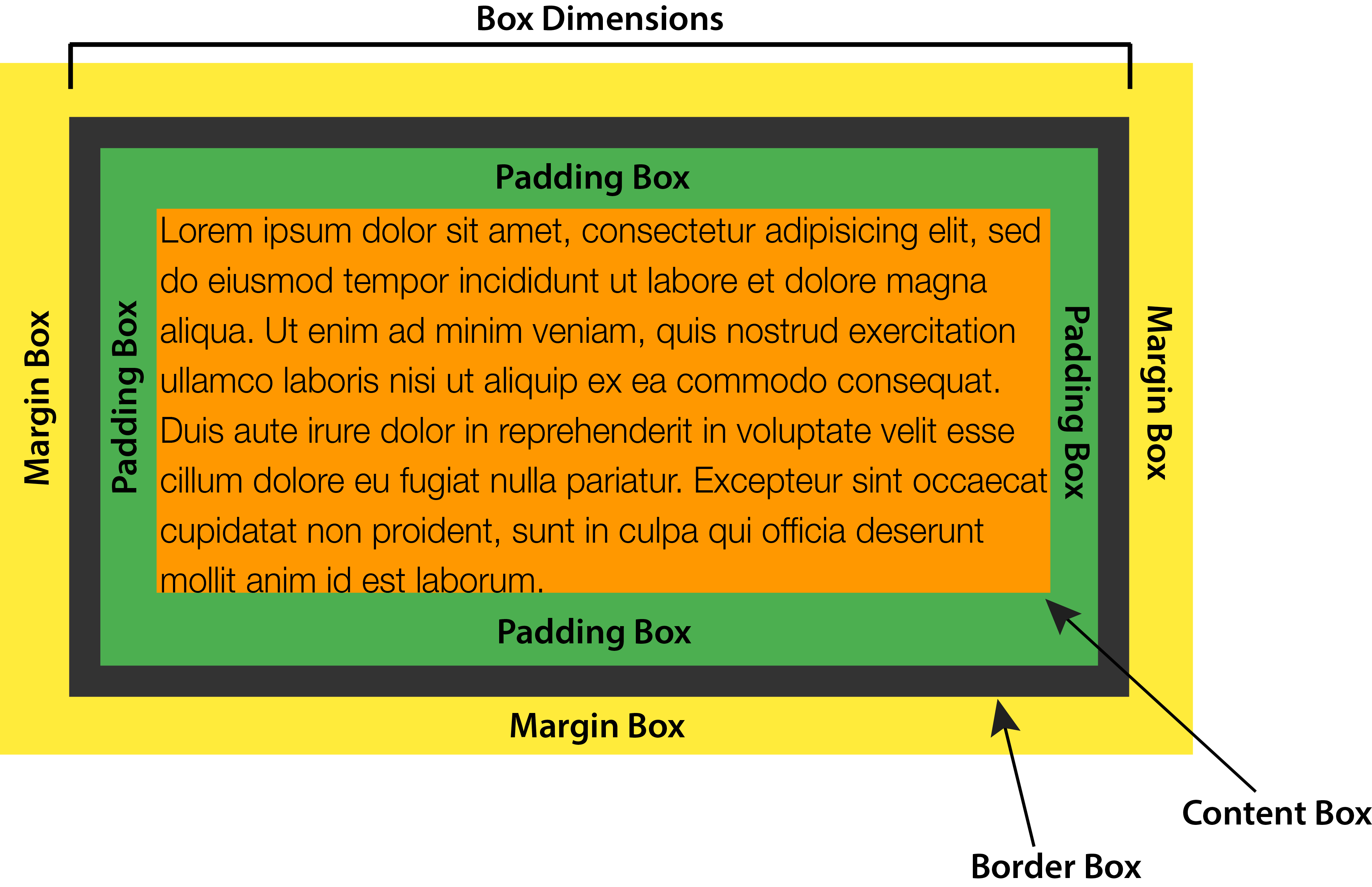
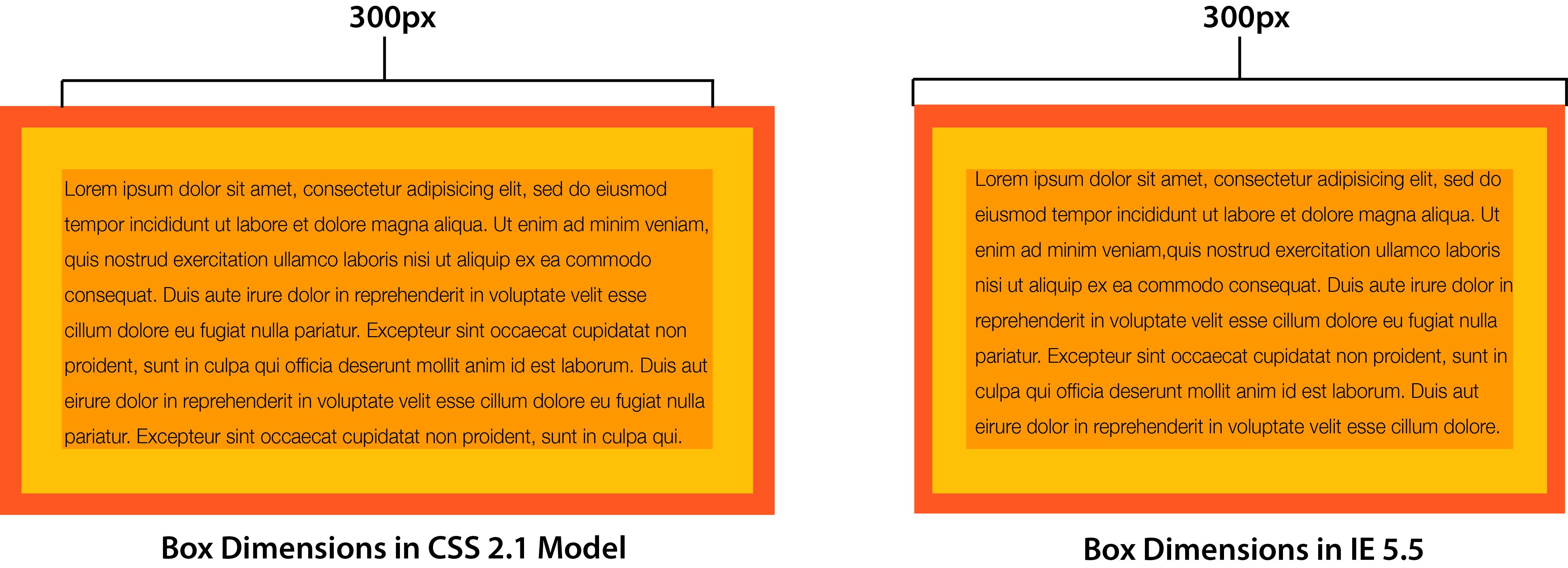
For instance, a p element with width: 300px, padding: 20px, and border: 10px has a calculated width of 360px. That’s the sum of its width, left and right padding, and left and right border-width properties. To create an element that’s 300px wide with 20px of padding and a 10px border, the width needs to be 240px.
Today, browsers calculate the width in just this way. Internet Explorer 5.5, however, didn’t. Instead, IE5.5 used the width property as the final arbiter of box dimensions, with padding and border drawn inside the box, as seen in figure 5-5. Both values were, in effect, subtracted from width, decreasing the size of the content area. Though it’s the exact opposite of the behavior defined in the specification, many web developers thought it was the more sensible approach.
As a way to resolve these competing models, the CSS working group introduced the box–sizing property. It lets us choose how the browser should calculate box dimensions.
Managing Box Dimensions with box-sizing
The box-sizing property is defined in the CSS Basic User Interface Module Level 3 specification. It has two possible values: content-box and border-box.
Initially, the value of box-sizing is content-box. With this value, setting the width and height properties of an element affects the size of its content area. This matches the behavior defined by the CSS 2.1 specification, and it’s the default behavior in modern browsers (as presented in figure 5-5 above).
Setting the value of box-sizing to border-box creates a little bit of magic. Now, the values of width and height will be applied to the outer border edge instead of the content area. Borders and padding are drawn inside the element box. Let’s look at an example that mixes percentage widths and px units for padding and borders:
<div class="wrapper">
    <article>
        <h2>This is a headline</h2>
        <p>Lorem ipsum dolor sit amet, consectetur adipisicing ... </p>
    </article>
    <aside>
        <h2>This is a secondary headline</h2>
        <p>Lorem ipsum dolor sit amet, consectetur adipisicing ... </p>
    </aside>
</div>
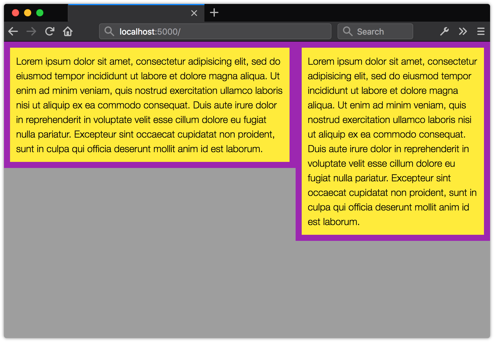
Both our article and aside elements have the following CSS applied, which gives us the layout shown in figure 5-6. Our first element has a width of 60%, while the second has a width of 40%:
article, aside {
    background: #FFEB3B;
    border: 10px solid #9C27B0;
    float: left;
    padding: 10px;
}
article {
    width: 60%;
}
aside {
    width: 40%;
}

By default, both aside and article have a box-sizing value of content-box. The border-width and padding values add 40px to the width of each element, which throws off the 60%/40% split considerably. Now let’s add box-sizing: border-box to the article and aside elements:
article, aside {
    box-sizing: border-box;
}
You can see the change in figure 5-7: the elements have the same width, but the box-sizing: border-box means that the width includes the border and padding. Because the width property applies to the border edge instead of the content area, our elements now fit side by side.
I recommend using box-sizing: border-box in your projects. It makes life easier, as there’s no need to calculate the width value to account for the values of padding and border. Boxes behave more predictably.
The best way to apply box-sizing: border-box is with reset rules. The following example is from Chris Coyier’s CSS-Tricks post, “Inheriting box-sizing Probably Slightly Better Best-Practice”:
html {
    box-sizing: border-box;
}
*, *:before, *:after {
    box-sizing: inherit;
}
This applies border-box sizing to every element by default, without affecting the box-sizing behavior of existing parts of your project. If you know that there’ll be no third-party or legacy components that rely on content-box behavior, you can simplify these rules:
*,
*:before,
*:after {
    box-sizing: border-box;
}
So far, we’ve reviewed managing the box model and the basics of normal flow. However, we often don’t want an element to stay in the normal flow. Here’s where floating and positioning come in.
Floating Elements and Normal Flow
When we float an item by setting the value of the float property to left or right, we remove it from the normal flow. The box is shifted to the left or right of the current line, until its edge aligns with the containing block or another floated element. Content will flow along the left or right edge of its box if there’s enough horizontal space. The height of its containing element will shrink or grow to accommodate the flowed content, unless the containing element invokes a block formatting context.
If, for example, we left-float an image that’s 300px by 225px, the adjacent lines of text will fill in along its right edge. If the computed height of the content exceeds 225px, it will continue to wrap around the bottom of the element:
If, however, the remaining content is shorter than 200px, the floated element will overflow its container:

Text and elements in subsequent containers will flow along the left edge (when float: right) or right edge (when float: left) of the floated element if there’s enough room. The length of each line—its line box—will be shortened to accommodate the float.
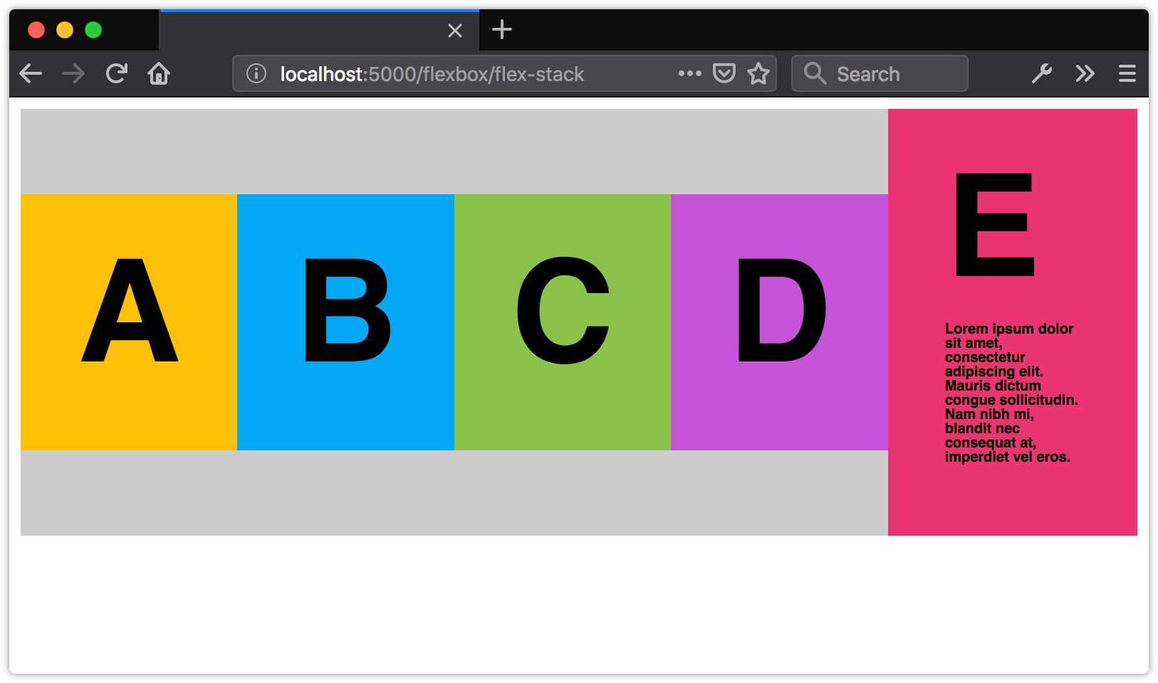
Floating a series of elements works a little bit differently. Let’s apply float: left to a series of div elements that are 250px wide inside a container that’s 800px wide. As you can see in figure 5-10, these elements stack horizontally to fill the available space. Elements that don’t fit in the available horizontal space will be pushed down until the box fits or there are no more floated elements:
Floated elements don’t wrap neatly. Yet in the Jurassic era of the Web, before Flexbox and Grid layout, developers often used floats to create gridded layouts. It was necessary to set a common height on elements within a floated grid to ensure that elements didn’t “snag” on others above them, or get prevented from floating to their intended position:

Removing elements from the normal flow can be tricky. Other content in the document will want to cozy up next to a floated element, yet that may not be the layout we’re trying to achieve.
Consider the UI pattern known as a media object. A media object consists of an image or video thumbnail that’s aligned to the left or right of its container, accompanied by some related text. You’ve probably seen this style of component in comments sections, on news sites, or as part of YouTube’s “Up Next” feature.

Here’s what the markup for a media object might look like:
<div class="media__object">
    <img src="video_thumbnail.jpg">
    <div class="media__object__text">
        Lorem ipsum dolor sit amet, consectetur adipiscing elit, sed do eiusmod tempor incididunt ut
        labore et dolore magna aliqua.
    </div>
</div>
The media object is a simple pattern: it consists of an image floated to the left or right of its container and some related text. Floating our image is the simplest way to create a media object layout:
.media__object {
    background: #ccc;
    padding: 1rem;
}
.media__object img {
    float: left;
    margin-right: 1rem;
}
Of course, the risk of simply floating an image is that the height of the accompanying text may be shorter than the height of the floated image. When that happens, our container will collapse to match the height of the text, as shown below.

To prevent this, we need to clear our float. Let’s look at some methods for doing so in the next section.
Clearing Floats
The simplest way to clear a float is to establish a new block formatting context for its container. A block formatting context always contains its children, even when those children are floated.
So how do we create a new block formatting context? One way is to use display: flow-root. Let’s add display: flow-root to our .media__object ruleset:
.media__object {
    background: #ccc;
    padding: 1rem;
    display: flow-root;
}
.media__object img {
    float: left;
    margin-right: 1rem;
}
Now our floated image will be completely contained by its parent, as shown in below.

The flow-root value for the display property is a fairly recent addition to CSS. Its sole purpose is to trigger a block formatting context for a containing element. Unfortunately, its newness means that support is limited to Chrome 58+/Opera 46+ and Firefox 53+. If you need to support older versions of those browsers, or any version of Microsoft Edge, you’ll need to use an alternative.
One such alternative is overflow: auto. Alas, overflow: auto isn’t perfect. In older browsers, overflow: auto may trigger unintended scroll bars. In modern browsers, overflow: auto can clip shadows and other effects that exceed the bounds of the container.
For the broadest compatibility with the lowest risk of unintended effects, we need another approach. Enter the “clearfix” hack. It’s a now classic web technique for clearing floats without extra markup or unintended effects.
Clearfix
Clearfix uses the ::after pseudo-element and the content property to insert a box at the end of a containing element. Since pseudo-elements can be styled like actual elements, we can apply display: table (or display: block) and clear: both to clear our float:
.media__object::after {
    content: "";
    display: table;
    clear: both;
}
Floats are still useful for aligning images and tables to the left or right, or for placing content asides within a page. For most other uses, Flexbox and Grid are better choices. Flexbox and Grid typically require less markup and less CSS while offering more flexibility in the kinds of layouts we can create. Grid and Flexbox also make vertical centering remarkably easy, as we’ll see later in this chapter.
But first, let’s discuss another way to remove elements from the normal flow: the position and z-index properties.
Positioning and Stacking Elements
Every element in a document participates in a stacking context. The stacking context is a model or set of rules for how elements are painted to the screen. If you’ve ever used the z-index property, you’ve worked with stacking contexts.
The root html element creates a root stacking context. Some CSS properties and values can also trigger a stacking context for the elements they’re applied to. Whether part of a root or local context, children within a stacking context are painted to the screen from back to front as follows:
- child stacking contexts with a negative stack level (for example, positioned and with
z-index: -1) - non-positioned elements whose computed
positionvalue isstatic - child stacking contexts with a stack level of 0 (for example, positioned and with
z-index: auto) - child stacking contexts with positive stack levels (for example, positioned and with
z-index: 1)
If two elements have the same stack level, they’ll be layered according to their order in the source HTML.
Let’s look at an example. Here’s our HTML:
<div id="a">
    <p><b>div#a</b></p>
</div>
<div id="b">
    <p><b>div#b</b></p>
</div>
<div id="c">
    <p><b>div#c</b></p>
</div>
<div id="d">
    <p><b>div#d</b></p>
</div>
 <div id="e">
    <p><b>div#e</b></p>
</div>
And here’s our CSS:
#a {
    background: rgba(233, 30, 99, 0.5);
}
#b, #c, #d, #e {
    position: absolute;
}
#b {
    background: rgba(103, 58, 183, 0.8);
    bottom: 120px;
    width: 410px;
    z-index: 2;
}
#c {
    background: rgba(255, 235, 59, 0.8);
    top: 190px;
    z-index: 1;
}
#d {
    background: #03a9f4;
    height: 500px;
    top: 10px;
    z-index: -1;
}
#e {
    background: rgba(255, 87, 34, 0.7);
    top: 110px;
    z-index: 1;
}
This will produce the stacking order shown in figure 5-15. The bottommost layer is #d, because its z-index value is -1. Since #a isn’t positioned, it sits above #d, but below the positioned elements (#b, #c, and #e). The next layer is #c, followed by #e. Since both elements have the same z-index value, #e is stacked higher, because it’s last in the source order. The topmost layer is #b, due to its z-index of 2.

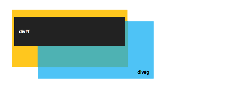
All the elements in the previous example are part of the root stacking context. But let’s see how stacking is affected by a property—opacity—that forces a local context when its value is less than 1. Consider the following HTML:
<div id="f">
    <p><b>div#f</b></p>
</div>
<div id="g">
    <p><b>div#g</b></p>
</div>
It’s paired with this CSS:
#f, #g {
    position: absolute;
}
#f {
    background: rgba(255,193,7,.9);
}
#f p {
    background: rgb(34,34,34);
    color: whitesmoke;
    position: relative;
    z-index: 1;
}
#g {
    background: rgba(3,169,244,.7);
    top: 50px;
    left: 100px;
}
According to the rules of the stacking context, #f p occupies the topmost layer in the stack. That’s what we see in figure 5-16.
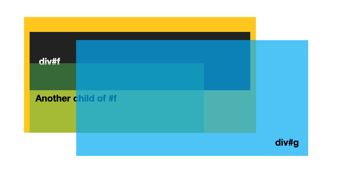
But if we change our CSS and add opacity: .99 to the #f ruleset, something interesting happens:
#f {
    background: rgba(255,193,7,.9);
    opacity: .99;
}
The opacity property creates a new stacking context any time its value is less than 1. As a result, the z-index for its child element becomes relative to its parent rather than the root stacking context. You can see how this works below. Notice that #g now occupies the topmost layer.

Let’s add an absolutely positioned div element to #f and give it a z-index value of 2. Now div is stacked on top of #f p (see below), but it’s still layered behind #g because #f has a local stacking context. Children of a local stacking context can only be reordered relative to that context. Elements that sit in other contexts can’t be layered within a local one.
Workaround for Undesired Behaviors
Because opacity triggers a new stacking context, you may run into undesired behavior when transitioning the opacity of layers that overlap. To work around this, use rgba() or hsla() values for color or background-color and transition those instead.
Let’s look at an example of using the stacking context to manage layers and positioned elements. In this case, we’ll create a menu that slides in from the top of the screen. But rather than slide in over the logo and menu button, we’ll make it slide in beneath it. First our HTML:
<header>
<img src="dont-awesomenews.svg">
<button type="button" id="menu">
<img src="dont-menu.svg">
</button>
<nav>
<ul id="menu-list">
<li><a href="/sports">Sports</a></li>
<li><a href="/politics">Politics</a></li>
<li><a href="/arts">Arts & Entertainment</a></li>
<li><a href="/business">Business</a></li>
<li><a href="/travel">Travel</a></li>
</ul>
</nav>
</header>
Clicking the button element causes the element to slide into view. Now for our (edited) CSS:
header {
    background: #222629;
    color: whitesmoke;
    position: fixed;
    top: 0;
    width: 100%;
}
nav {
    background: #222629;
    position: absolute;
    width: 100%;
    left: 0;
    top: -33vw;
    transition: top 500ms;
}
.open {
    top: 9vw;
}
The CSS above creates a menu that slides down from the top when triggered. But as it slides in, it passes over the AwesomeNews logo:

Our menu (the nav element) slides over the logo and menu button because it has a higher stack level. Remember that when multiple elements have the same z-index value, the last one in the source will be the topmost layer.
Let’s change this. What happens when we add z-index: -1 to the nav ruleset? Well, you get the mess you see in figure 5-20.
The navigation slides in behind the logo and menu button, but it also slides in behind the content. It’s hard to read and impossible to click.
Because its parent element (header) has a z-index of auto, the nav element is still part of the root stacking context. Adding z-index: -1 shoves it to the bottom of the root element’s stack, which means it sits behind other elements in the root stacking context.
So how do we fix this? By creating a new stacking context for nav. We already know that the opacity property will create a new stacking context when its value is less than 1. But positioned elements can also create a new stacking context if the z-index value is something other than auto or 0. Our header element already has positioned: fixed. Now we just need to add z-index: 1 to its ruleset:[5]
header {
    background: #222629;
    color: whitesmoke;
    position: fixed;
    top: 0;
    width: 100%;
    z-index: 1;
}
Now our nav element is contained within the stacking context of its parent. Since header has a stack level of 1 and nav is its child, the menu sits above the rest of our content. But because nav has a negative stack level, it sits at the bottom of the header element’s stacking context, as illustrated in figure 5-21.

For the rest of this chapter, we’ll switch gears and talk about three modules for creating complex layouts: multiple column, flexible layout, and Grid. These modules make previously difficult layouts straightforward, and previously impossible layouts possible. With them, we can create adaptive columns and grid-based layouts without the need for extra markup or JavaScript.
Using CSS Multicolumn Layout
Multiple-column (or multicolumn) layout allows text and elements to flow from one column to another, and automatically adjust to the width of the viewport or container. With it, we can create text layouts that mimic those found in newspapers, magazines, and ebooks. We can also use it to create space-efficient user interfaces.
Basic support for multicolumn layout is quite good. All major browsers support the ability to create columns (using the columns property), set an optimal column width (column-width), set the size of the gutter (column-gap), and add rules between columns (column-rule). Older versions of Chrome (≤ 49) and Firefox (≤ 51) require vendor prefixes—-webkit- and -moz- respectively. Firefox also lacks support for the column-span (or -moz-column-span) property.
Support for break-before, break-after, and break-inside, on the other hand, is a little more complicated. These properties specify how the children of a multicolumn element should be distributed across columns or pages.
Edge, Safari, and Chrome support these properties. Older versions of Safari and Chrome support the non-standard -webkit-column-break-before, -webkit-column-break-after, and -webkit-column-break-inside properties instead.
Firefox, on the other hand, lacks support for break-before, break-after, and break-inside entirely. Instead, it supports similar properties—page-break-before and page-break-after—that work the same way.
Holdover Properties
The page-break-* and -webkit-column-break-* properties are holdovers from earlier versions of the paged media and multicolumn specifications. The CSS Fragmentation Module Level 3 specification unified these properties into the break-* properties and supersedes that earlier work.
It’s safe to use multicolumn properties in projects, even without a fallback. If the browser doesn’t support it, text will default to the normal flow.
Defining Column Number and Width Using columns
To create multiple columns, set the columns property:
<div style="columns: 2">
    <p>Lorem ipsum dolor sit amet, consectetur adipisicing ... </p>
    <p>Duis aute irure dolor in reprehenderit in voluptate ... </p>
</div>
The columns property is a shorthand property for column-width and column-count. With columns, the first value that can be interpreted as a length becomes the value of column-width. The first value that can be interpreted as an integer becomes the value of column-count. Order doesn’t matter. A declaration such as columns: 10em 3 is the shorthand way of typing column-width: 10em; column-count: 3. It’s also equivalent to typing columns: 3 10em.
If a value is unspecified, it will default to the initial value of auto. In other words, columns: 4 has the same effect as typing columns: 4 auto or column-width: auto; column-count: 4.
Setting column-width determines the optimal size for each column. Its value should be in length units—for example, column-width: 200px or column-width: 10em. Percentages won’t work.
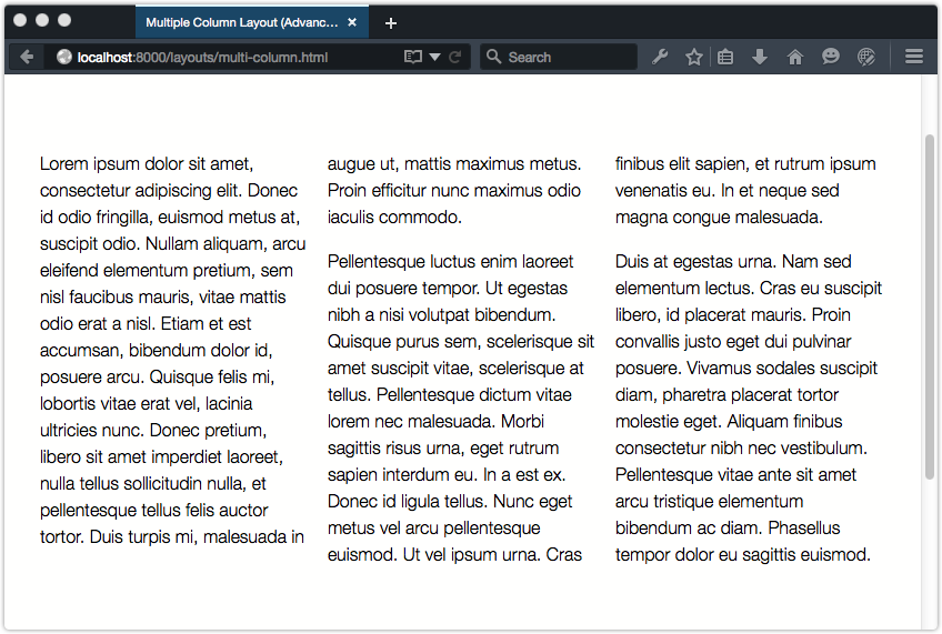
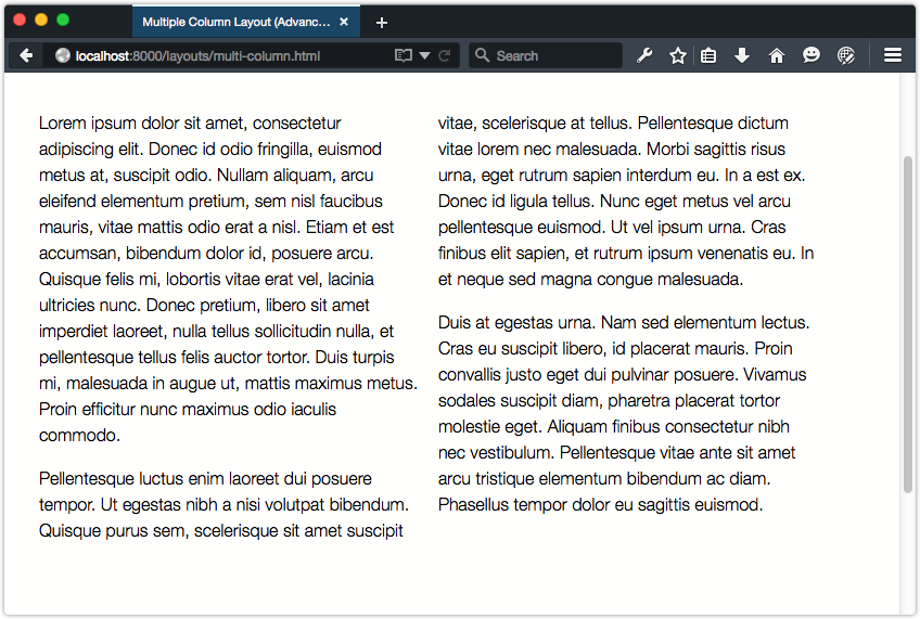
“Optimal,” of course, means that column-width sets the ideal width. The actual width of a column may be wider or narrower than the value of column-width, depending on the available space and/or viewport size. Below, for example, the container is 760px wide and the column-width value is 15em. That gives us three columns.
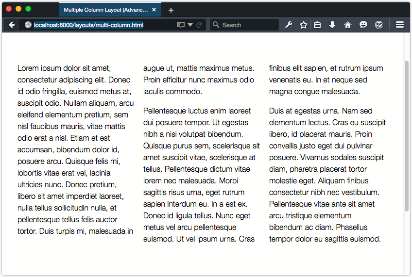
But if we expand the width of the container to 1080px, there’s now room for four columns:
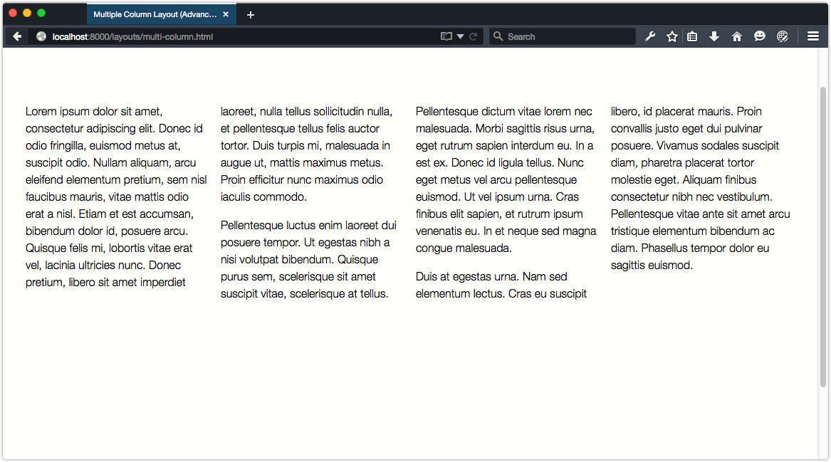
Shrinking the width of the container to 355px, on the other hand, reduces our columns to one:
Setting the column-count property defines the optimal number of columns to create. Its value must be an integer greater than 0. If column-width is something other than auto, the browser will create columns of that width up to the number of columns specified by column-count. If column-width is auto, the browser will create the number of columns specified by column-count. That’s a bit tricky to understand, so let’s illustrate it.
In the figures that follow, our container has a column-count value of 3, and a column-width value of auto. Whether our container is 760px wide (as in figure 5-25) or 355px wide (as in figure 5-26), we still have three columns.

Now, compare these to figure 5-27, where our container has a column-count value of 3, and a column-width value of 8em. Inside a container 760px wide, our number of columns remains the same. But when our container is 355px wide, we can only fit two columns.

This goes out of the window entirely, though, if we set the height of a column container. Setting a fixed height on a container forces the browser to create additional columns to accommodate the container’s content. In this case, the column-count property will be ignored.
Spacing Columns with column-gap and column-rule
How many columns will fit in a container also depends on the value of column-gap. Known as the gutter in print design, the column gap sets the distance between each column. The initial value of column-gap is normal. In most browsers, that’s about 1em.
Increasing or decreasing its width has no effect on the width of each column, just the space between. If an element is 45em wide with column-width: 15em and column-gap: normal applied, the content will be divided into two columns rather than three, as can be seen below.
Changing column-gap to 0, however, gives us our full three-column layout, as shown below. Without a column-gap, there’s now sufficient room for three columns.
As with column-width, the value of column-gap should be either 0 or a positive length value. Negative lengths such as -2em are invalid.

With column-rule, we can add lines to visually separate columns. It functions similarly to border, and accepts the same values. For example:
.multi-col {
    column-rule: thin dashed #0c0;
}
Like border, column-rule is really a shorthand for the column-rule-width, column-rule-style, and column-rule-color properties. Each column-rule-* property accepts the same values as its border counterpart. An example of using column-rule is shown below.

Column width is not affected by changes to column-rule. Instead, column rules sit at the midpoint of the column gap. If the width of the rule exceeds that of the gap, the column rule will render beneath the columns’ contents:

Images Within Columns
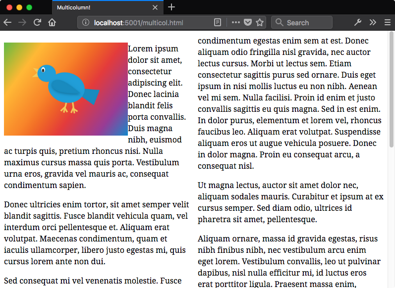
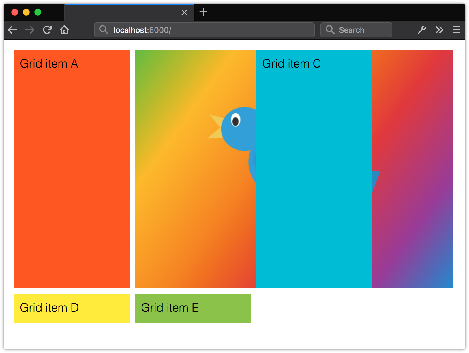
Sometimes, an image may be wider than its column. In Firefox ≤ 61 and Safari, the image will overflow the column’s width and be rendered below the surrounding text.
This overflow behavior is what’s currently defined by the specification. However, in Chrome, Samsung Internet, and Microsoft Edge, the overflowing portion of that image will be clipped by the column’s width:
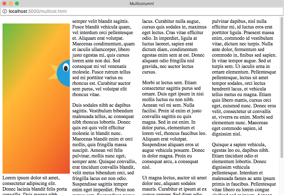
You can work around this by adding a width: 100% declaration to the image or object. Doing so constrains the width of the image to that of the column box, as shown below. It will also constrain the height based on the aspect ratio of the image.

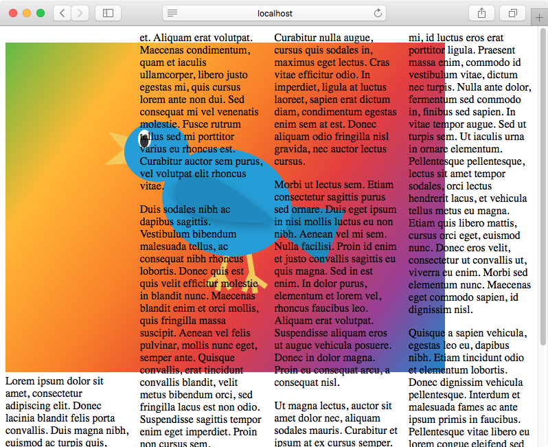
Floated elements, such as an image, within a multicolumn layout are floated within the column box. In the image below, the img element has a float: left rule applied. Text still flows around the image, but within the constraints of the column.
Positioned elements follow the normal stacking context rules. A positioned element will be placed within the root stacking context unless it’s a descendant element of a local stacking context.
Making Elements Span Columns
We can also make a particular element span columns with the column-span property. This property accepts two values: none and all. Using none means that the element will be part of the normal column flow; all will make the element span every column.
It’s currently not possible to make an element span a particular number of columns. We’re limited to specifying whether it should span all columns or none at all. Consider the layout shown below.
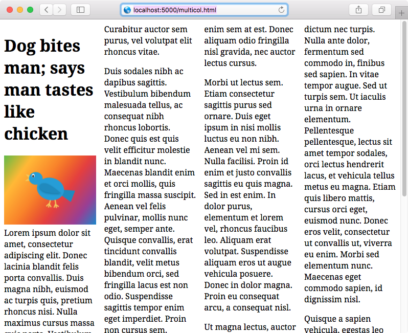
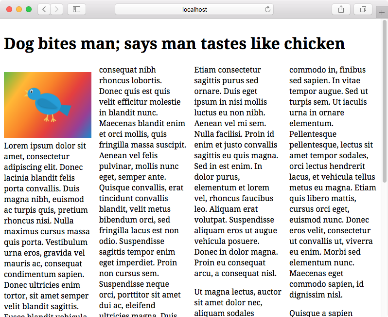
Here, the h1 element (the article headline “Dog bites man …”) is part of the multicolumn layout flow. It sits within a column box, wrapping as appropriate. Now let’s add column-span: all:
article > h1 {
    column-span: all;
}
This gives us the layout shown below, with a headline that spans all of our columns.
Managing Column Breaks Within Elements
In a multicolumn layout, a long block of text may start in one column and end in another:
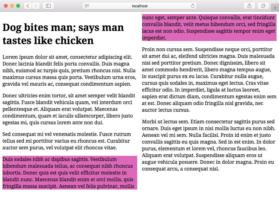
To prevent this, use break-inside: avoid or break-inside: avoid-column. The break-inside property applies to the children of a multicolumn container. For example, to prevent all children of .multi-col from breaking across column boxes, use the following:
.multi-col > * {
    break-inside: avoid-column;
}
Now the purple paragraph no longer breaks across columns, as can be seen in figure 5-39. The break-inside property also affects paged media, which explains why there are both avoid and avoid-column values. The difference is that avoid-column prevents a box from breaking across columns, while avoid prevents a box from breaking across columns and pages.

CSS Fragmentation Module Level 3
The CSS Fragmentation Module Level 3 specification is closely related to the multicolumn and paged media specifications. It further defines how block boxes should break across columns, pages, and regions.
It’s also possible to force a break before or after an element using break-before and break-after. Let’s force a column break before the third paragraph:
.multi-col p:nth-of-type(3) {
    background-color: #c09a;
    break-before: column;
}
Here, we’ve used the column value to force a column break before the selected element (see figure 5-40). The break-after property works similarly, forcing a column break after the selected element. The always value also forces column breaks, but always will also force a column break in paged media.

Older versions of Safari and Chrome use -webkit-column-break-before and -webkit-column-break-after. Both properties are holdovers from an earlier version of the specification. For those properties, the column value is unsupported, so use always instead. For Firefox, use page-break-inside instead.
Optimizing the User Interface
Arranging paragraphs of text isn’t the only use case for multicolumn layouts. We can also use it with lists to optimize the use of horizontal space. Consider the layout shown here:

The old-school way of creating this layout is to split our list into three separate ones and float them to the left or right of a containing element. Here’s what the markup might look like:
<div class="clearfix">
    <ul class="column-float-left">
        <li>Apples</li>
        <li>Oranges</li>
        <li>Bananas</li>
        <li>Dragon fruit</li>
    </ul>
    <ul class="column-float-left">
        <li>Cherries</li>
        <li>Strawberries</li>
        <li>Blueberries</li>
        <li>Raspberries</li>
    </ul>
    <ul class="column-float-left">
        <li>Durian</li>
        <li>Mangosteen</li>
        <li>Mangoes</li>
    </ul>
</div>
And the accompanying CSS:
.columned-list {
    float: left;
    width: 33%;
    min-width: 150px;
    margin: 0;
}
.clearfix::after {
    clear: both;
    content: ' ';
    display: block;
}
While this approach works, it requires more markup than a single-list element. We’re using three li elements instead of one. And we have to manage floated elements and clearing those floats. With a multicolumn layout, we can use a single element without worrying about clearing floats:
<ul style="columns: 3">
    <li>Apples</li>
    <li>Oranges</li>
    <li>Bananas</li>
    <li>Dragon fruit</li>
    <li>Cherries</li>
    <li>Strawberries</li>
    <li>Blueberries</li>
    <li>Raspberries</li>
    <li>Durian</li>
    <li>Mangosteen</li>
    <li>Mangoes</li>
</ul>
Missing Bullets
Blink- and WebKit-based browsers remove bullets and numbers from some or all list items in a multicolumn layout. As a workaround, add a left margin (or right margin in a right-to-left language) of at least 20px to li elements within a multicolumn container.
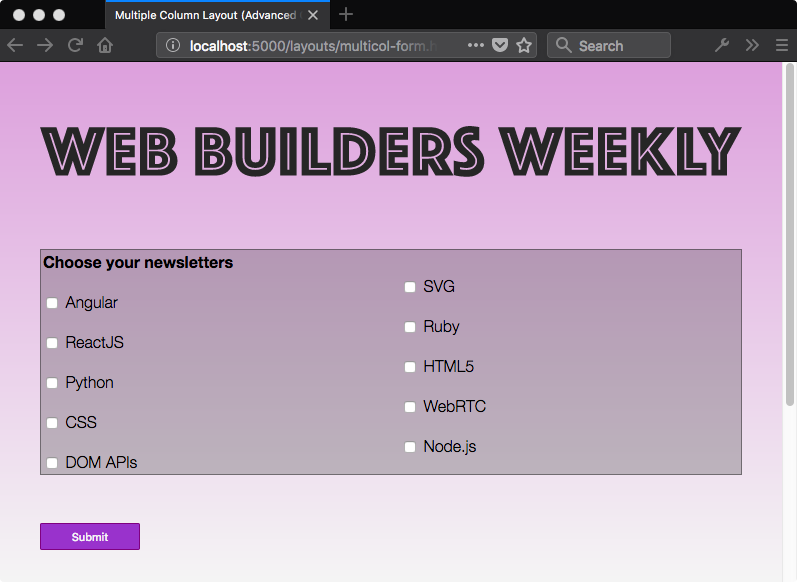
Another use case for multicolumn layouts is wrangling lists of checkbox inputs. Here, too, we can maximize the use of horizontal space to create more compact forms:
Use multicolumn layout when you have blocks of content to be automatically distributed and evenly spaced across several columns. It isn’t well suited to creating page layouts—such as adding a navigation column and a main content column. For page layouts, use Grid, Flexbox, or the legacy techniques of float and clearfix.
Creating Layouts with CSS Grid
CSS Grid is a more recent layout specification, shipping in most browsers as of October 2017. CSS Grid allows us to create two-dimensional grid-based layouts that were previously impossible, or only possible with lots of DOM operations.
Keep in mind that the CSS Grid specification is dense, and introduces several new concepts that are quite complex. Consider this section an overview rather than a comprehensive look at Grid. Don’t worry, we’ll point you to lots of resources for learning more.
The Grid Formatting Context
Adding display: grid to an element triggers a grid formatting context for that element and its children. In a grid formatting context, three things happen:
- The element becomes a block-level element that participates in the normal flow.
- Its children—whether elements or text nodes—create block-like, grid-level boxes that can be arranged into rows and columns. Immediate children of a grid container are grid items.
- In a horizontal writing mode, each member in a grid row will have the same height as its tallest element (as determined by content), unless an explicit height value is set. When the document uses a vertical writing mode, it takes on the same length as its longest element (as determined by content).
Using display: inline-grid works similarly. Children of inline-level grid containers create grid-level boxes, but the container itself participates in an inline formatting context.
By themselves, display: grid and display: inline-grid won’t automatically arrange these boxes into rows and columns. We also need to tell the browser where and how to place things.
Before creating your grid, determine whether you want a fixed number of columns and/or rows, whether you’d like the browser to calculate the number of columns and rows automatically, or whether you’d like a mix of the two. Knowing what kind of grid you want to create determines the approach you’ll take. Let’s look at a few techniques.
Defining a Grid Layout
After defining a grid container, we’ll need to tell the browser how many rows and columns our grid should contain. We can define the number of rows and columns using the grid-template-rows and grid-template-columns properties. They’re applied to the grid container.
Both grid-template-rows and grid-template-columns accept what’s known as a track list. The track list is a space-separated string that specifies grid line names and sizes of each position in the row or column.
Each value in a track list creates a new space—a track—within the row or column. You can use lengths, flexible length units (discussed later in this chapter), or percentages. You can also use sizing values such as auto, min-content and max-conent.
.grid {
    display: grid;
    grid-template-columns: 25rem 25rem 25rem;
    grid-template-rows: 10rem 10rem;
}
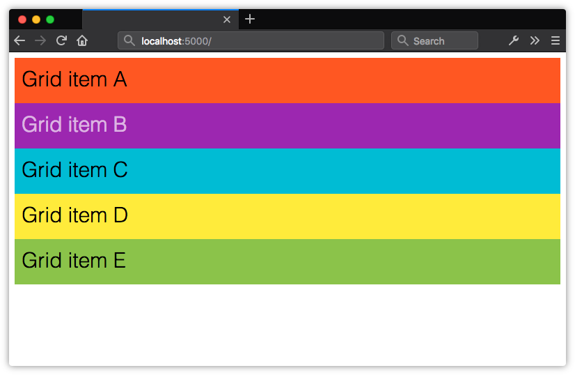
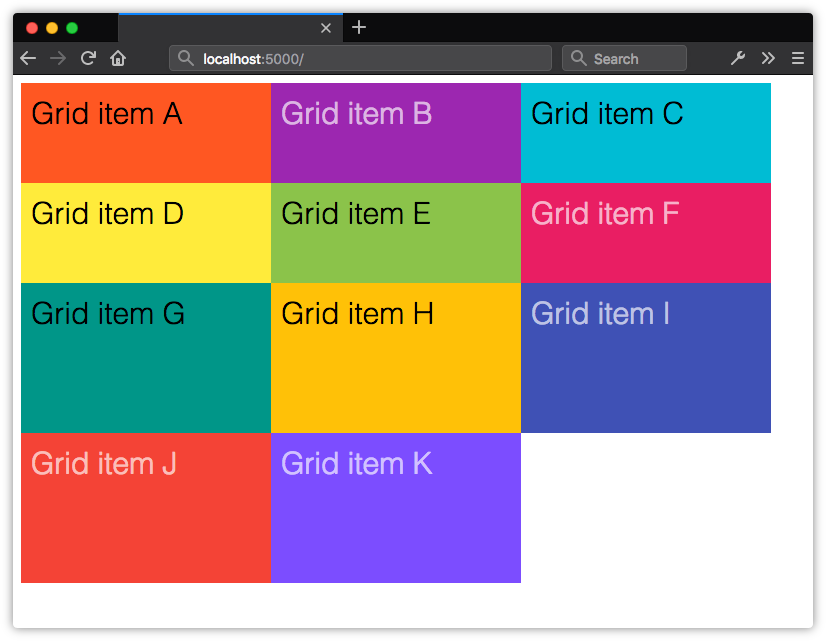
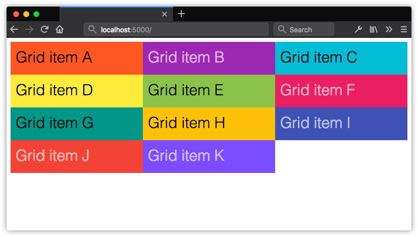
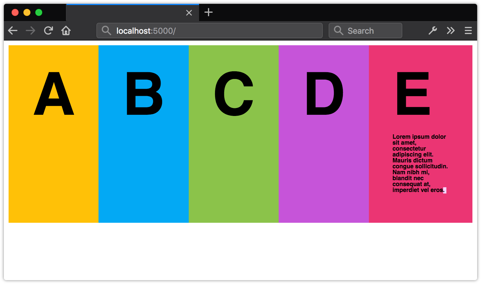
In the code above, we’ve defined a grid with three columns, each 25rem units wide and two rows, each 10rem units tall. Let’s apply it to the following HTML. Yes, this is all the markup required:
<div class="grid">
    <div>Grid item A</div>
    <div>Grid item B</div>
    <div>Grid item C</div>
    <div>Grid item D</div>
    <div>Grid item E</div>
</div>
Our grid items get organized into the columns and rows shown in figure 5-45.
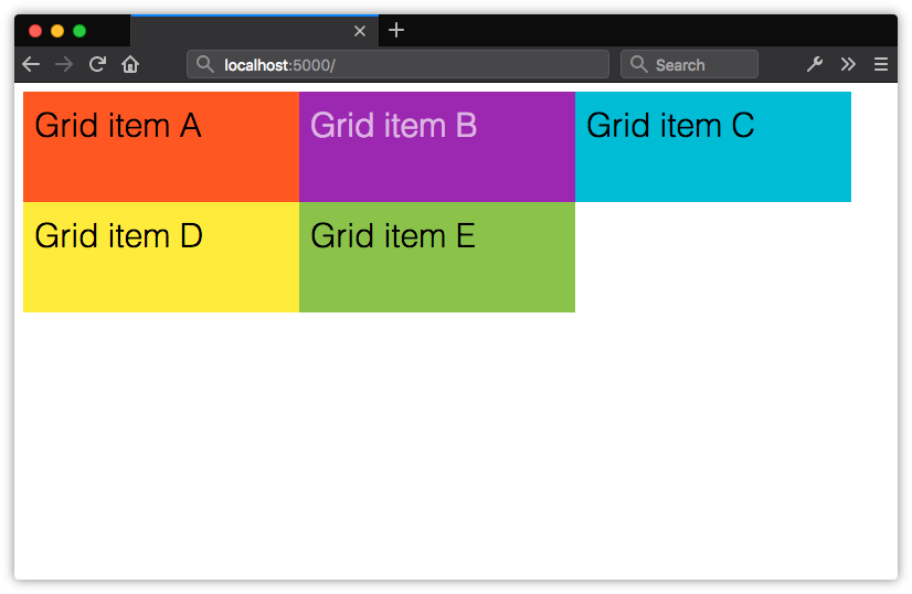
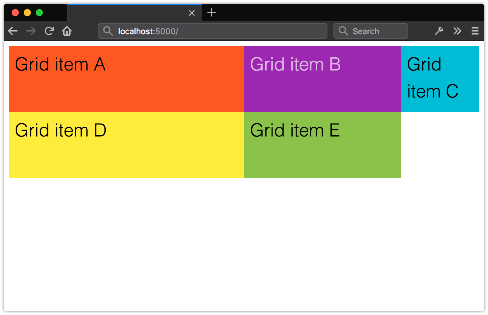
Here, we’ve created a grid of evenly sized rows and columns, but that isn’t a requirement of Grid. Let’s tweak our CSS slightly. We’ll change the value of grid-template-columns to 25rem 15rem 25rem:
.grid {
    display: grid;
    grid-template-columns: 25rem 15rem 25rem;
    grid-template-rows: 10rem 10rem;
}
Now the second column in our grid is narrower than the first and third (shown in figure 5-46).
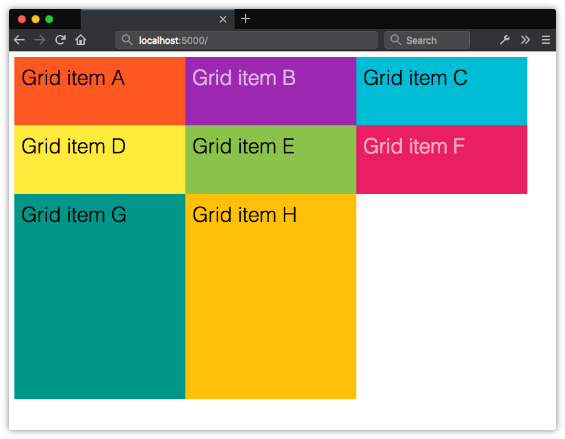
Explicit Grid versus Implicit Grids
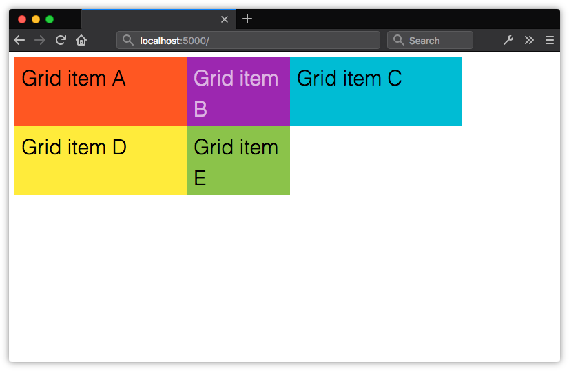
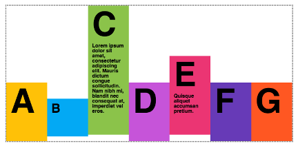
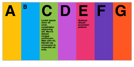
In the previous section, we explicitly stated that this grid should have six available grid cells formed by three columns and two rows. This is what’s known as an explicit grid. Here, our grid container only has five children. The remaining position is empty. Let’s see what happens when we add more children to the container.

Now we have three rows. Notice, however, that our third row is only as tall as its contents and padding. It’s part of the grid because these items are the children of a grid container. Yet the row isn’t explicitly defined by grid-template-rows. What we have instead is an implicit grid—an explicit grid with additional grid items that exceed the defined number of explicit grid cells.
Items within an implicit grid are auto sized by default. Grid items will expand to accommodate their contents, or fill the remaining vertical space in the container—whichever is taller. If, for example, we set the height property of our container to 50rem, our implicit grid track will expand to be 30rem tall.

If we add enough items to create a fourth row, the height of our implicit grid items will be distributed evenly across the remaining 30rem of vertical space in the container. Their computed height will be 15rem each.
In our original example, we’ve explicitly defined only two rows with a height of 10rem each, so our third row defaults to auto sizing. Its height will adjust to the size of its contents and padding.
Specifying Track Size for an Implicit Grid
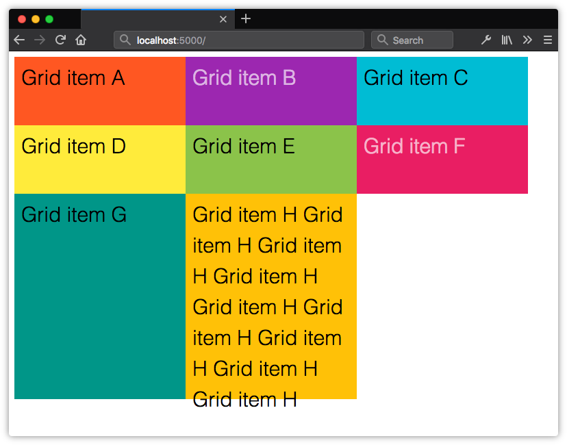
It is possible, however, to set a kind of explicit, default height or width for implicit grid items using the grid-auto-rows and grid-auto-columns properties. Let’s update our CSS with grid-auto-rows:
.grid {
    display: grid;
    grid-template-columns: 25rem 15rem 25rem;
    grid-template-rows: 10rem 10rem;
    grid-auto-rows: 30rem;
}
Now items in our third row—and any subsequent rows—will be 30rem in height.
There’s one drawback to using the grid-auto-* properties: when the contents of a grid item exceed its dimensions, they will overflow the container (as shown below), and may be clipped visually by elements in other rows.
One way to avoid this is to use the minmax() function. Let’s rewrite our CSS to use minmax():
.grid {
    display: grid;
    grid-template-columns: 25rem 15rem 25rem;
    grid-template-rows: 10rem 10rem;
    grid-auto-rows: minmax(30rem, auto);
}
As you may have guessed from its name, minmax() lets us define the minimum and maximum size of a track. It requires two arguments, the first of which is the minimum desired track size. The second argument is the maximum desired size.
In this case, our row will be at least 30rems high. But since we’ve set our maximum size to auto, our track will expand to accommodate the content of that cell. Arguments for minmax() can be lengths or percentages, or one of the auto, min-content, and max-content keywords. Here, minmax(30rem, max-content) would achieve much the same effect. Flexible units, discussed in the next section, are also valid.
Lengths and percentages can be used to define track sizes. Using them may mean that the grid items don’t fill the entire width or height of the container. For example, if our grid container is 70rem wide, grid-template-columns: 25rem 15rem 25rem; will only fill about 90% of its horizontal space. On the other hand, if our grid container is only 50rem wide, the total width of our columns will overflow the container’s bounds.
One way to avoid this issue is by using flexible length units.
Creating Flexible Grids with Flex Units
Flexible length or flex units are best understood as fractional units, and are expressed using fr. Flex units indicate to the browser what fraction or proportion of the leftover space in a grid container should be allocated to each grid item. They’re a ratio, not a true length value in the way px, em, or cm are.
There’s a formula for calculating the used width of an item when using flexible units: (flex × leftover space) ÷ sum of all flex factors. If, for instance, our grid container is 1000px wide, and the value of grid-template-columns is 3fr 2fr 1fr, our columns will be 500px, 333.33px and 133.33px wide. The width of each column is allocated proportionally from the space available, as shown below.
Because these units are ratios and not absolute lengths, grid-template-columns: 2fr 2fr 2fr is equivalent to grid-template-columns: 1fr 1fr 1fr. Both will result in columns of equal width for horizontal writing modes, and rows of equal height for vertical writing modes.
Not True Length Units
Nfr units are not true length values. This makes them incompatible with other length units, such as px and rem. It also means that you can’t use fr units with the calc() function. For example, calc(1fr - 1rem) is an invalid length value.
Using the grid-template Shorthand Property
We can also indicate the number of rows and columns using the grid-template property. Its syntax is as follows:
grid-template: [row track list] / [column track list]
Remember this block of CSS from earlier in the chapter?
.grid {
    display: grid;
    grid-template-columns: 25rem 25rem 25rem;
    grid-template-rows: 10rem 10rem;
}
We can combine the second and third lines using grid-template:
.grid {
    display: grid;
    grid-template: 10rem 10rem / 25rem 25rem 25rem;
}
For clarity, however, you may still wish to use the longhand properties.
Repeating Rows and Columns
In many cases, you’ll want grid columns or rows that repeat automatically; think of a list of store items or recipe search results. Grid offers a syntax for that—the repeat() function:
.grid {
    display: grid;
    grid-template-columns: repeat(3, 1fr);
}
repeat() accepts two arguments:
- the number of times to repeat the track list
- a track list to repeat
Arguments must be separated by a comma. The first argument may be a positive integer, or the auto-fit or auto-fill keywords. The above CSS produces the following grid. Our 1fr track list is repeated three times.
We could also use a two-column pattern that repeats twice. For example, grid-template-columns: repeat(2, 1fr 3fr); produces a four-column grid. As figure 5-54 shows, the first and third columns are one third the width of the second and fourth. In both cases, the value of grid-template-rows is auto.

Repeating Columns with auto-fit or auto-fill
Both of the preceding examples tell the browser: here’s a track list pattern; please repeat it X number of times. What you may want to tell the browser instead, though, is: please fit as many columns or rows as you can within this grid container. For that, we can use auto-fit or auto-fill as the first argument for repeat(), in combination with minmax().
What’s the difference between auto-fit and auto-fill? It’s subtle, but significant.
auto-fillfits as many grid items as it can within a track line, adding anonymous grid tracks if necessary.auto-fitfits as many grid items as it can within a track line, expanding or collapsing the dimensions of each track if necessary.
This difference becomes apparent when the grid container’s width exceeds the maximum total width of its grid items. Let’s compare some CSS:
.grid {
    display: grid;
    width: 800px;
}
.autofill {
    grid-template-columns: repeat(auto-fill, minmax(100px, 1fr));
}
.autofit {
    grid-template-columns: repeat(auto-fit, minmax(100px, 1fr));
}
And let’s apply this CSS to the HTML below:
<div class="grid autofill">
    <div>Grid item A</div>
    <div>Grid item B</div>
    <div>Grid item C</div>
    <div>Grid item D </div>
    <div>Grid item E</div>
</div>

<div class="grid autofit">
    <div>Grid item A</div>
    <div>Grid item B</div>
    <div>Grid item C</div>
    <div>Grid item D </div>
    <div>Grid item E</div>
</div>
The only difference between these two grid layouts is that one uses auto-fill and the other uses auto-fit. But compare the two grids in figure 5-55.

In both grids, the total maximum width of the grid items is less than that of the grid container. However, in the top grid—our auto-fill grid—that excess space is filled in by anonymous grid items.

Compare that to the bottom grid, in which each grid item has been stretched to fit the available space. Figure 5-56 illustrates what those anonymous grid cells look like using Firefox’s developer tools.
More on Auto-sizing Columns
If this still doesn’t make any sense, read Sara Soueidan’s “Auto-sizing Columns in CSS Grid: auto-fill vs auto-fit”. It contains some video examples that illustrate the difference a little bit better than static images can.
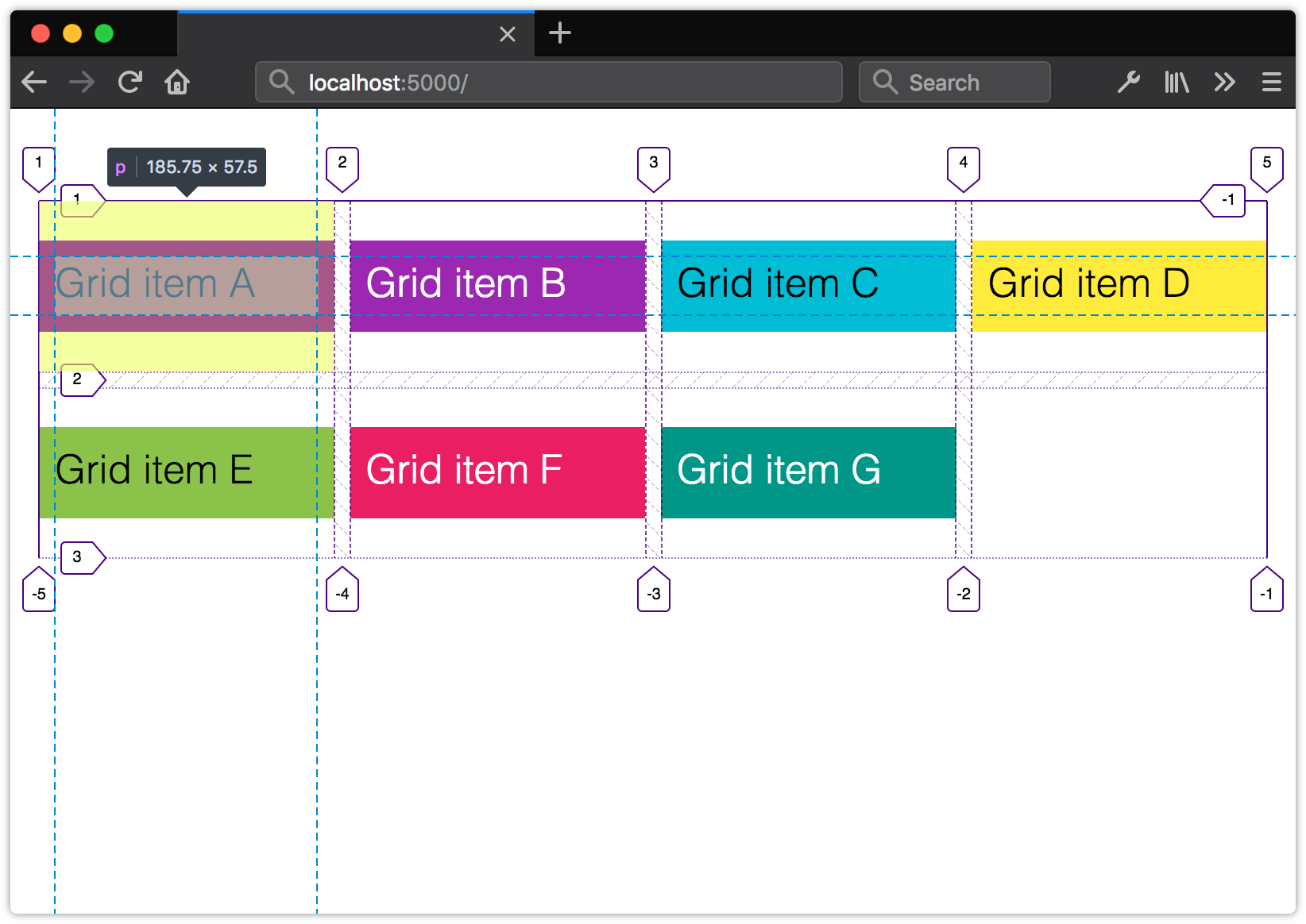
Line-based Grid Placement
So far, we’ve discussed simple grids that are neatly aligned rows and columns of boxes. But Grid layout is far more robust and flexible than that. We can also use it to create complex layouts.

The layout pictured above uses line-based grid placement, a core component of CSS Grid. We’ll look at how to create this layout later in this section. But first, let’s discuss grid lines.
Understanding Grid Lines
Grid lines are horizontal and vertical lines that separate rows and columns, as shown below. These lines exist on each side of a row or column, but don’t affect its dimensions.

The space between each grid line is known as a grid track. A grid track can be a row or a column; the phrase itself is a generic term for both. Grid columns and grid rows intersect to form grid cells.
Firefox’s grid inspector is currently the best way to visualize grid lines. When working with grid containers in Firefox, you’ll see a crosshatch icon between display and grid.

Clicking that crosshatch icon displays (or hides) the grid overlay. The screenshot below shows the Firefox grid overlay in action.
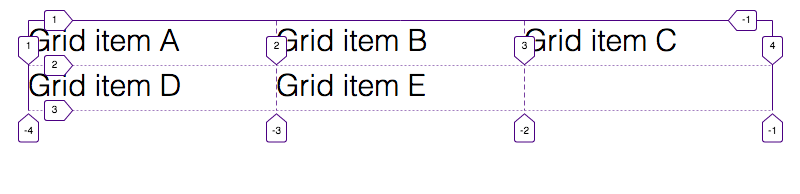
Notice that each edge of each column in this grid is bounded by a grid line, and each of these lines has a numeric index. The same is true for each row.
Grid line numbering begins with 1, and the count begins at the start of the grid container. When the text direction is left to right, the starting point is the left edge. When the direction is right to left, the starting point is the right edge.
Each grid line may also have a negative index. Negative index counts begin with -1, and decrement from the ending edge of the explicit grid. So an index of -1 specifies the ending edge of the container, while an index of -2 specifies one grid line in from that one, and so on. (We’ll see an example of negative line numbers in use shortly.)
Line numbers can be used to place items within the grid using the grid-column-start/grid-column-end and grid-row-start/grid-row-end properties. Here’s an example:
.grid-10cols {
    display: grid;
}
#a {
    grid-column-start: 1;
    grid-column-end: 11;
}
#b {
    grid-column-start: 1;
    grid-column-end: 6;
}
#c {
    grid-column-start: 6;
    grid-column-end: 11;
}
We’ll pair that CSS with the HTML below:
<div class="grid-10cols">
    <div id="a">Grid item A</div>
    <div id="b">Grid item B</div>
    <div id="c">Grid item C</div>
</div>
Figure 5-61 illustrates the result: #a fills the space between line 1 and line 11, or the entire width of the grid. #b begins at the first line and ends at the sixth. #c begins at the sixth line and extends to line 11. With grid-*-start and grid-*-end, we’re telling the browser to align the starting and ending edges of our grid items with specific grid lines.
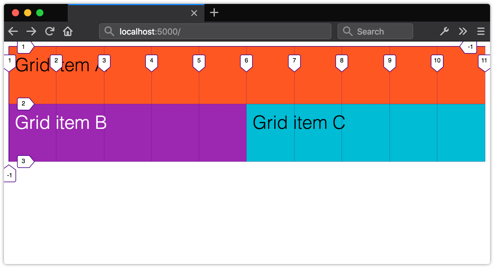
We didn’t use either of the grid-template-* properties in this example. By defining a start line and an end line, we’ve instead implied that our grid should have ten columns. Note here that, because our grid is implied and not explicit—for example, it’s not defined using grid-template-columns: repeat(10, 1fr), or something similar—we’ve lost the ability to use negative grid line indexes for placement.
Spanning Rows or Columns
In the example above, we’ve used line numbers to indicate where our grid items should begin and end. Another way is to use the span keyword. The span keyword indicates how many tracks—that is, how many rows or columns—a grid item should occupy. We could, in other words, rewrite our CSS like so:
.grid-10cols {
    display: grid;
}
#a {
    grid-column-start: span 10;
}
#b {
    grid-column-start: span 5;
}
#c {
    grid-column-start: span 5;
}
Again, span indicates how many columns or rows a grid item should occupy. Line indices indicate where to align the edges of a grid item.
Complex Layouts with Line-based Placement
Let’s return to our earlier example from figure 5-57. Once again, our markup is simple—a containing div with eight children:
<div class="grid-10cols-complex">
    <div id="a">Grid item A</div>
    <div id="b">Grid item B</div>
    <div id="c">Grid item C</div>
    <div id="d">Grid item D </div>
    <div id="e">Grid item E</div>
    <div id="f">Grid item F</div>
    <div id="g">Grid item G</div>
    <div id="h">Grid item H</div>
</div>
For this layout, we’ll explicitly define a five-row, ten-column grid:
.grid-10cols-complex {
    display: grid;
    /* Syntax: grid-template: [rows] / [columns] */
    grid-template: repeat(5, 9.5rem) / repeat(10, 10%);
}
Explicitly defining a grid isn’t strictly necessary for line-based placement. In this case, however, it ensures that each box in our layout has the right proportions. The next step is to place our grid items:
#a, #h {
    grid-column-start: span 10;  /* Span the entire grid */
}
#b {
    grid-row-start: span 3;
    grid-column-start: span 2;
}
#c, #d {
    grid-column-start: span 4;
}
#e, #f {
    grid-column-start: span 3;
}
#f, #g {
    grid-column-end: -1;  /* Begin from the container's ending edge. */
}
#g {
    grid-column-start: span 5;
}
Here, both #a and #h span all ten columns of our grid, while the other elements span between two and five columns, as you can see below. Element #b also spans three rows.
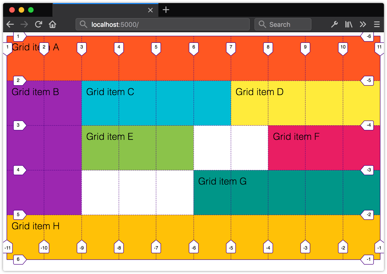
Notice that for #f and #g, we’ve used a negative line index. Remember that negative line indices begin at the ending edge of the container. With grid-column-end: -1, we’ve told the browser, align the ending edge of #f and #g with the ending edge of our grid container. These elements still span three and five columns, respectively, but their ending edges align with the edge of the container.
Using Named Grid Areas
One of the more clever aspects of CSS Grid is template areas. Template areas use the grid-template-areas property, and let us define our grid in terms of named slots. We can use template areas, in combination with grid placement properties, to define complex grid layouts that are still readable.
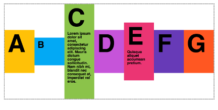
Take the layout shown in figure 5-63. It’s a fairly conventional, two-column layout with a header, footer, and main content area, along with a right-hand navigation menu.

Here’s the markup we’ll use to create this page. It’s simplified to emphasize the document’s structure:
<!DOCTYPE html>
    <html lang="en-US">
    <head>
        <title>GoodRecipes! Tuna with zucchini noodles</title>
    </head>

    <body>
        <header>...</header>
        <article>...</article>
        <nav>...</nav>
        <footer>...</footer>
    </body>
</html>
Named template areas are a bit tricky to understand at first. We still need to define rows and columns, but we can then distribute those rows and columns across our named areas using the grid-template-areas property. Here’s an example:
body {
    display: grid;
    /*
    Using the longhand properties for
    the sake of clarity. We could also use
    grid-template: repeat(2, auto) / 4fr 1fr
    instead.
    */
    grid-template-rows: repeat(2, auto);
    grid-template-columns: 4fr 1fr;
    grid-template-areas: "pagehead pagehead"
                         "mains navigation"
                         "pagefoot pagefoot";
}
Yes, the syntax of grid-template-areas is a little weird. Template areas are strings and must be enclosed in single or double quotes. Each template area corresponds to a row in the grid. Columns within each row are delineated by a space.
Line Breaks Not Required
You’re not required to use line breaks when setting the value of grid-template-areas. We could put our definition on a single line: grid-template-areas: "pagehead pagehead" "mains navigation" "pagefoot pagefoot";. Line breaks do, however, make it easier to visualize and understand the layout.
Now, in order for grid-template-areas to work, we have to account for every position in the grid. That’s why we’re repeating heading and footer. Repeating a name within a template string indicates that the area should span multiple columns:
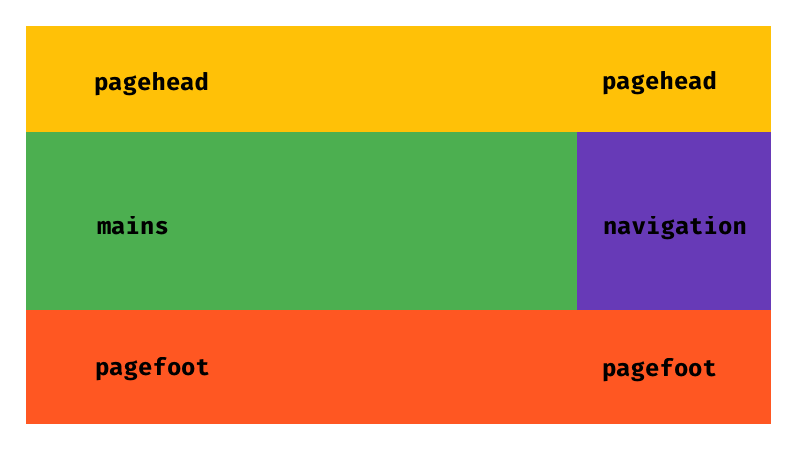
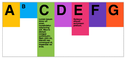
Now that we’ve defined our template areas, the last step is to assign our elements to each area using the grid-area property:
header {
    grid-area: pagehead;
}
article {
    grid-area: mains;
}
nav {
    grid-area: navigation;
}
footer {
    grid-area: pagefoot;
}
This tells the browser to place the header element in the pagehead area, the article element in the mains area, and so forth.
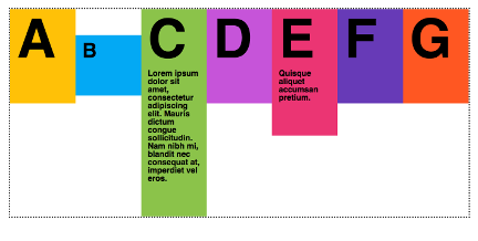
Spacing Grid Items
In all of the grids we’ve created thus far, the edges of our grid items abut each other. We can, however, add space—also known as a gutter—between our grid items with the column-gap and row-gap properties. Both properties apply to the grid container:
.grid {
    display: grid;
    grid-template: 10rem 10rem / 25rem 25rem 25rem;
    column-gap: 1rem;
    row-gap: 1rem;
}
Figure 5-65 shows the effect of adding 1rem row and column gaps.

In a grid formatting context, column-gap: normal and row-gap: normal resolve to a used value of 0px. That’s in contrast with multicolumn layout, where column-gap: normal resolves to a used value of 1em.
Only length and percentage values are valid for column-gap and row-gap (and the gap shorthand property). If you’d rather have the browser automatically distribute boxes along each grid axis, use justify-content or align-items instead. We discuss both properties later in the “Box Alignment and Distribution” section of this chapter.
The gap Shorthand Property
We can also specify the column-gap and row-gap at once using the gap shorthand property. The first value of gap becomes the size of the row gap; the second value is the column gap. Providing only one value sets the same gap size for both properties. In other words, we can rewrite column-gap: 1rem; row-gap: 1rem; as gap: 1rem;.
Originally, the CSS Grid specification defined grid-gap, grid-row-gap and grid-column-gap properties. Some browsers implemented this older version of the specification. As a result, recent but outdated versions of Firefox (≤ 60) and Safari (≤ 11) don’t support column-gap when used with Grid layout. They don’t support the row-gap property at all.
For compatibility with older browsers, include the legacy grid-row-gap and grid-column-gap properties in addition to column-gap and row-gap.
This ensures that your grid layouts will work in the broadest range of browsers.
Grid Items and Margins
Grid items can have margins of their own. However, margins work a bit differently in a grid formatting context than they do in a block formatting context.
Grid cells, and the grid lines that bound them, form containing blocks for grid items. As a result, adjacent margins of grid items do not collapse. That’s the opposite of what happens in a block formatting context.
For grid items, top and bottom margins of 1rem result in 2rem of space between the content boxes, as shown in figure 5-66. And because grid item margins fall within the containing block, they may affect the dimensions of auto-sized grid tracks.
Using column-gap and row-gap aren’t the only ways to space grid content. We can also use the justify-* and align* properties to distribute grid items within the available space. Since most of these properties are common to Grid and Flexbox, we’ll discuss them together in the section “Box Alignment and Distribution” later in this chapter.
Images Within Grids
Images within grid cells work similarly to the way they behave in multicolumn layouts. When the track size uses length or percentage units, images may overflow the grid cell if their dimensions exceed those of the cell.
However, when the track sizing function is auto, or uses flex units (fr), the track containing that grid cell will expand to accommodate the image.

As in multicolumn layout, we can constrain the image dimensions to those of its grid cell by setting its width to 100%.
Floating images or other elements within a grid cell works as you’d expect. But you can’t float a grid item. Floated siblings of grid containers also don’t intrude on the grid container.
Grid Conclusion
CSS Grid is a very dense topic. We’ve really just scratched the surface here. Luckily, there’s a wealth of resources that can help you learn more.
I believe in reading specifications where possible. In my opinion, the CSS Grid specification is quite readable, and it’s a good place to begin your own explorations of grid layout. But specifications do tend to contain a lot of jargon, because they’re targeted not only at web developers, but also those tasked with implementing the specification in browsers.
Rachel Andrew’s Grid by Example was created for a web developer audience. The site includes grid layout tutorials and a collection of common user interface patterns. Be sure to visit the site’s Resources section too. It’s a cornucopia of links that demonstrate what you can do with CSS Grid.
Jen Simmons’ Experimental Layout Lab is also chock-full of examples that illustrate Grid’s possibilities. If video is more your style, Simmons’ Layout Land YouTube channel includes video walkthroughs of grid and other layout topics.
When you need more of a cheatsheet-style reference, try “A Complete Guide to Grid”, by CSS-Tricks.
Creating Flexible Layouts with Flexbox
Before CSS Grid came along, there was Flexbox (which is officially known as the CSS Flexible Box Layout Module). Flexbox was designed to manage layout in one direction—a row (flex-direction: row or row-reverse) or a column (flex-direction: column or column-reverse). That’s in contrast to Grid, which accounts for rows and columns.
Internet Explorer 11
Internet Explorer 11 supports an older version of the Flexbox specification. We’re going to focus on the version of Flexbox that’s implemented in current browsers. If you want to implement a flexible box layout in Internet Explorer 11, consult Chris Mills’ piece “Advanced Cross-browser Flexbox”. Or use a float-based layout as a fallback.
A basic flexible box layout is simple to create: add display: flex or display: inline-flex to the containing element. These values for display will trigger a flex formatting context for that containing element’s children. As with Grid, both flex and inline-flex are inside display modes. We set these values on the container, which behaves like a block-level or inline-level box, respectively. The children of that container are then arranged according to the rules of flex layout.
Vendor Prefixes Required in Older Browsers
Older versions of Blink-based browsers such as Chrome (≤ 28), and WebKit-based browsers like Safari (≤ 8), require a vendor prefix. If your project still supports those browsers, you’ll need to use display: -webkit-flex or display: -webkit-inline-flex. Older versions of Firefox (≤ 21) also require a prefix. Use -moz-flex and -moz-inline-flex to support those browsers.
By adding display: flex or display: inline-flex to a containing element, its immediate children become flex items, as shown in figure 5-69. Flex items may be element children or non-empty text nodes. For instance, the markup below generates three flex item boxes that each behave according to the rules of flex layout:
<div style="display: flex">
    <span>This text is contained by a SPAN element.</span>
    <b>This text is contained by a B element.</b>
    This text node is still a flex item.
</div>
If no other properties are set, each flex item will have the same height as its tallest element (as determined by content). It will also stack horizontally (or vertically when the document has a vertical writing mode) without wrapping, and with no space between the edges of each box. Flex items may overflow the container.
This may not seem like such a big deal, but it simplifies the code necessary for a range of user interface patterns. Let’s look at a couple of examples.
A New Media Object Component
Let’s revisit the media object from earlier in the chapter:
<div class="media__object">
    <img src="video-thumb1.jpg">
    <div class="media__object__text">Lorem ipsum dolor sit amet, consectetur adipiscing elit, sed do
     eiusmod tempor incididunt ut labore et dolore magna aliqua.</div>
</div>
Before Flexbox, we might have paired the preceding markup with the following CSS:
.media__object img {
    float: left;
    height: auto;
    width: 150px;
}
.media__object__text {
    padding-left: 170px;
}
/* Let's use the clearfix hack! */
.media__object::after{
    content: ' ';
    display: block;
    clear: both;
}
This layout works, but it has one major drawback: it requires us to constrain the width of our images so that we know how much padding to use. That limits our ability to use this same component in multiple contexts. You may want an image 150px wide when this component is used for a “Related Stories” widget, and one that’s only 75px wide for comments.
Let’s try this using Flexbox. Here’s our updated CSS:
.media__object {
    display: flex;
}
.media_object img {
    margin-right: 20px;
}
That’s a lot less CSS. An added bonus is that we don’t have to worry about how wide or tall our image is. Nor do we have to concern ourselves with clearing floats. Whether the image is 200px wide or 20px wide, .media__object__text will abut the margin box of our img element.
Creating Flexible Form Components with flex
Another use case for Flexbox is creating flexible, vertically aligned form components. Consider the interface pattern shown below.

Here, we have a form input control and an adjacent button. Both are vertically aligned, and our button is 150px wide.
What if we want our input element to expand to fill the available space in its container? Without Flexbox, we’d need some JavaScript and hand-waving to update the width of input in response to changes in the width of its parent. With Flexbox, however, we can just use flex.
The flex property is actually shorthand for three other properties.
flex-growindicates that an element should grow if necessary and must be a positive integer. Its initial value is0.flex-shrinkindicates that an element should shrink if necessary and must be a positive integer. Its initial value is1.flex-basis:indicates the initial or minimum width (when the flex axis is horizontal) or the height of an element (when it’s vertical). It may be a length or percentage, orauto, and its initial value isauto.
Though it’s possible to set each of these individually, the specification strongly recommends using the flex shorthand. Here’s an example:
div {
    display: flex;
}
input[type="text"], button {
    border: 0;
    font: inherit;
}
input[type="text"] {
    flex: 1 0 auto;
}
button {
    background: #003;
    color: whitesmoke;
    display: block;
    text-align: center;
    flex: 0 0 150px;
}
Here, we’ve used flex: 1 0 auto for our input element. Since its flex-grow value is 1, it will grow to fill the available space of its parent. For the button element, however, we’ve used flex: 0 0 150px. The 0 values for flex-grow and flex-shrink prevent the width of the button from increasing or decreasing, while the flex-basis value of 150px sets its width.
As you can see below, our button remains the same size, but the width of input expands to fill the remaining space.
The tricky bit about flex-grow and flex-shrink values is that they’re proportional. Yes, flex: 1 0 auto means our input element will be wider than our button. But changing the value of our button’s flex property to flex: 1 0 auto doesn’t necessarily mean that both elements will have the same size:
Instead, flex items will be resized to fill the container, taking their used min-width and max-width values into account (which may be their initial values).
Unfortunately, we can’t use fr units with the flex or flex-basis properties. Use length or percentage values instead.
Vertical Centering with Flexbox
Finally, let’s take a look at how to vertically center content with Flexbox. Vertically centering elements is one of the more difficult tasks to achieve with CSS, particularly if the height of your content is unknown. But with Flexbox, we require just one additional line of CSS—align-items: center:
.flex-container {
    display: flex;
    align-items: center;
}
Now our flex items and their contents are vertically centered within the flex container.
Creating Grid-like Layouts with Flexbox
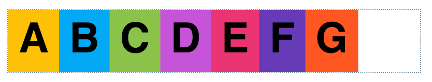
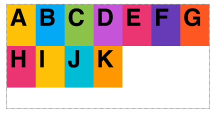
In most cases, you’ll want to use Grid to create grid-like layouts. However, you may find yourself wanting boxes that align when there’s an even number of items, but expand to fill the available space when there’s an odd number (figure 5-74).

Here’s the markup we’ll use:
<ul class="flex-aligned">
    <li>A</li>
    <li>B</li>
    <li>C</li>
    <li>D</li>
    <li>E</li>
    <li>F</li>
    <li>G</li>
</li>
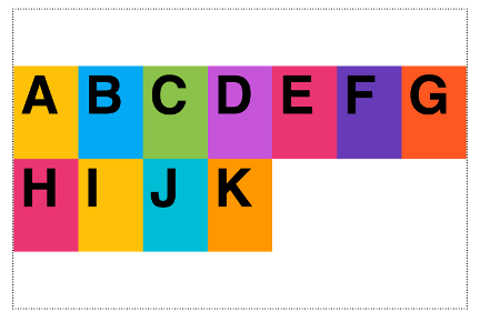
By default, flex items don’t wrap. To achieve the layout above, we’ll need to make them wrap using the flex-wrap property. It accepts three values: nowrap (the inital value), wrap, and wrap-reverse. We’ll use wrap here:
.flex-aligned {
    display: flex;
    flex-wrap: wrap;
}
Now we just need to indicate how our flex items should behave, and what their maximum width should be. Since we want a maximum of four columns, we’ll set our flex-basis value to 25%. And since we want our flex items to expand to fill the available space, we’ll set flex-grow to 1. We’ll keep flex-shrink at 0 so that our boxes never occupy less than 25% of their container:
.flex-aligned li {
    flex: 1 0 25%;
}
Learning More about Flexbox
There’s a lot more to Flexbox than what we’ve covered here. CSS-Tricks’ “A Complete Guide to Flexbox” digs into all the properties and values. You can also check out Philip Walton’s “Solved by Flexbox”, which showcases UI patterns that are made easier with Flexbox.
Box Alignment and Distribution
Before closing this chapter, let’s take a look at some properties that we can use for distributing and spacing boxes. These properties can be used with either Flexbox or Grid. Some properties also apply to multicolumn containers, although to date browser support is less robust. Most of the examples in this section use Flexbox.
First, some terminology: justify versus align. As the CSS Box Alignment specification explains, justify refers to alignment in the main or inline dimensions, while align refers to alignment in the cross or block dimensions. For documents that use a horizontal writing mode, the main dimension is horizontal, and the cross dimension is vertical. For documents that use a vertical writing mode, the main dimension is vertical, and the cross dimension is horizontal. Each of the three justify-* properties is concerned with the main, inline dimension. Their align-* counterparts are concerned with the block dimension.
Distributing Items in the Main Dimension with justify-content
The justify-content property indicates to the browser how the contents of a container should be aligned along the main or inline axis. It only has an effect when there’s leftover space available—for example, when no flex items have flex-grow: 0, or when the length of an explicit grid is less than that of its container.
The justify-content property accepts more than a dozen different values. The table below illustrates each value and its impact on box alignment and distribution, when using a left-to-right writing direction. The dotted line represents the outline of the flex or grid container.
| Value | Effect |
|---|---|
center |
 |
left |
 |
right |
 |
start |
 |
end |
 |
flex-start |
 |
flex-end |
 |
space-between |
 |
space-around |
 |
space-evenly |
 |
stretch (shown here with Grid) |
 |
The values above can be split into two broad groups: positional alignment values and distributed alignment values.
Positional alignment values indicate where items should be stacked within a container, and include:
centerleftrightstartendflex-startflex-end
Both justify-content: flex-start and justify-content: flex-end only apply to flex containers. For a similar effect in Grid and multicolumn containers, use start or end.
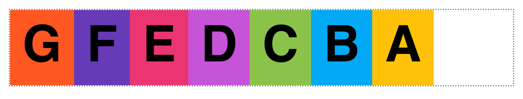
Despite appearances, left, start, and flex-start are not the same. Neither are right, end and flex-end. Writing mode and language direction affect box alignment and distribution for start/flex-start and end/flex-end. For example, when the direction is rtl (right to left), justify-content: flex-start packs boxes against the right edge of the flex container, as shown in figure 5-75. When flex-start and flex-end are used on non-flex containers, they behave like start and end.

On the other hand, justify-content: left and justify-content: right always pack boxes to the left or right of the container, respectively. Figure 5-76 illustrates the effect of justify-content: left on a container with a horizontal writing mode and right-to-left language direction.
Distributed alignment values indicate how to divvy up the remaining space in a container. Using justify-content: stretch, for example, causes the size of each element to increase evenly to fill the available space, within max-height/max-width constraints. However, it has no effect on flex items.
space-around versus space-evenly
Where space-between places the first and last items flush against the edges of their container and evenly distributes the space, the difference between space-around and space-evenly is more subtle.
space-arounddistributes items evenly within the alignment container, but the size of the space between the first/last item and the edge of the container is half that of the space between each item.space-evenlydistributes space evenly between each item. The size of the space between the first/last item and the edge of the container is the same as the the size of the space between each item.
Aligning Items in the Cross Dimension with align-content
Where justify-content affects items in the main dimension, align-content affects them in the cross or block dimension. The align-content property accepts most of the same values as justify-content, except for left and right.
Remember that align-content, like justify-content, affects the distribution of leftover space. You’ll only notice its impact when the used height of the container is something besides auto. The table below illustrates the impact of align-content and its values when using a horizontal writing mode and a left-to-right text direction.
| Value | Effect |
|---|---|
center |
 |
start/flex-start |
 |
end/flex-end |
 |
space-between |
 |
space-around |
 |
space-evenly |
 |
stretch |
 |
Because align-content distributes space in the cross direction, you only notice its impact when there are multiple rows of content.
We can also combine values for justify-content and align-content by using the place-content shorthand property. It accepts up to two, space-separated values. The first value assigns the align-content value; the second is the justify-content value. Take, for example:
.centerstart {
    place-content: center flex-start;
}
This is the equivalent of:
.centerstart {
    align-content: center;
    justify-content: flex-start;
}
Keep in mind, however, that support for place-content is not yet available in Microsoft Edge.
Aligning Items with align-items and align-self
Where align-content affects the distribution of rows in the block dimension, align-items and align-self are concerned with the cross/block alignment of each item within a grid or flex container. The table below shows how align-items and its values work with a horizontal writing mode.
| Value | Effect |
|---|---|
center |
 |
start/flex-start |
 |
end/flex-end |
 |
baseline |
 |
first baseline |
 |
last baseline |
 |
normal |
 |
Baseline alignment is probably the trickiest concept to understand. When items are aligned along a baseline, they’re vertically aligned with the bottom of each letter, without regard for descender height. Descenders are the stem parts of lowercase letters such as q and p that dangle below a line of text. Both baseline and first baseline align items along the first baseline of a row, while last baseline aligns them along the last line of a row.
The align-items property applies to the container element and sets the alignment for all of its children. align-self, on the other hand, applies to the child elements, and overrides the value of align-items. It accepts the same values as align-items. Here’s an example:
.flex-baseline {
    display: flex;
    align-items: flex-start;
}
.flex-baseline *:nth-child(2) {
    align-self: flex-end;
}

Now our second flex item is aligned with the end of the flex container, as shown in figure 5-77.
Choosing flex or grid
As you develop page or component layouts, you may find yourself wondering when it’s better to use Flexbox and when to use Grid.
- Use Grid when you want to arrange elements into rows and columns that align both horizontally and vertically.
- Use Flexbox when you want to arrange items in a row or a column, when you wish to align items vertically or horizontally, but not both.
Jen Simmons’ video “Flexbox vs. CSS Grid — Which is Better?” walks you through some things to consider when choosing between Grid and Flexbox. Rachel Andrew’s “Should I use Grid or Flexbox?” is another great resource for understanding both.
In practice, your projects will probably mix both of these techniques, as well as floats. For instance, you may use Grid to define the overall page layout, while using Flexbox for your navigation menu or search box, and floats to place tables or images.
Conclusion
We’ve covered a lot of ground in this chapter! Now that you’ve made it through, you should understand:
- what the CSS box model is, and how it affects page rendering and layout
- how the
floatproperty affects normal flow, and how to clear floated elements - what stacking contexts are, and how to use them to create layered effects in CSS
- when and how to use multicolumn, Grid, and flexible box layout.
In our next chapter, we’ll take a look at the fun topic of creating animations with CSS.