
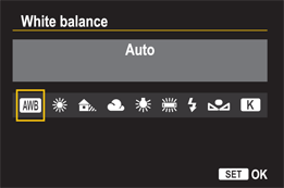
5.2 The color space options.
Chapter 5: Getting Great Color
Regardless of the type of light in the scene, the Canon EOS 6D offers a wealth of settings to ensure that your images have beautiful color. The options that affect the color are white balance settings, Picture Styles, and the color space. The more faithful you are in setting the white balance and Picture Style for JPEG shooting, the less time you’ll spend correcting color in post-production, and the more efficient your workflow will be.
Also, with Picture Styles, you have wide latitude to modify one of the supplied styles, create your own style, or use the supplied Picture Style Editor to create a style on the computer and upload it to the 6D. In this chapter, you learn when and how to use each of the options to get the best color, optimize your workflow, and fine-tune color for any type of light.
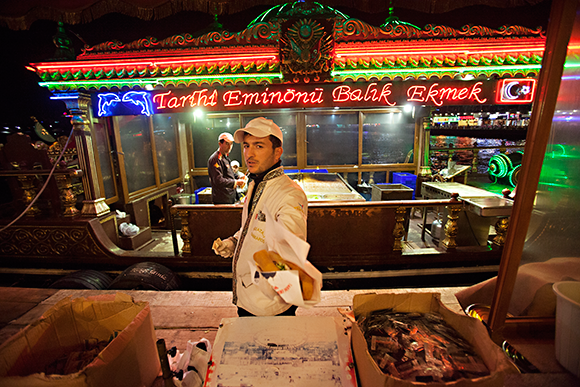
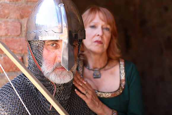
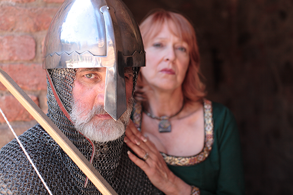
Regardless of the type of light in the scene, you can get stunning color by using the controls that the 6D provides, especially in low light situations. Exposure: ISO 3200, f/2.8, 1/200 second with a Canon 16-35mm, f/2.8L USM.
Working with Color
One of the best ways to keep your workflow efficient is to get the image color right in the camera. This applies especially to JPEG capture, but it applies to RAW capture as well. Three settings on the 6D affect the range of colors captured and the color rendering: color space, white balance, and Picture Style. Here is a quick summary before I go into more detail on each option:
• Color space. The color space you choose determines the gamut of colors that the camera can capture. Some color spaces, such as Adobe RGB, encompass a broader range of colors than other color spaces, such as sRGB. Choosing a color space also affects your overall image workflow. Typically, you want to keep the color space consistent from capture through editing and printing. The Color Space option is one that most photographers set once and seldom change.
• White balance setting. This setting ensures that the image color is accurate. To get accurate color, you must tell the camera what type of light is in the scene. You do this by setting a white balance that matches the ambient light or by setting a Custom white balance. White balance is a setting that changes every time the light source changes.
• Picture Styles. Picture Styles create a certain look in images, much like different types of film would. Each style has settings that render image colors more or less vivid and saturated and that determine the image sharpness and contrast. How often you change the Picture Style depends on your preferences and the type of scene or subject that you are photographing.
Each of these settings plays a unique role in determining image color. The following sections provide more detail on using these settings in everyday shooting.
Choosing a Color Space
A color space determines the range of colors the camera will capture. Colors are described numerically with RGB values.
Image files do not have a color profile appended to them, so you’ll want to embed a color profile during RAW image conversion or while editing JPEG images.
Two color spaces are offered on the 6D: sRGB (standard RGB) and Adobe RGB (Red, Green, Blue). The Adobe RGB color space supports a wider gamut of colors than the sRGB color space. As is true with all aspects of image capture, the more data captured in the camera, the more color information the file will have. The more information the file contains, the better it can withstand image editing. For my images, I want to get all the image data possible out of the 6D, which is, after all, why I bought a high-resolution camera, so I use Adobe RGB. It is easy to change to sRGB during image editing if necessary. Therefore, while I can move to a smaller color gamut during editing, I cannot go the other way — that is, add in colors that were not captured while I was shooting.
The second consideration is keeping a consistent color space through the workflow — from capture to editing to printing. Using the same color space in the camera, in your image-editing program, and on your printer decreases color loss or alteration during color-space conversions. When an image moves from a large color space to a smaller color space, the device — a computer or printer, for example — must decide which colors to keep and which to alter or throw out.
Another consideration when choosing color space is that the 6D has 14-bit files. These color-rich files have 16,384 colors for each of the three color channels (Red, Green, and Blue) when you shoot in RAW capture. (In contrast, 8-bit files offer only 256 values per color channel.) In addition, even if you shoot JPEG, which automatically converts 14-bit files to 8-bit files in the camera.
The 6D’s 14-bit RAW files can be processed in a conversion program, such as Canon Digital Photo Professional, Adobe Camera Raw, Adobe Photoshop Lightroom, Capture One Pro, or Apple Aperture, as 16-bit files.
Comparing color spaces
Figure 5.1 shows the difference between large and small color spaces. A good way to see the difference in color spaces is by comparing the histogram for one or more images. You’re probably familiar with reading a histogram, so you know that a spike on the right edge of the histogram indicates image data that is clipped or discarded from the image. A spike on the right indicates clipped shadow data. The higher the spike, the more data clipped. Ideally, colors do not clip at all, or as little as possible. In addition, predictably, the larger the color space, the less clipping that occurs. In short, more image color is retained by using the larger Adobe RGB color space. Capturing more color data translates into files that can better withstand editing, which is, by nature, destructive.
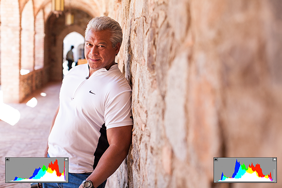
5.1 This is a RAW image with two histograms as displayed in Adobe Camera Raw. The histogram on the left shows an 8-bit image in the sRGB color space. The histogram on the right shows a 16-bit image in the Adobe RGB color space. Exposure: ISO 200, f/3.2, 1/250 second with a Canon 50.0 mm, f/1.2L USM.
Color space also factors into printing. Adobe RGB is the color space of choice for printing on inkjet printers and for printing by some, though not all, commercial printers. If you print at a commercial lab, be sure to ask which color space it uses and then supply files in that color space. While Adobe RGB is a great color space for capturing a wide range of colors, it’s not the best for online display. In fact, when you view an image that’s in the Adobe RGB color space outside of an image-editing program or online, the image colors look dull and flat. For online display, the sRGB color space provides the best color.
While it may sound difficult to choose color spaces, for most photographers it translates into using Adobe RGB for capturing images, editing, and printing. When an image is needed for the web or e-mail, it’s easy to make a copy and convert it to the sRGB color space in an editing program such as Adobe Photoshop, Adobe Photoshop Lightroom, Apple Aperture, or Capture One Pro.
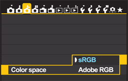
5.2 The color space options.
Here are some additional things to consider when choosing a color space:
• You can choose a color space when you are shooting in any of the Creative Zone modes. These are Program ( ![]() ), Shutter-priority AE (
), Shutter-priority AE ( ![]() ), Aperture-priority AE (
), Aperture-priority AE ( ![]() ), Manual Exposure (
), Manual Exposure ( ![]() ), and Bulb (
), and Bulb ( ![]() ).
).
• Filenames for images shot with Adobe RGB are prepended with an underscore (_).
• The 6D does not embed the color spaces in files. You can embed the desired color space in Adobe Photoshop 6.0 or later as well as in RAW conversion programs.
Setting the color space
Now that you have a background on the two color space options, you can choose the one that fits best into your overall image workflow.
For all step-by-step sequences in this chapter, be sure that you have the Mode dial set to one of the Creative Zone modes: Program ( ![]() ), Shutter-priority AE (
), Shutter-priority AE ( ![]() ), Aperture-priority AE (
), Aperture-priority AE ( ![]() ), Manual Exposure (
), Manual Exposure ( ![]() ), or Bulb (
), or Bulb ( ![]() ).
).
To choose a color space, follow these steps:
1. Press the Menu button (![]() ) to enter the camera’s menu screens.
) to enter the camera’s menu screens.
2. Use the Main dial (![]() ) to highlight the Shooting 3 menu tab (
) to highlight the Shooting 3 menu tab (![]() ), use the Quick Control dial (
), use the Quick Control dial (![]() ) to highlight Color space, and press the Set button (
) to highlight Color space, and press the Set button (![]() ) to enter the Color space options screen.
) to enter the Color space options screen.
3. Use the Quick Control dial (![]() ) to highlight the Color space option you want, and then press the Set button (
) to highlight the Color space option you want, and then press the Set button (![]() ) to confirm your selection. The color space you choose remains in effect until you change it. For RAW images, the color space is reflected both in the JPEG-based preview image on the LCD monitor and in the histograms.
) to confirm your selection. The color space you choose remains in effect until you change it. For RAW images, the color space is reflected both in the JPEG-based preview image on the LCD monitor and in the histograms.
Setting the White Balance
The key to getting pleasing and accurate color straight from the camera is to choose the white balance setting that matches the light in the scene. The white balance setting tells the camera what type of light is in the scene so that the camera can render colors accurately. Each white balance setting covers a range of color temperatures. The 6D offers seven white balance settings, including preset options for common light sources. In addition, you can set a Custom white balance to set the color temperature to the specific light in the scene, or you can set a specific color temperature.
Your white balance choice may be affected by the amount of time you have to shoot a scene, the type and consistency of light, the dominant light source in the scene, and whether you shoot RAW or JPEG capture. The list below summarizes the options:
• Use a preset white balance option. A preset white balance setting is a good choice when there is a single light source in the scene that clearly matches one of the preset white balance options. The preset white balance options, including Auto ( ![]() ), Daylight (
), Daylight ( ![]() ), Shade (
), Shade ( ![]() ), Cloudy (
), Cloudy ( ![]() ), Tungsten (
), Tungsten ( ![]() ), White Fluorescent (
), White Fluorescent ( ![]() ), and Flash (
), and Flash ( ![]() ), have good color accuracy.
), have good color accuracy.
• You can select which white balance to use in all Creative Zone modes. These modes are Program ( ![]() ), Shutter-priority AE (
), Shutter-priority AE ( ![]() ), Aperture-priority AE (
), Aperture-priority AE ( ![]() ), Manual Exposure (
), Manual Exposure ( ![]() ), and Bulb (
), and Bulb ( ![]() ). In the Basic Zone modes: Scene Intelligent Auto (
). In the Basic Zone modes: Scene Intelligent Auto ( ![]() ), Creative Auto (
), Creative Auto ( ![]() ), and Special Scene (
), and Special Scene ( ![]() ), Auto white balance (
), Auto white balance ( ![]() ) is set automatically. If you are new to using white balance, check out Figures 5.3 and 5.4, which illustrate the difference between the correct and incorrect white balance.
) is set automatically. If you are new to using white balance, check out Figures 5.3 and 5.4, which illustrate the difference between the correct and incorrect white balance.
5.3 This image was taken outside an overcast day using Auto white balance and the Standard Picture Style. The cool colorcast does not accurately reflect the warmth in the original scene. Exposure: ISO 200, f/2.8,1/640 second with a Canon 50.0 mm, f/1.2L USM.
5.4 Here, I’ve changed the white balance setting to Cloudy to capture colors closer to the original scene. Exposure: ISO 200, f/2.8, 1/640 second with a Canon 50.0 mm, f/1.2L USM.
• Set a Custom white balance (![]() ). A Custom white balance (
). A Custom white balance ( ![]() ) sets image colors specifically for the light in the scene, whether it’s a single light source or mixed light. This is the option to use with mixed lighting and when the light source doesn’t clearly match one of the preset white balance options. Setting a Custom white balance (
) sets image colors specifically for the light in the scene, whether it’s a single light source or mixed light. This is the option to use with mixed lighting and when the light source doesn’t clearly match one of the preset white balance options. Setting a Custom white balance ( ![]() ) takes a bit more time, but it provides very accurate color and it is worth the extra steps when you are shooting a series of images in the same light, especially if you are shooting JPEG.
) takes a bit more time, but it provides very accurate color and it is worth the extra steps when you are shooting a series of images in the same light, especially if you are shooting JPEG.
5.5 The White balance screen.
• If you are shooting RAW files, then shooting a white or gray card, and balancing images during RAW image conversion is often faster than setting a Custom white balance (![]() ). This technique is detailed in a sidebar later in this chapter.
). This technique is detailed in a sidebar later in this chapter.
• Set a specific color temperature (![]() ). With this option, you set the specific color temperature of the ambient light on the 6D. This is good for studio shooting when you know the temperature of the strobes or continuous lights. If you are fortunate enough to have a color-temperature meter, setting the specific color temperature is a good option.
). With this option, you set the specific color temperature of the ambient light on the 6D. This is good for studio shooting when you know the temperature of the strobes or continuous lights. If you are fortunate enough to have a color-temperature meter, setting the specific color temperature is a good option.
To change to a preset white balance, follow these steps:
1. Press the Menu button (![]() ) to access the camera’s menu screens.
) to access the camera’s menu screens.
2. Use the Main dial (![]() ) to select the Shooting menu 3 tab (
) to select the Shooting menu 3 tab (![]() ). Use the Quick Control dial (
). Use the Quick Control dial ( ![]() ) to highlight White balance. Press the Set button (
) to highlight White balance. Press the Set button ( ![]() ) to enter the White balance options screen.
) to enter the White balance options screen.
3. Turn the Quick Control dial (![]() ) to select a white balance setting that matches the scene’s light source or choose Auto white balance (
) to select a white balance setting that matches the scene’s light source or choose Auto white balance (![]() ). Instructions for using the Color temperature white balance (
). Instructions for using the Color temperature white balance ( ![]() ) option are in the next sections. In the Basic Zone modes — Scene Intelligent Auto (
) option are in the next sections. In the Basic Zone modes — Scene Intelligent Auto ( ![]() ), Creative Auto (
), Creative Auto ( ![]() ), and Special Scene (
), and Special Scene ( ![]() ) — the Auto white balance setting (
) — the Auto white balance setting ( ![]() ) is automatically selected.
) is automatically selected.
Always set the white balance to match the light that is falling on the subject. For example, if the subject is in daylight but the background is in shade, choose Daylight white balance ( ![]() ) because it matches the light falling on the subject.
) because it matches the light falling on the subject.
Setting a Custom white balance
Because setting a Custom white balance ( ![]() ) adjusts image color precisely for the light that is in the scene, a Custom white balance (
) adjusts image color precisely for the light that is in the scene, a Custom white balance ( ![]() ) produces the most accurate color in any light. It’s especially good in scenes where the light doesn’t match any of the preset white balance settings, and in scenes with multiple types of light. You can set a Custom white balance (
) produces the most accurate color in any light. It’s especially good in scenes where the light doesn’t match any of the preset white balance settings, and in scenes with multiple types of light. You can set a Custom white balance ( ![]() ) in any of the Creative Zone modes: Program (
) in any of the Creative Zone modes: Program ( ![]() ), Shutter-priority AE (
), Shutter-priority AE ( ![]() ), Aperture-priority AE (
), Aperture-priority AE ( ![]() ), Manual Exposure (
), Manual Exposure ( ![]() ), and Bulb (
), and Bulb ( ![]() ).
).
Setting a Custom white balance ( ![]() ) and shooting a white or gray card are similar techniques. The main difference is that you set a Custom white balance (
) and shooting a white or gray card are similar techniques. The main difference is that you set a Custom white balance ( ![]() ) while you are shooting. When you shoot a white or gray card, you set the white balance during RAW image conversion on the computer.
) while you are shooting. When you shoot a white or gray card, you set the white balance during RAW image conversion on the computer.
You’re probably wondering why you would not just use Auto white balance ( ![]() ) for all images. The reason is simple: you’ll get better image color using the light-specific white balance options. Auto white balance (
) for all images. The reason is simple: you’ll get better image color using the light-specific white balance options. Auto white balance ( ![]() ) makes a guess, albeit an educated guess, about the temperature of light in the scene. Light-specific settings are more concise, and therefore, produce color that is more pleasing. Also, Auto white balance (
) makes a guess, albeit an educated guess, about the temperature of light in the scene. Light-specific settings are more concise, and therefore, produce color that is more pleasing. Also, Auto white balance ( ![]() ) leans toward an overall cool (bluish) colorcast. However, I do recommend using Auto white balance (
) leans toward an overall cool (bluish) colorcast. However, I do recommend using Auto white balance ( ![]() ) for mixed-light scenes, for night shooting, and event photography where you don’t have time to set a Custom white balance (
) for mixed-light scenes, for night shooting, and event photography where you don’t have time to set a Custom white balance ( ![]() ).
).
5.6 With the camera set to Auto white balance, bright whites photographed outside can often cause an overall cool, blue colorcast. This is easily corrected in post-processing. Exposure: ISO 200, f/2.8, 1/500 second with a Canon 16-35mm, f/2.8L USM.
5.7 This is the same image color corrected in Adobe Camera Raw using a white balance sample of the dress to obtain warmer, more inviting colors. Exposure: ISO 200, f/2.8, 1/500 second with a Canon 16-35mm, f/2.8L USM.
Here’s how to set a Custom white balance ( ![]() ). If you’re new to this, be sure to complete all these steps:
). If you’re new to this, be sure to complete all these steps:
1. Ensure that the Picture Style is not set to Monochrome (![]() ). To change the Picture Style, press the Menu button (
). To change the Picture Style, press the Menu button ( ![]() ) to access the camera’s menu screens.
) to access the camera’s menu screens.
2. Use the Main dial (![]() ) to select the Shooting menu 4 tab (
) to select the Shooting menu 4 tab (![]() ). Picture Style (
). Picture Style ( ![]() ) is at the top of this menu. Press the Set button (
) is at the top of this menu. Press the Set button ( ![]() ) to enter the Picture Style menu. Use the Quick Control dial (
) to enter the Picture Style menu. Use the Quick Control dial ( ![]() ), to highlight a Picture Style (
), to highlight a Picture Style ( ![]() ) other than Monochrome (
) other than Monochrome ( ![]() ). Press the Set button (
). Press the Set button ( ![]() ) to confirm your selection.
) to confirm your selection.
It’s best to have the white balance set to anything except Custom white balance ( ![]() ) when you begin these steps.
) when you begin these steps.
3. In the light that you will use for the subject, position a piece of unlined white paper so that it fills the center of the viewfinder, and then take a picture of it. Ensure that the card isn’t underexposed or overexposed.
4. On the Shooting menu 3 tab (![]() ), use the Quick Control dial (
), use the Quick Control dial (![]() ) to highlight Custom White Balance. Press the Set button (
) to highlight Custom White Balance. Press the Set button ( ![]() ) to enter the Custom White Balance screen. The camera displays the white piece of paper on the LCD monitor with the Custom white balance icon (
) to enter the Custom White Balance screen. The camera displays the white piece of paper on the LCD monitor with the Custom white balance icon ( ![]() ) in the upper-left corner of the display and the word Set in the lower-right. If the image of the white paper is not displayed, turn the Quick Control dial (
) in the upper-left corner of the display and the word Set in the lower-right. If the image of the white paper is not displayed, turn the Quick Control dial ( ![]() ) until it is.
) until it is.
5. Press the Set button (![]() ) to choose the image being displayed. Use the Quick Control dial (
) to choose the image being displayed. Use the Quick Control dial ( ![]() ) to highlight OK, and then press the Set button (
) to highlight OK, and then press the Set button ( ![]() ) to confirm. When the Custom white balance confirmation screen appears, press the Set button (
) to confirm. When the Custom white balance confirmation screen appears, press the Set button ( ![]() ) to confirm your selection.
) to confirm your selection.
6. Use the Quick Control dial (![]() ) to highlight White Balance, also on the Shooting menu 3 tab (
) to highlight White Balance, also on the Shooting menu 3 tab (![]() ). Press the Set button (
). Press the Set button ( ![]() ) to enter the White balance options screen. Use the Quick Control dial (
) to enter the White balance options screen. Use the Quick Control dial ( ![]() ) to highlight Custom White Balance (
) to highlight Custom White Balance ( ![]() ), and press the Set button (
), and press the Set button ( ![]() ) to confirm your selection.
) to confirm your selection.
7. The color characteristics of the image you captured and applied in Step 3 have now been selected as your Custom white balance.
When you finish shooting in the light for which you set the Custom white balance ( ![]() ), reset the white balance option.
), reset the white balance option.
Setting a specific color temperature
There are times when you know the exact temperature of the light in the scene; in those situations, you can simply dial in the color temperature using the Color temperature white balance setting ( ![]() ). For example, I know that the temperature of my studio lights is 5300K, so I use the Color temperature white balance setting (
). For example, I know that the temperature of my studio lights is 5300K, so I use the Color temperature white balance setting ( ![]() ) to set this temperature. I can continue shooting without further adjustments to the white balance because the light temperature remains constant.
) to set this temperature. I can continue shooting without further adjustments to the white balance because the light temperature remains constant.
5.8 In this image, I used the Color temperature white balance setting, and set the color to 5500K to match the temperature of my studio lights. Exposure: ISO 400, f/4.5, 1/200 second with a Canon 16-35mm, f/2.8L USM.
With the Color temperature white balance option ( ![]() ), you can set a color temperature in the range of 2500K to 10000K in 100K increments. Here is how to set a specific color temperature:
), you can set a color temperature in the range of 2500K to 10000K in 100K increments. Here is how to set a specific color temperature:
1. Press the Menu button (![]() ) to access the camera’s menu screens.
) to access the camera’s menu screens.
2. Use the Main dial (![]() ) to select the Shooting menu 3 tab (
) to select the Shooting menu 3 tab (![]() ). Use the Quick Control dial (
). Use the Quick Control dial ( ![]() ) to highlight White Balance. Press the Set button (
) to highlight White Balance. Press the Set button ( ![]() ) to enter the White balance options screen.
) to enter the White balance options screen.
3. Use the Quick Control dial (![]() ) to highlight the Color temperature white balance setting (
) to highlight the Color temperature white balance setting (![]() ).
).
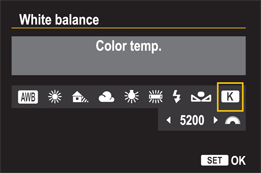
5.9 The Color temp. screen.
4. Turn the Main dial (![]() ) to the left to decrease the color temperature number or to the right to increase it, and then press the Set button (
) to the left to decrease the color temperature number or to the right to increase it, and then press the Set button (![]() ).
).
Fine-tuning white balance
Given the wide range of different types of lights for household and commercial use, you may find that some color correction is necessary to get accurate color. In addition, even in images where the color is accurate, you may want a warmer or cooler rendering than a preset white balance option provides. To compensate for differences in specific light temperatures and to fine-tune a preset white balance setting, you can use White Balance Auto Bracketing ( ![]() ) and White Balance Correction (
) and White Balance Correction ( ![]() ).
).
Both options enable you to bias image color in much the same way that color-correction filters would do for film.
Using White Balance Auto Bracketing
When the color isn’t quite accurate or pleasing, but you’re not sure how much color correction to apply, using White Balance Auto Bracketing ( ![]() ) should produce at least one image with pleasing color. Bracketing the white balance produces three images with varying levels of color correction with a magenta/green or blue/amber bias. The bias is set in +/–3 levels in one-step increments.
) should produce at least one image with pleasing color. Bracketing the white balance produces three images with varying levels of color correction with a magenta/green or blue/amber bias. The bias is set in +/–3 levels in one-step increments.
White Balance Auto Bracketing reduces the camera’s maximum burst rate by one-third. You can also combine it with exposure bracketing to produce nine images, a combination that predictably slows down shooting to a crawl and fills up a memory card in short order. However, in scenes that you can’t go back to and where image color is critical, White Balance Auto Bracketing is good insurance for getting pleasing color. You can use White Balance Auto Bracketing ( ![]() ) in all Creative Zone modes — Program (
) in all Creative Zone modes — Program ( ![]() ), Shutter-priority AE (
), Shutter-priority AE ( ![]() ), Aperture-priority AE (
), Aperture-priority AE ( ![]() ), Manual Exposure (
), Manual Exposure ( ![]() ), and Bulb (
), and Bulb ( ![]() ). In the Basic Zone modes — Scene Intelligent Auto (
). In the Basic Zone modes — Scene Intelligent Auto ( ![]() ), Creative Auto (
), Creative Auto ( ![]() ), and Special Scene mode (
), and Special Scene mode ( ![]() ) — Auto White Balance (
) — Auto White Balance ( ![]() ) is set automatically.
) is set automatically.
White Balance Auto Bracketing ( ![]() ) and White Balance Correction (
) and White Balance Correction ( ![]() ) involve similar steps. See the steps in the next section to set White Balance Auto Bracketing.
) involve similar steps. See the steps in the next section to set White Balance Auto Bracketing.
Using White Balance Correction
White Balance Correction ( ![]() ) sets a single and specific color bias rather than bracketing in two directions as White Balance Auto Bracketing does. This is the ideal technique when you know the bias type and amount needed to get the image color you want. Using White Balance Correction (
) sets a single and specific color bias rather than bracketing in two directions as White Balance Auto Bracketing does. This is the ideal technique when you know the bias type and amount needed to get the image color you want. Using White Balance Correction ( ![]() ) is similar to using color-compensation and color-correction filters with film, with the advantage of not needing to buy and carry multiple filters.
) is similar to using color-compensation and color-correction filters with film, with the advantage of not needing to buy and carry multiple filters.
You can correct color in any of four directions: blue, green, amber, or magenta. Each level of color shift is equivalent to 5 mireds of a color temperature conversion filter. A mired is a measure indicating a color temperature conversion filter’s density. To set White Balance Auto Bracketing ( ![]() ) or White Balance Correction (
) or White Balance Correction ( ![]() ), follow these steps:
), follow these steps:
1. Press the Menu button (![]() ) to enter the camera’s menu screens.
) to enter the camera’s menu screens.
2. Use the Main dial (![]() ) to highlight the Shooting menu 3 tab (
) to highlight the Shooting menu 3 tab (![]() ), use the Quick Control dial (
), use the Quick Control dial (![]() ) to highlight WB Shift/Bkt, and then press the Set button (
) to highlight WB Shift/Bkt, and then press the Set button (![]() ) to enter the WB correction/WB bracketing screen.
) to enter the WB correction/WB bracketing screen.
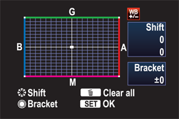
5.10 The WB correction/WB bracketing screen.
The menu screen for White Balance Correction uses the term shift for the white balance correction techniques detailed here.
3. To set White Balance Bracketing (![]() ), turn the Quick Control dial (
), turn the Quick Control dial (![]() ) clockwise to set a blue/amber bias, or counterclockwise to set a magenta/green bias. As you turn the dial, three tick marks appear and separate to indicate the direction and amount of bracketing. The bracketing amount is displayed alphanumerically under the Bracket section of the screen.
) clockwise to set a blue/amber bias, or counterclockwise to set a magenta/green bias. As you turn the dial, three tick marks appear and separate to indicate the direction and amount of bracketing. The bracketing amount is displayed alphanumerically under the Bracket section of the screen.
Bracketed images are taken with the Standard white balance first, followed by the blue (or magenta) bias, and then the amber (or green) bias.
4. To set White Balance Correction (![]() ), tilt the Multi-controller (
), tilt the Multi-controller (![]() ) in the direction of the shift you want. The direction and amount of shift is displayed in the Shift section of the screen.
) in the direction of the shift you want. The direction and amount of shift is displayed in the Shift section of the screen.
5. Press the Set button (![]() ). If you change your mind and want to start over, press the Erase button (
). If you change your mind and want to start over, press the Erase button ( ![]() ). If you set White Balance Correction, a
). If you set White Balance Correction, a ![]() icon is displayed in the viewfinder and on the LCD panel during shooting.
icon is displayed in the viewfinder and on the LCD panel during shooting.
White Balance Bracketing and correction are helpful particularly for JPEG capture to help avoid time spent color correcting images in post-capture. White Balance Correction is also handy when shooting in a controlled light environment with the camera tethered to the computer. If you know that the color is off, or if you want to bias the color in one direction or the other, then you can make one correction and shoot a series of shots with the same color bias or correction. If you often shoot in the same light, say in a stadium or arena, you can tweak the white balance and then save the setting as part of the settings for one of the Custom modes ( ![]() ).
).
For my shooting, I seldom use these options. I shoot RAW images, and I find the technique for getting accurate color with RAW images — described in the previous sidebar — works best for me.
Working with Picture Styles
Picture Styles provide different looks for images just as different films have specific looks and characteristics. For example, Kodak’s PORTRA NC film is characterized by its subdued color and contrast. On the other hand, saturated blues and greens and snappy contrast are hallmarks of FujiFilm’s Velvia film. Just as films are chosen for their rendering characteristics, you can choose Picture Styles on the 6D for their unique looks.
One advantage to using Picture Styles is that they produce classic looks that need little or no post-processing. That means that you can print JPEG images directly from the memory card and get fairly polished images. If you shoot RAW images, you can apply Picture Styles during image conversion in Digital Photo Professional, a Canon conversion program provided on the disc that comes with the camera.
Behind each Picture Style are parameters that set the tonal curve, color rendering and saturation, and sharpness for the images that you shoot with the 6D. Alternatively, the new Auto Picture Style ( ![]() ) evaluates the scene and changes the settings based on the scene. Other Picture Styles modify the contrast, color saturation and tone, and sharpness to give images a different look or rendering as described in Table 5.1. Default settings are listed in order of sharpness, contrast, color saturation, and color tone.
) evaluates the scene and changes the settings based on the scene. Other Picture Styles modify the contrast, color saturation and tone, and sharpness to give images a different look or rendering as described in Table 5.1. Default settings are listed in order of sharpness, contrast, color saturation, and color tone.
Table 5.1 Picture Styles
|
Picture Style |
Description |
Default settings |
|
Auto ( |
Varies by scene, but generally renders colors as vivid and saturated. |
3, 0, 0, 0 |
|
Standard ( |
Vivid colors and saturation, high sharpness. |
3, 0, 0, 0 |
|
Portrait ( |
Natural skin tones, soft flattering skin rendering, low sharpness. |
2, 0, 0, 0 |
|
Landscape ( |
Vivid blues and greens for skies and foliage, high sharpness. |
4, 0, 0, 0 |
|
Neutral ( |
Allows latitude for conversion and processing with low saturation and contrast, and no sharpness is applied. |
0, 0, 0, 0 |
|
Faithful ( |
True rendition of colors with no increase in specific colors. No sharpness applied. |
0, 0, 0, 0 |
|
Monochrome ( |
Black-and-white or toned images with slightly heightened contrast and sharpness. |
3, 0, N/A, N/A |
In Basic Zone modes — Scene Intelligent Auto ( ![]() ), Creative Auto (
), Creative Auto ( ![]() ), and Special Scene (
), and Special Scene ( ![]() ) — the camera automatically selects Auto Picture Style (
) — the camera automatically selects Auto Picture Style ( ![]() ), which you cannot change.
), which you cannot change.
With the Monochrome Picture Style ( ![]() ), only the sharpness and contrast parameters are adjustable, but you can add toning effects, as detailed in the sidebar.
), only the sharpness and contrast parameters are adjustable, but you can add toning effects, as detailed in the sidebar.
Choosing and customizing Picture Styles
While it’s fine to use Picture Styles with their default settings, I find that creating my own settings gives me more flexibility, allowing me to create my own unique styles for my images. With the 6D, you can also modify any or all of the existing styles, and you can create three of your own styles. There’s good latitude in adjusting parameters with seven adjustment levels for sharpness and eight levels of adjustments for contrast, saturation, and color tone.
Using Monchrome Filter and Toning Effects
With the Monochrome Picture Style ( ![]() ), only the Sharpness and Contrast parameters can be changed. However, you can apply a variety of filter and toning effects:
), only the Sharpness and Contrast parameters can be changed. However, you can apply a variety of filter and toning effects:
• Monochrome filter effects. Filter effects mimic the same types of color filters that photographers use when shooting black-and-white film. The Yellow filter makes skies look natural with clear white clouds. The Orange filter darkens the sky and adds brilliance to sunsets. The Red filter further darkens a blue sky and makes tree leaves look crisp and bright and renders skin tones realistically. The Green filter brightens foliage while rendering skin tones as subdued.
• Monochrome toning effects. You can apply creative toning effects with the Monochrome Picture Style ( ![]() ). The toning effect options are N: None, S: Sepia, B: Blue, P: Purple, and G: Green.
). The toning effect options are N: None, S: Sepia, B: Blue, P: Purple, and G: Green.
To apply a filter or toning effect, follow these steps:
1. Press the Menu button (![]() ) to access the camera’s menu screens.
) to access the camera’s menu screens.
2. Use the Main dial (![]() ) to select the Shooting menu 4 tab (
) to select the Shooting menu 4 tab (![]() ). Picture Style is at the top of this menu. Press the Set button (
). Picture Style is at the top of this menu. Press the Set button ( ![]() ), and the Picture Style screen appears.
), and the Picture Style screen appears.
3. Press the Set button (![]() ) and turn the Quick Control dial (
) and turn the Quick Control dial (![]() ) to select Monochrome (
) to select Monochrome (![]() ) on the Picture Style selection screen.
) on the Picture Style selection screen.
4. Press the Info button (![]() ) on the back of the camera. Using the Quick Control dial (
) on the back of the camera. Using the Quick Control dial ( ![]() ), highlight either Filter effect or Toning effect.
), highlight either Filter effect or Toning effect.
5. Press the Set button (![]() ) to display the options for the selected effect.
) to display the options for the selected effect.
6. Use the Quick Control dial (![]() ) to highlight the option you want, and then press the Set button (
) to highlight the option you want, and then press the Set button (![]() ) to confirm your changes. The applied effect remains in effect until you change it again.
) to confirm your changes. The applied effect remains in effect until you change it again.
In addition, once Canon’s Picture Style Editor is installed on your computer, you can customize and save changes to Picture Styles, and then copy those styles to the camera. The Picture Style Editor software is included on the Canon EOS Digital Solution Disk that comes with the camera.
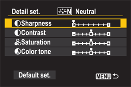
5.11 The Picture Style settings for a modified version of the Neutral Picture Style.
Customizing Picture Styles is a great way to adjust the look of JPEG images to meet your creative vision and to meet your editing and printing needs. For example, if you prefer to edit images on the computer before printing, then the Neutral ( ![]() ) and Portrait (
) and Portrait ( ![]() ) Picture Styles offer latitude for post-capture edits. If you want to print from the media card, then Auto (
) Picture Styles offer latitude for post-capture edits. If you want to print from the media card, then Auto ( ![]() ), Standard (
), Standard ( ![]() ), and Landscape (
), and Landscape ( ![]() ) work well to produce snappy prints. Alternately, if the results are not quite what you want, you can modify a Picture Style to suit your needs. Figures 5.12 through 5.17 show the difference between each Picture Style (except Auto).
) work well to produce snappy prints. Alternately, if the results are not quite what you want, you can modify a Picture Style to suit your needs. Figures 5.12 through 5.17 show the difference between each Picture Style (except Auto).
5.12 The Standard Picture Style. Exposure: ISO 200, f/3.2, 1/500 second with a Canon 50.0 mm, f/1.2L USM.
5.13 The Portrait Picture Style. Exposure: ISO 200, f/3.2, 1/500 second.
5.14 The Landscape Picture Style. Exposure: ISO 200, f/3.2, 1/500 second.
5.15 The Neutral Picture Style. Exposure: ISO 200, f/3.2, 1/500 second.
5.16 The Faithful Picture Style. Exposure: ISO 200, f/3.2, 1/500 second.
5.17 The Monochrome Picture Style with a Yellow filter effect. Exposure: ISO 200, f/3.2, 1/500 second.
Here are the parameters you can adjust:
• Sharpness: 0 to 7. Level 0 (zero) applies no sharpening and renders a soft look. If you routinely print images directly from the memory card, then use a higher sharpness level. However, if you prefer to edit images on the computer, then a 0–2 level is adequate, and it helps prevent sharpening halos when you sharpen images in an image-editing program.
• Contrast: –4 to +4. The Contrast parameter adjusts the image’s tonal curve. A negative adjustment produces a flatter look but helps prevent clipping. A positive setting increases the contrast and can stretch the tonal range. Higher settings can also lead to clipping (discarding highlight and/or shadow pixels). I prefer to get a slightly flatter look out of the camera and reduce clipping. If I want snappier contrast, I can always choose a User Defined Picture Style or set a tonal curve in Photoshop to brighten the quarter-tones and darken the three-quarter tones.
• Saturation: –4 to +4. This setting affects the strength or intensity of the image’s color. A negative Saturation setting produces low saturation, and vice versa. As with the Contrast parameter, a high Saturation setting can cause individual color channels to clip resulting in unnatural looking colors. A +1 or +2 setting is adequate for snappy JPEG images destined for direct printing. For images that you edit on the computer, a 0 (zero) setting allows latitude for post-capture edits.
• Color tone: –4 to +4. This setting modifies the hue of the image. Negative settings produce tones that are redder and bluer, while positive settings produce more yellow tones.
After evaluating and printing with different Picture Styles, you can change the default parameters to get the image look and rendering that suits your vision and workflow.
For my photography, I most often use a modified Neutral Picture Style ( ![]() ). This is because I always edit images on the computer, and this style gives me latitude for interpreting the color tone, contrast, and saturation of images to my liking and for the best printed result. Also, in portraits, it creates subdued, lovely skin tones with a nice level of contrast as long as the lighting is not flat.
). This is because I always edit images on the computer, and this style gives me latitude for interpreting the color tone, contrast, and saturation of images to my liking and for the best printed result. Also, in portraits, it creates subdued, lovely skin tones with a nice level of contrast as long as the lighting is not flat.
5.18 This image was taken with my modified Neutral Picture Style, which gives me latitude to interpret color tone and saturation. Exposure: ISO 400, f/2.8, 1/8 second with a Canon 70-200mm f/2.8L IS USM.
Here is how I set the modified Neutral Picture Style for my work. These settings work best when the lighting isn’t flat and the image isn’t underexposed. The settings are Sharpness +2, Contrast +1, Saturation +1, Color tone 0.
To modify a Picture Style, follow these steps:
1. Press the Menu button (![]() ) to access the camera’s menu screens.
) to access the camera’s menu screens.
2. Use the Main dial (![]() ) to select the Shooting menu 4 tab (
) to select the Shooting menu 4 tab (![]() ). Picture Style appears at the top of this menu. Use the Quick Control dial (
). Picture Style appears at the top of this menu. Use the Quick Control dial ( ![]() ) to highlight the Picture Style if it isn’t already selected. Press the Set button (
) to highlight the Picture Style if it isn’t already selected. Press the Set button ( ![]() ) to enter the Picture Style selection screen.
) to enter the Picture Style selection screen.
3. Turn the Quick Control dial (![]() ) to select the Picture Style you want to modify, and then press the Info button (
) to select the Picture Style you want to modify, and then press the Info button (![]() ) on the back of the camera. The Detail Set screen appears, displaying the parameters for the selected style.
) on the back of the camera. The Detail Set screen appears, displaying the parameters for the selected style.
4. Turn the Quick Control dial (![]() ) to select the parameter you want to adjust, and then press the Set button (
) to select the parameter you want to adjust, and then press the Set button (![]() ). The camera activates the control for that parameter.
). The camera activates the control for that parameter.
5. Turn the Quick Control dial (![]() ) to change the parameter, and then press the Set button (
) to change the parameter, and then press the Set button (![]() ) to confirm. Negative settings decrease sharpness, contrast, and saturation, and positive settings increase sharpness, contrast, and saturation. Negative color tone settings provide reddish skin tones, and positive settings provide yellowish skin tones.
) to confirm. Negative settings decrease sharpness, contrast, and saturation, and positive settings increase sharpness, contrast, and saturation. Negative color tone settings provide reddish skin tones, and positive settings provide yellowish skin tones.
6. Repeat Steps 4 and 5 to change additional parameters.
7. Press the Menu button (![]() ) to confirm your changes. The modifications are saved and remain in effect until you change them again. The Picture Style selection screen appears.
) to confirm your changes. The modifications are saved and remain in effect until you change them again. The Picture Style selection screen appears.
Registering a new Picture Style
For a greater range of Picture Styles, you can create three additional Pictures Styles. These User Defined Picture Styles are based on an existing style and then adjusted to get the image look you want. Therefore, if you create the three User Defined Styles, you then have those, plus the seven preset Picture Styles, for a total of ten image looks from which you can choose.
I use the User Defined Styles for different situations and subjects I shoot often. For example, I have one set up for studio shooting based on the Neutral Picture Style ( ![]() ). I have another style, based on the Portrait Picture Style (
). I have another style, based on the Portrait Picture Style ( ![]() ), that I have customized for more saturation and contrast. In addition, I have yet another style, based on the Monochrome Picture Style (
), that I have customized for more saturation and contrast. In addition, I have yet another style, based on the Monochrome Picture Style ( ![]() ), for shooting punchy black-and-white images. There is also the option to create a User Defined Style using the Canon Picture Style Editor, a program included on the EOS Digital Solution Disk that comes with the camera.
), for shooting punchy black-and-white images. There is also the option to create a User Defined Style using the Canon Picture Style Editor, a program included on the EOS Digital Solution Disk that comes with the camera.
Here’s how to create and register a User Defined Picture Style:
1. Press the Menu button (![]() ) to access the camera’s menu screens.
) to access the camera’s menu screens.
2. Use the Main dial (![]() ) to select the Shooting menu 4 tab (
) to select the Shooting menu 4 tab (![]() ). Picture Style appears at the top of this menu. Use the Quick Control dial (
). Picture Style appears at the top of this menu. Use the Quick Control dial ( ![]() ) to highlight Picture Style if it isn’t already selected. Press the Set button (
) to highlight Picture Style if it isn’t already selected. Press the Set button ( ![]() ) to enter the Picture Style selection screen.
) to enter the Picture Style selection screen.
3. Select User Def. 1-3 (![]() ), and then press the Info button (
), and then press the Info button (![]() ) on the back of the camera. The Detail set screen for the selected User Def. Picture Style will appear.
) on the back of the camera. The Detail set screen for the selected User Def. Picture Style will appear.
4. With the Picture Style option selected, press the Set button (![]() ). The camera activates the Picture Style control submenu.
). The camera activates the Picture Style control submenu.
5. Turn the Quick Control dial (![]() ) to choose a base Picture Style from the submenu, and then press the Set button (
) to choose a base Picture Style from the submenu, and then press the Set button (![]() ) to confirm your selection. You can select any of the preset styles as the base style.
) to confirm your selection. You can select any of the preset styles as the base style.
6. Turn the Quick Control dial (![]() ) to select a parameter, such as Sharpness, and then press the Set button (
) to select a parameter, such as Sharpness, and then press the Set button (![]() ). The parameter controls for the preset are now activated.
). The parameter controls for the preset are now activated.
7. Turn the Quick Control dial (![]() ) to change the parameters as desired, and then press the Set button (
) to change the parameters as desired, and then press the Set button (![]() ) to confirm your selection.
) to confirm your selection.
8. Repeat Steps 6 and 7 to change the remaining parameters. The remaining parameters are Contrast, Saturation, and Color tone.
9. Press the Menu button (![]() ) to register the style. The Picture Style selection screen appears. The base Picture Style is displayed to the right of User Def. 1. This Picture Style remains in effect until you change it.
) to register the style. The Picture Style selection screen appears. The base Picture Style is displayed to the right of User Def. 1. This Picture Style remains in effect until you change it.
You can repeat these steps to set up the two remaining User Defined Styles.
Canon offers additional Picture Styles, including Studio, Snapshot, Nostalgia, Clear, Twilight, Emerald, and Autumn Hues, on its special Picture Style website at http://web.canon.jp/imaging/picturestyle/file/index.html.
Using the Picture Style Editor
Modifying Picture Styles in the camera is useful, but it is not especially efficient because you have to experiment with styles and modifications to get the results you want. Canon offers a more efficient approach to fine-turning Picture Styles with its Picture Style Editor, a program included on the EOS Digital Solution Disk.
The Picture Style Editor enables you to apply a Picture Style to an existing RAW image, modify the style on the computer where you can watch the effect of the changes you make on a much larger screen, and then install your Picture Style in the 6D.
While the Picture Style Editor looks simple, it offers powerful and exact control over the style. For example, you can make color changes and minute adjustments to hue, saturation, luminosity, and gamma (tonal curve) characteristics. You can select up to 100 color points in the color specifications, and three color display modes — HSL (Hue, Saturation, Luminosity), Lab, and RGB — are available. You can also set the color workspace display, such as Adobe RGB.
As you make changes, a histogram shows the distribution of tones and color in the sample RAW image. If you are familiar with the Canon Digital Photo Professional program, then the color tones will be familiar because the Picture Style Editor uses the same algorithms for image processing. In addition, you can compare before and after adjustments in split windows with magnification up to 200 percent.
Because the goal of working with the Picture Style Editor is to create a Picture Style file that you can register and use in the camera, the adjustments that you make to the RAW image are not applied to the image. Rather, the adjustments are saved as a file with a .pf2 extension, and then you use the EOS Utility to register the file in the camera and apply it to images. You can also apply the style in Digital Photo Professional after saving the settings as a PF2 file. Additionally, if you use more than one Canon EOS dSLR, you can register the style and use it on all your cameras. You can also add a caption as well as your copyright to the Picture Style file.
With the 6D’s powerful features, you can spend more time shooting and less time in front of a computer monitor color-correcting images. The number of users and developers offering free and fee-based Picture Styles online reflects the growing use and popularity of Picture Styles. Here are some of the best resources I’ve found:
• Flickr (www.flickr.com/groups/canoncustompicturestyles)
• VisionCOLOR (http://vision-color.com)
• Cinescopophilia (http://cinescopophilia.com/download-the-vw-158-canon-dslr-picture-styles-picture-profiles)
• Phillip Bloom (http://philipbloom.net/2011/09/18/pictureprofiles)