
Chapter 15. Mobile Devices
Topics in This Chapter
• 15.1 Run Snail Bait on Mobile Devices
• 15.3 Scale Games to Fit Mobile Devices
• 15.4 Change Instructions Underneath the Game’s Canvas
• 15.5 Change the Welcome Screen
• 15.6 Incorporate Touch Events
• 15.7 Work Around Sound Idiosyncracies on Mobile Devices
• 15.8 Add an Icon to the Home Screen and Run Without Browser Chrome
As this book went to press in early 2014, Gartner—a highly respected technology research and advisory company—predicted a staggering 2 billion mobile phones and tablets would be sold in that year alone. By comparison, Gartner expected that around 280,000 desktop-based PCs and notebooks would be sold. That’s about 7,100 mobile devices for every PC and notebook, which is a compelling argument for making sure your game runs on mobile devices.
First, the good news. As of early 2014, lots of mobile devices can run HTML5 games such as Snail Bait at a rock-solid 60 frames per second. And players can add HTML5 applications to their home screens on iOS and Android, which means those applications open without browser chrome such as the address bar, making your games virtually indistinguishable from native games.
The bad news is that HTML5 games are not playable on less powerful devices, such as vintage 2010 iPods running iOS 4.X, or a first-generation Samsung Galaxy S3. And then there’s HTML5 audio, which has been one of the biggest challenges for browser developers to implement reliably. It’s not until recently, with the advent of iOS 6, that audio works reliably on iOS devices, but as you’ll see in Section 15.7, “Work Around Sound Idiosyncracies on Mobile Devices,” on p. 408, both iOS 7 and Android 4.X sound support still require workarounds.
There is not a specific version of Snail Bait for mobile devices; instead, the game detects when it’s running on a mobile device and configures itself appropriately. In this chapter we discuss how Snail Bait does that. Specifically, this chapter covers the following topics:
• Detect mobile devices (Section 15.2 on p. 376)
• Scale games to fit mobile device screens (Section 15.3 on p. 377)
• Change instructions when games run on mobile devices (Section 15.4 on p. 389)
• Implement alternative user interface controls (Section 15.5 on p. 391)
• Incorporate touch events (Section 15.6 on p. 405)
• Prevent zooming and inadvertent dragging during gameplay, but allow it otherwise (Section 15.6 on p. 405)
• Work around sound idiosyncracies on mobile devices (Section 15.7 on p. 408)
• Run your app like a native app on iOS and Android (Section 15.8 on p. 409)
You can find the online example for this chapter at corehtml5games.com/book/code/mobile.
 Note: Gartner’s predictions of PC and mobile device shipments for 2014
www.gartner.com/newsroom/id/2645115
 Tip: Remote debugging iOS games from Mac OS X
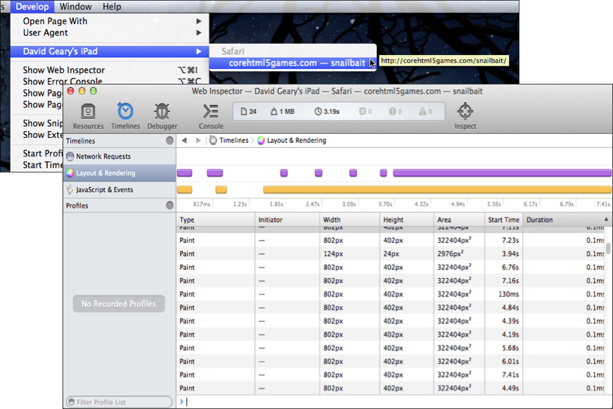
You can remotely debug your game on Mac OS X. As shown in Figure 15.1, with your device connected via USB to your Mac, Safari adds your device to the Develop menu. After selecting the application to remotely debug, Safari opens a debugger window, as Figure 15.1 also illustrates. See http://bit.ly/1i954dV for explicit instructions on how to set up remote debugging on Safari.
Figure 15.1. Remote debugging with Safari on Mac OS X
Note: To enable the Develop menu in Safari, go to the Advanced panel in Safari preferences and check the checkbox labeled Show Develop menu in menu bar.
Note: Remote debugging for Android
You can also remotely debug Android applications. See https://developers.google.com/chrome-developer-tools/docs/remote-debugging?hl=de for more information.
15.1. Run Snail Bait on Mobile Devices
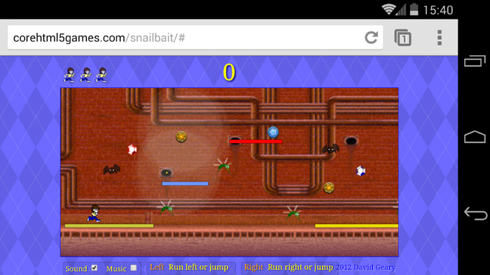
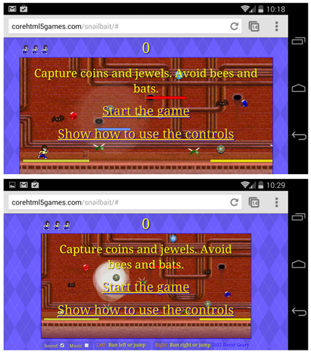
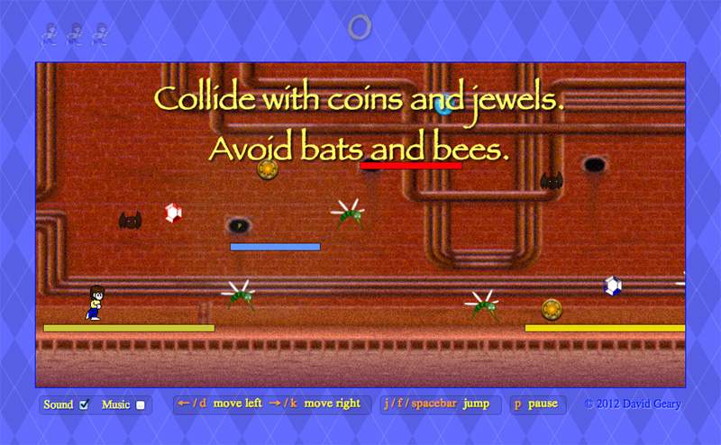
Snail Bait runs on mobile devices, as you can see in Figure 15.2, which shows Snail Bait running on an iPad and a Google Nexus 5.
Figure 15.2. Snail Bait running in Safari on iOS (top) and Chrome on Android (bottom)
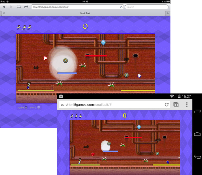
Table 15.1 shows the results of Snail Bait running on various mobile devices and operating systems.
Table 15.1. Snail Bait’s mobile browser report card (grades are subjective)
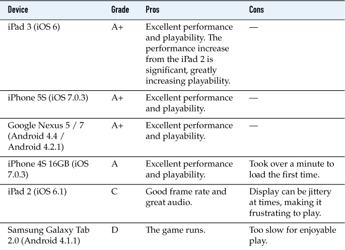
As you would expect, the newer the mobile device and its operating system, the better Snail Bait performs.
Next, let’s see how the game detects mobile devices.
15.2. Detect Mobile Devices
Because of alternative input controls and lack of a keyboard on most mobile devices, HTML5 games that run on both the desktop and mobile devices typically implement some code that runs on mobile devices only. For example, instead of controlling games with keyboards and mice, players on mobile devices use their fingers, which requires mobile-only code to detect and react to touch events.
The first order of business when tailoring your game to mobile devices is to determine whether the game is running on the desktop or on a mobile device. Example 15.1 shows the code that Snail Bait uses to make that determination.
Example 15.1. Detecting whether Snail Bait is running on a mobile device
SnailBait.prototype = {
...
detectMobile: function () {
snailBait.mobile = 'ontouchstart' in window;
},
...
};
The preceding method sets a snailBait.mobile Boolean variable to true if the window object contains an ontouchstart() method; otherwise, snailBait.mobile is false. Snail Bait invokes the detectMobile() method when the game starts and subsequently uses the snailBait.mobile variable to implement mobile-specific code, as shown in Example 15.2.
Example 15.2. Using Snail Bait’s mobile detection
snailBait = new SnailBait();
...
snailBait.detectMobile();
if (snailBait.mobile) {
// Mobile-specific code goes here, such as touch
// event handlers.
}
Now that you’ve seen how to detect features corresponding to mobile devices, let’s see how to scale HTML5 games to snugly fit their display.
Note: Feature detection on mobile devices
You can read more about determining whether a JavaScript object has a particular property or method at www.nczonline.net/blog/2010/07/27/determining-if-an-object-property-exists.
Note: Feature detection vs. media queries
In simpler times, when mobile devices were still novelties, developers detected mobile devices with media queries to determine screen size. If a media query revealed that a game was running on a device with 320 x 480 pixels, for example, the device was an iPhone.
Today, there are many types of mobile devices; in fact, the line between computer and mobile device itself is significantly blurred. Feature detection, which probes APIs instead of hardware, is a better choice than media queries for detecting capabilities that browsers provide.
Note: Feature detection with Modernizr
Other than Node.js and socket.io, which Snail Bait uses to communicate between the client and server, the game eschews frameworks and libraries altogether, so you can learn how to develop your own HTML5 games entirely from scratch.
When you implement your own game, however, you should take full advantage of frameworks and libraries as you see fit. One useful library is Modernizr, which performs all sorts of feature detection in a manner similar to the feature detection discussed in this section.
15.3. Scale Games to Fit Mobile Devices
When Snail Bait runs on mobile devices, the browser scales the game so that it fits snugly, as shown in Figure 15.3, which shows the game running on Android in the Chrome browser.
Players can push the address bar up and out of the way to run full-screen, as shown in Figure 15.4. To start the game in full-screen mode, players can add Snail Bait to their home screen, as discussed in Section 15.8, “Add an Icon to the Home Screen and Run Without Browser Chrome,” on p. 409.
Figure 15.4. Android full-screen
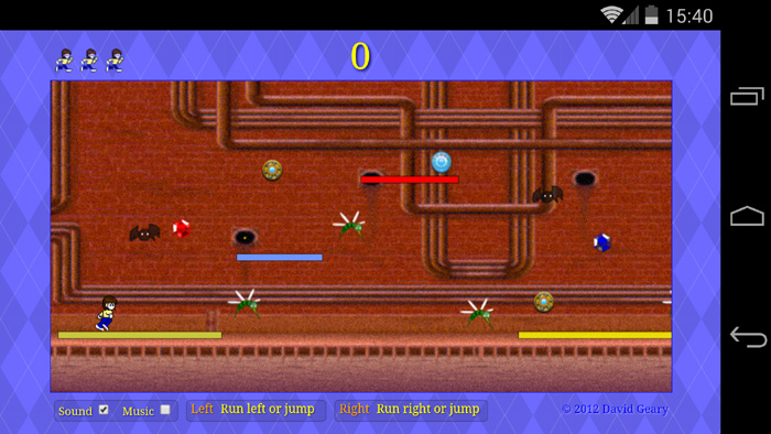
As you can see from Figure 15.3 and Figure 15.4, Snail Bait programatically resizes the game when the amount of available screen real estate changes.
Players can also pinch and zoom as they desire; for example, players can zoom in and concentrate entirely on the action if they wish, leaving the score and instructions behind as shown in Figure 15.5.
Figure 15.5. Zooming in on the game’s canvas
Once gameplay starts, Snail Bait prevents taps in the game’s canvas from zooming the display. See Section 15.6, “Incorporate Touch Events,” on p. 405 to see how Snail Bait disallows pinching and zooming.
Now that you’ve seen how Snail Bait scales to fit mobile device screens, let’s see how it implements that functionality with the viewport meta tag and programatic resizing.
15.3.1. The viewport Meta Tag
There’s a lot more available screen real estate on desktops than on small mobile devices, as Figure 15.6 illustrates.
Because webpages meant for the desktop are too big for small mobile devices, mobile device browsers scale webpages to fit the screen, as shown in Figure 15.7.
Figure 15.6. Most webpages don’t fit on small screens
Figure 15.7. Browsers scale webpages to fit small screens
When browsers display a webpage, they do not draw directly into the mobile device’s screen, as you might expect. Instead, the browser draws into an off-screen viewport and subsequently copies the contents of the off-screen viewport to the screen. The off-screen viewport is known as the layout viewport because that’s where the browser lays out the webpage, and the screen is known as the visible viewport. When the browser copies the contents of the layout viewport to the visible viewport, it scales the contents of the layout viewport to fit the visible viewport.
Layout viewports have different widths on different mobile operating systems, but for the most part they are close to the average width for a window on the desktop, meaning somewhere between 800 and 1,000 pixels. The layout viewport on iOS, for example, is 980 pixels wide, whereas it’s 800 pixels on Android. That correlation to desktop window size means that on mobile devices, CSS machinations result in websites that look proportionally similar to what you see on the desktop.
You can set the width of the layout viewport with the viewport meta tag, originally introduced by Apple. Figure 15.8 shows the effects of setting the width of Snail Bait’s layout viewport to 800, 900, and 2000 pixels, respectively, on an iPad.
Figure 15.8. How the viewport meta tag’s width directive affects scaling. Screenshots were taken on an iPad.
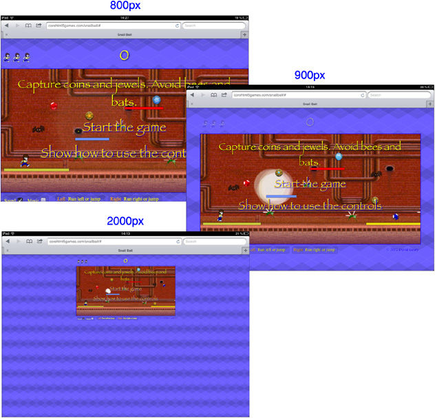
The width of Snail Bait’s canvas is 800 pixels. When the layout viewport’s width is also 800 pixels, the game fits snugly in the horizontal direction, as in the top screenshot in Figure 15.8.
When the layout viewport’s width is 900 pixels, there are 50 pixels on either side of the canvas, as you can see in the middle screenshot in Figure 15.8. When the layout viewport’s width is 2000 pixels, there are 600 pixels on either side of the canvas, as you can see in the bottom screenshot in Figure 15.8.
Snail Bait chooses a layout viewport width of 900 pixels, as shown in Example 15.3.
Example 15.3. Using the viewport meta tag
<!DOCTYPE html>
<html>
<head>
<meta name="viewport" content="width=900"/>
...
</head>
</html>
...
</html>
The viewport meta tag goes in the <head> section of your HTML page, as the preceding listing shows. Snail Bait uses only the width directive, but the viewport tag has several other directives, all of which are listed in Table 15.2.
Table 15.2. viewport meta tag directives
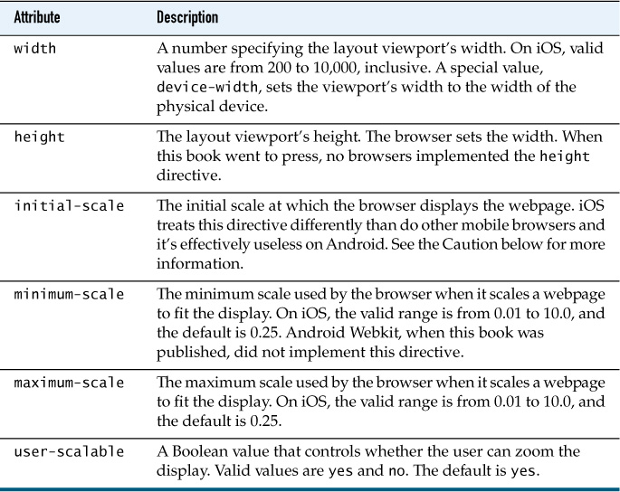
You can combine the preceding directives; for example, you could prevent browsers from scaling when they copy the contents of the layout viewport to the visible viewport, like this: <meta name="viewport" width="initial-scale=1.0, minimum-scale=1.0, maximum-scale=1.0">.
Now that you’ve seen how Snail Bait uses the viewport meta tag to fit mobile device screens horizontally, let’s see how it fits the game vertically.
Note: CSS pixels vs. device pixels
A device’s screen has a fixed number of pixels. For example, Google’s Nexus 5 has a resolution of 1080 x 1920 pixels. Those pixels are known as device pixels. In the previous discussion, when we talk about setting the viewport meta tag’s width to a certain number of pixels, we’re not talking about device pixels. Instead, the previous discussion refers to CSS pixels, meaning the number of pixels you specify in CSS for the sizes of HTML elements. High-resolution devices like the Nexus 5 use multiple device pixels to represent a single CSS pixel.
Note: The browser infers viewport meta tag directives that you do not specify
Given the width you specify for the layout viewport with the viewport meta tag, the browser infers the layout viewport’s height by maintaining the aspect ratio (width/height) of the webpage. The browser also infers the values of directives you don’t specify directly, so if you’re not getting the results you expect, specify more directives directly.
Note: Other configurations for the viewport meta tag
You can find many recommendations on the Internet for the following use of the viewport tag: <meta name="viewport" content="width=device-width, initial-scale=1, maximum-scale=1, user-scalable=0">. That use of the tag sets the width of the layout viewport to the width of the physical device. In addition, the preceding use of the tag disallows scaling and zooming.
Snail Bait opts for a simpler use of the viewport meta tag because the game conditionally allows dragging and zooming and because it adds breathing room on either side of the game’s canvas.
 Caution: The
 viewport meta tag has many quirks
When this book went to press, browser implementations of the viewport meta tag were a mess, especially for Android WebKit. For example, even though you should be able to set the height of the viewport instead of the width, no browsers implement it correctly, even on iOS. Also, iOS pays attention to the initial-scale directive only when a page loads initially; as a result, if the user rotates the device from portrait to landscape mode, the page puffs up to 1.5 times its original size. Android WebKit pays attention to initial-scale only if the value is 1 and there is no width directive. And that’s just the beginning of the problems with the viewport meta tag.
You can read more about the viewport meta tag at www.quirksmode.org/mobile/metaviewport and http://tech.bluesmoon.info/2011/01/device-width-and-how-not-to-hate-your.html.
Note: CSS Device Adaption
Instead of a meta tag, the W3C has specified a @viewport rule for CSS that provides functionality similar to the viewport meta tag; however, as this book went to press, the @viewport rule was not well supported among mobile browsers. You can read more about CSS Device Adaption at www.w3.org/TR/css-device-adapt.
15.3.2. Programatically Resize Games to Fit Mobile Device Screens
Because aspect ratios differ among mobile device displays, it’s not enough to merely use the viewport meta tag as discussed above to fit HTML5 games snugly in the horizontal direction. If the aspect ratio of a mobile device differs enough from your game’s aspect ratio, the game will be cropped vertically, as illustrated in the top screenshot Figure 15.9.
Figure 15.9. Aspect ratio cropping: Top screenshot is cropped; bottom screenshot accounts for aspect ratio.
To avoid aspect ratio cropping so the game is displayed as shown in the bottom screenshot in Figure 15.9, Snail Bait resizes the game to fit the screen at startup. Subsequently, Snail Bait also resizes the game whenever the window’s size changes (such as when the player pushes the address bar out of the way) or when the player changes the device’s orientation. Example 15.4 shows how Snail Bait does that.
Example 15.4. Resizing to fit the screen at startup and when window size or orientation change
snailBait.detectMobile();
if (snailBait.mobile) {
...
snailBait.fitScreen();
window.addEventListener("resize", snailBait.fitScreen);
window.addEventListener("orientationchange", snailBait.fitScreen);
}
Snail Bait’s fitScreen() method fits the game to mobile device screens when the game starts. Subsequently, Snail Bait specifies that method as a callback for the window’s resize and orientationchange events. The fitScreen() method is listed in Example 15.5.
Example 15.5. Snail Bait’s fitScreen() method
SnailBait.prototype = {
...
fitScreen: function () {
var arenaSize = snailBait.calculateArenaSize(
snailBait.getViewportSize());
snailBait.resizeElementsToFitScreen(arenaSize.width,
arenaSize.height);
},
...
};
The fitScreen() method gets the size of the visible viewport, which it uses to calculate the size of the game’s arena. Finally, fitScreen() resizes some of the game’s HTML elements to fit the arena.
The getViewportSize() method is listed in Example 15.6.
Using document.documentElement is the preferred method of getting the width and height of the visible viewport (clientWidth and clientHeight), but if that’s not available, getViewportSize() falls back to the inner width and height of the window.
Example 15.6. Snail Bait’s getViewportSize() method
SnailBait.prototype = {
...
getViewportSize: function () {
return {
width: Math.max(document.documentElement.clientWidth ||
window.innerWidth || 0),
height: Math.max(document.documentElement.clientHeight ||
window.innerHeight || 0)
};
},
...
};
The most interesting aspect of fitting Snail Bait to mobile device screens is the calculateArenaSize() method, listed in Example 15.7.
Example 15.7. Snail Bait’s calculateArenaSize() method
SnailBait.prototype = {
...
calculateArenaSize: function (viewportSize) {
var DESKTOP_ARENA_WIDTH = 800, // Pixels
DESKTOP_ARENA_HEIGHT = 520, // Pixels
arenaHeight,
arenaWidth;
arenaHeight = viewportSize.width *
(DESKTOP_ARENA_HEIGHT / DESKTOP_ARENA_WIDTH);
if (arenaHeight < viewportSize.height) { // Height fits
arenaWidth = viewportSize.width; // Set width
}
else { // Height doesn't fit
arenaHeight = viewportSize.height; // Set height
arenaWidth = arenaHeight * // Calculate width
(DESKTOP_ARENA_WIDTH / DESKTOP_ARENA_HEIGHT);
}
if (arenaWidth > DESKTOP_ARENA_WIDTH) { // Too wide
arenaWidth = DESKTOP_ARENA_WIDTH; // Limit width
}
if (arenaHeight > DESKTOP_ARENA_HEIGHT) { // Too tall
arenaHeight = DESKTOP_ARENA_HEIGHT; // Limit height
}
return {
width: arenaWidth,
height: arenaHeight
};
},
...
};
On the desktop, Snail Bait’s arena, which contains all the game’s HTML elements, is 800 pixels wide and 520 pixels high. The calculateArenaSize() method recalculates those values depending on the aspect ratio of the mobile device. The method returns an object with width and height properties that represent the width and height of the arena.
The fitScreen() method, listed in Example 15.5, passes the arena’s width and height to resizeElementsToFitScreen(), which is listed in Example 15.8.
Example 15.8. Snail Bait’s resizeElementsToFitScreen() method
SnailBait.prototype = {
...
resizeElementsToFitScreen: function (arenaWidth, arenaHeight) {
snailBait.resizeElement(
document.getElementById('snailbait-arena'),
arenaWidth,
arenaHeight
);
snailBait.resizeElement(snailBait.mobileWelcomeToast,
arenaWidth, arenaHeight);
snailBait.resizeElement(snailBait.mobileStartToast,
arenaWidth, arenaHeight);
},
...
};
The resizeElementsToFitScreen() method resizes the arena, along with mobile toasts. Those toasts are discussed in Section 15.5, “Change the Welcome Screen,” on p. 391.
Finally, resizeElementsToFitScreen() invokes Snail Bait’s resizeElement() method, listed in Example 15.9.
Example 15.9. Snail Bait’s resizeElement() method
SnailBait.prototype = {
...
resizeElement: function (element, w, h) {
element.style.width = w + 'px';
element.style.height = h + 'px';
},
...
};
The resizeElement() method changes the width and height properties of an HTML element’s style object. It’s important to remember to add the px string to the values for width and height; without it, browsers ignore the value.
Now that you’ve seen how Snail Bait combines the viewport meta tag with resizing the game’s arena in JavaScript, let’s see how the game changes instructions when it runs on mobile devices.
Note: Snail Bait uses the viewport meta tag and resizes the game
Snail Bait uses the viewport meta tag to fit the game initially in the horizontal direction. Subsequently, it resizes the game to fit the screen in both the vertical and horizontal directions.
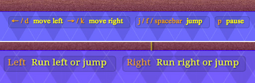
15.4. Change Instructions Underneath the Game’s Canvas
On the desktop, Snail Bait shows the instructions in the top screenshot in Figure 15.10. For mobile devices, Snail Bait changes those instructions to the ones shown in the bottom screenshot in Figure 15.10. Those instructions, unlike the instructions at the beginning of the game, are displayed all the time beneath the game’s canvas.
Figure 15.10. Snail Bait’s instructions on desktop (top) and mobile (bottom)
The HTML for the mobile instructions is shown in Example 15.10.
Example 15.10. The HTML for the mobile instructions element
<div id='snailbait-mobile-instructions'>
<div class='snailbait-keys'>
Left
<div class='snailbait-explanation'>Run left or jump</div>
</div>
<div class='snailbait-keys'>
Right
<div class='snailbait-explanation'>Run right or jump</div>
</div>
</div>
At startup on mobile devices, Snail Bait sets its instructionsElement property to the HTML element listed above, as in Example 15.11. That assignment cancels a previous assignment of the instructionsElement to the desktop instructions.
Example 15.11. Swapping out the instructions element
if (snailBait.mobile) {
// The following line of code overrides the instructionsElement
snailBait.instructionsElement =
document.getElementById('snailbait-mobile-instructions');
...
}
Now that you’ve seen how to change the instructions under the game, let’s see how Snail Bait modifies the game’s initial toasts for mobile devices.
15.5. Change the Welcome Screen
Implementing support for touch events is the most obvious aspect of customizing games for mobile devices. Often, that support results in different instructions for the game. In Section 15.6, “Incorporate Touch Events,” on p. 405 we discuss the implementation of Snail Bait’s support for touch events; in this section, we discuss the implementation of Snail Bait’s instructions for mobile devices.
Recall from Chapter 1 that when Snail Bait runs on the desktop it initially displays a brief toast, as shown in Figure 15.11. The game’s instructions showing which keys control the runner are always displayed beneath the game’s canvas.
Figure 15.11. Snail Bait’s initial toast on the desktop
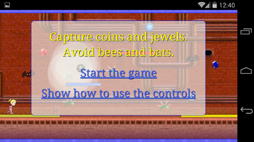
When the game runs on a mobile device, Snail Bait modifies the game’s initial toast as in the top screenshot in Figure 15.12. If the player taps on the Show how to use the controls link, Snail Bait displays a second toast, shown in the bottom screenshot in Figure 15.12, that describes the game’s controls.
Figure 15.12. Snail Bait’s initial toasts for mobile. Top: Welcome. Bottom: Instructions.
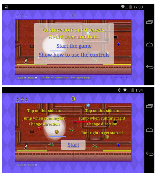
If players have played the game before, they probably don’t want to see the instructions again, so the welcome toast gives the player the option to immediately start the game, as shown in the top screenshot in Figure 15.12.
Implementing the toasts shown in Figure 15.12 involves the following steps:
• Implement a welcome toast (shown in the top screenshot in Figure 15.12)
• Implement an instructions toast (shown in the bottom screenshot in Figure 15.12) with a Start link that starts the game
15.5.1. Implement the Welcome Toast
We implement the welcome toast shown in the top screenshot in Figure 15.12 with the following steps:
• Modify the game’s start sequence
• Add HTML for the welcome toast
• Define CSS for the welcome toast
• Implement event handlers for the welcome toast’s links
15.5.1.1. Modify the Game’s Start Sequence
When Snail Bait runs on the desktop, the game’s startGame() method starts the game’s animation and displays the desktop welcome toast. We modify that method as shown in Example 15.12 to fade in the mobile welcome toast when the game is running on a mobile device instead of the desktop welcome toast.
Example 15.12. Snail Bait’s startGame() method, revised
var SnailBait = function () {
...
this.mobileWelcomeToast =
document.getElementById('snailbait-mobile-welcome-toast'),
...
};
SnailBait.prototype = function () {
...
startGame: function () {
...
if (snailBait.mobile) {
this.fadeInElements(snailBait.mobileWelcomeToast);
}
else {
this.revealInitialToast();
this.playing = true;
}
...
requestNextAnimationFrame(this.animate);
},
...
};
Before it returns, the startGame() method invokes requestNextAnimationFrame(), the polyfill for requestAnimationFrame() discussed in Chapter 3, to kick off the game’s animation. The screenshots in Figure 15.12 don’t show the effect, but underneath the partially transparent toast a smoking hole smokes, and the coins and jewels sparkle and bob up and down.
15.5.1.2. Add HTML for the Mobile Welcome Toast
The mobile welcome toast is a DIV element whose identifier is snailbait-mobile-welcome-toast, as you can see from Example 15.13. That DIV contains the brief message and two links shown in the top screenshot in Figure 15.12.
Example 15.13. The HTML for the mobile welcome toast
<!DOCTYPE html>
<html>
...
<body>
...
<!-- Arena.....................................................-->
<div id='arena'>
...
<!-- mobile devices only -->
<div id='snailbait-mobile-welcome-toast'
class='snailbait-mobile-toast'>
<div id='snailbait-welcome'>
Capture coins and jewels. Avoid bees and bats.
<div id='snailbait-welcome-instructions'>
<p><a href='#' class='snailbait-welcome-link'
id='snailbait-start-link'>
Start the game
</a>
</p>
<p><a href='#' class='snailbait-welcome-link'
id='snailbait-show-how-link'>
Show how to use the controls
</a>
</p>
</div>
</div>
</div>
...
</div>
...
</body>
</html>
The preceding HTML is unremarkable, other than the snailbait-mobile-welcome-toast DIV’s CSS class. Let’s look at that CSS next.
15.5.1.3. Define CSS for the Mobile Toasts
Snail Bait has one other toast for mobile devices in addition to the welcome toast listed in Example 15.13. That other toast, which contains a lone Start link, is shown in the bottom screenshot in Figure 15.12. The welcome and start toasts have several CSS properties in common, so they reside in a CSS class, listed in Example 15.14.
Example 15.14. CSS for the mobile toasts
.snailbait-mobile-toast {
position: absolute;
border-radius: 10px;
font: 30px fantasy;
text-align: center;
text-shadow: 1px 1px 1px rgb(0,0,0);
color: yellow;
-webkit-transition: opacity 1s;
-moz-transition: opacity 1s;
-o-transition: opacity 1s;
transition: opacity 1s;
display: none;
z-index: 1;
opacity: 0;
}
The preceding CSS exhibits the familiar pattern of HTML elements that Snail Bait fades in and out. The elements that have the snailbait-mobile-toast class are initially invisible and have a transition associated with their opacity property. See Chapter 5 for more information on how Snail Bait fades elements in and out.
Example 15.15 lists the CSS for the snailbait-mobile-welcome-toast element.
Example 15.15. CSS for the initial start toast element
#snailbait-mobile-start-toast {
width: 800px;
height: 400px;
}
The preceding CSS positions sizes the snailbait-mobile-start-toast element to exactly fit the game’s canvas. Next, we look at the event handlers for the links in the mobile welcome toast.
15.5.1.4. Implement Event Handlers for the Mobile Welcome Toast’s Links
When the player taps the mobile welcome toast’s Start the game link, the browser invokes the event handler listed in Example 15.16.
Example 15.16. The Start the game link’s onclick event handler
snailBait.startLink.addEventListener(
'click',
function (e) {
var FADE_DURATION = 1000;
snailBait.playSound(snailBait.coinSound);
snailBait.fadeOutElements(snailBait.mobileWelcomeToast,
FADE_DURATION);
snailBait.playing = true;
}
);
The browser detects click events when players either click links with the mouse or tap them with a finger. The preceding click event handler plays a sound, fades out the initial start toast, and sets the game’s playing property to true.
If the player taps the Show how to use the controls link, the browser invokes the event handler shown in Example 15.17.
Example 15.17. The Show how to use the controls link’s onclick event handler
snailBait.showHowLink.addEventListener(
'click',
function (e) {
var FADE_DURATION = 1000;
snailBait.fadeOutElements(snailBait.mobileWelcomeToast,
FADE_DURATION);
snailBait.drawMobileInstructions();
snailBait.revealMobileStartToast();
snailBait.mobileInstructionsVisible = true;
}
);
The preceding event handler fades out the welcome toast and subsequently draws the mobile instructions and reveals the mobile Start toast. The event handler also sets a flag named mobileInstructionsVisible that Snail Bait uses to determine when to draw the game’s mobile instructions.
15.5.2. Draw Mobile Instructions
Snail Bait draws instructions for mobile devices, shown in Figure 15.13, with a drawMobileInstructions() method. That method is listed in Example 15.18.
Figure 15.13. Snail Bait’s mobile instructions on Android

Example 15.18. Drawing mobile instructions
SnailBait.prototype = {
...
drawMobileInstructions: function () {
var TOP_LINE_OFFSET = 115,
LINE_HEIGHT = 40;
this.context.save();
this.initializeContextForMobileInstructions();
this.drawMobileDivider(cw, ch);
this.drawMobileInstructionsLeft(this.canvas.width,
this.canvas.height,
TOP_LINE_OFFSET,
LINE_HEIGHT);
this.drawMobileInstructionsRight(this.canvas.width,
this.canvas.height,
TOP_LINE_OFFSET,
LINE_HEIGHT);
this.context.restore();
},
...
};
The drawMobileInstructions() method saves and restores the context for the game’s canvas, so context settings made between those two calls are temporary. See Chapter 3 for more information about the context’s save() and restore() methods.
The drawMobileInstructions() method initializes the context for the game’s canvas with an initializeContextForMobileInstructions() method, which is listed in Example 15.19.
Example 15.19. Initializing the context for mobile instructions
SnailBait.prototype = {
...
initializeContextForMobileInstructions: function () {
this.context.textAlign = 'center';
this.context.textBaseline = 'middle';
this.context.font = '26px fantasy';
this.context.shadowBlur = 2;
this.context.shadowOffsetX = 2;
this.context.shadowOffsetY = 2;
this.context.shadowColor = 'rgb(0,0,0)';
this.context.fillStyle = 'yellow';
this.context.strokeStyle = 'yellow';
},
...
};
As discussed in Chapter 3, the HTML5 canvas context has properties that control certain drawing aspects, such as where to place text and whether or not to add shadows to graphics and text.
The initializeContextForMobileInstructions() method listed above sets the context’s textAlign and textBaseline properties so the context’s fillText() method draws text centered horizontally. The initializeContextForMobileInstructions() method also sets a fantasy font that’s 26 pixels high and black shadow for text and graphics. Finally, the method sets the context’s fill and stroke styles to yellow.
After initializing context properties, Snail Bait draws the vertical divider in the center of the game’s canvas with the drawMobileDivider() method, listed in Example 15.20.
Example 15.20. Drawing the divider
SnailBait.prototype = {
...
drawMobileDivider: function (cw, ch) {
this.context.beginPath();
this.context.moveTo(cw/2, 0);
this.context.lineTo(cw/2, ch);
this.context.stroke();
},
...
};
Next, drawMobileInstructions() draws the instructions on the left side of the game’s canvas with the drawMobileInstructionsLeft() method listed in Example 15.21.
Example 15.21. Drawing mobile instructions on the left
SnailBait.prototype = {
...
drawMobileInstructionsLeft: function (cw, ch,
topLineOffset,
lineHeight) {
this.context.font = '32px fantasy';
this.context.fillText('Tap on this side to:',
cw/4, ch/2 - topLineOffset);
this.context.fillStyle = 'white';
this.context.font = 'italic 26px fantasy';
this.context.fillText('Turn around when running right',
cw/4, ch/2 - topLineOffset + 2*lineHeight);
this.context.fillText('Jump when running left',
cw/4, ch/2 - topLineOffset + 3*lineHeight);
},
...
};
The preceding method primarily uses the context’s fillText() method to draw text. The same is true for drawMobileInstructionsRight(), which draws the instructions on the right side of the canvas, listed in Example 15.22.
Example 15.22. Drawing mobile instructions on the right
SnailBait.prototype = {
...
drawMobileInstructionsRight: function (cw, ch,
topLineOffset, lineHeight) {
this.context.font = '32px fantasy';
this.context.fillStyle = 'yellow';
this.context.fillText('Tap on this side to:',
3*cw/4, ch/2 - topLineOffset);
this.context.fillStyle = 'white';
this.context.font = 'italic 26px fantasy';
this.context.fillText('Turn around when running left',
3*cw/4, ch/2 - topLineOffset + 2*lineHeight);
this.context.fillText('Jump when running right',
3*cw/4, ch/2 - topLineOffset + 3*lineHeight);
this.context.fillText('Start running',
3*cw/4, ch/2 - topLineOffset + 5*lineHeight);
},
...
};
As you saw in Example 15.17, Snail Bait invokes drawMobileInstructions() when the player taps on the Show how to use the controls link in the mobile welcome screen. As you’ve seen, however, Snail Bait draws the mobile instructions directly into the game’s canvas, which is the same canvas that Snail Bait redraws every animation frame. Because Snail Bait continuously redraws the game’s canvas, it must continuously redraw the mobile instructions while they are visible. To do that, we modify the game’s draw() method, as shown in Example 15.23.
Example 15.23. Drawing mobile instructions every animation frame
SnailBait.prototype = {
...
draw: function (now) {
...
if (this.mobileInstructionsVisible) {
snailBait.drawMobileInstructions();
}
},
...
};
If the mobile instructions are visible, Snail Bait’s draw() method draws the mobile instructions. Recall that the mobileInstructionsVisible flag is set when the player taps on the Show how to use the controls link, as shown in Example 15.17.
To start the game, players tap the Start button that the game displays along with the mobile instructions. That Start button resides in a Start toast, whose implementation we discuss next.
15.5.3. Implement the Mobile Start Toast
The HTML for the mobile Start toast is shown in Example 15.24.
The Start toast contains only the Start link. The toast’s CSS class is snailbait-mobile-toast, which is the class shared by the initial start toast, as discussed in Section 15.5.1.3, “Define CSS for the Mobile Toasts,” on p. 395.
Example 15.24. The HTML for the mobile Start toast
<!DOCTYPE html>
<html>
...
<body>
...
<div id='arena'>
...
<!-- mobile devices only -->
<div id='snailbait-mobile-start-toast'
class='snailbait-mobile-toast'>
<a href='#'
class='snailbait-welcome-link'
id='snailbait-mobile-start-link'>
Start
</a>
</div>
...
</div>
...
</body>
</html>
The CSS for the Start toast is listed in Example 15.25.
Example 15.25. The CSS for the Start toast
#snailbait-mobile-start-toast {
width: 800px;
height: 400px;
}
The Start toast, like the mobile welcome toast, is the same size as the game’s canvas.
Next, we implement the event handler for the Start link.
15.5.3.1 Implement the Start Link’s Event Handler
The event handler for the Start link is shown in Example 15.26.
Example 15.26. The event handler for the Start link
var SnailBait = function () {
...
this.mobileStartToast =
document.getElementById('snailbait-mobile-start-toast');
...
};
...
snailBait.mobileStartLink.addEventListener(
'click',
function (e) {
var FADE_DURATION = 1000;
snailBait.fadeOutElements(snailBait.mobileStartToast,
FADE_DURATION);
snailBait.mobileInstructionsVisible = false;
snailBait.playSound(snailBait.coinSound);
snailBait.playing = true;
}
);
The preceding event handler fades out the mobile Start toast and sets the mobileInstructionsVisible property’s value to false, which prevents the game’s draw() method from drawing the instructions any further.
As was the case for the event handler for the Start the game link in the initial start toast, the preceding event handler plays the coin sound when the player taps the Start link. Finally, the event handler sets Snail Bait’s playing property to true, which activates the game’s event handlers.
15.5.4. Reveal the Mobile Start Toast
Recall that the event handler for the Show how to use the controls link, listed in Example 15.17, invokes the revealMobileStartToast() method. That method is listed in Example 15.27.
Example 15.27. Revealing the Start toast
SnailBait.prototype = {
...
revealStartToast: function () {
snailBait.fadeInElements(snailBait.mobileStartToast);
this.mobileInstructionsVisible = true;
},
...
};
The revealStartToast() method fades in the start toast containing the Start link and sets the mobileInstructionsVisible Boolean variable’s value to true. The revealStartToast() method is invoked by the Show how to use the controls link’s event handler, which we discussed in Example 15.17.
You’ve seen how to modify Snail Bait’s user interface for mobile devices, so now let’s see how to incorporate touch events.
15.6. Incorporate Touch Events
When Snail Bait runs on mobile devices, it adds touch event handlers to the game, as you can see in Example 15.28.
Example 15.28. Adding touch event handlers
if (snailBait.mobile) {
...
snailBait.addTouchEventHandlers();
...
}
Snail Bait’s addTouchEventHandlers() method, listed in Example 15.29, adds two touch event handlers to the game, one for touchstart events and another for touchend events.
Example 15.29. Specifying mobile touch event handlers
SnailBait.prototype = {
...
addTouchEventHandlers: function () {
snailBait.canvas.addEventListener(
'touchstart',
snailBait.touchStart
);
snailBait.canvas.addEventListener(
'touchend',
snailBait.touchEnd
);
},
...
};
The touchstart event handler, which is listed in Example 15.30, is uneventful.
Example 15.30. The mobile touch start-event handler
SnailBait.prototype = {
...
touchStart: function (e) {
if (snailBait.playing) {
// Prevent players from inadvertently
// dragging the game canvas
e.preventDefault();
}
},
...
};
If gameplay is underway, the preceding event handler prevents the browser from reacting in its default manner for touch start events. In more practical terms, the call to preventDefault() prevents players from accidentally dragging the canvas.
The touchend event handler is listed in Example 15.31.
Example 15.31. The mobile touch end-event handler
SnailBait.prototype = {
...
touchEnd: function (e) {
var x = e.changedTouches[0].pageX;
if (snailBait.playing) {
if (x < snailBait.canvas.width/2) {
snailBait.processLeftTap();
}
else if (x > snailBait.canvas.width/2) {
snailBait.processRightTap();
}
// Prevent players from double
// tapping to zoom into the canvas
e.preventDefault();
}
},
...
};
The touchend event handler calls either processLeftTap() or processRightTap(), depending on the location of the tap. The call to preventDefault() prevents players from zooming the display. The processRightTap() method is listed in Example 15.32.
Example 15.32. Processing taps on the right side of the screen
SnailBait.prototype = {
...
processRightTap: function () {
if (snailBait.runner.direction === snailBait.LEFT ||
snailBait.bgVelocity === 0) {
snailBait.turnRight();
}
else {
snailBait.runner.jump();
}
},
...
};
The preceding event handler turns the runner to the right when the runner is moving left; otherwise, the event handler makes the runner jump. The processLeftTap() method is listed in Example 15.33.
Example 15.33. Processing taps on the left side of the screen
SnailBait.prototype = {
...
processLeftTap: function () {
if (snailBait.runner.direction === snailBait.RIGHT) {
snailBait.turnLeft();
}
else {
snailBait.runner.jump();
}
},
...
};
The processLeftTap() method is the mirror image of processRightTap(). The former turns the runner to the left when the runner is moving right; otherwise, the event handler makes the runner jump.
Note: Touch event handlers lie dormant until gameplay starts
Both the touchstart and touchend event handlers only respond to events once gameplay is underway.
Note: Be careful of subtle distinctions between mouse and touch events
Mouse and touch events are similar, but not exactly the same. Not understanding the subtle distinctions between the two can be the source of bugs. You can read more about those subtleties at www.html5rocks.com/en/mobile/touchandmouse.
Note: Preventing inadverent dragging and zooming
Both the touch event handlers discussed in the previous section invoke the preventDefault() method on the event object the browser passes to those event handlers. For the ontouchstart method, that call to preventDefault() prevents players from double-tapping to zoom in or out. The call to preventDefault() in the ontouchmove event handler prevents players from inadvertently dragging the canvas.
Note: Preventing zooming and scrolling with preventDefault() also prevents other default actions
It’s important to keep in mind that preventDefault() has side effects you may not anticipate. For example, if you prevent the default reaction for every mouse event, the browser will not allow the default behavior of setting focus in a text field.
15.7. Work Around Sound Idiosyncracies on Mobile Devices
At the time this book was written, developers had to do the following two things, at a minimum, to get sound working reliably on mobile devices.
• Force the player to initiate a sound so that iOS will download sound files
• Adjust positions in the audio spritesheet for Android
The HTML5 audio element on iOS downloads sound files only if a user activates a user interface control to make the first sound. From then on, the operating system will dutifully play sounds without user intervention.
That requirement on iOS is the reason the event handlers for the start links discussed in this chapter played the coin sound; see Example 15.16 and Example 15.26.
Without the player initiating the sound with a click, iOS will refuse to play any of Snail Bait’s sounds at all.
The second nuisance associated with getting sound to work reliably on mobile devices is Android’s interpretation of where individual sounds lie in an audio sprite. Those sounds are offset anywhere from 0.2 seconds to 2.5 seconds. Because of those offsets, Snail Bait resets all the sound positions when the game runs on Android devices, as shown in Example 15.34. See Chapter 14 for more about how Snail Bait implements sound and music.
Example 15.34. Specifying different sound positions for Android
if (snailBait.mobile) {
...
if (/android/i.test(navigator.userAgent)) {
snailBait.cannonSound.position = 5.4;
snailBait.coinSound.position = 4.8;
snailBait.electricityFlowingSound.position = 0.3;
snailBait.explosionSound.position = 2.8;
snailBait.pianoSound.position = 3.5;
snailBait.thudSound.position = 1.8;
}
}
The preceding code uses a JavaScript regular expression to determine if the game is running on an Android device; if so, it adjusts the game’s sound positions in the audio sprite sheet.
Note: JavaScript regular expressions
JavaScript regular expressions have many other uses besides detecting mobile devices. See http://www.w3schools.com/jsref/jsref_obj_regexp.asp for a reference to these handy objects.
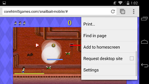
15.8. Add an Icon to the Home Screen and Run Without Browser Chrome
Both iOS and Android make it easy for users to add an icon representing a website to the mobile device’s home screen, as you can see from Figure 15.14, which shows a drop-down menu on Android.
Figure 15.14. Add an icon to the Android home screen
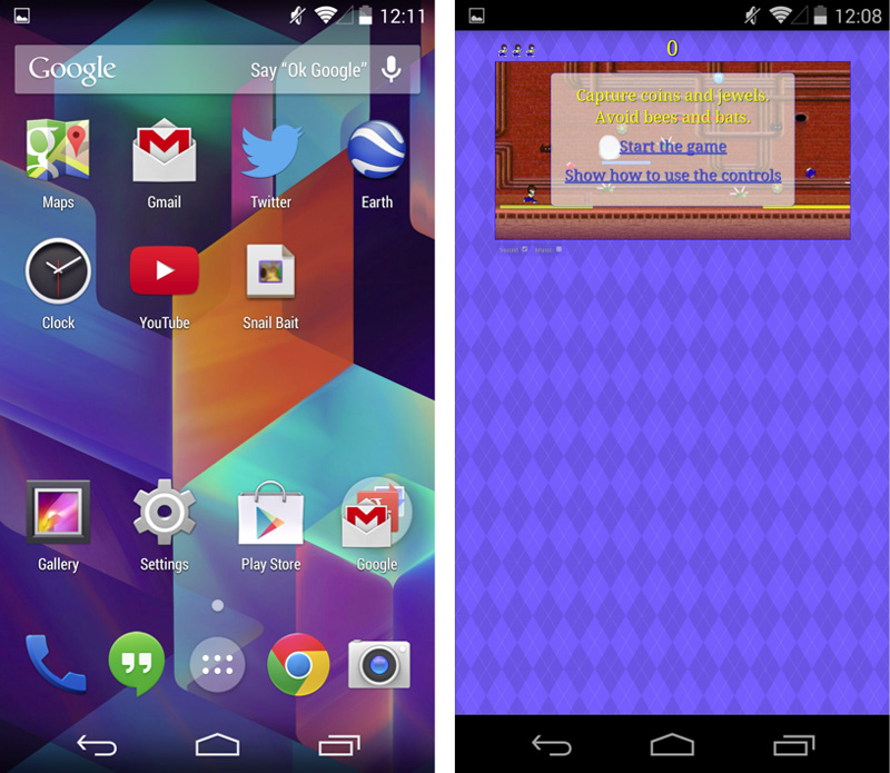
When the player taps on the resulting icon, shown in the second row and third column of the left screenshot in Figure 15.15, the game begins without browser chrome, as you can see in the right screenshot in Figure 15.15.
Figure 15.15. A Snail Bait icon on the Android home screen (left) and the ensuing game after a player taps the icon (right).
Note: The full-screen API
As this book want to press, the W3C had released a working draft of a full-screen API, that lets your web application run full-screen without user intervention, but that functionality was not widely supported.
15.9. Conclusion
There are lots of mobile devices in the world, with more being sold all the time at a rate of 2 billion per year and climbing. And lots of those mobile device users play games on their devices.
In this chapter you saw how to customize Snail Bait so it runs on mobile devices. This chapter is far from a full-fledged exploration of implementing games for mobile devices; you will find entire books devoted to that topic. Instead, this chapter shows you how to get a nontrivial video game running on iOS and Android, pointing out some of the pitfalls of HTML5 mobile development in general.
In the next chapter you will see how to implement particle systems to represent real-world phenomena such as smoke and fire.
15.10. Exercises
1. Try Snail Bait on different mobile devices and see how the game performs.
2. Experiment with the viewport meta tag by setting different sizes for the width.
3. Set the viewport meta tag’s width to device-width and restart the game on Android and iOS. Does the game initially scale the same on both operating systems?