

Design with Conviction
Commit to a unique voice.
Throughout my career, I've clocked untold miles at all kinds of receptions, conferences, and cocktail parties. After a party not terribly long ago, I was thinking about how the different kinds of conversations you have at a cocktail party make a good metaphor for the ways that companies use design. Our fellow party guests are the bore, the braggart, and the conversationalist.
The bore is Google. You might be thinking, “Oh, I'd love to be as boring and lucrative as Google.” After all, Google has an estimated 1 billion daily users and is so ubiquitous that its name has become a verb in I don't know how many languages. Yet I think of Google as the kind of boring person at a party who doesn't have much to contribute. Such people are polite and attentive, and perhaps good listeners. They look at you in a sympathetic way and say, “Tell me about you.” You sense their lack of self-confidence while they prod you for compliments about how great they look tonight in that Brioni suit.
What is so boring about Google? As I mentioned in Chapter 5, Google drives its design process by the numbers. The company tests prototypes and variations with huge numbers of users to optimize every visual detail on every page, as when it ran tests on 41 shades of blue1 for the HTML links on its pages. In fact, Google runs tests to collect data to justify just about every design decision. And who can argue with that? If the right color of blue attracts 0.01 percent more of 100 million people, well, that's still a million additional clicks and a lot of money to be made.
Yet the problem with data-centered optimization is that you lose the human touch that stirs emotion with a point of view. Google is the opposite of idiosyncratic; it is like a direct democracy in its design choices. Google looks lackluster, with the clear exception of its wonderfully simple and uncluttered home page that occasionally includes an artful logo interpretation for a specific event or anniversary. Its tool aesthetic leaves an emotional depth and connection on the cutting-room floor. It's like designing by numbers: You color between the lines without asking whether the lines are where you want them.
Back at the party, there's another bore over there in the corner by the name of Gap. Gap Inc. is the San Francisco specialty retailer whose brands include middle-of-the-road Gap, higher-end Banana Republic, and lower-cost Old Navy, as well as the online brand Piperlime and a unit consisting of performance apparel for women called Athleta. Founded in 1969 with a single store in San Francisco, Gap now has 3,200 stores worldwide. But over the past few years, Gap has struggled to regain its position as the brand that once defined casual American style. The brand lost its way, Barron's noted at the end of 2011 due to “a surfeit of stores and a deficit of cool.”2
To refresh its image, Gap introduced a new logo in October 2010: The iconic blue box with white lettering was replaced with a new design by Laird & Partners, which featured white lettering with a small blue box above the p in its name. The blowback (or, more aptly, the Internet hazing) began immediately. Gap loyalists hated the new look. But instead of retreating, the company responded by thanking fans for their “input” and asking them to share their design ideas for a new logo. “We love our version, but we'd like to see other ideas. Stay tuned for details in the next few days on this crowdsourcing project,” proclaimed Gap's Facebook page.
What a nice, positive corporate sentiment. “Oh, sorry, you don't like my dress? Well, I appreciate that input! That's terrific to hear. I mean, I love this one, but please come shopping with me and we'll pick out another one.” Gap retreated and scrapped the new logo, ending its brief flirtation with crowdsourcing. It was back to square one—in this case, the original square Gap logo that people were accustomed to.
Now along comes the braggart. He's the loudmouth guy over there—let's face it, it's always a guy—who shows up wearing trendy clothes and designer accessories and is more than eager to boast about his latest supposed achievement and conquest. Scratch below the surface, though, and you won't find much underneath the façade. “You just ran a marathon in record time, really?” Our braggart's name is Dell, the computer maker.
In 2009, Dell introduced a subbrand of notebook computers called Adamo (Latin for “to fall in love”), an ultrathin, sleek, and expensive rival to Apple's equally impressive MacBook Air. With its cool styling and craftsmanship, Adamo was a departure from Dell's more prosaic looking products, and it received positive reviews in the tech press. Adamo was the tank parked on Apple's front lawn. PCWorld magazine described the MacBook Air–Dell Adamo rivalry as a “deathmatch.”3 Guess who won? Dell withdrew Adamo from the market in 2011 as sales flagged. Despite its good looks, Adamo was way overpriced (at around $2,000) compared to MacBook Air ($1,200). But its really big problem was that Dell had showed up at the party, loud and boisterous and trailing a hot new girlfriend, but nobody believed this guy (i.e., Adamo) was anything more than a poser pretending to be a rock star.
The Dell Adamo notebook computers were beautifully designed and engineered products. This one includes a novel hinge design that raises the back of the keyboard for a more comfortable typing position. Image: Dell

As we stumble out of this party after a few too many tequilas, let's recount the people we met there. First the bore named Google, who listens too closely. Then the wishy-washy Gap, lacking conviction. And finally Dell, the braggart who tries showing off but can't muster long-term commitment. None of these companies is using design like Apple. Apple is at the party, too, of course, the guest who is a good listener and tells interesting stories and a joke now and then. Apple has mastered the design dialog and conversation and speaks distinctly in its own voice and with its own point of view. That voice speaks minimalism and simplicity, the lenses through which Apple makes all design decisions.
SIMPLY BEAUTIFUL
Apple's design voice arose from a singular vision espoused by Steve Jobs when the company was founded in 1976: Technology should improve people's lives and be easy to use. Technology must speak a language, he believed, that people can understand. Over decades, Jobs ensured that Apple stayed committed to this vision.
Walter Isaacson, in Steve Jobs, suggests that Jobs's commitment to design and craftsmanship originated in part from his father, Paul, who with his wife, Clara, adopted Jobs as a baby. According to Isaacson's book, Jobs recalls how his father, who refurbished and sold used cars, would point out to his son the intricate design detailing—the lines, vents, chrome, and trim of the seats. His father also taught him the importance of carefully crafting the backs of cabinets even though they would not be seen. “He loved doing things right,” Jobs says about his father. “He even cared about the look of the parts you couldn't see.” At Apple, Jobs took this further, insisting that a good-looking computer circuit board would communicate to customers that Apple cared about how things looked and therefore how they performed. He believed that the look, the mechanics, the performance of the keyboard and mouse, and everything else mattered.
The house Jobs grew up in was also an inspiration. In the 1950s, the family moved to a subdivision in Mountain View, a town in what would later become Silicon Valley. As Isaacson points out in his book, their home was designed and built by real estate developer Joseph Eichler, who was influenced by Frank Lloyd Wright's vision of simple modern homes with glass walls and concrete slab floors. Jobs told Isaacson that this type of architecture had instilled in him “a passion for making nicely designed products for the mass market.”
Jobs and his industrial design director, Jony Ive, shared the same modernist design sensibility that eschews decoration and ornamentation. The roots of modernism go back to the renowned German designer Dieter Rams, who led design at Braun from 1955 to 1997 and was a proponent of unadorned minimalism. The similarities in their work are profound. In fact, Rams said in the 2010 design documentary Objectified that “you find only a few companies that take design seriously, as I see it. And at the moment, that is an American company. It is Apple.”4 Rams and Ive had similar visions of what design could and should do. Rams catalogued his vision in a 1987 manifesto called “Ten Rules of Good Design,” one of which is “Good design is as little design as possible.”5 Or, as we have come to know it, less is more.
Apple is committed to making each product beautiful to behold, but it is not a superfluous or superficial beauty. And its devotion to minimalism doesn't necessarily mean spartan. There can be variations in the pitch and tone of the voice that enriches the overall voice. Consider the LED that shows through the front of the MacBook casing when it is asleep. Rather than flicker or blink, the light slowly undulates, like the breathing pattern of a resting companion. Apple's design voice is about simplicity but it is also about a devotion to the details of a form, an interface, and an experience. Those details are not left to chance. A half century before the iPod appeared, the renowned midcentury modernist designer Charles Eames noted, “The details are not the details, they make the product.”6 Apple's adherence to this idea is evident in the extraordinary attention it lavishes on the details that might seem irrelevant and unimportant at other companies.
For example, you might not have noticed this, but on an Apple computer the row of connectors for the power cord, the USB cable, and the headphone jacks all line up on the same centerline. A small detail, to be sure, but this lineup illustrates an important point. It would be easy to buy stock connectors from suppliers, place them on the circuit board, and put holes in the casing wherever they needed to be to accommodate the connectors. When I was working as a mechanical engineer, I did this very thing for many products. But Apple's design voice dictates that those connectors look better and simpler and more intentional when they march along together on the same centerline.
The Apple designers are right, of course, because this positioning results in a visual clarity and discipline in symmetry. To create this symmetry, Apple buys custom electronic components so that the outside of the product appears neat and orderly. This means additional and tedious work for Apple's design and manufacturing engineers, but there's an unexpected truth in the design world that extra work is needed to make products simpler. For me, this conundrum is best captured in the quirky imagination of Antoine de Saint-Exupéry who wrote in The Little Prince, “Perfection is achieved, not when there is nothing more to add, but when there is nothing left to take away.”7
Tony Fadell, the former Apple executive, told me that this type of customization is the way Apple shows its commitment to its voice, regardless of the extra cost. “Apple doesn't accept the easy route,” Fadell says. When Apple knows something will resonate with the customer, “then you spare no expense,” whether it's new packaging or a custom connector. This conviction to a voice can't be crowdsourced or divined through focus groups. It can be achieved only if a company has a clear sense of it itself and what it wants to accomplish and a game plan to get there.
Simplicity is not just about looks; it also applies to how Apple products function. Early versions of Apple software are devoid of many useful features that competitive products pack. For example, the first versions of Apple's Keynote presentation software didn't have as many templates or animation features as Microsoft PowerPoint users have come to expect. The upside was that everything that Keynote did include worked as advertised and was designed exquisitely, with elegant animations and templates in the unmistakable Apple voice. Every product and service can't be all things to all people, but every product and service does support and reflect the overarching message of Apple's design expression.
The simplicity paradigm extends to the overall product strategy. Apple exerts great discipline and control over the product lineup. When Steve Jobs returned to Apple in 1997 after being ousted in a boardroom coup, he found a company with a dizzying array of products on the company roster that were being sold in a variety of channels. The simple design strategy that he had devised was breaking down and giving way to a flood-the-market concept. Once back at the helm, he interviewed all the product teams and then reduced the entire line to a total of four products: one portable and one desktop each for the consumer and professional markets. Returning to simplicity meant saying no, as Jobs explained to BusinessWeek: “We're always thinking about new markets we could enter, but it's only by saying no that you can concentrate on the things that are really important.”8
OXO has leveraged the design language it created in this first product—the vegetable peeler—to create an entire range of products simply recognized for better ergonomics. Image: OXO

For all my gushing about the beauty of Apple products, I must admit that sometimes they are like the rest of us: imperfect. Erring on the side simplicity can result in products that don't “listen” to people's needs and are not as powerful as many customers demand. Or it results in the iPhone's ergonomic lapse of being too slippery to hold. If you use a MacBook Pro on your lap or in bed, depending on how your wrists are positioned while typing, the front edge of the keyboard feels exceptionally sharp, even painful. The single-button mouse that Steve Jobs pursued obsessively looks simple, but it doesn't have as many time-and-movement-saving features as a two-button or three-button version. Why did Jobs insist on the single-button mouse? Because of its apparent simplicity. Call it compulsive or just plain stubborn, but to design like Apple means sometimes giving up on even sensible requirements to rigorously maintain a cohesive voice.
CREATE YOUR OWN VOICE
Creating a voice for your company doesn't mean mimicking what Apple does or replicating the distinctive look and feel of its products. The principles of austere and unfussy Bauhaus minimalism have served Apple well, because for technology products, minimalism allows the technology to shine through. It renders what might appear to be complex and complicated to a user less so because the design is clean. But the Apple voice, refined and unique as it is, is certainly not the only one out there. Don't be seduced into minimalism as the only option; companies like BMW, Ace Hotels, Nike, and OXO each do their own thing with great effect. To design like Apple, you must find your own unique and differentiating design voice and apply that voice with discipline, because that is the voice customers will come to care about and to expect.
Design can sometimes take a backseat when start-ups offer a new technology or a breakthrough service. The technical innovation and the pressure to be first to market will often diminish the role of design. That strategy can work sometimes. But increasingly, companies realize that a groundbreaking technology goes only so far. They can miss out on a critical opportunity to use design to establish a brand along with their snazzy new widget. That widget might be a winning element, but it will speak even louder with a striking design voice.
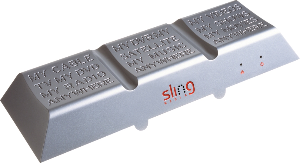
Blake Krikorian founded a tech company called Slingbox, which sells a gadget that allows you to view your television content from anywhere with an Internet connection. The technology hadn't been available for consumers before, so Krikorian could easily have launched the product in a bland beige box, the assumption being that the technical innovation of the Slingbox alone would do the trick and find a customer base. But in a smart design move, he decided not to.
Without a huge advertising budget, Slingbox employed an unusual design by San Francisco-based fuseproject to declare its virtues—a tapered prism sporting the value proposition molded into the top of the product in a dot-pattern typeface: “My cable TV, My DVD, My Radio, Anywhere.” Right out of the starting gate, Slingbox used standout design to create emotional differentiation from potential competitors, even though it was the first mover in its sector. Slingbox hit the market with a voice that proclaimed its difference, not only in how it looks, but also in the technology that lets you plug into your home cable box from a faraway place.
Sling Media worked with designers to create an iconic and memorable product—the original Slingbox. Image: Sling Media, Inc.
Our friends at Method Products also embraced design early on as a way to communicate its brand message of sustainability, efficiency, and, let's face it, coolness in a category known for mostly boring and dull products from entrenched competitors like Procter & Gamble and SC Johnson.
Method founders Adam Lowry and Eric Ryan were determined to create a family of green products that were good for the planet and so beautiful that consumers wouldn't want to hide them away under the sink. To grab attention, they enlisted star designer Karim Rashid to rethink dishwashing liquid, a commodity product. “Adam and Eric wanted to turn the category upside down, to be completely disruptive by taking a banal object and designing it to be quite beautiful,” says Joshua Handy, Method's vice president of industrial design and innovation, who at the time was working in Rashid's studio.
Rashid came up with a bottle shaped like bowling pin (which had actually originated in his design for a chess set) and the concept that the liquid would be dispensed from the bottom rather than the top when squeezed in the middle. No messy caps to fiddle with and an unusual, whimsical shape to place on the sink for everyone to see. This “iconic shape and form coupled with a unique dispensing idea,” as Handy explains, changed a product that hadn't seen any innovation in decades. Launched in 2002 at Target stores, the dishwashing liquid “by Karim Rashid” was an eye-opener as well as big seller. It helped establish Method as an innovative and design-savvy company invigorating a staid category.
From the get-go, Method used design to establish a unique and beautiful brand voice. In 2003, the company followed with liquid hand soap, also designed by Rashid. Instead of a bowling pin, Rashid created a teardrop-shaped dispenser that embodied Method's design voice with its fluid sculptural forms. As Handy describes it, the hand soap was “a nice little bright aesthetic treat for the bathroom” that would eventually become Method's most successful product to date.
Every product in Method's lineup doesn't look the same, but they do share a unified design language that sets them apart and lets consumers know they are Method. “We are in so many different categories that we morph the design language to be useful and disruptive for each category,” Handy says. “But the sum is always the same. People identify with it.”
We have seen how computers, cell phones, and other high-tech devices can get a big bump from design, and how a more basic consumer product like hand soap can benefit, too. How about a lightbulb?
One of LUNAR's clients is a California startup called SWITCH Lighting. Founded in 2007, SWITCH developed a long-lasting, energy-efficient LED (light-emitting diode) bulb that plugs into a standard socket. This bulb features a number of winning innovations: It has the warm glow of incandescent bulbs (which are soon to disappear due to federal energy regulations) and none of the harsh chemicals and off-putting glare of many CFL bulbs (the somewhat unpopular replacements for incandescent bulbs).
That's why SWITCH's new technology needed an equally dramatic design to define it, especially at a time when many companies are investing in next-generation, environmentally friendly bulbs to satisfy energy-efficiency requirements and the demands of customers looking for more sustainable products. “We said to the designers, we have this function, so what can you do with the form?” recalled Linda Elmer, the marketing manager at SWITCH. Her mandate to us was straightforward. “How can you polish it and nuance it and bring out the best of it for a finished product?”
SWITCH values standout design in its bulbs, packaging and marketing because it knows that a distinctive voice will help it communicate the technical advantages. Image: LUNAR
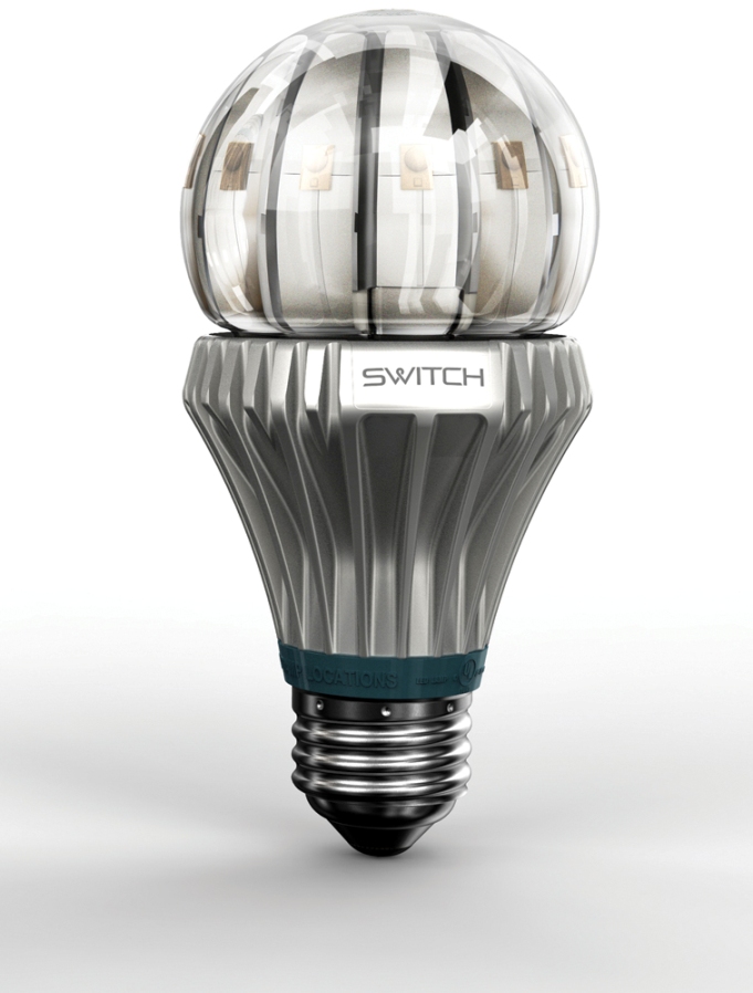
Our designers came up with a design as striking as the new technology. It is an industrial aesthetic concept with a sculptural aluminum base and a thick glass globe mounted on top that lets you peer inside to see the circuitry and other inner workings. Sort of a retro Star Wars look that telegraphs exactly what the product intends to deliver: a new lighting technology for a new way of thinking about energy and the environment. “It's like holding a snow globe with a sculptural base,” Elmer says, noting that design voice reflects the idea that “there hasn't been a product like this before” (and that it is worth the $35 to $40 the bulb will cost).
CONVICTION
Many clients come to me with a simple request. They obviously believe that sex sells, so they want their products to look sexy. We can do sexy, but quite honestly, that's not always the path to a successful product. The problem is not the design, but how design is regarded within the organization.
Great design (sexy or not) can be ineffectual if it is considered merely window dressing that a particular department wants to slap onto a product. This attitude often means that whatever design distinctiveness there is will be watered down along the way by engineering, manufacturing, marketing, or finance. There is always pressure to do this because of the competing entities within a company, each with its own goals and benchmarks. But creating really beautiful, ingenious, and charismatic products requires a corporate conviction that design matters, from the start, and that the company's design voice is paramount.
SUMMARY
To design like Apple, you must identify and define a clear, distinct, and singular voice that is used in a unified way throughout your company as the foundation of the design values and the lens through which customers see your products and services. Creating a design voice doesn't mean mimicking Apple's mantra of simplicity, but rather finding a voice that gives special meaning to your brand and represents the design values at all touch points of customer interaction.
THE BUILDING BLOCKS
Simply beautiful
is Apple's commitment to simplicity and the promise that each product will be beautiful to behold, but not in a superfluous or superficial way, but one that extends beyond looks to function.
Create your own voice
means establishing unique values for your company and brand that can be seen in your product and services and will always be linked to them.
Conviction
is having confidence in your design voice and ensuring that all teams understand and adhere to the voice and maintain it in all products and services.
DESIGN LIKE APPLE AGENDA
Notes
1 Holson, Laura M. “Putting a Bolder Face on Google.” New York Times, February 28, 2009.
2 Santoli, Michael. “Can The Gap Come Back?” Barron's, December 26, 2011.
3 Gladstone, Darren, “The MacBook Air-Dell Adamo Deathmatch,” PCWorld, April 9, 2009, www.pcworld.com/article/162909/the_macbook_airdell_adamo_deathmatch.html.
4 Hustwit, Gary. Objectified. Documentary. Plexi Productions, 2009.
5 Rams, Dieter, “Ten Principles for Good Design,” Vitsoe, www.vitsoe.com/en/gb/about/dieterrams/gooddesign.
6 Caplan, Ralph. Connections: The Work of Charles and Ray Eames. Frederick S. Wight Art Gallery, University of California, Los Angeles, 1977.
7 de Saint-Exupéry, Antoine. The Little Prince. San Diego: Harcourt Brace & Company, 1943.
8 Seed of Apple's Innovation,” BusinessWeek, October 12, 2004, www.businessweek.com/bwdaily/dnflash/oct2004/nf20041012_4018_db083.htm.