

Design Makes All the Difference
Beauty, ingenuity, and charisma create a unique competitive advantage.
The lesson to be learned from Apple's approach to design and its integration into the corporate culture is that design can make an enormous difference to a business. Apple is among a small number of public companies that have enthusiastically embraced design and invested in it as the single most important differentiating characteristic in their products and services. Design means that Apple products are unique and stand out in a crowd, from the minimalist styling and metal and glass enclosures to the seamless and fluid functioning of the software.
What do we really mean when we say design? The word is often used to describe many things. I think of design as both a process and an outcome. As a process, design is a verb, or how an object was created. As an outcome, design is a noun, the object itself, such as a computer or a lamp or a sofa. I'd like to add another meaning: Design as an experimental mind-set, a way of thinking about things that culminates in a fresh approach or in something new or innovative. Because Apple uses this full-court design approach to create its amazing products, I want to talk about the process and the outcomes to help you understand how to leverage design in your own work. First, let's break down the outcomes of Apple's design and development process into three elements—beauty, ingenuity, and charisma—and use them as lenses to consider and evaluate your own company's products and services.
There may be no better industry to illustrate how design makes a difference than the dynamic cell phone sector and the rise and fall of three of its battling handset titans: Motorola, Nokia, and Apple. Designers empathize with me when I relate this story about the different approaches to design that these companies used, and it's a great tale to get you thinking about the central role of design in bringing successful products to market.
“Good news,” said the engineering manager at Motorola proudly one day in the late 1990s when my firm was working with the company on designing a new family of cell phones. “We are going to use the same base for both phones,” he told me. “We'll be able to save millions in manufacturing.” At hearing these words my first thought was, yes, this is good news for him, the guy in charge of engineering. But for me it was a stark reminder of how little Motorola truly valued design. This decision signaled that the company was making another decision concerning product development based on elevating engineering and cost savings over design and striving for a result that would entice and delight customers.
But let's step back for a moment and look at the history to see how we got to that fateful moment.
At the time, LUNAR was working with Motorola to create new cell phone designs based on its then successful StarTAC platform, which was a slim, lightweight flip phone popular with mobile professionals. Motorola wanted to build on that success and attract a new and more diverse group of customers to its brand. Creating phone designs with different appearances—what we in the industry call “aesthetic expressions”—was a way to extend the brand to a wider audience, or so the thinking went at the time.
This design initiative came at the tail end of a much larger design strategy project that led to a vision for four unique brands targeting different consumer segments. LUNAR assembled a team of researchers to examine global consumer lifestyles and preferences, and from there we devised a set of design principles for the four consumer segments Motorola was trying to capture. This is one important aspect of a designer's job: to strategize with companies about their once and future products before actually going to the studio to design the products.
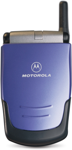
The Talkabout phone was an early step by Motorola to design products with more consumer appeal, though it lacked Apple-like commitment to making a stand out statement. Image: LUNAR
A suite of conceptual designs emerged from this process that embodied the varying principles or design language that would define the subbrands. These were early prototypical designs that would later be used as inspirations for a team of designers to create actual phones in harmony with the four design languages. This design strategy lets you coordinate the look and characteristics of an entire family of products, like Motorola's StarTAC line.
Once the design language was defined, we then applied those attributes to a version of the StarTAC phone called Talkabout, which targeted a customer group we were calling Active Networkers—those people who wanted a phone to connect to family and friends but who weren't especially interested in technology or extra gizmos. We gave this phone simple contemporary styling and fun colors like bright ocean blue. In parallel to our efforts, Motorola's internal team designed a version of the phone for another brand called Timeport, which had a trim look and silvery tones and was aimed at more demanding mobile professionals.
Because the guts for the all the phones were identical, the engineering manager I spoke with realized that he could save Motorola a ton of money by building just one version of the base of the flip phone. This base would be paired to either the Talkabout top or the Timeport top. The base remained the same, but the top changed. It had one body with a number of different heads, which is why I call this a Frankenstein approach to product design. And, like Frankenstein the monster, some of the phones looked a bit off: The head didn't fit the body.
Motorola created a Frankenstein phone because it regarded design as a marketing add-on. Its culture dictated that engineering decisions take top priority, sometimes at the expense of wowing customers. The customers wanted phones that were easy to use, that reflected their personality, and that had features meaningful to them. Even changing the outsides or the skins only vaguely addressed the desire for individual style.
Apple, by contrast, creates designs that have a deep and uncompromising aesthetic, unlike Motorola's ability to create a last-minute mash-up of a product.
This is not to say that I'm naive about the kind of pressures Motorola was facing and that confront every modern business. I know that the four C's—cost, competition, customers, and capability—weigh on an organization and its leadership on a daily basis, and that it's crucial to run an operational business that is attentive to all these factors. In that sense, the decision by the Motorola engineering manager was incredibly smart when considering the cost dimension. But what about the customer dimension? Motorola's engineering culture supported measurable, analytical decision making that favored bottom-line efficiencies above all else. Unfortunately, that orientation alone cannot produce products that captivate customers.
In contrast to this type of practice, Apple has a top-line orientation that leads to premium products with high profit margins that can be reinvested in development. I spoke about this with Tony Fadell, a former Apple executive who led the development of the iPod and the iPhone. “Everyone goes for market share, but Apple goes for margin,” Fadell told me. “We were happy to have a smaller percentage of the mobile phone market with iPhone because we made a higher percentage of the profit. And with all that money, you can invest in making the next great product.”
Having worked with Apple for many years as an outside design consultant, and through my conversations with former Apple engineers, I know that at Apple design is king. Creating products that rise to the level of insanely great is paramount to everything else. You can see this in a phone that feels like a solid piece of glass, or in a laptop computer that has backlit keys, or in a mouse with a touch-sensitive surface. In all these products, the cost dimension isn't allowed to overrun the design considerations. As an Apple engineer said to me, “Cost is for operations to figure out. Our job is to create the right product.”
THE SIREN SONG OF TECHNOLOGY
There is another aspect of this epic tale of cell phone giants that sheds light on design and technology and how they impact each other.
Engineering invention and ingenuity has driven much of Motorola's success since it was founded in 1928 as Galvin Manufacturing Corporation. In 1930, Galvin introduced the Motorola radio, one of the first commercially successful car radios. This was just the beginning for a company whose talented engineers would later produce the world's first commercial cellular device, among many other innovations. Creative engineering also led the company to the StarTAC, a phone that was ahead of its time in terms of size and weight. Although I disagreed with the engineer in charge about the decision to make Frankenstein phones, Motorola's engineering prowess is among the most impressive in the business, and that capability resulted in many outstanding products. One of these products was a phone called the RAZR V3—a complete reinvention of the flip phone expression. Introduced in 2004, it featured a surprisingly slim profile and a brushed metal housing that conveyed a sensual and sophisticated look customers loved.
Motorola's RAZR V3 made an impact with its slimness and ingenious use of materials but fell short of creating a lasting impression because of its clunky interface.
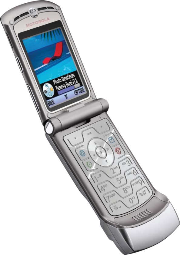
Yet the RAZR V3's beautiful shell hid a nagging problem that was rooted in Motorola's failure to incorporate design into its development process: The underlying user interface hadn't been revamped. I have always found this puzzling, because this situation created a disconnect between the phone's great looks and how it functioned. To understand how real people valued the appearance of the phone compared to its ease of use (what designers call usability), I created an informal, ad hoc research project.
“How do you like your phone?” I would randomly ask anyone whom I saw with a RAZR V3 in hand. An overwhelming majority of these people would look down at their phone, spin it in their hand, and say, “I love it!” Then I would ask, “What's it like to use?” The reaction was quite different. Frowns and complaints followed. Unprompted, a few people even showed me how hard it was to look up a phone number. What had gone wrong? My assessment is that Motorola's RAZR V3 used design on the surface to great success, but had not gone deeper to implement better design at all levels. The company was still making crucial decisions based on an engineering sensibility and operational limitations. The company's interface designers were saddled with an old operating system because management wouldn't make the investment to switch the brains of the phone to match the outstanding body.
In parallel to Motorola's cell phone problems, the Finnish company Nokia had gained fame and a global market by designing phones that resonated with customers on all levels. Unlike Motorola, the user interfaces on Nokia's phones were easy to navigate, and what's more the company was offering stylish handsets that were more like a personal accessory than an electronic device. Needless to say, customers loved everything about their Nokia phones.
Behind the scenes, another force was at work. Nokia was building phones based on newer digital transmission technology, while Motorola was standing by the older analog technology. Motorola's engineering leadership argued that analog was the way to keep going, because it offered the lowest-cost manufacturing and that, as a result, analog would win out. But Nokia rightly believed that digital would eventually empower all kinds of desirable services on the phone and that it would ultimately lead the way to richer customer experiences with the phone, such as the ubiquitous Internet-enabled smartphones we see today. Nokia also knew that initially, digital offered longer battery life, a feature that end user's would value highly. Nokia was right in the short term and also in its long-term hunches. It was an obvious decision in retrospect, but the basis for it is durable: Nokia was investing in what customers cared about rather than which technology was incumbent. The right design approach is to put the customer—not the technology or the company's operational capabilities—in the center of the development environment. Use the customer as the guide and the audience for everything. Nokia was living up to its tagline: Connecting People.
Too often, companies like Motorola look at their technology base as the source for what they can make. In other words, they are following the siren song of technology and deploying design in only a partial way. The result is therefore only partially successful—in blips, you could say. The StarTAC was ingenious in its use of technology. Blip. The RAZR V3 leveraged that ingenuity and added a sleek beauty. Blip, blip. Motorola's adoption of the Android operating system on phones that leverage their engineering capabilities points to a company that has learned to use design to connect with customers.
Apple's iPhone did all these things from the start. It is one of those products that come along every now and then to change an industry and the way we live. At the heart of this change was how Apple used design to rethink what a phone is and what it can deliver. First, Apple engineers created a physical design that attracted us. Then they brought technology in line with how they wanted people to experience it. Through the simple software, the model of useful little apps, and the whole Apple brand experience, iPhone bonded with customers and created an in-depth connection. In sum, I see how Apple used design to create a product with beauty, ingenuity, and charisma. These three qualities can result only when you are committed to creating extreme emotional engagement through the design of your products.
You might think that extreme emotional engagement is something that just happens spontaneously or by chance, like falling in love. Is it possible to intentionally design something like a cell phone so that it generates an emotional response? Cognitive scientist Don Norman writes in his book Emotional Design that there are three emotional processes at work when we encounter the world around us: behavioral, visceral, and reflective. We're always sizing up things in the world to determine whether they might be useful, comfortable, delicious, desirable, puzzling, funny, or any of a thousand other descriptions. And we're continuously shifting between the three different emotional modes in concert with the things and situations we encounter.1 Norman argues that a product triggers emotional responses, and whether we pay attention or not depends on our fight-or-flight responses. If you're aware of this connection and use design skillfully, you can invoke these trigger responses.
At LUNAR, we occasionally go through an exercise to make sure that our creative juices keep flowing. It's called Moonshine, but doesn't involve bootleg booze. We believe it's crucial for creative people to have the time and space sometimes to exercise their creative muscles, to look outside the challenges posed by our clients, and to develop their own ideas. This way, they are stimulated to explore any number of new ways of applying design. Fascinated by Norman's academic description of how the design of an object can connect emotionally, we enlisted the Moonshine tradition to create a response to his book.
Our designers posed a range of questions to try our hand at isolating the three responses in people, and we settled on focusing on three: 1 What if we just admitted that the chair we have in the bedroom is for holding dirty clothes instead of for sitting? 2 What would a trash can look like if it were designed to make you want to throw things into it? 3 How could we transform the most mundane household object into sculpture?
Our Moonshine experiment led to some interesting results that we believe validated Norman's cognitive framework. The Hanger Chair, as we call it, is evocative of a chair, but it is clearly more useful for hanging clothes. Playing with the icon of a chair and the wire hanger, this design forces the viewer into a reflective mode. The Trash Hole is a wastebasket that creates an inviting target and urges you to hit the basket with that crumpled-up paper. A sink stopper we jokingly called Water Stopping Water reinterprets the conventional household product by borrowing the form from a water droplet frozen in midsplash.
The Trash Hole plays with the idea of the conventional trash can, making the target opening vertical. Image: LUNAR
The Hanger Chair resembles the side chair we all have in our bedrooms, but acknowledges its real purpose: temporarily storing clothes. Image: LUNAR

This concept for a sink stopper uses design to surprise us, transforming a mundane object into sculpture. Image: LUNAR

We asked ourselves a number of questions about these products. What emotional responses do you encounter when you look at these concepts? Does the Hanger Chair make you laugh because of the way it visually pokes fun at your messy habit? Is the Trash Hole engaging your desire to play a game and tempting you to throw something through its target? Does Water Stopping Water make you smile because it has managed to freeze water in midsplash? These are the kinds of questions and responses that design can engender.
All of these ideas are striking because they stand out from the usual and connect to the customer in an unusual way. Nancy Duarte, a consultant who helps corporate leaders create compelling and persuasive presentations through the lens of storytelling, says in her book Resonate that because so many products are similar, “the one that makes an emotional connection wins.”2 Let's look at how extreme emotional engagement shows up in Apple designs.
BEAUTY
It's an old cliché but still true: You have only one chance to make a great first impression. When customers first encounter your product, service, or experience, they will size it up first for its aesthetic attractiveness. Do they find it beautiful, sophisticated, cute, novel, or serious in the way it looks or feels? This is not an exhaustive list, but the point here is that the aesthetic attributes of a product matter in the way that we perceive it. And whether or not you pay attention to it, the expression of your products will elicit an emotional response in the people you're trying to attract. We can think of the term beauty as a way to refer to any extreme emotional engagement created by the aesthetic attractiveness of a product.
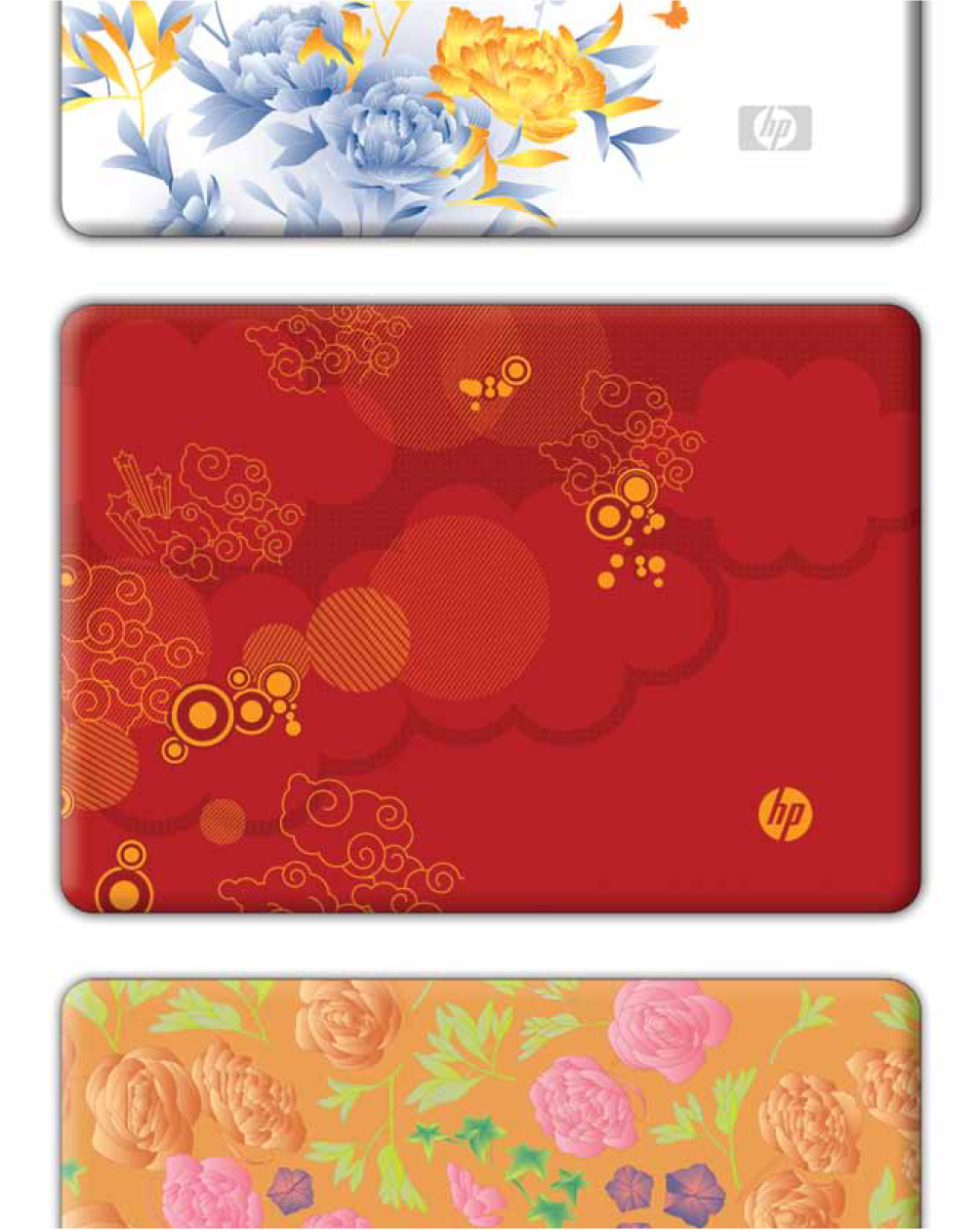
One day I bumped into a friend and noticed she had a new Hewlett-Packard notebook computer featuring graphic patterns that LUNAR had helped design. I shared with her some of the backstage stories about how those beautiful graphics found their way into the computer—the months of work developing a graphic pattern, working with manufacturers to reproduce the pattern faithfully and beautifully, and making adjustments to the pattern to account for the technical aspects of tooling. She was amazed. “Why go to all that trouble just for a PC, something that I buy solely for its function?” she wondered aloud. When I asked her about what her checklist included when she set out to buy a PC, we ended up talking about her technical requirements. But when I asked her why she chose HP, her answer was short and to the point. “Because it looks so cool,” she responded.
Clearly, it was worthwhile for HP to have invested in the design of the patterns, because it created an extreme emotional engagement in a world of exceptionally similar offerings. Motorola's RAZR V3 did the same thing: It had beauty. It tapped into this human response and by so doing broke the mold for a cell phone. The RAZR V3's amazing thinness and extraordinary metal finish surprised us. We marveled at the surfaces and stopped to think about how all that technology fit into such a slim package. We couldn't help but touch it to see how it felt and to explore how those buttons managed to give a satisfying click feedback even though they were so impossibly thin.
Apple understands these principles and uses design to trigger our emotional reactions in dozens of ways. Consider these three dominant design cues in the Apple products you've seen and might even have in your possession:
Thin.
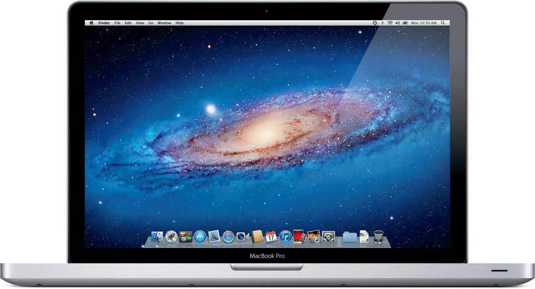
In products of all kinds (and especially in technology products), thin profiles where we might otherwise expect a thick one surprise and attract us. Engineers work hard to pack electronics into very slim packages—and designers support that effect with illusions in the design. The bright metal band around the iPhone 4 and 4S masks the true overall thickness of the phone, just like the flat edge on the MacBook Pro gives the impression that it represents the total thickness of the machine, even though the product bulges out to a dimension that can fit all of the electronics. The backs of the iPad 2 and its successor use a tapering effect that thins out to a knife-edge to achieve the same impression.
These HP notebooks use beautiful graphic patterns to differentiate from their competition, skillfully elevating technology products to an emotional purchase. Image: LUNAR
Tactile.
Apple pays close attention to how its products feel, both physically and virtually. The widespread use of metal and glass enhances that solid feel to convey the impression that it is one solid thing rather than a box wrapped around a bunch of components. On the screen, we are delighted by how the user interface has been designed to move and transform like objects in the real world. For example, when an application is minimized, it becomes a fluid shape that appears to get sucked down into an icon at the bottom of the screen. This offers a visual cue so that we know where to find it again. As humans, we are highly sensory, so these design attributes help us relate to the technology in a beautiful way.
Simple.
Apple's single most defining designer attribute is simplicity. The forms of every Apple product are geometric, symmetrical, and aligned to create a purity that is hard to copy. The mouse with only one button. The track pad with no apparent buttons. The bottom of the laptop that is stripped of all the clutter often found there in competitors' products. Even the product labels that are required by law are silkscreened onto housings in a type so faint it is hard to read with the naked eye. On my MacBook Pro, the edges of the keyboard align with the width of the screen hinge and also align, amazingly, with the width of the page in my word processing software. This simplicity touches everything that Apple designs, including the retail stores, which make me feel like I've walked into a contemporary art museum. In 2011, I was in the Apple Store in the Stanford Shopping Center in California that had a lighting effect on the ceiling that was incredibly even. I couldn't figure out how light reflected onto that surface so cleanly—until I realized that the entire ceiling was a translucent panel and the lighting was coming from above it. You could say, well, why bother with such design details when you're only selling a computer? But it's the attention to all of these details that together support Apple's commitment to beauty.
Apple designers maximize a perception of thinness in the MacBook Pro by emphasizing a thin belt of aluminum and by hiding the remaining thickness in a tapered shape on the bottom. Image: Apple Inc.
INGENUITY
Apple's iPhone 4S is a beautiful object. You hold it in your hand and marvel at its solid feel and glossy surface. And when you turn it on you recognize something else: its ingenuity. You hear the built-in voice-recognition system called Siri, which is ready to help you with any question, almost as if you had the concierge at a Four Seasons Hotel always available in your pocket. Ingenuity goes beyond mere invention. It's the way in which smarts—often technical and natural—are applied to solve problems in ways that amaze, surprise, and delight us. It's the way that complexity becomes simple elegance in the hands of a customer to create extreme emotional engagement.
Plenty of companies pour money into research and development, just like Apple does. But there are some hallmarks of the Apple approach that put technology in a place to really make a difference. The kind of invention that Apple uses qualifies as ingenious innovation. It's the kind of innovation that creates value for people and helps companies capture that value. In big ways and small, Apple's products embody ingenuity.
Ingenuity doesn't always depend on a new supporting technology. Sometimes ingenious solutions come from applying existing components in new ways. The breakthrough of the iPod was that Apple stitched together the bits and pieces that other MP3 players were using into a system that people understood.
Consider some of the ways that Apple has delivered ingenuity in its products:
Human.
Apple prizes making complex technology conform to the way that humans naturally work with the world. The handwriting technology behind (the failed) Newton personal digital assistant and the (more successful) voice recognition concierge Siri are perfect examples. Siri is a complex system working behind the scenes that makes interacting with a phone more like a human interaction, as well as easier and even fun. The gestural inputs that Apple is teaching us on the iPhone and other devices taps into our extraordinarily sophisticated hands. As Steve Jobs put it when addressing the 1997 World Wide Developers Conference, “You've got to start with the customer experience and work back toward the technology.”3
Craft.
Much of Apple's ingenuity shows up in the execution and delivery of the beautifully crafted final product. Most manufacturers try to create designs that will accommodate the manufacturing tooling; Apple has always looked at tooling as a means to the right end. Traditionally, plastic enclosures for electronics products have side surfaces that are slightly angled. This angle is a requirement of the way that the molds for plastic parts are made most cheaply. But to the trained eye, that small angle is visible. When Apple wanted plastic computer cases with perfectly perpendicular sides, more expensive tooling was required. Apple's priority is creating an end product that embodies the vision. It doesn't tailor the vision for the conveniences of the manufacturing processes.
Elegance.
At every turn, Apple solves problems simply, or at least the solutions appear to be simple, although the reality is that a great deal of effort is put into making it seem that way. That's elegance: simple solutions for complex problems. Other computer makers build latches in their laptops to hold the screen closed against the keyboard, but Apple was the first company to engineer a complex hinge that employs cams and springs to hold the screen shut. Those mechanisms are perfectly tuned to be strong enough to keep the screen closed but also weak enough to allow you to open them without lifting the bottom half of the laptop in the process.
The lesson here is that you have to strive for more than just technical excellence and invention. Never fall in love with technology for technology's sake; technology is merely a means to creating incredible utility that appeals to people. This is a common problem in Silicon Valley: entrepreneurs create a new technology and believe that there will be an instant market for it. As these stories suggest, when technology is coupled with innovation and great design, winning products are the result.
Another company that effectively deploys design and ingenuity is Method Products, the San Francisco-based maker of home-care and personal products, from laundry detergents to hand soaps to sanitizers. It's certainly not a high-tech company, but Method is always looking for ways to marry technology with design and innovation to entice the consumer to reach for its products. In this case, they are cleaning products, where innovation is subtle and aimed directly at responding to basic human needs to keep clothes and our bodies clean.
Consider laundry detergent. Since its founding a decade ago, Method has made advances in this category by questioning industry assumptions. In 2004, Method launched a laundry detergent with a three-times-concentrated liquid that enabled the company to shrink the package by one-third, which saved on the use of plastic, transportation costs, and water (which is the main ingredient in most laundry detergents). A concentrated detergent also played into Method's commitment to sustainability and, in turn, made retailers happy because they could save on shelf space.
The Method Laundry Detergent bottle brings ingenuity to a daily chore. Highly concentrated detergent means less packaging waste, and the one-handed pump action eliminates messy drips. Image: Method

But with an Apple-like drive toward ingenuity, Method wanted to go further with the concept of a concentrated detergent. It developed an eight-times-concentrated detergent. The problem, however, was how to dispense the plant-based liquid detergent, because existing delivery devices didn't fit the technological advance. Method experimented with soluble pellets, a delivery system that had always dogged detergent manufacturers, because pellets don't always dissolve completely. “We were left with a concentrated form but no way to deliver it,” recalls Joshua Handy, Method's vice president of industrial design and innovation.
After several years and much tinkering and experimentation, the idea surfaced for a pump bottle dispenser. This would give consumers an easy and accurate way to dose the amount of detergent needed “even while blindfolded and holding a baby,” Handy jokes. It would also solve the big problem of overdosing while ensuring that the detergent got where it was supposed to go and dissolved properly. Ingenious.
Now let me tell you a story about how ingenuity sometimes doesn't work. A novel technology doesn't always mean it's an ingenious product. Just because you have a patent for a great new technology doesn't mean you have a product. Take robots. In 1999, an inventor who had built a residential robot prototype came calling at LUNAR for help. He wanted the robot, which he claimed could do household chores and even fetch beers from the fridge, to be prepped for commercial delivery.
Everyone loves robots. Ever since Isaac Asimov wrote about them in the 1950s, robots have captured our collective imagination about what the future holds. And this inventor had certainly captured my attention. Nonetheless, I had some important questions to ask, like the ones I always ask potential clients at the start an engagement—factual stuff that helps me to understand where our firm could best be of service. Does your prototype work? What are your projected costs, and who is your target buyer? What is the business model and value proposition? By the time we'd asked the last question, the robot inventor was exceptionally frustrated. He didn't have sufficient answers, and he cut off the conversation. “I am looking for a firm that just gets it,” he fumed.
In its search for the killer app for robots, Willow Garage is opening up the challenge to a broad community with its Personal Robot 2—a platform for experimentation and innovation. Image: Willow Garage

Like many inventors, this guy was blinded, I think, by the siren song of the technology. Yet, as with a lot of technology that we can easily envision as the next big thing, robots have always been just around the corner. This inventor was angry because he couldn't answer my questions about the product. I suspect he assumed my queries were getting in the way of his quest to equip every home in America with a walking, talking household helper, when in fact I was hoping to help steer his passion toward something that would be meaningful to people rather than being merely a novelty.
Willow Garage is another company with a gang of technologists who are pursuing the illusive robotic future. Founded in 2006 and based in Menlo Park, California, in the heart of Silicon Valley, Willow Garage uses a crowdsourcing approach to technology development. This company has created a personal robot that rolls around on wheels and is packed full of sensors and has arms and interchangeable “hands” for a variety of tasks. Sounds promising. Yet Willow Garage hasn't clearly defined what the robot is good at, nor is the company programming it for specific tasks. Instead, the idea is to form a community of researchers and developers who will create programs—apps, if you will—for the robot. This is an open-sourced platform approach to technology development that might just uncover the killer application for a domestic robot.
In 2011, Willow Garage spun off a company called Suitable Technologies to focus on building robots that will serve as remote avatars for people working away from their office who want to get more of the intangible benefits that come from being there in person. Armed with a camera, screen, speakers, and a microphone, these robots are essentially rolling videoconferencing machines, driven around by employees working from a remote location. The premise is that when you can't be in your office, you miss out on face-to-face interactions and bumping into people in the hallway. Without being there in the room, you can't turn to face people when you talk to them. This robot promises to be our surrogate body carrying our head, eyes, and ears around wherever we want to go.
While it's fun to think about the future of the workplace with this kind of technology, I wonder if these inventions will have staying power once the novelty wears off. Even more, I wonder how we might use different technology—perhaps nonrobotic technology—to design even better connections between people than are achievable by mimicking human movements with a surrogate robot. For example, if screen and camera combos became prolific in a building, and especially in conference rooms, I could “attend” more than one meeting at a time without having to drive a robot between them.
The search for an ingenious application of robotic technology for the home or office continues, and the open-source approach of Willow Garage is widening that search. But it's not pure invention that constitutes problem solving that makes a difference. Real ingenuity is a clever, brilliant solution that surprises us by how simply and naturally it caters to our needs.
CHARISMA
We often say that politicians are popular because they have charisma, that certain spark of charm and attractiveness. We also know when they don't have charisma because we see they can't relate or connect to the public in an easy and natural way. Something is missing. In that sense, you could say that charisma is the sum total of the great experiences surrounding politicians, be it their hair and ambiance, their personal story and family, and of course their policies. Charisma is a feeling you get from this person. The same is true of products and companies.
Charisma is the positive characteristic of the very best companies that creates an extreme emotional engagement for customers. Products and services exhibit charisma when they consistently behave in a way that demonstrates an interest in me and my needs and, at the same time, exhibit what I call a leadership personality. These can be small things, as when my Wells Fargo ATM learns my behaviors and offers me meaningful shortcuts to improve banking services. Or for larger reasons, as when I urge friends to stay at Ace Hotels because they offer a charismatic experience, which has converted me from a customer into an advocate for the brand. That is the power of charisma.
Politicians make you feel that you are the center of the universe, and great products do, too. But it can be tough for companies to erase a long-standing charisma deficit—even if they come up with a winning product. That's what happened to Microsoft in 2006 after it finally launched its version of a portable music player called Zune a full six years after Apple revolutionized the industry with the iPod. Being so late to the party, it wasn't at all surprising that Microsoft let Zune fade away as a stand-alone product by inserting it in its smartphone operating system: The Windows Phone operating system launched in 2011.
Both of these Microsoft entries (Zune and Windows Phone) were strong products and received high praise from many customers and industry followers. A classmate of mine from Stanford, Albert Shum, who had led the development of the Windows Phone operating system, sent me a demo phone to try out. My assessment was that Shum and his team had created a beautiful, thoughtful interface that could be a contender. But even with such a promising product that created a standout user experience from all angles, Microsoft is still having trouble making a dent in either the portable music player or mobile smartphone markets. What's the problem?
I say that Microsoft lacks the charisma it needs to get over the hurdle of being late to these markets. After nearly 40 years of demonstrating to the world a lack of coolness, a company like Microsoft can't easily convince the world that it is suddenly very sexy. Lack of charisma is just as powerful a momentum as having charisma to spare. Even technically excellent products won't be able to counteract a charisma deficit.
The charisma problem became the background to what has been an ongoing battle between Apple and Microsoft over the past decades—that is, and the battle between the charismatic Steve Jobs and the less-than-charismatic Bill Gates. The almost comical fight has been played out in nasty comments on both sides and in ads, such as Apple's “Mac versus PC” campaign, which perfectly captured the cool versus uncool aura surrounding each company. Jobs perhaps summarized his opinion most clearly when he pointed out in the 1996 documentary film Triumph of the Nerds, that “[Microsoft] has absolutely no taste. And I don't mean that in a small way, I mean that in a big way, in the sense that they don't think of original ideas, and they don't bring much culture into their products.”4 In his own polarizing way, what Jobs was really talking about was charisma.
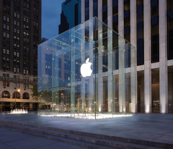
Apple's Fifth Avenue Store in New York City is as carefully designed and executed as any Apple product. Image: Apple Inc.
Some companies and brands (and people) have a natural charisma, a built-in charm that is part of their DNA. But more often than not, it takes time and resources, smarts, and determined leadership to build and sustain the kind of charisma that Apple has. A commitment to design over such a long period of time has created a cocoon of charisma around Apple that sticks. Discipline and focus add to that image. You detect that confidence and cool and aura of invincibility every time you see or place an Apple product in your hand.
Remember that Apple is one of the most valuable companies in the world, even though it sells only a handful of products. As Tim Cook, Apple's CEO who took over after Jobs's death in 2011, pointed out at a Goldman Sachs technology conference in 2010, “We can put all our products on the table you're sitting at. Those products together sell $40 billion per year. No other company can make that claim except perhaps an oil company. We are the most focused company that I know of, or have read of, or have any knowledge of. We say no to good ideas every day; we say no to great ideas, to keep the number of things we focus on small in number.”5
Step into an Apple Store anywhere in the world and you will understand how this intense focus plays out when the product meets the customer. The store is not merely a place to sell you a computer or an iPod. You can buy those things online or at other retailers. The Apple Store is the beautiful embodiment of the Apple brand and a wonderland where consumers can experience products, get help, and even attend classes and other events in an open, airy, and beautifully designed space. Apple recognizes that the future of retail resides is leveraging three things—place, people, and product—in a way that cannot be replicated by competitors or even by its own online store.
The Genius Bar in every store is just that, pure genius. Customers are lured to the store for free assistance with their Apple stuff, and in the process they are exposed to all the wonderful new products, accessories, and services that Apple offers. Moreover, the geniuses behind the Genius Bar have one-to-one access with their customers, thus creating the perfect sales situation for technology products that many customers find confusing. Who better to recommend the right (Apple) product than a “Genius,” in one the softest sells in retail?
Apple Stores maximize the best things about a store and minimize the minutiae. Products (it's all about the products, after all) are laid out on white tables like objects in a museum that you can walk around and observe and, of course, touch to give you the hands-on experience. The youthful sales team is friendly and knowledgeable and never pushy. They are equipped with portable scanners to help complete the purchase and get you out the door. How about an e-mailed receipt? Absolutely! Apple wants to suck you into the store to buy the product and then get you home and using it with the utmost speed. That's part of the total experience that creates charisma.
Apple used the same formula when it entered the portable music player market, in its own unique way, of course. Unlike the competition, Apple didn't focus only on the music player and its features and functions. As usual it looked at designing the entire experience of managing digital music, from downloading tunes to the device and then accessing these tunes on the go. What's more, because your Apple computer would be the hub of the system, the company shifted some of the usability load to the PC where the big screen, keyboard, and mouse helped ease some of the usual pain points along the way. The iPod software was minimized to focus on music playback, while iTunes on the computer was the central manager and the place where customers could buy their music. A Windows version of iTunes and the iTunes store followed.
With all the pieces of the experience in place, Apple was able to capitalize on the ecosystem it had created, which was founded on the initial observation that digital music could be better. And it was better; after all, you could get “1,000 songs in your pocket,” as the Apple ad so rightly promised, summing up the iPod experience with a simple, insightful, and charismatic slogan.
Then there's the secrecy. Secrecy creates a mystique around the company and the products, especially when new ones are introduced. Apple, in fact, is the ultimate secret corporate machine, rivaled only by spy agencies and Willy Wonka's chocolate factory. Little if any information leaks out of Apple headquarters in Cupertino, and employees are sworn to a Sopranos-like cult of secrecy. With so few products and such a high premium on people (from customers to financial analysts) wanting to know what Apple will do next, Apple goes to extreme measures to protect information about product planning and development initiatives.
A former Apple engineer told me that engineers are given access to only the part of a product that they are working on. Only a handful of people see the whole product. Apple Global Security personnel deliver new products to stores in locked cases. One person at Apple, who was of course sworn to secrecy and couldn't reveal his name, summed up the company's core values for me this way: “Secrecy, teamwork, quality.” Secrecy is a primary value that adds to Apple's charisma account.
That's especially important to build anticipation for product launches. To Apple's legions of fans and devotees—as well as stock market watchers—life revolves around the constant buzz and speculation about the company's next moves. When a product does make its debut, Apple goes all out to maximize the excitement. Steve Jobs, always the showboater, was a master at orchestrating these shows and milking the crowd for acclaim. Dressed in his Apple outfit of blue jeans and an Issey Miyake black turtleneck, he knew how to work the crowd and get them off their feet to see the latest Apple product. It's only a phone, of course, but with the charismatic impact of the company, the brand, the product, and the famous logo—not to mention Jobs himself—that phone became an instant star.
SUMMARY
Design can make all the difference to your company at the top and bottom lines if you embrace and leverage the power of design to create extreme emotional engagement. To achieve this, beauty, ingenuity, and charisma must become part of every product, service, and customer touch point. Once this is achieved, your products and services will stand out in even the most crowded field.
THE BUILDING BLOCKS
Beauty
creates a remarkable and unmistakable first and lasting impression through the qualities of aesthetic attraction. Apple does this by focusing on principles such as thinness; the tactile feel of the product; and the all-important simplicity, with a focus on forms that are geometric and symmetric.
Ingenuity
is a path that leads to emotional technology. New technology must always be human-centered, approachable, and natural for people to understand and use. Technology can surprise and delight customers, but the siren song of technology (robots anyone?) can lead us astray and away from immediate desires (more tablets, please).
Charisma
will be the result if you pay close attention to the relationship you are creating with your customers through every touch point. A product with charisma has a certain mystique and charm, and a bit of secrecy about the company adds to that allure and builds expectations. A charismatic product makes the customer feel like the center of the universe.
DESIGN LIKE APPLE AGENDA
Before moving on to the second principle in Chapter 2, take a moment to answers these questions about your own projects and the products of your company:
Now let's turn our attention to designing an agile organization that will be the framework for the value that design can create.
Notes
1 Norman, Donald A. Emotional Design: Why We Love or Hate Everyday Things. New York: Basic Books, 2004.
2 Duarte, Nancy. Resonate: Present Visual Stories That Transform Audiences. Hoboken, New Jersey: John Wiley & Sons Inc., 2010.
3 Jobs, Steve. World Wide Developers Conference. California, 1997.
4 Cringely, Robert. Triumph of the Nerds: The Rise of Accidental Empires. Documentary. Oregon Public Broadcasting, 1996.
5 Cook, Tim. Goldman Sachs Technology and Internet Conference. San Francisco, California, 2010.