CHAPTER 7
Camera
Whenever a scene is photographed, all of the objects in the scene obviously have been filmed with the same camera so they all share the same “look.” When two layers are shot with different cameras on different film stocks and then later composited, the film and camera lens differences can defeat the photo-realism of the composite. This chapter explores the issues of camera lens effects such as focus, depth of field, and lens flares, as well as film grain characteristics and how to get a better match between disparate layers. The ultimate objective here is to make the composited shot look as if all the objects in the scene were photographed together with the same camera lens and film stock.
One of the worst offenders in this area is, of course, cgi. Not only does the cgi have no grain, it also has no lens. While the cgi is rendered with a user-specified computer-simulated lens, these are mathematically perfect simulations that have none of the flaws and optical aberrations that characterize real lenses. Further, cgi lenses are perfectly sharp, and real lenses are not. The sharp edges in a 2k film frame will be a few pixels wide, but the same sharp edge in a 2k cgi render will be exactly one pixel wide. Even if the cgi element is rendered with a depth of field effect, the in-focus parts of the element will be razor sharp. The cgi element will appear too stark and crisp when composited into a film background.
Blurring the cgi render will work, but is very inefficient. A great deal of computing time has been invested to render all that fine detail, so it would be a shame to turn around and destroy it in the composite with a blur to make it look right. Better to render a somewhat lower-resolution version, around 70 percent of the final size, and then scale it up. This will both soften the element and cut the rendering time nearly in half.
7.1 Matching the Focus
There are algorithms that will effectively simulate a defocus operation on an image, but most software packages don't have them, so the diligent digital compositor must resort to a blur operation. At first glance, under most circumstances, a simple blur seems to simulate a defocus fairly well. But it does have serious limitations, and under many circumstances the blur fails quite miserably. This section explains why the blur alone often fails and offers more sophisticated approaches to achieve a better simulation of a defocused image, as well as methods for animating the defocus for a focus pull. Sometimes the focus match problem requires an image to be sharpened instead, so the pitfalls and procedures of this operation are also explored.
7.1.1 Using a Blur for Defocus
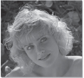
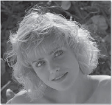
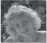
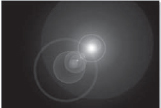
Photographing a picture out of focus will make it blurry, but blurring a picture does not make it out of focus. The differences are easy to see with side-by-side comparisons using the festive outdoor lighting element shown in Figure 7-1. The stark lights over a black background are an extreme example that helps to reveal the defocus behavior clearly. In Figure 7-2 a blur was used to create an “out of focus” version, and Figure 7-3 is a real out of focus photograph of the same subject. The lights did not simply get fuzzy and dim as they do in the blur, but seem to swell or expand while retaining a surprising degree of sharpness. Increasing the brightness of the blurred version might seem like it would help, but the issues are far more complex than that, as usual. Obviously, the simple blurred version is a poor approximate of the real out of focus photograph.
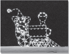

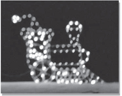
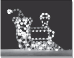
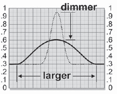
Figure 7-5: Results of a Blur Operation
With the blur operation each pixel is simply averaged with its neighbors, so bright regions seem to get larger, but they get dimmer as well. Figure 7-5 illustrates the larger and dimmer tradeoffs that occur when a blur is run over a small bright spot. The original bright pixels at the center of the bright spot (the dotted line) have become averaged with the darker pixels around it, resulting in lower pixel values for the bright spot. The larger the blur radius, the larger and dimmer the bright spots will become. The smaller and brighter an element is, the less realistic it will appear when blurred.
When a picture is actually photographed out of focus, however, the brighter parts of the picture expand to engulf the darker regions. Compare the size of the bright lights between Figure 7-2 and Figure 7-3. The lights are much larger and brighter with the true defocus. Even midtones will expand if they are adjacent to a darker region. In other words, a defocus favors the brighter parts of the picture at the expense of the darker parts. The reason for this can be seen in Figure 7-6. The light rays that were originally focused onto a small bright spot spread out to cover a much larger area, exposing over any adjacent dark regions. If the focused bright spot is not clipped, the defocused brightness will drop a bit, as shown in Figure 7-6, because the light rays are being spread out over a larger area of the negative, exposing it a bit less. The edges will stay fairly sharp, however, unlike the blur. If the focused bright spot is so bright that it is clipped (which frequently happens), then the defocused bright spot will likely stay clipped too, depending on the actual brightness of the light source.
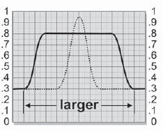
Figure 7-6: Results of a Defocus
7.1.2 How to Simulate a Defocus
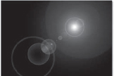
Very few software packages have a serious defocus operation, so you will most likely have to use a blur. The key to making a blurred image look more like a defocus is to simulate the characteristic expansion of the brights. This can be done with an edge processing operation that expands the bright, or maximum, parts of the picture. This is not the “maximum” operation that simply selects the maximum brightness pixel between two input images. It is a type of convolution kernel that compares the values of adjacent pixels and expands the bright regions at the expense of the darker, similar to a real defocus. A flowgraph of the sequence of defocus operations is shown in Figure 7-7. After the edge processing operation is used to expand the brights, the image is then blurred to introduce the necessary loss of detail. The results of this faux defocus process are shown in Figure 7-4. Although it is not a perfect simulation of the out of focus photograph, it is much better than a simple blur.
If your software does not have a suitable edge processing operation there is a work-around called the “pixel shift” method. A couple of pixel shifts “max'd” together with maximum nodes will give a rough approximation of expanding the brights with edge processing. When a layer is shifted by a few pixels and then max'd with the original unshifted layer, the brighter pixels of the two layers are retained at the expense of the darker pixels. This is a crude simulation of spreading the incoming light around to a larger area with a defocus. Pixel shift operations are suggested for shifting the image because they are integer operations and are therefore computationally much faster than floating point image translations.
A flowgraph of the pixel shift sequence of operations is shown in Figure 7-8, and the associated sequence of images is shown in Figure 7-9 through Figure 7-12. Working through the flowgraph in Figure 7-8, it starts with the original star image shown in Figure 7-9. The star is shifted horizontally, then max'd with the original star at “max 2,” with the results shown in Figure 7-10. Next it is shifted vertically and max'd with the “max 2” version at “max 4,” with the results shown in Figure 7-11. The “max 4” version is then blurred, with the results of the final defocus image in Figure 7-12.
For comparison, Figure 7-13 shows the same star with just a blur operation. It has actually “shrunk” visually compared to the original star in Figure 7-9, and is not nearly as enlarged as the final blurred star in Figure 7-12, which has had the benefit of the simulated brightness expansion. The pixel-shifted version may not be as good as a true edge-processing version, but it certainly looks better than just a plain blur.
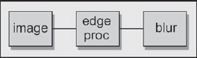
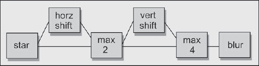
Figure 7-8: Flowgraph of Four Max'd Images


One problem with this pixel shift work-around is with small details, such as the very tips of the stars. You can see the “double printing” of the star tips in Figure 7-11. There are dark pixels between the double tips, but with a real edge processing operation there would not be. As a result, when the pixel shift version is blurred, the tips are a bit darker and blunter than they should be. This will rarely be an issue, but you should always be aware of the artifacts of any process you are using.
One last thought here. The wise digital artist always tries the simplest solution to a problem first, and if that doesn't work, only then moves on to the more complex solutions. For many normally exposed shots with limited contrast range the simple blur will produce acceptable results and should always be tried first. High contrast shots will fare the worst, so if the simple blur doesn't cut it, only then move up to the more complex solution.

7.1.3 Focus Pull
Sometimes a shot requires the focus to be animated during the shot to follow the action. This is called a focus pull or a follow focus. To simulate a focus pull, both the blur and the expansion of the brights must be animated—and animated together. The animation must also be floating point animation, not integer. An integer-based operation is one that can change only one full unit (pixel) at a time, such as a blur radius of 3, 4, or 5, rather than floating point values of 3.1, 3.2, or 3.3. The integer-based operations result in one pixel “jumps” between frames as you try to animate them. Many software packages do not support floating point edge processing or a floating point blur radius. You may need a work-around for one or both of these limitations.
The work-around for the lack of a floating point blur operation is to use a scaling operation instead of a blur. Scaling operations are always floating point. The idea is that instead of blurring an image with a radius of 2, you can scale it down by 50 percent, then scale it back up to its original size. The scaling operation will have filtered (averaged) the pixels together, similar to a blur operation. The more you scale it down, the greater the resulting “blur” will be when it is scaled back to original size. By the by, if your blur routines run slowly when doing very large blurs, try scaling the image down to, say, 20 percent of its size, running a small blur radius, and then scaling it back to 100 percent. This sequence of operations may actually run much faster than the large blur radius on the full sized image.
The work-around for the integer-based pixel shift operation is to switch to a floating point translation (pan) operation to move the layers. The floating point translation operation can be animated smoothly while the pixel shift cannot, so the amount of “enlargement” horizontally and vertically becomes smooth and easy to control.
7.1.4 Sharpening
Occasionally an element you are working with is too soft to match the rest of the shot. Image sharpening is the solution to this problem. Virtually any compositing software package will have an image sharpening operation, but it is important to understand the limitations and artifacts of this process. There are many.
7.1.4.1 Sharpening Kernels
Sharpening operations do not really sharpen the picture in the sense of actually reversing the effects of being out of focus. Reversing the effects of defocus is possible, but it requires Fourier transforms, complex algorithms not normally found in compositing packages. What sharpening operations do mathematically is simply increase the difference between adjacent pixels. That's all. Increasing the difference between adjacent pixels has the effect of making the picture look sharper to the eye, but it is just an image processing trick.
One consequence of this digital chicanery is that the sharpening will start to develop artifacts and look “edgy” if pushed too far. A particularly hideous example of an over-sharpened image can be seen in Figure 7-16. The original image in Figure 7-14 has been nicely sharpened in Figure 7-15, so sharpening can work fine if not overdone.
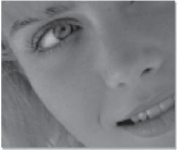
How the sharpening operation produces that edgy look can be seen in Figure 7-18, an over-sharpened version of the close-up in Figure 7-17. You can actually see the behavior of the algorithm as it increases the difference between adjacent pixels, but at the expense of introducing the contrasty edges. Notice also that the smooth pixels of the skin have also been sharpened and start taking on a rough look.
Now you see what I meant when I said that sharpening does not actually increase the sharpness of the picture, it just increases the difference between adjacent pixels, which tends to look sharper to the eye. Cheap trick. The other thing to keep in mind is that as the image is sharpened, so is the film grain or video noise. The artifacts are what limit how far you can go with image sharpening.
7.1.4.2 Unsharp Masks
Now that we have bemoaned the shortcomings of the sharpening kernels, we now consider their big brother, the unsharp mask. It is a bitter irony of nomenclature that sharpening kernels sharpen, and unsharp masks also sharpen. I guess it's like “flammable” meaning that something burns and “inflammable” also meaning that it burns. Oh well. Back to our story.
The unsharp mask is a much more sophisticated image sharpening algorithm, but many compositing software packages don't offer it. The sharpening kernel mindlessly increases the difference between all pixels, but the unsharp mask is more intelligent and selective. It finds the edges in the picture and increases their local contrast. As a result, it has much less of a tendency to get that edgy look or to punch up the grain. It does, however, have several parameters that you get to play with to get the results you want. What those parameters are and their names are software dependent, so you will have to read and follow all directions for your particular package. However, if you've got one, you should become friends with it because it is very effective at sharpening images without introducing severe artifacts.
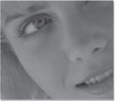
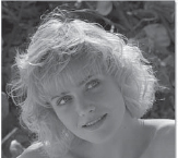
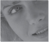
Figure 7-17: Close-Up of Original Image
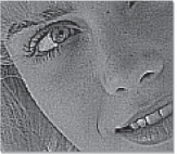
Figure 7-18: Sharpening Artifacts
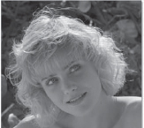
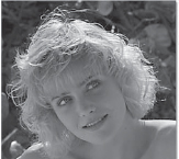
Comparisons between sharpening and the unsharp mask can be seen in Figures 7-19 through 7-24. The original image is in the center of each row, between the sharpened and unsharp mask versions. Most revealing are the close-ups. The sharpened image has become rough and edgy as the pixel-to-pixel contrast has been increased, even in smooth areas of the picture. The unsharp version, by comparison, has kept smooth things smooth and increased the contrast at the edges without adding the debilitating dark and light edge artifacts.
7.1.4.3 Making Your Own Unsharp Mask
Many compositing packages do not offer the unsharp mask operation, so you might find it useful to be able to make your own. It's surprisingly easy. The basic idea is to blur a copy of the image, scale it down in brightness, subtract it from the original image (which darkens it), then scale the results back up to restore the lost brightness. By the way, the blurred copy is the “unsharp mask” that gives this process its name.

The same scale factor that was used to scale down the unsharp mask is also used to scale up the results to restore the lost brightness. Some good starting numbers to play with would be a blur radius of 5 pixels for a 1k resolution image (increase or decrease if your image is larger or smaller) and a scale factor of 20 percent. This means that the unsharp mask will be scaled down to 20 percent (multiplied by 0.2) and the original image will be scaled up by 20 percent (multiplied by 1.2). These numbers will give you a modest image sharpening which you can then adjust to taste.
Figure 7-25 shows the edge characteristics of the unsharp mask and how the blur and scale operations affect it. The unsharpened edge obviously has more contrast than the original edge, which accounts for the sharper appearance. Again, it does not really sharpen a soft image—it only makes it look sharper. The scale operation affects the degree of sharpening by increasing the difference between the unsharp edge and the original edge. The blur operation also increases this difference, but it also affects the width of the sharpened region. So, increasing the scale or the blur will increase the sharpening. If a small blur is used with a big scale, edge artifacts like those seen with the sharpening kernel can start to appear. If they do, increase the blur radius to compensate.
There are a couple of different implementations of the unsharp mask, depending on whether you want to use a math node or a few discrete nodes. Let's start with the math node implementation shown in Figure 7-26 because it is the simplest. The original image and the blurred version are the inputs to the math node, and inside the math node is the following equation:
((1 + Z) × image) – (Z blurred image)(Eq. 7-1)
where Z is the brightness scale factor expressed as a floating point number. Using the starting numbers suggested above, if the percentage factor is 20 percent, Z would be 0.2 and Equation 7-1 would become simply:
(1.2 × image) – (0.2 × blurred image)
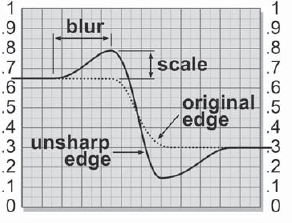
Figure 7-25: Unsharp Mask Edge Characteristics
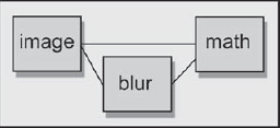
Figure 7-26: Unsharp Mask Using a Math Node
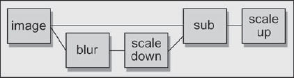
Figure 7-27: Unsharp Mask Using Discrete Nodes
The math node approach uses fewer nodes, but it is also harder to work with and computationally slower, so many folks don't like using it. For those of you who prefer the discrete approach, Figure 7-27 shows the unsharp mask operation implemented with discrete nodes. A blurred version of the image is scaled down using either a scale RGB node or a color curve node. The scaled blurred version is then subtracted from the original image in the “sub” node, and the results are scaled up to restore lost brightness, again using either a scale RGB or color curve node.
You may have noticed a subtle difference between the discrete node version and the math node version. In the math node version the original image was scaled up before subtracting the unsharp mask, while in the discrete version the scale up occurs after the unsharp mask subtraction. The reason for this difference is to avoid the clipping that would occur with the discrete node version if the image were scaled up first. The scale up operation can create pixel values greater than 1.0, which would be clipped at output by the discrete nodes. They will not be clipped internally by the math node, however, because it will subtract the unsharp mask, which restores all pixel values to normal before output. You will get the same great results with either implementation.
7.2 Depth of Field
Cinematographers go to a great deal of trouble to make sure that the picture is in proper focus. Barring the occasional creative camera effect, the reason that anything would be out of focus in the foreground or the background is due to the depth of field of the lens. Depth of field is used creatively to put the object of interest in sharp focus and the background out of focus in order to focus the audience's attention on the subject.
Camera lenses have a depth of field, a zone within which the picture is in focus. Objects closer to the camera are out of focus, as are usually objects on the other side of the depth of field, as illustrated in Figure 7-28. There is one case in which the far background will stay in focus, and that is if the lens is focused at its hyperfocal point. Everything from the hyperfocal point out to infinity will be in focus.
From the point at which the lens is focused, the depth of field is defined to be the region considered to be in focus, which extends 1/3 in front and 2/3 behind the point of focus. The reason for the evasive phrase “considered to be in focus” is that the lens is actually in perfect focus at only a single point and gets progressively out of focus in front of and behind that point, even within the depth of field. As long as the degree of defocus is below the threshold of detectability, however, it is considered to be in focus.
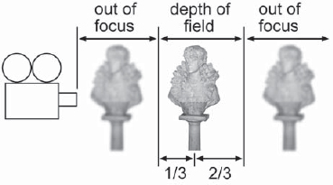
Figure 7-28: Depth of Field of a Lens
The depth of field varies from lens to lens and whether it is focused on subjects near to or far from the camera. Following are a few rules of thumb about the behavior of the depth of field that you may find helpful:
- The closer the subject is, the shallower the depth of field.
- The longer the lens, the shallower the depth of field.
Assuming a “normal lens” (28mm to 35mm) focused on a subject at a “normal” distance, you would expect to see:
- In a subject framed from head to toe, the background will be in focus.
- In a subject framed from waist to head, the background will be slightly out of focus.
- A close-up on the face will have the background severely out of focus.
- In an extreme close-up on a face, the depth of field can shrink to just a few inches so that the face may be in focus but the ears out of focus!
7.3 Lens Flare
When strong lights enter the frame the light rays refract off of the many surfaces in the lens assembly and strike the film to produce a lens flare. The complexity and character of the flare is due to the number and nature of the lens elements. Even a strong light source that is just out of frame can generate a flare. The key point is that it is a lens phenomenon which showers light onto the film where the original picture is being exposed. Objects in the scene cannot block or obscure the lens flare itself because it exists only inside the camera. If an object in the scene were to slowly block the light source the flare would gradually dim, but the object would not block any portion of the actual lens flare.
7.3.1 Creating and Applying Lens Flares
A lens flare is essentially a double exposure of the original scene content plus the flare, so a normal composite is not the way to combine it with the background plate. Composites are for light-blocking objects, not light-emitting elements. The screen operation is the method of choice, and its ways and wonders are explained in full detail in Section 5.5.1 of Chapter 5, “The Composite.”
Figures 7-29 through 7-31 illustrate a lens flare placed over a background plate. This is particularly effective when a light source such as a flashlight has been composited into a scene, and then a lens flare is added. This visually integrates the composited light source into the scene and makes both layers appear to have been shot at the same time with the same camera. Since many artists have discovered this fact, the lens flare has often been overdone, so do show restraint in your use of it.
Although it is certainly possible to create your own lens flare with a flock of radial gradients and the like, most high-end paint systems such as Adobe Photoshop can create very convincing lens flares on demand. Real lens flares are slightly irregular and have small defects due to the irregularities in the lenses, so beware of creating “perfect” lens flares because they draw attention to their synthetic origins. Also avoid the temptation to make them too bright. Real lens flares can also be soft and subtle.
7.3.2 Animating Lens Flares
If the light source that is supposed to be creating the lens flare is moving in the frame, then the lens flare must be animated. The flare shifts its position as well as its orientation relative to the light source. With the light source in the center of the lens, the flare elements stack up on top of each other. As the light source moves away from the center, the various elements fan out away from each other. This is shown in Figures 7-32 through 7-34, where the light source moves from the center of the frame toward the corner. Many 3D software packages offer lens flares that can be animated over time to match a moving light source. Again, watch out for excessive perfection in your flares.
7.3.3 Channel Swapping
If your lens flare generating software does not have good control over the colors, you could, of course, color correct whatever it gives you to the color you want. However, you would be crushing and stretching the existing color channels, sometimes a great deal, and with 8-bit images it could get very ugly very quickly. Wouldn't it be nice if the lens flare were already basically the color you wanted and you just had to refine it a bit?
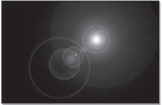
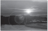
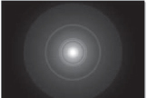
Figure 7-32: Centered Lens Flare
This you can do with channel swapping, as illustrated in the sequence of images from Color Plate 58 through Color Plate 60. The original image is basically a reddish color, but blue and green versions were made simply by swapping the color channels around. Swap the red and blue channels, for example, to make the blue version in Color Plate 59. Swap the red and green channels to make the green version in Color Plate 60. Of course, channel swapping is a generally useful technique that can be used to make a recolored version of any element, not just lens flares.
7.4 Veiling Glare
Remember all of those nifty little lens diagrams from school (like Figure 7-35) that showed straight little parallel light beams entering the lens and neatly converging at the focal point? Did you ever wonder about the nonparallel light beams? Where did they go? They never showed them to you in school because it made the story too messy. Well, the real world is a messy place and you're a big kid now, so it is time you learned the ugly truth. The nonparallel light beams fog up the picture and introduce what is called veiling glare. There are also stray light beams glancing off of imperfections in the lens assembly, as well as some rays not absorbed by the light-absorbing black surfaces within the lens and camera body. Even within the film emulsion layers there are errant photons. These random rays all combine to add to the veiling glare.
Figure 7-36 shows a nonparallel light beam from some other part of the scene entering the lens and landing on the same focal point as the parallel light beams. The rogue nonparallel light beam has just contaminated the focal point of the proper parallel light beams. This adds a slight overall fogging to the image that is sort of the average of all of the light in the picture. An extreme example is a greenscreen shot. The green screen in the background represents a large area of green light flooding into the lens. A small character standing in front of it would alter the light sum negligibly. This green light floods the camera lens, and some of it is nonparallel. As a result, a light green fog will be laid over the entire frame, including the small character. A green fog over the greenscreen is hardly an issue, but a green fog over the character is.
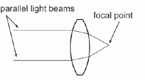
Figure 7-35: Parallel Light Beams
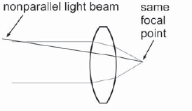
Figure 7-36: Nonparallel Light Beams
If you were to film the character again on the same greenscreen stage with the greenscreen replaced by a grayscreen, the character's green level would suddenly drop. The green fog has now become a gray fog, which no longer alters the hue of the character, but it does add some light that milks up the blacks. If the grayscreen were struck and replaced by a totally black background, the fog from the grayscreen would disappear and our character would suddenly increase in contrast as the blacks got denser. Fortunately, the color correction process will compensate for the differing veiling glare of the composited layers in most cases.
7.5 Grain
Technically, film grain is an artifact—a defect—but we have grown to love it. It adds a kind of charm and a look to film that video lacks. Video can have noise, which looks somewhat like grain, but real grain is good. When a foreground layer is composited over a background layer, the grain structure must reasonably match for the two layers to appear to have been shot on the same film. If the foreground is a cgi element, it has no grain at all and really must get some to look right. While the discussion here will focus on film grain, virtually all of the concepts and principles apply to video work as well, since much video work is film transferred to video, grain and all.
If the entire shot is cgi or digital ink and paint cel animation, there is no grain structure and you (or the nice client) now have an interesting artistic decision to make—namely, to add grain or not. You cannot count on the film recorder to add grain. Film recorders go to great lengths to avoid adding any grain because they are designed to refilm previously filmed film, if you know what I mean. If you are recording out to a laser film recorder, it will add essentially no grain whatsoever. If you are recording to a CRT film recorder, it will add only a little grain. The reasons for this are explained in Chapter 11, “Film.”
In the final analysis, the decision to add grain or not to a “grainless” project is an artistic decision. If it is a “grained” project, the question becomes whether two or more layers are similar enough for the difference to go unnoticed. That, of course, is a judgment call. Should you decide to fix the grain, read on.
7.5.1 The Nature of Grain
Hard-core mathematicians would define the grain characteristics in terms of standard deviations, spatial correlations, and other mathematically unhelpful concepts, but for the rest of us there are two more intuitive parameters for defining the grain characteristics—size and amplitude. The size refers to how big the film grains are, and the amplitude refers to how much brightness variation there is from grain to grain.
At video resolution, the grain size is usually no larger than a single pixel. At 2k film resolutions, however, the grain can be several pixels in size and irregularly shaped. Different film stocks have different grain characteristics, but in general the faster the film, the grainier it is. This is because the way film is made faster is by giving it a larger grain structure to make it more sensitive to light. It will take less light to expose the film, but the price is the larger grain.
The size and amplitude of the grain are not the same for all three color records of the film. The red and green records will be similar in size and amplitude, but the blue layer will be very much larger. These differences are shown in the color channel grain samples shown in Figures 7-37 through 7-39. If one wanted to simulate the grain very accurately, the blue record would get more grain than the red and green in both size and amplitude. Having said that, it will often suffice to give all three layers the same amount of grain. It is also more realistic if each channel gets a unique grain pattern. Applying the same grain pattern to all three layers will cause the grain pattern of all three channels to lie on top of each other in a most unnatural way.
The grain's behavior also changes with the degree of exposure. Figure 7-40 uses a gradient to illustrate the behavior of the grain relative to image brightness. As the brightness goes from dark to light, the amplitude of the grain increases. It is as if the grain were there all the time in the unexposed film, but scales up in amplitude as more and more light falls on it. A thoroughly accurate grain simulation would therefore attenuate the amplitude of the grain based on the brightness values of the original image. There would be higher grain in the brights, lower grain in the darks.
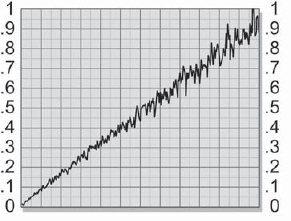
Figure 7-40: Grain Amplitude from Dark to Light
7.5.2 Making Grain
As mentioned, the grain structure for video work is usually just one pixel. Just hitting the video frames with a noise generator will usually suffice. For feature film work, however, more sophisticated techniques are required to truly simulate the grain structure. Some software packages have grain generators that add film grain to the images directly. A few packages have tools that will statistically measure the grain in an image and then replicate it. Use ‘em if you've got ‘em, but many software packages just have noise generators that you will have to use to simulate grain and match by eye.
Occasionally, simply adding a little noise to the film frames will be good enough and should always be tried first just in case it suffices. If, however, you need to use a generic noise generator to whip up some serious grain for feature film work, the recommended method is to prebuild several grain plates, then use them to apply grain structure to the images. If you are going all out for maximum photo-realism in your synthesized grain structure, then you will want to:
- Make a three-channel grain pattern. Real grain patterns are unique to each layer, so don't use the same single-channel noise pattern on all three color channels.
- Make the grain plate for the blue channel with both larger size and greater amplitude grain, as this is the way of the blue record.
- Make the grain amplitude greater in the brights than in the darks.
7.5.2.1 Generating the Grain
Generating the grain plates can be computer intensive. To reduce compositing time, you can prebuild just a few (five or seven) grain plates and cycle through them continuously over the length of the shot. The first order of business is to set the size and amplitude of the grain in the grain plates to the desired level and lower their brightness levels down to very dark values, nearly black.
If we assume a 50 percent gray plate has had noise added to it, a slice graph of it might look something like Figure 7-41. If this grain is for film, a blur is run over the noise plate to increase the size of the grain structure. Increasing the amount of blur will increase the grain size. For video, the grain is typically one pixel in size anyway, so the blur operation is usually skipped. The amplitude of the noise can be reduced simply by lowering the contrast with a contrast operation, as shown in Figure 7-42. It is usually much faster to adjust the amplitude with a contrast operation than to regenerate the noise at a lower level and re-blur it. Either way will work, of course.
Next, the brightness of the grain plate needs to be lowered to nearly black (as in Figure 7-43) so that the pixel values sit just above absolute zero (brightness, not Kelvin). Make sure to lower the brightness by subtracting from the pixel values, not scaling them. Scaling would alter the amplitude again, and we are trying to keep the two adjustments independent. If the contrast is reduced later, the brightness can be lowered a bit. If it is increased, the brightness will have to be raised a bit to prevent clipping the darkest noise pixels to zero.
The sequence of operations is shown in the flowgraph in Figure 7-44. Noise is added to the gray plate, then the noise plate is blurred (if it is a film job). Next, the amplitude is set by lowering the contrast, then the brightness is lowered to bring the grain plate pixel values very close to zero. It may take several iterations to get the grain plates to match the existing grain. By prebuilding them in a separate flowgraph like Figure 7-44 they can be quickly revised and re-rendered.
7.5.2.2 Applying the Grain
Now that you have prebuilt your grain plates, how do you apply them to the images? The pixels in the original image should have their brightness values displaced both up and down without altering the overall brightness of the original image. This can be done with a simple two-step procedure. First, simply sum the grain plate with the image, then subtract a small constant value that represents the average of the grain height. Adding the grain plate will slightly increase the brightness of the image, so subtracting the constant value simply restores the original brightness.
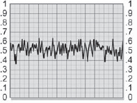
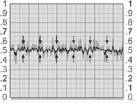
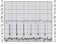
Figure 7-43: Lowered Brightness
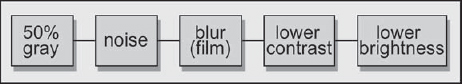
Figure 7-44: Flowgraph of Grain Plate Generation
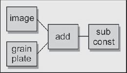
Figure 7-45: Flowgraph of Grain Application
A flowgraph of the process is shown in Figure 7-45. The grain plate is summed with the original image in the “add” node, and then a small constant is subtracted from the grained image to restore the original brightness. If the addition of the grain plates introduces clipping in the whites, then the subtract operation can be done first. If that operation introduces clipping in the blacks, then the image has pixel values near both zero black and 100 percent white. The RGB values may need to be scaled down a bit to introduce a little “headroom” for the grain.
The pixel behavior of the grain application process can be followed by starting with the slice graph of the raw grain plate in Figure 7-46, which has been prebuilt to nearly black using the procedures outlined in the preceding paragraphs. Even so, it has an average brightness value of 0.05. If you're not sure of the average brightness of your grain, just blur the heck out of it to average all the pixels together, then measure the brightness anywhere on the image. A slice graph of the original grainless image is shown in Figure 7-47. In Figure 7-48 the grain plate has been summed with the original image, which has raised the average brightness by 0.05. The original image is shown as a light gray line for reference. The original image brightness is restored in Figure 7-49 when the small constant (0.05) is subtracted from the grained image.
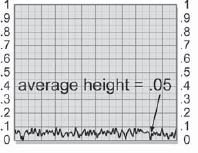
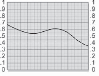
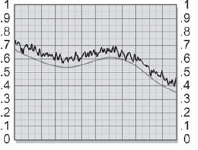
Figure 7-48: Adding Grain to Image Raises Brightness
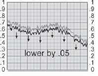
Figure 7-49: Grained Image Corrected for Brightness Increase
For those hearty folks who would like to simulate the increased grain in the lights, the following procedure is offered. The luminance of the image itself can be used to modulate the grain amplitude frame by frame just before it is applied. The flowgraph in Figure 7-50 shows the setup, and assumes a three-channel grain plate that is being scaled by a three-channel image. One channel could be dark in the same place that another channel is light, so using all three channels of the image to attenuate the grain is the most authentic simulation. If you use a one-channel grain plate instead, the image can be converted to a one-channel luminance image before being inverted. The rest of the flowgraph is unchanged.
The “scale grain” node is where the grain pattern is scaled down, based on the luminance of the image to be grained. It is an RGB scaling operation that is modulated by a mask input (the inverted image in this case), which is available in some form in all compositing software. The image is sent through the invert operation so that the darks become light. With the darks now light in the mask, the grain will be scaled down more in the darks, which is what we are trying to simulate—less grain in the darks. The modulated grain structure is now summed with the image in the add node as before, followed by the subtraction of the small constant value to restore original brightness.
Scaling the grain based on the brightness of the image does introduce a slight artifact that the truth in compositing law requires me to reveal. The assumption with this setup is that the grain average is everywhere the same—.05 in the previous examples. Scaling the grain down in the darks not only lowers its amplitude, but also lowers its average. The grain in the darks may now average .02 instead of .05, for example. This means that when the small constant is subtracted to restore the original brightness, the darks will be over-corrected and end up ever so slightly darker than they should. This will impart a very slight increase in contrast to the grained image, but the difference will usually be too slight to notice. If, however, the increased contrast is objectionable, just reduce the contrast of the grained image a bit. To avoid increasing the contrast in the first place, the scaled grain plate can be blurred to smooth it out then subtracted from the regrained image instead of subtracting the constant value.
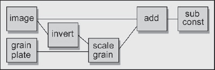
Figure 7-50: Using Image Luminance to Scale Grain
7.5.3 Matching the Grain of Two Film Layers
With a classic greenscreen composite you have two layers of film—one for the greenscreen and one for the background plate, each shot at different times and places and invariably on different film stocks. The mission is usually to match the foreground layer to the background because the background plate will normally already be matched to all of the other background plates and cannot be altered. A key point in matching the grain of two layers is to match them channel by channel. Don't try to judge the overall graininess of the two layers just by looking at the full-color images. Make sure the red layer matches, then the green layer, then the blue layer.
The final test of the grain match must be made at a frame rate that is at or near real time (24 fps for film, 30 fps for video) and at full resolution. Comparing static frames will not work because you need to see the grain “dance,” and low-resolution proxies will not work because too much grain detail is lost. For video work, viewing full resolution real-time sequences is not a problem for the modern workstation. For feature film work, however, workstations cannot yet play 2k film frames in real time. The most practical acceptance test is to crop out one or two regions of interest at full resolution that are small enough to be played on the workstation at or near real time. You also don't need the whole shot here. Twenty or thirty frames will be enough to see how the grain plays.
If the foreground layer has less grain than the background, the problem is simple. Add a small amount of grain until it matches the background. If the foreground is grainier than the background, then we have a pricklier problem. Removing grain from film is an extremely difficult prospect. The basic problem is that the grain edges are very similar to the object edges in the image, and any process that eliminates one tends to eliminate the other. There are some very sophisticated algorithms that can actually detect the object edges in the image, and not remove the grain from those pixels. But this method is very compute intensive and is not available in most software packages. Of course, if your software has a sophisticated grain removal operation, be sure to try it. But what can you do if it doesn't?
The obvious work-around is some delicate blurring operations, but they will also destroy some picture detail in the image. Following the blur operation with image sharpening to restore the detail is just pushing the problem around (with the addition of artifacts), so don't go there. An unsharp mask after a gentle blur may be worth a try because it works on different principles than plain old image sharpening, as described in Section 7.1.4.2, “Unsharp Masks.” One trick that might help is to blur just the blue channel. Most of the grain is in the blue channel, and most of the picture detail is in the red and green channels. This approach kills the most grain with the least loss of detail.
7.5.4 Adding Grain to Grainless Layers
CGI elements are rendered without any grain, so it must all be added at compositing time. For video work, a gentle noise operation will usually suffice due to the one pixel nature of video grain. For film work, some of the more sophisticated procedures cited in the previous section will be more effective. In the case of a matte painting there probably will be some regions with some “frozen” grain and other regions that are totally grainless. This is because matte paintings are often made from some original picture that had film grain, but then other regions were added or heavily processed, so the grain is missing there. You might want to see if the matte painter can clear the grain out of any grainy regions, since these will respond differently to the introduced grain than will the grainless regions.
A held frame is another frozen grain situation. Because the plate already has the frozen grain, only a little additional grain is needed to give it life, but this may not be a convincing match to the rest of the shot. If you have the tools and time, de-graining the held frame, then introducing full moving grain is the best approach. If the scene content is right, sometimes a grain-free held frame can be made by averaging several frames together. If you had, say, five frames to work with, scale each of them by 20 percent in brightness, then sum them all together to get back to 100 percent brightness. This makes by far the best grainless plate.
7.6 A Checklist
Here is a checklist of points that you may find helpful to run through when you finish a shot to make sure you have hit all of the issues:
- Focus
• Is the sharpness right for all elements in the shot?
• If there is a simulated defocus, does it look photo-realistic?
• If there is any image sharpening, are there any edge artifacts?
- Depth of Field
• Does the composited element have the correct depth of field?
• Is there a focus pull requiring a matching defocus animation?
- Lens Flare
• Will a lens flare help the shot?
• If a lens flare has been added, is it overdone?
- Veiling Glare
• Is there any noticeable veiling glare in the shot?
• Do the layers match in their apparent veiling glare?
- Grain
• Does the grain match between the composited layers?
• Are there any held frames or elements that need animated grain?