Chapter 4
Working with Text
Key Skills & Concepts
• Ensure Onscreen Readability of Text
• Add Logical Emphasis to Sections of Text
• Style Sections of Text by Changing Font Characteristics
• Offer Printer-Friendly Versions of Text Content
Before we dive into the nitty-gritty of structuring and laying out web pages, let’s go over one of the most important aspects of page development: working with text.
First, we’ll cover ways to optimize text content for web readability. Then, we’ll identify plenty of style sheet properties to help customize your text content. Finally, we’ll take a look at ways to offer printer-friendly versions of the text content to ensure your pages are readable both online and off.
Ensure Onscreen Readability of Text
Reading extensive amounts of text on a screen is not only difficult on the eyes, it’s also tiresome and inconvenient. Even so, many people use the same text content written for the printed page on their web sites. This repurposing of content detracts from a company’s overall identity and can make reading the web site content quite difficult.
TIP
In the “Writing for the Web” section of his web site, usability expert Jakob Nielsen instructs, “Write no more than 50 percent of the text you would have used in a hardcopy publication” (www.useit.com/papers/webwriting/). Even though some of the articles found here were written several years ago, the content is still relevant.
To make things easier on web readers, try following these guidelines:
• Keep it short and concise Chances are good that most web readers won’t last through more than a few screens of text on a web page. If you have a long article that needs to be made available to web surfers, try breaking it into several pages to avoid the super-long page-scroll. Remember, you only have a few seconds to grab a user’s attention, and long-winded “speeches” (even if they are on the Web) rarely work.
• Separate paragraphs with blank lines On the printed page, paragraphs are designated by an indent of the first sentence in each paragraph. On the screen, such paragraphs seem to run together. For easier onscreen reading, surround paragraphs with paragraph elements (
<p>) to leave a blank line between them.• Limit column widths Ever wonder why newspaper columns are so short? One reason is it eases and speeds reading for the viewer. The same is true online, so be wary of 500-pixel-wide columns. I like to stay between 200 and 400 pixels.
• Avoid underlining On the Web, underlined text signifies a link. When you give nonlinked text an underline, it’s confusing to users.
• When centering text, use moderation Avoid centering a whole section or paragraph of text, because more than a line or two of centered text is difficult to follow.
• Do place emphasis on important text, but don’t overemphasize While bold and italics draw attention to important text, you can easily overdo it by bolding too much.
• Avoid using all capital letters Consider which is used more on street and highway signs: all caps or a mix of lowercase and capital letters. You rarely see all caps used on street signs, because it’s much easier to read words with a mix of uppercase and lowercase letters. In addition, the use of all capital letters is considered “screaming” in online communication.
• Use lists and group related information Lists improve the “scannability” of your page, making them easier to scan quickly in search of particular information. Headlines can also help differentiate between sections and offer users quick insight on the section’s content.
• Place the most important information at the top of the page If users have to scroll for it, you may lose them. Avoid pages that are too busy by limiting paragraphs to one main idea and pages to no more than seven main options or thoughts.
• Use descriptive headlines and subheads Eyetracking software in conjunction with usability tests has shown just how little web users actually read web pages and e-mail newsletters (see www.useit.com/alertbox/newsletters.html). This is why it’s important to break up large sections of text with informative headlines to help your readers decide where to pause—and hopefully read—on the page.
• Make information easy to find Most studies show users don’t click more than three times on a web site to try to find the information they want. Avoid burying content more than three levels deep if you expect anyone to find it. And, if you have a search engine on your site (which you should if your site contains more than a few dozen pages), take care to ensure the titles of each page are descriptive.
Overall, remember most people scan web pages, as opposed to reading them. When you create a web page, put it away for a day or two and then look at it from a user’s standpoint. If you had no idea what the purpose of the page was because you just stumbled on it, would you be able to pick out the main point(s) within five seconds? If not, you might want to rework the content.
Or, ask a friend to look at the page and identify the first, second, and third things that pop out. If those three things aren’t the most important things on the page, perhaps you need to reevaluate the page.
Markup Text
Now that we’ve covered some key points for optimizing web text content, let’s talk about the different ways we can mark up that content. HTML includes different types of formatting elements to identify the purpose of certain bits of text.
Text-level semantics define how the affected text is to be used on the page, not how it will be displayed. This means the browser ultimately decides how to display the text (see Table 4-1). For example, if you were writing the HTML for the first sentence in this paragraph, you could use the dfn element to tell the browser the phrase “text-level semantics” should be highlighted as a defined term.

Table 4-1 Text-Level Semantics in HTML
Table 4-1 lists the most common elements used for differentiating bits of text from surrounding content. While previous versions of HTML actually dictated how text marked up with these elements should be displayed, HTML5 merely advises us to use them to help describe meaning to the browser.
So in the previous example, the
dfn tag would tell the browser to differentiate between the phrase “text-level semantics” and the rest of the sentence. Exactly how it does so depends on the different browsers, but many browsers display it as italicized text. It is then up to you to customize the display of the marked-up text in your style sheet.All of these elements must be opened and closed when they are used in an HTML document. Figure 4-1 shows how these tags are typically displayed before any CSS styles are applied.
Figure 4-1 Here’s how a Mozilla browser (in this case, Firefox) displays text-level semantics.
Style Text
There are style properties to affect just about any aspect of text necessary. Some, like those that alter font faces and sizes, enjoy wide support among browsers and operating systems. Others, like those that allow us to load our own fonts into the browser, are newer and perhaps not quite ready for widespread use.
By far, the most commonly changed text characteristics all have something to do with the fonts used to display the text. For that reason, we’ll look at which style sheet properties affect font display first.
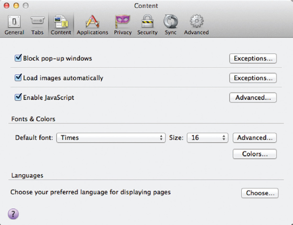
But before you begin changing the font characteristics of a web page, you should note that visitors to your web site have the ultimate control over these font characteristics. The following screen shows how the user can customize the way text displays in Firefox. Users can even choose to use their fonts, overriding page-specified fonts, so you should consider these tags as recommendations for the browser, but never rely on them for your page display. In other words, there is little you can do to absolutely guarantee your pages will look the way you want them to every single time. Rather than become frustrated by this fact, I encourage you to embrace it. Being flexible is an important characteristic of a web designer, just as the flexibility of the Web is one of its greatest assets.
Font Faces
When used in conjunction with the term font, face refers to the name of the font you’d like to use on your page. In style sheets, we specify the font face with the font-family property.
You can use the font-family property to specify virtually any font name you can think of, but the person viewing your web page will be unable to see your page in that font face unless he already has it loaded on his computer, or you provide access to that font. So, if you specify your page should be displayed in the Gill Sans font, but the person viewing your page doesn’t have access to Gill Sans, he will see your page in his browser’s default font face (usually Times New Roman).

To compensate for the possibility that not all visitors will have the font you specify, you can specify backup fonts in the value of the font-family property. If the browser cannot find the first font face listed on the viewer’s computer, it then looks for the second font face, and the third, and so forth until it comes up with a match. Once again, if the browser doesn’t find a font face listed in your HTML file that is actually installed on the viewer’s system, it displays the page in the default font.
NOTE
This process of providing a backup font name is also referred to as cascading.
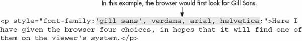
In the previous code, the browser first looks for Gill Sans. If it doesn’t find that font face, it looks for Verdana, followed by Arial and Helvetica. If none of those font faces is available, it would display the text in the browser’s default font.
Several font faces have become quite popular on the Web. This is because these faces offer the best chance of being installed on a majority of viewers’ systems. In addition, most of these fonts have been found to be more readable on the Web than others. Table 4-2 shows many readable font faces for your pages that enjoy default support from at least 80 percent of typical users.

Table 4-2 Popular and Widely Supported Web Fonts
The more products a font ships with, the more likely it is that viewers of your web site will have the font installed. The information on the availability of fonts was drawn from Microsoft’s discussion on web typography and Visibone’s font survey. To learn more, visit www.microsoft.com/typography/ and www.visibone.com/font/FontResults.html.
TIP
Font names may be a bit different across computer systems. Therefore, I recommend using lowercase names and sometimes even including two possible names for the same font. For example, the font Comic Sans can sometimes be installed as Comic Sans or Comic Sans MS. You can code your page to allow for both instances by using:
'comic sans, comic sans ms'.Google Web Fonts
What if you want to use a font not listed in Table 4-2? Say, for example, you’re working on a web site for someone whose logo contains a fairly unique font not normally found on most users’ systems. You should definitely include the logo as an image to ensure it displays consistently across the widest possible audience. But you would never want to include all, or even a majority, of the text on a site in images because that text wouldn’t be searchable or accessible by nonimage-based browsers (such as those used by vision-impaired readers or some mobile phone browsers).
Thankfully, there are a few ways around being limited to the fonts listed in Table 4-2. The first I want to discuss is Google Web Fonts (www.google.com/webfonts). Google maintains a database of open-source fonts that can easily be made accessible to web users. Simply browse through hundreds of font families and choose those you want to use on your pages. Then, copy the code necessary to make the selected font(s) accessible to your users.
Here’s an example. Suppose I wanted to use a font called Skranji for the navigation on my page. First, I need to make the font available to my users in one of three ways:
• HTML link element:
<link href='http://fonts.googleapis.com/css?family=Skranji" rel="stylesheet" type="text/css">• CSS @import rule:
@import url(http://fonts.googleapis.com/css?family=Skranji);• Javascript (using the following code snippet)

After you make the font available to users, you can simply reference it from within your style sheet, like this:
Pretty cool, huh? Google Web Fonts puts hundreds of open-source fonts right at our fingertips. The only drawback—if there is one—is that fonts must be open source in order to be included in the Google database. This means most of our favorite commercial fonts are not available this way.
Other Ways to Access Fonts
Still wondering how to use your favorite commercial font in your web pages? There are a few other options, but nothing that has a huge amount of browser support as of this writing. HTML5/CSS3 does bring us a new font tool in the @font-face rule. With this new style sheet feature, we can actually load a copy of a font onto the web server and make it accessible to our site visitors. Here’s an example of how it’s coded:
Then, you could use that font for your header section, for instance:
Looks pretty straightforward, right? It is, for the most part. The trick is that not all the browsers support the different font formats uniformly. For example, TTF (short for TrueType Format) fonts are supported this way on iOS devices. SVG (short for Scalable Vector Graphic) fonts are supported on iOS devices, but not in IE or on Android devices.
TIP
Want to learn more about the different font formats, like TTF? Check out http://computer.howstuffworks.com/question460.htm.
And to make matters worse, most commercial font companies do not allow you to load their fonts on your web server without purchasing an additional license. One notable exception is Fontspring (www.fontspring.com), which sells its professional fonts with licenses for both online and offline use.
My advice is this: Stick to fonts that are either already loaded on most users’ machines or those that can be freely loaded (without breaking any licensing rules).
Font Sizes
You can also use style sheets to change the size of the text. This is accomplished with the font-size property and any of the following possible values, as in:
font-size: 12pt.• Keyword xx-small, x-small, small, medium, large, x-large, or xx-large
• Relative size Smaller or larger
• Measured size Number followed by the unit, as in 12pt (for 12 point) or 8px (for 8 pixels)
Keywords
A keyword doesn’t identify an exact size measurement, but instead suggests a basic guideline for the browser to follow. Table 4-3 attempts to explain how the font-size keywords correlate to other default sizing measurements. I use the word “attempts” because default text sizes can vary given the operating system and browser used to display text. So, based on Table 4-3, you can see that font-size: x-small roughly translates into text that is approximately 9pt. Likewise, font-size: x-large would produce text approximately 16pt.

Table 4-3 Font Sizes
NOTE
Although these sizes loosely correspond to the point sizes you use in a word processor, most text in a web page tends to look a tad bit smaller on a Mac than it does on a PC because the two systems render type differently.
Figure 4-2 shows how these keywords translate into the four most popular browsers on the Mac OS (Opera, Safari, Chrome, and Firefox, from left to right). Thankfully, the sizes are fairly consistent when viewed in different browsers on the same platform. To be sure the results end up as expected, always test your pages on a variety of different systems, including mobile devices.
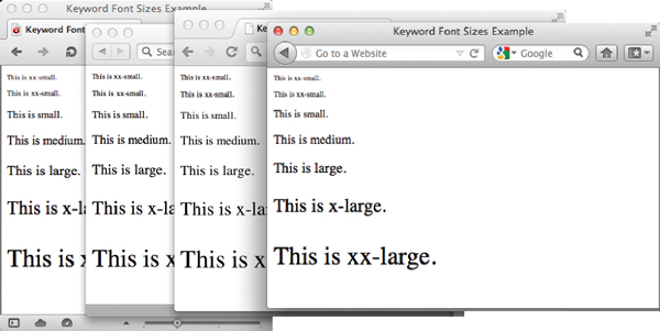
Figure 4-2 Here’s how font-size keywords are displayed in four browsers on the Mac OS.
Relative Sizes
Relative sizes can work together with keywords to provide additional customization of font sizes. For example, if you specify one section of your page should use “medium” text, then want to style a small bit of content inside of that section just a bit smaller than medium, you could use “smaller.” Note the er at the end of the keyword. That is what differentiates it from the small and x-small keywords previously mentioned. Adding the er to small or large basically gives you the ability to refine font sizes.
Wondering why you wouldn’t just use “small” for the text inside the “medium” section? Suppose you later decided to change the font size of that section from “medium” to “large.” If you had used “small” for that bit of text you wanted to make just a tad bit smaller than the rest, you would have to go edit that style as well. But, if you had used “smaller” instead, the browser would automatically understand your intent—that the text should be one step smaller than the rest—and adjust the size accordingly. So, in essence, the relative keywords smaller and larger help you get your point across to the browser while still remaining flexible and easily updatable.
Measured Sizes
With measured font sizes, you are telling the browser—using a length measurement—what size you want the text to be. (It should be noted, however, that ultimately the size of the text will also be impacted by the screen resolution.) The four most popular categories of measured sizes are pixels (px), percentages (%), ems (em), and points (pt).
Pixel measurements are the most common in web design, because they are the most specific to pages being displayed on the screen. When you specify a font should be rendered at 12px, the browser knows to only allot 12 pixels of vertical space for each letter.
Percentages are pretty straightforward, in that they are just percentages of the page’s default font size. For example, if the default font size of the browser were 16px (which is true for a lot of browsers), then text set to display at 50% would show up as 8pt type.
Ems also relate to the default font size. In fact, 1em equals whatever the default font size is. If you haven’t specified otherwise, this would mean 1em was 16px (or whatever the user’s default browser font size is set to). Using 1.5em would get you a font size of 24px.
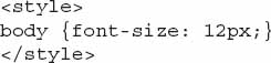
As you can see, percentages and ems are ultimately less absolute in nature, because they are affected by the user’s default font size. This means the trick to using percentages and ems successfully is to set your preferred default font size at the start of your style sheet:
Then, if you want to specify a section of text should be larger or smaller, you can use something like 50% or .8em.
TIP
When you start mixing pixels, ems, and other font measurements, things can get pretty confusing quite quickly. The best summary I’ve read regarding how to wade through all the details is here: www.css-tricks.com/css-font-size.
Point sizes are specific to the printed page, and should therefore be reserved for use in printer-friendly style sheets (which are discussed at the end of this chapter).
Ask the Expert
Q: If I can reliably use an absolute font size, such as 18pt, with the font-size property, why would I ever use a keyword or relative font size?
A: The answer lies in the Web’s adaptability to different user scenarios. Older versions of some browsers (namely IE6 and earlier) got a bit funky when handling absolute font sizes. In particular, older browsers rendered absolute font sizes unadjustable in the browser. This means a user with limited eyesight could not increase the font size in her browser if the text was displayed in pixel measurements. That translated into a pretty significant failure for the Web in general, which prides itself on being easily adaptable to a wide audience.
So, many web designers got comfortable using keywords and relative font sizes, which are always adjustable by the user. Thankfully, the modern browsers allow just about all text (except those embedded in images or multimedia files) to be adjusted in size by the user. But you can still use nonabsolute font sizes as needed. In fact, many designers prefer to set the default font size for the page using the body element as a selector, and then use relative keywords to change the size throughout the design. Here’s an example of that type of styling in action:

I In this case, text is set to 12 pixels for the whole page. Then, text enclosed in level-1 headings will be “larger” than 12px, while text with the .byline class attached will be “smaller.”
Font Colors
As discussed in Chapter 3, the CSS color property is used to change the color of any item in the foreground of a web page, including text. Alternatively, the background-color property is used to change the color of anything in the background of a web page. This means you can attach two color characteristics to a single paragraph, for instance. The following code shows how this might be done to add a yellow highlight behind some purple text with an inline style sheet.
Other Font Style Properties
We just covered how to change basic font characteristics, like the font face, size, and color, but what about other aspects of text like the space between the letters, as well as the space between words, the thickness of the font, underlines, and so on. Thankfully, there are style sheet properties available for just about any type of formatting you want to apply to text. For your convenience, the most commonly used properties—including those just covered—are outlined in Table 4-4.

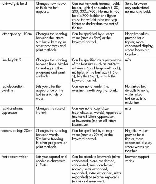

Table 4-4 Common CSS Properties for Styling Text
NOTE
There are many other new CSS3 properties for styling text. To learn more about these advanced options, visit www.w3.org/TR/2012/WD-css3-fonts-20120823.
Offer Printer-Friendly Versions of Text Content
Even though many people use electronic documents to avoid having reams of paper on their desks, plenty of us still print lots of pages from the Web. The fact of the matter is we are more likely to read long articles of text when they’re printed. The problem with this is that most web pages were not created to be printed and, as such, don’t print well.
PDFs
One solution to this problem is to enable users to download PostScript versions of the documents. A PostScript file, in contrast to an HTML file, was created with a printer in mind and contains specific instructions on how the file should be printed. Different types of PostScript files can be created from all kinds of software titles, regardless of the computer platform.
For example, Adobe’s Portable Document Format (PDF) enables you to take any file from another program (such as Microsoft Publisher or Adobe InDesign) and save it in a universally recognizable file format, characterized by the .pdf file extension. Adobe PDF has become a standard in electronic document delivery because of its ease of use, reliability, and stability.
Unlike HTML pages, which look different depending on the browser and computer system, PDF files look the same across different platforms, even when printed. This makes it easy to distribute documents, such as your company’s annual report or newsletter.
TIP
Some programs, such as Adobe Photoshop, Adobe InDesign, and Microsoft Office 2010, automatically allow you to save files as PDFs. Check with your page layout or publishing program’s manual before purchasing Adobe Acrobat. Also, Mac users can save as PDF from most applications by default. Microsoft Office 2007 users can download a plug-in from Microsoft that allows you to save as PDF right from within tools like Word and Excel (see http://www.microsoft.com/en-us/download/details.aspx?id=7).
To save text files in the PDF format, you typically must have the Adobe Acrobat software loaded on your system. Once you do, it’s only a matter of selecting a few menu items before the file is converted to the PDF format.
To view PDF files, you typically must have the Adobe Acrobat Reader installed on your system. This free utility is available from Adobe’s web site. Even if you’ve never downloaded the Reader, you may already have it because it’s included with many other software titles and computer systems. If you do include a link to a PDF file on your web page, remember also to tell users what is needed to view the file and where to download the Reader.
NOTE
Visit www.adobe.com/products/acrobat/readermain.html to download the free Acrobat Reader.
Because users must have the Reader to view a PDF, avoid using PDFs as the only means for electronically delivering important information. Whenever possible, it’s good to have both an HTML version—for online viewing—and a PDF version—for printing—of important documents. (Visit http://access.adobe.com for tips on creating accessible PDFs, as well as tools for converting PDFs to HTML documents and vice-versa.)
Printer-Specific Style Sheets
Ever visited a web page and seen a button labeled “click for printer version” or something similar? While that link may have led to a PDF version of the page, it more likely led to another HTML version of the page—this one using a printer-specific style sheet.
When using external style sheets it’s possible to add the
media attribute to your link tag to tell the browser when to use a particular style sheet. For example, the following shows some code that loads two different style sheets: one if the page is printed, and one if the page is displayed on the screen:
Once you’ve linked to your printer-specific style sheet, you just need to edit that style sheet to make the page display appropriately when printed. I recommend starting with a copy of your normal style sheet, and then editing as necessary. So what should you change? The text that follows presents a few things to look out for.
Backgrounds
Always set your background color to white and remove any background images you might have already assigned to the page. This will ensure the user doesn’t waste precious ink printing a black background with white text for no real reason. What may have looked attractive on screen might only be a big bleed of ink on the printed page.
NOTE
Some of these concepts—like links and margins—will be covered in later chapters, but I mention them here just to give you an idea as to what needs to be customized for printer-specific style sheets.
Links
If you turned your link underlines off, be sure to turn them back on. Likewise, consider making them bold or otherwise emphasized so they’ll stand out even when printed in black and white. You can even specify that links should display the actual URL after the link. This would be quite useful if someone prints your page and then wants to access its links at a later date, because the link addresses would be printed on the page.
The following code specifies that the URL should be printed after both visited and unvisited links. (While the code that follows doesn’t look like the rest of the code you’ve learned thus far in this book, it is correct. The spaces, in particular, are important to the code, so be sure to type this CSS exactly as you see it.)

If you have a lot of internal links on your pages, you may need to add your domain name to this code. Without it, users might see only a portion of the URLs printed: index.html or aboutus/address.html. The following shows how the code should look in order to make those links display completely:

Finally, consider turning off any graphical navigation bars, advertisements, or buttons when styling a printed version of the page. Not only do web navigation bars typically print poorly, but they are frequently of no use to the reader of a printed page.
Fonts
The standard font measurement for printed pages is points. Therefore, if you used another measurement for your screen pages, such as pixels, be sure to change that for your printer-specific style sheet.
Margins and Padding
If you’ve removed all margins and padding on your page to make things snug against the edges, you should remove those style declarations in your printer version. I like to leave the margins and padding at their default values so as not to have content cut off when printed. However, many designers prefer to add a 5- or 10-percent margin to either side so the content has a good amount of buffer space when printed.
Ultimately, the choice is yours. As with all web pages, it’s important to test your printer-specific pages by printing them on at least two different printers from two different browsers until you are happy with the results.
NOTE
If you styled any aspects of your page to be absolutely positioned, consider removing that declaration and allowing the content to flow freely on the printed page.
Final Tips for Printer-Friendly Pages
Whenever you create pages that will be printed, whether PDF files or printer-specific style sheets, remember the following things:
• Page Size Whereas web pages are designed for screen format, printed pages should be designed for the paper on which they will be printed. Most users in the United States will probably print in portrait format on standard letter-size paper (8.5" by 11"). Be sure to leave at least a 1/2" margin on all sides.
• Color Avoid dark background colors on printed pages. Many browsers don’t print background colors anyway, so someone might end up with light-colored text on white paper and have trouble reading anything. Remember, many people have black and white printers as opposed to color, so printed documents should be readable in both formats.
• Reference Always include the web page address (URL) on a printed page, so users can return to the page for more information as needed.
• Image Resolution Images created for the Web are low in screen resolution (72 dpi) because that makes them quicker to download. It does not, however, make them pretty when printed. In fact, printed web graphics often look quite bad. Therefore, when creating alternate versions of web pages that will be printed, avoid graphics whenever possible.
| Try This 4-1 | Style Text in Your Web Page |
Returning to the index.html page, let’s vary the font characteristics of the text on that page and add some style. Goals for this project include
• Adding emphasis to the page where necessary
• Changing the face, size, and color of the text on a page
1. Open your text/HTML editor and load the index.html page saved previously.
2. Add a level-1 heading.
3. Add a level-2 heading in between the first and second paragraphs. Align this heading to the center of the page.
4. Add emphasis to the name of the business or organization wherever it displays in the body copy.
5. Change the font face of the body copy to one listed in Table 4-2.
6. Change the size of the level-1 headings to be approximately 16pt.
7. Change the size of the level-2 headings to be approximately 14pt.
8. Change the color of the footer text to a lighter color than the rest of the text on the page.
9. Change the font size of the footer section to be approximately 10pt.
10. Open your web browser and choose File | Open Page (or Open File or Open, depending on the browser you are using). Locate the file index.html you just saved.
11. Preview the page to check your work. If you need to make changes, return to your text editor to do so. After making any changes, save the file and switch back to the browser. Choose Refresh or Reload to preview the changes you just made.
TIP
Do any of your changes continue past where you want them to stop? Make sure to use the appropriate closing tag to tell the browser where to stop. For more tips, see Appendix C.
Chapter 4 Self Test
1. Which file format has become a standard in electronic document delivery because of its ease of use, reliability, and stability?
2. Why should you avoid underlining text on a web page?
3. What is a reasonable range for column widths on web pages?
4. What are three key things to consider when designing a printable version of a web page?
5. Name four possible values of the
font-size CSS property. 6. What is the default characteristic of text marked with the
del element? 7. What is the default characteristic of text marked with the
mark element? 8. Fill in the blank: You use the ________ property in CSS when specifying the font name in which the text should be rendered.
9. When you specify a font size in ems, that size is relative to what?
10. Fill in the blank: The process of providing a backup font name in the
font-family property is also referred to as _____________...................Content has been hidden....................
You can't read the all page of ebook, please click here login for view all page.