
Chapter 13
Formatting and Styling Forms
Key Skills & Concepts
• Apply Tables to Forms
• Make Forms More User-Friendly
• Style Forms for Layout
• Style Forms for Client-Side Validation
In the previous chapter, you learned the basics of setting up a form on a web page. As you might have guessed, you can use many of the formatting techniques discussed in other chapters to format and style those forms. For example, to add a line break in between a text input field and its label, you could simply add the br element:
But what if you wanted to add line breaks in between all of a form’s input controls and labels? Sure, it’s possible to add
br elements like this throughout the whole form, but what if you change your mind later and then need to remove them all? Thankfully, there are much better ways to format and style forms. Let’s take a look at some of the options.Apply Tables to Forms
If you refer to the form you created in the last chapter’s Try This, you may notice the text fields are scattered through the page. If, instead, you want to have all the text fields lined up in a column, you could use a table to format your form.
When using a table to lay out a form, you will probably place each individual element in its own table cell. Perhaps the labels for the form (telling people what information to enter) might be placed in cells in the first column, while the input controls (text fields, and so forth) might be placed in the second column.

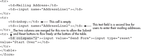
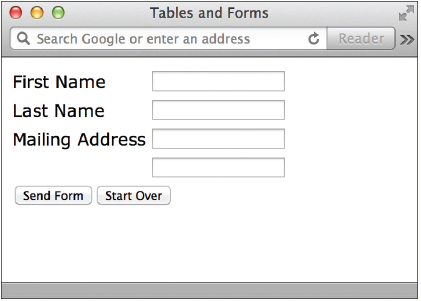
Using a table like this enables you to achieve a more uniform look in your forms. Notice in the following illustration how all of the text fields line up vertically, regardless of how long or short the preceding text is.
While a table can definitely help give structure to your forms, it is not always the most user-friendly way to do so. First, let’s look at a few ways to make forms more user-friendly in general. Then, we’ll review a few other ways to structure forms that don’t require the use of tables.
TIP
Because determining where each text label and input control should be placed can initially be confusing, I recommend you first create the form itself before placing it into a table. As with any table, it may help to plan the form on paper before coding.
Make Forms More User-Friendly
One of the goals in formatting and styling forms is to make them easier to understand and complete. Forms have become such an integral part of the Web; we cannot ignore opportunities to make them better. Whether you’re creating a simple contact form, a search tool, or a complex job application, it’s important to spend adequate time and energy to make your form as user-friendly as possible.
Set Tab Order and Keyboard Shortcuts
Chapter 7 discussed changing the tab order and adding keyboard shortcuts for links using the
tabindex and accesskey attributes. You can also use these attributes to format input controls in a form. Remember, the tab index begins at 0, not 1.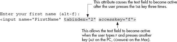
Refer to Chapter 7 for details on using either of these two attributes.
Ask the Expert
Q: I used a table to lay out my web page and placed a form for searching in one cell. When I did so, however, I noticed a lot of extra space in that cell, which I can’t seem to delete by adjusting the padding or margins. What’s going on?
A: Unfortunately, this is a common problem. The root of the problem lies in understanding what kind of tag the
form tag is. As outlined in Chapter 2, tags in HTML usually fall into one of two categories: block elements or inline elements. Block elements, like form and table, are used for structure and layout on a page, while inline elements are employed to alter the appearance of text. For example, strong, an inline element, is used to make text bold, but it doesn’t alter the location of the text. Block elements do alter the location of text I or other items on a page, and by default, many of them force a line break within the page. This means that wherever you place the form element, a blank line is also inserted.Q: Yes, but isn’t there any way around that?
A: The easiest way to fix this is to turn off the margins of your form with CSS. Using the
form tag as your selector, add margin:0 and padding:0 to the style declaration to reset both values and remove any extra space. If this is a big problem on your page, a better option is to use style sheets instead of tables to lay out your form. This is discussed more in the latter part of this chapter, in the section titled “Use Styles and Fieldsets to Eliminate the Table Layout.”Include Labels
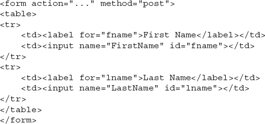
Whenever you include descriptive text before an input control, you are labeling it for users, helping them to understand what type of information they should enter. To link the label and the associating control formally, you can use the
label element and the id attribute. Each label can only be attached to one control. Also, it’s worth mentioning that when labels are used with check box and radio button fields, clicking the label actually checks or unchecks the selected box or button.
NOTE
As of this writing, the use of either the
label element or the id attribute doesn’t change the way the page appears in a graphical browser.This formal labeling process was new to HTML in version 4.01. Since then, it’s become an important technique for linking labels and controls, particularly to ensure your page is accessible to all users. The reason for this is that when tables are used, controls and their labels are often separated across table cells. This can be especially troublesome for nonvisual browsers when they try to link controls with the appropriate label.
There are a lot of different opinions regarding the best place for form field labels. The most common three options are
• Top-aligned Where the form field item is placed just below its text label
• Left-aligned Where the form field is placed to the right of the text label, but left-aligned on the page
• Right-aligned Where the form field is placed to the right of the text label, but then right-aligned on the page
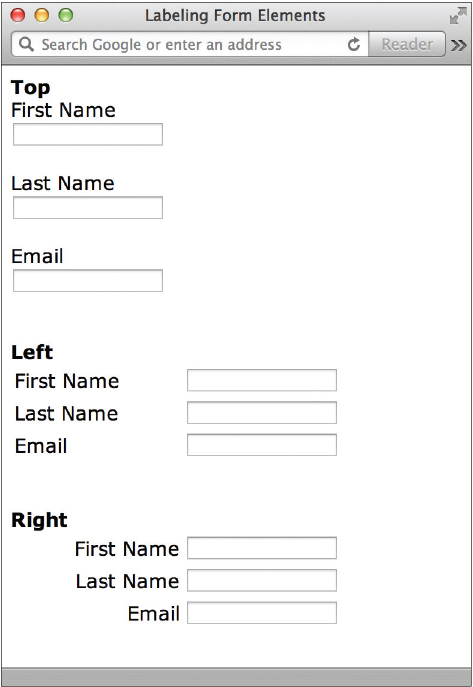
Of these, studies have shown that top-aligned form labels offer the best readability for users, so much so that they increase the likelihood users will actually complete the form. However, this type of vertical layout does increase the overall height of the form, which can sometimes cause other usability concerns. So in situations where height is an issue, right-aligned labels are the next best choice. In the end, you must balance all of the various usability factors to determine the best course of action for your particular forms.
Group-Related Controls
While the
label element is used to attach names to controls formally, the fieldset element enables you to group sets of labels and controls. Grouping input controls with these elements can be a great alternative to using tables for form layouts. For example, if you had an employee application form with three distinct sections, such as Schooling, Work Experience, and Skills, you could use fieldset tags to group all the labels and controls under these headings. The legend tags then give a caption to the group, if you want to include one.
Most browsers supporting the
fieldset element add boxes around each group and place the caption from the legend tag in the outline of the box as a headline.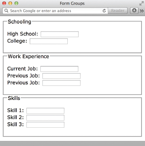
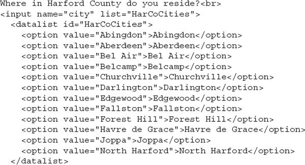
Add Data Lists
What if you want to provide a list of options for the user, but also want to allow custom options to be entered? Or suppose you asked users to enter the name of their city, but couldn’t include options for every single city out there. You might include the most popular city names in a data list for a text field, like this:
Then, when the user starts typing a city name, matching values from your data list will display as selectable options. Browser support for data lists is not widespread as of this writing. But, the following illustration shows how this is supported in Chrome on the Mac.
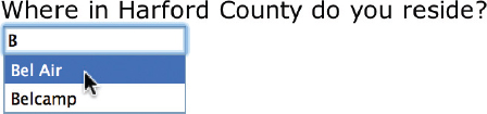
Data lists like this are great for making forms more user-friendly, because they reduce the amount of typing that is necessary to complete the form. In addition, they help the data entry to be more uniform, such as without spelling errors or capitalization issues.
The key to matching up your data list with the corresponding input control is this: Make sure your input tag’s list attribute matches the value of the id attribute assigned to the datalist element.
Show Progress
HTML5 introduces two new elements to handle the measurement of various aspects of your forms:
progress and meter. Let’s take a look at how these work.The key difference between these two elements has to do with the type of measurements described. While the
progress element marks a measurement that is changing, such as one that is on a path or part of a process, the meter element simply identifies measurements, regardless of whether they are changing or part of a process.There are six attributes for the
meter element, the first three of which are also used for progress:•
value Marks the starting or default measurement•
min Identifies the minimum allowed measurement (default is 0)•
max Identifies the maximum allowed measurement (default is 1, or 100%, depending on the content)•
low Specifies the low end of the measurement range (cannot be lower than the min value)•
high Specifies the high end of the measurement range (cannot be higher than the max value)•
optimum Identifies the optimal value, somewhere between the min and max valuesWith this information in mind, let’s consider a few real-world examples. Suppose you wanted to show the progress of a file upload inside of a form. The progress element is perfect for this situation. The basic HTML for this example is super easy, and could be something as simple as this:

What’s much trickier is getting the progress bar to actually update as the file is being uploaded. That bit of interactivity requires some scripting beyond HTML, typically with JavaScript. Read over Chapter 14, and then when you’re ready to tackle some JavaScript, check out the following online tutorials about scripting progress bars:
• Using the HTML5 Progress Tag www.htmlatoms.com/basic/using-the-html5-progress-tag
• Mozilla Demos the New 'Progress' HTML5 Element news.softpedia.com/news/Mozilla-Demos-the-New-HTML5-Element-in-Firefox-6-204713.shtml
• HTML5 Progress Bar – jsFiddle www.jsfiddle.net/wmichaelgreen/Gj6Pv/
Other examples of uses for the progress element include showing the strength of a password and indicating progress in a multistep or multipage form.
NOTE
While these two elements are often used within forms, you can actually use them to show progress and measurements in other parts of your pages as well. This means it’s safe to include them even if you don’t have a form on your page.
The
meter element is used not so much to show progress, but to show a measurement in relationship to a defined range. For example, you might use it to show the percentage of responders who selected a particular option on a form.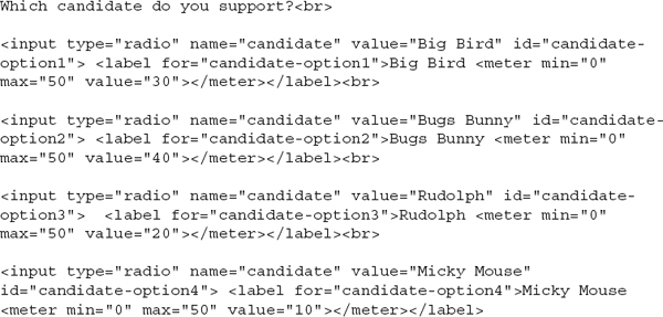

In addition to the
min, max, and value attributes, the high, low, and optimum attributes can help provide visual clues about the measurement. For instance, consider a thermometer to gauge a child’s fever. While the official min and max might be 90° and 106°, adding a high of 104° and a low of 96° might help parents see when there is perhaps cause for concern. In this situation, an optimum value would be 98.6°. If we used all these numbers within a meter element and added an initial value of 104.1, supporting browsers would color the bar yellow, so as to indicate it is above the target high.
Here’s what the corresponding code might look like:

With both the
progress and meter elements, any text included between the opening and closing tags will only display in browsers that do not support meters and progress bars. As of this writing, there are still some modern browsers that don’t offer support, so be sure to thoroughly test your pages when using these elements.TIP
The
progress and meter elements each require some level of scripting to truly be functional and interactive in web pages. Check out www.basewebmaster.com/html/html5-form-elements.php for a very basic set of examples and then read Chapter 14 for more on JavaScript.Other examples of uses for the
meter element include showing user ratings, indicating relevance in search results, and giving a total score on a test or quiz.Assist Your Users
There are a few final comments I’d like to make about making forms more user-friendly before we close this section:
• Mark required fields When you specify form fields as required in the code, don’t forget to let the user know. Clearly indicate those fields are, well, required so a user doesn’t waste time trying to submit a form before it’s complete. Note if 8 out of 10 fields are required, it makes more sense to mark the optional fields and then specify—in the instructions for the form—that all other fields are required.
• Explain yourself Make it clear why the form itself is necessary to help the user understand why he is being asked to provide his information.
• Make text labels readable Web designers are known for preferring smaller font sizes and faces, but web forms are not appropriate places to test out our latest favorites. Stick with standard web fonts of at least 11 pixels in colors that stand out well against the background.
• Avoid adding links to external content within the form No one likes having to re-enter content. If you provide distracting links within a form that then take the user somewhere else without first finishing the form, he risks having to re-enter the content later. If you absolutely must include a link inside the form, force that content to display in another browser window or tab, so as not to lose the user’s current place in the form.
• Don’t ask for information you don’t need Many business owners want to capture as much information as possible from their user base. This is understandable, but maintaining said information can get risky. You don’t want to be responsible for storing, and safeguarding, your users’ personal information if you don’t need it. This means, for example, if you don’t plan to call your users, you don’t need their phone numbers. In addition, many users stop filling out long forms when they get to information they either don’t find relevant or simply don’t want to give.
• Likewise, safeguard the information you do request If you gather personal information about users through web forms, you better have a safe way to store it. Here’s what is not safe: simply having the form data emailed to you and then stored in your inbox. Using Secure Sockets Layer (SSL) encryption is a good option, but does require some additional setup. Check out www.sslshopper.com/article-how-to-make-a-secure-loginform-with-ssl.html for some tips.
• Match the button’s importance level to its weight Have you ever accidentally clicked the Reset or Cancel button in a form, only to lose all of your work? This occurs when a form designer gives equal visual importance to all the buttons, so much so that the user can’t quickly distinguish between them. To solve this problem, change the style of less important buttons (or lose them altogether if possible) to clearly indicate the primary actions on the form.
TIP
For more tips on making forms usable, check out this great resource: http://uxdesign.smashingmagazine.com/2011/11/08/extensive-guide-web-form-usability.
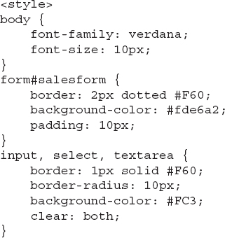
Style Forms
Most of the form tags you learned can also be altered with style sheets. This means you could quite easily turn all of your text boxes green if you wanted to. It also means you can finally do away with those boring white and gray form elements! And because the
form tag is a block-level element (just like the p tag), you can even style your entire form to have a particular background color or border.To further illustrate this point, consider Figures 13-1 and 13-2. The first figure shows a basic HTML form, created with the tags discussed in this chapter and the previous one, that has been placed in a table. The HTML used to create this form is shown next.

Figure 13-1 This is our very basic HTML form (inside a table) before CSS.

Figure 13-2 This is the same HTML code with a style sheet applied.


Figure 13-2, however, adds a style sheet to customize the design of both the form elements and the table. Here, the HTML code has not changed at all—the only addition is the following internal style sheet:


TIP
The key to styling forms (or any other page element for that matter) is in properly preparing the HTML code before you even begin the style sheet. Depending on your needs, this may mean adding
id attributes to each form element so that they can be referenced later. Or perhaps using the colgroup tag to enable easy access to each column (for styling purposes).Use Styles and Fieldsets to Eliminate the Table Layout
What if you wanted to take your style sheet one step further and use it to lay out the entire form, and even eliminate the need to use a table for layout? Not only is this a great option, it actually can make the design and maintenance of forms much easier. Consider the same form used in the previous section, this time coded without any table tags:

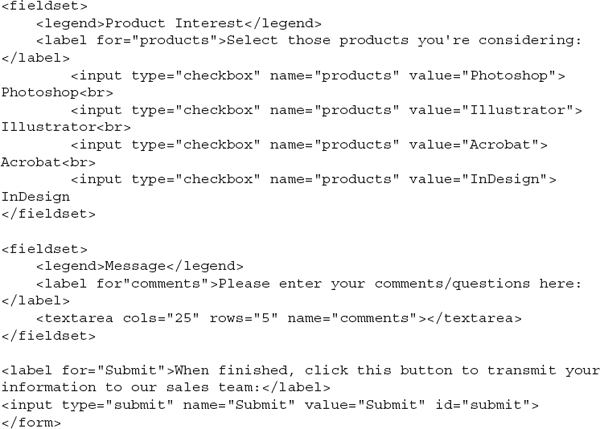
Figure 13-3 shows the preceding table as coded, without any styling. While there is a little bit of structure, just from the
fieldset tags, much of the content runs together across the screen. To prevent this, you could specify that the labels for each form element be displayed as block elements. You might remember this causes the browser to fill the screen horizontally with the element in question. So in the case of our form field labels, it forces the form field after each label to drop down to the line below. Compare Figures 13-3 and 13-4 to see what I mean. The following is the complete style sheet used to display the styled form.
Figure 13-3 This form was created with fieldsets instead of tables. Even though it’s a bit jumbled now, a style sheet will make this form shine.

Figure 13-4 After the style sheet is added to this form, the content becomes more legible and organized.


As you can see, by comparing the table-based form with the fieldset/style-based form, you can achieve somewhat similar results with the two different types of coding methods. However, the latter—when combined with style sheets—is easy to code and maintain, and offers significantly more customization options. For more help with creating functional and stylish web forms, check out http://wufoo.com/gallery. This online sample gallery has tons of downloadable forms and style sheets to help get you started.
Use Styles for Client-Side Validation
In the previous chapter, I outlined a few ways to help ensure your forms are completed properly before being submitted by the user. In this section, I want to take that one step further to show how you can use CSS to clarify any errors or missing data so the user understands why the form isn’t complete.
As I mentioned previously, we use the new
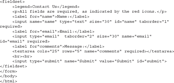
required attribute to let the browser know a form field must be completed before the form can be submitted. I also told you it’s possible to use the pattern attribute to further ensure the right kind of content is entered into the form field. But how is the user to know exactly which fields are missing or incorrect? This is where client-side (meaning in the browser) validation comes into play.Consider the following bit of code used to create a basic “contact us” form:

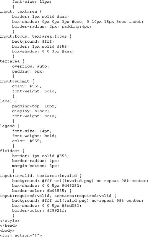
As you can see by the code, all three fields are required. Next, let’s add some style declarations to help the user understand what is required. Let’s tackle the rules for the invalid fields first.
The
input:required:invalid selector tells the browser to look for input controls that are required, but currently invalid. By default, all required fields are considered invalid by the browser until the user enters at least one character. In this case, I’m telling the browser to add a small red icon inside the field’s background to indicate the field is invalid. I also add a red box shadow.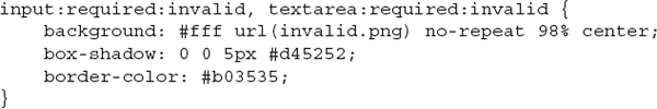
Now, let’s use the
input:required:valid selector to identify a CSS rule for all required fields after they are valid. We’ll change the icon to a green check mark to indicate the data is valid. And because the browser understands what constitutes a valid email address, it will not turn the icon green for the email field until data in the proper email format has been entered ([email protected]).
Take a look at Figure 13-5 to see this client-side form validation in action. If you want to try it yourself, here’s the complete code I used:

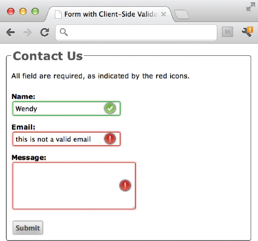
Figure 13-5 The browser recognizes the email field has not been properly completed in this example.
This is just the tip of the iceberg in regard to form validation. Check out these resources to learn more:
• A List Apart’s Forward Thinking Form Validation www.alistapart.com/articles/forward-thinking-form-validation
• Form Field Validation Styles From CSS http://blog.ngopal.com.np/2012/04/09/formfield-validation-styles-from-css
• IBM Developer Works’ Example Form Field Validation https://www.ibm.com/developerworks/mydeveloperworks/blogs/bobleah/entry/html5_example_form_validation_and_form_elements141?lang=en
• HTML5 Form Field Validation with CSS3 from GirlieMac! Blog http://girliemac.com/blog/2011/11/28/html5-form-field-validation-with-css3
| Try This 13-1 | Format the Form |
Returning to the Contact Us page created in Try This 12-1, use additional formatting techniques to achieve a more uniform appearance of the labels and controls. Goals for this project include
• Grouping form elements with the
fieldset and legend tags• Styling the form
• Adding the
method and action attribute to the form tag1. Open your text or HTML editor and open the file entitled contactus.html from Try This 12-1.
2. Group related controls into fieldsets.
3. Use
label elements to associate each form control with its text description.4. Add a style sheet to format the page in a similar fashion as was discussed previously in the final section of the chapter. (Feel free to adjust the colors, fonts, and so on, according to your tastes.)
5. Add the
action and method attributes to the opening form tag. For testing purposes, you can have the results mailed to your e-mail address, or simply use a fake address for a CGI script. Set the method to post.6. Save the file.
7. Open your web browser and choose File | Open Page (or Open File or Open, depending on the browser you’re using). Locate the file contactus.html you just saved. Make sure the file appears as you intended it.
8. If you need to make changes, return to your text editor to do so. After making any changes, save the file and switch back to the browser. Choose Refresh or Reload to preview the changes you just made.
Many of the additional formatting techniques used with forms help to make them more efficient and accessible. This project gave you practice using some of those techniques to make an existing form more user-friendly.
Chapter 13 Self Test
1. True/False: The
fieldset element is used to divide long select menus into categories of submenus. 2. Add the appropriate attribute and value to allow users to press the F key to access this input control:
3. Add the appropriate attribute and value to set this input control as the first in the tab order:
4. Which tags and attribute should be placed around the following descriptive text to indicate that the text belongs to the birthday input control?
5. What CSS selector would you use to create a style sheet rule for all invalid required form fields created with the input element?
6. What CSS selector would you use to create a style sheet rule for all valid required form fields created with the textarea element?
7. Which attribute is used to specify the ideal value in a meter element?
8. Which element is used to indicate progression in a multistep process?
9. Which element is used to signify a relationship between a measurement and its range?
10. Which element is used to add suggested data to input fields to help a user complete a form?
..................Content has been hidden....................
You can't read the all page of ebook, please click here login for view all page.