
Chapter 12
Creating Forms
Key Skills & Concepts
• Understand the Concept and Uses of Forms in Web Pages
• Create a Basic Form
• Validate the Form Content
• Provide a Way for Your Form to Be Processed
One of the best features of the Web is its capability to enable new forms of communication and have them connect with other methods already in existence. Online forms are popular ways of facilitating such communications. For example, forms allow web site visitors to comment on a site, order a product, communicate with friends via social media, and register for a service. This chapter discusses how to create forms such as these and use them effectively on your web site.
Understand the Concept and Uses of Forms in Web Pages
The most basic purpose of any form is to collect information. When you register to vote, you fill out a form specifying your name, address, birth date, and political party affiliation. The form is collected and processed. The same concept holds true with online forms—they are filled out, collected, and processed. For example, Figure 12-1 shows a page with a form for people to post an item for sale on Craigslist.

Figure 12-1 Online forms have a variety of uses, from sending messages to searching for keywords.
Just as paper forms must have once been written, typed, or otherwise created, online forms need to be coded. This can be accomplished with HTML alone or by combining HTML with other technologies. For the purposes of this chapter, we will use HTML to create our forms.
Create a Basic Form
Even the most basic forms have the same structure. This includes opening and closing
form tags, input controls, and processing methods. The form element surrounds the entire form, just as the html element surrounds the entire HTML document.
First, let’s discuss input controls, or ways for users to enter data. For example, for you to enter your name on a form, there must be a space for you to do so. This space is what I’m referring to when I use the phrase input control or simply “control.” Figure 12-1 contains some of the following input controls:
• Text inputs
• Check boxes
• Radio buttons
• Select menus
• File selects
• Buttons (submit buttons, reset buttons, and push buttons)
• Hidden controls
Because most controls are created with an
input element, the actual description of which control you want to include is made through the type attribute, as in the following example:
NOTE
The input element is empty, which means it doesn’t require a closing tag.
The complete list of input types is included in Table 12-1. The most popular of these are then discussed in the next few sections, as well as a few other controls not created with the input element. Those new to HTML5 are marked with an asterisk.

Table 12-1 Types of Controls Added with the input Element
Text Input
The most basic text-input controls are single-line text boxes (called text fields) and multiple-line text areas.
Single-Line Text Fields
The single-line text field is actually the default type for input controls, which means you don’t even have to specify the type attribute because without it the input element defaults to a plain text field. This control is a space, resembling a box, that can contain a single line of text. Usually, text fields are preceded by descriptive text telling the user what to enter in the box. For example:

As the following illustration shows, text fields are single-line white spaces that appear slightly indented into the page. Unless you specify otherwise with the
size attribute, text fields are usually 20 characters in length.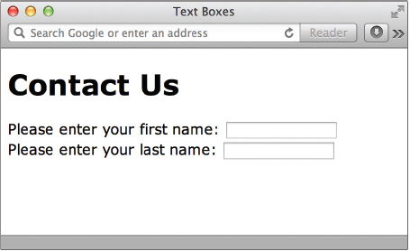
NOTE
The sizes of text fields are specified in characters. However, it ultimately depends on the default font size in the viewer’s browser. This means even though you might specify a text field to be 25 characters in length, it may appear larger or smaller on someone else’s system, depending on how that person’s browser is set up.
Any of the attributes listed in Table 12-2 can be added to this and other
input elements to customize the control. We’ll cover more of these attributes in the next few sections, but first we need to talk about the most important one—and the one every input control needs—name. To process all the controls in your form, each one must be identified with a name. For example, when the form is processed, you could tell it to take whatever the user entered in the control you named “FirstName” and print that text at the top of an email message.
Table 12-2 Attributes for Text Fields
TIP
Blank spaces between words in the values of some attributes can cause problems in HTML and other coding methods. To avoid such problems when using the
name attribute, many developers like to run any phrases together, capitalizing the first letter in each word. For example, instead of using “Middle Initial” as the value of your name attribute, use “MiddleInitial.” Just remember, these values are case-sensitive, which means whenever you reference that control later, you must also capitalize the first letter of each word. In addition, be sure to use unique names to avoid confusion when the form is processed.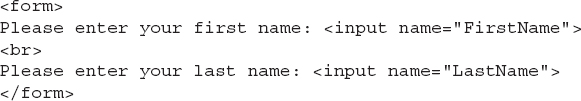
The other attributes are optional. For example, you can use the
size attribute to specify the length of the text field in characters, while the maxlength attribute enables you to limit the number of characters that can be entered in that box. For example, if you created a text field where users can enter their ZIP code in the following format: xxxxx-xxxx, you could specify a maxlength of ten characters.Every control has an initial value and a current value. An initial value is an optional value you specify for a control when you code the form, while a current value is whatever the user entered that is then processed with the form. For example, if most users will enter a certain value for a field, you might use the
value attribute to prepopulate that field with the default answer. You may be tempted to use the value attribute to send instructions to the user, but if you do and the user doesn’t enter any data, then the initial value you entered is sent along when the form is processed.
When the page is viewed, however, users who need to change the value will have to erase it before entering their information. So, if you’re intending to give users a hint but let them enter a unique value, the placeholder attribute is a better option.
In this case, as soon as the user puts the cursor in the text box, the placeholder text disappears, allowing a new value to be easily entered.
Text Fields for Passwords
HTML also enables you to create single-line text fields for passwords. The main difference is that password text fields show text that’s entered as bullets instead of straight text.

You use
password as the value of the type attribute in your input element to create this type of control. The following is an example of the code for the preceding illustration: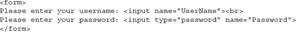
Although this may seem as if it adds a level of security to your page, it’s merely a way to prevent those looking over the user’s shoulder from seeing a password. The actual password is not encrypted in any way when the form is processed, and therefore, this control shouldn’t be implemented as the only means of security for pages with passwords.
Text Fields for Search Boxes
Using the search input type identifies an otherwise normal text field as one that contains search terms.
Supporting browsers round the corners of the box to set it apart from regular text boxes.
In addition, after the user starts typing, a small cancel icon (usually in the shape of an x) appears to the right side of the search field. This allows the user to quickly clear the box and start over as needed.
Multiple-Line Text Areas
When it’s necessary to allow your web site visitors to enter more than a single line of text, use a text area instead of a text field. Unlike most other form input controls, a text area uses the
textarea tag instead of the input element.
To specify the size of the text area, use the
cols and rows attributes:• The
cols attribute identifies the visible width of the text area, based on an average character width.• The
rows attribute identifies the visible height of the text area, based on the number of text lines.Because the sizes of the
rows and cols attributes relate to the character width in the browser, the actual size of the text area may differ, depending on the user’s settings. Scroll bars may appear when users attempt to enter more data than can be displayed in the visible text area.While you can use the placeholder attribute to specify hints to users, you don’t use the
value attribute in this tag to create an initial value that prints within the text area. Instead, include any text you want to print within the text area between the opening and closing textarea tags. Figure 12-2 shows how the following code might be displayed in a browser:

Figure 12-2 Text areas enable users to enter more than a single line of text. Any text you enter between the opening and closing
textarea tags is used as the initial value of the text area.TIP
You can control whether scroll bars appear on your text area with the CSS
overflow property. For example, setting overflow: scroll forces scroll bars to appear, while overflow: auto leaves it up to the browser to decide based on the amount of text entered.Radio Buttons
Radio buttons are small, round buttons that enable users to select a single option from a list of choices. This is accomplished with the
input element and a value of radio in the type attribute. You might use radio buttons to allow those interested in receiving more information the option of choosing to do so via email, phone, fax, or regular mail. When the user selects one of the options by selecting the radio button, the circle is filled in with a black dot.TIP
Radio buttons are particularly useful for questions requiring a yes or no answer.
The
name and value attributes are especially important to radio buttons because they help to make sure the data is processed correctly. Consider the following HTML code used to create the illustration shown next: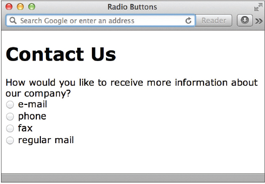

Notice the
name attributes contain the same value for all four options. This ensures these four controls are linked together when the form is processed. Because the type of control is radio, the browser knows only one option can be selected. If you make a mistake and use different names for each of the options, the user will be able to select multiple buttons.When the form is processed, it locates the selected option (meaning it looks for whichever radio button the user selected) and transmits that option’s
value along with its name. If I selected the radio button next to the word fax, the appropriate name and value would be transmitted: ContactMe – fax. You can see how using words and phrases that actually mean something can be important.If you want to set one of the radio buttons to be selected by default when the page is initially loaded, use the
checked attribute in the input tag. Users can select a different option if they want.
Check Boxes
Check boxes are similar to radio buttons in that they don’t let users enter any data; they can only be clicked on or off. However, check boxes let the user select more than one choice from a list of options. For example, you might use check boxes to give users the option to select which services they would like to receive more information about. When a check box is selected, a small x or a check mark typically appears in the box, depending on the browser.

To include a check box in your online form, use the
input tag and type attribute with a value of checkbox (note that check box is one word when used as an HTML value). Just as with radio buttons, the values of the name attributes for all the options should be the same. Use the value attribute to identify what is different about each option, as in the following example:
When the form is processed, the values of any check boxes selected by the user will be transmitted to the server along with the value of the
name attribute. So, in the preceding example, if I selected the check boxes next to “graphic design” and “illustration,” the appropriate name and values would be transmitted: Services – graphic design, illustration.Use the
checked attribute any time you want a check box to be selected by default when the page is loaded. Users can uncheck that box if they want.
Date and Time Inputs
HTML5 brings us several new input controls, including six from Table 12-1 that help with date and time fields:
• date
• datetime
• datetime-local
• month
• time
• week
As of this writing, Google Chrome, Opera, and Safari on an iOS device are the only browsers that support any of these new controls, and Opera is the only one that supports all six. Take a look at Figure 12-3 to see how Opera displays these controls, coded like this:


Figure 12-3 Opera is able to show user-friendly date and time pickers for these types of input controls.

Thankfully, the good news is these new input controls degrade quite gracefully. In other words, in browsers without support for the new HTML5 input controls, the fields simply display as default single-line text fields. So even if your users cannot use a handy month or date picker, they can still enter the month or date by typing it in the text field (as they likely would have prior to HTML5), as shown in Figure 12-4.
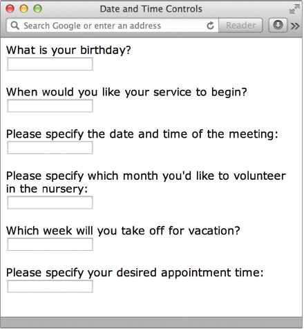
Figure 12-4 Safari 6 on a desktop system simply displays these controls as default text fields.
Other Number Inputs
Prior to HTML5, there was no way in HTML to differentiate between text fields and number fields. Developers often had to resort to using something like JavaScript to achieve similar results. The number and range input types change all that.
The number input type can be used to simply designate a text box as a number field, or you can customize it a bit with the addition of a few other attributes, like this:

In this example, the
min attribute designates the minimum possible value, while the max attribute identifies the maximum possible value. Then, because the step value is set to 2, only even-numbered options between 0 and 12 are possible. The starting value is 8.The range control type is similar, in that it accepts the min, max, and step attributes, but different because it displays the input field as a slider. The following illustration shows how this code displays in Opera.
NOTE
As with the date and time inputs, those using browsers that don’t support these number inputs will simply see standard text fields. So make sure your explanations are thorough enough for all users to know how to answer the question or request, even with older browsers.
Contact Methods
Three other input controls have been added in HTML5 to help identify certain types of contact methods. While the email, url, and tel input types don’t change the way the form fields display in desktop browsers, they do offer great help to mobile users with supporting operating systems (as of this writing, only Apple mobile devices support these features). For example, the following code displays what appears to be three basic text boxes in most browsers:

But when those same form fields are encountered in Safari on the iPhone, the keyboard changes to help the user enter the desired content. Compare Figures 12-5, 12-6, and 12-7 to see how the keyboard updates according to the input type.

Figure 12-5 Keyboard adjusted to help user input email addresses

Figure 12-6 Keyboard adjusted to help user input web addresses
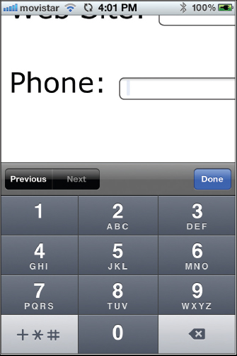
Figure 12-7 Keyboard adjusted to help user input phone numbers
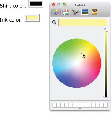
Color Selectors
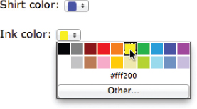
The final new type of input type I want to discuss in this section gives us the ability to add color pickers to our forms. Suppose you were creating a site for a t-shirt designer. You might use these color input fields to allow customers to select the shirt and ink colors for their designs, like this:
NOTE
Browsers that don’t yet support the color input type simply display the default text box.
As of this writing, many modern browsers don’t yet support the color input type. The previous illustration shows how Opera supports color pickers. Chrome also supports color inputs, but relies on the operating system to actually select the color. As you can see in the next illustration, clicking the color box in Chrome on the Mac reveals the Apple color picker.
Select Menus
Whenever you want to let users select from a long list of options, you might consider using a select menu instead of check boxes or radio buttons. Select menus are lists that have been compressed into one or more visible options, similar to those menus you find at the top of other software applications.
NOTE
Menus may appear differently depending on which browser or computer system is used.
Also called drop-down menus, this type of menu enables users to click an option initially visible, and then pull down to reveal additional options. Unless a number greater than 1 is specified in the
size attribute, only a single option is visible when the page loads. This option is accompanied by a small arrow, signifying that the menu expands. When the size attribute is 2 or more, that number of choices is visible in a scrollable list. Figure 12-8 shows two select menus. The first one uses the default size of 1, while the second is set to size=3.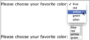
Figure 12-8 The
size attribute enables you to specify how many options in your select menu are visible at once.The
select element is used to create the menu initially, while option tags surround each item in the menu. A menu asking users to choose their favorite color might be coded like the following:
NOTE
If you don’t use the
value attribute with each option tag, the text displayed in the menu will be transmitted as the option’s value when the form is processed. Based on my experience, I recommend using the value attribute whenever possible to avoid confusion when the form is processed.By default, users can select one item from the list. If you’d like them to be able to choose more than one option, add the
multiple attribute to your opening select tag. The way users select more than one menu item depends on their computer system. For example, Macintosh users hold down the COMMAND key when clicking, while Windows users hold down the SHIFT key (or the CONTROL key to select noncontiguous choices in the list) and click.
In addition, you can specify any item to be already selected when the page is loaded by adding the
selected attribute to that item’s opening option tag. Users can select a different menu item if they choose.NOTE
Don’t specify more than one item as
selected, unless you also let users choose more than one option by adding the multiple attribute to the select tag.
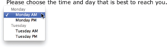
Submenus
The
optgroup element is used to divide long menus into categories of submenus. The label attribute is employed along with the optgroup element to give the submenu a name. The following is an example of how to create submenus with optgroup tags, followed by a visual representation of how one browser displays them: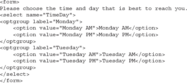
Disable Form Elements
When you want to restrict a user’s input for a specific element, you might use one of two attributes:
The
readonly attribute can be added to input controls so that users cannot change the values. For example, in the following code, the phrase ww1234 is displayed in the text field but cannot be changed by the user. If you try to type in a text field that has been set to readonly, an alert is displayed or heard, but otherwise, no change exists in the appearance of the box.
The
disabled attribute works essentially the same way, except input controls that are disabled also appear in gray or faded text to reduce their importance in the form. You cannot click in a text field that has been set to disabled.
While these attributes can be useful for sending data the user can’t edit, there’s actually a better way to do that. Keep reading to see what I mean.
Hidden Fields
Depending on the type of form you are creating, you may need to include a hidden field. For example, many teachers create several versions of a test to avoid having students look over their classmate’s shoulder and cheat. In cases like this, you might make a special mark on the test identifying to which answer key it belongs. On web forms, these special marks are called hidden fields.
A hidden field is data attached to, and processed with, a form that cannot be seen or changed by the user. You can use as many hidden fields in your form as you’d like, using
input tags with type attributes set to hidden.
TIP
This is also how you pass information from one form to the next when you start to build multipage forms.
File Uploads
Some online forms might require that a file be transmitted along with any data from the form. For example, you might provide the option for potential employees to submit a photo along with a job application being filled out online. This can be accomplished by using
type="file" with the input element.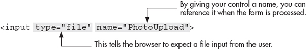
NOTE
Check with your site’s system administrator before adding file uploads to your web form because some hosts do not permit users to upload files through the web browser for security reasons. In addition, even if file uploads are permitted on your site’s system, some adjustments to the host computer may need to be made.
For document uploads, most browsers display a text field followed by a button typically labeled Browse. By clicking the button, users can locate the file they want to send with the form on their computers. After they do so, the browser prints the location and name of the file in the text field provided.
You can increase the size of the text field by adding the
size attribute to the input tag. Because many file locations may be long, you might want to specify a size of 30 to 40 characters.
In addition, HTML5 added the multiple attribute to file uploads. Using this attribute lets the browser know it’s okay for the user to select multiple files to upload:
Buttons
Buttons enable users to interact with a form. For example, to tell the browser you’re finished filling out a form and are ready to process it, you might click a button labeled Submit. You can create three types of buttons with HTML:
• Submit buttons Used to process a form
• Reset buttons Used to reset a form
• Other buttons Serve any alternative needs for buttons in a form
You can use the
input or button tag to create any of these buttons. Because the input element is the preferred method for adding buttons to forms, I suggest you use that. In either case, add the type attribute and appropriate value to identify which button you are creating (see Table 12-3).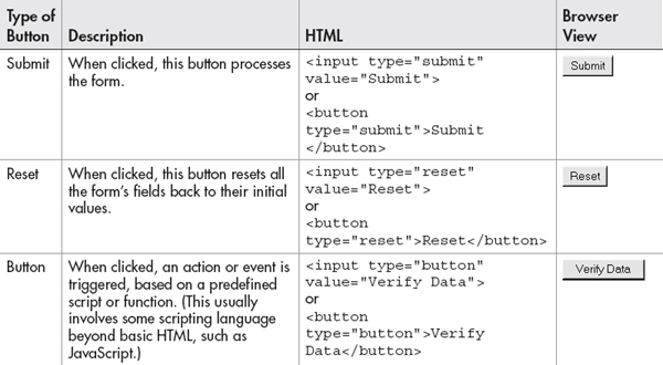
Table 12-3 Types of Buttons
TIP
On the PC, these buttons are displayed as rectangles with squared-off edges by default. On the Mac, these buttons have rounded edges.
Formatting with the button Element
You may be wondering why I’d even mention the
button element when the input element is more popular. Well … while the input and button elements both create a basic gray button with text inside, the button element has additional formatting possibilities. You may have noticed in Table 12-3 that, unlike the input element, which doesn’t have a closing tag, the button element has both opening and closing tags. This enables you to enter text, images, and other HTML that will be placed on the button when viewed in the browser.For example, if I include an
img element between the opening and closing button tags, that image would be displayed in the center of the button when viewed in the browser.
By default, most browsers display a gray background with a black border around buttons created in this fashion. This means by default, using the preceding code, that button might look like this in the browser:

If you want your images to appear seamlessly on the button, use that same gray as your image’s background color or make the image’s background transparent. Or, change the background color and turn off the border in your style sheet.
Graphical Buttons with the input Element
You can also use an image as a button with the
input tag by changing the type to image, as in the following example. The src attribute is then required to specify where to find the image. Likewise, you also should add the alt attribute to allow for a text description to display when the image does not.
Graphical buttons created with the
input tag are different from those created with the button tag because they aren’t naturally placed on a button in the browser. Instead, they’re surrounded by a border, just like what’s around any other linked image by default. You can use style sheets, as needed, to turn off that border.| Try This 12-1 | Create a Basic Form |
All web sites should contain some way for visitors to contact the business or organization. Otherwise, it’s like having an advertisement in the phone book that doesn’t list your phone number! This could be accomplished through a simple email link, a listed phone number, or even a Contact Us form. In this project, you create a Contact Us form for your practice site. The goals for this project include
• Creating a basic form
• Using several different input controls in the form
• Creating submit and reset buttons
1. Open your text or HTML editor and create a new file entitled contactus.html.
2. Type all the HTML tags needed for a basic HTML page.
3. Type opening and closing
form tags.4. Create input controls that allow visitors to request information about products and services for this company. Be sure to include ways for the company representative to reach the user, such as through a phone number and/or email address.
5. Save the file.
6. Open your web browser and choose File | Open Page (or Open File or Open, depending on the browser you’re using). Locate the file contactus.html, which you just saved. Make sure the file appears as you intended it. Note: Nothing will happen when you try to “submit” your form, but don’t worry—we address processing forms in the next section. For now, we’re focusing on creating the form itself.
7. If you need to make changes, return to your text editor to do so. After making any changes, save the file and switch back to the browser. Choose Refresh or Reload to preview the changes you just made.
TIP
Do your text fields, select menus, and other controls appear? If not, check to make sure you closed your
form tag (</form>). For more tips, see Appendix C.Online forms are a great way to get customer feedback. In addition, forms make it easy for your visitors to ask questions about products and services. This project gave you practice working on a basic form.
Validate the Form Content
Prior to HTML5, the only way to validate form content involved scripting or programming beyond basic HTML. This pushed it beyond the realm of many new or novice developers. Thankfully, HTML5 brings us the required and pattern attributes.
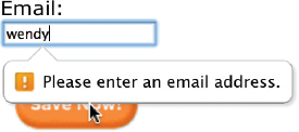
This eight-letter word—required—may seem inconsequential at first glance, but is actually quite powerful in supported browsers. Simply adding it to an input control will prevent the form from being submitted if that particular field is left empty.

As an added bonus, when used in conjunction with a specialized text field like email, supporting browsers will prompt the user to enter the appropriate content before proceeding.
If you’re practicing these elements and attributes alongside me, you may have noticed the browser indicated the field was invalid in some way, to identify the problem area to the user. You can adjust the color, shape, or other characteristic of the input control—both when it is valid and when it is invalid—with a few special selectors. For instance, in the following code snippet, all input controls will carry a two-pixel, solid gray border. When the cursor is present inside the form field—with the :
focus pseudo-selector—the border changes to green. When the form is submitted within the required fields—with the :invalid pseudo-selector—the border changes to red.
We’ll look at this a bit more in the next chapter.
Using Patterns
One of the most frustrating aspects of forms can be the incomplete data received when the form is submitted. We’ll talk a little later about validating that content to help prevent the submission of incomplete data, but first let’s consider one of the new HTML5 attributes that is applicable to this conversation.
NOTE
The
pattern attribute works with the following types of input controls: text, search, url, tel, email, and password.The
pattern attribute allows us to specify those characters deemed acceptable for a particular text input field. For instance, suppose you coded a form with credit card fields. How useless is it to receive a completed form that is missing one of the numbers in the credit card field? We can use the pattern attribute to indicate exactly how many numbers are required, like this:
The accepted value of the
pattern attribute is a valid regular expression. In the preceding example, the first part of the pattern, [0-9], tells the browser to only accept numbers between zero and nine. The second part, {16}, specifies the total length of the required characters. Regular expressions—or regexp in JavaScript terminology—are somewhat cryptic-looking character strings that specify an expected pattern. There are tons of different options available, depending on exactly what you’re looking to describe. For an excellent resource on writing regular expressions for your patterns, check out www.html5pattern.com.The following illustration shows how Chrome handles a situation when the user input doesn’t match the requested pattern.

It’s important to note that the tool tip only displays when the user enters incorrect data and attempts to submit the form. If the field is left blank, the pattern is not checked. So to prevent users from submitting a form with a blank field, add the
required attribute to the input tag, like this:
With both the
pattern and required attributes, the browser will prevent the form from being submitted unless a valid text string is entered in the corresponding field.Provide a Way for Your Form to Be Processed
The phrase processing method refers to what happens to the form after the user enters all the data and clicks the Submit button. Is it emailed to the site’s administrator or stored in a database? Or perhaps it’s written to another web page on the site, such as what occurs with a guest book or bulletin board. Many possibilities exist, which ultimately depend on the purpose of the form.
Inside the opening
form tag, you need to tell the browser how to process your form. This is accomplished through the action attribute (which is required), as well as the method and enctype attributes (which are optional).The action Attribute
The
action attribute gives the location where the form’s information should be sent. This can be in the form of either an email address:
or the URL of a CGI script:
While the easier way to process a form is to have the data sent to an email address, I don’t recommend this method. Because no official specification exists for using email to process forms in HTML, the results achieved with this method vary according to the browser. In fact, many browsers don’t support this method at all. Perhaps the best use of this might be testing your forms before implementing a CGI script.
TIP
You might think of a CGI program as being similar to the mail carrier for your post office. This person picks up your mail and transports it to and from the post office. Some mail carriers drive trucks, while others drive cars or walk. Regardless of how they get there, they all take mail to the post office and bring mail back to you. In like manner, CGI scripts, regardless of which language they are written in, transfer information to and from the server.
CGI stands for Common Gateway Interface and refers to a program that sends information to and from the server. This program, also called a script, can be written in several different scripting languages such as ASP, PHP, or CFM. The oldest and most common of these languages is Perl, because of its ease of use and the large number of people who are able to write it.
CGI scripts must reside on your server (the computer hosting your web pages for everyone on the Web to access) in directories with special settings that allow them to be executed, or run. For this reason, using a CGI script requires you to talk to the company that hosts your web site about whether it supports CGI scripts and, if it does, how to implement them. Most hosting companies receive questions about CGI scripts quite often and have pages of information on their web sites dedicated to the subject. When in doubt, visit your host company’s web site or call to see what your next step should be.
NOTE
One reason some hosting providers don’t allow CGI scripts on their servers is that they can infringe on the site’s security. If your hosting provider doesn’t let you use a CGI script, don’t worry. Several services are set up to host these scripts and process your forms for you. Check with your own hosting provider for referrals, or search Google for a list of companies providing these types of services.
What Does a CGI Script Look Like?
Just because a CGI script cannot be written in HTML, that doesn’t mean you can’t learn how to write one. As I mentioned before, I don’t consider myself a computer programmer and I didn’t study computer science in school. I can understand and write basic Perl scripts to process my HTML forms, though.
While creating CGI scripts (whether in Perl or another language) is beyond the scope of this book, Figure 12-9 shows what a CGI script written in Perl looks like. By showing this, I hope to give you an idea of what happens to the form data after a user clicks the Submit button.

Figure 12-9 This CGI script, written in Perl, was used to process a form that lets parents and friends email kids at camp.
Where Can I Get a CGI Script?
Literally thousands of free CGI scripts are available on the Web, and thousands of others are available for small fees. First, check with your hosting provider for referrals. Your provider might even have some scripts on hand for you to use that are already set up to work on their systems.
If you need to find your own scripts, try searching Google or looking at some of these sites:
Pay attention to the documentation offered with each script because it should tell you how to customize the script for your needs and how to install it on your server.
The method and enctype Attributes
The two other attributes you’ll probably use in the opening
form tag are method and enctype. The method attribute tells the browser how to send the data to the server. There are two common values for this attribute: get and post.TIP
For help deciding which method or enctype to use, consult your hosting provider or the creator of your CGI script.
The
get method takes all the data submitted with the form and sends it to the server attached to the end of the URL. For example, say the script location is http://www.yoursite.com/cgi-bin/form.cgi, and the only data from the form is the user’s name (in this case, we’ll use wendy). If the method was set to get, here’s what would be sent to the server when the user clicked the Submit button:
This method works best for searches where a small amount of information must be transferred to the server, such as the keywords you are searching for. For more comprehensive forms, the
post method can be used. Instead of attaching the information to the URL of the script, the information is sent directly to the location of the script file. (However, there are limitations on file size, depending on where the data is going and how the server is set up. Check with your system administrator for more information if file size becomes an issue.)The
enctype attribute, short for encoding type, tells the browser how to format the data when the method attribute is set to post. The default value is application/x-www-form-urlencoded. Because this should work for most of your forms, you needn’t include the enctype attribute in your form tag unless you want to change the value.For example, if you are allowing users to upload files with your form, you need to change the
enctype to multipart/form-data, as in the following example:
Chapter 12 Self Test
1. Fill in the blank: _______________ tags must surround all web forms.
2. Name four types of text input controls in HTML web forms.
3. Which attribute names an input control so that it’s correctly handled when the form is processed?
4. Which input control is most useful for questions requiring a simple yes or no answer?
5. True/False: Radio buttons are small, round buttons that enable users to select a single option from a list of choices.
6. Fill in the blank: The ___________ attribute identifies the visible width of a text area based
on an average character width.
7. Fix the following code so that users can enter multiple lines of data into the comment box, which should measure 30 characters wide by 5 lines tall:
8. How do you cause three options in a select menu to be visible at once?
9. Add the appropriate code to create a single-line text field in which, upon entry of data, all contents are displayed as bullets or asterisks in the browser. Name the field “secret.”
10. Fill in the blank: ____________ tags surround each item in a select menu.
11. Add the appropriate code to create a place where users can upload a graphic file from their personal computers to the web server. Name the field “upload.”
12. Which attribute is added to the
form tag to give the location where the form’s information should be sent?13. Which attribute and value are added to the
form tag to tell the browser to take all the data submitted with the form and send it to the server attached to the end of the file’s URL?..................Content has been hidden....................
You can't read the all page of ebook, please click here login for view all page.