Chapter 5
Page Structure
Key Skills & Concepts
• Organize Sections of Content
• Format Paragraphs and Page Elements
Now that you’ve learned the basics of planning for, opening, editing, and saving a web page, and know a little about working with text, you’re ready to learn about structuring the content.
Organize Sections of Content
As we’ve discussed, planning is an important aspect of developing a web page—especially when it comes to organizing sections of content on that page. A great strength of style sheets is the ability to easily apply groups of formatting characteristics to whole sections of text. For example, suppose you have three paragraphs and a list making up the main body copy of a page, and you want to see how the text in that section looks with a different font face and size. As long as you’ve organized your content appropriately, the code changes will be minimal.
The key to all this is the use of some appropriately placed container elements. Prior to HTML5, the primary container element was the div element, but we now have several others to use as well.
So at this point in the process, here’s an important concept to understand: When structuring web pages, we first group content into sections with HTML; then we apply style and formatting with CSS later. Let’s take a closer look at the HTML used to create those content sections.
Identifying Natural Divisions
When developing HTML5, the authors took a look at how web designers were using div containers. Over and over again they saw the same types of sections being contained within div tags: headers, footers, navigation bars, and so on. The code used to separate each section might look similar to the following:

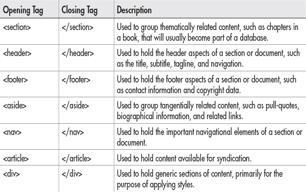
To help speed up the development process, and to make it all more user-friendly, HTML5 added six new container elements. The original div element and the six new container elements are briefly described in Table 5-1.
Table 5-1 HTML Container Elements
Once you’ve set up basic divisions like this—leaving the styling and formatting to CSS—the possibilities are endless. Need to move the navigation from the top of your page to the bottom ... on ten different pages? If you put all of it into its own content areas ... piece of cake! Not only is it easy to move that entire navigation bar, you only have to edit the style sheet—and not the individual HTML pages—to do so.
To help you understand how these natural divisions work, let’s look at the sample web page shown in Figure 5-1.

Figure 5-1 Sample web page for a school
Then, let’s take that page and reverse-engineer it, so to speak, to try and identify the natural content divisions. Figure 5-2 shows one possible way this page might be coded using the new container elements. In this instance, I choose to put the logo, navigation, and search fields into a header section, and then nest the nav section inside of it. Next, I used the section elements to contain the main body content, plus an aside element for the related content in the sidebar. Finally, I finished the structure with the footer.
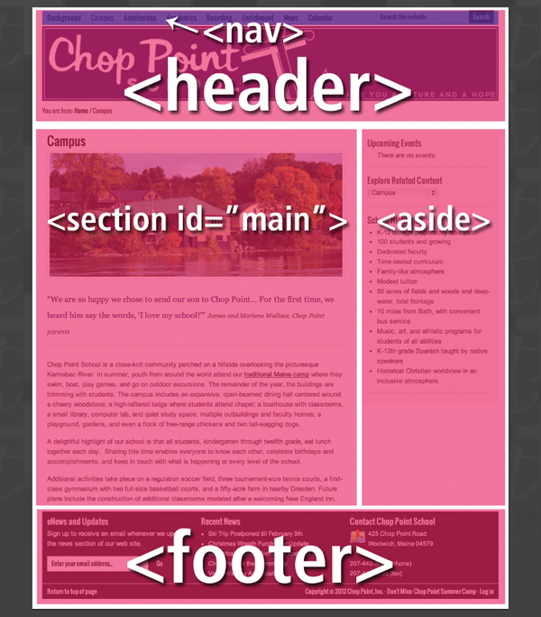
Figure 5-2 Sample web page for a school with content divisions identified
Because the specific use of these elements is flexible, there are plenty of additional ways this page could be coded too. Keep that in mind as you begin to structure your page content. As long as you follow the general W3C guidelines for container elements, you have some leeway in regard to which elements are used where.
On their own, the container elements will not change the way the page displays. It is through the combination of this structure, and the style information added later, that the page display is created. You might think of it this way: Before you can paint a wall, it has to be built with construction materials first. At this point in the process, we are using container elements in HTML to “build” the wall, which will then be “painted” with a style sheet.
Now let’s take a closer look at those six new container elements.
The Header and Footer Elements
The header and footer elements can be used to contain the primary header and footer areas of a page, as well as other minor header and footer sections. This means you can actually have multiple headers and footers on a single page. Here’s an example of how the header tags are used:

Both opening and closing tags are required for these elements; the content to be displayed inside the header or footer goes in between the opening and closing tags.
NOTE
Even though the names are similar, the header element has nothing to do with the head element. Headers go inside the body content, while the head element is placed outside the body of the web page.
The Nav Element
The nav element can be placed inside of another section or can stand on its own. However, it is not necessary to enclose every single link on your page inside of a nav container. On the contrary, only the most important navigation block(s) should go inside nav tags.

The Aside Element
An aside in HTML is a chunk of content related to the main article or section, but not part of the main flow of the page. Most commonly, that results in the aside element being used for pull quotes, biographical information, and related advertising or links.
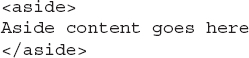
Both the opening and closing tags are required for the aside element.
The Section and Article Elements
I left these two last because they are most easily confused with each other. Both primarily contain the same type of content, but only one—the article element—is ear-marked for syndicated content. Some examples of syndicated content include blog posts and newspaper or magazine articles.
TIP
On the Web, syndication refers to content made available to other web sites for reproduction. Oftentimes a site makes it known that its content is available for syndication by displaying a small orange icon like this: |
 |
By contrast, the section element works better for chapters in a story, general sections of a web site (such as About Us, Contact Information, and Company History), and other nonsyndicated page content.
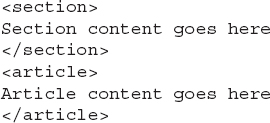
Both opening and closing tags are required for these elements. You can have multiple sections and articles on a single web page. Also, each of these elements can be nested inside one another, depending on the use case.
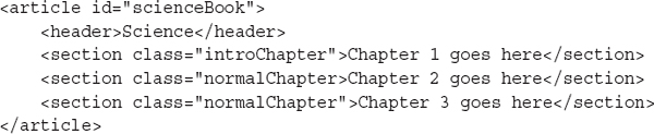
For instance, suppose you were creating an online book. You might place each chapter in the book inside section elements, and then put the entire book in an article element for syndication. Here’s a very rudimentary example of how the structure of such a book might be created:

NOTE
According to the W3C, the section element was specifically created for chunks of content to be stored in a database. This means it should not be used as a generic container for content; if you’re just looking for a generic container element to house content for styling purposes, use a div element instead.
Element + ID
If it doesn’t make sense to use any of those six container elements, you’ll want to use the div element, which essentially is the most generic container element. It’s important to note that you needn’t try to force your content areas into one of the new elements. It is perfectly acceptable, and even sometimes preferable, to use the generic div element for most or even all of your page’s content areas.
But whenever you use any of these container elements multiple times on a page, you’ll likely want to add an id attribute to give each content area a name.

In the same way that a unique Social Security number is assigned as identification—ID—for each person living in the United States, so, too, should a name be given to each content area you intend to style uniquely. Once you’ve named your divisions, these content areas can then easily be formatted in the site’s style sheet, which might look something like the following:
TIP
Avoid spaces in ID names. Instead, I typically use capital letters to help make the name more readable if it contains several words.
In the style sheet, the # before each content area name is necessary because this isn’t a normal tag selector. Instead of using an HTML tag as my selector, like p, I’ve essentially made up my own selectors and given them names like introduction and summary. And because I used the id attribute to do so, I prefaced my selector name with a hash mark (#).
Element + Class
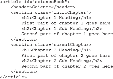
Wait—what about instances where you want to style multiple sections the same, or with only minor adjustments? In these cases, you can apply a class—instead of or in addition to an ID, depending on the situation—to the opening tag. In the following example, I set up two different classes for the chapters in a series of books. First, the class titled “introChapter” will be styled one way; then the rest of the chapters—“normalChapter”—will follow a different style.
The corresponding style sheet might then start off with something like this:

(We’ll cover these and a lot of other styling options throughout the course of the book, but for now I just want you to understand styles as they relate to the structure of the web page.)
You’ll notice I added a hash mark (#) before “scienceBook” and a period before the two chapter styles. The difference is simple: “scienceBook” was created with an
id attribute, whereas the other two were created with class attributes. Even though I named them all, they need to be prefaced by specific characters to let the browser know where to find them in the rest of the code (in other words, whether they should follow id or class attributes). So, when you use the class attribute, you always preface the class name with a period in your style sheet. Likewise, you use a hash mark or pound sign before your id names.We’ve just added two types of selectors to those mentioned in previous chapters. So to help solidify your knowledge, refer to Table 5-2 for an overview of the most commonly used CSS selectors. There are tons of other types of selectors too. Check out www.w3schools.com/cssref/css_selectors.asp for a great online CSS selector reference.
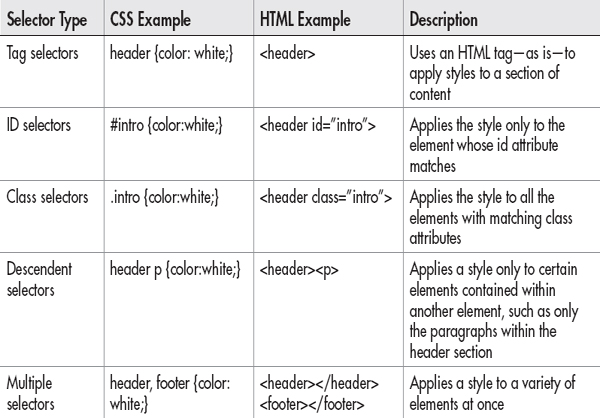
Table 5-2 Commonly Used CSS Selectors
TIP
While there are many people in a class, your personal identification (ID) is unique to you. This holds true in CSS—id selectors can only be used once on a page, whereas classes can be repeated as many times, and in as many tags, as necessary.
Set the Outline
One of the intentions of HTML5 is to make our web pages more structurally sound and easily interpreted by nonvisual users. This is achieved largely through the new sectioning elements we just discussed, but also through well-placed headings.
Heading tags are similar to the headings you might use in a word processor such as Microsoft Word. And just like outlines in Microsoft Word, HTML headings are intended to be used only in the proper order, from
h1 down to h6.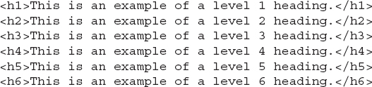
For example, you wouldn’t create an outline that began with a small letter a and was followed by the Roman numeral I. Instead, you would begin with the Roman numeral I, follow that with a capital A, and, most likely, follow it with a number 1. In like manner, an
<h1> should be followed by an <h2>, as opposed to an <h3>.NOTE
Using a heading tag automatically adds breaks before and after the heading because these tags are block-level container tags. You can refine the spacing around a heading in your style sheet.
You can add headings to each of your content areas, as dictated by the content. Here’s a quick example to show you how this might work in combination with the section containers:
Styling Headings
You use the heading tags to tell the browser which pieces of text function as headings, and then specify how to style them with CSS. So, you could quickly adjust the alignment of your headings with an inline style by using
<h3 style="text-align: right;">. Likewise, you could use h3 as a selector in an internal style sheet (placed in between the opening and closing head tags on your page) to specify the formatting options of all level-3 headings on the page.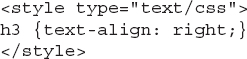
Get Inspired
Now that we’ve covered the basics about the structural elements, let’s pause to remind ourselves why it is important to structure well. One of my favorite sources of inspiration on this topic is the CSS Zen Garden (www.csszengarden.com). This web site shows how one web page can be drastically altered simply by changing the style sheet attached to the page. Each content area of this page is clearly and structurally defined in the HTML code.
NOTE
This site was created before the development of HTML5, and therefore uses only div tags for structuring the page. Even so, the site is a wonderful example of how structural markup and styles work together to display pages.
After dividing his page into sections, the author then attached a style sheet with directions for how to display each of those content areas. Style sheets are so powerful that a few simple changes to them can cause the page to appear completely different, as you can see in Figures 5-3 and 5-4.

Figure 5-3 Creator Dave Shea’s original design for the CSS Zen Garden
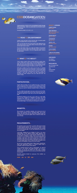
Figure 5-4 One of the additional designs, achieved simply by altering the style sheet (and not the HTML code)
Organize Text
After you’ve structured your page into the key content areas and added headings, you can further organize the text in those content areas. As discussed briefly in Chapter 2, HTML is different from traditional word processors because you cannot simply press the RETURN or ENTER key to end a paragraph, and then the tab key to indent a new one. Instead, you have to use tags to tell the browser where to start and end paragraphs, as well as any other types of breaks.
Paragraphs
The
p element functions specifically as a container for paragraphs. This means you use an opening p tag at the beginning of your paragraph and a closing p tag at the end. If each line in this nursery rhyme were a paragraph, it might look like this: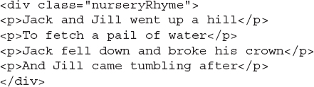
Figure 5-5 shows how the browser would render this code. Notice how the
p tag forces a blank line between each of the paragraphs or sections by default.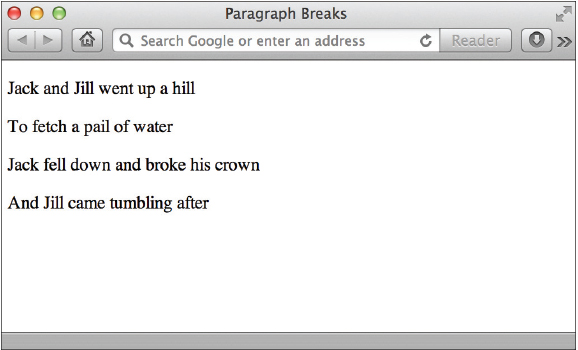
Figure 5-5 The paragraph element defines sections of text.
Even though the p tag is most often used to contain paragraphs of text, it doesn’t automatically indent them. There’s no regular HTML tag to indent and, as discussed in Chapter 2, the browser ignores any tabs and multiple spaces you enter using the keyboard.
Indenting
To indent the first line of a paragraph, you can use the text-indent property in your style sheet. In the following example, I specify that the first line should be indented 25 pixels from the left edge of the paragraph:
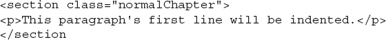
While the preceding example uses an inline style to affect this paragraph only, you could add the same declaration to an internal or external style sheet to achieve this effect on all the paragraphs in a page or a whole site. For example, if I wanted all of the paragraphs in the normalChapter sections of my page to be indented 25 pixels, I might add the following declaration to my style sheet:

Here’s how the HTML for the related paragraph might look:
NOTE
On the printed page, such as in books and newspapers, paragraphs are indented to ease readability. But on the Web, the
p tag automatically adds blank lines between paragraphs to ease readability, thus removing the need for additional indentations.Line Breaks
You can also use the
br tag to add a line break in your HTML page. Typing the br tag in HTML is the same as clicking the RETURN or ENTER key on your keyboard in a word processor. It causes the browser to stop printing text on that line and drop down to the next line on the page. The following code uses the same nursery rhyme with line breaks instead of paragraph breaks between each line. Figure 5-6 shows how the browser would display this code.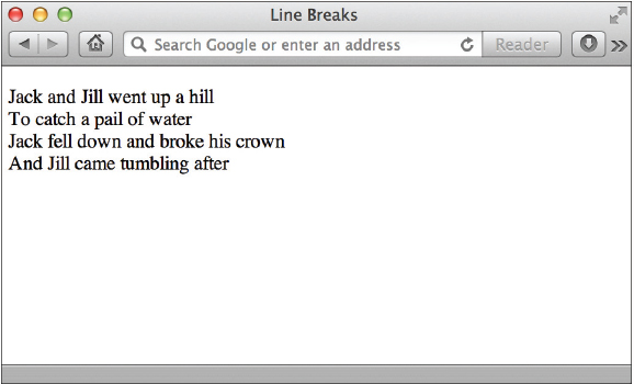
Figure 5-6 The browser understands the
br tag as a signal to stop and begin again on the next line.
In most cases, it doesn’t matter if you click the RETURN or ENTER key after typing
<br> to begin again on the next line (as shown in the preceding code). In fact, that code would have the same output if you let all the text run together, as in the following example: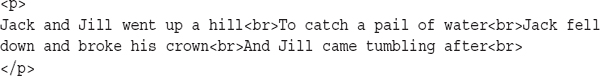
Unlike when using the
p tag, which cannot be repeated to add multiple paragraph breaks in a row, you can use the br tag to add several line breaks. To do so, simply repeat the tag in your HTML file. Figure 5-7 shows how the browser renders this code.
Figure 5-7 You can use multiple br tags to add as many breaks as you want to your page.

Preformat
The only time pressing the RETURN or ENTER key in your page creates line breaks in the browser view is when the
pre tag is used. Short for preformat, the pre tag renders text in the browser exactly as you type it. Why, then, wouldn’t I just use the pre tag for everything, since it sounds so much easier? Two reasons:• The
pre tag usually displays text in a monospaced font, such as Courier, that looks similar to what a typewriter prints. While this may be appropriate for examples of programming code, it probably isn’t the look you want for your entire web site.• The output isn’t guaranteed to remain as you envisioned it. Even though you’re able to use the TAB key to format text in the
pre tag, browsers may interpret a tab as a greater or lesser number of spaces than your text editor did. This could cause any tables you lay out to render incorrectly.With that said, the
pre tag can be quite useful for displaying code examples or even creative illustrations.
Here’s how one browser displays the preceding code:

Quotation Blocks
The
blockquote element is used to set apart content quoted from another source. By default, this element indents the entire selection on both the right and the left, and also adds a blank line above and below. The browser determines the exact amount of the indentation, so it may vary from browser to browser. The result of the following code is shown in Figure 5-8.
Figure 5-8 Notice how the
blockquote element causes the text to be indented on both sides.
TIP
You can include
br or p elements within the content of your blockquote. In addition, you can nest blockquote elements as needed.To achieve a specific amount of indentation, as well as control the blank space above and below, you can use CSS’s margin and padding properties in your style sheet. But wait, you say, we haven’t even learned those yet! Here we go…
Box Properties
Every element on a web page is contained within a box of sorts, or at least it’s considered a box in coding standards. This means you can format content on the page by adjusting its box dimensions, for example, or by indicating how far away from the browser edges it lies.
Unfortunately, this has been known to get pretty tricky because some of the browsers have interpreted the box properties a bit differently. Thankfully, HTML5/CSS3 now gives us the ability to even out the playing field, so to speak, by first using the box-sizing property to specify exactly which interpretation method should be used.
•
box-sizing: border-box; Tells the browser the borders and padding values are included inside the height and width values (see Figure 5-9)
Figure 5-9 The border and padding are included in the overall box height and width when the box-sizing property is set to border-box.
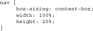
•
box-sizing: content-box; Tells the browser the borders and padding values are not included inside the height and width values (see Figure 5-10)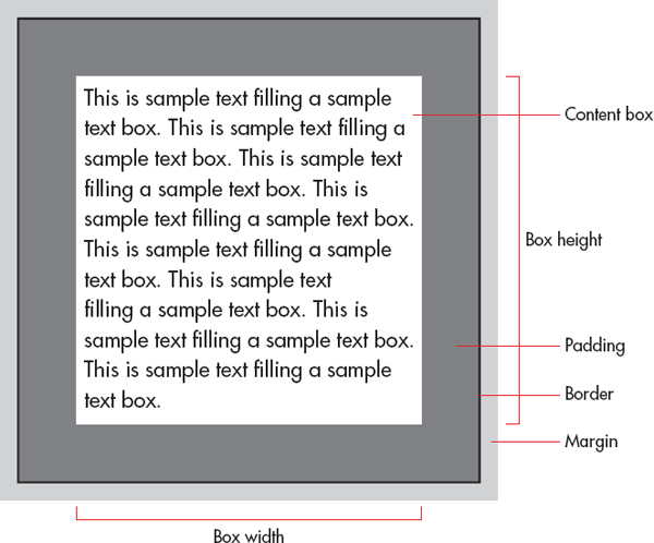
Figure 5-10 The border and padding are not included in the overall box height and width when the box-sizing property is set to content-box.
In Figure 5-9, notice how the padding is contained within the borders of the box. By contrast, it is not included in the overall content box height and width in Figure 5-10. It doesn’t matter which of these methods you use, as long as you first tell the browser how to interpret your measurements and plan accordingly. However, if you want to use content-box as your sizing method, you’re in luck because that is now the default option. To clarify, you only need to specify the box-sizing property in your style sheet if you intend to change it from the default (content-box) to border-box.
Height and Width
After you specify which type of box properties you’re using, you may want to also identify the box’s intended height and width. Note it is not required to do so, if all you’re doing is adding a border or adjusting the buffer space around the content. (If you’re trying to position a section of content on the page, the height and width values become more critical. We’ll cover that in the following chapter.)
Height and width properties are referenced with a unit of measurement:
• px (pixels)
• cm (centimeters)
• % (percentage of the containing box)
TIP
The most common unit of measurement is pixels, particularly for sections of content that need to always be displayed in a certain size “box.” However, a growing number of designers are sticking to percentage widths because they allow the content to grow and shrink according to the available space in the browser window.
So, if I wanted to specify that my nav box should run the entire width of the page, but only 20 percent of the page height, here’s how that code might look:
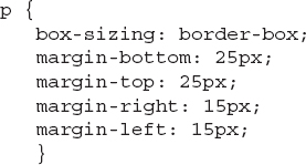
Padding
You can use the padding property in a style sheet to give the content a buffer zone of white space on one, two, three, or all four sides, as I did for the
blockquote tag in the following example:
If you do specify a certain amount of padding using this box method, such as padding-right: 15px, those 15 pixels are then subtracted from the total width of the content box. So if your box is 200 pixels wide by 200 pixels tall, and you code a 25-pixel padding on all four sides, you are left with 150 pixels across and 150 pixels down for the actual content.
Speaking of using the same padding dimension on all four sides … we can use shorthand to speed up that process. Instead of writing out padding-bottom: 25px; padding-top:25px; and so on, we can simply use:
TIP
A faster way to code padding that is different for each side is this: blockquote {padding: 25px 15px 20px 35px;}, where the sides are specified in the following order: top, right, bottom, left (clockwise, starting with top).
Margins
The margin property affects the buffer space outside the box boundaries, so it won’t subtract space from the overall size of the content box. As with the padding property, you can define the margins for one, two, three, or all four sides of the box, such as in the following:
TIP
You might think of margins and padding in terms of a framed painting. The padding affects how far the paint is from the edge of the canvas, while the margin corresponds to how wide the matte and/or frame is.
TIP
A faster way to code margins that want to specify one value for the horizontal margin and another for the vertical margin is this: p {margin: 25px 15px;}, where the sides are specified in the following order: top/bottom, left/right.
Borders
Boxes can have both horizontal and vertical borders. You can easily alter the size and style of borders, which can be placed around all sorts of page elements—from images to paragraphs of text. Table 5-3 identifies the properties used to control borders and rules for web pages.
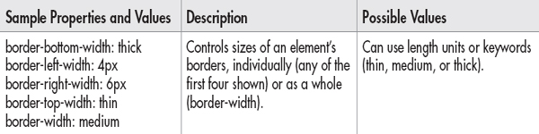
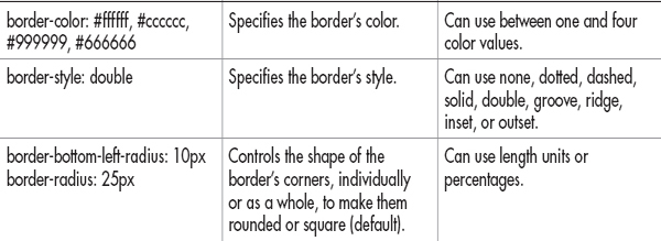
Table 5-3 Style Sheet Properties Used to Control Borders and Rules
The following bit of code shows an inline example of using the border property to add a single-pixel black line below a paragraph:
NOTE
Did you see all those border style declarations and wonder if there was a simpler way to write them? There is. Using shorthand, you could also write the following code to specify a single-pixel black border below a paragraph. While older web browsers had trouble with shorthand, all modern browsers understand such code without any trouble:
Alignment
The normal text alignment depends on how text is read across the page in the browser’s default language. If text is read from left to right, the normal alignment is left. If text is read from right to left, however, the normal alignment is right. In either case, when text is aligned to one side or the other, the opposite side is ragged, in that it doesn’t continue all the way to the margin. When text does continue to both margins, it is called justified.
The text-align style sheet property allows you to realign text on your page in any of the following ways:
• left
• right
• center
• justify
Styles also enable you to align text vertically with the vertical-align property, as listed in Table 5-4.

Table 5-4 Style Sheet Text Alignment Properties
The following code provides an example of how embedded style sheets can change the text alignment of three different paragraphs. Figure 5-11 shows how the browser interprets this code.

Figure 5-11 The example code is illustrated here, showing different alignment possibilities for the text-align property.


But what if you wanted to justify all three of those paragraphs—would you have to add the same style sheet information to each p tag? Definitely not! For one thing, if you planned your page appropriately and separated the content areas with the appropriate container tags, you could take advantage of that planning by adding the text-align property to the appropriate selector in your style sheet, instead of any individual tags within each content area. For example, the following code shows how I named one division with the three paragraphs:

Then, in my site’s main style sheet, I use that name—aboutMe—when assigning the formatting of that section. Remember, the # before aboutMe is necessary because this isn’t a normal style sheet selector. Instead of using a tag as my selector, like
<p>, I’ve made up my own selector and given it the name of aboutMe. And because I used the id attribute to do so (instead of the class attribute), I prefaced my selector name with a hash mark or pound sign.
NOTE
Beyond this most basic style of alignment, style sheets also offer advanced alignment and positioning options. Refer to Chapter 6 for more details.
| Try This 5-1 | Format Paragraphs and Page Elements |
This project gives you practice in structuring content and then applying basic page formatting. Goals for this project include
• Using logical container elements to structure a page
• Adding a header, footer, and navigation
• Adding at least one other natural division to house the main page content
• Formatting one of the content areas with some of the style properties discussed in this chapter
1. Open your HTML editor and load the index.html page saved from the previous activity. Make the following changes and save the file.
2. Create content areas for the header, footer, and navigation sections.
3. Create another content area for the main body copy.
4. Add at least one more paragraph of text in between the existing paragraph(s) and the copyright information. Use a logical container tag (such as article, section, or div) and id attribute to contain all these paragraphs in a section called home Intro (or something appropriate to your particular page content). If you are using my sample business, you can use the text shown after this numbered list.
5. Add a quote and format it as an aside. If you are using my sample business, you can use the text shown after this numbered list.
6. Add at least one style declaration to the internal style sheet. You might try adding a top border above the footer or justifying the paragraphs.
7. Open your web browser and choose File I Open Page (or Open File or Open, depending on the browser you are using). Locate the file index.html you just saved.
8. Preview the page to check your work. If you need to make changes, return to your HTML editor to do so. After making any changes, save the file and switch back to the browser. Choose Refresh or Reload to preview the changes you just made.
Added Paragraphs
The following paragraphs were mentioned previously in Step 4 and can be added to your web page if you’re using my sample company.
My family moved to Nicaragua to volunteer and do mission work. As a way to support ourselves, I started an online tutoring business. I have taught math at the middle school, high school, and college levels for over 12 years.
I believe everyone has the potential to learn math. All that is needed is the right motivation, focus, and someone who can explain the material in a way that makes sense to the learner.
I pride myself on being able to explain difficult material in different ways so that the student can fully understand a concept. I love math and my enthusiasm in the subject shows in my teaching. Ultimately, my goal is to help all of my students be successful in learning math.
Quotation
The following quote is the new text (as mentioned previously in Step 4) and can be added to your web page.
“No human investigation can be called real science if it cannot be demonstrated mathematically.”—Leonardo da Vinci
Chapter 5 Self Test
1. What is the purpose of the
br element?2. What happens when you code three
p elements in a row?3. List two style sheet properties used for text alignment.
4. How is the
div element different from the article element?5. Which element—head or header—goes inside the body of an HTML document?
6. True/False: The
blockquote element indents text on both the left and right sides by default.7. True/False: You can only use one header element in each page.
8. Using #introduction indicates the style named introduction was applied to an element using which HTML attribute?
<section _______ = “introduction”>
<section _______ = “introduction”>
9. What is the primary difference between the article and section elements?
10. Which CSS property is used to specify the buffer space around a content box, inside of the box’s border?
11. Which CSS property is used to specify the buffer space around a content box, outside of the box’s border?
..................Content has been hidden....................
You can't read the all page of ebook, please click here login for view all page.