
Writing Text for Interaction
Introduction
Your application’s user interface tells your product story: The pages and surfaces your users view and interact with throughout the experience explain how the story fits together. Each surface consists of a collection of textual elements: explanations, instructions, titles, labels, interactive buttons and options, hyperlinks, and metaphors used in graphics. The text you provide for these elements is the glue that holds the story together, guiding your users through the various stages of their interaction with the application. Landing pages introduce the main concepts of the story, wizards guide users through the main processes, and property sheets and dialogs present the options required to set up and use the application.
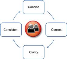
In previous chapters we looked at the “C’s” of good user interface text for creating content that is easy to read and understand. In this chapter we’ll look at the “A’s” of writing which are crucial for providing content users’ needs, at the time they need it. By creating text that is both readable and written for interaction, you will provide your users a comprehensive, positive information experience.
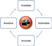
The Four A’s of Writing
While the four C’s of good writing revolve around writing content that is easily scanned and read, the A’s of writing focus on building text that guides and assists your users.
When users reach a page in your application, they should intuitively understand what tasks are available and the actions for completing the task. When deciding where to place your text and when writing the content, applying the “A’s” of writing means asking yourself these questions:
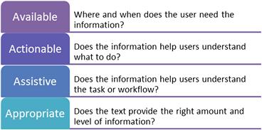
Available Content
When writing your text, it’s important to provide the information the user needs, when and where they need it. Your information is there to help users make decisions, move forward in their workflow, and understand the application. If the information exists, but is not available at the right time or in a location, you have missed your opportunity for supporting your users.
The examples below show examples of how you can make content available, helping users through a workflow, understanding the options, and providing recommendations.
In the past few years, many tools have become available for building a layer of guidance, such as help callouts into your application.
In this example, the callouts automatically appear at each step in the flow.
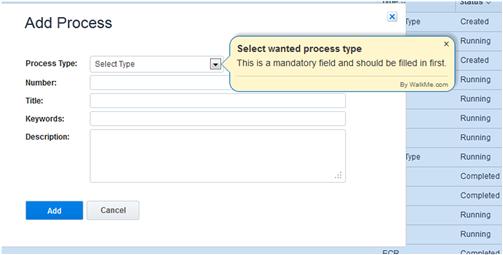
The callouts help the user understand the requirements and make sure they complete the steps in the required order.
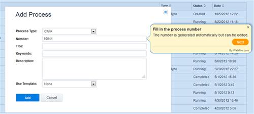
Built-in assistance can also let users know the constraints and recommendations for specific fields and options.
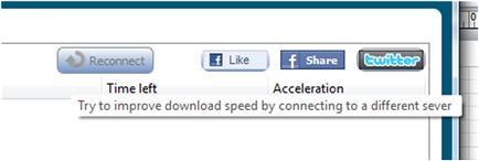
Callouts are good for letting users know what to expect at each step, as well as any constraints and recommendations. The callouts provide useful information but do not interfere.
Actionable Content
While explanations and informational text are useful for helping users understand how a feature works and what options are available, as well as for providing warnings and notes, keep in mind that the main purpose of your text is to help people complete tasks. Actionable content guides users through tasks, helping them interact with your application; it also helps users make choices and move through workflows.
In the following page, the writer combines explanatory and actionable instruction. Notice that the text in the heading and in the paragraph that follows describes the interaction from the users’ perspective. The button label clearly indicates what will happen when the user clicks the button.
Actionable content should provide enough text for users to understand the action they should take and the result of that interaction. In the following example, users don’t need to know anything beyond the information provided.
What Is Nonactionable Content?
Although some explanatory information is helpful, keeping in mind that your main goal is to promote user interaction with the application will help you avoid pages like the following one. In this page, the writer tries to explain the feature, but none of the text guides the user toward action. The page would be much more helpful if it included instructions or examples rather than explanations.
Assistive Content
Each string of text within the interface should in some way help users interact with your software. Assistive content can be provided in a variety of formats—notifications, callouts, and hover text are all familiar ways to help your users get acquainted with your features, move through a task, or proceed from one task to another.
While short explanations such as subtitles and prompts often provide enough guidance within a page, you may find that some workflows are more complex than others, and users could benefit from additional, assistive guidance. Assistance guidance integrated into a workflow is becoming increasingly common within web applications in particular.
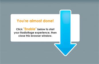
Although the callouts in the previous examples helped users enter information into fields, in the following example, the callout text helps the users understand the workflow, letting them know that the previous task was completed and telling them how to proceed to the next logical step in the sequence. This is a good example of how you can guide users toward completing a series of tasks.
Notice that while the text in this callout suggests the next step, it doesn’t force the user to take the action. This is a good example of how you can recommend a workflow to the user, while allowing flexibility.
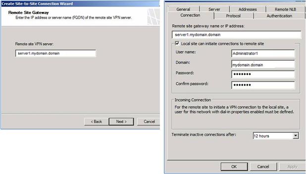
When tasks require users to complete the steps in a specific sequence, without flexibility, you can integrate a step-by-step callout sequence within your interface, allowing users to move only in the required order of steps. When steps must be completed in a specific order, wizards are also an optional form of assistance.
Appropriate Content
In previous chapters we spoke about using the right tone, which is one component of appropriate writing. Another component is making sure your content provides the right concepts and level of information for your users.
Every label, string, and piece of information in your pages should be relevant for the target user. Avoid the tendency to overexplain concepts within the user interface, and avoid technical jargon. This helps you reduce redundant text and create pages that are easier to read and scan.
If the information is important, providing a link to a help topic is a preferable method for presenting detailed explanations and technical concepts.
Mapping Information to the User Workflow
Matching the flow of the information to the order in which the user needs the information, or the order in which the task is presented, helps users understand the connection between the options, workflow, and the text in the page.
Landing pages are good for presenting high-level information about main features and providing links for drilling down into the options and help for that feature. Explanations and short descriptions within the user interface are an effective way of teaching users about using your application, introducing new terminology, and describing what options and features offer.
Landing pages help users understand a workflow or aid in selecting a specific path when a sequence of steps is either recommended or required.
In the next example, the text describes three main options the user may want to use and lets the user know the benefits of each option. The text doesn’t suggest any sequence of action or imply that any one option is preferable over another.
Whether it’s a landing page, a property page, or a wizard, planning how your content is placed helps avoid situations where users are presented with a page requiring them to work at figuring out the connection between the information and the settings.
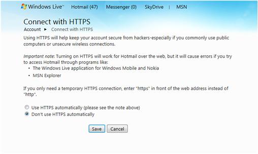
In the following page, the information presented is meant to help the users decide whether or not they want to use HTTPS and to suggest the implications of either selection. However, users will have to work hard to figure out how to interpret the text and how the information fits together with the options.
Notice how in this wizard page, the flow of the text, the spacing alignment, and grouping help users understand the connection between the settings.
Keep in mind that when users complete a wizard, they believe they’ve completed a process. If, for example, the name of the wizard is the “Setup an Account Wizard,” they will assume that when the wizard is completed, the account is set up and ready to use. If any additional steps are required to complete the process (such as restarting the computer or selecting a checkbox somewhere else in the application), you should provide this information as soon as the wizard completes. Telling the users on the first page of the wizard what they need to do when the wizard ends is not very effective: It’s highly unlikely they will remember by the time they get to the end of even a short wizard.
Finding the Right Voice
In every conversation, there are different ways to express a single idea. You may say something as a statement, a command, or a suggestion. The same is true for the way you express yourself in the user interface. While it’s generally considered good writing practice to write in the active voice, there are times when the passive voice is acceptable, and even preferable.
Active Voice
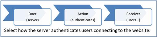
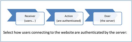
As the term implies, text written in the active voice is constructed with the subject of the sentence doing the action. The subject is typically the user or a component of the application. Sentences written in the active voice follow this word order: doer of action–action–receiver of action.
Sentences written in the active voice are less wordy and easier for users to scan, read, and understand. They are also considered more engaging for your users.
There is a common misconception that any sentence using a form of “to be” (e.g., is, are) is not using active voice. This is not always the case, and you may find yourself needing a “to be” verb for letting the user know what will happen when an option is selected.
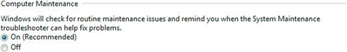
Writing the same message in this way would not result in a sentence that is easier to understand:
Windows checks for routine maintenance issues and reminds you when the System Maintenance troubleshooter helps fix problems.
Passive Voice
Sentences written in the passive voice are constructed in such a way that the subject is being acted upon (the receiver) rather than being the doer of the action. Because passive sentences require additional words and change the usual ordering of a sentence, they tend to make readers work harder to understand the intended meaning.
Although the active voice is a better choice when actions are in the present tense, you may find that passive sentences are better for conveying information without placing blame or responsibility. In the figure on the right, the message implies a problem with the program which may or may not be the case.
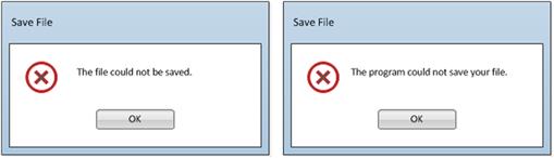
In this example, the message on the right, using the active voice, implies that the user may be responsible for the error. In this case, using the passive voice provides a better experience.
Some messages simply read better when written in the passive form. For example, “Your file is being saved” reads better than “The program is saving your file.”
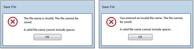
Use the passive voice to soften a message when the active voice may place blame or cause the users to feel that you are scolding them. For example, in the samples below, the passive sentence on the left in the following figure is much friendlier than the active voice sentence on the right.
Imperative Voice
Imperative voice gives instructions or commands, or expresses a request. Imperative sentences generally begin with a verb and include ending punctuation. The imperative voice is good when users are required to take action, selecting an option or following a sequence of steps. Examples of imperative voice sentences are as follows:
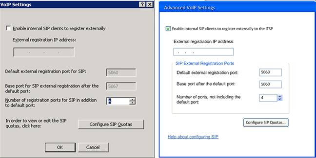
Notice in the following wizard page that the subtitle uses the imperative voice to instruct the user. However, when users view the property page, the settings are already configured: They may only be viewing the page. In the corresponding property page, the imperative voice is not used.
When writing for web applications, it’s important to find the balance between instructing users with the imperative voice and guiding users by using gentler language. One way of finding this balance is to use the nonimperative voice with a friendly and supportive tone for explanations and descriptions, and to use the imperative voice for titles, button labels, and interactive elements.
Web applications also have to find the balance between providing relevant information and using the real estate for marketing messages. In particular, if your application is integrated into your company web site, limit your marketing messages and buzz words within the interactive text. Any marketing messages integrated into your text messages should be used sparingly and should be subtle.

Visual Considerations
When designing and writing your information, think about how your user will read the page and use the options. Remember to take a holistic look at the page. Will the user scan the page as you intended? Are the options in the correct order?
For example, in the following page, the explanatory text and bullet points are clearly written, appropriate, and relevant. However, the arrow toward the bottom of the page is distracting, drawing the user to information that is irrelevant and confusing given that the same action already exists in a button on the page.
The next example shows how, in this case, visuals help users understand the task, with very little text.

Figure 10.20 Sample of first-time user experience (Zazzle.com).
Writing the User Interface Elements
Now that you understand the concepts and ideas behind writing user interface text, it’s time to start writing the actual text. The next sections provide guidelines and examples that will help you write the content within the user interface.
Writing Title Bars
Title bars help users to continue being oriented to where they are in the application. Remember that your users may be in the midst of several activities and may have multiple windows open on their monitors. The text you use for the title bar will help them keep focused on the task they are completing in that page. As such, the text should correspond directly to the command, link or to whatever element they interacted with to arrive on that page.
Title bars should be as specific as possible. As in the next example, when you have generic command button labels, such as Settings, Delete, Add, and Edit, it’s easier for your users if you include the name of the feature or action in the title (e.g., Delete Image, Add Label, Edit Colors).
In this example, the name of the feature is added to the title bar, helping users remember from which option the dialog was accessed.
In a wizard, the title bar generally contains the name of the wizard. There are different ways to write the wizard name, and whatever format you decide on ultimately depends on the formality or informality of your application. Traditional server applications tend to use a formal tone, that is, “Getting Started Wizard” and “Network Configuration Wizard.” Less formal applications generally use a friendlier tone, such as “Getting started setting up your computer” or “Configuring your computer settings.” The best guideline is to choose a format and tone that works well for your application and to use it consistently.
Writing Subtitles
Subtitles are useful for describing the overall purpose of a page or section, such as in landing pages and wizards. In the following example, you can see that the subtitle tells the user the purpose of the settings in the page.
Remember to keep subtitles short and user-focused, helping your users understand the purpose of the page or section.
Explanatory Text
In addition to subtitles, explanatory text describes the features or options presented in the page. Explanations at the top of the page, next to a section, or alongside a control can help users decide if they want to use an option or how to select the option that best suits their needs.
The explanatory text helps users understand the selections available in the page and, optionally, the benefits of using the options.
Writing Instructions
Instructional text tells the users what action they should take in the page and provides guidance on how to take that action. The amount of instruction in a page depends on how much information the user needs to complete the action. Some pages many require little or no instructional text, while other, more complex pages may require additional guidance throughout the page.
The location of the instructions depends on the way your pages are built. If the instruction relates to the entire page, then the instruction usually goes at the top of the page. If the instruction relates to a specific control, then the instructions should be placed next to the control, or the instructions can be used as the label for the specific option.
In the following example, the instructional text displays right under the subtitle. The subtitle tells the user the benefits of this feature, while the instructional text tells them what to do.

In the following example, when there is no subtitle or explanation, the instructions display right next to the relevant field. In this example, the text provides information used to complete the task.
When writing instructions, remember to write from the users’ point of view, describing the actions the users must take, rather than describing the feature.
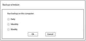
Radio Buttons
Radio buttons are used when the user may select one option from a set of provided alternatives. In many cases, selecting a radio button brings additional options or limits choices. When writing radio button options, you can improve readability by using consistent formatting and avoiding redundancy.
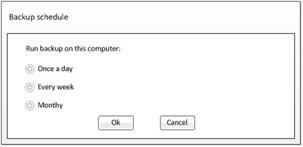
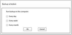
In this example, the options are consistently written, and there is no redundant text. Consistent text formatting makes the options easy to scan.
Checkbox Text
Checkboxes are used as a toggle for turning features on or off (enabling or disabling a feature) and are also a common control used for allowing users to select multiple items from a set of options.
Checkbox labels should be written in a positive tone, with users selecting the option to enable or turn on a feature rather than disabling a feature. Notice in the next example that each option describes a positive action.
When writing checkbox text, you should follow these writing guidelines:
 The text should be specific enough for the user to understand what the “turn on” option actually turns on.
The opposite action of not selecting the checkbox should be obvious.
The text should be written in a positive manner.
Options should be mutually exclusive and easily distinguishable from each other.
The same structural writing format for each option in the list should be used.
Drop-down Menu Options
Drop-down menus, similar to radio buttons, are used when users can choose one item from a set of items. Drop-down menus are often a better choice when there are space constraints or when there are many options available. Drop-down menus are also a good choice when the items in the list are dynamic, changing based on other selections in the page, or may vary for different versions of the application.
In the following example, drop-down menus make it easy for users to see the current settings.
The structural format of the text you use to write the options depends on the specific items in the list. The options in the following menu are very different from the options above. Both are valid and correct ways of writing drop-down menu items.
You also need to consider the ordering of the items. Ordering items alphabetically is a good method for long lists of items. For shorter lists, you may want to order items according to popularity—items you know most users select at the top (with the default value first in the list), and the least frequently selected items at the bottom.
Using Examples
Adding examples to your page is a good way to let users know what you expect them to enter in free-form text boxes. In this example, letting the users know the URL format and the picture formats supported will help them enter the URL correctly the first time, avoiding a validation error message.
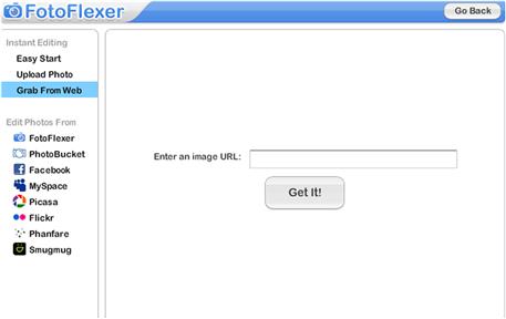
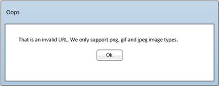
When users incorrectly enter a field, the error validation message should also provide an example. The user getting the following message after entering the URL incorrectly above may or may not be able to correct the error based on the message provided.
Follow these general rules when writing examples:
When possible, place the example text directly under the text box. The text box should indicate the number of accepted characters.
Use a simple structure, such as: Example: www.mypictures/image.png
Frames and Separator Lines
Frames and separator lines are useful for labeling and differentiating a set of controls from other controls in the page. The text you use in frames (also known as group boxes) and separator lines provide context for all the controls in the group. You can use sentence case, or title case; just remember to be consistent throughout the application.
Write titles that present concepts. For example, in the following picture, “Picture Sharpness” would probably be a better title for the first section rather than repeating the options, “Sharpen and Soften.”
And be consistent in the ordering of the words. Using “Sharpen and Soften” for the title and then presenting them on the slider in reversed order will make the brain work harder.

Separator text may be located above a group of controls, to the left of the controls, or in a frame around the controls. The text should be relevant to all the controls in the group.
When writing separators and group labels, follow these guidelines:
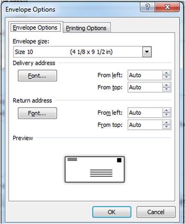
Text Box Labels
Each text box or drop-down menu is accompanied by a label. This label can be above or next to the field to which it is relevant. When writing labels, remember to keep them succinct and focused on the object the user must either select or enter.
In addition, consider whether the imperative voice should be used. In the next example, most users will accept the default values and move on. If users were required to make a selection, you would consider using the imperative voice (“Select the envelope size:”).
Following these guidelines when writing textbox labels will help you write meaningful labels:
Hover Text
Hover text, often referred to as tooltips and info-tips, displays when the user hovers the pointer over an item without clicking. Hover text is useful for describing icons, adding explanations to interactive elements, and providing notifications.
The amount of text you include in hover text, or a tooltip, may vary. One or two words may be all that is required, or you may want to provide instructional content, as in the example above. As with any text, it’s important to write hover text consistently for related items.
When writing hover text, follow these guidelines:
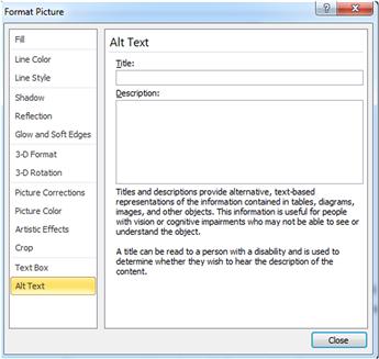
Alt Text
Alt text is a term for alternative text or alt attribute. The alt text is used in HTML and XHTML pages for showing text for an image on a web page when images are turned off on a user’s web browser, or when the screen reader is turned on.
The alt-text description displays in a small text box when users hover over the frame where an image is set to load. This is the text that screen readers will read to users who are using the screen reader feature.
When writing alt text, keep in mind that it defines the images for your users. As such, use words that describe the content of the image rather than the technical specifications or image parameters (for example, “Golden Gate Bridge,” not “gif file of GGB”).
Remember that the text should be short—only a few words—inasmuch as longer text strings result in auditory clutter for users relying on screen readers.
General Text Guidelines
Adhering to these general guidelines will help you provide text that follows the 4 A’s of writing interactive content.
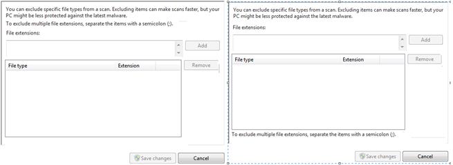
Place the text close to the control if users need the information in order to complete an action. In this example, placing the instruction about how to include multiple file extensions is much more noticeable and therefore helpful when placed directly above the control rather than at the bottom of the page.
Align controls to the right, with subordinate controls indented to the right.
Use grouping (frames or line) separators, spacing, and alignment to show how controls are related to each other. Frames may also help you reduce the amount of text on the page by providing context for the group of controls.
Place notes and warnings above or alongside text if the information is relevant for making a selection or entering information in a field. In this example, the information in the warning is important for the user to understand when entering the user account details.
Place notes or warnings that contain information relevant for the page, but not necessary for making the current selection, toward the bottom of the page. In this example, the note provides information for actions they may want to take as a result of the selection made above.
Avoid redundant text. Too much text is difficult to read and understand. Try using help links to explain concepts if the page requires additional information. You can see below how the page on the right has less text but without reducing the important information.
When writing labels for ribbons or tooltips, use verbs or verb phrases whenever possible.
Summary
In this chapter you learned about best practices for writing the information that appears within your application. Remember that your content must be easily available and should provide actionable information, be helpful, and be written at a level that is appropriate for your users.
Keep these principles in mind when writing your content:
Callouts and help balloons are a good way to provide on-the-spot information.
Callouts are also a good medium for guiding users through a series of tasks.
Keep your user at the center of your text and use active voice whenever possible. But remember that passive voice is sometimes more appropriate for softening a message.
Avoid generic titles. Instead, use titles that provide additional meaning to the page.
Avoid redundant text. Too much text is difficult to read and understand.
Avoid writing about the features. Instead write about the tasks.