Understanding User Reading Patterns
Introduction
In recent years, marketing and usability teams have spent millions of dollars and countless hours trying to understand how users view online pages. This data is used to decide where advertisements are placed in a page, to prepare general page layouts, and to show what fonts and colors are used in a page. This research can help writers design how to create the information in the page and how users read the information. The end result of these activities help our users interact with our products.
Traditional research methods, such as usability studies, site visits, and user observation, also provide insights into how layout and content affect the way users read web pages, dialogs, wizards, and the like provided within an application. By taking the information learned from research and applying it together with basic usability principles, you can create user interface text that provides the optimal user experience.
How Do Users Interact with Online Text?
Most recent research on how users read online text has been done on web pages, using marketing research to observe and improve web page design. Advanced research methodologies include using tools such as eye tracking and mouse tracking, which provide empirical data and analytics about user navigation and interaction with the elements within the surfaces of online pages.
Eye-Tracking Research
Eye tracking as a means of understanding user interaction with a product and improving product design was first used in the 1950s to study the movement of pilots’ eyes as they landed an airplane. It wasn’t until the 1980s that researchers became interested in applying eye-tracking technology for understanding human–computer interaction. During an eye-tracking study, the user wears an eye-tracking apparatus, which includes an eye camera and other optical equipment, mounted on a helmet or some other headband, placed on the user’s head. Following an initial calibration stage, the apparatus records user eye movements as they navigate through each task, tracking both the pupil and cornea reflection as the user views the page.
The eye-tracking data provides a visual assessment about how a user interacts with an interface, showing how a user interacts with specific areas on the page. As an additional form of data, eye-tracking software also records eye movements and mouse clicks, helping researchers understand the correlation between the user’s eye movements, gaze patterns, and actions. This data provides insights into the user’s viewing patterns, and while they can’t show you what users are thinking as they look at a screen, they can provide some insights.
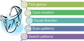
The information provided by eye-tracking research helps us understand the ways users view and interact with online pages.
![]() First glance: The area on the page that first catches the user’s attention
First glance: The area on the page that first catches the user’s attention
![]() Gaze duration: How long users gaze on a particular area
Gaze duration: How long users gaze on a particular area
![]() Visual direction: How users visually move through the user interface
Visual direction: How users visually move through the user interface
![]() Scan patterns: How users scan pages and read text
Scan patterns: How users scan pages and read text
![]() Search patterns: How users scan pages when searching for specific items
Search patterns: How users scan pages when searching for specific items
Through analysis of eye-tracking visualizations and recorded user mouse movement, results can easily be correlated and interpreted. For application designers, the data helps determine where to place the most important options and buttons. For information designers, the visualizations can show you where to place text that is most relevant and how much text users are likely to read in different locations on a page. Analysis tools provided in the eye-tracking software can further show you how users scan and read your text.
Only a few years ago, eye-tracking technology required users to wear a heavy helmet-like structure and heavy glasses. This made it difficult for users to feel and act natural during the eye-tracking sessions. In recent years, eye-tracking technology has improved considerably, with portable units and smaller glasses held in place with a headband. This helps users feel more at ease and provides better results. While lightweight headbands and smaller glasses allow users to move about more freely, users are still aware of the equipment on their heads and are conscious that their eye movements are being observed.
There are two common ways to show the visual output of an eye-tracking test: heat maps and gaze plots.
Heat Maps
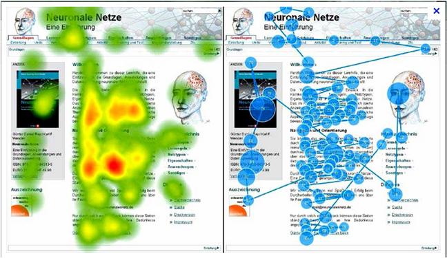
A heat map is a graphical representation using colors to show where activity takes place, based on duration of gaze. When used to evaluate user interfaces, darker colors, such as red, usually indicate areas with lower activity, and brighter colors (such as orange, yellow, and green) show areas with highest activity. Areas with no coloration have no activity. For example, the accompanying graphic shows how users viewed this web page. Most attention is paid to the box on the left side of the page, with very little visual activity on the right side of the page. You can also see that visual activity is strongest at the top of the page, becoming weaker toward the bottom of the page.
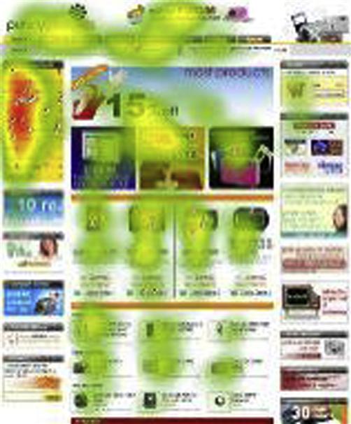
In his book, Eyetracking Web Usability, Jakob Nielson identifies users’ tendency to view a page in an F pattern and to focus their attention on information presented in bulleted lists. This page, taken from Jakob Nielson’s research, shows a typical F pattern, which is similar to the pattern shown in the preceding example.
Gaze Plots
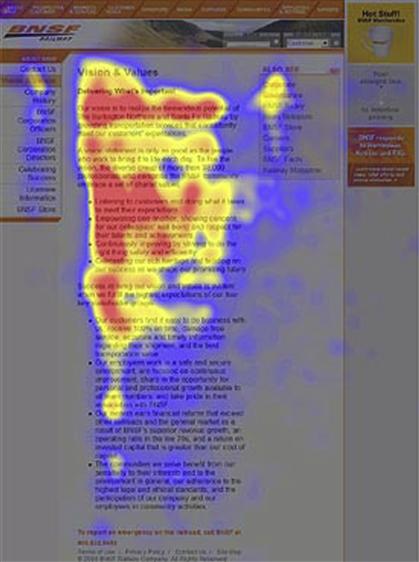
Gaze plots provide a visualization of user search patterns, showing an optical mapping of user scanning behavior in order. For example, the accompanying gaze plot shows the search pattern of a user when presented with a new web page. Similar to the outcome of the preceding heat map you can see that most activity occurs on the left side, toward the top of the page, with little or no activity toward the bottom right corner of the screen.
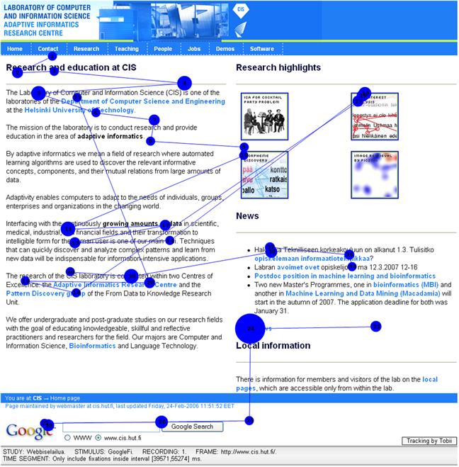
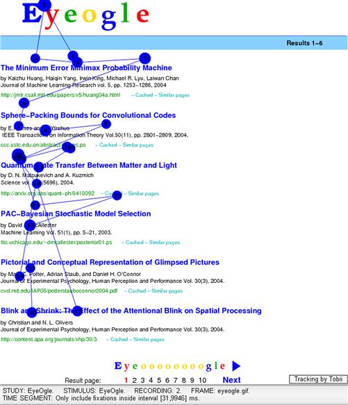
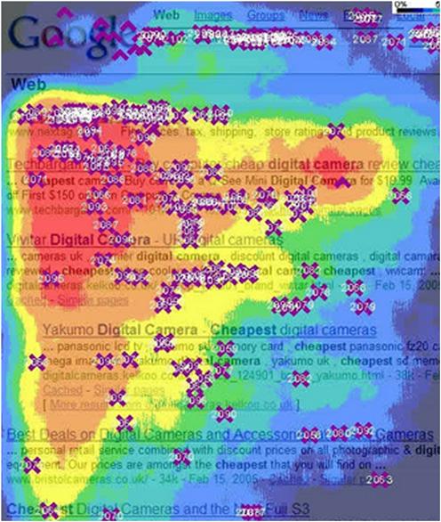
Figure 6.5 Heat map for Google.com.
Research showing how users view a page on Google.com shows similar viewing patterns to the above heat maps.
The following example shows the comparison between the heat map and gaze plot for this page. When combined, you can see how comparing heat maps and gaze plots can show you how users moved around the page and viewed the page.
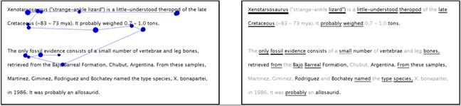
Gaze plots can also be configured to show how users read text. This helps you understand how users scan blocks of text provided on a page. As you can see in this example, users start at the top left and read in a zig-zag pattern. However, toward the bottom of the text, the pattern stops with users only glancing at words toward the bottom of the text.
Mouse-Tracking Research
Mouse tracking, as its name implies, shows how users move the mouse around the page, and where and how frequently they click various options. Mouse-tracking heat maps are similar to any other heat map, showing areas where users most frequently moved the mouse or most often clicked. Mouse-tracking data is also useful for identifying “dead zones,” that is, the areas that have little or no activity.
The following example shows a mouse heat map. In the example, you can see where users moved the mouse most frequently, other areas where mouse movement was detected, and areas where users did not interact with the page.

Figure 6.8 Sample mouse movements (Clicktale.com).
Click heat maps show the places on the page where users clicked the mouse. In the example below, you can see which options were most frequently clicked by users and areas where users did not have any interaction.
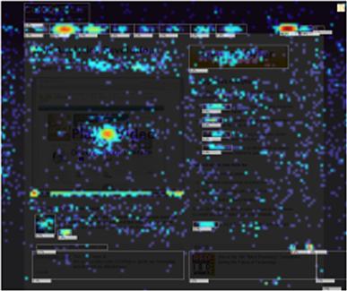
Figure 6.9 Sample mouse click frequency (Clicktale.com).
While mouse click data helps you understand which areas have the most activity, in the absence of other research you have no real way of telling why users clicked those options and avoided clicking others. Specifically, you can’t tell if users gazed at an area but did not click the option, or if they did not view the area at all. As such, mouse click tracking alone provides limited value. However, mouse click tracking, when combined with eye tracking or other research methods, is a powerful tool for understanding the correlation between how users search a page and how they interact with the links and options available in the page. For example, this chart shows the eye-tracking pattern, up until the time the user clicked an item.
Figure 6.10 Gaze plot pattern and mouse interaction (Tobii.com).
What the Research Tells Us
Fortunately, because the research shows that there is a high correlation (84 to 88 percent) between eye-tracking and mouse-tracking movements, the combination of both mediums is considered solid evidence and provides many insights into how users read text presented on a screen.
Based on this research—eye tracking and mouse tracking—the research community has reached a general consensus about the way users search for and interact with user interfaces, and how they read text online.1
Using the conclusions of Nielson’s research and based on what we know about how users read online text, here is a simple list of guidelines you should consider when building information into the user interface:
![]() Users start reading at the top left corner of the page and move horizontally, in an F formation (this is the opposite for right-to-left languages).
Users start reading at the top left corner of the page and move horizontally, in an F formation (this is the opposite for right-to-left languages).
![]() After reading the first or second line of text on a page, users begin scanning the text.
After reading the first or second line of text on a page, users begin scanning the text.
![]() Users scan text looking at keywords or phrases that will help them complete the task at hand. They do not read word by word, or read entire blocks of text. Rather, they are looking for relevant bits of information.
Users scan text looking at keywords or phrases that will help them complete the task at hand. They do not read word by word, or read entire blocks of text. Rather, they are looking for relevant bits of information.
![]() Users are more likely to read bulleted lists than blocks of text.
Users are more likely to read bulleted lists than blocks of text.
![]() Users make a selection on the page as soon as they think they have enough information to understand the options. This is the point when they stop reading or skimming the text.
Users make a selection on the page as soon as they think they have enough information to understand the options. This is the point when they stop reading or skimming the text.
![]() Users rarely, if ever, focus on the bottom right corner of the page.
Users rarely, if ever, focus on the bottom right corner of the page.
Based on these conclusions from the research, here are some helpful guidelines for writing user interface text:
![]() Provide the most important or useful pieces of information at the top of the page. If you have information the user must know before doing anything else on the page, it should be in the first line of text or set apart from another block of text.
Provide the most important or useful pieces of information at the top of the page. If you have information the user must know before doing anything else on the page, it should be in the first line of text or set apart from another block of text.
![]() Make the text easy to scan. Start a sentence with the main point of the sentence and use concise language throughout.
Make the text easy to scan. Start a sentence with the main point of the sentence and use concise language throughout.
![]() Avoid large blocks of text. Instead, use bullet points, or callouts.
Avoid large blocks of text. Instead, use bullet points, or callouts.
![]() Break your content into meaningful chunks of information in order to help users scan it for the information they need. Keep in mind that long lines of text are hard to scan.
Break your content into meaningful chunks of information in order to help users scan it for the information they need. Keep in mind that long lines of text are hard to scan.
![]() Be aware that the words you use will help users find information as they skim through the page. Make sure keywords are easy to locate within the text.
Be aware that the words you use will help users find information as they skim through the page. Make sure keywords are easy to locate within the text.
![]() To help users understand the relationship between text and interactive elements, maintain visual proximity between text and corresponding options.
To help users understand the relationship between text and interactive elements, maintain visual proximity between text and corresponding options.
Readability Scales
Although placement on the page strongly affects how users read online, reading level is another factor you should consider when designing and creating your text.
Many factors affect reading level, such as the user’s reading skills and knowledge levels, but there are many readability scales and formulas available for determining the ease with which the average reader can read and understand your text. Most readability formulas are based on one syntactic variable (word length) and one semantic variable (number of words in a sentence).
The most common methods for evaluating reading ease are the Flesch–Kincaid Grade Level Scale and the Flesch–Kincaid Reading Ease Scale, which are available in most word processors, such as Microsoft Word.
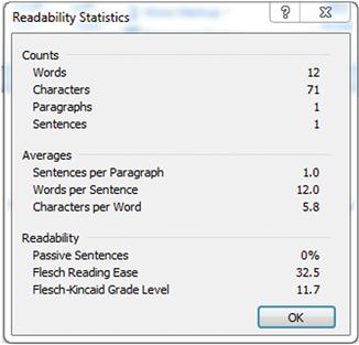
This is how Microsoft Word presents readability statistics for the first sentence in this page:

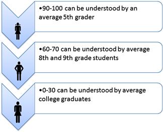
Comparing the statistics to the Reading Ease Scale, you can see that this sentence is far beyond the reading ease of most readers. And based on the grade-level scale, the text scored 13.3, or at college level.
By reducing the number of words and the sentence length, the readability statistics for this string are reduced.
“This wizard helps you select how Adobe Reader interacts with assistive technology.”
Although most journals written for the public aim their writing at an eighth-grade reading comprehension level, depending on your target audience, you can decide on the appropriate target reading level. Paying attention to the reading level of your text and matching it to the reading levels of your intended audience will help you create text that is easily scanned and understood.
Summary
In this chapter, you learned about research methods for understanding how users read online. Eye-tracking and mouse-tracking research helps us understand how users read and process user interface text.
![]() Through heat maps and gaze plots we can understand the area on the page that first catches the user’s attention (first glance), how long users gaze on a particular area (gaze duration), how users visually move through the user interface (visual direction), how users scan pages and read text (scan patterns), how users scan pages when searching for specific items (search patterns).
Through heat maps and gaze plots we can understand the area on the page that first catches the user’s attention (first glance), how long users gaze on a particular area (gaze duration), how users visually move through the user interface (visual direction), how users scan pages and read text (scan patterns), how users scan pages when searching for specific items (search patterns).
![]() Mouse click heat maps show the areas over which the user moved the mouse and the mouse clicks on the page.
Mouse click heat maps show the areas over which the user moved the mouse and the mouse clicks on the page.
![]() Research shows that most users move through the page in an F pattern. When creating your user interface text, keep in mind that users scan text, starting from the top left corner and moving down the page. If you have important text or options, make sure they appear within the hotspots on the page.
Research shows that most users move through the page in an F pattern. When creating your user interface text, keep in mind that users scan text, starting from the top left corner and moving down the page. If you have important text or options, make sure they appear within the hotspots on the page.
![]() Readability scales help evaluate the reading levels content and understand the complexity of our text. Matching the readability levels of your text to the expected reading levels of your most common users will result in a better information experience.
Readability scales help evaluate the reading levels content and understand the complexity of our text. Matching the readability levels of your text to the expected reading levels of your most common users will result in a better information experience.
1Many well-known research findings in web usability were presented by Jakob Nielson (Nielsen, (2006)), and many designers and writers use his research as the basis for web site design.