
Applying Usability Principles to Your Writing
Introduction
In the previous chapter you saw how users view online pages and how they scan content. Understanding how users read online will help create the right information for helping users interact with your application. This includes deciding what information users need and the best way to integrate that information into the interface.
This chapter describes how usability guidelines and best practices apply to writing the text that appears within the application. Examples are presented throughout this chapter. When looking at these examples, think about the guidelines. What guidelines were followed, or where did the writers slip up? And ask yourself: How can this page be improved?
Understanding Your Users’ Information Needs
Being guided by usability design principles when you are building your information experience will help you design, build, and write the text users need to interact successfully with your application. Now that you understand the guiding principles of how users scan and read online, you are ready to move onto the next phase: understanding what kind of information the user needs. Before you can apply these principles, you should first understand the user attributes that influence their information needs and how users will interact with the application.
Understanding User Attributes
User attributes are the qualities and characteristics of your users that impact the amount and type of information you will provide. Following are the questions you should ask yourself each time you design and write the text that will appear on a surface in the application.
What Is the Current Knowledge Level of the User?
If your application is targeted toward a well-defined, cohesive group, you may be able to make assumptions about their skill levels. For example, if you are writing for business software that will be used by a specific user group, you may be able to assume that key phrases commonly used in that business environment will be understood by your users. These are the concepts, phrases, and terms you should use in the text. In fact, if you don’t use terminology matching the user knowledge levels and expectations, your application may lose credibility.
The knowledge levels for applications created for a general audience are harder to gauge. Embedding helpful text into the surfaces, as well as explanations of key terms and phrases, may be required for users to understand the requirements and tasks.

When in doubt, assume users are unfamiliar with professional terms and concepts and so provide the support they need to understand the interaction.
What Are the Users’ Confidence and Motivation Levels?
Understanding confidence levels and motivational levels is not easily achieved. Are the users likely to enjoy the challenge, or will they be easily frustrated? Gamers, for example, are generally more comfortable trying to learn new ways of doing things, and will spend time playing around and experimenting with the application until they understand how it works.
Users who are less computer savvy are more easily frustrated. Trying to set up an online banking application or booking a vacation with several stops along the way may become stressful, and so these users will be less motivated to continue with the process. Using text to provide additional support may keep these users engaged, guiding them until they are successful. Adding callouts, help prompts, help links, and success messages to the user interface are ways you can provide support and encouragement to your users, while guiding them through the application.
Understanding Information Attributes
Information attributes are all the elements and characteristics of your text that, when combined effectively, will make your user interface easy to read and useful for your users.
Visibility
Even the best written text is not going to be very useful if the user can’t find it. Users scanning the page should understand immediately which information is relevant for which controls. Information that is vital on a page should be easy to see and find.
Text Location
The placement of the text on the surface depends on where and when the user needs the piece of information. If a piece of information is crucial for making a selection, it should be easy to see, and should be directly next to, or above, the control to which it relates.
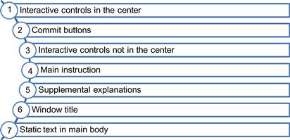
Although we know that users tend to scan a page from left to right, top to bottom, according to the Microsoft Windows Style Guide, users will most likely read the UI text in this order:
The layout of this page makes it easy for users to understand the logic of the page, to find and read the relevant text, and to understand the interaction between the text, the options, and the commit buttons.

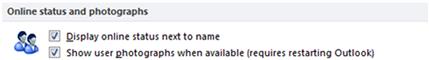
One way to help users find information is to include the relevant text as part of the control itself. In this example, the information users need about restarting Outlook is part of the control. Users selecting this option are aware up front that they will need to restart the Outlook application.
Popup Messages
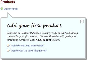
If the user must know certain information before or after making a selection, or when moving between surfaces, you may decide that instead of placing the text directly on a surface, a popup message, or callout, is a better text medium. Popup messages, while they should be used sparingly, are often the best solution for ensuring that the user actually sees the information. If a message is static—users always need it when they are on a specific surface—then a popup is probably not the best solution. If, however, only some users will need the information, depending on the selection they make, a popup may be the right way to ensure the message is viewed.
One benefit of popup messages aside from showing them only as needed, is that they don’t take up real estate on the page, nor do they distract users from focusing on other elements in the page, if and when the text is irrelevant.
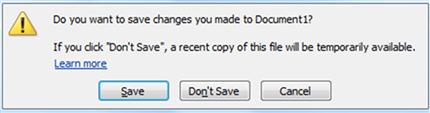
One downside, however, is that because popup messages disappear after the user closes the message, any important information is no longer available after the user clicks OK or Cancel. For example, after closing the following message, users may not remember where they can view the update status. And once the information is gone, they have no way of recovering it.

Readability
Readability refers to how easy it is to read your text. This sounds obvious and simple, but sometimes even the best written text comes out clumsy or too wordy when the message is placed on the surface. When writing for user interfaces, every effort should be made to provide text that is easy to scan and skim. Writing text that is concise and avoids extraneous information or information that is relevant in only a very few cases is one way to improve readability. Organizing your text into meaningful chunks, and deleting any extraneous words and punctuation, will also make it easier for users to interact with the page.
Conciseness
Concise text improves readability by keeping text to a minimum and eliminating any redundancy. Redundant text is either repetitive or not useful for completing the task at hand. Removing extraneous words or content improves the readability of your text by making it easier for users to find the information they need. Simple changes to your text can make a big difference in improving conciseness.
| Extraneous Words… | Better |
| In order to add a picture to your album, select the Add Picture button. | To add a picture to your album, click Add Picture. |
| Select whether or not you want updates to be downloaded automatically. | Select if updates are downloaded automatically. |
In your attempt to keep text concise and minimalistic, however, you should remember that users do need some guidance; therefore, removing all helpful text is not the goal.
Your text should be user focused and provide enough information for the user to understand the logic of the page, as well as the expected interaction. Conciseness alone does not make text more easily understood. As you can see in this example, some additional text would help the user understand the controls and options. The cryptic labels are not user-focused, and the layout of the page does not provide logical ordering of options, making it difficult to scan the page. Poor spacing and lack of alignment make it difficult to see the relationship between options.
Spacing
When you design and create your text, the spacing on the page should make it obvious which text and controls are related. White space between sections, group boxes, and proper alignment all provide visual cues, showing the connection between the elements on the page.
In this example, the developer tried to space everything out to balance the page. However, the end result is that it’s difficult to discern which buttons actually belong with what text.
Here you can see how slight changes to the spacing improve the readability of the controls.

Understandability
For information to be easily understood, you should use the clearest, simplest text possible. The words you use depend on the target users of your application. Whenever possible, use common words and terminology associated with that application. When creating labels and object names, use names that are concrete and that effectively describe the object or action.
Learn the common terminology associated with the technology and features included in your application. This will help you communicate the concepts and ideas using the right language for your users.
Syntax and sentence structure also affect the readability and understandability of your text. Consistent sentence structure and shorter sentences are generally easier to read and understand. Also, making sure the key concepts and terms are easy to identify in the text and paying attention to how the sentence displays on the page and where the sentences break helps the readability of your text.
The following example shows what happens when the writer tries to overexplain the feature. The lack of spacing in this dialog makes the text difficult to comprehend, and there is a general lack of cohesiveness The explanation in the second paragraph may have been added for legal reasons, but it may have been better placed under the options as a warning or an informational note.
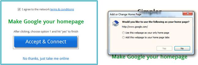
Even a well-composed, concise sentence does not assure that text is easily understood. In this next example, the writer has good intentions. The sentence is concise and easy to read. However, the explanation is somewhat confusing and doesn’t help the user decide which option to select.
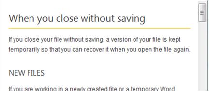
The following text, provided in the help topic (opened by clicking the “Learn more” link), gives a far better explanation and could have been used in the dialog instead of the current text.
Accuracy
Even more important than conciseness and readability is the accuracy of your text. Users need to be certain that your text is correct in order to believe that it’s worthwhile. If you’re presenting technical information, be sure it has been reviewed by a subject matter expert. Providing sensible examples and logical recommendations improves the accuracy and overall trustworthiness of your content.
Accuracy is especially important in business and networking software where a simple mistake owing to unclear or inaccurate text can cost a company both time and money. And keep in mind that if network administrators in particular don’t feel that they can trust the information in the user interface, they will not want to use your product.
With regard to consumer products, inaccurate text may not have a direct cost, but it will result in user frustration and a lack of confidence in your application. Once the trust is lost, users are hesitant to try the application again.
Consistency
Consistency refers to several aspects of your text—terminology, syntax, and text position. One of the simplest ways you can help readers scan your text is to provide consistent terminology, syntax, and text positioning.
Even a small glitch in consistency can cause confusion. In the following example, the inconsistent wording between the instruction in the block of text (Change password) and the button it relates to (Create password) can result in confusion. And although the user will probably figure out which button to click, it creates a poor impression and causes the user to pause unnecessarily.

Consistent Terminology
There are two types of terms you should pay attention to when creating text: terms you use when describing components of your user interface, and terms relating to the technologies and features in your application.
Terms describing the interface refer to the elements users interact with to complete their tasks (e.g., panels, windows, toolbars, task panes, button, and labels). Terms describing the technologies and features are directly related to the tasks and goals of the application. When describing the technologies and features, it’s important to use the terms consistently, making it easier for users to scan the text to find key terms. Creating a terminology list for the team will help you define the correct terms and use them consistently across features and within other written materials. If, for example, your application requires users to configure a network adapter, you should decide whether to call it a network adapter, network interface card, or NIC. Then use the term consistently throughout the application.
Consistent Syntax
There are many different ways you can write a sentence or a phrase. Creating a style guide outlining how specific types of phrases or instructions are written will help your users and will ultimately save you time when writing the text. For example, if you have a list of system alerts or events, using a consistent style to write the alert name and description will help users scroll through them, finding the information they are seeking. If you have a landing page with a list of options, using the same format for each option will help users scan the list.
In this next example, you can see that each main section is a noun phrase as a title and that the options all begin with verbs. This helps users scan the page and find the options they need.

Consistency is also important when users move between pages; using consistent language between surfaces helps users understand what is expected. In the following example, the instructions in the first page (on the left) do not match what the user sees in the next surface in the dialog (on the right) creating a confusing transition.
Understanding Task Attributes
Throughout the life cycle of an application, users perform a variety of tasks. The amount of textual support you provide and the depth of the text depend on the task itself. You will need to consider several attributes of each task before creating the accompanying user interface text. These attributes are task complexity, frequency, and learnability.
Complexity
Task complexity does not necessarily relate to the difficulty of the task; novice and advanced users alike often deal with complex tasks. Tasks are complex if they require several steps, or a sequence of steps to complete.
When planning the content for a complex task, it is helpful to ask yourself these questions:
 Is it clear how one step leads to another?
Are there dependencies between options (steps)?
At what point in the process will users require the most assistance?
After thinking about these questions, you can decide the best location for the text and how to break the text up into helpful chunks of information.
Task Frequency
Many tasks, such as setting up an account and installing a printer, are done once, or infrequently, throughout the product life cycle. Other tasks, such as logging into an application, adding an item, or generating a report, may be performed on a regular basis.
When designing your text, ask yourself:
If a task is completed only once but is pivotal to the success of using the application, then it may require special instruction built into the workflow surface. Infrequent but complex tasks may benefit from creating a wizard to walk the user through the steps.
For example, in the following page, in order to complete the task, the user must enter the interest rate. The callout pointing to the field draws the user’s attention to the task and also provides information on how to complete the field. The task on the right of the field lets the user know where he or she can look for the information. This is a good example of how you can help users complete an infrequent task that is key to completing a core task.
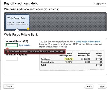
Figure 7.15 Helping users complete a core task (Mint.com).
Learnability
As in all tasks you complete throughout the day, some tasks are easy to learn, while others may have a steeper learning curve. When you create your information, think about the difficulty level of the task and the likelihood users will stumble through the steps each time they complete the task. Depending on the complexity of the task, the frequency, and the learning curve, you can decide the best approach for providing information. Wizards and integrated help balloons are good strategies for tasks with a high learning curve. If a task has a short learning curve, a simple text prompt and accurate label may be all that is required.
In this next example, first-time users will have a difficult time understanding how to get started using the tool.
A simple help balloon or text prompt on the page would be valuable for helping users get started.
General Writing Considerations
Write about Tasks, Not Features
Software teams often think and plan in terms that describe product features and options. And since we talk about the application in these terms, it’s easy to write in these terms as well. Before preparing your information, think about each task and what the user is trying to accomplish. Remember that users don’t think about features, but rather think about actions.
| Feature based – “I want to…” | Task based – “I want to…” |
| Run the Add Content Wizard | Add content to the page |
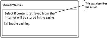
| Enable the caching checkbox | Cache content retrieved from the Internet |
| Define album properties | Design the pages of my album |
| Turn on track changes | Keep track of the changes I am making |
Keeping the task in mind will help you write introductory text and labels that describe tasks and actions rather than the user interface—and avoid stating the obvious. In the first example below, the introductory text is almost a repetition of the checkbox text.

In this example, little text is devoted to describing accessibility-related options and assistive technology; most of the information relates to how the wizard works rather than to the available options. And while the tone of the text is friendly, the content does not relate to the actions the user may want to take in the page.

The following page provides another example of a textbox in which text placement, conciseness, and spacing should be improved. The nondescriptive frame titles don’t provide helpful information. And the placement of the explanatory text is somewhat confusing; it isn’t entirely clear from the block of text what will be ignored—the checkbox and the frequency setting, or both. If the text only relates to the second control, it should be placed next to that control.

Provide Examples
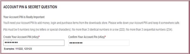
One of the most effective and easiest ways to help users enter data and make selections in a page is to provide an example of the expected input. Examples can be far more effective than written descriptions or help topics.
In this example, not only is the description difficult to understand, but the input box does not provide the right visual clue as to how many digits are allowed.

After entering a PIN incorrectly, this is the error provided.

Adding an example with a sample PIN number under the input box would provide the crucial information that the PIN must be exactly six digits long, and at the same time demonstrate the constraints of the PIN in a way that is much easier for the user to understand. Also, moving the text describing the PIN so that it is easier to read would help users understand the PIN requirements.
Examples can take on many different forms, depending on what the user must enter, helping users understand what data they are searching for, or what values to enter. Examples are particularly helpful when users must enter a string, such as a URL that must be written in a specific format.
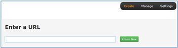
In the input box, adding an example would help users understand the format that should be used (e.g., https://www.mysite.com).
Using the Right Language
Previous chapters discussed ways to learn about your users and different types of users. When creating your messages, keep in mind the target users and use language that is appropriate for that group.
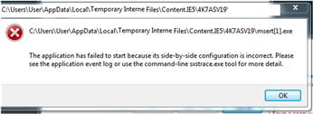
This error message may be appropriate for an IT administrator, but the computer jargon and recommended actions (sending the user to the event log or to the command-line) are far too technical for a home user.
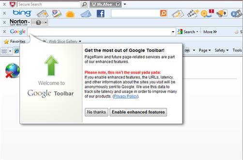
On the other end of the spectrum, web applications in particular use informal language and tone. Keep in mind that while your tone should be friendly, it should also be appropriate for the application and user. For example, in the following screen, this text “yada yada” is fine for Google, but would be inappropriate for a business software application. While Google is able to get away with this kind of informality, it’s somewhat doubtful that users will understand the terms latency and site latency used in the explanatory text.
General Text Usability Guidelines
In the earlier sections, we talked how to improve the information experience for your users. Below is a list of the general guidelines for you to refer to when creating and writing the information appearing in the user interface.
1. Use natural language, choosing terms, keywords, phrases, and concepts that are familiar to users. Avoid the tendency to use computer jargon when common, easier to understand words are available.
2. Use consistent terminology, consistent syntax, and consistent style throughout the application. This will help users find the keywords and phrases.
3. Avoid words such as “terminate” and “abort” that have a negative connotation, when a better word is available—for example, “end” or “stop,” respectively.
4. Always use a tone that is user-focused, encouraging, and positive. Never blame the user or make the user feel inadequate by using condescending or angry language. The tone should be friendly and straightforward. Avoid any legal or corporate undertones. And never use a sarcastic tone.
5. Let users know how they are proceeding. The outcome of an action should be obvious, with feedback provided to let users know that they are moving along successfully, that the system is processing the action, or that an error has occurred.
6. If an error or warning message is required, the message should include a brief explanation of what caused the incident and should provide ways to amend the problem and continue.
7. Avoid using technical terms and system code in the message, and don’t suggest a fix that requires technical knowledge beyond the user’s capabilities.
8. Text should be accurate and relevant for the current page or task. Adding nice-to-know information will slow the user down and may even cause confusion.
9. Your text should guide users toward their goals. If additional information beyond what you can offer in the interface is required, consider adding help callouts or help prompts to the surface.
10. Text and options that go together should be spaced near each other so that the relationship between the text and associated controls is visually apparent.
11. Help links within the interface should navigate to a topic relevant to the task users are focused on when clicking the link; it should not take users to a general help page or landing page.
Summary
In this chapter, you learned how users read and process user interface text. Remembering these principles will help you create content that helps your users read and understand how to interact with your application.
When creating your user interface text, keep in mind that users scan text, starting from the top left corner and moving down the page. If you have important text or options, make sure they appear within the hotspots on the page.
When writing your text, think about user attributes, information attributes, and task attributes.
When designing your information, consider the complexity, frequency, and learnability of a task.
Examples are an effective way to help users enter data and make selections on a page.
Your text should focus on the tasks users want to complete, not on the features.
Following the usability guidelines for text will help you create text that is easy to scan and understand.