
The Universal Totem Pole
Abstract
Technology optimization and miniaturization have successfully broken down most common frontiers to usage: literacy, accessibility, and applicability. The pervasiveness of modern technology has allowed emerging economies to get on the fast track of the latest technological innovations. Technology is the great equalizer and the driver of development. This is at the root of the explosion of mobile in developing nations. There is a changing logic of globalization relationships at work, and the triumph of design as the prime methodology to impart global thought on corporate action.
Keywords
Technology; user; diversification; brand localization; interface; marketing; culture
2.1 Metabolism of a Digital Product
One minute was enough, Tyler said, a person had to work hard for it, but a minute of perfection was worth the effort. A moment was the most you could ever expect from perfection.
Chuck Palahniuk, Fight Club
According to the International Federation of the Phonographic Industry, there was an aggregate of US$6.7 billion in global digital revenue for the music market in 2015. That represents a growth of 10.2% over 2014, with streaming increasing over to represent over 19% of the global industry revenue. Music streaming has constituted a contentious market over the years, overcoming initial doubts and fears of the music companies to become a staple of modern user habits over the world. Spotify, Rdio, Google Play, and other similar services have become ubiquitous in the households of 68 million subscribers that, according to the IFPI, use these services all over the world. Despite the increase in music streaming all over the world, sampling and remixing still constitute legal wildernesses subject to judicial entanglement. Artists from amateur to authoritative require access to common platforms of sharing, however, and licenses like Creative Commons allow creators to share music freely without risk of copyright infraction. Sites like Soundcloud and Freesound allow access to a world of music for open sharing and appropriation by other (re-)creators. And there are a lot of them: over 90% of all artists are undiscovered and unable to capture an audience. Only 0.2% of all artists can be considered “super-stars,” according to a 2013 Next Big Sound report.
This is a reflection of how accessible and flexible sound technology has become. There were past premonitory predictions of this evolution, however. In 1624 Francis Bacon depicted the “sound-house” in The New Atlantis as specialized quarters where scientists would manipulate audio at will and “practice and demonstrate all sounds and their generation.” In effect, Bacon was anticipating the modern electronic capabilities of the recording studio, where sound can be designed and repurposed at will. Digital audio manipulation is a ubiquitous presence in the modern world, its presence felt in every audio manifestation, from bombastic Hollywood blockbusters to the catchy jingle playing in the local radio station (Fig. 2.1.1).

Compare this level of customization and manipulation to what the average phone or laptop offers: we can generate soundboards from audio recordings, edit photos with Instagram and Snapchat facial recognition, and even enact your own digital paintings with specialized apps. The massive infrastructure that was to become the “sound-house” now conveniently fits into one hand and is completely flexible to purpose.
Technology optimization and miniaturization have successfully broken down most common frontiers to usage: literacy, accessibility, and applicability. According to the 2014 OECD report on global well being since 1820, the world literacy levels have seen an exponential increase in the past few decades, from 42% in 1960 to 83% in 2010, and the pervasiveness of accessibility and usability has allowed emerging economies to get on the fast track of the latest technological innovations higher rate than the richest markets. This is one of the reasons behind the explosion of mobile as a premier device range in developing nations, and why Uruguay and Kazakhstan, among other smaller economies, were in the top 10 countries with best LTE coverage in 2015.
This is partly not only due to the changing logic of globalization relationships, with the expansion of worldwide commerce facilitating the exchange of goods and services, but also due to the triumph of design as the prime methodology behind innovation (Fig. 2.1.2). According to the World Intellectual Property Organization, the amount of industrial design applications worldwide amounted to over 1 million, with Asia (particularly China and South Korea) at the top of the list, with over 750 thousand design applications in 2013. However, the number of patents filed has dropped considerably since then, suggesting that the emphasis is not on innovative technologies, but rather improving and maintaining the existing ones. Research is expensive and prolonged, and the law of diminishing returns is met with a stabilizing market, which can account for some of this reduction. However, Africa and Latin America have surged in industrial design applications since the early 2000s with 22 thousand patent applications combined, and there is a combined investment effort in technology research, particularly in Brazil, Mexico, and Argentina.

In all of these scientific communities, human–computer interaction occupies a significant role, and the interactive aspect surpasses that of web and app development: industrial and large-scale systems are also implied. However, user experience (UX) crosses many of the key areas in industrial design with other, more specific applications. It is an all-encompassing set of methodologies that absorbs the entire spectrum of user interactions and contexts, including psychology and human factors. UX is largely the art of optimization and maximization, in an attempt to answer the needs and requirements of how to interact with technology. UX is largely about the hedonic dimensions in utilitarian use cases, and iterating on design and presentation to make interaction simpler, more gratifying, and focused. UX is seldom used in the context of videogames, and there is a simple reason for it: the term itself is embedded with the instrumentalism inherent to supporting external (or real-world) tasks. One does not “use” a game, so much as play it. Similarly, interfaces and services are not (usually) played, so much as “used”.
The relationship between an interface front-end (or, all that is visible and on the surface) and the user is one of status and power. An “user” can be considered an actor, an agent who explores an utilitarian side of the technology. The user is not a creator or an inventor in any known or accepted convention of the term. The “user” is, as defined, a construct: it is an abstraction of an actor and a subjective relationship between the user and the product follows (McCarthy & Wright, 2004).
Usage of a digital product encompasses two main dimensions: the actor, the afforded interaction framework, and the context or ergonomics involved. The actor can be a person, a system, or any combination or escalation of both. They bring their own set of expectations, methods, and processing methods: their actions trigger certain sets of responses in the digital product itself. These actions may be as simple as pressing what is interpreted as a button (arguably the simplest of metaphors in an interface) or installing a new object that alters and expands the product from its original purpose (like updating an app).
These actions are influenced by not only their native intuitive cognitive processes but also the influence of observed habits (cultural influence) and internalized behavior patterns. In other words, we learn that a button is a button in a fairly universal way, as a simple trigger for a desired consequence, but the manifestation of the button is cognitively wider and not linked to our interpretation of it. For instance the user can interpret a button as a text link, a call to action, or even as a visual nuisance, given the ubiquitous nature of banners and other “dark” patterns in modern web design used in betting websites and other persuasive contexts. This contextual interpretation is driven by previous knowledge of what constitutes a button (a push or click-down event), how it can be represented (an actual button with color, shading, or a rectangle, or simply the text label), and its contextual raison d’être (the content, layout, and purpose of this page tell the user that a button should be present). And this alone allows for massive individual variation in the usage of a user interface. The metaphors and esthetic principles that allow us to identify a button as an action are built by context, education, recognition, and cognitive appropriation.
Until the early 2000s, the web was a vast mosaic of choice, which prompted users to visit several websites in order to get the information they needed or were accustomed to receiving. This has since been replaced by networks of content that are deeply linked regardless of the website they are on. Sites like Reddit, Facebook, etc. (a permanent fixture in the top 3 most used websites in nearly every country in the world) perform the indexing of this content, allowing the user to jump between assorted curated content at will on miscellaneous and often random posts. It is easy to spend hours navigating the static of these seemingly mindless posts, which has been interpreted by users by “entrancing”.
On a wider scale, there is a “state of flux,” carried through onto personable disembodiment, which occurs when a user engages with a user interface. It is the result of the conflict between the combination of an established mental model and set of expectations. When using a user interface, we are interpreting its internal logic, its affordances, and its visual disposition as a model that we need to interpret and our actions are subject to. Our center of decision submits to its model as the user bends to adapt to the kernel of this framework.
Culture bends these dispositions and the values assigned to the interpretation, so if the friction between the act of interpreting and the plan of design is the result of models imposed by the interface and those internalized by the user, as UX attempts to bridge cross the gap between what is expected, what is relevant, and what is efficient.
2.2 Universal and Local Design
I paint mostly from real life. It has to start with that. Real people, real street scenes, behind the curtain scenes, live models, paintings, photographs, staged setups, architecture, grids, graphic design. Whatever it takes to make it work.
Bob Dylan
IKEA is usually identified as a case study in proper acculturation and adaptation to local markets. This is primarily linked to a general quest for simplicity, where content is stripped down to its most basic features. The Swedish company’s market strategy is based on broadening the appeal and understandability of its product range by stripping customizable content to its minimum. However, this does not avoid cases like in Thailand, where the product name Jättebra was changed in order to avoid associations with its vulgar counterpart in Thai. In Saudi Arabia this concern translated in radical decisions like removing all female presence in the photos of the local catalog.
The success of the IKEA ethos is also a consequence of changing housing conditions and demand. As many have come to rely on rented housing, the need to express oneself through decoration of a personal domestic space has taken a step back into oblivion. Apartments have become transient spaces, and young professionals (aged 25 to 35) renting furnished houses are restricted in making any changes for the sake of personal decoration. The concept of “home” has changed, along with its traditional association with past memories or nostalgic family gatherings. The urban lifestyle leaves little time or inclination to assert a space of our own.
This is one of the reasons why Ikea enjoys such global success: it represents a limited vocabulary from which to draw from, enabling its buyers to focus strictly on the application of the various furniture elements in their environments.
This is the case with most of the usage scenarios around the world. There is a limited device portfolio available across the world, and the popularity of mobile devices has brought with it a streamlining of available interaction options. Regardless of processing power and screen size, iOS and Android phones constitute most of the global market’s choices and preferences with over 95% of installed mobile systems all over the world, according to a 2015 Gartner study. However, the software and webpages designed for international environments often fails to take into account the variety of hardware and specialized use case scenarios a good local version may require. And this is where designing for the world implies knowing the world’s users as well.
The uniqueness of the Japanese market demands specifically designed products that take into account Japanese culture and society. Products that take a Western-centric point of view and impose it on Japanese consumers are doomed to failure.
Starbucks is an example of a brand that has successfully transcended its identity and reinvented itself as a temple to “high-end cool” in Japanese cities. With over a thousand stores in the country, SUTABA (a Japanese-friendly adaptation of the iconic brand name) is more expensive and decidedly more Western than other traditional tea houses, but the brand has successfully associated itself with a high-end social status. Its perception as a classy caffeine den for well-off individuals has been aided by the ubiquitous presence of glowing Apple logos at its tables. As in the West, the distinctiveness of a Starbucks store riddled with brand-new silver laptops has become an aspirational image in Japan, with the same bearings of a digital-based lifestyle in a comfy cocoon laced with the aroma of roasted coffee beans (Fig. 2.2.1).

The emphasis that the brand places on space and context has cut through the very strategy of the company. Its elements are consistent across its stores and the basic components of the store experience are predictable: a comfortable place to sit, a nice cup of coffee, a welcoming environment. However, the brand has retained its leading position not by settling for the baseline of its business, but by reworking its product offer, with seasonal offerings and a wider variety of beans, thus retaining interest for casual and regular coffee drinkers all year long.
However, these are classic approaches that thousands of coffee haunts, big and small, adopt every day. As a standard suburban cafe or train station hot beverage stall, Starbucks stands for a standardized coffee experience. However, the brand has retained its market leadership not because of its spicy pumpkin latte concoctions, but by becoming the single biggest coffee store design firm in the world. No other detail of the Starbucks coffee experience has been more important in its enduring international success as it has carefully constructed store layout and decoration.
“The moment when you share a cup of coffee with someone is different in different parts of the world“, stated Bill Sleeth, Starbucks' VP of Design for the Americas, at the 2014 Specialty Coffee Association of America Symposium. “Our goal was to create store designs with locally relevant design.“
From Seattle’s 15th Avenue to the Care Center in Beijing, Starbucks has endeavored to turn selected stores into unique design experiences. Daring oak patterns line the ceiling of a historic bank on Rembrandtplein Square in Amsterdam, in a nod to the meaning of the country’s name, as the Germanic origin of “Holland” is holtland (wood land). The brand’s image is translated into a contextual experience that pushes an eclectic design vocabulary which incorporates the local sensibility. This long-term strategy ultimately aims to personalize the design of every one of their 23,000 stores. Certain key elements of the store experience are to be kept intact (down to the pervasive burned bean smell so common to smaller shops), but Starbucks is developing a business strategy of differentiation by design. This is a threat to smaller and local coffee houses, but the growth of the Starbucks empire is directly related to a general trend: customers welcome the safe bets of familiarity and reliability, while being delighted by the design novelty of the environment. This mass personalization of Starbuck’s physical stores is part of a larger trend that also rings true for the digital market. The most widely used websites are not awash with bombastic innovation, but rather subdue their design to content and experience: Facebook, Amazon, YouTube, Reddit. Designing for mass localization on a digital platform on a scale is a fruitless endeavor unless it is correlated with quantitative data: analytics and tracking can help designers and Information Architects in finding the best structure for a site map or flow for transactional websites and customize it to suit the user needs. Like a Starbucks coffee house, make available all that is expected, and have excess trigger surprise, not confusion.
2.3 Ergonomics and Standards
Know the rules well, so you can break them effectively.
Dalai Lama XIV
In the late 1970s, screens were called visual display terminals (or units). The then recent proliferation of screens generated a widespread concern over the effects of prolonged use in the eyesight of the users, particularly for screens with lower image quality. However, studies have reoccurringly shown that the main impact on eyesight comes from aging and working with screens merely makes the users aware of these problems sooner. Nevertheless, there are tangible (pun intended) issues with ergonomics, particularly in an age of touchscreens and gestural interfaces. Natural user interfaces are beginning to overtake the traditional paradigms of keyboard and mouse, and the old metaphors designed at the Xerox PARC research facility, that were later appropriated by Apple and Microsoft.
This has caused a number of standards to emerge, and despite being only partially successful in accommodating for the emerging needs of users, they remain in force:
ISO 9241-3:1992 Ergonomics requirements for work with VDTs: Display Requirements
This standard has been successful in setting a minimum standard for display screens on an industry-wide basis. It focuses on Cathode Ray Tube (CRT) display technology, which is arguably obsolete. Compliance based on a performance test (therefore making it technology-agnostic independent) was approved in the early 2000s. It has since been revised with standard ISO 9241-302:2008, on Ergonomics of human–system interaction—Part 302: Terminology for electronic visual displays.
ISO 9241-400:2007 Ergonomics of human–system interaction—Part 400: Principles and requirements for physical input devices.
This standard was slow in redaction, but remains valid as of 2015. It describes generic ergonomic principles and requirements for the design and use of input devices, such as keyboards, mice, and joysticks. It is aimed at exploring the terminology for other parts of the ISO 9241-9 standard and includes several touchscreen and hedonic technology definitions. However, a definitive standard for that technology is still more implicit than openly available.
Over the years, ISO has published a number of standards of interest to digital designers and architects:
Usability and usage: ISO/IEC 9126-1: Software engineering—Product quality—Part 1: Quality model
ISO 20282: Usability of everyday products
ISO/IEC TR 9126-4: Software engineering—Product quality—Part 4: Quality in use metrics
ISO 9241-11: Guidance on usability
ISO TR 18529: Ergonomics of human-system interaction—Human-centred lifecycle process descriptions
Interface and interaction: ISO/IEC TR 9126-2: Software engineering—Product quality—Part 2: External metrics
ISO/IEC TR 9126-3: Software engineering—Product quality—Part 3: Internal metrics
ISO 9241: Ergonomic requirements for office work with visual display terminals. Parts 10-17
ISO 13406: Ergonomic requirements for work with visual displays based on flat panels
ISO/IEC 14754: Pen-based interfaces—Common gestures for text editing with pen-based systems
IEC TR 61997: Guidelines for the user interfaces in multimedia equipment for general purpose use
ISO 11064: Ergonomic design of control centres
ISO 14915: Software ergonomics for multimedia user interfaces
ISO 9241: Ergonomic requirements for office work with visual display terminals. Parts 3–9
ISO/IEC 10741-1: Dialogue interaction— Cursor control for text editing
ISO/IEC 11581: Icon symbols and functions
ISO/IEC 18021: Information technology—User interface for mobile tools
ISO 18789: Ergonomic requirements and measurement techniques for electronic visual displays
ISO/IEC 18019: Guidelines for the design and preparation of software user documentation
ISO/IEC 15910: Software user documentation process
ISO 13407: Human-centred design processes for interactive systems
ISO/IEC 14598: Information technology—Evaluation of software products
ISO TR 16982: Usability methods supporting human centred design
ISO 9241-2: Part 2: Guidance on task requirements
ISO 10075-1: Ergonomic principles related to mental workload—General terms and definitions
ISO DTS 16071: Guidance on accessibility for human-computer interfaces
Other standard for touch screen technology have been created in the meantime, including the American National Standards Institute (ANSI) and Human Factors and Ergonomics Society (HFES) 100-2007 standard.
These standards all differ in recommendations. One of the key aspects is button size, which varies significantly between the different expert authorities. ANSI/HFES recommends a button size of at least 9.5 mm with a gap of 3.2 mm, and advises against using button sizes larger than 22 mm.
The ISO 9241-9, on the other hand, recommends a button size similar in size to the breadth of the distal finger joint of a 95th 87 percentile male (which consists of roughly 22–23 mm in diameter). The 1996 Monterey Technologies standard, on the other hand, recommends a button size of 19.05 mm with a 6 mm gap.
These differences in international standards reflect the changing user needs and the rapid pace of hardware change for end-users. Nowadays, people reach, hold, view, and extend their limbs and digits during an interaction, which may involve the full body. The fact that more children and elderly than ever are also using devices entails new concerns about posture and accessibility.
The issue with designing for difference, however, is how much of it there is about it. Human beings are naturally diverse in size, height, fingertip height, elbow measurements, and the natural preference that each individual prefers. An ATM screen to be available to different viewers on the street can be optimized for an adult's average height, but this hardly accommodates for vertically challenged people like dwarf populations and children. Eye height, like other factors in urban and industrial design, is usually designed for the mean, and not the exceptional audiences. This is also a sign of the designer bias, where the design tends to reflect and be adapted to the needs and preferences of the population creating the particular design. This is a fundamental issue of designs that ignore anthropometry (meaning, without specific knowledge of human body measurements) and consequently compromise the importance of the practicality inherent to a product for a universal audience.
According to Molenbroek (1994) and Dirken (1997–2004), this problem translates into eight design types:
1. Design as Procrustus The user adapts itself to the product, like the ancient Greek myth of yore about a rogue smith. The expression “Procrustean bed” itself refers to forced conformity with an arbitrary standard.
2. Ego design The designer fits his or her own designs to his own size and assumes they will be fine for everyone else.
3. Design for the mean Variations in size and height are overridden in favor of designing for the average and minimizing the extremes. Groups outside of the mean are excluded.
4. Design for the small The design is made with smaller or weaker populations in mind, but becomes ineffective with the mean user.
5. Design for the tall The designer assumes the user is tall and fits the design to that segment of that population.
6. Design for more types This is a targeted type of design, taking into account the anthropometrical aspects of a population, and fitting it for a reasonable range within the population (typically from 5% to 95%). This helps to exclude more extreme segments of the population, that would require significant design changes.
7. Design for adjustability The user should be able to adjust and adapt the equipment to their need. Although it is more difficult to know what the average limits are, this approach is more akin to the actual purpose of design, which is to enhance by adaptation and suit the users' needs.
8. Design for All This is not the same as universal design for everyone, but instead it is an attempt to make a design as inclusive as possible.
2.4 Brand Localization
“I am not an angel”, I asserted; “and I will not be one till I die: I will be myself.”
Charlotte Brontë (Jane Eyre)
Perrier water is one of the most popular fizzy waters in the world. From shrimp cocktails to creamy lasagne, it accompanied millions of overpriced and filling meals all over the world. Its image was one of class, elegance, and sophistication—much like its advertisement depicting a female hand caressing a growing bottle of Perrier until it exploded (an advertisement which was eventually banned from French TV), the brand aimed at having a glitzy, sexy image. This is why you would never expect it to taste like gasoline. However, in 1989, millions of unhappy fizzy water lovers found out that their meals were not in need of additional seasoning by way of refined petroleum. After a contamination spurt, the company was forced to withdraw billions of bottles from the shelves and face huge costs in compensation. This also sets the scene for an outstanding come back that allowed Perrier water to become one of the top fizzy water bottlers worldwide, with a renewed emphasis in mixology and targeting a younger demographic.
Happy consumers are trusting ones, and even when, like Perrier, a successful brand sees its image tarnished in the face of unexpected hardship, the “halo effect” is maintained. Companies that aim their marketing powers at a broad socio-demographic spectrum deal with perception tarnishing better than others, more niche ones. This is because a brand acts like an affordance, setting the expectations of the customer interaction. A positive character can be defined as the “intangible values created by a badge of reassurance” (Feldwick, 1996, p. 86).
A brand is stronger than nationality or culture. Most companies are multinational enterprises owned by consortiums which often are nationality-agnostic. Nationality is not as evident for the end-user as the perception of its origin and cultural setting. In other words a company is not necessarily European, Japanese, or American, but it can still sell its products as part of a distinctive cultural setting of origin. As an example, for several years, Sony, a Japanese multinational, has owned the movie rights to Spider-Man, an American superhero created by Stan Lee, founder of the all-american Marvel Entertainment media company. Heineken is often considered one of the top beer brands in America and a distinctively German beer, despite the fact the brand is actually Dutch.
With their complex production chain and international distribution systems, companies should be the first to acknowledge the importance of guarding brand perception against typical human bias, particularly when it comes to the sensitive nature of culture. Even when the origin of a brand is imminently local, however, indulging in cultural stereotypes for advertisement seldom works:
The British bottler of Kirin, a Japanese beer, ran an advertisement of two geisha girls with a slurring samurai crooning this caption: “My karaoke singing used to sound rike fowsand howring banshee but now I sing rike spawo and hafe recod contract with Wonco [after drinking Kirin Beer].”
We saw nothing offensive about the ad – we thought it was quite funny, actually,” said Alasdair Fraser, who worked on the ad for Team Sacchi, a subsidiary of London-based ad giant Sacchi & Sacchi. The spots were pulled after they were criticized by Japanese newspapers, and Kirin executives in Tokyo became enraged. “We wanted to appeal to British lager drinkers,” he said. “We thought a Japanese character who spoke the way a Japanese person might speak would be funny – certainly more interesting than putting a beer bottle in front of Mount Fuji.
(Kline, 2005, p. 158)
Cultural sensitivity is one of the major factors for ethical advertising, but the real hallmark of a popular brand is its response to the real-world concerns and interests of the local users. This is nowhere more visible than with international markets, where copycatting and appropriation are sometimes commonplace. Brand squatting is a real issue in China, for instance, where Hermès was denied registration of its Chinese company name after a local company successfully managed to register the brand word in 1995. There is a complete segment of industry in Shenzhen devoted to absorbing the best ideas from Kickstarter and developing the products at an accelerated pace before the funding is even finished for the European and American entrepreneurs populating the platform.
In the postmodern globalized world, ownership is diffuse and hard to pin down, particularly in international settings where copyright might mean very little. A brand’s ownership is always partly crowd-sourced, as the multitude of appropriations and subversions in advertising, art, and the media show. One example is the tongue-in-cheek advertising of products like Carl’s Jr. Most American Thickburger commercials, a brand whose very name borders on self-parody, are designed directly to appeal to the millennial “meta” crowd, one that is aware of the ironies of advertising, yet recognizing the appeal of exaggeration as a distinguishing factor in the face of market saturation. The ads are heavy-handed and bordering on offensiveness, while still avoiding it by being self-aware. This is nothing new even for smaller and emerging markets, however, where a tongue-in-cheek tone is common and even mandatory to command attention. For instance, the 1986 “Super Timor” advert from Ivory Coast became internationally known for its rollicking play on African stereotypes and the trappings of television clichés. Similarly, the song “Gangnam Style” became infamous not only because of its catchy chorus, but also because of its parody of the pretentiousness associated with a neighborhood in South Korea. The local audience did not laugh at these portrayals as much as laughing with them, and their intended message was very different in foreign territories, that valued primarily their viral novelty (Fig. 2.4.1).

Perception changes with distance–physical and cultural. Similarly, brands are localizable and depend on a close relationship with their target markets for their success and intended message to thrive. As a representation of combined values and perceptions, brands depend on the consumers’ beliefs to deploy an inherent trust that speaks to the intimate world of the individual. The “Share a Coke” campaign launched by Coca-Cola is a direct translation of this attempt to appeal to the individual by putting the most common names in markets around the world on the soda bottles. The campaign soon went viral (Fig. 2.4.2).

What does a brand represent at its core? The term “brand” comes from the original practice of cattle branding, protecting the livestock as private possession against theft. Capitalism has prompted the term “brand” to evolve from this act of possession to a noun depicting identity, a symbol that lives within a cultural continuum and is appropriated by markets around the world. Peter Doyle has defined it as “a name, symbol, design or some combination” thereof, and this is a significant departure from the original implicit meaning of the term.
Consider how a brand may have a specific combination of factors that renders it absolutely unique: as the representation of a certain commercial segment, it has a voice of its own and a unique identity that resonates with the intended target.
Broadly, three frames of reference can be drawn:
![]() Corporate positioning: what is unique and distinct in the user’s mind about the brand compared to its competitors;
Corporate positioning: what is unique and distinct in the user’s mind about the brand compared to its competitors;
![]() The retailers: often having as much or more visibility than the brand itself, the retailer partnership should be well considered and weighed, as well as the impact it carries on the consumer’s mind;
The retailers: often having as much or more visibility than the brand itself, the retailer partnership should be well considered and weighed, as well as the impact it carries on the consumer’s mind;
![]() The consumer’s perception: the sum of past experiences, accumulated knowledge from other sources, and the way the brand both presents and communicates itself.
The consumer’s perception: the sum of past experiences, accumulated knowledge from other sources, and the way the brand both presents and communicates itself.
There is one common principle to all of these three aspects. Thanks to the ubiquitous nature of contemporary information, a brand does not exist in a vacuum and is challenged every day by competitors and customers alike. A negative reaction on Twitter or Facebook can easily become a rallying cry for other unsatisfied users. Unresponsiveness tends to be almost as damaging as an uninterested or a cold response.
It is therefore essential to communicate on a small scale, keeping the tone personal yet not invasive. A personalized answer is guaranteed to generate a much more positive image of the brand in the consumer’s mind than any form of automated customer support, like a cold “we are working on your problem” message would imply.
A 2011 study by the Umeå School of Business found that the three main dimensions of service quality are “responsiveness,” “empathy,” and “reliability.”
Today's modern world is all about short attention spans and a quickening pace. It is important to be as concrete as possible regarding the wins and advantages of your particular product or service. In an expansive worldwide market, it is more important than ever that the individual feels connected to the general logic of a world that is huge, yet so close and accessible. The world is a village: try to talk to your users as you would to your favorite neighbor.
2.5 Expectations and Loyalty
I loved her against reason, against promise, against peace, against hope, against happiness, against all discouragement that could be.
Charles Dickens (Great Expectations)
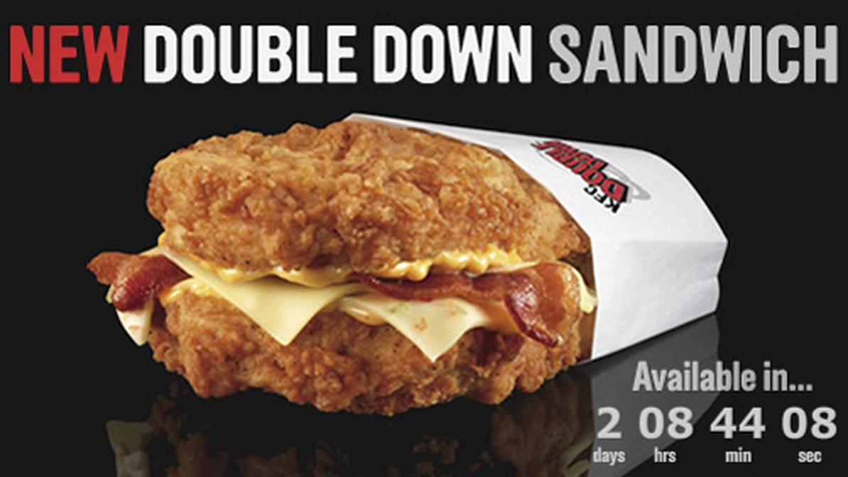
In an age where nearly every single marketing and psychological trick has been used, shock effect speaks louder. When the KFC Double Down was first launched in 2010, it seemed like a joke—and indeed the greasy creation was unveiled to the public as an April Fool's prank. However, the infamous fried chicken sandwich with two pieces of fried chicken serving as buns was an instant hit (Fig. 2.5.1). Other companies like Taco Bell and Jack in the Box followed suit with foods designed to shock and allure. The trend quickly expanded to other countries, including Japan, where the Kuro Burger, served on black buns tinted with squid ink, met with a rapturous reception.
All these companies were able to introduce new and highly successful product because of their established position in the market, and their deep knowledge of the local market. Kentucky Fried Chicken has been one of the most successfully established fast-food brands in the world and its expansion to other countries reflected its flexible approach to local markets. For example, in China, it has been one of the perennial stop-over joint for Chinese teenagers before an evening out. This comes on the hot steps of a campaign that explored Chinese cultural values and succeeded in growing the brand in the country from a tentative opening in Beijing in 1987 to opening its 1000th restaurant in 2004. Companies like KFC have succeeded in “clothing their brands in local costumes” (Belk, 2000) in order to fulfill a complete “localization of language, product attributes, advertising content, and even product meanings” (Zhou and Hui, 2003). KFC achieved its success not by the quality of the food, which was met with an initial lukewarm reaction, but rather through the entire experience surrounding it: a friendly and efficient staff met customers on clean, well-lit, and flawlessly air-conditioned spaces. Western food has gradually become more acceptable since the early 1990s, and KFC's use of poultry has been seen as more relevant to the Chinese cooking traditions than the heavy beef used in McDonalds. However, KFC's success was achieved by a savvy advertising that played to the different “China markets,” which reflected the country’s complex diversity of social groups, climate, religion, economic status, and language. Their advertising became more family-oriented, emphasizing social value for large groups (e.g. KFC bucket), as well as the importance of young boys in the family structure (a perspective that has since slowly changed). However, the real appeal of the brand was to design an offer that included locally-influenced dishes like Old Beijing Chicken Rol, as well as typical Chinese breakfast, alongside Western novelty foods like New Orleans Barbeque Wings and Mexican Chicken Warp. The success of a product is heavily influenced by the perception of its country of origin (Nagashima, 1977). Stereotypes play heavily into acceptance: a positive mental model can often determine whether or not a product is not only accepted, but its degree of success. Customers are more forgiving toward successful brands. Strong branding can overcome the individual negative feelings.
This may sound like a contradiction, but there is a specific reason behind how brands can consistently defy their customer’s negative perceptions and remain in the game.
The fast food industry is one example of this type of behavior. Fast food has been indicted almost universally for its lack of healthy options, unethical behavior, and low wages toward its workers, and yet yearly results are through the roof.
Part of it is due to advertising which, to a large extent, expects a harmonization of the audience. Top brands spend millions every year to launch massive advertising campaigns that are recognizable from Magadan to Buenos Aires, expressing a unique set of values and beliefs about the brand that supersedes cultural or political borders. However, it is very recognizable in very different ways, with the same products generating different reactions in different contexts.
The end product is only part of the story, and our expectations are everything. These unweighted anticipated impressions are related to who we are and what our experiences were. They are preconscious and relate directly to values. We latch onto the familiar, and there are several values that are universally appealing: order, fraternity, respect, and awareness.
The most successful companies live by well-defined internal principles, but these can sometimes be mysterious even to the most business-savvy executive. Consumers do not seek to align themselves with values that could be excluded from their lives.
This applies to how we see brands as well. A brand is not only a symbol or a representation of values: in its best assertion, it acts as a rallying agent. It is an indirect recruiting platform. Its brick-and-mortar stores are temples. Its logo is an adored icon. Its personality is complex and layered, and it can be anthropomorphized in our thought.
2.6 Aspirations and Brand Identity
Loneliness is the human condition. Cultivate it. The way it tunnels into you allows your soul room to grow. Never expect to outgrow loneliness.
Janet Fitch
One of the reasons for the success of Apple products, though, is their inherently universal appeal. Apple barely changes its product portfolio in different territories, because its overarching principles are simplicity and minimalism: universal qualities that are easily identifiable and marketable. When assuming the reins of a waning Apple in 1997, Steve Jobs excised most of the previous product line to focus only on a few select products, stating that Apple needed to get back to basics: “great products, great marketing, great distribution.” Marketing became a core aspect of the company, and with it a new campaign emerged: Think Different, a watershed moment that associated the Apple brand with some of the important and representative thinkers and artists of the past century. This became a hallmark of the company, who successfully leveraged this early success to pave the way for the more daring and innovative products that would follow in the forthcoming years: the iPhone and the iPod, which were a smashing success worldwide.
The Apple iPhone 5C campaign in 2013 recognized the potential of the product in foreign markets and was a clear indicator of the brand’s international strategy. The main TV advert displayed a succession of iPhone users engaged in a call, each emitting a greeting or an expression of surprise in various languages. Each caller was of a different age, gender, and race, located in a different part of the world, and in different situations (sailing, waiting on the taxi, in the middle of a yoga class) while making the call. After a canopy of idioms, the ad concludes with the caption “For the Colorful” before introducing the iPhone 5C model, which went on to sell over 35 million units all over the world. Its unique selling point was the light customization allowed with the steel frame–reinforced case color.
Apple’s strategy never focused on customization or personalization, but rather aimed at pushing audiences the world over into assigning a different personal meaning to a fully standardized and instantly recognizable range of products. The fact that Apple’s prices are uniformly high in every market and its unwillingness to cede control on their devices speak of monopoly but are actually one of the many strategic decisions that allowed them to reach their domineering role in the market.
The company also knows when to assume a more passive role and cede control. In 2015, Apple managed to achieve a total of $59 billion in revenue for China alone not only because of the attractiveness of big sellers iPhone 6S and 6S Plus, but also because of accommodating political requirements, like censorship of the News and Maps apps and using China Telecom servers owned by the state. However, the company also worked hard to establish itself, by signing with the biggest telecommunication provider in the country, China Mobile, and directly tapping into a market of 760 million subscribers. The company also pushed their then biggest phone, the iPhone 6 Plus, for millions who had no television at home and used their phone as a streaming device, a game console, and communication center.
Reliability and flexibility are more important than snazzy design. Companies often run into the mistake of increasing familiarity in their content tone to appear more familiar. But there is more about being more accessible and friendlier to users than to increase the number of exclamation marks in a copy.
Familiar tropes and buddy expressions should be avoided if they are not in line with the audience’s expectation. If the customer segmentation shows that there is a significant 40–50 age group accessing the website, would familiarity work better than reassurance?
For some brands, however, the question is not even about content subtleties. Sometimes the user expectations subvert the interpretation of content. Some brands are more “forgivable” than others. Why does this halo effect help to distinguish between a “cool” brand and one that is not?
On his book Brand Is a Four Letter Word, Austin McGhie lays out a perception of brand as a combination of positioning and eccentricity, and a construction that requires both work within the company and raising the expectations of the unsuspecting audience. He also reminds companies that a youthful, multisided appeal is not only not always possible, but not even recommended in some cases:
Cool is … not an inherently desirable characteristic. Remember that so-called cool brands, while fun to talk and write about, tend to be on the smaller end of the business scale. It’s tough to be big and stay cool. There are exceptions, of course. Apple and Nike have certainly managed it, Starbucks still does pretty well for such a well-distributed brand, and Twitter and Google are still going strong. But no one ever mentions MySpace these days, and Facebook, while still increasing its audience, is losing its edge. At the end of the day, big does not coexist comfortably with cool, so the list really isn’t that long. Cool ubiquitous brands are rare. (p. 244)
Larger corporations have a more complex ecosystem and as departments grow and hierarchies become more layered, it is more difficult to remain focused on a single business vision and still appeal to the target audiences with a personalized flair. Apple, Starbucks, and Nike managed to keep their image fresh not by adopting high-street popularity fads as their own, or a portrayal of desperate unconformity. These brands have one thing in common, and that is their insinuation of aspirational appeal, and their aura of social exclusivity.
Few products carry more of a social meaning (or stigma, to some) than an Apple product. It is a representation of status, and it embodies a sense of belonging that is often fiercely defensive. For proof, look no further than an argument between Windows and Mac users, a division that was partially promoted by the company itself with the Get a Mac campaign, which had a string of adverts depicting a PC character as a stuffy bookish-looking nerd awkwardly confronting or attempting to deceive a smart-casual laid-back Mac. The campaign consistently depicted the PC as a system for work and “boring presentations,” whereas the Mac was meant to be used for fun, easy communication, and entertainment. These characters were also played by different actors and with different emphasis depending on the country they were played, with John Hodgman as PC and Justin Long as Mac in the US and Robert Webb and David Mitchell in the UK (Fig. 2.6.1).

The perception of the product relationship and the community building and positive reinforcement aspects. Richardson (2013) labels community-driven innovation and product support as elements of the tribal following that Apple has successfully rallied around its products: “less [of a] computer, more a statement of creativity, style, and difference from the grey and uninspiring world of the PC” (p. 7). The Apple consumer tribe that populates the trendiest Starbucks coffee houses is a truly global one: a collusion of high-tech style drenched in fair trade beans sourced from South America or Southeast Asia. It is a tribe that feeds off the brand’s reputation and nurtures it.
Aspirational brands fit with the millennial crowd. A 2016 study undertaken by GlobeScan found that aspirational consumers make up 40% of potential shoppers. Aspirational are primarily empowered by the search for style and status, rather than focusing on price-quality efficiency or loyalty to a single brand. On the other hand, generational perspectives are easily put into conflict. A 2014 US phone poll revealed that over 60% of Americans considered millennials, aged 18–29, were “entitled” and “selfish” (http://reason.com/poll/2014/08/19/65-of-americans-say-millennials-are-enti). Rather than GenX’s navel-gazing, hipster GenerationMe is staring at their digital pin board and endorsing the value of social media communication and the positive effect of supporting movements and companies that improve the state of society, like anti-pesticide petitions and alternative fuel policies—with the power and conviction of an easy, single click, or tap.
However, this European and American reality also finds its way into the wider reality of a worldwide economy. GlobeScan's research also found that aspirational consumers are more prevalent in developing economies: Nigeria (58%), India (53%), China, South Africa (52%), Indonesia (51%), Ghana (49%), Peru (49%), Kenya (44%), and Brazil (42%). The richer economies with the largest groups of aspirational consumers found were: Canada (42%), the United Kingdom, Russia (41%), Greece (40%), Spain (37%), and the United States (36%). The aspirational element of international consumerism serves as a mediation layer between the local reality and a global repertoire of hedonistic images as influenced by Hollywood, advertising, and the full brunt of capitalist institutions, enabling “progress through pleasure” (Mazzarella, 2003, p. 101). This is exemplified by the popularity upswing of fashion and jewelry brands in Southeast Asia and India, resisting economic slumps and consumer fatigue elsewhere in the world.
2.7 Diversification and Communities
Strength lies in differences, not in similarities.
Stephen R. Covey
The impact of brand on multicultural environments is becoming more important and recognized as an independent field of marketer work, but keep in mind that multicultural audiences are not necessarily international. An institution recognition factor can be the result of its importance and recognition within the mainstream. One example of this is the US Marine Corps, which launched in 2013 a campaign with the title A Warrior’s Education aimed squarely at the Asian communities in the United States. This was part of a wider diversification effort within the army, and it pitched a human angle, showing the testimony of Asian-Americans soldiers in active duty as a way to increase relatability for audiences.
Weaving a story for the audience with identifiable faces is essential to achieving personal identification. Brands often hold more enclosed meanings than they seem. Look closely at the current FedEx logo and you will notice a small arrow in the midst of the simple design, deceptively pointing toward the accuracy and precision of the service.
The increasing complexity of demographics is prompting more specific targeting of ethnic demographics, as the social landscape becomes more fluid. “Understanding the nuances of multicultural markets, yet maintaining inclusive brand message is essential for brands to thrive in our increasingly multi-ethnic economy,” explains Andrea Van Dam, CEO of Women’s Marketing. American marketing agencies have increasingly specialized in a number of markets, targeting minorities, genders, and age ranges as the demographics become more complex.
One of the immediate consequences of this diversification is the use of social media in grassroot organizations and activism. Movements like Africans in the Diaspora promote social change in African countries by reaching out to Africans all over the world to reinvest in local projects. Other projects, like Invisible Children, aim at upholding human rights and freedom for youngsters caught in conflict situations.
The impact of acculturation is not limited to those who strive to maintain a landline to their background: it also happens with those who are integrated in larger cultural streams and affect their context with new habits and routines. Attitudes and behaviors are the two main components that determine the level of acculturation (Berry, 2005): the first one must stimulate the second one in order to be affected positively.
Communication is always two-sided and bilateral, even when dropping a 140 character message onto an unsuspecting legion of followers. Twitter conditions the nature of messages by way of the very medium, with the character limit and hashtags. A feedback loop is inevitable with comments and retweets, as that is the basis of the entire value proposition. This is one of the reasons why social media has taken a heavy role in the realization of international communication. Facebook is a perfect example of a dominating internationalization strategy that relies on excellent internationalization tools and sound modular architecture. Server-wise, the isolated components of the web front-end are layered in an independent manner and distributed across different machines in order to alleviate processing and data access. The site also has a mobile-only version with a dedicated URL at m.facebook.com instead of relying on a responsive version, which allows greater control over the layout and features made available to mobile users. It is impossible to overestimate the impact of Facebook on lives across the globe. Even in China, where the service is blocked by the local government, there are almost 2 million users who are able to access the latest news on their friend’s activities and outings. Facebook is consistently the most widely used website on the planet, with more than 1.3 billion users, and acts as a central platform for social communication and economic activity. However, the variety of social media available is correlated to geographical preference as well. While Facebook is relatively omnipresent in every country except China and Japan, WeChat is the Chinese equivalent that has seemingly taken over mobile communication, the main driver of traffic in the country. Chinese immigrants living in the West have the app installed on their phones in order to easily communicate with friends and family back home. Mobile preferences are another factor of distinction of diasporic communities in foreign countries and contribute even more to a kaleidoscopic variety of communication patterns.