
Global Designs
Abstract
Although there is negligible genetic disparity between the different people that inhabit the planet, the expression of design varies wildly. From the understated elegance of Japanese architecture to overwrought European Gothic structures, design is as much an expression of culture as it is of time and place. But, for all of its explosive variety, is there an actual universal sense of design? Do humans use essentially the same rules, only with different purposes and sensibilities? Our cognition and intellectual prowess is remarkably similar across cultures, so why are there so many variations on such disparate themes? The essential mechanisms of our mind that make us closer to each other are also the ones that make us closer to the laws of the universe: geometry, patterns, and language. Yet each one of these can be used in a different manner depending on the dominating preferences and tastes of our surroundings. This chapter proposes to analyse these very differences, be it in the input we provide the systems we interact with–or the output.
Keywords
Design; User Interface (UI); User Experience; Golden Ratio; Western design; E-Health systems; smartphones; cognition; internationalization; usability
7.1 Cultural Aesthetics
The first step to controlling your world is to control your culture. To model and demonstrate the kind of world you demand to live in. To write the books. Make the music. Shoot the films. Paint the art.
Chuck Palahniuk.
Although there is negligible genetic disparity between the different people that inhabit the planet, the expression of design varies wildly. From the understated elegance of Japanese architecture to overwrought European Gothic structures, design is as much an expression of culture as it is of time and place. But, for all of its explosive variety, is there an actual universal sense of design? Do humans use essentially the same rules, only with different purposes and sensibilities? Our cognition and intellectual prowess is remarkably similar across cultures, so why are there so many variations on such disparate themes?
To understand the variation of themes, we must understand what they are made of: their basic components and their most essential parts. And this understanding often leads us into the realm of geometry and patterns.
Geometrical regularity has been a pillar of Western design since the outbreak of the Ancients Greeks, a knowledge that was overtaken by the Roman empire. The principles of symmetry and the power of edges and intersections became a dominant discourse in most design work, be it architectural, artistic, industrial, or all of the former.
Mathematical images are prominent in our design aesthetics, and geometry is the regulating defining basis of almost every cultural aesthetic everywhere. The Giza pyramids are one of the most awe-inspiring examples of human design, and its iconic shape and endurance has continued to be a subliminal inspiration for designers throughout history. Triangles force the viewer focus and point toward elements in a futuristic fashion that belies the power of their presence in a design.
Design is not only a matter of laying out pleasing visual aesthetics. In the case of the pyramids, as of landmarks across the globe, design is often infused with a performative aspect, shrouded in ritual and belief. Geometrical concentric drawings called kolams, popular in southern India and the Far East, involve a performative ritual whereby the representation is connected to a supernatural view of the world or system of knowledge. One needs not look further than the use of tiles and stained glass in medieval churches, and their inherent association with Christian symbolism, to understand the deep impact of these designs. Geometrical images have always been imbued with deeper meaning, and web design, fundamentally tied to basic principles of typesetting and regularity, reflects this deep and recurring design motif (Fig. 7.1.1).

The influence of these principles is wide-ranging, as certain forms and shapes allow for practical considerations. For instance, triangles, hexagons, and squares are appropriate for stacking and packing. These forms are economical and leave no space in between. On the other hand, natural patterns like branching, or storing, occur in nature, as well as fractals, are one of the most important patterns of design in nature. From the leaves of a tree to the relation between shock waves, the importance of fractals is paramount and one of the most universal design principles across civilizations.
Professor Ron Eglash has devoted a lifetime to understanding the influence of fractals in African architecture and design, and has noted several intriguing uses of fractals in local African populations with little influence The Ba-ila people, a dying tribe found in Zambia, have built villages based on complex fractal patterns, with substructures and dependencies between the various areas of their dwellings. The disposition is circular, with buildings nestled in rings around each other.
The prominence of fractals in African architecture reminds us that technology and sophistication are two separate factors with very little in common. The technology used by these populations would normally be deemed underdeveloped by most Western societies, but they are directly using extremely complex patterns which are a part of the surrounding natural environment in utilitarian manners in a way that avoids straight lines and the “boxed” language of concrete.
This approach is a contrast to the Western preference for regularity and symmetry in detriment of pattern and context. The use of the triptych structure in classical paintings is fundamentally inherited from a sense of balance and aesthetic equilibrium passed on from Classic Antiquity. Greek aesthetics formulated a geometrically-inspired model that relied on proportion and symmetry that is still prevalent in our modern aesthetic outlook.
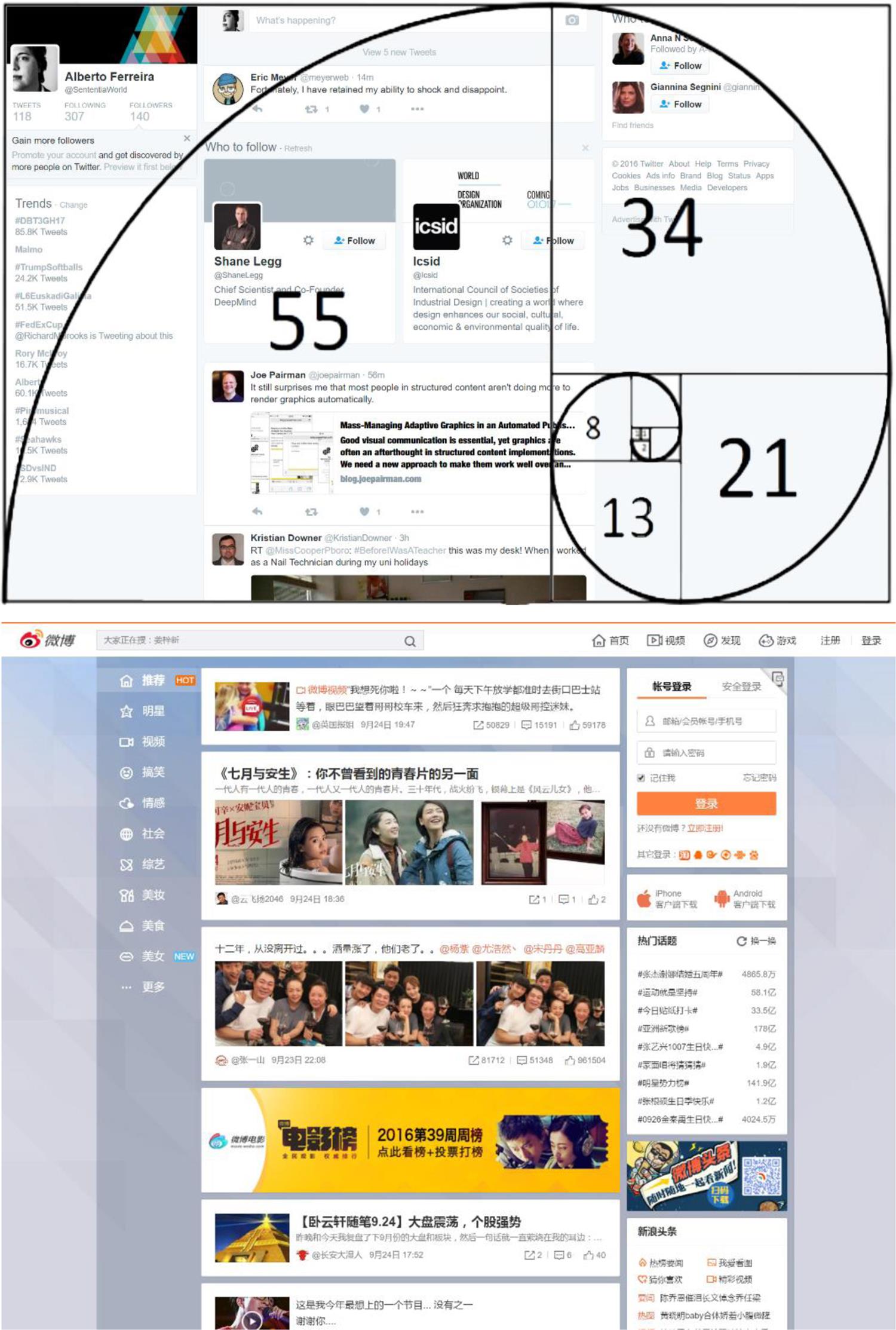
Webpages, as a modern artefact subjected to the appeal of contemporary taste and interpretation, tend to follow similar organizational and aesthetic patterns. The quality of “harmony” refers to geometrical proportions applicable both to classical works of art to typesetting to web design. Critical attention-grabbing points in the visual framework or the sense of hierarchy between these very elements, like the usage of the “Golden Ratio.” The Golden Ratio is an ancient visual device that assigns balance and distribution in a layout according to the Fibonacci sequence, which is obtained by adding the two previous numbers: 0, 1, 1, 2, 3, 5, 8, 13, 21, 34, 55, 89…
The mapping of this sequence will create a regular spiral, and despite the naming being attributed to Leonardo Pisano Bogollo, an Italian mathematician from the 12th century, it was actually a well-known pattern in Indian lore centuries before.
One of the most visible examples of this application is on sites with a heavy emphasis on implicit user tasks, like Twitter and Facebook, with a focus on central content areas and a de-emphasis on peripheral areas.
The question remains, however, whether the application of classical aesthetics in modern design assists or facilitates usability from a practical point of view. Western users have a different perspective on spatial data and information organization, and scan and interpret it differently from Asian cultures. The “Golden Ratio” is not an institutionalized geometric principle in Asian culture and is subjected to various cultural and social constraints (Fig. 7.1.2).
One of the key aspects of this visual interaction is the concentration of information with a left justification, and the use of three columns in the layout itself. In most websites, the use of a tri-parted canvas allows for the following elements to be easily placed and perceived by audiences:
The identity is most clearly manifested by the website’s logo and masthead, which establishes authorship or, most frequently, ownership, and casts dominance over the remaining elements. A website without a clear title or brand is most easily perceived as confusing, orphaned, or, in the worst possible case, irrelevant. The title is usually set at the top of the page, following conventional typographical principles that date back to the alphabet structure devised by the Phoenicians in the 15th century BCE and the information structure implied therein, whereupon elements relied on the following properties in order to communicate meaning (Fig. 7.1.3):

At their core, websites are structured around an organization most easily perceived through its disposition of vertical columns along the page canvas. A grid model can be applied to its information architecture. The similarity between print and webpage design are striking in the resemblance of most text-heavy websites to their print counterparts, which relied on letter pressing methods for centuries and a paper grid model for the layout work on the page.
7.1.1 Design and Belief
Beliefs are culturally determined both in appearance and popularity. Beliefs condition one’s expectations toward achievable and obtainable goals in this life, and play a role in aspirations and interests beyond mere living. For example, many societies in sub-Saharan Africa still perpetrate a belief in animism and the power of natural remedies against larger forces in the universe. Nature is a set of characters that can reflect or illustrate events in one’s own life.
This is extendable to Burkina Faso, where Muslim medicine men are extremely prominent and spell craft is prevalent amongst the general population. In the Philippines, belief in supernatural spirits is widespread. Folktales play a major role and education and in shaping the imagination of young children. In Mozambique and Angola, witchcraft and traditional medicine are sponsored and regulated by the Mozambican Department of Health. Even fully industrialized societies like Singapore still carry many superstitions from previous generations.
What is the running thread in these different manifestations of belief? Why are these important to design? Because belief and representation shape symbolism. Symbolism, according to Maggie Macnab, is universal and not a fact, but a common concept. It relies on the representation of basic structures in nature in an iconic form, where shapes in nature are usually engaged in spatial terms. This implies that metaphors and other representations are underlined by symbols of belief: creatures, space, and time. All are encoded in the same form of communication and reflected in different ways from proverbs to visual design.
7.1.2 Semiotics and the Stroop Effect
While criticized in certain quarters, semiotics provides an appealing framework to investigate the weight of culture in UI design. While “the sign can be understood as a correlation of differences” according to Ferdinand de Saussure, contemporary perspectives of semiotics place it closer to the study of culture, and it inevitably has an impact on design. It is for this fundamental reason that one of the key principles of design, visual affordance, is often not enough when learning how to organize knowledge and standard practices of usage. Artefact design is often reliant on cultural assumptions: the impact of metaphors, aesthetic choices, imagery, and information structure directly have an impact on the interpretation of a technologically mediated interface.
However, measuring and quantifying this impact, particularly on a cross-cultural basis, demands a sturdy conceptual framework, to which the concept of User Experience is often attached to. It has become a ubiquitous term in contemporary software engineering, reflecting the “person’s perceptions and responses that result from the use or anticipated use of a product, system or service” (as per the definition in the ISO standard). Its emphasis on the emotional persuasion of the user, then, prompts the question on what constitutes a desirable representation medium for different cultural backgrounds.
For instance, Japanese and Chinese websites are often criticized by Western designers as being too busy and dense, therefore conditioning usability and unclear information architecture. However, internationally localized websites are routinely redesigned and adapted to local expectations, often without proper usability testing, prompting the question: are localized websites taking into account user expectations at all? The fact that Chinese and Japanese UI design differs so much from prevailing design tendencies in both America. Europe is deeply connected with political and commercial reasons, namely the fiendishly transient nature of the market, as well as a demand for feature and information abundance at the expense of abundance. Whereas the minimalistic stance of Western UI design promotes accessibility and privileges repetitive task methodology through clear placement of affordances and conditioning expectations, Chinese and Japanese mobile markets focus on the value of anonymity and density.
This attitude is, however, changing. Popular websites such as QZone already feature a minimalistic interface, which conforms to the common Western design standards, but this change is still not prevalent in websites such as Weixin and, most importantly, in the UI of its applications, which use manga-inspired emoticons extensively (Fig. 7.1.4).

Social networks are one of the richest semiotic systems in HCI: regulated by social organization structures that act as metaphors of actual social interactions, with continuous content delivery systems acting as object-world environments co-created by the channeling user. This form of engagement is further expanded in Toshi Takahashi’s theory of audience engagement, which encompasses seven modes:
This conceptual framework should be explored in the context of culture, encompassing the organized and socially enforced system of signs, expectations, and indoctrinated aesthetics that users are embedded in.
The impact of culturally-specific semiotics in User Experience is relevant in the appeal and comfort that a specific website or product holds for users. Clarisse Sieckenius de Souza’s pioneering study of semiotics in the context of computer-mediated communication published in 2005, demonstrates that the sign system encoded in a UI is an exchange between designer and user mediated by technology. Semiotic engineering has been increasingly viewed as a valid methodology in the analysis of the information structure underlying user interfaces. The field has since produced relevant studies in the matter, including Shaleph O’Neill’s perspective on the ways that semiotic models can be applied to interactive media.
Semiotics are relevant to User Experience as it often finds itself construed as a multidisciplinary field aimed at optimizing a product design and delivery in a way that optimizes the emotional receptivity of the audience. This includes taking into account the user’s moral values, aesthetic sense, emotional outset, cultural stance, preferred ergonomics, and usability preferences. User Experience is, then, a combination of all of these elements into one single unified node: how we connect with the world and with others as the digital divide erodes barriers of communication modes.
7.2 Indigenous User Interfaces
She had studied the universe all her life, but had overlooked its clearest message: For small creatures such as we the vastness is bearable only through love.
Carl Sagan, Contact.
Empathy aids us to establish a perspective of the other, to understand what the implications and especially the motivations are behind the actions of the users. Why is the checkout cart abandoned midway? Why are they drawn to certain areas of the service? What are they looking for? Why are they visiting the website in the first place?
Behavior modeling does not have to be a huge taxing endeavor. Often times the simple cues and guides are the best ways to trigger a change. Contemporary technology usage is heavily utilitarian and remarkably superficial. The complexity and sophistication of an app or website has absolutely nothing to do with the actual experience of the user. A bad connection is enough to downgrade the overall perception and ultimately the reputation of a product or company.
There is only a short window to stimulate a user’s interest and curiosity. This is one of the reasons that have led the OASIS open standards consortium to start an initiative for delivering personalized user experiences online. This standard reflects the customization of content and layout for planned audiences, and marks an initiative that extends to the various projects taking place in areas of the globe where the experience of data and web design necessarily needs to be curtailed and adapted to the local needs and perceptions of technology.
One example is the Mukurtu project (mukurtu.org), a community development initiative, started in Australia by the Warumungu Aboriginal community. It has produced a web-based content-management system and a set of ethical processes for tailoring guidelines for archiving and sharing information via the CMS.
The aim of the project is to provide indigenous community groups with digital resources for cultural heritage preservation as well as providing the means to do this work in accordance with community values. The project leaders recognized, from the outset, that archival work is value-laden and that information systems often have built-in assumptions about access and representation that can threaten the core goals of cultural heritage preservation work. Where communities’ ability to represent themselves—via descriptions and images of artifacts, places, and people—become threatened, so do core human values of individual and collective sovereignty.
Other projects, like the one led by Kasper Rodil and other researchers (2014), focused on co-design with indigenous groups, particularly with the Herero community in Namibia, in order to study the categorization and interpretation of concepts that the members of the community displayed when classifying objects. This method was primarily based on location and layout rather than causality, which is the main identified method in Westerners.
User-centered design is not a straightforward process that can be applicable necessarily to other cultures without some form of cultural interference. Smith, Dunckley, French, Minocha, and Chang (2004) suggest that user-centered design might be influenced by the Western culture’s “view that users as individuals have a democratic right to be involved in the development of software,” whereas other cultures may have a very different conception of the implications of design.
These differences are relevant in the wider context of globalization and outsourcing. This is a common practice, with a visible effect on the relationship between European and American companies and Indian or Latin-American UX agencies, respectively. This outsourcing is often driven by financial factors, and design and development, but research services are seldom used. Sergio Nouvel, co-principal of Continuum, argues that “there’s a whole lot of front-end and UI design work done in Latin America, especially the graphic/HTML work, because a native English speaker is required to produce UI copy with the nuances and the right tone.”
Producing content is a focal point that requires familiarity with the local culture. Sergio emphasizes the importance of local specialists with knowledge that are aware of the cultural distinctions: “one of our Peruvian clients worked with IDEO before us, and one of their main complaints was that, despite the high quality work, the American consultants were not able to capture the subtleties of Peruvian culture, and decided to prioritize local consultants for future projects.”
The search for short-term financial saving pushes American and European companies to outsource work to emerging economies with equally trained and specialized professionals, like Argentina and Uruguay. This has an impact on the development of local talent, but it also has an impact on other countries. Brazil, for instance, is developing a sizable web-design workforce with a sizable chunk working directly for local branches of large companies in the country. Companies still face tremendous challenges when entering the continent via Brazil, as they have to establish different offices in other Spanish-speaking countries due to the language barrier in the continent.
7.2.1 Galapagos and Sushi: Japanese Web Design
Amongst the conundrums of UI design, the Japanese indulgence in apparently ugly interfaces is intriguing to Westerners. Most Japanese websites gleefully escape the paradigm of simplicity and specialization that colors most Western websites, or even most modern Asian websites such as Nicovideo and Ameba.
Driven by their own internal consumer and design trends, website design in Japan became a discipline with its own background and quirks. The direct result of specialization via the Galápagos syndrome, web design in Japan is a fascinating insight into how isolation is opposite to homogenization.
The adoption of HTML5 and other technologies was slower in the country due to legacy and tradition, in a country that is imminently creative but bound by hardened social and professional ties. One of the reasons for the apparent abundance of content in Japanese websites is the perception that a site that hides information from the user is enclosing itself deliberately, which reduces trust and openness. This visual “horror vacui” manifested itself in overly busy sites (to Western eyes), but has since been minimized, particularly in the international versions of Japanese brands.
This stands in stark contrast to the Japanese concept of “ma,” a concept that entailed the use of negative space and implicit relations. Instead of expressing something literally, “ma” ( ) encouraged the use of gaps and intervals in order to allow the viewer to build their own mental depiction of a design and envisage the consequence.
Seeing as Apple took more than a page from Japanese minimalistic design, the reasons why digital web design in particular remained steeped in tradition is related with the functional attitude toward web technology.
7.3 Gender and UX
I would rather trust a woman’s instinct than a man’s reason.
Stanley Baldwin.
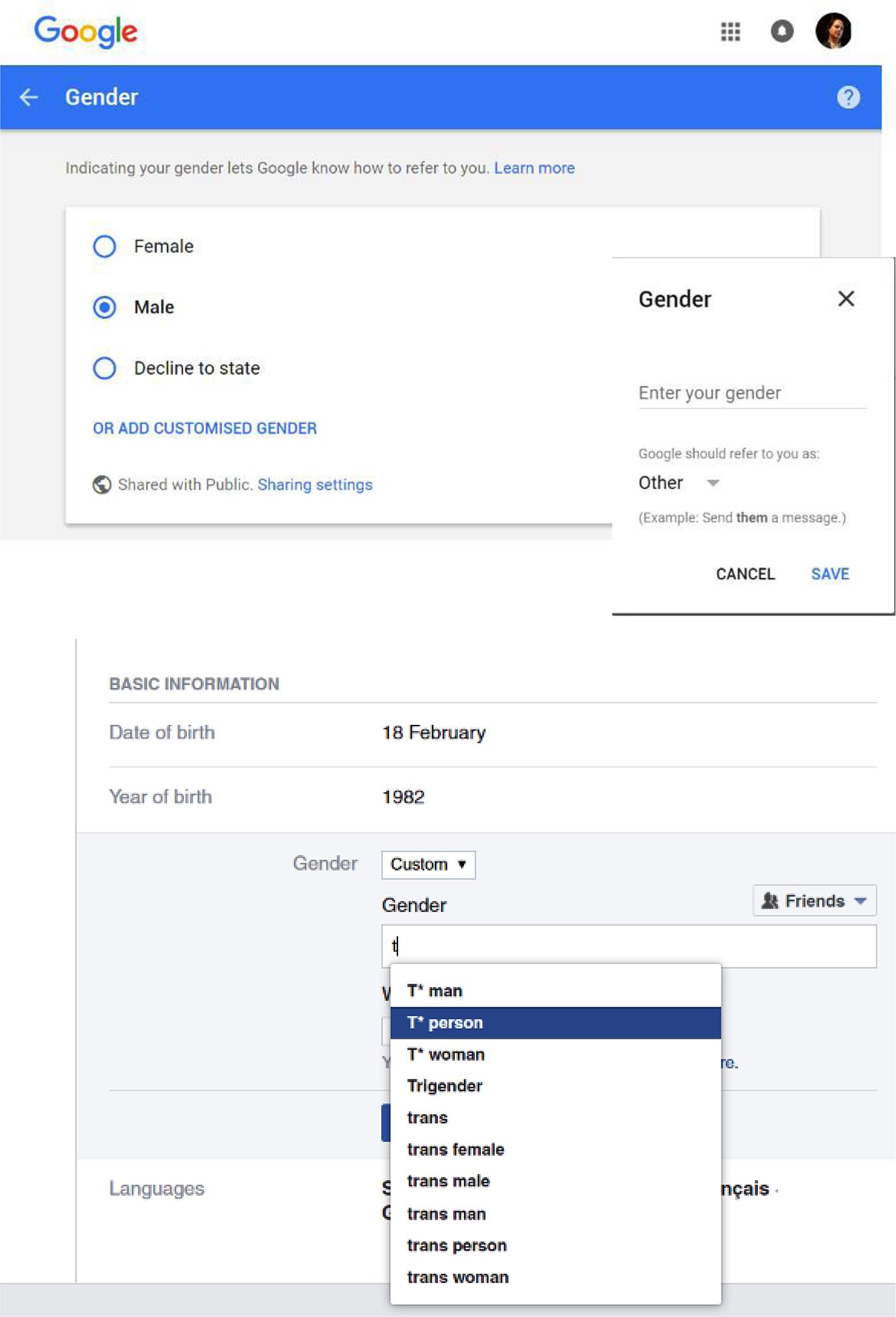
Gender is encoded subtly in many elements of our everyday lives. From color to shapes, femininity and masculinity are frequently alluded to in everyday observations, yet seldom recognized consciously. “That’s a macho thing.” “That car is a bit girly.” “This is a manly pocket watch.” As sexist stereotypes, the use of such generalizations is under questioning and reframing in the general media and the voice of the public. The binary opposition is slowly giving way to more rounded descriptions with other options in registration forms and personal profiles pages.
Gender is largely a cultural construct, but it can also reflect personal, physiological, and psychological stances about personal identity. Gender is not only genetic, but an essential component of social role, and personal identity and expression.
Its relevance in UX design is manifest in the need to design in an inclusive manner that reaches out to most users in increasingly polyvalent and heterogeneous societies. Imbuing your site with masculine imagery, or appealing to a feminine aesthetic, may fly in the face of an audience that includes transgender and nonbinary users. This does not imply that the design needs to be stale and devoid of any sexualized elements, but it does necessitate user testing and a deep reflection on the deeper motifs and strategy behind this digital presence.
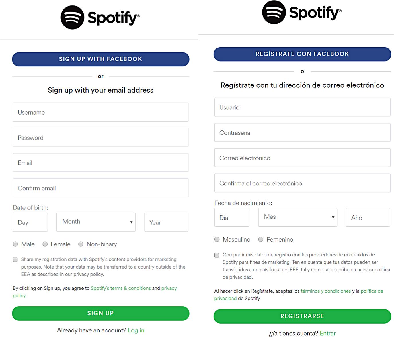
Assuming that the audience has a particular set of physical attributes, or using the wrong gender implication in the copy, can alienate the audience and negate concepts of self in a way that is both damaging to the individual and the brand proposition. This is especially essential when writing in Latin languages and others that have gender encoded as part of the subject. The use of the male form is prevalent throughout these languages, with no neutral form and forcing the use of masculine pronouns as the standard. This is in line with the audience’s expectations, but should be used with care in order to avoid disparaging other audiences (Fig. 7.3.1).
In Western design, the distinction between masculine and feminine (and the blurred lines between them) still persists as a method to critique and frame purpose, identity, and visual appearance. It is easy to justify a design choice as a reframed self-as-user bias, and UX, like other technical fields, can suffer from an overly masculine sensibility. Part of this is related to the stereotypes that can seep in through the designer’s attempts to create a new and engaging experience. Nicola Marsden, professor at the IT department of Heilbronn University, found this to be consistently true in the way e-commerce German newsletters address their audience:
In signing up to shop on their websites, about half of them did not ask for any title. The other half of the online stores usually gave me the choice between “Herr” (Mr.) and “Frau.” Frau is equivalent to both “Ms.” and “Mrs.” […] Of the sites that asked for a title, one-third placed the female title first and two-thirds have the male title first—even though in Germany, like the U.S., most ecommerce revenue comes from women. Nearly all of these websites allowed me to make a selection regarding the gendered title, but around 20 percent had already set the gender at a default—almost always the male title—and they offered no option that did not include gender.
Recommendation: When implementing controls for an interface, do not incorporate gender in the name titles. Avoid encoding gender in the title. The use of “transgender” or other as an additional option to “man” or “woman” is strongly discouraged, as it can contribute to marginalizing these communities as alternatives to the mainstream binary. Be consistent in your choices across markets (Fig. 7.3.2).
“Gendered interfaces” have been theorized extensively in feminist research, but they are a real-life concern in increasingly diverse societies, namely because of the following factors:
a. Men process information differently from women. Simon Baron-Cohen’s Extreme Male Theory of Autism proposed that the neurological difference between men and women made both genders develop different cognitive styles. While male babies would be more prone to pay attention to movement and spatial layout, female babies would be more interested in social stimuli like faces and voices. These tendencies would eventually develop into preferences for systemizing, in the case of men, and empathizing, in the case of women. Baron-Cohen proposes that the male brain can be essentially located at different spots of the autistic spectrum, and more extreme cases of systemizing would be reflected in clinical cases of autism. Only 20–25% of the autistic population is female.
b. Men interact socially in a different manner than women. A 2013 study demonstrated that males have on average a higher friend count on Facebook than women across most countries. Research at the social media giant also consistently showed that women receive more comments and acknowledgments from their social network. Women also tended to post more status updates with messages concerning thankfulness, family fun, and birthday wishes than men.
c. Men use the Internet differently. A 2004 Pew Internet survey showed that men are most likely to go online to get general and political news, make reservations, and check sports scores. Women were most likely to search for health, support group and social media sites, and obtain spiritual and religious information. (The same report also highlighted that African-Americans were more active than white people in searching for school or job information, and in listening and downloading music.)
Different concepts on how to apply these principles effectively in the context of UX design exist. One of them is the GenderMag method, which aims at finding gender-inclusiveness issues, led by Margaret Burnett, Professor of Computer Science at Oregon State University, and incorporating academics and researchers from Cambridge University, Microsoft, and City University London. The inspection framework is aimed at highlighting gender-inclusiveness issues in software design and development, according to persona facets like motivation, information processing styles, computer self-efficacy, risk aversion, and tinkering.
The greatest value of this empirical method is to introduce realistic and observable metrics that can guide designers toward a greater awareness regarding the masculine and feminine aspects of their designs—and their impacts on audiences.
7.3.1 Gender Disparity in the UX Industry
Design is not traditionally seen as a field where the gender disparity is a major issue, but the starkness of numbers shed a dark light on the subject. Design schools are generally populated with fairly similar ratios of men and women. Half the doctorates in science and engineering in the United States are awarded to women. However, the active community of professional UX and industrial designers is predominantly male in both the United States and the United Kingdom, and women take up only 5% of engineering teaching positions at a postgraduate level in the United States.
The popular UX blog A List Apart launched in 2009 a poll about readership gender. 82.6% of the respondents were male web designers. When asked whether there was any gender bias in the field, 66.5% of the participants answered “definitely not.”
Stereotypes and strained relationships in the working place are also part of the prejudiced bias against women in scientific fields. Tim Hunt, a distinct Nobel laureate, was compelled to resign his post at University College London after remarking publicly at the World Conference of Science Journalists in Seoul, South Korea: “Let me tell you about my trouble with girls… Three things happen when they are in the lab… You fall in love with them, they fall in love with you, and when you criticize them, they cry.” (The Guardian, 2015).
Apart from difficult relationships in the working place, technical fields show a distinct predominance of male presence versus female, and this is and this unbalance has been addressed in several studies. However, there have been recent remarkable strides in achieving a greater equilibrium between the sexes, particularly in digital media. One of these projects is Chicas Poderosas, an initiative started by Mariana Santos, an ICFJ Knight International Journalism Fellow and a former member of the interactive team at The Guardian UK newspaper. What she saw in her daily experience with media teams and in other offices prompted her to start an initiative that would give “voice to the underrepresented stories and women” and help women climb up the ladder of “leadership, management and entrepreneurship.” Other projects to give voice to audiences that had previously been denied a voice in the production and direction of the design industry are the Design for Women Foundation in Africa and International Women’s Media Foundation (IWMF).
Research suggests that, predominantly, technology design is biased in favor of groups similar to the designer (Jonge & Schraner, 2010), and women may be at a disadvantage when using propositions designed mostly by men. “The appropriation of technology by men, and the exclusion of women from many of the domains deemed technical, are processes that leave their mark in the very design of tasks…” They argue that technology has resulted in “the construction of men as strong, manually able and technologically endowed, and women as physically and technically impotent” (MacKenzie & Wajcman, 1999: p. 25) (Fig. 7.3.3).

According to the U.S. Bureau of Labor Statistics, women make up only a third of the web development force, but these numbers are much smaller elsewhere in the world. However, the situation is changing. According to the United Nations World’s Women 2010 report:
Nevertheless, with fewer female designers in tech, it is only inevitable that design as a discipline suffers an unwanted bias in accordance with the dominant group: men. The matter of gender diversity is relevant to design, both technical- and service-wise, not only because of the social value of the audience in question, but also because of the accessibility and suitability of the design in disciplines ranging from gardening to urban planning.
For instance, the American Planning Association and Cornell University’s Women’s Planning Forum denounced the fact that most urban settings are male-oriented in a 2014 survey with more than 600 planners. Some of the main difficulties highlighted included the unsafe condition offered by poorly lit parking lots and public transportation, as well as the difficulty in maneuvering strollers in sidewalks and public buildings. Moving around comfortably and safely in public transportation is a very different experience depending which group you are on, and a relaxed ride home can easily be filled with apprehension and fear if you happen to be on the wrong side of the gender or racial fence. Depending on gender and race, security and infrastructural planning and design may not answer these differences fully. Designing for gender poses specific inclusion challenges and, in a post-feminist society where different experiences and perspectives are not only respected but a crucial part of the social matrix of societies worldwide (Gill, 2007), fostering diversity in your audience is not an option, but a necessary effort that is at the very crux of the UX field.
7.4 Scripts and Keyboards
In his 2013 dissertation, Santiago Ruano Rincon argued that there is a case to be made for the use of cultural factors in user interface design, after an experiment with the Nasa Indians in deep Colombia. In it, Santiago accounted for the influence of writing systems, literacy, and aesthetic perception in the drafting of software user requirements. The work followed on the footsteps of previous research, which had stumbled primarily because of two aspects:
1. the native computer users were unaware of desktop as an interface metaphor
2. the Nasa language was not fully supported by keyboards available in Colombia.
This is not an isolated case where a minority language being directly limited by the mainstream technology. In 2015, an Irish woman by the name of Caoimhe Ní Chathail was prevented from corresponding with her mobile phone provider through their website due to the presence of the accented “í” in the name.
In terms of infrastructure, there is usually no limitation on language implementation in most major OS (Windows, Mac OS, Android, and iOS). Several conditions must be fulfilled in order for a language to become available as both an input and output language, namely:
• The language tag should be defined in the BCF 47 series of documents by the Internet Engineering Task Force,
• A language character encoding (such as the ones included in Unicode) must be available in order to allow alphabets and other language characters to be rendered digitally.
Nearly every language in the world is accommodated for in the list of available languages. Android 5.0.1 includes over 600 locales, amongst variations of Uzbek, Moroccan Tamazight, Bafia (Cameroon), and Langi (Tanzania). Compatibility with scripts is an essential part of any app or website. The minimal expectation is to be able to render the language intended for that territory correctly, e.g., correct script, punctuation, and spacing. Another huge internationalization necessity is the support for the regional settings, like currency, date, and address formats.
The most frequently used types of scripts are:
A script look is very powerful in terms of product identity. The size of the scripts also matters, as both large and small systems can take up a significant amount of space in the design layout. Chinese, for instance, has a significant amount of characters which do not fit into the same conventional spacing used by the Roman character sets. This is one of the reasons why Chinese UI normally appear stilted to Western eyes, even when using Western alphabets. The Chinese character inset is a few pixels wider than the Roman script, and its layout is necessarily larger.
Asian systems can also count in the tens of thousands of symbols, like with Chinese and Japanese, compared to alphabets such as the English, which counts only 26 characters. The combination of different writing systems is also a problem in these languages, where the use of different writing systems in the same text block can generate an unbalance in the kerning.
As in the Internet, countries can have several official languages. Communities can live side-by-side and have a completely different idiom. Nowhere is this truer than in Africa, by far the most multicultural and multifaceted continent on the planet. This is where the current holder of the world record in official languages lives: Zimbabwe has a total of 16 official languages, approved by the Zimbabwean parliament. According to Wikipedia, the languages are: Chewa, Chibarwe, English, Kalanga, Koisan, Nambya, Ndau, Ndebele, Shangani, Shona, sign language, Sotho, Tonga, Tswana, Venda, and Xhos. Sign language is one of the official languages, and its status is recognized in over 30 countries around the world as a social language.
This prompts several adaptations that a responsive layout will need to address in order to maintain order and weight in the typeset.
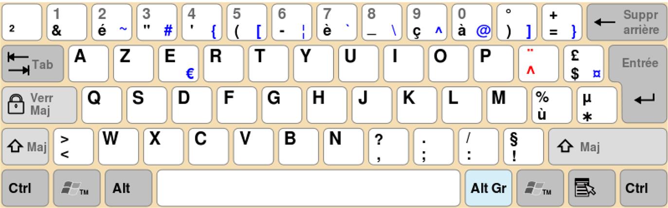
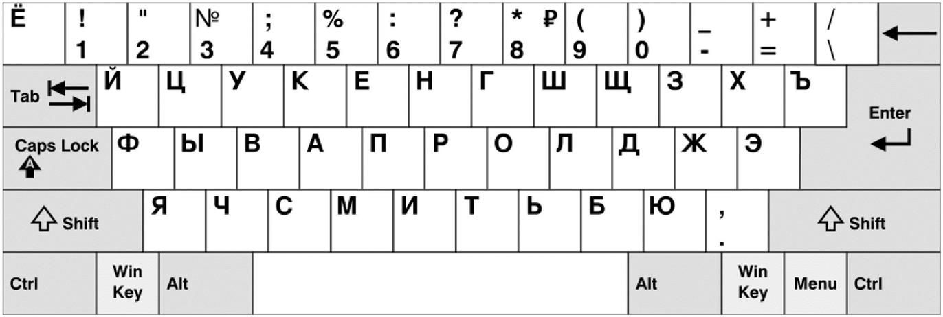
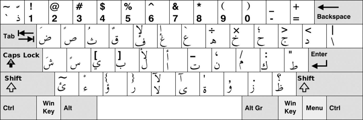
The direction of the script is essential to understand the impact of a different web script on the overall layout and design. The direction can be bidirectional (bidi) or unidirectional. The former poses the most problems in terms of internationalization, as the direction of the script can be compromised by the frameworks used. Arabic is one of the most complex scripts to use in design because of its bidirectionality, and also its ability to switch directions for numbers and special words within the same sentence.
Apart from bidirectionality, you also have to consider the impact of the string axis. Japanese is normally written vertically, whereas web concessions have normally laid out the characters horizontally. Most Japanese expect web text to be horizontally laid out.
Right-to-left languages represent a challenge to most web designers who want to achieve a consistent design whilst thinking of international audiences. The interface is normally mirrored, with the strings roughly implemented in the same relative positions.
Insertion points should also be relative to the direction of the word.
Bidirectional languages will change the insertion point according to the relative position on the word. Similarly, the text orientation plays a role and is culturally determined: many countries prefer the flow of the text on a book spine, for instance, to be from the bottom to the top. The United States prefer top to bottom. However, any trademarked names need to be in the original language: law is (for the most part) language-neutral (Fig. 7.4.1–Fig. 7.4.4).
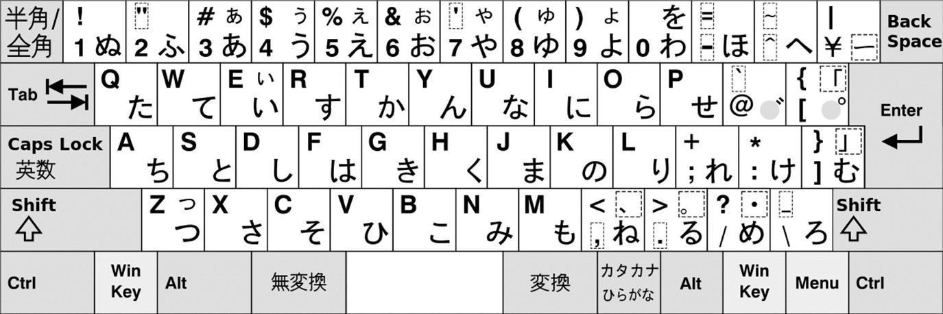
 maji (Latin) characters in order to make up more complex characters like kanji. Source: Wikipedia.org.
7.4.1 Arabic Script
Arabic is one of the most distinctive and oldest languages in the world, but its relevance to the web design world is still stifled by inadequate standards and lack of local development. Its fine calligraphic qualities and attention to detail earmark the script as one of the most beautiful in the world.
However, compared with Roman scripts, Arabic has a far more restricted font library available in the web design world. Its right-to-left direction, extended use of ligatures and cursive nature render the script’s typefaces particularly difficult to handle as standardized fonts. The ascension of Unicode has assisted in the creation of more compatible desktop fonts, but the situation is still unfair to ambitious web designers who want to leverage the calligraphic script in their websites.
Contemporary Arabic script is indebted to the popular Kufic style, now over a thousand years old. The Kufic calligraphic style has a revered historical relevance, as it is the script used in the earliest known copies of the Qur’an. European imitations of the script have come to associate it closely to the Arabic language in the West, and pseudo-Kufic adorns several landmarks in southern France and the Iberian Peninsula. The historical implications are vast and far-reaching.
Arabic scripts have two basic text styles that influence its presentation:
Common Unicode system fonts like Ariel, Verdana, and especially Tahoma were until recently routinely used as de facto choices in Arabic design and typesetting, but browsers and the increased adoption of web fonts has made Arabic fonts more accessible and easier to use in Web development. There are several fonts commercially available, but their legibility and typesetting difficulty can compromise usage in mobile devices.
Since 2014, Google has started to make available additional Arabic web fonts to web designers. Other fonts have started as an open collaborative project by hobbyists and designers, like Amiri. The font “is a revival of the beautiful typeface pioneered in early 20th century by Bulaq Press in Cairo, also known as Amiria Press, after which the font is named,” as the designer, Khaled Hosny, explains. “It is one of the few metal typefaces that were used in typesetting the Koran, making it a good source for a digital typeface to be used in typesetting Koranic verses” (Hosny, 2016).
The amount of glyphs available in these types are increasing, making it easier for designers to integrate them in their designs (Figs. 7.4.5 and 7.4.6).

7.4.2 Lessons From the Field: Minority Languages
Some movements are in place in order to push for the acceptance of minority languages, particularly in mobile technology. The Interaction Design for Indian Needs Lab at the Indian Institute of Technology in Bombay is researching and designing solutions for literacy and education. “Our focus is on using design to solve problems and creating social impact,” stated the group. The group has a community focus and is a good example of how local digital research can be leveraged with limited means. It actively collaborates with masters and PhD students, along with the interns that join them every year, in the pursuit of better digital solutions for local populations, free of concerns over technology and corporate sponsorship. The group is currently developing Swarachakra, an Android gesture keyboard app for touchscreens, which has been released for 12 Indian languages, including Hindi, Marathi, Telugu, and Punjabi. The apps are open source and depend on the contribution of volunteers. The group has also been developing fonts for other languages as well.
7.5 Internationalization Requirements
Cyberspace. A consensual hallucination experienced daily by billions of legitimate operators, in every nation.
William Gibson.
Internationalization issues abound in most UI implementations, despite the contemporary availability of frameworks that minimize or even completely offload developers from its perils, like the Ninja Web Framework (a Java library) or i18next (for JavaScript). The fact that an app can be released and updated in over a hundred countries simultaneously has put different pressures on developers, who have a wider audience provide on-the-fly feedback on localization issues. On the other hand, the checklist to get through when localizing a product for the first time has become wider: translate the App Store market description, update app screenshots, translate strings and documentation, privacy policy, websites, blogs, establish local social media marketing…
Different environments have different requirements, however. Android has in-built internationalization frameworks in the form of resource qualifiers, where each locale can have a specific strings XML file. Like most mobile operating systems, the locale depends on the user-configured system language. A similar mechanism is employed by iOS apps, where the internationalization depends on the environment compatibility, and string files made available.
On the Web, the omnipresence of internationalization frameworks is reliant on the browser’s compatibility with encoding standards like Unicode and UTF-8 for HTML and JavaScript, allowing any pages to open correctly in their native language without character corruption as long as the character set configuration is harmonized.
However, this does not minimize internationalization issues which can occur both with native and desktop apps, and can be categorized in a number of ways (Shneiderman, 1998; Fernandes, 1995):
• characters, numerals, special characters, and diacritical,
• left-to-right versus right-to-left versus vertical input and reading,
• numeric and currency formats,
• telephone numbers and addresses,
• social-security, national identification, and passport numbers,
According to Del Galdo and Nielsen (1996), internationalization issues can be broadly split into:
• Comprehensibility: A computer interface that is capable of displaying the user’s native language, character set, and notations, such as currency symbols.
• Usability: A computer interface that is understandable and usable in the user’s native language.
• Desirability: A system that is able to produce systems that accommodate users’ cultural characteristics.
7.5.1 Sorting Issues
Different accented characters might be sorted differently in languages. A may be followed by ä, á, but where would ã go?
Among the many conventions enunciated in Japanese traditional and cultural, the sorting order is one such example of variable arbitrariness. The language harbors various sort orders such as the “poem” order, which lists an arbitrary sorting delineated by a traditional poem.
7.5.2 Controls
Checkboxes are sometimes difficult to decipher for cultures that use the symbol to cross out the choices they do not desire, e.g., Switzerland, Korea. Radio buttons are always preferable. One other example of the shoddy usability provided by the symbol is the red cross versus checkmark conundrum that befalls many a design, and the toggling between both choices.
7.5.3 Currencies and Number Handling
On your latest trip to Russia, getting a bank extract from an ATM might have seemed a bit off. For an instant, your bank account may have fooled you into believing you had been scammed by a local hacker. Assuming you had no WiFi connection in a remarkably cold country, and that you actually took the risk of hanging around Moscovite streets in an attempt to collect a meaningless piece of information.
Nevertheless, for the sake of argument, the position of the point and the comma internationally is one of the most common causes of frustration amongst avid bank statement reviewers. Russia uses the point to separate the digits of the thousands and space for the decimals.
7.5.4 Calendars
Time is relative, we learn. But even more than relative, there are several versions of its measurement ruling the daily lives and habits of people all over the world. Although the Gregorian calendar is used by mostly Western countries, and in the process has reached other corners of the world as an authoritative reference for international dealings. However, there are other calendars that are references for millions:
Apart from different holidays and week/month measurements, the calendars differ greatly in application. The Japanese imperial calendar is still applicable to traditional businesses that regulate their time based on the Emperor year of reign. Normally, the Gregorian calendar is used by Japanese businesses that communicate frequently with the West, but the old timescale is still honored in certain quadrants of the society.
Some of the implementation faux pas of this type of calendar include an old implementation of Lotus 1-2-3 where the Emperor reign year had an option to be reset, which did not fall favorably with the notion of the Emperor’s immortality. The company quickly removed the feature.
Holidays and their applications should also hold the regional preferences and politics in mind. Keeping calendars in mind might impact usability with the assumptions put forward by geotracking and regional IPs. Dates themselves are also prone to the same variety of representation both in full and short forms. Week days have different spellings and their abbreviation differs depending on space requirements, times, and layouts.
Time formatting is equally distinctive, with North America using the ante/post meridian (a.m. and p.m.) standard. 24-hour clocks are normally used in Europe, a standard that the American military also adheres to.
This is an exception that North America adheres to, but is by no means the only one. The most distinctive idiosyncratic choice in this domain is the unit of measure, with the pounds and stones of the imperial system still causing disruption in many international shipping routines. The metric system, however, prevails over most of the world’s economies.
7.5.5 Postal Addresses
The traditional landline telephone is quickly becoming an outdated artifact in 4G-converted countries, but it is still the main means of emergency calls in remote areas, and an essential tool of voice communication all over the world. Phone numbers and their conventions, however, are still as variable as the countries in which they are available. The use of area codes is restricted to only a few territories, as well as prefixes for certain numbers. Most countries use a single string of digits, and even when the additional previous digits are a part of the overall number, the different representations are mostly for local recognition only and there is limited difference in the actual number itself.
Other conventions include ANSI for US flowcharts and DIN standards for German.
Color specification standards also differ, such as Pantone, CMYK, and Toyo, and should be held in account.
Paper sizes differ between different territories, with the traditional Letter format of 8 1/2 by 11 in. A4 is the most popular paper size in Europe and Japan.
7.6 Cross-Cultural Usability
Philipp Bachmann (2013) suggested six basic patterns for cross-cultural usability:
Multicoded instruction. By encoding the same message in various ways in the interface, the cognitive load on the user is minimized and the possibility of a loss in information. One example of how to overcome the difference in attention and interpretation is the use of a simultaneously visible pictogram and a text label in any interactive label on an interface.
Message catalog: The application or website should use a lookup function in order to retrieve the same message in different languages, depending on the user’s configuration and the intended locale. By allowing the application to have the same message handle represented in various languages, potential internationalization issues can be minimized, which also includes time zones, number formatting, and other culturally-specific units.
Culturally and environmentally neutral persistence: The design should not depend on any one locale in order to perform conversions from, instead sticking with a standardized form. For example, using coordinated universal time (UTC) as the standard internal time for the code, and converting it using the local settings of the operating system for end-user representation.
Culture and environment-aware persistence: Design for and be aware of the local value as well as the internal neutral value. Store units in nonculture specific models so that they can be easily retrieved and converted when necessary by the front-end. The design should be aware of the locale and the units used, like currencies, in order to reuse them in the future when necessary.
Input example: If the design expects data input from the user, text fields with in-line validation can be used in order to provide information like phone numbers, dates, location, etc. Instead of providing additional information via pop-ups and explanatory text next to the control, provide examples of the intended input in the textbox itself. When possible, suggest statistically probable values based on the user’s previous preferences, or data that can serve as example, e.g., next week as dates for flights.
Hierarchy driven by target culture: Phone numbers, addresses, and dates are all variable in structure around the world. American usage privileges the month preceding the day, e.g., MM/DD/YY, whereas the European standard usage is DD/MM/YY. Similarly, the state is often a prevalent field in online forms, legacy of the American standard form, but few other countries around the world require this in address records.
7.6.1 Conventional Usability Issues
Wayfinding. Problems in website navigation are usually equated with the process of using contextual information to navigate to a selected destination. In the context of user interface design, it is most visible as the visual cues provided to the user in order to guide it to a specific functionality or process (e.g., Wizards) or monitoring its position in a given stage of the interface flow (e.g., breadcrumbs). In these cases, a visual indication usually helps the user to keep the flow in mind. Breadcrumbs are the most suitable to this type of context, as they can help route monitoring, particularly when a wayfinding mistake has been made and backtracking is necessary.
Error classification and escalation of user actions. According to the conventionally standard classification introduced by Donald Norman, there are two basic types of errors: slips and mistakes. Slips are usually errors of execution where the user goes through a set of automatic and unconscious processes and misses a common step or does not execute an action as intended due to motor or cognitive distractions (e.g., unintentionally clicking on the wrong button because it is too close to the intended button).
Mistakes are sometimes referred to as errors of intention or errors of planning, and occur when an intention is inappropriate. For example, a mistake occurs when a user is shown a warning and selects the wrong settings to try to fix it. It is a conscious process of decision-making that is biased according to currently available information and expectations. Another example is that the user is biased to select only from visible options and avoid more complex processes that involve navigating dialogs to go through a process. In cases where the user is warned with an “error” in the guise of a warning, cognitive dissonance can be created.
Unbalance in screen real-estate usage. Screen real-estate is, according to UsabilityFirst, “the amount of space available on a display for an application to provide output.” Typically, its proper use is directly related to the information conveyed in the dialog, the aesthetics, and the context. Maximizing effective use of screen real estate is one of the most difficult design challenges: excessive information may be poorly organized or confusing, so effective screen layouts must be used with appropriate use of white space. Another principle of usability that is of particular interest to static areas is the memory load over user actions. Users have to learn and remember the navigation flow of the UI to reach for the required functionality.
Optimally, especially in applications with a limited feature scope, any functionality should be reached within one click, or a key combination stroke. The sidebar can be refactored into a toolbar or status bar where the available actions are permanently presented to the user. A horizontal bar is preferable because it reduces the area of the dialog used to present options and hotspots and uses this space more effectively.
Gulf of expectations and evaluation in information structure. The gulf of execution is a quantified distance between a user’s intentions and expectations and what is actually possible to do with the interface. According to Norman, it is the difference between the intentions of the users and what the system allows them to do or how well the system supports those actions. The gulf of evaluation, on the other hand, is related to the user’s ability to diagnose what the UI process actually implies in terms of steps: from interface to interpretation and to evaluation. In other words, the gulf of evaluation is directly related to how easy it is for the user to get information on the current status and feedback on its actions. This separation between action and information areas increases the interaction cost since the information areas and the action points are spread across different panes of the vertical tabs.
Inconsistent use of controls. Consistency, both functional and aesthetic, enables users to efficiently transfer knowledge, learn new processes more quickly, and grow trust in the design of any given system. Functional consistency refers to consistency of meaning and action (e.g., a traffic light that shows a yellow light before going to red). Functional consistency improves usability and learnability by enabling people to leverage existing knowledge about how the design functions. Aesthetic consistency refers to consistency of style and appearance (e.g., a company logo that uses a consistent font, color, and graphic). Aesthetic consistency enhances recognition, communicates membership, and sets emotional expectations.
Low signal-to-noise ratio in dialog information. In the context of UI design, the signal-to-noise ratio is relevant to the conciseness and directness of the information presented to the user. Extraneous elements (noise) degrade the form and quality of information relevant to the user (signal). Maximizing signal means clearly communicating information with minimal degradation. Signal degradation occurs when information is presented inefficiently: unclear writing, inappropriate graphs, or ambiguous icons and labels. Signal clarity is improved through simple and concise presentation of information.
System status is not permanently available. In technical settings, the system status is critical to proper operation: from a forklift to a cell phone, the general status of the device or entity should be both clearly visible and clear to the user. The same happens in UI, especially for security software. The usability of a system is improved when its status and methods of use are clearly visible.
Feature implementation dissemination. Simplicity is one of the prime examples achieved when everyone can easily understand and use the design, regardless of experience, literacy, or concentration level. It is one of the basic principles of UI design and it is a powerful ally against feature creep: unnecessary complexity should be avoided and consistency becomes of prime value as it decreases interaction cost. Consistency and control centralization can be better be achieved by reusing patterns and control sets.
Inefficient use of control metaphors. The use of controls as metaphors is represented universally in UI layouts, from the traffic light window controls in the Mac OSX to the use of the trash as a metaphor. Generally, metaphors trigger in the user a sense of familiarity and allow it to associate a system functionality or structure with another real-life concept or object known by the user (Fig. 7.6.1).

Color is also a component of this metaphor system. It allows highlighting or attracting attention to specific elements of the UI, as well as signal status in an effective way. Saturated colors (pure hues) naturally attract attention as they are perceived as more vivid and dynamic to the human eye. However, intense use of saturated colors can also cause fatigue to the user.
The use of a switch as a metaphor is much more efficient when the switch itself uses the symbolism to its potential. The absence of color for highlighting status in switches makes it harder to determine its status. The use of two text labels next to the control introduces complexity unnecessarily as the control status is being clarified with additional text instead of using the control itself as a representation of the metaphor. The switch used for signaling on/off does not necessarily have to be a neutral color native switch and could instead use a bitmap that uses red and green, or an illustration to show its current state.
One example is the folder icon, with it yellowish color suggesting the idea of a filing folder for everyday use to Western users. However, this particular office artefact is not popular in Asian countries, like for example, China. Chinese folders are characterized by their thick rectangular brown paper without tabs, seemingly cardboard-like in appearance. For Chinese users, the Western folder icon has no immediate association to an everyday folder and this association is not a clear association.
Duplicate configuration logic. Discrete design based on elementarity implies smart decisions on building functionality models in an application. This is directly related to the Occam’s Razor principle, which in itself is a solid adaptation of the simplicity paradigm and equates that entities should not be multiplied without necessity. Functional equivalence is only to be duplicated in cases where concrete usability studies and metrics justify it. This is also a prime directive for effective information architecture: pin it, lock it, reuse it.
Developing a Western Brand in China
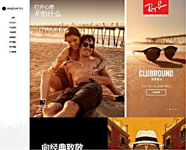
China is a hotbed of feverish consumerism, but Western brands often struggle for success and even acceptance in the distinctly insular marketplace. IT Consultis sought to curb this on a project to establish the new Sunglass Hut Chinese site. The stylish brand has adorned the tanned faces of many a movie star in idyllic marinas throughout Europe and America, but Asia remained an elusive world.
The challenge for IT Consultis was to build a brand new web presence that stood out in an increasingly crowded marketplace. The first step was to assess the actual distinctions and differences that the particular local version of the website demanded. A full site audit was performed in order to check its appropriateness and resonance with the Chinese audience. Every page in the main user journeys was reviewed by a local team, as well as the sitemap and main navigation categories. Essential components for social media were integrated in the website structure:
• A custom Weibo feed in the footer of the website to gain traffic and to drive users to become a follower of the brand.
• The WeChat QR code was placed directly in the menu side bar in order to allow users to follow the brand on WeChat at any point during their navigation.
As a fashion retailer, the popularity of Sunglass Hut in the USA is unparalleled, but it remained largely unknown to Chinese consumers. However, there is an eager audience for luxury brands, many of which are represented in the portfolio. The visibility of these companies was leveraged in order to increase the overall brand awareness. Brands like Armani, Burberry or Miu Miu were given a personalized touch by creating dedicated pages for each one of them, allowing users to get more information on a single-stop point for their products in the official Sunglass Hut website.
Dedicated brand pages also benefitted SEO, as the content could be specialized and optimized accordingly for each brand. All elements of the website (pictures and content) were built with a view to being indexed by search engines, enabling a much-needed boost to the search engine presence of the brand new website.
Performance was also a consideration. The assets and code of the entire website were revised and optimized in order to facilitate access for Chinese users with slower connections. The new website was built to be locally hosted for connection reasons, and local APIs and lazy loading were implemented in order to allow for a smoother page navigation and loading.
The website also received a dedicated mobile version exclusively for deployment on smartphone browsing. This allowed for a better integration with WeChat, improving the odds of success by having a dedicated version of the site for the most popular social media network in China.

7.7 Virtual Realities
Deep in the human unconscious is a pervasive need for a logical universe that makes sense. But the real universe is always one step beyond logic.
Frank Herbert
Computer and communication scientist Marc Weiser suggested in 1991 that “in the 21st century the technology revolution will move into the everyday, the small and the invisible.” Often appointed as the father of ubiquitous computing, this Xerox Parc visionary pointed the way to technology assuming an omnipresent, increasingly supporting and discrete role, reducing conscious user interaction and aiding the user instead of hindering or patronizing his actions.
This is the paradigm behind ubiquitous computing, a set of technologies that can help redefine technical communication.
As the term indicates, ubiquitous technology is upon us everywhere: in airports, art galleries, public spaces, and even the comfort of our own homes. The term loosely refers to the “calm technology,” as baptized by Marc Weiser, where information processing and user interaction happen in the background or surreptitiously in peripheral systems, and are not constricted to button-pressing on a keyboard.
As a recent advancement in computing, there is still some wide-eyed wariness over the concept of ubiquitous technology and its implications on privacy, habits, and machine decision-making. However, its ultimate ambitions are still only suggested in our current technological setting, even as we see the first signs of its standardization.
From the Internet of Things to hands-free interfaces, game consoles, media computers and mobile devices are being taken by storm by alternative interfaces that render computing less obtrusive and interaction more intuitive.
The future of interaction will eschew button-pressing keyboards and pads, and instead rely on tactile and direct sensing interfaces. Our communication with our devices is already cross-modal, mixing visual and audio. When we set our phone to vibrate mode instead of using an audible ringtone, it is using a haptic mode to communicate with us. Promising research from Tactus Technology allows the creation of physical buttons on a flat smartphone screen, literally allowing users to change the way an object can feel. The REVEL project, developed at Disney Research, aims at integrating different textures onto everyday objects.
Despite its potential, haptic research still accounts for less than one percent of all multisensory research. Haptic feedback carries many advantages, like the ability to use body language as an information carrier. Over 95% of our communication is established through our body language: to use only verbal or written input with a machine implies a tremendous waste of contextual information, including the urgency of our goals (e.g., whether we are in a hurry) and the social context (e.g., whether we have company).
Ubiquitous computing is also the perfect vehicle for transmitting information without distracting the recipient. Too often, users’ attention is distracted by other tasks, alerts or the inconveniences of having to access information physically, losing the sense of flow when doing something. When searching for information on Google, it is easy to get sidestepped by tabs, ads, chats, and environmental distractions. Our attention is split across a multitude of levels, all vying for our intervention. Ubiquitous computing sidesteps this with an adaptive approach that can deliver the right information at the right time—and to the right people.
7.7.1 Content Delivery and Communication
Technical communication is evolving, not only in its delivery, but also in the nature of what is delivered. Instruction manuals are slowly being replaced with assisted guidance, where instructions are placed in-context when the user tries to interact with an equipment.
Ubiquitous technologies allow us to look at content as a set subjected to responsive conditions, which can be grabbed, cropped, recombined and reused. Intelligent content using XML data models like DITA, or Linked Data formats like RDF or JSON-LD, can group and deliver shreds of content using a semantic model that enables highly adaptive and granular delivery of content. An example of this semantic indexing is Google’s massive Knowledge Graph, which displays relevant information about a search already on the results page.
Dynamic content does not equal a factored version of static content, but instead a rich tapestry of text and visual assets that are assembled with a rich structure. In a world that is ruled by the ebbs and tides of social media, big data and machine processing are not the bogeyman of yesteryear: they are tools with which to understand and process content as an organic network of structures.
As such, the delivery of content in this ambient intelligence can vary wildly. In the following sections I will highlight its main applications.
7.7.2 Context-Awareness
Everyday, millions of Bluetooth and WiFi modules are produced around the world and built into smartphones, computers, cars, vending machines, kiosks, and other digital products. These modules are the size of a pin and can accommodate the highest possible broadband speeds available.
Ubiquitous computing is often envisioned as the natural step in taking advantage of this miniaturization trend. It proposes a seamless context-aware approach to information and services regardless of whether the user is on the move or located in a specially equipped environment, like an airport or hospital. The success of this technology relies, however, on the adequacy and relevance of the content generated and delivered to the user and on the place, time, and profile that the user is supplied with.
Motion and proximity sensors, as well as satellite connections, allow our phones to provide contextual, relevant information depending on location, time and even our own motion. Context-aware systems can respond naturally to user activity. The usability of ubiquitous computing relies to a large degree on its adaptivity: a sensor that is triggered by the user’s presence should be smart enough to trigger the right action and “mute” itself should the user indicate that no action is required (Fig. 7.7.1).

7.7.3 Voice-Recognition Environments
Walking into your living room after a long day at work, you are concerned with the plans for the evening: that well-deserved ticket to the star-studded arena show could not come at a better time. But your tickets are not yet printed. You speak to the open air: “Computer, print the tickets for tonight’s concert. Also check a store nearby that sells leather jackets.”
Voice-activated technology is intimately associated with golden-age science fiction and Star Trek galaxy-surfing, but its actual benefits as a cross-modal interaction method is becoming a research priority. On a consumer level, there are already projects like the Ubi, an always-on ambient voice computer that can sit behind your couch and respond to vocal request, giving the means to browse the Internet only with the sound of your voice, without any need for a screen. When asked, the system can deliver and read the weather forecast, calculations, instruction manuals, warning leaflets, and any other content accessible through the Web.
This attempt to introduce discrete voice-recognition systems already features prominently in consoles like the Xbox and the iPhone and Android platforms through Siri and other speech recognition and synthesis software. Although imperfect, the technology works remarkably well in closed quarters and points the way to a future where keying in information will be an option and not a necessity.
7.7.4 Guidance
One of the best examples of ubiquitous computing with transparent purposing are the guidance and interaction systems that are starting to populate public facilities like museums and gardens. With the growth of the digital market, traditional brick-and-mortar institutions are increasingly compelled to find new solutions to engage communities. Part of the solution is precisely to take advantage of the digital arena. For example, the Cleveland Museum of Art’s Gallery One (http://www.clevelandart.org/gallery-one) cleverly combines an augmented reality app called ArtLens with in situ interactive displays.
These services are not only multidevice, but also multilingual. The Ueno Zoo Ubiquitous Guide Service, in Japan, allows users to gain information about animals by using a small iPhone-like device on code tags in the Ueno Zoological Gardens. Similarly, the Hama-rikyuu Gardens service allows explanations in multiple languages regarding the history of the gardens in the Tokyo Metropolitan Park.
7.7.5 Real-Time Localization
Software giants are also wary of the role ubiquitous localization can play in today’s international market. One of the most successful examples of this technology, Word Lens, offered a glimpse into real-time localization by allowing common users to see translated signs and lettering instead of the content they display in reality. The technology is based on a set of optical recognition frameworks and graphical display methodologies that allow it to emulate a specific type font just seamless enough to provide a practical augmented reality overlay feature to users that complements and offers an useful glimpse of possible mass applications of the otherwise cumbersome and usability-inept device. Acquired in 2014 by Google, the technology behind Word Lens is now being integrated in the Google Translate services.
One of the reasons behind the growing popularity of these apps is the ubiquitous nature of mobile devices: despite the variation in size, specifications, and service providers, cell phones and tablets remain the primary disseminators of “calm technology,” offering contextual information and tools that are increasingly relevant to our geographical position and everyday activities. On the other hand, devices like Google Glass have not yet reached a point of maturity to allow their mass adoption as standard everyday devices, primarily due to being heavy and cumbersome to wear and because of the stigma associated to social interaction (Fig. 7.7.2).

Real-time interpretation without human intervention is also now becoming a reality, as a result of the integration of voice recognition and synthesis, and automated translation. The new functionality, soon to be included in Skype Translator, can translate a spoken utterance almost immediately into the language of the person on the other end of the line. This technology can be easily transposed to an auditorium with simultaneous translation or to virtual classrooms around the world.
7.7.6 E-Health
Mobile technology is becoming more important than ever in keeping track of health and general wellbeing. The explosion in running and fitness tracking apps like Endomondo and Runtastic shows the growing role of the handheld device as a personal and adaptable trainer, with far more precise metrics and records than a human coach could possibly track.
Health is one of the most critical and practical applications of ubiquitous computing. It is estimated that, in 2010, over one-third of Europe’s population has had at least one chronic disease, and this number is increasing. With aging populations and receding health budgets, e-health provides a critical method for using mobile technology to replace traditional paper diagnosis forms and stimulates awareness of the importance of quality of life.
The greatest advantage of mobile technology is that it is almost permanently available to the patient. Projects like MONARCA, which focuses on bipolar disorders, used the phone sensors as well as wearable technology in order to trace the process of the patient’s mental state throughout the day.
Other systems like autonomic management of ubiquitous e-Health systems (AMUSE) are based on on-body sensors that can interact with ubiquitous environments. This is useful, for example, in hospitals where the environment is recording the body temperature, breathing rate, and other vitals of patients as they move around freely, unencumbered by monitoring equipment.
As Geoffrey Miller states in his essay, The Smartphone Psychology Manifesto, “smartphones could transform psychology even more profoundly than PCs and brain imaging did.” And indeed the same applies to the wider field of medicine.
7.7.7 E-Learning and E-Training
The mobile technologies involved in ubiquitous computing allow users to empower their learning by being free to access online learning platforms anytime and anywhere. Online MOOCs (Massive Open Online Courses) and other platforms are available for users who want to accommodate the learning experience by module or course to their own availability.
Learning technology, however, is a bourgeoning field that accommodates other modes of learning. The effectiveness of lectures and tests can be limiting for students, and more effective learning strategies will translate into better results.
Projects like Mindtool-Assisted In-Field Learning (MAIL), developed at the National University of Taiwan, rely on a combination of digital technology and fieldwork. When learning in-field, students can use a specialized app in their phones, which provides information on the images that are captured by the camera. This type of blended learning works well in training contexts, where the user is expected to undergo a series of tasks and execute them correctly with the help of documentation delivered through an app.
Ubiquitous learning allows students to move across learning contexts and stimulates learning in nonconventional contexts, mixing both real-world situations and digital support like augmented reality. This implies a rethinking of the traditional curriculum that programs like LOGOS (Knowledge-on-demand for ubiquitous learning) and workshops like Digiskills attempted to prototype on an institutional level.
In the corporate setting, u-learning and training represent an opportunity to reduce long-term costs, since the average training cost of an employee in the USA is around $1500. The past decade has seen a constant increase of studies on Virtual Learning Environments (VLE) and their applicability as ubiquitous learning environments to train prospective agents, officers, and employees.
However, the great potential of ubiquitous e-learning in a fully-formed discipline that combines a community of learners, real-world interaction, and a task-based evaluative framework, is yet to be fully unlocked.
MDInteractivo
MDInteractivo, JWT Puerto Rico/Gatorade
MDInteractivo Gatorade produces sports beverage and food products based on performance data, and works with celebrity athletes.
In 2010, Gatorade wanted to sponsor the Central American and American Games, due to its widespread audience and popularity, but this position was already occupied by Powerade, a competitor. The challenge for Gatorade was to create the impression of an association with the Games without paying for official sponsorship, to benefit from its popularity amongst athletes and sports fans, and to foster an image of innovation.
Instead, Gatorade sponsored NBA player Jose Barea, one of Puerto Rico’s most popular athletes, who was the country’s most likely candidate for winning a gold medal, and had been selected for the prestigious act of carrying the flag during the Opening Ceremony of the Games. Due to the lack of official game sponsorship, Gatorade could not directly use The Games’ grounds, logo or name. So, in pursuit of innovation, they drew on technology to find their way in, and measured Barea’s heartbeat, respiration, temperature, activity, and even heartbeats and emotions, through a chest strap. They broadcast these intimate statistics live over the internet and television, including mobile apps, which meant that they reached fans directly, who could experience carrying the flag, and winning a gold medal win directly with him. This was transmitted to over 300,000 households through television, and over 60,000 people on the web and mobile sites: a large proportion of Puerto Rico’s 4 million population.
The campaign was a huge success, despite not involving the usual large sponsorship budget. It inspired a new, ubiquitously-used nickname, “The Heart of Puerto Rico” for Barea, and was honored with PepsiCo’s “Smile for Excellence Award,” the most prestigious accolade that the region had received. The official sponsor, Powerade, may have been able to pay for its logos to be featured in the event, but through creative thinking and clever use of technology, Gatorade was able to tap into the emotions of the country, to resounding success.