
A Thousand Pictures
Abstract
As a common form of nonverbal communication, gestures are simultaneously universal and yet culturally determined. We communicate information to nearby observers by our mere poise and our expressions. Our gestures can immediately tell our state of mind, our perception, and our reaction. However, gestures are also naturally dependent on energy, context, and application. Although their physicality is appealingly universal, it was also one of the key detractors to their adoption as a standard interaction method. Hardware constraints and designing for understanding constitute the greatest challenges of UX design, and achieving a concerted international design strategy requires a layered approach.
Keywords
Touchscreen; gesture; scanning pattern; color scheme; design; user experience
8.1 Gestures and Inputs
Between an action and reaction, between a gesture and its consequences, everybody agrees that there is an exact relationship, but not necessarily a proportionate one.
Filippo Bologna.
As a common form of nonverbal communication, gestures are simultaneously universal and yet culturally determined. We communicate information to nearby observers by our mere poise and our expressions. Our gestures can immediately tell our state of mind, our perception, and our reaction. However, gestures are also naturally dependent on energy, context, and application. Although their physicality is naturally bound to the ergonomic factors of our bodies, they are also inherently personal and highly variable, which represented for many years one of the key detractors to their adoption as a standard interaction method. Even after they became an industry standard, several researchers (Baudel et al., 1993; Norman, 2010) argued that gestural interface design and touchscreens were a resounding bad idea for everyday devices:
• Interactions would always be inaccurate, due to the variability in pressure, finger size, and expected acceleration,
• Users would quickly get tired of pressing and sliding on a flat surface.
However, in just a few short years, touchscreens have become the norm across the world. The interactions allowed by touchscreens are intuitive and represent affordances common to the physical world, such as pressing a button or pushing something out of the way by sliding. These and other gestures have become ubiquitous and gestures a necessary part of interaction. Is there any measurable difference in the way that different cultures use gestures with their mobile devices?
Largely, yes. A UX Fellows Study in 2013 (Goto & Wörmann, 2013) examined an international sample of participants on making gestures and commands. It is found that everyday gestures are surprisingly similar between countries. For example, the gestures of telling somebody to be quiet and making a phone call were found to be the same across all 18 countries studied. Even the sign for writing an email, despite having become a common technology only in the past 20 years, was the same in 16 out of 18 countries. The study also found that signaling ‘OK’ is usually made in 1 of 2 ways: European countries (except Italy) raise a thumb, whereas Russia, Australia, and East Asia put their index finger and thumb into a circle (Fig. 8.1.1).
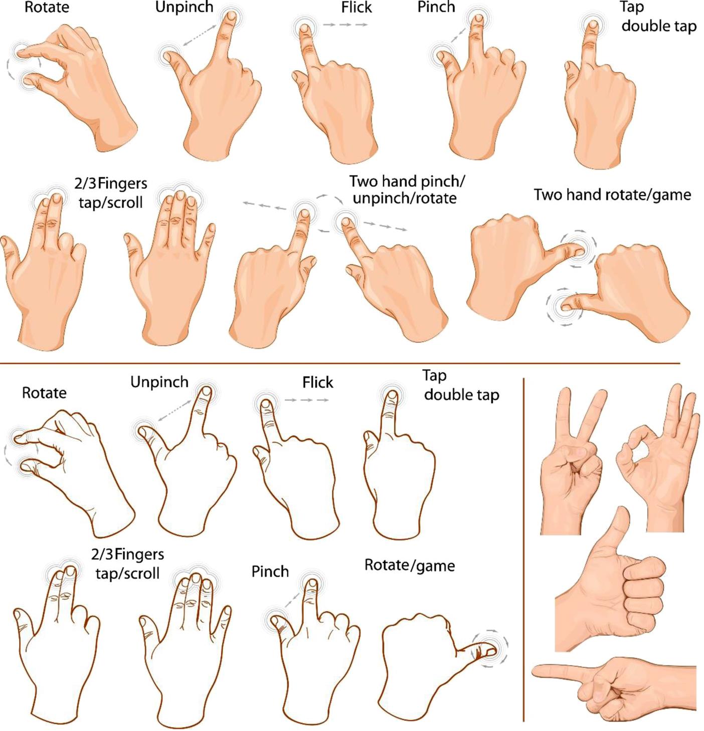
All the countries included in the study also counted from two to five on their fingers in a near-identical manner. However, counting from one to three brought up slight differences: most countries used three fingers for this, though participants from Argentina, Germany, France, and Italy mostly used a thumb and two fingers.
The study also found that across cultures, many people are influenced by touchscreen technology, and use “swiping” motions as a result. This was mostly observed in participants from Australia, Spain, Finland, France, Mexico, the Netherlands, and the United Kingdom. These motions were used most frequently when dealing with computer menus, and when navigating forwards or backwards. Whether participants “swiped” from left to right or from right to left was determined by their country.
One of the most basic commands, turning a device on and off, in fact did not correlate strongly within each country, and was determined on an individual basis. The study observed that this usually involved idiosyncratic gestures that incorporated sound, such as clapping hands and snapping fingers, as if devices could not “see” the users, and had to be “woken” from “sleep.”
Study participants found it reasonably easy to make a gesture to skip to the next or previous chapter, however less than half of the countries included chose the same one. Some countries, including Belgium, China, Spain, Finland, Mexico, and the United Kingdom, used swiping gestures for this, again influenced by touchscreen interfaces, whilst others, including Argentina, Australia, Canada, Germany, Italy, and Korea, chose a new semantic gesture.
In order to restart a paused film, most participants used the same gesture they had used for stopping or pausing the film. Interestingly, participants also found it difficult to identify unique gestures for getting information about the current program, with the same gesture often used for both commands.
At the beginning of the study, participants were told that their gestures did not need to accord to an internally consistent logic, nevertheless, many attempted to do this throughout, and when performing the opposite of a command, such as turning the volume down instead of up, the corresponding gesture was inverted. Similarly, participants tended to use the same gesture to restart a film that they had paused it with. However, this did not apply to switching a TV on versus turning it off, for which participants often chose different types of gestures. Because these gestures were more abstract, they were rated among the most difficult, and subscribed the least to cultural trends.
A majority of participants stated that for each function, only certain gestures should be recognized, such as when selecting a chapter, allowing the same gestures to be reused in different functions. This offered a conclusion that users wished to have a reduced cognitive load, by needing to learn and remember less gestures. Users also stated that possible gestures were limited by the positions in which they might watch TV, which would restrict their physical movements.
The study concluded that two distinctions in gesture can be drawn: those that directly draw upon relationships in reality, such as raising an arm to raise volume; and those that have a more metaphorical connection, based in language or iconography, such as indicating a roof to prompt returning to the homepage.
In terms of neighboring countries, the study found few similarities. For example, participants in the United Kingdom indicated different difficulty ratings to those from France, and this difference was also observed between China and Korea.
Finally, the study determined that there was usually a difference determined by country in whether a participant found it easier to think of everyday gestures: for participants from Turkey, Mexico, Finland, Canada, Belgium, Spain, and the Netherlands, everyday gestures were much easier than abstract gestures to conceptualize. Those in China, Russia, the United States, Italy, and the United Kingdom, on the other hand, found it comparatively difficult to think of both everyday and abstract gestures.
Older audiences tend to have different patterns, particularly in relation to the position of the elements on the screen. A study on older Portuguese adults (Leitão, 2012) showed clear preferences in terms of the position of elements and optimal position on screen:
• Tap gestures: works better with targets larger than 0.55 in. (14 mm).
• Swipe gestures: more accurate with targets larger than 0.68 in. (17.5 mm).
The same study found that the orientation of the swipe gesture did not make an impact on the usability level, but that the optimal areas for tapping were the center, right side, and bottom right corner of the average smartphone display.
8.2 Cognition and Cues
To achieve, you need thought. You have to know what you are doing and that's real power.
Ayn Rand.
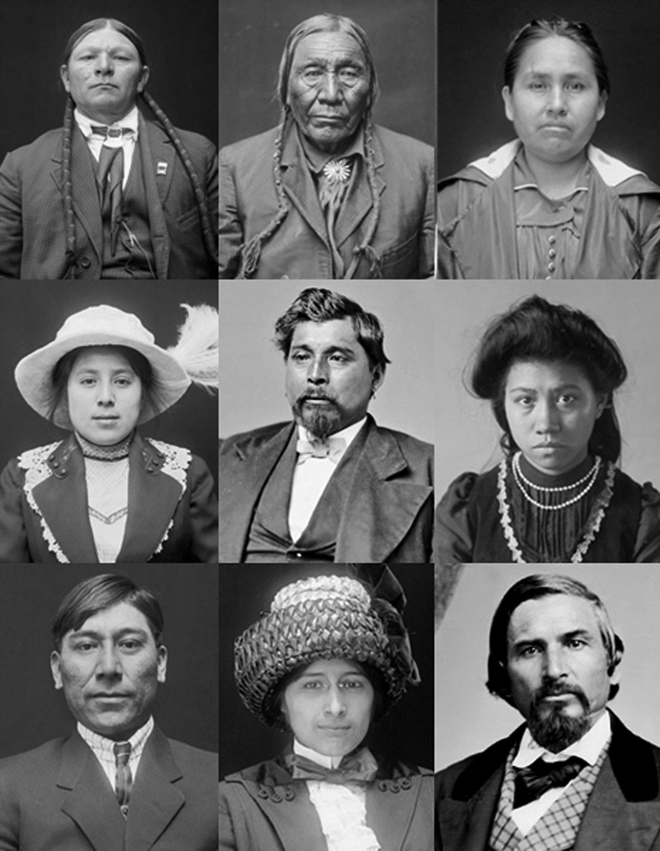
Cross-cultural research must also address the process of acculturation, namely when populations are exposed to other cultures. In the case of immigration, the local culture can absorb the cultural shock waves of a mass migration, but it is largely the individuals who migrate who are influenced by the target culture in terms of beliefs, language, and habits (Suinn, Ahuna, & Khoo, 1992). Several acculturation scales exist, like the Suinn-Lew Asian Self Identity Acculturation (SL-ASIA), which consists of a multiple-choice survey with 21 questions and, while on a holistic perspective, this may account for differences of behavior and perception between communities, it presents an insight into fundamental mechanisms of interpretation and information processing across the human brain (Fig 8.2.1).
Think about how you scan visual information. Scanning patterns consist of the path our eyes take when looking at something, like a picture or a book. Westerners usually start from the top left of the screen and then proceed to drift to the next line of available text on the left. When these gaze paths are marked on a screen, they create a distinct F-shaped pattern that reveals a distinct behavioral trait: the further away an element (picture or text) is from top left half of the screen, the less attention it gets from the user. What about cases when there is nothing on the left corner, like a homepage with just a big blue button (usually to register or download an app) in the middle? Does the gaze path change there? Yes, but because the user usually start from the top left where they enter the URL of the page, the results can be biased as well. The gaze path in eyetracking studies also stands in stark contrast between cultures. An early study (Hotchkiss, 2007) found that Chinese users tended to pay attention to a lot more contextual elements in a layout than Westerners, who were more focused and granular when scanning a page. They jumped from title to title in a quick scan before getting into the details of the page. There was also evidence that our reading habits play a role. When compared to the left-to-right gaze direction of European and North American users, those who read from right to left, as in the Arabic languages, have been identified as preferentially scanning pictures in the same direction. Japanese, conversely, scan a picture from top to bottom following the same pattern as the writing system (Goodnow & Levine, 1973).
This tendency is related to more than just the overall direction of scripts. Hebrew uses left to right strokes for single letters, even though the direction of the script is right to left. In analyzing a picture, a Hebrew speaker is more likely to scan it from left to right. There is some correlation between the motor skills and a tendency to replicate certain patterns in writing for drawing, e.g., in drawing a circle. Comparative studies between Japanese and American adults show that American adults tend to draw circles in a counterclockwise direction whereas Japanese adults tend to draw them in a clockwise direction.
Depth perception is also one of the main factors in visual interpretation. Our brain only collects visual information in two-dimensional form, as the stimuli provided by our eyes is purely deciphered and does not match the actual reality of things front of us (Hoffman, 1998). This has inspired many a philosopher to go into serious bouts of alcoholism, but it remains one of the conundrums of cognitive science. The images our eyes seem to capture are purely a fabrication of our brain’s interpretation. In other words, our brain is tricking us into believing a particularly subjective form of reality. One of the most evident displays of this is our inability to describe colors and even, occasionally, to agree on what a given color looks like. As in most of our perceptions, culture plays a dominating role in determining what we understand visually. There is some stability in cross-cultural studies about the naming of basic colors, as the extensive World Color Survey (WCS) has shown (Kay & Regier, 2003; Lindsey & Brown, 2006; Regier, Kay, & Cook, 2005).
Education and exposure to three-dimensional pictures can dramatically improve visual perception of visual illusions, like the devil’s tuning fork (Vaughn, 2010: p. 83). In this sort of visual illusion, people with less educational and training opportunities often regard the picture as two-dimensional and not particularly complex or difficult to interpret. There is also evidence to suggest that tricky visual illusions often confuse educated Western viewers more than those coming from rural areas or other cultural contexts. Urban dwellers are more prone to horizontal visual illusions then vertical ones, particularly those related to an escape point (Fig 8.2.1).
This is also related to the forms and shapes that we are raised with as children. Our exposure to straight angles and boxed outlines from the earliest moments of our existence, for the most part, tends to dominate our expectations of design perceptions, cues, and affordances.
This is the premise behind the “carpentered world” hypothesis put forth by Segall, Campbell, and Herskovits (1966), who suggested that our exposure to a world that is primarily square and straight tends to overcome our adjustments in interpreting nonrectangular figures as geometrical variations of rectangles scene from an angle. Living in rectangular spaces, with the bulk of architecture based on straight lines, has influenced our perceptual set. This is the way we see the world and anticipate its visual rules to manifest themselves: the sum of our perceptual expectations. This controls the bulk of our interpretations of shape, color, and visual qualities.
Studies suggest (Bar et al., 2006; Reber et al., 2004) that people generally feel better with curved shapes, leading to positive feelings, whereas hard edges to shapes create a sense of negativity. We also prefer simple shapes. The density of elements in a layout may vary, but the threshold on acceptability is largely up to the individual. However, there is a clear impact of two key factors:
• Parsimony: the complexity of the individual elements used in a layout.
• Orderliness: the way in which these elements are organized.
In short, the density of a web design is not as important as the structure and internal layout of its information architecture, and the elements themselves should be as consistent and simple as possible.
8.3 Typesetting and Typography
Typography may be defined as the art of rightly disposing printed materials in accordance with specific purpose: of so arranging letters, distributing the space, and controlling the type as to aid to the maximum the reader's comprehension of the text... Therefore, the disposition of printing material which, whatever the intention, has the effect of coming between the author and the reader is wrong.
Stanley Morrison, First Principles of Typography.
Beautiful and intricate, the Japanese language is one of the most difficult languages to typeset, as its character set includes over 6000 characters. Before word processors came into force, most Japanese texts were written by hand and the layout seldom conformed to a standard or obeyed formal guidelines. Typesetting later became a wider issue when software word processors were introduced. Software such as WordPerfect helped to introduce the concept of the computer as a typewriter, but by the very nature of its logographic organization, hierarchy and order were difficult factors to have in account during the typesetting.
Japanese writing featured rows and columns of 20 characters in a grid, with the orientation from top to bottom and right to left. The ruled writing-pad was, however, never used in a productive setting, and the typewriter paradigm eventually became ubiquitous in word processing in office and home work.
Japanese has since become one of hundreds of languages supported by software, with its intricacies and unique writing system perfectly represented in both desktop and mobile devices, including its layout. Typesetting relies on more than sequential placement of characters, as the Japanese furigana, for instance, relies on the integration of small characters which are meant as pronunciation aids. This annotation is common in children's books, particularly for lesser-known kanji characters.
Like children’s books, which rely heavily on attention-seeking cues and must adopt a strategy of brevity and clarity, a good UX-oriented interface should use typography smartly. Text placement, layout and typographical arrangement are essential parts of the equation. Weight and scale are just two of the aspects that should be privileged.
Large titles with striking typography are easily remembered due to the quick impression they perform on short-term memory, and the increasing size of the text used in websites in recent years, along with its increasing conciseness, are reminders of the digital emphasis on legibility and accessibility, reconciling the ergonomic and literacy factors that often distinguish audiences.
The way the text is printed on-screen carries deep semantic implications for its meaning. Common fonts used in modern Western scripts are mostly based on sans-serif fonts. Serifs (aesthetic projections of letters meant to underscore their limits) were progressively eliminated from characters in order to save ink on printing. Also, sans-serif characters are easier to read in pages where there is a large density of text. Text design, such as the choice of font, can influence the user’s interpretation directly. For example, Irish pubs worth their salt might have a sign with a Celtic font. This has cultural implications and is meant to provide a sense of familiarity. The same can be applied to websites with a strong cultural appeal.
When adapting a UX pattern into other languages, particular attention should be paid to the following items:
• Avoid widows and orphans. Widows are single words at the end of lines, while orphans are single lines of a paragraph at the top of a column. These break text flow and compromise a harmonious look and feel.
• Ensure kerning, tracking, and leading are aesthetically sound. Regardless of the target script, ensure that kerning (the distance between characters) and leading (distance between lines) remains consistent in different target cultures. Right-to-left scripts such as Arabic or special pictographic languages such as Chinese often require leading adjustment as text density can increase dramatically.
• Avoid centered text. Because of its variable margins, centered text gives a feeling of discontinuity.
• Use grids as aids for localized layouts. A webpage or a desktop application layout can have an arrangement and layout adaptation facilitated by using a grid to visualize margins and limits in a clearer way.
Large titles with striking typography are easily remembered due to the quick impression they perform on short-term memory, and the increasing size of the text used in websites in recent years, along with its increasing conciseness, are reminders of the digital emphasis on legibility and accessibility, reconciling the ergonomic and literacy factors that often distinguish audiences.
At its core, websites are structured around an organization most easily perceived through its disposition of vertical columns along the page canvas. A grid model can be applied to its information architecture. The similarity between print and webpage design are striking in the resemblance of most text-heavy websites to their print counterparts, which relied on letter pressing methods for centuries and a paper grid model for the layout work on the page.
Text is a part of a complete visual system that allows users to interact with an information system directly through codified linguistic signs. Text allows users to retrieve and access information, and directly represents the most accessible entry point to the interaction model offered by the user interface.
European typesetting industry promoted the need for it. Paper production methods were far from optimized, meaning that paragraph alignment was not just a mere formality, but a necessity in order to make the best possible use of the text area.
A pictographic language like Chinese or Japanese is not limited in hyphenation by syllables, and a break can be introduced at nearly any point in the text. A hyphen is not necessarily used. Arabic does not allow word hyphenation. Roman script, on the other hand, can be easily underlined and made bold. Japanese scripts, however, use amikake, where the word is surrounded with a background rectangle. Bullets are placed above the character itself (wakiten) (Fig. 8.3.1).

Decisions regarding color in typography are critical. Colored type appears smaller to the human eye than the same type in black. This is important to consider when designing user interfaces. One must also consider the “smear” effect on typography in displays, based on the color chosen and interaction with colors around it. Additionally, quality and calibration of displays impact characteristics of color online.
Official typefaces are over 600 years old, and the reliance on them cannot be overstated in contemporary web design. Typefaces were unleashed onto the world to represent a certain set of values and aesthetic concerns, and their value is deep and intrinsic when representing cultures. Think about how quickly you can identify a “celtic” design for an Irish pub, an “oriental” design for a Chinese restaurant, or the cold linear sharp edges of a “Swiss” type. Then wonder how these typefaces actually carry a cultural meaning and association, despite what seems to be an arbitrary association.
Sometimes typefaces fall flat on their face (pun intended). Comic Sans is one such example. Often heralded as the fall of Western civilization and notorious for being one of the few fonts with its own hate website (“Ban Comic Sans”), the typeface created by Vincent Connare in 1994 was originally intended to be used in one of the most advanced front-ends in the Windows universe, Microsoft Bob. Eventually, Comic Sans was not used in what came to be recognized by PC World as one of the worst tech products in history (http://www.pcworld.com/article/125772/worst_products_ever.html), but its legend only grew with time. Its initial release in Windows 95 marked the beginning of a long journey that saw it become one of the most reviled typefaces in the world.
Part of the hatred came from its ubiquity. Comic Sans was considered an extremely accessible and playful font and the advent of mass computing in the 1990s meant that the appealing typeface was soon adopted by a swelling wave of home users who thought its playfulness could enliven anything from birthday cards to real estate agent adverts. It didn’t help matters that there was a reduced number of fonts available, and most of them were Serif fonts, a solemn style geared towards readability (like Times New Roman).
Consider the difference between Comic Sans and Times New Roman, and your receptivity towards each other. Apart from any previously acquired bias, Comic Sans is mainly unpleasant not of its inherent informality, but due to the disproportionate visual weight of the lettering. Each character is unbalanced, using the same stroke width through each segment. This characteristic makes Comic Sans an unmodulated font, and a visual mess that is hard to read in smaller font sizes and can make any text look like an inelegant screeching piece of juvenile graffiti. The distance between the characters (kerning) is also nonsymmetrical, a jarring difference from other fonts like Helvetica and Arial.
This combination of visual issues contrast with the classic sense of proportion and balance sported by typesetting standards. These were largely inherited from the ones used by Middle Age scribes and, later, passed into the earliest printing presses. Our visceral reaction to Comic Sans is mainly a subconscious reaction to a visual aesthetic that clashes with that aesthetic, one that counters our intuition of what constitutes “attractive” type for reading.
8.4 Color Schemes
Colors, like features, follow the changes of the emotions.
Pablo Picasso.
The deception of perception is the ultimate factor of variability in everyday life. We tend to assume that our perception covers all five senses in an equal and universal manner, and nowhere is that more evident than in color. Colors do not look the same to everybody, and the difference is often jarring and confusing.
We live in a global world, so when in Rome… Remember that different colors have different connotations within various cultures, religions, professions, etc. For example, in the United States on February 14th, red means love, but in Korea, red means death, and in China, red is used in weddings and symbolizes good luck and fortune. In many other countries, red means revolution. To a competitor, red means first place, and to an accountant, red means a negative balance. To a motorist, red means stop, and in emergencies, a red cross means medical help. (Jacko, ed., 2012: p. 335)
This includes text coloring. As stated by the Institute for Color Research, we establish our opinions about a “person, environment, or item within 90 seconds of initial viewing, and between 62% and 90% is based on color alone”.
Color is dependent on context, location, size, and visual acuity (Fig 8.4.1). In his book The Interaction of Color, Josef Albers lays out the basic principles of using color effectively, and labels the key factors in its changing perception:
In addition to quantity, form, and recurrence, wider aspects exert still more changing influences. These are:
• changed and changing light—and, even worse, several simultaneous lights;
• reflection of lights and of colors;
• direction and sequence of reading;
• presentation in varying materials;
• constant or altering juxtaposition of related and unrelated objects.
With these and other visual displacements, it should not be a surprise that the sympathetic effect of the original “ideal” color combination often appears changed, lost, and reversed (Albers, 2006: 42).
Albers lays out one of the key principles of using color in interaction: that it should be seen in context. Color compositions can be laid out in accordance with tested circumstances and actual user observations, in order to refine the visibility and legibility of all elements during an actual user session. Many mobile devices already have dynamic brightness adjustment preintegrated as a way to counter changing circumstances of usage in dark or well-lit areas. However, these also have a direct effect on the hue and chromaticity. This is especially relevant as different screens have different calibrations, depending on their hardware and intended audience. However, there are standards like the ISO 15076-1:2010, aimed at image technology color management, which provide an authoritative reference for color in software.
The deeper challenge with color, however, resides in its usage in changing circumstances. The colors that a commuter sees when using his iPhone over a long trek in a subway are not the same seen on the same screen in the comfort of an halogen-flooded kitchen. Apart from the environmental distinctions, the user itself may be in different conditions psychologically: fatigue and expectation make a huge difference to the vividness and perception of color.
This is not immediately apparent to most, however, because color is primarily psychological and less-than-optimal color perception is naturally compensated by our brain. If the cones in our eyes are not capturing enough information to render the correct color of an object in the darkness (e.g., in a cellar or at night), our brain triggers compensatory mechanisms that allow for color constancy.
Age also compromises color sensitivity. Older audiences have problems discerning blue and darker hues, and, for these people, colors often need to be more vivid in order to make more of a visual impact. Regardless of sensorial ability, there are also cognitive conditions hardwired that can even disable the ability to perceive color. Color-blindness affects especially male population (around 8%), and particularly in the inability to distinguish red from green.
Our learning of color is the product of three distinct processes: (1) empirically, we learn from the environment how to distinguish and identify them in a practical manner; (2) culturally, we learn about the representations of color and its various meanings; and (3) cognitively, we are predisposed to certain perception bias and reactions due to our particular physiology and nervous systems (Belpaeme & Bleys, 2005; Dowman, 2007; Jameson, 2005; Komarova, Jameson, & Narens, 2007). But, outside of our own perception, is there a fundamental agreement on how color is seen and described? Color theory is based on this premise. For the purposes of categorization and distinction, colors are fundamentally split into three groups:
• Primary colors: Red, blue, and yellow are the basic shades that can originate any other color by combination. These fundamental colors are the three additive colors that light can be decomposed into. An equal mix of all three generates a black tone.
• Secondary colors: These colors result of a mix between two primary colors. The three secondary colors are: orange (red and yellow), violet (red and blue), and green (yellow and blue).
• Tertiary colors: These colors result of a mix between one primary and one secondary color. There is a large variation of possible colors, including amber or marigold (mix of yellow and orange), saffron or vermilion (red and orange), magenta (red–purple), violet (blue–purple), teal or turquoise (blue–green), and chartreuse/lime green (yellow–green).
Colors have significant cultural meanings that vary around the world, and have important implications for web design. Ken Rohrer (2010) has noted the way in which colors represent various “…feelings, people, [and] countries”, determined by culture. He offers the following examples of the relation between colors and certain symbolic themes:
And colors themselves can have multiple meanings:
• Green: Eternity, family, harmony, health, peace, posterity
• White: Children, helpful people, marriage, mourning, peace, purity, travel
He described the way in which this can be used by companies: those wanting to promote an environmentally friendly image tend to use green in their branding, for example. Similarly, car insurance firms sometimes “…charge more for red cars because some of the owners of red cars are more aggressive or take more risks.” (Rohrer, 2010).
It is important to note that these symbolisms can be radically different between cultures: blue, e.g., represents calmness or authority in Europe, truth in Arabic cultures, and villainy for Japan (Pettersson, 2002). The variation in color symbolism even extends to genders, as the color pink is associated with females in the West, whereas it is extremely popular with both genders in Japan.
Bear (2010) also theorizes color as being able to offer symbolism and meaning through nonverbal communication, which can even have physical effects, such as the color red raising blood pressure. She also emphasizes the significance of the “…relationship of adjacent, harmonizing, contrasting, and complementary colors,” which can also impact the perception of color: the more contrasting the colors, the more likely they are to be noticed. Complementary colors, on “opposite side of the color wheel,” are more effective than similar ones. Bear also offers the meanings behind certain color groups:
• Cool Colors—calming: Blue, green, turquoise, silver;
• Warm Colors—exciting: Red, pink, yellow, gold, orange;
• Neutral Colors—unifying: Brown, beige, ivory, gray, black, white.
Color is subjective and immeasurable, as people see colors differently. However, it usually provoke similar emotional responses within single cultural groups. Combining colors can affect their meanings: red, e.g., has negative associations in the West, but it has more positive associations when combined with green, representing Christmas, or with red, representing Valentine’s Day.
Language also impacts cultural color associations, as Mario De Bortoli and Jesús Maroto (2001) have determined, through drawing on Benjamin Whorf’s “Linguistic Relativity Hypothesis” (1956). For example, in Zimbabwe, people do not perceive the difference between red and orange, because the Shona language does not distinguish a difference. They also explore the impact factors such as gender, age, and climate on color perception, and concluded that women preferred softer colors, while men prefer brighter ones; that children prefer “…strong, warm and intense colors”, as oppose to the “subdued” colors that are “more attractive” to older people; and that the sunnier the climate, the warmer the colors that tend to be preferred.
In the case of web design, brighter colors are most effective in attracting the user’s eye (Beaird, 2007). Pettersson (2002) has shown that, when comparing colors of equal intensity, white, yellow, and green are the most visible, whereas red, blue and violet are the least visible.
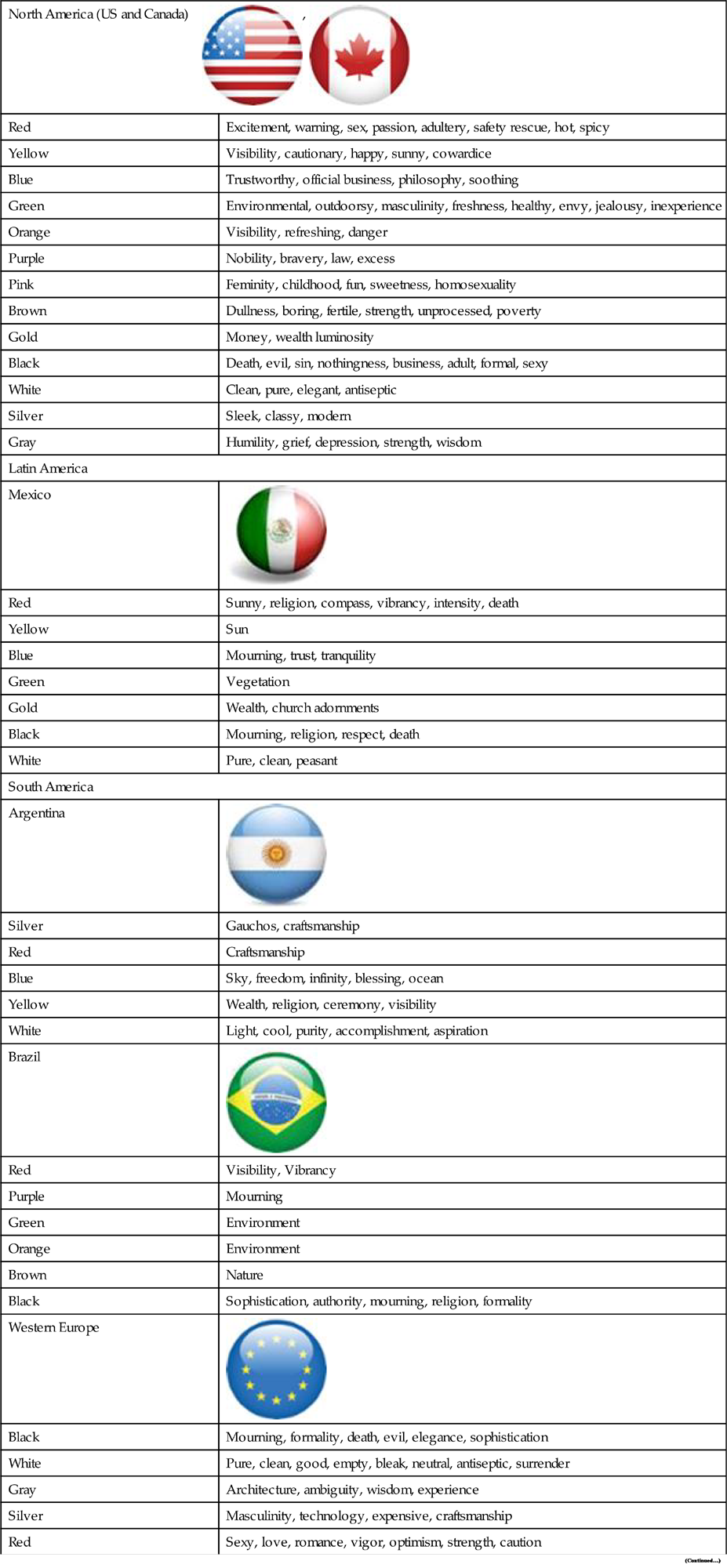
The variety of color arrangements and the cross-cultural psychology implications are of primary concern when creating a design, and the difference between elements and a wise use of contrast should pave the way to an appropriate design (Table 8.4.1).
Table 8.4.1
Colors and Associated Meanings in Different Cultures (Bortoli & Maroto, 2001)
North America (US and Canada)  , ,  | |
| Red | Excitement, warning, sex, passion, adultery, safety rescue, hot, spicy |
| Yellow | Visibility, cautionary, happy, sunny, cowardice |
| Blue | Trustworthy, official business, philosophy, soothing |
| Green | Environmental, outdoorsy, masculinity, freshness, healthy, envy, jealousy, inexperience |
| Orange | Visibility, refreshing, danger |
| Purple | Nobility, bravery, law, excess |
| Pink | Feminity, childhood, fun, sweetness, homosexuality |
| Brown | Dullness, boring, fertile, strength, unprocessed, poverty |
| Gold | Money, wealth luminosity |
| Black | Death, evil, sin, nothingness, business, adult, formal, sexy |
| White | Clean, pure, elegant, antiseptic |
| Silver | Sleek, classy, modern |
| Gray | Humility, grief, depression, strength, wisdom |
| Latin America | |
| Mexico |  |
| Red | Sunny, religion, compass, vibrancy, intensity, death |
| Yellow | Sun |
| Blue | Mourning, trust, tranquility |
| Green | Vegetation |
| Gold | Wealth, church adornments |
| Black | Mourning, religion, respect, death |
| White | Pure, clean, peasant |
| South America | |
| Argentina |  |
| Silver | Gauchos, craftsmanship |
| Red | Craftsmanship |
| Blue | Sky, freedom, infinity, blessing, ocean |
| Yellow | Wealth, religion, ceremony, visibility |
| White | Light, cool, purity, accomplishment, aspiration |
| Brazil |  |
| Red | Visibility, Vibrancy |
| Purple | Mourning |
| Green | Environment |
| Orange | Environment |
| Brown | Nature |
| Black | Sophistication, authority, mourning, religion, formality |
| Western Europe |  |
| Black | Mourning, formality, death, evil, elegance, sophistication |
| White | Pure, clean, good, empty, bleak, neutral, antiseptic, surrender |
| Gray | Architecture, ambiguity, wisdom, experience |
| Silver | Masculinity, technology, expensive, craftsmanship |
| Red | Sexy, love, romance, vigor, optimism, strength, caution |
| Yellow | Visibility, hazard, quality |
| Blue | Sky, fidelity, serenity, truth, reliability, responsibility, emotion |
| Green | Nature, fertility, confidence, jealousy, inexperienced |
| Orange | Visibility, cheap, loud |
| Brown | Masculinity, earth |
| Purple | Nobility, luxury, power, vanity |
| Pink | Delicate, flirtation, femininity, sensitivity, soothing |
| Gold | Mysticism, luxury, wealth, excessive |
| England, Scotland, Wales and Ireland |  , ,  |
| Red | Power, authority, government, visibility, temper |
| Yellow | Visibility, rubber |
8.5 Iconography and Imagery
In order to grow your audience, you must betray their expectations.
Hayao Miyazaki.
Emotions create physical reactions in our bodies. As the sympathetic nervous system excites your organism to react to a specific stimuli, the parasympathetic inhibits and normalizes this response when needed. This provided evidence for neuroscientists and researchers to associate physical reaction with emotional stimulation. Our bodies literally react according to what we feel.
The distinction between images with a strong emotional content and neutral effect on the users can be measured with a number of techniques. The most popular model of emotional space is composed of two basic dimensions: valence and arousal. Arousal loosely determines the intensity of the emotion and is closely related to physiological body reactions. Valence, on the other hand, determines the “intrinsic attractiveness or aversiveness” (Frijda, 1986: p. 207) of an emotion, meaning the desire with which it is pursued.
One of the most powerful stimulation devices for emotions is the visual medium. We are permanently stimulated by our vision, and around 40% of our brain is devoted to the processing of visual information. The visuals we come into contact with can make a lasting impression: how then can visual content be chosen in a way that stimulates perception and interest? And how does it translate in a way that can cross-cultural expectations?
On a formal level, humans share similar cognitive mechanisms and our cognitive subsystems for visual perception are largely similar across populations. The emotion displayed by facial expressions is an universally common factor. Darwin suggested the idea in 1872, after successfully conducting a small pioneering experiment with a single-blind study on several pictures taken by the French physician Guillaume-Benjamin-Amand Duchenne during his attempts to correlate certain groups of muscles with facial expression. Darwin successfully showed that emotion was universal, and that idea was perpetrated fully in his theory of evolution, which suggested that emotion was not only innate, but directly correlated with evolutionary adaptation.
Unlike the theory of evolution, the idea of universal facial expressions was challenged by social scientists for decades, believing it to be merely a by-product of cultural framing (Ekman, Friesen, & Ellsworth, 1972). It was only in 1962 that reputed psychologist Silvan Tomkins again established the link between human emotion and facial expression. A series of cross-cultural “universality studies” ensued in the 1970s, with psychologists Paul Ekman, Wallace Friesen, and Carroll Izard proving that facial expressions like smiling and disgust were used consistently across cultures and did not depend on education and social factors.
While it took centuries to prove scientifically that the seven basic human emotions (anger, contempt, disgust, fear, joy, sadness, and surprise) are indeed applicable to societies across the world, they depend largely on context. And this is where the need for a grounded approach resides.
Concrete imagery that either shows a human face in context or generates an immediate emotional response is more effective in long-term memory. Academic projects like the International Affective Picture System (IAPS), which includes a standard group of images for large standardized groups, point the way to a more normative approach of content testing, but how much of this imagery is actually universal? (Fig. 8.5.1).

If you draw a person on a piece of paper, odds are that, no matter how sophisticated your design is, it will be easy for somebody else to identify it as a person. However, your perception of that image is a trained one.
Your concept of how a person looks like as a result of experience and personal preferences.
According to the Swiss psychologist Jean Piaget, who pioneered an influential cognitive development model, development of sensory perception is the result of education and upbringing, which links existing cognitive structures to a set of symbols and imagery surrounding and nurturing it in the social context that you are brought up on (Piaget, 1952). Although globalization, media diffusion, and the Internet have allowed cultures to have access to content from all over the world, we are learning as users to accustom ourselves to images and realities completely alien to our own, as well as the aesthetic and formal preferences that come with it. There is no such thing as a universal aesthetic that is necessarily inherent to all cultures. For example, in a study developed by Deregowski et al. (1972), members of the Mekan tribe revealed severe difficulties to correctly identify detailed pictures of animals that they saw on an everyday basis.
We are led by the visual meanings of things. We can recognize a tool, an asset, a warning, by recognizing how it looks and the way it is shown to us. The use of visual metaphors in user interfaces is becoming narrower: despite the experimentation in certain fields, designers are mostly using textual content and standard metaphors like a button or a switch in order to get their message across. This is not coincidental with the growing international nature of most products. Traditionally, textual content was a priority even in street signs. American streets feature an assortment of signs with varying messages concerning parking, traffic rules, and points of interest. This jungle of physical pop-ups is bound to be informative, but also overloads the perception of the average pedestrian and driver. There is less of an implicit message in these situations: the Anglo-American world tends to prefer verbose descriptions of rules, featuring even in crossings with the “Don’t Walk” sign.
While pretty to look at, most complex interfaces with heavy use of graphics are typically more confusing than impressive when actually used in a productive setting. Consistency and simplicity pave the way for a smooth locale-independent source that can be then implemented in other locales. The modern return to basics with an emphasis on typography and minimalistic, sparse backgrounds and layouts is not a passing fad: adaptation into different devices and cross-platform rendering is made much easier with this arrangement.
While text can be used effectively in guiding the user towards specific points of interest, let users figure out the score by using visual cues and inference points. Users can interpret subtleties of speech more clearly if they are not buried under a torrent of text. For instance, when suggesting that a user introduced a password incorrectly and that the password is case-sensitive, it is redundant to tell the user explicitly to check the Caps Lock key. A much more user-friendly way to resolve this is to provide a pop-up while writing the password that notifies the user that the key is active.
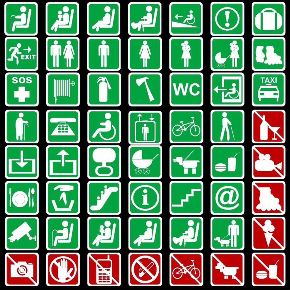
There is a number of international standards that regulate and promote pictograms that can be used as a guidance for safety and technical contexts. ISO is the most active regulation body in this regard (Fig. 8.5.2), with the following standards being the most relevant:
• The ISO 3864 series of standards which specify design requirements, including shapes and colors, for safety signs.
• The ISO/IEC 80416 series of standards which specify basic principles for graphical symbols for use on equipment.
• ISO 7000, Graphical symbols for use on equipment—Registered symbols.
• ISO 7001, Graphical symbols—Public information symbols.
• ISO 7010, Graphical symbols—Safety colors and safety signs—Registered safety signs.
• ISO 17724, Graphical symbols—Vocabulary.
• ISO 20712-1, Water safety signs and beach safety flags—Part 1 : Specifications for water safety signs used in workplaces and public areas.
• ISO 20712-2, Water safety signs and beach safety flags—Part 2 : Specifications for beach safety flags—Color, shape, meaning, and performance
• ISO 20712-3, Water safety signs and beach safety flags—Part 3 : Guidance for use
• ISO 22727, Graphical symbols—Creation and design of public information symbols—Requirements
• ISO/IEC Guide 74, Graphical symbols—Technical guidelines for the consideration of consumers’ needs.
Culture: Dotting the I’s
Adapting a global site into an international experience with depth and appeal is not an easy task. Quantifying cultural factors in particular can be a daunting proposition. Using the Hofstede cultural model, Mannheim/Berlin based design studio “The Geekettez” successfully implemented cultural dimensions as the first step towards a new digital strategy plan.
The client had received feedback from the international offices that the landing pages were not appealing to the local markets. Some features expected by the local markets were not available on the international landing pages. In order to harmonize the situation, the company decided to create country-specific pages, offering a shared base of content modules and components. These could be combined differently on the local websites in order to allow greater freedom in the international designs.
This container system allowed the designers to curb the expense of building specific regional websites. Stefanie Kegel, co-founder of The Geekettez Gbr, promoted the flexibility of the approach, where “different content [can be placed] within predefined and designed containers, which can be switched on and off.” These modules were contained in a TYPO3 database system, and consisted of a combination of JavaScript and HTML.

The existing country-specific landing pages were analyzed according to variables based on Geert Hofstede’s hypothesis of cultural dimensions. Dimensions like power distance, especially individualism versus collectivism, masculinity versus femininity, uncertainty and avoidance, were used to make choices on imagery and content related to cognition and behavior.
Based on this research framework, The Geekettez produced a report which included examples of do’s and don’ts for each country, as well as best practice examples. The research was topped off with a referral on how content modules should be displayed for the individual countries.
Next, a Google Analytics analysis took place in order to align the recommendations with the company’s brief, especially their business goals and visions, their strengths and Unique Selling Points, as well as their ambitions for their communication framework. These recommendations formed the basis for a concept paper on the company’s digital content strategy.
Some of the recommendations for collectivistic cultures included:
• the use of imagery relevant to communities and groups;
• iconography depicting a sustainability and collective responsibility message;
• the use of color according to the local meaning interpretation, especially warmer colors like red and yellow, which have very different meanings depending on the target market.
The Geekettez, Intercultural Aspects of Interface Design, http://www.thegeekettez.com/intercultural-aspects-interface-design/, 2014.
The navigation and color scheme retained the familiarity of the company’s original web presence, but was refreshed and updated in order to allow greater flexibility of presentation.
Collectivistic photos and a sense of familiarity was used in order to make the brand seem friendlier in the Asian websites.
8.6 Resolutions and Devices
Cyberspace. A consensual hallucination experienced daily by billions of legitimate operators, in every nation.
William Gibson.
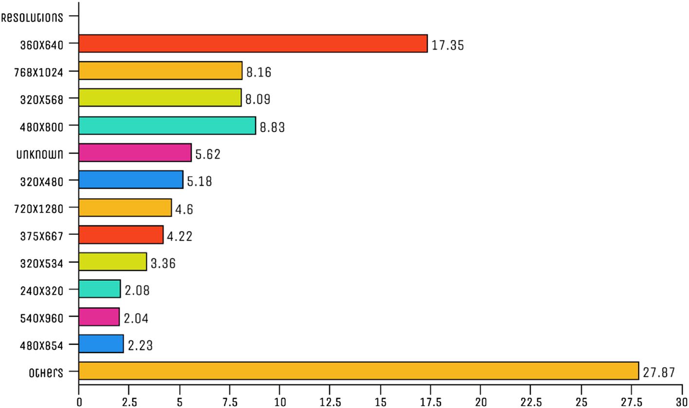
Devices around the world share a limited range of screen sizes, and Apple devices are typically much more standardized than Android devices. Emerging markets tend to have fewer PPI (pixels per inch), and even when the screen size is bigger, the image quality tends to suffer. The trend for optimization implies that Full HD has become the standard for mid-range phones, whereas qHD (exemplified by Samsung S7 and HTC 10) is increasing in acceptance and popularity (Fig. 8.6.1).
Although the App Store dominates worldwide app revenue with 58%, the overall number of app installs is higher in Google Play, with over 60% of install volume and 36% of revenue in 2015.
As the largest smartphone market in the world, the Chinese market is still maturing. Apple steers the market as the iPhone gathered momentum in China since its introduction, and quickly became associated with a sign of status and a popular choice due to its minimalist aesthetic in the social eye.
However, home-grown brands like Huawei and Xiaomi have also grown considerably in the market and dominate large segments of the market. Apple remains a consistent presence in the country, particularly in tier 1 cities like Beijing and Shanghai, and has traditionally been perceived as a high-end phone with a lifestyle association. In a strategic move, Apple has targeted “Chinese premium smartphone consumers,” according to James Gong, vice president of Nielsen China.
However, the competitive market has pushed high-end phones like the Xiaomi Mi 5, which includes a 5.15 in. full HD and high-ranking aspects, to the top positions as some of the most popular phones in the country. As the middle class proliferates throughout the country, and purchasing power increases, the 560-million strong mobile user base is pushing for higher-quality mobile devices, and the protectionist policies of the country help to drive domestic brands to the pole positions, even when their international standing is minimal (Fig. 8.6.2).

However, there are still an abundance of lower-end models, primarily Android phones, which make up over 50% of the total Chinese smartphone market. Samsung is a major player in the lower rungs of the market.
Apple's dominance, however, is much more visible in Japan, where it commands nearly half the mobile market. Home brands like Sony and Sharp share popularity segments, with Samsung trailing, even as it pushes the outer limits of mobile technology with its Galaxy devices and integration with Gear VR and smartwatch technology. Japanese mobile technology is almost exclusively focused on high-end models, as it pioneered many ubiquitous features in the earlier days of mobile: e-money, camera, music, car navigation. Low-end smartphones are not a sizable market in the country, with the average family income exceeding US$57,000.
One of the main reasons for Apple's domination in the market is the partnership with local phone operators, with phone contracts allowing the devices to be sold at a more reasonable price than Samsung or Sony’s high-end devices. Coupled with smart marketing, this allowed the iPhone to become the most used mobile device in Japan and the Japanese app market to become the largest in the world in 2013 in combined Android and iOS sales. As the feature phones in the country were amongst the most advanced in the world, smartphones took several years to catch on, but over 75% of the mobile users in the country owned a smartphone by 2015. Desktop ownership rate is in a downward trend since 2009, with laptops and tablets becoming the most popular devices for work and entertainment at home (Fig. 8.6.3).

Japan also leads the amount of mobile e-commerce transactions and conversions, along with South Korea and the United Kingdom, arguably the largest mobile economies. However, in terms of growth and expansion, Africa is still at the forefront of cell phone expansion.
8.7 Personas and Characters
All the world's a stage and most of us are desperately unrehearsed.
Seán O’Casey.
Personas are a tool that allow end-user qualities and characteristics to be recognized, addressed, and incorporated into the design process. They allow design teams to focus on the various users of a given product, and to ensure that the product meets their needs.
Personas take the form of conceptualized versions of the people that a company estimates are using its products. Even though they are effectively abstract, they are given detailed descriptions, and given a story through which they can be visualized. The most crucial element of all is to define the goals of each persona, which allows design to cater for them.
Creating personas has long been a staple within marketing processes, where they are based on statistical averages and demographics, in order to build a successful marketing campaign that appeals to the audience in their targeted area.
However, in software design, personas are used for different purposes, and through different means. Here, the aim is to produce a product that suits users’ needs. Instead of being based on numbers, personas in software design consider the types of people who would use the product in the ‘real world’, on a conceptual basis, and imagine the functions that they would require. Software can then be developed in order to meet these requirements. This often involves balancing the various needs of different users: some, e.g., prefer more complicated menus, with many options available, while others prefer a simpler, streamlined approach. Personas enable design to cater for those who will be using it.
Typically, personas should be shared across are created for each project. Usually, they should be recreated for each project, though in certain contexts, the same can be reused if addressing the same user base. From these personas, 1–3 are selected as primary personas, whom the design is based upon most directly.
Bear in mind that each persona is a fictional character: while they might share characteristics with people we know in reality, they should not be based directly upon any one real person, in order to build a picture of the most representative users and generate the most effective results in terms of team guidance (Fig. 8.7.1).
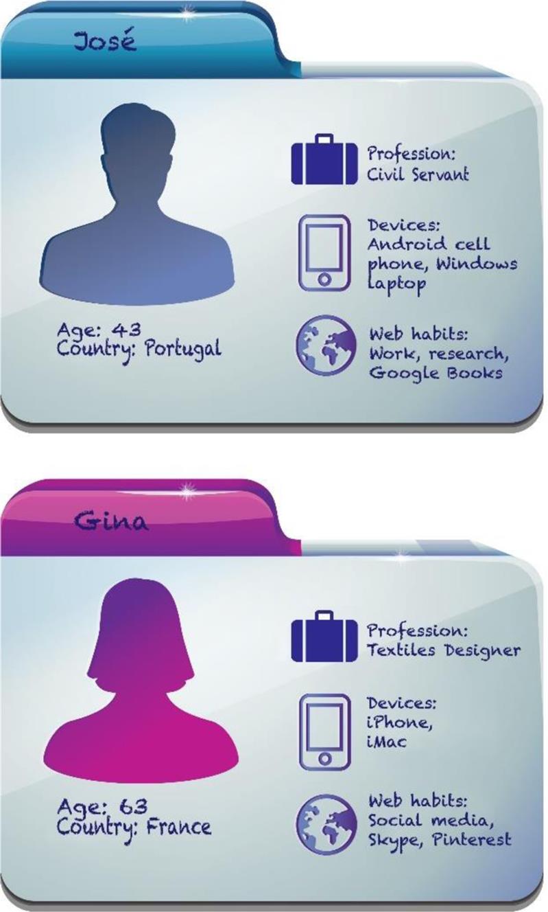
Each persona should be given a name and a picture (e.g., from a magazine or search engine), to allow everybody working on the project to be in sync. They should each have a detailed description, with their physical traits, likes and dislikes, in addition to their desires, goals, and needs. The most effective way to work with personas is to be familiar with them, on an everyday basis: one way of achieving this is through putting up posters with their core details on the office wall.
It is important to note that different members of a team interpret personas differently, according to varying expectations. Because personas are used across teams, and correlate to constructions created by UX designers and product managers, they are not comprehensive enough to cover every detail of a real customer, and can involve assumptions. For example, if a persona uses their cell phone on the subway, teams would assume the user to be able to use its cell phone effectively and achieve its goals in transit, and would picture them in an urban setting with strong reception.
The perceptions of the perceiver make a big impact upon these narrative elements of the persona. Nielsen (2010) showed the way in which personas are perceived differently by people from different countries, and that this also applies to the customer experience. Customer experience maps can be used to map this. They allow layers of information to be built up, such as indicating which activities are relevant to each persona. This can also incorporate research findings by country, and activities specific to different markets, which highlights the similarities and differences between them. Through doing so, any areas that need more localization attention can be flagged, allowing design and development budget and time to be allocated to them.
Segmenting the customer journey with actual data from users is key to a firm strategy, and performing user research is crucial to develop a perception of their actual habits, expectations, and requirements. Research can take the form of ethnographic studies, user interviews, focus groups, or international surveys on the qualitative side, but more than not, with established businesses, you will have to leverage the quantitative data your analytics and traffic statistics are providing.
Start by analyzing the geographical information of your business traffic:
• What markets are primarily active on the transactional pages?
Usability issues, socio-demographic, user habits all come into play here and assumptions should be challenged and reframed. Internal references from sales and marketing might be a useful operator to add dimensions to your personas. Specifically, for international brands, it is important to be aware of what different clients and users do in different markets.
Even if you do have demographic data, do not rely on it exclusively, and do not assume qualitative dimensions from data traffic alone. While it is very easy for a brand to argue that the current profile of their customers is the be-all and end-all of user knowledge, it is important to understand the user’s definition of success and how these markets will evolve in the future. Again, the possibility of starting a conversation with the user will result in a structured list of insights that will help you build an accurate portrayal of your primary and secondary personas.
International personas should also accommodate for the differing channels (mobile, desktop, tablet, online–offline) used by the different profiles, as well as the local habits. The local culture, as well as the technology range, will make a huge difference in the decisions you make for your designs.
Personas should supersede the empty categorization of stereotypes. You may perceive that part of your user base is composed of “millennials”, but there is a need to analyze what the underlying motivations are. Values like “environment-friendly” and “technology-savvy” are seldom worthwhile epithets.
8.7.1 Gamification
Different gamification strategies apply to different cultures. The benefits of achievement and competition are viewed differently across cultures. For example, Scandinavians with a more equalitarian and interpersonal social structure do not view openly competitive behavior as an end in and of itself.
Gamification is the application of game-oriented principles in nongame contexts (Deterding et al., 2011) and its appropriation by a number of contexts has expanded its reach into productivity, corporate work, finances, and community building. The value impressed upon gamification strategies varies with the actual values in practice in the cultural mindset.
Sometimes the product is appropriated by a specific group for a different purpose then the intended original market just hijacking is very common and physical products such as the Doc Martens, which were initially designs for British police officers and later taken over by Guinness and punks who integrated it into their own subculture of subversion and rebellion.
8.7.2 Case Study: Decisions on Subscriptions
A project with a leading newspaper aimed at understanding how readers used the games section to solve puzzles, as well as their preferences and expectations regarding this type of game.
20 individual semistructured interviews were held with readers from different backgrounds:
The expectations were to understand how the readers were engaging with these games, and the type of activities that most interested them. In order to collect this information, the interviews approached mainly their opinions, attitudes, preferences, past experiences, and other expectations with general games and puzzles like Sudoku, including those provided by the challenges in the newspaper.
The personas were developed from the analysis of these interviews, with 5 distinct personas emerging from the possible audience. The age of the persona influenced their tendency to engage with and stay with the game, seeing as younger audiences tend to play on multiple devices, at various points throughout the day, and engage with different types of games, ranging from competitive arcade to multiplayer strategy.
The older personas also had more time available and were more reticent to engage in games with complex rules, and preferred to have different options for their gaming.
Personas also reflected the likelihood of engaging with the newspaper gaming, clearly reflecting an increase in interest as age increased for the average persona.