Chapter 3. Building Data-Centric Applications
In This Chapter
• The User Interface: Implementing Screens
• Testing the Application on the Development Machine
• Default Validation of Business Types
Visual Studio LightSwitch is a Rapid Application Development (RAD) environment focused on making it easier to build line-of-business applications (that is, data-centric software). Up to now, you have learned what LightSwitch is and a fair bit about its integrated development environment (IDE), but there is a lot more to learn. Starting from this chapter, you begin developing applications with LightSwitch, and in the process, you learn how easy it is to build complex applications in a very few steps. This is the probably the most important chapter in the book because it provides the fundamentals of LightSwitch development, offering tons of information about creating data sources, creating screens, and implementing data validation, and covering important concepts such as business data types. In this chapter, you create a simple application based on a single data source. This is enough to understand how LightSwitch works and how you can take advantage of all its features to create high-quality, professional business software quickly.
Creating a New Application
This chapter guides you through the process of building an application that enables you to keep track of all your contacts, such as family members, friends, and co-workers. You will be able to store information about each person you add to your contacts list. For example, you might want to add information such as name, phone number, email address, and so on. Although this might look simple, this example teaches you how to use a number of LightSwitch features.
To create a new project, select File, New Project, and in the New Project dialog, select the LightSwitch Application (Visual Basic) project template.
Code examples in this book are presented in Visual Basic. If you develop in Visual C#, you can download the C# version of the code from this book’s page on the InformIT website. The reason for using Visual Basic is that one of the Visual Studio LightSwitch’s purposes is to make migration to the .NET Framework easier for developers coming from Microsoft Visual Basic 6, Microsoft Access, or Microsoft Visual FoxPro.
Let’s name this new project ContactsManager, as shown in Figure 3.1.
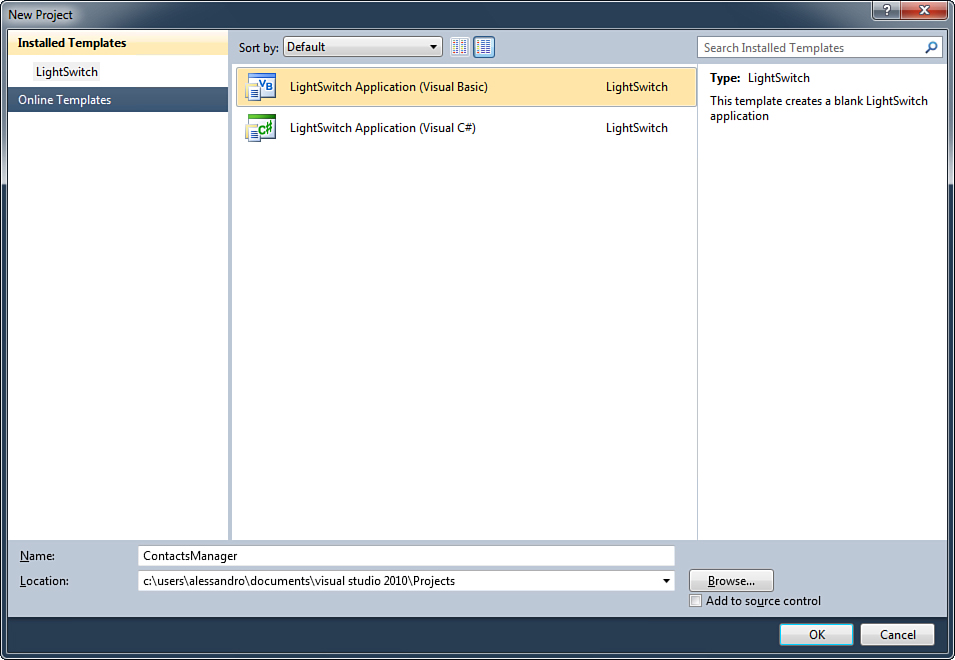
Figure 3.1. Creating the new ContactsManager application.
Click OK. After a few seconds, LightSwitch shows the LightSwitch Designer introduced in Chapter 2, “Exploring the IDE.” This is when you decide how to create the data source for the application. As you will learn throughout this book, Visual Studio LightSwitch can create new data sources or grab schemas and data from existing sources such as SQL Server or other databases, SharePoint, or WCF RIA Services. Right now, however, you are at a point when you still have a lot to learn about LightSwitch, so the best approach for a complete understanding is to create a new table from scratch.
Creating a New Data Source
Tables are primitive data containers. A table represents a series of items of the same type. For example, a table can represent a list of customers or of employees or of cars or of any object that has some properties. Tables are divided into rows and columns. A row represents a single item. For example, if you have a table storing a list of customers, a row represents a single customer in the list. In LightSwitch terminology, a single item is referred to as an entity, and a list of items is called entity collection. Columns represent properties of the elements that the table stores. For example, a customer has a company name, an address, and so on. This information is represented with columns. In LightSwitch terminology, a column is also referred to as a property. Actually, columns also allow you to specify the type of the property (such as date and time, strings, numbers), as detailed later in this section. Continuing with the creation of this application, the first step is to create a new entity that will represent a single person in the contacts list. Do so, and name it Contact. In the LightSwitch Designer, click Create New Table. Doing so opens the Table Designer, as shown in Figure 3.2.
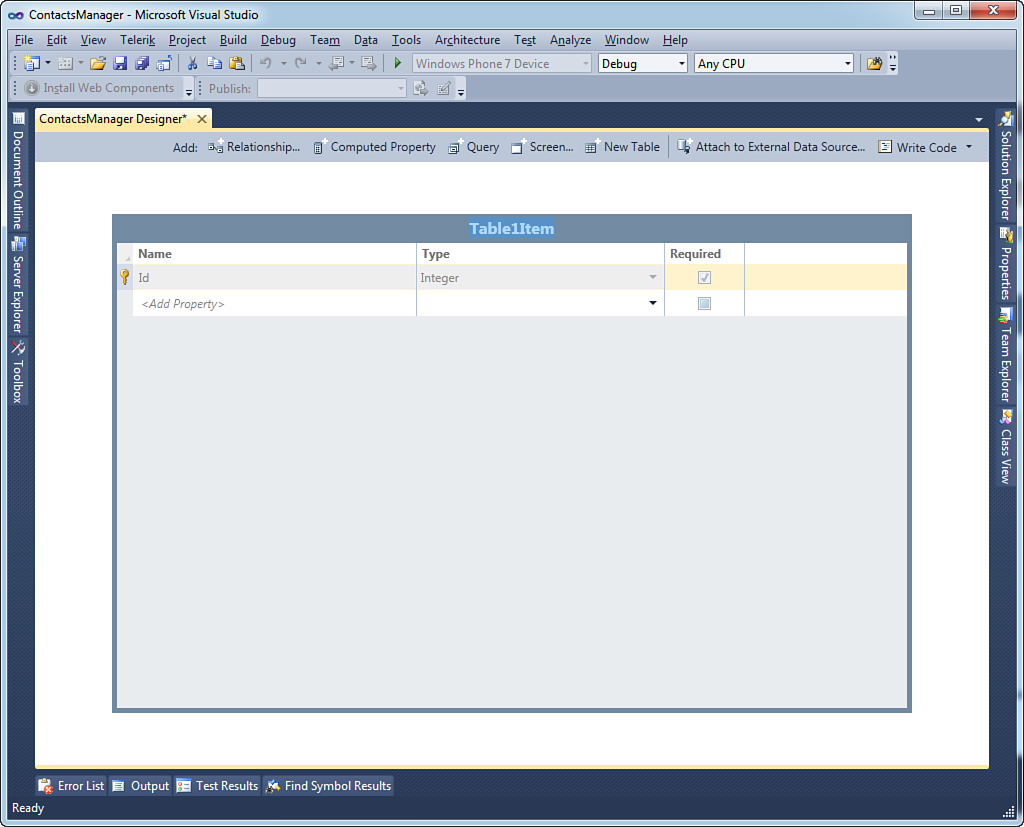
Figure 3.2. The Table Designer shows a new empty entity.
Here you can design your entity by specifying its properties. By default, the focus is on the entity’s title, which is Table1Item. Rename this Contact.
Avoid Confusion Between Tables and Entities
Although the Table Designer looks like a table editor, it actually allows you to design a single entity. This is why the entity name is singular (Contact). After you design your entity, Visual Studio LightSwitch generates a table for you, pluralizing the entity’s name. So, in the current example, the generated table will be named Contacts.
At this point, you can begin designing your new entity by adding properties. Notice that, by default, LightSwitch adds an Id property of type Integer (a type representing integer numbers), which identifies the entity as unique in the table (this is why such a property cannot be edited or removed). Therefore, such a property is an auto-incrementing index that is incremented by one unit each time a new element is added to the table. If you have some experience with other data-access tools such as Microsoft SQL Server or Microsoft Access, you might think of this as an identity field.
Adding Entity Properties
Each property has three requirements: the name, the type, and whether it is required (meaning that the information is mandatory or not). With regard to an entity that represents a contact, the first property you may want to add is the last name. So, click inside the Add Property field under the Name column and type LastName. Remember that property names are alphanumeric combinations of characters and digits and cannot contain blank spaces. If you want to provide some form of separation between words, you can use the underscore (_) character or you can use the so-called camel-case notation, where the words that compose an identifier start with an uppercase letter. LastName is an example of a camel-case identifier. LightSwitch automatically sets labels in the user interface to contain a space between camel-cased words automatically.
After you type the property name, you can press Tab on the keyboard to switch to the Type field. You can see the list of available data types and select a different one by expanding the Type combo box. By default, LightSwitch assigns the String type to each newly added property. Because the last name is actually a string, you can leave unchanged the default selection. Before providing the full list of available data types, let’s focus on the Required field. You mark a property as required when you want to ensure that the user must provide information for that property. In this example, the last name is mandatory because it is the piece of information that allows the identification of a person on our list of contacts, so Required is checked. LightSwitch marks new properties as required by default, so you need to manually unselect the box if specific property information is optional. Figure 3.3 shows the result of the previous addition.
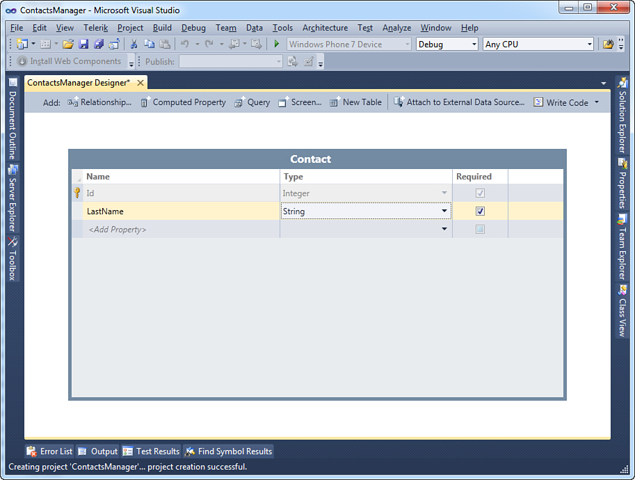
Figure 3.3. The new property has been added to the entity and marked as required.
Each entity can expose different kinds of information. This is accomplished by assigning the most appropriate data type to each property. Before adding more properties to the Contact entity, it is important for you to understand what data types are and what data types Visual Studio LightSwitch offers.
Understanding Data Types
Whatever tasks your application performs, it manipulates data. Data can be of different kinds, such as numbers, strings, dates, or true or false values. When you add a property to an entity, you need to specify its data type to clarify what kind of data that property is going to manipulate. Visual Studio LightSwitch provides some built-in data types that are based on types exposed by the .NET Framework 4.0 and that in most cases are sufficient to satisfy your business needs. Table 3.1 summarizes available data types.
Table 3.1. Available Data Types in Visual Studio LightSwitch
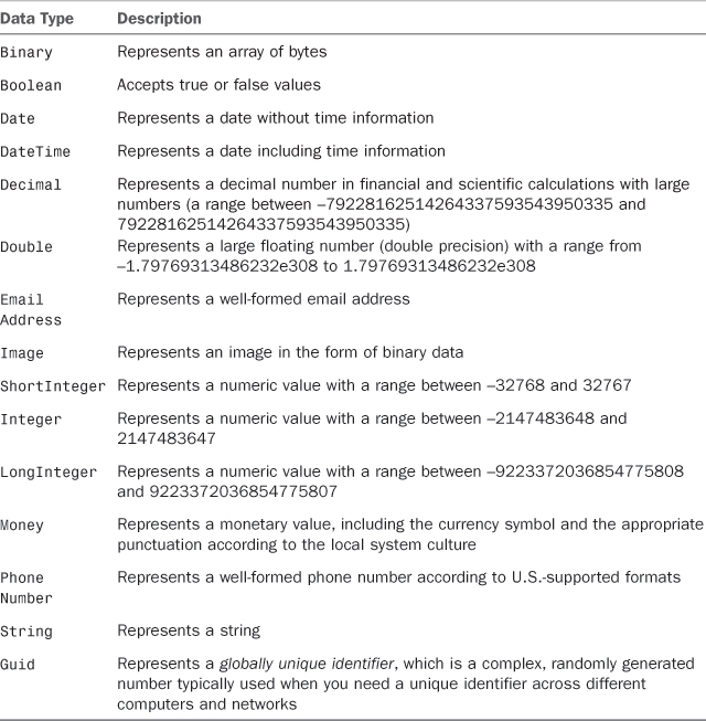
Using the appropriate data type is very important because it makes data manipulation easier, provides the right mapping against the back-end database, and in most cases can save system resources. As an example, instead of using a String to represent a date, you use the Date type. This is useful (other than natural) because SQL Server has a corresponding data type and the .NET Framework provides specific objects for working with dates if you need to write custom code. The same consideration applies to numbers, Boolean values, and binary data.
Table 3.1 summarizes data types that Visual Studio LightSwitch supports when adding new entities. By the way, to provide the best experience possible, when importing existing data from external data sources (such as SQL Server databases), LightSwitch maps imported types into a more convenient .NET type, even if this is not generally available in the Entity Designer. For a better understanding, consider the Northwind database, which is a free sample database from Microsoft popular in the developer community (see http://archive.msdn.microsoft.com/northwind). If you consider such a database, the Picture column in the Category table is of the SQL type IMAGE, but LightSwitch does not map it as an Image. Instead, it maps it to a Binary type (which is an array of System.Byte in .NET), but you are still allowed to change it into an Image. Another example is the Discount column in the Order_Details table; this is of the SQL type REAL, but it is mapped to a Single .NET type. In this case, the mapping cannot be changed because this is a primitive type. Generally, you can leave unchanged the default mapping because LightSwitch takes care of translating data for you into the most appropriate form.
With regard to numbers, both the Visual Basic and Visual C# compilers are optimized to work with the Integer data type. For this reason, you should always prefer Integer even when an integer number is in the range of ShortInteger. For the same reason, you should use LongInteger only when you are sure that your application will work with numbers greater than the range supported by Integer.
The Concept of Business Data Types
In Table 3.1, you might have noticed something new in the LightSwitch approach to data types. In contrast to other development tools and technologies, including .NET Framework 4 and Visual Studio 2010, LightSwitch introduces the concept of business data types. For example, suppose you want to add a property to an entity for inserting or displaying monetary information. Before LightSwitch, this was accomplished by using the Decimal data type, which can display decimal numbers and is therefore the most appropriate .NET type in this scenario. This is correct but has some limitations: For example, you must write some code to add the currency symbol or format the information according to the local system culture. Next, consider email addresses. Developers usually represent email addresses with the String data type but they have to implement their own validation logic to ensure that the string is a well-formed email address. The same is true for phone numbers. This approach makes sense in a general-purpose development environment such as Visual Studio 2010. But Visual Studio LightSwitch is a specialized environment focusing on business applications, so the LightSwitch team at Microsoft introduced four new data types, specifically to solve business problems:
• Money, a data type for displaying currency information that provides the appropriate currency symbol and culture information according to the user’s system regional settings.
• Image, which allows storing and returning an image in the form of binary data.
• Email Address, which accepts only valid email addresses and implements validation logic that throws errors if the supplied email address is not well formed.
• Phone Number, which accepts only valid phone numbers and which implements validation logic that throws errors in case the supplied phone number is not well formed. This data type can be customized to accept phone numbers in a format different from the default one, built specifically for the United States.
If you think that any data-centric applications must validate the user input to ensure that the entered data is valid, business data types can save you a lot of time, especially because you do not need to write the validation logic: LightSwitch does it for you. You will get a visual sensation of the power of business data types in this chapter when you run the application and test the validation functionalities. In addition, Visual Studio LightSwitch provides an extensibility point where you can add custom business types, as described in Chapter 19, “LightSwitch Extensibility: Data and Extension Deployment.” Now you know everything important about data types in LightSwitch and are ready to complete the design of the Contact entity by adding specialized properties.
Building a Complete Entity
So far, the Contact entity exposes only the LastName property, so it needs to be extended with additional properties that complete the single contact information. Table 3.2 shows the list of new properties (and their data type) that are added to the entity. You add properties by clicking inside the Add Property field and specifying types from the drop-down Type combo box, as you learned earlier.
Table 3.2. Properties That Complete the Contact Entity
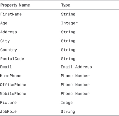
None of the new properties is required because the entity already provides two ways to identify a contact as unique: the Id property and the LastName property. After you complete adding properties, the Contact entity looks like Figure 3.4.
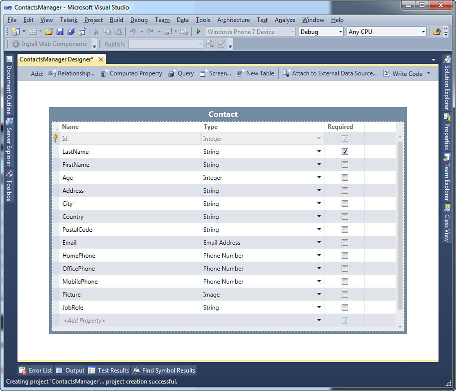
Figure 3.4. The Contact entity has been completed.
The Contact entity represents a single contact, but Visual Studio LightSwitch also generates a Contacts table that represents a list of items of type Contact. If you open Solution Explorer and expand the Data Sources node, you can see how such a table is visible, as demonstrated in Figure 3.5. If you name your entities with words from the English language, LightSwitch automatically pluralizes the entity’s name when generating the table, thus providing the appropriate name for the new table.
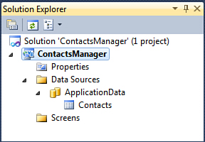
Figure 3.5. The new Contacts table is visible in Solution Explorer.
Now that you have successfully created a new entity and a table for storing a list of entities, you might wonder where data is stored by your application. This is briefly explained in the next subsection and is revisited in Chapter 12, “Dissecting a LightSwitch Application.”
Data Storage
LightSwitch applications use the Microsoft SQL Server database engine to store their data. In fact, one of the prerequisites when you install LightSwitch is the presence on your development machine of SQL Server Express Edition. Supported versions are 2005, 2008, and 2008 R2. When you create an application, Visual Studio LightSwitch creates a SQL Server database for the application itself, also known as the intrinsic database, naming such a database ApplicationDatabase.mdf. This is the physical storage for your data until you run the application on the development machine. When you deploy the application to a web server or a networked computer, you also need to deploy the database. You can decide to export the current database and attach it to the running instance of Microsoft SQL Server, and its name is replaced with the name of the application (for example, ContactsManager.mdf). Alternatively, you can let the deployment process build and attach to SQL Server a brand-new database with a different name, but you can also publish the database in the cloud by deploying it to your SQL Azure storage. LightSwitch can perform these tasks for you, especially if you use the one-click deployment systems covered in Chapter 10, “Deploying LightSwitch Applications.” For now, you just need to know that data is stored into ApplicationDatabase.mdf, which is located in the %ProjectFolder%BinData folder.
The User Interface: Implementing Screens
The Contact entity and the Contacts table represent your data structure. A professional standalone application needs a graphical user interface that enables users to enter and retrieve data easily from the database. In LightSwitch applications, the user interface has the form of screens, which are what users see. You may think of screens as of windows made of fields you fill in with data, of grids showing lists of data, and of buttons (or other controls) bound to perform some actions such as saving or searching data. You do not need to build screens manually because LightSwitch ships with a number of full-feature, reusable screen templates that satisfy most of the needs in a business application. Such templates implement fields, buttons, grids, and all other user interface elements required to work with data. Default command buttons are organized inside tabs exposed by a Ribbon Bar control (which mimics the Microsoft Office user interface). If you ever developed applications with Microsoft Access, you can easily compare LightSwitch screens to Access forms. Offering predefined screen templates is another benefit in Visual Studio LightSwitch because these enable you to quickly build the user interface for an application without writing a single line of code or without any work from the developer. At a higher level, you can customize screens as follows:
• Rearrange predefined controls, moving them to different positions on the screen
• Add tabs and buttons
• Style screens with different themes
• Add custom Silverlight controls
• Delete the entire content tree and add data items manually or create an empty screen and still add items manually (Chapter 8, “Aggregating Data from Different Data Sources,” provides an example)
So, what you basically cannot do is lay out the screen pixel by pixel, as you would do in other development environments, but this makes sense in LightSwitch development: The goal of LightSwitch is to provide tools to build fully functional business applications in the quickest way possible, extending such an experience to novices and nonprofessional developers, as well. The idea is that you do not want to (or need to) waste your time in building the user interface; you just take advantage of what LightSwitch has ready to run. Visual Studio LightSwitch currently offers five screen templates. In this chapter, you use only two of them. In Chapter 4, “Building More-Complex Applications with Relationships and Details Screens,” you begin to work with the other three templates. The reason for this is that in this chapter, you are working with a single table database and therefore you will learn about screens that work well in this scenario. This approach is also useful for understanding how screens work, how you can customize their properties, and how binding data to screens is really straightforward. In Chapter 4, you learn how to build master-details applications, and thus you will also learn about screens that enable you to work with one-to-many relationships. In the current scenario, our users need a way to add new contacts to the database and one to show the list of available contacts.
Controls Overview
The user interface of any application is made of controls.
Each control is a graphical element that the user can easily associate with a particular action in the application. Buttons and text boxes are examples of controls. These are typically arranged within containers (or panels). For example, the main application’s window is the root container for nested control containers and controls. In Visual Studio LightSwitch, screens are made of controls, too. Because screens are based on a predetermined set of templates, LightSwitch offers a common set of controls that you interact with at both design time and at runtime. This section provides a brief overview of common controls in LightSwitch so that you can have a general idea about which elements are actually used within screen templates. Table 3.3 summarizes controls in LightSwitch.
Table 3.3. Common Controls in LightSwitch
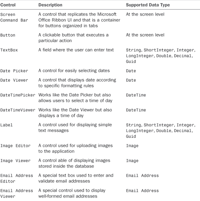
This set of controls is the most common in LightSwitch development and covers the needs for almost any business application. Of course, you can create and add custom Silverlight user controls, which you learn in Chapter 7, “Customizing Applications with Buttons, COM Automation, and Extensions.” You first need to understand how to create, manage, and customize screens. Let’s begin by creating a data entry screen, which is the place where users enter data and is also the first contact you have with screens in LightSwitch.
Creating a Data Entry Screen
To add a screen to the project, you use one of the following options:
• Right-click the Screens folder in Solution Explorer and select Add Screen.
• Click the Screen button in the Entity Designer.
• Select Project, Add Screen.
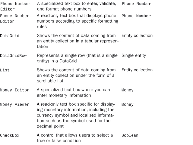
Whichever option you use, you are prompted to specify a screen template, a screen name, and screen data in the Add New Screen dialog, shown in Figure 3.6.
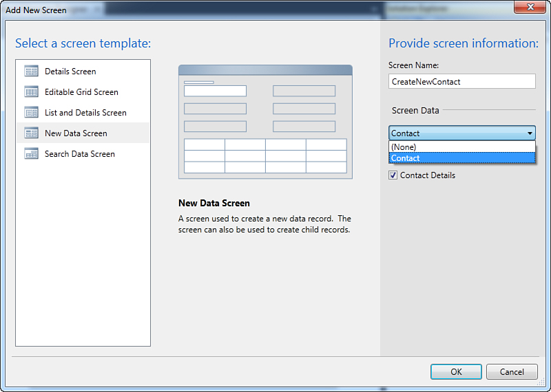
Figure 3.6. You can add new screens to the project in the Add New Screen dialog.
On the left side of the dialog, you see the list of available templates. Select the New Data Screen one. Notice that in the center of the dialog, you can see a preview of what the screen looks like. Next, you need to specify the data source that will be associated with the screen. In the Screen Data combo box, pick up the table you want to associate with the screen. Basically, here you see the list of all the entities you defined in your project. Currently, there is only the Contact entity, so just select this one. After you select the screen data, a check box becomes visible. In this case, it is named Contact Details and, if you check it, the resulting application will also allow editing the entity’s details. When you choose the data source, LightSwitch automatically changes the content of the Screen Name text box, providing a more meaningful value (CreateNewContact) in the current example. Now click OK. At this point, Visual Studio LightSwitch switches to the Screen Designer view. As explained in Chapter 2, you will not get an interactive designer for the screen; instead, you get a list of controls laid out in a content tree comprising the screen’s user interface. Figure 3.7 shows the Designer screen for the CreateNewContact screen.
Figure 3.7. The Screen Designer for the CreateNewContact screen.
Where’s the XAML? A Note for WPF and Silverlight Developers
If you have had any experience developing Windows Presentation Foundation (WPF) and Silverlight applications, this is the point at which you might wonder where the user interface elements are actually declared. In WPF and Silverlight, you define the user interface via the Extensible Application Markup Language (XAML), and you would probably expect that this happens in LightSwitch, too. In LightSwitch applications, you have no XAML. The user interface (and the entire visual tree) is generated and compiled for you when you build the application.
This also ensures that nobody can accidentally make changes to the user interface that might prevent the application from running correctly. This might seem disappointing if you are an expert developer, but it makes sense because LightSwitch is intended for both experts and novices.
The user interface composition is shown in a hierarchical fashion. At the top is an element named Rows Layout that specifies how the user interface is globally organized. Nested are the Screen Command Bar (that is, the Ribbon) with two buttons (one for saving data and one for refreshing controls) and an element named Rows Layout that contains all controls that allow user input. In particular, you can see a number of text boxes that accept input from the user, a control named Email Address Editor that is specific for accepting email addresses, a Phone Number Editor control that can accept and format phone numbers, and an Image Editor control that allows uploading an image. Rows Layout consists of two containers of controls that are part of a major set that is described later. For now, you need to understand how the user interface is organized and that you have no form designer as in Visual Studio 2010. It is worth mentioning that the new screen now appears in Solution Explorer (see Figure 3.7). On the left side of the designer, you have an element named ContactProperty that represents a single contact on the screen. This element is expanded to show the data properties, which basically are the same properties you defined in the Contact entity. There are also some elements referring to buttons (Close, Refresh, and Save).
Available Controls and Customizations
This chapter has one important goal: showing how easily and quickly you can create and run a LightSwitch application. There is a lot more to say about screens, controls, and screen customization, but this is not yet the time for that. For now, focus on building the application. Later in this chapter and then in Chapter 4, you learn all about controls and how to customize your screens by working with controls and by adding/removing elements in the user interface using the Screen Designer.
There is nothing else to do. With a simple sequence of mouse clicks, you successfully added a new screen to your project. But adding data is not the only requirement in this application; we also need to enable users to display and search available data.
Creating a Search Screen
Every business application must provide some user interface for displaying the data stored inside the database. In addition, it should enable users to easily search data. Visual Studio LightSwitch provides a screen template that includes such requirements. Open again the Add New Screen dialog and select the Search Data Screen template (see Figure 3.8).
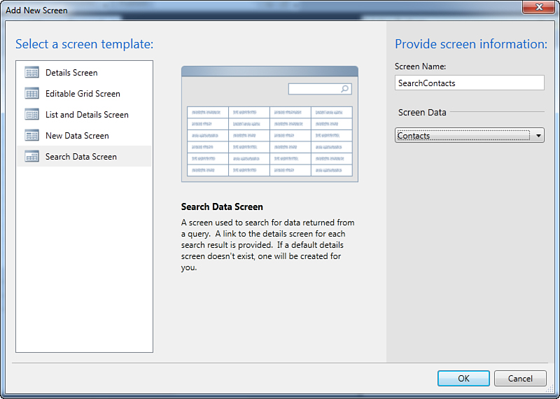
Figure 3.8. Selecting the Search Data Screen template.
Select the Contacts data from the Screen Data combo box so that the Screen Name box’s content is also updated to SearchContacts. Notice that you have now specified a table rather than a single entity. This is because the search screen is for showing a list of entities.
Whatever screen template you add to your application, selecting the table data is always accomplished via the Screen Data combo box.
After you click OK, the Screen Designer displays the composition of the search screen, as shown in Figure 3.9.
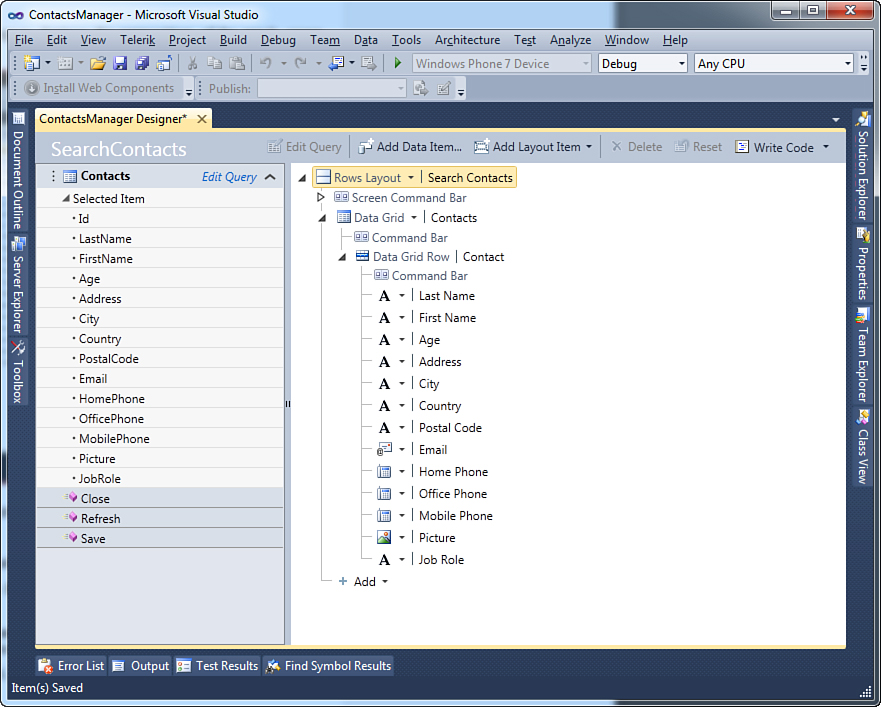
Figure 3.9. The Screen Designer shows the composition of the search screen.
As you can see, the screen consists of the following components:
• A container of type Rows Layout, which allows arranging nested controls.
• The Screen Command Bar element, representing the Ribbon user interface, with nested buttons.
• A Data Grid control, which provides the ability of displaying tabular data.
• Nested controls such as a Command Bar, which contains action buttons, and a Data Grid Row element. This represents a single entity (one contact in our scenario), and it is made of several nested elements, each representing a field in the contact definition. In particular, you can see labels and specific viewers (Email Address Viewer, Image Viewer, and Phone Number Viewer) for business data types.
On the left side of the designer, you can see the data source composition. There is a Contacts element that, as its name implies, represents a collection of items of type Contact. Basically, a collection of items is nothing but a .NET representation of a database table. The Contacts object is the data source for the screen, and each item is data-bound to a single row on the screen itself. LightSwitch performs this work for you. Then the Selected Item property from the collection represents a single entity that is selected within the search screen at runtime, and this is why in the designer, you see the list of properties exposed by your entity. Now that you have added the second necessary screen, the application is ready to run. In a few minutes, you have built a business application that can add, edit, and display your favorite contacts. Now it is time to see how your application works.
Testing the Application on the Development Machine
LightSwitch applications can be executed on the desktop or inside a web browser. This is a tremendous benefit because you can make your programs available as desktop or web applications just by changing one setting. In this chapter, you see how to run your program both as a desktop client and as a web application, starting from the default setting that is the desktop client.
Silverlight 4 Under the Hood: Out-of-Browser Applications
You learned in Chapter 1 that LightSwitch applications are nothing but applications built on Silverlight 4. Starting from version 3, Silverlight introduced a feature known as out-of-browser applications, which allows installing and running a Silverlight application as if it were a classic desktop client program. Out-of-browser applications run effectively as desktop clients, so they have more permission over the target machine than web clients. When you create a new LightSwitch application, it runs by default as a 2-tier desktop client. This is actually an out-of-browser Silverlight application unless you change a specific setting in the Application Designer, as demonstrated later in this section. Another great benefit is that (and in contrast to the classic Silverlight development, where you need to manually set some options) in LightSwitch, you just need one mouse click to switch between desktop clients and web clients, and this can be done as many times as you want during the application development process. It is important to emphasize that most of the power of your LightSwitch applications results from the Silverlight infrastructure that runs behind the scenes.
Starting the Application as a Desktop Client
Running from Within Lightswitch
When you run applications from within the LightSwitch development environment, the IDE automatically attaches an instance of the debugger to the application. In other words, applications running from within the IDE are always in debugging mode (in contrast to other editions of Visual Studio 2010, in which you can switch from the debug configuration to the release configuration). Actually, this is not a problem. You will read more about debugging in LightSwitch in Chapter 14, “Debugging LightSwitch Applications”; this current chapter focuses instead on how the application works based on entities and screens you build.
To run the application, press F5. After a few seconds, it displays what you see in Figure 3.10.
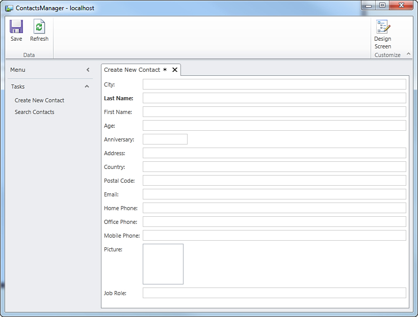
Figure 3.10. The application is finally running.
Before going into detail about how the application works, there are a few things to point out:
• The application implements a Ribbon Bar showing a built-in tab (Home) that includes two default buttons: Save and Refresh. This piece of the user interface is common to all screens and can be customized by adding new buttons or new tabs via the Screen Designer or in custom code.
• There is a Menu bar that is common to all screens and that includes collapsible panels nesting common shortcuts. By default, LightSwitch creates a Tasks panel that lists available screens and that you use for navigation between screens.
• Names of items in the user interface, including data fields and shortcuts, are autogenerated and are taken from tables and screen definitions.
• The remaining client area of the application is about screens. In Figure 3.10, you see the Create New Contact screen, which you use to add a new contact. Screen navigation is organized in tabs. If you click Search Contacts in the Tasks panel, another tab shows the Search Contacts screen (see Figure 3.11).
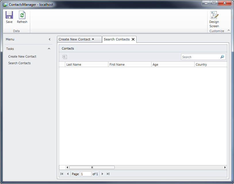
Figure 3.11. Screens are organized in tabs.
The user interface is intelligent enough to understand that the search screen is not used for data editing, so here the Save button is not available. It is also worth mentioning that what you are now seeing on screen has been created without writing one line of code, because LightSwitch takes care of all the plumbing for you. Let’s now see how the application works by adding/editing data and displaying lists of data.
In this book, we refer to screen names by invoking either the name as it appears in the designer or the name that is generated in the user interface. This means that SearchContacts and Search Contacts (the latter has a blank space in the middle) are two ways to refer to the same screen. Typically, the first way is used when referring to the screen while designing the user interface, whereas the second way is used when running the demo applications.
Adding and Editing Data
To add new data, you can either click Create New Contact in the Tasks panel or on the Create New Contact tab. This screen opens first because it was the first to be created. If you want to change the startup screen, you can go to the Application Properties and select the Screen Navigation tab. This feature is discussed in detail in Chapter 4.
You just fill in fields according to the information you want to add. Notice that required fields are presented in bold (such as Last Name in the current example). To fill the Picture field (and ones like it), simply pass the mouse over such a field and click the green arrow to add the picture from disk or the click the black cross to remove an existing picture from the field. Figure 3.12 shows what the screen looks like when filled with custom data.
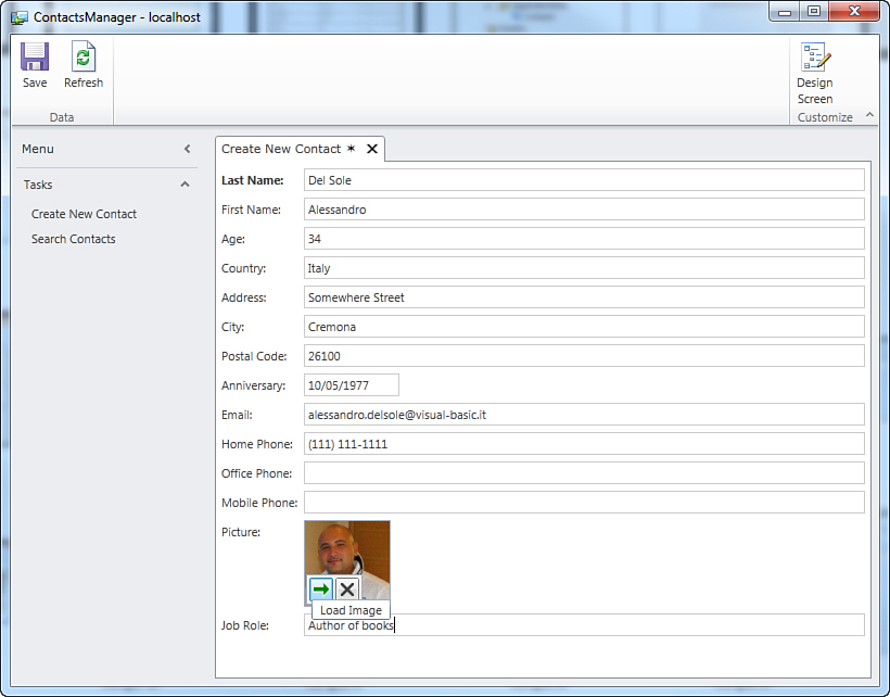
Figure 3.12. Filling the screen with information for a new contact.
After you have finished adding information, click Save to permanently store the information to the database. When you save your data, the application shows an edit screen for the newly added item.
The star symbol also disappears, and the tab title is replaced with the content of the Last Name field. (This automatic choice is because it was the first property added to the entity.) Finally, the Id read-only field shows the record number of the element inside the database. Figure 3.13 shows what the screen looks like after saving data.
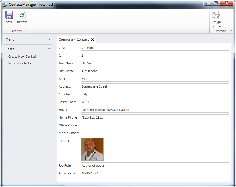
Figure 3.13. The screen changes after saving data.
It is worth mentioning that data is still available for editing. So, you might change your data by replacing the content of fields and then save again. In this case, a star appears inside the tab’s title, indicating some pending changes.
Adding and Formatting Phone Numbers
While entering data, you might have noticed that fields of type Phone Number were automatically formatted. The Phone Number Editor control in LightSwitch applications can parse phone numbers and present them in one of the built-in formats if they are recognized as valid; otherwise, data remains as you entered it. The default formatting can be overridden by passing the mouse over the field and clicking the down arrow on the right side of the field. This shows a group of fields that you fill with your local phone number information, as shown in Figure 3.14.
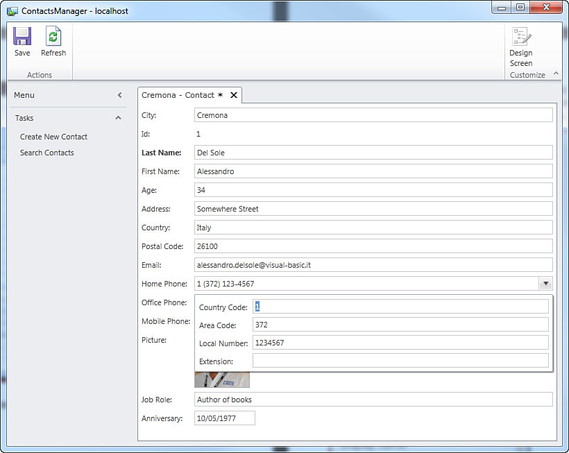
Figure 3.14. Providing local information for phone numbers.
In particular, you can specify the following information:
• Country Code: The phone number prefix for your country
• Area Code: The local prefix for your area
• Local Number: The actual phone number without any prefixes
• Extension: Additional information for the phone number
After you specify such information, the Phone Number field is updated to reflect changes. Sometimes the built-in phone number formats are not enough to satisfy your requirements, especially if you do not live in the United States. Fortunately, LightSwitch enables you to add custom phone number formats and edit built-in formats, as explained in the next subsection.
Customizing Phone Number Formats
The Phone Number Editor control provides automatic phone number formatting capabilities by comparing the phone number entered by the user with one of the built-in phone number formats available for the Phone Number data type. If the phone number entered by the user matches one of the available formats, the Phone Number Editor presents the number according to this format. You can customize phone number formats by both editing built-in formats and providing new ones. To accomplish this, you need to close the application and open the Table Designer for the desired entity (Contact in the current example). Once the entity is shown in the designer, select one of the properties of type Phone Number. Continuing the current example, select the HomePhone property, and then press F4 to enable the Properties window. Figure 3.15 shows what this window looks like with regard to the selected property.
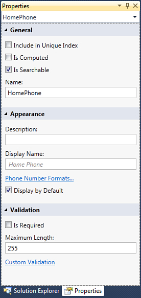
Figure 3.15. The Properties window for properties of type Phone Number.
First Contact with the Properties Window
This is the first time you use the Properties window in this book. Basically, this is the place where you can assign all customizable properties for a data type with the appropriate values. In most cases, customization possibilities are self-explanatory (such as Maximum Length). In other cases, however, explanations are required. You will use the Properties window many times throughout this book, and you will see it in action with almost all available data types and in the most common scenarios (with all the necessary explanations where needed).
Among the available properties, you can find a shortcut named Phone Number Formats. If you click it, the Phone Number Formats dialog appears, showing all the available built-in phone number formats, as shown in Figure 3.16.
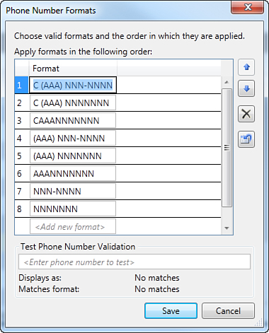
Figure 3.16. The Phone Number Formats dialog enables you to customize phone number formats.
To edit an existing format, just click the box related to the format and replace it with custom information, remembering that
• The letter C represents the country code. You can enter up to three C letters for country codes requiring three numbers.
• The letter A represents area code numbers. There is basically no limit to the number of A letters.
• You can enclose letters between parentheses to provide this kind of formatting.
• The letter N represents the local number. You must specify the exact number of N letters to match a fixed phone number length. For instance, you add six N letters if you want to match a phone number exactly six characters long, but not numbers that are seven or five characters long.
You can test whether a phone number matches one of the listed formats by typing it inside the Test a Phone Number text box. This is useful to understand how formats work. You follow exactly the same rules if you want to specify a new custom format. Just click inside the Add Format field at the bottom of the list and begin writing your format by following the explanations provided in the previous bulleted list. Notice that Visual Studio LightSwitch validates your format while you write it. If it does not comply with built-in rules, LightSwitch shows validation error messages, as shown in Figure 3.17 with regard to C letters.
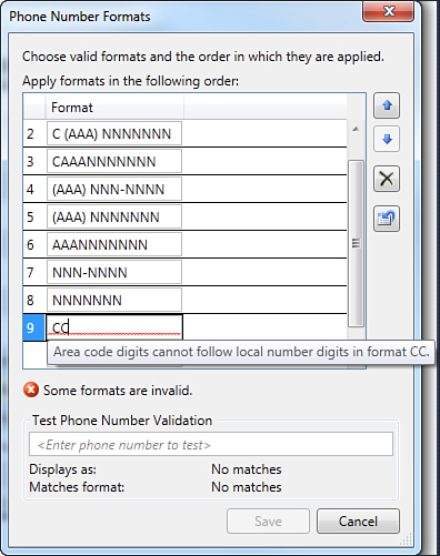
Figure 3.17. LightSwitch performs validation when you are adding a custom format.
After you finish adding your custom phone number format, click OK. If the user enters a phone number that matches your format, it is formatted according to your rules.
Automatic Check for Pending Changes
The LightSwitch infrastructure automatically provides to applications the so-called dirty checking feature, which is the ability to check whether the user is attempting to close a screen or the application without saving pending changes (and ask for confirmation that the user really wants to do this). For example, if you are adding or editing a contact and then try to close the CreateNewContact screen before saving your changes, the application asks whether you want to save or discard changes before closing, as shown in Figure 3.18.
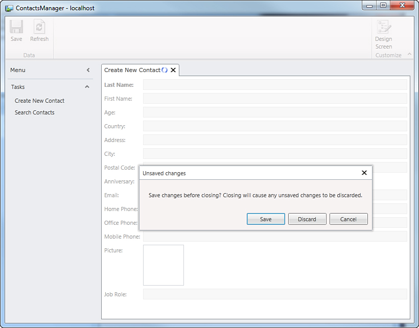
Figure 3.18. The application asks for user confirmation before discarding unsaved changes.
Similarly, users are asked for confirmation when attempting to close the application but there are some unsaved changes. It is important to underline that such a feature is implemented automatically, meaning that you do not need to enable it manually or write a single line of code.
Displaying and Searching Data
So far, you have seen how to add items to and edit items in the application’s database via the user interface of the ContactsManager application example. Now it is time to see how the application can list and search existing data via the search screen implemented earlier. Let’s suppose you have added a number of contacts to the application. Now, in the Tasks panel, click the SearchContacts element. You will get the full list of data in a tabular form, similar to what you would get in Microsoft Excel. Figure 3.19 shows an example taken from my machine, showing a list of friends of mine.
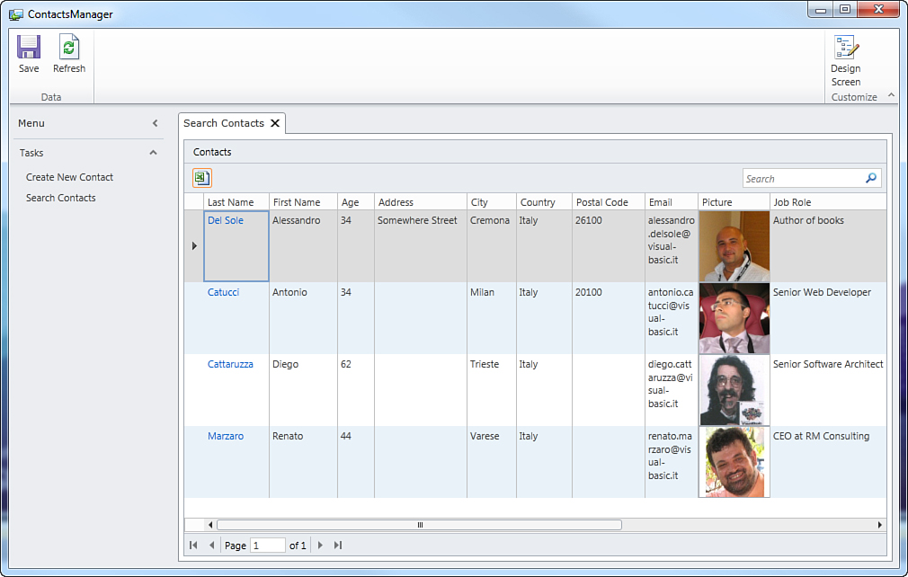
Figure 3.19. The search screen displays the full list of data.
As you can see, the tabular representation shows all the available information organized in columns, one per property exposed by the Contact entity. By default, the search screen is read-only, so you cannot directly edit items inside the grid (although there are two ways to accomplish editing that are discussed later). Data is shown via a DataGrid control; and phone numbers, email addresses, and images are displayed respectively via Phone Number Viewer, Email Address Viewer, and Image Viewer controls. The search screen also offers lots of interesting built-in functionalities that the LightSwitch infrastructure offers without the need to write a single line of code, as described in the following sections.
Paging
Suppose that you have added thousands of records to your application’s database. If a search screen had to show them all, it would have to load all items in memory and then render the list to the user interface, and this would heavily affect performances. In addition, scrolling the list of records on the screen would also be slow because the user interface would refresh each time you scrolled the list. Because of this, LightSwitch applications offer a built-in paging mechanism. Thanks to paging, the application divides data into virtual pages and loads and displays 45 items at a time. For example, when you run an application that stores 100 elements, it divides the data into 3 virtual pages (45 + 45 + 10) and then it loads and displays the first 45 items. Then you can go to page 2 or 3 (and then go back) by using the DataPager control shown in Figure 3.20.
Figure 3.20. The DataPager control allows moving between data pages.
The first button on the left side of the control brings you back to the first page, and the last button on the right side of the control moves to the last page. Intermediate controls browse data by one page. Only when you click one of these buttons does the LightSwitch application load and display the corresponding number of items. This paging mechanism is a convenient way to maintain optimal performances and is something that is provided by default, without writing a single line of code. The page size is not fixed; you can replace the default value of 45 with a custom one. To do so, open the Screen Designer and select the collection in the upper-left corner (which is Contacts in the current example). Then, in the Properties window, edit the value of the No. of Items to Display per Page property.
Searching and Filtering
As its name implies, a search screen not only displays the list of items from a table, but it also provides search tools. By default, search screens in LightSwitch applications implement a search text box where you can type your search key. Then you click the button with a lens inside or you simply press Enter. For example, you might want to retrieve a specific record from the list. Figure 3.21 shows how to retrieve a contact by its last name.
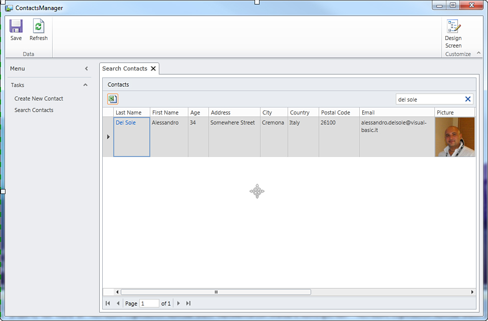
Figure 3.21. Searching for a specific record.
You can simply return to the full list by clicking the button with a blue X near the search box. It is important to mention that the search tool filters all the items that contain the specified text in every string column. For example, if you use the “cat” search key in the sample application, the search screen returns all the items that contain the specified key, and in this case, this is true in the Last Name column, as shown in Figure 3.22.
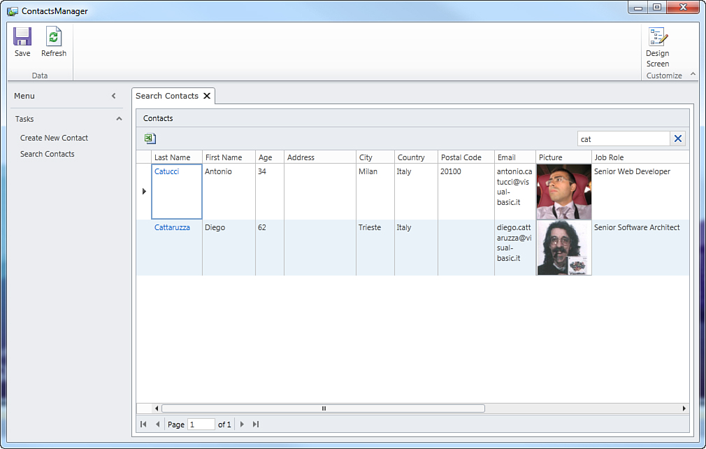
Figure 3.22. Filtering items: first example.
Similarly, if you type the “de” key search, the search screen filters all the items that contain the search key in every string column that in the current example is contained in the Job Role column, as shown in Figure 3.23.
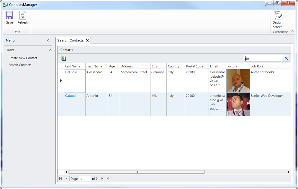
Figure 3.23. Filtering items: second example.
Refreshing the Search Results
Search screens provide a Refresh button on the Ribbon Bar.
You use this button to reload the full list of data, and it is useful when you add a new or edit an existing item. In fact, when you are editing items, the search results do not automatically reflect changes, so you need to refresh the list with the Refresh button. To understand how this works, follow these steps:
1. In the Tasks panel, click Create New Contact.
2. Add a new contact by specifying real or sample information, and then save your changes.
3. Return to the search screen.
At this point, you might notice that the new contact is not automatically displayed in the search results. The reason is that the screen displays a snapshot of items stored in the database at the time you executed the search, which is similar to requesting a web page in your browser.
So, click the Refresh button on the Ribbon Bar to get the list updated with the new data.
Editing Data from the Search Screen
By default, you cannot edit data directly inside cells. By the way, LightSwitch presents cells in the first column (for each row) with a hyperlink that you can click to edit the current item. This refers to the summary property of your table, which by default is the first property you added to your entity and that is used as the default column. You can change this in the Table Designer.
Continuing the previous example, the Contact column refers to the LastName property in the Contact entity, and you can click the last name of each contact to easily edit the item. Figure 3.24 shows what happens when you click the last name of a contact.
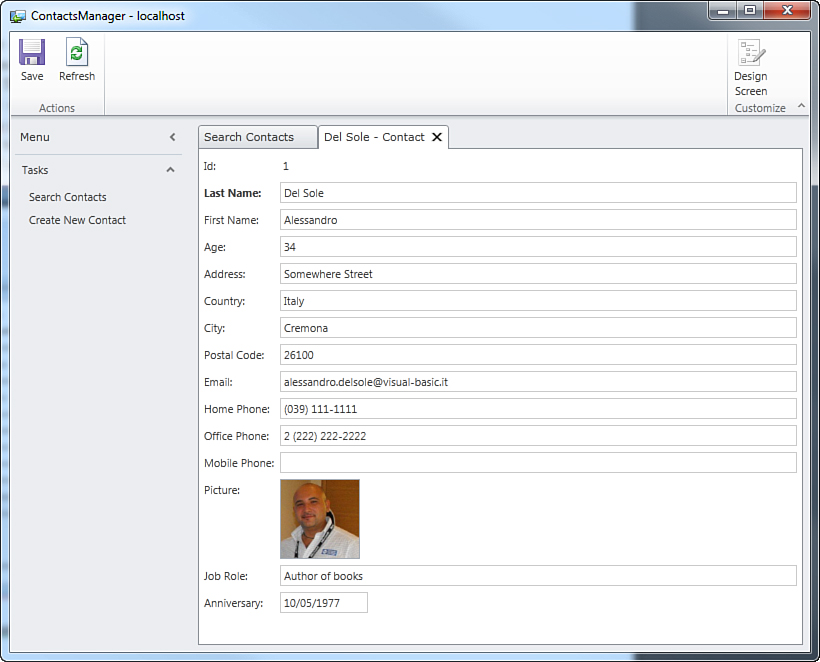
Figure 3.24. Accessing the edit screen from the search screen.
As you can see, a new tab appears containing a screen that allows editing the item you selected. Here you just make your changes and then click Save when you are done. It is worth mentioning that LightSwitch created this editing screen for you, saving you a lot of time. You can return to the search results by closing the current tab or by clicking the Search Screen tab.
Understanding Summary Properties and the Show as Link Feature
Earlier you saw how LightSwitch presents the first property added to the entity with a hyperlink in search screens. By clicking this hyperlink, you can immediately access detail properties for the selected item (see Figures 3.19, 3.22, and 3.23). In the current example, the LastName property value is presented with a hyperlink because that was the first property added to the entity. Of course, you can change the default setting, and this is an easy task. For instance, with regard of the current ContactsManager application, you might want to make the Email property the hyperlink. If you just want to change the property that is displayed as a hyperlink, in the Screen Designer you simply select the control mapped to the property, and in the Properties window you check the Show as Link check box, as shown in Figure 3.25.
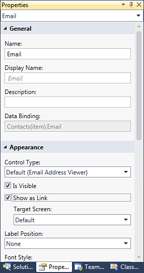
Figure 3.25. Setting the hyperlink for a different property.
Notice that selecting a new property does not automatically deselect the previous one (in this case, LastName). Therefore, LightSwitch allows you to present multiple properties as hyperlinks, but you have to manually uncheck the Show as Link check box for undesired properties. If you now run the application, you can open contact details by clicking the Email hyperlink. Using Show as Link is the simplest way possible to change the default behavior, but in some situations, this is not enough. In fact, some screens use the Summary control to display a list of items but present them via only one property. For a better understanding, consider Figure 3.26, which is taken from the sample application that will be built in Chapter 4. Notice how the Customer property shows a list of customers but only the company name is displayed. That is an example of Summary control, and the property that is displayed is referred to as a summary property.
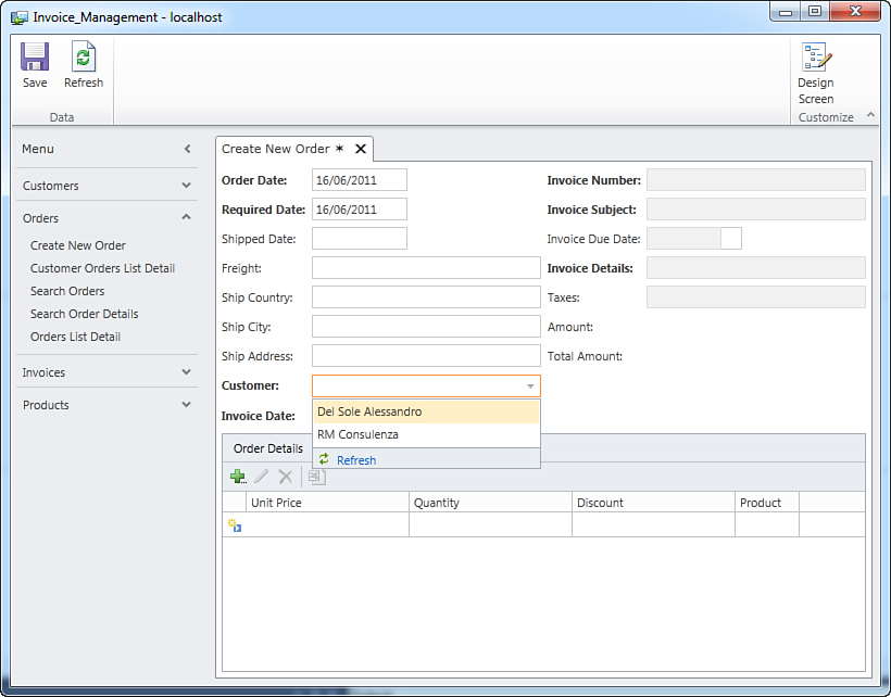
Figure 3.26. Summary properties enable you to display one entity property within the Summary control.
By default, the summary property is the first property added to the entity. To change the summary property, double-click the desired table in Solution Explorer, and then in the Table Designer, click the table name. In the Properties window, you can see at this point the Summary Property field, where you can select a different entity property to identify a list of items within a Summary control. With regard to customers, you could select the email address or the name of the contact. Figure 3.27 demonstrates how to change the current summary property.
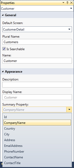
Figure 3.27. Setting summary properties.
Generally, search screens are not the place in which summary properties are used. By the way, you could replace the Data Grid control in a search screen with a List control. This uses a Summary control that points to summary properties. You can test this yourself with the current sample application.
Using Controls That Support Editing
The default behavior for search screens is that they are read-only and that you cannot directly edit data within cells, but you can access the edit screen by clicking the hyperlink provided for each row. If you do not like to invoke an external screen for editing data, you can override the default behavior by changing the Use Read-Only Controls property for the screen.
LightSwitch also offers a screen template called Editable Grid, which works exactly like a search screen but that also allows editing data within cells. It is discussed further in Chapter 4. For now, though, focus your attention on modifying properties of a search screen.
To accomplish this, follow these steps:
1. Close the application if it is running.
2. In Solution Explorer, double-click the SearchContacts screen and then press F4 to enable the Properties window.
3. Uncheck the Use Read-Only Controls check box, as shown in Figure 3.28.
Figure 3.28. An unchecked Use Read-Only Controls check box.
If you now rerun the application and open the search screen, you can click inside the cells you want to edit and type your information without opening an external screen. Figure 3.29 shows an example, where the Address property for the first contact in the list is being edited.
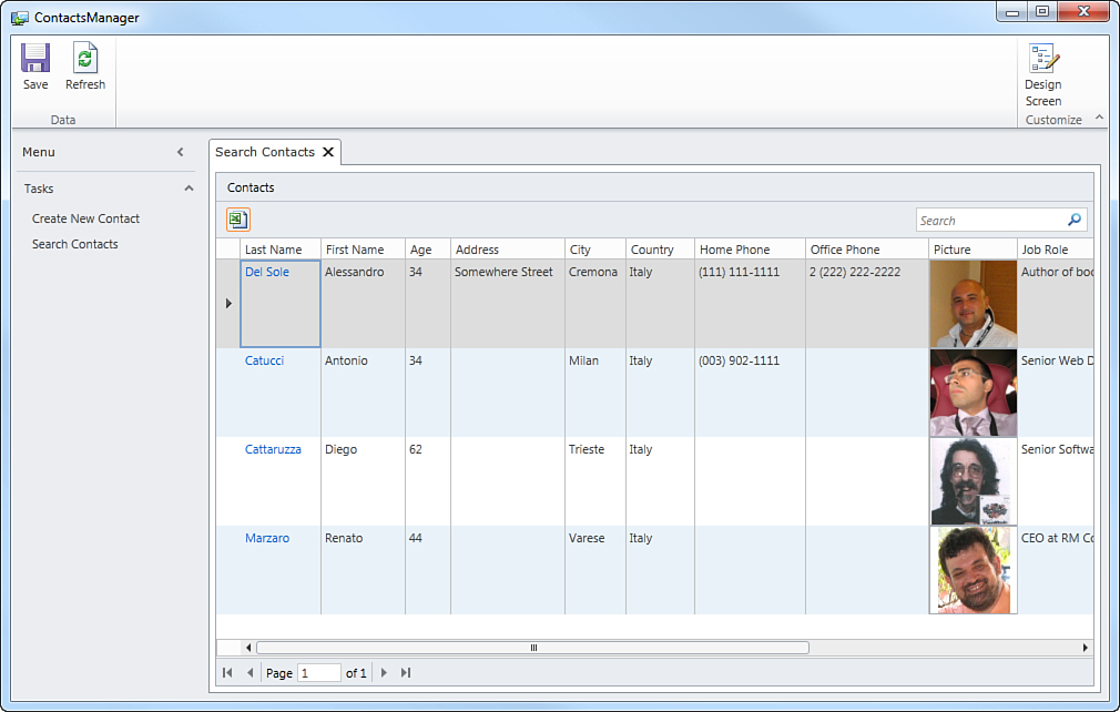
Figure 3.29. Editing data directly inside the cells.
You can also edit email addresses, phone numbers, and images. This is because the viewer controls (for example, Image Viewer) are replaced with the editor counterparts (for example, Image Editor). Of course, you can still edit data by clicking the hyperlink in each row, which points to the edit screen for the current item. Editing data inside cells is a plus.
Exporting Data to Microsoft Excel
In most business applications, interaction with the Microsoft Office suite is a common scenario. For example, you might want to export a report to a Microsoft Excel spreadsheet, or you might want to produce letters in Microsoft Word starting from a list of customers. One goal of Visual Studio LightSwitch is to make Office integration easier. Because exporting data to Microsoft Excel is a common scenario, the LightSwitch infrastructure provides automation for this particular task from within search screens. Under the search box is an Export to Excel button, identified with the typical Excel icon. If you click this button, after a few seconds your search results are exported into a new Excel workbook, as shown in Figure 3.30.
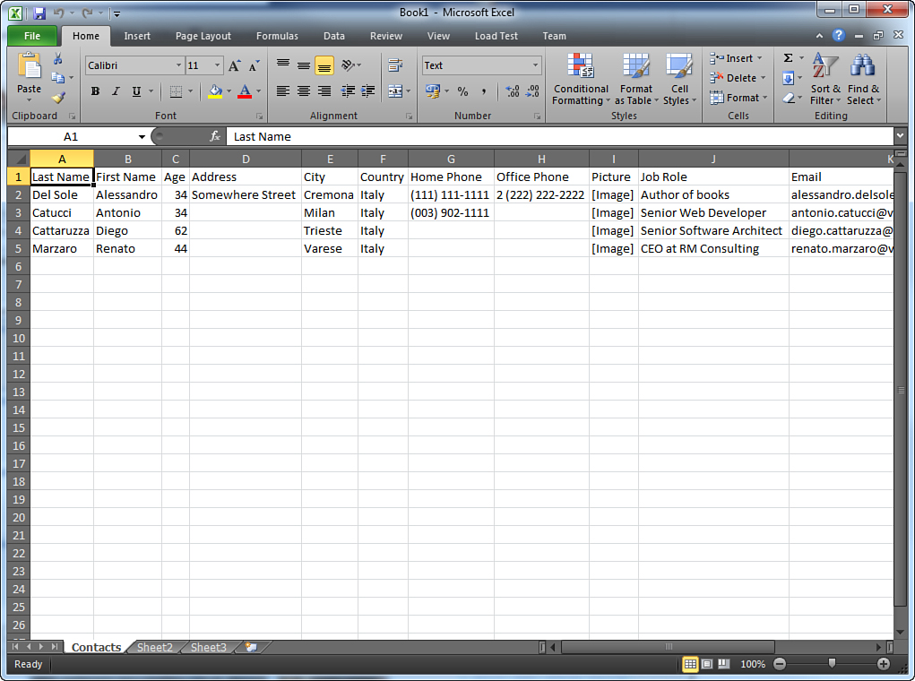
Figure 3.30. Microsoft Excel shows the data exported from the LightSwitch application.
The generated Excel workbook shows a list of columns representing exactly the columns in the Data Grid, including column headers. Below, there is the actual list of data that you can treat as you would in any other Excel spreadsheet. For example, you might want to format column headers in bold, but you can also add formulas, edit cells, and so on. Just notice that with regard to pictures, there is no Excel counterpart for the Image data type in LightSwitch, so the Picture column just reports the string representation of the .NET data type that handles images, which is [Image]. (System.Byte() is the .NET representation of the type.) Excel integration is, without a doubt, a requirement in most cases, and LightSwitch makes this easy.
You might wonder what other built-in possibilities LightSwitch offers for integrating applications with Microsoft Office, other than exporting to Excel. The answer is: none, out of the box. You can still automate Office applications by taking advantage of different techniques (such as COM interoperability, which is covered in Chapter 7, Chapter 8, and the Office Integration Pack, which is covered in Chapter 17), but all these techniques require writing code and that you understand some important .NET programming concepts.
Basic Screen Customizations
So far, you have generated a fully functional LightSwitch application without making any changes to the user interface. You can customize screens in a number of ways, both basic and advanced. In this chapter, you learn about basic customizations. In Chapter 4, you learn about advanced customizations.
Customizing Display Names and Descriptions
When generating screens, LightSwitch automatically provides descriptive text for controls by picking up the name of the related entity’s property. For example, you have a LastName property in the entity. When you create screens, LightSwitch generates a text box into which you can type the last name and names that text box Last Name (refer to Figure 3.10 for an example).
Properties in entities expose two particular subproperties, Name and Display Name. The first identifies the control within the application; it cannot contain blank spaces and can be changed, although it is preferable to leave the autogenerated name unchanged. The application infrastructure refers to the control via the Name property (for example, when binding the data to the control). The Display Name property refers to the text you see on the screen, so you can replace this with more meaningful content. Let’s see how to provide the CreateNewContact screen with a more meaningful user interface. Close the application, if it is running, and open the Screen Designer for the CreateNewContact screen by double-clicking it in Solution Explorer. When ready, select the top-level element named Rows Layout, Create New Contact and press F4 to enable the Properties window. Locate the Display Name property and replace its content with Add a New Contact. Figure 3.31 shows this edit.
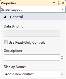
Figure 3.31. Adding a more meaningful description for the Display Name property.
Changing Properties at Runtime: Immediate Customization
Visual Studio LightSwitch introduces a great feature called Immediate Customization, which enables you to rearrange elements in the user interface and set screen properties while the application is running. The feature is described later as you learn about more-complex user interfaces. For now, just know that by clicking the customize screen in the upper-right corner, you can access the customization page on which you can change element properties and arrangement in the user interface. A screen preview shows how changes will appear, and when you save these, the screen layout is automatically updated. The benefit of Immediate Customization is that you do not need to break the application execution every time you want to make a change to the user interface.
After you change display name values, such changes are reflected in the Screen Designer, which shows the new display name for each element. At this point, you can update the user interface for any other screen in the application by following the steps described here. Another step that you can take is to add a description for each property. For example, you might want to indicate to the user how to fill in a particular field, why it is required, or any other useful information. With LightSwitch, you can provide descriptive text inside the Description property in the Properties window. (Refer to Figure 3.31 to understand how to locate it.) Text that you type inside the Description property is shown via a yellow tooltip when you click inside the related field. For example, with regard to the LastName entity’s property, add the following text inside the Description property: Required. Specifies the contact’s last name.
Customizations described in this subsection are summarized in Figure 3.29. Before running the application to see how what the user interface now looks like, however, you should replace the application’s name with a more meaningful one.
Changing the Application’s Name
When you create a new application, LightSwitch assigns the application a name that is taken from the project name. This makes sense except for the user interface. In fact, considering the current example of the ContactsManager application, you can easily see from the previous figures how the application’s window title reports ContactsManager, but a professional user interface should say Contacts Manager (with a blank space). The application’s name is an application-level setting and can be changed within the Application Designer. So, double-click Properties in Solution Explorer, and on the General tab of the Application Designer, replace the content of the Application Name box with Contacts Manager, and then save your changes.
First Contact with the Application Designer
The Application Designer is the place where you set application-level properties, including themes, version information, deployment strategy, and security. You will use the Application Designer several times in this book, but each aspect is related to a particular chapter. In this chapter, you just change the application’s name, whereas in Chapter 4 you learn about other features, such as screen navigation. Access control and application types are topics covered, respectively, in Chapters 14, “Debugging LightSwitch Applications,” and 15, “Customizing the IDE.”
At this point, run the application again. You can now see a more professional layout, with the window’s title and descriptions updated with more meaningful information, as shown in Figure 3.32.
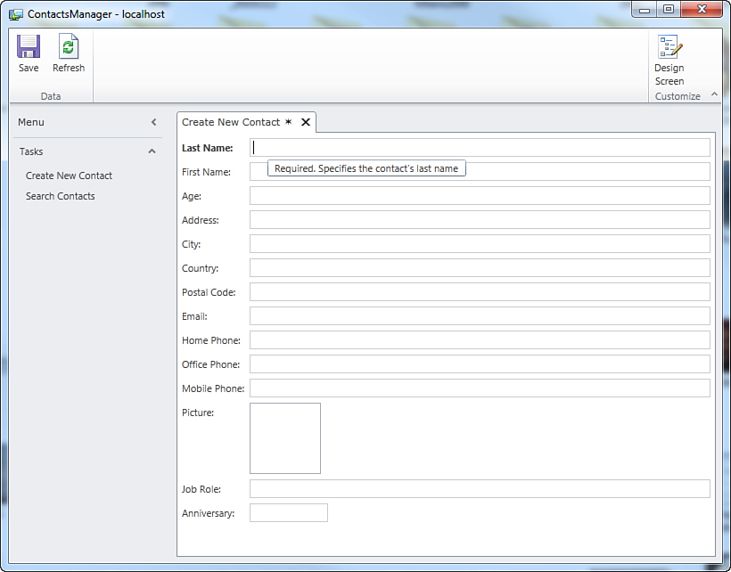
Figure 3.32. The user interface now has high-quality descriptive text.
Adding and Removing Data
You will sometimes need additional data on the entity side and so must add the appropriate control on the screen side to map the new property. LightSwitch makes updating the user interface really easy; you just drag and drop. For example, suppose you want to add a WebSite property to the Contact entity. To accomplish this, open the Table Designer and add a new property called WebSite of type String, marking it as not required, and then save your changes. Double-click the CreateNewContact screen in Solution Explorer so that the Screen Designer displays. On the left side of the IDE, you can see that the new WebSite property has been added to the ContactProperty item. Now click the WebSite item and drag it under the Job Role text box, as shown in Figure 3.33.
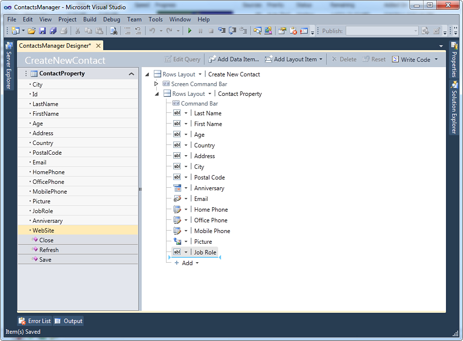
Figure 3.33. Dragging the new property onto the designer surface.
When you release the mouse button, you can see how LightSwitch adds a new TextBox control, which is data-bound to the WebSite property. This is enough to update the user interface to reflect changes to the data structure.
Repeat the same steps to update the SearchContacts search screen, dragging the WebSite property under the Job Role text box (inside the Data Grid Row element). If you now run the application, you can see how screens have been updated with the new item, which correctly accepts (or shows, in case of the search screen) the specified information, as shown in Figure 3.34.
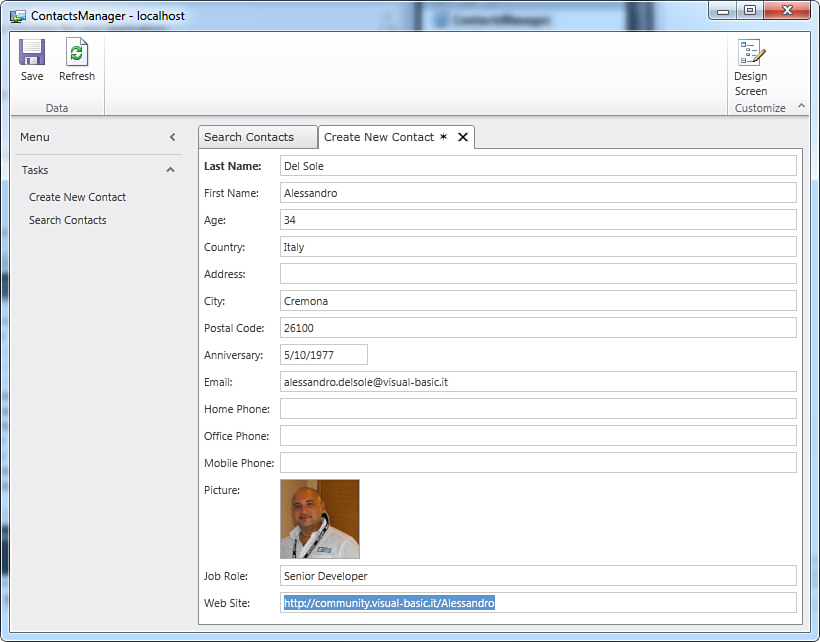
Figure 3.34. The screen now reflects updates to the entity structure.
The important thing to remember here is that you updated the user interface with a simple mouse click, without writing a single line of code to associate the new property with the appropriate text box.
Running the Application as a 3-Tier Desktop Client
When you run the application as a 3-tier client from Visual Studio LightSwitch, the ASP.NET development server is used.
Internet Information Services (IIS) is actually required only on the web server that you use for deployment, as described further in Chapter 15. As a general rule, you change the application type and deployment topology for your application in the Application Designer. So, in Solution Explorer, double-click Properties. When the Application Designer is available, select the Application Type tab on the left. Figure 3.35 shows how things look at this point.
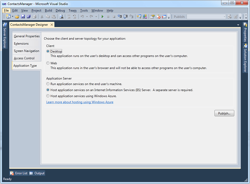
Figure 3.35. Changing the application type in the Application Designer.
As you can see, LightSwitch shows the list of available application types. You just need to click the desired type and nothing else. Select the Desktop client type, and then select the Host Application Services on an Internet Information Services (IIS) Service application server option type. When you build the project, Visual Studio LightSwitch generates a 3-tier application in which the middle tier is hosted by IIS and that exposes services responsible for working with data and responsible for communications between the user interface and the data. If you try to run the application, you will see no difference in how the application looks. The reason why is that this application type is, again, a desktop client, even though behind the scenes there is a middle tier working in IIS. For now, this is enough. Later in Chapter 15, when discussing deployment and installations, a complete explanation of the IIS requirement is provided.
Running the Application in the Web Browser
LightSwitch applications can run inside a web browser such as Microsoft Internet Explorer, Mozilla FireFox, or any other browser that supports Silverlight 4. This is without a doubt a great benefit because you can easily create and deploy applications that end users can use via a web interface. In addition, a 3-tier browser client means that the application is available online only, without the need of a local installation as instead happens for n-tier desktop clients. This is discussed in detail in Chapter 15. For now, let’s see how to run the application in a web browser for testing purposes. Open the Application Designer and go to the Application Type tab shown in Figure 3.32. Now simply select the Web client application type. With this simple selection, you switch to a web interface. Press F5 to run the application again and see the magic happen. The application now runs inside your default web browser and provides the same functionalities that desktop clients offer, as shown in Figure 3.36.
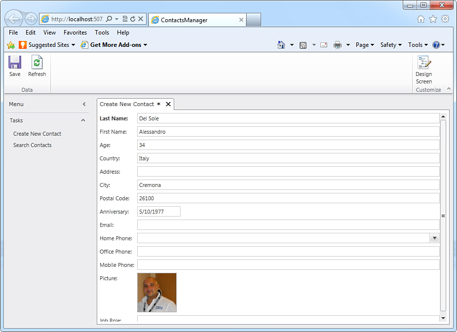
Figure 3.36. Running the application as a 3-tier browser client.
The program is nothing but a complete Silverlight 4 application available online only, running inside a web browser like any other Silverlight application would do, unless you turn it into an out-of-browser application. Before going on, in the Application Designer revert to the default setting, which is a 2-tier desktop client. This is the application type that is used to demonstrate other important LightSwitch built-in features, such as data validation.
Input-Data Validation
Business applications need to validate user input to ensure that entered data is valid, meaningful, and correct with regard to a particular data type. For example, when users enter an email address, the application must validate it to ensure that it is well formed. Other examples are checking that a required field is not empty or checking that a string is shorter than a fixed number of characters or checking that a date is earlier than another one. The main reason for this is that the back-end SQL Server database cannot accept invalid data, and therefore validation is important so that no errors occur when sending data to storage. As a developer, you write validation rules, which are procedures ensuring that data adheres to specific requirements. In other development environments (including Visual Studio 2010), you must write validation rules on your own for every single column in a table. Visual Studio LightSwitch offers a built-in validation mechanism that does most of the work for you, as explained in the following subsections.
Required Fields Validation
Probably the most common requirement in data validation is checking that a required field is neither null nor empty. Visual Studio LightSwitch makes this easy because the generated applications implement a built-in mechanism that automatically checks for empty fields and notify the user about the error. For instance, when you run the Contacts Manager application and you attempt to save changes by leaving the Last Name field empty, the application surrounds the field with a red border and tells you that an error must be fixed before saving changes, as shown in Figure 3.37.
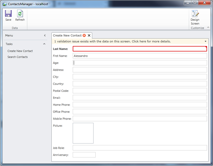
Figure 3.37. The validation fails and the user interface notifies the user.
By clicking the error message, you can get detailed information about the issue that caused the error. In this particular case, the user is informed that the Last Name value cannot be null, as shown in Figure 3.38.
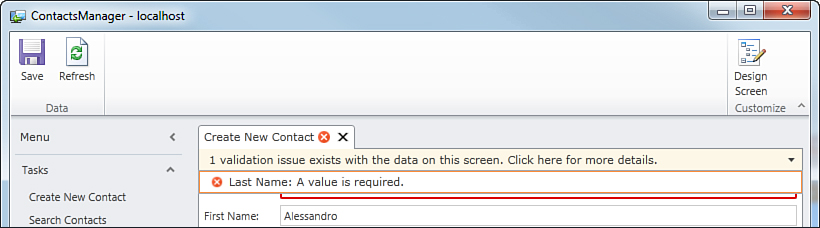
Figure 3.38. Getting detailed information about the error.
Of course, screens can handle multiple validation issues. If multiple fields do not pass the validation, the screen shows the total number of validation issues at the top of the screen and displays a list of error messages in the details box. This affects not only strings, but any supported data type.
It is important to understand that the error message is not raised by the user interface. Instead, it is raised by the entity, and the user interface is responsible for catching the error, presenting it to the user, and ensuring that validation issues are fixed before saving changes. Entities provide the actual validation mechanism by implementing built-in validation rules.
You can override the default behavior by writing custom validation rules, as described in Chapter 5, “Customizing Data Validation.” For now, focus on the fact that (without writing a single line of code) you have a fully functional, built-in data validation mechanism, which ensures that the user enters correct data without writing a single line of code.
String-Length Validation
Another common requirement in data validation is ensuring that a string is shorter than a fixed number of characters. The default length for the String data type in LightSwitch is 255, but you can make this larger or smaller.
Sometimes this limit is unnecessarily high, so you may decide to reduce the maximum length of a string. For example, the name of a country will never be 255 characters long, so you might want to limit user input for a country name to 50 characters maximum. To accomplish this, you first open the Entity Designer and select the property for which you want to edit validation. Continuing with the Contacts Manager application, select the Country property. Then, open the Properties window and locate the Validation group.
The Validation group in the Properties window is something common to all properties. This group enables you to edit default validation rules for each data type you use in your entity. In addition, it allows you to access the code editor in case you want to write custom validation rules. From now on, it is understood that editing default validation rules is accomplished by locating the Validation group in the Properties window, regardless of the current data type.
To shorten the maximum string length, you just change the value of the Maximum Length text box from 255 to the desired value (to 50 in our example). Figure 3.39 shows what the box looks like after the change. If you previously entered some string longer than the new limit, you get a warning message about data truncation.
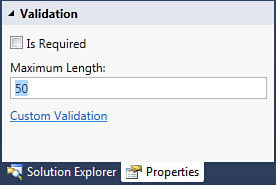
Figure 3.39. Changing a string’s maximum length.
Now run the application and, in the Country field, try to write a string longer than 50 characters. At this point, you will get a validation error informing you that the entered string is longer than allowed.
This ensures that the validation rule is respected, keeping the user interface’s behavior consistent. Figure 3.40 shows this validation scenario.
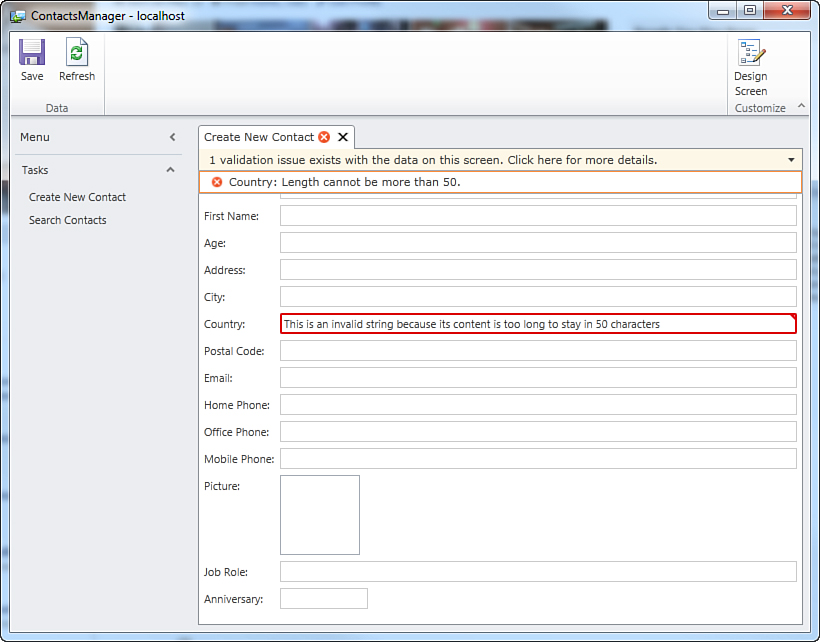
Figure 3.40. Strings greater than the maximum length are not allowed.
Date Validation
The LightSwitch infrastructure provides default validation mechanisms for the Date type, as well. To understand how this works, open the Table Designer and add a new property named Anniversary, of type Date, not required. At this point, open the Properties window and locate the Validation group shown in Figure 3.41.
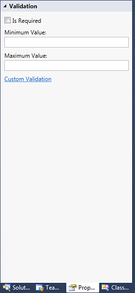
Figure 3.41. The Validation group for properties of type Date.
It is a good idea to provide a suitable range, from the minimum to the maximum value. So, replace the Minimum Value content with 1/1/1920 and the Maximum Value content with 12/31/2000. This will prevent users from adding people born before January 1, 1920 and after December 31, 2000. Next, following the instructions described earlier in the “Adding and Removing Data” section, open the Screen Designer for the CreateNewContact screen and drag the Anniversary item onto the designer surface. Notice that when you add items of type Date, LightSwitch, by default, wraps them via a DatePicker control. This control displays a calendar that allows easy selection of a date (with just a single click).
When mapped to an entity property of type DateTime, the DatePicker control can display either a date or a time interval or both. This is accomplished by selecting the control in the designer and then modifying the appropriate property value in the Properties window. In addition, the DatePicker control can display dates in an extended format (which includes the name of the day and month); just check the Long Date property.
Now run the application and try to specify an out-of-range date in the Anniversary field. Again, the application shows validation errors explaining the details, as shown in Figure 3.42.
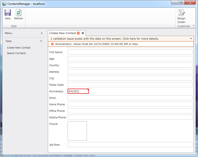
Figure 3.42. Default validation results against items of type Date.
By taking advantage of the LightSwitch built-in mechanism, you can perform validation against dates without writing a single line of code.
Number Validation
The LightSwitch validation mechanism also provides an easy way to validate numbers. This kind of validation is typically used to check whether a number falls within a specified range. This applies to the following types:
• Integer numbers, meaning Short Integer, Integer, and Long Integer data types
• Decimal numbers, meaning the Decimal data type
• Double precision numbers, meaning the Double data type
To understand how it works, consider the Age property, of type Integer, in the Contact entity of the Contacts Manager application.
Differences Between Integer Types
Validation for integer numbers is exactly the same for Int16, Int32, Int64, and Double. The validation mechanism is simply applied by checking whether the number is within the range specified by the MinimumValue and MaximumValue properties. The only difference is in the types themselves, because each has different minimum and maximum values.
Earlier, we decided that only dates between 1920 and 2000 will be accepted, so the person’s age must be within a range of 80 years. If we consider that at the moment when this chapter is being written we are in 2010, according to the dates range, the person cannot be younger than 10 and cannot be older than 90. With that said, open the Entity Designer for the Contact entity, and then select the Age property. Then open the Properties window. Locate the Validation group and replace the content of the Minimum Value and Maximum Value (empty by default) fields, respectively, with 10 and 90.
This discussion requires manual calculations to fit the age of a person with a date range. Actually, LightSwitch provides a more convenient way to automate calculations based on other properties in the entity, known as computed properties (discussed in Chapter 4). The current example is just to demonstrate validation against numbers.
If you now run the application and try to enter a value for the Age field that does not fall within the expected range, you get a validation error, as shown in Figure 3.43.
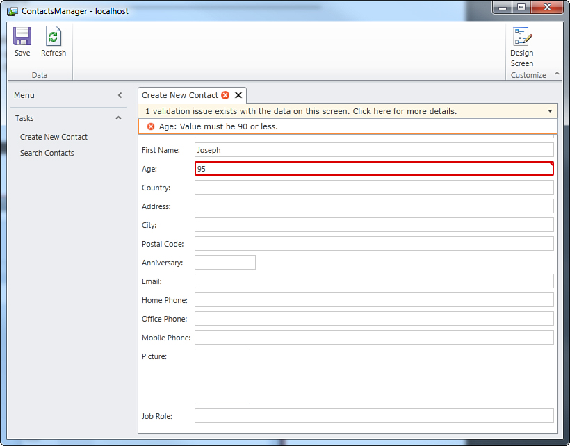
Figure 3.43. Validation fails because the numbers do not fall within the expected range.
Notes About Decimal Numbers
Numbers of type Decimal provide two additional properties for validation: Precision and Scale. The first one represents the maximum number of digits for the value in the entire field, including digits that are both on the left and on the right of the decimal point. Scale allows you to specify the number of digits to the right of the decimal point.
Default Validation of Business Types
In this chapter, you learned that Visual Studio LightSwitch introduces the concept of business data types. You also learned what business data types are about and why they are so useful. Continuing the discussion about data validation, business data types provide default validation mechanisms specific to their role. For instance, think of email addresses. These are not simply text; they are something requiring specific validation, such as the presence of a domain name or of the @ (at) symbol. LightSwitch provides a sophisticated validation mechanism that does the work for you, for all business data types. This section explains the default validation of the various business types.
Support for Custom Validation Rules
As with primitive types described earlier in this chapter, the validation mechanism for business data types can be personalized by writing custom validation rules. For more information, see Chapter 5.
Validating Email Addresses
The Email Address data type has a built-in validation mechanism that checks whether the supplied email address is well formed. Therefore, if the user enters an invalid email address, the application throws a notification reporting the error and prevents invalid changes from being saved. Figure 3.44 shows the validation error the user receives if a pound symbol (#) is entered rather than the required @.
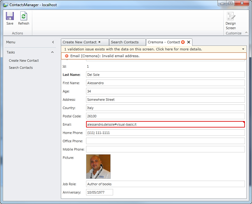
Figure 3.44. Default validation on Email Address data types.
After you fix the error, the validation test passes and you can save your changes.
Setting the Default Domain
The validation mechanism for the Email Address data type works against three properties: IsRequired and MaximumLength, which you already encountered when studying other primitive types; and Require Email Domain. When enabled, this last one requires the user to supply a valid domain name in the email address. For example, in my email address, the domain is @visual-basic.it. This can be quite annoying if you want to build a list of contacts from the same group of people, such as your colleagues, because in such a circumstance, all of your contacts’ email addresses have the same domain. Fortunately, the Email Address data type also provides the possibility of specifying a default domain that is automatically added to each email address. To provide a default domain, follow these steps:
1. In the Entity Designer for the Contact entity, select the Email property and open the Properties window.
2. Locate the Validation group and uncheck the Require Email Domain property.
3. Locate the General group and, inside the Default Email Domain field, type the desired email domain. If you do not add the @ symbol at the beginning, LightSwitch adds it for you.
When you run the application next, you will notice that each time you add an email address, the specified domain is automatically added for you, saving a lot of time.
Validating Phone Numbers
Validation for properties of type Phone Number works as it does for strings, in that you can just specify whether the property is mandatory (IsRequired) and the length of the string representing the phone number (255 characters by default). More than for validation, the Phone Number data type is interesting for its customization and formatting methods, described earlier in this chapter.
Validating Images
The Image data type has just one validation property: IsRequired. This is because this type works in conjunction with controls that automatically determine whether an image is valid and can be accepted by properties of type Image.
Validating Money
The Money business data type is basically an evolution of the Decimal primitive type. In fact, their behavior is pretty identical; the difference is that Money provides the currency symbol and localized information according to the system’s regional settings. So, default validation for this type checks for the same properties as in Decimal: MinimumValue, MaximumValue, Precision, and Scale.
Summary
Visual Studio LightSwitch wants developers to be able to develop business applications quickly and easily. This kind of application is all about data, so in this chapter, you learned how LightSwitch organizes data in tables, entities, and entity collections. Then you learned how entities can handle specific data types, such as strings, integer numbers, dates, email addresses, and so on. This chapter also explained the main steps you follow in the development process:
• Create a new Visual Basic or Visual C# project.
• Design data sources via the Table Designer, by providing properties and setting data types for each property.
• Add screens from a set of common templates, understanding how LightSwitch automatically binds data to the user interface.
• Test the application by running it as a 2-tier or 3-tier client, both on the desktop and in the web browser.
• Validate data and customize the default validation behaviors.
An overview of the most common controls and of the application architecture was provided to give you the basics about topics that are discussed in more detail later in this book. This chapter provided the basics of the LightSwitch development for a single-table database and a user interface that has no relationships with other screens. But real-world applications are more complex, both on the data side and on the user interface side. This is what we cover in the next chapter.