
Chapter 4. Building More-Complex Applications with Relationships and Details Screens
In This Chapter
• Creating a New LightSwitch Project
• Designing Complex Data Sources
• More-Complex, Business-Oriented User Interfaces
• Implementing Data Validation
Companies are quite complex. They produce a number of products that are placed in stock and given an identifier and a unit price. They have customers that buy their products, so they need to keep track of customer information, such as physical address, email address, phone number, and so on. Customers buy products via orders. Each order has a date, a required date, and a shipment date; also, each order contains the list of products that customers want to buy. When the order shipment is finalized, the company creates an invoice and sends it to the customer.
This is just a glimpse of typical company processes, but the description is complex enough so that you can understand how encompassing business applications must be to help companies solve their problems. If you think of this description from a developer’s perspective, you know that you need to define several tables in a database and that most of the tables are related to one another (the typical relationship is between a customer that has many orders); in addition, you need to design lots of data forms required for entering, searching, querying, and filtering data.
This is where Visual Studio LightSwitch comes to the rescue. Microsoft understands how complex it is to build business applications powerful enough to suit the needs of a company, so the goal of LightSwitch is to facilitate the process of building composite data-centric applications on top of the most recent and powerful technologies. In Chapter 3, “Building Data-Centric Applications,” you saw how LightSwitch enables users to create a data-centric application quickly, easily, and in very few steps. The application example showed how to build a list of contacts and how to manage such a list by adding, searching, and filtering items, taking advantage of the LightSwitch’s tooling, controls, and automation.
That simple explanation helps you understand the process of rapidly building a fully functional, data-centric application with LightSwitch, but real-world business applications require more data, more screens, and most of all, more data processing. Starting from this chapter, you learn how to build complex line-of-business applications. Here you learn how to design complex data sources with relationships and sophisticated screens that provide the most complete experience with regard to visually interacting with data. And, you write code only when strictly necessary. Then, in the next chapter, you learn how to leverage and customize the data-processing step that is another important requirement in every respectable business application: custom data validation. In addition, while reading this chapter, you will better understand the importance of Chapter 3. In fact, in this chapter, you reuse all the concepts, terminology, tasks, and automation features described previously, but now against more-complex applications.
What You Find and What You Do Not Find in this Chapter
Remember that the goal of this book is not to explain database theory or provide general discussions about business applications architecture. The goal of this book is to explain how you build business applications with Visual Studio LightSwitch. So, it is impossible to explain every single concept related to business applications and databases. This is important to point out because there are places where the book assumes that you are already familiar with certain concepts. If you aren’t, you can study them in other books or learn about them from articles available on the Internet.
Creating a New LightSwitch Project
In this chapter, you build a simplified application for a company that sells food and beverages. You have a list of customers that purchase your company’s products via orders and that receive invoices from your company. You will learn how to create master-details relationships between entities, how to take advantage of all the available screen templates, and how to organize the screen navigation. The application that you build in this chapter is also the base for the following chapters, where you add additional tables from different sources and where you learn to customize both the data and the user interface with more-elaborate data processing. The first step is to create a new project and name it InvoiceManagement, as shown in Figure 4.1.
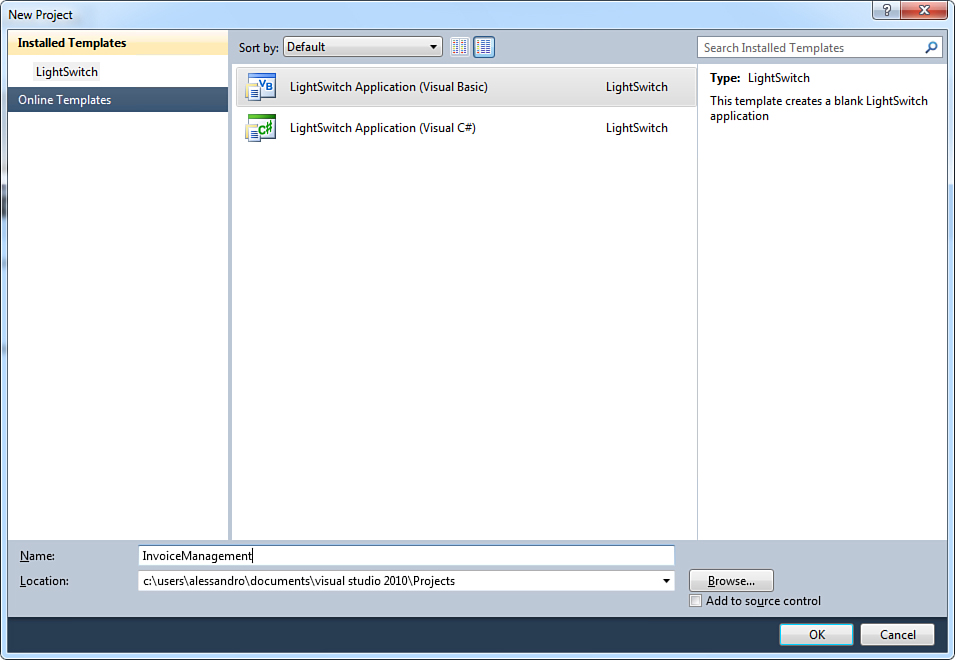
Figure 4.1. Creating the new project.
When the LightSwitch designer appears, select Create New Table. In reality, we need to design our data source from scratch. Now it is time to design tables.
When you use the Table Designer, you design an entity, and then LightSwitch creates a table for that entity. An entity is actually an instance of the object that contains the data at runtime, which maps one-to-one to a table in LightSwitch. For this reason, in this book these terms are used interchangeably.
Designing Complex Data Sources
Based on the application description in the previous section, we need five entities: Customer, OrderHeader, OrderDetail, Product, and Invoice.
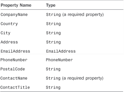
The first entity that you design is Customer. Table 4.1 summarizes properties and their types (except for the read-only Id property, which is provided by default).
Table 4.1. The Customer Entity Definition
Remember that the order in which you add properties to the entity is the order in which they appear by default on screens you create.
At the end of your work, the new entity looks like Figure 4.2.
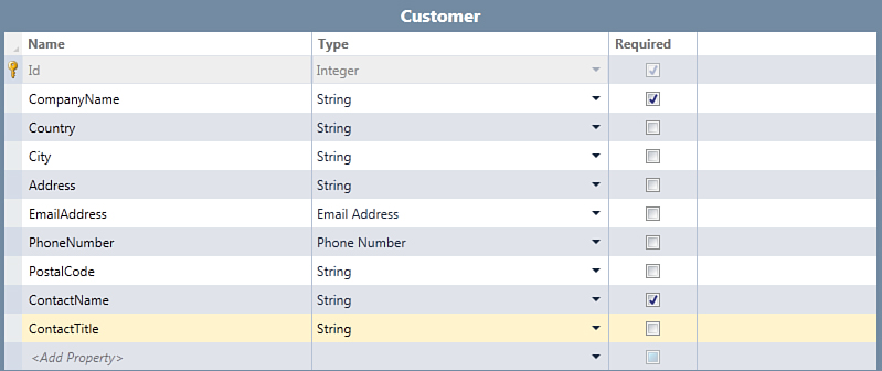
Figure 4.2. The Customer entity as it appears in the Entity Designer.
As you would expect, LightSwitch also generates a Customers table, which is visible in Solution Explorer inside the Data SourcesApplicationData subfolder. The next entity that you design is Order. Just click the New Table button in the Entity Designer, and a new empty entity will appear. Rename it OrderHeader and add the properties summarized in Table 4.2.
Table 4.2. The OrderHeader Entity Definition
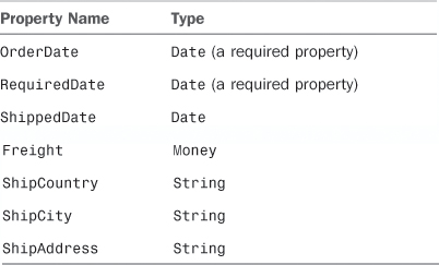
Notice that only the first two properties are marked as required; this is because your company might receive an order that has not been processed yet. Also notice that for the first time, you use the Money data type, which is one of the new business types (see Chapter 3). After you design the OrderHeader entity, it looks like Figure 4.3.
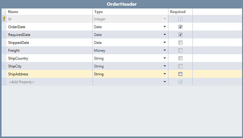
Figure 4.3. The new OrderHeader entity as it appears in the Entity Designer.
Visual Studio LightSwitch correctly generates an OrderHeaders table, as you can see in Solution Explorer. Next you need to define an entity named OrderDetail. Because an order can refer to multiple products, this entity stores order details such as unit price, product quantity, and discount. Table 4.3 describes the OrderDetail entity definition, and Figure 4.4 shows what the entity looks like in the designer.
Table 4.3. The OrderDetail Entity Definition
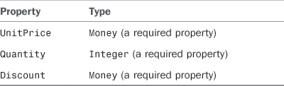
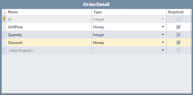
Figure 4.4. The OrderDetail entity definition.
Consider that the OrderDetail entity works strictly with the OrderHeader and the Product entities (the latter is defined in next subsection), but relationships within entities are explained in next section. For now, let’s finish designing entities and take a look at an interesting feature in LightSwitch: choice lists.
Entities That Define Choice Lists
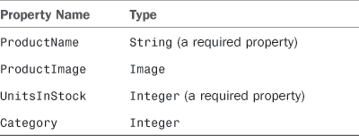
The next step is to design the Product entity. Again, repeat the steps described before to create a new entity and name this one Product. Then add the properties summarized in Table 4.4.
Table 4.4. The Product Entity Definition
At the end of your work, the entity looks like Figure 4.5.
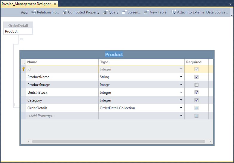
Figure 4.5. The new Product entity definition.
The entity definition has a peculiarity: the Category property of type Integer. Suppose you want to prompt the user with a list of categories; the product being entered (or edited) will be associated with the most appropriate category picked up from the list. In other data development environments, you generally accomplish this with lookup tables. In LightSwitch, you can still create lookup tables, but if you have a limited number of choices, you also have a more elegant alternative: choice lists.
A choice list is basically a static list of items made of two columns: value and display name. The value is necessary to identify the item, and the display name is descriptive text that is shown inside the user interface. If you are a developer with previous .NET experience, you can think of a choice list as a Dictionary(Of Integer, String) collection. Additionally, you can create choice lists on properties of type String other than Integer. In this case, the value is a string, not an integer value (if you enter a number it is converted into its string representation). This is useful if you have to represent columns that contain nonnumeric values. When you choose to define a choice list for a property of type String, the .NET Framework actually generates a Dictionary(Of String, String).
Use choice lists when you want to represent short, static lists of choices. Choice lists are not feasible with hundreds of choices, so if you have more than 20 choices (for instance), you should use a lookup table. Of course, the goal of this book is to explain all the available features in LightSwitch, so the current example is conceptually appropriate to explain choice lists. If you have hundreds or thousands of product categories, however, you might want to use a specific table.
To create a choice list, follow these steps:
1. In the Entity Designer, select the property you want to create a choice list for (Category in the current example).
2. Open the Properties window and, in the General group, click the Choice List shortcut.
3. In the Choice List dialog, add the value/display name pairs that describe your list. Figure 4.6 shows how to build a choice list for the Category property.
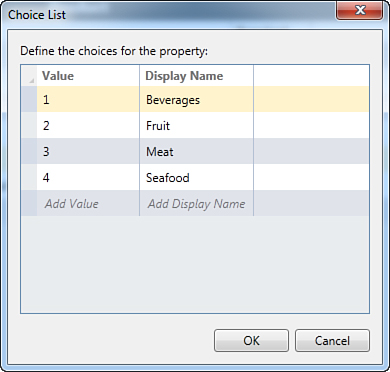
Figure 4.6. Defining a choice list for categories of products.
The Value column requires you to specify an alphanumeric identifier, and you are not required to strictly follow an incremental order.
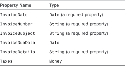
The Display Name column lists a series of food categories, each associated with the provided numeric value. After you are done, click OK to return to the Entity Designer. You will see how the choice list works inside the user interface later in this chapter. Now we can finish constructing the data structure for the application by designing the last entity for this chapter. So, create a new entity and name it Invoice. Then, add the properties summarized in Table 4.5.
Table 4.5. The Invoice Entity Definition
In the next subsection, you learn how to handle the currency symbol and other properties of the Money type. Finally, the entity looks like Figure 4.7.
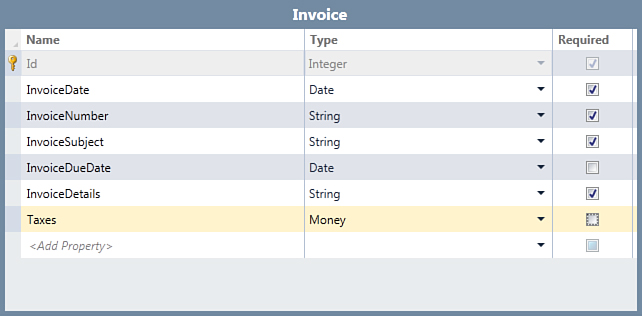
Figure 4.7. The new Invoice entity definition.
Working with the Money Data Type
Because this is the first time you are working with the Money data type, some explanations are required. This type is used to represent currencies and is based on the Decimal .NET type and includes the currency symbol and decimal digits. If you select any item of type Money in the Entity Designer and then open the Properties window, in the Appearance group, you can find some important properties: Currency Code, Decimal Places, and Symbol Mode, as shown in Figure 4.8.
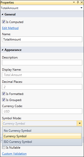
Figure 4.8. Specific properties for the Money data type.
The Currency Code property enables you to specify the currency symbol based on the international currency code. This information is made of three uppercase letters representing a code. For example, the default USD value means that the currency used by the application is the U.S. dollar. If you live in Europe, the appropriate currency code for most Countries is instead EUR (euro). If your application is going to be used by Canadian users, the appropriate code is CAD (Canadian dollar).
You can find the full list of available currency codes at www.nationsonline.org/oneworld/currencies.htm.
Specifying the appropriate currency code is important because this affects how the monetary information is displayed. For example, the USD code tells LightSwitch to use the $ currency symbol, as in this example:
$ 1,000,000.00
In contrast, the EUR code tells LightSwitch to use the $ currency symbol, as in this example:
€ 1.000.000,00
Therefore, after you have determined the appropriate currency code, specify it as the Currency Symbol property value. You can eventually replace what the currency symbol displays as by changing the Symbol Mode property. You have the following three options:
• Currency Symbol (default): This shows the currency symbol for the selected culture, such as $ or €.
• ISO Currency Symbol: This shows the actual currency code, such as USD or EUR.
• No Symbol: This shows the numeric value without any currency symbol.
Next, the Decimal Digits property specifies how many digits follow the decimal separator (which is 2 by default). Now that we have examined the Money data type, we need to consider one more thing: So far, you have defined four entities, each representing a particular moment in the business life of your company. But at this point, they cannot communicate with one another because there is no connection among them. So, you have to define relationships, which are explained in next section.
Adding Relationships
This section assumes your familiarity with basic concepts in the theory of relational databases, especially with regard to Microsoft SQL Server. If you are an absolute beginner with SQL Server, bookmark the MSDN Library Getting Started Guide: http://msdn.microsoft.com/en-us/library/ms130214.aspx.
Relationships are the way you define connections between sets of data so that the system can maintain data integrity. For instance, Customers have many OrderHeaders. When you define the relationship, you can specify that no Customer can be deleted in the system if an OrderHeader exists. Relationships are very important; they maintain the completeness of your data and safeguard against missing and inconsistent data.
Relationships can be of several types:
• One-to-many: This is the most common type of relationship in business scenarios. You have one instance of an entity (for example, Customer), which can have many instances of another entity (such as OrderHeaders). Basically, each entity of the “many” part must be related to an entity of the “one” part.
• Zero or one-to-many: This is like one-to-many, but it differs in that each entity of the “many” part can be related to an entity of the “one” part (for example, one Customer can have many OrderHeader instances and one OrderHeader can have one Customer).
• Zero or one-to-one: You have one instance of an entity that can have an instance of one other entity (for example, one OrderHeader must have a Customer, and one Customer can have one OrderHeader).
One-to-One and Many-to-Many Relationships
Notice that in this first version of Visual Studio LightSwitch, one-to-one and many-to-many relationships are not supported. Only zero or one-to-many, one-to-many and zero, or one-to one relationships are currently supported. You can eventually achieve a many-to-many mapping by using a linking table. Andy Kung, from the LightSwitch team, has a blog post explaining how to accomplish this: http://bit.ly/fGyF12.
Business applications heavily use one-to-many relationships. When talking about the user interface, they are also referred to as master-details relationships because one entity (the master) is related to many instances of another entity storing the details of the master part. In this section, you learn how to add both one-to-many and one-to-one relationships. Let’s start by adding the easiest one-to-many relationship possible, which is between the Customer and OrderHeader entities. In Solution Explorer, double-click the OrderHeaders table so that the Entity Designer displays presenting the OrderHeader entity. In the designer’s toolbar, click the Relationship button. At this point, the Add New Relationship dialog appears, as shown in Figure 4.9.
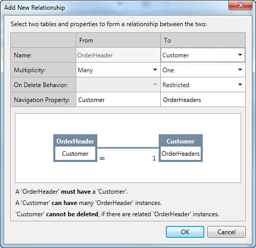
Figure 4.9. The Add New Relationship dialog enables you to specify relationships between entities.
The dialog is organized in columns and rows. The From and To columns specify the relationship direction and simplify the visual understanding of items involved in the relationship. The Name row basically indicates the name of the entities involved in the relationship. Notice that the table name in the From column cannot be changed, whereas you specify the name of the second table involved inside the To column. The Multiplicity row allows specifying the relationship type, in both the From and To columns. In this case, the One multiplicity is for the Customer table and the Many multiplicity is for the OrderHeader table (see Figure 4.9 for a visual representation).
In the On Delete Behavior row, you can specify what you want to have happen when you try to delete a row in a table.
You have two available choices: Restricted and Cascade Delete. When set to Restricted, the “one” entity cannot be deleted until there are one or more instances of the entity in the “many” part; in this particular situation, this means that a Customer instance cannot be deleted if any OrderHeader instances exist. When set to Cascade Delete, when the “one” is deleted all the related instances of the entity in the “many” part are also deleted. In this particular example, this means that if a Customer is deleted, so are all the related OrderHeader instances. In addition, this means that you need to be very careful when using the Cascade Delete behavior. In the current scenario, leave the default setting unchanged. The Navigation Property row allows you to specify the name for the entity reference LightSwitch will use to handle the relationship. Typically, you want to leave this setting unchanged. Now click OK to finalize the relationship addition. At this point, Visual Studio LightSwitch shows the existence of a relationship between entities by adding a small box reporting the name of the related entity, as shown in Figure 4.10.
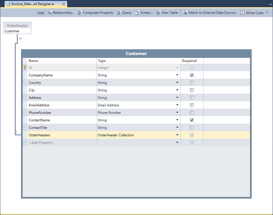
Figure 4.10. The relationship is displayed in the Entity Designer.
In the Table Designer also notice that LightSwitch adds a property named OrderHeaders, of type OrderHeader Collection. This property keeps the relationship alive and allows loading all the orders that are related to a single customer, and the reference between the customer and the collection of orders is handled by the OrderHeaders_Customer navigation property defined in the Add New Relationship dialog. As you see later in this chapter, screens with master-details support use both the navigation property and the data collection to display items related to a specific entity. Collection properties cannot be modified within the Entity Designer because they are basically just a reference. However, if you take a look at the OrderHeader entity definition, you can see how LightSwitch adds a new Customer property of type Customer, which represents the single customer that the current order is related to. Now repeat the same steps to add a new one-to-many relationship between the Customer entity and the Invoice entity. At the end, ensure that a new entity property is added to the Customer entity, named Invoices of type Invoice Collection. Behind the scenes, Visual Studio LightSwitch handles the relationship and loads data for related entities.
Now it is time to add new relationships for other entities. For example, open the OrderHeader table inside the Table Designer. Orders are the way other companies buy our company’s products, but each order of products has details mapped by the OrderDetail entity. So, there is the need of a relationship between the OrderHeader and the OrderDetails entities. Click Relationship again in the Table Designer’s toolbar and specify the One multiplicity of the OrderHeader table and the Many multiplicity for the OrderDetail table, as shown in Figure 4.11.
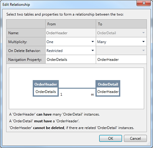
Figure 4.11. Setting another one-to-many relationship.
When you click OK, the new relationship is added, and a Product property of type Product is added to the OrderDetail entity, as you can see in the Table Designer. Another kind of relationship also needs to be added. Usually, for each order, your company will create an invoice; however, the invoice is not actually created until the order is in process. So, this is the case for a zero or one-to-one relationship, between the Invoice and the OrderHeader entity. Open the Invoice entity and, in the Table Designer, click the Relationship button. Set the Zero or One multiplicity for the Invoice entity and the One multiplicity for the OrderHeader entity in the Add New Relationship dialog, as shown in Figure 4.12.
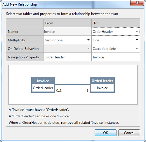
Figure 4.12. Setting a zero or one-to-one relationship.
In this case, an OrderHeader property of type OrderHeader is added to the Invoice entity. After adding all the required relationships, it can be useful to have a visual representation of what the database definition looks like. This is easy in LightSwitch. For instance, double-click the OrderHeaders table in Solution Explorer. You will see how the Table Designer shows all the available relationships, except for the Product table (see Figure 4.13).
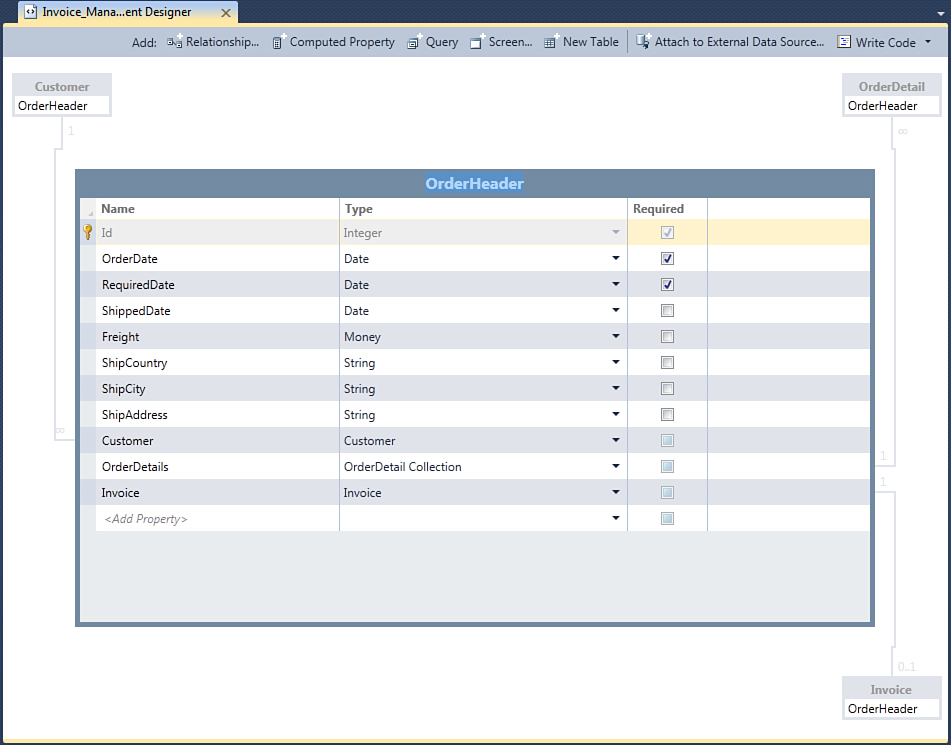
Figure 4.13. The Table Designer points out all relationships for the selected table.
Editing Existing Relationships
If you realize that a relationship defined previously needs to be changed, you can right-click the relationship inside the Entity Designer and then select Edit Relationship. Doing so opens the Edit Relationship dialog, which works like the Add New Relationship one.
Change the relationship settings, and then click OK. The important thing is that all references to data are updated to reflect changes. Now that defining entity relationships has been completed (and understanding how all available screen templates work), it is time to add the user interface.
For Experienced .NET Developers: How LightSwitch Handles Relationships
Microsoft SQL Server, the database engine used by Visual Studio LightSwitch, provides support for relationships the classic way: A primary key for a unique field on the first table matches a foreign key on the second table, by referencing a field with the same name on both tables. The benefit in LightSwitch is that the developer does not need to know about the underlying architecture, but it can be useful if one plans to create custom WCF RIA Services. Visual Studio LightSwitch works over SQL Server databases, but it models data based on the ADO.NET Entity Framework, so the way relationships are modeled in LightSwitch is quite different. Basically, you do not need to have a field with the same name in two tables you want to be related. This is because the Entity Framework creates an entity reference, which is actually a .NET property that handles the relationship between entities. Under the hood, the Entity Framework runtime generates primary keys and foreign keys in the intrinsic database for you. In addition, instead of having a field with the same name of one in the first table, in the second table it generates a specific foreign key. Actually, you never see all this stuff when working with LightSwitch because you just specify the relationships you want to add between entities and the IDE does the rest.
A nice way to investigate the structure of a database created by LightSwitch, including keys and relationships, is using SQL Server 2008 R2 Management Studio Express to generate a database diagram. To generate diagrams, the database must be attached to the local instance of the SQL Server engine. To determine whether a database is attached, launch SQL Server Management Studio and, when connected, expand the Databases node. If the database is not listed among the attached database, right-click the Databases node and select Attach. Specify the pathname for the database and wait until it gets attached to the SQL Server instance. After your database is attached, expand its name and then expand the Database Diagrams node. You should be prompted that the database is currently missing some required objects so your permission is required for generating them. Once such objects are generated, simply right-click the Database Diagrams node and click New Database Diagram. At this point, you are asked to select the tables you want to add to the diagram. When working with LightSwitch applications, you can exclude tables that are related to users’ security and management infrastructure (whose name begins with aspnet_). After a few seconds, you will see the new diagram inside Management Studio, as shown in Figure 4.14.
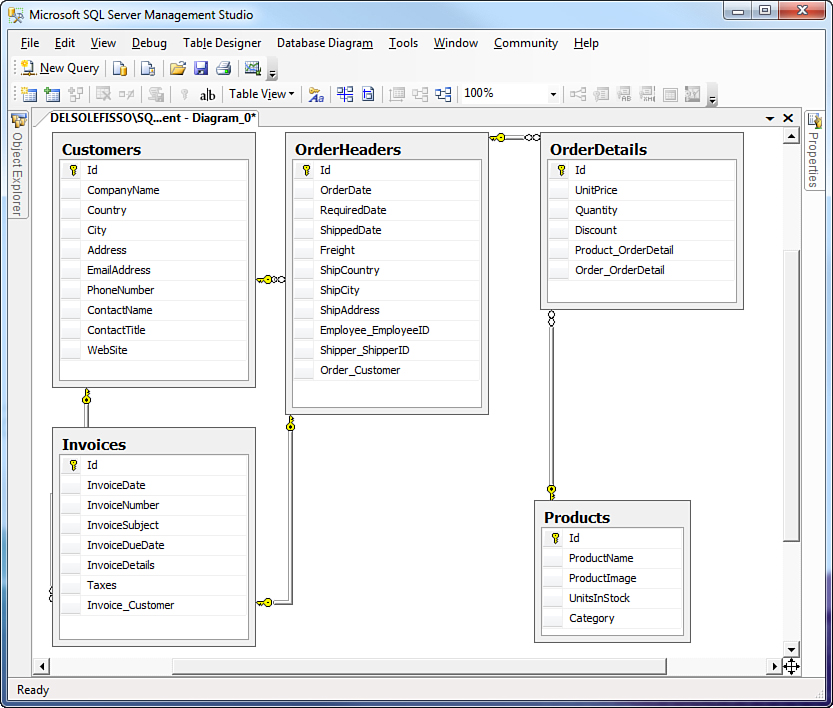
Figure 4.14. The sample application’s database diagram.
In this diagram, you can see how the tables are actually defined inside the SQL Server database that LightSwitch generated for the application. Notice how there are some differences between the LightSwitch approach and the pure SQL Server structure. In particular, pay attention to the following points:
• Relationships are represented with gray lines that join two tables. The yellow key symbol identifies the table exposing the primary key in the relationship, and the two-circles symbol represents the foreign key.
• Each table has a column whose name is based on the navigation property’s name defined for each relationship inside the LightSwitch Add New Relationship dialog. As an example, consider the Customer_OrderHeader column in the OrderHeaders table.
• The column described in the previous point is of type int. The database engine checks whether this column matches the Id column of the related table to understand if an item in the first table is related to the second table.
Generally, what you see in LightSwitch is different in the following ways:
• Database items are mapped to .NET objects. An entity is a .NET class that represents a single item in a table. Tables are represented by a collection of entities, and columns are mapped to .NET properties.
• Relationships are handled via navigation properties, which are nothing but .NET classes. This is different from matching the relationship between columns of type int as happens instead at the SQL Server level.
• The Table Designer does not show columns of SQL type int. For example, if you consider the OrderHeader entity, it does not show a Customer_OrderHeader property. Instead, it shows a Customer property of type Customer that represents the instance of the Customer entity that one order is related to. On the other side, the Customer entity shows the OrderHeaders property, which is a collection of OrderHeader entities.
These differences exist because Visual Studio LightSwitch uses the ADO.NET Entity Framework modeling mechanisms. Then the Entity Framework translates into SQL instructions that LightSwitch generates as .NET code.
Using Computed Properties
Sometimes you need to perform math calculations and store the result inside a field. For example, think of invoices. You have the invoice amount and taxes amount, and then you have the total amount, which is the sum of the invoice amount and taxes. In business applications, you could write some code that performs the calculation and stores the result inside an entity’s property. By the way, it is important only for displaying and printing purposes, not for handling data, so it would be nice if it could be calculated on the fly only when you actually need it and use it.
Fortunately, LightSwitch provides an interesting alternative, which is referred to as computed properties. A computed property is an entity property of the specified type that contains the result of a calculation and whose value is actually calculated only when required; this means that the value of a computed property is not stored inside the database; it is calculated on the fly, in memory.
To understand how computed properties work, consider the Invoice entity designed earlier. It would be interesting to add a computed property to calculate the invoice amount, without the taxes amount, based on the value of orders requested by the selected customer. Select the Invoices table in Solution Explorer, and then in the Table Designer, click the Computed Property button, which is located on the designer’s toolbar. This action adds a new property to the entity, named Property1, of type String. You can visually recognize computed properties because LightSwitch adds the symbol of a small calculator near the property name. Replace Property1 with Amount and change the data type from String to Money. Now, by pressing F4, open the Properties window for the newly added property and locate the General group at the top of the window, as shown in Figure 4.15.
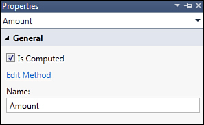
Figure 4.15. The General group for computed properties offers the Edit Method shortcut.
You immediately notice two things: the first is that (obviously) the Is Computed property is checked. The second thing you notice is the Edit Method shortcut. This allows writing the procedural code that performs the calculation and that assigns the result to the computed property. (Methods in the .NET terminology are both functions and procedures.) This also means that you are going to meet the LightSwitch code editor for the first time. In fact, there is no other way to perform math calculations than writing Visual Basic or Visual C# code. That said, click the Edit Method shortcut. Doing so opens the code editor shown in Figure 4.16.
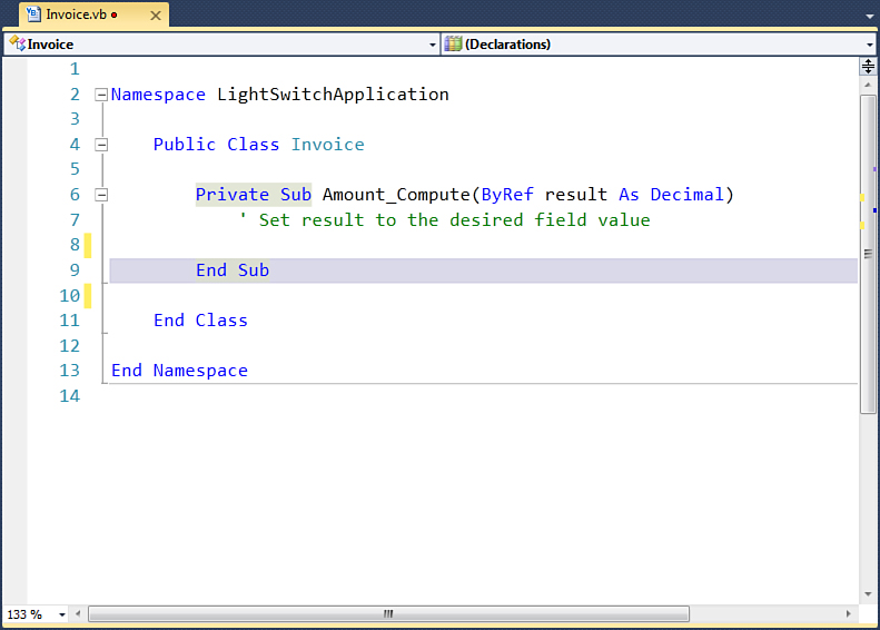
Figure 4.16. The code editor shows an empty function.
Because this is the first time you see and write code in LightSwitch, you need to pay attention to a few things:
• LightSwitch applications are 100% .NET applications organized in Visual Studio solutions, so there are some commonalities listed in the following points with typical tasks in Visual Studio.
• Each entity is represented by a .NET class—in this case, Invoice.
• Each class is defined inside a code file. In LightSwitch, code files are named exactly as in Visual Studio 2010 and they have .vb extension (if working with Visual Basic) or .cs extension (if working with C#).
• Each entity property is represented by a .NET property—in this case, Amount.
• There are a number of methods that, behind the scenes, process data when particular events occur. You can hook into most of these methods and write your own code.
• In LightSwitch, most methods do not return values; instead, they work on variables passed by reference. (Figure 4.8 shows the ByRef keyword.) Although this approach might seem strange, it is used through all the LightSwitch applications’ infrastructure and makes sense especially when you work with collections of validation results.
In addition, the Amount_Compute method definition should let you immediately understand that this works similarly to an event handler for an event named Compute exposed by the Amount property, which is raised when the Amount property needs to be loaded. Also notice that the method takes a parameter of type Decimal, although the entity property is of type Money. This is because business data types are a feature in LightSwitch but not in the .NET Framework. Thus, the managed code you manually write works with .NET data types that LightSwitch then maps to the appropriate business types when required (and Money is a LightSwitch evolution of the Decimal .NET type). As a general LightSwitch rule for computed properties, you return the result of a calculation by assigning such a result to the variable passed by reference as the method parameter. With regard to the current example, this is translated into the following code:
Private Sub Amount_Compute(ByRef result As Decimal)
' Set result to the desired field value
If Me.OrderHeader IsNot Nothing Then
Dim totalExpense As Decimal = 0
For Each det In Me.OrderHeader.OrderDetails
totalExpense += (det.UnitPrice * det.Quantity) - det.Discount
Next
result = totalExpense
Else
result = 0
End If
End Sub
So, the code first checks that the current instance of Invoice has a valid instance of OrderHeader attached (Me.OrderHeader IsNot Nothing). If this is true, the code iterates each order detail and returns the sum of all the unit prices per product, less the discount. The sum is returned to the caller by assigning its value to the result variable, which is handled by the LightSwitch framework. All this work avoids the need to manually enter the invoice amount. This code also demonstrates how simple it is to access related entities, which is accomplished by simply calling the name of the related entity on the current object (such as Me.OrderHeader.OrderDetails). Now you can add a new computed property to calculate the invoice total amount, summing Amount and Taxes. Repeat the steps described previously to create a computed property and rename the new one TotalAmount, of type Money. Click the Edit Method hyperlink in the Properties window for the newly created property and write the following code:
Private Sub TotalAmount_Compute(ByRef result As Decimal)
' Set result to the desired field value
If Me.Taxes IsNot Nothing Then
result = Me.Amount + Me.Taxes.Value
End If
End Sub
The code simply returns the sum of the Amount and Taxes property values by assigning the result of the sum to the result variable. Of course, you can perform more-complex calculations, and you are not limited to data of type Money/Decimal, but you can do it against different data types, such as Date or other types. Just as an example, you can have a computed property of type String, which could allow concatenation of strings.
After you have done your edits, save your changes and close the code editor window.
More-Complex, Business-Oriented User Interfaces
In Chapter 3, you created an easy user interface for a single-table data source. In this chapter, you are working on a more-complex application that has a data structure based on four tables with relationships. So, you now need to implement screens that can handle multiple tables and relationships. For example, other than data entry screens and search screens, you need to implement a screen that displays the list of invoices per customer, including invoice details. Basically, the process of adding elements to the user interface is no different from what you saw in Chapter 3, but Visual Studio LightSwitch offers templates for building data screens specific for handling master-details relationships, which is what you learn in this section. You begin by creating data entry screens and search screens, and then we examine the screen templates that LightSwitch offers to handle complex data sources and relationships.
Creating Data Entry Screens
Every business application needs data entry screens on which users enter new data. In the current example, the application exposes four entities that require four data entry screens. In Chapter 3, you learned how to add data entry screens in LightSwitch, so what you do here is nothing new. Let’s start by adding a new data entry screen for the Customer entity. To accomplish this, follow these steps:
1. Click the Screen button in the Entity Designer.
2. In the Add New Screen dialog, select the New Data Screen template.
3. From the Screen Data combo box, select the Customer entity and then click OK.
Repeat the same steps for the Order, Invoice, and Product entities to complete the data entry screen’s generation. With regard to the OrderHeader entity, ensure that the OrderHeader OrderDetails check box is checked. This allows adding order details when creating a new order instead of creating a specific data entry screen for the OrderDetails entity (which would not make much sense).
Chapter 3 describes in detail, and with figures, how you generate data entry screens. Go back and review if the previously mentioned steps do not sound familiar. In addition, when you create data entry screens for an entity that hold a relationship with another entity, the Add New Screen dialog asks if you want to add details from the related entity in the data entry screen. Because in this chapter, you learn how to handle master-details relationships via other screen templates, for the sake of the examples shown here, uncheck these types of check boxes. Of course, try them on your own time and see what you get.
Creating Search Screens
Generating search screens is another task you learned in Chapter 3 and that you reuse in the current application. Of course, you can customize your search screens with queries and filters, but this is described later in the book. For now, just consider the scenario in which you want to implement some basic search screens. Starting from the Customer entity, you perform the following steps:
1. In Solution Explorer, double-click the Customer entity, and then click the Screen button in the Entity Designer’s toolbar.
2. In the Add New Screen dialog, select the Search Data Screen template.
3. From the Screen Data combo box, select the Customers entity collection, and then click OK.
Repeat the same steps for the Product and Invoice entities so that you complete the generation of search screens.
It is a best practice to think about the flow of your application, including screens. The LightSwitch team has a blog post that explains how a developer should approach this topic. You can find it at http://bit.ly/lR6Uwq.
Running the Application and Entering Data
After generating data entry screens and search screens, run the application by pressing F5. Ensure that everything looks like Figure 4.17, and then enter some sample data by running the Create New Customer, Create New Invoice, Create New OrderHeader, and Create New Product screens.
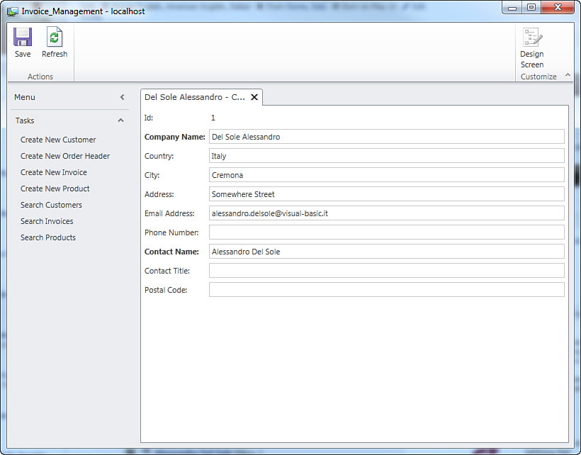
Figure 4.17. The application running.
Simply fill in the data forms with fictitious information: You just need some data to work with during the rest of the chapter. For example, Figure 4.18 shows an example for a new product.
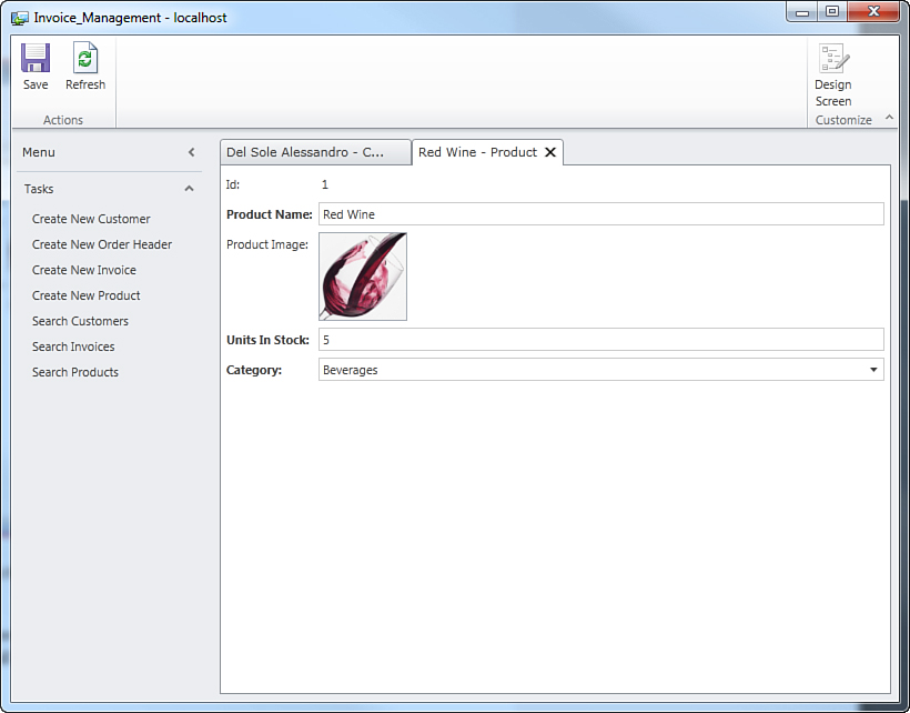
Figure 4.18. Entering a new sample product.
After you have added some customers, orders, invoices, and products, save your changes and ensure that all search screens work as expected (that is, as explained back in Chapter 3).
Multiple Users Saving Changes: Handling Optimistic Concurrency
Due to their nature, LightSwitch applications can slot perfectly into a multiuser environment, in which multiple clients connect to the same database simultaneously. In this scenario, it could happen that two or more users attempt to save changes to the same information (for example, to the same instance of an entity). In this case, there is a conflict that you, as the developer, are responsible for solving; so optimistic concurrency is how violations are caught. By default, LightSwitch uses optimistic concurrency, and when the server intercepts a concurrency violation, it returns an error to the client. In particular, it generates a screen for the user explaining what has been changed by another user.
Handling optimistic concurrency requires some more experience both as a developer and as a LightSwitch user other than writing some lines of code. Being a task more for experts, the discussion is detailed in Chapter 12, “Dissecting a LightSwitch Application.”
At this point, the application has all it needs to create and display items, but much more is still required because you need to handle master-details relationships. In the following sections, you learn about the specific screen templates that LightSwitch offers for this purpose.
In the following sections, you add to the project all available types of screens. Although you will not always be reminded to do so, to test the screen functionalities and work with sample data, you must run the application. By doing so, you can also compare the figures in this chapter with actual results you get from the application running on your machine.
Editing Data with Editable Grids
In Chapter 3, you saw how search screens can be used to edit data within cells by unchecking the Use Read-Only Controls check box in the Properties window. Instead of making changes to a search screen, Visual Studio LightSwitch offers a convenient alternative for editing tabular data via the Editable Grid screen template. Basically, this screen template works like a search screen with the read-only controls property disabled, so it displays a list of items that can be edited inside cells. Also, this screen template adds some functionality, such as buttons for adding, editing, deleting, and refreshing data. To understand how it works, suppose you want to have a screen for editing a list of your company’s products inside a data grid. In the Entity Designer, click the Screen button. When the Add New Screen dialog appears, select the Editable Grid Screen template, and then from the Screen Data combo box, select Products. Figure 4.19 shows what the dialog looks like.
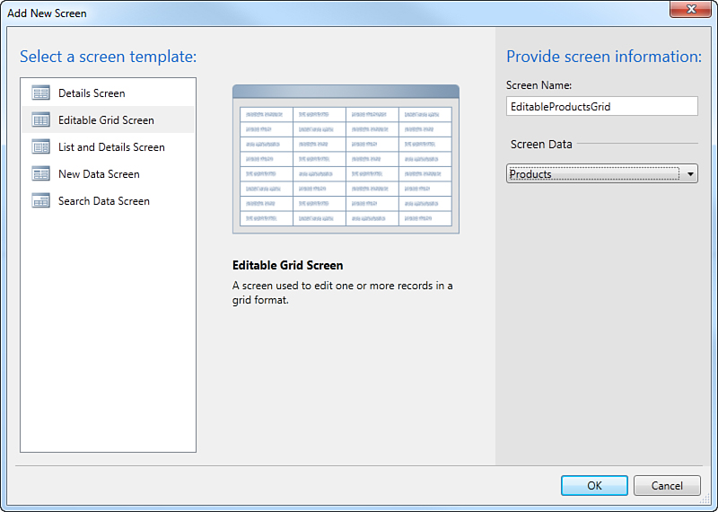
Figure 4.19. Adding a new screen template of type Editable Grid Screen.
When you click OK, inside the Screen Designer you can see how the crucial part of the new screen is made of a Data Grid control and of a command bar that includes some buttons: Add, Edit, Delete, which are self-explanatory. Although at this point, the application has not been completed yet, the best way to understand how the screen works is to see it in action. So, launch the application by pressing F5, disregarding all the things that must be improved in the user interface. In the Tasks panel on the left of the main window, click the Editable Product Grid shortcut. Doing so opens the editable screen added before, as shown in Figure 4.20, which displays a pair of sample products added for demonstration purposes.
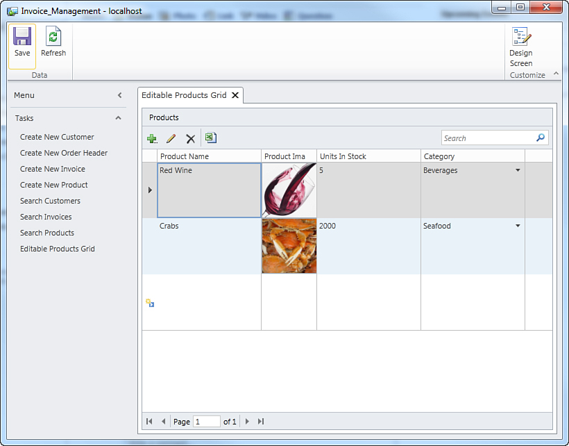
Figure 4.20. The new Editable Grid allows inline editing for each item.
As you can see, the Editable Grid template provides a search box and the Export to Excel button, exactly like search screens. In addition, data is displayed in a tabular representation and can be edited by simply clicking inside cells. In this screen, you also see for the first time how the user interface maps choice lists. In the Category column, you select the product’s category by expanding the combo box inside the cell and then select the desired category. As a general rule, Visual Studio LightSwitch presents choice lists by using combo boxes in the user interface. As for images, the Editable Grid template takes advantage of the Image Editor control that you used in Chapter 3. The most important difference between an editable grid and search screens with the read-only controls option disabled is that in the first template, there are a number of new buttons:
• Add, which allows you to enter a new instance of the entity via a useful pop-up dialog
• Edit, which allows you to edit an existing instance of the entity via a pop-up dialog instead of inline editing
• Delete, which allows you to delete the selected item (after asking for your confirmation first)
When you add or edit data via the Add and Edit buttons, the action is performed via a pop-up, which is shown in Figure 4.21.
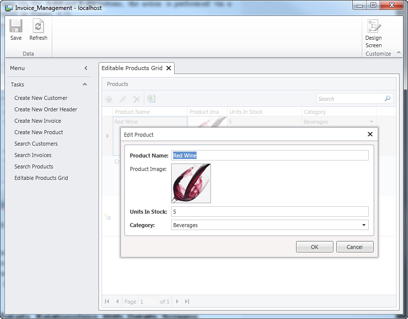
Figure 4.21. You can add or edit data via a simple pop-up.
So far, you have seen how to add, edit, and search items, but you have not yet learned how to visualize entities having relationships with others. Visual Studio LightSwitch offers specific screen templates to display master-details relationships in the user interface, as explained in the next section.
Handling Master-Details Relationships with Details Screens
In business applications, the user interface often needs to display the result of one-to-many relationships. When talking in terms of user interface, this is referred to as master-details relationships. Visual Studio LightSwitch offers a screen template that is dedicated to displaying master-details relationships in an easy way. Actually, any screen template allows you to include children, but this template is optimized for a List and Details layout. In fact, such a template is called List and Details Screen, and it enables you to display sophisticated relationships. In this section, you view this template from two perspectives: First, you add a screen to display a list of invoices and details for each invoice. Second, you add a screen to display a list of customers, plus the orders and order details for each customer.
In Solution Explorer, right-click the Screens node and select Add Screen. When the Add New Screen dialog appears, select the List and Details Screen template, and as the data source, select the Invoices collection, ensuring that the Invoice Details checkbox is checked; then click OK. At this point, the Screen Designer shows a more-complex layout, as shown in Figure 4.22.
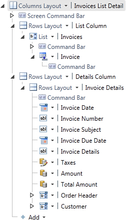
Figure 4.22. The List and Details screen as it appears in the designer.
Following are some important considerations related to the new screen generation:
• The screen is divided into two columns, and the root level includes the usual Screen Command Bar control.
• The first column (List Column) displays a summary of the available items (invoices, in this example) via a List control.
• The second column displays the details for the selected item in the list via controls that you are already familiar with. You can locate it through its name, which is Invoice Details. It is worth mentioning that the data-binding work for linking the selected invoice to its details is performed by LightSwitch for you. Also, you can access related entities (Customer and OrderHeader in the current example) via controls of type Auto Complete Box and Modal Window Picker who are responsible for selecting (or displaying to) the parent entity.
Controls for Computed Properties
Figure 4.22 shows that the TotalAmount computed property (which is of type Money) is displayed via a Money Viewer, because it is a read-only object. As a general rule, LightSwitch displays computed properties with read-only controls that are appropriate for a particular data type, such as Image Viewer for images, Email Address Viewer for email addresses, and Money Viewer for money. When the computed property is a date or text, LightSwitch uses, respectively, the Date Viewer and the Label controls.
If you previously entered some customers, orders, products, and a number of invoices, the Invoice List Detail screen should be similar to Figure 4.23.
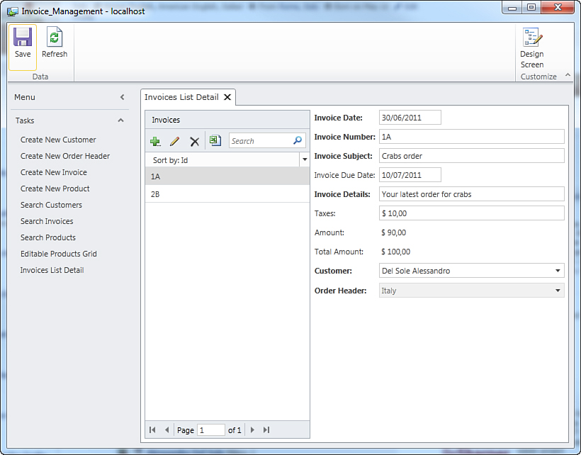
Figure 4.23. The first List and Details screen in action.
Use the Sort By drop-down box in the list to change the property that entities are arranged by. This is a user-specific feature available at the screen level, but if you as the developer want to force a sort order, you must implement a query.
Basically, a search subscreen on the left side of the screen displays the list of all available invoices. This piece of the user interface allows exporting the list to Excel; searching and filtering the list; and adding, editing, or removing items from the list. Adding and editing new items is performed via a pop-up window that is similar to the one shown in Figure 4.22 but that obviously provides specific data entry fields for the current entity (Invoice). After you select an item in the list, details for such an item are displayed on the right side of the screen. Here you can also edit the properties for the selected item and, once done, save your changes to the database. As with invoices, you might want to have a List/Details view for your customers list, which is a common scenario in business applications. If you do, repeat the steps described at the beginning of this section to create a new List and Details screen for the Customer entity, ensuring that only the Customer Details check box is checked in the Add New Screen dialog. As you can see from Figure 4.24, the new screen is organized the usual way, into two columns, where the first column stores the list of customers and the second column displays details for the selected customer on the list. Again, you can see how the screen uses editing controls (such as TextBox, Email Address Editor, and Phone Number Editor), meaning that you can edit customer’s details directly from within the details form.
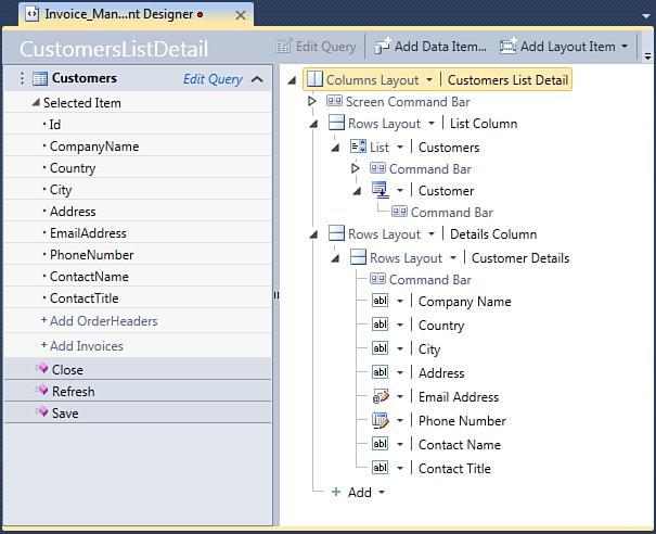
Figure 4.24. The Screen Designer displays the structure for the new Customers List Detail screen.
When running the application, the new screen simply displays the list of customers on the left and details for each customer on the right, as shown in Figure 4.25. You can again add, edit, or delete customers from the list or edit details for the current customer.
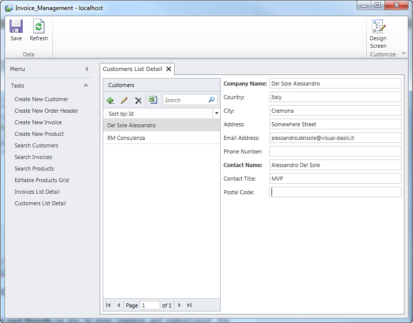
Figure 4.25. The Customers List Detail screen in action.
List and Details screens can also be more complex and sophisticated. For example, suppose you want the application to display the list of orders and, for each order, order details and products ordered. LightSwitch makes this easy. In Solution Explorer, right-click Screens and select Add New Screen. Next, in the Add New Screen Dialog, do the following:
1. Select the List and Details Screen template.
2. Select the OrderHeaders entity collection as the data source.
3. Ensure that both the OrderHeader Details and OrderHeader OrderDetails check boxes are checked, and then click OK.
Figure 4.26 shows how the new screen appears quite complex in the Screen Designer.
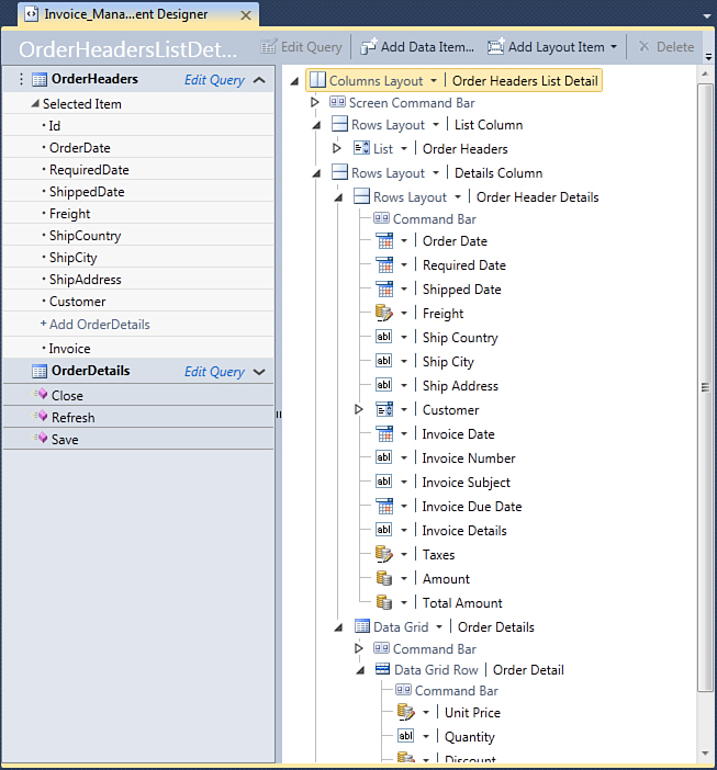
Figure 4.26. The Order Header List Detail screen’s composition.
At a higher level, the new screen is divided into two columns and consists of the following components:
• The Ribbon-like Screen Command Bar.
• A Columns Layout container, which is made of two columns.
• The left column, which contains the list of orders and can display a pop-up window for adding/editing orders directly from the list by clicking the button with a pencil symbol.
• The right column, which displays the order details at the top (including information from the associated invoice and an Auto Complete Box control, allowing the selection of the related Customer entity), and a Data Grid at the bottom that contains the list of order details related to the current order. Each Data Grid Row is made of controls that allow editing the list of products belonging to the order.
When the application is running, such a new screen enables you to display the list of orders and also edit order details and display/edit the list of products that are associated with the current order. Figure 4.27 shows what this screen looks like in action.
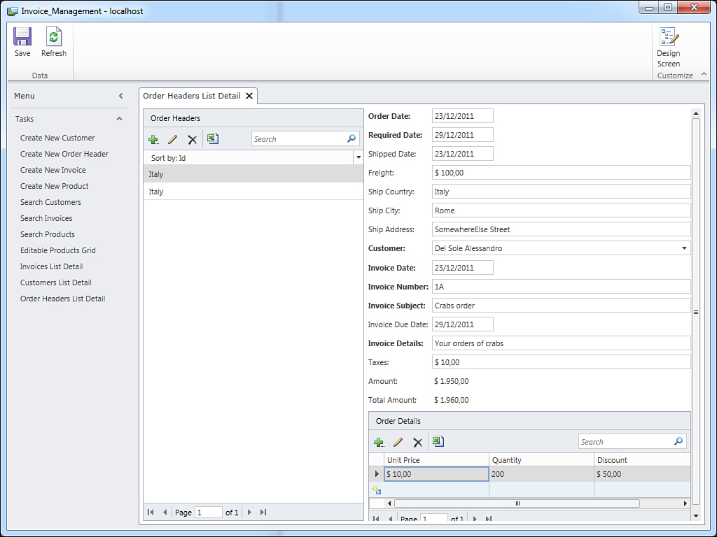
Figure 4.27. The new Order Header List Detail screen enables you to work with both the order and products.
This kind of screen gives the user a comprehensive view of items and their details and makes the user experience really straightforward. You can search, filter, add, and edit data and related details within one screen. You can also export to Microsoft Excel both the Orders collection and the Products collection.
Notice that when you export lists from the same screen to Excel, what you actually get is two instances of Excel with two different workbooks. This information can be useful if you expected one workbook with two sheets.
It is worth mentioning that with regard to the collection of OrderDetail entities, you can select a product when entering a new order detail by simply expanding the autocomplete box available in the Product field, which shows the list of available products, as shown in Figure 4.28.
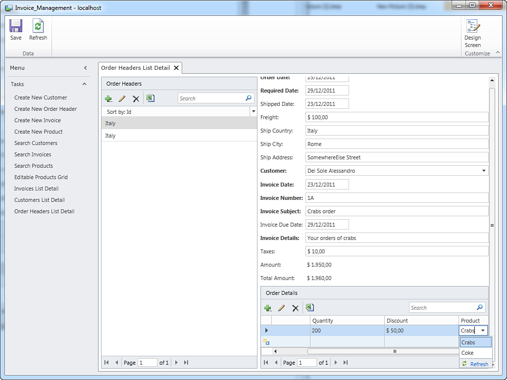
Figure 4.28. Selecting from a list of products is made easy.
This is a convenient way to select products with a simple click and no other effort for the user, and it is important to emphasize that this is offered by LightSwitch without users having to write a single line of code. You can also reach another level of complexity. Take a look at Figure 4.27. You can see how the screen displays the list of order details that are associated with a particular order. But how would you display two lists of entities that are associated with a master one? For example, suppose you want to show the list of customers, and then you want to see customer details plus orders and invoices for each customer. The List and Details Screen template enables you to display more than one associated entity collection thanks to panels.
In Solution Explorer, right-click Screens and then Add New Screen. In the Add New Screen dialog, select the same template. From the Screen Data combo box, select the Customers collection, and then ensure that both Customer OrderHeaders and Customer Invoices check boxes are checked. Finally, replace Screen Name with CustomerOrdersListDetail and click OK. For your convenience, Figure 4.29 summarizes these steps.
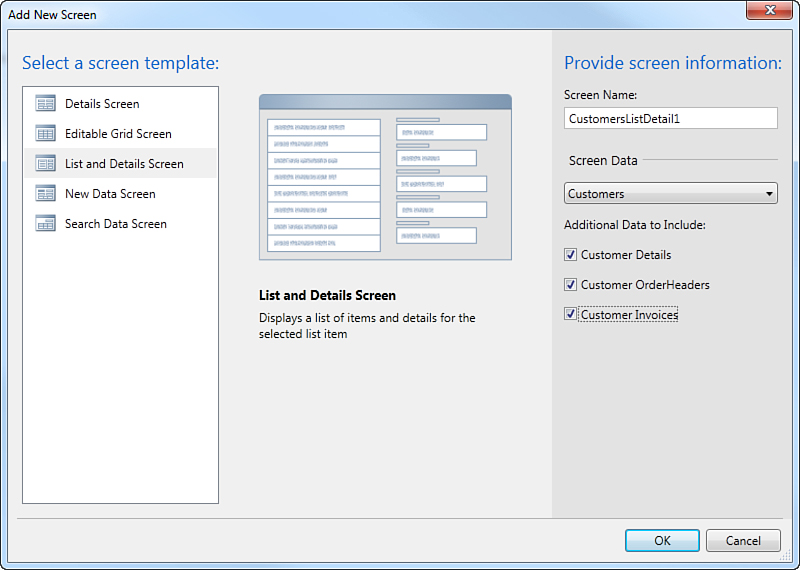
Figure 4.29. Generating a complex List and Details screen.
Now take a look at the Screen Designer. The new screen definition is similar to the previous screen’s definition, but it differs in that at the bottom, two collections of related items are available and organized inside a Tabs layout. Figure 4.30 shows what the designer looks like with the newly added screen.
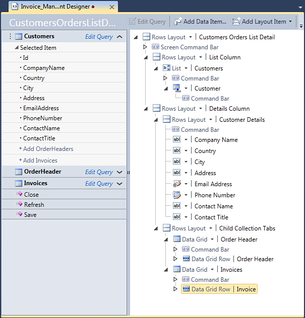
Figure 4.30. Via the Tabs panel at the bottom, multiple related collections are displayed.
The Tabs panel is named Child Collection Tabs. This name implies that such a panel includes a collection of related collections, as you can understand by expanding the Tabs panel’s definition, which shows two Data Grid controls, one named Orders and one named Invoices (whose role on the screen is self-explanatory). When you run this screen, you get the customers list on the left side, and on the right side you see the customer details at the top and both the Order and Invoice collections at the bottom, organized within tabs. Just switch between tabs to view the desired items. Figure 4.31 shows what the screen looks like.
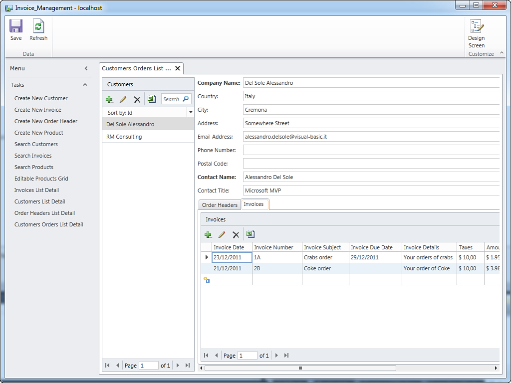
Figure 4.31. A complex List and Details screen showing multiple detail collections.
In summary, here is what you can do inside the screen:
• Display, search, filter, add, and edit items of type Customer
• Display details for items of type Customer
• Display, search, filter, add, and edit items of type Order that are associated with the current Customer instance
• Display, search, filter, add, and edit items of type Invoice that are associated with the current Customer instance
• Export lists to Microsoft Excel (available only for desktop clients)
List and Details screens provide a flexible and powerful way to display and edit multiple data sources coming from master-details relationships. You can give users one place where they can manipulate multiple data, thus providing them a full view of the items they are working on. If you do not want to offer this kind of complex representation, keep in mind two important considerations:
• LightSwitch offers the quickest and easiest way to build business applications. Therefore, you have to sacrifice, in some cases, a Windows-based or page-based user interface, as you would do in Windows client applications or in Silverlight applications. However, this does not mean sacrificing power and data-processing functionality.
• Fortunately, you can customize the user interface in a number of ways. As you learn in next sections, you can use details screens when necessary, and you can rearrange the panels within a user interface.
Creating and Invoking Details Lists
List and Details screens offer the quickest way to display entity details from a list of items, but this is not the only way. For example, you might want to build a screen that displays only the entity list and then pick up the details only when the user clicks a button. This might be useful to provide a simplified and cleaner data visualization. Visual Studio LightSwitch offers a screen template named Details Screen that groups entity details but that is not part of the user interface and therefore is not available on the Screen Navigation control. Instead, this kind of screen becomes available on demand (in other words, when an entity needs to be edited). For example, consider the SearchCustomer screen built at the beginning of this chapter. You know that it displays the list of customers and provides an Edit button (the one with the pencil symbol) for quickly accessing customer details. By default, this action shows a pop-up where you can provide customer details. For instance, suppose that you do not want to show a pop-up and that you want to show the customer details in a new tab instead. You can override this behavior in the following ways:
• Rewrite the default code for the Edit button.
• Add a new button to perform the custom action.
• Show one of the properties of the customer as a link, by using the Show as Link feature that you learned previously. This is already enabled on screens and is the easiest way.
In this section, you learn the first two ways (the third one does not involve customizations in code), but the explanation starts with adding a new button. This is done to familiarize you with some features in LightSwitch that are explained in detail in Chapter 7, “Customizing Applications with Buttons, COM Automation, and Extensions,” and because to override the default code, you need to learn concepts about the execution of button methods. So, the first step is to add a new Details Screen to the project. To do so, right-click Screens in Solution Explorer and select Add New Screen from the pop-up menu. When the Add New Screen dialog appears, select the Details Screen template, ensuring that Customer is the current data source and that both the Is Default Details Screen and the Customers Details check boxes are checked (see Figure 4.32).
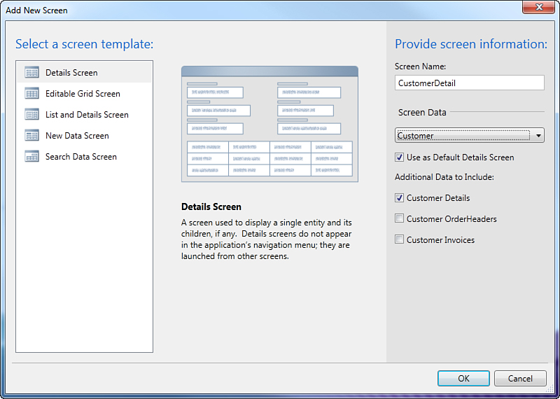
Figure 4.32. Creating a new details screen for the Customer entity.
By checking the Is Default Details Screen check box, you tell LightSwitch to use the new screen as the default details screen in each screen that uses a details view for the selected entity. This is important to know because you actually do not do any changes to the new screen. The details screen is normally opened when you click property links to navigate entity details, but the goal here is to explain a custom behavior.
Now open the Screen Designer for the SearchCustomers screen so that you can add a button that will launch the previously generated details screen.
To accomplish this, follow these steps:
1. Expand the Command Bar element, which is nested in the Data Grid control.
2. Click Add, and then click New Button from the drop-down list. You are asked to specify a method that performs an action when the new button is clicked (see Figure 4.33). So, in the Add Button dialog, select New Method and then specify ShowDetails as the method name. Then click OK.
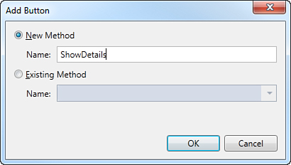
Figure 4.33. Specifying the name of the method for the new button.
Basically, you added a new button that, when clicked, launches the details screen for the current customer. The problem is that the button does not know yet how to launch the screen, so you need to write some code. Right-click the button and select Edit Execute Code. LightSwitch displays the code editor, where you need to handle the Execute method so that you can implement the action that must be executed when the button is clicked. The LightSwitch object model offers a class named Application that, among other features, exposes procedures for quickly launching screens. The name of each of these procedures starts with Show, followed by the name of the screen. Because you want to invoke the CustomerDetail screen, you call the ShowCustomerDetail method that receives as a parameter the Id of the current customer. Here is the code:
Private Sub ShowDetails_Execute()
' Write your code here.
Me.Application.
ShowCustomerDetail(Me.Customers.
SelectedItem.Id)
End Sub
Every entity collection exposes the SelectedItem property, which represents the currently selected item in the list and which is of the same type of the entity. Therefore, the Customers collection has a SelectedItem property, of type Customer. Because the target screen accepts only the entity identity number, not the instance, the code passes the customer Id to the CustomerDetail screen. To make things as complete as possible, there is also another event to handle, which is CanExecute. As its name implies, this event notifies the user interface whether the button can be executed and requires you to supply a Boolean condition that allows executing the button’s action when the condition is evaluated as True. In this case, a good idea is to allow the button execution only when a customer is actually selected in the list (technically speaking, when the selected customer is not null). You can either go back to the Screen Designer, right-click the button, and select Edit CanExecute Code, or you can write the following code directly in the code editor:
Private Sub ShowDetails_CanExecute(ByRef result As Boolean)
' Write your code here.
result = (Me.Customers.SelectedItem IsNot Nothing)
End Sub
The expression Me.CustomerCollection.SelectedItem IsNot Nothing evaluates to True if one customer is selected in the list, and the result is assigned to the result variable.
Execute, CanExecute, and the Model-View-Viewmodel Pattern
Behind the scenes, LightSwitch generates business applications that rely on the Model-View-ViewModel (MVVM) pattern. This is discussed later in Chapter 12, “Dissecting a LightSwitch Application.” If you have previous experience with the MVVM pattern in Silverlight or Windows Presentation Foundation (WPF), you will find the controls’ Execute and CanExecute methods familiar. It is beyond the scope of this book to discuss the MVVM pattern, but you can think of the two methods in this way: CanExecute establishes if a command associated with a control can be executed or not, by handling a Boolean value that returns True if the command can be executed. Execute represents instead the action that must be executed when the command associated with a control is invoked.
If you now run the application and show the SearchCustomer screen, you notice how the new Details button is available and that the company name is no longer displayed as a hyperlink, as shown in Figure 4.34. Just select a customer in the list and click the Details button. When you do so, the details screen you created before will display the customer’s details in a separate tab.
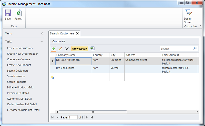
Figure 4.34. The SearchCustomer screen now shows a custom button.
The second way to change how a details screen is launched is to override the code of the built-in Edit button. Close the application if it is still running, and then in Visual Studio LightSwitch, open the Screen Designer for the SearchCustomer screen. Right-click the Edit button and select Override Code. At this point, the code editor is opened, displaying empty definitions for two methods: gridEditSelected_Execute and gridEditSelected_CanExecute, where gridEditSelected is the name of the built-in Edit button. The following code demonstrates how to show the Customer Details screen in a different tab, plus show a message box before the screen is launched:
Private Sub gridEditSelected_Execute()
' Write your code here.
ShowMessageBox("You are about to edit customer " +
Me.Customers.SelectedItem.CompanyName + " in a different tab.")
Me.Application.ShowCustomerDetail(Me.Customers.SelectedItem.Id)
End Sub
Private Sub gridEditSelected_CanExecute(ByRef _
result As Boolean)
result = (Me.Customers.SelectedItem IsNot Nothing)
EndSub
At this point, you can just run the application again and see how the details screen is launched via the custom code when the Edit button is clicked.
Of course, you can override the code for all the built-in buttons, not only Edit, although this is not usually necessary.
Details screens represent just one of the customizations to applications that LightSwitch offers.
Editing the Screen Navigation Control
So far, you have added a lot of screens to the current sample application. All of them appear in the Screen Navigation control, which is the piece of the user interface that enables users to navigate between screens and that appears on the left side of the main application window (or page, if you are running the application as a browser client). It consists of a main menu and a default Tasks panel that lists all the available screens. This default behavior is not always the most appropriate, and in some cases, it can be confusing. In fact, the best approach is to organize screens in multiple task panels; for example, you might want to group screens of the same type in one group, or just organize the screen navigation according to the data type you want to work with. For example, you might want to group all screens related to customers in one group, all screens related to orders in another group, and so on. Visual Studio LightSwitch enables you to organize the Screen Navigation control by adding task groups and associating screens with the new groups.
You set the screen navigation properties via the Screen Navigation tab in the Application Designer (which can be launched by double-clicking Properties in Solution Explorer). When opened, the screen shows the available task panels for the current application, which by default, are two: Tasks and Administration. Tasks is always available, but Administration is visible only when you enable authentication in your application (showing two screens, Roles and Users). This is why such a group is discussed in Chapter 9, “Implementing Authentication and Authorization,” and Chapter 10, “Deploying LightSwitch Applications.” If you focus your attention on the Tasks group, you can see how it groups all the screens you have defined so far, as shown in Figure 4.35.
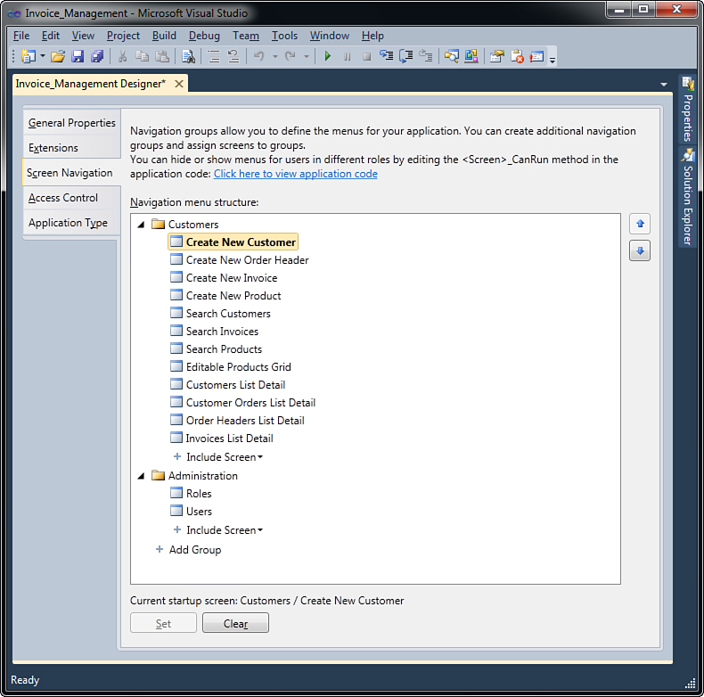
Figure 4.35. The Screen Navigation control in its original state.
The Tasks group is a general-purpose container facilitates easy navigation between screens. In a real-world business application, users should get a more organized navigation control. The Screen Navigation control enables you to add, rename, and remove groups, plus it enables you to place screens into the appropriate group and decide what screen will be the startup screen. Suppose you want to rearrange the screen navigation by grouping screens according to their destination, such as screens for customers, orders, products, and invoices. To accomplish this, follow these steps:
1. In the Navigation menu, right-click Tasks, and then click Rename in the pop-up menu. At this point, the name of the panel becomes editable, as you can see in Figure 4.36. Replace Tasks with Customers.
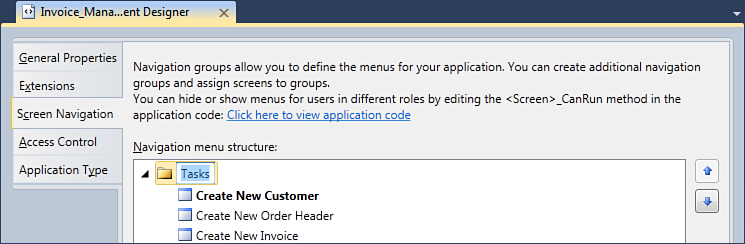
Figure 4.36. Renaming the default group.
2. Using Figure 4.35 as a reference, click the Add Group button, available at the bottom of the tree. You can then add a new group. You can immediately assign a name to the group, so name it Order Headers. As you can see in Figure 4.37, the designer offers a nested button called Include Screen.
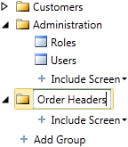
Figure 4.37. Adding a new group.
3. Click the Include Screen button and select the Create New Order Header screen so that it is added to the new group. Notice that adding a screen to a group does not remove the screen itself from another group. In this particular case, you can see in Figure 4.38 that the Create New Order Header screen is available in both the Customers and Order Headers groups. This makes sense because you might want to organize the screen navigation by grouping screens according to different criteria. If you want to group screens according to just one criterion, just right-click the screen in the desired group and then click Delete in the pop-up menu (or just press the Delete key).
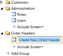
Figure 4.38. The Create New Order Header screen is actually visible in two groups.
In this particular example, right-click the Create New Order Header screen in the Customers group, and then click Remove in the pop-up menu.
4. Add to the Order Headers group all the screens related to the OrderHeader entity, such as Order Headers List Detail, and Customer Orders List Detail. Except for the last, remove all the other ones from the Customers group.
5. Repeat the previous steps to create the Invoices and Products group and to add screens to the appropriate groups. Figure 4.39 shows what the Navigation menu structure on your machine should look like.
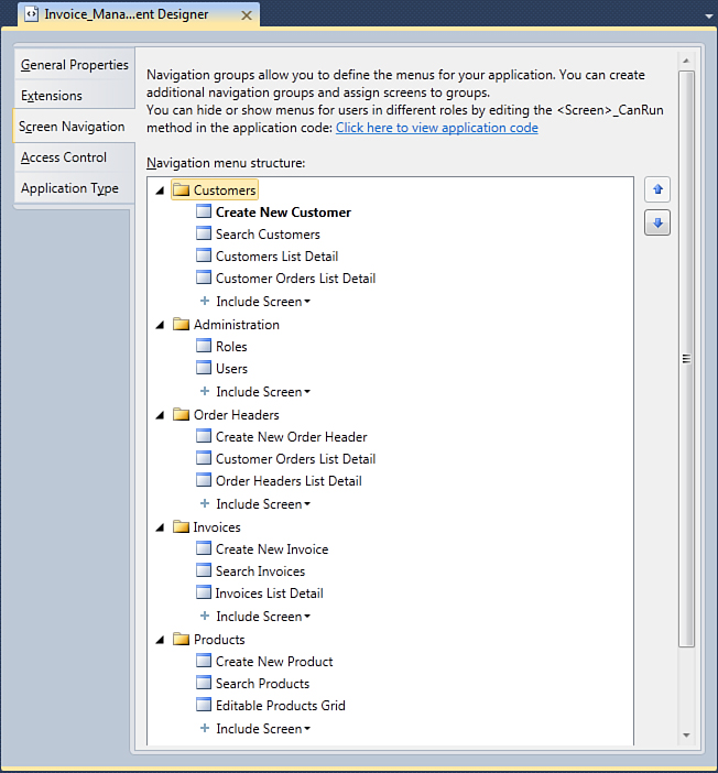
Figure 4.39. The screen navigation rearranged.
You can use the Up and Down arrows located on the right of the designer to change the position of both groups and screens in groups. This affects the order in which groups and items display in the user interface.
By default, Visual Studio LightSwitch sets the first screen you add to your project as the startup screen. You can change this behavior by selecting the screen you want to be the startup screen in the Navigation menu structure and then clicking the Set button at the bottom of the designer (see Figure 4.35). You can restore the default state by clicking the Clear button.
If you now run the application, you can see how the main menu is organized better: Screen navigation is arranged in multiple groups, each targeting a specific group of screens related to one entity, as shown in Figure 4.40.
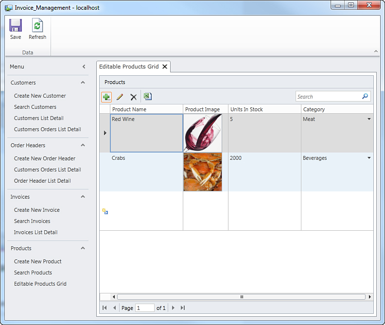
Figure 4.40. Reorganizing the Screen Navigation control results in a better impact user interface.
When you finish rearranging the screen navigation, the application development process is almost complete. The final step is customizing screens by examining control containers.
Customizing the Look and Feel of Screens
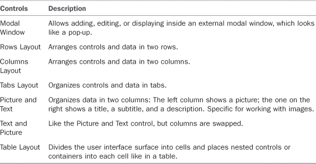
You have been told that controls within a screen are organized inside other controls acting like containers that arrange controls in the user interface, but so far you have seen only the default behavior. In this section, you learn about available layout controls and how you can customize the screen layout. Table 4.6 summarizes available layout controls.
To understand how groups work, let’s consider the CustomerOrdersListDetail screen, which is the most complex screen in the user interface. In the Screen Designer, click the drop-down on the root element, named Columns Layout, Customer Orders List Detail. Here Columns Layout is the main container that contains subgroups and controls. Replace the Columns Layout container with Rows Layout and run the application again. As you can see from Figure 4.41, the screen layout has changed, and now the Customers collection and the list details are arranged in two rows.
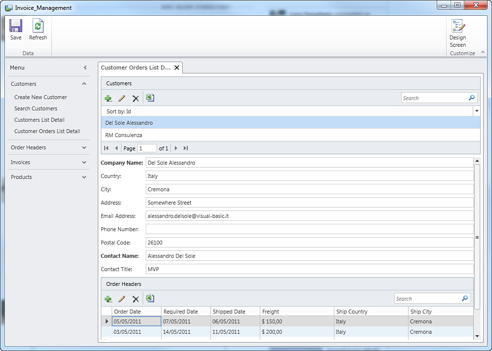
Figure 4.41. Changing the screen layout by using a Rows Layout container.
Other interesting customizations are available, and LightSwitch also offers another simple way to customize the screen layout in real time. This feature is called Customization Mode and is discussed in the next subsection.
Customization Mode
Breaking the application’s execution and going back to the Screen Designer each time you want to make a change to the appearance of the user interface can be annoying. Fortunately, LightSwitch offers a more convenient way for editing the appearance of the user interface in real time, meaning that this can be done while the application is still running and without the need of breaking the execution, and performing all the aforementioned steps. This feature is known as Customization Mode and can be easily enabled by clicking the Design Screen button that you can see in the upper-right corner of the root element in the user interface (see Figure 4.42).
Figure 4.42. The Design Screen button.
To understand how it works, consider the Customer Orders List Details screen. Suppose you want to rearrange the position of containers and controls in a different way, to see (without breaking the application’s execution) what the user interface could look like. Click Design Screen; at this point, the main screen of the application switches to the Customization Mode, displaying the list of containers and controls that currently make up the user interface (on the left side of the screen) and a preview of what the user interface looks like (to reflect changes in real time). Note that that this preview is interactive, so you can test it by using the controls as you would do in the normal screen. In addition, you can change control properties by using the Properties box at the bottom of the screen. Figure 4.43 shows what the Customization Mode looks like at this point.
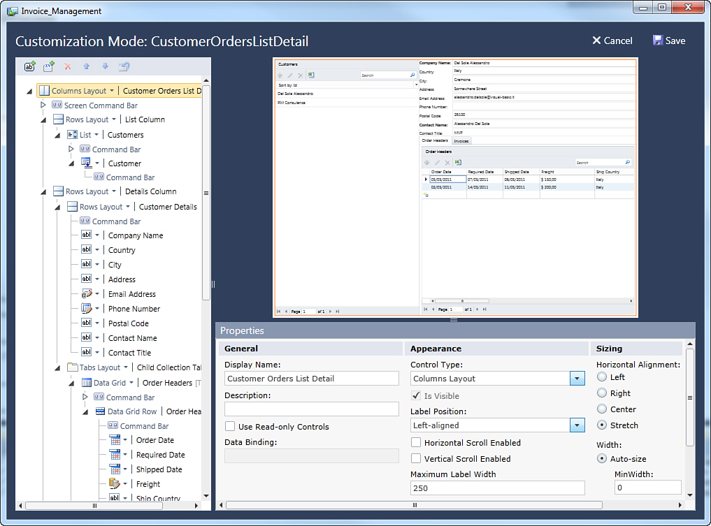
Figure 4.43. In Customization Mode, you can make real-time edits to the user interface.
Also notice that on the left side of the screen that a toolbar offers shortcuts to common tasks, such as adding new buttons and new groups of items and moving items up and down. Each shortcut gets enabled according to the element you select in the user interface tree. For example, suppose you want to test a different appearance for the user interface of the current screen. To do so, follow these steps:
1. Replace the current root-level container, Columns Layout, with Tabs Layout.
2. Look for the Tabs Layout, Child Collection Tabs element.
3. Replace the Tabs Layout container with a Rows Layout.
You can now see how changes to the screen layout show in the screen preview. You can see exactly what the screen will look like in the running application. In addition, you can test the screen behavior by clicking the various controls, which are fully interactive. Figure 4.44 shows how Customization Mode appears after the previous edits, and Figure 4.45 shows what the screen looks like after your edits.
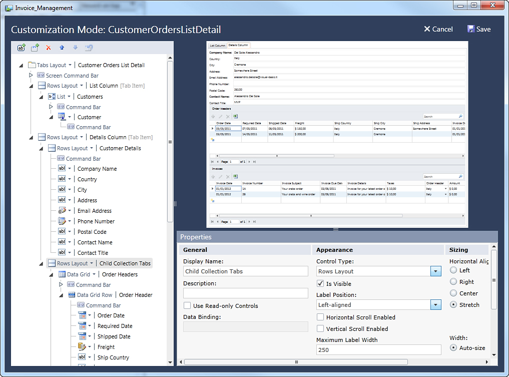
Figure 4.44. Changes to the user interface are shown in the preview and can be actively tested.
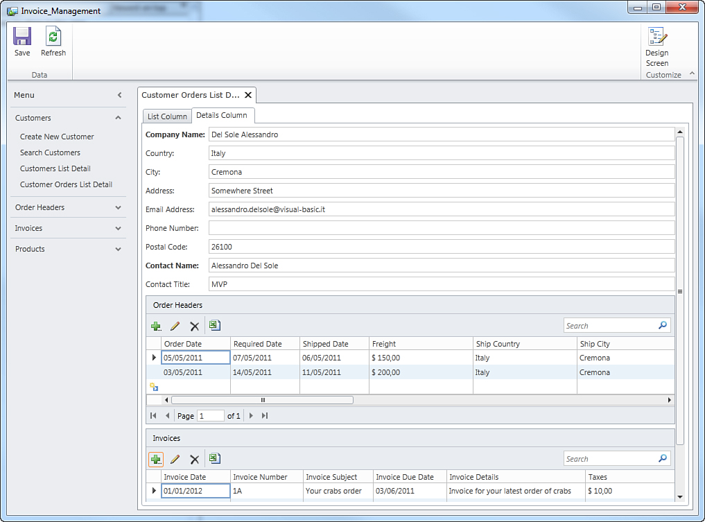
Figure 4.45. Changing the screen layout by using Tabs Layout and Rows Layout groups.
If you already know how to develop with Silverlight or WPF, you probably understand that the preview control in Customization Mode reproduces the actual screen by applying a ScaleTransform object. This is why the control is not just a simple preview but a fully functional UI element.
With particular regard to the Properties box, you can use it to make the following edits:
• Change the display name for both containers and controls (Display Name property)
• Set a description for both containers and controls (Description property)
• Choose a different control type by expanding the Control Type combo box
• Mark an element as visible or invisible (Is Visible check box)
• Set controls of type List and Data Grid to use read-only controls
• Prevent controls of type List and Data Grid from offering the Export to Excel button
• Change the size and stretch of controls (Sizing box), which proves particularly useful when you add custom controls to the user interface and you need to check their position on the screen.
When you are satisfied with your edits, click Save to save those changes to the current configuration. When you do so, the application’s current screen shows the modifications. If you decide not to save changes, just click Cancel and go back to the original screen composition.
Just to test another scenario, restore the root container to Columns Layout. Then locate the Tabs Layout, Child Collection Tabs and replace it with a Modal Window control.
What the modal window does is add a button on the screen, and once this button is clicked, a modal window pops up and shows the child collections, as shown in Figure 4.46.
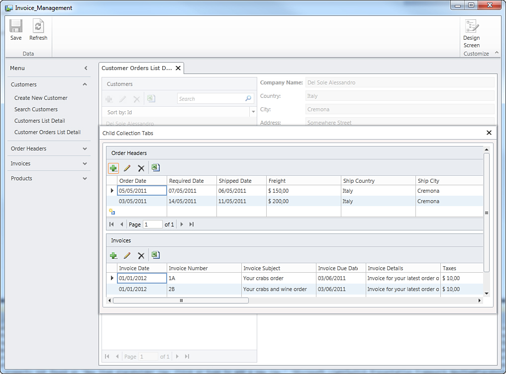
Figure 4.46. Rearranging screens with modal windows.
As listed in Table 4.6, there are also the Picture and Text and Text and Picture groups. You use them with entities that strictly adhere to the group requirements (picture, title, subtitle, and description) and thus arrange entity properties in an interesting fashion. The only difference between them is that in the first group, a picture is placed on the left, whereas in the second group, the picture is placed on the right. In the current application, the Product entity is a good candidate for this. The following example demonstrates how to arrange entity properties within a Picture and Text layout in the Search Products screen. To understand how it works, follow these steps:
1. Click Design Screen.
2. Locate the element called Data Grid, Products and click the drop-down. Then replace Data Grid with List. At this point, the Summary control is available under the List element.
3. Click the drop-down near Summary and select Picture and Text, as shown in Figure 4.47.
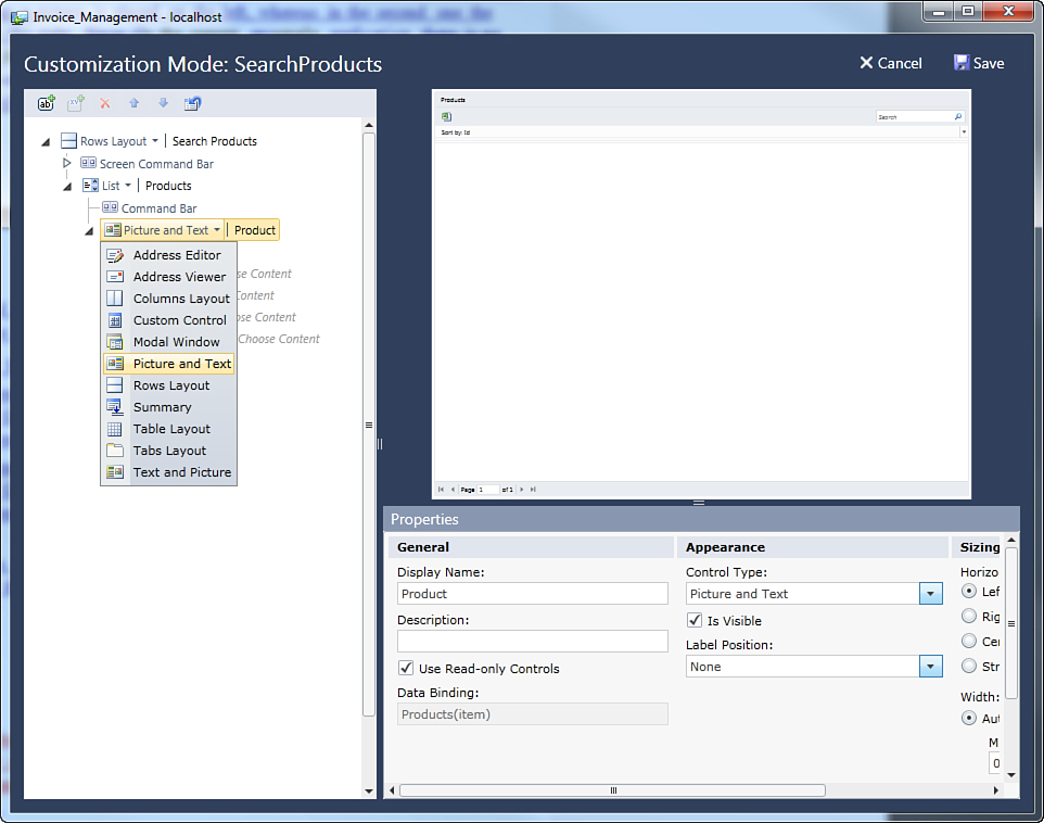
Figure 4.47. Selecting the Picture and Text layout element.
4. Map each element of the new layout to the appropriate entity properties (see Figure 4.48). Except for the picture, which has to be mapped to an entity property of type Image, you are free to map the other properties the way you like. In the current example, you could specify the product name as the Title, the units in stock as the Subtitle, and the category as the Description.
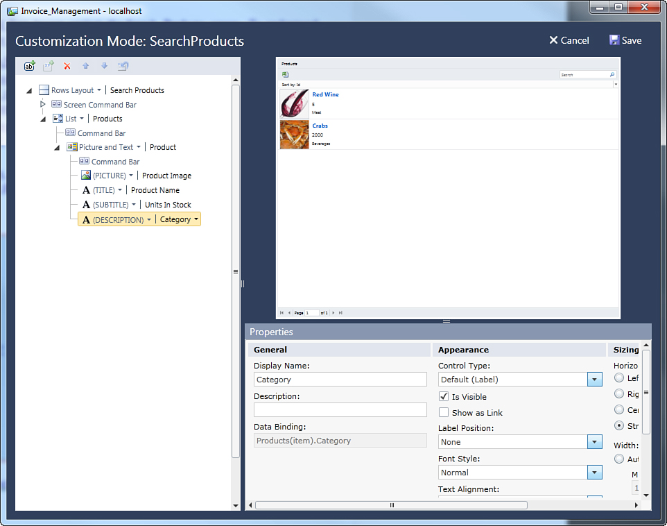
Figure 4.48. Mapping entity properties to the Picture and Text layout.
The preview shows the new look of this screen. This particular layout uses summary properties, so the default summary property can be used to access the item details. Figure 4.49 shows what the screen looks like after you save the changes.
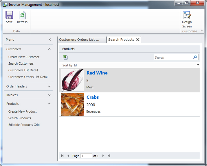
Figure 4.49. A search screen customized with the Picture and Text layout.
Customization Mode, available layouts, and the way LightSwitch allows screen customization make it straightforward to adapt screens to your business needs.
Customization Mode and Visual Studio 2010 Configurations
If you are running Visual Studio 2010 Professional or higher, you can choose either the Debug or Release configuration to compile applications (in contrast to what you do with Visual Studio LightSwitch). Remember that Customization Mode is a 100% debugging feature, so it will be available in your screens only if an application is launched under the debug configuration. Because Visual Studio LightSwitch does not offer the release configuration, Customization Mode is always available.
Showing Text Messages Inside Labels or Text Boxes
Sometimes, you might want to display simple text messages on your screens, such as advice, notices, warnings, general information, or welcome messages. By default, every Label or TextBox control on a screen is bound to data, so you cannot directly use such controls to show text. However, you can add a local property to your screen, add the property to the screen designer, and then populate its value in code with the desired text. Local properties are discussed later in this book; for now, focus on how you use them to show some text. Follow these steps to add a text message:
1. Open a screen in the Screen Designer and click Add Data Item.
2. In the Add Data Item dialog box, select Local Property and leave unchanged the default selection on the String type.
3. Deselect the Is Required check box.
4. In the Name field, specify a name for the new local property (for example, SampleMessage), and then click OK. At this point, the new property becomes available in the list of data items on the left of the designer.
5. Drag the local property onto the Screen Designer and release it after the Screen Command Bar (or in a different place). Notice that, by default, LightSwitch selects a TextBox control for local properties of type String. You can replace it with a Label control, which is more appropriate if you only need to display some text.
In this way, the newly added local property becomes part of the screen data and you can populate its value programmatically. To do so, you must write a couple of lines of code. You can easily assign a value to the local property by writing the Created method hook for the screen. To write this method, expand the Write Code drop-down list in the Screen Designer, and then select the ScreenName_Created method, where ScreenName is the name of your screen. For example, the following code shows how to populate the sample property in the CreateNewCustomer screen:
Private Sub CreateNewCustomer_Created()
Me.SampleMessage = "In this screen you can add a new customer"
End Sub
As you can see, with a simple line of code you can assign the text message to the local property that will appear on your screen when you run the application. You can also change the default font style for your text by selecting the Label (or TextBox) in your screen and changing the value of the Font Style property in the Properties window. For example, if you select the Warning style, your message will be displayed in red bold. If you select Strong, your message will be displayed in bold. Simply revert to Normal to show your message in the normal style. You can also hide or change the position of the local property name onscreen by changing the value of the Label Position property. It is worth mentioning that changing the style and label position of text properties is not limited to local properties you add manually, but can be applied to any data-bound label or text box on the screen.
Implementing Data Validation
Concepts covered in Chapter 3 are still important for another fundamental topic: data validation. All the data entities and screens described in this chapter still take advantage of built-in validation rules that LightSwitch implements for you. As for the current application example, screens take advantage of built-in validation rules for email addresses, strings, and phone numbers. It would be helpful to provide some kind of validation for other data types, such as Date and Money. For example, it is a good idea to ensure that the user does not enter an invoice date that does not fall within a specified time interval and that the user does not enter negative values for an invoice. Because validation is made on the entity definition, this automatically affects all screens in the user interface. Consider, for example, the Invoice entity. Select the InvoiceDate property, and in the Properties window, locate the Validation group, and then replace the Minimum Value content with 1/1/2010. By doing so, you prevent the user from entering invoices with dates prior to 1/1/2010. Repeat this step for the InvoiceDueDate property. Next, move to the Taxes property of type Money. By default, this accepts negative numbers, which is not good. So, replace the Minimum Value content with 0. Figure 4.50 shows validation errors for the Create New Invoice screen if you attempt to enter an invalid date and a negative amount.
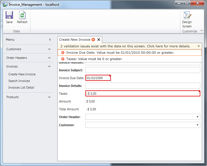
Figure 4.50. Data validation errors when the user enters invalid data.
Similarly, you can customize the OrderDate, RequiredDate, and ShippedDate properties of type Date in the Order entity definition and the Freight property of type Money by following the same rules described here. With regard of the Product entity, ensure that the UnitsInStock property, of type Integer, has the Minimum Value set as 0. The Customer entity does not need an additional validation rule because the built-in rules for data types are sufficient enough. Of course, a good validation infrastructure should take care of additional scenarios. For example, the Order entity definition should ensure that the ShippedDate is not before OrderDate. Such validation is beyond the scope of the built-in validation rules and is something that must be defined manually. For more information about writing and implementing custom data validation rules, see Chapter 5, “Customizing Data Validation.”
Validation on Master-Details Relationships
Previously in this chapter, you learned how to add and manage relationships with the Add New Relationship dialog. In particular, you saw how this dialog provides information about the behavior for the selected relationship, especially for the delete behavior. For example, consider the Customer - OrderHeaders relationship of type one-to-many. The default delete behavior is Restricted, which means that if the user attempts to delete an instance of the Customer entity (which has active orders), the delete operation is rejected. If you try to perform this action while the sample application is running, you get a validation error saying that the selected customer cannot be deleted because related records still exist (and are referencing it), as shown in Figure 4.51.
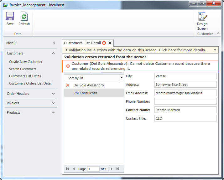
Figure 4.51. Validation errors for master-details relationships.
This validation issue is raised only when the user attempts to save changes. (In fact, this is a server-side validation, which is explained in the next chapter.) If you do not like this kind of behavior, you can replace the Restricted rule with Cascade in the Edit Relationship dialog. But be careful; this rule will not only delete the selected item but also all the related entities (continuing the customer example, the customer and all the related orders are deleted).
Summary
Real-world business applications with complex data sources require well-composed and detailed data forms. Visual Studio LightSwitch enables you to create complex entities, and it enables you to design relational data by adding relationships to entities. To provide the end user with the best user experience possible, LightSwitch offers a number of built-in screen templates that help you design master-details relationships; you can enable users to enter, search, filter, and edit related data (via, for example, editable grids and List and Details screens). Because the user interface consists of several screens, LightSwitch enables you to design the screen navigation by customizing the Screen Navigation control. You can also change screen layout by using different control containers known as panels, instead of just making a more readable user interface by setting display names. You can also leverage built-in data-validation features that you can extend to all data types you use. Beginning in the next chapter, you use many interesting features in Visual Studio LightSwitch that make the development experience incredibly productive.