7. Working Smarter
Chapter Overview
So far, you’ve learned how Illustrator’s tools work and how to use them to create a single mockup. This final chapter will explain how you can use Illustrator’s tools and techniques to work smarter as you begin to use it for larger projects. This chapter focuses on ways you can use Illustrator to create a fast and efficient workflow:
• Planning UI design
• Communicating your design intentions
• Creating a style library
• Getting your work out of Illustrator
UI Design Planning
UI design isn’t easy. There are a lot of steps to take when creating a system or application. It’s pretty difficult to just sit down and start designing a user interface without putting some thought into it first. Sure, as a creative person, you might sit down and test a few visual ideas as they pop into your head. There’s nothing wrong with taking advantage of a little inspiration. But to develop a successful design, you’ll want plan the design so that you understand the scope of what you need to create.
UI design is just one piece of a process for user experience design. There are many methods to planning the user experience of a project. That subject falls outside the scope of this book; in fact, there are shelves of books dedicated to the topic. However, Illustrator is extremely useful for this part of the process. From information architecture to interaction design to visual design, you can efficiently use one tool for the job so that you don’t have to start all over again as you move through the process.
While you can certainly utilize Illustrator’s comprehensive text-editing features for any upfront documentation, I focus on the visual deliverables of the planning process in this section.
Creating a Site Map
One of the beginning steps in the process of creating a good user experience is that of information architecture. The Information Architecture Institute (www.iainstitute.org) defines information architecture as “the art and science of organizing and labeling websites, intranets, online communities and software to support usability.” Basically, the task of the information architect is to provide a means of organizing content with the proper context so that the user can easily find the right information.
One of the tools you’ll use to do this is a site map. This is a diagram of the site structure used as a map of all the content on the site. While there are other tools dedicated to the task of building site maps, simple site maps can be created right inside Illustrator. In fact, you can include your site map in the same doc you use for the rest of the project, making it convenient to refer to while designing.
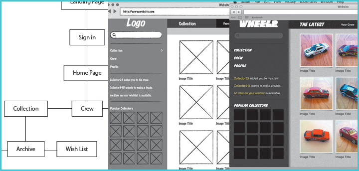
Before you create the site map, you should have a concrete plan for the content contained in the application. You’ll then organize that content into logical sections. You can use plain rectangles, ellipses, or other shapes to represent the pages in the app, or you can add a little style to the diagram (7.1). In this exercise, you’ll learn how to use graphic styles to speed up the creation of a simple site map.
7.1. A site map with style
1. Choose File > New ( N/Ctrl+N) to create a new document. Select the Web profile and choose the 1024x768 artboard size. Then click OK.
2. Choose View > Smart Guides (U/Ctrl+U) to turn on Smart Guides. If there is already a check mark next to the menu item (7.2), you can skip this step.
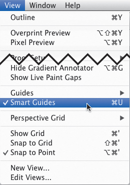
7.2. Smart Guides can be toggled in the View menu.
Using Smart Guides will help you to keep your site map elements lined up neatly and will aid in the creation of connector lines.
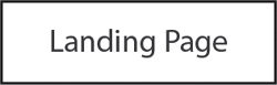
3. Select the Type tool  (T) and click once to create a point type object, and then type Landing Page on the artboard.
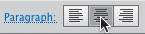
4. In the Control panel at the top of the screen, select the Align Center button (7.3) to change the text alignment.
7.3. The Align Center button
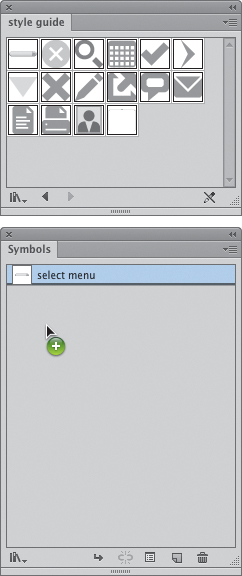
Creating a Dynamic Page Symbol
Now that you have the first page of the application represented with text, you’ll add a page symbol. A site map uses objects called symbols (not to be confused with an Illustrator symbol) to represent a page, group of pages, or bits of programming logic. What makes it dynamic is that the element itself will resize based on the text inside of it. You’ll save this element as a graphic style that can be used for the rest of the site map.
1. Click the text with the Selection tool  (V) to select it. Remove its fill by choosing the None swatch in the Swatches panel (7.4).
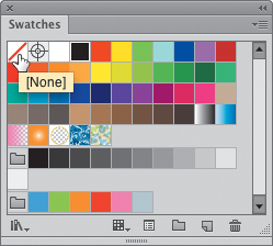
7.4. Clicking the None swatch will remove the fill from the text.
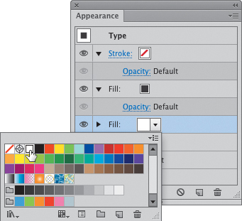
2. In the Appearance panel, click the Add New Fill button  at the bottom of the panel twice to add two new fills to the appearance stack.
The top fill in this stack will provide the color for the text, while the bottom one will be converted to a rectangle.
3. Click the bottom fill in the appearance stack (7.5) and choose Effect > Convert to Shape > Rectangle.
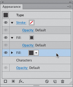
7.5. Select the bottom fill to convert it to a shape.
4. In the Shape Options dialog box, choose Relative for the size, and enter 18 px and 9 px in the Extra Width and Extra Height fields, respectively (7.6). Then click OK.
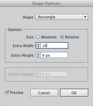
7.6. Choosing the Relative size option allows you to specify how much space to add around the text.
Choosing Relative will allow the rectangle to automatically resize to fit any text entered in the page icon. This is the key element of this exercise.
5. With the bottom fill still selected, change the color to white from the fill’s Color pop-up (7.7).
7.7. Change the bottom fill color to white.
6. Click the Stroke layer in the Appearance panel. Change the stroke to 1 px, and then choose Effect > Convert to Shape > Rectangle. Use the same settings as in step 4.
7. Choose New Graphic Style from the Graphic Style panel menu (Window > Graphic Styles) and name the new style Page.
You now have a dynamic page symbol (7.8) to use throughout the site map. It is dynamic in that the box will automatically resize to fit any text within it.
7.8. This page indicator will resize automatically as new text is entered.
You can change the stroke units to pixels in the Preferences dialog box. You can access this setting directly by using the keyboard shortcut ,(comma)/Ctrl+,(comma).
Organize Pages
Once you have the page indicator to represent a page in the application, you can fill out the rest of the map to match 7.9. All you need to do is type the name of each page of the site, apply the graphic style you created in the previous section, and then arrange each indicator to match the desired structure. Use the alignment tools (covered at the beginning of Chapter 4) to align and space them perfectly. When you have finished, use the Line Segment tool  () to draw connector lines to show the relationships between each page.
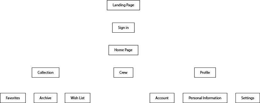
7.9. The site map before connector lines are added
1. Select the Line Segment tool ().
2. Hover your mouse near the bottom-center of the Landing Page icon. The Smart Guides will highlight when you have reached the center point of the box (7.10).
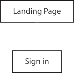
7.10. Smart Guides show the center of the nearest object.
3. Click and drag to create the segment. The Smart Guide will constrain the segment to the vertical axis and automatically snap to the next symbol (7.11).
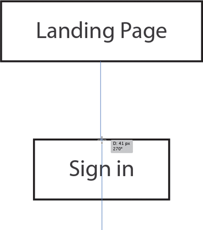
7.11. The Smart Guide constrains the new line segment and shows its distance and angle.
4. Repeat the steps to create all the connector lines (7.12).
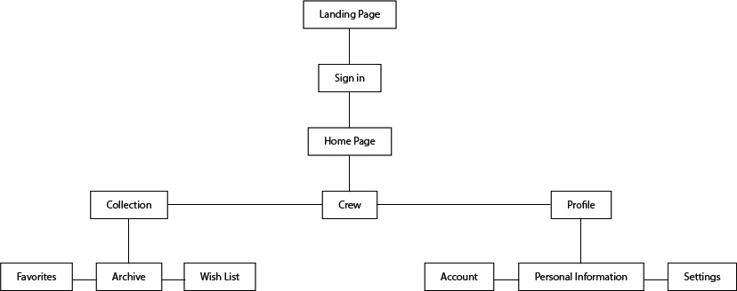
7.12. The finished site map
Creating a site map is as simple as that. As you edit the text within the page symbols, the box grows or shrinks to fit automatically. You can change the Page graphic style to edit the design at any time.
Creating Wireframes
Another step in the user experience design process is the creation of wireframes. Wireframing takes the information learned from content strategy, information architecture, user research, and functional analysis to begin the process of structuring a design. Wireframes are used to determine layout, feature placement, and design patterns, and are usually a rough representation of the final product. They are typically devoid of style so as to not distract from making sure that the structure and content are correct.
Several different wireframe styles are commonly used today. I have dubbed these the plain jane (7.13), gray box (7.14), and sketch styles (7.15).
7.13. The “Plain Jane” wireframe style
7.14. The “Gray Box” wireframe style
7.15. The “Sketch” wireframe style
While the styles themselves are fairly different, there are some conventions I like to follow when creating wireframe elements in Illustrator:
• Don’t worry about typography, but do worry about visual hierarchy. Use only one typeface while wireframing, but do use different sizes. In fact, the closer you can get to the sizes to be used in the final design, the less fiddling you’ll have to do when converting your wireframes to final artwork.
• Use photo indication, not actual photos. This keeps your file light and fast. The rough representation also keeps the focus on the content and structure of the page, rather than on the photography.
• Don’t worry too much about the pixel grid. You can always tighten up the layout once you get to the final mockup stage.
• Use graphic styles and symbols in your wireframes. This is helpful for two reasons. First, if you create symbols and graphic styles of your wireframe elements, you won’t have to recreate them every time you start a new project. Second, with symbols, you can use sublayers (layers within layers) to keep both the wireframe element and the final element in the same symbol.
Communicate Your Design Intentions
If you work with a team to create software, you’ll learn that communicating with your team about how your design works will make developing the application much smoother. As a designer, you probably have a lot of this information in your head. However, if you don’t communicate that information to your developers, there will be a lot of questions down the road. What follows are a few different methods for communicating your design intentions.
Visualizing Interactions with Storyboards
As you design a user interface, it’s important to think about how the user will interact with the features you are creating. It’s even more important to let your development team know how those interactions work as they develop those features. While sitting with your team and explaining your ideas to them in detail might work, it’s better to clearly communicate the ideas to them in a way that they can visualize what you need.
If you are adept at creating clickable prototypes, you can probably skip this section, because I feel that’s the best way to show how features and interactions are designed to work. But if that option is outside your skill set or job description, you’ll need a way to communicate your intent. Storyboards are a great way to show step-by-step how a feature is designed to work.
Creating low-fidelity storyboards at the beginning is a quick way to get your ideas out of your head to see whether they work the way you envision them. This method uses sketches in frames to represent each step of the interaction. You’ll use this method to sketch out how adding a car to your collection in Wheelr might work.
Since this is primarily a sketching exercise, why include it here? You can use Illustrator to create the template for your storyboards and then bring your sketches back into Illustrator for archiving. To complete this exercise, I created a storyboard template for you to use. To download this template, go to www.peachpit.com/UIwithAI/ch7/storyboard.ai.
As you open this file, you’ll see that it has storyboards for a browser, tablet, and smartphone, each on a separate layer. To use a certain storyboard, show its layer and hide the others. For this exercise, you’ll use the browser layer.
In case you jumped into the book at this point, Wheelr is an example web application that was mocked up in Chapters 4, 5, and 6.
1. Print the storyboard file and use as many panels as you need to sketch out the interaction (7.16).
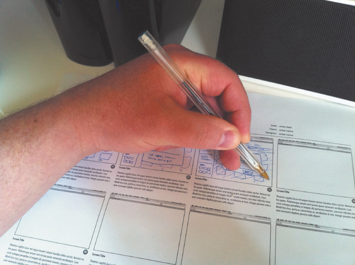
7.16. Sketch your storyboard ideas on the template.
2. There are many ways to get your sketches into Illustrator. One way is to use the camera on your phone to capture the sketches and send them to your desktop via email or a cloud service. You can also use a scanner to capture the images.
3. Using your preferred photo editor, crop each image to the size of the sketch, eliminating any of the printed matter.
4. Back in Illustrator, choose File > Place for each image and use the Scale tool  (S) or the Free Transform tool
  (E) to size and position each sketch within its respective panel (7.17).
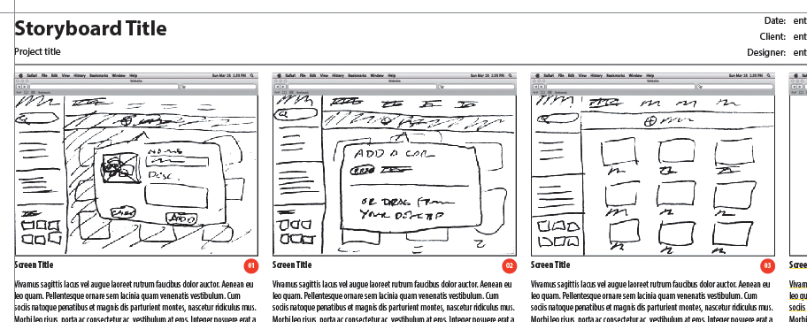
7.17. Scan, edit, and place your sketches in the digital storyboard for presentation and archival purposes.
5. Press  S/Ctrl+Shift+S to save your storyboard to a new file.
Once you have the interactions worked out, you can create the high-fidelity storyboards in Illustrator using wireframes.
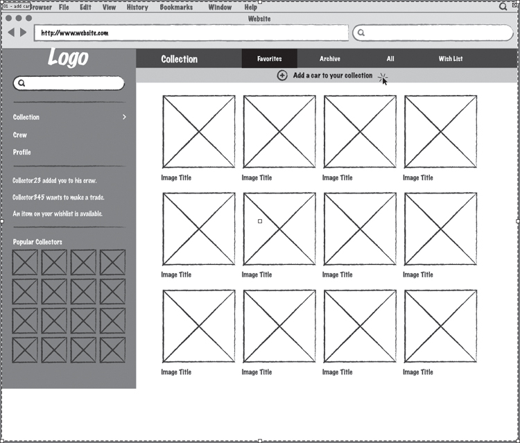
Set Up the Storyboard
To document how the interaction works, you’ll use multiple artboards, one for each state. To complete this exercise, download and open the wireframe file at www.peachpit.com/UIwithAI/ch7/add-car.ai. This file has the first artboard in the interaction sequence already completed. It also contains all the symbols and graphic styles necessary to build the sequence.
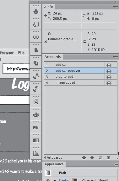
1. Using the Artboards panel, duplicate the current artboard by dragging it to the New Artboard icon  at the bottom of the panel (7.18).
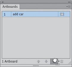
7.18. Drag the artboard to the New Artboard icon to duplicate it.
2. Double-click the artboard name in the panel and rename the artboard add car popover.
I used the font Marker Felt for the wireframe. If you don’t have this font, you’ll get a warning message when you open the file. Click Open to ignore this warning. You can use any informal-looking font from your font list instead.
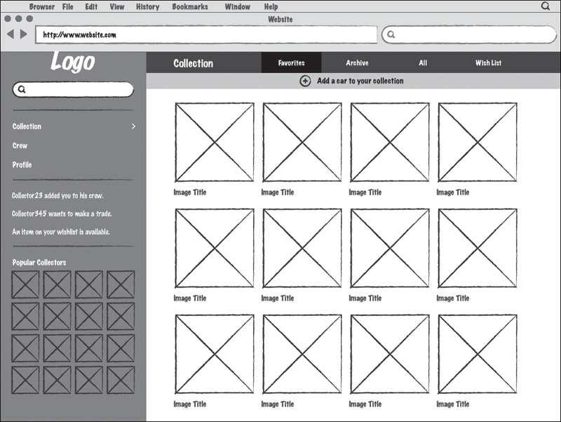
Create the Popover Interaction
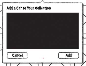
Now, you’ll create the first interaction state in this sequence, which is a popover for adding a new car image to the collection:
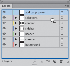
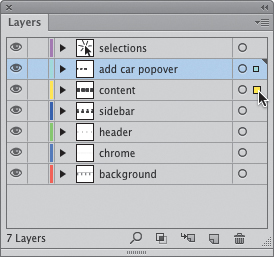
1. Create a new layer in the Layers panel (Window > Layers). Double-click the name and rename it add car popover.
2. Select the new layer you just created and drag it above the Content layer (7.19).
7.19. Drag layers to rearrange their stacking order.
3. From the Symbols panel (Window > Symbols), drag the popover symbol onto the artboard (7.20).
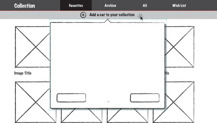
7.20. The popover symbol dragged into place
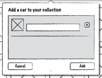
4. With the Type tool (T), click once in the popover and type Add a Car to Your Collection (7.21). Format the type to your liking and then press Escape to leave text-editing mode.
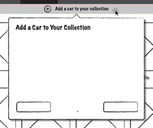
7.21. Adding a title to the popover
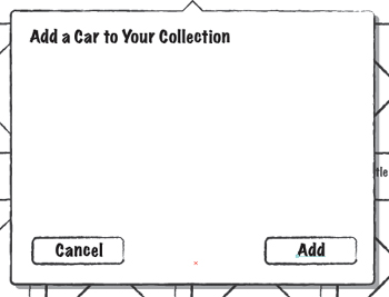
5. Click within the left button on the popover and type Cancel. Press Escape and then click within the bounds of the popover’s right button and type Add (7.22).
7.22. Adding text to the buttons
6. With the Rectangle tool  (M), click in the popover and create a 355 px wide by 180 px tall rectangle (7.23). This will be the drop zone for images to be uploaded.
7.23. Adding the drop zone rectangle
7. With the Brushes panel (Window > Brushes), click the Charcoal – Pencil brush to add a sketchy outline to the rectangle (7.24).
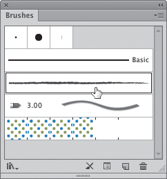
7.24. The Charcoal-Pencil brush is the key element of the sketchy wireframe style.
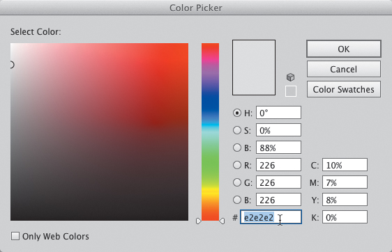
8. To give the rectangle a fill, double-click the Fill indicator in the Tools panel and type e2e2e2 in the hexadecimal color field (7.25).
7.25. Recoloring the drop zone rectangle from the Color Picker
9. Select the Type tool (T) again, click once in the rectangle, and type Drag files here from the desktop (7.26).
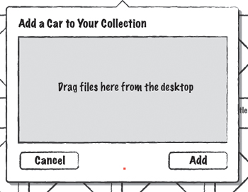
7.26. The instruction text for the drop zone
Create the Next State
Now you’ll duplicate the current artboard to create the third state. This state will show what it looks like once a file has been dragged in from the desktop and the user is about to click the Add button.
1. Using the Artboards panel, duplicate the add car popover artboard by dragging it to the New Artboard icon at the bottom of the panel.
2. Double-click the new artboard name in the panel and rename the artboard drag image to add.
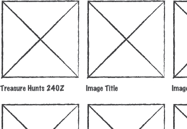
3. Delete the “Drag files...” text. From the Symbols panel (Window > Symbols), drag the cursor click, thumbnail, text field, horizontal rule, and icon delete symbols into the popover. Arrange them as shown in 7.27.
7.27. Adding the symbols for the dropped art
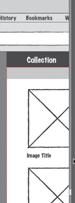
4. Select the Type tool (T) and click just above the text field. Type Image Title. Press Escape and then click in the text field and type Treasure Hunts 240Z (7.28).
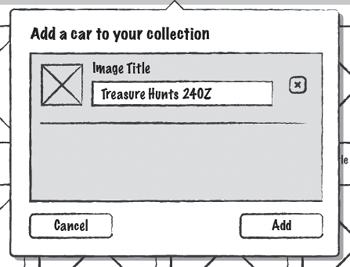
7.28. Adding the image title text
5. Drag the cursor click symbol onto the Add button to make it look like it’s being clicked (7.29).
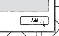
7.29. Using a symbol to indicate a click
Create the Final State
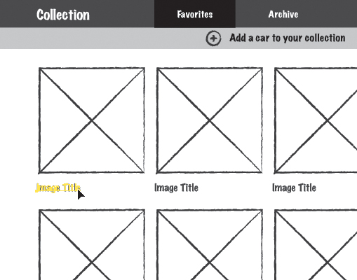
The final state of this interaction will show the page with the new image added. You’ll put a label on the new image to give the user feedback as to which one was just added.
1. Using the Artboards panel, duplicate the drag image to add artboard by dragging it to the New Artboard icon at the bottom of the panel.
2. Double-click the new artboard name in the panel and rename the artboard to image added.
3. Delete the popover from this artboard. Click the first Image Title label (7.30) and choose Object > Expand Appearance.
7.30. Expanding the appearance of the label
Expanding an appearance removes any live effects from an object. Because this text used the Transform effect to repeat it across and down, any change made to the text would be repeated in all the copies. To show the user feedback for an added image, you’ll want to break that link so you only change the filename of the first title.
4. Select the Type tool (T) and triple-click the first Image Title. Triple-clicking will engage type-editing mode and select the text simultaneously. Type Treasure Hunts 240Z (7.31).
7.31. Naming the “new image”
As the final step, you’ll add a snipe symbol to the corner of the image to show that it is new.
5. From the Symbols panel, drag the snipe symbol onto the artboard. Position it at the corner of the first image (7.32).
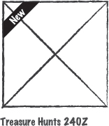
7.32. Adding the corner snipe
6. Press S/Ctrl+S to save your work.
Adding Notes
Another way to communicate your design intentions is by adding notes to your mockups. Because of the editable nature of artboards, you can include notes on the wireframe or mockup itself in a very simple way.
1. Using the storyboard wireframes you created in the last section, navigate to the add car artboard by selecting it in the artboard navigator at the bottom of the document window (7.33).
7.33. Using the artboard navigator to switch artboards
2. Click the Artboard tool  (Shift-O) and drag the bottom of the artboard to resize it slightly (7.34).
7.34. Making the artboard larger to accommodate notes
3. Select the Type tool (T) and drag to create an area type box in the empty space below the design. You can type notes in this space relating to the design of the screen (7.35).
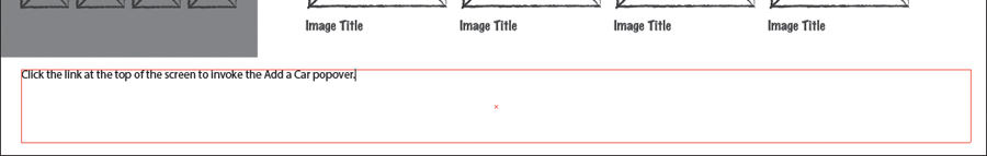
7.35. Adding notes to the wireframe
Another way to leave notes on your design is with a virtual sticky note. Since Illustrator doesn’t have a built-in annotation tool, you can create your own virtual sticky note and save it as a scalable symbol that can be reused as often as you need. Here’s how to create it:
1. Using the storyboard wireframes again, select the Rectangle tool (M) and click to create a 300 px wide by 300 px tall rectangle. Give the rectangle a white fill.
2. In the Layers panel, move the rectangle to the content layer by dragging the colored square to the appropriate layer (7.36).
7.36. Drag the color square to move objects between layers.
3. With the rectangle still selected, press F8 to create a new symbol. In the dialog box, type Sticky Note as the name and select the 9-slice scaling option. Deselect the Align to Pixel Grid option. Click OK (7.37).
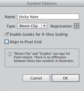
7.37. Symbol settings for the sticky note
Adding Color
1. Double-click the symbol in the Symbols panel to enter isolation mode.
The first thing you’ll need to do is add color to the rectangle. Then you’ll add some stylistic touches to make it look more realistic.
2. Select the rectangle and press the > (greater than symbol) key to add a gradient. In the Gradient panel (Window > Gradient), double-click the first color stop, change the color mode to RGB in the panel menu, and enter d3d540 in the hexadecimal color field (7.38).
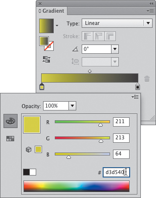
7.38. Setting the color for the first color stop
3. Double-click the second color stop and repeat step 2, except enter f3f560 in the hex color field.
4. Change the angle in the Angle field (7.39) to 90 degrees.
7.39. Adjusting the gradient angle
Adding Style
Now you’ll add some live effects with the Appearance panel to give the sticky note a more realistic look.
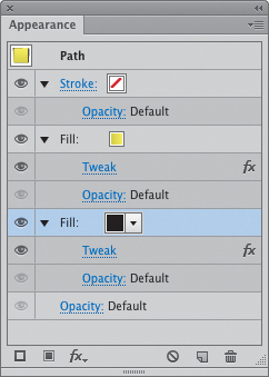
1. With the rectangle selected, click the Fill layer in the Appearance panel (Window > Appearance).
2. Choose Effect > Distort & Transform > Tweak. In the dialog box, select the Absolute radio button and set both the Horizontal and Vertical amounts to 3 px. In the Modify section, select only the Anchor Points and ‘In’ Control Points options (7.40). Click OK.
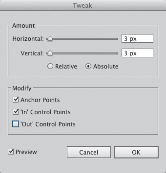
7.40. Setting the Tweak parameters for the sticky note
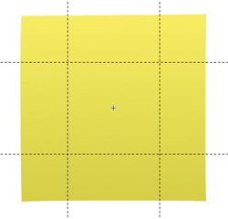
You should end up with a rectangle that is slightly tweaked (7.41). This looks more realistic than a perfect square.
7.41. Adding the Tweak filter adds a realistic touch to the sticky note.
3. In the Appearance panel, add another Fill layer by clicking Add New Fill button at the bottom of the panel. Color this fill black by clicking the swatch pop-up and choosing the black swatch (7.42).
7.42. Coloring the bottom fill black
4. Choose Effect > Distort & Transform > Transform. Select the Preview option and experiment with the settings until it looks right to your eye (7.43). Click OK.
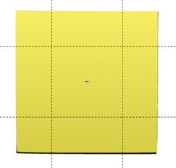
7.43. Adjust the Transform effect settings until the shadow looks right.
5. Change the Opacity of the bottom fill to 50% and choose Multiply from the blend mode pop-up (7.44).
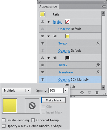
7.44. Adjusting transparency settings on the bottom fill
I can’t be more specific about what settings to use for this particular effect because it is totally random and different every time. Experiment with the Scale and Move settings until the shadow looks realistic to your eye.
6. Press Escape to leave isolation mode.
You now have a resizable Sticky Note symbol that you can use to leave annotations directly on your document (7.45). This is especially helpful if you work with others that will access your Illustrator file. You could create a different color sticky note for each person that will comment on the file.
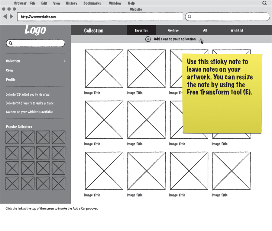
7.45. The finished sticky note can be used to leave notes directly on the artwork.
Why not just use the Drop Shadow effect? When striving for this type of look, canned effects are less customizable and therefore less realistic.
Style Libraries
As you begin to get comfortable doing UI design with Illustrator, you’ll start to use it for larger projects. It’s helpful to create a style guide for a large project, as it provides an easy way to access, document, and share styles with your teams. One of the best ways to do this is to create a file that contains all of your app’s graphic elements with each of their corresponding states. One of the benefits of creating this type of guide is that it helps you achieve consistency in your design.
You can start small and fill in the guide as you flesh out the design. Once you have every element completed, Illustrator allows you to save portable libraries for color schemes, symbols, and graphic styles, as well as character and paragraph styles. You can then package all of these into a template you can use when you begin a new project.
The next few sections walk you through how to do this.
The inspiration for this style guide comes from Yaron Schoen, who created one for a site called Kontain. You can see what his style guide looked like by going to http://d.pr/WYmp.
Create Color Schemes
There are several ways to create compelling color schemes in Illustrator. If you are an expert at choosing coordinating colors, you can do it the manual way by creating some squares on the artboard and mixing colors until you have something you like. But if you’re color-challenged, Illustrator can help you out with a couple of unique tools.
Color Guide
The first of these tools is the Color Guide panel (Window > Color Guide). This panel is a robust color inspiration tool that allows you to find and create color schemes based on harmony rules and preset swatch libraries (7.46). When I say robust, I mean robust. So much, in fact, that I will only be able to cover a small portion of what this panel can do. Let’s try it out to create a new color scheme:
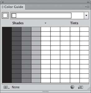
7.46. The Color Guide panel
1. Open a new document (N/Ctrl+N) and then open the Color Guide panel by choosing Window > Color Guide.
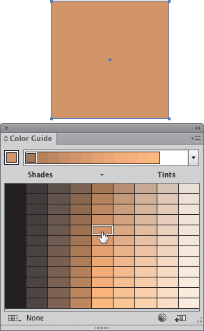
2. Select the Rectangle tool (M) and draw any size rectangle on the artboard. Give it a fill by choosing any color from the Swatches panel (Window > Swatches). This will allow you experiment with colors and see the results.
3. Select the rectangle and then click a color variation in the Color Guide panel (7.47).
7.47. Coloring the rectangle with a variation swatch
The rectangle you created will be filled with the color you clicked. Now it’s time to have some fun.
4. In the Color Guide panel, click the Base Color button (7.48) to set this new color as the base color for the color scheme.
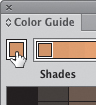
7.48. Click the Base Color button to set a new base color for the scheme.
You’ll notice that the color variations all change in relation to the new base color.
5. Click the Harmony Rules menu and select a harmony rule. (I chose the Complementary 2 rule in 7.49.)
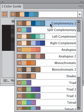
7.49. Choosing a harmony rule
Now you’re looking at shades and tints of the active color set in the color variation pane (7.50). You can also view variations based on Warm/Cool colors or Vivid/Muted colors by selecting the appropriate set from the panel menu. For now, go ahead and stick with tints and shades.
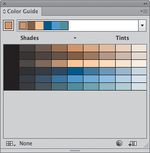
7.50. Showing tints and shades of the active colors
6. You can select color variations based on a preset swatch library as well. Click the Swatch Library button  and choose Nature > Landscape.
The variations adjust again, this time creating a nice blend of cool and warm colors. You can save these colors as a group of swatches for use in a project.
7. To save the color group, click the Save Color Group to Swatch panel button  at the bottom of the Color Guide panel.
Open the Swatch panel (Window > Swatches) to see that Illustrator has created a group of swatches for you (7.51). You can rename this color group by double-clicking the folder icon and naming it in the dialog box that appears.
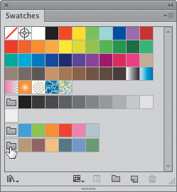
7.51. Color groups are indicated with a folder icon.
You just created your first color scheme. When you have some time, play around with the Color Guide panel and see what you can come up with on your own. You’ll find that it can help immensely as a tool for color inspiration.
Kuler
Another tool for color inspiration is Adobe’s own Kuler plug-in. Adobe released Kuler several years ago as a website where a large community of users create, save, and share color themes. It was such a useful tool that Adobe integrated it as a plug-in panel within Illustrator. The panel contains user-created themes with search and filtering functions to help you find the colors you’re looking for. To open the Kuler panel, choose Window > Extensions > Kuler.
By default, the panel shows the top 10 most popular themes of all time (7.52). You can page through these themes with the arrows at the top of the panel. To change the sorting, select the desired criteria from the pop-up menus. Hovering over a theme shows metadata and a star rating. To add the theme as a color group to the Swatches panel, click the “Add selected theme to Swatches panel”  button at the bottom of the Kuler panel. Finally, you can upload your own color schemes to Kuler by selecting a scheme in your Swatches panel and clicking the “Upload from Swatch Panel to Kuler community”
  button at the bottom of the Kuler panel. Your default web browser will launch and go to http://kuler.adobe.com. You’ll need to sign in with your Adobe ID before you can save your theme
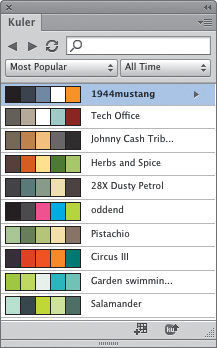
7.52. The Kuler panel
Portable Colors, Symbols, and Styles
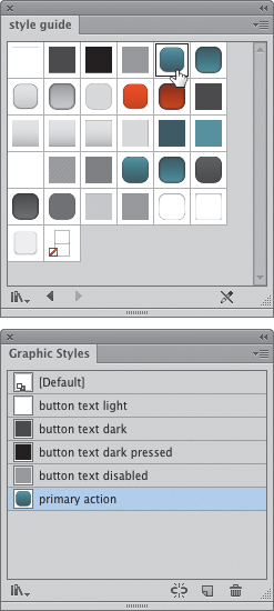
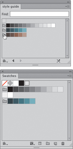
With a style guide in place, you can use your colors, symbols, and styles in other documents without having to recreate them from scratch. You can also save your color swatches to be used in other applications that support the Adobe Swatch Exchange (.ase) file format for import. To see how this works, download the example style guide mentioned earlier from www.peachpit.com/UIwithAI/ch7/style-guide.ai. This file contains a couple of color groups, a collection of symbols, and graphic, character, and paragraph styles (7.53).
7.53. A sample style guide
To get the most out of this style guide, go to www.fontsquirrel.com and download Trocchi, a free web font.
Open the Swatches panel (Window > Swatches) to find that there are three color groups included. To save these color groups for use in another document, perform the following steps:
1. From the Swatches panel menu, choose Save Swatch Library as AI. In the Save As dialog box, navigate to your desired folder; give the file a memorable name and then click Save.
2. To save the color groups for use in InDesign or Photoshop, choose Save Swatch Library as ASE from the panel menu. The file will be saved in a format that you can load into one of those applications.
Templates
Once you have a style guide completed, all your graphic, character, and paragraph styles created, and a symbol library finished, you can create a template file that can be used to create new documents. A new document created from a template opens with all your settings in place, ready for you to begin designing. You can build as many templates as necessary to fit the needs of your project. Using templates can save tons of time.
To create a template based on the style guide from the previous sections, complete the following steps:
1. Create a new document (N/Ctrl+N). In the New Document dialog box, be sure to set the doc up with settings that you’ll need when you use the template to create a new project file.
This means that your profile, number of artboards, artboard dimensions, and advanced settings all get saved with the template. Don’t worry, though, you can change it later by overwriting the old template file with a new one.
2. Once you have all your document settings as you like, click OK to create the new file.
Now it’s time to load all your symbols, colors, and styles. If you haven’t downloaded the style guide file, go to www.peachpit.com/UIwitrhAI/ch7/style-guide.ai to grab it.
Load Symbols
First, you’ll need to load your symbols. Before you do that, though, open the Symbols panel (Window > Symbols) and choose Select All Unused from the panel menu. Click the Delete Symbol button  at the bottom of the panel. This removes all the default symbols that ship with Illustrator, giving you a clean slate from which to start. You’ll do the same with graphic styles and swatches.
1. Click the Symbol Libraries Menu button  and choose Other Library from the menu. Navigate to where you saved the style_guide.ai file and click Open.
A new Symbols panel opens containing the symbols from the style guide.
2. Click the first symbol and then Shift-click the last one to select all. Drag all the symbols into the default Symbols panel (7.54).
7.54. Adding symbols from one file into another
Load Graphic Styles
Second, you’ll load your graphic styles. To clear out the defaults, open the Graphic Styles panel (Window > Graphic Styles) and choose Select All Unused from the panel menu. Click the Delete Graphic Style button to remove them.
1. Click the Graphic Style Libraries Menu button and choose Other Library from the menu. Again, navigate to the style_guide.ai file and click Open.
A new Graphic Styles panel opens, containing the styles from that file.
2. Click the first style and Shift-click the last to select all. Drag these styles into the default Graphic Styles panel (7.55).
7.55. Adding styles into the new document.
Load Color Swatches and Groups
Third, you’ll add your colors. Clear out the defaults by opening the Swatches panel (Window > Swatches) and following the steps as before. If any remain, select the stubborn ones and click the Delete Swatch button .
1. Click the Swatch Libraries Menu button and choose Other Library from the menu. Navigate to the style_guide.ai file and click Open.
A new Swatches panel will open containing the swatches from that file.
2. Click the folder icon at the front of each color group and drag them to the default Swatches panel (7.56).
7.56. Click and drag the folder icons to add color groups to the new file.
Load Character and Paragraph Styles
Finally, you’ll add your text styles. This is the easiest of the bunch, because there aren’t any defaults to remove and you can add all styles with a click.
1. From the Window menu, open either the Character Styles (Window > Type > Character Styles) or Paragraph Styles (Window > Type> Paragraph Styles) panel (it doesn’t matter which).
2. From the panel menu, choose Load All Styles (7.57). Then navigate to the style guide file to load the styles.
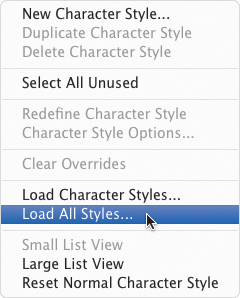
7.57. Select Load All Styles from the Character or Paragraph panel menu...
This option loads both character and paragraph styles in one shot (7.58).
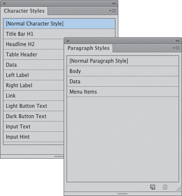
7.58. ...and both sets of styles will be loaded into their respective panels.
Save the Template
The last step is to save the template file by doing the following:
1. Choose File > Save as Template.
2. Enter a name for the template and choose a save location, then click Save.
To use this template to create a new file, all you’ll need to do is choose File > New From Template (N/Ctrl+Shift+N) and choose the template file from its saved location. A quick check of the Symbols, Graphic Styles, Swatches, and Character/Paragraph Styles panels should confirm that everything saved correctly. Now you can get to work!
Getting Your Work Out of Illustrator
Once you’ve created a set of screens and/or graphic assets, you’ll need to get them out of Illustrator. You might need to show your screens to a client during a meeting, send a PDF to a stakeholder for approval, or slice some images for your dev team. With Illustrator, there are a lot of options for sharing your work, and you have a lot of flexibility in how you can accomplish the task.
Presentation Mode
In my old Photoshop workflow, I would create different screens and states of interaction on various layers, all of which I would have to show or hide as I presented. This meant I had to spend so much time naming and organizing layers so that I knew where everything was. It was a fairly clumsy experience for both the client and me. As I moved my workflow to Illustrator, I followed that same pattern at first. One day, a light came on and I discovered the keys to presenting work from Illustrator, a method I dubbed Presentation mode.
Presentation mode consists of two key elements to work properly:
• Creating screens and interaction states on separate artboards instead of separate layers
• Making full use of Full Screen mode
To see how this works, open the add-car.ai file you worked on earlier in the chapter. This file has four screens in sequence to preview an interaction.
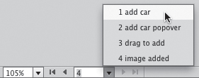
Once you have the file open, all you’ll need to do is select Full Screen mode from the Change Screen Modes button  at the bottom of the Tools panel. The window will stretch to fill the screen, all panels will be hidden, and you’ll be left with the artboard navigator and scroll bars (7.59). Once in this mode, you can use the next and previous buttons in the artboard navigator to step through your screens in sequence.
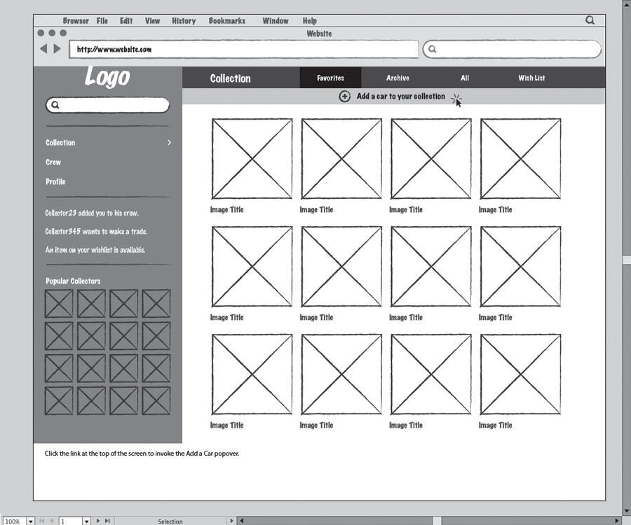
7.59. Presentation mode
If you started reading here, you can download the finished file by going to www.peachpit.com/UIwithAI/ch7/add-car-final.ai.ai.
If you have a large display, the artboards will fill the screen as you step through them. While this is annoying, you can quickly press 1/Ctrl+1 to zoom to 100%. This doesn’t usually happen when displaying your work on a projector, as projector resolutions tend to be lower than desktop displays.
If you need to access any of the panels while in Presentation mode, you can drag your mouse to the edge of the screen (7.60) and they will slide into view (7.61). Move your mouse away from the edge and they will slide back out. If you need to show them for an extended period of time, press Tab to toggle panel visibility.
7.60. In Presentation mode, bump your mouse to the edge of the screen...
7.61. ...to temporarily expand the panels.
Exporting to Other Formats
Another way to get your artwork out of Illustrator is to export (File > Export) to one of the various supported file formats. You can export a single artboard, a specified range, or all at once. Illustrator exports to several formats, but the ones most useful for UI design are as follows:
• PNG: PNGs are great for images that have large areas of flat color. They are a good alternative to the older GIF format. PNGs support 8-bit transparency like a GIF, but also offer 24-bit alpha transparency for smooth gradations in transparent areas. PNG employs lossless compression, meaning that it can compress your file without losing any data. PNG files support only the RGB color space, so don’t use this format if you need to export any CMYK images.
• Flash: The Flash exporter allows you to create animations in the Flash SWF format. This can be a great tool for visualizing interactions and previewing how CSS animations might work in the browser.
• JPEG: JPEGs are best for photographic images. JPEG offers lossy compression, meaning it discards file data to create the smallest possible file size. This can create artifacts in your images. The more compression you choose, the more artifacts you get.
• Photoshop: The Photoshop exporter allows you to save your Illustrator files to Photoshop with layers and editable text. This works well if you need to shuttle graphics back and forth without losing editing flexibility.
When exporting multiple artboards, Illustrator uses the filename plus the artboard name for the name of the exported file. If you don’t want to end up with names like “untitled08-01.jpg,” be sure to save your Illustrator file first and then give all your artboards meaningful names.
Saving PDFs
If you need to save your Illustrator artboards in a cross platform-compatible vector format, look no further than the Portable Document Format (PDF). PDFs can be viewed by just about anybody, and they don’t suffer from any loss of quality like a bitmap file would. Additionally, you can save multiple artboards to a single PDF file, which makes sharing large projects super easy. After presentation mode, PDFs are the best way I have found to share screens with clients for the purpose of reviewing work.
To save an Illustrator file as a PDF, perform the following steps:
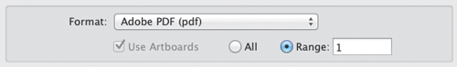
1. Create a new file (N/Ctrl+N) with 10 artboards.
2. Choose File > Save As (S/Ctrl+Shift+S). Choose PDF from the Format pop-up at the bottom of the dialog box.
Under the Format pop-up, there is an option to save all artboards or save a range. Selecting the All radio button will do just as it says, while clicking Range will allow you to specify any number of artboards to save (7.62).
7.62. Choosing the PDF format and range of artboards to save
Here are some examples:
• Entering 1 will save only artboard number 1 as a PDF.
• Entering 1–4 will save artboards 1 through 4.
• Entering 1, 3–5, 7, 9–10 will save all but artboards 2, 6, and 8.
3. Clicking Save will move to the next step in the process, which allows you to specify PDF options.
The majority of these options are for documents destined for printing, so there is a lot that you won’t use in this dialog box.
4. If you’re saving this file for sending to a client, you can clear all the checkboxes under the Options section (7.63). Otherwise, you can leave each of these options at the default. Click Save PDF to complete the process.
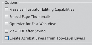
7.63. Clear all Options checkboxes for a smaller PDF file.
Save for Web
Finally, you can save individual graphics in your Illustrator file as separate files with the Save for Web command ( S/Ctrl+Shift+Alt+S). In order to do this, you’ll need to first create the boundaries for each exported file with the Slice tool
  (Shift-K). This tool creates slices that are recognized by the Save for Web command as a separate image and will save each slice to its own file. Each slice can have its own format and compression properties.
To learn how to use this command, go to www.peachpit.com/UIwithAI/ch7/slices.ai to download and open the example file. Once you have the file open in Illustrator, do one of the following:
• Select the Slice tool in the Tools panel and drag a box around one of the icons. You can zoom in for more precision if necessary (7.64).
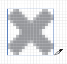
7.64. Creating a slice with the Slice tool
This method allows you to create a precise slice that is independent of the artwork. The slice can be selected, moved, and deleted without affecting the underlying art.
• Select one or more icons and choose Object > Slice > Create from Selection.
This method creates a slice around the boundaries of your selection (7.65).
7.65. Creating a slice from a selection
• Select one or more icons and choose Object > Slice > Make.
This method creates user slices, which are tied to the underlying artwork. If the artwork dimensions change, the slice automatically adjusts to fit. To remove a user slice, select the object and choose Object > Slice > Release.
Once you have your slices created, choose File > Save for Web. A large dialog box appears with your sliced artwork in the middle (7.66). Each slice is designated by a number.
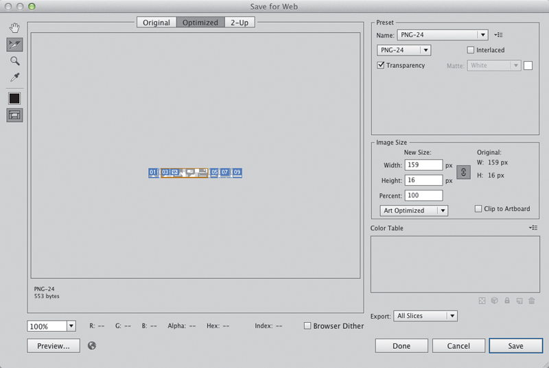
7.66. The Save for Web dialog box
Before you click Save, do the following:
1. Choose the Slice Select tool  (K) and double-click each slice to give it a name (7.67).
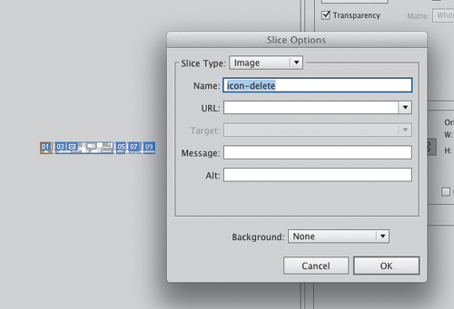
7.67. Naming slices for export
The name you enter in the dialog box will be the name of the exported artwork. If you don’t name your slices, Illustrator will name them for you. That’s not necessarily a good thing.
2. Click each icon in turn and choose an export format in the Preset section (7.68).
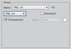
7.68. Choosing an export format for a slice
Each slice can have its own individual settings for complete optimization.
3. Select which slices to export from the Export menu (7.69).
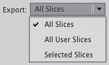
7.69. Choosing which slices to export
Choosing All Slices will export everything, including slices that Illustrator automatically creates between your artwork. Choosing User Slices will export only slices you created with Object > Slices > Make. Choosing Selected Slices will export only slices you explicitly have selected in the Save for Web dialog box.
4. Click Done to save your settings and return without exporting anything, or click Save to export your selections.
If you click Done, your Save for Web setting will be saved with the file, allowing you to come back any time and export your artwork.
Conclusion
In this book, you’ve learned which tools work best for UI design; explored color, typography, and layout; and created a sample user interface using graphic styles and symbols. You’ve also learned how to use Illustrator to help you plan, communicate your efforts, and share your work effectively. With these tools, you’re ready to start tackling UI design at a higher level.
I hope I’ve helped you to see that Illustrator can be a viable tool for UI design, and that you find ways to build on this knowledge and become an Illustrator expert yourself. One last tip: spend some quality time playing with all the tools and features of Illustrator. As you explore the interface, you’ll find new ways to use tools and techniques to help you become a power user, going beyond the tips and techniques I’ve shown you here. Be sure to share what you learn with your friends, coworkers, Twitter followers, and Facebook friends. If you have any comments, feedback, or just want to share, feel free to contact me at [email protected] and on Twitter @rmmixd. Keep track of the latest information and updates for the book on Twitter, #UIwithAI.
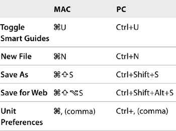
Table 7.1. Keyboard Shortcuts in This Chapter