
7. Color and Background Properties
Colors form the cornerstone of all design, even if they’re only black and white. They create the first impression of your site. Bright, vibrant, jewel-like colors make a radically different statement than earth tones. Even if you choose to use only black and white, your design will make a statement. Beyond their decorative impact, colors can also guide the viewer’s eye around the page, helping to highlight some important areas while downplaying others.
In this chapter, you will learn the primary methods used to add and control color with CSS. Keep in mind, however, you can specify color using several CSS properties. (See the sidebar “Other Ways to Add Color.”) But before you learn how to code colors, let’s quickly explore how to choose them.
Getting Started
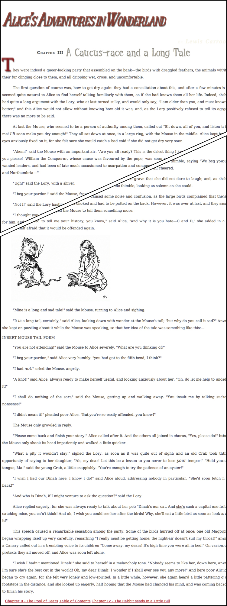
I’ll be pulling the sample code for this chapter from Chapter 3 of Alice’s Adventures in Wonderland. An expurgated version is shown in Code 7.1, including a navigational footer at the bottom. It imports the final CSS code from Chapters 5 and 6, and imports a new file called color-background-properties.css, that will contain the CSS code from this chapter.
Code 7.1. The HTML5 code used for the examples in this chapter.
<!DOCTYPE html>
<html lang="en">
<head>
<meta charset="utf-8">
<title>Alice’s Adventures In Wonderland | Chapter III</title>
<link href="../css/font-properties.css" type="text/css" rel="stylesheet" media="all">
<link href="../css/text-properties.css" type="text/css" rel="stylesheet" media="all">
<link href="../css/color-background-properties.css" type="text/css" rel="stylesheet" media="all">
</head>
<body id="chapter3" class="book aaiw chapter">
<header class="page">
<hgroup>
<h1>Alice’s Adventures in Wonderland</h1>
<h2>By <cite>Lewis Carroll</cite></h2>
</hgroup>
</header>
<article>
<h2>Chapter III
<span class="chaptertitle">A Caucus-race and a Long Tale</span>
</h2>
<p>They were indeed a queer-looking party that assembled on the bank—the birds with draggled feathers, the animals with their fur clinging close to them, and all dripping wet, cross, and uncomfortable.</p>
<footer>
« <a href="AAIWL-ch03">Chapter II - The Pool of Tears</a>
<a href="../index.html">Table of Contents</a>
<a href="AAIWL-ch03">Chapter IV - The Rabbit sends in a Little Bill</a> »
</footer>
</body>
</html>
Choosing Color Values
You can define colors in a variety of ways in CSS. Several methods simply represent how the primary colors—red, green, and blue—should be mixed, but that is by no means the only way colors are defined in CSS (Table 7.1).
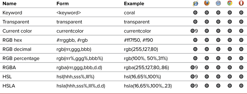
Color keywords
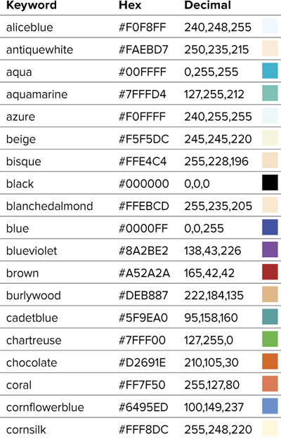
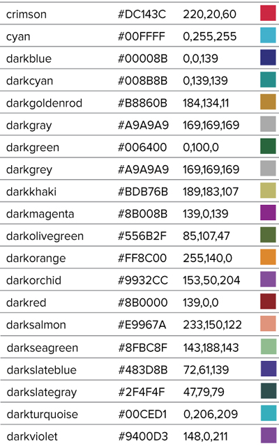
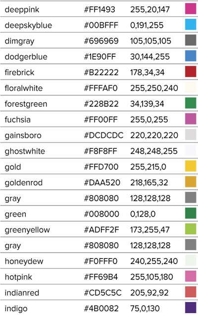
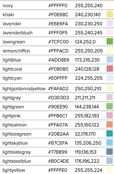
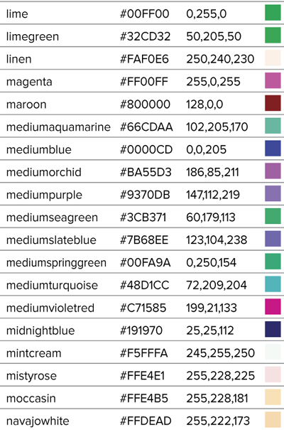
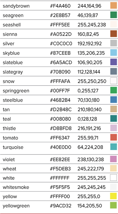
You have access to many predefined color values derived from lists defined in the HTML4 and SVG specifications. Table 7.2 shows the list of keywords along with the equivalent hex and decimal values.

In addition to the color keyword list, you can use the currentcolor keyword. Using currentcolor to set any color value will use the element’s current color value. For example, to create an aqua border color, use:
color: aqua;
border-color: currentcolor;
If you assign currentcolor specifically to the color property, it will inherit its parent element’s color value just like using color: inherit.
Transparent keyword
Another important keyword is transparent, which is the equivalent of a 0 alpha. That is, it’s completely transparent. This keyword allows anything behind that element to show through.
RGB hex values
Hexadecimal values can range from 0–9 and a–f. Values include three couplets of hexadecimal values representing the levels of red, green, and blue (in that order) in the desired color. The color value couplets range from 00 (no color) to FF (full color)  . However, if the couplets contain the same hex value, only three values are needed to define the color. For example, these two sets of values represent the same pure blue:
#0000ff
#00f

RGB hex color values are represented by three couplet values, or by three single values ranging from 0–9 or A–F that indicate the levels of red, green, and blue that combine to create the color.
RGB decimal values
Often, simply referred to as the RGB values, RGB uses decimal values from 0 (no color) to 255 (full color) to represent the levels of red, green, and blue (in that order) present in the desired color  .
.
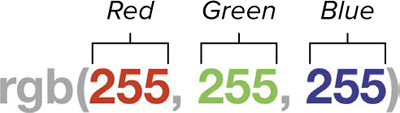
RGB decimal color values range from 0–255 to indicate the levels of red, green, and blue that combine to create the color.
Percentage values
RGB values can also be expressed as whole percentages from 0% (no color) to 100% (full color) to represent the levels of red, green, and blue (in that order) present in the desired color  .
.
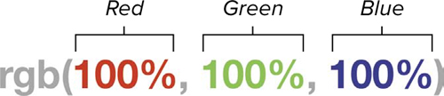
RGB percentage color values range from 0–100 to indicate the amount of red, green, and blue that is combined to create the color.
 HSL values
Although their notations are different, hex, decimal, and percentage values are just different ways to define the levels of red, green, and blue in a color. CSS3 adds a completely different method for defining color by its hue, saturation, and lightness (HSL)  :
:
• Hue—A degree value from 0 to 360, although the degree symbol is not included. The hue is based on a color’s position in the standard color wheel where red is at 0°, yellow at 60°, green at 120°, cyan at 180°, blue at 240°, and magenta at 300°.
• Saturation—A percentage from 0% (no color) to 100% (full color).
• Lightness—A percentage from 0% (black) to 100% (white).
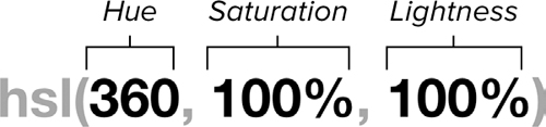
HSL color values represent hue as the angle on a standard color wheel (0–360), saturation as a percentage, and lightness as a percentage.
Hex values are currently the most popular way to define color values, but they are by no means the best way to add colors. I find it much easier to imagine colors using Base 10 decimal values rather than Base 16 hexadecimal values.
Although HSL is a bit difficult to master at first, it can be easier to use when setting complementary colors. Just add 180° to the hue.
Setting Alpha Values for Color Transparency
Although the opacity property allows you to make elements transparent, this is applied to the entire element. CSS3 now allows you to make specific colors transparent. An alpha value is generally a fourth value in a color, but rather than representing a color, it sets the opacity of the color—a value from 0 (transparent) to 1 (opaque). So, an alpha of .5 is the equivalent of 50% opacity  .
.
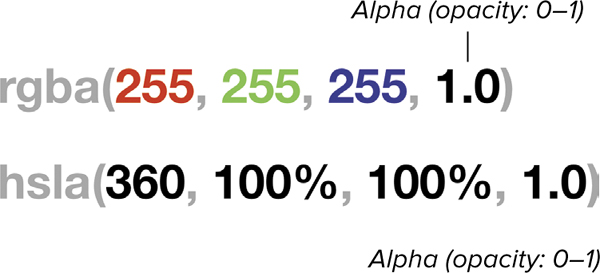
RGBA and HSLA add an alpha value as a decimal (0–1) to represent the opacity of a color with 0 completely transparent and 1 completely opaque.
You can set an alpha channel for either RGB decimal or HSL color values, but currently there is no way to add alpha values to RGB hex values.
In addition to setting the color opacity, CSS includes the ability to set the opacity of an entire object and any of its content. See “Setting an Element’s Opacity” in Chapter 11 for more information.
Creating Color Gradients
Although not yet a finished part of the CSS3 standard, the ability to fill an element’s background with a gradient has been introduced as extensions in Opera, Internet Explorer, Webkit, and Mozilla—which means you can add linear and radial gradients compatible with Opera, Internet Explorer, Safari, Chrome, and Firefox .
Linear and radial gradients are available in all modern browsers, including IE9+.
To ensure maximum compatibility, you need to include the CSS3 standard version of the gradient property along with the browser extension versions: -o, -ms, -webkit, and -moz. Don’t worry, they all take the same values. If you need to support really old browsers (Safari 3 and earlier or Internet Explorer 8 or earlier), you may also need to include values for them. For more details, see the sidebar “Older Gradient Syntax?”
Linear Gradients
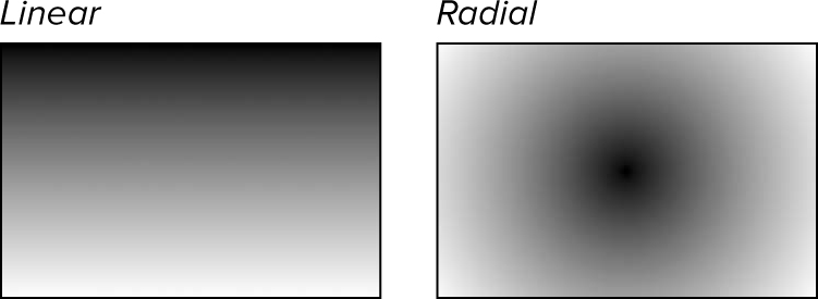
Linear gradients have two different value types, the angle of the gradient and the colors that make up the gradient .
• Angle (degrees)—The angle for the gradient expressed as a numeric value, using degrees (deg): such as 45deg.
• Angle (keyword)—Instead of an angle numeric value, you can use one or two keywords—separated by a spaces—defining the side or corner where the gradient should start and stop—and preceded by the word to. Values can include top, right, bottom, and/or left. If two values are used (separated by a space), they specify a corner, such as to top left. such as to bottom right.
• Color stop—The values of two or more colors at a particular point along the gradient with values separated by spaces. You should include at least two values (otherwise you’ll get a solid color), but you can follow them with as many values as you want. These may include any color value type as shown in Table 7.1, including transparent colors using RGBA or HSLA, and an optional percentage or length value to set where the color should be positioned along the gradient axis, such as green 67%: rgba(221,160,221).
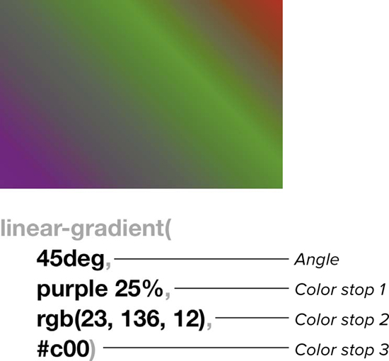
Linear gradients have an optional angle value, followed by two or more color stops separated by commas. The angle can be in degrees, or one or two keywords to indicate the starting side or corner. The color stop is a color value and an optional length or percentage value for the position of the stop—where it is at full color—along the gradient line.
At its simplest, a linear gradient can be two color values with the default angle at 270°, the start stop at 0%, and the end stop at 100%:
linear-gradient(navy, gold);
This is the same as:
linear-gradient(270deg, rgb(0,0,128), rgb(255,215,0));
linear-gradient(to bottom, navy, gold);
linear-gradient(to top, gold, navy);
linear-gradient(#008 0%, #ffd700 100%);
linear-gradient(180deg, gold 0%, navy 100%);
All of these values produce the same gradient .
There’s more than one way to create the same gradient.
Radial Gradients
Radial gradients get a little more complicated than linear gradients because they have four possible value types :
• Position—The location of the center of the gradient within its box (see Chapter 10). The value(s) are a numeric distance value (such as 5em), a percentage (such as 23%) or a keyword (such as center) that sets the center of the radial gradient (which is the same as setting background image positions shown later in Table 7.10). You can use two values to define the horizontal and vertical positions independently (such as at 2em 5em, at 23% 46%, or at left center). You can mix value types (such as at 2em center). The position is optional, and if omitted defaults to center.
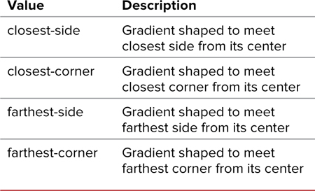
• Size (keyword)—The size sets the radial gradient’s endpoint, using a keyword (Table 7.3). Currently, the webkit version of the property uses a different and more limited set of keywords, but they have equivalents in the new standard.
Table 7.3. Radial Gradient Size Values
• Size (length)—If the shape is not explicitly stated, the size can be set as one or two length (such as 20px) or percentage (such as 89% 42%) values. If two values are used, the first is the horizontal length and the second is the vertical length. Negative values are not allowed.
• Shape—The shape of a radial gradient, either circle or ellipse. The shape value is optional; but if omitted, the value defaults to circle. Otherwise, the size is a single length, and ellipse.
• Color stop—The values of two or more colors at particular points along the gradient with values separated by spaces. You should include at least two values (otherwise you’ll get a solid color), but you can follow them with as many values as you want. These may include any color value type shown in Table 7.1—including transparent colors using RGBA or HSLA—and an optional percentage or length value to set where the color should be positioned along the gradient axis, such as green 67%, rgba(221,160,221,0.5).
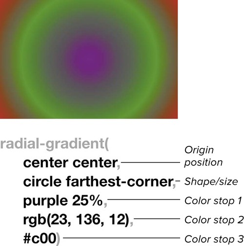
Radial gradients have optional values for the origin of the gradient, the shape and size, and two or more color stops. The position can be two values for the horizontal and vertical location. The shape is either circle or elliptical and the size can be keyword or two values. The color stop has a color value and an optional length or percentage value for the position of the stop—where it is at full color—along the gradient.
At its simplest, a radial gradient can be two color values with the default position in the center, the shape an ellipse, the size set by the farthest-corner, and the start stop at 0% and end stop at 100%:
radial-gradient(navy,gold);
This is the same as:
radial-gradient(ellipse rgb(0,0,128), rgb(255,215,0);
radial-gradient(center, navy, gold);
radial-gradient(farthest-corner, #008 0%, #ffd700 100%);
radial-gradient(center center, ellipse farthest-corner, navy 0%, gold 100%);
All of these values produce the same gradient .
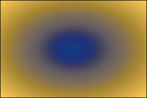
There are many ways to create this elliptical gradient.
Repeating Gradients
Both linear and radial gradients can repeat, rather than fill the area with the end color. To repeat gradients, simply use:
-repeating-linear-gradient()
-repeating-radial-gradient()
If you specify a gradient as a background, also specify a background color to ensure that text will be legible in browsers that do not support gradients.
Use the background-image property to set gradients in the background of an element. You could also use the background property, but background-image works more consistently across multiple browsers.
If you really need to support an older syntax, though, the best way to get the code is to use the CSS3 Gradient Generator Tool (http://gradients.glrzad.com) .
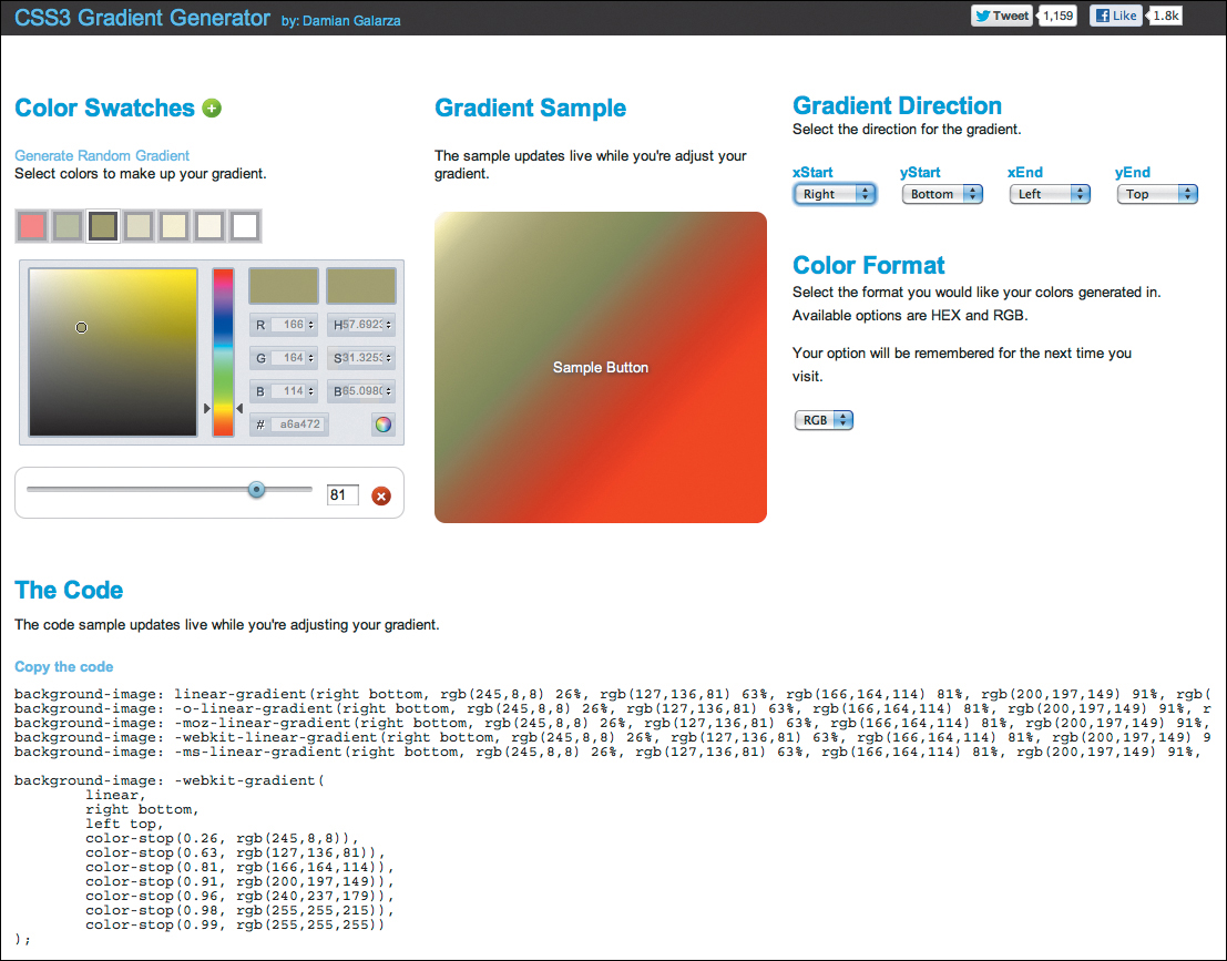
A great tool for plotting gradients can be found at http://gradients.glrzad.com.
Choosing Your Color Palette
Graphic designers have a saying, “No color is better than bad color.” If you are not careful, color can work against you by obscuring your message and confusing your visitors. The effective use of color in design takes a lot of practice to get right, and designers have been practicing for centuries to get it right .
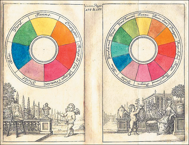
Eighteenth-century color wheels. Although modern color wheels have a lot more colors , the basic concept remains unchanged.
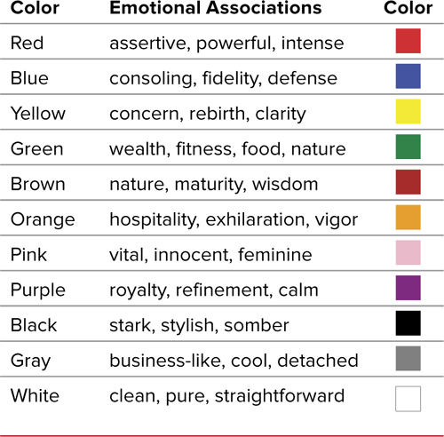
Colors have powerful emotional meanings that cannot always be predicted, especially when used in different combinations. Table 7.4 presents some of the most common color associations in Western culture. When you put two colors together, the meanings begin to interrelate, much like words in a sentence.
Table 7.4. Western Color Associations
You want to make sure you don’t just slap colors down on your page. If you do, they’ll probably clash. The most important thing you can do to avoid this is to take time to plan your color choices. Begin by choosing the specific colors you will use and their exact RGB or HSL values. Then apply these colors consistently throughout your project.
You will need to consider the colors that you will be applying to the basic parts of your Web page (including the colors in the background images) . You do not have to choose a different color hue for each part, but you should define what color will be applied to each component:
• Body background—Covering the entire visible area of the browser window, the background generally should provide the most contrast with the foreground text colors.
• Content background—Often, you will use a different color for the background directly around the content of the page, allowing the body background color to absorb extra horizontal space in the browser window.
• Border/rule—You may want to use contrasting colors around the borders of content areas, headers, navigation blocks, lists, and tables, or use rules to separate different chunks of content. Choose a color that contrasts with the area that the lines are meant to separate.
• Header—You may choose not to change the background color for section headers, but always make sure that the text color clearly contrasts with the background colors you choose.
• Copy—Your copy (generally sentences or paragraphs of text) should have the highest contrast with the background to maximize legibility.
• Link/navigation—You may choose different colors for your site navigation and for links in the copy, but these link colors should be easily discernible from other text while still contrasting with the background.
• List/table—You may choose different background colors behind lists and tables or even alternating row colors, called zebra striping, to improve readability.
• Form—You can specify the border, foreground, and background colors of many form elements to give them a more distinctive look for your site, apart from their default appearance. However, be careful not to customize them so much that the visitor does not know what they are.
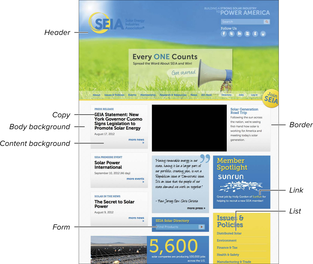
Consider which colors you will use for each component of your Web page. (Site: SEIA.org)
Color wheel basics
A color wheel is a disc or circle that shows the spectrum of color values, providing you with a quick overview of all the possibilities from red, orange, and yellow, to green, blue, indigo, and violet, and back to red again. Some color wheels also allow you to view brightness (dark to light) and saturation (full color tone to gray) levels .
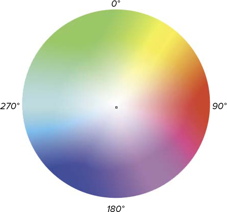
The color wheel. This is especially important to know if you want to use HSL color values. The wheel goes from 0° to 90° to 180° to 270° back to 0°.
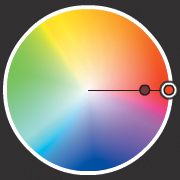
When you get down to it, though, color is a matter of preference. Colors that I think look great together may make my wife gag (and usually result in changing my outfit). To be safe, you can count on a single color (monochrome) or one of the following color-combination schemes as (more or less) fail-safe:
Analogous—Three or more colors and their tones with one primary color and two secondary colors that are the same angle from the primary color, from 0 degrees to 60 degrees.
Monochromatic—A single color with different brightness or saturation values for contrast.
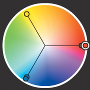
Triad—Three colors and their tones with one primary and two secondary colors that are at equal angles in the color wheel, 120 degrees to 180 degrees from the primary.
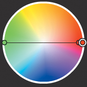
Complementary—Two colors from opposite sides of the color wheel (180 degrees), providing the highest contrast.
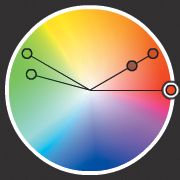
Compound—Four colors that include one primary color, one secondary color (in direct contrast to the primary color), and two colors that are the same angle from the primary or secondary color, from 0 degrees to 90 degrees.
All of these color schemes allow you to choose the basic hue and then use various brightness and/or saturation values for the colors to add additional shades to your palette.
Online color scheme tools
Not sure where to start planning your color scheme? Here are some excellent online tools that you can use:
• Build a palette—Adobe’s Kuler (http://kuler.adobe.com) provides an excellent tool for comparing colors side by side in an interactive environment .
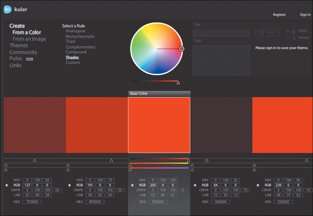
Adobe’s Kuler (http://kuler.adobe.com)
• ColRD: Palette Creator—Explore color palettes and gradients on ColRD (http://colrd.com/create/palette) .
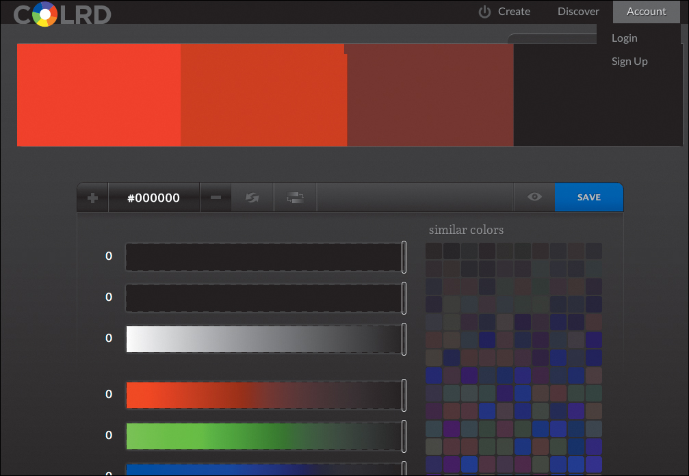
ColRD: Palette Creator (http://colrd.com/create/palette)
• DeGraeve’s Color Palette Generator—When you are using graphics or photography with a particular color scheme in them, the Degrave.com Color Palette Generator (degraeve.com/color-palette) will analyze the image and then produce a color palette based on those colors in the image  .
.
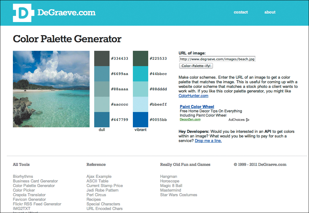
DeGraeve’s Color Palette Generator (degraeve.com/color-palette)
• Color Scheme Designer—If you need an advanced color wheel tool, I recommend the Color Scheme Designer (colorschemedesigner.com)  .
.
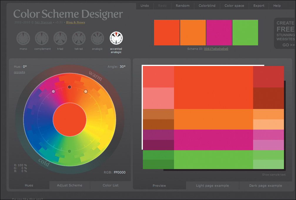
Color Scheme Designer (colorschemedesigner.com)
I also recommend that you check your foreground and background colors for accessibility at http://snook.ca/technical/colour_contrast/colour.html  .
.
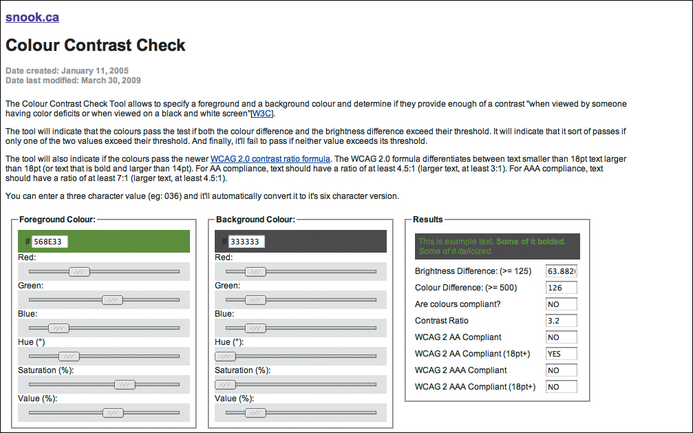
Check your color contrast to make sure it’s accessible (http://snook.ca/technical/colour_contrast/colour.html).
Setting Text Color
The color property is used to set the text color (sometimes called the foreground color) of an element (Table 7.5). This color will be inherited by all of the element’s children (see Chapter 4), so you need only set it once in the body element and then provide overrides as needed. For example, if you set the color to gray in the <body>, then all text on the page will be gray. If you then set the <p> element to red, all paragraph text and any elements in it will be red, overriding the gray.

To define the text color
1. Add the text color property to your CSS declarations. Type color in the CSS rule, followed by a colon (:) (Code 7.2).
color:
2. Specify a color value. Type a value for the color based on color values from Table 7.1. This includes RGB, HSL, transparent, or current color.
rgb(51, 51, 51);
It’s a good idea to set a default page color for the body, table, and input tags independently—even if it’s just to black—to ensure that colors are consistent across the page.
Code 7.2. Added to color-background-properties.css—The header text is rendered in a variety of shades of red, the text is a dark gray, and the form button and the text that gets typed into the form field are red . The brighter red text is much more prominent than the lighter red and the gray text.
/*** color-background-properties.css ***/
body { color: rgb(51,51,51); }
header h1 {
color: hsla(7,62%,40%,.8); }
header h2 {
color: rgba(242,237,217,.25); }
header h2 cite {
color: rgba(242,237,217,.5); }
article h2 .chaptertitle {
color: rgba(135,127,107,.5); }
article p:first-of-type:first-letter {
color: rgb(153,0,0); }
footer {
color: white; }
a:link {
color: rgb(204,0,0); }
a:visited {
color: rgb(153,0,0); }
a:hover {
color: rgb(255,0,0); }
a:active {
color: rgb(153,153,153); }
Code 7.2 when applied to code 7.1: The contrast of the page text has been reduced by making it dark gray with titles and the drop cap rendered in shades of red. Link colors in the footer are red.
3. Add colors with alpha channels, as needed. If you want the color to be partially transparent, then under the color value you can add the same again using the RGBA or HSVA value. For browsers that do not support alpha values, the first color value will be used and the second will be ignored:
color: hsla(7, 62%, 40%, 0.8);
When choosing foreground text colors, be careful to use colors that contrast with the background color or image. The lower the contrast (that is, the less difference in the brightness of the foreground and background colors), the more your readers will have to strain their eyes when reading. If you are unsure, you can use the Colour Contrast Check tool (http://snook.ca/technical/colour_contrast/colour.html).
Notice that I broke the color contrast rule in the title for this page. I’ve used a dark red title on a dark red background. To be legit, I should lighten the red color.
Color change is one important way of showing the different states of a hypertext link, but it is by no means the only style you can change. Chapter 14 will show you best practices for styling links, navigation, and controls using the anchor tag.
Setting a Background Color
The ability to set the background color on an HTML page has been around almost since the first Web browsers. However, with CSS you can define the background color, not only for the entire page, but also for individual elements using the background-color property (Table 7.6). Unlike the color property, though, background colors are applied only to the element, and are not directly inherited by its children. That said, by the very fact they are within the parent, they will be set against that background.
Table 7.6. Background-Color Values
To define the background color of an element
1. Add the background color property to your declaration list. Start your declaration by typing background-color (Code 7.3), followed by a colon (:).
background-color:
2. Specify the color value. Type a value for the background color. This value can be the name of the color or an RGB value.
rgb(102,0,0);
Alternatively, you could type transparent, which would allow the parent element’s background color to show through, or currentcolor to use the value of the color property.
The default state for an element’s background color is transparent, so the parent element’s background will show through unless the background color or image for that particular child element is set.
Code 7.3. Added to color-background-properties.css—Background colors can be set as solid or transparent .
/*** color-background-properties.css ***/
body {
background: rgb(76,76,76); }
header.page {
background: rgb(102,0,0); }
article {
background-color: rgb(242, 237, 217);}
figure {
background-color: rgb(242, 237, 217); }
footer {
background-color: rgb(0,0,0); }
Code 7.3 when applied to code 7.1: The colors begin to define distinct areas of the page, including the page header, the article, and the footer.
You can also set the background color using the background property, as described later in this chapter in “Using Background Shorthand to Add Multiple Background Images and Gradients.”
Some older browsers had incomplete HTML5 support, so you may see variation in the displayed appearance of your code. For example, Safari 4 did not support backgrounds in HTML5-specific tags such as <header> unless they have display: block set (see Chapter 10).
Setting Background Images
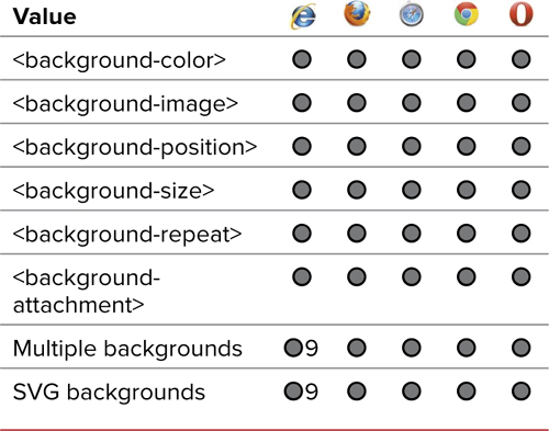
Beyond the ability to set an image as the background of an element, CSS includes several properties that offer you great flexibility in the exact placement of the image:
• Repeat—Sets whether the image tiles appear only once or repeat only horizontally or vertically.
• Attachment—Sets whether the image scrolls with the rest of the page or stays in one place.
• Position—Moves the image to the left and down (positive values) or to the right and up (negative values) from the top-left corner of the parent element.
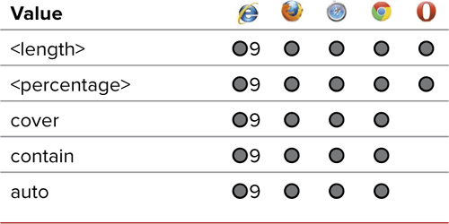
• Size—Sets the width and height of the image within the element’s background as an absolute length, percentage, or the keywords cover, contain, or auto (which maintains the aspect ratio).
• Clip—Sets whether the background fits to the border or just within the content area.
• Origin—Sets the position of the background relative to the border, padding, or content. This is especially useful for setting the background of inline elements that might break across multiple lines.
• Multiple background images—Although not a specific property, CSS now allows you to layer multiple background images using a comma-separated list.
You can also use the background-image property to set gradients in the background of an element. You could use the background property, but background-image works more consistently across browsers.
To define a background image
1. Add the background image property to your CSS code with the image file source. Type background-image, followed by a colon (:), url(), and a URL in the parentheses for the location of the image file (GIF, JPEG, or PNG) that you want to use as the background. It can be either a complete Web address or a relative path (Code 7.4).
background: url(../images/chrome/
dark-victorian.jpg);
Alternatively, you could type none instead of url() along with a path to instruct the browser not to use a background image (Table 7.7).
Table 7.7. Background-Image Values
Code 7.4. Added to color-background-properties.css—Background images are added over the background colors .
/*** color-background-properties.css ***/
body {
background: url(../images/chrome/dark-
victorian.jpg);
background-repeat: repeat;
background-attatchment: fixed;
background-position: 0 0; }
header.page {
background: url(../images/chrome/bg-book-spine.jpg);
background-repeat: repeat-x;
background-position: 0 0; }
article {
background-image: url(../images/chrome/paper-01.jpg);
background-repeat: repeat;
background-position: 0 0; }
article p:first-of-type:first-letter {
background-image: url(../images/chrome/alice02b.png);
background-repeat: no-repeat;
background-position: center center;
-webkit-background-size: contain;
-moz-background-size: contain;
-ie-background-size: contain;
-o-background-size: contain;
background-size: contain;
-webkit-background-clip: padding-box;
-moz-background-clip: padding;
-ie-background-clip: padding-box;
-o-background-clip: padding-box;
background-size: padding-box;
-webkit-background-origin: padding-box;
-moz-background-origin: padding;
-ie-background-origin: padding-box;
-o-background-origin: padding-box;
background-origin: padding-box; }
figure {
background-image: url(../images/chrome/paper-01.jpg);
backgound-repeat: repeat;
background-position: 0 0; }
Code 7.4 when applied to code 7.1: Adding background images begins to add texture to the page.
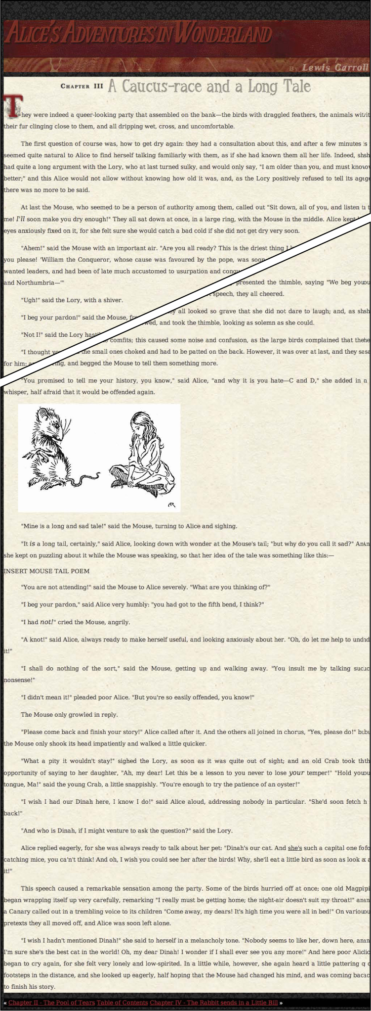
2. Add the background repeat property and specify how the background should be tiled (or not). Type background-repeat, followed by a colon (:)
background-repeat: repeat;
Then define how you want your background to repeat by typing one of the following options (Table 7.8):
• repeat instructs the browser to tile the graphic throughout the background of the element horizontally and vertically. This is the default value if the property is omitted.
• repeat-x instructs the browser to tile the background graphic horizontally only, so that the graphic repeats in one straight horizontal line along the top of the element.
• repeat-y instructs the browser to tile the background graphic vertically only, so the graphic repeats in one straight vertical line along the left side of the element.
• no-repeat causes the background graphic to appear only once (and not tile).
• round resizes the image so that it repeats without clipping.
• space spaces the image to fill the area so that it is not clipped.
Table 7.8. Background-Repeat Values
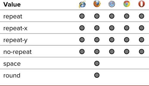
3. Add the background attachment property and specify how the background should scroll with the element. Type background-attachment, followed by a colon (:).
background-attachment: fixed;
Then define how you want the background to be treated when the page scrolls by typing one of the following options (Table 7.9):
• scroll instructs the background graphic to scroll with the element. This is the default value if the property is omitted.
• fixed instructs the browser not to scroll the background content with the rest of the element. However, it will scroll with parent elements.
• local is similar to fixed, but the background is fixed to the content of the element, rather than the element itself.
Table 7.9. Background-Attachment Values
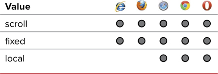
4. Add the background position property and specify the positioning of the background. Type background-position, followed by a colon (:).
background-position: 0 0;
Then type one value or two values separated by a space to indicate where you want the background to appear in relation to the top-left corner of the element. If one value is entered, it is used for x, and y is centered. Use one of the following values (Table 7.10):
• Length values, such as –10px. The values can be positive or negative. The first number tells the browser the distance the element should appear from the left edge of its parent; the second value specifies the position from the top edge of the parent. See “Values and Units Used in This Book” in the Introduction for more information.
Table 7.10. Background-Position Values
• Percentage values, such as 25%. The first percentage indicates the horizontal position proportional to the parent element’s size; the second value indicates the vertical position proportional to the parent element’s size.
• Keywords in plain English: top, bottom, left, right, or center.
5. Add the background size property and specify the exact size, percentage, or sizing method. Type background-size, followed by a colon (:).
-webkit-background-size: contain;
-moz-background-size: contain;
-ie-background-size: contain;
-o-background-size: contain;
background-size: contain;
Then type a value from Table 7.11. Two values can be included to define separate x and y sizes:
• Length values, such as 10px.
• Percentage values, such as 25%. The first percentage indicates the width proportionate to the parent element’s width; the second value indicates the height proportionate to the parent element’s height.
• cover fits the image to the width or height of the containing element while preserving the aspect ratio.
• contain scales the image to the smallest size to fit the entire image in the desired area while preserving the aspect ratio.
Table 7.11. Background-Size Values
6. Add the background clip property and specify a clipping method. Type background-clip, followed by a colon (:).
-webkit-background-clip: padding-box;
-moz-background-clip: padding;
-ie-background-clip: padding-box;
-o-background-clip: padding-box;
background-clip: padding-box;
Then type a value from Table 7.12. Two values can be included to define separate x and y sizes.
Table 7.12. Background-Clip Values
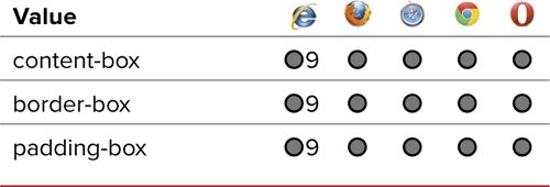
Mozilla and Webkit both use a slightly different syntax than what was finally implemented in the CSS3 standards.
• border/border-box clips the image to the outer edge of the border.
• padding/padding-box clips the image to the outer edge of the padding.
• content/content-box clips the image to the outer edge of the content.
You can mix percentage and length values in the same background position and size declarations, but you cannot mix length or percentages with plain English keywords.
Several of the background images used in this example are transparent PNGs, which allow the background to show through them.
Any space in the background that does not have a background graphic will be filled with the background color, so I always recommend specifying a background color with a background image.
Background images are used to create CSS Sprites, discussed in Chapter 14, one of the most useful tools in your dynamic Web design arsenal.
7. Add the background origin property and specify an origin method. Type background-origin followed by a colon (:).
-webkit-background-origin: padding-box;
-moz-background-origin: padding;
-ie-background-origin: padding-box;
-o-background-origin: padding-box;
background-origin: padding-box;
Then type a value from Table 7.13. Two values can be included to define separate x and y sizes.
Table 7.13. Background-Origin Values
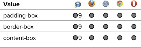
• border/border-box positions the image relative to the outer edge border, placing it behind the border.
• padding/padding-box positions the image relative to the inner edge of the padding.
• content/content-box positions the image relative to the outer edge of the content.
8. Finally, specify the background image to which the above properties are applied. To layer background images, add each value in a comma-separated list. Images will be placed beneath previous images in the list with background color behind all of them. Be sure to add values for all the properties, as necessary.
background: url(../images/chrome/alice02b.png);
background: no-repeat;
background-position: center center;
Using Background Shorthand to Add Multiple Background Images and Gradients
The background shorthand property (Table 7.14) allows you to define the background image and color for an entire page or individual element, rolling many of the background properties into a single quick and compressed declaration. From a coding standpoint, this method is preferable because it uses less space, but it requires that you remember the purpose of each of the values in the list.
Code 7.5. Added to color-background-properties.css—Although the results will be similar to Code 7.4, this version is much more compact, easier to scan, and cuts down on file size .
/*** color-background-properties.css ***/
body {
background: rgb(76,76,76) url(../images/chrome/dark-victorian.jpg) repeat 0 0; }
header.page {
background: url(../images/chrome/bg-book-spine-title.png) no-repeat right top,
rgb(102,0,0) url(../images/chrome/bg-book-spine.jpg) repeat-x 0 0; }
article {
background: url(../images/chrome/embelish-01.png) no-repeat right top,
rgb(242, 237, 217) url(../images/chrome/paper-01.jpg) repeat 0 0; }
footer {
display: block;
padding: 1.5em;
background: rgb(153,153,153);
background: -webkit-linear-gradient(top, rgba(0,0,0,0), rgba(0,0,0,1));
background: -moz-linear-gradient(top, rgba(0,0,0,0), rgba(0,0,0,1));
background: -ms-linear-gradient(top, rgba(0,0,0,0), rgba(0,0,0,1));
background: -o-linear-gradient(top, rgba(0,0,0,0), rgba(0,0,0,1));
background: linear-gradient(to top, rgba(0,0,0,0), rgba(0,0,0,1)); }
figure {
background: rgb(242, 237, 217) url(../images/chrome/paper-01.jpg) repeat 0 0; }
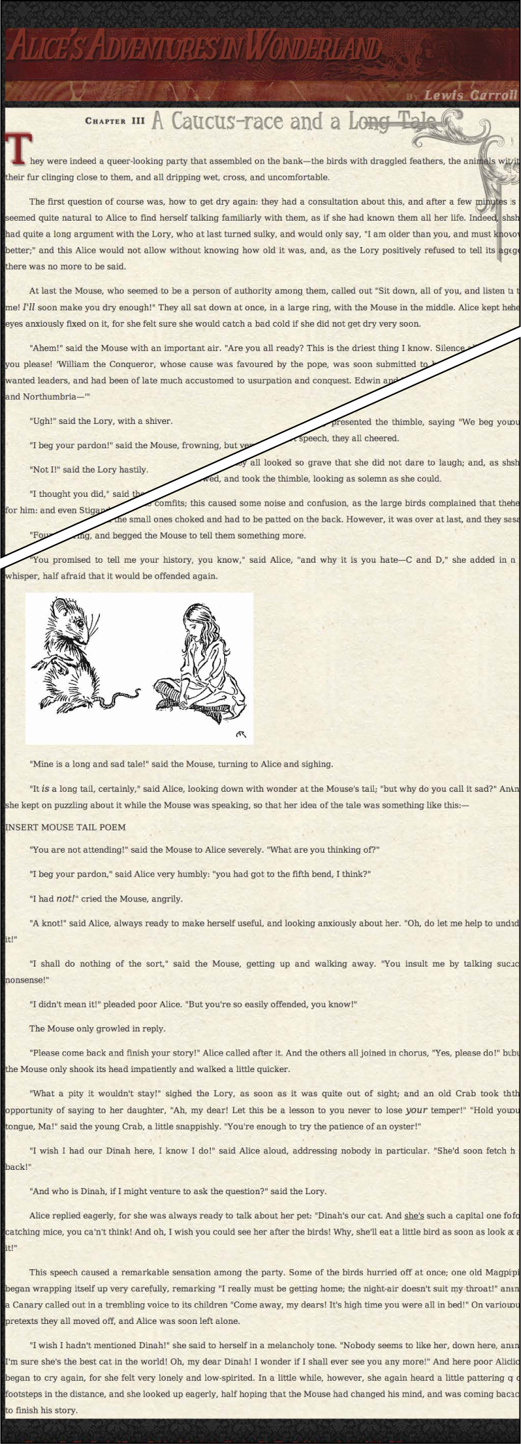
Code 7.5 when applied to code 7.1: Adding background images makes the design come alive, giving it texture and structure.
To define the background
1. Add the background property to your CSS rule declarations list. Start your declaration by typing background, followed by a colon (:). Then define a background value (Code 7.5).
background:
2. Specify the color value. Type a value for the background color, followed by a space. This value can be the name of the color or an RGB, HSL, or keyword value (Table 7.1) Use transparent if you do not want a background color to appear.
rgb(76, 76, 76)
3. Specify the URL for the background image. Type url() and in the parentheses, add an absolute or relative path to the background image (Table 7.7), followed by a space. This location is the image file (GIF, JPEG, or PNG file) that you want to use as the background and is either a complete Web address or a local filename .
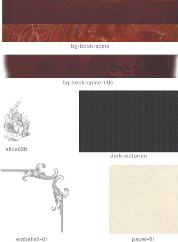
All of the images that go into making this design.
url(../images/chrome/dark-victorian.jpg)
Alternatively, you could type none instead of a URL, which would instruct the browser not to use a background image.
4. If you included a background image, specify how it should tile. Type a value for the way you want your background to repeat, followed by a space.
repeat
Use one of the following options (Table 7.8):
• repeat instructs the browser to tile the graphic throughout the background of the element, both horizontally and vertically.
• repeat-x instructs the browser to tile the background graphic horizontally only. In other words, the graphic repeats in one straight horizontal line along the top of the element.
• repeat-y instructs the browser to tile the background graphic vertically only. In other words, the graphic repeats in one straight vertical line along the left side of the element.
• no-repeat causes the background graphic to appear only once.
5. If you are using a background image, specify how it should scroll.
fixed
Type a keyword for the way you want the background attached—how it should be treated when the page scrolls—followed by a space. Use one of the following options (Table 7.9):
• scroll instructs the background graphic to scroll with the element.
• fixed instructs the browser not to scroll the background content with the rest of the element.
• local is similar to fixed, but the background is fixed to the content of the element, rather than the element itself.
6. If you are using a background image, specify how it should be positioned.
0 0;
Type two values, separated by a space, to specify where you want the background positioned relative to the top-left corner of the element. Use any of the following units; you can use a mixture across the two values if you like (Table 7.10):
• A length value, such as –10px. The values can be positive or negative. The first number tells the browser the distance the element should appear from the left edge of its parent; the second value specifies the position from the top edge of the parent.
• A percentage value, such as 25%. The first percentage indicates the horizontal position proportional to the parent element’s size; the second value indicates the vertical position proportional to the parent element’s size.
• A position keyword, such as top, bottom, left, right, or center.
7. Add multiple backgrounds to an image in a comma-separated list.
background: url(../images/chrome/bg-book-spine-title.png) no-repeat right top,
rgb(102,0,0) url(../images/chrome/bg-book-spine.jpg) repeat-x 0 0;
As with the stand-alone background properties, you can place multiple backgrounds in a single object. Just add the values in a comma-separated list. Place the background color value in the last value set; otherwise, it will cover everything beneath it.
While it is possible to include the background image size and clip in the shorthand, the browser support for this is spotty at best. I recommend keeping these as separate declarations.
8. Add gradients to backgrounds.
background: rgb(153,153,153);
background: -webkit-linear-gradient(top, rgba(0,0,0,0), rgba(0,0,0,1));
background: -moz-linear-gradient(top, rgba(0,0,0,0), rgba(0,0,0,1));
background: -ms-linear-gradient(top, rgba(0,0,0,0), rgba(0,0,0,1));
background: -o-linear-gradient(top, rgba(0,0,0,0), rgba(0,0,0,1));
background: linear-gradient(to top, rgba(0,0,0,0), rgba(0,0,0,1));
Add the default background color, which will be used by browsers that do not understand gradients, and then add the gradient property for all of the browsers. Finally add the official CSS3 version at the bottom. Browsers will use whichever version applies to them.
The ability to place graphics behind any element on the screen is a very powerful design tool for Web pages, especially when using the CSS Sprite technique, where a single background image can be used for different dynamic states. See Chapter 14 for more information.
The default state for an element’s background is none, so the parent element’s background image and/or color will show through unless the background color or background image is set for that child element.
A fixed background can be particularly effective if you’re using a graphic background in your layout to help define the layout grid.
Putting It All Together
Code 7.6 shows the final results for the file color-background-properties.css, which we have been building in this chapter.
Code 7.6. Final color-background-properties.css—The finished code for this chapter, using the background shorthand wherever possible.
/*** color-background-properties.css ***/
body {
color: rgb(51,51,51);
background: rgb(76,76,76) url(../images/chrome/dark-victorian.jpg) repeat 0 0; }
header.page {
background: url(../images/chrome/bg-book-spine-title.png) no-repeat right top,
rgb(102,0,0) url(../images/chrome/bg-book-spine.jpg) repeat-x 0 0; }
h1 {
color: hsla(7,62%,40%,.8); }
header h2 {
color: rgba(242,237,217,.25); }
header h2 cite {
color: rgba(242,237,217,.5);}
article {
background: url(../images/chrome/embelish-01.png) no-repeat right top,
rgb(242, 237, 217) url(../images/chrome/paper-01.jpg) repeat 0 0; }
article h2 .chaptertitle {
color: rgba(135,127,107,.5); }
article p:first-of-type:first-letter {
color: rgb(153,0,0);
background: transparent url(../images/chrome/alice02b.png) no-repeat center center;
-webkit-background-size: contain;
-moz-background-size: contain;
-ie-background-size: contain;
-o-background-size: contain;
background-size: contain;
-webkit-background-clip: padding-box;
-moz-background-clip: padding;
-ie-background-clip: padding-box;
-o-background-clip: padding-box;
background-size: padding-box;
-webkit-background-origin: padding-box;
-moz-background-origin: padding;
-ie-background-origin: padding-box;
-o-background-origin: padding-box;
background-origin: padding-box; }
footer {
color: white;
display: block;
padding: 1.5em;
background: rgb(153,153,153);
background: -webkit-linear-gradient(top, rgba(0,0,0,0), rgba(0,0,0,1));
background: -moz-linear-gradient(top, rgba(0,0,0,0), rgba(0,0,0,1));
background: -ms-linear-gradient(top, rgba(0,0,0,0), rgba(0,0,0,1));
background: -o-linear-gradient(top, rgba(0,0,0,0), rgba(0,0,0,1));
background: linear-gradient(to top, rgba(0,0,0,0), rgba(0,0,0,1)); }
a:link {
color: rgb(204,0,0); }
a:visited {
color: rgb(153,0,0); }
a:hover {
color: rgb(255,0,0); }
a:active {
color: rgb(153,153,153); }
figure {
background: rgb(242, 237, 217) url(../images/chrome/paper-01.jpg) repeat 0 0; }
/* putting it all together */
nav.global a:link, nav.global a:visited {
color: rgb(248, 240, 227); }
aside {
background: rgb(242, 237, 217) url(../images/chrome/paper-01.jpg) repeat 0 0; }
td {
background-color: rgba(200, 200, 180,.25);
border: 1px solid rgb(200, 200, 180); }