
Chapter 3. Sketching and Prototyping
Having worked our way through the first three chapters, we now have a decent idea of who our user is, what problem our user is trying to solve, and what our user would consider to be the characteristics of a good solution. It is now time to start creating and refining the potential solutions to this particular problem for this particular user.
It’s an ongoing, iterative process. The only way to succeed is to fail: fail early, fail often, fail cheaply. Cheap, disposable sketches are the way to make that happen.
Prototyping: The Wrong Way to Start
The biggest mistake I see developers make is this: when it’s time to start working on solutions, they immediately fire up a full application developer tool, such as Visual Studio or Expression Blend or Xamarin Studio. They use that tool to create a new skeleton application project, be it desktop or Web or mobile. They then immediately start dragging controls from the palette onto the design surface—a button here, a check box there; what do you think, should this be a dropdown list or a set of radio buttons? Then they start adding code to it to demonstrate some of its functionality—having a button bring up a dialog box, maybe connecting a grid to display data from a dummy database. Then they show it to their developer peers, not the users or their representatives, for feedback. The peers, busy with their own projects, always nod and say, “Yeah, looks pretty good.”
When asked why they do this, developers are puzzled. “What kind of question is that?” they say. “We’re building an application. This is the tool that we use. What else did you have in mind?”
What the devs are doing is constructing a prototype. A prototype is an actual product that more or less works—perhaps not perfectly, probably needing some refinements, but it works from one end to the other. A prototype airplane actually does fly. You test the prototype to confirm that it flies as far and as fast as your calculations say that it should. If it doesn’t, you still have a chance to fix the problem before you produce thousands of them and deliver them to customers. Figure 3.1 shows a prototype US Air Force F-35 fighter testing its ability to restart its engine in flight. But this isn’t the way to start designing a user experience.

Figure 3.1 This prototype F-35 is being tested for its ability to restart the engine in flight. (US Air Force photo, www.edwards.af.mil/shared/media/photodb/photos/081023-F-3571D-400.jpg)
Starting with a Good Sketch
The medium of software is almost infinitely tractable. In the words of Frederick Brooks, we are working with “nearly pure thought-stuff.” We have a few physical constraints, such as the size of the display area and the types of input devices. But apart from that, we can put almost anything into our app. Figuring out what ought to be programmed is as hard as actually programming it.
It is extremely difficult to put ourselves into our users’ shoes, to know what they’ll like and understand and find useful and (we hope) buy. We can make guesses, educated by our user research and interviews, personified via personas and stories. But the only way we can know how good our guesses are is to actually show them to users and get feedback. We incorporate their suggestions, refine our design, and get feedback again. This iterative process is the only way to produce a design that works.
The type of feedback we get from users is astounding. They give us initial input, but they don’t realize what they know until they actually see it in front of them. “Yes, I’m doing this thing here, but now I need this piece of data. Didn’t I mention that? Oh, sorry. But I need it now. Where is it? On another screen, you say? That’s no good. Bring it to me now. Where should it go? Maybe get rid of this thing here, which I’m not using.” And so on.
Users themselves can’t tell us the first time around what they need or want. They need to have their minds jogged, their ideas stirred around, by specific examples. You probably remember the old night-before-implementation spoof poem:
And the user exclaimed with a snarl and a taunt,
“That’s just what I asked for, but not what I want.”
The only way to solve this problem is to try many different ideas. And because we need to do that, we need to do so quickly and cheaply. We will therefore start by making sketches instead of prototypes. A sketch is a simple, quickly executed drawing that illustrates essential concepts without providing details. Think of what you see an artist do with just a few strokes of a pencil, as in Figure 3.2.

Figure 3.2 A good early sketch—just a few simple strokes evoke the entire butterfly. (Photo © iStock.com/red_frog)
A sketch is intended to suggest ideas to the test users, to stimulate their imagination and thought process. “Do you like this? What about that? Why? Why not? Do you not like this because the font is too small or because you’re not thinking about these things at this time?” and so on.
Above all, you want the sketch to appear temporary. You are not looking to produce anything reusable at this point. You want the test users to feel free to say, “Change this.”
When users see the sketch, they’ll often contradict something that they told you in an interview. “I know I said I wanted this, but now that I see it here, it just doesn’t fit. Get rid of it; we’ll see it on another screen maybe.” That’s not something to get upset about. It’s just the way humans are. Be happy that you found it out now, early in the process, so you can do something about it.
You especially do not want any code at this point, because if the UX changes, the code will have to change as well. That takes time, costs money, and makes you more reluctant to explore something interesting or abandon something that hasn’t proved useful.
Imagine you had a set of radio buttons with rudimentary code behind them. Suppose a reviewer said, “I don’t like those radio buttons. They take up too much space, and all those names distract me when I’m trying to think. And I don’t change them often anyway.” You reply, “How about turning them into a dropdown list?” and the test user agrees. Now you have to change the code that selected the initial radio button and responded to clicks on the set and replace it with code for managing a list. Changing that code has a larger cost than just changing a drawing. And because it has a larger cost, you are more reluctant to try that change, and users are more reluctant to suggest it.
In general, you want to keep these sketches in monochrome. If you start putting in colors, the users to whom you show the sketches will think immediately about the color and not about other things. “Hmm, I don’t know about that blue. Could it maybe be a little more green?” You don’t want them thinking about it at this stage of the game. That’s for the graphic designers, otherwise known as the decorators, and it happens at the very end.
The process of creating and refining sketches until we get to one we like resembles a funnel (see Figure 3.3). We start with a number of ideas covering a wide range of possibilities. (a) “Are you thinking more in terms of menus or tabs? Or maybe a toolbar?” We’ll show them to users and get feedback. “Now that I see them on the screen, I think tabs work the best for what we’re doing here.” So we throw out all the sketches involving menus and toolbars (b).1 Then we’ll develop the remaining ideas about tabs, adding some detail, expanding the choices among the remaining elements (c): Two tabs or three? At the top or bottom of the screen? We’ll repeat the process, getting feedback, winnowing down the choices, and so on. Eventually, we’ll wind up with the concept that we’re going to implement (three tabs at the bottom of the screen).
1. You probably want to move the menu and toolbar sketches out of your mockup project so they don’t distract you from looking at the tabs. But you probably don’t want to completely erase them, in case you want to circle back later. I often keep a file called “Removed Ideas” for each project that I’m working on, for this express purpose.
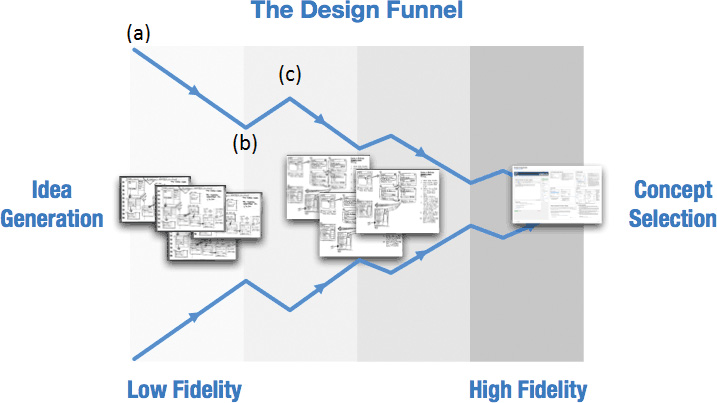
As we improve our concept, we increase the fidelity of the representation. At the beginning, we might use an empty rectangle to indicate a toolbar. As we move ahead, and the toolbar survives more of the winnowing process, we might sketch a few buttons on it. At the end, the toolbar would probably contain all its controls with their labels.
Mockup Tool Example: Balsamiq
Now you’re starting to think about making these sketches, and of course you’re freaking out. Sketch? That’s what art majors do when they get a break from flipping hamburgers: sketch pigeons in the alley and hope that someday their talent will be discovered. “I’m a geek; I use computers for everything,” you’re thinking to yourself. “Do I have to start carrying around a paper sketch pad and a pencil, even—God help me—an eraser?”
Of course not. Very good software tools exist for sketching a UX layout. They’re just not built into the major development tool packages, which are geared toward producing code. You want a sketching package that makes simple things very, very simple; very, very fast; and very, very cheap. You want the sketches thus produced to be disposable and to appear disposable, so reviewers feel free to suggest changes. You don’t want them to tempt you toward prematurely producing code.
These sketching tools produce a low-fidelity representation of a proposed screen layout. The terms used to describe this layout vary. So far we’ve used the generic term sketch, though as you see, it has paper-and-pencil connotations we should avoid. You will sometimes hear wireframe as a generic term for a low-fidelity representation. This too has specific connotations from the early days, meaning a three-dimensional model that showed a figure’s outlines without the computationally intensive task of rendering its surfaces. To avoid these confusing connotations, this book will henceforth use the term mockup to mean a low-fidelity representation of a user experience layout produced by a software tool.
One useful mockup editor is Balsamiq Mockups (www.balsamiq.com). The desktop version costs $89 for a one-user license. Its closest competitors are MockFlow and Axure. Balsamiq produces mockups like Microsoft WordPad produces documents—with quick, cheap, basic functionality. Neither provides the capability of deep diving, as Expression Blend does for drawing (see databinding class diagrams) and Microsoft Word does for writing (see the equation editor). This simplicity is a feature, not a bug, for our needs at this stage of the UX process.
With Balsamiq, you will find it very easy to produce quick mockups of your UX ideas. You will also find it easy to copy a mockup and make small changes to it, so you can examine a great many different ideas very quickly. Rather than spend more time describing it, let’s look at a quick example.
You might remember Nextel, a wireless phone carrier in the United States before Sprint bought it in 2005. Nextel provided standard cell phone service like the other carriers, but its primary attraction to customers was its unique “push-to-talk” feature. The user would press and hold a button on his handset while talking into the mouthpiece, similar to a walkie-talkie radio. The call would be automatically directed to the Nextel phone or group of phones that the user had preconfigured. The recipients would hear an alert tone, then the caller’s voice, without having to touch their phones. The original caller would release his button when he was finished talking, at which time the recipient could press his button to talk back to the caller.
This communication pattern fit a certain operational niche very well. It had almost a cult following among customers who needed frequent, short interactions among a small set of users who moved around a lot—the dispatcher of a small fleet of vehicles, say, or a contractor, or a caterer.
Or a medical examiner. Shiya Ribowsky worked as a medicolegal investigator for the New York City Medical Examiner’s Office. In his book Dead Center (Harper Collins, 2007), he wrote about their staff responding on 9/11, charging downtown before the towers fell, “all equipped with Nextel phones and two-way radios. . . . At the office, we listened over the phones and radios to our seasoned co-workers crying as they watched people jump from the burning towers.”
You can’t buy these phones anymore. But many users swore by them. Suppose we wanted to re-create them in today’s smartphone environment, like the dinosaurs in Jurassic Park. The key, of course, is getting the UX right. So here are some mini-personas and a mini-story to jump-start this design:
The carpenters who built my house absolutely loved the Nextel walkie-talkie phone. I spent a lot of time watching them use it and discussing it with them. They were really angry when Sprint discontinued it.
Imagine the boss man, Todd, and his employees, Pete, Jimmy, and Bob. They’re skilled carpenters, they’re busy as heck, and in their own words, “We don’t have time to fart around.” Some days they’ll all work on one site; some days they’re spread out among several sites. Sometimes Todd has to stay back at the office to do paperwork, or visit prospective clients to bring in new business. These guys need to talk to each other dozens of times per day, for example:
Pete (presses to talk to all users): Guys, I’m at the hardware store. How many boxes of those nails do you need? [releases talk button]
Bob (hears alert tone, hears Pete’s request, presses talk button): Get me three boxes, OK? [releases button]
Jimmy (hears Pete and Bob, presses talk): I’ll need a couple more next week, so how about you grab them now? [releases button]
Todd (hears entire conversation, presses talk): That store gives a discount for ten boxes, so get that many. We’ll use them soon. [releases button]
If Sprint won’t sell phones with walkie-talkies anymore, why not just do a conference call via Skype, or the cell carrier’s own connection? Partly it’s simplicity. Pushing a dedicated button is faster than bringing up an app and selecting a contact, even one on speed dial. And hearing the caller’s voice without needing to answer saves some time as well. When you do it 50 times a day, those savings add up. Partly it’s the ability to speak to a group of contacts directly. A taxi dispatcher saying, “Hey, who’s near 15th Street?” could just tap a button and speak, without waiting for the recipients to answer. Anyone with his phone turned on will hear the incoming message without having to answer it. He doesn’t have to touch his phone if it’s not something he needs to respond to. Skype makes many more operations possible than the simple walkie-talkie case. But these simplest of operations are no longer as simple as they were.
When I tell this story to developers, I invariably get howls of protest: “But Skype lets you do X! And Y! Why don’t those dumb users want those things? Sounds like we need to educate them.” Wrong, my geeky friend. Your user is not you. These users would rather have the ultra-simplicity in their most common case than fancy features in less common cases. If you want their money, you have to give them what they want.
“They said that if we liked our cell phones, we could keep our cell phones,” complains Todd. “No, wait a minute, that was our health plan. But why do they insist on wrecking something that we were fine with?”
Like it or not, smartphones are what we have today. A few apps, such as Voxer, claim to provide the previous functionality on a modern platform, but users of those apps know that no, they’re not the good old thing. As with most modern apps, they are loaded with features, and the old simplicity gets lost. Suppose we wanted to provide a bare-bones walkie-talkie app to make Todd and his crew happy? Let’s sketch out what it might look like, show it to some users, and see what they think.
Understand that we are sketching out the UX solely from the user’s point of view. We’re not talking about designing the underlying communication functionality. We do not care what sort of gyrations the communication engineers go through to make it work the way our users want, what sort of five-dimensional hyper-pretzels they have to contort themselves into. If the engineers squawk (and they probably will when they see the simplicity of the UX instead of the feature bloat that such geeks prefer), we’ll fall back on Plattski’s Universal Geek Challenge Remedy: “What? You mean you’re not smart enough?”
We could construct some layouts in Visual Studio or Expression Blend. But learning and then using these very powerful environments takes a whole lot longer than doing the same thing in Balsamiq. The finished appearance of controls would make the users less willing to suggest changes. And it would encourage us to start coding the UX prematurely. So we’re going to mock up our layouts in Balsamiq instead.
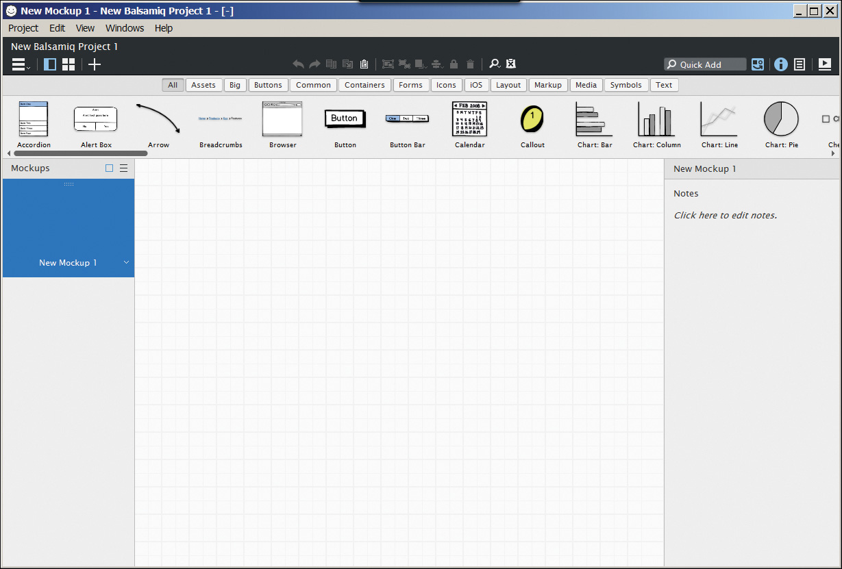
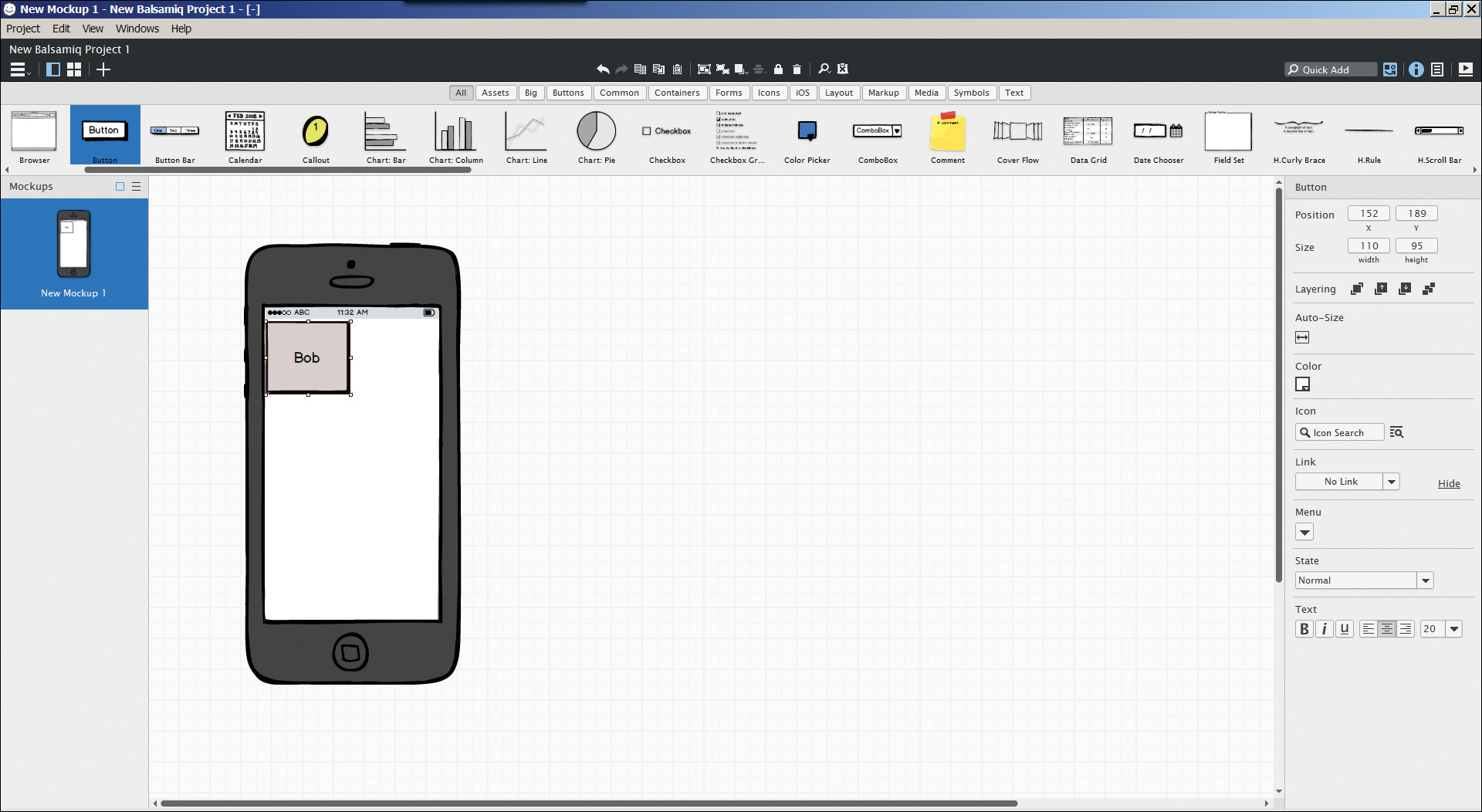
We open the desktop version of Balsamiq, shown in Figure 3.4. There’s a list of all our mockups on the left. Currently we have only one, labeled “New Mockup 1.” The column on the right contains a place for notes about this mockup. Our work surface is in the middle. Across the top you see a toolbar with the outlines of the different symbol objects that Balsamiq knows about; we can drag and drop these onto the work surface.
This app is intended for a smartphone, so we probably want to start with some sort of phone-shaped frame. Looking on the symbol toolbar, we see one for an iPhone. We haven’t yet thought about whether this app should aim for Android or iPhone, or if we should even consider Windows phones. But that doesn’t matter at this stage of the mockup design. We’re at the largest opening of the design funnel. So we press and hold the left mouse button on the iPhone symbol, drag it onto the work surface, and release the left mouse button to drop the symbol where we want it. The results are shown in Figure 3.5.
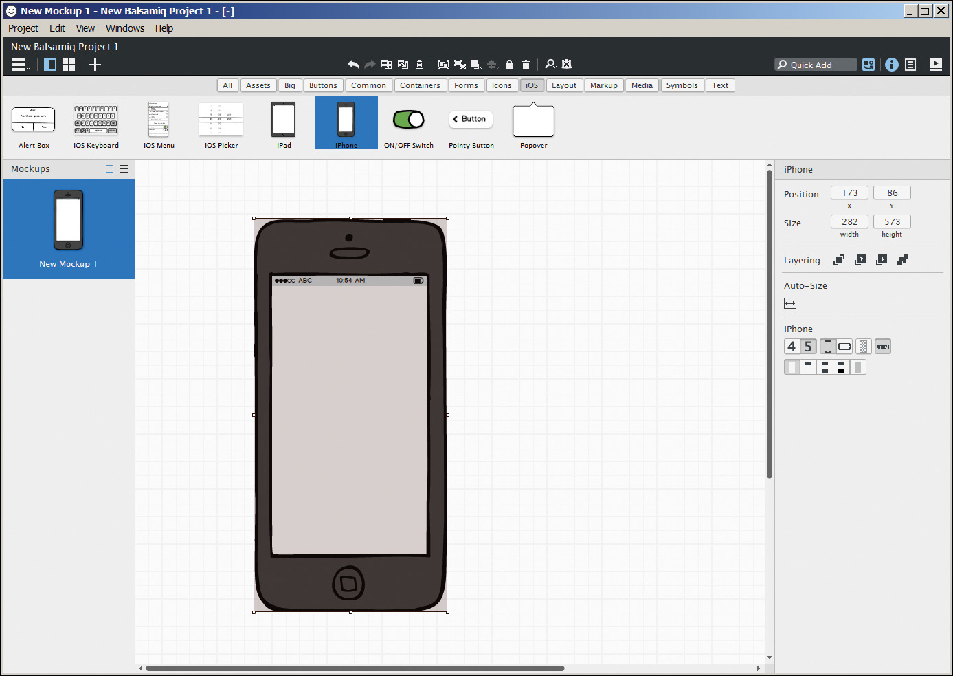
Note that Balsamiq deliberately shows the outline in a sketchy sort of rendering. For example, the home button at the bottom is not perfectly rectangular, nor is the circle around it completely circular. This lack of fidelity suggests to your subconscious mind that this is a cheap, disposable mockup. You couldn’t ship a product with this makeshift appearance. It is, and appears to be, purely a mockup.
On the right side, you now see a window showing the editable properties of this iPhone layout. You can see such choices as the iPhone 4 or iPhone 5, and landscape or portrait orientation. The differences between the iPhone versions are small enough that we can ignore them for now. Phones are almost always used in portrait orientation while talking, so we’ll leave that setting intact as well. Again, remembering the design funnel we saw earlier in this chapter, we don’t want to spend time on these details now.
The location and size of the phone are shown in PC screen pixels. The actual resolution of an iPhone 6 display is 1136 x 640 pixels, about double what Balsamiq is showing. The pixels on phones, particularly iPhones, are more densely packed than on most PC monitors. That lack of fidelity is precisely not the point here. We’re not going to spend time matching pixel for pixel. We are looking to do a relatively large number of layouts, quickly and cheaply, so we can decide which ones we want to spend time developing further. We can zoom in (Ctrl +) for a closer look, or out (Ctrl -) for a wider one.
How should we start? What would the simplest design be? Well, this app is about frequently calling a small number of people, the same ones all the time. So let’s plan from the very beginning to optimize this case. How about putting some large buttons on the app’s home screen for quick access? Maybe with contact names in them?
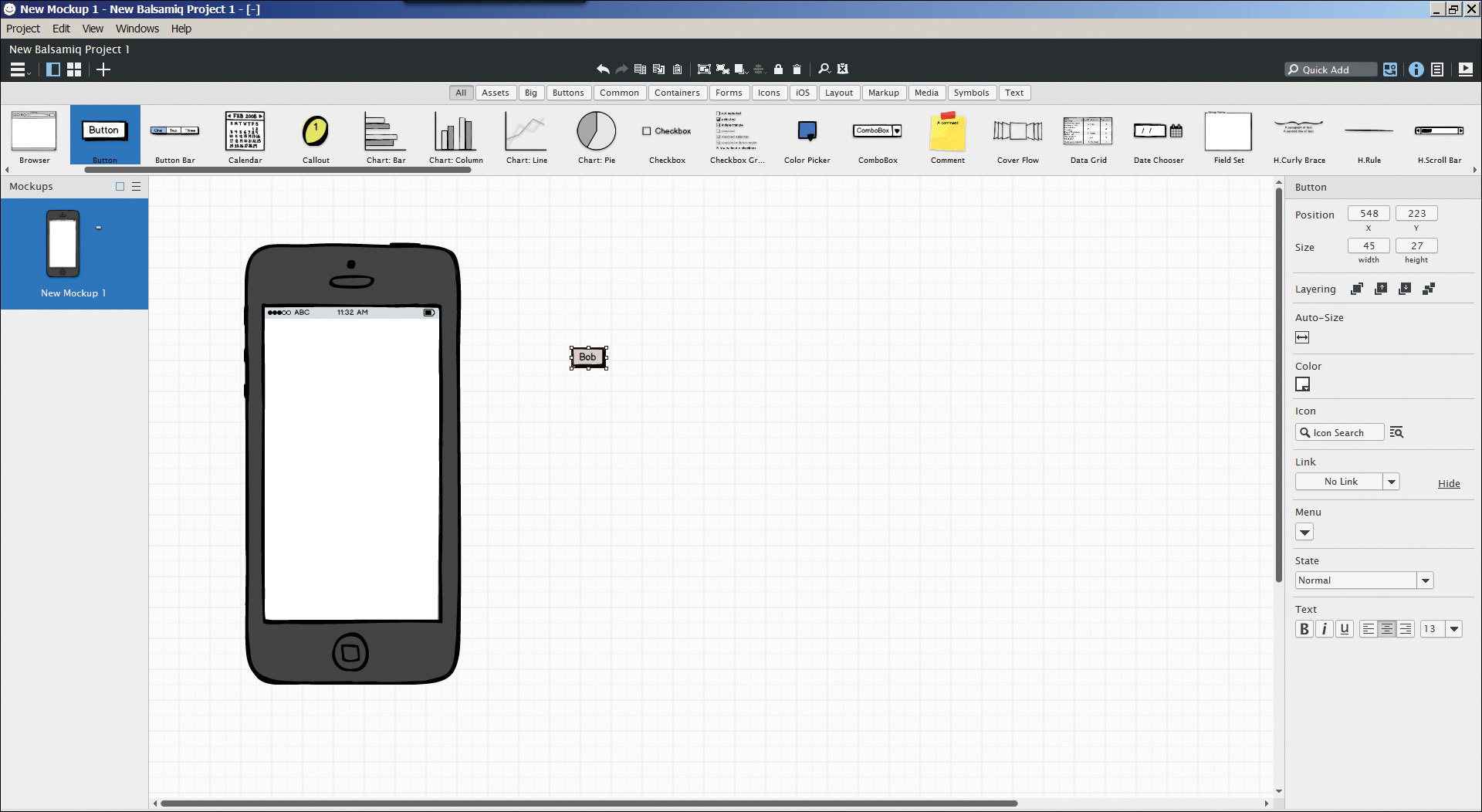
Let’s select the Button control from the UI library toolbar, drag it, and drop it on the screen. When we do this, the data entry editor for the button opens, so we can type in the text that we want it to display. In this case, it’s “Bob,” the employee we want the button to call. The right column now shows the properties of the new text area. The default is centered, which is what you expect from a button most of the time. The button’s size is automatically set to the size of the text string (Figure 3.6).
We now need to figure out the size and arrangement of buttons within the phone. Remember, we’re talking about fast access to a small, tight group. We don’t want to spend time scanning a long list. Carpenters work with their hands, so they tend to have larger fingers with less fine control. So how about something large, say, two columns, with maybe three or four buttons in each? Let’s drag Bob’s button into the iPhone layout and size it to take up about half the width. We’ll adjust its height to where it looks and feels good to us. The text string will probably get small, so we’ll use the properties window to adjust its font. Twenty-four point looks OK for now (Figure 3.7).
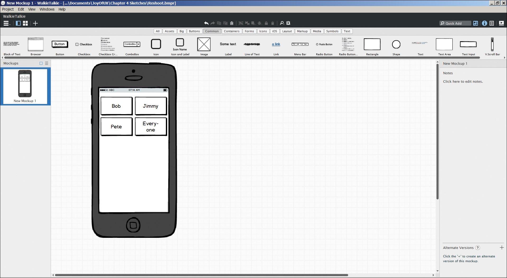
Now that we have one button in our iPhone layout, we want to add more buttons. To make them the same size as the first one, we’ll just click on that button to select it, type Ctrl-C to copy, then Ctrl-V to paste. We repeat Ctrl-V two more times, giving us a total of four buttons. We drag the new ones to form a square arrangement in the mockup. Then we double-click each button to edit its text string. We can change “Bob” to “Pete,” “Jimmy,” and “Everyone.” Oops, the legend “Everyone” doesn’t quite fit this button size in 24-point font. What to do? Change its font size maybe? Or add a character into the text which splits it onto two lines? Change its name to “All”? We’ll try one of those; if we don’t like it, we’ll try another. But above all, we won’t spend much time fiddling with it. Now we have what’s shown in Figure 3.8. The touch zones are large, and the button names are too. The buttons are easy to see and easy to tap, hard to screw up. Simple, as a walkie-talkie should be.
We now have one mockup to show to some potential users. Let’s try another type of layout to see which they like better. Suppose we wanted to explore the possibility of using photos on our buttons instead of just the contact’s name. That’s a common feature on many cell phones today. On the other hand, the reason these customers are demanding this app is a return to the simple old days. Which would they prefer, pictures or just text? I don’t know. And I won’t believe you if you say that you know. In fact, I don’t think I’d believe the users if they told me without seeing it first. Fortunately, we can mock this up quite easily and show it to them.
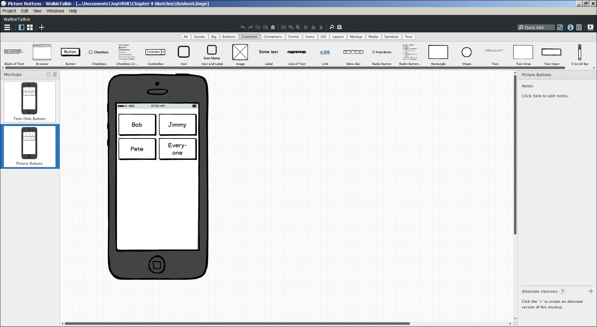
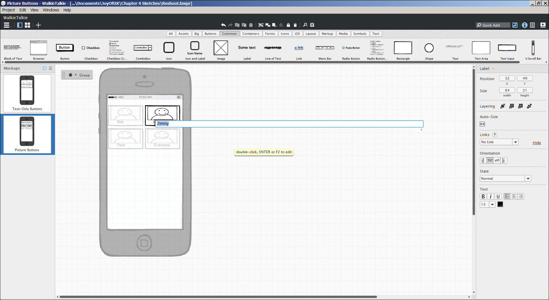
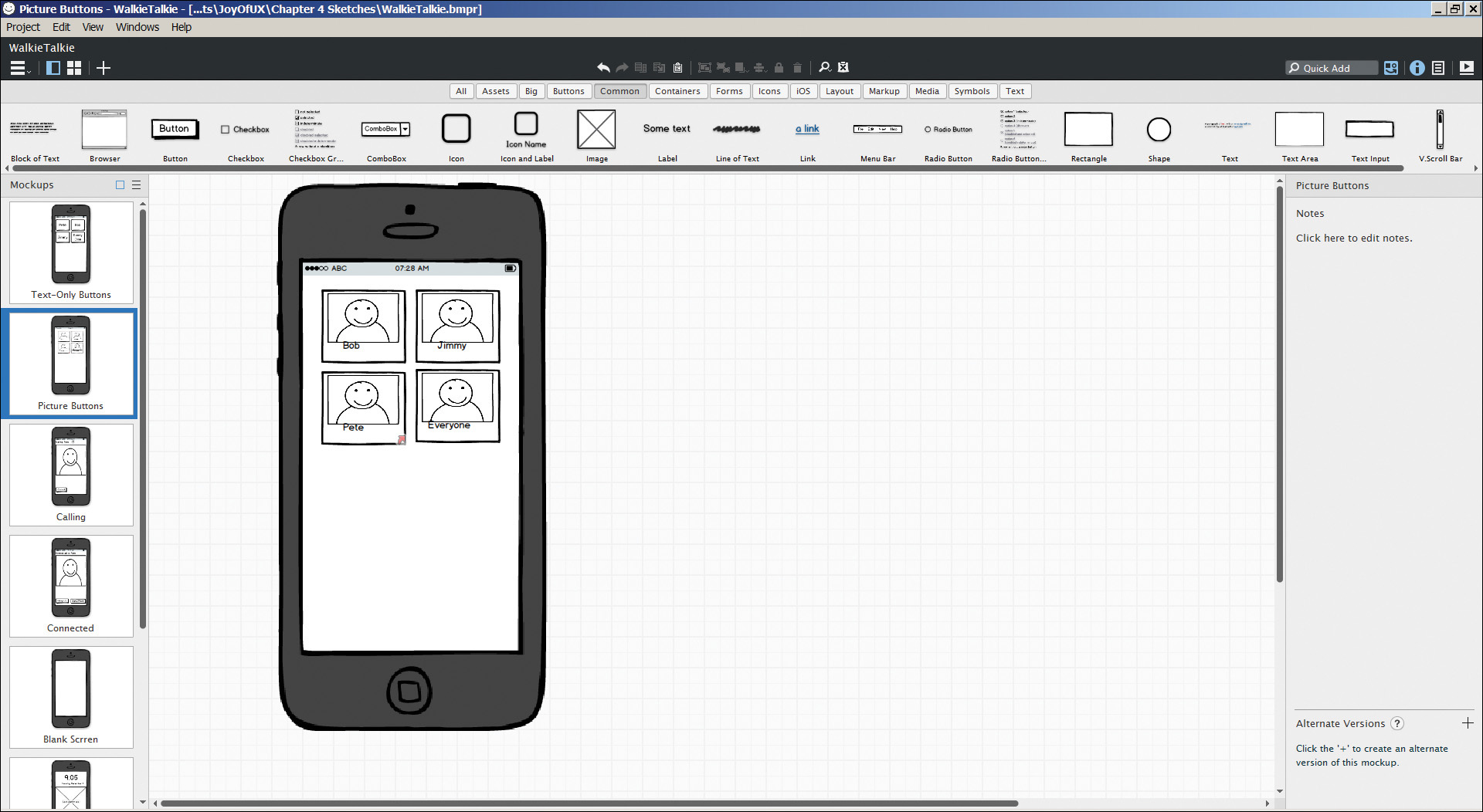
If we right-click on our mockup in the Mockups list on the left side, we’ll see a context menu with the choices of Rename and Duplicate. We’ll click Duplicate, and it will make a copy of the existing mockup (Figure 3.9). You tend to get a lot of these cloned mockups because it’s so easy to do. We might as well give it a name right now, at creation time. So a descriptive name is a good idea. However, not too much of the name shows in the list, so very long ones get clipped. Try to make mockup names distinctive in the first couple of dozen characters. We’ll call this new one “Picture Buttons.” (While we’re at it, we might as well change the name of the first mockup, perhaps to “Text-Only Buttons,” as shown.)
Now we start putting in buttons that could contain pictures. How do we get these? Balsamiq doesn’t supply an image button on the control list. We could try pasting a picture onto a regular button, but Balsamiq doesn’t allow us to change the vertical position of the text. We could drag a rectangle symbol into each button location, and a label, and a picture, four times or more. But that would get complicated, and we’d have to keep repositioning and resizing all of the sub-items, especially as we develop the idea further.
Fortunately, we can simulate an image button by making a group. This is a logical combination of several Balsamiq control symbols that we manipulate as a unit. Again, it’s easier to show you one than to describe it. We select a rectangle control and drag it onto the design surface. We adjust its size to be the same as that of the button controls we used previously. Now we’re ready for the picture. We could use an image control, which can display a picture of any type. But it’s easier to use the control called Webcam, which already contains a caricature of a person’s face. We drag a webcam control into the rectangle and adjust its size. We still need a name, so we drag a label control into the box. We adjust its position underneath the webcam control and set its text to “Jimmy.”
Now that we have these together, we want to tie them together so that we can manipulate them as a unit—drag and drop, position, size, and so on. That’s quite easy. We select all three of these items—the rectangle, the label, and the webcam picture—in the standard Windows way, by holding down the Control key and clicking each item. When we have them all selected, we click the Group button on the toolbar, as shown in Figure 3.10.
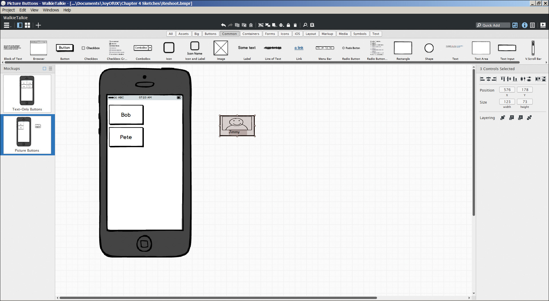
Now, all three of these controls are bound together in a group. We can click just once to select the group, move it around, and position it wherever we want. The group sizes as a unit, more or less. We can copy the group as a unit and paste several groups into the new mockup, as we did before with the buttons—Ctrl-C, then Ctrl-V three times. We drag each group where we want it, more or less where the buttons are in the other mockup.
But wait. What about changing the text? We surely don’t want four buttons to say “Jimmy,” do we? Of course not (unless we really like Jimmy). We can edit the internal items of a group without ungrouping them. If we double-click on the group, we enter a mode in which we can change the contents of the group. If we then double-click on Label with the group, it opens up the text editor, so we can change the label’s contents (Figure 3.11).
That’s all we’ll look at with layouts in Balsamiq. There is a whole tutorial on the Balsamiq Web site, exercising each part of the editor product. However, don’t spend too much time on tutorials—just jump in, and consult the documentation only as you get stuck.
Showing Interaction through a Storyboard
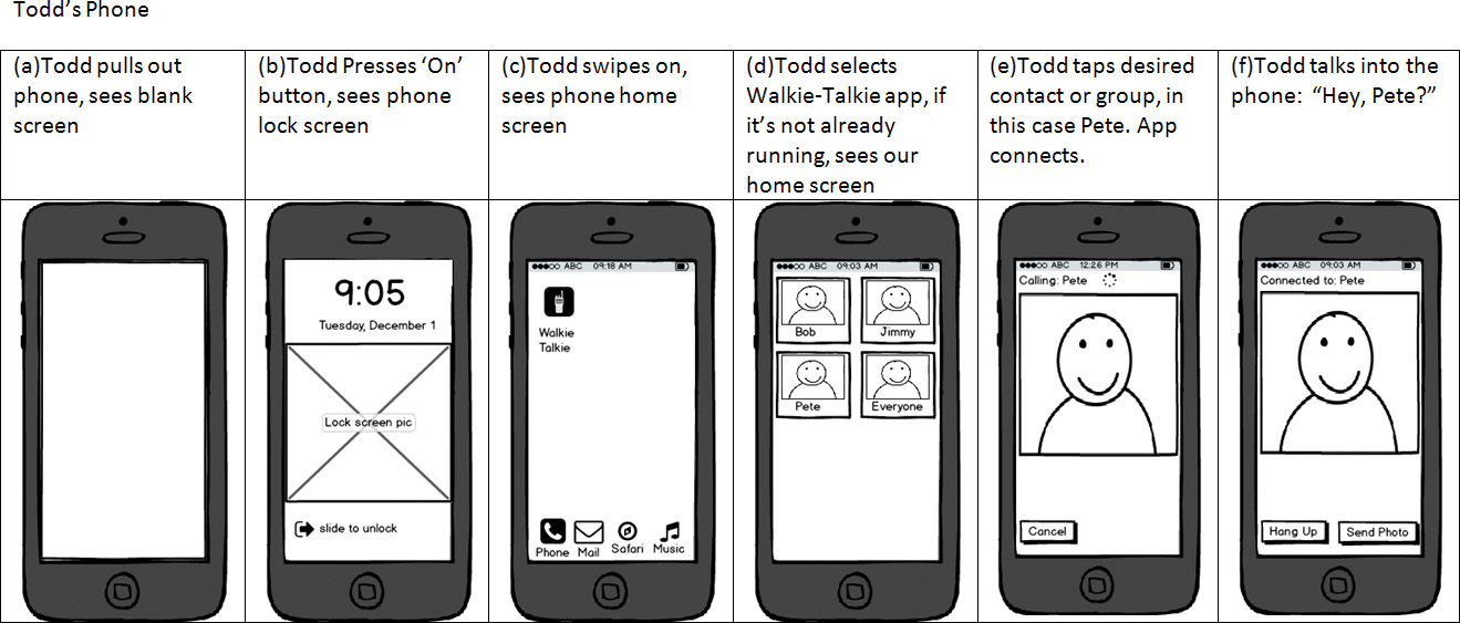
Each static image shows the UX at a particular point in time. But to effectively communicate a user’s ongoing actions, we often need to show several screens in a connected sequence. We do that by pasting mockups side by side on a single panel, known as a storyboard. Let’s see how a storyboard can help us discover and fix an important problem in our walkie-talkie cell phone app example.
More than anything else, we learned that Nextel’s former users liked its extreme simplicity. Todd would pull out his phone, press a single button, and say, “Pete?” Pete would hear Todd, pull out his own phone, press a single button, and say, “Yeah, Todd?” No swiping, no scrolling, no tap dancing, no nothing. Push the button and there’s the guy.
So far, we’ve thought of our walkie-talkie app as a regular smartphone app. We’d launch it from the phone’s home screen. We’ve never questioned this unconscious decision—it’s for a smartphone, so it’s an app like all the others. But when we make up a storyboard of the connection process and present it to nostalgic Nextel users, we’ll discover that it leaves them underwhelmed. Look at the storyboard shown in Figure 3.12.
Note
I produced this storyboard in Microsoft Word. I set the page orientation to landscape and inserted a table, with two rows and six columns. I copied each image from Balsamiq into the Clipboard (“Project→Export→Mockup to Clipboard”—Balsamiq’s menus are often a little bit strange) and pasted them into the cells in the lower row of the table.
As in a comic strip, each cell shows the mockup of the screen after one sequential user action. The caption on the top explains what the user has done to get to this position. We take the simplest case where Todd wants to talk to Pete. He pulls out his phone and sees the blank screen (a). He taps the On button. Now he sees the phone’s lock screen (b). Todd swipes into the phone and sees the phone’s home screen (c). Now he has to select our walkie-talkie app, if it’s not already running (d). This shows him our app’s home screen with the selection of contacts (e). He taps “Pete,” and the phone shifts to the connection screen. Only now can he start talking (f).
Now that we’ve laid it out on a storyboard, we see that launching this app as a classic smartphone app imposes a high overhead compared to the Nextel devices that our customers miss. The smartphone is capable of doing so much more than the Nextel was—playing music, taking photographs, whatever. But precisely because of its wide capabilities, undertaking any particular task means that we have to start by telling the phone which of its many capabilities we want to use. Talking to Pete now requires at least three actions: press the phone’s button to turn it on, swipe to unlock, and tap the desired contact. And if our walkie-talkie app isn’t the current one, that is, if we’ve done anything else with our smartphone since the last call (there are some dandy three-D level apps), we’ll need additional taps to get to our walkie-talkie app—at least two (tap home, then tap ours)—and maybe a few sideswipes if our walkie-talkie app isn’t on the current home page panel. Our user effort has gone from one button press to at least three, and maybe five or more. That’s not going to please our users.
The Nextel phone had a hardware button dedicated to this particular task. Talking to Pete used to take just one button press. If we really want to optimize our walkie-talkie app, we’ll need to connect to a hardware button in some way. Most modern smartphones, however, do not have dedicated hardware buttons that we can assign to this task. What can we do?
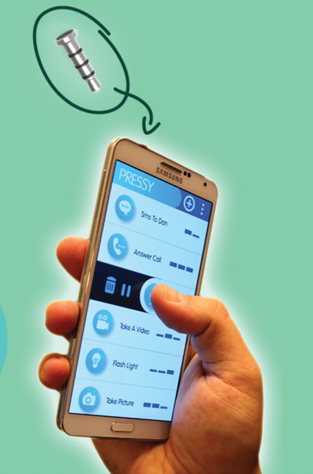
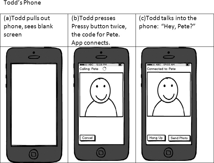
We can buy a dedicated hardware button as an add-on. For example, Pressy (www.pressybutton.com) makes one for Android only. It plugs into the headphone port (Figure 3.13) and triggers a command when you press it. Pressy can recognize sequences of presses as well, perhaps press once for everybody, twice for redial, three times to open the app to the selection page. It’s cheap, 15 bucks a pop. You can’t use your headphones with it plugged in, but contractors shouldn’t be wearing headphones on the job anyway. The storyboard now looks like Figure 3.14.
Pressy isn’t the only choice for a hardware button. The Cliq smartphone case has three hardware buttons, which use the NFC chip to communicate with the phone. You can program one action for each button. Unfortunately, Cliq works only if the phone is already on, unless you root it. Another solution could be QuickClick, an app that uses the phone’s volume control buttons to launch actions, such as our walkie-talkie app. Which would our users prefer?
We have, through our mockups and storyboards, identified a major stumbling block, that our smartphone app, launched from the home screen, would lose the fundamental benefit of the walkie-talkie: very quick connections to a small set of frequent contacts. We’ve therefore uncovered the need for hardware buttons. But no one seems to make an add-on button for the iPhone, at least not at the time of this writing. Our design decision to support hardware buttons in turn leads to the question of whether to support only Android or try to do the iPhone as well. I’d guess that the rough-and-tumble world of the contractor is better suited to Android; we could choose a phone ruggedized to take the pounding, or cheaper for replacement when it breaks. But as always, our users will tell us, once we figure out how to ask them.
As always, the point of this example is not that it is perfect; it isn’t. The point is that with this rough cut we have conveyed an amazing amount of information. We can very easily show these choices to our users or their representatives. Which one do you think they’d prefer? They’ll understand quickly, and their choices will be clear. We’re not polishing a cannonball here.
Demonstrating through Live Action
The storyboards convey a great amount of information with their comic-strip displays. But suppose we wanted to demonstrate the storyboard in a more evocative way. Balsamiq provides a full-screen presentation mode that allows us to demonstrate actual transitions.
On most, but not all, controls, Balsamiq provides a property called Link. This allows you to specify that clicking on that control, while in full-screen presentation mode, switches to another mockup.
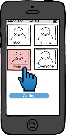
Suppose we wanted to show that. Figure 3.15 illustrates what we would do. On the Picture Buttons mockup, we select Pete’s button group. The properties of that group appear on the right. Clicking on the Link property, we see the list of other mockups. We select the mockup to which we want to transition when the user clicks “Pete.” In this case, we select Calling.
Now we can run the full-screen presentation mode by pressing F5. This leads us to Figure 3.16. The mockup is shown on the full screen. The Pete button is shown in pink, indicating that it has a link. When we move the cursor to this button, it changes to a hand, showing the name of the mockup to which it would change if we clicked there. (If we don’t like the big cursor or the pink link hint, we can turn them off on the Settings control at the upper right.)
We can continue here, putting in links to show as much of the interaction as we care to. We would probably put a link on the Cancel button to go back to the Picture Buttons mockup and do the same on the Connected screen. To illustrate the transition from the Connecting screen to the Connected screen, we might like to automatically advance after a small delay. This is something that Balsamiq doesn’t do. Being a geek, you may be tempted to hack it to try to make it do so, or even to agitate for Balsamiq to add this feature. But consider the simplicity of the interaction that you have had with Balsamiq so far. By adhering to the 80-20 rule, Balsamiq has made everyone’s interaction simpler. The whole reason that you are using Balsamiq instead of Visual Studio or Expression Blend is for this simplicity, and its concomitant lower effort and quick turnaround. It is absolutely key to the philosophy. So swallow it, and stop being such a geek.
Now that we have our mockups, we can present them to users as storyboards, which will get us a great deal of information. But if we really want to get good data, we have to test them in action. That’s the topic of our next chapter.