
9. In-Store Migration Patterns: Where Shoppers Go and What They Do
“There is no path. You make the path when you walk.”
—Antonio Machado, poet
An award-winning store in the Philadelphia area was designed with a dual entry—one entrance on the left and one on the right. It was arranged by the designer in such a way as to make the right entry inconvenient to reach, creating what was expected to be a dominant left entry. Customers were expected to move from the parking lot into the left entry and then proceed around the store starting from the left. Of course, shoppers did enter from the left, but this is where the plan broke down. The designer knew a lot about design, given that the store won industry awards, but not as much about shoppers. When the store opened, shoppers were so determined to make a right entry that they entered through the left door, and then crossed the entire front of the store to shop in the natural direction, starting at the right and moving counterclockwise.
Managers deemed this unacceptable shopper behavior, so they positioned several pallet displays to impede efforts to execute a counterclockwise shopping trip. Given these obstacles, they thought shoppers would come to their senses and start from the left. Instead of accepting the flow of the shoppers, the managers tried to change shopping behavior. The managers, of course, were wrong. It was with real sympathy that we observed shoppers struggling to maneuver their carts around these pallets, as determined as salmon swimming upstream. Because this store won awards, it reveals a weakness in understanding shoppers not only by the store itself but also across the industry.
Retailers who understand the natural migration patterns of shoppers can design stores that fit with shopper behavior, rather than trying to change behavior to fit the store. Sociologist William Whyte reflects this understanding when he writes about the virtues of a good entrance: “A good entrance draws people—not just those who mean to go in, but those who do so out of impulse. It draws them not by forcing a decision, but by making a decision unnecessary.” To illustrate, he describes the entrance of Paley Park in Manhattan, which has been cited as one of the finest urban spaces in the United States. “Its attractive paving and trees extend out to the curb. There is no clear line between the park and the street, and because that entry space is so broad, there is a full view of the activity within. Passers-by look at it. Some will pause. Some will move a few steps closer, then a few steps more, and they are in, without having decided to be ... Store doorways should be similarly inducing.”1 Contrast this view with the image of store managers throwing obstacles in the path of hapless shoppers.
The experience of many shoppers and many stores shows that changing such basic shopping behavior is like trying to convince a dog not to spin around several times before settling in for a rest. Understanding and aligning with this behavior can lead to higher sales and profits. In fact, one retailer we worked with increased sales by 7% simply by moving the left entrance to the store to a more natural position. This is a huge increase in sales just from a better understanding of shoppers, and perhaps more valuable to a retailer than a design award.
If You Stock It, They Will Come
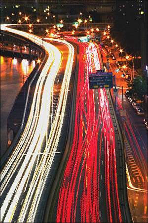
Retailers are quite expert at where to locate stores. They put stores at major expressway interchanges and other high-traffic areas. (In fact, it was traffic studies that inspired, in a way, our in-store studies of shopper traffic patterns; see the sidebar, “A Time-Lapse Photograph.”) Retailers study demographics and traffic patterns to place retail in the path of consumers. Except for Wal-Mart’s counterintuitive early strategy, retailers don’t locate their stores in the hinterlands hoping that customers will make a pilgrimage. This may work for religion, but few retailers have that kind of draw, even among their most passionate zealots. Retailers take the stores to places where they are likely to find customers.
Yet when shoppers arrive at the entrance to one of these stores, this logic and science tend to disappear. Retailers may have an entire department dedicated to studying what happens before shoppers arrive, understanding the traffic that will bring shoppers into the store. But the locational focus is lost once the shopper is inside.
One reason for this state of affairs is that retailers and brand suppliers alike believe that the location of the products in the store determines where shoppers will go once they are inside. So, if retailers put the products in certain places, the shoppers will “find” them—a Field of Dreams logic: If you stock it, they will come. This is the model that retailers have followed for years. In their minds, the relationship between people and products represents the most important aspect of shopping. This is an illusion of knowledge and is a consequence of being intimately involved with stores without actually measuring what shoppers do there.
The traditional view is that people come to the store to buy goods, and travel from one product to another, rationally working their way through their supposed shopping list. As discussed in Chapter 7, “The Quick-Trip Paradox: An Interview with Mike Twitty,” the quick-trippers who dominate retail may not even have a list. And, as we saw in Chapter 8, “Three Moments of Truth and Three Currencies,” exchanging products for money is not the only concern in the shopping experience. Shoppers are spending time and angst along with their money, and they are receiving experience along with hard goods. The approach of letting shoppers find their way to products focuses on the exchange of products for money but does not place a very high value on shopper time or angst. Whereas money is the proper metric of the outcome of shopping, time is the proper metric of the process of shopping. Money measures sales, and time measures shopping. So, if shopping is our subject, time is our focus.
A passive retailer relies upon gross measures—sales, margins, inventory, and square feet or meters—which offer a pretty good picture of the relationship of the store’s assets to profit. But between the time the shopper walks through the entrance and reaches the checkout, a great deal has happened. In this period, our passive retailer has left the shopper to do all the work in finding products in the store. How has the shopper spent time during this shopping trip? Did the shopper earn a decent return for this time? What kind of debt of angst has the shopper racked up? Could the retailer have reduced this angst and time, while realizing opportunities along the way to make additional sales? The data on shopper time and angst never appear on the retailer’s balance sheet, but you can bet they are top of mind, at least in qualitative form, for the shopper.
A more active retailer plans to pursue the sale by making offers to where the shopper actually is, including where they are facing, and for how long. The questions are: Where are shoppers to be found in the store? And what is the most efficient way to make offers to them?
Understanding Shopper Behavior
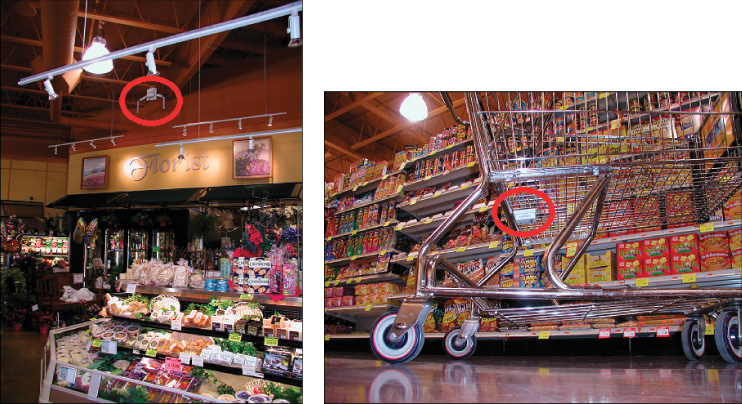
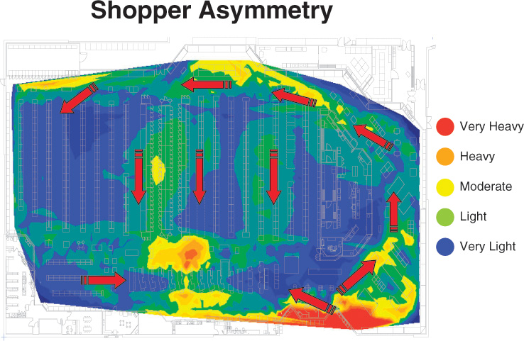
To understand shopper behavior in stores, we need to look at where and how shoppers are spending their time in stores. These measures are similar to the studies of frequency and reach in advertising (see the sidebar, “Three Measures: Counting Shoppers, Time, and Direction”). As with studies of vehicle traffic used to locate stores, looking at traffic volume, speed, and direction, in the store we need to measure where the shoppers are, how long they stay there (in time or speed), and where they are heading. With these measures, we can create distribution maps that show the high-traffic and low-traffic areas of a given store, as illustrated in Figure 9.1 (which we presented in the Introduction). The checkout stands typically are centrally located across the front of the store. For the most part, the retailer has absolute control over only two points in the shoppers’ trip—where they enter the store and where they check out and exit. We consider three insights from these studies: the importance of the entrance, shopper direction, and the role of products in dictating shopper traffic.
First Impressions: The Entrance
As with stage acting, a strong entrance sets the tone of the entire trip. First, we notice that there are a lot of shopper seconds being invested just inside the entry. This is because nearly 100% of shoppers visit this area, and a very large number of them stop at the cart corral to pick up a shopping cart. But this “landing area” plays another role: Here is where shoppers can stop to get their bearings as to where they are going to head and to check their shopping list, if they have one. For the active retailer, this is an important opportunity to begin the sales process. For many supermarkets, this opportunity is taken to establish a “fresh, attractive” ambiance by featuring prominently such items as produce, fresh deli, and possibly the in-store bakery. As we discussed in Chapter 1, this would also be the location for the convergence depot, in the ideal self-service store of the future where shoppers would pick-up their preordered, Autopilot purchases before proceeding into the rest of the store for Surprise/Delight purchases.
This, however, definitely doesn’t happen in every case. Our purpose here is not to consider the pros and cons of all the different ways of handling the immediate entry, but just to call attention to its extreme importance. And this is not simply for grocery operations, but for any type of store. As William Whyte notes in the previous comment, a good entrance finds visitors “in, without having decided to be.” Whyte suggests minimizing the demarcation between inside and outside and widening the entrance (extending the welcome) to the extent practical. Personally, I prefer air curtains, even in fairly harsh climates, rather than doors of any kind. It takes shoppers three to four times longer to buy a frozen food item than another grocery item, as we will consider next. This is almost certainly—or at least partially—because of the door that you have to go through to retrieve what you want.
Of course, the second area with a great concentration of shopper seconds is the checkout area. Nearly all shoppers must pass through here, as with the entry. Otherwise, one sees a band of high density of shopper seconds most of the way around the perimeter of the store, with two bands of heavy concentration linking the back of the store with the front of the store. In fact, one or the other of those two bands represents the heavy flow of the traffic from the back of the store to its front.
Some retailers have experimented with left-entry and center-entry stores, in addition to the more traditional right entrance. With center-entry stores, most shoppers turn to the left when they get to the back of the store. The entry is the last place you want to have a choke point. McDonald’s realized this years ago when they replaced their small windows for taking orders with a storewide counter. It removed a choke point right at the entry. Center-entrance stores have a choke point at entry. This nearly always leaves such stores with under-shopped areas to the right of the entry. Again, the dominant back to front traffic is the first aisle leading to the checkout, and again in this example, the wide frozen food aisles, which have in this case been arrayed at the beginning of the left third of the store. Almost certainly it is the continuation of the wide perimeter aisle, here returning to the front along the left perimeter, that has encouraged a quite wide distribution of shopper seconds in this store.
For the left-entry store, we previously discussed the Philadelphia store that tried to force customers into the left-side pattern. Some shoppers make their way to the right side of the store so they can move in a counterclockwise pattern. What happens to the others? Some shoppers move directly back from the entrance through produce, as hoped. Others walk along the front of the store and then turn up one of the aisles, then resuming their counterclockwise progression from that point. If they turn up the middle aisle, for example, they will miss half the store on their right.
Shopper Direction: Establishing a Dominant Path for the Elephant Herds
In addition to finding out where shoppers spend the most time in the store, we can also discover the general direction of their movement, as shown by the arrows in Figure 9.1. (Just like vehicle traffic studies, the direction of travel has a significant impact as discussed in the sidebar, “Walgreens Finds Profits in Two Directions.”) We see that not only do the shoppers enter at the right of the store, but that the dominant traffic is around its perimeter, in a counterclockwise rotational pattern. This rotational pattern dominates shoppers’ movement in the store, and echoes many rotational patterns in nature, such as migration of elephant herds. For shoppers, we know that substantial majorities are right-handed, and a right-handed person, pushing a shopping cart, is going to tend to push with their right hand, giving the cart a natural tendency to turn left; that is, in a counterclockwise direction.
The next question is why is there the heavy traffic through the center of the store, several aisles after the shopper begins crossing the rear of the store? In examining store after store, this phenomenon is often repeated, with the first dominant path from the back of the store to the front being the first aisle where the checkout area can be clearly seen. This is a manifestation of the “checkout magnet,” which draws the shoppers toward it, like a vortex.
The second back-to-front dominant aisle is near the end of the checkout area, and through, in this store, the frozen food aisles. But we should also note that it is through the wide frozen food aisles. The wideness is significant because “open space attracts.” Thus, there are at least three forces driving traffic down this aisle: It is the last visual opportunity to return to the checkout; it is wide and accepting; and it contains frozen food. This third factor—the actual products—probably accounts for the least number of shoppers down this aisle, although the perishability of frozen goods means that shoppers tend to like to buy them at the end of their trip (see the sidebar, “Shoppers Save Frozen Foods for Last, but Not Produce”).
We can cite a number of principles seen on this shopper second flow diagram, as follows:
![]() Trips always start at the entrance, and end at the checkout/exit.
Trips always start at the entrance, and end at the checkout/exit.
![]() After pausing at the entrance, shoppers tend to move to the back of the store, especially if that pathway is broad and attractive.
After pausing at the entrance, shoppers tend to move to the back of the store, especially if that pathway is broad and attractive.
![]() Once at the back of the store, shoppers will tend to turn to the left, counterclockwise, and immediately begin to exhibit exit behavior.
Once at the back of the store, shoppers will tend to turn to the left, counterclockwise, and immediately begin to exhibit exit behavior.
![]() The appearance of checkout stands on their left, at the front of the store, will attract many to move there.
The appearance of checkout stands on their left, at the front of the store, will attract many to move there.
![]() Several extra-wide aisles will hasten the growing rush to exit the store.
Several extra-wide aisles will hasten the growing rush to exit the store.
The Checkout Magnet
It takes less and less time for shoppers to make a selection as their trip progresses. Why is this happening? Shoppers come through the front door with a goal in mind. That goal is the checkout and exit (and beyond), and they behave as if drawn by an irresistible force toward it. The speed of their shopping increases as they near the checkout. The shopping trip is not so much an event, such as a movie or sports contest, as it is a road or pathway (or even a detour) on their way to somewhere else. Within the store, we can refer to this shopping behavior as the “checkout magnet.”
The checkout and exit is drawing the shopper away. This may seem obvious because all shopping paths lead to the exit. But it is manifested also in the quickening pace of shopping within sight of an open (and short) checkout line (and by steadily decreasing time spent per item purchased as the shopper moves around the perimeter racetrack). The shopper will hasten to complete any shopping to get into the short line before other shoppers can lengthen the line. Retailers should thus plan for more leisure time at the beginning of a shopping trip.
Products Hardly Ever Dictate Shopper Traffic—Open Space Does
There is a great deal more that could be pointed out for this store, but the single most important thing to learn here is that there is nearly nothing about products that is required to explain this shopper traffic. This is radically at variance with very close to 100% of all thinking about shopping, which assumes that it is all about the shoppers and their relationships with this or that product or category. After all, people come into stores looking for products. Why wouldn’t products be the driver of movement through the store?
The location hypothesis: 85% of shoppers’ behavior is controlled by the geographic location of the shopper in the store, and only 15% of behavior is controlled by product interactions.
Observations of millions of shopper trips have led to what I call “the location hypothesis”: 85% of shoppers’ behavior is controlled by the geographic location of the shopper in the store, irrespective of what products may be around them, and only 15% of behavior is controlled by product interactions. This hypothesis has been confirmed by two groups of independent researchers working to create models that predict shopper patterns across a single store (Wharton) and across multiple stores (Pepsi).
A recent study with Wharton provided additional confirmation of this hypothesis. The study examined the impact of changing locations of products in the center aisles across six matched stores. The results indicated that the product itself had very little impact on sales, whereas location had a significant impact.2
So far, we have discussed how produce and other fresh goods influence the initial shopper landing zone, forming an attraction for shoppers. We also cited the frozen food aisles in relation to channeling traffic back to the front of the store. But there are plenty of examples of shoppers not moving through produce to the back of the store, and even largely ignoring the produce if it is not on their natural path. Also, notice that on the frozen food aisles, we cited the extra-wide nature of these aisles. Products have a role to play, but they are not the primary driver of traffic patterns.
Open Space Attracts: The Call of the Open Aisle
This is one of the most powerful motivators to shoppers—open space attracts. This means that adding a foot or two to the width of any aisle is likely to generate more traffic. Convenience stores generally do a much better job of creating open space than do other types of stores, primarily because their fixtures tend to be not as tall. Retailers in larger supermarkets want to entice shoppers down steel canyons, but shoppers like open space and visual freedom. For a convenience store, this extends right on outside the store. If a driver passing a convenience store, particularly at night, can’t see into the store, and preferably the entire store, they are unlikely to stop and enter. Hence, these stores are typically heavily glassed and lighted, inside and outside.
Drug stores, potentially very effective competitors to convenience stores (they’re convenient, given a multitude of locations), could significantly enhance their traffic by getting rid of those fortress exterior walls (reserve that for around the pharmacy in the back corner, if necessary). But it isn’t just glass and lighting. I would never build a store with fixtures over five feet high in any area where I expected significant traffic. These six-foot and higher displays are overt throwbacks to the retailer as warehouseman. There is a place for warehouse displays, but not where you want to attract shoppers—you need open space.
Narrow, crowded aisles like packed highways can lead to social pathology, and even “aisle rage.” In one incident, two shoppers met in an aisle less than two feet wide. They exchanged words, and as the hapless patron arrived from the aisle to pay for his purchases, the fellow shopper from the narrow-aisle encounter clubbed him. The angry assailant escaped for the moment, but the security camera recorded his criminality. Few shoppers carry matters to such extremes. Rather, they avoid cramped aisles, and probably the stores that have them, in the same way that motorists avoid congested freeways if they can.
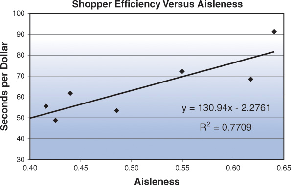
Using a few wide aisles as thoroughfares to move the bulk of shoppers around stores is, of course, common everywhere. Beyond those nice “drive aisles,” there is a more nuanced question of the “aisleness” of stores. We define this as the extent a store is divided into aisles. There are several ways to approach computation of this measure, but the simplest is probably the percentage of the store occupied by products, fixtures, and staff compared to the remaining total shopping area (where shoppers can actually walk). The higher the aisleness, the more crowded the store.
We first identified the importance of “aisleness” while trying to unravel a puzzle at a chain of gift and card stores. We found that two stores had much higher sales than two similar stores. All the stores stocked the same merchandise and were matched stores, but the key difference was that the two underperformers had much higher aisleness. They were cluttered and hard to navigate. We started looking more closely at this issue across a number of stores and found it was correlated with the success of the store. (It should always be compared across a set of congruent stores.)
The point here is that space in the store is allocated either to the shoppers or to the overall effort to sell to them—products, fixture, and staff. As the products and fixtures swell, about the only thing the retailer can do is work to highly organize and expand this product space. This results in aisles rather than free space. More open formats—what we typically refer to as a “bazaar” shopping domain, referring to souks and less-structured shopping—are more like typical produce areas in supermarkets.
There are aisles of sorts in these open arrangements, but they do not limit a shopper’s walking path. Center-of-store aisles, for example, are highly constrained for the shopper—no turning this way or that way. It is all usually toward the front or toward the back. Of course, those long aisles are often intersected by a transverse aisle about halfway back in the store. This is a highly recommended feature that decreases aisleness to some small extent but adds an extra rank of end-aisle displays.
The bottom line is that stores with a lot of aisleness necessarily have less freedom for the shopper. This doesn’t mean that all aisleness is all bad, but it is mostly bad, so in general the ideal store will have a minimum of aisleness. Aisleness costs the shopper time, so shoppers penalize the retailer by spending more sluggishly. Looking at shopping efficiency across a series of stores tends to confirm this, as shown in Figure 9.2. As aisles become more crowded (higher aisleness), the time it takes for shoppers to spend a dollar increases. As we have noted, the faster customers spend money, the higher the overall store sales. Aisleness is a significant factor to consider in thinking about store navigation.
If you are a retailer, perhaps you have never thought of actually measuring your store’s capital commitment to shoppers’ space, instead of to the merchandise space. In fact, it is widely thought that investing in a massive product offering for the shopper is done to cater to their needs. But it is simply not true. Shoppers do not prefer to shop in a warehouse. Hence, the slow death of the center-of-store “warehouse.”
So, what kind of fixtures should the ideal store have?
![]() A maximum of 66 inches (2.6 meters) high.
A maximum of 66 inches (2.6 meters) high.
![]() Not more than 30 feet (9 meters) long, preferably 15 to 20 feet.
Not more than 30 feet (9 meters) long, preferably 15 to 20 feet.
![]() Always pyramidal—sloping back from the shopper.
Always pyramidal—sloping back from the shopper.
This does not mean that if you have a store with tight aisles, you have to tear down the store. If you intelligently manage the store, you might blow away competitors. If you have a store with high aisleness and you recognize it, you can intelligently manage it through use of devices such as sloping displays, as we consider next.
The Great Pyramids
The sloping back is well illustrated by a Pão de Açucar store in São Paulo, Brazil, as shown in Figure 9.3, but we have seen this feature occasionally in Europe, Asia, and North America as well. It creates a sense of greater openness and wider aisles without expanding the actual distance of the aisle at floor level.
Figure 9.3 Sloping shelves create a sense of greater openness without expanding the aisle width at floor level.
We can see the shopper not only has the benefit of being able to see (more or less) over the top of the fixture, creating a great sense of openness, but the top of the fixture is recessed from the shopper by about 16", giving nearly three full feet of apparent extra aisle width, if this type of fixture is used on both sides of the aisle. This is of tremendous significance: With pyramid fixtures deployed in the typical seven-foot wide aisle, the shopper would react as if the aisle were nine or ten feet wide. Whether this would make possible a shrinking of total aisle width is uncertain, but it is most certain that shoppers are far less concerned about the crowding of their feet than they are about the crowding of their visual space.
The old canard that “eye level is buy level” is quite simply untrue. The true shelf sweet spot is from the waist to the shoulder. The pyramidal fixture focuses on this sweet spot, sacrificing nothing in terms of facings, other than above “buy level.” The shelf, however, serves as more than a vehicle to display merchandise (facings). It is also the primary vehicle for maintaining inventory (avoidance of out-of-stocks). So, the most serious loss is of “warehouse” space behind the facings, particularly at the top shelves. This seems a small price to pay for a greatly enhanced shopping experience.
A slightly less radical design is to use an offset. Rather than a smoothly sloping pyramid, the offset design uses a series of steps to move products away from the shopper. It maintains vertical shelf facing, but at about 40 inches, pushes the upper shelves back eight to 12 inches. This gains up to 2 feet of the precious visual space per aisle (assuming both sides are similarly treated). This design also allows for the addition of a sloped signboard of 8 to 12 inches width, the full length of the fixture.
Some early applications of in-store media, for all their hype, were close to worthless, but new approaches are now sometimes highly effective. The offset fixture may be the true future of in-store digital media, with several targeted messages or “kiosk” functions at perhaps five to eight foot intervals for the length of the fixture. Such deployments, automatically or shopper-activated, allow many of the functions to be found on mobile Internet devices, whether cell phones, PDAs, or custom devices such as Modiv Shopper and MediaCart.
New Angles
Before moving on from fixtures, we should consider something about their orientation and layout in stores. Another way to change the customer experience of the store is to shift the angles of the aisles. The angle of the aisles does not have to be from front to back. Rectilinear layout is a clear throwback to warehouse type thinking. The store shown in Figure 9.4 has aisles set at a 45-degree angle. This means that, among other things, shoppers will ordinarily be approaching these from a less acute angle, which may make them more inviting to enter.
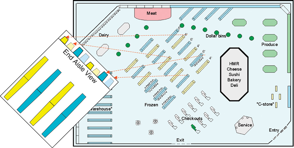
These are shortened gondolas, laid out in a staggered pattern. So, if you are looking down any of those aisles, instead of being treated to a continuous view to the opposite side of the store, you see the endcap of a gondola in the next rank.
Notice also that every other gondola in each rank has been shortened, rather than shortening every gondola. In other words, as a shopper navigates down any of these “aisles,” they will see on one side a gondola of standard height, about six feet, and on the other a lower gondola that they can see across, giving them a lateral visual expanse in the neighborhood of 20 feet—two “aisles” plus one gondola width. Also, because many fewer shoppers get to the center of any gondola/aisle, we suggest that giving the gondola a slight diamond shape, or otherwise providing some interruption of the surface of the gondola—vertical signage, for example, or convex shelving protruding into the aisle (referred to as “bump-outs”)—is entirely acceptable, and likely to be a plus from the shopper’s perspective.
You may notice also the nook nature of some of the perimeter shelving, as well as a designated “warehouse” area on the most remote perimeter. These are ideal locations for Long Tail displays, and will be discussed further as we look at the five basic ideal store designs.
Many of these ideas are conceived not to involve radical departures from existing operations. This is in recognition of the fact that radical changes may be foolish, since what is has considerable merit—including management inertia and shopper familiarity. There is no such thing as an objective “ideal” store, primarily because shoppers themselves have been thoroughly indoctrinated for many years, by the way things are already being done, and thus there is a level of acceptance and expectation by the shopping public. This is an expectation that is not based on strictly scientific, rational grounds but on the grounds of familiarity. (Remember that the persistent QWERTY keyboard we use on our computers was originally designed to separate mechanical keys that might stick if struck too quickly but has persisted long after the age of mechanical typewriters.)
These facts account for the well-nigh worthless results of many surveys asking shoppers how things should be done. For example, in surveys, most shoppers regularly report that they shop “most of the store” on each shopping trip, when in reality less than 2% shop as much as three-fourths of the store. There is nothing wrong with asking them, but the results will be a more accurate picture of their current perception than any reasonable plan for evolving the future.
Although we have stressed the wideness of aisles in drawing shoppers to them, products certainly play a role in attracting shoppers and causing them to spend time when they arrive. Frozen foods, as noted, benefit from a broader aisle, but also tend to take longer to purchase—two to three times as many seconds as the average item in the store. This is likely due to both the means of display (often behind closed glass doors) and the multiplicity of similar items that make choice difficult. This latter factor evidently also causes longer purchase times for canned soups, yogurt, and baby foods. (And although we generally advocate efficiency in making the best use of shopper time, there are cases such as canned soups where some strategic inefficiency works to the retailer’s advantage, as discussed in the Alphabet Soup example in the sidebar, “Alphabet Soup: The Power of Inefficiency.”)
Having wide frozen food aisles contributes to an accumulation of shopper seconds from the wideness of the aisles, as well from the nature of the product (and display). This illustrates the interplay of the location hypothesis with the product hypothesis. There is no point in pretending that the products play no role; simply that it is far less significant than generally thought.
Managing the Two Stores
There are two stores inside nearly every store—the main store (primary) and the promotional (secondary) store. These roughly correspond to the Big Head (promotional) and Long Tail (main store) we discussed in Chapter 1. Although retailers can’t ignore the main store, the success or failure of the store is driven primarily by the promotional side of the store. This is not because the items there are promotional. As we have noted, promotions do not do much to drive traffic and sales. Instead, the importance of the promotional store is due to its location. Although the main store is located in the center aisles (with the exception of produce, dairy, and meats), the promotional store is on the perimeter, around the entry and the checkout stands or in special displays such as shippers and pallets.
How shoppers are reached in these two stores is illustrated in Figure 9.5. This is actual reach, by categories, measured on a million shopping trips in supermarkets scattered across the U.S. The actual reach in any single supermarket will vary from these averages, possibly significantly, depending on the store’s design and layout.
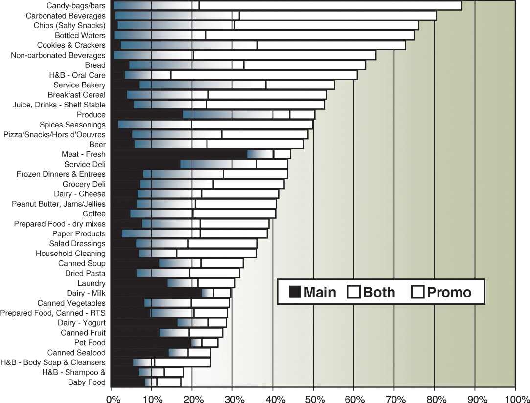
One of the most striking observations here is the minor role of the main store, except for a few categories such as produce and dairy that predominantly appear at a single location, usually on the heavily traveled perimeter of the store. In other words, except for those few categories with large black bars, you could effectively shut down the main store and still reach nearly all the shoppers with the category! Even though the promotional store contains only a small fraction of the total number of items in the store, it delivers something like 40% of all store sales.
Take a category such as cookies. Across a wide selection of stores, retailers offer this category to 78% of all the shoppers in their stores. They “reach” 30% of their shoppers in the main aisle, on the gondola. Virtually all of those main aisle shoppers, however, have been reached by at least one promotional display. This means that the main display adds nothing to the reach of cookies. The promotional displays deliver more than twice the total sales of the main aisle—5% of store shoppers versus 2% for the main aisle.
Scattering displays around the store increases sales. In one store, for example, several of the cookie displays occur in alternate aisles, not in the usual promotional locations. But any alternate display, even on an aisle not frequently visited, has more potential to increase incremental sales than another, expanded main aisle gondola location. Of course, the reasonable expectation is that “cookie” shoppers will be found in the cookie aisle. But this is only true in a very limited way, since a high percentage of cookie purchases occur outside the main category aisle. Not only that, but we know that a large share of shoppers going down any aisle are not particularly interested in the merchandising in that aisle. Instead, they’re simply using it to get from one place to another. In other words, they are navigating the store, which is what the shopper spends the majority of time doing. So placing cookies in an unrelated aisle is not necessarily a bad strategy.
Five Store Designs
Given these insights on shopper behavior and movement within stores, what are the implications for store design? There is clearly no one right answer for all occasions. Retailers need to design the best store for their customers and products. But it is useful to think about where the insights into shoppers would lead. A supermarket executive once challenged me to provide him with ten new ideas to increase sales—with the proviso that they needn’t all be immediately workable. In that spirit, we discuss five models for store design that take advantage of our knowledge of shoppers.
As discussed in Chapter 7, there are three distinct groups of shoppers: quick trip, fill-in, and stock-up. For simplicity, the store designs discussed next take a layered merchandising approach to accommodating two types of trip: a combination of quick/fill-in trips, simply designated as quick, and the ever-desirable stock-up. Any loss in matching the needs of diverse groups is more than made up by the practicality of execution in the store. For the quick trip, there are a few hundred thousand U.S. stores that specialize only in the quick trip—the convenience stores—so I would look there for what is working best, in terms of store design, layout, and merchandising selection and display.
However, some things are crystal clear:
![]() The quick trip store must be near the entrance to permit a quick in and out.
The quick trip store must be near the entrance to permit a quick in and out.
![]() The merchandise is mostly a selection of big head items, not entire categories.
The merchandise is mostly a selection of big head items, not entire categories.
![]() No promotional pricing is needed—premium and high margin should dominate.
No promotional pricing is needed—premium and high margin should dominate.
![]() Visual enticement to the rest of the store should saturate the experience without being intrusive.
Visual enticement to the rest of the store should saturate the experience without being intrusive.
The Enhanced Perimeter
The enhanced perimeter design is pretty much the direction that retailers have evolved the modern supermarket. That is, there is a broad perimeter aisle, which we sometimes refer to as the “racetrack,” around the entire store. They have retained the classic center-of-store self-service “warehouse” but have gradually built a very attractive high-volume service belt around it (mixed with self-service, for sure).
There is nothing stunningly creative about this approach, but tens of thousands of sharp minds have created and refined this structure. It doesn’t matter that the reasons for its existence have largely to do with the fact that shoppers need “stuff” and will solve almost any retail “problem” adequately for their own purposes. Another advantage of the enhanced perimeter store as ideal is that it can compete effectively with the other designs we will consider, with less draconian changes to traditional store format. These stores are going to be with us for some time to come and can function at a high level without revolutionary changes.
In this format, retailers focus mostly on the profitable (for them) perimeter and cede the center-of-store “warehouse” to the brand supplier—with category management and aisle management being a cooperative effort. The brand suppliers who have successfully escaped the center-of-store dungeon have been the direct-store-delivery (DSD) categories like carbonated soft drinks and, to a lesser extent, the salty snacks. Pulling magazines and candy into the checkout lanes blesses those businesses, too. Otherwise, access to the majority of the store’s traffic, for brand suppliers, is limited to end-aisle displays and occasional lobby or other promotions, for which the all-important promotional dollars are required.
The Inverted Perimeter
This store is essentially the enhanced perimeter turned inside out. That is, all of that center-of-store merchandise is moved out of the way, and the perimeter departments migrate into the center of the store. Of course, then the former center-of-store merchandise is properly arrayed, probably still in its “warehouse” fashion, around the perimeter of the store.
Within five miles of my office is a store based on this design, which regularly does a million dollars of sales in a single day! Of course, it is not a supermarket, but a big-box Costco, the highest volume store in the chain, that pushes nearly $300 million per year in sales. There are obviously a lot of factors at play here other than store design. But the center-of-store is a very large open area, with low displays—a bazaar design—similar to other high-producing displays.
Surrounding this are true warehouse shelves, all visible from nearly anywhere in the center-of-store, where the majority of shoppers spend the majority of time. But all that warehouse merchandise is there, just a few steps away, without cramping the shopper’s visual space. No wonder sales in a store like this, for an individual shopper, are often double what the shopper intended when they came in. But they like it! Think of all the money they are saving!
In fact, Marsh Supermarkets (the people who introduced electronic grocery scanning to the world) built a store like this a few years ago. This was a remodel from an earlier conventional perimeter store (see Figure 9.6).
Initially, shoppers did not care for this “radical” new design. Nothing in their shopping experience prepared them for such a concept. As time passed, however, shoppers adapted, comfort levels grew, and after several months, the desired sales lift was achieved. The nerve-wracking transitional period has, though, dampened the appetite of management for further digression from shopper expectations. None of this deterred HEB from undertaking a similar approach with its now highly successful Central Market concept. We see validation and a growing body of thinking and data favoring the inverted perimeter style of store.
The Serpentine Design
There is no question that part of the angst issue in most stores is, ‘where is the ...?’ This problem is greatly alleviated at Stew Leonards by eliminating navigation! How is this done? Simple, there is only one aisle in the store! That is, the store mostly consists of one wide aisle that snakes its way through the store, so that as shoppers traverse this one aisle they are exposed to all the merchandise in the store. Although most supermarkets do $10 to 30 million in annual sales, he is doing $100 million in sales. As discussed, he gains an additional $80 million in sales by significantly pruning shopper choice, reducing choice angst and wasted time, and then streamlines navigational angst by creating a single serpentine path through the store—not to mention his superior customer service. But the serpentine design takes advantage of natural shopping behavior and creates an experience for customers moving through the store that is directed by the retailer. As long as the selection of products and their display are right, then the shopper only has to follow this road and put products in the cart.
The Compound Store
The fourth “ideal” store is less a single store than an aggregation of stores. Of course, one can create a compound store by deliberately aggregating distinct stores. In this sense, the typical shopping mall is a compound store. But what we are referring to here is rather the fact that somewhere between 40,000 and 80,000 square feet (4,000 to 10,000 square meters), stores begin to fragment into substores, which then constitutes a compound store. Below this size, the store is shopped more or less as a unitary whole. That is, even though shoppers typically only shop a small portion of the store (less than 25%), they cruise and can see enough of the store to at least have all the square footage as a part of their consideration set. This fragmentation does not require distinct walls demarcating the various stores. Instead, we have found “virtual walls” that divide up the store, defined by shopper behavior.
This means that in a standard supermarket, you can think of the entire population of the store, at any given time, as a single population. However, as the store grows in size, eventually there will be distinct populations in the different virtual substores of the compound store. If there are two substores, few shoppers visit both the stores. One crowd visits one, and another crowd visits the other, with little cross-over. When looking at detailed performance measures, the figures will be distorted because we need to separate out the performance of the two stores.
The Big Head Store
This final store focuses exclusively on the Big Head, an approach popularized by retailers such as Trader Joe’s and Tesco stores in the U.S. southwest. Instead of a promotional store and then a main store, this store is just the promotional store. By introducing a 10,000 to 15,000 square foot store, and offering only 3,500 different items, Tesco aims to replace long stock-up trips with many more short- and medium-size trips. I think an even smaller store would be adequate to the purpose, and the aisleness is probably higher than it needs to be, depressing shopping efficiency. This, however, is offset by lower gondola fixtures, resulting in the very attractive, greater openness that is common in the convenience store channel.
We note with approval, also, the 45-degree angle of the aisles in Trader Joe’s, rather than the less ideal rectilinear, as discussed earlier in the chapter. The much smaller size offsets the navigational issue to a significant extent. I don’t know that I would recommend the serpentine path here, but certainly fewer fixtures with better full-store visibility—think Costco—would be helpful. There is no problem with having tall fixtures as small nooks around the perimeter, if there is a desire to include the first few percents of the Long Tail.
Where the Rubber Meets the Linoleum
Changing store designs requires understanding the Big Head and Long Tail, courage in challenging tradition, and specific insights into shoppers measured in the store. Notice that the first two designs I discussed included both the Big Head and the Long Tail in their strategy. I don’t know how to put this more plainly: Whether brand or retailer, you will learn to manage the Big Head and the Long Tail distinctly, or enjoy your retirement in the not-distant future.
If your store design is not a result of direct measurement of the shoppers in your stores, it isn’t real, unadulterated shopper insight. To my knowledge, there are only three people (and their organizations) in the world who got their insight from studying shoppers in the store, through observation and measurement of various aspects of the overall shopping experience. That would be Paco Underhill of Envirosell, Siemon Scammell-Katz of TNS Magasin, and, immodestly, myself. Like they used to say of EF Hutton, when Paco and Siemon talk, I listen. That doesn’t mean we always agree, but at least we are pretty much the only ones drinking from the pool that should matter to you. This doesn’t mean that no one else does good, valid research. But they don’t live on the sales floor—Paco’s rubber-soled shoes, if I might. Given the source of our data, we have collectively lived on the selling room floor for upward of 100 years. So I salute my colleagues Paco and Siemon, and the millions of our colleagues in the retail and supplier businesses to whom we have dedicated so much of our lives. It is the indomitable spirit of the retailer that delivers to the masses of the world the things they need and must have. It is our goal to help them do it better.
Review Questions
1. What are the traditional (passive) retailers’ views about shopper traffic and navigation in-store?
2. What are the most crucial areas in a store? What principles should be followed in designing and managing shopper traffic in those areas?
3. Why is the position of the entrance of a store important? What does this tell us about shopper navigation and how retailers can utilize it in establishing a Dominant Path?
4. What are the main patterns in shopper navigation in a store?
5. What is the significance of open space and how does it facilitate shopper navigation? How do the height of shelves and other fixtures influence shoppers’ perceptions of open versus closed spaces? What are the ideal height, length, and shape of a shelf? Explain what makes these dimensions ideal.
6. What is meant by aisleness of a store? How does this quality relate to shopper navigation? Describe what is meant by a “bazaar” environment within a store. How do shoppers navigate such a space?
7. Discuss the five store design ideas. How does each design reflect the diversity of shopping trips (quick-trip/stock-up) and types of merchandise (Big Head/Long Tail)? Think of examples of real stores in your geographical area for each type.
Endnotes
1. Whyte, William H., City: Rediscovering the Center, Doubleday, 1988, p. 100.
2. The study was conducted by Wharton student Jacob Suher.