
Introduction
From time to time a researcher has the opportunity to see their earlier ideas combine in a way that brings the current subject of study into sharper focus. This was the case as I sat down to write an issue of my occasional online publication, Views on the World of Shoppers, Retailers, and Brands. As I thought about my endeavors to look at shopping from a strictly scientific point of view—but, at the same time, with tremendous commercial significance—three earlier ideas came together and brought into focus the issue of navigability through stores.
Before exploring each of these ideas, let’s set the scene with a single shopper purchasing a single item (see Figure I.1). All of retail, whether bricks or clicks, builds on this as the basic unit of sales:
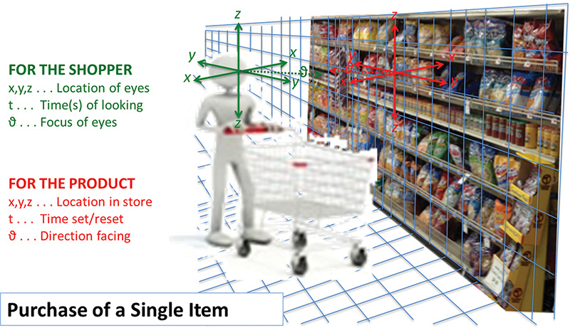
The illustration above shows the two parties to the purchase, the shopper and the product. Note the complementarity between the two. In other words, if you take either one of them out of the picture, the purchase will not happen. Here we balance the interests of the two. By diagraming this complementarity dimensionally, we capture both parties to the purchase in a common metric system, rather than in a separate one for each. This will be very significant going forward in understanding the process by which purchases occur. Purchases are not simply events to be tabulated. They are examples of a process to be understood.
Bidirectional Search
The first idea that demonstrates how navigability drives shopping is what I call bidirectional search. This idea is important because it is the fundamental process of shopping, whether online or in bricks-and-mortar stores. In bidirectional search, as the illustration above shows, retailers and suppliers are searching for shoppers, while at the same time shoppers are searching for products. Much of the time the industry does not properly recognize the first part of this bidirectional search, primarily because of the relatively passive role retailers and suppliers play at the final point of purchase.
I've written about this passivity in my post, “Googling” the Store,1 in the aforementioned Views (in this edition of this book, I frequently reference material that I and others have previously published. We provide notes and links to all of these sources). Passivity, in turn, leads merchant warehouse retailers, whose neighborhood warehouses merely store merchandise until a shopper puts it in her basket, to fail in reaching their full potential in sales. This stark description is my attempt to break through the mechanical way we tend to look at retailing, particularly the accounting, or more accurately the counting of events, that has become deeply embedded in the industry’s thinking and retail metrics.
Retailers and suppliers are of course not physically present to search for shoppers. Instead, they rely on their surrogates, the displays and products, to do the searching for them. For the retailer, a display is a display, whereas for the supplier it is more about products. That is, the suppliers are sending in their brands and individual products to represent them, whereas the retailers take a more aggregate approach, with entire displays, aisles, and departments representing them.
So all the displays and products in the store do their best to shout at shoppers as they pass by: “Buy me! Buy me!” “No, no, no, buy me!” It’s no wonder shoppers typically shop the store so superficially. They have to in order to retain their sanity. The shopper’s clutter filter maintains a state of obliviousness by screening from consideration everything except the little bit of information that makes it through the cacophonous roar that retailers and suppliers orchestrate in their search for shoppers to buy their products.
Never forget this bidirectional perspective: shoppers looking for products; products looking for shoppers. It should drive store design and operations. Mr. Retailer, Ms. Brand Supplier, you can be far more effective on your side of the search by working with the shopper, rather than by indiscriminately shotgunning from your side of the aisle and display interface.
Products/Shoppers Competition
The second idea that brings navigability into focus here is that there is an actual competition occurring in the store between the products and the shoppers. This competition gets very personal, particularly in the selection process when it is this shelf or product display talking to this specific shopper or passerby (see illustration above.) I won't discuss this in detail here because that personal communication between products and shoppers has more to do with package and planogram design than store design, which is what we focus on here. I will, however, mention one at-the-shelf principle: Shoppers do not like to be talked down to!
This is why top shelves are typically very poor places to sell anything. Shoppers do not want their products staring at them from eye level. Rather, the products should be humble supplicants looking up to the shopper from 30 to 60 inches above the floor. That is where most purchasing occurs. Those products have the decency to respectfully look up to their masters, the shoppers. One way to achieve this proper product humility is to place the bottom shelf protruding into the aisle a few inches, with a slight tip upward. This is an excellent way to give that bottom shelf a bit more prominence. The products are well displayed, humble supplicants to the shopper at the cost of only a few inches of crowding of the shopper’s feet, something they really don’t mind at all. A little intrusion into the aisle down there is no serious offense: The feet scarcely notice!
Other than right at the shelf, the competition between products and shoppers is almost totally under the control of the store designer. The store designer manages this competition through how much space the designer allocates to displays and products versus how much space he allocates to the shoppers. Here we are talking about the total area of the store, and its division into shelves, displays, and other product areas versus the actual square footage in which the shoppers can walk, navigate, and shop. We call this measure product/shopper allocation.2 The more products and displays you jam into the store, the less space for shoppers.
This ratio, product-space to shopper-space, is a major controller of the efficiency of the store. (See Figure I.2, below.)
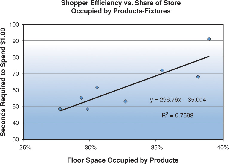
All stores must have space for both shoppers and products. But this chart shows that at a certain point the amount of space allocated to products can actually suppress sales rather than increase them. This is not a simple relationship, but it further demonstrates how open space attracts shoppers and generates sales.
Although retailers may be unaware of it, they have learned to provide lots of open space on the perimeter, in produce, and other areas of their stores where the vast majority of sales occur. Increased sales in these areas are not due to the specific merchandise offered there, only, but rather, also, to the attractive way retailers display the products in these locations.
Open Space Actually Attracts Shoppers—Think Navigation!
The third idea that supports navigability of the store is that shoppers are subconsciously drawn to open space. This happens because shoppers shop through their eyes. They do not look for products through careful, rational thinking, but by habit and instinct. This is why I often urge, “If the shopper does not see it, it’s effectively not in the store.” The shopper sees only a small fraction of the store up close and personal. If you are going to manage the sales process, you better know what that small fraction is.
Everything about store design is about seeing. An ideal store design includes a wide, open track that circumnavigates the store. Low displays on at least one side of that track allow a wide vista so that shoppers see to the furthest areas of the store. It’s okay for shoppers to see lots of merchandise at a distance. Let the shopper go that distance if that merchandise resonates with them. Don’t jam it all into their faces, limiting their ability to see more of the store and more available products. See Chapter 3 of this book.
Professor Allen Penn of the University College of London showed exactly how open space moves shoppers around the store.3 Professor Penn and one of his students ingeniously illustrated how shoppers respond to the space in an IKEA floor plan by creating a model store that consisted of only floor space and blank blocks representing the displays and fixtures. (Upper left of Figure I.3) They then sent bots programed to seek out open spaces through the floor plan. Here you can see how their open-space sensitive bots created the exact same paths that real shoppers walked in the real, fully stocked store:
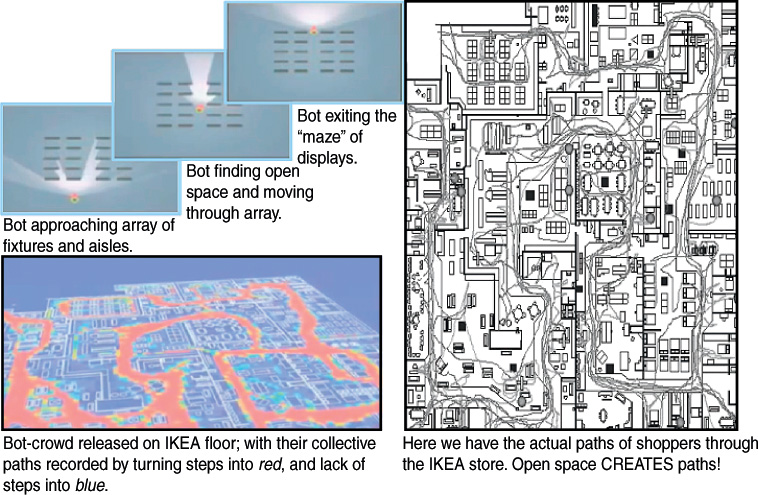
Figure I.3 Open space driving the shoppers’ navigation. (Images provided by Professor Alan Penn, UCL.)
In the upper-left of Figure I.3, you see three successive scenes of a bot approaching an array of shelf displays that block vision, with seeable open spaces indicated by the lights penetrating the array. The bot moves in the direction of the most light and seeable space and makes its way to the widest aisle, and down that to the exit of the array of displays.
On the lower-left you see this principle applied with a crowd of these bots making their way through an IKEA store model with fixtures matching a real store. The steps of the bots on the floor turns the floor redder, and areas where they don’t step, over time, turn bluer. On the right, the white lines on the same floor plan is the recorded paths of actual shoppers in the real IKEA store. Open space drives the paths of the shoppers. There may be multiple major paths, but all of them will have the characteristic of wide visual accessibility.
We have discussed three ideas that should drive store design and impact selection at the shelf:
![]() Bidirectional search—Products search for shoppers; shoppers search for products.
Bidirectional search—Products search for shoppers; shoppers search for products.
![]() Products/shoppers compete for space—They occupy interfacing spaces.
Products/shoppers compete for space—They occupy interfacing spaces.
![]() Open space actually attracts shoppers—Think navigation!
Open space actually attracts shoppers—Think navigation!
We have recognized and appreciated these principles before, but we have not recognized them as part of the mosaic of shopping, and particularly navigation, in the store. This reminds me of something J. R. R. Tolkien observed about a beautiful painting that you might buy and hang in a prominent place for your regular enjoyment. As time goes by, and you see it again and again, the painting gradually fades from your consciousness, until, possibly, a guest seeing it for the first time exclaims, “What a beautiful painting!” And then you look at it anew and say, “Yes, it is quite lovely!”
This principle applies to the wonder and joy of this incredible thing we have, self-service retailing, which came into being only about 100 years ago. It had a massive and positive global impact for consumers, retailers, and their suppliers. In fact, a century ago, some people understood the glories of self-service retail going on around them, and didn't just see it as “pile it high, and let it fly!” In 1916, an American visionary filed a patent for a self-serving store.4 You can still find that spirit of innovation and efficiency today.5 (See also: The “Path-to-Purchase” is Often a U-Turn6.)
For retailers, the reduction or elimination of their sales team/staff, meant that their focus moved to logistics, supplier management/negotiations, and matching merchandise selection with their shoppers. No real selling was needed. Again, self-service means, “shopper, sell yourself.” But the death of retailer selling (as contrasted with merchandising) was resisted by a few retailers. One in particular, Clarence Saunders, continually pressed for more efficiency in selling, and patented the store design represented here:
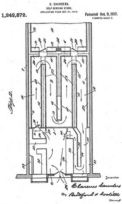
Notice the vestibule area at the front of the store, where shoppers can enter the display area, on the left, and pass in a serpentine path up and down a series of aisles. The purpose of this serpentine path was to allow the merchant to introduce the shopper to an “appropriate” offering of merchandise in a systematic way. In this way, Clarence Saunders retained control of the selling process, and was able to assist the shopper with their purchases. In effect, in these serpentine stores, the retailer assumed responsibility for selling, to an extent, instead of passively abdicating this responsibility for the sale to the shopper.
Obviously, instead of following this lead, retailers the world over abandoned Saunders' serpentine path, multiplied aisles, for which manufacturers generously rewarded them, and turned shoppers loose, to their own devices, in mini-warehouses. Retailers became passive in the process of shoppers making purchase decisions, essentially allowing selling skills to atrophy.
It is no wonder shoppers waste 80% of their time in the store, wandering about seeking something to buy - not to mention vast options when they finally arrive in an area where a purchase will actually occur. But there are modern incarnations of the serpentine store. Ikea is probably the best known global example. But for the CPG/FMCG market the pre-eminent example is Stew Leonards, where they achieve something like $100 million in sales with the serpentine path.5
By studying that history, and by measuring everything going on in the store, I like to think we have scraped the dull overfamiliarity off of this marvelous painting, to once again stand in awe at the view. It might seem odd that it would take a scientist, mindful of Lord Kelvin's dictum, “If you cannot express your knowledge in numbers, it is of a meager and unsatisfactory sort!” to understand the art of modern self-service retailing. But I am hoping an increasing number of fellow viewers will delight in the perspective—to see the obvious, again, possibly for the very first time.
My colleague, Mark Heckman, and I are getting closer to rolling out a comprehensive retail management system we call Accelerated Merchandising. Thinking things through from scratch again—in particular, putting the science of retailing into an historical perspective—has been a privilege. Every principle discovered can be validated by the successes and failures of the past 100 years, and accounts for the rise and fall of the retail giants in our own time. We believe it shows the way from where we are today to increased performance for all self-service retailers, both bricks and online, going forward. Here we want to share a significantly different view of the self-service sales process going on in stores around the world. I hope you find this useful to your own thinking!
Review Questions
1. Discuss what the term bidirectional search means. What are the two components of bidirectional search?
2. How does bidirectional search look in a passive store?
3. What does the author mean by a shopper’s clutter filter? Why is this coping mechanism necessary in a contemporary store?
4. Is eye-level the best place on a shelf? What areas of a shelf are potentially more appealing from the shopper perspective?
5. What is meant by product/shopper allocation? Why does a store designer need to consider space for shoppers, not just a space for store fixtures and products?
6. What is the role of open space in in-store navigation and product visibility?
Endnotes
1. Sorensen, H. (2012, June 11). “Googling” the Store. Retrieved from http://www.shopperscientist.com/2012-06-11.html
2. Sorensen, H. (2008, August 16). The Aisleness of Stores. Retrieved from http://www.shopperscientist.com/2008-08-16.html (We now refer to “aisleness” as “product/shopper allocation.)
3. Penn, A. (2011, January 18). Who enjoys shopping in IKEA? UCL Lunch Hour Lectures. Retrieved from https://www.youtube.com/watch?v=NkePRXxH9D4
4. Saunders, C. (1916, October 21). U.S. patent application for the self-serving store. Retrieved from http://pdfpiw.uspto.gov/.piw?Docid=01242872&homeurl=http%3A%2F%2Fpatft.uspto.gov%2Fnetacgi%2Fnph-Parser%3FSect1%3DPTO1%26Sect2%3DHITOFF%26d%3DPALL%26p%3D1%26u%3D%2Fnetahtml%2FPTO%2Fsrchnum.htm%26r%3D1%26f%3DG%26l%3D50%26s1%3D1242872.PN.%26OS%3DPN%2F1242872%26RS%3DPN%2F1242872&PageNum=&Rtype=&SectionNum=&idkey=NONE&Input=View+first+page
5. Leonard, S. (2009). Stew Leonard: My Story. Colle & Co., Publishers.
6. Sorensen, H. (2010, March 27). The “Path-to-Purchase” is Often a U-Turn. Retrieved from http://www.shopperscientist.com/2010-03-27.html